#...like 9 overlay and multiply and soft/hard light layers
Explore tagged Tumblr posts
Visit Tumblr Blog
Explore Tumblr blogs with no restrictions, modern design and the best experience.
Last Seen Tumblr Blogs


Fun Fact
Tumblr was created by web developers David Karp and Marco Arment.
Text

I think my copy of the game is broken they've been doing this for 30 minutes
Crop of the Biolizard edit I did bc it makes me laugh:

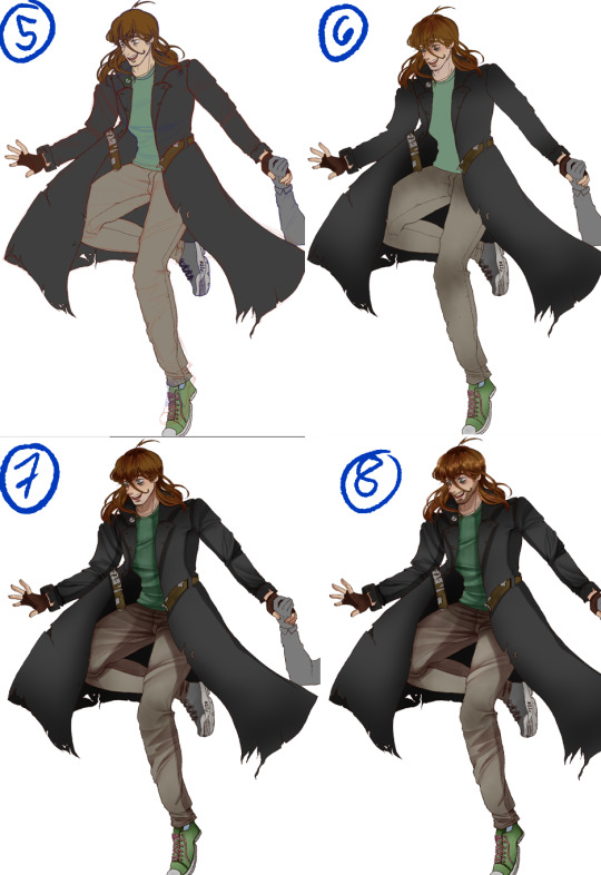
#art#sonic the hedgehog#sonic#shadow the hedgehog#rouge the bat#their dynamic is so funny to me like hello what episode of Untucked is this#I am rotating them in a 2 bed 1 bath apartment in my mind#Also very proud of how this turned out I think I'm finally finding a comic rendering style that doesn't make me want to rip my hair out#Simplify baybee it's a comic not an illustration you can get a little crazy with it#Spoiler alert. Getting looser with lineart and better at colour schemes and simplifying shading. Is good actually.#It's so much easier to eyeball what a colour would look like in a setting instead of colourpicking the OG palette and struggling with...#...like 9 overlay and multiply and soft/hard light layers#Approximating colour genuinely looks better than forcing local colour into the piece. As long as the values are still there it works out#comic
11K notes
·
View notes
Text
“ You are a child of the Stars,
Shout what has been unsung ”
— Dustan "Fish in a Birdcage" Townsend, Rule #9 - Child of the Stars
Vic posting art two days in a row? Crazy I know. This one’s actually recent lol
Does this fandom exist on here? I'm not sure. Frankly, I'm not in this fandom either - I actually can't get myself to play the game. But Anaxagoras is just Su (HI3) with a gun and I love Su and therefore I must love this guy
Dissection of this piece and the process below the cut
I forgot his hand tattoo thing till about half an hour after I finished, oops
In total, there were 68 layers and it took me 3h 45 mins. This was ever so slightly inspired by something my wife North norrthie made a while ago
Closeups!


Below you can see my lighting guidelines (in red) and the layer separations for the skin. Separating it like this makes it easier for me when I'm doing something lineless. I typically do it for hair as well (I'll demonstrate this eventually lol), but for this piece I decided not to.


These are the base colours. For the clothing I did use two slightly darker blues (which I shifted slightly more toward purple!) because of limitations, but otherwise all the shading was done with the colours here. In some parts I did play with the opacity, though. This is why it's slightly less shaded than I would normally do, especially when it comes to clothing and skin. Usually I would do a lighter colour for highlights, but for the skin there wasn't exactly a lighter colour to use, and so for consistency I didn't add highlights to the clothes.

For the extra glowiness, I had four different layers of the same yellow colour (lol). Two in the middle, one at the bottom, and one on top of the smoke. In the middle, I used a Saturation layer at 42% opacity, then a slightly smaller area on max opacity set to Hard Light. At the bottom I used Multiply (covering about 1/4 of the image), and finally for the smoke I set it to Linear Burn at max opacity.
Here’s the piece without the overlays!
All my art is done on Procreate unless stated otherwise. For brushes, I mainly used Inka. I do, however, often use Syrup for small details (such as the eyes and hand tattoo), and Soft Brush at 69% for any airbrushing (which, mind you, I do a lot of lol). For the smoke, I used a custom brush - it uses Kunanyi as a base, but I made the shape rectangular and did some minor adjustments.
#anaxagoras#anaxa#hsr anaxa#honkai star rail anaxa#hsr#hsr fanart#honkai star rail#honkai sr#star rail#fanart#digital art
52 notes
·
View notes
Photo
Since I’m still stuck at work and cant do anything, I thought it would be fun to post my drawing process for my semi-serious style, using the latest fanart I did with Edd and Edu but only featuring Edd :3c Maybe one day I’ll make a speedpaint but thats not today. If you’re curious, one by one below the line + me talking about the process (as best I can)
1. Preliminary sketch. These are my roughs, this is the start after I had my brainstorm and planning phase. I’ve found all my references and did the pose myself as well so I know what it feels like and if its bodily possible. 2. Clean sketch. This is where I loosely put in all the nitty-gritty, where the folds are, details of the hair, etc etc. I change the pencil colour so I can differentiate certain parts. 3. Line art. Like it says on the tin, but for my semi-serious style I tend to avoid lining folds because I prefer to paint them in this style. 4. Grey out. I need this layer so that I don’t get blinded/confused when I lay down the colours,
5. Flats. So all the colours needed, usually when I draw backgrounds they would also depend on the lighting, so I would colorize them if needed, but for standalones I just put in the basic colours. 6. Soft shadows. I tend to use multiply layers for this step, but sometimes I also do normal layers, in case I feel as though the colour should be more relative to its surroundings since multiply wont let me do that. It all depends on how I want the shadows to feel on the piece, but when I’m lazy I just do multiply (lol). Soft shadows also include the colour on the planes of the face, so = yellow for forehead, red for middle, blue for the lower part aka jaw area. Of course also the reds on the skin in other areas like elbows and knees, but since Edd is fully clothed, its just the tip and inner part of his ear, and the tips of his fingers. 7. Hard shadows and minor highlights. For my style, I gear more towards a watercolour style kind of shading, so I follow that principle when I decide where to put and how to render my shadows. Typically I have at minimum 4 layers for this type of hard shadow shading. The minor highlights here are just the lights in the pupil, and a soft large airbrush going over the spaces where shadows cant reach. 8. Missing details and overlay highlights. Near the end I put in all the little details I missed, so in here its Edd’s 5 o’clock shadow, and some scuffs and scrapes on his clothing and shoes. The overlay highlights are super subtle but make the drawing feel a bit more alive, for me at least, these highlights are the ones on the “bumps” of the clothing folds, and the hair highlights.
9. Hard highlights and atmospheric lights. The finale! This is where I just put in the brighter, harder, highlights in places they should be, and then clip a Luminosity/Overlay layer on top of the entire drawing, using a large soft brush I go over the drawing to put a bit more brightness into it. And there! Thats how I render in my semi-serious artstyle. But...eh, dont be fooled, I know this step by step makes it look like I would jump around all the parts of the drawing and render things equally, sadly thats far from the truth. My perfectionism flares up badly and it often leads to me obsessing over a singular part before moving on, so the process would look more like this:
yeah......
20 notes
·
View notes
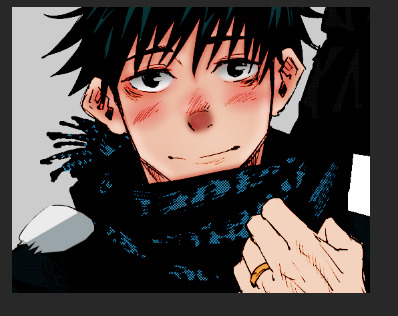
Note
can you pretty please make a tutorial on how you color 🥺 i really liked ur yutta coloring so much and i wanted to know how you’re able to achieve that smooth finish and airbrushed quality on the finished products and it still looks sharp :<<
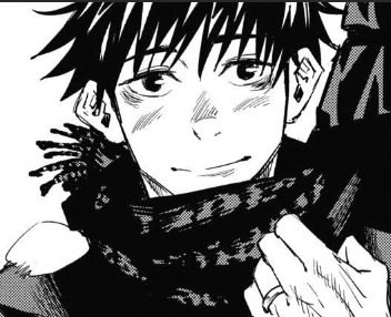
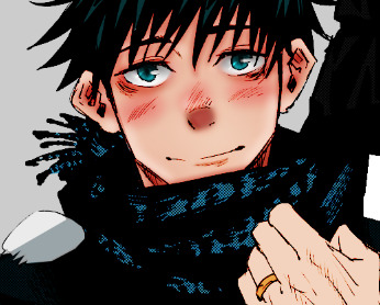
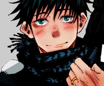
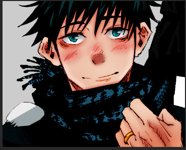
hi anon!! tysm!! I'm still very new to manga coloring so I do not yet have a defined style or an exact method, but I'd be happy to explain how I colored this panel:
I’ll walk through roughly what my process was under the cut (i’ve also upl*aded the psd file here, if you want to see what exactly I did on each layer).
I used PS18 to make this but any version should work about the same.
I’m not sure what your level of experience w coloring is so I will just start from the very beginning:
Step 1: Get and Crop Manga Panel
pretty self explanatory lol
Step 2: Remove the whites
With your manga panel layer selected, go into channels and click this button:
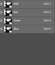
& hit delete. The whites should all be gone now. The outlines were a little faint so I made a couple duplicates and set them to multiply. Then I grouped all the outlines together and set their blending mode to color burn.
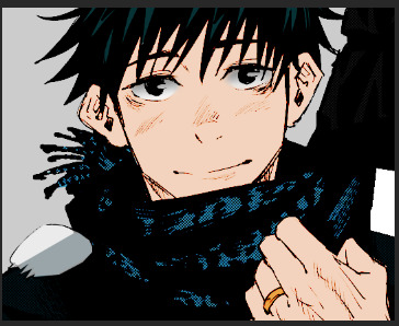
Step 3: Base coloring
Underneath the outlines, I did my base coloring. I use a separate layer for the face / hand / ring / hair / etc. this makes it much easier to color later.
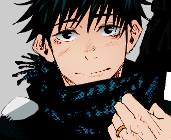
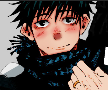
Step 4: (Very) soft shading:
For panels like this I always do shading on the face first since it takes up 80% of the panel and where the eyes go to first. Usually I’ll start with a very soft shading (hardness: 0%, brush size: as big as possible) and shade the top and bottom parts with a slightly darker color than the skin tone to create a soft gradient:
It’s very subtle
Then, I gradually make the brush smaller (keep hardness @ 0%), and the brush color darker to add a couple more layers of soft shading:

On the last layer I used the blur tool pretty liberally since the brush size was small enough that it didn’t look very smooth.
Step 5: Blush, nose & Under eye circles
Under eye circles are probably not necessary for most other characters but they are yuuta’s defining trait so:
For the under eye circles I used the same color as in the last layer of shading from step 4. For the blush I used a dark red and then set the opacity to 50%. For the nose I also used a darker red and kept the opacity a little higher. For all of them, I used the blur tool to smooth it out
Step 6 & 7: Extra shadows & lighting
To emphasize the under-eye circles, the shadow on yuuta’s neck & to add some depth to the ears I made a new layer & used black to color over these areas, and then set the layer to soft light.
Used a white layer on the jawline, above the eyebrows and eyelids & on the top and bottom parts of the ears. I kept the brush size much smaller for these, and then blurred them to smooth them in.
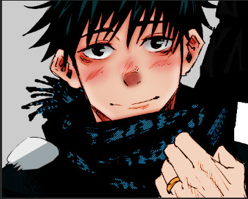
Step 8: Eyes
Because the eyes are black in the manga panel, when I color the eyes I have to do them above the outlines created in step 2. So I start with just the blue:
I then (on a separate layer), colored over the eyelids using black and white. I use blacks towards the top and in the areas where the pupil would be, and white towards the bottom of the eyes. I set the blending mode of these layers to soft light:
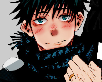
Then I used a white brush (very small, hardness @ 100%), to add a “shine”. I set the blending mode of this layer to overlay.
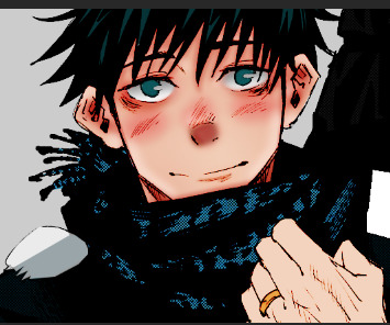
Step 9: Hand
I honestly mostly repeated the same steps as above (but in much less detail) for the hand.
I also added a layer with black & white shading set to soft light to add some shine to the ring (its very subtle):
Step 10: Clothing and hair
The clothing is already black so it’s very difficult to shade w the method of coloring under the lines. It also does not take up much of the panel so I just did not shade the clothing at all lol. For the hair, I added a layer shading over the top of the hair in black, and set that layer to soft light:
And that’s the final product!!
Again, I’m still discovering my style, so I don’t have an exact set of steps I follow, but this is the rough process. When I first started, I found this yt video to be very very helpful & would highly recommend it. It’s for coloring original art instead of manga coloring but the general ideas still apply.
I hope this was helpful, please let me know if you have any questions!
36 notes
·
View notes
Photo

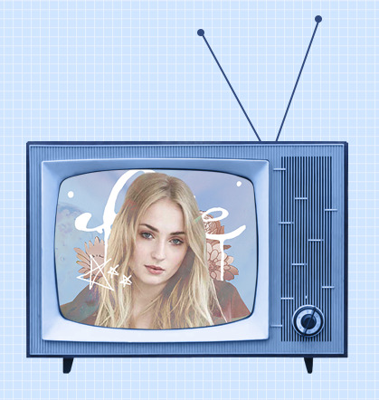
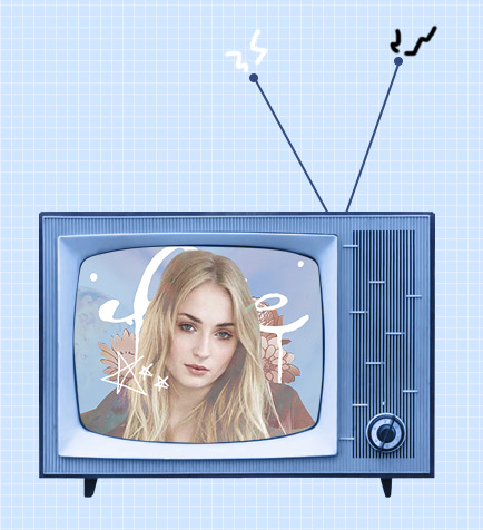
。・ tutorial four, graphic tutorial two by graphictutorials ゜+.*
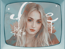
-`. Hello everyone! In this tutorial, I’ll teach you how do make an edit/graphic with a TV and electricity doodles, like this: .’-
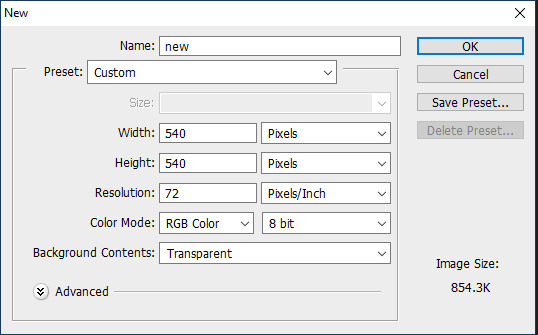
1. Open photoshop and create a new document with the size you want.
For this tutorial, I’ll be doing 540x540px.
2. Add your background. You can make it a solid color, use a pattern, gradient, texture, etc.
For example, I used the paint bucket tool to fill the background with a solid color (#d1ecff, to be exact), and I applied a pattern overlay (using the last one here) in soft light mode.
So my background looks like this:

A/N: I’m making the example pastel-ish, but you don’t have to!
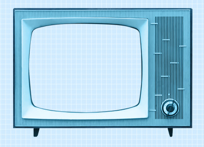
3. Now make a png of a vintage-esque TV, or you can use one of these: 1, 2, 3, 4.
I’ll be using the 2nd png in the 1st pack.
A/N: You’re going to want the screen portion erased if it isn’t already, because that is where you’re going to put an image.
4. This is optional, but if you don’t like the color of the TV, you can change it by:
Double-clicking on the TV layer, and go to the “Color Overlay” tab, clicked the colored rectangle, choose the color you want, click OK, and change the mode to one of the following: Overlay, Soft Light, Color, Hue, or Multiply. Choose which one looks best with your color and you can adjust the opacity if you want.
For example, here’s what I did:

5. If you chose a TV that already has antennae, skip this step. If your TV does not have antennae, like mine, I will show you how to quickly make some.
Create a new layer, choose a foreground color to a color that matches your TV color, select the line shape tool, make the line 2px weight with no stroke, and click and drag a couple lines from the top of the TV to make antennae.


A/N: You might want to rasterize those shapes (to do so, right-click on each layer and click “rasterize layer”) or put those shape layers under the TV layer.
Now create another new layer, use the ellipse shape tool, click and drag a small circle to fit on top of one of the antennae (hold shift as you do so to get an even circle). Duplicate that and drag it over to the other antenna.


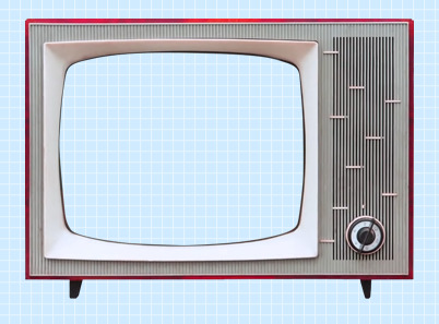
6. Now for the screen image.
Create a new layer and drag it under all of the TV/antennae layers.

Select the pen tool. You’re going to make some points around the screen portion and connect them.

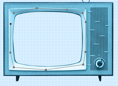
Once you connect them, It’ll make a line like this:
Go to the top bar and click the “Selection...” button. It will make the outline into a selection and that’s what you want.

A/N: There will be a dialogue box pop up, but just click OK.

Now it is a selection.
Click the fill bucket tool and click inside the selection to fill it. It doesn’t matter what color it is.

Click CTRL+D to deselect it.
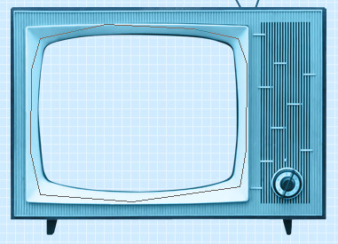
7. Now we will put an image/edit inside.
If you just want to put an image, open the image, drag it to the TV edit document, make sure it’s right above the screen fill layer, right-click on the image layer, and select “Create Clipping Mask.” It will be inside the screen portion and you can resize.


If you want to put an edit inside, I’d suggest making the edit in a new document, merge all of the layers of the edit document when you’re done, drag it over to the TV edit document, make sure it’s right above the screen fill layer, right-click on the image layer, and select “Create Clipping Mask.” It will be inside the screen portion and you can resize.
For example, I quickly made this edit in a new document and merged all the layers:

Then I followed the steps above and put it inside the screen.
8. Creating the “electricity”.
Create a new layer and use the brush tool with a simple hard round brush in a small size and draw a couple little zig-zags coming from one of the antennae.
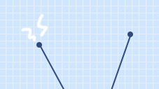
Create another new layer and make a couple more for the other antenna.
Now you could stop here, or if you want, you can make them into a little gif with the next step:
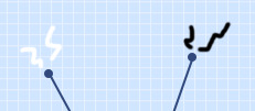
9. Duplicate one of the electricity layers, choose the select tool, right click on the document, and click “Free Transform”. Go to the top bar, and in the rotation box, enter -10. Hit the Enter key when you’re done.

It rotated the duplicate slightly to the left.


A/N: If it’s blurry around the edges, apply a Surface Blur with 5 Radius and 10 Threshold.
Duplicate the other electricity layer, Free Transform it, and apply a Rotation of 10. (Do the same number but polarize it. i.e., if you previously put -10, put +10 for this one. If you previously put +10, now put -10.)


10. Open the frame animation timeline.
For the first frame, hide the duplicated electricity layers. Only the original ones should be visible.
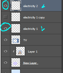
Create a new frame and in this one, hide the original electricity layers and un-hide the duplicates.


Set the speed of the gif to 0.5, or something around there. You don’t want it too fast because it’ll hurt people’s eyes!
Make sure the loop is on “Forever” as well!
11. Go to File>Save for Web.., and save the gif.
And you’re done!
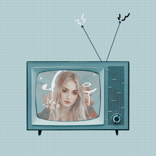
Here is my edit, image version:

And here it is as a gif:

Other Suggestions:
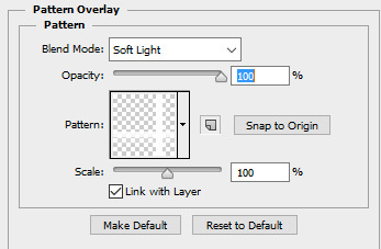
> For the full effect, you can go to the screen fill layer (not the image/edit inside of it) and select it, double-click, and apply a pattern overlay with a horizontal stripe and put the mode on Soft Light and lower the opacity to create that line effect.
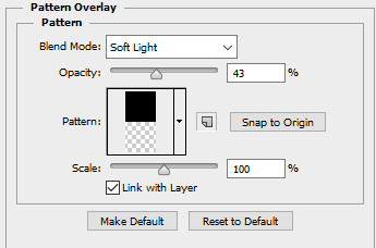
Result:
> You can also apply an Inner Glow to the screen layer and create a shadow.
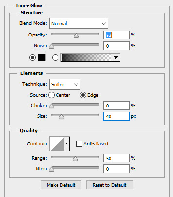
Result:

Anyways, I hope this tutorial/guide was helpful. If you need any help or have any questions, feel free to ask!
#yeahps#itsphotoshop#completeresources#tutorial#tutorials#*#graphic tutorial#graphic tutorials#graphic#edit#photoshop tutorial#photoshop tutorials#edit tutorial#edit tutorials
815 notes
·
View notes
Text
Create an abstract brush portrait
1. Prepare your reference image
Source a reference photo to help you with your portrait. We’ve used the image 28120087 from Dreamstime. Set up the guides by dividing your canvas into thirds. Enlarge your image so that the eyes meet the guides. Adjust the Levels, Curves and Posterize settings to help bring out the highlights and shadows.
2. Start brushing
With a black Hard Round Brush, set Size to 45px, Angle to 39, Roundness: 12%, Spacing: 1%. Begin with the eyes by painting the more obvious shapes of the iris, eye lashes, and brow bone, each on its own layer. Switch between black and white brushes by pressing X on your keyboard.
3. Create tones
Experiment with brush Opacity and Flow to create different tones. Alternatively, open up the Color Picker and set Color to different tones of grey. Press E to activate Eraser Tool. Toggle between [ and ] to control eraser size. Erase parts of the brows to make them look less blocky.
4. Set up a colour palette
Setting up a palette can help organise the colours of an illustration. For our image we wanted an overall purple tone with bright yellow and orange for highlights. Create an eclipse and set its colour to a bright yellow/green. Duplicate and set the rest of the colours as shown.
5. Begin colouring
Ctrl/right-click on a brush layer, select Blending Option. Turn on Color Overlay to set the colour of your brush stroke. Use the Color Picker to select one of the colours from your palette. You will notice that playing with the brush Opacity settings earlier will now affect a colour’s translucency.
6. Continue colouring
Assign dark colours to the blacks and dark greys; lighter colours to the lighter tones. We’ve kept some of the really dark areas like the iris, nostrils, and inner mouth black, while the white of the eye and the teeth stay white.
7. Adjustments
Tweak the colours by Ctrl/right- clicking on the area to select the layer, and change its colour using the same Color Overlay option. Add more highlights on the left forehead and cheeks with a white brush, with the layer’s blend mode set to Soft Light. Repeat for the shadows around the face using a black brush.
8. Introduce the wave guide
Load a horizontal guide such as the one in the screenshot into your artwork. Begin warping using the Twist, Wave or Flag option to create your desired wave form on the lines. Set the layer blend mode to Multiply to form a guide. We’re going to create the next portion of our brush strokes along these guidelines.
9. Painting wavy strokes
On a new layer, start painting strokes using the Hard Round Brush you used previously along these guides, picking the colours from your colour palette. Place these strokes around the edges of the face to blend the face and the wavy strokes together. Organise them into layer groups for ‘big’, ‘medium’ and ‘small’ strokes.
10. Bring up the facial features
As your brush strokes build up, some of the facial features might get lost as a result. Add in some white highlights on the cheeks and forehead. Similarly, boost the eyes with some black shadows on the brows, eyelids and lashes.
11. Add a drop shadow
Create a separation of your wavy strokes from the artwork. Group your wavy strokes into a folder. Duplicate the folder with Cmd/Ctrl+J. Merge the folder with Cmd/Ctrl+E. Select this merged layer, Ctrl/right-click, select Blending Options and turn on Drop Shadow. Set Opacity to 25%.
12. Soft toning
Using a Soft Round Brush, start painting highlights on the face as shown. Set the layer’s blend mode to Soft Light, Opacity at 50%. Repeat the steps, this time painting black on the shadow areas. Build up more shadows towards the side of the image, keeping the face bright for focus.
13. Colour adjustments
Create a Selective Color adjustment layer underneath the wavy stroke layers. We’ve darkened the reds by adding cyan and moved the hue towards pink by reducing the yellows. On the midtones, we’ve gone towards blue and yellow. Set colour gradients to Soft Light, Opacity: 50% for overall toning.
14. Cleaning up
With so much colour on your canvas, there will be distractions. Clean up areas where there are only tiny bits of colour. On a new layer, select the surrounding colour by pressing I to switch to the Eyedropper Tool, and start painting over the area. Be sure to select All Layers under the Sample drop-down box.
1 note
·
View note
Text
CSS: The Definitive Guide, 4th Edition
A note from the editors: We’re pleased to share an excerpt from Chapter 19 (“Filters, Blending, Clipping, and Masking”) of CSS: The Definitive Guide, 4th Edition by Eric Meyer and Estelle Weyl, available now from O’Reilly.
In addition to filtering, CSS offers the ability to determine how elements are composited together. Take, for example, two elements that partially overlap due to positioning. We’re used to the one in front obscuring the one behind. This is sometimes called simple alpha compositing, in that you can see whatever is behind the element as long as some (or all) of it has alpha channel values less than 1. Think of, for example, how you can see the background through an element with opacity: 0.5, or in the areas of a PNG or GIF87a that are set to be transparent.
But if you’re familiar with image-editing programs like Photoshop or GIMP, you know that image layers which overlap can be blended together in a variety of ways. CSS has gained the same ability. There are two blending strategies in CSS (at least as of late 2017): blending entire elements with whatever is behind them, and blending together the background layers of a single element.
Blending Elements
In situations where elements overlap, it’s possible to change how they blend together with the property mix-blend-mode.
mix-blend-mode
Values: normal | multiply | screen | overlay | darken | lighten | colordodge | color-burn | hard-light | soft-light | difference | exclusion | hue | saturation | color | luminosity Initial value: normal Applies to: All elements Computed value: As declared Inherited: No Animatable: No
The way the CSS specification puts this is: “defines the formula that must be used to mix the colors with the backdrop.” That is to say, the element is blended with whatever is behind it (the “backdrop”), whether that’s pieces of another element, or just the background of its parent element.
The default, normal, means that the element’s pixels are shown as is, without any mixing with the backdrop, except where the alpha channel is less than 1. This is the “simple alpha compositing” mentioned previously. It’s what we’re all used to, which is why it’s the default value. A few examples are shown in Figure 19-6.
Figure 19-6. Simple alpha channel blending
For the rest of the mix-blend-mode keywords, I’ve grouped them into a few categories. Let’s also nail down a few definitions:
The foreground is the element that has mix-blend-mode applied to it.
The backdrop is whatever is behind that element. This can be other elements, the background of the parent element, and so on.
A pixel component is the color component of a given pixel: R, G, and B
If it helps, think of the foreground and backdrop as images that are layered atop one another in an image-editing program. With mix-blend-mode, you can change the blend mode applied to the top image (the foreground).
Darken, Lighten, Difference, and Exclusion
These blend modes might be called simple-math modes—they achieve their effect by directly comparing values in some way, or using simple addition and subtraction to modify pixels:
darken: Each pixel in the foreground is compared with the corresponding pixel in the backdrop, and for each of the R, G, and B values (the pixel components), the smaller of the two is kept. Thus, if the foreground pixel has a value corresponding to rgb(91,164,22) and the backdrop pixel is rgb(102,104,255), the resulting pixel will be rgb(91,104,22).
lighten: This blend is the inverse of darken: when comparing the R, G, and B components of a foreground pixel and its corresponding backdrop pixel, the larger of the two values is kept. Thus, if the foreground pixel has a value corresponding to rgb(91,164,22) and the backdrop pixel is rgb(102,104,255), the resulting pixel will be rgb(102,164,255).
difference: The R, G, and B components of each pixel in the foreground are compared to the corresponding pixel in the backdrop, and the absolute value of subtracting one from the other is the final result. Thus, if the foreground pixel has a value corresponding to rgb(91,164,22) and the backdrop pixel is rgb(102,104,255), the resulting pixel will be rgb(11,60,233). If one of the pixels is white, the resulting pixel will be the inverse of the non-white pixel. If one of the pixels is black, the result will be exactly the same as the non-black pixel.
exclusion: This blend is a milder version of difference. Rather than being | back - fore |, the formula is back + fore - (2 × back × fore), where back and fore are values in the range from 0-1. For example, an exclusion calculation of an orange (rgb(100%,50%,0%)) and medium gray (rgb(50%,50%,50%)) will yield rgb(50%,50%,50%). For the red component, the math is 1 + 0.5 - (2 × 1 × 0.5), which reduces to 0.5, corresponding to 50%. For the blue and green components, the math is 0 + 0.5 - (2 × 0 × 0.5), which again reduces to 0.5. Compare this to difference, where the result would be rgb(50%,0%,50%), since each component is the absolute value of subtracting one from the other.
This last definition highlights the fact that for all blend modes, the actual values being operated on are in the range 0-1. The previous examples showing values like rgb(11,60,233) are normalized from the 0-1 range. In other words, given the example of applying the difference blend mode to rgb(91,164,22) and rgb(102,104,255), the actual operation is as follows:
rgb(91,164,22) is R = 91 ÷ 255 = 0.357; G = 164 ÷ 255 = 0.643; B = 22 ÷ 255 = 0.086. Similarly, rgb(102,104,255) corresponds to R = 0.4; G = 0.408; B = 1.
Each component is subtracted from the corresponding component, and the absolute value taken. Thus, R = | 0.357 - 0.4 | = 0.043; G = | 0.643 - 0.408 | = 0.235; B = | 1 - 0.086 | = 0.914. This could be expressed as rgba(4.3%,23.5%,91.4%), or (by multiplying each component by 255) as rgb(11,60,233).
From all this, you can perhaps understand why the full formulas are not written out for every blend mode we cover. If you’re interested in the fine details, each blend mode’s formula is provided in the “Compositing and Blending Level 1” specification.
Examples of the blend modes in this section are depicted in Figure 19-7.
Figure 19-7. Darken, lighten, difference, and exclusion blending Multiply, Screen, and Overlay
These blend modes might be called the multiplication modes—they achieve their effect by multiplying values together:
multiply: Each pixel component in the foreground is multiplied by the corresponding pixel component in the backdrop. This yields a darker version of the foreground, modified by what is underneath. This blend mode is symmetric, in that the result will be exactly the same even if you were to swap the foreground with the back‐drop.
screen: Each pixel component in the foreground is inverted (see invert in the earlier section “Color Filtering” on page 948), multiplied by the inverse of the corresponding pixel component in the backdrop, and the result inverted again. This yields a lighter version of the foreground, modified by what is underneath. Like multiply, screen is symmetric.
overlay: This blend is a combination of multiply and screen. For foreground pixel components darker than 0.5 (50%), the multiply operation is carried out; for foreground pixel components whose values are above 0.5, screen is used. This makes the dark areas darker, and the light areas lighter. This blend mode is not symmetric, because swapping the foreground for the backdrop would mean a different pattern of light and dark, and thus a different pattern of multiplying versus screening.
Examples of these blend modes are depicted in Figure 19-8.
Figure 19-8. Multiply, screen, and overlay blending Hard and Soft Light
There blend modes are covered here because the first is closely related to a previous blend mode, and the other is just a muted version of the first:
hard-light: This blend is the inverse of overlay blending. Like overlay, it’s a combination of multiply and screen, but the determining layer is the backdrop. Thus, for back‐drop pixel components darker than 0.5 (50%), the multiply operation is carried out; for backdrop pixel components lighter than 0.5, screen is used. This makes it appear somewhat as if the foreground is being projected onto the backdrop with a projector that employs a harsh light.
soft-light: This blend is a softer version of hard-light. That is to say, it uses the same operation, but is muted in its effects. The intended appearance is as if the foreground is being projected onto the backdrop with a projector that employs a diffuse light.
Examples of these blend modes are depicted in Figure 19-9.
Figure 19-9. Hard- and soft-light blending Color Dodge and Burn
Color dodging and burning are interesting modes, in that they’re meant to lighten or darken a picture with a minimum of change to the colors themselves. The terms come from old darkroom techniques performed on chemical film stock:
color-dodge: Each pixel component in the foreground is inverted, and the component of the corresponding backdrop pixel component is divided by the inverted foreground value. This yields a brightened backdrop unless the foreground value is 0, in which case the backdrop value is unchanged.
color-burn: This blend is a reverse of color-dodge: each pixel component in the backdrop is inverted, the inverted backdrop value is divided by the unchanged value of the corresponding foreground pixel component, and the result is then inverted. This yields a result where the darker the backdrop pixel, the more its color will burn through the foreground pixel.
Examples of these blend modes are depicted in Figure 19-10.
Figure 19-10. Color dodge and burn blending Hue, Saturation, Luminosity, and Color
The final four blend modes are different than those we’ve seen before, because they do not perform operations on the R/G/B pixel components. Instead, they perform operations to combine the hue, saturation, luminosity, and color of the foreground and backdrop in different ways:
hue: For each pixel, combines the luminosity and saturation levels of the backdrop with the hue angle of the foreground.
saturation: For each pixel, combines the hue angle and luminosity level of the backdrop with the saturation level of the foreground.
color: For each pixel, combines the luminosity level of the backdrop with the hue angle and saturation level of the foreground.
luminosity: For each pixel, combines the hue angle and saturation level of the backdrop with the luminosity level of the foreground.
Examples of these blend modes are depicted in Figure 19-11.
Figure 19-11. Hue, saturation, luminosity, and color blending
These blend modes can be a lot harder to grasp without busting out raw formulas, and even those can be confusing if you aren’t familiar with how things like saturation and luminosity levels are determined. If you don’t feel like you quite have a handle on how they work, the best thing is to practice with a bunch of different images and simple color patterns.
Two things to note:
Remember that an element always blends with its backdrop. If there are other elements behind it, it will blend with them; if there’s a patterned background on the parent element, the blending will be done against that pattern.
Changing the opacity of a blended element will change the outcome, though not always in the way you might expect. For example, if an element with mix-blend-mode: difference is also given opacity: 0.8, then the difference calculations will be scaled by 80%. More precisely, a scaling factor of 0.8 will be applied to the color-value calculations. This can cause some operations to trend toward flat middle gray, and others to shift the color changes.
http://ift.tt/2BEqFtd
0 notes
Text
CSS: The Definitive Guide, 4th Edition
A note from the editors: We’re pleased to share an excerpt from Chapter 19 (“Filters, Blending, Clipping, and Masking”) of CSS: The Definitive Guide, 4th Edition by Eric Meyer and Estelle Weyl, available now from O’Reilly.
In addition to filtering, CSS offers the ability to determine how elements are composited together. Take, for example, two elements that partially overlap due to positioning. We’re used to the one in front obscuring the one behind. This is sometimes called simple alpha compositing, in that you can see whatever is behind the element as long as some (or all) of it has alpha channel values less than 1. Think of, for example, how you can see the background through an element with opacity: 0.5, or in the areas of a PNG or GIF87a that are set to be transparent.
But if you’re familiar with image-editing programs like Photoshop or GIMP, you know that image layers which overlap can be blended together in a variety of ways. CSS has gained the same ability. There are two blending strategies in CSS (at least as of late 2017): blending entire elements with whatever is behind them, and blending together the background layers of a single element.
Blending Elements
In situations where elements overlap, it’s possible to change how they blend together with the property mix-blend-mode.
mix-blend-mode
Values: normal | multiply | screen | overlay | darken | lighten | colordodge | color-burn | hard-light | soft-light | difference | exclusion | hue | saturation | color | luminosity Initial value: normal Applies to: All elements Computed value: As declared Inherited: No Animatable: No
The way the CSS specification puts this is: “defines the formula that must be used to mix the colors with the backdrop.” That is to say, the element is blended with whatever is behind it (the “backdrop”), whether that���s pieces of another element, or just the background of its parent element.
The default, normal, means that the element’s pixels are shown as is, without any mixing with the backdrop, except where the alpha channel is less than 1. This is the “simple alpha compositing” mentioned previously. It’s what we’re all used to, which is why it’s the default value. A few examples are shown in Figure 19-6.
Figure 19-6. Simple alpha channel blending
For the rest of the mix-blend-mode keywords, I’ve grouped them into a few categories. Let’s also nail down a few definitions:
The foreground is the element that has mix-blend-mode applied to it.
The backdrop is whatever is behind that element. This can be other elements, the background of the parent element, and so on.
A pixel component is the color component of a given pixel: R, G, and B
If it helps, think of the foreground and backdrop as images that are layered atop one another in an image-editing program. With mix-blend-mode, you can change the blend mode applied to the top image (the foreground).
Darken, Lighten, Difference, and Exclusion
These blend modes might be called simple-math modes—they achieve their effect by directly comparing values in some way, or using simple addition and subtraction to modify pixels:
darken: Each pixel in the foreground is compared with the corresponding pixel in the backdrop, and for each of the R, G, and B values (the pixel components), the smaller of the two is kept. Thus, if the foreground pixel has a value corresponding to rgb(91,164,22) and the backdrop pixel is rgb(102,104,255), the resulting pixel will be rgb(91,104,22).
lighten: This blend is the inverse of darken: when comparing the R, G, and B components of a foreground pixel and its corresponding backdrop pixel, the larger of the two values is kept. Thus, if the foreground pixel has a value corresponding to rgb(91,164,22) and the backdrop pixel is rgb(102,104,255), the resulting pixel will be rgb(102,164,255).
difference: The R, G, and B components of each pixel in the foreground are compared to the corresponding pixel in the backdrop, and the absolute value of subtracting one from the other is the final result. Thus, if the foreground pixel has a value corresponding to rgb(91,164,22) and the backdrop pixel is rgb(102,104,255), the resulting pixel will be rgb(11,60,233). If one of the pixels is white, the resulting pixel will be the inverse of the non-white pixel. If one of the pixels is black, the result will be exactly the same as the non-black pixel.
exclusion: This blend is a milder version of difference. Rather than being | back - fore |, the formula is back + fore - (2 × back × fore), where back and fore are values in the range from 0-1. For example, an exclusion calculation of an orange (rgb(100%,50%,0%)) and medium gray (rgb(50%,50%,50%)) will yield rgb(50%,50%,50%). For the red component, the math is 1 + 0.5 - (2 × 1 × 0.5), which reduces to 0.5, corresponding to 50%. For the blue and green components, the math is 0 + 0.5 - (2 × 0 × 0.5), which again reduces to 0.5. Compare this to difference, where the result would be rgb(50%,0%,50%), since each component is the absolute value of subtracting one from the other.
This last definition highlights the fact that for all blend modes, the actual values being operated on are in the range 0-1. The previous examples showing values like rgb(11,60,233) are normalized from the 0-1 range. In other words, given the example of applying the difference blend mode to rgb(91,164,22) and rgb(102,104,255), the actual operation is as follows:
rgb(91,164,22) is R = 91 ÷ 255 = 0.357; G = 164 ÷ 255 = 0.643; B = 22 ÷ 255 = 0.086. Similarly, rgb(102,104,255) corresponds to R = 0.4; G = 0.408; B = 1.
Each component is subtracted from the corresponding component, and the absolute value taken. Thus, R = | 0.357 - 0.4 | = 0.043; G = | 0.643 - 0.408 | = 0.235; B = | 1 - 0.086 | = 0.914. This could be expressed as rgba(4.3%,23.5%,91.4%), or (by multiplying each component by 255) as rgb(11,60,233).
From all this, you can perhaps understand why the full formulas are not written out for every blend mode we cover. If you’re interested in the fine details, each blend mode’s formula is provided in the “Compositing and Blending Level 1” specification.
Examples of the blend modes in this section are depicted in Figure 19-7.
Figure 19-7. Darken, lighten, difference, and exclusion blending Multiply, Screen, and Overlay
These blend modes might be called the multiplication modes—they achieve their effect by multiplying values together:
multiply: Each pixel component in the foreground is multiplied by the corresponding pixel component in the backdrop. This yields a darker version of the foreground, modified by what is underneath. This blend mode is symmetric, in that the result will be exactly the same even if you were to swap the foreground with the back‐drop.
screen: Each pixel component in the foreground is inverted (see invert in the earlier section “Color Filtering” on page 948), multiplied by the inverse of the corresponding pixel component in the backdrop, and the result inverted again. This yields a lighter version of the foreground, modified by what is underneath. Like multiply, screen is symmetric.
overlay: This blend is a combination of multiply and screen. For foreground pixel components darker than 0.5 (50%), the multiply operation is carried out; for foreground pixel components whose values are above 0.5, screen is used. This makes the dark areas darker, and the light areas lighter. This blend mode is not symmetric, because swapping the foreground for the backdrop would mean a different pattern of light and dark, and thus a different pattern of multiplying versus screening.
Examples of these blend modes are depicted in Figure 19-8.
Figure 19-8. Multiply, screen, and overlay blending Hard and Soft Light
There blend modes are covered here because the first is closely related to a previous blend mode, and the other is just a muted version of the first:
hard-light: This blend is the inverse of overlay blending. Like overlay, it’s a combination of multiply and screen, but the determining layer is the backdrop. Thus, for back‐drop pixel components darker than 0.5 (50%), the multiply operation is carried out; for backdrop pixel components lighter than 0.5, screen is used. This makes it appear somewhat as if the foreground is being projected onto the backdrop with a projector that employs a harsh light.
soft-light: This blend is a softer version of hard-light. That is to say, it uses the same operation, but is muted in its effects. The intended appearance is as if the foreground is being projected onto the backdrop with a projector that employs a diffuse light.
Examples of these blend modes are depicted in Figure 19-9.
Figure 19-9. Hard- and soft-light blending Color Dodge and Burn
Color dodging and burning are interesting modes, in that they’re meant to lighten or darken a picture with a minimum of change to the colors themselves. The terms come from old darkroom techniques performed on chemical film stock:
color-dodge: Each pixel component in the foreground is inverted, and the component of the corresponding backdrop pixel component is divided by the inverted foreground value. This yields a brightened backdrop unless the foreground value is 0, in which case the backdrop value is unchanged.
color-burn: This blend is a reverse of color-dodge: each pixel component in the backdrop is inverted, the inverted backdrop value is divided by the unchanged value of the corresponding foreground pixel component, and the result is then inverted. This yields a result where the darker the backdrop pixel, the more its color will burn through the foreground pixel.
Examples of these blend modes are depicted in Figure 19-10.
Figure 19-10. Color dodge and burn blending Hue, Saturation, Luminosity, and Color
The final four blend modes are different than those we’ve seen before, because they do not perform operations on the R/G/B pixel components. Instead, they perform operations to combine the hue, saturation, luminosity, and color of the foreground and backdrop in different ways:
hue: For each pixel, combines the luminosity and saturation levels of the backdrop with the hue angle of the foreground.
saturation: For each pixel, combines the hue angle and luminosity level of the backdrop with the saturation level of the foreground.
color: For each pixel, combines the luminosity level of the backdrop with the hue angle and saturation level of the foreground.
luminosity: For each pixel, combines the hue angle and saturation level of the backdrop with the luminosity level of the foreground.
Examples of these blend modes are depicted in Figure 19-11.
Figure 19-11. Hue, saturation, luminosity, and color blending
These blend modes can be a lot harder to grasp without busting out raw formulas, and even those can be confusing if you aren’t familiar with how things like saturation and luminosity levels are determined. If you don’t feel like you quite have a handle on how they work, the best thing is to practice with a bunch of different images and simple color patterns.
Two things to note:
Remember that an element always blends with its backdrop. If there are other elements behind it, it will blend with them; if there’s a patterned background on the parent element, the blending will be done against that pattern.
Changing the opacity of a blended element will change the outcome, though not always in the way you might expect. For example, if an element with mix-blend-mode: difference is also given opacity: 0.8, then the difference calculations will be scaled by 80%. More precisely, a scaling factor of 0.8 will be applied to the color-value calculations. This can cause some operations to trend toward flat middle gray, and others to shift the color changes.
http://ift.tt/2BEqFtd
0 notes
Text
Create a Prisma-style image
1. Retouch the portrait
Start by cutting out your subject using Healing brush (J) to fix blemishes and the bags under the subject’s eyes. Create a Curves adjustment, invert (Cmd/Ctrl+I) and mask in the eyes with a soft, white brush. Increase the contrast of the eyes.
2. Outline with the Pen
Select the Pen tool again. On a new layer, select around the face and fill with #e4b5a3. Select the eyes on a new layer and fill in with black, then create an outline for each body part. Hide these layers for now; they will provide detail later.
3. Work on the shadows
Create a 50% opaque layer, and again with the Pen, select and fill some of the shadows with black. Create another 50% opaque layer and do the rest of the shadows. Merge these layers, then go to Filter>Filter Gallery>Dry Brush, set to Brush Size: 2, Brush Detail: 8, Texture: 1.
4. Run the Poster Edges filter
Hide your shadows layer along with the body parts you outlined with the Pen. Duplicate your portrait layer (Cmd/ Ctrl+J) and go to the Filter Gallery again. Go to Poster Edges and choose Edge Thickness: 10, Edge Intensity: 10, Posterization: 6.
5. Apply the Oil Paint filter
With your Poster Edges effect applied, you’ll have a subtle outline to the entire portrait. Go to Filter>Stylize>Oil Paint and choose Stylization: 10, Cleanliness: 6, Scale: 10, Bristle Detail: 10, Lighting Angle: 90 degrees, Shine: 0. This will soften and blend your portrait to give a more painted feel to the image.
6. Make the Cutout effect
Go to the Filter Gallery once again. Choose Cutout, but instead of following a set rule of what you should type for each value, experiment with what would work best for your subject. Keep Simplicity low and Fidelity high for clearest results.
7. Re-apply the Oil Paint filter
Once again, go to the Oil Paint filter. Run exactly the same values as you did before – Photoshop will automatically load the last ones that you used – only this time, slide the Cleanliness up to 10 for even more of a smudged effect.
8. Filter the hair
Hit Cmd/Ctrl+Alt/Opt+Shift+E to merge everything to a new layer. Select the hair with the Pen, and hit Cmd/Ctrl+J to duplicate to a new layer. Go to the Filter Gallery; choose Paint Daubs (Brush Size: 20, Sharpness: 40), Palette Knife (Stroke Size: 7, Stroke Detail: 3, Softness: 10).
9. Draw over the hair
On a new layer above the hair, select strands of hair with the Pen tool. Fill these in with #642215 and set this layer to Multiply. Because we filtered the hair in the previous step, it should be easier to select blocks of colour.
10. Brush over the hair
Cmd/Ctrl+click on the preview window of the hair layer you just created. Create a new layer, select a big, 0% hard brush, and using the colours from the supplied swatches on the FileSilo, add touches of different colours for a multicoloured, gradient-like effect.
11. Repeat the hair effect
Repeat this effect until the majority of the hair is covered with these bright colours. You may wish to experiment with different blend modes, such as Screen, Soft Light and Color Dodge. Unhide the Pen outline layers you created, and drag them to the top of the layer stack.
12. Touch up the hair
Again, hit Cmd/Ctrl+Alt/Opt+Shift+E to merge everything to a new layer; Cmd/Ctrl+click on the preview window of the layer on which you filtered the hair in step 8, and hit Mask. Use Smudge to blur colour into the roots, then go to Filter>Filter Gallery>Paint Daubs, with Brush Size set to 20 and Sharpness: 40.
13. Adjust the piece
At this stage, start to adjust your image with a Curves adjustment (as seen), Vibrance (Vibrance: +50, Saturation: +10) and add a Gradient Map. We’ve supplied a gradient that you can apply to the piece; just turn the Gradient Map to Soft Light for optimum effect.
14. Add noise
Create a new layer. Go to Filter>Noise>Add Noise and choose Amount: 400%, Distribution: Gaussian and check the Monochromatic box. Click OK, set to Soft Light, 30% Opacity. Insert a paper texture, desaturate (Cmd/Ctrl+Shift+U) and set this to Overlay, 40% Opacity. Insert your background at the bottom of the layer stack.
15. Sharpen and cartoonise
Finally, merge everything to a new layer twice more. On the first of these two layers, go to Filter>Noise>Reduce Noise; choose Strength: 10, Preserve Details: 100%, Reduce Color Noise: 100%, Sharpen Details: 0%. On the second, go to Filter>Other>High Pass; choose 6px, click OK and set to Overlay to sharpen.
3 notes
·
View notes