
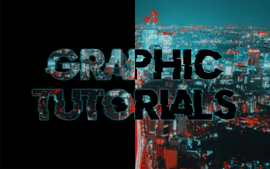
Statistics
We looked inside some of the posts by graphictutorials and here's what we found interesting.
Average Info
Notes Per Post
80K
Likes Per Post
48K
Reblog Per Post
31K
Reply Per Post
37
Time Between Posts
13 days
Number of Posts By Type
Photo
6
Note
8
Text
3
Last Seen Tumblr Blogs


Fun Fact
Kazakhstan’s Minister of Communications and Informatics has blocked the Tumblr site because it contained 60 sites of terrorism, extremism, and pornography in 2015.
Photo

。・ tutorial six, graphic tutorial four by graphictutorials ゜+.*
-`. Hello everyone! In this tutorial, I’ll teach you how to use and edit gif overlays, like this: .’-

1. Finish editing your image and adding your psd. We want to put the overlay over the psd, that way the white stands out. Here I have edited this picture and I will soon be adding an overlay:
2. Find an overlay gif.
Here is a blog of some: https://overlaygifs.tumblr.com.
octomoosey has posted some gif overlays before, and you can go through their tag to check them out.
library-mermaid has made some as well: 1, 2.
You can also search "gif overlay" on Tumblr and see if you can find any, or go through the tag.
Find the one you like and download it.
I'll be using one from one of library-mermaid's posts.
3. Open the gif in Photoshop and open the timeline (Window>Timelime or Window>Animation). The frame animation should be on.
Example (it should look something like this):

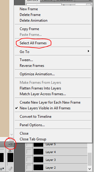
4. Go to the corner of the timeline and click the settings arrow, and then click "Select All Frames."
5. Once the frames are selected, click the settings arrow again, and select "Convert to Timeline."

It will now look something like this:

6. In the Photoshop menu, go to Select and click "Select All Layers."

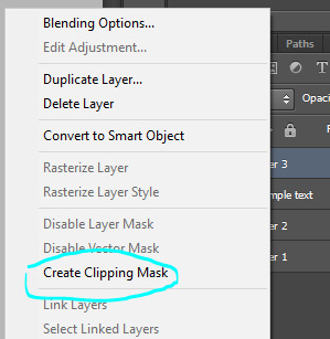
7. Once the layers are selected, right-click on one of them, and select "Convert to Smart Object."

It will place all the layers into one, like this:

8. Drag the gif over to your edit document.

***Make sure to place the gif layer above all the other layers from the edit, like so:

9. Put the gif layer mode to "Screen" or "Lighten."

It doesn't matter which, but I think people use Screen mode more because it picks up more of the gif. But for certain things, Lighten mode looks better. It is up to you.
It will now look something like this:

10. If your gif doesn't fit like mine clearly doesn't, select the gif layer, click the select tool, right-click on the document, and select "Free Transform" to make the gif bigger.

If it ends up blurry, sharpen it by going to Filter>Sharpen>Smart Sharpen.
Now it fits:

11. Now, before saving it, make sure the timeline duration is in sync to the gif.
As you can see below, the timeline duration ends way after the gif. You don't want that because the overlay will stop for a long period of time.

Drag the end point to where the gif ends.

12. Finally, go to File>Save for Web & Devices, and save it.
***Make sure the looping option is on "Forever" and I recommend setting the Gif to "Adaption" and "Pattern"!!

Here is my final result:

OTHER INFO / TUTORIALS:
Sometimes the background of gif overlay isn't entirely black, so it'll end up looking like this:

It will have a white background and it won't look right. If this happens, add a Selective Color adjustment.
Go to Layer > New Adjustment Layer > Selective Color.
On the adjustment, switch the color to black. Add some to the "Black" section to darken the background.
Here I added 26% more to the black:

Now it is just the overlay with no white background:

For this, I used this gif.
Another obstacle you might run into is the overlay might not be white or grey.
Here mine is light pink, but I don't want that:

If that happens and you want it to be black and white, go to Layer > New Adjustment Layer > Gradient Map.
On the adjustment, click the arrow to choose and black and white gradient.

Place that into a clipping mask, so that it only makes that layer black and white, not the rest. (right-click on the adjustment and select "create clipping mask.")
It is now black and white:

For this, I used this gif.
But what if you want to change it to a different color?
Go to Layer > New Fill Layer > Solid Color.
Upon the pop-up box, set the mode to "Multiply" and click OK.

Now choose a color you want it to be. (Btw, it's going to temporarily change the entire thing to that color, but we'll fix that in a second.)
I chose cyan, but click OK when you're done.
Now it's gonna look something like this:

To fix it, make sure the color layer is right above the gradient layer, right-click on the color layer, and select "Create Clipping Mask" to put it inside the gif only.

Now it should color the gif overlay only.

That’s all there is to it!
I hope you found this helpful and plan on using it. If you need any further help, just send me a message!
#yeahps#completeresources#itsphotoshop#tutorial#tutorials#*#graphic tutorials#graphic tutorial#graphic#edit#overlay tutorial#gif overlay#gif overlays#photoshop tutorial#photoshop tutorials#edit tutorial#edit tutorials#gif overlay tutorial
921 notes
·
View notes
Note
can you maybe explain how you colored your picnic at hanging rock edit (post/177739886542)? the coloring is so pretty xx
Sure! Here is how i colored THIS:

Keep reading
137 notes
·
View notes
Text
free software alternatives
i never stop talking about some of these so i might as well banish them to a single post! you might know about a lot of them already, but feel free to look anyway
Adobe Animate (Flash) → OpenToonz, Synfig Studio, or Pencil2D
Adobe Audition → Audacity
Adobe Illustrator → Inkscape
Adobe Photoshop → GNU Image Manipulation Program or Paint.NET
Adobe Premiere Pro/After Effects → Fusion, Shotcut, OpenShot, Natron, or Blender
Autodesk Maya → Blender
Clip Studio Paint/Paint Tool SAI → Krita, FireAlpaca, (both also include animation tools!) or MediBang Paint
FL Studio → LMMS
Microsoft Office → LibreOffice or Calligra Suite
Scrivener → Celtx (sort of?) or Evernote
VLC media player → VLC media player lol
freeware can be a great opportunity to get a feel for something and learn a new skill. and in some cases, the free versions are almost as powerful, so you might find that you saved a lot of money but made work that was just about equal to what you might have done with paid software!
64K notes
·
View notes
Note
hi could you maybe to a tutorial on how to do a mobile header like the one you have now?
hey! sure, it’s super easy.
in this post i’m going to explain how to make a header like this:

Keep reading
493 notes
·
View notes
Photo

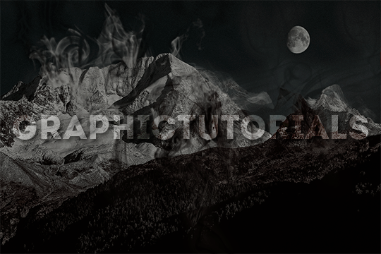
。・ tutorial five, graphic tutorial three by graphictutorials ゜+.*
-`. Hello everyone! In this tutorial, I’ll teach you how do make an edit/graphic with smoke distortion, like this: .’-

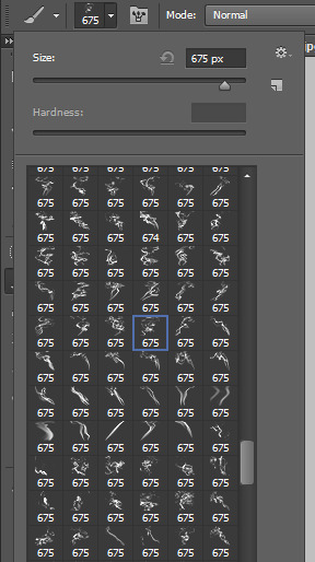
Important note: You will need smoke brushes.
If you don’t already have brushes, here are some recommendations: 1 (I think this is the one I have), 2, or 3.
Download some smoke brushes and open them in Photoshop to install them.
Once you’ve done that, we can begin.
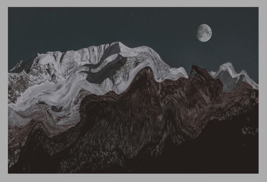
1. Open your image in Photoshop and duplicate the layer.
For example, this is my image:

And here you can see I made a copy:

2. On the duplicate layer, go to Filter>Liquify (or hold shift+ctrl+x).
3. Change the tool options to what you feel is best.
If the brush is too big, make it smaller. You don't want it to be too big, you want it to be small so you can liquify only a few parts of the image. If the brush is too big, it will liquify the entire image, and you do not want that.
You can change the density and pressure, as well, depending on how you want your brush to be.
Here are my settings:

(Keep in mind, my image is 540x360, you might want to make your settings bigger if your image is bigger.)
4. In the liquify section, you're going to click and drag portions of your image in a certain direction.
For example, for my mountains, I'm going to drag the mountains upwards.

You can make swirls, zigzags, or just straight strokes.
You can switch between brush sizes to create smaller or bigger strokes, too.

Click OK when you're done.
5. Go to Filter>Blur>Gaussian Blur and apply a small blur.
For example, I put 0.5 radius.

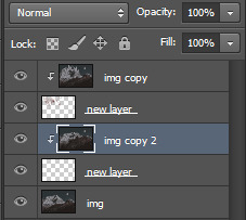
6. Create a new layer (ctrl+j) and place it under the liquified duplicate image.

7. Select the duplicated image layer again, right-click, and select "Create clipping mask."

The duplicate/liquified image will disappear from the workspace but don't worry, it's supposed to do that.
8. Select the new layer again, and go to the brushes. Choose a smoke brush you want. I recommend choosing one that goes in the direction of your strokes.
For example, if your strokes go upward, choose a smoke brush that goes upward.
9. Adjust the brush size if you need to, and go back to the workspace, choose where you want the brush to be, and click once.
That portion will now be filled with your liquified image.

10. Apply some more smoke brushes for more of the liquified image to appear.

11. You can go back to the original, unedited image, and duplicate it, liquify again, and repeat the steps for more distortion and smoke.


12. Once you're done with the smoke, go to each brush layer, double-click, and apply an outer glow of either white or black, depending on the image, in Overlay mode and lower the opacity a bit.
For example, here are mine:

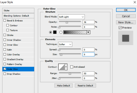
Make sure you only do it to the brush layers, not the liquefied layers!

This will make each smoke layer stand out from the original image and from the other smoke layers.

If you plan on making more portions of your image smoked (?), then repeat the steps until you're done.
That’s all there is to it!
I hope you found this helpful and plan on using it. If you need any further help, just send me a message!
#yeahps#completeresources#itsphotoshop#tutorial#tutorials#*#graphic tutorial#graphic tutorials#graphic#edit#photoshop tutorial#photoshop tutorials#edit tutorial#edit tutorials#distort#smoke
401 notes
·
View notes
Note
I don't know if you have done it before but can you make a shadow tutorial?
HOW TO MAKE A SHADOW TUTORIAL
in this tutorial i will be showing you how to go from this:

to this:

Keep reading
2K notes
·
View notes
Photo

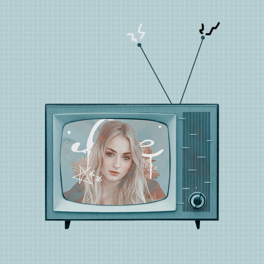
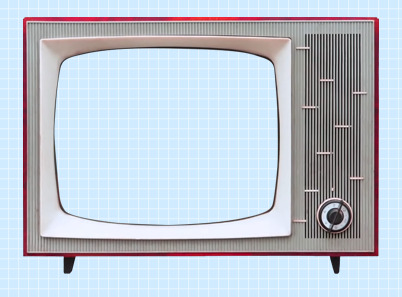
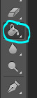
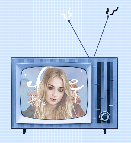
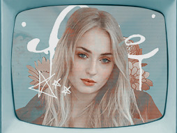
。・ tutorial four, graphic tutorial two by graphictutorials ゜+.*
-`. Hello everyone! In this tutorial, I’ll teach you how do make an edit/graphic with a TV and electricity doodles, like this: .’-
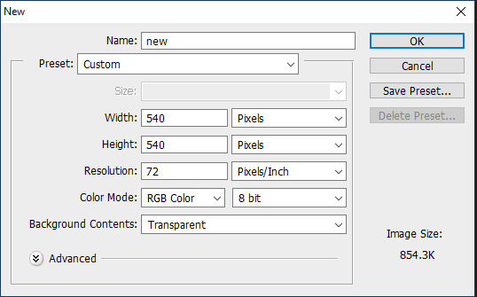
1. Open photoshop and create a new document with the size you want.
For this tutorial, I’ll be doing 540x540px.
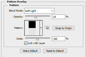
2. Add your background. You can make it a solid color, use a pattern, gradient, texture, etc.
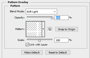
For example, I used the paint bucket tool to fill the background with a solid color (#d1ecff, to be exact), and I applied a pattern overlay (using the last one here) in soft light mode.
So my background looks like this:

A/N: I’m making the example pastel-ish, but you don’t have to!
3. Now make a png of a vintage-esque TV, or you can use one of these: 1, 2, 3, 4.
I’ll be using the 2nd png in the 1st pack.
A/N: You’re going to want the screen portion erased if it isn’t already, because that is where you’re going to put an image.
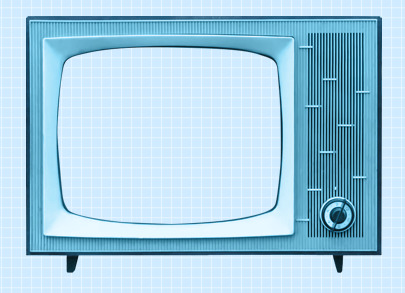
4. This is optional, but if you don’t like the color of the TV, you can change it by:
Double-clicking on the TV layer, and go to the “Color Overlay” tab, clicked the colored rectangle, choose the color you want, click OK, and change the mode to one of the following: Overlay, Soft Light, Color, Hue, or Multiply. Choose which one looks best with your color and you can adjust the opacity if you want.
For example, here’s what I did:

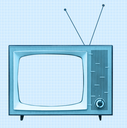
5. If you chose a TV that already has antennae, skip this step. If your TV does not have antennae, like mine, I will show you how to quickly make some.
Create a new layer, choose a foreground color to a color that matches your TV color, select the line shape tool, make the line 2px weight with no stroke, and click and drag a couple lines from the top of the TV to make antennae.


A/N: You might want to rasterize those shapes (to do so, right-click on each layer and click “rasterize layer”) or put those shape layers under the TV layer.
Now create another new layer, use the ellipse shape tool, click and drag a small circle to fit on top of one of the antennae (hold shift as you do so to get an even circle). Duplicate that and drag it over to the other antenna.

6. Now for the screen image.
Create a new layer and drag it under all of the TV/antennae layers.

Select the pen tool. You’re going to make some points around the screen portion and connect them.

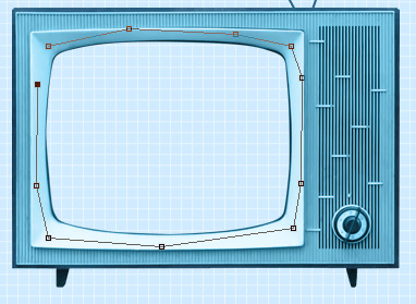
Once you connect them, It’ll make a line like this:
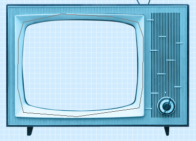
Go to the top bar and click the “Selection...” button. It will make the outline into a selection and that’s what you want.

A/N: There will be a dialogue box pop up, but just click OK.

Now it is a selection.
Click the fill bucket tool and click inside the selection to fill it. It doesn’t matter what color it is.

Click CTRL+D to deselect it.
7. Now we will put an image/edit inside.
If you just want to put an image, open the image, drag it to the TV edit document, make sure it’s right above the screen fill layer, right-click on the image layer, and select “Create Clipping Mask.” It will be inside the screen portion and you can resize.


If you want to put an edit inside, I’d suggest making the edit in a new document, merge all of the layers of the edit document when you’re done, drag it over to the TV edit document, make sure it’s right above the screen fill layer, right-click on the image layer, and select “Create Clipping Mask.” It will be inside the screen portion and you can resize.
For example, I quickly made this edit in a new document and merged all the layers:

Then I followed the steps above and put it inside the screen.
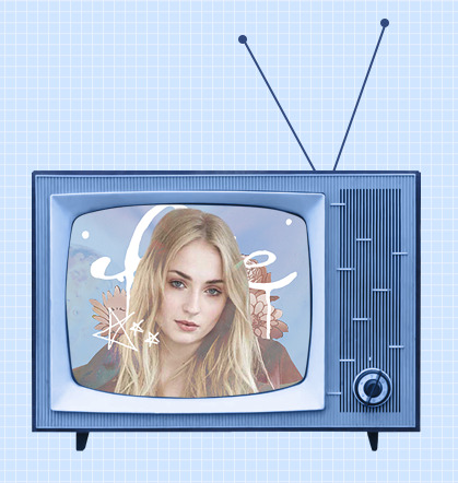
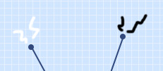
8. Creating the “electricity”.
Create a new layer and use the brush tool with a simple hard round brush in a small size and draw a couple little zig-zags coming from one of the antennae.
Create another new layer and make a couple more for the other antenna.
Now you could stop here, or if you want, you can make them into a little gif with the next step:
9. Duplicate one of the electricity layers, choose the select tool, right click on the document, and click “Free Transform”. Go to the top bar, and in the rotation box, enter -10. Hit the Enter key when you’re done.

It rotated the duplicate slightly to the left.


A/N: If it’s blurry around the edges, apply a Surface Blur with 5 Radius and 10 Threshold.
Duplicate the other electricity layer, Free Transform it, and apply a Rotation of 10. (Do the same number but polarize it. i.e., if you previously put -10, put +10 for this one. If you previously put +10, now put -10.)


10. Open the frame animation timeline.
For the first frame, hide the duplicated electricity layers. Only the original ones should be visible.
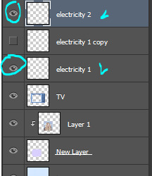
Create a new frame and in this one, hide the original electricity layers and un-hide the duplicates.


Set the speed of the gif to 0.5, or something around there. You don’t want it too fast because it’ll hurt people’s eyes!
Make sure the loop is on “Forever” as well!
11. Go to File>Save for Web.., and save the gif.
And you’re done!
Here is my edit, image version:

And here it is as a gif:

Other Suggestions:
> For the full effect, you can go to the screen fill layer (not the image/edit inside of it) and select it, double-click, and apply a pattern overlay with a horizontal stripe and put the mode on Soft Light and lower the opacity to create that line effect.
Result:
> You can also apply an Inner Glow to the screen layer and create a shadow.
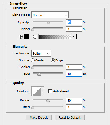
Result:

Anyways, I hope this tutorial/guide was helpful. If you need any help or have any questions, feel free to ask!
#yeahps#itsphotoshop#completeresources#tutorial#tutorials#*#graphic tutorial#graphic tutorials#graphic#edit#photoshop tutorial#photoshop tutorials#edit tutorial#edit tutorials
815 notes
·
View notes
Photo

⇨ How to Add Color to a Black and White Image: A Tutorial, Recoloring Tips and Other Random Sh*T by ME! If you’ve been following me for any amount of time or have looked at my original posts, you probably already know that I absolute love to colorize black and white photos and recoloring. I needed to do a tutorial so here you go, have fun!
Examples: 1, 2, 3, & 4
Program: Adobe Photoshop CC 2018.
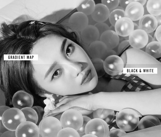
I’ll be using an already colorful image of Red Velvet’s Joy from the Summer Magic teasers. I personally prefer to use a Gradient Map to turn images to black and white instead of Black & White adjustment because Gradient Maps leave more of a dramatic contrast but it’s up to personal taste.
After removing the color from the image, create a new Solid Color layer. I always start with the skin, do everything in between, then end with the background. Once the layer for the base skin appears, select the Layer Mask and invert it by pressing Ctrl-I or Image > Adjustments > Invert. Set the layer blending mode to Color. Making sure to still be on the Layer Mask, start drawing over the skin with White as your foreground color. Do not draw the eyes.

TIP: Lower the hardness of the brush when going around the hairline and around the ears, if hair strands are near it. If there’s skin showing through hair or if the person has bangs, lower the opacity to 20-30% and draw over it.
Now to add more warmth and detail to the skin. I start with a blush, then I add shadows and highlights. Set the brush hardness to 0%. Create a new Solid Color layer with the same color used for the skin but nudge it towards a warmer tone. Once the layer appears, select the Layer Mask and invert it by pressing Ctrl-I or Image > Adjustments > Invert. Set the layer blending mode to Color Burn. To make it easier and avoid drawing outside the skin, holding command, click on the Layer Mask from the base skin layer. With the selection, go to the Blush layer and paint.
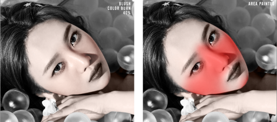

HIGHLIGHT: I only add a highlight to the forehead, nose bridge, top of the lip, and under the eyebrows. I take the same color as the skin and move it closer to white, set the layer mode to Soft Light. Feather the layer mask to blend it better.
EYEBROWS: I use the Polygonal Lasso tool to select the eyebrows. With a Solid Color layer set on Soft Light, I use a rich brown color (5b2b22) and fill it, fading a bit to fit Korean beauty I guess and feather the layer mask.

LIPS: Repeat the same steps used to do the eyebrows but this time for the lips.
EYES: Solid Color Layer > Whatever color you want the eyes > Invert Layer Mask > Draw the Eyes > Set Blending Mode to whatever looks best. I used Soft Light.
⇨ LAYERS SO FAR Before you think something like “Wow, Nicolle! Joy isn’t that pale, stop whitewashing!” Adjustments exist for a reason, but I’ll show those later or in part two, if it gets too long.

NOW FOR THE HAIR! A lot of you fools like to edit idols with different hair colors and I support. Now I will teach you a nice, cleaner way to make it look like your idol’s hair is as natural looking as possible with an unnatural, fake color.
Solid Color Layer > Multiply or Color (Or whatever looks best with the color you pick > Select the hair. Use Select and Mask to try to make it as accurate as possible but we’re going to be drawing with the Layer Mask layer, so don’t worry to much. With the hair selection, Invert the mask to reveal the color. Ugly, right?

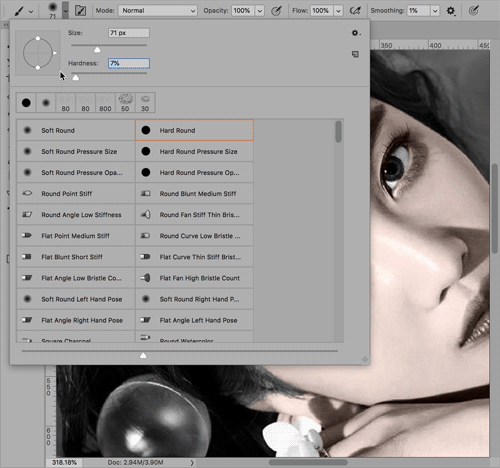
Don’t worry, the Soft Round brush is your friend. Make the brush very large near the hairline and hide the rough edges. Make the brush smaller and go around the edges and blend them away. Once you hide all the ugly, harsh parts, lower the opacity of the brush to 20% and paint over the baby hairs, the sideburns, and big chunks of hairs that show the background through the strands.

If the person in your image is wearing hair accessories, use the Polygonal Lasso to select the accessories and hide them with 100% Hardness. Try to not be sloppy. Take your time. The great thing about Solid Color layer is that you can always change the color at any time!

BACKGROUND: Same as everything above. Solid Color layer > Color Mode > Draw to show, draw to hide. Boom, DONE. A lot different than the B&W, right? Still UGLY! Add adjustments. Add WARMTH TO IDOLS! Bump up Vibrance and Saturation, Photo Filters, Color Lookups, Color Balance, all those.

If you’re like me and feel ugly without textures, add them. I always use a small “3D” effect and white specks on my edits because that’s how I like my stuff. Do whatever you like with your work to make it yours.
⇨ FINISHED PRODUCT


Message me if you have any questions or feel stuck. I’m sorry for any spelling mistakes, I’m stupid. Good luck! Tag me if you ever use this tutorial!
1K notes
·
View notes
Note
Could you tell me what font you used in GRAPHIC TUTORIAL 1?
Sure. It’s called “Doctor Glitch.” You can download it here.
33 notes
·
View notes
Text
How to sharpen low quality videos
Hey, guise. So today multiplytime asked me what settings did I use to sharpen this Common gifset. So I decided to make this text post so I can explain it because a) tumblr didn’t let me put all my prints in my answer to her and b) I’m super glad to share this with you. As I said, I couldn’t find the video in 720p or better quality, so I used these settings. But they work in great qualities as well.
First, Filter > Sharpen > Smart Sharpen and I used these settings:


Then Filter > Blur > Gaussian Blur

And the result:

I hope this will help you :)
5K notes
·
View notes
Note
I wonder if you would make a tutorial like your graphic tutorial but how to do the text effect? Or is it the font??
It’s actually a font called “Doctor Glitch”! You can download it here.
23 notes
·
View notes
Photo

。・ tutorial three, graphic tutorial one by graphictutorials ゜+.*
-`. Hello everyone! In this tutorial, I’ll teach you how do make a simple edit like the one below .’-

1. Open Photoshop and create a new document, using the proportions you want. For this tutorial, I'll be doing 800x500.
1a. Using the paint bucket tool, fill the document with a solid color.
I’ll be using white.
2. Open the image you want and drag it over to the new document, and resize it if you need to.
For this tutorial, I’ll be using this image.
3. Create a new guide halfway through your new document.
To do so,
3a. Go to View>New Guide
3b. Select "Vertical" under the Orientation options
3c. Enter the position, which would be half the size of the width of your new document.
For example, if the width was 540px, you would enter 270 px. If the width was 500px, you would enter 250 px.
Since I used 800px width, I would put in 400 px.
Just figure out half of the size width you put. (Width/2=Position)

3d. Click OK when you’re done.
It should now have a line that goes through half-way, like so:

4. Select the image layer, click the rectangular select tool, click and drag the select tool until half of the document is selected. You would do it to the smart guide you previously created.

5. Once half of the image is selected, go to Edit>Cut. It should remove that half. Don't worry, that is what it is supposed to do.

6. Now go to Edit>Paste Special>Paste into Place. The half should now be put back into place, in a new layer separate from the other.


Now you can remove the smart guide if you want. If you do, simply go to View>Clear Guides.
I’ll be doing it, too. It’ll look back to normal, like so:

7. Hide the half layer for now and click the text tool.

8. Choose the font, text size, color, etc., then click on the document and enter the text you want on the side where the half would be.

9. Unhide the half-image layer, and place that half layer above the text layer.
For example, it’ll go from this:

To this:

10. Right-click on the half layer, and click "Create Clipping Mask."
The layers should look like this:

And the image should now be inside the text, like this:

That’s basically all there is to it. You can customize as much as you want.
You can enter a quote, like so:

You can make a birthday edit, like so:

Add a psd, like so:
Change the background color, and add a text style, like so:

Or, instead of having the text on one side, you can center it all together and it’ll look like this:
Just change the text color and background color, and it should match.

Anyways, I hope this tutorial/guide was helpful. If you need any help or have any questions, feel free to ask!
#yeahps#itsphotoshop#completeresources#tutorials#tutorial#*#simple#graphic tutorial#graphic#edit#text#photoshop tutorials#photoshop tutorial#graphic tutorials#edit tutorial#edit tutorials
2K notes
·
View notes
Text
How to Add a Torn Paper Edge to a Header
You will need:
A header image.
A torn paper texture (I found mine via Google Images but you can look on DeviantArt too).
Photoshop (I’m using Elements 18).
Difficulty rating: ★☆☆☆☆
We’ll be going from this:
to this:
Tutorial under the cut:
Keep reading
2K notes
·
View notes
Note
hey! sometimes when i try to center my text, it just won't do it? it centers it vertically but not horizontally like i want it to; the smart guides won't help either. do you know how to solve that?
Did you click the “horizontal centers” icon after the vertical one? You have to click both of these icons to center things:

Or it could be because you didn’t center align your text. This one should be the selected one for it to be centered:

If you switch between the alignment settings after doing the vertical and horizontal centering, it can mess up, too. Be sure to use the center align text, then do the vertical and horizontal centering.
31 notes
·
View notes
Note
Thank you so much for this blog. 👌🏻
np ❤
5 notes
·
View notes
Photo

。・ tutorial two by graphictutorials ゜+.*
-`. Hello everyone! In this tutorial, I’ll teach you what shapes are, what the default shapes are, how to use them, how to style them, and how to make your own custom shapes. .’-
Here’s the navigation: (find the portion you want and the corresponding letter, then scroll down till you see the letter.)
a - explaining the shapes
b - showing the default shapes
c - explaining how to use the shapes
d - explaining how to style the shapes
e - making custom shapes tutorial
f - explaining how to get more shapes
A. What are the shapes?
Photoshop shapes are pretty self-explanatory. Much like the shape tools in Microsoft Word, you can use them to create edits/graphs/etc.
They are similar to brushes, but unlike brushes, they don't have the textures as some do. Shapes are solid.

Another notable difference is that if you make your brush size bigger than what it was, it will be blurry. If you make your shape size bigger than what it was, it will not be blurry.

B. Default Shapes
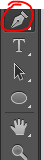
The default shapes are the rectangle, rounded rectangle, ellipse, polygon, line, and custom shape.

With the rectangle shape, you can make rectangles. You can also make squares if you hold shift while you drag and create the shape.

With the rounded rectangle, you can make rectangles with rounded corners. You can also make squares if you hold shift while you drag and create the shape.

With the ellipse shape, you can make ovals and you can make circles if you hold shift, as well.

With the polygon shape, you can create shapes with more than 2 sides. You have to enter the number of sides you want, from 3-100. You can make a triangle shape with 3 sides, a square with 4 sides, a pentagon with 5 sides, a hexagon with 6 sides, a heptagon with 7 sides, an octagon with 8 sides, a nonagon with 9 sides, a decagon with 10 sides, and so on until you reach 100 sides, which will then be a circle.

With the line shape, you can create lines/dividers. You can change the weight to be bigger or thinner, too.

And then there are the custom shapes. That is where the other shapes are and if you download shapes from online, they will appear here. The preset custom shapes are random things like a heart, arrow, frame, etc.

C. How do you use shapes?
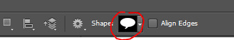
1. Select the shape you want.
2. Go to the document.
3. Click and drag until the shape is the size you want.
4. If you want your shape to keep its proportions, hold the SHIFT key while you click and drag.

D. How do you edit the shapes?
You can change the color of your shape by going to the "Fill:" section and change the color.


You can also change the fill to a pattern, gradient, or no fill at all.

The setting circled in red is the option to have no fill. If you click that, the shape will be invisible, like this:

The setting circled in yellow is the color fill.
The setting circled in aqua is the gradient fill. If you choose that, you can select a gradient. It’ll look somewhat like this:

The setting circled in pink is the pattern fill. If you choose that, you can select a pattern. It’ll look somewhat like this, depending on what patterns you have:

You can resize your shape by using the select tool, right-click on the shape, click "free transform path," and resize it.
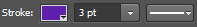
You can have a border by enabling the "Stroke:" portion. You can have the stoke to be a color, pattern, or gradient. Then you can change the size of the border next to it. And you can change the style of the border to be solid, dashed, or dotted.

E. How do you make your own custom shapes?
1. Open the image you want. 2. If it's not already a png, you have to make it to a png. Otherwise, the shape will not turn out.

3. This step is optional, but I like to set the color overlay to black to see what the shape will look like. (ctrl+u, lightness: -100)

4. Use the select tool to select the entire document.

5. Click the move tool. (Make sure the document is still selected)

6. Move the shape a little. For example, click the backward key once and put it back by clicking the forward key once. 7. The png should now be the only part selected.

8. Go back to the select tool. (Make sure the png is still selected) 9. Right-click on the png and select "Make Work Path".

10. Enter a tolerance level. I recommend 0.5-2.0. It depends on the png, really. It might look better with lower tolerance, or it might look better with higher tolerance.

11. Click the pen tool and right-click on the png.
12. Click "Define Custom Shape."

13. Name the shape and click OK.
14. Click the delete key and delete the png layer. 15. Create a new layer. 16. Click the custom shape tool.

17. In the custom shapes navigation, scroll down until you see the shape you created. Click it.

18. Click and drag the shape until it's the size/portions you want.

19. Change any details you want (fill, stroke, etc.), and you're done!

What to keep in mind:
The shape is not going to be perfect. The work path tries to detect as close as it can, but it will not get every detail.
F. How do I get more shapes?
Shapes4Free has a wide selection of shapes to choose from. Just choose the one you like, scroll down until you see the green “download” button, and click it. Then open it in photoshop. The shapes will appear in the custom shapes section.
Deviantart has tons of shapes available, too. Just search “photoshop shapes”, “custom shapes”, etc.
I hope this tutorial/guide was helpful. If you need any help or have any questions, feel free to ask!
#itsphotoshop#yeahps#completeresources#tutorials#tutorial#*#basics#shapes#shape tutorial#photoshop tutorial#photoshop tutorials#photoshop shapes#custom shapes
647 notes
·
View notes
Note
do you happen to know where i could psds for little symbols and things? because i could have sworn at one point i saw posts that had like different symbols, ribbons, and little things like that to add to things in ps, thanks!
I’m not exactly sure what you mean, but I think you should try shapes or brushes. You can download endless shapes and brushes of different symbols, ribbons, banners, etc.
For example, here are some shapes you can check out: 25 Flower Shapes, Badge Shapes, Banner/Ribbon Shapes, Label Shapes, Divider Shapes, Web Ribbon Shapes, and brush smudge shapes. You can browse Deviantart’s search for more, or check out Shapes4Free. To use these shapes, you download them, open them in photoshop, use the custom shape tool, select one of the shapes, and drag it to the desired size.
As for brushes, here are some you can check out: Lightning Brushes, Star Brushes, Smoke Brushes, Splatter Brushes, Polaroid Brushes, and Frame Brushes, just to name a few. You can browse Deviantart’s search for more, too. To use these brushes, you download them, open them in photoshop, use the brush tool, select one of the brushes, change the size if you want, and click on the document where you want it to be.
I’m not sure what you mean by psds, though. Are you referring to those doodles/objects people make for edits/icons?
Anyways, I hope this helped, but if not, you can message me again with more detail and I’ll try to help further, or if someone else knows what you mean, please reply to this or message me!
73 notes
·
View notes