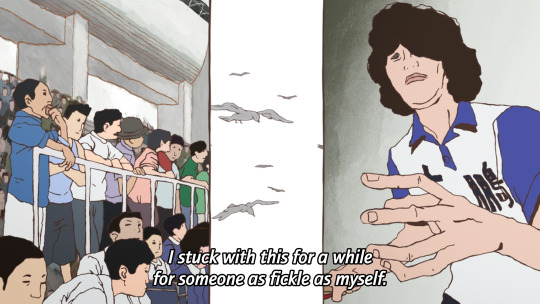
#AND YOU KNOW HOW MUCH I LOVE THE WAY YOU DO YOUR LINEART
Note
I love your artstyle!! Do you have any tips for drawing?
thank you so much! i'm really happy you like it!!💗
as for tips, what i would say would change drastically depending on what kind you're looking for, but some very general ones:
draw what you love and want to see most, regardless of whether anyone else wants to see it. if you don't enjoy what you're drawing it'll never come out as good or genuine as something your whole heart and soul is in. i mean you'd think this would be a no-brainer but sometimes i've had to sit back and ask myself 'if no one was ever going to see this except me, would i actually spend time drawing this?' and i was surprised by the answer
that said, it is also completely valid if your motivation for drawing is to draw for other people! there have been plenty of times where i was too artblocked to draw my own ideas but was still able to draw commissions or gifts and enjoyed it simply because making other people happy with my art makes me happy.
don't get too caught up in having a consistent art style. in my experience this 1000% hinders you
having your sense of anatomy degrade over time without you noticing because you keep drawing the same types of characters is a very real thing! if this is a concern to you be sure to draw a variety
follow a billion artists that you like the art of and you will have endless inspiration injected directly into your brain every time you open social media
my favourite practical tip for those who draw at a desk: keep a small mirror next to you at all times. absolute game changer for quickly referencing hands
if you're drawing digitally, make the canvas huge! in my experience this lets you draw messier/faster and you can't tell at all when you zoom out. if you tend to get stuck spending unnecessary amounts of time micromanaging pixels (me💀) keep it zoomed out while drawing
related to the above point, messy drawings can have far more expressiveness in them than neat and polished drawings. nowadays i never do lineart and go straight from 'barebones stickman pose' to 'varying-levels-of-coherent sketch' and use that as my lineart. sweet freedom from the sketch-looks-better-than-the-lineart phenomenon
if your goal is to improve, then you really do have to scrutinize your art, figure out what you're not satisfied with, and commit the time to focusing on it. 'practice makes perfect' kinda rubs me the wrong way because of how much i've seen it interpreted as 'just draw everyday and you'll magically improve' but genuinely it won't get you very far if you don't actively think hard about what you're trying to improve and take the steps to do it. is this a hot take idk. also hand in hand with this, not every artist is trying to improve and you shouldn't feel bad for this! maybe you just wanna make a little headshot doodle of your fave blorbo and that's your only drawing goal ever. awesome. maybe you know your art has flaws but it's passable enough to convey what you want and you're perfectly satisfied with that. (this is the stage i'm usually at). also awesome!
don't hesitate to draw something because you think it's out of your skill level. the worst that can happen if you draw it is that it comes out terribly but you learned something and can always redraw it better in the future. the worst that WILL happen if you don't draw it is that you'll never draw it. and then it will sit in the back of your brain haunting you for years. it's not like i'm speaking from experience or anything aha
look up 'hand stretches for artists' and do them if you draw a lot unless you wish to summon the wrath of the carpal tunnel demons
of course, these may not necessarily work for you, and most importantly(!) these are coming from the perspective of someone who is primarily a hobbyist. some of this won't be practical for people who need to build an audience, maintain a consistent style for work, etc. these are just things that have personally helped me over many years of drawing :)
71 notes
·
View notes
Text
I'M GONNA START CRYING I'M SO ILL RN
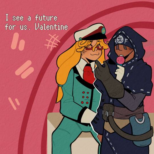
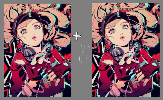
#(🚂) *.✧ — Valentine Grantz#(♡) 。.゚— Eli Clark#THANK YOU SO MUCH MY LOVE MY HUNNI FOR THIS OMFG I'M GOING CRAZY RN#I CAN'T STOP LOOKING AT THEM. LEMME. ORGANIZE MY IDEAS#It makes me so hapoy to look at Eli's face. he looks so cute#thanks for making him justice mu love. I'm so crazy rn aougg#I'm OBSESSED with how Eli looks in general#HIS CLOTHES. HIS FACE. HIS NOSE. ALL THE DETAILS YOU PUT IN HIM MAKES ME SO HAPOY#I'M LITERALLY KICKING MY FEET RN#ALSO VALENTINE. HE LOOKS ABSOLUTELY ADORABLE#THE FACE. HE IS SO HAPOY TO BE WITH HIS BOYFRIEND :3#I WANNA GRAB HIS CHEEKS AND KISS THEM MWA MWA#now. let's talk. about#“I see a future for us Valentine”......#no bc. I'm so ill I'm going crazy.#me thinking of how I planned their entire wedding.#man I don't wanna rish things with him but I'm already so in love#I just wanna see them hapoy#AND THEY ARE NOW#those comforting words... aoughhhgjj#I love them so bad I'm gonna cry#THANK YOU SO MUCH AGAIN MY LOVE YOU DID SO GOOD#I LOVE IT I LOVE IT#THE TEXTURE IT'S SO GOOD. IT FEELS SOS GOOD TO THE EYE#AND YOU KNOW HOW MUCH I LOVE THE WAY YOU DO YOUR LINEART#KISSES YOUR HANDS AND MAKES OUT WITH U MWAMWMWMAM#⭐ — Nero!!!#(🔮)*.♡ — Valeli
8 notes
·
View notes
Note
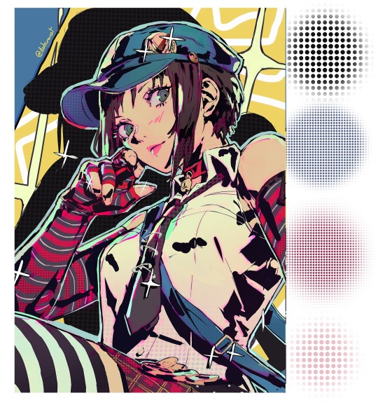
HI HELLO I love your art So much,,, do you have any tutorials on how you render your stuff? For example, the colors you use & how you pick them, how you get that pink tone around the Lineart (I think) (it's just rly cool). I would love to see stuff like that, cuz your art is Such visual candy (◍•ᴗ•◍)
Hey! Thank you so much, I'm glad you like my art, I worked hard to make it what it is!! Means a lot you appreciate it!!!!!!
I've had no professional art training, I seriously don't know what I'm doing and struggle making tutorials. But will try here!!
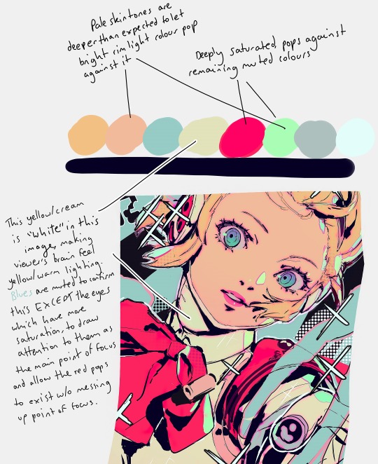
For me the colour work is really situational on the drawing! I find myself experimentally attempting to weaponize colour theory and there's a lot of instinct involved that I can't figure out how to verbalise yet. Here's an example of some thought process I have:
My main advice is to play with sliders a lot and really experiment (that's what I do for every drawing)!
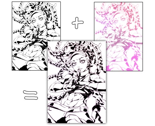
To get the pink glow around your lineart, copy your lineart layer, fill the copy in with a pink of your choice (sometimes I do a gradient), blur the layer (experiment with how much blur you'd like), put it directly below the lineart layer, and set the layer to multiply (or any mode you think looks pretty)!
You may want to adjust your piece's brightness/colours after applying it and sharpen the image after exporting.
A lot of colour gradients are involved and on their own they can eventually compromise the gritty/punchy style, especially the ones that are between extreme and subtle. A good way to combat this is with screentones/haftones!! You can use them to diversify colours and imply shading/texture.
I recommend going nuts and having a lot of fun with it to find what works for you!
I often add a lot of small lens flares as they satisfyingly cut through the piece, imply flash photography (which goes well with the strong black shading), add visual noise to areas you don't want to be your main point of focus, are a great way to show speculars, and idk man sparkles are just pretty haha.
Go nuts with them and have fun!! When you get them to look good, think to yourself why that is.
I made a tutorial ~1 year ago on how I shade with black. This simple trick will really help it look good, 3D and rendered - it just requires a lot of knowledge about shadows to start with. I have a lot of experience rendering "normally" which helped me learn how to use black in an experimental way.
Minor correction that the shadows labelled "ambient occlusion" in the tutorial are actually just normal shadows, ambient occlusion is total lack of light.
I hope this is useful to you!! You have a knack for art, your work is very inspired. Please keep drawing!! I am still learning too, let's keep going baby.
-Cravat x
406 notes
·
View notes
Note
Hi! I finally got the chance to read Aurora a bit ago. It's a wonderful story--all I was expecting and better! I was particularly amazed and delighted by the artwork and visual mechanics used to tell the story, so I wrote a post to yell about how cool it is and break some of it down. (No criticism, just praise.) I'm mostly a hobbyist, so I'm hoping I've done it justice.
That said: zero pressure to read it or respond to this ask. Normally I wouldn't send it since I tagged, but I know Tumblr's notifs are a mess and things get lost very easily. I've been in both the "one (1) word of praise will feed me for a year" and the "oh gods don't talk about my writing/art because anything that seems Off will break my brain" modes before, and I absolutely don't want to push or make you uncomfortable!
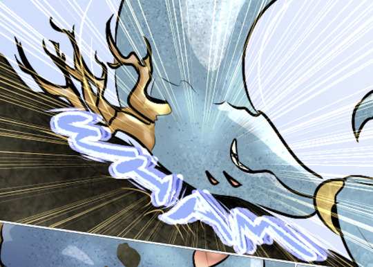
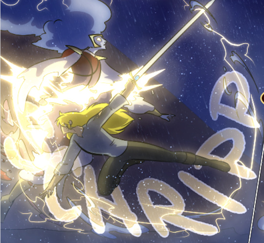
If you are comfortable, however, I wanted to ask about your use of what I'm assuming are Screen and blending modes in sound effect words. (I'm only guessing that's the technique, though, so I could be totally wrong about how it's done! I'm mostly experienced in image manipulation in Photoshop.) Making them semi-transparent over the actions is genius :) What inspired you to do that, and are there specific techniques you use to make it work?
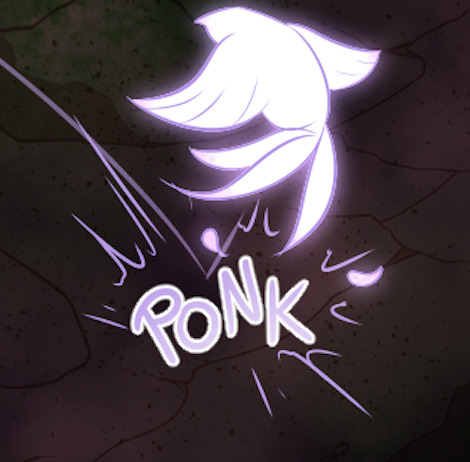
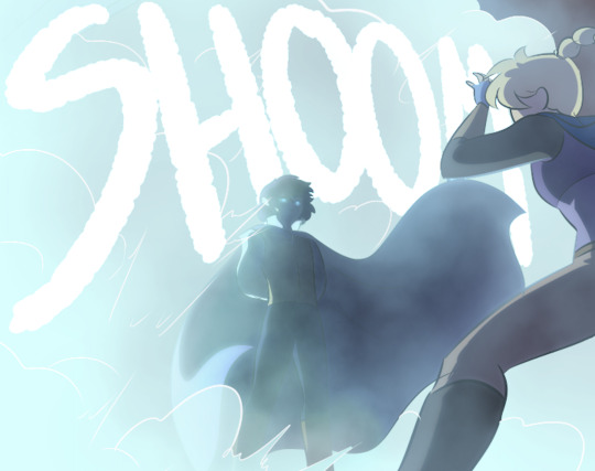
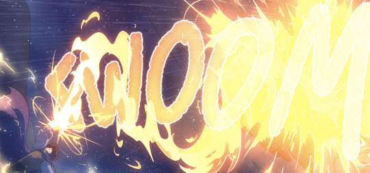
Same questions go for using specific colors to distinguish different characters' words and actions. I really noticed it in the cave sequence with Falst and Dainix, since their colors are so vivid in the dark (ex. Falst's little swats and Dainix's swooping kick at 1.20.9). It lends excellent clarity to busy scenes.
Thanks! Have a lovely day, enjoy your break, and happy holidays <3
You're correct about the technique! "Screen" is the blend mode I use most often for sound effects. I stumbled on it mostly through trial and error - I love how sound effects add depth to a comic panel, but it's very easy for them to obscure the art in a way I find counterproductive, so "Screen" lets me put the sound effect directly over the origin of the sound while still letting it be visible through the word. Early chapters didn't have it as much-
Most of the sound effects in early chapters are just solid colors with reduced opacity if I'm feeling fancy. But I started figuring it out around chapter 8 and 9, because Falst is kind of a sound-effect-heavy guy, especially in his fight scenes.

In order to make sure they don't impede the visibility of the action, I'll often soft-erase the top or bottom half of the SFX to reduce its opacity while still leaving it readable.
I'll usually double that up with an outline on the SFX so it's still readable. This is an especially important consideration if the SFX goes over an area of the background that's very bright or glowing.

Color-coding the speed lines and SFX to the character or force causing them isn't a hard and fast rule, but I like using it (in part because it's a habit from the OSP illustrations, where every character has a single pop of color in their lineart) mostly because it sort of codes every sound to make it clear where it's emanating from, or the general feeling of the sound. Since I normally do character-colors for SFX, something like this stands out more jarringly-

Which it's supposed to, but a big lightning strike doesn't register as anything too worrying because it's just Tess up to her usual shenanigans.

It's also very useful for magic effects, because each form of magic has its own associated palette.

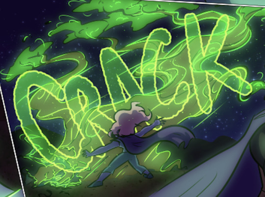

And when I had a very complicated fight scene in a dark environment, I used the texture pattern I'd already made for the monster to color its SFX, so when I Screened them onto the panels they didn't obscure too much while still communicating "this is something else."

Changing the weight, lined-vs-not-lined, and opacity of the SFX words also helps to communicate that not every sound has the same feeling. A strong motion is solid and aggressive, but a crackling, unstable sound is more ephemeral and staticky.

It's definitely been a process of learning as I go - looking back at the earlier chapters I can actually see when I first tried various tricks I now use regularly, like doubling and distorting an SFX to produce the effect of a camera-shaking impact. I haven't really seen any other comics that do it like I do, probably because most other comics follow a more traditional production pipeline where text bubbles and sound effects get locked into the composition early, before the inking stage, because traditional physical comics don't have digital-art layers to play with. Adding sound effects to a page is almost the last thing I do before exporting them, and that only works because digital art and layers allow for a ton of flexibility.
375 notes
·
View notes
Note
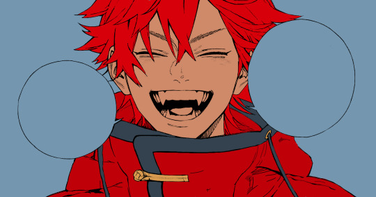
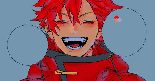
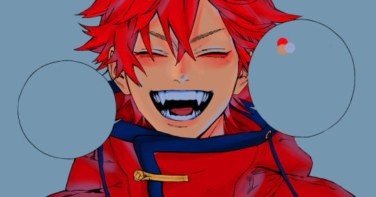
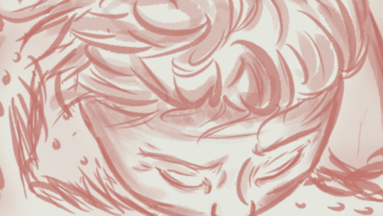
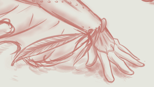
I just want to say I love how you do your lineart, it looks so good! ahhhhhhhh!!
I'm gathering a lot of advice about the topic of lineart and I just wanna know how you get it to look like that? My line weight is getting better but the drawing itself just comes out a bit.. weird.
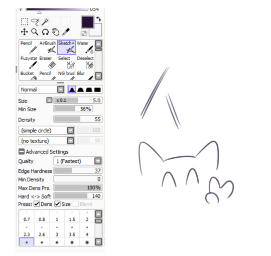
Thank you so much! Lineart is probably the thing I've been working hardest on as I am not a lineartist (and still struggle a lot) but it's something I really need to get better at for my job.
UM there's honestly so much that could be said on the topic of lineart. Big things for me are:
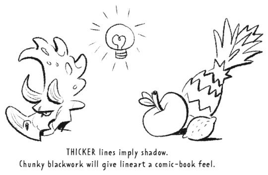
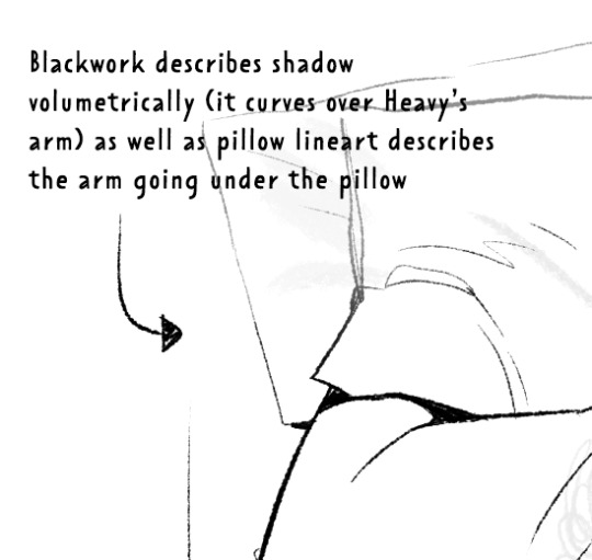
Weight -> Use line weight (aka thickness) to describe form, lighting, contact and scale. Thick lines imply shadow, contact and nearness-to-camera. Thin lines imply tension, recession and light.
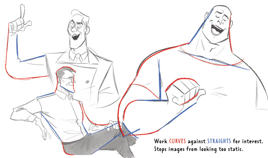
Straights vs Curves -> Use straight lines against curved ones for maximum interest. This is partly a character design thing but as we're using lines to describe our characters it's worth mentioning :)
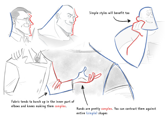
Complex vx Simple -> Use complex lines against simple. Faces are always complex so therefore the backs of heads should always be simple. Chests are quite complex so backs should be simple. Dorsal sides of the arms are complex (Delt, tricep, bicep) whilst the ventral side is more simple (tricep...mainly) etc.
'Think in Ink' -> Lower your sketch layer almost to 0% opacity so you're not getting hung up on how nice/energetic your sketch look and instead are approaching the piece from an ink mindset. BUT it's digital! So if there's something in your sketch that you like just bring it forward (copy and paste) into your ink layer. I sketch and ink with the same brush so I can use this workflow
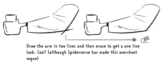
'Confidence' -> small hesitant feathery lines will look nervous compared to big swooping lines. Less is always more. I'll redraw arms/limbs until I can get the appearance that it was done in one brush stroke. Again it's digital so you can erase to cheat this look : )

MISC 01: I always hear 'draw from the shoulder'........meh............it's digital so draw from your wrist...it's fine honestly. If we were working at A1 in a life drawing class then we could get some shoulder action going but most of us are hunched over 16inch tablets. I think this advice aims to pull people away from feathery-nervous lineart honestly which you can improve on without relearning how to draw from your shoulder.
MISC 02: For a 'smoother' look do your lineart at a larger canvas size than you need. Once I'm happy with a sketch I usually double the canvas size and do my lineart then.
MISC 03: In PS (at least) anti-aliasing goes funny at any zoom level that isn't in the 5 times table. So try not to look at your canvas when you're zoomed in to 87% or 71.39% or something crazy. Just stick to 25%, 50%, 75% and 100% if possible.
UNFORTUNATE TRUTH: Lineart is incredibly based on raw draughtmanship I've discovered. When you're working with colour you can hide a lot in rendering (shadows, highlights) or post-processing (depth of field) but in lineart all your mistakes are just...there for people to see.
There's ways round this...which I use A LOT. 'Flourishes' (I use 'flourishes' to mean over-confident lineart where it veers particuarly thick or particuarly thin in contrast to your approach in the rest of the image) can sort of trick people into thinking you're more confident about an area than you actually are.

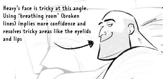
As well as leaving 'breathing room' within your lineart instead of actually...resolving the area. I do this the most around the face and hands.
Hopefully some of this helps? Honestly there's a lot of deep dives that could be done into indivudal things and there's also the massive caveat that all of these are 'guidelines' and not strict rules.
I also favour a more...concept-arty? animation-y? storyboard-y? look to my lineart which favours flourishes and breathing room for a incomplete/work-in-progress feel which would make methodical colouring (ie: for a comic or something) a pain.
Keep up pratice is the main thing and doing studies of artists who you like that have great lineart - you'll pick up draughtmanship skills along with the lineart studies. Here's some of my lineart from a year or two ago...it varies between very 'standardised' (which makes it difficult to read volumes and to be honest, it's boring) and 'TOO EXCITING' (which...also makes it difficult to read volumes and for the eye to rest).
I'd like to share my brushes at some point as I've found 3 that I really like and use for everything more or less. I discovered that a shocking low amount of people use PS on tumblr (shocking to me I guess as i'm so used to PS being the standard) and everyone seems to use Procreate or Clip Studio Pro...so I want to check that the brushes are Procreate compatible at least before I share!
#sorry if none of this makes sense. im on day TWO of a hangover...kill me now#asks#art tutorial#tutorial
736 notes
·
View notes
Text

charr body types for practice, rambling nonsense under the cut
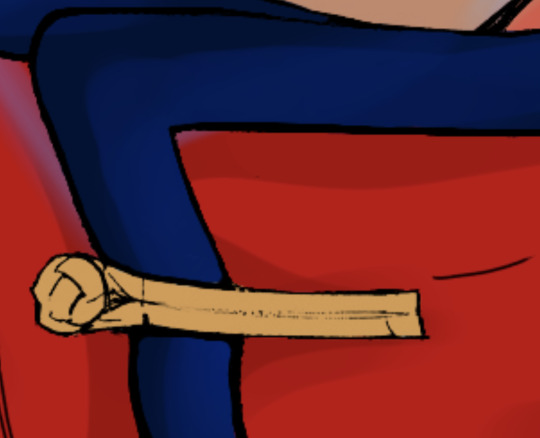
ive been trying to get better at drawing more varied body types for a while now and i think ive still got a long way to go but im getting there. fat and muscle definition werent something i bothered to learn for a long time because all i wanted to draw was twinks and dragons ... but in the last year or so ive really been pushing myself to do better. i think learning to draw different body shapes is really important and improves your overall anatomy skill by a mile, its also just really fun for me to think about how fat is distributed across the body and affected by gravity and all that stuff. bodies in general are my favorite thing to draw and what i spend the most time sketching
ok enough word vomit lets talk about my ocs
iovitus is supposed to be built more like an athlete, but im not sure i got that across very well. they're still skinny and comparatively twinky next to their fellow cats, but still strong and in good shape. after they left the legions they didnt really bother that much with the upkeep of their figure, but since theyre focusing more on mercenary work again they've been better about it
most of iovitus' muscle is in their shoulder & back, as their weapons of choice -- longbow and throwing axes -- require a lot of strength in that area. theyre very triangular shaped & top-heavy, with a broad chest & shoulders, thin waist and narrow hips. skipped leg day :/
nero is supposed to have sort of a dad-bod type of build. i changed a bit about his design as ive been tinkering around with his lore recently. she was always supposed to have some tummy to her, but i dont think i drew it very well in the past. i think a dad bod is very fitting because she is one after all
i also wanted to make her blind eye more obvious because i kept forgetting about it whenever i drew her so umm sorry babe. still need to come up with an explanation as to why it happened! was considering having him just born with it for a while, but i love scars and scary traumatic events so... sorry nero
in spite of the good layer of fat he's got on his body though, nero is very strong and muscular underneath it all. his warband doesnt do a lot of combat stuff anymore but he's still working most of the time and takes good care of himself. juicy thighs btw
ruckus... i dont have much to say about. i love you babygirl
she's so much taller than everyone else.... its difficult to notice in the line-up as they are, but i wanted to see so i lined them up in front of one another and. well. ->

look at her. and iovitus. why are you so small??
finally, lia! she's still small in comparison to most other blood legion charr, but she makes up for it in her strength. or, well, she might've in her younger years; at her current age she's definitely lost a lot of that muscle definition just by the nature of aging
thats not to say she's weak, though. she can and will definitely fuck you up if you try her
her burned arm is her main weak point. it was burned severely enough where the muscle and nerves were permanently damaged, resulting in a lot of stiffness, uncomfortability, and chronic pain. the movement in that arm is limited and she has to guard it closely if she's ever in a scuffle
i think in general a lot of muscle definition for charr is lost just cause they have fur to cover it up, evident by the fact you cant really see a lot of it on the in-game models. or at least thats my excuse for not knowing how to define muscle with lineart
#iovitus rainbreak#nero wolfcaller#ruckus gutsaw#lia windwalker#my art#charr#guild wars charr#gw2 charr#gw2#gw2 art#gw2 ocs#gw2 oc#guildwars2#guild wars#guild wars 2#guild wars art#guild wars oc#cw nudity#i guess??? not really but whateva#i got really lazy with the scars in this one so ignore how butt ugly they are ok#theyre not the main focus here
110 notes
·
View notes
Note
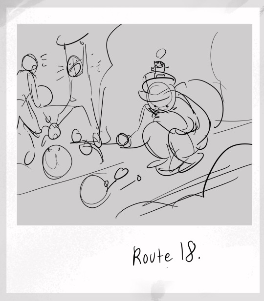
I finally got all my brain ducks into enough of a row to send this! I just wanted to say that Tumblr recommended your art to me on a whim, and I am actually OBSESSED now lol. I had no prior investment in Submas or anything tangentially related to it prior to this (aside from liking Pokémon generally lol), but I couldn’t help but tear through everything you’ve drawn for these silly little rat children and I love them so much now!!! I wanna pick them up and shake him around like little action figures! The shenanigans and the heartfelt moments are just,, UGH so good! I have no words! Thank you for the food I am going FERAL over them <3
Your art is also high key goals for me now tbh. I absolutely ADORE your coloring and rendering style, and also they way you draw Pokémon in general?? Very animalistic but still recognizably Pokémon?? Literally galaxy brained. I’m going to SCREAM. I know you already posted a bit of your art process, but I’d love to know if you’ve got any rendering tips and/or how you get that clean but sketchy look. It looks so good I want to eat it lol.
(Also I really love the way you’ve been formatting Elesa’s dialog, with the extra lines around the letters. It really gives the vibe that her grasp on Galarian is currently shaky at best and idk, I like that you’ve managed to find a way to convey that over text. I think that’s pretty cool :D)
I SAW YOU REBLOG A WHOLE BUNCH AND IM,,, (throwing hearts at you)
Thank you so so much! I’m glad you love these terrible little guys wandering Unova just as much as I do, haha!
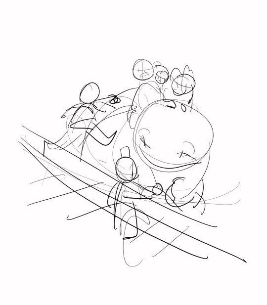
As a treat, lemme pull out some drafting for the mini illustrations. I usually start every snapshot with a run down of what I remember from the area, possible shenanigans encountered, and then a doodle of ideas to come.
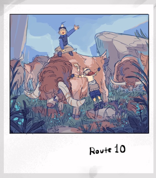
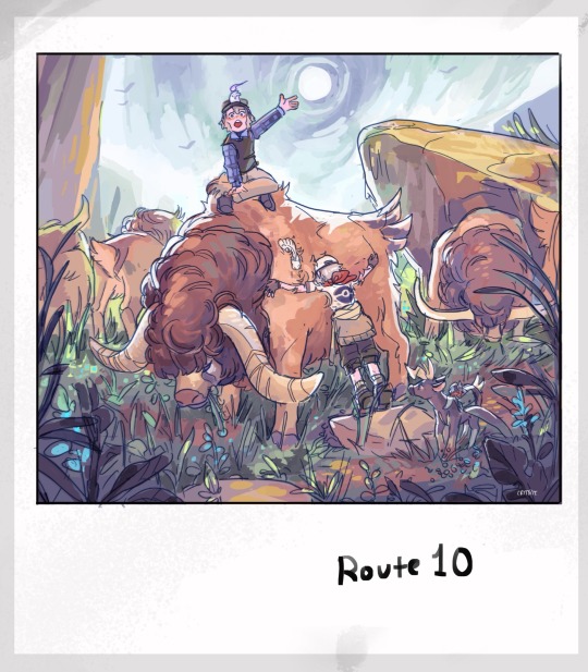
From there, it’s a SUPER rough sketch, followed by lineart and rough color, and then cleanup!
(More thumbs and their finals below!)
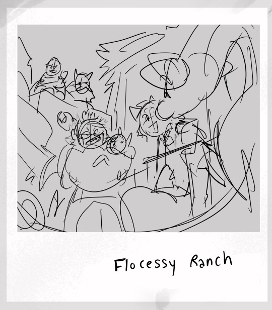
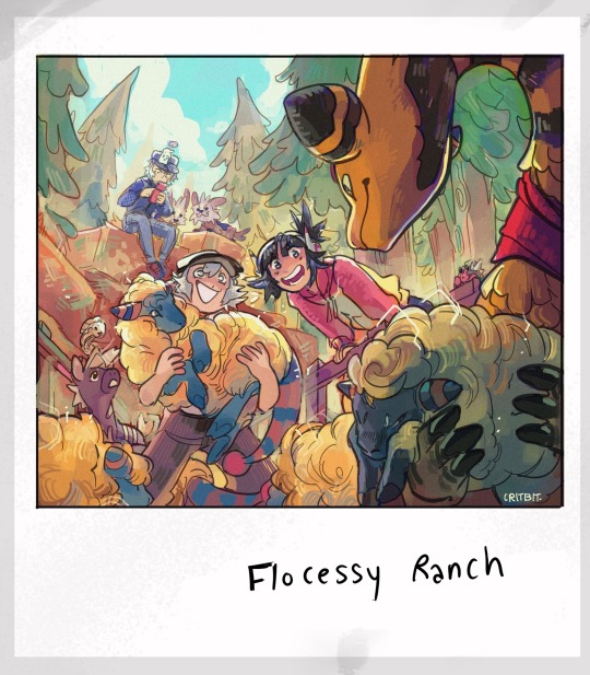
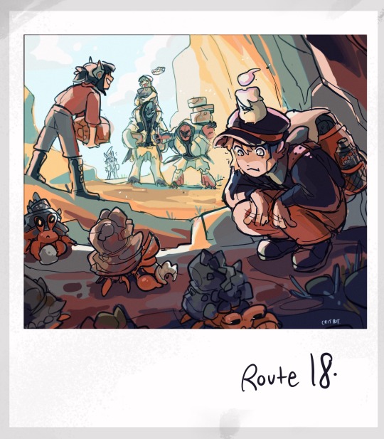
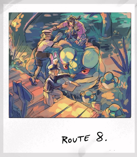
At the end of the day, all my lines are VERY sketchy. I’m a lot stronger when it comes to mashing colors. That, and if you set your line layer from normal to multiply, the lines will always be automatically darker then whatever layer is placed underneath. It’s a trick used quite a bit for placing cel shadows in animation, but it’s useful for lineart in a pinch.
For colors, I like to stick to a limited pallet and branch out only after setting my primary colors. This entire series has been very experimental for me though, as you can probably tell.
As for the last bit— YES… YOU GET IT! As Elesa grows, the lines in her dialogue will start appearing less and less. It’s the little things that map the span of time for these guys.
Yippee!
#ask#mailbox#aah… scared to respond to my inbox because there r so MANY asks but#this one’s asking for tips and i love getting on my soapboxes#and also the sheer amount u reblogged??? holy shit okay if ur gonna put the effort so shall i!!#ANYWAYS!#critterbitter screams into the void#critterbitter
337 notes
·
View notes
Note
Hey, so I really love Lore Rekindled, and the art is one of my favorite parts! The style, the coloring, the background, all of it is just so… smooth! I don’t really know how to describe it. Recently, I’ve been trying to replicate it, and I was hoping you would give me a few pointers. What brushes do you use for line art? How do you decided what to line, and what to leave blank? What about coloring brushes? Do you use smudge brushes? Whats, like, the step by step process? You don’t have to answer if you don’t want to! But any tips or answers would be great!
Ah thanks so much!!!
Here are the brushes! They're .abr brushes, so they should work in Photoshop, Clip Studio and Procreate :) (they don't work in Krita or other software that utilizes PNG brushes though, sorry ; ; )
There's also a tutorial included with that file that breaks down my process layer by layer! That said, there are a couple things that have changed in my process since doing that tutorial:
I mostly use the Hard Square Pastel brush now for all of that 'crispy' lighting that often happens along the edges of characters' shoulders and heads, such as seen here:

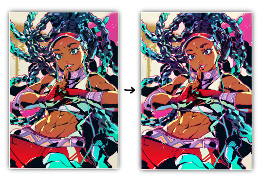
I now do an extra step of applying a 'blur' layer, where I essentially merge all the layers into a new layer on top of everything, set it to Overlay, and then Gaussian Blur by about 60%. This is how I get that 'dreamy' look that's been present in a lot of the more recent episodes!
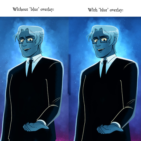
It's subtle, but really effective in making the glow effects and deeper colors really pop!
As for the more nuanced stuff like lineart, it's kinda just something I do by feel! Sometimes I'll shade something in and realize the lineart doesn't need to be there, so then I'll go in and erase, other times I have to be a bit more excessive with it esp if two similar colors are up against each other. I'm actually trying to use less lineart going forward to get more of that authentic LO look but it's hard, I'm very used to doing lineart-heavy drawings so it's forcing me to draw in a way that I'm not used to! 😆 I usually always start with flat colors first though, meaning I start by 'shaping' out the character poses and then lining them in afterwards!
You can see an example of this process in my END OF PERSEPHONE time lapse here:
youtube
I also usually stream work sessions of Rekindled over on my Twitch, but I'm currently on hiatus from streaming due to technical difficulties (OBS just... decided it was gonna stop working, sigh). Go give it a follow anyways tho so you can be notified when I start streaming again! I'm thinking in the meantime until I can get my Twitch going again I might start doing some screen sharing sessions in Discord. So keep your eyes peeled for that if you ever wanna catch me working! I'm always happy to talk about and demystify the process <3
93 notes
·
View notes
Text
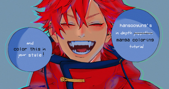
hansooyung's coloring tutorial & ctiys: alma time! 🍒
hello everyone! though i've been meaning to for a while, i've finally gotten around to making my first manga coloring tutorial! i'll be going over cleaning panels and screentones, choosing base colors, and finally shading and lighting.
this will also be a color this in your style challenge, so if you're willing, feel free to post your colored panel and tag me in it!! i'd love to see all the results :)
find details under the cut! 🦋
DISCLAIMERS:
this is just how i personally color! i know for a fact that some of my other friends follow other methods and have such beautiful colorings <33
for colors specifically, i play around a LOT. if you don't like your color scheme for the time being, mess around with it! i don't use psds since i like to mess around by hand with color palettes, but maybe i'll look into it for the future.
i explain a lot just bear with me gang 🙏
TECHNICAL STUFF:
software: ibis paint x (on iphone). i use ibis since it is FREE for all phones and it worked on my chromebook as well.
while this tutorial is made for ibis paint x, everything works on other softwares except the brushes, which i've provided alternatives for below.
brushes: i will be using dip pen (hard) which is automatically included with ibis, and two other brushes i made myself which you can find here and here. for more brushes, @/bkdkdh was incredibly helpful and posted her awesome set here!
for other softwares, you can use similar brushes. dip pen (hard) can just be the default brush, while wet edges is just the default brush on lowered opacity (and more of a rectangle/marker shape?). watercolor pencil is a watercolor brush in the rectangle/marker shape as well. if you can't get the shape, you can always smudge your lines into shape as well, so don't fret too much! a bunch of people only use one brush for coloring everything (which is insane to me, personally, they are so talented!)
fun fact: the first brush listed that i made was originally called "aki tao watercolor smooth" 👍
ok here we go guys!!
STEP ONE: CLEANING THE PANEL
i think of this part as setting up the panel for coloring! usually it's pretty exhausting cuz it's all b&w but it's all worth it i swear. the panel i'll be coloring is this beautiful one of alma from chapter 2:
imgur link here (x)
a lot of people redraw their lines to avoid screentones, which is extremely helpful. however, i work on a phone and my fingers are not steady even with the stabilizer turned all the way up T~T. i do it this way, but a different (possibly easier) way may work for you!!!
your first step will be to remove all the white, giving us a transparent background to work with. THIS IS THE NUMBER ONE REASON WHY I USE IBIS PAINT X.
when you upload the image to ibis, a popup comes asking if you would like to "extract line drawing". this creates a lineart of your image. click yes, and your work is like 90% done.
if you're not on ibis, you can redraw your panel, put lineart layer on screen, etc. or you can just extract line drawing from ibis and upload to software of your choice
for those of you not on ibis, i've included the line drawing here (x) if it looks black, don't worry and set your background to white.
omg i was not kidding when i said i explained a lot. ok now onto the three main steps of cleaning the panel:
cleaning background
removing screentones
repainting black lines
for cleaning the background, we're going to clear off all the extraneous stuff. this includes the text in the speech bubble, the gradient screentones behind alma, and the panel line on the left side. just use your eraser tool and go crazy! (i forgot to save the panel at this point of the coloring OTL)
for removing screentones, we're going to remove all those "dots" that mangakas use for shading. these are used to show value for b&w art, but since we're coloring we don't need them—a lot of people have really cool ways of incorporating screentones in their colorings though, and it looks amazing! i used it on nana's hand in my bnha coloring.
remove the screentones from alma's hair and jacket with your eraser tool. this will take time, but it's worth it in the end!
for portions with a bunch of lines, you can create A NEW LAYER and redraw some of the lines. that way, you can erase indiscriminately from the original layer but the lines you drew are still there. again, like i said, my hand is really shaky so i don't do it a lot, but it's extremely helpful for smaller parts where i have control! i used this on alma's jacket, and here's a screenshot of the process:

(i made his jacket purple so i could distinguish between layers easily).
it should look like this when you're done:
for the final step of cleaning, i like to erase all the things colored black (the collar and strings of the jacket, along with the back part of his hair). that way, i can color them in with dark colors and it adds to the whole look of the coloring.
i've circled the parts i'm going to erase below:

and it should look like this when you're done!
ok everyone cheer we're ready to color now!!!!
STEP TWO: BASE COLORS
CROWD CHEERS ok lets go!
this part is the most important to me, because it sets the tone for the whole coloring. i like to use three-four main colors in my colorings, and it's usually background, skintone, hair, and the secret fourth color. the secret fourth color is usually whatever color fits the character's vibe, or if the character's color is the bg, it'll be an accent color.
for example, with my nagi coloring, i used white for the hair, i had my skintone, i had blue as the main coloring vibe (as nagi's color), and black as the accent color.
for alma, i chose his main color to be red! it's the color of his hair and his jacket, so i wanted it to be vibrant and stand out. since blue contrasts red, i went for a greyish-blue shade for the background. (i went for grey rather than solely blue because then it would clash rather than complement).
disclaimer please please please take your device off night mode warm mode f.lux whatever you have. this has screwed me over more times than you may think :(
i like to make my vibrant colors closer to the right end of the color square. for alma's hair, i chose this color:

i dragged it down from the corner a bit but kept the saturation since his hair is kind of dark. we can use vibrant colors to shade it though, so don't worry!
here's his hair and the background together:
now from here, play around with skintones until you find one that matches the hair!
i usually drag around the wheel to the orange-red intersection, and have it on the lighter, more saturated side. here's the color i chose for alma's skintone.
i thought his original skintone looked a bit too orange, so i pulled the saturation back a little bit (moved closer to the left side of the square).
after that, color in his jacket with a bit darker red than hair, choose a gold color for the accents on his jacket, and color in the black parts with a grey-ish color (we will change that later).
here's the base colors!
if it looks a bit bright, don't worry! we can change that with shading. or you might just have to. accept the light.
STEP THREE: SHADING AND LIGHTING
wooo we made it!!!!!!! ok now i lied, we have a bit more of base colors to go. on a layer above the skin, color in your teeth and tongue. for pieces that have a more red feel (like this one), i like to make the teeth and the shading a more vibrant blue color. (for blue pieces, i make it a purple!).
IMPORTANT NOTE: ALL SHADING AND ALL COLORS SHOULD BE DONE ON NEW, CLIPPED LAYER.

i'll then go in and do some light shading with my wet edges brush. i'll use a darker color for hard shadows and then a lighter, more vibrant color to accentuate it.
next up we have blush! a lot of people do this in very different ways but i like to do it directly under the eyes, in a vibrant red shade. make a new layer above the skin and clip it on. color pick alma's hair and drag it to the most saturated shade (red corner). then using the watercolor pencil brush, lower the opacity of the brush and drag a line under the eyes on both sides.
make sure to erase the portion of blush that goes above the eyeline. i also added some lips for alma as you can see, and then added a red line under the eyes! this was back to the regular dip pen (hard) brush on 100% opacity. it may take a few tries to get your blush to the way you want it, so don't worry too much.
now we can start our actual shading!
i break this part up into three steps: skin shading, blue shading, and light shading (highlights?)
for all of them, think about where the light is falling and how it will look on alma.
quick interlude about brushes: i use the watercolor pencil brush for softer, bouncy looks (like blush and noses) and i use the wet edges brush for more hard lines in shading.
again, make a new layer above the skin and clip it on. (i like to have it below the blush, so it doesn't cover it). for skin shading, i take the vibrant red and lower the opacity of the wet edges brush by a significant amount (specifics don't really matter, as long as you're happy with it). i'll trace his neck, from the shadow of his face, shadows of his hair falling on his face, ears, and nose. (for the nose i used the watercolor pencil brush for a softer look).

this is what i have once i'm done!
next we have skin shading part two, where we basically make a new layer on top of our first shading, lower the opacity further, and trace outside whatever we just did to blend it in more.

i used the watercolor pencil brush since it's more softer shading meant for blending! i also added it around the eyebrows for depth.
next up we have our blue shading! this is a technique that i learned from @/bkdkdh's colorings, but adding blue as a shadow really adds to the whole coloring. using the watercolor pencil brush, select a light-ish blue shade (a bit more saturated than background color) and use it to shadow a few more areas than your skin shading. i always make sure to hit the underside of the nose, cuz i think it adds depth!
finally, to wrap up our skin shading we have our lights. i use an orange-ish yellow color, which i set pretty light to not blend into the skin. using the watercolor pencil brush, i'll basically highlight any areas opposite to where the blue was, and highlight different parts. i always highlight one side of the nose as well.
i erased the line around the nose since we now have shading there, and added a darker shade to the teeth since i felt it wasn't shaded enough.
now onto the hair!!! (guys we're almost done bear with me, skin and hair are the two main things and then you can half-ass the clothes)
color pick alma's hair color, then drag the red a bit further down to get a darker yet still saturated color. here's mine:

then, using the wet edges brush, draw lines of shadow wherever clumps of his hair fall or overlap with each other. you can have the opacity set to whatever level you want, i just went with around 90. just try to follow the natural lines and patterns of the original line drawing, and everything should work out fine.

here's how mine looks! then, just like we did for skin shading, place a layer on top and lower the opacity to around 50%. place some more shading to blend it in. you can also shade more parts with this shade for some softer shading. i actually forgot to take a screenshot of this step but you'll see it in the next one!
for our (almost) last part of hair shading, take a layer and place it below both of your shading layers. this is going to be our highlight layer! you can see it below, labeled 49%.

remember how we set alma's hair a bit darker from the corner color? now select that corner color and draw highlights in the center of each hair clump.

lightly visible but it's there!
now here i skipped around a bit bc i was having fun and forgot i was doing a tutorial, but repeat the shading (not highlighting) steps with darker colors for alma's jacket. you should have your base layer, a dark shading, and a softer shading for blending.
we're almost there guys!!!
for the pretty much final step of shading, select a light blue color and do some blue shading with the watercolor pencil brush opposite to wherever your darker shading falls (just like we did on the face). make sure to do it to both your hair and your jacket! here's mine:
now for the black portions, we're going to color the whole thing in a dark blue color. just alpha lock your layer and make a big stroke of dark blue, almost black. for our black shading, we're actually going to go lighter.
select a lighter (but still dark) color and place highlights on the base layer, then take an even more vibrant, lighter blue and place it on the very outside for highlights. a better example of this would be nagi's legs in his blue lock uniform here. then, choose a shade to apply shading to the gold accents on alma's jacket and we're done!
CROWD CHEERS!!!!!
STEP FOUR: FINISHING TOUCHES
we made it guys!!!! for finishing touches, i'll usually do background effects or text or that kind of stuff.
step one is coloring your lines. you can add a new layer and clip it to your lineart, or simply alpha lock your lineart and color directly on top. for hair i like to add vibrant blue/purple lines, along with a few red ones. for skin lines i try to do dark brownish purples, but leaving some black is good too bc it adds flavor!
i colored in the text boxes and added shadows using the wet edge feature, then added some text. for the glitch effect, i duplicated the lineart, dragged the layer below all of my colors (including speech bubbles) and then used the glitch effect with height full from ibis. if you don't have ibis, you can look into features on your software, or you can also just drag your lineart layer a bit to either side and color it in. i also applied just the tiniest bit of noise on top of everything
and there we go!!!!! we made it to the end :)
if you've read all the way til here, thank you so much! if you decide to color this panel of alma (or any other panels!) don't be afraid to post them and tag me for a color this in your style type of thing! (you can also put it in my tracked tag, #user.roy) i'd love to see everyone's works :)
here's the full timelapse: (it stalls for a bit at some times but hey we can't have everything)
#roy colors#tutorials#manga coloring tutorial#useraki#usergojoana#usermica#usernikiforova#tagging some friends <3#alma#gokurakugai
77 notes
·
View notes
Note
hi!! i love your art, i'm not sure if you've answered this before but what type of pens/settings do you use to draw? nd if you're okay with it what your coloring process is like, you don't have to go in2 detail but your method really brings a sort of realism that keeps it cartoony but still humanely? not sure if that makes sense but thank you!! <33 ^w^
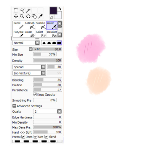
i don't mind man not at all, the brushes i mainly use are the mech pencil rough for lineart and the flat square for coloring (as depicted below) i use those cuz i like how they look and like the texture feels right.

i've already answered an ask where i share all the brushes but just know that i use procreate and those brushes are for it so sorry in advance if u can't use them :°[
the flat square is the main one i use to color and it's my fav cuz it's rlly good at layering/building up color. i tend to do light strokes as opposed to harsh ones that way u can built up depth, the way i color is to lay down the flat colors which are usually the darkest colors in a single layer then i do layers on top of the lineart going from darkest to lightest i it helps me locate where the highlights are gonna be and not worry so much abt the shadows.
i tried recording myself coloring to show the process like a speedpaint but my shit kept crashing and not saving the video so i had to use the timelapse at the end.. anyways sorry if any of this isn't that understandable i'm not good at explaining but i hope it helps in some way :°]
76 notes
·
View notes
Note
hi!! I absolutely love your style!! do you have any process vids or tutorials on how you go about shading?? I struggle with not turning mine into a whole ass painting :’)
Unfortunately I don't 😔 I recorded some a while ago but haven't figured out how to speed them up and stitch videos together yet cjjcjckg but when I do I'll post something :')
But about shading, I get what you mean about painting cjcjkc I had the same issue a while ago actually. Here's a couple of things that helped me change that, hopefully they'll help you too:
putting more emphasis on lineart. If you polish your linework and create occlusion shadows with it, it'll do a lot of the heavy lifting when it comes to shading, so you won't need to shade all that much with colors and values. like so:

simplifying things. You get something complex, like a face, and you break it down to bigger, simpler shapes, and then you shade that. There's tools online like the asaro head(I like to use this model in particular), which you can use to help you with simplification, but you can simplify it even more than that. Like if you look at the way I shade faces, I shade them with even less shapes than the asaro head jdjfjf I disregard a lot of the finer details and just portray what I consider to be the bigger or most prominent shadows. I'd say even if you're going for more complex shapes, think about the big ones first, put those down, and gradually go for the smaller ones.


using design principles on shading. I don't know if you know design theory already, but in case you don't, I recommend taking a look at the principle of "big, medium, small". It's pretty simple, but once you understand it you can apply it to literally everything in your art and make it look better. Once I started applying them to the shapes I create when I'm shading, it also became a lot easier to shade in a more simplified style.


That's mostly what helped me I think!! Other than that, it probably goes without saying but I'd highly recommend studying other artists. Like, just grabbing a bunch of pieces you like from a particular artist, throwing it all in a moodboard, observing and taking notes and then trying to mimick their style. That's a type of study that usually helps me improve really fast. But yeah, I hope this helps!!
103 notes
·
View notes
Text
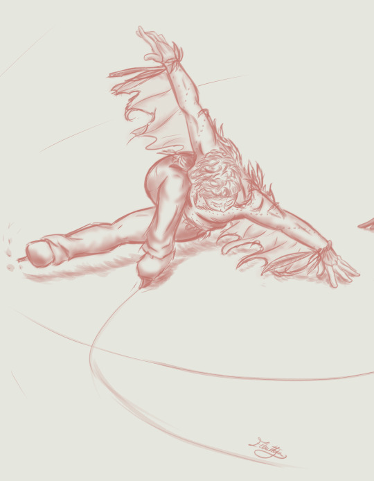
DAY 13 - «On Thin Ice» Good Omens AU - Triptych Tribute for @blairamok
Part 1/3: "Falling Angel" Aziraphale
Please, listen to this
Change everything you are
And everything you were
Your number has been called
Fights and battles have begun
Revenge will surely come
Your hard times are ahead
Don't let yourself down
Don't let yourself go
Your last chance has arrived
Best, you've got to be the best
You've got to change the world
And use this chance to be heard
Your time is now
Falling Angel, your time is now!
(yes I know this Muse song has another sense in the On Thin Ice universe - for Crowley. Well, our Fallen Serpent will show us what IS a true Survival, tomorrow. ;-)
[Previous] [Next Day] [First Day]
Don't forget to 💕/ reblog ;-)
Personal challenge: a simple sketch each day
Goal: forcing me to keep things simple - inking, shading, just a few sashes of colour
Improvement pursued: to get the movement, the emotion, finding how to add depth, learning how to leave things barely finished
Max time allowed: 2 hours, as usual for my Daily Challenges. Well, this is a very special Tribute for me, and I was on a three-days break. So I didn’t really set a timer for the « On Thin Ice » sketches. Plus, I drew them quite in the same time and on the same file to be sure Crowley and Aziraphale would match. I guess I spent more or less 3 hours on the lineart for each one of them (the clothes and the figures needed a lot of time), plus 1h30-2h on the colouring/shading for each one.
Be aware that in my first sketches for this project, Crowley and Aziraphale were supposed to train on the same ice rink, and I dearly wanted Crowley to be watching Aziraphale, and Aziraphale was supposed to glance back to him. I had to give up on this idea later – because the figure I chose for Aziraphale definitely couldn’t allow such a shared glance. (but, hello, it will be a triptyque ! So, guess what? About the third part… :-p)
About Aziraphale, as my « Falling Angel ».
« On Thin Ice » author, @blairamok, describes the Hydroplane ice skating figure as very representative of Aziraphale, and the drawing reference pictures were numerous enough to get some solid inspiration. It’s a complex skating figure. I have watched some ice skating tutorials on YouTube – because I wanted the movement of the clothes and hair to be accurate and, if I understand everything properly, even a slight alteration in the position of the arms can make you fall. Such perfection ! That IS the right move for Aziraphale !
I told sooner on my Gymnast !AU challenge that I appreciated drawing Aziraphale with realistic curves more and more each day – even if it still triggers me sometimes about my own shaming roundnesses. I realised my way of doing art – and my mind too, maybe - was evolving when I got back to check references in the amazing Blair artworks (link AO3). A few months ago, I felt insecure watching Blair’s Aziraphale, which seemed to me too much plump and very soft – not a « good sportive look », I thought then. But now I like him more and more, so maybe my way of thinking is changing, and I think this is for the very best.
My Aziraphale is performing a difficult figure, so he is using all his muscles into maintaining his balance. He seems so statuesque, so powerful, yet very focused and oblivious to the world around him, with his eyes shut. That is why he couldn’t share a glance with my Crowley. T.T
.
Maybe this is my way to guess Aziraphale’s behavior in the so-awaited « On Thin Ice » next chapters. Focused on his own training, trying to ignore Crowley’s sassyness but still secretly impressed by his partner’s skills. Because they share the same love for Ice Skating, even if they don’t show it in the same way.
Blair, if you ever read this, thank you. For your artworks, for making us dream about a wonderful story that still remains to be told.
Thank you for « On Thin Ice », for your so-kind message last week, and for everything else.
I have faith. I’ll wait for your story. But even if it doesn’t exist yet, I am already dreaming about it, and this is priceless.
[Previous] [Next Day] [First Day]
Don't forget to 💕/ reblog ;-)
#on thin ice#blairamok#I am so happy about it!#good omens#good omens fanart#Aziraphale#Crowley#aziracrow#art#my art#ineffable husbands#David tennant#Michael Sheen#ElenPersonnalChallenge#ElenthyaAndGoodOmens#Ineffable Feathers#good omens au#Ineffable lovers#Ineffable Ice Skaters#ElenthyaGallery
131 notes
·
View notes
Note
Hello!! :DD
First of all I know I always write that in the tags but I mean it: your art is so beautiful!! I love the colors you use and the way you do the lineart and everything is just so pretty and lovely!!
Also I wanted to ask, since You said to took art requests, if you could perhaps draw alttp link and Zelda dancing together, while surrounded by apple trees? Maybe there are also some butterflies flying around… I’d love to see something like that drawn in your style!!
and congrats again for reaching 500 Followers!! :))
Hello again!! Thank you for your lovely message, I’m so happy you like my art that much 🥹
Your request was so cute it made me squeal when I received it a few weeks ago haha! I assume you pictured them dancing in Link’s orchard?
(How about I add a forehead kiss to your list? 😇)
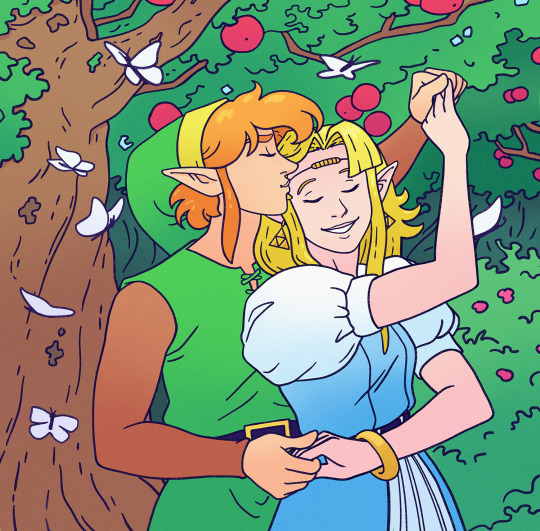
I hope this was worth the wait ^^
I had never drawn ALttP Zelink before and that’s a shame!!
EDIT: @zeldaelmo wrote a beautiful fic with an ending inspired by this piece :DD
———————
I won’t accept more requests at the moment! This is a request I received for my 500 followers celebration and I still have a few to do :)
Answered art requests
#ask#art request#loz#zelda#loz fanart#the legend of zelda#a link to the past#alttp#link#princess zelda#alttp link#alttp zelda#alttp zelink#zelink
193 notes
·
View notes
Text
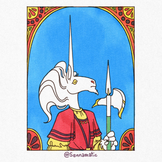


Every New Years, I like to show off some of the art that never got posted during the year! I think its important to know not everything makes it through to the final stage, but its always good to keep track of your work!
Explanations under the read more!
One of the many unicorn drawings I made this year, I was SUPER dedicated to making something that echoes the design of a halberd. When I was making it, it ended up feeling like I was going through the motions and I lost sight of the original idea. It ended up being finished, but I never posted it because it felt like it wasn't good enough to stand alongside my other works in the series!
A little doodle of Uncle Stinky and I from early January! I really DO like this one, and would have posted it if it were more substantial. I'm hoping to maybe repurpose it into a bigger collection of my diary comics instead of letting it rot on my hard drive for no reason!
Another Uncle Stinky drawing. I actually think I might've posted this one somewhere on twitter or Instagram, but it didn't seem to make it to tumblr for the same reason as the previous drawing. But fun fact! This was one of the first drawings I made with the Kolormarc brushes that ended up shaping my unicorn art during the year!
Another unfinished Unicorn drawing. This one went through a ton of differently thumbnails over quite a few weeks. I got all the way to the lineart before I burned out on it. I just couldn't decide how I wanted to color it and other work ended up piling up. I would really like to see it through to the finish line in the future.
A collection of photobashed weapons from a DnD campaign. This was the campaign my friend DMed and the same campaign that created Romeo. I made this drawing for a zine we've been working on for a few months. If it ever makes it to finish, I'd love the share the zine with you guys! The weapons are (in order from left to right) a lethal squirt gun, owned by Romeo, a glittery mace owned by Hugh Mongus, a temperature-controlled hook for Captain Hook, and a feather-light sword for Hickory.
The very first thing i made in the Womp 3D software! I don't have much experience with 3D modeling, but it was pretty easy to latch onto the mechanics of this! It was just a simple beast, I still kind of like it!
Another DnD drawing for the same zine as #5. This is a little drawing of an NPC named Rumple, who's some fancy fashion designer who's crossed paths with Romeo in the past. Rumple was really fun to interact with, and the snazziest dresser in the campaign!
A itty bitty Uncle Stinky I made for a super bare-bones pet game i found somewhere? It was so barebones that it's pretty much useless. But hey! If you wanna try it out, I'm hosting it on my (practically unused) neocities page
Some drawings of my friend @finnimate 's DnD character from the same campaign as Zoltan! His name is Angel, and he's a big sturdy triceratops. I love a good dinosaur, but Triceratops are notoriously awkward to draw. I threw this page together just to try it out and see if I could help them settle on a design. I don't think I succeeded, but I like getting to draw Angel anyways :D
#art tag#digital art#art#illustration#happy new year#artists on tumblr#drawing#artwork#oc#original character#my art#new years#new years eve#new years resolution#fantasy art#drawings#illlustration#unicorn#furry#uncle stinky#unicorn art#kolormarc#the kingdom of lattice#dnd#dnd art#dnd character#dnd oc#dungeons and dragons#dragonborn#triceratops
129 notes
·
View notes
Note
Sorry to come out of nowhere but I just wanted to say that your art is so warm and so colorful and so ROUND in all the best ways and your style really captures my favorite things about Kirby! I've always found it really inspirational!
Also, I love the way your line art looks?! I have to ask (you don't have to answer though) is there a specific brush or technique you use to get that soft, multi-layered effect?
Either way, wishing you a wonderful day!
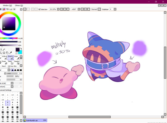
Thank you so much for your nice message, it means a lot!!
I've been wanting to make a small tutorial about how I make my Kirby art, so I guess your question came right on time hehe ^^
As I'll be explaining all of my process, I'll also answer your question about my line art! Btw my art program is Paint Tool SAI and I'll also be showing the brushes I use as well as their settings (i made up most of them a long time tho).
So first here's the brush that I use for basically anything, whether sketch or lineart!
It took me a while to understand what you meant by multi-layered effect, but no the brush doesn't do that, that's actually my way of doing "lineart" (ig it's not really lineart cus I just do sketches that I clean later on).
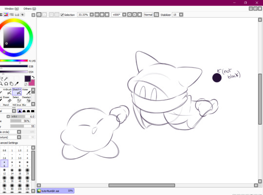
I then clean up everything, add the details and block by using a grey color.
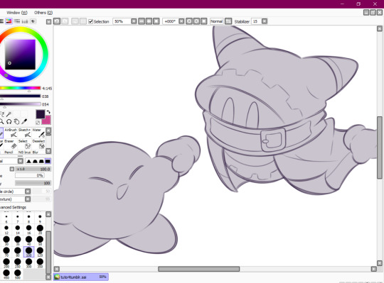
Afterwards I add the flat colors! I already have my own made up color palette, but otherwise I always use a purple color as overlay.
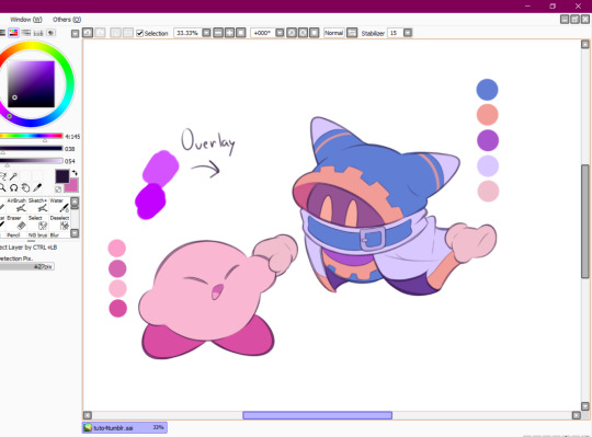
And I also use that same shade to color the lineart!

Next comes the fun part, shading! Here's THE brush that gives that soft effect to all of my drawings ^^ It's the same setting as my eraser too!
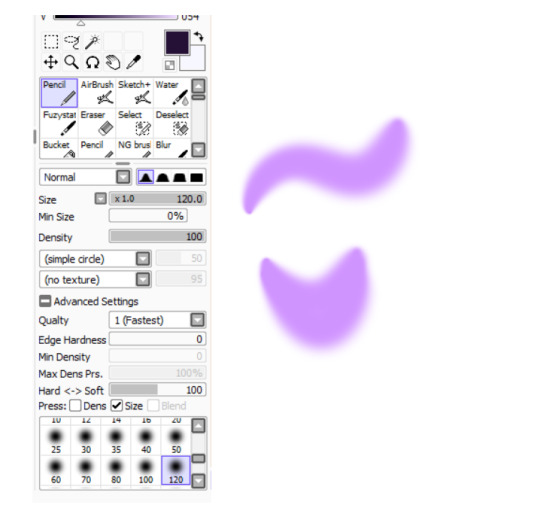
And yeah I also shade with light purple lol
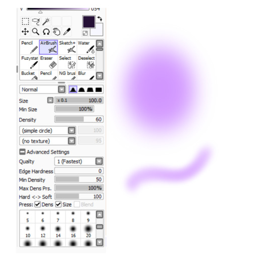
There's also some other brushes that I use for more effects, like the airbrush! (I don't think I've touched the settings that much) I mostly use this one for lighting effects.
And finally the water brush! I sometimes use it for blending or for quick backgrounds,
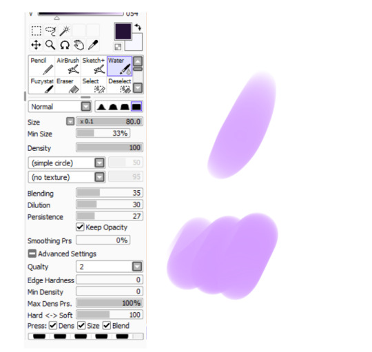
but you can also see that when put it to "Spread" it also becomes the one that I use for my blushes hehe
Aaand I believe that's all of the brushes I use for my art! I do have more, but I only use those for other specific stuff like animation or pixel art.
Adding some details AND VOILÀ!!

Now you know how I make my Kirby art! (but this also applies for all of my art) I sometimes redraw on the contours to give that "pop up effect" a bit like what they did in rtdldx lol ^^
I really hope it was easy for everyone to understand cus this is my first time making a tutorial! And to Desultory Novice, I hope I managed to answer your question too!!
Thanks again and have a great day :D
248 notes
·
View notes
Text
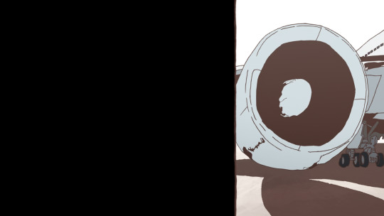
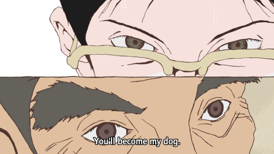
Ping-Pong The Animation: eps 1-3
So Masaaki Yuasa [AN12, AN28, AN150] can do no wrong, right? OK, well, I'll admit Ride Your Wave was kinda mid, and Devilman Crybaby goes hard as hell at the beginning and end but sorta treads water in the middle, but... generally speaking! No-one does it like Yuasa.
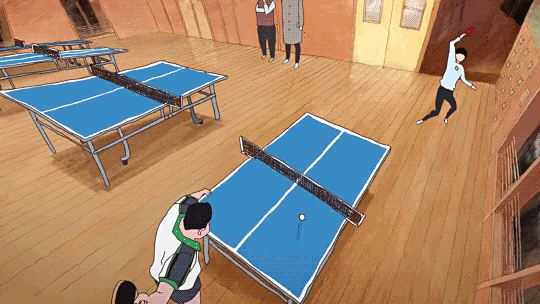
For reasons I don't really remember, I didn't get very far watching Ping-Pong The Animation some years ago. It should be entirely my shit: Yuasa pulling in a gang of wildly creative animators to put their unique spin on something. However, the first episode didn't entirely hook me, and I never got round to trying the second before something else punted 'watching Ping Pong' out of my brain. ADHD, y'know.
This is a shame because even the very next episode seriously goes, as does the one after that. But also this anime isn't entirely what I was expecting (crazy sakugafest full of Yuasa weirdness). Not to say it doesn't do a lot of really unique stuff with its cinematography and animation, but these first episodes at least are more about like... dissociation! ennui!
But more on that in a mo. First I wanna continue the thread of 'how do you animate sports'.
So, ping-pong, or table tennis. Not a sport I know much about, I'll be honest. (To be fair I don't know a lot about sports in general outside of some very specific niches. The sports I've pursued so far are rather eclectic: swimming, fencing, tai chi chuan, and roller derby; I never got particularly far in any and it's been years since I've done them.)
I'll inevitably be drawing a lot of comparisons to The First Slam Dunk, the other sports anime I've watched recently. I do think it's a productive comparison though! Both of them bring something of the visual language of manga into their presentation in unique ways. I have not yet read the Ping Pong manga, but it's by Taiyō Matsumoto, otherwise known for scifi manga like Tekkonkinkreet (god tier movie, still need to read the manga) and Number Five. So that's a pretty impressive track record!
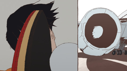
If you go take a look at some scans of Ping Pong, what will immediately jump out is the shaky, rough line style and unusual camera angles and compositions.
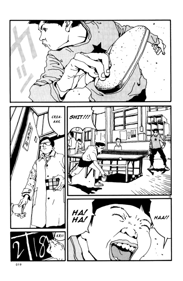
The stylisation is also very different from a lot of manga. Noses are fully drawn, eyes are realistically small, and in contrast, lips and mouths tend to get the emphasis - as well as hands.
Knowing this makes a lot of the creative choices in the anime make sense! It also adopts a shaky lineart style, and makes use of heavy line weights and spotting blacks to add definition. It also has a lot of crazy closeups and layouts, and it loves a visual metaphor. But most of all, the most striking element of this anime is how often it loves to split the picture up into little panels...
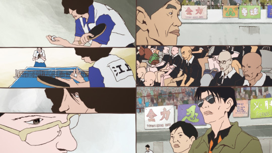
...which [eli]'s subs do a really good job of typesetting, incidentally, moving the dialogue to fit naturally into the split composition. And while this shot with 7 smaller shots is perhaps on the extreme end, splits of three or more are pretty frequent. It's a really interesting way to evoke the effect of seeing a whole page of manga
So, as you proooobably know, ping-pong is a game of bouncing balls off a little table and directing them into places the opponent will find it hard to hit them back. From watching this anime I picked up that there are a number of styles of holding the racket (e.g. 'penhold grip' and 'shakehand') and approaches to hitting the ball (e.g. 'chopping'). A lot of this pretty much went over my head, but honestly it didn't matter, since the narrative significance was pretty much always evident.
Compared to basketball, though, ping-pong is a pretty tricky sport to make visually interesting! Sure, you have the players running to and fro, and that can lead to some interesting poses, but how do you get the drama and tension into this?
Ping-pong additionally is all 2D, it doesn't have the sort of resources that Toei could throw at making the best looking 3DCG basketball game ever. It is limited to a TV-feasible drawing count. So it has to make use of clever limited-animation tricks to get the most impact out of fewest drawings.
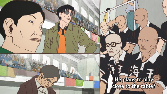
Let's take an example sequence from episode 3. A minor character is about to get his ass kicked by Tsukimoto. Tsukimoto is something of a pingpong prodigy, and yet he is very emotionally closed-off and even standoffish; he doesn't particularly seem to like the game very much, and doesn't particularly feel inclined to flex on other players and get into the status games. But other players, like Wenge, have heard about him and want to see what he's got.
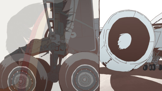
First we have the setup. Other characters are observing and discussing the game. Since ping-pong tends to involve very rapid exchanges, it can follow the classic shōnen model where there's a lot of talking, flashy fight sequence, more talking...

The cut happens in two steps, maintaining the vertical dividing line. This approach to cutting is used a lot in Ping-Pong, and it's quite a creative way to keep visual interest when it's using a lot of largely static shots. The panel on the right is more animated than the panel on the left, a naturalistic depiction of bouncing the ball off the table.

Things start moving faster here. A rapid pan on the image on the left disguises the fact that this anticipation pose is actually not moving at all. This then goes into a rapid, explosive moment as this guy serves.
The final pose is held for a couple of seconds while the voiceover line discussing his intended move finishes. This sort of elasticity of time is a very Osamu Dezaki type of move - it's something that Hayao Miyazaki and Isao Takahata actually really disliked.
A sound effect hits as Tsukimoto appears on the right in silhouette, anticipating his reaction, and setting up the next shot which leaves the split picture and hides the background for just a moment, as if to put us in Tsukimoto's shoes: he only sees the ball.

Tsukimoto follows through and holds this pose - the ball is the only thing moving here. The ball moves mainly on 2s while Tsukimoto moves on 3s and 2s, and he and the ball move on alternating frames. He holds the pose as the ball zips off to the right (bouncing off the corner of the table), with a speed lines-like effect. At the end of the shot, the ball freezes in the air for the moment while the sound echoes.
The actual table-tennis round lasts just seconds, and the drawing count involved is pretty minimal, but it does a lot with those drawings.
We go back to voiceovers and reactions in the next few shots, returning to the split video as Tsukimoto's opponent thinks about how he'd really rather be at the beach...
Often, these comic-like compositions will change one panel at a time, and while one panel is animated another panel will be still, naturally moving your eyes across the screen. It is an approach similar to some experiments I've seen in 'animated comics' viewed in a web browser, where the panels do not appear all at once, but enter with some animation.
So this is the sort of animation technique that Ping Pong uses. It's effective! Elsewhere the cuts are used in a less direct, continuity-editing way and more in a juxtaposition/montage way. For example, Wenge's desire to return to China is symbolised by match cutting/fading to shots of an aeroplane.

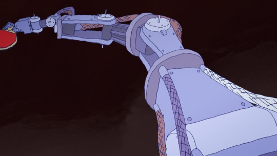
And there is a recurring image, which I'm sure will be expanded on, of Tsukimoto hiding in a cupboard and wishing for a tokusatsu hero to come save him from his isolation. As Tsukimoto's feelings about himself change, the toku hero is replaced by a robot. At this points it starts to feel like an outright Ikuhara anime.
There is occasionally a little bit of CG, mainly when Tsukimoto uses a different type of racket surface, and the way the ball and racket make contact is the crucial thing that the shot is trying to convey...
It gets the job done, but I'm glad they stuck with 2D for most of it.
So I went in the first time expecting like, crazy elaborate sakuga - and to be fair, the OP, animated by none other than Shinya Ohira, delivers on that front - but if anything what I've seen so far in Ping-Pong is actually a triumph of storyboarding and limited animation techniques. I think back then I didn't have the eyes to appreciate it in the same way.

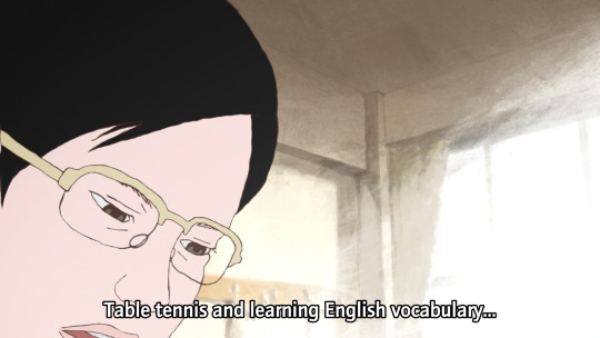
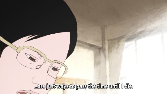
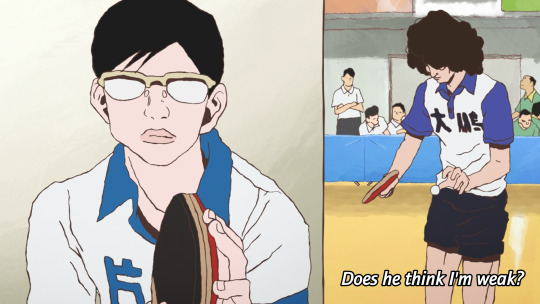
OK, that's the film nerd stuff, but what about the story? Ping Pong follows two school friends, Makoto Tsukimoto aka "Smile" (right), and Yutaka Hoshino aka "Peco" (left). Smile is defined by a flat affect and a standoffish persona. He's just going through the motions. He's very good at ping-pong, but to him it's just a way to pass time, and he's scornful about the idea of caring all that much about it. Much like Shinji with his casette player, Tsukimoto is pretty much always staring at a handheld games console rather than make eye contact with anyone.
Peco on the other hand is the more childish one - playful, kinda arrogant, very much an 'emotions on his sleeve' kinda guy. He sulks when he loses and gloats when he wins, and is constantly seen with bubblegum or other kinds of candy. He provides a lot of our commentary when he chats with the other players.
日本語上手 readers probably noticed the tsuki (moon) vs hoshi (star) symbolism thing they've got going on here!
High-school table tennis in this story seems to be a rather 'tough love' kinda world. Most of these players tend to look down on those who can't meet their level. Going easy on someone is seen as weakness, or cultivating bad habits, by almost everyone. Tsukimoto doesn't play at his full potential because he isn't as invested in winning as all these weirdos, but it seems that might be starting to change...

The coach is interesting. He's an old man and fairly disdainful of the club at large, and prone to speaking English randomly with a heavy accent. But he gets excited at the prospect of getting Tsukimoto to unleash his full potential, in terms that are repeatedly metaphorically compared to romance/marriage.
And when Tsukimoto gets sick of it, he challenges him to a game, with the stakes as...

Cue Makima/Beatrice images here I guess.
Tsukimoto de facto wins when the coach collapses, but this episode marks a change of heart. He starts to think of himself as a robot - the affect of a robot replacing the affect of the toku hero in his fantasy. And in this way he does what people seem to want and plays ping pong with mechanical precision, expressed once again in visual metaphor (shot here from a cool transformation sequence)...

What if I just dissociate harder? This is gonna end well.
So it really is one of those kind of like 'ennui of being a teenager' kind of stories - c.f. say FLCL. 'Boy with complicated emotional landscape' is Yuasa bread and butter, but the particular variant here seems a little unusual for him - they tend to be a little more earnest. I'm curious to see how Tsukimoto develops.
I am definitely enjoying the arrogant Chinese player Kong Wenge. Dude's got a lot of screen presence, and while I'm sure he'll get shown up sooner or later, he makes for a very fun antagonist of sorts.
In comparison to Slam Dunk... one thing that's significantly different about table tennis is that it's an individual rather than a team sport, which means it's harder to have an ensemble cast all contributing to the protagonists' eventual victory - instead it's about a lot of individual arcs interweaving with each other, individual duels. Besides that, it does seem like it will be following a similar arc of a character in an emotional hole (grief for Ryota, depression for Tsukimoto) finding new meaning and purpose through sports - though I can't be sure how things are gonna go for Tsukimoto here!
The tone however is quite different. Even when it's silly, I feel like Slam Dunk is a very sincere story. There's little detachment or irony, or false consciousness - with perhaps the major exception of Ryota's mother, who lets her own grief and trauma get in the way of understanding her son. But ultimately 'why would you care this much about basketball' is not a question that anyone would ask in Slam Dunk. Even the judo guy in the manga who's trying to recruit Sakuragi is just as hot-blooded about his own sport of choice.
There's a difference in like, general affect about the players as well, which has something to do with the sport itself. Yeah, Sakuragi's superpower is his 'genius' ability to predict rebounds, and there is plenty of strategising in Slam Dunk - but basketball is still a sport that very much emphasises physical power, and as much as Slam Dunk will work hard to sell you on a clever trick pass, the visuals are also emphasising the speed that players are dashing, the height they're jumping, their physique. Table tennis by contrast seems to be a sport that's more about prediction and mind games.
That said it is equally just like Matsumoto's style being different from Inoue's. Now I know it's by the guy who wrote Tekkonkinkreet, a lot about this series falls into place! There's a sense of tension here, of being fundamentally at odds with the world. The autismfeels. This is reflected also in the drawings - the characters don't entirely seem comfortable in their embodiment.
So if that's what I'm getting from just three eps, I'm very excited to see what the remaining 8 have to offer. This series is probably too long to cram into Animation Night format, but we'll see...
80 notes
·
View notes
Last Seen Blogs

falcondraws
Falcon Draws!
writingaboutarchitecture
Design Diorama

ranfordgallus
Ranford

emmabthomsonnnz
Untitled