#Bokeh effect art
Explore tagged Tumblr posts
Visit Tumblr Blog
Explore Tumblr blogs with no restrictions, modern design and the best experience.
Last Seen Tumblr Blogs


Fun Fact
Forty percent of Tumblr users are between the ages of 18 to 25.
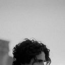
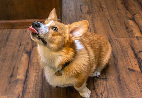
Text
#art#artists on tumblr#j.n.r dutton#experimental art#digital art#my art#pattern art#abstract art#Bokeh effect art
0 notes
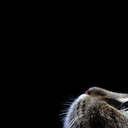
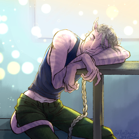
Text
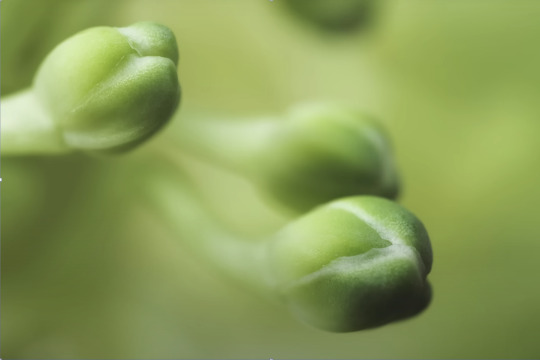
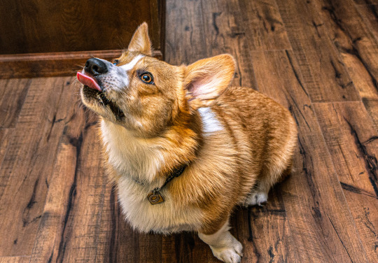
Tw eyestrain (I think, idk, kinda hurts my eyes)

Is it obvious that I rlly like drawing ink?
Without the effects
#Decided to try drawing some bokeh effects#sans au#undertale au#utmv fanart#sans#my art#utmv au#undertale#fanart#sans undertale#utmv#ink!sans#ink sans
565 notes
·
View notes
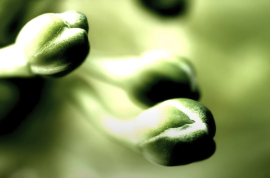
Text
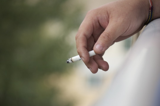
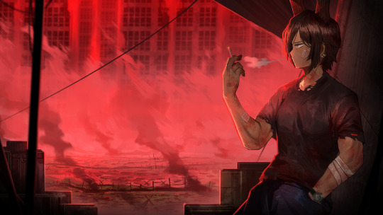
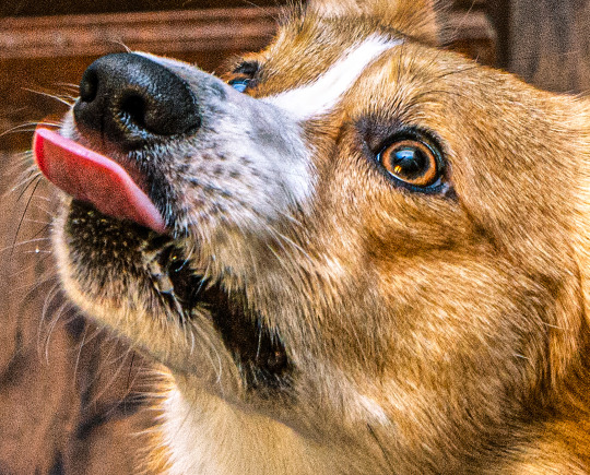
This photo was taken back in 2013 when I had been in Art School in Portland, OR. I don't know what it is about it..but I've always liked it. Just one of my friends smoking a cigarette. Nothing very special about it. Maybe I like the lighting. Maybe it's the positioning of it. Either way it's just one of those photos that I really like. I'm sure every photographer has a few. I do not condone smoking tobacco really, but to each their own is how I see it. I don't really judge, but it's just not for me.
#Photography#Photographer#Kaitlin Graff Photography#Photo#Picture#Hand#Cigarette#Bokeh#Bokeh Effect#2013 Photography#Art School#Portland#Oregon#Friend
2 notes
·
View notes
Text
500+ Free Overlays for Photographers & Video Creators
New Post has been published on https://thedigitalinsider.com/500-free-overlays-for-photographers-video-creators/
500+ Free Overlays for Photographers & Video Creators
Adding an overlay to your videos or photos can make a huge difference, whether you’re working on a portrait or a beautiful sunset shot. The good news is that you don’t need to spend hours creating a specific overlay effect from scratch every time you edit a photo or video.
Regardless of your photography or video specialization, a well-designed overlay can do wonders. Our collection of artistic overlays includes a range of options and effects to choose from, so take a look and download your favorites.
With over 500 free photo overlays, you can effortlessly transform your photos into works of art. Whether you’re looking for a vintage, grunge, or abstract effect, you’re sure to find something that suits your style.
You might also like our collections of free Photoshop actions or free Lightroom presets.
14,000+ Actions, Brushes, and Layer Styles for Photoshop
Photoshop Actions & Brushes, Lightroom Presets, Illustrator Brushes, Procreate Brushes, and much more!
The Top Free Photo & Video Overlays
8K Film Grain Texture Overlays (Free, 10 Overlays, JPG)
This free pack of texture overlays contains ten grainy textures captured using a Lomography camera on 35mm film. These high-resolution textures are versatile, easy to apply, and perfect for enhancing your projects with a realistic, cinematic look, adding depth to your creative work.
Sunburst Overlays (30 Overlays, JPG)
This overlay pack will give your photos a dynamic new look. With 30 different sunbursts to choose from, the ability to mix and match, as well as the ability to increase the intensity by duplicating layers, this is a perfect resource.
4K Transparent Shadow Overlays (Free, 100 Overlays, PNG)
These free high-quality, 4K resolution PNG texture overlays are perfect for adding realistic shadows to photos or videos. With diverse patterns like palm leaves, floral designs, and window shapes, they effortlessly blend into your projects.
Magic Photo Overlays (20 Overlays, JPG)
This resource gives you 20 psychedelic photo overlays that will add some spice to all your images. Simply place the overlay over your image, set its mode to screen, and watch it transform your image in just a few clicks.
Vintage Photo Texture Overlays (Free, 20 Overlays, JPG)
These free high-resolution JPGs, created with photographs from the 1800s, will add depth and nostalgia to your photo or video projects. They’re perfect for creating a unique, aged look in your visuals. These overlays offer an effortless way to enhance photos with a timeless charm.
Hand Painted Photo Mask Shapes (EPS, PNG & PSD)
This collection offers 30 different hand-painted acrylic photomasks. Each shape mask has been isolated to make it easy to mix and match masks until you find your perfect combination.
Retro Overlay Effects (Free, Photoshop PSD)
This free Photoshop PSD overlay adds vintage charm to videos and photos. It’s ideal for anyone looking to blend modern photography with classic aesthetics. This overlay is a must-have for creating visually appealing, timeless designs.
Bokeh & Light Leaks Backgrounds (15 Backgrounds, JPG)
Save time and money trying to create your own Bokeh or light leaks effects. This resource gives you 15 ways to effortlessly blend in light leaks and apply a Bokeh effect. Use it in design, photographs, 3D renders, and as a background.
Dust & Dirt Overlay Textures (Free, 10 Overlays, JPG)
These free high-resolution JPG texture overlays are perfect for creating a vintage or worn-out look. They are versatile and suitable for anyone looking to give their visuals an authentic, rugged enhancement. This set is ideal for adding depth and character to your creative projects.
Vintage Effect Resources (JPG & PSD)
Save time and energy trying to recreate a vintage look by applying any of these 30 different overlays. Easily create black and whites or vintage paper and book textures to use on any photo.
4K Film Grain Textures (Free, 32 Overlays, JPG)
These 4K overlays are ideal for creating a gritty film-like atmosphere, bringing an authentic grainy effect to your visuals. They’re perfect for adding a touch of classic film aesthetics to photos and videos.
Dirty Scanner Texture Overlays (Free, 30 Overlays, JPG)
This free collection of texture overlays includes 30 high-quality JPG files that add a unique, edgy look and feel. They’re perfect for anyone looking to give their work a vintage, rough-around-the-edges feel.
Smoke Background Overlays (Free, 15 Overlays, JPG)
These free smoke overlays add a misty, atmospheric effect to photos and videos, creating a sense of depth and intrigue. They’re perfect for enhancing a wide range of creative projects, from dramatic photoshoots to moody video scenes, adding a layer of mystery and sophistication to your work.
Film Texture Frame Overlays (Free, 10 Overlays, PNG)
These free PNG overlays add a film-like texture to your videos and photos. With a resolution of 100 dpi, they are perfect for various graphic projects like banners, mockups, and packaging. This pack is an easy-to-use and effective way to bring a cinematic feel to your visuals.
Graffiti Overlay Effect (Free, Photoshop PSD)
This free Photoshop PSD template will transform standard photos into striking graffiti-style art, mirroring the dynamic energy of street culture. Its user-friendly Smart Object functionality makes it effortless to apply, making it a go-to for impactful, eye-catching visuals that capture the spirit of the streets.
Light Overlays (Free, 120 Overlays, PNG)
This resource pack has 120 different drag and drop light elements that will give all your images a custom feel. This resource includes a step-by-step tutorial that will walk you through the ins and outs of creating memorable pictures with these overlays.
Bokeh Photo Overlays (Free, 7 Overlays, PSD)
The Bokeh effect can add a dramatic flair to any photo. Just add your image to the editor and apply the overlays to get the desired effect you want. You can easily hide or show the bokeh layers until you have the perfect bokeh mix.
Scratch Overlays (Free, 10 Overlays, PNG)
Use this collection of scratch overlays to spice up your photos with ease. By using this collection as an addition to any other collection, you will be making photo magic.
Flare & Haze Texture Overlays (Free, 6 Overlays, JPG)
This flare and haze overlay pack is perfect for your next photographic business card design. This mockup is easy to use and comes with smart objects, so you can just drag and drop your image in.
Golden Glitter Overlay (Free, PSD)
Add a little gold to your next photo with this overlay set. This effect is perfect for your portraits and landscapes shot outside with rich natural light. This collection is also compatible with light leaks, which creates a perfect feel for the photos.
Vintage Photoshop Overlays (Free, 10 Overlays, PNG)
The easiest way to give your photos a realistic aged feel is to apply this vintage overlay. This pack comes with ten different ways to delicately and lovingly age your precious photos.
Rain Effect Overlays (Free, 20 Overlays, JPG)
Getting caught in the rain is not always fun and romantic, but adding rain to spice up your fun and romantic photos can be. This pack includes 20 different ways to add rain to any of your photos.
Distressed Overlays (Free, 10 Overlays, JPG)
Adding a distressed look to your photos can enhance the overall look and quality by giving it a robust retro feel. The pack includes ten easy-to-use overlays that can be mixed and matched to get your desired result.
Grunge Paint Texture Overlays (Free, 5 Overlays, JPG)
This overlay pack has five ways to instantly add a grunge painting feel to any of your photographs. Simply place the desired overlay over your image and then blend it until you have found your perfect look.
Fog Overlays (Free, 10 Overlays, JPG)
Applying a gentle fog to any of your images has never been easier than using any of these ten overlays. Effortlessly enhance the natural fog or simply add it where there wasn’t any. Find your perfect balance and produce high-quality images.
Various Grunge Paper Overlays (Free, 12 Overlays, JPG)
This assortment of grunge papers will be perfect for your next background. With 12 variations to choose from, all are set to a 1000×1000 size at 200 dpi. These will enhance any of your text projects.
Smoke Overlays (Free, 50 Overlays, PNG)
With this resource, you will be able to add smoke to any of your dark and moody photographs, giving them an air of mystery. With ten different variations to choose from, it will be easy to customize each effect until you have found your perfect combination.
Sky Overlays
Getting the perfect outdoor image can be quite hard when everything is right, except for the sky. Choose from any of the sky overlays in this pack to give your photos a new meaning and life with just a few clicks.
Sunset Sky Overlays
Get the perfect sunset look for your outdoor photos with this sunset sky overlay pack. Enhance any of your photos by applying these overlays to give your photos a breath of fresh air.
Lightning Overlays (Free, 10 Overlays, JPG)
Catching an actual lightning strike can be an almost impossible task, but with this overlay pack, you don’t have to wait for the next storm. Simply choose from these ten different overlays and apply them to your image to give them a striking new look.
What Are Photo & Video Overlays?
Overlays, also known as masks, are a creative layer you can add to your video or photos to alter their appearance or add an effect. They come in various forms, from subtle textures to eye-catching elements like light leaks, raindrops, or even animated effects. They’re designed to enhance the mood, style, or story you want to convey in your visuals.
How Do Photo & Video Overlays Work?
Using overlays is simple. You simply superimpose them onto your photos or videos using editing software or apps, and you can then instantly add an extra dimension to your visuals. The overlays can be edited in terms of opacity, size, and placement, giving you full control over the final appearance.
Why Use Photo and Video Overlays?
Boost Creativity: Overlays can be a game-changer when expressing your creativity. Whether you want to add a vintage touch, a dreamy atmosphere, or a touch of whimsy, overlays will do the job for you.
Engage Your Audience: Adding overlays to your visuals can help capture your audience’s attention and leave a lasting impression.
Save Time & Money: Many talented designers and content creators offer free overlays (see above) for personal and commercial use. This means you can access high-quality resources without breaking the bank.
Tell Your Story: Overlays can be used to convey emotions or tell a story. For instance, adding raindrops can create a melancholic mood, while glitter overlays can add a touch of magic.
Conclusion
When creating stunning visuals for your creative projects, whether for social media, presentations, YouTube, or any personal content, you don’t have to break the bank to take your work to the next level.
Photo and video overlays are an easy-to-use resource for enhancing your visuals. With a bit of creativity and the right overlay, you can take your projects to new heights, capturing your audience’s attention and telling your story with flair.
They are a simple yet powerful resource that can quickly transform the quality of your video and photos into something truly compelling. Start exploring the world of overlays today, and watch your visuals come to life!
Related Topics
Top
#000#3d#4K#8K#air#amp#apps#Art#atmosphere#attention#background#Bokeh Effect#book#Business#Capture#Collections#content#creative projects#creativity#creators#Dark#Design#designers#dust#easy#Editing#editing software#effects#emotions#energy
3 notes
·
View notes
Text
Celestial Blooms: Orange & Blue Surreal Bouquet Throw Pillow

A vibrant spherical bouquet of overlapping orange and blue flowers glows softly against a dreamy abstract backdrop. Delicate translucent petals and painterly stems blend into swirling cobalt and golden bokeh, creating bold contrasts and an ethereal, otherworldly mood. Perfect for lovers of surreal botanical art and magical realism.
#throw pillow#Pillow#surreal floral art#abstract botanical illustration#vibrant orange blue bouquet#ethereal flower design#magical realism art#painterly botanical composition#dreamy bokeh background#celestial wall decor#glowing translucent petals#warm cool tone contrast#organic abstract art#whimsical home decor#artistic flower arrangement#chromatic aberration effect#mystical garden aesthetic
0 notes
Text

Title: Swirling yellow background and dark orange gradient with glowing circles suitable for abstract backgrounds, digital designs, social media, and vibrant presentations. Great for modern visual projects.
#swirling#glowing#yellow#dark#orange#gradient#background#circles#sparkle#shine#bright#light#bokeh#abstract#texture#artistic#colorful#luminous#radiant#illuminated#effect#loop#art#pattern#energy#dynamic#fluid#motion#glow#looping
1 note
·
View note
Text
Limbus Company and its visual portrayal of female characters, an essay
Limbus Company, and by extent, Project Moon has been a great example of how female characters are visually portrayed. In this article, I’ll try to dissect why and how, focusing on Limbus Company as it has by far the largest amount of images I can talk about. Let’s dive in.
Disclaimer: I'm by no means a professional so please, PLEASE don't clown on this i.e mention the summer controversy. I have a personal trauma on that and do not wish to revisit it. I know it's practically impossible to ask from tumblr, but still.
Visually portraying a subject
Where to start? At the very beginning, of course. Portraying a subject visually (not talking about female characters in specific yet) has a number of things attached to it. Perhaps the first question one can ask themselves is this:
Where do I want the focus to be?
Now, you can be short and say ‘the subject, of course’, but even then, that won’t often be precise enough. Let’s say you have a butterfly as your subject. Do you want the focus to be on its beautiful wings? Or its curious multi-faceted eyes, or its roll-up tongue? What do you want the viewer to notice immediately?
Arguably, even photos of landscapes have at least one point of focus. The pretty waterfall, the vast mountains, the green pastures or the starry sky. Some have the focus split up in two, where both the lake and the mountains are to be spotted immediately.
How focus can be created
There are multiple ways focus can be drawn to a specific part or to a specific subject.
One way is to simply make everything but your point of focus uninteresting. A common effect used is the Bokeh, which blurs out the background so that it will automatically appear as less interesting and more as a faded bunch of colors that contrasts with the point of focus which is sharply shot in HD. You can also make the background to be a flat color, like black or white. Some pieces of art additionally add colored shapes or lines behind the subject as to accentuate it further.
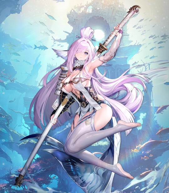
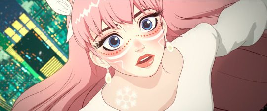
(an example of Bokeh. In addition, the direction in which another character looks shows what our main subject is, who is actually positioned off-center.)
You can also just…fill the space with the subject, as in a close-up of the thing in question. Following the previous butterfly example, it’s like only showing a small part of its wings, enlarged to comparatively huge proportions. This is also seen in portraits and to a lesser extent, similar art like waist-ups.
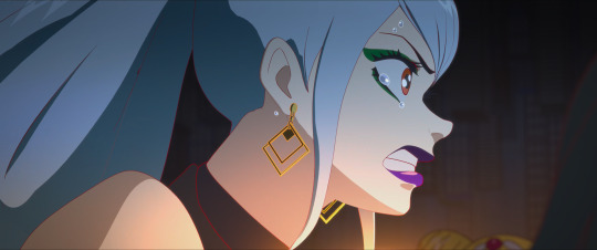
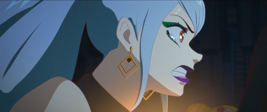
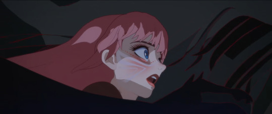
The eye is immediately drawn to what we should look at, which is the character who’s front and center in the image. Secondarily the blood. Her hair also uses the next point below: color.
If you’re working with color, then color is an excellent way to bring the focus to a subject. Bright colors and contrasts can be used, like what’s done here:
The bright red forms a direct contrast to the green that dominates the color pallette. It thus leads the eye to the red areas - aka the blood the character is spilling as well as her face, which is technically a tint of red. The red returning in her eyes which have a small trail, and on her bloodied face, as well as the yellow of her tie, further help to bring focus to her face and her expression. (Other than that, this image also has classic cartoon speed lines, which are minor but do help).
Light is also something I should mention. Using the image from above, the character is actually rushing towards the darker areas of the image. The light is coming from where she seemed to come from, judging by the speed lines and the trail of red we just saw in all its glory. The light forms a line around the subject which keeps said subject’s green uniform from blending into the darkness and the green of the image.
There is a specific technique called chiaroscuro (lit. ‘light-dark’) which is totally a real thing that even old masters like Rembrandt have used to bring focus. The gist of it is that the painting has very bright areas which is the subject, surrounded by dark areas, with not much in between. This technique is often used to make scenes more dramatic, and to immediately show us what the artist wants us to see, without any possible doubt. It’s like putting a spotlight on your head in a dark room. Chiaroscuro is also seen in Limbus:
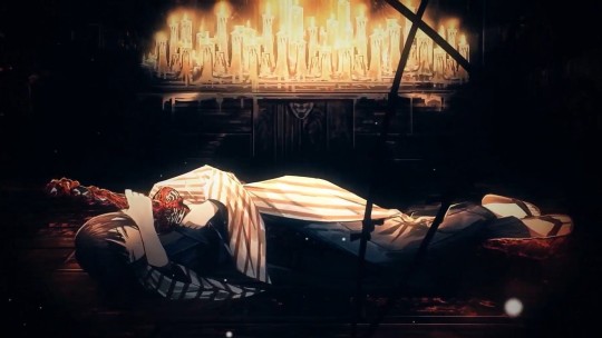
You can’t actually see much of the room our subject is in. The only light is coming from the candles, illuminating the top part of our subject. The other, darker half is much harder to see the details of. This makes it so that the eye is led from either the character towards the source of the light (the candles) or in reverse, both of which are possible and valid because in both cases, we ignore the pitch black part of the artwork.
How to create focus with characters (in specific)
Now, humans and humanoids are fascinating subjects to focus on, because there are so many situations a person can be in, and so much stuff a person can be. Are they the commander of a spaceship? A medieval ruler? An overworked office clerk? There are specific things that more or less pertain to humanoid characters more. I’m going into two aspects, clothing and posing - I’m aware there’s more, but for the sake of making this not longer than it is I’m going into only those two.
1. Clothing
What someone wears makes up a considerable part of how they’re seen and what they are presumed to be. This is also a large part of stereotyping. If you're wearing a t-shirt with pants, sunglasses, and have a camera around your neck, chances are people think you’re a tourist. To them, it likely won’t matter if you are, they will perceive you as one anyway. This is also important here: you might want to pretend you don’t know anything about the portrayed character or show their image to an unknowing friend and see what they think that the character is.
And that brings me to this point that I have seen so many times with female characters: their description/role not directly matching with how they are supposed to look if that were true. I’m talking about the battle-hardened veteran without muscles or scars of both kinds (even if adequate healing/scar removal is available in the setting). I’m talking about the scientist with a leotard under their lab coat. However, I’m not saying they should look a certain way or be the same - that’d be boring - I’m saying that…hey, it might make the viewer not take the character as serious as you want them to be.
The way clothing is built up can also serve as a way to bring focus to a specific aspect. Which will most often be either the boobs or the butt (or both) in the case of female characters. Look at this (non-Project Moon) example.
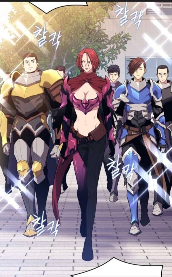
The woman in the front (obviously the focus due to the place she is standing in being squarely in the middle, and her red hair standing out) is the leader of that squad…as well as the strongest in battle. Without any protection of vital organs. With a shape under her boobs that would stab her fatally in the liver if she does as little as bend over.
The way her clothing is built up also brings the focus to her boobs - not only with how they’re prominently on display, but also with the shape the top and the fabric covering her shoulders makes. In a similar vein, her ‘pants’ and the belt all lead the eye downwards to her crotch as well. Furthermore, her thigh highs look skin-tight, bringing secondary focus to her legs, of course.
And last but not least. The guys behind her are actually properly armored from the neck down, making them somewhat more of a homogenous whole… in theory. The different body types, hair, and colors of the armor of the right and left dude make them stand out slightly more, which in turn only accentuates this ridiculous difference.
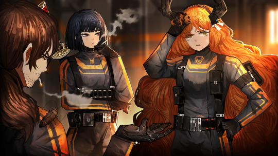
I don’t really have many Project Moon-originating images on hand that are similar to this. Every time we’ve had an ID with a female character being the leader of their group (of which we’ve had surprisingly many, actually - Don has two Section Director IDs to boot) they have usually been posing alone, or well, posing…their full uptie art normally shows a moment when they’re beating their enemy into a pulp instead of posing for the camera like in the above image. This is really consistent with the other half of the playable characters, who are male.
I want to give a special mention to two characters despite that. Faust and Rodion are both known as the more well-endowed characters, but from their IDs and E.G.O it is treated as something that’s there rather than something to be exploited.
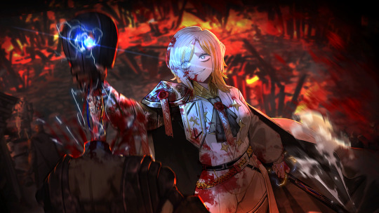
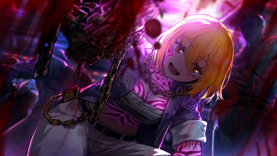
The blue glint is the highlight here, illuminating her blood-stained clothing but also finding its equal in her small, blue eyes. I have found eyes like this and expressions like this to be quite rare on female characters. Just look at her and her face. She’s completely lost it, wrapped in twisted and warped euphoria of the moment of ‘purging’ another ‘heretic’ - and from the looks of it, the last one on the scene. She’s not even trying to clean her own clothing or face, or expose her boobs. That’s not what matters to her image, showing any kind of skin doesn’t add to her character. She’s caught in this violent moment, having her victim completely in her literal grip - not even her eyes are looking at the camera. This image showcases the violent and sadistic nature of the character.

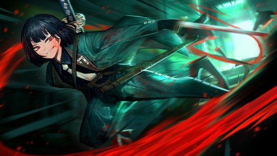
I find this art to be a curious thing. The background is actually rather bright, making the inverse true: the character is dressed in dark clothing, so that’s what the focus is on instead. Her coat flared out in such a way it can almost be mistaken for the underside of her long hair, making her seem even larger (something certain animals use when threatened to scare others into leaving). Her actual figure is thus more obscured, it only being a few tones darker. The thing that keeps her from being a dark blob in the foreground is her sword, large enough to be an odachi. Because she’s unsheathing it, the glint that comes from the blade immediately draws attention - arguably away from her partially unbuttoned top. The animation of this in the game supports this: no boob jiggle, just her standing calmly in the moment she’s just about to unsheathe her sword.
Because I’m going to use this example further in this thing, keep this one on hand.
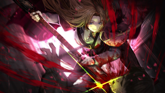
An image that’s again in the middle of the action. Rosespanner Workshop Director Rodion is right now turning an enemy into an unrecognizable stain on the pavement with her huge weapon. The highlight is her weapon again, but this time it actually serves as a secondary source of light, illuminating her face. The yellow coloration of this secondary light source also makes the whole thing more interesting than if it just had the background light that serves a similar purpose as it did in the first image of this post. Even though the image has a heavy pinkish tint, the red that splatters all over the scene is still very much present and they draw the eye back to the yellow light. While her pose is ambiguous, it keeps things vague by not putting any sort of focus on her lower body. In any other piece of media this pose would be viewed from another angle, as to profit from as much of her body’s curves. Not here. Her killing an enemy with visible ease is important. Not her pose. This sounds logical, doesn’t it?
2. Posing
Which brings me to this. The way a character is posed also plays a part in their portrayal. It is possible to accentuate certain body parts with this - like when a character brings their hand to their chin, or the way their legs are posed. No matter the actual scene that’s meant, the way the character is posed is a factor that decides how it’s viewed and where the focus lies. Most often I’ve found this to be when a character is shown wielding a weapon, but their ‘battle pose’ being rather something that accentuates their bare skin, or their little clothing that does the same thing.
Is your character actually showing that they’re dangerous through being shown fighting…or are they just sexily posing with a weapon in their hands to add a sense of ‘danger’? Some can be highly difficult to distinguish. Some CGs can show the middle of the action yet the way the character is posed still brings the focus away from the violence or brings a secondary focus to it. Unfortunately I don’t have examples of those on hand but I know they exist.
A character just posing with a weapon isn’t wrong - I draw that all the time - but when the focus is brought to a character’s boobs and/or butt with the pose the character is in, it will be kind of obvious (even if it isn’t true) that sexualizing those features of the character what the artist is really intending to do instead of showing how dangerous she is with the weapon.
I’m going to use this image from Echocalypse as an example. I regularly take poses like this as a reference point and then attempt to make them more realistic, or, funnily, point out their weirdness by putting a male character in it. Often I do this by using them for a different, more appropriately clothed character. This goes to show that clothing can already decide a lot in posing itself.
This character is posing with a weapon, a…particularly huge odachi in this case (I thought it was a staff at first until I saw the hilt). Which is exactly the same what Rodion is doing up there in the image we already handled. Yet, there are subtle differences between that image and this one, and it’s actually more minor than you think it is (disregarding the thematics of the pieces). Both characters…
are posing with an odachi of similar size (assuming that both characters are of similar height for ease of comparison) as opposed to being locked in battle; theoretically making the focus more on how pretty they look
have long hair (that, minus the bun and the bangs, have a similar cut) that makes their silhouette appear larger than it is
do have a relatively bright and sort-of detailed background going on
have large boobs
are unsheathing their weapon just slightly
However, to get to our first difference, we need to get back to point 1: clothing. Using the same two images, the largest difference is clothing. Kurokumo Rodion is wearing all-black clothing that covers her from the head down except for the unbuttoned top. If I had to describe what the other girl is wearing, I’d say she’s wearing a piece of armor on one of her arms, a flowered collar, thigh highs but no footwear otherwise, and something…obviously lingerie/bikini derived. I’m actually not sure if that’s a tail or part of the clothing.
But to return to our point: posing. The pose of Kurokumo Rodion is actually fairly neutral. She’s just standing there, menacingly! (I should note that their normal character talksprites are also just standing there neutrally) No, literally. Anyone with working legs and arms, can reproduce that. Just give them a sword prop and you’re done. Coat cape optional. The way she is standing does convey some sort of subtle confidence, however, just like the way she is actually looking down (at the viewer). It’s likely you’ll see the sword first for the reasons I mentioned when first discussing the piece above and then look at her from top to bottom as usual.
The way our other girl is posed…is a little harder to replicate in real life to say the least. Not only is this a floating pose (i.e you’d need support), the way her body is bent sharply brings the focus upon her boobs and butt. The human body is actually rather flexible, depending on how you’re built of course, but even so I do doubt whether anyone can do this pose even if they could somehow float in mid-air. Or do this lying down. I (someone with joints that are a little too flexible for my own good) haven’t tried and highkey don’t want to. The thigh and upper leg that is prominently on display, along with the way her body curves leads the eye to her butt or downwards towards her legs and feet.
Her facial expression is neutral, but I get some sort of… ‘dreamy’ vibe from it from the traditional anime-like proportions (huge eyes, tiny nose and mouth). Almost as if she’s doing puppy-eyes to beg for candy or something. It’s, well, what most people call to be a ‘babyface’. Kurokumo Rodion is also in ‘anime-style’ and her facial proportions are still a little bit unrealistic, but I do dare to say they’re more realistic than those of the other girl.
Also, small sidepath. What do you think the second girl is based off? One would judge from her tail that it must be some sort of water creature but whether she’s a shark or any other kind of sea creature isn’t really obvious. Would it surprise you if I told you she’s based on a bake-kujira, a SKELETON-whale (which sounds cool as all hell)? Without any kind of skeleton-parts worked into her design? To be fair, I wouldn’t have guessed it either if it were not for her canonical description.
Also, one last note about that latter image. I think that an odachi of that format would be extremely tricky to unsheathe in such a pose, because of the distance between your arms. Her arm that actually unsheathes the thing is also obviously reaching out, so she’d need more strength to do that than what the look of her arms suggest.
Speaking about arms…
On paper, our Limbus girls would have all the reason to have twig arms. After all, the City allows one to get stronger without visually changing their physique much. One can carry around huge weapons like chainsaws, lances and zweihanders without visible muscles. And yet. And yet.
One of the few times bare arms are seen (most art prefers to cover them up - for Limbus standards, this would be the ultimate fanservice thing), it becomes very clear that they at least have a basic tone. Like, the basicest of basic efforts is done to make them not look malnourished. Even if this girl above is not like, the strongest of the world (for as far as we know...) the muscles she does have are very lovingly shaded and detailed.
To end this, I’ll showcase something one last time with a funny in-game example: Roseate Desire. Roseate Desire is an E.G.O which wraps the wearer in pink ribbons and is highly implied to especially speak to the sin of Lust (which is the affinity of the attack). In the game, this E.G.O is given to two characters, a girl and a guy. In any other gacha game, it would only be given to girls.
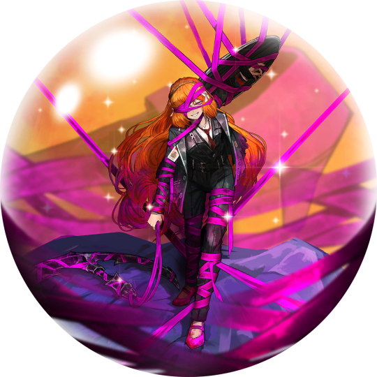
While bent over and with a happy expression, she’s still coming to get you. How can you tell? For one, the huge anchor she has with her is within her hand (i.e opposed to it being tied up next to her or something like that), and the shield that’s tied to her arm. Despite being wrapped up, she does still look as if a portion of her is still in control, and her attack suggests the same.
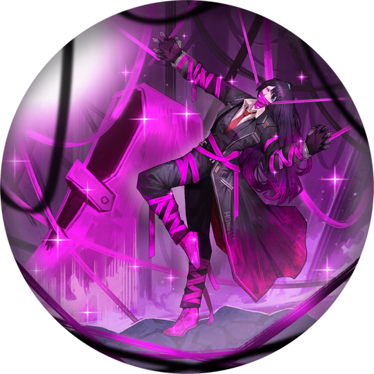
Hong Lu wearing it always makes me grin. He does wear clawed gloves and his fingers are arched, that’s true, but the way he’s strung up like a puppet makes it so that he can’t even get you with those. The manner in which he is posed and his head is tilted is highly reminiscent of how one would pose a marionette. And ingame properly he doesn’t even use these claws in close combat! He wraps up the enemy in the pink ribbons with doll-like movement. Even the way he’s covered evokes a sense of powerlessness, like he’s led on by the ribbons instead of controlling them.
I think this example, along with the others, is implicative of how Project Moon’s visual portrayal of female characters is done so well. They’re equally portrayed as the male characters, if not arguably more powerful, and there’s an equal roster of 6 to 6. They’re not overtly sexualized by bare skin or impossible poses while the men are covered up in a sensible pose. These are characters designed for their personality and role first, not with fanservice or money in mind first. Even the female NPCs fit within this rule, even though they have less art to go from. When you have a game which had 97% completion on the story and a mere 64% on the systems (i.e monetization) it would kind of figure that character designs fall in line with the role the character fulfills, is it not?
244 notes
·
View notes
Text
A Scam... Tutorial?
I was watching Photoshop tutorials and YouTube recommended this video to me.

And I was already skeptical. Clarity is an extremely powerful and useful adjustment in Lightroom and Photoshop and I could not think of a reason why anyone would recommend *not* using it to the extent they were using ALL CAPS.
But I was curious if there was a new technique I was unaware of. It's impossible to know everything regarding Photoshop and I learn new stuff all the time.
So I gave the video a chance.
youtube
To quote my late father... what a crock of shit.
I have seen a few scam videos in my time, but I cannot think of ever seeing a digital art tutorial scam. I found myself angry and a strongly worded comment just flew out of my brain.

I continued...
"First, no one should use clarity and texture at 100%. And I think showing the effects at 100%, as if that is a normal workflow, is highly misleading. You are creating a problem that does not exist and then offering a solution to it. And then you are using a provocative title to attract clicks. Not to mention you may be convincing beginners to abandon clarity and texture altogether when it is one of Camera Raw/Lightroom's most powerful tools. People should absolutely use clarity and texture. That is a crazy thing to tell people.
Second, high pass sharpening is… old school. It works but it can create a lot of nasty artifacts if overdone. (Personally I find it too crunchy and prefer smart sharpen on a smart object so it is non destructive). Clarity and texture are much more modern approaches to help bring out detail and I find they actually produce *fewer* artifacts than typical sharpening filters/techniques. And if you have trouble with clarity or texture adjustments in the bokeh areas, then use a local adjustment that doesn't affect those areas. You can even do a separate clarity and texture layer and use the opacity slider and the blend if and masking just like you did with the high pass. Why are you acting like you can only make a global clarity adjustment?
Essentially you are giving a worst case scenario of a clarity/texture adjustment just so you can make your technique seem like it is orders of magnitude better.
And what is even more infuriating is that you can do clarity/texture AND you can do high pass sharpening *together*. Why are you acting like it is one or the other?
I'm so confused by your motivations. Did you invent this clarity problem just so you could make a click bait-y title so you can then sell your little panel thing? And then you used an old school sharpening technique that many have abandoned so it seems like you have secret knowledge that was lost? And I could argue it isn't even a better solution. It's just a different way to achieve similar, if not worse results.
This is like if you put a pound of sugar in lemonade and then said, "Wow, this is way too sweet! You should try my superior lemonade that has a normal amount of high fructose corn syrup."
Lastly, if clarity and texture (set at a reasonable amount) aren't enough to produce sharp, detailed results, then it might be worth considering your actual photography techniques. Modern photography with modern sensors and lenses should be able to produce extremely sharp results without having to juice the hell out of sharpening filters in software. 20% clarity and texture (if that) plus a little bit of smart sharpen is usually more than enough to bring out detail in almost all of my photos and I have never been accused of having soft images.
So, if you are getting soft results, you might need to adjust how you are capturing your images. Are you using a very small aperture like f/22 on that macro image? That could be a diffraction issue. Perhaps it would be better to use a larger aperture at the lens's sweet spot and then do a focus stack.
I mean, I can't think of any other reason a person would need to do 100% clarity and texture unless they completely bungled the actual photography or were still using a kit lens.
I'm sorry but this video is a mess."
Let's look a little closer at what he did to his example.
He started with this.

Then he applied clarity & texture to MAXIMUM. Which, again, is like adding a pound of sugar to lemonade.
And by golly, it looks pretty bad!
Then he used his secret ancient high pass technique to get this.
Which looks a hell of a lot like the unsharpened image to me. And the high pass sharpening is probably only visible when zoomed in to 100% on the full resolution image.
Which is one of the issues with this technique. It isn't even noticeable on social media—the place where the majority of photos are viewed these days.
And then after showing you this groundbreaking effect that does almost nothing, he tries to sell you his Photoshop panel.

Yes, that' looks intuitive. Just hit the blue checkmark to do... something?
And what is this green eyeball with a crescent moon inside?

Only $50!

And if you want to know what the purple X button does, you need to pay another $15 for the tutorial on how to use it.

Neat.
Just to prove this is all a scam I'd like to show you an example of my own.
Here is a picture of Otis with no clarity, texture, or sharpening applied.
And here is a reasonable amount of sugar. I set the clarity and texture to where I felt they looked best.
Wow, that looks better. Not only that, you can actually see the difference at social media resolutions!
Now let's add a pound of sugar. MAXIMUM CLARITY GO!
Yep, that looks a bit rough. Because no one does this ever.
And now let's see his high pass sharpening technique.
Barely a difference on social media.
Okay, let's try zooming in 200%. Maybe that will give the high pass sharpening the victory.
Normal...

Reasonable clarity & texture...
FULL BEANS CLARITY & TEXTURE!
High pass...

Just as I said, the high pass introduces crunchy sharpening artifacts.
I can't speak for anyone else, but I much prefer the subtle clarity and texture. Perhaps the details in the eyeballs aren't quite as crispy, but in the version that isn't zoomed in, I don't think you feel like the image is soft and the normal clarity and texture adjustment added contrast and actually noticeable detail to the image.
In the end, except for the pound of sugar, these are all subtle adjustments and other photographers might be the only ones who would ever notice. The original Otis picture was probably fine to most people. So disparaging the clarity slider was even more unnecessary.
Why does this matter?
Being a beginner at photography is frustrating. There are so many resources to choose from and it's very difficult to know who is competent and who you can trust. If someone just starting out was recommended this video they could be easily be convinced it is legit. And it could set them back in their progress because they think useful tools will actually make their photos worse. They will waste a lot of time doing a time consuming old school technique in Photoshop when they probably never needed to even leave Lightroom in the first place. They could move two sliders to get similar or better results and it would only take literal seconds.
Time is valuable to a lot of people. And he seems intent on wasting everyone's time. And what sucks is that I have no real way of exposing this dude on a scale that would do anything.
I also just really hate the idea that educational content is being used to scam people.
This is some PragerU shit right here.
68 notes
·
View notes
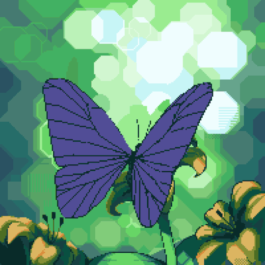
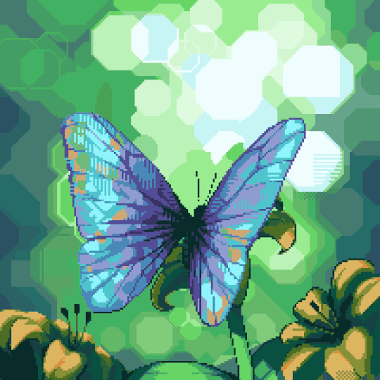
Text
Process breakdown #1
Here is a breakdown of the butterfly animation. This was originally posted as a twitter thread, but a real blog post seems to be a much better format for it.
Step 1: Static Drawing
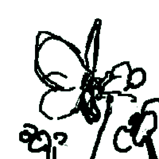
I've long wanted to experiment with Bokeh effect in pixel art as a way to avoid drawing background. It ended up being a lot more challenging than just a normal background 😂. Still an interesting experiment nonetheless and I might use it for some other stuff in the future.
Step 2: Rough Animation
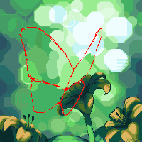
I traced the static drawing with a contrasting colour, then roughly sketched the other frames. Seeing it in motion made it clear to me that the form was very obviously incorrect, but I thought I'd adjust as I go.
Step 3: Refined Animation
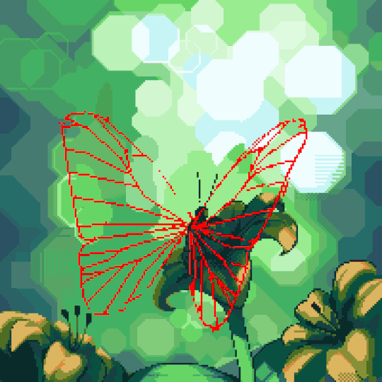
Before I got to this point, I naively tried to put in the colour. I quickly realized making the "veins" look consistent would be very hard without guides. So I looked up pictures of actual Morpho butterflies to study the wings in detail. Also made the shapes (mostly) correct and doubled the frame count once I was happy with the shapes.
Step 4: Colours
This was the most fun part. I conceptualized the wings as two blue tinted, matte, textured mirrors rotating in 3D space. When two mirrors come together, they start reflecting each other. The closer they get, the less the lighting from the surrounding world contribute to the colours you see. Eventually, nearly no light from the outside world make into the gap and all you see is dark blue/black.
It started looking almost like mirrors as I figured out the rough movements of the reflections; then a shimmering mess of colours as I threw in more details from the static drawing. The key trick to making the complex colours look consistent was to pay attention to every "partition" of the wings to make sure the dark colours creep in and out smoothly.
I also gradually filled in the eye spots and details on the backside of the wings, not sure if many people noticed them but I was pretty happy with how they looked.
Step 5: Shadow
A big part of realism comes from how a moving object affects the lighting around it. In this case: the shadow on the flower. This is a rough version of the shadows as I worked on it. Wasn't too concerned about making it look 100% correct, since the wings probably catch all the attention anyway.
Step 6: Final Touches
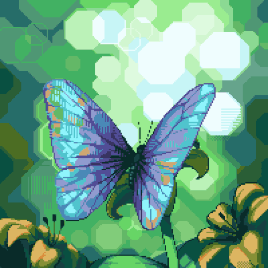
I spaced out the movements so it didn't feel quite so frantic. Instead of using the last frame as the resting frame, I used the second last, and only briefly showed the last frame at the begging and end of the motion to add a bit of realism (although in reality, butterfly wings probably don't have enough mass for that to happen, but hey, 🤷♀️).
Also spent some time to reduce the palette down by merging similar looking colours. Also reused the darker, subtler yellow in the background to create the illusion of more flowers out of focus.
275 notes
·
View notes
Text

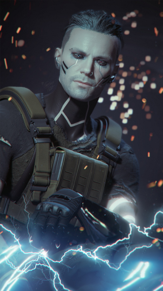
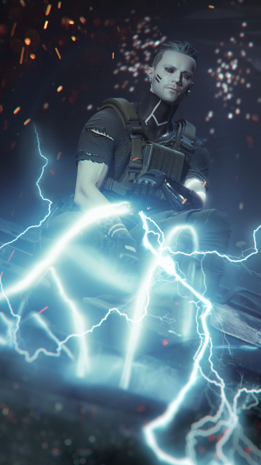
[NC_RES]-13062047-EUR-BU-NED de_wit_m_portraits_030_1_MM_DT_PCFA.file ///core:_thyjs_de_wit.file\\\
—
⚠️ READ: Please do not repost/reupload any of my art here or to any other platform nor for ai, or I will be forced to do anything to get it annihilated.
"Een Militech Chimera is voor mij geen probleem." — Thyjs
I've been working on this approximately a month as I was uncertain how I want it to be in the end. The shots are from November 2023 when I was in my focused game play bringing Thyjs into Dogtown.
I loved the scenery after the Chimera is slayn already when I went through with Arki in my first playthrough but with Thyjs I wanted to take some special pics, thinking he's super good in exterminating a Militech Chimera. So I placed him onto it after the machine got slayn and thought why not make Thyjs pull the last remaining energy left of that big machine to load his cybernetic arm up with energy again when that big fight was over.
I love the tiny electricity effects and even spawned some more but it wasn't sadly enough so I was forced to add more later in post processing with lightning brushes. I've spend an immense time on getting the lightning to look good enough and probably worked on this set (and another I'll post later) over a month after work until I was finally satisfied.
The the idea stroke me to add more: bokeh, fire, dust, make all a bit blurry and well that's the result. This has been sitting in my drafts since more than a month as I always try to figure out when to post best, but there is no best time, so if you read and see this: I eventually managed to hit that button.
This is the first time I can actually really show what Thyjs is able to do. That electricity he can use is insane. I wish it was able to play like that ingame.
#cyberpunk 2077#oc: thyjs de wit#masc v#male v#male v monday#soldier character#ex militech#militech#militech chimera#lightning#electricity#cyberpunk photomode#cyberpunk oc#original character#virtual photography#cyberpunk 2077 screenshots#electro
113 notes
·
View notes
Text
Yvette Heiser - How Mastering Photography Fundamentals Can Improve Your Night-Time Food Shots
Night-time food photography presents both challenges and opportunities for photographers looking to capture the delicious allure of culinary creations. With low light conditions and the need for effective composition, mastering the fundamentals of photography becomes essential. Yvette Heiser - Mastering Night-time Food Photography provides valuable tips and techniques for overcoming these challenges and capturing stunning food shots even in the darkest settings.

Understanding the Importance of Photography Fundamentals
Photography fundamentals encompass essential concepts such as exposure, composition, lighting, and focus. By mastering these foundational elements, photographers can effectively capture the essence of their subjects—especially in challenging conditions like nighttime settings. Yvette Heiser - Click with Confidence: Mastering Photography Fundamentals offers valuable insights into these core principles, helping photographers build a solid foundation for capturing stunning images in any environment.
1. Exposure: Balancing Light and Darkness
Exposure refers to the amount of light that reaches your camera sensor, affecting how bright or dark your image appears. In night-time food photography, achieving the right exposure is crucial to highlight details while avoiding overly dark or washed-out images.
Key Tips for Managing Exposure:
Use a Wide Aperture: A wide aperture (e.g., f/2.8 or f/4) allows more light to enter the camera, making it easier to shoot in low-light conditions. This also creates a beautiful background blur (bokeh) that emphasizes your subject.
Adjust ISO Settings: Increasing your ISO sensitivity can help capture images in low light. However, be cautious—higher ISO settings can introduce noise. Aim for the lowest ISO that allows you to achieve a properly exposed image.
Utilize Longer Shutter Speeds: Slowing down your shutter speed allows more light to hit the sensor. Use a tripod to stabilize your camera during longer exposures, preventing motion blur.
2. Lighting: Creating Atmosphere and Mood
Effective lighting is crucial in night-time photography, as it sets the mood and enhances the visual appeal of your food shots. Natural light may be limited, so understanding how to manipulate artificial light sources is essential.
Lighting Techniques for Night-Time Food Photography:
Use Soft Light: Soft, diffused lighting is ideal for food photography. Consider using softboxes or LED lights with diffusers to create even lighting without harsh shadows.
Incorporate Ambient Light: Utilize available ambient light sources—such as candles, string lights, or lamps—to create a warm and inviting atmosphere. Experiment with different angles to see how the light interacts with your subject.
Control Shadows: Be mindful of shadows in your composition. Use reflectors (like white foam boards) to bounce light onto darker areas, ensuring your food remains enticing and well-lit.
3. Composition: Framing Your Subject
Composition is the art of positioning elements within your frame to craft a visually engaging and harmonious photograph. Effective composition can draw attention to the food while providing context about the setting.
Tips for Strong Composition in Night-Time Food Photography:
Rule of Thirds: Use the rule of thirds by dividing your frame into a 3x3 grid. Place your main subject along these lines or at their intersections to create balance and interest.
Frames Within Frames: Use elements in your environment (like plates or utensils) to create frames within your composition. This technique adds depth and guides the viewer’s eye toward the main subject.
Negative Space: Incorporate negative space around your food subject to emphasize it further. This technique helps prevent clutter and allows viewers to focus on the dish itself.
4. Focus: Sharpening Your Subject
Achieving sharp focus on your culinary subject is vital in food photography. In low-light conditions, it can be challenging to maintain focus, but mastering this skill will elevate your night-time shots.
Focus Techniques for Crisp Images:
Manual Focus: In low-light situations, autofocus may struggle. Switch to manual focus to ensure precise control over which elements are sharp in your image.
Use a Tripod: A tripod stabilizes your camera and helps achieve sharper images, especially when using slower shutter speeds. This is particularly useful for night-time photography where motion blur can easily occur.
Focus on Key Details: Highlight specific features of the dish—such as texture or garnishes—by focusing closely on those areas. This adds visual interest and draws attention to the quality of the food.
Mastering photography fundamentals is essential for anyone looking to improve their night-time food shots. By understanding exposure, lighting, composition, and focus, photographers can create stunning images that showcase their culinary creations in the best possible light. With practice and experimentation, you’ll find that these fundamental skills not only enhance your night-time photography but also enrich your overall photographic journey. So grab your camera, experiment with these techniques, and watch as your night-time food photography transforms into mouthwatering works of art!
#wedding#pictures#camera#moments#photographytips#photographer#photography#childphotography#yvette heiser#events
6 notes
·
View notes
Text
LensCraft Mastery: Elevate Your Photography Skills to the Next Level

Photography is more than just pressing a button; it’s an art, a science, and a means of storytelling. LensCraft Mastery is a comprehensive guide designed to help photographers—whether beginners or seasoned professionals—unlock their full creative potential. This tutorial series delves into the intricate aspects of photography, from mastering the fundamentals of exposure and composition to exploring advanced techniques in lighting, post-processing, and storytelling through imagery.
Why LensCraft Mastery?
The name LensCraft Mastery symbolizes the fusion of technical expertise (Lens) with artistic craftsmanship (Craft). Photography is both a technical discipline and an expressive medium, requiring a balance between understanding camera mechanics and developing an artistic vision. This tutorial series aims to bridge that gap by offering structured, easy-to-follow lessons that cater to all levels of experience.
1. Mastering the Basics of Photography
For those new to photography, LensCraft Mastery begins with the fundamental concepts that form the backbone of great photography:
Exposure Triangle: The Key to Perfectly Lit Photos
Aperture: Understanding how f-stops affect depth of field and light intake.
Shutter Speed: Capturing motion creatively, from freezing action to long exposures.
ISO: Controlling sensor sensitivity for optimal brightness without excessive noise.
Composition Techniques: Crafting Visually Stunning Images
Rule of Thirds: Placing subjects strategically for balanced compositions.
Leading Lines: Drawing the viewer’s eye to the subject.
Framing & Negative Space: Enhancing depth and focus in a photograph.
2. Advanced Photography Techniques
Once the basics are mastered, LensCraft Mastery delves into techniques that can take your photography to a professional level.
Understanding Light & Shadows
The role of natural light vs. artificial lighting in photography.
How to use soft light for flattering portraits and harsh light for dramatic effects.
Mastering golden hour and blue hour photography.
Camera Settings & Manual Mode
How to use manual focus for precision.
Customizing white balance for accurate color reproduction.
Shooting in RAW vs. JPEG and when to use each format.
3. Specialized Photography Genres
Photography is a vast field, and LensCraft Mastery explores different genres, allowing photographers to find their niche.
Portrait Photography
How to pose subjects naturally for candid and professional shots.
Best lenses for portrait photography (prime vs. zoom).
Background blur (bokeh) techniques for dreamy aesthetics.
Landscape Photography
Composition techniques for breathtaking vistas.
Use of ND (neutral density) filters for long exposures.
How to capture the perfect sunrise and sunset.
Street Photography
Capturing the essence of everyday life.
Ethical considerations in photographing strangers.
How to blend into the scene for natural compositions.
Wildlife & Macro Photography
Tips for photographing animals in motion.
Choosing the best gear for close-up macro shots.
Patience and planning for capturing rare moments.
4. The Power of Post-Processing
A great photo doesn’t always end with the camera—post-processing is essential for refining images. LensCraft Mastery provides in-depth tutorials on:
Adobe Lightroom & Photoshop Editing
Adjusting exposure, contrast, and white balance for balanced images.
Retouching techniques for portraits and landscapes.
Removing unwanted elements and enhancing details.
Mobile Editing for On-the-Go Photography
Best apps for editing (Snapseed, VSCO, Lightroom Mobile).
Color grading techniques for a unique aesthetic.
Quick retouching methods for social media-ready images.
5. Developing a Photographer’s Mindset
Photography is more than just technical skill—it requires creativity, patience, and an eye for detail. LensCraft Mastery helps photographers develop a storytelling approach, teaching how to:
Capture emotions and narratives within a single frame.
Use minimalism and abstract photography to create intriguing images.
Experiment with angles and perspectives to bring a fresh outlook to everyday scenes.
6. Monetizing Your Photography Skills
For those looking to turn their passion into a profession, LensCraft Mastery includes insights on:
How to start a photography business and build a portfolio.
Selling photos online (stock photography, prints, NFTs).
Social media strategies to grow an audience and attract clients.
Final Thoughts
Whether you’re just starting or looking to refine your craft, LensCraft Mastery offers a structured, engaging, and practical way to enhance your photography skills. By blending technical knowledge, artistic creativity, and real-world applications, this tutorial series is designed to empower photographers at every stage of their journey.
Start mastering your craft today and turn your vision into reality—one frame at a time. 📸✨
2 notes
·
View notes
Text
Art Fight Attack #13
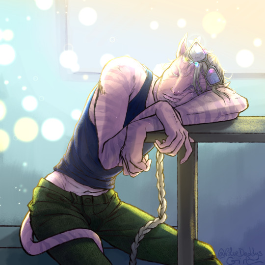
Dr. Matias is a much beloved OC who belongs to @exxorcius but has also captured my heart.
This is my last Artfight entry!
The morning light catches in a fancy bokeh behind him, refracting in his glasses... But overworked Matias is completely out of it. Bonus exposed belly for people who couldn't resist tugging on his shirt to cover it, and those who'd come in for a poke.
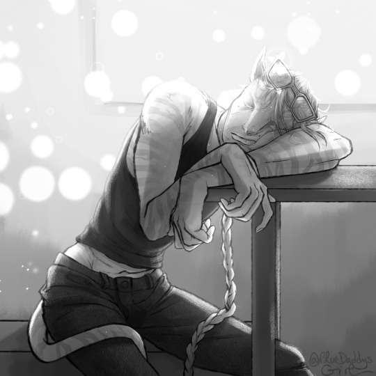

B&W, lineart, no effect and without glasses...
#dr matias#fanart#artfight#artfight 2023#avatar#avatar 2#recombinant#recom#friendsoc#not my oc#my art#albino character#atwow#artfight attack#artfight werewolves
20 notes
·
View notes
Text
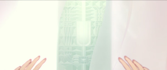
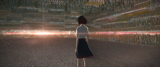
I have a Belle brainrot so have me rambling about differences between trailers and final version of the move, from scenes shot differently, to literal slight lighting changes (part 2 baby)
Release -> Trailer :]
continuing in no particular order:
tears moved and maybe changed from 3d to drawn on. added some shadows and light
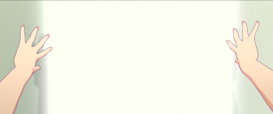
hands were more outlined
the scene of belle opening the door to U for the first time, in the trailer is spliced with the scene of opening the door when Beast's castle is attacked. When she first opens the door, we never actually see her hands as it cuts to her face

see? trailer just had the castle whited out. thumb is positioned slightly differently. a lot brighter too

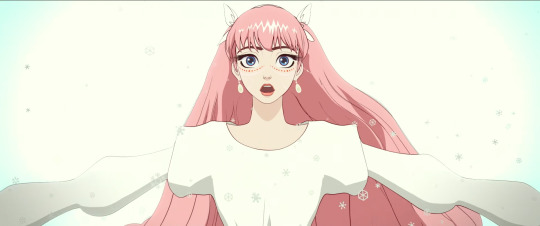
they fucking forgot her body blush in the trailer??? this is the same frame as the snowflakes match up btw. hair has a few more details in the trailer, as well as her eyelashes being flatter. different hair shine. her right hair bow was fixed to be pointier

same scene but a few seconds later, you can see how her hair is positioned differently and the above things
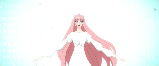
idk why the trailer is so yellow tinted btw it's just like that

hair has a looot more details. this shot was used in marketing so maybe they wanted to glam it up to be prettier. hairshine was moved down
I'm not sure if the hair details are draw on, or done on the model itself. both are possible
forgot to turn off the captions sorry. bangs are now thinner in places, sleeve covers more of the hand, hairshine moved, the hairclip on the right was moved closer to her face

font on the English comment(?) was changed. messages got a more spread out and bigger

i fucking knew that U was modeled differently. i fucking knew it
U has a lot less modules which makes the sky more visible :]

shadows were fixed to look better. I think they mentioned they used a special texture they applied to her model to make the desired effect which is cool
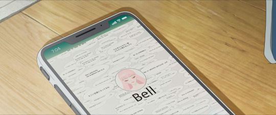
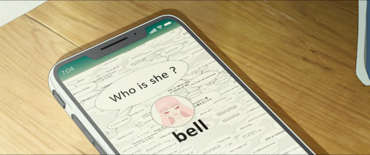
shot of the phone from the beginning of the movie. font used is different and slimmer. UI is bigger. Comments are moved around to different places, no big "Who is she?" comment. Whatever that is in the top left corner was finished for the final

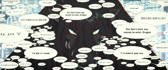
this shot of users commenting on Dragon, lot more comments added, they're also smaller. English comments were changed to Japanese. The art is a lot more zoomed in to focus on his eyes

now this shot is only in the youtube version of the trailers and it doesn't match any shot of the final movie, the closest being on the right
U looks modeled differently but just use your eyes for this one
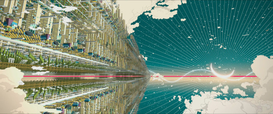
The sky was given different clouds and the moon was slightly turned and put in front of the red equator line
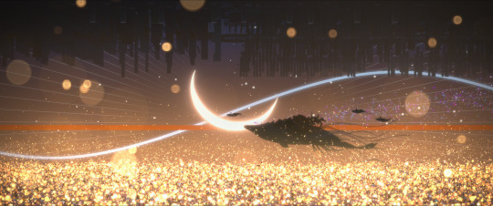

ok last one! also only on the youtube trailer. Sea of sparkles instead of bokeh lights! super pretty! moon was moved down, and if you look closely, you can see that Belle's flowers were visible on the whale's side
there's actually a textless version of the image in high quality, it seem it was originally posted by Ludvig Forssell on Twitter, but the earliest I can find is here but in low quality.

5 notes
·
View notes
Text
30 Tutorials for Creating Stunning Photo Effects in Photoshop – Speckyboy
New Post has been published on https://thedigitalinsider.com/30-tutorials-for-creating-stunning-photo-effects-in-photoshop-speckyboy/
30 Tutorials for Creating Stunning Photo Effects in Photoshop – Speckyboy
Photoshop is a powerful tool for creating a range of stunning photo effects that can take your images to the next level. With the help of these tutorials, you will learn how to recreate various effects, including glitch, sepia tone, watercolor, tilt-shift, HDR, cinematic, bokeh, sketch, and many more.
By mastering these techniques, you can add an artistic touch to your photos and make them truly memorable. Whether you’re a professional photographer, graphic designer, or just someone looking to improve their photo editing skills, learning how to create these photo effects in Photoshop can be a valuable asset.
Exploring the world of Photoshops and experimenting with different photo effects can be a lot of fun. With a bit of practice and creativity, you will soon be creating stunning results that are sure to impress.
So why not start learning to recreate these photo effects in Photoshop today? With dedication and a little time, you can become a master of photo editing in Photoshop in no time.
If you prefer a different application, we also have collections of tutorials for Lightroom, Procreate, and Figma.
The Top Photo Effect Photoshop Tutorials
Analog Effect in Photoshop
The analog photography effect mimics the look and feel of old film photographs. This aesthetic can be achieved by adding grain, light leaks, and desaturated colors in Photoshop. This tutorial takes you through the steps to re-create the effect, giving your photos a nostalgic charm and artistic touch.
Analog Effect Photoshop Action
Black & White Conversion Effect in Photoshop
The black and white photography effect is a classic style that emphasizes contrast and texture, creating a timeless and elegant look. This Photoshop video tutorial will teach you how to create stunning black and white images in Photoshop.
Black & White Effect Photoshop Actions
Bokeh Effect in Photoshop
Bokeh is a photography technique that creates a blur in the background of a photo, emphasizing the subject and adding a dreamy, romantic feel. This Photoshop tutorial will guide you through the steps to add the bokeh effect to your photos.
Bokeh Effect Photoshop Actions
Cinematic Effect in Photoshop
The cinematic photography effect is a dramatic and moody style that mimics the look and feel of movie stills, with deep shadows, rich colors, and a cinematic aspect ratio. This tutorial will show you how to re-create the cinematic effect, giving your photos a professional and cinematic flair.
Cinematic Effect Photoshop Actions
Color Grading Effect in Photoshop
Color grading involves adjusting the colors in a photo to create a specific mood or atmosphere. Using Curves and Hue/Saturation adjustments, this Photoshop tutorial takes you through the steps of adding stunning color grading effects to your photos.
Color Grading Effect Photoshop Actions
Comic Effect in Photoshop
The comic effect is a fun and playful style that mimics the look and feel of comic book illustrations, with bold outlines, vibrant colors, and halftone patterns. This Photoshop video tutorial will teach you how to create stunning comic effects, giving your photos a creative and whimsical vibe.
Comic Effect Photoshop Actions
Cross-Processing Effect in Photoshop
Cross-Processing is a photography technique that involves developing film in the wrong chemicals to create unexpected and artistic color shifts. This Photoshop tutorial will take you through the steps to add cross-processing effects to your photos, giving them a retro feel.
Cross-Processing Photoshop Actions
Dispersion Effect in Photoshop
The Dispersion effect is a creative and dynamic style that creates the illusion of a shattered or fragmented subject, with particles or fragments dispersed across the photo. This effect can be achieved in Photoshop using various tools, such as the Liquify filter and layer masks. This tutorial will show you how.
Dispersion Effect Photoshop Actions
Double Exposure Effect in Photoshop
The Double Exposure effect blends two or more images together, creating a dreamy and surreal composition. Using layer masks and blend modes, this tutorial guides you through the process of creating stunning double exposure effects in Photoshop.
Double Exposure Effect Photoshop Actions
Duotone Effect in Photoshop
The Duotone effect is a creative technique that uses two contrasting colors to create a bold and striking final image. It is often created using gradient maps, curves, and color balance in Photoshop. This tutorial will show you how to add this unique effect to your photos.
Duotone Effect Photoshop Actions
Glitch Effect in Photoshop
The Glitch effect mimics the look of digital errors and glitches, creating a distorted and fragmented image. This Photoshop video tutorial will show you how to create fantastic glitch effects, allowing you to add an edgy vibe to your photos.
Glitch Effect Photoshop Actions
Grain Effect in Photoshop
The Grain effect is a timeless technique that adds a film-like texture and grain to digital images, creating a vintage and nostalgic look. This Photoshop tutorial will take you through the steps to re-create the effect in your photos.
Grain Effect Photoshop Actions
Grunge Effect in Photoshop
The Grunge effect is an edgy style that creates a raw and distressed look in photos, often with scratches, stains, and grungy textures. This effect can be easily achieved in Photoshop, using various techniques like brushes, textures, and blend modes.
Grunge Effect Photoshop Actions
HDR Effect in Photoshop
The HDR (High Dynamic Range) photography effect is a popular technique that combines multiple exposures to create a more detailed and dynamic image. This tutorial guides you through the steps to create the HDR effect using Photoshop tools like merging and tone mapping.
HDR Effect Photoshop Actions
High Contrast Effect in Photoshop
The High Contrast effect is a striking style that emphasizes the difference between dark and light areas in a photo. Photoshop can achieve this effect using various adjustments, such as levels and curves, and this tutorial will show you how.
High Contrast Effect Photoshop Actions
Infrared Effect in Photoshop
Infrared photography is a surreal style that creates a false-color effect in photos. Using channel swapping and color balance, this Photoshop tutorial guides you through the process of re-creating the effect.
Infrared Effect Photoshop Actions
Lens Flare Effect in Photoshop
The Lens Flare effect is a dynamic technique that adds a burst of light to an image, often simulating the look of the sun or other light sources. Learn how to add lens flares to your photos in this Photoshop tutorial, giving you a dramatic and cinematic touch.
Lens Flare Effect Photoshop Overlays
Light Leak Effect in Photoshop
The light leak effect simulates the look of light leaking into a camera, creating a dreamy and, at times, nostalgic look. This easy-to-follow Photoshop tutorial will show you how to add stunning light leaks to your photos.
Light Leak Effect Photoshop Overlays
Lomo Effect in Photoshop
The Lomo (Lomography) effect is a creative photography technique that mimics the look of photos taken with a Lomo camera, with bold colors, high contrast, and vignetting. This Photoshop tutorial will guide you through creating your own Lomo effects.
Lomo Effect Photoshop Actions
Motion Blur Effect in Photoshop
The Motion Blur effect is a popular technique used to convey motion and speed by blurring moving objects. This Photoshop video tutorial will show you how to create stunning motion blur effects in your photos, adding a sense of dynamism and energy.
Motion Blur Effect Photoshop Actions
Oil Painting Effect in Photoshop
The oil painting effect is an artistic photography style that mimics oil paintings by applying filters to a photo giving it a textured, brushstroke look and feel. This Photoshop video tutorial will show you how to do it yourself.
Oil Painting Effect Photoshop Actions
Posterize Effect in Photoshop
Posterize is a photography effect that reduces the number of colors in an image, creating a bold and simplified look to create a poster-like appearance. Learn how to create stunning posterize effects in this Photoshop tutorial.
Posterize Effect Photoshop Actions
Selective Color Effect in Photoshop
The selective color effect allows you to highlight or change the colors of specific parts of an image and convert the rest to black and white (or desaturated). This Photoshop video tutorial will show you how to create your own selective color effects.
Selective Color Effect Photoshop Actions
Sepia Tone Effect in Photoshop
The sepia tone effect is a photography technique that adds a warm and vintage look to digital images, giving them an aged, antique look. This Photoshop tutorial will take you through the steps to add sepia tones to your own shots.
Sepia Tone Effect Photoshop Actions
Sketch Effect in Photoshop
The Sketch effect is an artistic technique that mimics the look of a hand-drawn sketch, with lines, strokes, and shading. Following this sketch effect Photoshop tutorial, you can add a personal touch to your photos.
Sketch Effect Photoshop Actions
Solarize Effect in Photoshop
The Solarize effect converts the colors in a photo to create a high-contrast, surreal effect. This video tutorial will show you how to add this unique and bold effect to your photos.
Solarize Effect Photoshop Actions
Tilt-Shift Effect in Photoshop
The tilt-shift effect is a creative photography style that simulates the look of a miniature world by blurring parts of an image. This easy-to-follow Photoshop tutorial will show you how to add the effect to your photos.
Tilt-Shift Effect Photoshop Actions
Vintage & Retro Effects in Photoshop
Vintage and retro effects are a timeless photography style that adds a nostalgic and old-fashioned look to digital images. This Photoshop video tutorial will guide you through the steps so that you can add your own vintage and retro style to your photos.
Vintage & Retro Effect Photoshop Actions
Vignette Effect in Photoshop
The Vignette effect is a versatile technique that’s achieved by darkening the edges of a photo to draw attention to the center. This Photoshop tutorial will take you through the steps to create your own vignettes.
Vignette Effect Photoshop Actions
Watercolor Effect in Photoshop
The watercolor effect is an artistic technique that mimics the look and feel of watercolor paintings, with soft colors, blurred edges, and brush strokes. This Photoshop tutorial will guide you through creating your own watercolor effects.
Watercolor Effect Photoshop Actions
Photo Effect Tutorial FAQs
What are photo effect Photoshop tutorials?
These tutorials guide you through various techniques to apply creative and artistic effects to photos using Photoshop. They range from basic editing to advanced manipulation.
Can beginners use these photo effect tutorials effectively?
Absolutely! Most tutorials are tailored for beginners, breaking down complex effects into simple steps. As skills develop, more advanced tutorials can be tackled.
What kinds of effects can I learn from these tutorials?
You can learn a wide array of effects, like turning photos into paintings, creating vintage looks, adding dramatic lighting effects, and much more.
Do I need the newest version of Photoshop to follow these tutorials?
While some may use newer features, many tutorials are applicable to older versions of Photoshop as they rely on fundamental tools and techniques.
How long does it usually take to complete one of these tutorials?
It varies based on the complexity of the photo effect. Some can be completed in minutes, while others might take longer to fully grasp and apply.
Can practicing these tutorials improve my overall Photoshop skills?
Yes, working through these tutorials not only teaches specific effects but also improves your overall understanding and proficiency in Photoshop.
Learning New Photo Effects
Learning new effects in Photoshop is not only fun but can also be a valuable skill. By mastering the art of photo editing, you can offer your clients unique and visually stunning imagery that will set you apart from the competition.
By diving into these photo effect tutorials, you will, of course, learn valuable new skills, but you will undoubtedly unleash your creativity as well!
More Photoshop Tutorial Collections
Related Topics
#ADD#amp#analog#Art#atmosphere#attention#background#blur#Bokeh Effect#book#change#channel#chemicals#Collections#Color#colors#competition#complexity#Composition#course#creativity#Dark#Design#Difference Between#diving#do it yourself#double#Duotone Effect#easy#Editing
0 notes
Text
Celestial Blooms: Orange & Blue Surreal Bouquet Neck Tie

A vibrant spherical bouquet of overlapping orange and blue flowers glows softly against a dreamy abstract backdrop. Delicate translucent petals and painterly stems blend into swirling cobalt and golden bokeh, creating bold contrasts and an ethereal, otherworldly mood. Perfect for lovers of surreal botanical art and magical realism.
#necktie#surreal floral art#abstract botanical illustration#vibrant orange blue bouquet#ethereal flower design#magical realism art#painterly botanical composition#dreamy bokeh background#celestial wall decor#glowing translucent petals#warm cool tone contrast#organic abstract art#whimsical home decor#artistic flower arrangement#chromatic aberration effect#mystical garden aesthetic
0 notes