#Bootstrap Grid
Explore tagged Tumblr posts
Visit Tumblr Blog
Explore Tumblr blogs with no restrictions, modern design and the best experience.
Last Seen Tumblr Blogs


Fun Fact
Tumblr’s reach among the 26-to-35-year-olds in the US is 11%.
Text
What is a Bootstrap Grid and How Does It Work?
Web design has truly advanced since the early, basic days of static websites. Now, it’s all about reaching people on any device they use – whether it’s their phone, tablet, laptop, or desktop, each with its own screen size and display. A good website today needs to be responsive, meaning it cleverly changes its look to fit any screen perfectly, without making it hard to read or use. To make a…
0 notes
Text
Premium Bootstrap Portfolio Grid Section Kits

Enhance your portfolio with Premium Bootstrap Portfolio Grid Section Kits by DesignToCodes. These sections showcase your projects in a clean, modern layout, making your work stand out. They are perfect for creatives looking for a professional touch.
Visit: https://designtocodes.com/product/premium-bootstrap-portfolio-grid-section-kits/
1 note
·
View note
Text
oh css grid, i hate you, oh so much
0 notes
Text
In Vue.js, scoped styles are a feature that allows you to apply styles to a specific component without affecting the styles of other components. This is achieved by adding the scoped attribute to the <style> tag within a Vue component file. Here's how you can use scoped styles in Vue.js
#vuejs#vue js 3#vue js grid#vue js website#vue js frontend#vue 2#vue js bootstrap#vue 3 js#vue js#vue router#stackoverflow#web design#web dev#web development#website#programming#backedn#backend eng#tech#technology#engineering
0 notes
Text
Frederick Sinclair is a really interesting foil to Mr. House. I mean you start digging into this and it's just parallel after parallel after parallel. Start at the high level. House sinks inordinate amounts of resources into saving the city of Las Vegas - not the people, but the city- from nuclear destruction; as long as the stage endures, he can get anyone to wear the costumes. Sinclair sets up an entirely new "community" totally off-the-grid for the sake of protecting one woman, plasters that place with her likeness. House is a visionary with a 200-year action plan to rebuild society in his image, bootstrap space exploration, and construct an interplanetary empire; Sinclair sank everything he had into building the most secure facility possible for a woman who he knew was terminally ill anyway, just to ensure that her last few years lived in the aftermath of the nuclear apocalypse would be as comfortable as possible- there's a fundamental pessimism baked into what he was doing. Both House and Sinclair relied heavily on automated defensive systems and cutting-edge, esoteric technologies to accomplish their ends, but House built his power base on proprietary robotics and computing technology, much of which he personally designed- an outgrowth of his policy of never widening his circle any more than he absolutely has to. Sinclair, in his naive techno-optimism, outsourced his utopia, grabbing flashy third-party technologies like a kid in a candy store- opening a backdoor for the Think Tank to poison his city and ultimately getting everyone at the Gala Event killed when the holograms malfunctioned and went berserk.
Their management styles are inverse. House allows countless abuses to occur under his aegis because he subscribes to a libertarian-when-convenient philosophy where he doesn't much care what the little people do as long as he gets his cut and they don't rock the boat too much- a hands-off approach that fosters resentment amongst his subordinates, lets the White Gloves and Omertas get up to untold levels of fuckery while Freeside languishes and Benny conspires against him. Sinclair, by contrast, had a sincerely-held utopian-straight-edge safety-first micromanagement approach built into the very bones of the casino, he appeared to genuinely give a shit about the safety of the construction crew on the villa, and he was well-liked by nearly everyone who had any direct contact with him- and yet untold horrors also went down under his aegis, because his myopic focus on building the vault for Vera let Dean Domino and the Think Tank run circles around him, good intentions be damned. Their respective interpersonal dispassion and obsession are on display in how they react to betrayal. House's tone never rises above exasperation when it comes time to clean house of Benny, the Omerta Leadership and the White gloves; he treats them as problems to be solved, gears that are slightly out of alignment; By contrast, when Sinclair learns that Dean and Vera have been playing him, he channels the monomaniacal energy he previously directed towards protecting Vera towards the goal of building the perfect poetic-ironic death trap for her and Dean.
There are some other parallels in their personal lives. For one thing they both trusted a pastiche of a 40s lounge singer a lot more than they should have. They both tried to digitize, immortalize their girlfriends- and the discrepancy in how they went about it is telling. House's recreation of Jane isn't terribly robust, and in terms of House's overall project she's an afterthought. She's more a sock-puppet than a person, a sanded-down copy of a woman who died forever-and-a-half ago, forever agreeable, never saying no. Convenient. Only the most superficial visual elements preserved- an illustration of her face on a robotic chassis. Sinclair was obsessive in recreating Vera, preserving her likeness. It's all over the villa, her hologram is everywhere, her voice is everywhere. The terminal in the lightwave lab in Old World Blues reveals that he was still obsessed with getting her hologram right even after the love curdled into hate. All of it a monument to the real woman, and yet in all of it the real woman is still lost, buried under the mythologized projection. He didn't respect the real person enough to let her know that she was dying. A total failure of preservation from the opposite direction. (Except in the suites, where you can hear her very authentic dying pleas.)
You find both of them in their basements. House only looks a little better than Sinclair, but he's got much more of a voice in the narrative. He took steps to make sure he'd be around to tell you what he thinks about everything, fine-tuned the voice with which he speaks to the world, the face he presents. It matters to him that he gets to tell his own story. We find out a lot about House, from House; but for the kind of figure that he is, a shocking amount of what we learn about Sinclair comes from other people, people who knew him or wrote about him. The only image of him you can find is a downplayed element of a larger mosaic. The two documents you find that're written from his perspective have been buried for 200 years, and they're yards from his corpse. And the more recent of the two is an apology. I mean admittedly at the point where he wrote that apology Sinclair was personally turbofucked regardless. If the cloud didn't get him the holograms would have, or the radiation, or, or, or. You can read some level of ego into what he did in the face of that. But however futile it was, he died in the specific way that he did because he recognized that he'd done something awful, and he was trying everything he could think of to correct it. Somehow I find it very hard to imagine House doing either of those things- admitting fault or putting skin of his own in the game to make it right.
#fallout#fallout new vegas#fnv#mr house#frederick sinclair#meta#vera keyes#fallout jane#dead money#thoughts#fallout: new vegas#robert house#effortpost
825 notes
·
View notes
Note
Hey! I was thinking of trying to write something for you about DU Drow but after a trying to gather stuff about him via your page I’m struggling to get something substantial for his personality- like I get it mostly (I think?) but it’s hard to put into words (which makes it easier for me) so if it’s not too much to ask; how would you explain DU Drows personality and maybe some of his values? - if you don’t mind! I love your art BTW!
Man, this is a tough ask and I MADE the guy. The fic is definitely the best place to see his personality in action, but it is also 20 chapters long so far - and I'm a fairly reasonable man.
Before I get to any descriptions, there's two important things to note: A) Overwhelmingly, his looks do not match his demeanor. and B) DU drow is extremely hedonistic in practice. He might claim to have certain beliefs or standards but hardly ever practices them.
Anyways, I present to you: The guy, more-or-less summarized to the best of my abilities.
BEHAVIOR: Purposefully standoffish. He wants to be noticed, but he does not want to be bothered. He's a little bit stiff with his body language and mostly makes use of head/neck gestures to assert his sentences and signal his level of interest. On that note, me makes it extremely obvious for the socially-versed individual to tell what he thinks of them - he hardly ever tries to hide if he's disinterested, annoyed, or having a laugh at your expense. He expresses emotion through his face a normal amount, but his default look is eerily bland, and subtle emotions might go unnoticed because of his eye-color and thin brows.
As it is with most people, the more uncomfortable he is with a situation the more stiff and inexpressive he becomes, and vice versa.
SPEECH: DU drow is very much well spoken, and simultaneously very blunt. He abides by most conversational formalities (definitely more formal than you would assume him to be) and basic etiquette. He will greet you and he will say please and thank you even if clearly not meaning it or feeling like you're unworthy of the gesture. Sometimes, he does it just to be patronizing.
With all of that in mind, he has a tendency to use violent turns of phrase and analogies to express himself, this applies to both negative and positive feelings. That being said he's aware of social norma and knows full well when things are or aren't appropriate, even if sometimes he chooses to ignore that and be weird anyway - usually with the purpose of intimidation.
He is the most earnest and sincere with very close friends (quite literally only Astarion and Shadowheart) and rather curt with everyone else unless you catch him in a particularly good mood. He's a little chummier with dwarves and duergar (he finds them amusing and fun to hang out with) and reserves a slight bit more tenderness and kindness for children and mothers, especially if they're elves. He's also fond of animals. He is dismissive of gnomes, goblins, bugbears, half/full orcs and hobgoblins. He despises githyanki and drow. He treats humans fairly respectfully but thinks they are a far lesser race than pretty much all others.
He has a very dark/offensive sense of humor and a tendency to make well crafted, but cruel jokes or quips about sensitive topics. This goes for everybody, including people he's on good terms with.
VALUES: Here's where things get tricky. DU drow is both a hypocrite and a unreliable narrator of his own story, not to mention deeply unfamiliar with his own inner-workings and feelings. Politically, he would be the guy who doesn't vote, doesn't want to pay taxes and dreams of living off the grid, who thinks everybody should pull themselves up by the bootstraps and that it's a dog-eats-dog world. He hates systems of government, authority figures, hierarchical structures and archaic customs. He believes it would a chaotic but functional world if people governed themselves.
In practice, he doesn't stand for anything and gladly overlooks injustices and things that don't align with his supposed values as long as they favor him, or just don't get in his way, and easily makes exceptions for things on a whim. He's indifferent to slavery; unless it's Astarion's. - He thinks humans are a worthless pet-race, except for his dearest and nearest friend, the half-elf Shadowheart. He thinks Half-orcs are intellectually inferior, but he will gladly be chummy with them if they amuse him and make for good-company during a night-out.
INNER WORLD AND INTIMACY: DU drow is extremely unfamiliar with his own emotions and very often comes up empty when he has to justify or explain anything that is based on feeling, while simultaneously operating on impulse and instinct for the vast majority of the time. He is subject to fear, resentment, and insecurity as much as anyone else, but carries a deep shame in acknowledging his own vulnerability at all. He is very intense when it comes to love, however, and shows no reluctance in expressing it through his words and actions towards the people he cares about. He does care for the levels of comfort of those dearest to him though, and doesn't bombard them with it unless the moment is right, or if overwhelmed into doing so. The same applies to physical affection - he's extremely comfortable with it, but cares deeply for respecting the boundaries of his loved ones. When it comes to strangers, he only touches them outside of combat if there is some kind of power-game at play.
A couple of other things that might be of note:
-He likes creature comforts, but is also fine with going without them and won't ever complain about having to live, sleep, or survive in less-than-ideal circumstances as long as he feels in control of the situation. -He can be enticed by valuables and gold because they make the immediate future easier, but he doesn't seek a life of vast riches. -He is not an alcoholic but probably has a binge-drinking problem. -While he is fond and respectful of animals, he has no issues killing them if the situation calls for it. -He pretty much always believes himself to be the most impressive person in the room. -He is not a vain man, but very much likes the way that he looks and to have it be acknowledged by his partner. -He believes faith, religion, and gods to be a waste of time.
284 notes
·
View notes
Text

part of me is like this is beautiful and true and we should all make a conscious effort to live deeply and learn deeply and try new things and explore art and culture and so on. It’s a great premise. But there’s another part of me that’s like… i think this post misinterprets the actual complaint and problem, and it doesn’t seem to grasp that the internet isn’t a place that is separate from our daily lives anymore. Social media is deeply entrenched in our social lives and it is where a lot of culture happens now. Complaining about how the algorithm drives the culture and our social lives is not a frivolous complaint that we should just shuck off and go to a bookstore instead. Especially because the directions that the algorithm takes us to is towards whatever is most profitable for the company, usually increasing polarization and alienation, and it explicitly and intentionally manipulates us with every psychological trick in the book to keep us hooked into the algorithm, meaning unless we develop superhuman discipline, we will inevitably spend some sizable portion of our lives exposed to algorithmic feeds. Idk i just don’t think we should be making a bootstrap “personal responsibility” argument, it makes us sound like conservative libertarians who don’t believe in systems change. And even if individuals can make the shift, it’s impossible that 100% of people will be able to make the shift spontaneously and intentionally. Ops recommendation is not a realistic solution for the problem of algorithm-influenced culture and social life.
Also it’s interesting that op talks about flipping through magazines from the 80s i guess because the decline in print media is self-evident, but that’s also because of the algorithm. Not that some print media doesn’t still exist, but yeah. It’s just like, half of these suggestions are to look for things from times past, basically. Old books, old mediums like vinyl and dvds and radio, old clothes, old magazines. But what’s happening right now is important to people. We like to actively participate in the world as it’s being made and new things come along, and that’s central to culture and our need for community. People are also extremely pressed for time and energy, and physical spaces for culture to thrive have been disappearing from the lives of many people for years, in varying degrees depending on where you live and what circles you run with, but in some degree for everyone. So if the easiest and most convenient way people can learn about or participate in culture is through an algorithm, then they’re going to do that.
It’s just like. This post is saying “why don’t people participate in real culture anymore, it’s so easy!” and then can’t enumerate any ways to participate in culture without relegating ourselves to artifacts from previous eras. Not that those things aren’t cool and important, and not that you can’t find any community there ever. But it’s harder, and lonelier, and separate from the social media apparatus in which most people are heavily integrated into and which opting out of makes it harder to socialize. Complaining about the algorithm is a lot like complaining about taxes or something, and this post is like, “why don’t you just not pay taxes and live off the grid!” Idk man it’s hard! And I don’t really wanna do that
Also it boils down to “go outside, talk to your friends and neighbors, and get hobbies that aren’t scrolling” which, again, beautiful and true, but not necessarily a scalable solution. Society is restructuring itself around social media platforms before our very eyes. The problem won’t go away if we just go outside about it
#also i think this person is smart and also probably just frustrated with annoying online people which is also soooo true#so this isn’t me like fighting or saying they’re dumb. i think they’re onto something this is just how i’ve been thinking about it#also i wrote this upon waking up so if i misunderstood something. whatever it’s over i’m gonna go get coffeeeeee#i also realized that i’m always so essay pilled in the morning. i’m always writing paragraphs girl get up you have work in 45 minutes#i guess i’m productive in the morning? weird#kennapost
3 notes
·
View notes
Text
Look, you don't have to do everything in code from scratch. It's fine to use generators to make your grid layout, or use scss to css converters to keep your stylesheets neater. As long as people have put a tool out there for the public to use, take free and full advantage. Most of the ethos in actual coding circles is in favor of open source- we none of us are doing anything truly original, unless we're writing a new language or framework from the ground up, which VERY few do. Even then, people want their tools to be used, and that's why they include examples, working sites, documentation, sometimes whole startup tools that will get you running a page in two commands. What matters on all sites it the actual CONTENT you put on a webpage, which is why all the most successful companies in the internet age rest on the foundation of what other people populate their sites with. netflix is nothing without creative film and television output, youtube is nothing without content creators, twitter, tiktok, facebook. even amazon doesn't mean anything if manufacturers don't sell their products there. All these sites are just wireframes for what YOU put on there. Do not shake in your boots about using freely disseminated code on the internet- stack overflow, open source repositories, design frameworks like bootstrap, material ui, free font packs, tutorials on code education websites, etc. Go, use it. People share these things with the intent of it all acting as a shortcut, usually without expectation of credit. They know that other people can figure this stuff out on their own eventually, their intent is to HELP. If a resource is open source, if a tool is available to the public, if a stranger answers a question on a coding help forum, I promise you. You can use it. There is no glory in making coding harder for yourself. Stand on the shoulders of coders who came before you. They wouldn't have put themselves there if they didn't want you to.
9 notes
·
View notes
Text
Beautiful Poster Art Created with CSS & JavaScript – Speckyboy
New Post has been published on https://thedigitalinsider.com/beautiful-poster-art-created-with-css-javascript-speckyboy/
Beautiful Poster Art Created with CSS & JavaScript – Speckyboy
Posters are among the most common art forms. You probably had a few of them on your wall as a child. They cover the full spectrum of people, places, and events.
They also serve as an inspiration for web designers. Their use of color and typography is part of how we see the world. We can see the impact all over the web.
What’s more, we can recreate and enhance the experience online. Goodies like 3D effects and animation bring posters to life. There’s also an element of interactivity. That can be just as powerful as a bold layout.
We wanted to see how designers are using their creativity. So, we perused the archives of CodePen for beautiful poster art. Here are some examples that use CSS, JavaScript, and other technologies. Enjoy!
Unlimited Downloads for Web Designers
Starting at just $16.50 per month, download 1,000s of HTML, Bootstrap, and Tailwind CSS, as well as WordPress themes and plugins with Envato Elements. You will also get unlimited access to millions of design assets, photos, video files, fonts, presets, addons, and much more.
Furiosa 3D Animated CSS Poster by Olivier 3lanc
Talk about a poster that’s brimming with life! This 3D rendering places the movie’s characters in a cut-out. The entire presentation looks like a diorama. Everything is powered by CSS – no JavaScript in sight.
See the Pen FURIOSA 3D Animated Poster by Olivier 3lanc
Replicating & Animating Zürich Tonhalle’s Poster by Jon Yablonski
This snippet is part of a project that recreates iconic posters. The beauty here is in the minimal layout and bold typography. Animated lines add a modern touch to this classic.
See the Pen Zürich Tonhalle (1955) by Jon Yablonski
CSS Grid Poster Exercise by Victoria Bergquist
A combination of Flexbox and CSS Grid fuels this example. The variation of shapes would seem nearly impossible to do without these tools. The included splash of color makes for a compelling result.
See the Pen CSS Grid Poster Exercise 1 by Victoria Bergquist
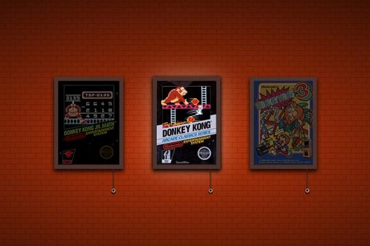
Donkey Kong Poster Collection by Daniel Fontes
Here’s a fun tribute to the past. Gamers will instantly recognize this series of images from Donkey Kong. The classic video game posters feature a fun lighting feature. Tug on the chain to illuminate your favorite poster. Bonus points for the flicker effect!
See the Pen Donkey Kong – a small poster collection by Daniel Fontes
PPL MVR CSS & SVG Poster Designby Kristopher Van Sant
Band posters are a common theme among designers. Perhaps that’s because so many of us have them on our walls. This animated sequence takes inspiration from print artwork. And it’s another example of what CSS is capable of.
See the Pen PPL MVR by Kristopher Van Sant
Grid Duotone Gradient Poster Design by Cassie Evans
The power of CSS Grid is real. The poster is beautiful and complex. Most impressively, the styles consist of less than 200 lines. A little code and a lot of imagination can go a long way.
See the Pen Grid Poster by Cassie Evans
Grunge Poster with the Wave Motion Effect by ilithya
Who can resist the retro vibes coming from this poster? It captures the look of the 1990s – complete with raining triangles. Move your cursor to change the perspective of the photo. It’s a far-out experience, for sure.
See the Pen Grunge Poster by ilithya
The Matrix Resurrections Digital Poster by Sparklingman
The Matrix movie series is known for a different kind of rain. This digital poster may appear simple. However, clicking on it shifts the green and black pattern. The effect is subtle – but fits beautifully with the movie’s aesthetic.
See the Pen The Matrix Resurrections | Sparklingman digital poster #026 by Sparklingman
A New Take on a Classic Art Form
The examples above combine classic print sensibilities with online capabilities. It’s a fun exercise that goes beyond what’s hanging on your wall.
We may think of posters as being simplistic. But they also open a world of possibilities for designers. Thus, we can take this inspiration and run with it.
For example, posters may help us rethink traditional web layouts. Elements like vertical text and unique container shapes come to mind. They can serve as a launching pad for ideas.
Want to see more examples of online poster art? Check out our CodePen collection!
Related Topics
Top
#3d#ADD#amp#animation#Art#assets#Beauty#Bootstrap#change#code#Color#container#creativity#CSS#CSS Grid#CSS Layouts#CSS Snippets#Design#designers#effects#Events#Exercise#fonts#form#Forms#fuels#Full#game#green#grid
1 note
·
View note
Text
Component Libraries: Should You Build Your Own or Use a Prebuilt One?

Component libraries are a vital tool in web application development in maintaining uniform design, shortening the time taken to develop web applications and improving reusability of the code. Some developers find this dilemma; should they create a��component library or use an existing one? In addition, they help reduce the struggle while building well-designed and interactive websites because of the availability of animation-oriented UIs such as Accentricity UI among others. Now, let’s get more to the point in order to help you find the right way.
What is a Component Library?
Component libraries are collections of reusable UI elements such as buttons, forms, modals, and more— and are intended to reuse the components across several projects. Such libraries not only guarantee a consistent look of an application but also save time and costs during its implementation because the elements have been already coded. So, there's no need to build components from scratch.
Prebuilt Component Libraries

Prebuilt Component Libraries
Prebuilt component libraries are the ready-made collections of different UI components that are specifically designed and optimized for common use cases that developers can face during development. Some well-known examples include:
Material-UI (MUI):
A library based on React and it follows Google's Material-UI design, MUI allows a comprehensive set of components customization.
Ant Design:
It's an UI design system framework for enterprise-level products, ant design offers built-in themes and a rich set of UI components.
Bootstrap:
It's an widely-used CSS framework that provides basic components and a responsive grid system.
Pros of Prebuilt Libraries :
Rapid Development: Prebuilt libraries save a lot of time of the developers by providing pre-designed reusable components that you can quickly integrate into your project.
Standardized Design: They help ensure a consistent user experience across different screens and features.
Community Support: Many prebuilt libraries come with robust community support, providing a wealth of tutorials, plugins, and enhancements.
Cons of Prebuilt Libraries
Limited Customization: Customizing components to fit your unique design can sometimes be difficult, leading to constraints on flexibility.
Performance Overhead: Many prebuilt libraries come with extra features you may not need, which can bloat your codebase.

Pros And Cons of Prebuilt Libraries
Animation-Centric Libraries: Bringing UIs to Life
In recent years, a new category of libraries has emerged, specifically focused on providing built-in animations and smooth UI transitions. These libraries not only offer pre-designed components but also emphasize adding dynamic, interactive features to web applications.
Here are some popular examples of animation-focused libraries:
Lottie
Category: Animation Integration Library

Lottie:The industry standard for motion design
What it Offers: Lottie allows you to render animations created in Figma or Adobe After Effects as JSON files using the built-in plugins. These animations are then rendered natively on the web, offering high-quality motion without a heavy performance impact.
Why It’s Useful: Lottie is perfect for apps or websites requiring rich, scalable animations that are lightweight. It’s commonly used for logos, loading animations, and subtle UI effects. Unlike other component libraries, it focuses purely on bringing visual design elements from tools like Figma & After Effects into the web environment.
Accentricity UI
Category: Hybrid Component and Animation Library
What it Offers:
Accentricity UI combines traditional UI components with built-in support for smooth animations and transitions. It offers a wide range of components like buttons, forms, modals, and navigation menus, but with an added layer of predefined animations, making it easier to create interactive, dynamic interfaces.
In addition to these standard components, Accentricity UI provides responsive behaviors and subtle animation effects like hover states, fade-ins, and sliding transitions that enhance user engagement. The library's components are fully customizable, allowing developers to easily adjust animation timings, easing functions, and durations to match the look and feel of their brand, ensuring both visual appeal and performance across devices.
Why It’s Useful:
Think about it, what would be easy for a dev? Making a custom component with tons of animation which the dev has to write from scratch and polish it before the deadline or use a library, where the dev can make use of the library with the built-in support to combine the custom designed elements with smooth animations and transitions offered by the library.
It’s particularly helpful for developers who want the convenience of a prebuilt library but need polished, built-in animations to enhance user experience without writing complex animation code from scratch.
Framer Motion
Category: Animation-focused Component Library (React)

Framer Motion
What it Offers:
Framer Motion is a powerful library for React that allows you to create fluid animations and micro interactions with minimal effort. It supports interactive features like drag, scroll, and spring-based animations, which makes it ideal for interactive & highly animated UIs. It also provides easy-to-use APIs for gesture-based animations and layout transitions, offering developers extensive control over complex animations while maintaining simplicity in implementation.
Why It’s Useful:
Framer Motion combines the simplicity of component libraries with the flexibility of advanced animation frameworks, making it easy to enhance user interfaces with dynamic visual effects. It’s a great choice for React developers who want to integrate animation without compromising performance or adding significant overhead. With its built-in optimizations for smooth rendering, Framer Motion ensures high-quality animations that enhance both usability and visual appeal.
Should You Use Prebuilt Animation Libraries?
The role of animations is really important in web applications to enhance the UX(user experience), by making interfaces feel more fluid and interactive makes user's remember the website due to its great experience. Since users are constantly getting used to smooth effects, micro-interaction and dynamic feedback, animations are no longer viewed as a good to have feature but are rather considered as a must have feature. Prebuilt animation libraries like Framer Motion and GSAP (GreenSock Animation Platform) simplify this process by providing powerful, flexible tools that allow developers to integrate complex animations without having to manually manage every aspect of motion or dive deep into animation theory.
Advantages of Animation-Centric Libraries

Advantages of Animation-Centric Libraries
Ease of Use
Prebuilt animation libraries abstract away the complexities of coding animations from scratch. Without manually writing keyframes, easing functions, or browser-optimized transitions, developers can simply use predefined APIs to implement fluid animations. This drastically reduces development time, as many animation details are handled by the library, letting developers focus on building features and interactions rather than tweaking animations for performance or cross-browser compatibility. For example, with a few lines of code, animations can be applied to any UI element, making the development process much more efficient.
Advanced Features
Many animation libraries offer advanced features that go far beyond basic transitions like fade-ins and slide animations. These include timeline control, scroll-triggered animations, physics-based interactions, and even 3D transformations. For instance, timeline control allows developers to create synchronized sequences of animations, which can be used to create smooth, coordinated interactions across multiple elements. Scroll-based animations enhance user engagement by triggering effects as the user scrolls, perfect for parallax websites or content reveal effects. Physics-based animations, such as spring-based drag-and-drop or object bouncing, add natural, realistic movement to interactive elements, elevating the overall experience. Additionally, 3D transformations provide extensive control over how objects rotate, scale, or move in three-dimensional space, something that is cumbersome to achieve with native CSS alone.
See What Happens Next
#webdevelopement#werbooz#own website#build vs prebuilt component library#custom UI components#prebuilt UI libraries#web development#Material-UI#Ant Design#Bootstrap#Framer Motion#Accentricity UI#animation libraries#best UI libraries 2024#component library pros and cons#web app development#UI design optimization#web performance#web development trends
2 notes
·
View notes
Note
MOURN YOU'RE THE BEST. THANK YOU SO MCUH!!
still confused but yknow what i know more now and thats all that matters
THANK YOU SO MUCH AUHAGHDFYGHUHE i was literally struggling for lijke. three hours i wish i was joking.
FIGURING THIS OUT THANK YOU SO MUCH


omg no worries !!!!
since you're very new, i think the only things you need to touch is just the plain text… be careful when adding/deleting things, because if you do too much or too little, you might end up breaking the code!
anyways, toyhouse uses bootstrap html (but not all of it is functional) so if you wanted to teach yourself about putting things next to each other, you can read it here:
3 notes
·
View notes
Text
Implementing a real-time chat feature in Vue.js typically involves using a backend server to handle communication between users. In this example, I'll guide you through creating a simple real-time chat application using Vue.js and a backend service with WebSocket support. We'll use Socket.io for the WebSocket implementation.
#vuejs#vue js 3#vue js grid#vue js website#vue js frontend#vue 2#vue js bootstrap#vue 3 js#vue js#vue router#stackoverflow#web design#web dev#web development#website#programming#backedn#backend eng#tech#technology#engineering
0 notes
Text
Implementing a real-time chat feature in Vue.js typically involves using a backend server to handle communication between users. In this example, I'll guide you through creating a simple real-time chat application using Vue.js and a backend service with WebSocket support. We'll use Socket.io for the WebSocket implementation.
#vuejs#vue js 3#vue js grid#vue js website#vue js frontend#vue 2#vue js bootstrap#vue 3 js#vue js#vue router#stackoverflow#web design#web dev#web development#website#programming#backedn#backend eng#tech#technology#engineering
0 notes