#Brno Biennial 2016
Photo
Flyer
ー
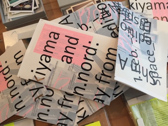
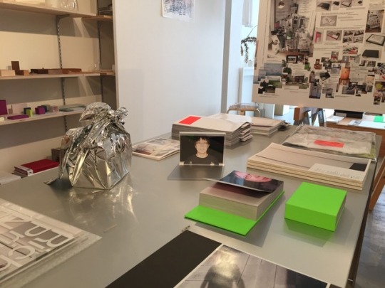
Shin Akiyama and edition.nord: Display from The 27th Brno Biennial 2016 + Recent Works
ー
フライヤーが届きました!
会期延長の情報を挟み込んだ後に配布を開始します!
ー
#Shin Akiyama#shinakiyama#Shin Akiyama and edition.nord: Display from The 27th Brno Biennial 2016 + Recent Works#edition.nord#editionnord#Flyer#The 27th Brno Biennial#Brno Biennial#Brno Biennial 2016#Display#graphic#graphic design#graphic designer#designe#27BB
1 note
·
View note
Photo


Lothar Reher, 1932-2018
A Shelf for Lothar, showcasing the stark covers of the Spektrum series designed by Lothar Reher, Curated by Wayne Daly and Adrien Vasquez, 2016 Brno Biennial + Dressed In Black: An Interview with Wayne Daly and Adrien Vasquez, by Ben Schwartz, September 5, 2017, «the Gradient», Walker Art Center @walkermag, Minneapolis, MN + Spektrum paperback series (1968-1993), by Peiran Tan, «Font In Use», November 29, 2017
#graphic design#typography#exhibition#book#rip#lothar reher#dylan thomas#wayne daly#adrien vasquez#ben schwartz#peiran tan#the gradient#walker art center#font in use#biennial of graphic design brno#2010s
97 notes
·
View notes
Photo

IDEA #376 – Graphic designers and exhibitions / Available at www.draw-down.com / Issue #376 of Japan's IDEA magazine is largely about graphic designers and exhibitions from yesterday, today, and tomorrow. Writers like #TetsuyaGoto and IDEA editor-in-chief #KiyonoriMuroga explore the meaning of exhibitions to graphic designers today, beginning with a focus on the 27th Brno Biennial 2016, the world’s longest running design biennial. Included is an interview with #RadimPeško #TomášCelizna #AdamMacháček the curators of the 2016 Brno Biennial. Part 2, “The State of #GraphicDesign Exhibition Today,” covers the USA, Poland and South Korea through interview with #JonSueda #DavidCrowley (“International Poser Biennale, Warsaw”), #MinChoi and Hyungjin Kim (“Graphic Design, 2007-2015, Seoul”). Part 3, “Japanese Graphic Design and the History of #Exhibitions and Collections,” offers a chronology of Japanese exhibitions, with texts by Tatsuya Kuji and Tetsuya Goto. And more! #ideamagazine #typography
#jonsueda#tomášcelizna#kiyonorimuroga#exhibitions#minchoi#tetsuyagoto#graphicdesign#adammacháček#davidcrowley#typography#ideamagazine#376#radimpeško
7 notes
·
View notes
Photo

Recently published on The Gradient: Dressed In Black: An Interview with Wayne Daly and Adrien Vasquez
At the 2016 Brno Biennial, Wayne Daly and Adrien Vasquez exhibited A Shelf for Lothar, showcasing Lothar Reher’s stark covers for the Spektrum series. This year, the pair worked together to produce the accompanying publication, Dressed In Black, which documents the shelf at Brno, with 1:1 reproductions of each book cover.
Above: A Shelf for Lothar, 27th Brno Biennial, 2016 © Wayne Daly and Adrien Vasquez
16 notes
·
View notes
Text
Hilary Greenbaum
Graphic Designer/Art Director
Design Director
Whitney Museum of American Art
New York, New York
design.whitney.org
Photo by Philip Friedman
In this, our 100th issue of SLICE Ann Arbor, we are honored to present Hilary Greenbaum, design director at the Whitney Museum of American Art in New York, New York. Hilary talks with SLICE about how she got her start in the profession, why she does what she does — and life.
________________________________________________________
SPECIAL GUEST SERIES
Hilary Greenbaum serves as director of graphic design for the Whitney Museum of American Art in New York, New York. Hilary previously worked as a staff designer and design columnist for The New York Times Magazine, designing numerous covers, feature story layouts, special issues, and infographics. In 2011, she initiated a series titled, Who Made That?, which provides design and art aficionados an opportunity to learn about the people working in the profession. Hilary’s work has been recognized by the American Institute of Graphic Arts, Society of Publication Designers, Type Directors Club, Art Directors Club, Society for News Design, and most recently, the work of her team at the Whitney was included in the 2016 Brno Biennial. She earned an MFA in graphic design from the California Institute of Arts, and a BFA from Carnegie Mellon University. Hilary has also served on the board of directors of AIGA/NY, and as a guest critic at Parsons, Pratt, and Boston University, among others. When she’s not working, you can find her sleeping, running, or trying her best to do nothing in particular. Hilary resides in Brooklyn with her fiancee Justin, cat Luna, and a variety of houseplants that will hopefully make it through 2017.
________________________________________________________

FAVORITES
I’ll preface this whole section with the caveat that my favorites change all the time. There are just so many interesting works being created, places that continually redefine themselves, and phrases that take on new meaning that it’s difficult for me to isolate a “favorite” as in “favorite for all time.” What I can do is list a “favorite for right now.”
Book: All the Birds in the Sky by Charlie Jane Anders; because there’s a lot of truth in the surreal.
Destination: Home; because all my favorites are there.
Film: The Shining; because it’s so perfectly designed.
Motto: Restrictions don’t have to be restrictive; because creativity comes from adversity.
THE QUERY
Where were you born?
New Jersey
What were some of the passions and pastimes of your earlier years?
Drawing was one of my earliest interests, and whenever I was asked what I wanted to be when I grew up, I would always respond that I wanted to be an artist.
How did you begin to realize your intrigue with graphic design?
Graphic design wasn’t a common profession when I was young, and it wasn’t until later in high school that I realized what I enjoyed most about making ‘art’ was actually ‘design’: the visual problem-solving, the systemic thinking, the interaction with other people, the rigor of making something that I liked and worked for the task at hand.
Why does this form of artistic expression suit you?
I really enjoy all aspects of the design process, from defining the big picture to refining the last details. It’s also immensely satisfying to make things for a living.
What path did your formal and/or informal training/education follow?
My parents were very supportive of my desire to study design, but to ensure that I was truly committed to it, they enrolled me in a summer pre-college program focusing in design at Carnegie Mellon University. The course was only six weeks, but it cemented my interest in both the field and the school. I went on to attend Carnegie Mellon for my undergraduate degree, graduating in 2001. After working for a few years, though, I began to feel restricted by the modernist approach to design that Carnegie Mellon’s program is anchored by, so I decided to go back to school to learn about the post-modernist end of the design spectrum. In 2006, I graduated with my master’s degree (also in graphic design) from California Institute of the Arts.
How did you get your start in the business of graphic design?
My first job was for Ziba, a design firm in Portland, Oregon. I had interned there when I was in college, and was lucky enough to be offered a full-time job once I graduated. As a company, Ziba’s roots were in product design. But at the time I started, they were beginning to branch into other disciplines. I worked on a wide range of projects, from product packaging to brand strategy.
What led to your coming on board with the Whitney Museum of American Art in 2012?
I saw the job posting, thought it was a great opportunity, and applied.
How would you describe your day-to-day role at the Museum?
An average work day will contain five scheduled meetings, three impromptu meetings, sending and receiving of 50+ emails, 3+ phone calls, 3+ hours of hands-on designing, 1+ hour of project management, three inept attempts at making a joke, one successful joke, 4+ cups of coffee, and if I’m lucky, one really good idea.
What types of projects/endeavors are you engaged with currently?
We are currently preparing for the Whitney Biennial (opening in March), which entails exhibition graphics, advertising, web-based initiatives, and invitations to opening events, among other projects.
Do you have a creative process that you turn to as you begin a project?
I don’t believe in a one-size-fits-all creative process. Every project has different goals, motivations, and personalities involved, so I try to remain as fluid with my process as possible so that each project can be as successful as possible. The best way to start, though, is to ask a lot of questions!
Is there a project/period along the way that has presented an important learning curve?
Each project is a learning opportunity, but working on the rebranding of the Whitney was larger than any other project I’d worked on to date. The scale of it (in terms of people involved, number of projects to complete, and visibility) was equally thrilling and overwhelming.
How has your aesthetic evolved over the years?
I find that I lean more towards the minimal and less towards the trendy.
When and how did the series, Who Made That?, for The New York Times Magazine take seed?
Early in 2011, the New York Times Magazine started The 6th Floor, a blog populated by the employees of the printed publication. Editor in chief, Hugo Lindgren, encouraged all of the departments, from art to research, to participate. I initiated a series called, Who Made That?, which would encourage those who appreciate design and art to become more familiar with the people who make what we see on a daily basis. Starting in March, I began posting at least once a week, covering everything from the radiation symbol to the Moka Express to the NASA logo. Six months later, Hugo decided to turn the online series into a weekly column in the printed magazine.
Is there a project you worked on for the Magazine that remains a favorite?
The Who Made That? series was definitely a highlight, as was overseeing the 9th Annual Year in Ideas issue.
What moment in your professional life stands out, even today?
Taking the risk of moving to New York ten years ago without a job or an apartment.
What is it about graphic design that keeps you interested and intrigued?
It continues to be challenging because it’s constantly changing; the tools we use, the formats that we work within, and even the role design plays within organizations.
What three tools of the trade can’t you live without?
Adobe everything, Open Type, and an unlined sketchbook from Muji.
What’s the best advice you’ve ever received?
Always have a reason.
From where do you draw inspiration?
I try to derive inspiration from the context of each project I work on, as opposed to outside sources.
What three things can’t you live without?
Coffee, whiskey, and family.
Is there a book or film that has changed you?
Jennifer Bornstein; the catalog for the artist’s first solo exhibition at The Museum of Contemporary Art in Los Angeles, and the first book I designed professionally.
What drives you these days?
I am driven by a curiosity for new ideas and a fear of failure, which are constantly in opposition.
1 note
·
View note
Photo

27th Brno Biennial Catalogue (2016) / Available at... http://ift.tt/2iWpE76
0 notes
Link
Artist: Sam Lewitt
Venue: Miguel Abreu, New York
Exhibition Title: DREAMBOAT DIRTBLOCK
Date: January 16 – February 23, 2020
Click here to view slideshow
Full gallery of images, press release and link available after the jump.
Images:
Images courtesy of Miguel Abreu, New York
Press Release:
Why do [those] in the middle of the boat move the boat the most? Is it because the oar is a lever?
– Archytas of Tarentum
Cover the champagne glasses. They’ll swell to shattering. A toast – to a streamlined luxury liner that will never exist.
Dirt block is your hard cure for lack of supply.
The lever is a stick plus will. No bubbles here. Pressure expels excess air.
Brick fits your hand.
Disappointment follows relief. The portal cracked to soft focus lenses. It’s all stagecraft.
You know this.
Pleasure follows disappointment. Unfulfilled projects look better in the pictures. It’s never enough.
DREAMBOAT DIRTBLOCK is made between a lever and lens. Compressed blocks of soil extracted from NYC building foundation pits, curing to maximum hardness throughout the duration of the exhibition sit next to fragmented images of a boat, itself a toppled skyscraper.
This unrealized design for a streamlined cruise ship from the early 20th century is the result of an office exercise commissioned by Norman Bel Geddes design associates. The boat was shaped to optimally reduce friction with external environmental conditions. In this exhibition it appears through the effluence of its internal combustion. The drift of multiple fires has been simulated in a digital model of its hull using software designed to test fluid dynamics.
LENS crystallizes snapshots of this ‘smoke test’ into light shaping surfaces. Milled shards of a shattered Plexiglas sheet filter the light from a single LED: gathering it into an image through sheer surface variation. These projections are physically identical to rippled patterns refracted onto surfaces adjacent to water on a sunny day. The computational reconstruction and control of this phenomenon is being developed as a method of optical watermarking. While the movement of water and light are technically the guiding principle, in optics this phenomenon is referred to as a “caustic” projection, a word whose original meaning is “to burn.”
LEVER produces more terrestrial projectiles: interlocking blocks of compacted subsoil dug up for the project of stabilizing air rights over terra firma. These compressed earth blocks are made with a manual earth-ramming machine, whose mobility within resource scarce contexts enables the direct use of local soil for shelter and road construction.
This press is a descendent of the so-called CINVA-RAM designed in the 1950s by Chilean engineer Paul Ramirez. It is historically associated as much with the ambiguous history of “self-help” housing in the developing world throughout the 20th century as it is with practitioners of small-scale ecological self-sufficiency. It is portable, yet totally bound to a simple metabolism of production with the ground on which it sits. Dreams of frictionless transport are grounded in relations negotiated on site.
DREAMBOAT (Model Views) presents further fragments of the boat model rotating through various perspectives. These views result from the resistance of oil, acid and water to one another. The craft’s shell is etched by these clashing fluids on the surface of copper-clad plastic, a material support that is engineered to control friction and passage in the circulation of information.
Sam Lewitt was born in Los Angeles in 1981. He completed the Whitney Independent Study Program in 2005 after receiving his BFA from the School of Visual Arts in 2004. In 2017, his work was on view in ARTE VIVA ARTE, the 57th International Art Exhibition, Venice Biennale. Lewitt’s exhibition More Heat Than Light opened in September 2015 at the CCA Wattis Institute in San Francisco, before then traveling in 2016 to the Kunsthalle Basel, and finally, under the title Less Light Warm Words, to the Swiss Institute in New York. Previously, Lewitt co- organized the exhibition and Materials and Money and Crisis at the MUMOK (Vienna) with Richard Birkett, a show in which he was also included, and drunken walks/cliché/corrosion fatigue/ebay at Miguel Abreu Gallery. His work “Fluid Employment” was exhibited in the 2012 Whitney Biennial. Solo exhibitions dedicated to Lewitt’s work have been held at Miguel Abreu Gallery (2018, 2014, 2011, 2008, 2006), Galerie Buchholz, Berlin and Cologne (2017, 2013, 2011, 2008), Leopold-Hoesch-Museum, Düren (2014), and Galleria Franco Soffiantino, Turin (2009, 2007). His work has also appeared in exhibitions at the Musée d’Art Moderne de la Ville de Paris, the Museum of Modern Art, Bergen Kunsthall, Secession, La Panacée, The Brno House of Arts, the Pulitzer Foundation, Fridericianum, David Roberts Art Foundation, White Columns, SculptureCenter, MoMA PS1, Artists Space, the Swiss Institute, David Zwirner, Elizabeth Dee Gallery, and Andrew Roth Gallery. His work is held in the collection of the Whitney Museum of American Art, the Museum of Modern Art, New York, the San Francisco Museum of Modern Art, MUMOK, Vienna, the Centre Georges Pompidou, Paris, and the Fondation d’Entreprise Galeries Lafayette, Paris, among others. Lewitt was the recipient of the 2018 BMW Open Work commission at the Frieze Art Fair in London, a 2018 Grants to Artists award from the Foundation for Contemporary Arts, and was also the 2018 Teiger Mentor in the Arts at Cornell University. Lewitt will have a solo exhibition at Z33 – House for Contemporary Art in Hasselt, Belgium in June 2020.
Link: Sam Lewitt at Miguel Abreu
Contemporary Art Daily is produced by Contemporary Art Group, a not-for-profit organization. We rely on our audience to help fund the publication of exhibitions that show up in this RSS feed. Please consider supporting us by making a donation today.
from Contemporary Art Daily http://bit.ly/37qYCgz
0 notes
Photo
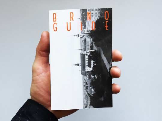
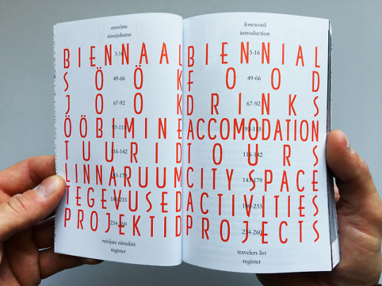


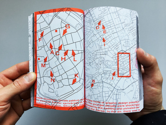

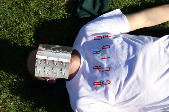

BRNO GUIDE (2018)
Travel guide to Brno, Czech Republic.
Handy 100 x 160 mm, paperback and 288 pages of pure pleasure.
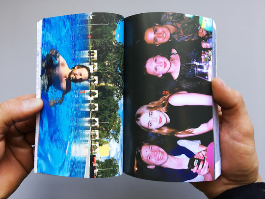
Since 2004, the Graphic Design department at Estonian Academy of Arts has organised collective study trips to Brno Biennial. This pocket book offers a unique and original view of the city and – through the memories and recollections of graphic design students throughout the years – gives an entertaining overview of local food, nightlife, accomodation, activities, etc.
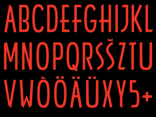
Headline font Brno 2016 is made by Vello Lutter and me. So this book is also the font specimen for Brno 2016.
Typeface: Brno 2016 by Vello Lutter & me.
Collaboration with Vello Lutter.
Tutors: Indrek Sirkel, Jaan Evart & Kert Viiart.
* 25 BEST DESIGNED ESTONIAN BOOKS 2018
0 notes
Text
14. Jon Sueda
Jon Sueda is a designer, curator, and educator. He is the founder of the Stripe, a graphic design studio based in San Francisco specializing in printed material, identity, and exhibition work and the Chair of the MFA Design program at California College of the Arts. He's also curated the exhibitions for the CCA Wattis Institute for Contemporary Arts, the 25th International Graphic Design Biennial in Brno, Czech Republic, and SOMArts Cultural Center in San Francisco. In this conversation, Jon and I talk about his design background, the intersection of graphic design and curation, and studying under critics like Lorraine Wild and Jeffrey Keedy at CalArts.
Show notes:
Stripe
@stripesf
@JonSueda
Jon Sueda: When World's Collide (Walker Art Center Talk)
CCA
Martin Venezky *David Carson
Lorraine Wild
Jeffery Keedy
Michael Worthington
Denise Gonzales Crisp
The Watts Institute
Experimental Jetset
An Index of Fragments - Jon Sueda
All Possible Futures
Graphic Design: Now In Production
Task Newsletter
Dunne and Raby
Jens Hoffmann
Download mp3 | Soundcloud | iTunes
0 notes
Photo
Buku Akiyama: Composition No.1-10 and the derivatives, 2001-2016: RONDADE
ー
会期中のワークショップも大盛況に終わり、限定100部の残りも僅かとなった『秋山ブク:コンポジション1-10番とその派生物 2001-2016』が1冊のみ再入荷しました!
この機会に是非お買い求めください!
「コンポジション」シリーズは、2001年に秋山伸として参加した建築展「東北大学建築学科50周年記念展覧会」で委託されたインスタレーション「Arrangement: Gallery 4200, Sendai Mediatheque」(2008年に「コンポジション 1番:せんだいメディアテークの備品による」に改題)から始まった。
建築展という文脈と開催施設が竣工間もない話題の公共施設であるという文脈から、インスタレーションは所与の空間に対する生活者の自由についての実験として構想された。
「コンポジション」における秋山の日用品の扱い方の特徴は、それを画材や素材に代わる材料として扱うのではなく、個々のものを唯一の独立した存在として扱うところであろう。生きられた場にあるものは、売られているものとは異なり、必ず何らかの社会的な意味や歴史を纏っている。
その生きられたものを、廃品を扱うように無個性な素材へと解体したり、ただ質量を生み出すだけの群へと抽象化することなく、秋山はものそれぞれの固有性を尊重し、それらの存在の間に関係をひとつひとつ付与していくのである。
その「コンポジション」のシリーズが、今年の大阪PANTALOONでの制作で10作となった。
この活動の節目としてアートブック「Buku Akiyama: Composition 01-10, 2001-2016」をRONDADEより刊行。
デザインは本人秋山伸(エディション・ノルト)名義。
#Shin Akiyama and edition.nord: Display from The 27th Brno Biennial 2016 + Recent Works#shin akiyama#shinakiyama#edition.nord#editionnord#buku akiyama#bukuakiyama#RONDADE#contemporary art#art#GraphicDesign#graphic designer#installation#artbook#bookdesign
4 notes
·
View notes
Photo

The exhibition period, Shin Akiyama and edition.nord: Display from The 27th Brno Biennial 2016 + Recent Works, has been extended.
ー
好評につき3月25日(土)17時まで会期延長します。
開館時間:10:00-18:30 [最終日は17:00まで]
休館日:日・月・火・祝日
ー
Revised Exhibition Period:
Feb 5 - Mar 25, 2017
*Closed on Sun, Mon, Tue and National Holiday
Special Attention: Irregular Holiday Announcement
http://twitter.com/inframince_inc
ー
Don't miss it !
#Shin Akiyama#shinakiyama#Shin Akiyama and edition.nord: Display from The 27th Brno Biennial 2016 + Recent Works#edition.nord#editionnord#Brno Biennial#The 27th Brno Biennial#Brno Biennial 2016#Recent Works#extended#Revised Exhibition Period#space_inframince
0 notes
Photo

In preparation......
/
Shin Akiyama and edition.nord: Display from The 27th Brno Biennial 2016 + Recent Works
#Shin Akiyama#edition.nord#Display from#The 27th Brno Biennial 2016#Recent Works#Brno Biennial 2016#Brno Biennial#space_inframince
0 notes
Photo
edition.nordより近日刊行予定の”辺口芳典:mean”のサンプル版を展示しています。
─
Yoshinori Henguchi: mean
─
大阪、梅香の自宅兼ギャラリー「黒目画廊」を拠点に活動する詩人の辺口芳典は、インスタントカメラ〈写ルンです〉しか使わない写真家としても知られてきた。
2000年代半ばより、身近なモノや風景を生々しく捉えた写真を発表してきた彼だが、2011年から突然開始され、デジタルカメラを使うようになった現在も執拗に撮り続けられているポートレートのシリーズがある。
彼の妻・梨華の写真だ。
今までほとんど発表されることがなかったそのシリーズの膨大なアーカイヴから、アナログ207点、デジタル354点が切り出され、
「mean」と名付けられたエディションが生まれた。
─
イメージと物性、虚と実、レンズと光学装置、公と私…… 単純な二項対立を超えて、写真芸術についての可否と根源を問う問題作!
販売価格が決定次第、space_inframinceにて先行予約受付を開始いたします。
この機会に是非ご高覧ください。
#Yoshinori Henguchi#mean#shin akiyama#shinakiyama#Shin Akiyama and edition.nord: Display from The 27th Brno Biennial 2016 + Recent Works#edition.nord#editionnord#Yoshinori Henguchi: mean#artbook#photobook#contemporary art#photograph#graphic designer#graphic design#degital photo#analog photo
2 notes
·
View notes
Photo

otk 003
–
Shinro Otake “NewNew”
–
完売となっていました大竹伸朗 “ニューニュー” が再入荷しました。
–
2013年に香川の丸亀市猪熊弦一郎現代美術館で行われた同展の公式カタログ。
─
「大竹伸朗展 ニューニュー」(7月13日─11月4日)は、
高松市美術館で行われた「大竹伸朗展 憶速」、瀬戸内国際芸術祭2013での展示「女根」とともに、瀬戸内地域でほぼ同時期に開催された大竹の3つの展覧会のうちのひとつとして注目された。
─
「ニューニュー」では、タイトル通り、新作・近作・未発表作だけが選ばれており、丸亀市猪熊弦一郎現代美術館の特徴的な立地環境と建築空間を存分に生かした構成となっている。
ドクメンタ13参加作品の「モンシェリー:スクラップ小屋としての自画像」を���むインスタレーション作品と大型彫刻、コラージュ作品と油彩、大型のドローイング、小型のグアッシュのシリーズなど、作品内容も実に多様なものとなった。
-
カタログは、シート、冊子、DVDに分かれていて、着脱可能なペーパーファスナーでまとめられている。
作品は、技法あるいは展示空間別に、冊子とシートへと分冊形式で収録。
DVDでは、美術館前の風景から展示室の奥に至るまで、ビジターの鑑賞経験に沿った映像がおさめられている。
-
A3を超える大きな8枚のシートには、それぞれ大型のインスタレーション作品を収録。
表には各作品の全体像の裁ち落とし写真が掲載され、ポスターとして掲示することも可能。
裏には細部写真、関連作品、キャプション・データが掲載されている。
サイズの異なる3つの冊子には、絵画的な作品(油彩冊子とコラージュ・ドローイング冊子)とテキスト・資料を収録。
-
youtube
-
A_表紙
カラー/1枚
-
B_インスタレーション・シート
A3+変形/カラー/8枚=16頁
sheet 1:『時憶/雲』
sheet 2:『時憶/ゾーン』
sheet 3:『宇和島駅』
sheet 4:『時憶/美唄』
sheet 5:『焼憶』
sheet 6:『モンシェリー:スクラップ小屋としての自画像』
sheet 7:『モンシェリー:スクラップ小屋としての自画像』詳細
sheet 8:展示風景、開催概要、等
-
C_book 1:コラージュ、ドローイング
B5/カラー/48頁
-
D_book 2:油彩『Karlsaue, Kassel』
A5+変形/カラー/32頁
-
E_book 3:テキスト、略歴、参考文献
寄稿:大竹伸朗、中田耕市[美術館学芸員]
A5/モノクロ/32頁
-
F_DVD:展示風景
DVD-Video/ALL Region/MPEG-2/NTSC/COLOR/STEREO/本編映像26分・付録映像20分
-
G_ペーパー・ファスナー
綴じられている全てのアイテムは着脱可能です。
-
-
Supervised by: Marugame Genichiro-Inokuma Museum of Contemporary Art / The MIMOCA Foundation
Editor: Koichi Nakata
Texts: Shinro Ohtake, Koichi Nakata
Translation: Alfred Birnbaum
Photo (Installation view): Masahito Yamamoto
Design: Edition Nord; Shin Akiyama, Wataru Kobara, Takashi Honda, Genki Abe
Printing and binding: SunM Color Co., Ltd.
-
First edition: 1 September, 2014
External dimensions: 297 x c.235mm
otk 003 / first edition: 2000 copies
#Shin Akiyama#shinakiyama#Shin Akiyama and edition.nord: Display from The 27th Brno Biennial 2016 + Recent Works#edition.nord#editionnord#Shinro Otake#NewNew#MIMOCA#Koichi Nakata#Alfred Birnbaum#Masahito Yamamoto#Wataru Kobara#Takashi Honda#Genki Abe#SunM Color
2 notes
·
View notes
Photo
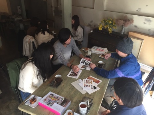
Design Tea Party 0304
ー
柔らかな日差しが差し込む中、お隣のChef-D'œuvreに移動して歓談中!
ー
#Shin Akiyama#Shin Akiyama and edition.nord: Display from The 27th Brno Biennial 2016 + Recent Works#shinakiyakma#edition.nord#Design Tea Party#editionnord#art#design#Graphic design#artbook#graphic designer#Chef-D'œuvre#ChefDœuvre
1 note
·
View note
Photo
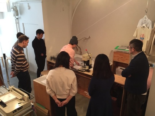
Feb26: Lectures + Work Shop: Drilling 01
#Shin Akiyama#shinakiyama#Shin Akiyama and edition.nord: Display from The 27th Brno Biennial 2016 + Recent Works#artbook#book#design#Graphic design#graphic designer#workshop#Work Shop#rondade#contemporary art#bookdesign
1 note
·
View note
Last Seen Blogs

messyxbangs
🌙eve

meumviscera
MeumViscera🫀🥩

belovedbit
Beloved bit

mettatonbf420
mettatons gay bf

wheelernance
@caindean