#CSS position property improved
Explore tagged Tumblr posts
Visit Tumblr Blog
Explore Tumblr blogs with no restrictions, modern design and the best experience.
Last Seen Tumblr Blogs


Fun Fact
Tumblr’s reach among the 26-to-35-year-olds in the US is 11%.
Text
Mastering Z-Index in Elementor: Everything You Need to Know
When designing websites with Elementor, managing layers and ensuring proper content visibility can be a challenge—especially when multiple elements overlap. This is where understanding Z-Index in Elementor becomes essential.
What is Z-Index in Elementor?
Z-Index is a CSS property that controls the stacking order of elements on a web page. In simpler terms, it decides which element appears on top when two or more elements overlap. The higher the Z-Index value, the closer the element appears to the front.
In Elementor, every widget or section can be assigned a custom Z-Index value. This is especially helpful when creating advanced layouts such as overlapping text, layered images, sticky headers, or pop-ups.
How to Use Z-Index in Elementor
Select the Element: Click on the widget, column, or section you want to modify.
Go to the Advanced Tab: Under the 'Advanced' settings, scroll down to the 'Z-Index' field.
Set the Value: Input a positive or negative number. Higher values will place the element in front.
Example: If your text is hidden behind an image, increasing the text’s Z-Index will bring it forward.
Common Uses of Z-Index in Elementor
Making sticky headers stay on top while scrolling.
Creating interactive hover effects.
Layering background shapes or graphics.
Fixing overlapping issues between sections and widgets.
Tips for Using Z-Index in Elementor
Avoid unnecessary high values: A Z-Index of 9999 might work, but keep your values logical to avoid conflicts.
Use relative positioning: For Z-Index to take effect, elements often need a relative, absolute, or fixed position.
Check responsive views: Overlapping might differ between desktop, tablet, and mobile views.
Special Features of Z-Index in Elementor
The Z-Index in Elementor isn’t just a basic layering tool—it's a powerful feature that gives you full control over how elements appear in relation to each other on your webpage. Below are some standout features and benefits of using Z-Index effectively in Elementor:
1. Precise Layer Control
Z-Index allows you to manually control which elements appear on top or behind others. This gives you the freedom to design complex, multi-layer layouts without coding.
2. Works Across Widgets, Columns, and Sections
Elementor makes Z-Index available for:
Widgets (like buttons, images, headings)
Columns
Entire Sections
This means you can adjust layering at any level of your layout.
3. Dynamic with Position Settings
Z-Index works best when combined with Elementor’s position controls:
Relative
Absolute
Fixed
You can create advanced designs like sticky headers or floating call-to-action buttons that stay on top of all other content using Z-Index.
4. Responsive Control
With Elementor’s responsive settings, you can tweak Z-Index for mobile, tablet, and desktop individually. This ensures your designs remain visually consistent across all devices.
5. Conflict Resolution
Z-Index is your best friend when solving layering conflicts—like when a menu hides behind a section or a popup doesn’t appear as expected.
6. Supports Negative and High Values
You can assign negative values to push elements further back, or high values (e.g., 999) to bring elements to the front. This flexibility is crucial in layered design scenarios.
7. Improves User Experience
Using Z-Index properly ensures that clickable elements like buttons and menus stay accessible and visible, leading to a smoother UX.
Unlock the Full Power of Elementor Pro at an Unbeatable Price
Want to take your web design to the next level with advanced features, templates, and custom controls?
Get Elementor Pro @ Just ₹499 through CVWorld’s Elementor Group Buy and access premium tools affordably!
0 notes
Text
What's new about HTML6 and CSS5?
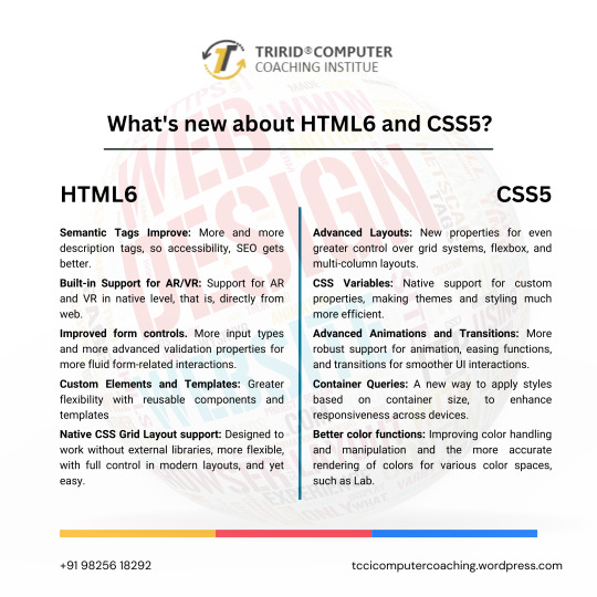
As technology continues to advance, so do the characteristics of how languages will shape a web in the future. HTML and CSS were also the constituent elements of web design. Although HTML5 and CSS3 have become standards in the industry, the web development community has anticipated HTML6 and CSS5 to come soon as they already breathe of new features and improvements that will revolutionize the way websites are constructed and experienced. Let's dive into what we can expect from these upcoming languages.
New Features of HTML6
Under development, HTML6 is expected to proffer any features exciting enough that it makes web development much more powerful and intuitive. Here is what is expected to come in:
Better Integration with JS Frameworks
HTML6 will come with a design that perfectly matches the working of modern JavaScript frameworks, for e.g., React, Angular, or Vue.js, enabling easy creation of dynamic and responsive web applications.
Reduced Complexity in Syntax
HTML6 should lessen complexity with new tags and attributes opening up ways to easier and simpler syntaxes. For example, semantic elements would be new to better content structuring, improving code readability.
Better Web Accessibility
Web accessibility is among the important developments of HTML6. New features would offer facilities to construct effective websites capable of usage by disabled people with improvements in screen reader usage and improved ARIA (Accessible Rich Internet Applications) integration.
Advanced Multimedia Support
HTML6 gives web developers greater control in the handling of multimedia elements, such as video and audio. Enhanced support of 3D content and interaction with more immersive user experience could be possible.
What Is Latest in CSS5?
Similar to the development of HTML6, CSS5 is being developed and is expected to give web designers an improved capability in designing. Here are some of the expected newer features of CSS5:
CSS Grid 2.0
CSS Grid has changed the face of layout design in CSS3, and CSS5 would go a step further by offering more positioning control of the elements to allow even more complex and fluid designs of grid layouts.
Advanced Typography Features
There will be improvements in typography with new properties that will allow for an even more impressive and lively text styling in CSS5. Better variable font support, animated text, and superior text alignment control can be expected.
Enhanced CSS Variables
CSS Variables are reusable styles incorporated in the development of a website that increase the ease with which developers could use styles. CSS5 will also reinvent custom properties, making them much easier to use in crafting flexible and scalable design systems.
New Pseudo-Classes and Pseudo-Elements
New pseudo-classes and pseudo-elements will be added to form CSS5. They will also provide new flexibility for selecting and styling elements on a page. Elements targeting dynamically, based on their state or position, will then be easier.
Flexible Improvements
Flexbox will be stable and strong as it is, and in addition to that, CSS5 is expected to give added powers. Here will come in new properties to enable better flexible-tenant layout construction, to make building responsive into it.
For What Purposes One Should Learn HTML6 and CSS5?
Well, whenever the new versions come into existence, it becomes important for web developers, designers, and students to keep pace with the changes. The TCCI Computer Coaching Institute makes up the best educational institutions for aspiring web developers to learn master HTML5, CSS3, and beyond.
Courses related to website designing and development will happen at TCCI, including practical learning sessions with HTML, CSS, JavaScript, and more. Whether a student is entering the doors of the web development world for the first time or wishes to learn new technologies to update their skill set, expert trainers are there for every step of the journey.
What HTML6 and CSS5 are going to do is a revolution in the way we build our websites. They are going to enhance the experience at the front end in terms of features, make the application more accessible, and increase compatibility with modern framework development. With these technologies, you are going to prepare yourself at the TCCI Computer Coaching Institute to be relevant in the changing tech world and develop the next generation of web experiences.
Call now on +91 9825618292
Get information from https://tccicomputercoaching.wordpress.com/
#Best Computer Training Institutes Bopal Ahmedabad#Computer Training Institutes near me in Ahmedabad India#TCCI - Tririd Computer Coaching Institute#Top Web Designing Institutes in Bopal Ahmedabad#web development courses in ahmedabad
0 notes
Text
How can you become a full-stack developer?

How Can be a Full Stack Developer?
Full stack developer has become one of the most sought-after positions in the industry of technology. The boom in this area leads to increase both web-based and in-class training centres. It allows individuals of Top Engineering Colleges in Jaipur become full stack developers. Some of these centres support trainees to get coding jobs at the end of the course.
Who Is a Full Stack Developer?
A programmer skilled in coding both the frontend and the backend parts of a web application is popular as full stack web developer. It includes the following factors: Frontend is the part of the web application that the user sees and uses. Backend are the parts of application that function behind the scenes and execute the direction issued by the user. This usually includes logical processes, database-related processes, validation of users, server configuration, etc.
A full stack developer of Best Engineering College in Jaipur need not to become expert in all areas pertaining to the frontends and backends. The individual needs to be knowledgeable in all the technologies and lets you understand the processes happening within the entire application. Become a full stack developer by following a few simple steps, including:
1. Learn The Necessary Programming Languages
A full stack developer uses following technologies:
a. HTML/CSS
HTML is a tool that helps developers of Engineering Colleges Jaipur input content into a website and CSS is a designing tool used to alter the appearance of web applications. Both are essential tools for a full stack developer and are taught in different courses, whether online or in-person.
b. JavaScript
This is an important tool for full stack developers. They are used in both front-end and back-end processes. Browsers are built on JavaScript and can be used as a server-side language as well.
c. Backend technologies
After mastering HTML/CSS and JavaScript, an individual need to learn at least one language used for coding backend processes. The functions occurring in the backend of a web application are user validation, database operations, and logical operations. Any course, whether online or otherwise, most often will teach you backend technologies like PHP, Java, Python, or SQL. Learning one of the languages should serve you and lets you should attain proficiency in it.
2. Refine The Knowledge
a. To understand complex concepts, students of best Private Engineering College in Jaipur need to ensure about the fundamentals. JavaScript & HTML/CSS creates the base of web development. For any beginner, an individual should be clear about all aspects of these technologies.
b. Test your knowledge by creating test web pages and apply the concepts learned in the course. JavaScript can be found in most of the web applications and become proficient in its use.
c. Knowledge of programming concepts helps you improve coding skills. Some theories/knowledge can acquire Servers and their functioning, Networks and their nuances, Web-hosting environments, Algorithms and their formulation, Data structures (types, properties, and use), Programming technologies, Databases and their management, etc.
d. An individual will be able to piece together the different parts of the application and create a whole out of the parts. For this, candidates should understand how each part works, its role in the bigger scheme of things and how one part connects to the other.
3. Become Familiar with All Technologies but A Master of One
With the expansion of learning, students of the list of engineering colleges in Jaipur will realize that there is much more to learn than you possibly can master. Most programmers fail because as they try to learn too much of too many things. Get the expertise in one and understand the remaining factors.
As your experience grows, your ease with the major technologies will also improve. Take pains to get expertise in one technology. Choose a technology that are popular among the professionals. This should let you compete effectively with others in the field and produce an outstanding work. In this way, an economy is growing with lower taxes and creates a bright career ahead and be able to relocate other states if you wish to.
4. Take A Course
Best prepared professionals should be willing to keep learning new things to remain relevant. New technologies join the foray frequently and no one knows everything. A full stack developer needs to stay ahead of competitive changes. Taking online or virtual courses is an easy way to keep enhance your skills.
Since the objective is to learn theory and get practical exposure within the shortest time possible, choose courses at computer science engineering colleges in Jaipur that offer mentoring by knowledgeable coders, flexible schedule that matches yours, projects as part of the curriculum, tutoring to clarify doubts, etc.
5. Get Practical Exposure
The most challenging part of the process helps you make a thorough understanding of all the necessary technologies like HTML/CSS, JavaScript, databases, back-end programming, and HTTP/REST. Time has come to use all the knowledge within an application. For this, you need to know the right way to structure code, means to separate files, environment to host large media files, the right data structures to use, location of each computational task, etc.
Theoretical knowledge can be obtained by reading online materials, but to understand application architecture properly, students of BTech colleges Jaipur must implement an actual web application. Working with a team is the ideal way to fulfil this through an individual can also develop an application alone. This exercise adds all the essential practical exposure to the technology toolkit of a full-stack developer.
6. Take Up Additional Assignments
Join additional projects that work on technologies that are outside your expertise. It helps you enhance skills and add extra value to your organization as well.
Conclusion
The journey to become a full stack developer might appear impressive but experience makes the process easier. Continuously upgrading your skill-set is less daunting as it appears. Moreover, being able to understand different types of projects will make you an indispensable part of your company or department.
Source: Click Here
#best btech college in jaipur#best engineering college in jaipur#top engineering college in jaipur#best private engineering college in jaipur#best btech college in rajasthan#best engineering college in rajasthan
0 notes
Text
Mastering CSS Grid Layout: Tips and Tricks for Front-End Developers

The simplicity with which web developers can now easily create complex, flexible designs has been revolutionised by CSS Grid Layout. Front-end developers who want simplicity and variety in their layouts often turn to CSS Grid because it has been a robust toolkit for two-dimensional content layout since its inception. We'll go over hints and techniques in this blog to help you become an expert at CSS Grid Layout and make sure your designs are both aesthetically pleasing and useful.
Comprehending the Fundamentals of CSS Grid Understanding the foundations of CSS Grid is crucial before moving on to more complex methods. Fundamentally, CSS Grid enables you to construct rows and columns inside a grid container. Here are some fundamental ideas:
Grid Container: An element with display: grid becomes a grid container, enabling the use of grid properties.
Grid Items: The direct children of a grid container are grid items.
Grid Tracks: Rows and columns in the grid.
Grid Lines: The dividing lines between grid tracks.
.container { display: grid; grid-template-columns: repeat(3, 1fr); grid-template-rows: auto; gap: 10px; }
html
<div class="container"> <div>Item 1</div> <div>Item 2</div> <div>Item 3</div> <div>Item 4</div> </div>
In this example, .container is a grid container with three equal columns and an automatic row height, with a 10px gap between items.
Tips and Tricks for Advanced CSS Grid Layouts
1. Utilize Grid Template Areas
Grid template areas allow you to name specific areas of your layout, making your CSS more readable and maintainable.
.container { display: grid; grid-template-areas: 'header header header' 'sidebar main main' 'footer footer footer'; grid-template-rows: auto 1fr auto; grid-template-columns: 200px 1fr; } .header { grid-area: header; } .sidebar { grid-area: sidebar; } .main { grid-area: main; } .footer { grid-area: footer; }
Using grid-template-areas helps visualize the layout structure directly in your CSS, simplifying the management of complex layouts.
2. Responsive Design with Media Queries
Combine CSS Grid with media queries to create responsive layouts that adapt to different screen sizes.
.container { display: grid; grid-template-columns: 1fr; } @media (min-width: 600px) { .container { grid-template-columns: repeat(3, 1fr); } }
This example creates a single-column layout on small screens and a three-column layout on screens wider than 600px.
3. Grid Autoflow for Dynamic Layouts
Use the grid-auto-flow property to control the automatic placement of grid items.
.container { display: grid; grid-template-columns: repeat(2, 1fr); grid-auto-flow: dense; }
grid-auto-flow: dense tries to fill gaps in the grid, making the layout more compact and efficient.
4. Aligning Items and Justifying Content
CSS Grid provides properties to align items and justify content within the grid.
.container { display: grid; grid-template-columns: repeat(3, 1fr); align-items: center; /* Align items vertically */ justify-content: center; /* Align items horizontally */ }
You can fine-tune the positioning of grid items using align-items, justify-items, align-content, and justify-content.
5. Fractional Units for Flexible Layouts
The fr unit is a powerful feature of CSS Grid that allows for flexible sizing.
.container { display: grid; grid-template-columns: 1fr 2fr 1fr; }
In this example, the middle column takes up twice as much space as the other columns, allowing for flexible and proportionate layouts.
In summary Your ability to easily build sophisticated, responsive web designs can be greatly improved by being proficient in CSS Grid Layout. Layouts that are both aesthetically pleasing and extremely functional can be created by grasping the fundamentals and utilising more complex techniques like grid template areas, responsive design, grid autoflow, item alignment, and fractional units.
These pointers and techniques can assist you in making the most of CSS Grid, regardless of your level of experience as a developer or where you are in using it for the first time. You'll become an expert in CSS Grid and be able to handle any design problem that comes your way if you continue to experiment and hone your skills.
Take into consideration enrolling in LearNowx front end developer course if you're keen to advance your knowledge and become a top-tier front-end developer. Our extensive curriculum is made to take you from basic abilities to sophisticated methods, making sure you're ready for the cutthroat IT sector. Enrol in LearNowx right now to begin your path to become a front-end development expert!
0 notes
Text
Full Stack Developer Interview Questions for Freshers:A Complete Guide
Are you a fresh graduate or a budding developer looking to kickstart your career as a full stack developer? Congratulations on taking the first step towards a rewarding journey in the world of software development! As you prepare to enter the job market, it's crucial to familiarize yourself with the types of questions you might encounter during interviews for full stack developer positions.
In this blog post, we'll provide you with a comprehensive guide to full stack developer interview questions for freshers. We'll cover various technical and non-technical topics to help you showcase your skills and ace your interviews.
1. Introduction to Full Stack Development
Before diving into the interview questions, let's briefly discuss what full stack development entails. A full stack developer is proficient in both front-end and back-end technologies, allowing them to work on all aspects of web application development. This includes designing user interfaces, developing server-side logic, managing databases, and ensuring overall system performance.
2. Technical Interview Questions
a. Front-End Development
What is the difference between HTML, CSS, and JavaScript?
Explain the box model in CSS.
What are CSS preprocessors like Sass or LESS, and why are they used?
What is responsive web design, and how do you achieve it?
Have you worked with any front-end frameworks like React, Angular, or Vue.js? Explain the benefits of using a framework.
b. Back-End Development
What is the role of a server in web development?
Explain the difference between SQL and NoSQL databases. Provide examples of each.
What is a RESTful API, and how do you design one?
How do you ensure the security of a web application?
Have you worked with any back-end frameworks like Node.js, Django, or Laravel? Discuss your experience with them.
c. Database Management
What is normalization in databases, and why is it important?
What are SQL injection attacks, and how can they be prevented?
Explain the ACID properties in database transactions.
What is indexing, and how does it improve database performance?
d. Version Control and Collaboration
Have you used Git for version control? Explain the basic Git workflow.
What are Git branches, and how do you merge them?
How do you handle conflicts in Git?
Have you worked in a team using collaboration tools like GitHub or GitLab?
3. Non-Technical Interview Questions
a. Project Experience
Can you walk us through a project you've worked on from start to finish?
What challenges did you face during your project, and how did you overcome them?
Did you work in a team or independently on your projects?
b. Problem-Solving Skills
Describe a complex problem you've encountered in your coding projects and how you solved it.
How do you approach debugging and troubleshooting code?
Have you contributed to open-source projects or participated in coding competitions?
c. Learning and Adaptability
How do you stay updated with the latest technologies and trends in the industry?
Have you learned any new programming languages or frameworks recently?
How do you handle learning new tools or technologies on the job?
4. Tips for Interview Success
Practice coding challenges on platforms like LeetCode, HackerRank, or CodeSignal.
Build and showcase your own projects on platforms like GitHub or create a personal portfolio website.
Prepare for behavioral questions by reflecting on your past experiences and achievements.
Stay confident, ask questions, and show enthusiasm for learning and growing in your career.
In conclusion, preparing for a full stack developer interview as a fresher requires a combination of technical knowledge, problem-solving skills, and a positive attitude towards learning. By familiarizing yourself with these interview questions and practicing your coding skills, you'll be well-equipped to showcase your potential and land your dream job as a full stack developer. Good luck!
Thanks so much for reading.
ReadMore:
What does full-stack developers actually do?
Tips and tricks for full stack interview
#full stack developers in pune#best full stack course in pune#full stack#education#interview questions#interview tips#interview with the vampire#interview preparation#interview magazine
1 note
·
View note
Text

Maximizing Your Online Presence: The Power of Responsive Web Design in Modern Digital Solutions
In the ever-evolving digital landscape, having a strong online presence is crucial for businesses to thrive. From website development to digital marketing strategies, embracing responsive web design has become imperative. Let’s delve into the significance of responsive design, key principles, optimization tips, and its profound impact on user experience and SEO.
The Significance of Responsive Web Design:
Responsive web design ensures that websites adapt seamlessly to various devices and screen sizes, providing an optimal viewing experience. With the proliferation of smartphones and tablets, catering to diverse user preferences and behaviors is essential. A responsive website enhances accessibility, usability, and engagement, fostering positive interactions with your brand across different platforms.
Key Principles to Follow:
Fluid Grids: Utilize relative units like percentages instead of fixed units to create flexible layouts that adjust to screen sizes.
Flexible Media: Employ CSS media queries to resize images, videos, and other media elements proportionally according to device dimensions.
Breakpoints: Strategically define breakpoints to reconfigure layout and content presentation for specific screen sizes, ensuring readability and functionality remain intact.
Optimization Tips for Responsive Design:
Performance Optimization: Optimize images, minify CSS and JavaScript files, and leverage caching techniques to improve page loading speed across devices.
Mobile-First Approach: Prioritize mobile optimization during the design process, focusing on essential content and functionalities for smaller screens before scaling up for desktops.
User-Centric Design: Conduct usability testing to identify pain points and refine user journeys, enhancing overall satisfaction and engagement.
Impact on User Experience:
Responsive design fosters a seamless and consistent user experience, irrespective of the device used. By eliminating the need for pinching, zooming, or scrolling excessively, it reduces friction and enhances accessibility, driving user satisfaction and loyalty.
Responsive Design and SEO:
Google prioritizes mobile-friendly websites in search results, making responsive design a crucial factor for SEO success. With a single URL and consistent content across devices, responsive sites streamline indexing and ranking processes, improving visibility and organic traffic.
Real-Life Examples of Successful Implementations:
Airbnb: With its responsive website, Airbnb delivers a consistent user experience across desktops, tablets, and smartphones, facilitating effortless property searches and bookings.
BBC News: BBC News’ responsive design adapts seamlessly to various screen sizes, delivering news content in a visually engaging and accessible manner across devices.
Conclusion:
In today’s digital ecosystem, responsive web design serves as the cornerstone of effective online strategies, encompassing website development, digital marketing, software development, blockchain development, IoT, and embedded development. By prioritizing user experience and SEO, businesses can leverage responsive design to enhance visibility, engagement, and ultimately, drive growth.
For comprehensive solutions in website development, digital marketing, software development, blockchain development, IoT, and embedded development, BlockVerse Infotech Solutions stands as a trusted partner. With a commitment to innovation and excellence, we empower businesses to thrive in the digital age. Reach out to us today for bespoke solutions tailored to your unique needs.
[BlockVerse Infotech Solutions — Empowering Your Digital Journey]
0 notes
Text

CSS Notes Professionals E-book
Download
Subjects covered include:
Getting started with CSS
Structure and Formatting of a CSS Rule
Comments
Selectors
Backgrounds
Centering
The Box Model
Margins
Padding
Border
Outlines
Overflow
Media Queries
Floats
Typography
Flexible Box Layout (Flexbox)
Cascading and Specificity
Colors
Opacity
Length Units
Pseudo-Elements
Positioning
Layout Control
Grid
Tables
Transitions
Animations
2D Transforms
3D Transforms
Filter Property
Cursor Styling
box-shadow
Shapes for Floats
List Styles
Counters
Functions
Custom Properties (Variables)
Single Element Shapes
Columns
Multiple columns
Inline-Block Layout
Inheritance
CSS Image Sprites
Clipping and Masking
Fragmentation
CSS Object Model (CSSOM)
Feature Queries
Stacking Context
Block Formatting Contexts
Vertical Centering
Object Fit and Placement
CSS design patterns
Browser Support & Prefixes
Normalizing Browser Styles
Internet Explorer Hacks
Performance
Cascading Style Sheets (CSS) is a style sheet language used for describing the presentation of a document written in a markup language like HTML. CSS is a cornerstone technology of the World Wide Web, alongside HTML and JavaScript.
CSS is designed to enable the separation of presentation and content, including layout, colors, and fonts. This separation can improve content accessibility, provide more flexibility and control in the specification of presentation characteristics, enable multiple web pages to share formatting by specifying the relevant CSS in a separate .css file, and reduce complexity and repetition in the structural content.
Separation of formatting and content also makes it feasible to present the same markup page in different styles for different rendering methods, such as on-screen, in print, by voice (via speech-based browser or screen reader), and on Braille-based tactile devices. CSS also has rules for alternate formatting if the content is accessed on a mobile device.
The name cascading comes from the specified priority scheme to determine which style rule applies if more than one rule matches a particular element. This cascading priority scheme is predictable.
The CSS specifications are maintained by the World Wide Web Consortium (W3C). Internet media type (MIME type) text/css is registered for use with CSS by RFC 2318 (March 1998). The W3C operates a free CSS validation service for CSS documents.
In addition to HTML, other markup languages support the use of CSS including XHTML, plain XML, SVG, and XUL.
CSS has a simple syntax and uses a number of English keywords to specify the names of various style properties.
A style sheet consists of a list of rules. Each rule or rule-set consists of one or more selectors, and a declaration block.
Read more
0 notes
Text
Timeless Elegance: Before & After Effects with CSS

Introduction
Welcome to the world of timeless elegance in web design! In this blog post, we'll embark on a journey through the evolution of CSS and explore how it has played a pivotal role in shaping design trends. Understanding the principles of timeless design is crucial for creating websites that stand the test of time. From classic color schemes to the subtle art of typography, we'll delve into the key elements that contribute to a timeless and sophisticated visual appeal. Join us as we showcase the transformative power of CSS with before-and-after effects, providing insights into how simple yet strategic changes can elevate the aesthetic value of any website. Whether you're a seasoned designer or just starting, this exploration of timeless design principles and CSS techniques will inspire you to create websites that exude timeless elegance. Let's dive in!
The Evolution of CSS

The Evolution of CSS As we trace the fascinating journey of Cascading Style Sheets (CSS), it's remarkable to witness how this fundamental technology has evolved over the years, influencing the visual aesthetics of the web. Let's embark on a brief exploration of the key milestones in the evolution of CSS. CSS1 (1996): The journey begins with the introduction of CSS1 in 1996. This initial version laid the groundwork for styling HTML documents, allowing developers to separate content from presentation. Basic styling options, such as font properties and text alignment, marked the inception of web design customization. CSS2 (1998): Building upon its predecessor, CSS2 emerged in 1998 with expanded capabilities. This version introduced features like absolute positioning, media types, and improved styling options. Web designers now had more tools at their disposal to create visually appealing layouts and enhance user experiences. CSS3 (2001 - Present): The journey takes a significant leap with CSS3, a modularized version introduced in 2001. CSS3 brought a plethora of new features and modules, enabling designers to implement sophisticated styling techniques. Selectors, gradients, shadows, and transitions became integral parts of the designer's toolkit, allowing for a higher level of creativity and customization. Responsive Design: With the proliferation of mobile devices, responsive design became a crucial aspect of CSS evolution. Media queries, introduced in CSS3, empowered designers to create layouts that adapt seamlessly to different screen sizes. This marked a paradigm shift in web design, emphasizing user experience across various devices. Flexbox and Grid: In the quest for efficient layout systems, CSS introduced Flexbox and Grid. These layout models revolutionized how designers structure and organize content. Flexbox excels in one-dimensional layouts, while Grid provides powerful tools for two-dimensional layouts, offering unprecedented control over design structures. The Future - CSS4: As we look ahead, discussions around CSS4 have gained momentum. While CSS3 continues to be widely used, the community anticipates new features and improvements that will further elevate the capabilities of style sheets, keeping pace with the ever-evolving landscape of web development. From its humble beginnings to the present and the potential innovations of the future, the evolution of CSS has been instrumental in shaping the visual language of the internet. As designers continue to push the boundaries of creativity, CSS remains a cornerstone in crafting compelling and visually stunning web experiences.
Key Principles of Timeless Design
Creating timeless design involves a thoughtful blend of aesthetic appeal, usability, and a keen understanding of design principles. Let's delve into the key principles that contribute to the enduring elegance of web design. - Simplicity: Embrace the beauty of simplicity. Clean and uncluttered designs not only enhance user experience but also stand the test of time. Strive for clarity in layout, navigation, and visual elements. - Consistency: Establish a consistent design language across your website. Consistency in color schemes, typography, and layout fosters a cohesive and harmonious visual experience for users. - Balance: Achieve a sense of balance in your design by distributing visual elements evenly. Whether it's text, images, or whitespace, a well-balanced composition creates a pleasing and enduring aesthetic. - Typography: Pay special attention to typography, as it plays a crucial role in conveying information. Choose fonts that align with the tone of your content, ensuring readability and a timeless quality. - Color Harmony: Select a timeless color palette that resonates with your brand and evokes the desired emotions. Classic color combinations endure the passage of design trends, providing a timeless appeal. Additionally, incorporating these principles into a coherent design strategy requires a meticulous approach. Consider using a table to outline the key principles and their corresponding application in web design: Principle Application in Web Design Simplicity Minimalistic layouts, straightforward navigation Consistency Uniform color schemes, consistent typography Balance Even distribution of visual elements for a harmonious layout Typography Thoughtful font choices for enhanced readability Color Harmony Selection of classic color palettes for enduring visual appeal By incorporating these principles into your design philosophy, you lay the foundation for a timeless aesthetic that resonates with users and withstands the ever-changing winds of design trends.
Before and After: CSS Transformations
CSS transformations have revolutionized the way we approach web design, providing a powerful toolkit to enhance the visual appeal of elements on a webpage. Let's explore how CSS transformations can take a design from ordinary to extraordinary, examining the transformative effects they offer. 1. Basic Transformations: The foundation of CSS transformations lies in basic properties like translate, rotate, scale, and skew. These properties enable designers to manipulate the position, rotation, size, and skewing of elements, respectively. Imagine a static webpage where a simple rotation or scaling can breathe life into an otherwise static layout. 2. Hover Effects: Utilizing transformations on hover events can create dynamic and interactive user experiences. For instance, a button that subtly scales or changes color upon hover not only provides visual feedback but also adds a layer of sophistication to the design. 3. Image Galleries: CSS transformations shine when applied to image galleries. Implementing effects like zoom-in on hover or creating a smooth carousel transition between images elevates the overall user engagement and aesthetics of a webpage. 4. 3D Transformations: Going beyond the 2D plane, CSS introduces 3D transformations. This opens up possibilities for creating depth and perspective in design elements. Imagine a card flip effect or a rotating carousel that adds a sense of dimensionality to the user interface. Consider the impact of these transformations on a webpage. To illustrate, let's use a table to showcase a before-and-after comparison: Element Before After (with CSS Transformations) Button Plain button with no hover effects Button scales and changes color on hover Image Static image display Image zooms in on hover with a smooth transition Card Static card display Card flips on hover, revealing additional content Gallery Simple image display Images smoothly transition in a carousel format These transformations not only enhance the visual aesthetics but also contribute to a more engaging and user-friendly web experience. By leveraging CSS transformations judiciously, designers can create a lasting impression that transcends the boundaries of conventional web design.
Case Studies
Delving into real-world examples allows us to witness the practical application of timeless design principles and the impactful use of CSS transformations. Let's explore a few case studies that showcase how websites have successfully implemented these elements to create visually stunning and enduring user experiences. - Example 1: E-commerce RedesignA popular e-commerce platform underwent a redesign focusing on simplicity and consistency. By implementing a clean layout with minimalistic product displays, the website embraced timeless design. CSS transformations were employed to add subtle hover effects on product images, providing an interactive touch without compromising the overall elegance. - Example 2: Portfolio WebsiteA graphic designer's portfolio website exemplified the power of typography and color harmony. The designer opted for classic fonts and a carefully chosen color palette. CSS transformations played a role in creating an eye-catching gallery section, where images smoothly transitioned with a 3D effect on hover, leaving a lasting impression on visitors. - Example 3: News Publication SiteA news publication site embraced timeless design by focusing on readability and balance. The use of consistent typography and a well-defined grid layout contributed to an organized and aesthetically pleasing interface. CSS transformations were subtly incorporated to enhance the visual appeal of featured articles, creating a dynamic yet timeless presentation. To provide a clearer comparison, let's use a table to highlight key aspects of each case study: Case Study Design Focus CSS Transformations E-commerce Redesign Minimalistic and consistent layout Subtle hover effects on product images Portfolio Website Classic typography and color harmony 3D image transitions in the gallery News Publication Site Focus on readability and balance Subtle CSS transformations for featured articles These case studies exemplify how the strategic application of timeless design principles and CSS transformations can elevate the user experience and leave a lasting impact. By drawing inspiration from these examples, designers can infuse their projects with a sense of enduring elegance and modern functionality.
Mastering Classic Color Schemes
Color plays a pivotal role in creating a timeless and visually appealing design. Mastering classic color schemes involves understanding the principles of color harmony, balance, and the emotional impact of different hues. Let's explore how designers can leverage classic color schemes to achieve enduring elegance in their projects. - Monochromatic Elegance:Opting for a monochromatic color scheme involves using different shades and tones of a single color. This creates a harmonious and sophisticated look, allowing for a visually pleasing and timeless design. For example, shades of blue can evoke a sense of calm and professionalism when applied consistently throughout a website. - Timeless Neutrals:Neutral colors such as white, beige, gray, and black stand the test of time. These hues provide a clean and timeless canvas, allowing other design elements to shine. A classic combination of black and white, for instance, exudes a sense of simplicity and elegance that never goes out of style. - Complementary Contrasts:Complementary color schemes involve using colors that are opposite each other on the color wheel. This creates a dynamic and visually striking contrast. When applied thoughtfully, complementary colors can add vibrancy and energy to a design while maintaining a classic appeal. - Analogous Harmony:Analogous color schemes involve selecting colors that are adjacent to each other on the color wheel. This creates a harmonious and cohesive look, perfect for achieving a timeless design. For instance, combining shades of green and blue can create a serene and nature-inspired palette. Let's use a table to summarize the key characteristics of classic color schemes: Color Scheme Description Example Monochromatic Various shades of a single color Shades of blue for a calm and cohesive look Neutral Classic tones of white, beige, gray, and black Timeless combination of black and white Complementary Colors opposite on the color wheel Dynamic contrast for visual impact Analogous Colors adjacent on the color wheel Harmonious and cohesive color palette Mastering classic color schemes involves a thoughtful selection and application of colors to create a timeless and visually appealing design. By understanding the nuances of different color combinations, designers can infuse their projects with a sense of enduring elegance that resonates with users across time.
Responsive Design for Timelessness
As the digital landscape continues to evolve, ensuring a seamless user experience across various devices has become paramount. Responsive design is not only a modern necessity but also a key element in achieving timeless web aesthetics. Let's explore the principles and practices of responsive design that contribute to the enduring appeal of a website. - Fluid Grids:Responsive design begins with the implementation of fluid grids. Designers use relative units like percentages instead of fixed units like pixels to create layouts that adapt to different screen sizes. This ensures a consistent and visually pleasing experience whether the user is on a desktop, tablet, or smartphone. - Flexible Images:Images play a crucial role in web design, and responsive design requires flexible images that can scale based on the screen size. Using CSS properties like max-width: 100%, designers can prevent images from overflowing their containers and maintain a harmonious layout across devices. - Media Queries:Media queries allow designers to apply specific styles based on device characteristics such as screen width, height, and orientation. By tailoring styles for different breakpoints, a website can gracefully adjust its layout and presentation to accommodate varying screen sizes and resolutions. - Mobile-First Approach:Embracing a mobile-first approach in responsive design involves designing for the smallest screens first and then progressively enhancing the layout for larger screens. This approach ensures a streamlined experience on mobile devices while providing additional enhancements for desktop users, resulting in a timeless and future-proof design strategy. Let's use a table to summarize the key components of responsive design: Principle Description Fluid Grids Layouts based on relative units for adaptability Flexible Images Images that scale to fit different screen sizes Media Queries Styles tailored for specific device characteristics Mobile-First Approach Designing for small screens first and enhancing for larger screens By incorporating responsive design principles, designers can create websites that not only adapt to the current technological landscape but also stand the test of time. A responsive and user-friendly experience across devices is a hallmark of timeless web design.
Typography: The Art of Timeless Fonts
Typography is a fundamental element in web design, and the choice of fonts can significantly impact the overall aesthetic and readability of a website. Mastering the art of timeless fonts involves understanding the principles of typography, selecting appropriate typefaces, and ensuring optimal readability. Let's delve into the key considerations and practices that contribute to achieving enduring elegance through typography. - Classic Typefaces:Timeless fonts often include classic typefaces that have stood the test of time. Serif fonts like Times New Roman or sans-serif fonts like Helvetica are examples of versatile and enduring choices. These fonts provide a sense of familiarity and readability that transcends design trends. - Consistent Hierarchy:Establishing a consistent typographic hierarchy is essential for guiding users through content. Bold text, italics, and varying font sizes can be used to create a clear hierarchy, emphasizing important information while maintaining a cohesive and organized visual structure. - Whitespace Considerations:Whitespace, or negative space, is equally important in typography. Ample whitespace around text elements enhances readability and provides a sense of sophistication. Carefully managing line spacing (leading) and letter spacing (tracking) contributes to a comfortable reading experience. - Responsive Typography:Responsive typography ensures that fonts adapt gracefully to different screen sizes. Using relative units like em or rem for font sizes allows text to scale appropriately on various devices, maintaining a harmonious and readable presentation. Let's use a table to highlight key considerations in mastering the art of timeless fonts: Consideration Description Classic Typefaces Timeless choices like serif or sans-serif fonts Consistent Hierarchy Establishing a clear visual hierarchy for text elements Whitespace Considerations Optimal use of negative space for readability Responsive Typography Fonts that adapt seamlessly to different screen sizes By meticulously considering these typography principles and practices, designers can craft websites that not only showcase timeless elegance but also provide a delightful and readable experience for users. Typography remains a powerful tool in the arsenal of design, shaping the way users interact with and perceive digital content.
Enhancing User Experience with Subtle Animations
Subtle animations have become a hallmark of modern web design, adding a layer of interactivity and visual appeal to user interfaces. When implemented thoughtfully, these animations not only catch the user's attention but also contribute to an overall enhanced user experience. Read the full article
0 notes
Link
JavaScript DOM makes your web pages interactive and dynamic update page elements add event listeners create Games JS DOM
What you’ll learn
JavaScript DOM Projects InterActive Dynamic WebPages JS DOM
Perfect to get started with JavaScript – loaded with starter projects to get you coding
Master the DOM (document object model)
Explore how you can learn JavaScript while building FUN real-world
JavaScript projects from Scratch
Create interactive and dynamic web pages
Selection of web page elements and manipulation of elements
Requirements
HTML and CSS knowledge and JavaScript experience
Use of editor to write code
Description
Learn JavaScript DOM – This JavaScript Course will provide Java Script Essentials so that you can explore and learn more about JS JavaScript. Complete JavaScript course covers ES6 and modern JavaScript coding. Bring your web pages to life with JavaScript – access the browser document object – select and update the elements on the page! Learn more about how to create dynamic web pages – connect with the DOM -> Update and manipulate page elements Covering the common methods and properties that JavaScript uses to select elements from the web page and apply changes with code. Fine-tune your JavaScript Skills while creating fun interactive projects. – Challenges at the end of each lesson. – Modern JavaScript coding and examples – PDF resource and code guides in every section – Examples and how to apply logic to create the interactions you want – practice and learn more about the DOM while creating fun games – Unique projects to grow your skills – you won’t find these anywhere else!!! – Content professionally designed to help focus your learning improve your skills – Add and expand your portfolio Source code is included – step by step learning on how to apply JavaScript to make thing happen JavaScript and the DOM – learning objectives to get you coding!!! Professional instructor with over 20 years of JavaScript experience ready to help you learn and answer any questions you have.
Covering the core code examples to interact with the DOM + 3 AWESOME JAVASCRIPT DOM PROJECTS
Build an interactive game – generate a responsive grid with JavaScript and CSS Grid.
JavaScript Slot machine with real element movement and tracking of element values. Build with a dynamic global game object that you can adjust to change the game dynamics
JavaScript DOM Frogger game – Classes and how to track classes, update and check if the element contains classes. The logic for gameplay and how to create a complete game from start to finish. Game Grid and design.
The Document Object Model (DOM) connects web pages to scripts or programming languages by representing the structure of a document—such as the HTML representing a web page—in memory. JavaScript DOM Projects InterActive Dynamic WebPages JS DOM The DOM represents a document with a logical tree. Each branch of the tree ends in a node, and each node contains objects. DOM methods allow programmatic access to the tree. With them, you can change the document’s structure, style, or content.
Complete Introduction to the DOM and how to access page elements with JavaScript Code
How to write JavaScript editor used in the course and resources for lessonsResources for writing code and for the upcoming lessons. Code editor used in the course
How to select all matching page elements with JavaScript QuerySelectorAll. DOM examples and how the DOM relates to JavaScript Code. Mini JavaScript Object with nested objects to illustrate a simple example of the DOM element tree. Update and selection of page elements using querySelector and querySelectorAll to select web page elements and update the value of the object. Select the element and manipulate the contents with textContent property value.
Web Page Element Style Attribute Update with JavaScript. Page element style values within the style property of the element. Select an element and update the style values, get and set Attributes of the page element.
Attributes ClassList Add Remove Toggle Contains within the class of page element. Explore how to select and update the element attributes, add new attributes and get contents of existing attributes. Useful classist methods to toggle existing classes, add and remove classes and check if the class exists on an element returning a boolean value.
Add HTML to Page with JavaScript Code innerHTML property of web page elements. Select a page element with JavaScript – create page elements with a loop from JavaScript to create multiple elements on the page. Add HTML to the page elements with innerHTML property value. Setting hyperlink attribute to have target blank, selecting all hyperlinks on-page. Creating images with image elements as HTML code for the page. Generate a random color with the JavaScript string method. The lesson also includes a challenge to add HTML to a parent element and then select the new elements with JavaScript.
JavaScript DOM Projects InterActive Dynamic WebPages JS DOM
JavaScript to Create new page elements and Remove Elements. Use of createElement method to generate new page elements with JavaScript Code. Append Prepend AppendChild to parent Element methods of adding page elements to the page. JavaScript insertBefore to add within an element and get the callback value. Coding Challenge to create multiple image elements adding images and properties with JavaScript Code.
JavaScript Traversing the DOM parents siblings children of elements. Navigate the DOM tree, select a starting element and move to its related elements with JavaScript Code. Select element parent object, get a list of elements children and child nodes. Select an element to get the first last and siblings related to the current element. Move to the next element and update the element.
Click Events and Event Listeners with JavaScript. Create interactive page elements that can be clicked to run blocks of code. User actions to trigger code blocks with JavaScript. How to set up click only once, add event listeners and remove event listeners. Create custom object property values. Update elements dynamically with code. JavaScript DOM Projects InterActive Dynamic WebPages JS DOM
How to add Mouse Event Listeners with JavaScript code. Common mouse events to page elements, on mouse-over movement, and other actions. Create events with mouse actions and how to track the events, what the difference is between mouse over and mouse out.
Events Listeners Keyboard Events with JavaScript Code. Track keyboard events, get key values, and how events can be attached to input fields. Focus and Blur on input fields running events and JavaScript Code. Key and KeyDown events tracking arrow presses on the keyboard.
How to Move an Element with Arrow presses on Keyboard using JavaScript. Coding exercise with JavaScript and keyboard events. Track arrow key presses and update the element position on the page. Keypress to move an element on screen using JavaScript.
JavaScript Element Clicker Game CSS grid JavaScript Dynamic Gri
The objective of this section is to create a dynamic fully responsive Game Grid – that can be interacted with and updated using javaScript. Game with dynamic Fully responsive Grid using JavaScript and CSS Grid. JavaScript Game Clicker Project Introduction. Introduce the JavaScript Game created in the upcoming lessons. Set the game and demo the final game project.
Setup of HTML Web Page and JavaScript Code. Setup of page structure for the JavaScript Game. Using HTML and setup CSS to prep for Dynamic Elements with JavaScript.
Create a Responsive Dynamic Grid using JavaScript. Use JavaScript to generate a grid that is fully responsive and ready for gameplay elements. Create main container elements and grid items.
WebPage Elements into Array with JavaScript. As you create the elements with JavaScript track them into a Global Array that can be used to easily select the elements and create interactions. This can be used to select elements by an index value.
Add Event Listeners make Elements Clickable. Create interactions with page elements and users. Click elements and track click events on elements with JavaScript.
JavaScript Code updates tweaks for counters. Update the element counters removing the timeout function call and adding counters on each element object. Add variables to elements using JavaScript.
JavaScript Game Scoring and GamePlay Updates improvements. Adding more gameplay – with scoring and better visuals for the player. Use JavaScript to update the hits and misses counter and display it to the player. Add game difficulty option to increase play dynamically adjusting the game with changes in the main global parameters.
JavaScript Game Clickers Code Review. A high-level overview of game code and the functions used to create the JavaScript game. Updated and options for gameplay. Full code review of JavaScript Game.
JavaScript Slot Machine coding project Dynamic Interactive JavaScript DOM project
Explore how you can create elements that have user interactions and trigger visual events making your web pages come to life.
Project Setup creates HTML and JavaScript files. Setup HTML file prep to add JavaScript coding. Create HTML game container element, link to JavaScript source files. Select the main output element using JavaScript.
Project Setup creates HTML and JavaScript files. Setup HTML file prep to add JavaScript coding. Create HTML game container element, link to JavaScript source files. Select the main output element using JavaScript.
JavaScript SlotMachine creates an interactive Button. Setup of HTML Web Page and JavaScript Code. Select the main container element, add a button for interaction. Allow user to toggle button content and select and invoke a function on button click action. Setup of core Global Game properties to make the application dynamically adjust with new game object values. Append elements to the page with JavaScript. Create elements with JavaScript. Add event listeners to elements with JavaScript.
JavaScript DOM Projects InterActive Dynamic WebPages JS DOM
Create Game Elements JavaScript Apply CSS. Add and update the toggle of the clickable button element. Invoke a JavaScript function on click. Use of DOMContentLoaded event to build game board once the DOM is loaded and ready to use. Get document body properties to use values within the JavaScript code document.body.clientWidth. Create an element maker function to generate elements within the JavaScript code, add and append a new element to the parent, add a class, element tag, and HTML content within the element.
Update CSS styling to set dynamically created elements on-page. Adding CSS to position elements, set widths and heights to set the content on the page by applying classes with JavaScript to the newly created page elements.
JavaScript adding an animation frame to create a smooth movement of elements. The window.requestAnimationFrame() method tells the browser that you wish to perform an animation and requests that the browser calls a specified function to update an animation before the next repaint. The method takes a callback as an argument to be invoked before the repaint. Add animation frames that can be added and removed with a global object.
Movement of Slot Wheels with JavaScript Page element style updates. Update the position of the element on the page, move the elements restack the order of elements within a parent element. Getting element property values to use within the code to update position. offsetTop with JavaScript. Conditions and calculations to manipulate element style positions top and left to create the animation of elements with JavaScript code. JavaScript DOM Projects InterActive Dynamic WebPages JS DOM
JavaScript Game Movement debugging and Fixes. The JavaScript Game movement and debugging. How to troubleshoot your JavaScript game application and how to create and optimize gameplay. Update the game area styling with CSS. Adding and removing classes from JavaScript objects. Game playthrough and updates in element positions, style properties are done with JavaScript.
Movement and Game Results Setting Conditions for win JavaScript. Final spin results and retrieving the values of the output results. Comparison functions and setting up win conditions for JavaScript Game Object. JavaScript
JavaScript Slot Machine Win Conditions and payout for matches. How to create a final tally object that can be used to calculate the final results for the player. Track matches and number of occurrences to be able to apply calculations on the win.
JavaScript Slot Machine Final Code Tweaks and Updates. Improvement of visuals, testing of gameplay to ensure proper functionality. Update to the global game object values to test dynamic content and gameplay. Adding of icons for more appealing game visuals, use of colors to add more appeal to gameplay.
JavaScript DOM frogger game Project
Practice updating and manipulating web page elements while creating a fun interactive game using JavaScript and the DOM. All gameplay is DOM-based and can be used and reused to get more familiar with how the DOM works and how you can create interactive and dynamic Web Pages.
JavaScript Game Setup Add Elements and create core files. Info setup index and files. Prepare and plan main elements for gameplay. Setup CSS and use of querySelector to select the Game Play Area element.
How to Create a Dynamic Element Grid JavaScript CSS Game Grid. Using JavaScript to generate elements grid using CSS grid. Add Rows and Columns to the dynamic fully responsive game grid. Setup of the game board and gameplay area.
How to move element class with Keyboard events Arrow Keys move element JavaScript Example. Add movement to the game character with event listeners. Listen for arrow key presses and track user actions to the player element on the screen. Move the class of the main character across the board.
Player Movement with JavaScript Smooth movement animations. Adding smooth movement and animation frame in JavaScript. Animation frames to call functions creating animations of elements on the web page. User keyboard clicks to element page movement.
JavaScript Game Objects Background Design adding colors. Update and build JavaScript Frogger gameboard. Add roads and water classes to elements. Check if the frogger is on the safe final block. Use of classList to check which element contains specific classes needed for JavaScript Game
JavaScript Game Obstacles added logs and cars. Add interactive items on JavaScript Gameboard. Create elements with classes added to represent the obstacles that will be moving. Create visuals for gameplay add elements that the player can interact with.
JavaScript Game Object Movement of Classes motion and interaction. Selecting and updating classes in Game Animation. Creating gameplay and interactive obstacles that can move automatically on the screen. Update element classes and create the motion of elements for the player within the JavaScript Frogger Game. Update game to have an option for speed values to increase and decrease game speed.
JavaScript Frogger GamePlay Fixes Updates. Play the game and test to debug. Create and catch areas to improve the gameplay and increase game functionality. Use of a classist to detect classes on elements. Setup to start and stop gameplay for game debugging and help with game calculations.
Frogger Game Debugging with JavaScript and game updates. Play and check game conditions, apply game logic to help move the player through the game. Add movement of frogger on log update of key presses for more responsive key actions and tracking of key events.
JavaScript Game Play Design and Improvements add images and graphics. Adding images to increase gameplay appeal. Update with CSS and JavaScript code. Game testing and debugging methods. Adding visual to the game, adjustment of global game values to dynamically change gameplay. Complete JavaScript Frogger Game Code Review. Overview of coding and game design points.
Download
If you are looking for more paid courses and want to access them for free visit course for free where you will get 500+ paid courses for free. If you want to download this paid course for free visit the link below. JavaScript DOM Projects InterActive Dynamic WebPages JS DOM
2 notes
·
View notes
Text
Picking the Privilege SEO for Your Private company Needs

SEO could profit numerous organizations who are hoping to build their online presence and drive more focused on traffic to their sites. Tragically the SEO business isn't known for its straightforwardness and this can be mistaking for organizations that are pondering exactly what precisely they will receive as a trade-off for their speculation.
The SEO business has likewise pulled in a great deal of cowhands who utilize "dark cap" methods that conflict with the arrangements of Google and the other search engines. You should ensure that your SEO will be finished utilizing moral "White Cap" methods.
Organizations that accidentally utilize a SEO that utilizes these procedures may see transient outcomes until Google finds the effects had behind by these strategies, so, all in all they will see a negative impact on their search engine rankings. The dark cap SEO offers convenient solutions and is normally a distant memory by this point!
What's With every one of the Caps?
The expression "Dark Cap" comes from the old western films, the trouble makers consistently wore dark caps! The heroes wore white caps, you will hear moral SEO alluded to as "White Cap" SEO. Recollect the trouble makers consistently got their appropriate reward!
How Should your SEO be Doing Your Business?
It is critical to know precisely how your SEO will do you and how they will give you quantifiable outcomes. Be careful about any SEO who offers an ensured positioning, it is difficult to ensure a positioning with Google or some other search engine!
Any SEO who can ensure results without knowing which catchphrases you need to target is utilizing this as a showcasing ploy, how is it possible that they would ensure results in the event that you needed to vie for watchwords like "Apple", "Google" or "Facebook"?!
Without directing catchphrase research it is difficult to tell how likely the accomplishment of a SEO mission will be and what amount of time it is probably going to require. SEO is a progressing cycle of research, testing and investigation. It takes cautious wanting to distinguish the best catchphrases and to then set up a strong methodology to rank for those watchwords.
On location and Off Site SEO
SEO considers factors that are both on location and off-site. On location SEO involves an investigation of your site. It includes taking a gander at numerous variables including the site structure, utilization of watchwords, the locales content, page stacking times and the HTML and CSS that the site is worked with. Great on location SEO benefits the end client and furthermore assists with staying away from any specialized "Gotchas" that search engines don't care for, like copy content.
A decent SEO will begin by examining your site and causing suggestions to improve a to enhance the site for the two clients and search engines. Off site SEO includes making significant backlinks from different locales to yours.
Each backlink is tallied by the search engines as a decision in favor of your site. Sites are given a position score called Page Rank. Each time a site connects to you it shares a tad of its page rank with you, joins from high power locales share a greater amount of this page rank than lower authority destinations. Approaching connects to a site are known as backlinks.
To Follow or to Nofollow...
A few connections convey no authority by any means, numerous connections convey a nofollow property that advise the search engines not to consider that interface a vote. Website admins and bloggers may add this property themselves in the event that they don't their connection to be considered a decision in favor of the outside webpage or it very well may be consequently added by the stage they are utilizing to distribute their substance, this is regularly the situation when a website offers its client to add remarks or content and the website admin has little command over what connections get made by the destinations donors.
Connections without the nofollow property are named "dofollow" and pass page rank from your page to the connected page. In HTML there is no genuine dofollow property, dofollow occurs as a matter of course without a nofollow characteristic. You ought to never nofollow inside joins as this will cause any page rank that would have been passed to that connect to simply vanish!
Where Did You Get Those Connections?
You ought to ask your SEO how they will make backlinks, a decent SEO will attempt to fabricate a shifted backlink portfolio for you. This portfolio ought to incorporate high worth connections that are found in collections of text, for example, blog entries. These typically convey the most page rank yet additionally require the most work as the SEO should construct associations with blog proprietors and regularly give the actual substance.
Any great SEO will search for quality over amount, anybody promising a high number of connections is presumably best evaded. The search engines like to see "Common Connections of Affection", a couple of great connections will go significantly farther than numerous inferior quality connections.
Other connecting procedures incorporate utilizing quality professional listings or remarking on websites and discussions just as utilizing online media and social bookmarking locales.
Connection trades are best stayed away from as these two way interfaces don't look like common connections. Search engines can consider the To be as a progression of associated hubs and effectively distinguish unnatural examples like this.
Your Business, Your Necessities
Your SEO should chat with you about your business needs and objectives and furthermore attempt to comprehend however much they can about your intended interest group. Assuming they don't do this, they are probably not going to pick watchwords that will draw in and convert the correct crowd for you business. They should lead broad catchphrase research and have the option to recognize the watchwords that will get a greater amount of the correct traffic. Traffic is futile in the event that it doesn't change over!
Added Worth
Your SEO ought to likewise have the option to research your opposition and mention to you what catchphrases they are focusing on and furthermore what amount of time it is probably going to require to vie for similar watchwords. They ought to likewise have the option to concoct elective methodologies if those catchphrases are unreasonably serious for your financial plan or to get traffic while you run after vieing for the principle watchwords.
SEO requires some serious energy, it doesn't occur without any forethought. Your SEO ought to have the option to furnish you with a month to month report that shows how you are advancing through the search engine results for your watchwords. They ought to likewise have the option to run PPC crusades for your sake and furthermore make substance and duplicate for your site. click for more info Social Signals
Numerous SEO's can likewise advance you through online media and exhort you on other Web advertising procedures like structure mailing records for email crusades.
The Reality
The rate for a SEO differs a dreadful part. A few offices will charge as much as 1000 per month! A private company ought to have the option to track down a fair SEO for around 300 per month, this relies upon the degree of administration required however 300 should get you a decent mission focusing on 5 catchphrases.
The main month is typically a touch more costly as this is the month that the on location SEO happens just as the watchword and contender research.
Some SEO's offer a modest help, you get what you pay for and remember that SEO takes a great deal of time as it includes a ton of research, investigation and substance creation.
3 notes
·
View notes
Text
Moving Buttons to the Bottom with CSS: Handy Techniques
Introduction
When it comes to web design, the placement of buttons is a critical aspect that can significantly impact user experience and the overall aesthetics of a website. Buttons serve as a gateway to various interactions and actions on a web page, making their positioning crucial for user engagement. In this blog post, we will explore a range of handy techniques to move buttons to the bottom of a web page using CSS. Whether you're designing a landing page, a contact form, or an e-commerce site, knowing how to elegantly position buttons at the bottom can improve the flow and functionality of your website. We will delve into CSS Flexbox, positioning properties, CSS Grid layout, and the 'bottom' property to help you master the art of button placement. By the end of this post, you'll have a solid understanding of the various methods available to achieve this and be equipped to make informed design decisions based on your specific project's requirements. So, let's dive into the world of CSS and discover the techniques that can take your button placement skills to the next level.
1. Using CSS Flexbox
CSS Flexbox, or the Flexible Box Layout, is a powerful tool for creating dynamic and responsive layouts. It is particularly handy for moving buttons to the bottom of a container. Let's explore how you can leverage Flexbox for this purpose.

Flexbox works by distributing space within a container, and it's especially well-suited for aligning elements along a single axis. In our case, we'll use it to align buttons vertically at the bottom of a container. Here's a step-by-step guide: - Create a Container: Start by wrapping your buttons in a container element. This could be a or any other suitable HTML element. - Apply Flexbox: To activate Flexbox, set the container's display property to flex. For example: display: flex;. - Define Alignment: To ensure the buttons are at the bottom of the container, you can use the align-items property and set it to flex-end. This will align the items at the end of the cross-axis, which in this case is the bottom of the container. Example: align-items: flex-end;. - Flex Direction: By default, Flexbox works in a row layout. If you want the buttons to stack vertically, you can set the flex-direction property to column. Example: flex-direction: column;. Using CSS Flexbox offers several advantages. It's a clean and elegant solution, and it ensures that your buttons are responsive. As the container size changes, Flexbox will automatically adjust the button placement to keep them at the bottom. This simplifies your design process and ensures a consistent user experience across various devices and screen sizes. However, keep in mind that Flexbox may not be suitable for all scenarios. It works best when you have a single container with buttons that need to be aligned at the bottom. If you have more complex layouts or multiple containers, you may need to consider other techniques, which we'll explore in the following sections. With the power of CSS Flexbox in your toolkit, you can effortlessly move buttons to the bottom of your web page, enhancing the aesthetics and usability of your designs. Let's continue our exploration of CSS techniques in the upcoming sections.
2. Using Positioning
Positioning in CSS allows you to precisely control the placement of elements within a container or the entire viewport. While it's a versatile technique, it can be particularly useful for moving buttons to the bottom of a container. Let's delve into how to achieve this using CSS positioning. See the Pen Moving Buttons to the Bottom with CSS: Handy Techniques by CSS Monster (@CSS-Monster) on CodePen. Understanding 'position' Property: The 'position' property in CSS can take several values, but the two most relevant for button placement are absolute and relative. Using 'position: absolute': To position buttons at the bottom of a container, you can set the button's CSS position property to absolute. This removes the button from the normal document flow, allowing you to specify its position with respect to its nearest positioned ancestor. To ensure it stays at the bottom, set the bottom property to 0. Example: position: absolute; bottom: 0;. Using 'position: relative': Alternatively, you can apply position: relative to the container. This establishes a positioning context for the buttons inside the container. Then, by setting the buttons' position to absolute and bottom to 0, they will be pinned to the bottom of the container. Example: position: relative; position: absolute; bottom: 0;. It's important to note that the 'position' property should be used judiciously. Absolute positioning can lead to overlap and layout issues if not managed properly. Be cautious when using absolute positioning for multiple elements in the same container, as they may stack on top of each other. Also, when using relative positioning, consider how the container's size may affect the button's placement. Responsive Considerations: When using positioning, it's essential to think about responsive design. Ensure that the positioning works well on various screen sizes and orientations. Media queries and other responsive design techniques may be necessary to adapt the button placement to different devices. While CSS positioning provides precise control over button placement, it may require more manual adjustments to ensure a responsive and consistent layout. In some cases, it might not be the ideal choice, especially for complex designs. As we continue exploring techniques, you'll discover alternatives that might better suit your specific project requirements. Next, we'll explore another powerful CSS technique—CSS Grid layout—and how it can be used to move buttons to the bottom of a container. grid-row: 3; /* Places the buttons in the third row (the bottom row) */position: relative;
FAQ
Here, we address some common questions related to moving buttons to the bottom of a container using CSS. These frequently asked questions will help clarify any doubts and provide further insights into the techniques discussed in this post. How do I center buttons at the bottom of a container? Centering buttons at the bottom can be achieved by using CSS Flexbox or the 'position' property. With Flexbox, you set the justify-content property to center for horizontal alignment and the align-items property to center for vertical alignment. For 'position' property, you'd use left: 50% and transform: translateX(-50%) to horizontally center the buttons while keeping them at the bottom. Are there any cross-browser compatibility issues? CSS Flexbox and Grid layout are well-supported in modern browsers. However, when using advanced features, it's essential to test your layout on various browsers to ensure compatibility. Additionally, consider providing fallback layouts for older browsers if necessary. What are best practices for responsive designs? For responsive designs, use media queries to adapt your button placement techniques for different screen sizes. Test your layout on various devices to ensure that buttons remain at the bottom and maintain a user-friendly experience. Additionally, consider mobile-first design principles for a more seamless responsive experience. These FAQs aim to provide answers to some of the common queries you may have when implementing these CSS techniques. By addressing these questions, we hope to assist you in achieving the best results for your web design projects.
Conclusion
In this blog post, we've explored several techniques for moving buttons to the bottom of a container using CSS. Buttons are fundamental elements of web design, and their placement plays a crucial role in user experience and aesthetics. Each technique we discussed offers its unique strengths and considerations, enabling you to choose the best approach for your specific project requirements. CSS Flexbox provides a flexible and responsive method for aligning buttons at the bottom of a container. It's an elegant solution for straightforward layouts, ensuring that buttons remain at the bottom as the container size changes. Positioning with the 'position' property offers precise control over button placement. Whether you use 'position: absolute' or 'position: relative,' it allows you to tailor the button's location to your design's needs. CSS Grid layout, on the other hand, provides a comprehensive approach to layout design. It's a great choice when you have more complex layouts or require a two-dimensional grid structure. With CSS Grid, you can allocate space to the last row to move buttons to the bottom. Lastly, the 'bottom' property in CSS offers a simple and effective way to place buttons at the bottom of a container. It's particularly useful when you need a straightforward solution without intricate layout configurations. When choosing the right technique, it's essential to consider your project's context, the complexity of the layout, and the compatibility with different browsers. Additionally, responsive design is a critical factor in ensuring that your button placement works seamlessly across various devices and screen sizes. We hope this blog post has provided you with valuable insights and a clear understanding of the options available for moving buttons to the bottom with CSS. By applying these techniques, you can enhance the visual appeal and usability of your web designs. Remember to test and refine your approach based on the unique demands of each project, and continue to stay updated with the evolving world of web design and CSS. Read the full article
0 notes
Text
A Guide In Firefox to New And Creative CSS DevTools
Over the last few years, our team at
Firefox
has been operating on new CSS gear that address both cutting-edge strategies and age-old frustrations. We’re the Layout Tools team, a subset of Firefox Developer Tools, and our quest is to improve the modern-day internet layout workflow.
The internet has seen an first-rate evolution inside the final decade: new HTML/CSS functions, browser improvements, and design strategies. Our crew is dedicated to constructing gear that fit that innovation so that designers and developers can harness extra of the performance and creativity that’s now possible.
In this guide, we’ll proportion a top level view of our seven new equipment, with memories from the design system and realistic steps for trying out each tool.
1. Grid Inspector
It all started out three years in the past while our CSS format expert and dev advocate, Jen Simmons, labored with members of Firefox
DevTools
to construct a device that would aid customers in examining CSS Grid layouts.
As one of the most powerful new functions of the cutting-edge internet, CSS Grid had quick gained decent browser adoption, but it still had low internet site adoption. There’s a steep studying curve, and you nevertheless need fallbacks for sure browsers. Thus, part of our purpose turned into to help popularize Grid by way of giving developers a more hands-on manner to research it.
The middle of the device is a grid outline, overlaid at the page, which facilitates devs visualize how the grid is positioning their elements, and the way the layout modifications once they tweak their styles. We introduced numbered labels to identify each grid line, the capability to view up to 3 grids at once, and colour customization for the overlays. Recently, we also introduced support for subgrid, a modern day CSS specification implemented in Firefox and hopefully in extra browsers soon.
Grid Inspector changed into an idea for all of the tools that followed. It was even an notion for a brand new team: Layout Tools! Formed in late 2017, we’re unfold across 4 time zones and collaborate with many others in Mozilla, like our rendering engine builders and the best parents at MDN.
TRY OUT THE GRID INSPECTOR
In Firefox, go to our Grid example site.
Open the Inspector with Cmd + Shift + C.
Turn on Grid overlay through one of 3 ways:
Layout Panel:
In the Grid section, check the checkbox subsequent to .Content.Grid-content;
Markup View:
Toggle the “grid” badge next to ;
Rules View:
Click the button next to display:grid; inside
#page
-intro .Grid-content;
Experiment with the Grid Inspector:
Change the crimson overlay coloration to red;
Toggle “Line numbers” or “Extend strains infinitely”;
Turn on greater grid overlays;
See what takes place while you disable grid-gap: 15px in Rules.
2. The Editor of Form Path
The next project we have been working on has been the Shape Path Editor: our first visual editing tool.
CSS Shapes permits you to define shapes for textual content to drift around: a circle, a triangle, or a many-sided polygon. It can be used with the clip-path assets which permits you to trim elements to any of those equal shapes. These two techniques collectively open the opportunity for a few very specific graphic design-stimulated layouts.
However, creating these sometimes complicated shapes can be difficult. Typing all the coordinates manually and the use of the right CSS units is error-inclined and some distance eliminated from the creative mind-set that Shapes allows. Therefore, we made a device that allows you to edit your code through at once clicking and dragging shapes on the web page.
This kind of feature—visible editing—became new for us and browser tools in general. It’s an instance of how we will go beyond inspecting and debugging and into the world of design.
TRY OUT THE SHAPE PATH EDITOR
In Firefox, go to this web page at the An Event Apart website.
Open the Inspector with Cmd + Shift + C and pick out the first circular image.
In Rules, click on the icon subsequent to the shape-outside property.
On the web page, click on the factors of the shape and notice what happens while you drag to make the shape massive or tiny. Change it to a size that appears exact to you.
3. Text Reader
We have had a Fonts panel in Firefox for years which displays an informative list of all the fonts used in a website. We decided to convert this into a Font Editor to fine-tune the properties of a font by continuing our trend of designing in the browser.
A driving force behind this assignment become our purpose to support Variable Fonts at the same time that the Firefox rendering engine team changed into adding support for it. Variable Fonts gives font designers a way to offer fine-grained variations alongside axes, like weight, within one font file. It also supports custom axes, which offer each font creators and web designers an exceptional amount of flexibility. Our device routinely detects these custom axes and offers you a manner to alter and visualize them. This would otherwise require specialized websites like Axis-Praxis. Additionally, we added a characteristic that gives the ability to hover over a font name to spotlight in which that particular font is being used at the page. This is helpful because the manner browsers select the font used to render a bit of text can be complex and depend upon one’s computer. Some characters may be abruptly swapped out for a special font due to font subsetting. TRY OUT THE FONTS EDITOR
In Firefox, go to this variable fonts demo site.
Open the Inspector with Cmd + Shift + C and pick out the word “variable” within the title (the element’s selector is .Title__variable-web__variable).
In the 1/3 pane of the Inspector, navigate to the Fonts panel:
Hover over the font name Output Sans Regular to look what receives highlighted;
Try out the load and slant sliders;
Take a take a look at the preset font versions within the Instances dropdown menu.
4. Flexbox Inspector
Our Grid, Shapes, and Variable Fonts equipment can together electricity some very advanced graphic layout at the internet, but they’re still somewhat present day based on browser support. (They’re nearly there, however still require fallbacks.) We didn’t need to work most effective on new features—we were drawn to the problems that maximum web builders face on a every day basis.
So we started work at the Flexbox Inspector. Design-wise, this has been our most ambitious assignment, and it sprouted some new consumer research strategies for our team.
Like Grid, CSS Flexbox has a fairly steep learning curve while you first get started. It takes time to truely recognize it, and a lot of us hotel to trial and error to gain the layouts we need. At the beginning of the assignment, our team wasn’t even sure if we understood Flexbox ourselves, and we didn’t recognize what the main challenges have been. So we leveled up our understanding, and we ran a survey to discover what human beings wanted the most when it got here to Flexbox.
The outcomes had a big effect on our plans, making the case for complicated visualizations like grow/decrease and min/max. We continued operating with the community at some point of the task by means of incorporating remarks into evolving visual prototypes and Nightly builds.
The tool consists of two main parts: a highlighter that works just like the Grid Inspector’s, and a detailed Flexbox device inside the Inspector. The middle of the tool is a flex item diagram with sizing info.
With help from Gecko format engineers, we have been able to show the step-by-step size choices of the rendering engine to offer users a full image of why and the way a flex object ended up with a positive size.
Note: Learn the full tale of our design manner in “Designing the Flexbox Inspector”.
TRY OUT THE FLEXBOX INSPECTOR
In Firefox, visit Mozilla’s Bugzilla.
Open the Inspector with Cmd + Shift + C and pick out the element div.Inner (simply inside the header bar).
Turn on the Flexbox overlay through one of 3 ways:
Layout Panel:
In the Flex Container section, turn on the switch;
Markup View:
Toggle the “flex” badge next to ;
Rules View:
Click the button next to display:flex.
Use the Flex Container panel to navigate to a Flex Item known as nav#header-nav.
Note the sizes shown within the diagram and length chart;
Increase and reduce your browser’s width and see how the diagram modifications.
Interlude: Doubling Down On Research
As a small team and not using a formal person research support, we’ve regularly resorted to design-by-dogfooding: basing our critiques on our personal stories in using the tools. But after our achievement with the Flexbox survey, we knew we wanted to be better at collecting statistics to guide us. We ran a new survey to assist tell our subsequent steps. We crowdsourced a list of the 20 largest demanding situations faced by internet devs and asked our community to rank them using a max-diff format. When we discovered that the huge winner of the demanding situations was CSS Layout Debugging, we ran a follow-up survey on unique CSS insects to discover the largest pain points. We supplemented these surveys with user interviews and user testing. We also asked folks to rank their frustrations with browser developer tools. The clear pinnacle difficulty became moving CSS modifications returned to the editor. This became our subsequent project.
5. Changes Panel
The difficulty in shifting one’s work from a browser developer device to the editor is one of those age-old issues that we all just got used to. We were excited to make a easy and straight away usable solution.
Edge and Chrome DevTools got here out with versions of this device first. Ours is centered on assisting a wide range of CSS workflows: Launch DevTools, trade any patterns you want, and then export your modifications by means of either copying the overall set of changes (for collaboration) or simply one changed rule (for pasting into code). This improves the robustness of the whole workflow, such as our other format tools. And this is just a start: We recognize accidental refreshing and navigation from the web page is a huge source of facts loss, so a manner to bring persistence to the tool may be an essential next step. TRY OUT THE CHANGES PANEL
In Firefox, navigate to any website.
Open the Inspector with Cmd + Shift + C and pick an element.
Make some adjustments to the CSS:
Modify patterns inside the Rules pane;
Adjust fonts within the Fonts pane.
In the right pane of the Inspector, navigate to the Changes tab and do the following:
Click Copy All Changes, then paste it in a text editor to view the output;
Hover over the selector name and click Copy Rule, then paste it to view the output.
6. Inactive CSS
Our Inactive CSS feature solves one of the top troubles from our layout debugging survey on precise CSS bugs: “Why is this CSS assets now not doing anything?”
Design-wise, this feature is very simple—it grays out CSS that doesn’t affect the page, and shows a tooltip to give an explanation for why the property doesn’t have an effect. But we understand this can enhance efficiency and cut down on frustration. We have been bolstered by research from Sarah Lim and her colleagues who constructed a similar device. In their studies, they observed that novice builders had been 50�ster at building with CSS when they used a device that allowed them to ignore beside the point code.
In a way, that is our favorite sort of feature: A low-placing UX fruit that barely registers as a feature, however improves the complete workflow without actually wanting to be determined or learned. Inactive CSS launches in Firefox 70 but may be used now in prerelease variations of Firefox, consisting of Developer Edition, Beta, and Nightly. TRY OUT INACTIVE CSS
Download Firefox Developer Edition;
Open Firefox and navigate to
wikipedia.Org;
Open the Inspector with Cmd + Shift + C and choose the center content material area, called central-featured;
Note the grayed out vertical-align declaration;
Hover over the data icon, and click on “Learn extra” if you’re interested.
7. Accessibility Panel
Along the way we’ve had accessibility functions developed by means of a separate group that’s typically one person — Yura Zenevich, this year together with his intern Maliha Islam.Together they’ve turned the brand new Accessibility panel in Firefox into a powerful inspection and auditing tool. Besides displaying the accessibility tree and properties, you could now run different varieties of checks on a page. So far the checks include shade contrast, textual content labels, and keyboard attention styling.
Now in Nightly, you can strive the new shade blindness simulator which harnesses our upcoming WebRender tech.
TRY OUT THE ACCESSIBILITY PANEL
Download Firefox Developer Edition;
Navigate to
meetup.Com;
In the developer tools, navigate to the Accessibility tab, and click the “Turn on Accessibility Features” button;
Click the drop-down menu subsequent to “Check for problems” and pick out “All Issues”;
Take a have a look at the diverse contrast, keyboard, and text label troubles, and click the “Learn greater” links if you’re interested.
Next Up
We’re currently hard at paintings on a browser compatibility tool that uses facts from MDN to expose browser-specific problems for a particular element. You can follow along on GitHub to learn extra. The Future
We’re committed to helping the modern-day web, and that means continuously converting and growing. New specs get implemented via browser vendors all of the time. Guidelines and nice practices around progressive enhancement, responsiveness, and accessibility evolve constantly. Us device makers need to hold evolving too.
And what of the long-lived, ever-present troubles in creating the web? What ordinary user interfaces need to be rethought? These are a number of the questions that preserve us going!
What approximately a better manner to navigate the DOM tree of a page? That a part of DevTools has gone essentially unchanged since the Firebug days.
We’ve been experimenting with functions like again and forward buttons that might ease navigation between lately visited elements. A extra dramatic trade we’re discussing is including a compact DOM view that makes use of a syntax much like HTML templating engines. The attention could be on the most common use case—navigating to CSS—as opposed to viewing/enhancing the source.
We’ve additionally been thinking about a higher element selector. We realize how it can be more effective to work inside the web page, with much less jumping backward and forward into DevTools. We should make the detail selector extra effective and greater persistent. Perhaps it could choose whitespace on a page and tell you what causes that space, or it can shed mild at the relationships between extraordinary elements.
As a reputed Software Solutions Developer we have expertise in providing dedicated remote and outsourced technical resources for software services at very nominal cost. Besides experts in full stacks We also build web solutions, mobile apps and work on system integration, performance enhancement, cloud migrations and big data analytics. Don’t hesitate to
get in touch with us!
Source:
whizzystack.co
#b2b ecommerce
#b2b content marketing
#b2b seo
#b2b marketing blog
1 note
·
View note
Text
Mark Wahlberg Gets into the CBD Business
What started with ex-sports stars such as Paul Pierce and Rob Gronkowski, has now entered the realm of movie stars with the news that Mark Wahlberg has invested a portion of his considerable resources into a water company looking to expand into the CBD market.
Wahlberg’s Company Merges with Industry Rival
His involvement - along with rap mogul Sean Coombs - with a Los Angeles-based bottled water company called AQUAhydrate has taken him into the CBD business via an acquisition by an industry rival named the Alkaline Water company. Consumers may know the company better by its trading brand name, Alkaline88.
The newly-combined company intends to diversify their offerings to include hemp-derived CBD products. It’s expected that these products are set to take the form of beverages, rather than more traditional offerings such as CBD oil or CBD flowers.
Wahlberg Ditches Marijuana for CBD
Mark Wahlberg has long been famed for his pot smoking. Perhaps depicted most famously through his scenes in the Seth MacFarlane comedy movies Ted and Ted 2. However, he recently admitted that a conversation with his daughter was enough to make him throw away his bong and quit smoking marijuana for good.
After announcing the deal with the Alkaline88 he remarked;
“When Sean and I first got involved in the business, our vision was to build a lifestyle company focused on health and wellness, and that’s what we’ve done. The AQUAhydrate and Alkaline88 brands align well and will support exciting innovations in flavors, sparkling and CBD products.”
Other Celebrities Are Singing the Praises of CBD
Mark Wahlberg has joined a growing list of famous faces who are discovering the benefits of CBD first-hand. One of which is fellow movie star Seth Rogan, who is more famed for his links with smoking cannabis than for its potential medical benefits.
Seth’s experience with his mother-in-law’s descent into dementia has seen him campaign for CBD to be used as a treatment. Indeed, early studies concerning CBD’s effect on dementia have produced some positive results.
But what are some of the other health benefits associated with CBD?
CBD has a Range of Purported Health Benefits
Despite the fact that the US Food and Drug Administration claim there isn’t enough science to back up many of the claims associated with CBD, there have been multiple early studies to suggest that this chemical compound is helpful for a wide range of ailments.
Clinical conditions including: chronic pain and inflammation, epilepsy, sleep disorders, multiple sclerosis, anorexia, schizophrenia and other mental health conditions have improved with the use of CBD in early studies.
Clinical trials are now required to validate the evidence found during these initial studies. If those trails prove successful, the FDA has said it’s willing to verify claims about CBD’s health benefits on an evidence-based case-by-case basis.
WHAT ARE YOUR THOUGHTS?
COMMENT BELOW 👇
var mantis = mantis || []; mantis.push(['display', 'load', { property: '5c5cc906880e560018688a50' }]);
var mantis = mantis || []; mantis.push(['recommend', 'load', { property: '5c5cc906880e560018688a50', render: 'recommended', css: 'https://assets.mantisadnetwork.com/recommend.3columns.css' }]);
28 notes
·
View notes
Text
HTML vs CSS
In the digital world, if you want to design your website, you need to use HTML and CSS. And explaining what the difference between HTML and CSS is can help you web design faster and create likable sites with great user experience counts.
HTML vs CSS
Works mutually to generate the website. Hypertext markup language generates the on-page page content, and CSS generate the style of the website.
In other words, HTML is like a body, and CSS looks like a garment. The body may exist without clothes, but it can look quite simple. When you put simple HTML on CSS, you create a more dynamic website, improving your user experience.
In this blog, we will explain the difference between HTML vs CSS below:
Difference Between HTML vs CSS
These are the following:
HTML: HTML stands for a hypertext markup language.It is a fundamental language being used to make website pages. It has an especially d code structure, which makes it very simple to learn and learn differentiated with some other language.
CSS or falling style tables are the language of style tables that can be applied to any XML archive. Its motivation is to improve the stylization of specific things so the composed code will be a lot simpler to peruse.
HTML is really basic, with a couple of signals that are intended to arrange certain words, sentences, or passages. It additionally very justifies mistakes by giving a few outcomes, regardless of whether there are mistakes in the code.
This part of HTML makes it simple to learn and compose basic site pages that contain just a modest quantity of substance and designing. The issue with HTML is that it doesn’t scale well when you begin to create greater or progressively delightful pages.
Styling can remember a few catchphrases for each area, and this is rehashed a few times in the same spot, making the page pointlessly long. The simple to learn language turns out to be confusing, and it’s very hard to follow after you’ve committed errors.
Examples:
HTML tags on very basic level keywords, which are encased in point sections and usually arrive in a set.
<tagname> content </tagname>
HTML components represent a particular area on a site page.
Content is the writings, connections, pictures, or other data shown on your site page.
The start tag is an HTML component used to show the start of the component.
End tags are the HTML component to separate individual parts.
CSS: CSS stands for cascading style sheets. This is the language of style tables that can be utilized for any XML record on the screen. CSS was intended to rearrange code on a lot of bigger pages.
This doesn’t indicate that CSS can’t be utilized on more straightforward and less complex pages. CSS can, in any case, be helpful for littler pages, however, the advantages become all the more clear as the page size increments. CSS does this by making a custom that characterizes the correct textual style, size, shading, edges, and even foundation. These custom labels can be utilized similarly as standard HTML catchphrases.
For example:
Font and Bold; however rather, on the off chance that you simply transform one perspective, it changes each viewpoint as per the meaning of the tag.
The last result of this is you will simply need to use one tag to achieve a particular view, and you can use that tag over and over on your pages. You are moreover not confined to a solitary tag, you can make as much as you need to change your page totally.
CSS is just a gadget that has gotten well known on account of its identity. This makes it much less complex to make pages and fix issues. While you can use CSS on HTML pages, it’s not just for HTML. It can in like manner be utilized in various tongues like XML and XHTML, among others.
Examples:
CSS statements rest inside wavy sections, and each consists of two sections: property and its worth, isolated by a colon. You can characterize various features in a single revelation, each separated by a semi-colon.
Selectors demonstrate which HTML component you need to style.
Declaration incorporates property and worth isolated by a colon. Also, wavy props encasing all affirmations are known as Declaration square.
Qualities determine the settings you need to apply in the picked properties.
Properties mean the parts of components you need to change.
Advantage of HTML vs CSSHTML:
HTML is generally utilized.
Simple to learn and utilize.
Each program supports HTML Language.
Try not to need to buy any additional product since it is naturally in each window.
Analogous from XML linguistic structure, which used to an expanding degree for information stockpiling.
It is free as you need not purchase any product.
Simple to learn and code even to apprentices.
CSS:
It easily maintains large websites.
CSS saves the time of the website. You can specify a method for each HTML element and easily apply it to the web pages.
The Script offers steady stage freedom and can bolster the most recent programs also.
Global web standards provide good ideas to start using CSS in all the HTML pages.
The search engine will allow a large number of users to locate you on the internet. Less content will play an important role in the search engine.
CSS can position your elements where you want on the web page.
CSS has better styles for HTML and a lot more extensive scope of characteristics.
Disadvantage of HTML vs CSS HTML:
1. It can generate just static and plain pages, so if we need dynamic pages, at that point, HTML isn’t valuable.
2. Need to compose part of code for making an easy site page.
3. Security highlights are bad in HTML.
4. On the off chance that we have to compose long code for making a website page, at that point, it delivers some intricacy.
CSS:
Lack of security: CSS doesn’t have the work in security that will shield it from being abrogated. Any individual who has a perused/compose access to a site can change the CSS document, adjust the connections or upset the organizing, regardless of whether coincidentally or structure.
Fragmentation: CSS renders various measurements with every program. Developers ought to consider and test all code over numerous programs before taking any site, or portable application live with the goal that no similarity issues would emerge.
Key Difference between HTML vs CSS
These are the following:
HTML is essentially a standard markup language for representing the structure of website pages though CSS is the template language for depicting the introduction and plan of pages
HTML is anything but difficult to learn and has clear language structure though CSS can here and there get untidy and can make entanglements in codes.
CSS is autonomous of HTML, and it tends to be utilized with any XML-based markup language while this isn’t a similar case with HTML
HTML records can contain CSS codes, yet then again, CSS can never contain HTML codes in it.
HTML gives labels which are encompassing the substance of any website page components through CSS comprises of selectors which are encompassed by an affirmation square
CSS has fractured, yet HTML doesn’t create any such issues.
CSS utilizes a lot lesser code and along these lines produce a lot lesser page stacking time than HTML.
Should you learn HTML or CSS
Website designers need to ace both HTML and CSS. When all is said in done, it bodes well, to begin with, HTML first, especially on the grounds that the expense framework is generally simple to learn.
Yet, learning HTML and CSS together, particularly the manners in which they associate with one another, gives website specialists more authority over their pages.
For instance, architects compose CSS in a few distinct organizations: outside templates, inner templates, and inline style. Outer models gather all the CSS guidelines for a site’s plan in a single record, which creators usually connect to in the header of each page on their site.
Interior templates apply to one specific page, a valuable device for architects who need an alternate style for a single page on their site. Creators incorporate the inner template in the page’s header. At long last, inline styles influence just a solitary line of HTML code, changing only the title or one single section.
Understanding when to utilize these various arrangements is a significant piece of acing, both CSS and website designers.
Conclusion:
In the above discussion, we explain the difference between HTML vs CSS. In the difference of looking at HTML vs CSS over a scope of variables, it very well may be supposed that these are two of the center web scripting languages for website page improvement however at a similar purpose of time, everyone has its own upsides and downsides.
Along these lines, before picking any of them, engineers ought to learn and break down various parts of HTML and CSS dialects. Therefore, in light of the kind of undertaking need, time of work and on all other unique examined viewpoints, these web scripting languages ought to be chosen to appear at the ideal objective.
Our computer science homework help and computer science assignment help experts provide programming assignment help related to HTML assignment help with the best solution.
#hypertextmarkuplanguage#html#CSS#programming#difference#difference between HTML and CSS#html and css#blog#codeavail
1 note
·
View note
Text
HTML to PDF, XPS Conversions & Enhanced Z-Index Positioning Algorithms inside .NET Apps
What’s new in this release?
Aspose team is happy to announce the new release of Aspose.Html for .NET 17.12.0. In this version of the API, Aspose team has made significant improvements to the processing of CSS styles and HTML to PDF conversion feature. Furthermore, it has also made some internal bug fixes and enhancements, related to z-index and page splitting algorithms. An overview of the improvements and changes is given in the release notes of Aspose.Html for .NET 17.12. According to z-index positioning specifications, z-index specifies the stack level of the box in the current stacking context as well as whether the box establishes a stacking context. In Aspose.Html for .NET 17.12, Aspose team has improved z-index positioning algorithms so setting position property of an element to “absolute” value will place the element correctly without an overlapping of content. Since the inter file format conversion has been the most attractive feature of the APIs offered by Aspose, It has fixed some internal bugs related to formatting in HTML to PDF/XPS conversion(s). In previous version(s) of Aspose.Html for .NET, it was observed while converting HTML into PDF/XPS, that the resultant PDF/XPS file(s) used to have some formatting issues. These issues were identified as miscalculation of Colspan width with incorrect processing of CSS styles and have been fixed in Aspose.Html for .NET 17.12. Below is the list of new and improved features added in this new release
Incorrect Processing of styles converting HTML to PDF/XPS
HTML to PDF - Formatting issues in resultant file
Incorrect render result with CSS position property
Newly added documentation pages and articles
Some new tips and articles have now been added into Aspose.Html for .NET documentation that may guide users briefly how to use Aspose.Html for performing different tasks like the followings.
HTML to PDF Conversion
HTML to XPS Conversion
Overview: Aspose.Html for .NET
Aspose.Html for .NET is an advanced HTML manipulation API that enables developers to perform a wide range of HTML manipulation tasks directly within .NET applications. This API offers the capabilities to create as well as manipulate HTML files within your .NET applications. It also provides the features to iterate through HTML elements, Nodes, extract CSS information, edit or remove HTML nodes, configure a document sandbox which affects the processing of CSS styles, rendering of HTML to PDF, XPS or raster image formats and much more.
More about Aspose.Html for .NET
Homepage of Aspose.Html for .NET
Download Aspose.Html for .NET
Online documentation Aspose.Html for .NET
#HTML to PDF Conversion#HTML to XPS Conversion#Z-Index Positioning Algorithms#Inter File Format Conversion#.NET HTML API#CSS position property improved#Convert HTML to raster image
0 notes
Text
Best Free Animation Software For Windows And Mac
With over a thousand animations there's one thing for each video and presentation venture that will significantly lower the stress of constructing your next video. Ask any profitable video marketer and he will let you know that videos, when performed proper, can dramatically improve engagement together with your presentation and finally improve conversion rates. Entering therapeutic massage therapy faculty will take the graduates into the national certification exam. The gross sales course of can take on a brand new dimension of understanding for the possible consumer. You can enroll in style faculties and take trend design programs. From multimedia and animation workshops for schools to corporate group building actions for businesses, Get Smart Media imparts expertise and information in a enjoyable way. If you like animation, you would possibly wish to obtain some free 3D models and follow your uncooked puppetry skills. No camcorder is required or something greater than basic skills and a polished video is shortly produced from nothing greater than a number of pics from your digital photograph assortment.
While the fundamental perform of Photo Story are unchanged, Photo Story 3, launched in 2004, is a much more full-featured product, with a stunning number of improvements over previous versions. Improvements are sure to occur as the nation is getting exposed to raised applied sciences of the world and the institutes and faculties are attempting their greatest to match up with the standards. Simply put, Stykz has got quite a lot of use for anyone who likes to draft issues out before getting down to completely-fledged artwork and animating. You'll find yourself spending extra time in understanding the software program, relatively than getting work performed. Stay HIP and Current with trendy movement property that work EVEN WITH POWERPOINT! They seamlessly combine into just about any PowerPoint template or slide deck. Icon Animate is the leading edge animation product that brings professional video making ability to each newbie presenter and explainer video maker on the planet. Combined with the fact that it is now free to obtain and you have a great product for making quick, easy and good quality videos to make use of for selling your web site, product or service. It is out there totally free to download and use. But its use is just limited by your imagination.
First of all, why would you want to use CSS to create your animation? Powtoon is the first company to supply a free animation studio. If possible, consult the company that offered you the booth and ask their opinion on the place it is best to place the Tv. With this unique tool you'll be able to export content to Virtual Earth through which you can place your 3D content straight into Virtual Earth. This software is Dexterity based. Video sport designers are part of every section of the event of a sport starting from idea to layout to programming. Both methods usually require you to summary report itself from its database query - or in other words, good thought is to base report on SQL View or Stored Procedure versus making an attempt to use immediately Report Wizard. You can program EDI code in formatted SQL Select statement. 5. EDI Programming for Dynamics GP. A video recreation designer has a technical background in programming and graphic designs.
A film animation as a career commences with graphic arts training by way of an animation degree. It could be unnecessary because you might just want the software program to embed some graphic items to your net page. Up till lately, application software types have been meant for use on laptop desktops, but with the extensive adoption of cell devices and internet, traits in software program implementations demand that apps also change into mainstream. For those who a lot data regarding 3D max, clearly, you'll get a superb profession in video or computer games and movie or leisure industry. The 3D digital media industry is sort of a broad time period used to describe industries reminiscent of visual effects, animation, visualisations and computer generated imagery. He's his personal boss in entrance of the pc together with his on-line trade. A movie animator transports animated characters and imaginary worlds to life by way of computer graphics know-how. Create skilled, studio-quality movies in minutes with their amazing movement maestros animated characters. You are also in a position to boost your movie tasks in submit-production utilizing key-body movement animation, masking, dummy objects and extra. Animation lets artist or animator to explore the infinity of world in movement. It also permits you to create your personal music using a singular function that dynamically generates a soundtrack based on a collection of style varieties, styles, bands, moods, tempo, and intensity.
jasa animasi jasa video animasi jasa pembuatan animasi
#animation#video animation#video#3d animation#animation software#game animation#film animation#render animation#software
2 notes
·
View notes