#Calculation of Standard Deviation in Grouped Data
Explore tagged Tumblr posts
Visit Tumblr Blog
Explore Tumblr blogs with no restrictions, modern design and the best experience.
Last Seen Tumblr Blogs


Fun Fact
Tumblr was named as a finalist in Lead411’s New York City Hot 125 in Aug 2010.
Text
Calculation of Standard Deviation in Individual, Discrete & Continuous Series | Statistics
In this article, we will discuss about Calculation of Standard Deviation in Individual, Discrete & Continuous Series and measures of dispersion in Statistics. How to calculate Standard deviation Standard Deviation Standard deviation Measures of Dispersion in Statistics is the measure of the dispersion of statistical data. The standard deviation formula is used to find the deviation of the data…
View On WordPress
#Calculation of Standard Deviation#Calculation of Standard Deviation in Continuous Series#Calculation of Standard Deviation in Discrete Series#Calculation of Standard Deviation in Grouped Data#Calculation of Standard Deviation in Individual Series#Calculation of Standard Deviation in Ungrouped Data#How to Calculate Standard Deviation#How to Calculate Standard Deviation in Continuous Series#How to Calculate Standard Deviation in Discrete Series#How to Calculate Standard Deviation in Individual Series#Measures of Dispersion Statistics#Standard Deviation
0 notes
Text
How does this blog work?
Good question sent in, and one that I haven't tried to answer in a long time so I apologise if this doesn't make total sense. I'll go through the different data sets I use.
Family Specific Data I use specific family data for the Bates, Duggar and Rodrigues families to predict the start date of relationships and the length of new relationships. I take the average and the Standard Deviations for the start of courtships in each family and use that to predict when younger family members may start a relationship. I also average previous relationship lengths to predict when engagements and weddings will happen for new couples. For instance, the average Bates daughter starts a courtship at 20.79 years but the average Duggar daughter starts a courtship at 22.29 years. The first set will apply to Addee Bates, the second set to Hannie Duggar.
Maternal Multiplier This is probably my biggest data set as it includes previous generations and other fundie families I used to casually follow but no longer really look into.
It includes all the births I have ever tracked. Births are categorised by the age of the mother at the time of the birth. The categories are Under 25, 25-29, 30-34, 35-39, 40-44 and 45+. I take the average of each age group to create a maternal multiplier, IE: how many times larger is the average for each group compared to the Under 25 category. For instance, the average Under 25 spacing is 532 days while the average 25-29 spacing is 628 days. This is roughly 1.179x the length of the Under 25 spacings.
First births after marriage don't qualify for this as they are statistically much quicker than all other births.
Post-Loss Spacing Quite simply, the mean average of all post-loss spacings on the spreadsheet, plus the Standard Deviation of the set. The average currently stands at 426 days and the Standard Deviation at 156 days. This makes it likely a post-loss birth will occur by 582 days after loss. Post-loss spacings aren't included in the maternal multiplier, second child multiplier etc. though loss data is if the couple announce when the lost pregnancy was due.
Second Child Multiplier As I said earlier, first children come much quicker than others in fundie families (and probably in a lot of families if my friendship group are anything to go by?) so are not much use in predicting when a second child will come. Instead, I have all the Bates, Duggar and Rodrigues couples in the spreadsheet to compare when their first and second children arrived. A multiplier is then created by dividing the second child spacing and the first child spacing. I then average all these different multipliers for the overall second child multiplier.
Currently, the quickest second child multiplier is Nurie Rodrigues at 0.91 (her second child spacing was quicker than her first) and the longest is Carlin Stewart at 3.13 (her second child came more than 3 times slower than her first).
The mean multiplier is 1.74. That means when a couple has only one child, their first child spacing is multiplied by 1.74 to predict their second child spacing.
Example: Tiffany Bates has had one child, but they are post-loss. Her loss data is used instead. Her estimated spacing for that first pregnancy was 738 days after marriage. To calculate her second child spacing, the following is used: 738 x 1.74 = 1,284 days. I would usually also apply the maternal multiplier to this... but this spacing is so large, I'm not following my own rules!
Third Child Onwards From the third child onwards, I take the mean of all used spacings (second child onwards, not post-loss) and multiply by the applicable maternal multiplier.
Example: The mean of all Erin Paine's applicable spacings is 618 days. This multiplied by 1.291 (the 30-34 maternal multiplier) is 783 days - so this is her predicted spacing for Baby 7.
5 notes
·
View notes
Text
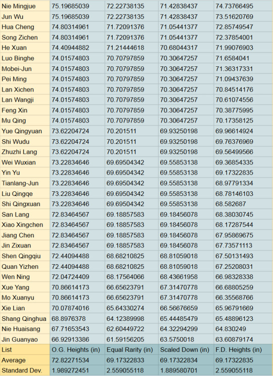
If MXTX's character's heights were real
The rest of the post is an unloading of all the fun I've had playing with the heights of most of the male adult characters from MXTX's novels. If you ever want to compare the heights of different male characters or pretend the novels don't exist in a magic-everyone-is-handsome-but-only-one-gay-relationship-can-exist-per-world alternate reality, this is your post.
I assume the average height of 19-year-old Chinese youths is 175.7 cm and the standard deviation is 6.5 cm (as of 2020, which was 3 years ago as of this post)
I referenced the Global Times article: "Average height of Chinese men sees the biggest rise of nearly 9 cm over 35 years: report" and a random height-percentile-in-different-countries website as it is literally impossible to find data on the standard deviation of height??
The inches and feet versions are at the end of the post, along with a comparison of a few of the heights
It all started with this chart by @jinxednoodle, which happens to be the first image if you google MXTX heights:

Free data? don't mind if I do…
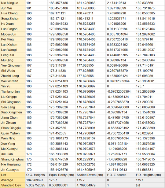
I finished with 3 final calculated columns
Equal Rarity
This column compares the characters' heights to one another by putting them in the context of the real-world equivalent height. Essentially, if you assume the distribution of heights is normal in MXTX-land and our sample accurately represents those heights (Neither is true, which is why this is Bad Math), being [character's name here]'s height in MXTX-land is as common as being ____ cm tall among a group of 19-year-old Chinese guys.
Perfect evidence that JGY is short
I divided each O.G. height by the average (~184.97) and standard deviation (the average difference between each number and the average) (5.05) of the O.G. heights, which gave me their z-scores (the number of standard deviations a number is from the average). I de-Z-scorified them by multiplying by 6.5 (the new STD) and adding 175.7 (the new average).
2. Scaled Down
This column just drags them small so they aren't giants compared to the rest of us
I divided the O.G. heights by their average (~184.97) and then multiplied by the 19CM average (175.7)
F.D. (Fixed Distribution) Heights
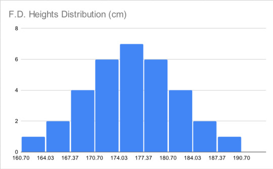
My personal favorite because it was the hardest to get right and my end goal all along. Heights are normally distributed, meaning if you mark all the heights along the horizontal axis and all the people with that height on the vertical, you should get a shape like the one below, with the exact average height in the exact middle, shorter people to the left, and taller to the right. I wasn't satisfied with only the average and standard deviation of my calculated samples matching real life, I wanted the distribution to match too

Below is the histogram of the O.G. heights. oof. Not the worst, because it only has one "hump" (one mode) and does have few extremely short people and few extremely tall people, but the shortest people have heights way further to the left of the mode than the tallest people's heights to the right of it. The data is heavily left-skewed. I think MXTX likes tall characters but cuts herself off at 191 cm (6'3.2") because any further is too tall to suspend disbelief.

I use an awful, unnecessarily complicated method after a few even worse attempts and split a normal distribution into 33 parts of equal area, then found the weighted average z-score of each section. I de-Z-scorified them by multiplying by 6.5 (the new STD) and adding 175.7 (the new average), producing the F.D. Heights column and this histogram:

I cannot tell you how many attempts I made before getting here. But my work was not done. Instead of starting with the O.G. heights, I had worked backward and needed to match my predetermined list of possible heights to the names. The order of who was at what height on my list was simple:
O.G. height was my first reference, but lots of characters are the same height. Their position in these "height blocks" was decided based on their appearance according to fandom.com. Anyone described as tall or strong-looking is put at the top and anyone delicate or synonymous is put near the bottom of the height block. Any additional selection was down by personal preference, which is why Yin Yu is exactly average (very evil of me), Mu Qing and Feng Xin are neighbors in height (to fuel the rivalry) and Yue Qingyuan is the tallest of his block (Big Bro vibes).
I didn't do the female heights because there were too few to make a good sample.
In Inches and Feet:

Example height differences, including an average 19-year-old female:

#bad math#mxtx#svsss#tgcf#mdzs#how do i tag this#reference#tall guys#China has a ThingTM with height#danmei#my posts
32 notes
·
View notes
Text
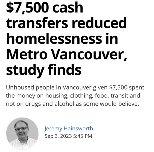
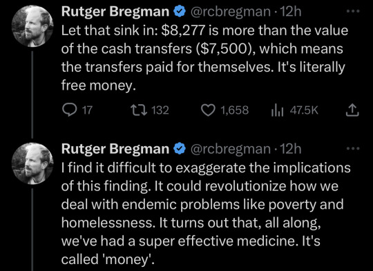
Unfortunately it's really easy to exaggerate the implications of the finding. I went down a pretty massive rabbit hole reading the study being referenced here (“Unconditional cash transfers reduce homelessness” (Ryan Dwyer, Anita Palepu, Claire Williams, and Jiaying Zhao 2023)). and looking at where the numbers came from, and that $8277 per person cost savings shows up in the discussion of the results but directly contradicts the findings. When they directly estimated the cost of services provided to the people in the study by counting the days the people used those services, they found a savings of around $2400 per person over the year - meaning with the $7500 lump sum payment, it was $5100 more expensive to give people a lump sum rather than $777 cheaper.
So where did the $8277 value come from? Why was it brought up in discussion? As far as I can tell, it comes from
Saying the participants who received cash spent 89 fewer days homeless and assuming, contrary to what they measured, that ALL days homeless were spent in shelters (as opposed to on the streets, in cars, couch surfing)
Assuming a cost of $94 per night for shelter
... based on a different study
... which had ranges of $14 to $144 per night for different kinds of housing
... which includes the MARKET VALUE PRICE OF THE BUILDING AMORTIZED AS A CAPITAL EXPENSE
which you would find if you dug through that study's appendix.
And if you pick that value you see a "cost savings", even though you measured a loss in the work at hand.
Now, this study has some other major problems, but that one seems glaring. Come on. You calculated the cost based on the actual number of days spent in the shelter, found that it was only $2400ish lower, and then made a worse estimate based on other people's approximations and intentionally misrepresented how long people spent in the shelters?
Here's their actual data.
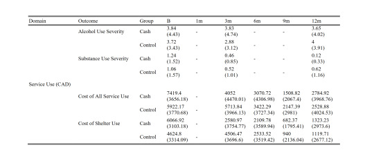
Values without parentheses are means, values in parens are standard deviations. "B" is the baseline survey and it covers the 12 month period before the study. Each 3-month survey captures 3 months' worth of spending. You can see that neither the cash nor control group used more than $7500 worth of housing in the prior year. Here's my little table showing the sums, for convenience:
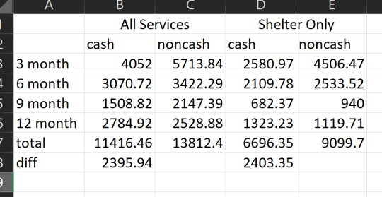
so. their own data really seem to contradict the conclusion they draw by estimating with other people's approximations.
anyway. there are a dozen other glaring issues but I think the main point is well-summarized by figures they left in the appendix. These figures show the standardized outcomes for a bunch of things they measured at the 1, 3, 6, 9, and 12-month surveys:
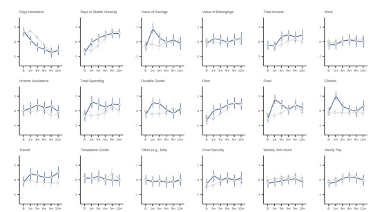

Blue lines got cash, grey lines didn't.
By the end of the study period - really, after the first three months - there was virtually no difference on any metric between the cash and non-cash groups. None.
This study was pre-registered. It stated its hypotheses ahead of time as well as the way it was going to do its power analysis, and
EVERY SINGLE HYPOTHESIS IT PREREGISTERED FAILED. Not significant.
Even in the exploratory findings, they found short-term benefits but "The cash transfer did not have overall impacts on employment, cognitive function, subjective well-being, alcohol use severity, education, or food security."
Like, yes! Giving people money increased the time they spent in stable housing by about 55 days over the year. That's valuable! That's good! But it didn't have any meaningful effect on whether they ended the year in stable housing, or whether they got a job, or even the value of their savings.
There's a whole nother rabbit hole, which I'll spare you, about the sampling bias they have here (only people 19-65 years old, homeless LESS THAN 2 YEARS, citizen or permanent resident, with nonsevere levels of substance use, alcohol use, and mental health symptoms, which excluded 69% of the shelter population) (and who agreed to participate, and stuck with the study - down to just 35 people in the sample group, <5% of the shelter population) - and two more rabbit holes about their "people don't want to give homeless people cash transfers because they think they'll spend it on drugs" studies. The news story screenshotted in the tweet kinda misrepresents that aspect too - if you explicitly exclude people with substance use and alcohol use issues from your study, the people you study don't spend money on drugs and alcohol! and water is wet. But that's a post for another day.
but in short:
the program did not save money. and the study sucks.
**** for the record! I think that society should absolutely ensure housing for everyone, especially the people with highest support needs. that's the point of society! and in general I think cash transfers can be far more effective at getting people fed and housed for many of the same reasons the study authors do. I really, really wanted this study to hold water because it would be a great piece of evidence in favor of faster and easier and cheaper ways to house people. But because I wanted it to be true so badly, I knew I ought to give it extra scrutiny. which I think was solidly warranted. ****
Source

Source
#sorry for coming onto your reblog and spilling trash everywhere#it's#I got curious about the study and was not pleased with what I found when I looked closer#fact checking#long post#for the record i believe in the value of cash transfers and donate money for cash transfers in poorer countries.#and i think housing and shelter are fundamental human rights#and like the function of a society is in large part to care for the people least able to care for themselves#and sobriety shouldn't be a prerequisite for housing and people with substance use problems should have safe and comfortable housing
55K notes
·
View notes
Text
Anova with multiple factors (python) for beer-days in a year
I have used the National Epidemiologic Survey of Drug Use and Health Code Book (NESARC ) for 2001-2002 in order to check if there is any influence of the highest academic degree completed (=explanatory) and the number of days a year people drink beer (=response). This is the python script:
********************************************************
import numpy import pandas import statsmodels.formula.api as smf import statsmodels.stats.multicomp as multi
data = pandas.read_csv('C:/Users/zop2si/Documents/Statistic_tests/nesarc_pds.csv', low_memory=False)
# convert data to numeric
data['S1Q4B'] = pandas.to_numeric(data['S1Q4B'], errors='coerce') # how first marriage ended data['S1Q6A'] = pandas.to_numeric(data['S1Q6A'], errors='coerce') # highest grade or school year completed data['S2AQ5B'] = pandas.to_numeric(data['S2AQ5B'], errors='coerce') # how often drank beer in the last 12 months
# subset adults age older than 18
sub1=data[data['AGE']>=18]
# SETTING MISSING DATA
sub1['S2AQ5B']=sub1['S2AQ5B'].replace(99, numpy.nan)
# recoding number of days when beer was drunk
recode1 = {1: 365, 2: 330, 3: 208, 4: 104, 5: 52, 6: 36, 7: 12, 8:11, 9: 6, 10: 2} sub1['BEERDAY']= sub1['S2AQ5B'].map(recode1)
# converting new variable USFREQMMO to numeric
sub1['BEERDAY']= pandas.to_numeric(sub1['BEERDAY'], errors='coerce')
ct1 = sub1.groupby('BEERDAY').size() print("Values in ct1 grouped by size of factor: ") print (ct1)
# using ols function for calculating the F-statistic and associated p value
model1 = smf.ols(formula='BEERDAY ~ C(S1Q6A)', data=sub1) results1 = model1.fit() print (results1.summary())
# drop empty rows from the model:
sub2 = sub1[['BEERDAY', 'S1Q6A']].dropna()
print(" ") print ('means for beerday by highest degree') m1= sub2.groupby('S1Q6A').mean() print (m1)
print(" ") print ('standard deviations for beerday by highest degree') sd1 = sub2.groupby('S1Q6A').std() print (sd1)
mc1 = multi.MultiComparison(sub2['BEERDAY'], sub2['S1Q6A']) res1 = mc1.tukeyhsd() print(" ") print(res1.summary())
Comments: running the script produces following results:
OLS Regression Results
Dep. Variable: BEERDAY R-squared: 0.006 Model: OLS Adj. R-squared: 0.005 Method: Least Squares F-statistic: 8.580 Date: Mon, 28 Apr 2025 Prob (F-statistic): 1.07e-17 Time: 13:55:01 Log-Likelihood: -1.1017e+05 No. Observations: 18291 AIC: 2.204e+05 Df Residuals: 18277 BIC: 2.205e+05 Df Model: 13
Covariance Type: nonrobust
-> Prob=1.07e-17., therefore we can reject Ho and accept Ha.
Ho: the completed highest academical degree has no influence in the beer-days a year.
Therefore, the completed highest academical degree has a significant influence in the yearly number of days that beer is drunk.
Checking the groups in pairs more insights can be won:
Multiple Comparison of Means - Tukey HSD, FWER=0.05
group1 group2 meandiff p-adj lower upper reject
1 2 30.8819 0.9 -46.5267 108.2905 False 1 3 10.0912 0.9 -53.692 73.8744 False 1 4 3.7916 0.9 -54.3187 61.902 False 1 5 5.0949 0.9 -57.4846 67.6745 False 1 6 16.2915 0.9 -41.2944 73.8774 False 1 7 21.7755 0.9 -33.2348 76.7858 False 1 8 18.233 0.9 -36.3811 72.8471 False 1 9 22.6684 0.9 -33.2449 78.5817 False 1 10 9.5206 0.9 -45.1032 64.1443 False 1 11 6.7234 0.9 -48.2474 61.6942 False 1 12 7.14 0.9 -47.6076 61.8875 False 1 13 -1.1993 0.9 -56.8982 54.4996 False 1 14 -4.0322 0.9 -59.0191 50.9548 False 2 3 -20.7907 0.9 -85.1972 43.6157 False 2 4 -27.0903 0.9 -85.8841 31.7035 False 2 5 -25.787 0.9 -89.0017 37.4276 False 2 6 -14.5904 0.9 -72.8659 43.685 False 2 7 -9.1064 0.9 -64.8381 46.6253 False 2 8 -12.649 0.9 -67.9897 42.6917 False 2 9 -8.2135 0.9 -64.8368 48.4097 False 2 10 -21.3614 0.9 -76.7116 33.9889 False 2 11 -24.1585 0.9 -79.8513 31.5342 False 2 12 -23.742 0.9 -79.2144 31.7304 False 2 13 -32.0812 0.7977 -88.4927 24.3303 False 2 14 -34.9141 0.6734 -90.6228 20.7946 False 3 4 -6.2996 0.9 -45.452 32.8529 False 3 5 -4.9963 0.9 -50.5188 40.5262 False 3 6 6.2003 0.9 -32.1694 44.57 False 3 7 11.6843 0.9 -22.6992 46.0679 False 3 8 8.1418 0.9 -25.6043 41.8878 False 3 9 12.5772 0.9 -23.2333 48.3878 False 3 10 -0.5706 0.9 -34.3323 33.191 False 3 11 -3.3678 0.9 -37.6882 30.9526 False 3 12 -2.9512 0.9 -36.9128 31.0103 False 3 13 -11.2905 0.9 -46.7653 24.1843 False 3 14 -14.1234 0.9 -48.4696 20.2228 False 4 5 1.3033 0.9 -35.8561 38.4626 False 4 6 12.4999 0.9 -15.4422 40.4419 False 4 7 17.9839 0.2658 -4.169 40.1368 False 4 8 14.4413 0.5532 -6.7086 35.5912 False 4 9 18.8768 0.3378 -5.432 43.1856 False 4 10 5.7289 0.9 -15.4459 26.9037 False 4 11 2.9317 0.9 -19.1229 24.9864 False 4 12 3.3483 0.9 -18.1438 24.8404 False 4 13 -4.9909 0.9 -28.8023 18.8205 False 4 14 -7.8238 0.9 -29.9187 14.2711 False 5 6 11.1966 0.9 -25.1371 47.5303 False 5 7 16.6806 0.9 -15.4151 48.7763 False 5 8 13.1381 0.9 -18.2737 44.5498 False 5 9 17.5735 0.8963 -16.0464 51.1934 False 5 10 4.4256 0.9 -27.0029 35.8542 False 5 11 1.6285 0.9 -30.3995 33.6565 False 5 12 2.045 0.9 -29.5982 33.6883 False 5 13 -6.2942 0.9 -39.5563 26.9679 False 5 14 -9.1271 0.9 -41.1828 22.9286 False 6 7 5.484 0.9 -15.2541 26.2222 False 6 8 1.9415 0.9 -17.7216 21.6046 False 6 9 6.3769 0.9 -16.65 29.4038 False 6 10 -6.7709 0.9 -26.4608 12.919 False 6 11 -9.5681 0.9 -30.2013 11.0651 False 6 12 -9.1515 0.9 -29.1823 10.8792 False 6 13 -17.4908 0.336 -39.992 5.0104 False 6 14 -20.3237 0.0599 -40.9999 0.3525 False 7 8 -3.5426 0.9 -13.3727 6.2876 False 7 9 0.8929 0.9 -14.6065 16.3923 False 7 10 -12.255 0.0026 -22.1386 -2.3713 True 7 11 -15.0521 0.0012 -26.7022 -3.4021 True 7 12 -14.6356 0.001 -25.1819 -4.0893 True 7 13 -22.9748 0.001 -37.6819 -8.2678 True 7 14 -25.8077 0.001 -37.5337 -14.0817 True 8 9 4.4354 0.9 -9.5931 18.464 False 8 10 -8.7124 0.0056 -16.0782 -1.3467 True 8 11 -11.5096 0.0046 -21.1164 -1.9028 True 8 12 -11.093 0.001 -19.3266 -2.8594 True 8 13 -19.4323 0.001 -32.5801 -6.2844 True 8 14 -22.2652 0.001 -31.9639 -12.5664 True 9 10 -13.1479 0.0957 -27.2139 0.9182 False 9 11 -15.945 0.0331 -31.3038 -0.5863 True 9 12 -15.5285 0.0236 -30.0678 -0.9891 True 9 13 -23.8677 0.001 -41.6572 -6.0782 True 9 14 -26.7006 0.001 -42.117 -11.2842 True 10 11 -2.7972 0.9 -12.4587 6.8644 False 10 12 -2.3806 0.9 -10.678 5.9168 False 10 13 -10.7199 0.2638 -23.9077 2.468 False 10 14 -13.5527 0.001 -23.3057 -3.7998 True 11 12 0.4166 0.9 -9.9219 10.755 False 11 13 -7.9227 0.8503 -22.4814 6.636 False 11 14 -10.7556 0.0982 -22.295 0.7838 False 12 13 -8.3393 0.7112 -22.0308 5.3523 False 12 14 -11.1721 0.0226 -21.5961 -0.7482 True
13 14 -2.8329 0.9 -17.4525 11.7867 False
1 note
·
View note
Text
ANOVA work
The work below is based on the 'Outlook on Life' dataset. The primary question that I looked at was how different groups perceive the treatment of the criminal justice system based on race.
I looked at two explanatory variables, first gender and second race. The response variable was a numerical rating from 1 to 7, with 1 being equal treatment and 7 being unequal treatment. The question asked by the researchers was whether or not minorities receive equal treatment as whites in the criminal justice system.
Looking at gender first, I rejected the 'null' hypothesis since the p-value was less than 0.05 (6.65e-6). Average ratings from women (2) were higher than men (1), meaning that women perceive less equality in the criminal justice system than men do. When I looked at just the averages (5.07 vs 5.46), I thought that this would not be a significant difference. But statistically it is. This is why it's important to 'check the math' and not just go on your gut feeling.
Looking at race second, I rejected the 'null' hypothesis since the p-value was less than 0.05 (1.48e-158). The Tukey post hoc test showed that group 2 (black) were different than the four comparison groups and had the highest rating (6.18). Group 1 (white) had the lowest rating (3.87) was different than three of the other groups - the only group that they were similar to was group 5 (2+ races), which had an average rating of 3.96. These results mean that whites have the highest perception of equal treatment of minorities in the criminal justice system and blacks have the lowest.
code{
import numpy import pandas import statsmodels.formula.api as smf import statsmodels.stats.multicomp as multi
data = pandas.read_csv('ool_pds.csv', low_memory=False)
setting variables you will be working with to numeric
data['W1_K4'] = pandas.to_numeric(data['W1_K4'])
subset data to those who answered according to the rating system (1-7), excluding refused (-1) and not sure (9)
sub1=data[(data['W1_K4']>=1) & (data['W1_K4']<=7)] #& (data['PPETHM']>=3) & (data['PPETHM']<=4)]
ct1 = sub1.groupby('W1_K4').size() print (ct1)
using ols function for calculating the F-statistic and associated p value
model1 = smf.ols(formula='W1_K4 ~ C(PPGENDER)', data=sub1) results1 = model1.fit() print (results1.summary())
sub2 = sub1[['W1_K4', 'PPGENDER']].dropna()
print ('means for rating of criminal justice treatment by gender') m1= sub2.groupby('PPGENDER').mean() print (m1)
print ('standard deviations for rating of criminal justice treatment by gender') sd1 = sub2.groupby('PPGENDER').std() print (sd1)
by race
sub3 = sub1[['W1_K4', 'PPETHM']].dropna()
model2 = smf.ols(formula='W1_K4 ~ C(PPETHM)', data=sub3).fit() print (model2.summary())
print ('means for rating of criminal justice treatment by race') m2= sub3.groupby('PPETHM').mean() print (m2)
print ('standard deviations for rating of criminal justice treatment by race') sd2 = sub3.groupby('PPETHM').std() print (sd2)
mc1 = multi.MultiComparison(sub3['W1_K4'], sub3['PPETHM']) res1 = mc1.tukeyhsd() print(res1.summary())
}
results {
W1_K4 1 170 2 112 3 91 4 165 5 343 6 317 7 800 dtype: int64
OLS Regression Results
Dep. Variable: W1_K4 R-squared: 0.010 Model: OLS Adj. R-squared: 0.010 Method: Least Squares F-statistic: 20.40 Date: Mon, 21 Apr 2025 Prob (F-statistic): 6.65e-06 Time: 14:03:17 Log-Likelihood: -4162.2 No. Observations: 1998 AIC: 8328. Df Residuals: 1996 BIC: 8340. Df Model: 1
Covariance Type: nonrobust
coef std err t P>|t| [0.025 0.975]
Intercept 5.0651 0.064 79.114 0.000 4.940 5.191
C(PPGENDER)[T.2] 0.3940 0.087 4.517 0.000 0.223 0.565
Omnibus: 234.131 Durbin-Watson: 1.893 Prob(Omnibus): 0.000 Jarque-Bera (JB): 319.632 Skew: -0.973 Prob(JB): 3.91e-70
Kurtosis: 2.777 Cond. No. 2.72
Notes: [1] Standard Errors assume that the covariance matrix of the errors is correctly specified. means for rating of criminal justice treatment by gender W1_K4 PPGENDER 1 5.065076 2 5.459108 standard deviations for rating of criminal justice treatment by gender W1_K4 PPGENDER 1 1.989139 2 1.904511
OLS Regression Results
Dep. Variable: W1_K4 R-squared: 0.310 Model: OLS Adj. R-squared: 0.308 Method: Least Squares F-statistic: 223.4 Date: Mon, 21 Apr 2025 Prob (F-statistic): 1.48e-158 Time: 14:03:17 Log-Likelihood: -3802.3 No. Observations: 1998 AIC: 7615. Df Residuals: 1993 BIC: 7643. Df Model: 4
Covariance Type: nonrobust
coef std err t P>|t| [0.025 0.975]
Intercept 3.8666 0.062 62.148 0.000 3.745 3.989 C(PPETHM)[T.2] 2.3130 0.078 29.469 0.000 2.159 2.467 C(PPETHM)[T.3] 0.9027 0.268 3.374 0.001 0.378 1.427 C(PPETHM)[T.4] 1.1855 0.177 6.693 0.000 0.838 1.533
C(PPETHM)[T.5] 0.0977 0.313 0.312 0.755 -0.517 0.712
Omnibus: 153.821 Durbin-Watson: 1.924 Prob(Omnibus): 0.000 Jarque-Bera (JB): 189.998 Skew: -0.715 Prob(JB): 5.53e-42
Kurtosis: 3.488 Cond. No. 10.3
Notes: [1] Standard Errors assume that the covariance matrix of the errors is correctly specified. means for rating of criminal justice treatment by race W1_K4 PPETHM 1 3.866569 2 6.179532 3 4.769231 4 5.052083 5 3.964286 standard deviations for rating of criminal justice treatment by race W1_K4 PPETHM 1 2.006179 2 1.306314 3 1.769055 4 1.755411 5 2.301081
Multiple Comparison of Means - Tukey HSD, FWER=0.05
group1 group2 meandiff p-adj lower upper reject
1 2 2.313 0.001 2.0987 2.5273 True 1 3 0.9027 0.0068 0.1723 1.633 True 1 4 1.1855 0.001 0.7019 1.6691 True 1 5 0.0977 0.9 -0.7577 0.9531 False 2 3 -1.4103 0.001 -2.1326 -0.688 True 2 4 -1.1274 0.001 -1.5987 -0.6562 True 2 5 -2.2152 0.001 -3.0637 -1.3668 True 3 4 0.2829 0.885 -0.5595 1.1252 False 3 5 -0.8049 0.2663 -1.9038 0.2939 False
4 5 -1.0878 0.0159 -2.0406 -0.135 True
}
1 note
·
View note
Text
Pregnancy outcome and the time required for next conception, Jain (1969) looks at a large group of presumably fertile women and seeks to determine the average age of conception after a previous pregnancy or the length of time between pregnancies in the absence of birth control. According to the study the average length of time between pregnancies remains high in those under the age of 20, then levels out to spike again in individual women according to advancing age. Additionally the outcome of the pregnancy was also considered, where those who had live births ending the pregnancy or fetal death via natural or artificial means also experienced shortened pregnancy intervals, though higher among ages less than 20 and which gradually increases with maternal age. Hypotehsis The paper hypothesis surrounds an empirical exploration to add to the knowledge base regarding the length of pregnancy interval by age of women and to help provide an inferred length of amenorrhea among these same women all in the absence of contraception, with the assumption that in the absence of contraception the natural pregnancy interval will be determined. Statistical Methodology The methodology employed is demonstrative of a simple mean and variance report, where the average was determined and then a variance among all participants was determined. The mean is determined in this study by adding all the interval lengths in months of all the participants and then dividing by the number of participants to determine the average between them. The mean is then calculated based on both maternal age as well as the outcome of the pregnancy i.e. live birth, termination of pregnancy and infant death at birth, prior to one year of age and after one year of age. The variance is determined by finding the square of the standard deviation, which is the square root of the variance. The sample is derived from a 2,443 sample of surveyed individual married women who recorded their pregnancy histories prior to beginning a family planning program, in Taichung (Taiwan) known as the Intensive Fertility Survey (1962). The sample are then weeded out by eliminating the data associated with those who reported any contraception use (only about 7%). (422) Additionally the researchers then further reduce the statistical analysis data by eliminating the first pregnancy interval or the time it took from marriage to first pregnancy end, as well as the last (open)pregnancy interval the last pregnancy end to the survey time so as not to skew the data unnecessarily. The work also notes two statistical biases that are significant for obtaining accurate data and then attempts to account for them statistically, a truncation bias where the researchers believed that the collective data of all women irrespective of age would bias the results, to account for this possible bias the researchers offered statistical analysis of two methods of data analysis. One where the interval determination was the same for all participants and one where the age was measured at the beginning of pregnancy intervals for age groups less than 20 and 20-24 and at the end of pregnancy intervals for the age groups 25-29,30-34 and 35-39. (424-425) The second potential bias discussed is a memory bias, associated with the inability of individuals to remember pregnancy intervals from the past especially when reporting fetal deaths from the past and the researcher assumes this bias will be greater for the older participants than the younger (423). Results The results of the study indicate that the mean pregnancy interval was 16 months in the absence of contraception. The researchers go on to state that this number was greatly affected by the outcome of the preceding pregnancy, where pregnancies that resulted in live birth and an infant that survived to one year the interval was 17 months. Additionally, if the preceding pregnancy ended in fetal death prior to one year the following pregnancy interval was shortened by 6 months. The work then goes on to statistically compare the two methods of age classification and the statistical comparison between the various ages, which included a high pregnancy interval in the less than 20 age group that then declined again in the 20-24 age group and gradually increased in the remaining age groups 25-29,30-34 and 35-39. (424-430) Finally, the researcher then attempts to conclude the statistical data on the length of amenorrhea following pregnancy termination. (430-433) Conclusion This work is clearly dated, (1969) but it is also important to note that the age of the dataset may be essential for the data collected as finding a large population of married women who practice no contraception is exceedingly rare given the pervasive nature of contraception use all over the world today. A much more timely work associated with pregnancy interval, looking specifically at the impact of pregnancy interval (intentional or otherwise) and the outcome of pregnancies (i.e. fetal prematurity, underweight or death) utilized a much larger sample of 14,930 women. The work did not use multiple pregnancy data (eliminating memory bias) but instead used the documented pregnancy interval from the termination of the previous pregnancy to the beginning of the next pregnancy (based on due date calculations) after termination of current pregnancy. (Cecatti, Correa-Silva, Milanez, Morais, & Souza, 2008) The data collection for the Jain study clearly could have used this method of collection (i.e. current to past for a current pregnancy based on report or medical records) to arrive at a dataset with less unknown and/or notable memory bias. Though the intention of the Jain work was to inflate data availability by including multiple pregnancy via survey self-report the inclusion of memory bias as well as self-report bias using this method is questionable. The intention of the second work additionally was to determine the outcome of pregnancies, i.e. maternal and infant health based on pregnancy intervals as opposed to just determining the interval itself which is reported by the researcher to be a median of 27 months, which again varied by age and other demographic factors. The findings of this research article are also based upon only pregnancies that end in live birth in the current pregnancy, and again are based on the end of the interval between the termination of the last pregnancy and the end of the current pregnancy, minus the gestation period. The mean pregnancy interval was not calculated as this was not of interest to the researchers but the largest statistical group (34.6%) included pregnancy intervals of Read the full article
0 notes
Text
you have hit on one of the great paradoxes if designing for the average (mean) human being: while most people (68% in a normal distribution) are within one standard deviation of average, very few people, if any at all, are EXACTLY the perfect measurements of average
In the 1920s, the US Air Force measured hundreds of pilots to create a perfectly average-fitted cockpit.
nobody fit in it. pilots crashed all the fucking time.
in the 1940s and 50s they remeasured thinking there had been some generational change in the average. that wasn't the problem. The problem, someone finally discovered, was that even among the limited preselected group of AF pilots used to calculate the average, no individual was matched the average across all the measurements. no individual was average enough to fit the perfectly average cockpit
the solution was not a perfectly average cockpit but a cockpit were everything was adjustable
anyway, this test technically gives people enough information to figure out how many standard deviations from normal you are but i don't think standard deviations are a commonly understood phenomenon if you haven't taken a statistics class (or if it's been a while). It would be more meaningful if the test told you directly.
here's the shorthand/quick and dirty calculation of standard deviations
ok so prev's perfectly average score means they see greener than 50% of people and bluer than 50% of people, right?
ok. so. assuming this data set is a normal (bell curve) distribution, which it seems to be even if it's displayed a little irregularly, everyone who sees bluer or greener than 50-84% of the population falls within one standard deviation of the perfect average. (because the middle 68%--34 over and 34 under center-- is within one standard deviation.)
(For example. I see bluer than the entire greenleaning 50% + 16% of less blueleaning people at 66%, my 16% off center falls squarely inside a standard deviation of up to 34% off center)
so. if the percentage the test gave you is a number under or up to 84% you're definitely normal
ok but guess what statistically you're not even really considered weird ("stastitically significant") until you're TWO standard deviations from normal. two standard deviations is the middle NINETY-FIVE+ percent of results. if you see bluer (or greener) than the bottom 50% plus ~48% of blue seers who lean less blue than you--if the test gave a number of 98% or higher--ok you're a weirdo. under 98% you're not a statistically significant result--you're well with expected range.
you wanna be different tho you wanna be an outlier? you wanna be spiders georg? ok "outlier" is technically subjective ie scientists decide what counts as an outlier on a dataset-by-dataset basis
but kind if a rule of thumb is three standard deviations from average? that's an outlier.
three standard deviations covers 99.7% of the normally distributed bell curve. to fall beyond it, you gotta be greener (or bluer) than the bottom 50%, + 49.85% of folks who lean green less strongly than you.
if the test told your percentage was 99.85% or higher (and i'm not sure it gives figures to that decimal place at all) you are vision spiders georg.
tl;dr hardly anyone ever is perfectly average but the vast majority of results are statistically normal
HOW DO YOUR PERCEIVE BLUE AND GREEN?
24K notes
·
View notes
Text
DataCAMP Data Collection Solution | AHHA Labs

AHHA Labs' DataCAMP data collection solution is a powerful industrial AI-driven platform designed to gather, process, and analyze data from various sources in real time. It enables manufacturers to optimize production, enhance equipment efficiency, and improve decision-making through smart data collection and AI analytics.
- Data CAMP Business intelligence enabled by user-friendly dashboard
Data CAMP offers a range of built-in statistical process control (SPC) solutions. Users can analyze patterns in collected manufacturing data and detect anomalous trends in real time.
Statistical process control (SPC) is a technique for managing production processes and quality. It helps companies maximize their assets, reduce rework or scrap, and produce more products that meet quality standards. Data CAMP provides a variety of SPC functions useful for manufacturing companies, allowing organizations to select and apply individual SPCs that fit their manufacturing context.
- Real-time process monitoring and anomaly detection
Data CAMP collects and analyzes manufacturing data to derive insights into processes and quality.
- I-MR, Xbar-R, Xbar-S chart
Monitor variability in the production process
Display Center Line (CL), Upper Control Limit (UCL), and Lower Control Limit (LCL)
Intuitively understand process status
- Process Capability Index (CPK) and Process Performance Index (PPK)
Measure how consistently the process operates within specification limits in the short and long term
- Parameter Correlation Analysis
Calculate the influence of different variables
Identify factors that significantly impact product quality
- Various Specification Management Functions
Define tolerance ranges for products and processes
The visual dashboard allows users to view each measurement in chronological order, observe variations between data points, and intuitively see the average value, range, and standard deviation of each sample group. This enables quick and accurate determination of the need for process improvement.
- Configure a manufacturing field-specific dashboard
Design an SPC application pipeline and configure visualization dashboards for your manufacturing context to enhance overall process efficiency, operational transparency, and accessibility, and to facilitate data-driven decisions. Organizations can consistently produce high-quality products, maintain competitiveness, and boost customer satisfaction.
If you are looking for data collection solution and industrial AI models, you can find it at AHHA Labs.
Click here if you are interested in AHHA Labs products.
View more: DataCAMP Data Collection Solution
0 notes
Text
SAS Tutorial for Researchers: Streamlining Your Data Analysis Process
Researchers often face the challenge of managing large datasets, performing complex statistical analyses, and interpreting results in meaningful ways. Fortunately, SAS programming offers a robust solution for handling these tasks. With its ability to manipulate, analyze, and visualize data, SAS is a valuable tool for researchers across various fields, including social sciences, healthcare, and business. In this SAS tutorial, we will explore how SAS programming can streamline the data analysis process for researchers, helping them turn raw data into meaningful insights.
1. Getting Started with SAS for Research
For researchers, SAS programming can seem intimidating at first. However, with the right guidance, it becomes an invaluable tool for data management and analysis. To get started, you need to:
Understand the SAS Environment: Familiarize yourself with the interface, where you'll be performing data steps, running procedures, and viewing output.
Learn Basic Syntax: SAS uses a straightforward syntax where each task is organized into steps (Data steps and Procedure steps). Learning how to structure these steps is the foundation of using SAS effectively.
2. Importing and Preparing Data
The first step in any analysis is preparing your data. SAS makes it easy to import data from a variety of sources, such as Excel files, CSVs, and SQL databases. The SAS tutorial for researchers focuses on helping you:
Import Data: Learn how to load data into SAS using commands like PROC IMPORT.
Clean Data: Clean your data by removing missing values, handling outliers, and transforming variables as needed.
Merge Datasets: Combine multiple datasets into one using SAS’s MERGE or SET statements.
Having clean, well-organized data is crucial for reliable results, and SAS simplifies this process with its powerful data manipulation features.
3. Conducting Statistical Analysis with SAS
Once your data is ready, the next step is performing statistical analysis. SAS offers a wide array of statistical procedures that researchers can use to analyze their data:
Descriptive Statistics: Calculate basic statistics like mean, median, standard deviation, and range to understand your dataset’s characteristics.
Inferential Statistics: Perform hypothesis tests, t-tests, ANOVA, and regression analysis to make data-driven conclusions.
Multivariate Analysis: SAS also supports more advanced techniques, like factor analysis and cluster analysis, which are helpful for identifying patterns or grouping similar observations.
This powerful suite of statistical tools allows researchers to conduct deep, complex analyses without the need for specialized software
4. Visualizing Results
Data visualization is an essential part of the research process. Communicating complex results clearly can help others understand your findings. SAS includes a variety of charting and graphing tools that can help you present your data effectively:
Graphs and Plots: Create bar charts, line graphs, histograms, scatter plots, and more.
Customized Output: Use SAS’s graphical procedures to format your visualizations to suit your presentation or publication needs.
These visualization tools allow researchers to present data in a way that’s both understandable and impactful.
5. Automating Research Workflows with SAS
Another benefit of SAS programming for researchers is the ability to automate repetitive tasks. Using SAS’s macro functionality, you can:
Create Reusable Code: Build macros for tasks you perform frequently, saving time and reducing the chance of errors.
Automate Reporting: Automate the process of generating reports, so you don’t have to manually create tables or charts for every analysis.
youtube
Automation makes it easier for researchers to focus on interpreting results and less on performing routine tasks.
Conclusion
The power of SAS programming lies in its ability to simplify complex data analysis tasks, making it a valuable tool for researchers. By learning the basics of SAS, researchers can easily import, clean, analyze, and visualize data while automating repetitive tasks. Whether you're analyzing survey data, clinical trial results, or experimental data, SAS has the tools and features you need to streamline your data analysis process. With the help of SAS tutorials, researchers can quickly master the platform and unlock the full potential of their data.
#sas tutorial#sas tutorial for beginners#sas programming tutorial#SAS Tutorial for Researchers#Youtube
0 notes
Text
LAB 1 ASSIGNMENT DISPLAYING AND DESCRIBING DISTRIBUTIONS
In this lab assignment, you will use Excel to display and describe observations on a single variable from several groups. In particular, you will use histograms and boxplots to display the data. Also, you will calculate summary statistics for the data like the mean, standard deviation, median, and interquartile range. Before you start working on the assignment questions, you should get familiar…
0 notes
Text

HIM6007 Statistics for Business Decisions Assessment Group Assignment
Assessment Details and Submission GuidelinesTrimesterT3 2024Unit CodeHIM6007Unit TitleStatistics for Business DecisionsAssessment TypeGroup AssignmentDue Date + time:
Due on 31/01/2025
11.59 pm (Melb/ Sydney time)
Purpose of the assessment (with ULO Mapping)
Students are required to show understanding of the principles and techniques of business research and statistical analysis taught in the course.
Integrate theoretical and practical knowledge from the discipline of Statistics for Business Decision Making to solve business needs; Synthesise advanced theoretical, practical knowledge fromthe discipline of statistics for business decision and be able to apply statistical tools and techniques to solve business problems; Critically analyse a scenario and apply and justify statistical techniques to solve business problems and the explain the results to a range of stakeholders. Work well autonomously as well as within groupsettings to identify and apply statistical solutions to a business scenario Weight40%Total MarksAssignment (40 marks)Word limitN/A, except where specifiedSubmission Guidelines
All work must be submitted on Blackboard by the duedate along witha completed Assignment Cover Page. The assignment must be in MS Word formatunless otherwise specified. Academic Integrity InformationHolmes Institute is committed to ensuring and upholding academic integrity. All assessments must comply with academic integrity guidelines. Please learn about academic integrity and consult your teachers with any questions. Violating academic integrity is serious and punishable by penalties that range fromdeduction of marks, failure of the assessment task or unit involved, suspension of course enrolment, or cancellation of course enrolment.Penalties
All work must be submitted on Blackboard by the duedate and time,along with a completed Assessment Cover Page. Late penalties apply. Your answers must be based on Holmes Institute syllabus of this unit. Outside sources may notamount to more than 10% of any answer and must be correctly referenced in full. Over-reliance on outside sources will be penalised Reference sources must be cited in the textof the reportand listed appropriately at the end in a reference list using Holmes Institute Adapted Harvard Referencing. Penalties are associated with incorrect citation and referencing. Group Assignment Guidelines and Specifications
PART A (20 marks)
Assume your group is the data analytics team in a renowned Australian company. The company offers its assistance to a distinct group of clients, including (but not limited to) public listed companies, small businesses, and educational institutions. The company has undertaken several data analysis projects, all based on multiple regression analysis. One such project is related to the real estate market in Australia, and the team needs to answer the following research question based on their analysis.
Research question:
How do different factors, such as the size of the land, the number of bedrooms, the distance to the nearest secondary school, and the number of garage spaces, influence the selling price of residential properties?
Task
Create a data set (in Excel) that satisfies the following conditions. (You are required to upload the data file separately).
Minimum number of observations — 100 observations. The data set should be based on houses soldfrom 01/07/2024 onwards. (To verify the data set, you are required to add a hyperlink to each property’s details from the real estate websites that you used.) (5 marks)
Questions
Conduct a descriptive statistical analysis in Excel using the data analysis tool. Create a table that includes the following descriptive statistics for each variable in your data set: mean, median, mode, variance, standard deviation, skewness, kurtosis, and coefficient of variation. (4 marks)
Provide a brief commentary on the descriptive statistics you calculated. Describe the characteristics of the distribution for each variable based on these statistics. (4 marks) Create an appropriate graph to illustrate the distribution of the number of bedrooms in your data set. (2 marks) Derive a suitable graph to represent the relationship between the dependent variable and the land size in your data set and comment on the identified relationship. (3 marks) Based on the data set, perform correlation analysis, and based on the correlation coefficients in the correlation output, assess the correlation between explanatory variables and check for the possibility of multi collinearity . (2 marks) Part B (15 marks)
Assume your group is the data analytics team in a renowned Australian company (CSIRO). You are given the dataset derived from their recent research. This data compiles fortnightly observations of Logan’s Dam, a small body of water located near Gatton, in Southeast Queensland. It consists of measurements taken by CSIRO and the Urban Water Security Research Alliance with the intention of measuring the impact of the application of an evaporation-reducing monolayer on the dam’s surface.
The measurements recorded indicate the biomasses present (P.plankton and Crustacean) in the dam, chemicals present in the dam (Ammonia and Phosphorus) , as well as more general measures of water quality such as pH and temperature.
Research Question:
What are the factors (variables) that significantly impact on the health of the dam in relation to water Turbidity, and what measures should be taken to ensure its effective maintenance?
Task
Note: Refer the data given the excel file “HIM6007 T3 Dam_Water_Quality_Dataset”
Based on the data set, perform regression analysis and correlation analysis, and answer the questions given below. (Hint: Turbidity as dependent variable)
Derive the multiple regression equation. (2 marks) Interpret the meaning of all the coefficients in the regression equation. (3 marks) Interpret the calculated coefficient of determination. (2 marks) At a 5% significance level, test the overall model significance. (2 marks) At a 5% significance level, assess the significance of the independent variables in the model. (3 marks) Based on the correlation coefficients in the correlation output, assess the correlation between explanatory variables and check for the possibility of multicollinearity. (3 marks) PART C (5 marks)
Based on the answers in PART A above, write a summary of your analysis addressing the research question (100 -150 words). (3 marks) Based on the answers in PART B above, write a summary of your analysis addressing the research question (100 words). (2 marks) Marking criteria
Marking criteriaWeightingPART A Data collection (Excel spreadsheet)5 marksDescriptive statistical analysis and review (Questions i andii)8 marksGraphical representations of data (Questions iii and iv)5 markscorrelation output and interpretation of coefficients (Questions v)2 marksPART B Derive the multiple regression equation and interpret the meaning of all the coefficients in the regression equation (Question i and ii)5 marksInterpretation of coefficient of determination (Question iii)2 marksAssessing the overall model significance (Questioni and v)5 marksExamining the correlation between explanatory variables and checking for the possibility of multicollinearity (Question iv)3 marksPART C Summary (i and ii)5 marksTOTAL Weight40 Marks
Assessment Feedback to the Student:
Marking Rubric
ExcellentVery GoodGoodSatisfactoryUnsatisfactoryPerformingDemonstration ofDemonstration ofDemonstration ofDemonstration ofDemonstration ofdescriptiveoutstandingvery goodgood knowledgebasic knowledgepoor knowledge onstatistical analysisknowledge onknowledge onon descriptiveon descriptivedescriptive measuresand review of thedescriptivedescriptivemeasuresmeasures calculated valuesmeasuresmeasures Deriving suitableDemonstration ofDemonstration ofDemonstration ofDemonstration ofDemonstration of poorgraph to representoutstandingvery goodgood knowledgebasic knowledge onknowledge onthe relationship between variables
knowledge
on presentation of data
knowledge on presentation of data
using presentation
on presentation of data using suitable
chart types.
presentation of
data
using suitable chart
presentation of data using suitable chart
types.
using suitable chartof data using types. types.suitable chart types. Deriving multiple regression equation based on the regression output.
Demonstration of outstanding knowledge
on regression model estimation and interpretation
Demonstration of very good knowledge on regression model estimation and interpretationDemonstration of good knowledge on regression model estimation and interpretationDemonstration of basic knowledge on regression model estimation and interpretation
Demonstration of poor knowledge on regression
model estimation and interpretation
Interpreting the calculated coefficient of determination.
Demonstration of outstanding knowledge
on coefficient of determination calculation and interpretation of relationship between
variables
Demonstration of very good knowledge on coefficient of determination calculation and interpretation of relationshipDemonstration of good knowledge on coefficient of determination calculation and interpretation of relationship between variables
Demonstration of basic knowledge on coefficient of determination calculation and interpretation of relationship
between variables
Demonstration of poor knowledge on coefficient of determination calculation and interpretation of relationship between
variables
between variables Assessing the overall model significance.Demonstration of outstanding knowledge on model significance
Demonstration of very good
knowledge on model significance
Demonstration of good knowledge on model
significance
Demonstration of basic knowledge on model significanceDemonstration of poorknowledge on model significanceAssessing the significance of independent variables in the model.Demonstration of outstanding knowledge on significance of independent variables.
Demonstration of very good knowledge on significance of independent
variables.
Demonstration of good knowledge on significance of independent
variables.
Demonstration of basic knowledge on significance of independent
variables.
Demonstration of poorknowledge on
significance of independent variables.
Examining the correlation between explanatory variables and check the possibility of
multicollinearity.
Demonstration of outstanding knowledge on correlation
coefficient calculation, interpretation of relationship between variables and assessing
multicollinearity.
Demonstration of very good knowledge on correlation coefficient calculation, interpretation of relationship between variables and assessing
multicollinearity.
Demonstration of good knowledge correlation coefficient calculation, interpretation of relationship between variables and assessing
multicollinearity.
Demonstration of basic knowledge on correlation coefficient calculation, interpretation of relationship between variables and assessing
multicollinearity.
Demonstration of poorknowledge on
correlation coefficient calculation, interpretation of relationship between variables and assessing multicollinearity.
Addressing research questions based on data analysisDemonstration of outstanding knowledge on addressing research questions based on data analysis.
Demonstration of very good knowledge on addressing research questions basedon
data analysis.
Demonstration of good knowledge on addressing research questions based on data
analysis.
Demonstration of basic knowledge on addressing research questions basedon data analysis.Demonstration of poor knowledge on addressing research questions based on data analysis.
Your final submission is due Friday of week ten before midnight.
The following penalties will apply:
Late submissions -5% per day. No cover sheet OR inaccuracies on the cover sheet -10% No title page -10% Inaccuracies in referencing OR incomplete referencing OR not in Holmes-adapted-Harvard style -10% Student Assessment Citation and Referencing Rules
Holmes Institute has implemented a revised Harvard approach to referencing. The following rules apply:
Reference sources in assignments are limited to sources that provide full-text access to the source’s content for lecturers and markers. The reference list must be located on a separate page at the end of the essay and titled: “References”. The reference list must include the details of all the in-text citations, arranged A-Z alphabetically by author’s surname with each reference numbered (1 to 10, etc.) and each reference MUST include a hyperlink to the full text of the cited reference source. For example: Hawking, P., McCarthy, B. & Stein, A. 2004. Second Wave ERP Education, Journal of Information Systems Education, Fall, http://jise.org/Volume15/n3/JISEv15n3p327.pdf
All assignments must include in-text citations to the listed references. These must include the surname of the author/s or name of the authoring body, year of publication, page number of the content, and paragraph where the content can be found. For example, “The company decided to implement an enterprise-wide data warehouse business intelligence strategy (Hawking et al., 2004, p3(4)).”
Non-Adherence to Referencing Rules
Where students do not follow the above rules, penalties apply:
For students who submit assignments that do not comply with all aspects of the rules, a 10% penalty will be applied. Students who do not comply with guidelines BUT their citations are ‘fake’ will be reported for academic misconduct. Academic Integrity
Holmes Institute is committed to ensuring and upholding Academic integrity, as Academic Integrity is integral to maintaining academic quality and the reputation of Holmes’ graduates. Accordingly, all assessment tasks need to comply with academic integrity guidelines. Table 1 identifies the six categories of Academic Integrity breaches. If you have any questions about Academic Integrity issues related to your assessment tasks, please consult your lecturer or tutor for relevant referencing guidelines and support resources. Many of these resources can also be found through the Study Sills link on Blackboard.
Academic Integrity breaches are a serious offence punishable by penalties that may range from deduction of marks, failure of the assessment task or unit involved, suspension of course enrolment, or cancellation of course enrolment.
Table 1: Six categories of Academic Integrity breaches
PlagiarismReproducing the work of someone elsewithout attribution. Whena student submits their own work on multiple occasions this is known as self- plagiarism.CollusionWorking with one or more other individuals to complete an assignment, in a way that is not authorised.CopyingReproducing and submitting the work of another student, with or without their knowledge. If a studentfails to takereasonable precautions to prevent their own original work from being copied, this may also be considered an offence.ImpersonationFalsely presenting oneself, or engaging someone else to present as oneself, in an in-person examination.Contract cheatingContracting a third party to complete an assessment task,generally in exchange for money or other manner of payment.Data fabrication and falsificationManipulating or inventing data with the intent of supporting false conclusions, including manipulating images.
“Need academic support? Punjab Assignment Help offers personalized, expert assignment solutions that ensure you meet deadlines and earn top grades!”
0 notes
Text
Excel Data analysis
Excel Data analysis Data analysis Excel is a powerful tool for data analysis, offering a wide range of features to help you understand and interpret your data. Here are some key aspects of data analysis in Excel: 1. Data Preparation: Data Entry and Import: Excel allows you to manually enter data or import it from various sources like CSV files, databases, and other spreadsheets. Data Cleaning: This involves identifying and correcting errors, inconsistencies, and missing values. Techniques include: Filtering: Isolating specific data based on criteria. Sorting: Arranging data in ascending or descending order. Removing Duplicates: Eliminating redundant data. Text to Columns: Splitting data within a single cell into multiple columns. Data Transformation: This involves modifying data to suit your analysis needs. Techniques include: Formulas and Functions: Using built-in functions like SUM, AVERAGE, IF, and VLOOKUP to perform calculations and manipulate data. PivotTables: Summarizing and analyzing large datasets by grouping and aggregating data. Data Tables: Performing "what-if" analysis by changing input values and observing the impact on results. 2. Data Analysis Techniques: Descriptive Statistics: Calculating summary statistics like mean, median, mode, standard deviation, and percentiles to describe the central tendency and variability of your data. Data Visualization: Creating charts and graphs (e.g., bar charts, line graphs, scatter plots, pie charts) to visually represent data and identify trends, patterns, and outliers. Regression Analysis: Modeling the relationship between variables to make predictions or understand cause-and-effect relationships. Hypothesis Testing: Using statistical tests to determine if there is significant evidence to support a claim or hypothesis about your data. Data Mining: Discovering hidden patterns and relationships within large datasets using techniques like clustering and classification. 3. Tools and Features: Formulas and Functions: A vast library of built-in functions for calculations, data manipulation, and statistical analysis. PivotTables: Powerful tool for summarizing and analyzing large datasets by creating interactive tables. Charts and Graphs: A variety of chart types to visualize data effectively. Conditional Formatting: Applying visual rules to highlight data that meets specific criteria. Data Analysis ToolPak: An add-in that provides advanced statistical and data analysis tools, including regression, ANOVA, and time series analysis. 4. Examples of Data Analysis in Excel: Financial Analysis: Calculating financial ratios, analyzing stock trends, and forecasting future performance. Sales Analysis: Tracking sales trends, identifying top-selling products, and analyzing customer behavior. Market Research: Analyzing survey data, identifying customer preferences, and segmenting markets. Quality Control: Monitoring product quality, identifying defects, and analyzing production processes. Scientific Research: Analyzing experimental data, conducting statistical tests, and generating reports. By effectively utilizing Excel's data analysis features, you can gain valuable insights from your data, make informed decisions, and improve your business or research outcomes. اكسل متقدم via عالم الاوفيس https://ift.tt/k2WmMpl January 01, 2025 at 01:03AM
0 notes
Text
ANALYSIS OF VARIANCE OF EFFECTS BY CONSUMING CANNABIS
This assignment aims to directly test my hypothesis by evaluating, based on a sample of 2412 U.S. cannabis users aged between 18 and 30 years old (subsetc5), my research question with the goal of generalizing the results to the larger population of NESARC survey, from where the sample has been drawn. Therefore, I statistically assessed the evidence, provided by NESARC codebook, in favor of or against the association between cannabis use and mental illnesses, such as major depression and general anxiety, in U.S. adults. As a result, in the first place I used ols function in order to examine if depression (‘MAJORDEP12’) and anxiety ('GENAXDX12’) disorders, which are both categorical explanatory variables, are correlated with the quantity of joints smoked per day when using the most ('S3BQ4’), which is a quantitative response variable. Thus, I ran ANOVA (Analysis Of Variance) method (C->Q) twice and calculated the F-statistics and the associated p-values for each disorder separately, so that null and alternate hypothesis are specified. Furthermore, I used ols function once again and tested the association between the frequency of cannabis use ('S3BD5Q2E’), which is a 10-level categorical explanatory variable, and the quantity of joints smoked per day when using the most ('S3BQ4’), which is a quantitative response variable. In this case, for my third one-way ANOVA (C->Q), after measuring the F-statistic and the p-value, I used Tukey HSDT to perform a post hoc test, that conducts post hoc paired comparisons in the context of my ANOVA, since my explanatory variable has more than 2 levels. By this way it is possible to identify the situations where null hypothesis can be safely rejected without making an excessive type 1 error. In addition, both means and standard deviations of joints quantity response variable, were measured separately in each ANOVA, grouped by the explanatory variables (depression, anxiety and frequency of cannabis use) using the groupby function. For the code and the output I used Spyder (IDE).

When examining the association between the number of joints smoked per day (quantitative response variable) and the past 12 months major depression diagnosis (categorical explanatory variable), an Analysis of Variance (ANOVA) revealed that among cannabis users aged between 18 and 30 years old (subsetc5), those diagnosed with major depression reported smoking slightly more joints per day (Mean=3.04, s.d. ±5.22) compared to those without major depression (Mean=2.39, s.d. ±4.16), F(1, 2368)=7.682, p=0.00562<0.05. As a result, since our p-value is extremely small, the data provides significant evidence against the null hypothesis. Thus, we reject the null hypothesis and accept the alternate hypothesis, which indicates that there is a positive correlation between depression diagnosis and quantity of joints smoked per day.

When testing the association between the number of joints smoked per day (quantitative response variable) and the past 12 months general anxiety diagnosis (categorical explanatory variable), an Analysis of Variance (ANOVA) revealed that among cannabis users aged between 18 and 30 years old (subsetc5), those diagnosed with general anxiety reported smoking marginally equal quantity of joints per day (Mean=2.68, s.d. ±3.15) compared to those without general anxiety (Mean=2.5, s.d. ±4.42), F(1, 2368)=0.1411, p=0.707>0.05. As a result, since our p-value is significantly large, in this case the data is not considered to be surprising enough when the null hypothesis is true. Consequently, there are not enough evidence to reject the null hypothesis and accept the alternate, thus there is no positive association between anxiety diagnosis and quantity of joints smoked per day.


ANOVA revealed that among daily, cannabis users aged 18 to 30 years old (subsetc5), frequency of cannabis use (collapsed into 10 ordered categories, which is the categorical explanatory variable) and number of joints smoked per day (quantitative response variable) were relatively associated, F (9, 2349)=52.65, p=1.76e-87<0.05 (p value is written in scientific notation). Post hoc comparisons of mean number of joints smoked per day by pairs of cannabis use frequency categories, revealed that those individuals using cannabis every day (or nearly every day) reported smoking significantly more joints on average daily (every day: Mean=5.66, s.d. ±7.8, nearly every day: Mean=3.73, s.d. ±4.46) compared to those using 1 to 2 times per weak (Mean=1.85, s.d. ±1.81), or less. As a result, there are some pair cases in which using frequency and smoking quantity of cannabis, are positive correlated.

In order to conduct post hoc paired comparisons in the context of my ANOVA, examining the association between frequency of cannabis use and number of joints smoked per day when using the most, I used the Tukey HSD test. The table presented above, illustrates the differences in smoking quantity for each cannabis use frequency group and help us identify the comparisons in which we can reject the null hypothesis and accept the alternate, that is, in which reject equals true. In cases where reject equals false, rejecting the null hypothesis resulting in inflating a type 1 error.
FOLLOWING IS A PYTHON PROGRAM WHICH I HAVE USE ANAYLSIS THE VARIANCE
import pandas import numpy import statsmodels.formula.api as smf import statsmodels.stats.multicomp as multi nesarc = pandas.read_csv ('nesarc_pds.csv' , low_memory=False) # load NESARC dataset
Set PANDAS to show all columns in DataFrame
pandas.set_option('display.max_columns', None)
Set PANDAS to show all rows in DataFrame
pandas.set_option('display.max_rows', None)
nesarc.columns = map(str.upper , nesarc.columns)
pandas.set_option('display.float_format' , lambda x:'%f'%x)
Change my variables to numeric
nesarc['AGE'] = nesarc['AGE'].convert_objects(convert_numeric=True) nesarc['S3BQ4'] = nesarc['S3BQ4'].convert_objects(convert_numeric=True) nesarc['S3BQ1A5'] = nesarc['S3BQ1A5'].convert_objects(convert_numeric=True) nesarc['S3BD5Q2B'] = nesarc['S3BD5Q2B'].convert_objects(convert_numeric=True) nesarc['S3BD5Q2E'] = nesarc['S3BD5Q2E'].convert_objects(convert_numeric=True) nesarc['MAJORDEP12'] = nesarc['MAJORDEP12'].convert_objects(convert_numeric=True) nesarc['GENAXDX12'] = nesarc['GENAXDX12'].convert_objects(convert_numeric=True)
Subset my sample
subset5 = nesarc[(nesarc['AGE']>=18) & (nesarc['AGE']<=30) & (nesarc['S3BQ1A5']==1)] # Cannabis users, ages 18-30 subsetc5 = subset5.copy()
Setting missing data for quantity of cannabis (measured in joints), variable S3BQ4
subsetc5['S3BQ4']=subsetc5['S3BQ4'].replace(99, numpy.nan) subsetc5['S3BQ4']=subsetc5['S3BQ4'].replace('BL', numpy.nan)
sub1 = subsetc5[['S3BQ4', 'MAJORDEP12']].dropna()
Using ols function for calculating the F-statistic and the associated p value
Depression (categorical, explanatory variable) and joints quantity (quantitative, response variable) correlation
model1 = smf.ols(formula='S3BQ4 ~ C(MAJORDEP12)', data=sub1) results1 = model1.fit() print (results1.summary())
Measure mean and spread for categorical variable MAJORDEP12, major depression
print ('Means for joints quantity by major depression status') m1= sub1.groupby('MAJORDEP12').mean() print (m1)
print ('Standard deviations for joints quantity by major depression status') sd1 = sub1.groupby('MAJORDEP12').std() print (sd1)
sub2 = subsetc5[['S3BQ4', 'GENAXDX12']].dropna()
Using ols function for calculating the F-statistic and the associated p value
Anxiety (categorical, explanatory variable) and joints quantity (quantitative, response variable) correlation
model2 = smf.ols(formula='S3BQ4 ~ C(GENAXDX12)', data=sub2) results2 = model2.fit() print (results2.summary())
Measure mean and spread for categorical variable GENAXDX12, general anxiety
print ('Means for joints quantity by major general anxiety status') m2= sub2.groupby('GENAXDX12').mean() print (m2)
print ('Standard deviations for joints quantity by general anxiety status') sd2 = sub2.groupby('GENAXDX12').std() print (sd2)
#
Setting missing data for frequency of cannabis use, variable S3BD5Q2E
subsetc5['S3BD5Q2E']=subsetc5['S3BD5Q2E'].replace(99, numpy.nan) subsetc5['S3BD5Q2E']=subsetc5['S3BD5Q2E'].replace('BL', numpy.nan)
sub3 = subsetc5[['S3BQ4', 'S3BD5Q2E']].dropna()
Using ols function for calculating the F-statistic and associated p value
Frequency of cannabis use (10 level categorical, explanatory variable) and joints quantity (quantitative, response variable) correlation
model3 = smf.ols(formula='S3BQ4 ~ C(S3BD5Q2E)', data=sub3).fit() print (model3.summary())
Measure mean and spread for categorical variable S3BD5Q2E, frequency of cannabis use
print ('Means for joints quantity by frequency of cannabis use status') mc2= sub3.groupby('S3BD5Q2E').mean() print (mc2)
print ('Standard deviations for joints quantity by frequency of cannabis use status') sdc2 = sub3.groupby('S3BD5Q2E').std() print (sdc2)
Run a post hoc test (paired comparisons), using Tukey HSDT
mc1 = multi.MultiComparison(sub3['S3BQ4'], sub3['S3BD5Q2E']) res1 = mc1.tukeyhsd() print(res1.summary())
1 note
·
View note
Text
Preliminary Results
Initial Statistical Analysis of the Data
After collecting the data from [please specify the source or topic], I began conducting an initial statistical analysis to identify key trends and verify the integrity of the data. In this post, I will present some initial findings derived from basic analysis tools such as descriptive analysis, frequency distribution, and some charts that help visualize the data more effectively.
1. Initial Descriptive Analysis:
The aim of descriptive analysis is to summarize and simplify the data to identify key patterns or trends. In this analysis, the following measures were used:
Mean: The average for several variables was calculated to determine the central tendency of the data. For example, the average age of participants in the study was 30.5 years.
Median: The median represents the middle value, where half the data points lie above and half lie below. The median age was found to be 31 years.
Standard Deviation: This measure was used to assess the spread of the data around the mean. The standard deviation was found to be 4.5 years.
Range: The range represents the difference between the highest and lowest values. The range in this study was 18 years.
2. Frequency Distribution:
The data exhibited significant variation in ages, with a large concentration in the 25-35 year age group. This is evident from the frequency distribution. It was also noted that the highest number of participants were clustered in the middle age range.
3. Charts and Graphs:
Below are some charts that illustrate the overall distribution of the data:
Chart 1: Age Distribution of Participants Interpretation: The chart shows that the majority of participants are aged between 25 and 35 years. It also indicates that the distribution is not perfectly symmetrical, with a higher concentration in this age group.
Chart 2: Gender Distribution Among Participants Interpretation: This chart displays the gender distribution among participants, showing that the male-to-female ratio is approximately balanced.
4. Preliminary Conclusions:
There is a specific age group (25-35 years) that represents the majority of the participants, which suggests this group may be most interested or aligned with the topic being studied.
The gender distribution was balanced between males and females, indicating no gender bias in the sample data.
These preliminary findings provide an overview of how the data is distributed and concentrated within certain categories. Further advanced analyses will be conducted in the future to explore influencing factors and relationships between the different variables.
Note: You can add actual charts using tools like Excel or programming tools such as Python (matplotlib or seaborn) to create visualizations, or use online data visualization platforms like Tableau or Google Data Studio.
0 notes
Text
From Basics to Advanced: A Complete SAS Programming Guide
SAS programming is a powerful tool for data management, statistical analysis, and advanced analytics. Whether you're a beginner eager to dive into data analysis or an experienced professional looking to enhance your skills, mastering SAS programming can significantly improve your ability to manage and analyze large datasets. In this blog, we’ll take you through the fundamentals and advanced techniques of SAS programming, ensuring that you are equipped with the skills needed to unlock the full potential of this powerful software.
What is SAS Programming?
SAS programming refers to the process of writing scripts or code in the SAS language to perform data manipulation, analysis, and visualization. SAS (Statistical Analysis System) is a suite of software tools used for advanced analytics, statistical modeling, and data visualization. It’s widely used across various industries, such as healthcare, finance, and marketing, because of its ability to handle large datasets, perform complex analyses, and generate insightful reports.
With SAS programming, you can perform a wide range of tasks, including data cleaning, statistical analysis, regression modeling, and even machine learning. Whether you're working with structured or unstructured data, SAS provides a comprehensive set of tools to process and analyze data efficiently.
SAS Programming for Beginners
If you're new to SAS programming, it's important to start with the basics. In this section of the SAS tutorial for beginners, we’ll cover the core concepts that will help you get started.
1. Understanding SAS Syntax
SAS programming follows a simple structure, consisting of two main steps: the DATA step and the PROC step.
DATA Step: The DATA step is used to create or modify datasets. It’s where you define variables, read in data, and apply transformations.
PROC Step: The PROC step is used for analysis. It allows you to apply various procedures such as statistical tests, regression models, and data summaries.
Each of these steps is followed by specific statements to define your data and analyses. Here’s a simple example:
DATA Step: This is where you define your dataset.
PROC Step: This is where you apply your analysis procedure.
2. Creating and Importing Datasets
One of the first tasks in SAS programming is importing data from various sources, such as Excel, CSV files, or databases. SAS provides a range of functions and procedures for importing data. A beginner-friendly way to start is by using the PROC IMPORT procedure to read in data from CSV or Excel files.
Once you have your data, you can begin exploring it using basic SAS functions to check for missing values, inconsistencies, or duplicates.
3. Basic Data Manipulation
SAS programming allows you to manipulate your data using a wide range of functions and procedures. You can filter, sort, or even merge datasets with simple SAS commands. For example, you can remove rows with missing values, calculate new variables, or group data into categories.
A simple data manipulation task could involve creating a new variable based on an existing one or applying conditional logic to your data.
4. Basic Statistical Analysis
For beginners, SAS offers a rich set of statistical tools. You can use PROC MEANS to calculate basic summary statistics like the mean, median, and standard deviation. You can also use PROC FREQ to explore the frequency distribution of categorical variables.
Advancing Your SAS Programming Skills
Once you’re comfortable with the basics, it’s time to explore more advanced features in SAS programming. This section will focus on key advanced topics that will enhance your ability to perform complex analyses.
youtube
1. Advanced Data Management
In advanced SAS programming, data management becomes a crucial skill. You may need to work with large datasets, perform complex merges, or manage data from multiple sources. SAS provides powerful data manipulation techniques, such as merging datasets, handling missing values, and working with complex data types (e.g., date and time).
You can use PROC SORT to sort datasets, and MERGE statements in the DATA step to combine multiple datasets efficiently.
2. Regression and Predictive Modeling
Once you’ve mastered basic analyses, predictive modeling is a natural next step. SAS programming allows you to perform a wide range of regression analyses, including linear regression, logistic regression, and time-series analysis. Using PROC REG, PROC GLM, and other procedures, you can fit models, assess the significance of predictors, and generate forecasts.
Advanced users can also explore machine learning techniques in SAS, such as decision trees, random forests, and support vector machines, which are available through SAS Viya and other tools in the SAS ecosystem.
3. Data Visualization
While SAS is known for its statistical analysis, it also offers powerful data visualization capabilities. Advanced SAS programming includes creating charts, graphs, and interactive visualizations. PROC SGPLOT and PROC SGSCATTER are commonly used to create scatter plots, bar charts, and line graphs, which help communicate complex findings clearly.
By visualizing your data, you can uncover trends, patterns, and relationships that may not be immediately apparent through raw data analysis.
4. Automating and Optimizing SAS Programs
As you progress in SAS programming, automation becomes a critical component of your workflow. Advanced users often create macros to automate repetitive tasks, making their code more efficient and reusable. SAS Macros allow you to write code that can adjust to different datasets and parameters without having to rewrite the entire program each time.
Key Tips for Mastering SAS Programming
To excel in SAS programming, consider these helpful tips:
Practice Regularly: The more you work with SAS, the more comfortable you’ll become. Try solving real-world problems and challenges to build your skills.
Leverage SAS Documentation: SAS has extensive documentation and online resources that can help you troubleshoot issues and learn new techniques.
Join the SAS Community: There are many forums and online communities where you can ask questions, share ideas, and collaborate with other SAS users.
Keep Learning: SAS is constantly evolving. Stay updated on the latest features and best practices to ensure you're making the most of the software.
Conclusion
Mastering SAS programming opens up a world of possibilities for data analysis, statistical modeling, and predictive analytics. Whether you're just getting started with a tutorial or you're looking to take your skills to the next level, SAS offers the tools and capabilities to handle complex data and perform in-depth analysis.
From basic data manipulation to advanced modeling techniques, programming is an essential skill for anyone working in data science, statistics, or analytics. By following this SAS tutorial, you'll be well-equipped to turn raw data into valuable insights and drive data-driven decisions for your organization.
#sas programming#sas programming tutorial#SAS Programming Guide#basic to advance#sas tutorial#Youtube
0 notes