#DesignCriticism
Explore tagged Tumblr posts
Visit Tumblr Blog
Explore Tumblr blogs with no restrictions, modern design and the best experience.
Last Seen Tumblr Blogs


Fun Fact
Total funding amounts to $125.3M.
Text
WOII: Week 10 - Poststructuralism
This week’s exploration of poststructuralism has fundamentally shifted my understanding of design's relationship with meaning. Derrida’s concept of différance, the idea that meaning is fluid and perpetually deferred within language (Derrida 23), strongly resonated with our activity’s deliberate juxtapositions. The pairing of "got birds?" with water ripples evolved into a poignant question about ecological fragility, while "emergency intercom" alongside marbled umbrellas transformed weather data into a surreal warning. These exercises highlighted that meaning isn't inherent but actively constructed through contextual interaction.
Foucault’s power/knowledge framework (Foucault 135) has significantly impacted my perspective on design practice. The seemingly simple locker with a push bar now represents how visual hierarchies, such as grids and typography, can subtly enforce control. My previous inclination towards "clean" layouts now feels potentially complicit in prioritizing singular interpretations over the richness of ambiguity, a notion reinforced by Nietzsche’s assertion: “Truths are metaphors we’ve forgotten are metaphors” (Nietzsche 84). This prompts a critical re-evaluation: why not allow textual elements to fragment into abstraction or images to resist singular narratives, embracing a more open and participatory engagement with the viewer's interpretation?
This perspective aligns with Barnett Newman, whose abstract canvases deliberately reject representational certainty. His zip paintings, vertical lines bisecting fields of color, refuse fixed meaning, inviting individual and subjective interpretation. Similar to poststructuralist thought, Newman’s work suggests that meaning isn't a static discovery but an active construction by the observer. This week has challenged my core assumptions about design's communicative function, pushing me towards a more dynamic and less prescriptive approach that acknowledges the inherent instability of meaning.
Total word count: 259 Words
------------------------------------------------------------------------------
Works Cited
Derrida, Jacques. Of Grammatology. Translated by Gayatri Spivak, Johns Hopkins UP, 1997.
Foucault, Michel. Discipline and Punish: The Birth of the Prison. Translated by Alan Sheridan, Vintage, 1995.
Newman, Barnett. The Sublime Is Now. 1948, Tiger’s Eye, vol. 1, no. 6, pp. 51–53.
Nietzsche, Friedrich. “On Truth and Lies in a Nonmoral Sense.” Philosophy and Truth, edited by Daniel Breazeale, Humanities Press, 1979, pp. 79–97.


------------------------------------------------------------------------------

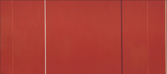
"Vir Heroicus Sublimis" (1950-51)

"Who’s Afraid of Red, Yellow and Blue I" (1966)

"Onement I" (1948)
#SublimeChaos#DesignIsPolitical#ArtIsFreedom#EmbraceAmbiguity#UnlearnRules#VisualPoetry#DesignAsArt#ChaosAndOrder#Poststructuralism#Derrida#Foucault#Nietzsche#CriticalTheory#Deconstruction#Semiotics#VisualTheory#DesignPhilosophy#BarnettNewman#AbstractExpressionism#ModernArt#ArtTheory#PowerKnowledge#Différance#Epistemology#Aesthetics#ContemporaryPhilosophy#VisualCulture#DesignCriticism#ArtAndPhilosophy#Structuralism
0 notes
Text
Why Write?
The first post is always the hardest because you feel the need to “set the standard”, to find the “write tone”. It’s the equivalent of looking through 50 selfies and asking yourself “which one feels the most me”. I spent a good afternoon fiddling around with what I should write for a first entry and the top three candidates consisted of: an architectural review of my local library, a response to a quote from a Senior Apple Designer about social media’s shift towards e-commerce, and an angry tear-down of a pop psychologist.
None of them felt very me. So I’ve decided to do something more straightforward, albeit also more dull, which is to answer the question “Why do I want to write”.
I want to write because I like to seem smart and worldly. To be honest, I think everyone who writes is a bit self obsessed. One needs a good dose of sheer delusion to walk into a bookstore and say “You know what this place needs? More books.” Egoism can’t be the only reason, but I do feel that my intentions aren’t entirely pure. At age 22, I’m not exactly brimming with wisdom and yet I still feel this inclination to share with the world all my passionate (and probably misinformed) opinions. To think I have something worth saying (or the humbler version: to think in the future I’ll have something worth saying so I should spend my Saturdays tweaking my grammar) stems from a place of inflated self importance. But this egoism shouldn’t be written off entirely. Many thinkers and makers required this kind of delusional optimism to get them where they are today. With enough hard work and luck, the feeling that one has something meaningful to contribute can easily become a self-fulfilling prophecy.
Aside from wanting to seem smart and worldly, I want to write to improve my thinking. I’m in my last semester of study and soon after I’m going to get thrown into the harsh world of New York capitalism where I will exchange my goods and services for wages. Outside of school, there won’t be a lot of opportunities for me to think in a way that is deep and critical and meaningful, so I want to get in the habit of doing that now. I want to form opinions that are deeper than just vomiting back out the latest NYT morning briefing. Finally will I be able to contribute a mildly-informed opinion at parties. Also, as designers, we’re asked to justify our thought process in our work. In writing about design criticism, I’m hoping to understand more of the large design landscape I am contributing and also improve the ways I talk about design. I really need to stop using the word “vibes” when I talk about design.
And thirdly, be warned. This angry Chinese Canadian is hoping to indoctrinate future readers with her lofty, unrealistic ideas of democratic socialism. I don’t know a lot about taxes and economics and running an entire country, but I sure act like I do. Maybe in flushing out my thoughts on good design, bad technology and personal branding, I’ll discover flaws in my argument and gain an appreciation of the nuance and complexity of such topics. Haha, maybe!
Also, it’s a good excuse to get out of brunch.
1 note
·
View note
Photo


Exhibition
18 June - 23 August 2020 Exhibition CriticALL! (un)professional design criticism at Onomatopee in Eindhoven (NL). Featured is my essay ‘Buy this, nothing makes you happier’ about the rise of Amazon in The Netherlands, capitalism and the world of reviews.
Exhibition curated by Joannette van der Veer. Photography by Wibke Bramesfeld.
Publication
Onomatopee 186: Edited by Joannette van der Veer. Graphic design by Studio Bramesfeld and text editing by Amy Gowen.
Authors: Vanessa Brazeau, Lara Chapman, Pete Fung, Iskander Guetta, Adina Glickstein, Judith Leijdekkers, Ellen Lupton, Rosannagh Maddock, Jo Minhinnett, PLSTCTY Studio, Josh Plough, Alice Rawsthorn, Bessie Rubinstein, Y. Selim, Lauren Thu, Anniek Tijmes, Joannette van der Veer, Vincent van Velsen, Stijn van de Vyver and Zack Wellin.
Get a copy here. Release date 31 March 2021.
2 notes
·
View notes
Photo

A Line Which Forms a Volume / Available at www.draw-down.com / The first edition of a critical reader of #graphicdesign led research that is edited, written, designed, and published by MA Graphic Design Media course participants at the #LondonCollegeofCommunication. A Line Which Forms a Volume takes its name from a subheading in the 1996 essay “The Book as Object,” written by Michel Butor. Butor writes that threads of thought and speech must be set into lines, lines divided into columns, and columns stacked along a third axis of depth to form a volume. The notion of ‘volume’ as a publication, as well as the space that something occupies and as a quality of something audible, lends itself to the endeavor of A Line Which Forms a Volume to make graphic design research public. A Line Which Forms a Volume is curious, evolving and current, and aims to thread the research of participants into the wider contexts of #designcriticism and publishing. Designed by #AldoCaprini and #CarlosRomoMelgar
29 notes
·
View notes
Photo

@kennethfitzgerald is kickstarting a new book of design criticism. Kenneth is one of the most important voices of Postmodernism—we live in a time of a glut of glossy books, but a true dearth of people actually writing shit that is *meaningful* about design. His writing is akin to walking across a grassy plain and hearing an unknown but recognizable aural signal that things are awry... in short: WORTH IT. #vcfa #vcfadesign #pomo #emigre #designcriticism https://www.instagram.com/p/B9YhftTB2fP/?igshid=w79ikk8jhiv8
0 notes
Text
Exhibition Review: Frau Architekt
Written in English and published on the weblog of Depatriarchise Design, 22 Oct 2017.

The exhibition Frau Architekt [Mrs. Architect] currently on show at Deutsches Architekturmuseum (DAM) [Museum of National German Architecture] aims to celebrate “over 100 years of women in architecture”. Curated by Mary Pepchinski and Christina Budde it presents 22 portraits, project examples and personal stories of women who have significantly influenced architecture in Germany or are currently shaping it. The research is well-elaborated, the material original and the knowledge absolutely relevant and crucial to exhibit. But still, – a lot of questions come up: Why does a museum in 2017 still have to show an exhibition solely about female architects? Isn’t it high time to implement all the knowledge about women architects into the general discourse about the discipline?
Therese Mogger was 25 years old when she divorced her husband, placed her three sons in boarding school and decided to study architecture. Without her family inheritance, these steps would have surely been impossible – it was the year 1900 and life for women in Germany who wanted to go their own way was anything but easy – even for the wealthy and privileged among them. Shortly after Bavaria had allowed women to attend universities as auditors beginning in 1904 and to matriculate in 1905, Mogger became a guest student. She took classes in architecture at the Technical University of Munich and later became one of the first German female architects, building a great variety housing that served the needs of a diverse urban population.
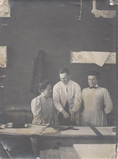
Image: Elisabeth von Knobelsdorff and Therese Mogger at the Technical University of Munich, 1909/10. Photo: Weber-Pfleger.
The exhibition Frau Architekt [Mrs. Architect] currently on show at Deutsches Architekturmuseum (DAM) [Museum of National German Architecture] aims to celebrate “over 100 years of women in architecture”. Curated by Mary Pepchinski and Christina Budde it presents 22 portraits, project examples and personal stories of women like Therese Mogger who have significantly influenced architecture in Germany or are currently shaping it.
The curators went through archives and conducted in-depth original research. Even though their findings are arranged in chapters, each presenting one architect, they do not simply tell the life story of each woman: photographs, models, and newspaper articles also give insights into the respective time they lived in. For example issue 31/32 of the architecture magazine Bauwelt from 1979, dedicated solely to the topic “Frauen in der Architektur –: Frauenarchitektur?” [“Women in Architecture –: Women Architecture?”], can be flipped through and read in the exhibition space.

Image: Bauwelt, issue 31/32, 1979, “Frauen in der Architektur –: Frauenarchitektur?” [“Women in Architecture –: Women Architecture?”].
The research is well-elaborated, the material original and the knowledge absolutely relevant and crucial to exhibit. But still, – a lot of questions come up: If already in 1979 Bauwelt published a whole issue dedicated to women in architecture – why does a museum in 2017 still have to show an exhibition solely about female architects? Isn’t it high time to implement all the knowledge about women architects into the general discourse about the discipline? Why having an issue or an exhibition dedicated to female architects every couple of years, but ignore them in the daily editorial and curatorial routine?
The danger of dedicating an exhibition solely to female practitioners is that their work gets, again (just like outside of the museum), marginalised. To present them through the perspective of their gender and sex as “women architects” means to reproduce the idea of a category that is subordinated to “architects”. But what do these women have in common – apart from the fact that they had to fight for their education, for their place in the discipline, and for being remembered, because of being female in a patriarchal system? They are so much more than women architects – their interests represent a great variety, so do their talents, styles, projects, political views, and clients. To show their work primarily through the lens of their sex doesn’t do justice to them.
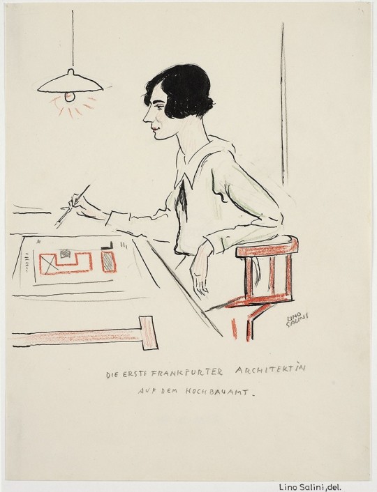
Image: Margarete Schütte-Lihotzky: „Die erste Frankfurter Architektin auf dem Hochbauamt“ [“The first female architect at Frankfurt’s Building Department”]. Portrait: Lino Salini.
Apart from this: Who is most likely to visit an exhibition solely dedicated to women architects? People who are interested in architecture and feminism – so those who are already aware of the issue(s) at stake. But people who generally ignore women architects probably won’t change their minds and visit this exhibition. And if so, they will certainly perceive it just as it is presented: as one more side aspect of the architecture that they already know. It is not even likely for visitors to the museum to end up in the exhibition by accident since it is shown in more or less closed space on the first floor.
Frau Architekt makes clear that the knowledge of how to research the work of women architects is there and also the experts are there. The logical next step is to implement the work of female architects into the “normal” exhibitions of museums and to, by doing so, challenge the fact that until now exhibitions dominated by male practitioners are standard while the work of women gets often marginalised.
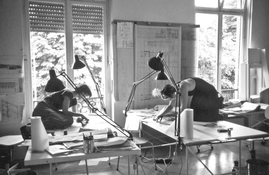
Image: Employees at the studio of Ingeborg Kuhler. Photo: Büro Ingeborg Kuhler.
If it is difficult to find women architects in fields like Brutalist architecture – the museum’s next exhibition will be “SOS Brutalism: Save the Concrete Monsters!” – this can be discussed within the frame of the respective show. Even though Alison Smithson, for example, was one half of one of the most influential Brutalist architectural partnerships in history, the aesthetical and functional values that the style fosters exclude women in a structural way: Brutalism can be described with adjectives like bold, dramatic, monstrous, massive, monumental, scientific, and cold. Patriarchal logics (still rules the society in which we are living) attributes “femininity” to the oeuvres of female architects, linking them to nature and depicting as fragile, subtle, warm, instinctive and emotional. The question to what extent this statement is true could be analysed in one of the show’s chapters.
However, there are surely other topics that offer more possibilities to include women architects. It’s absolutely possible to identify “new” themes, one just has to look close enough. Housing for military families, for example, is a theme that is being touched on in Frau Architekt: Marie Frommer, who had to move to the US in order to escape Nazis, was active in this field. Another topic could be the design of planetariums: Gertrude Schill built planetariums for the company Zeiss. And how about big visions in architecture? This one could include Merete Mattern’s imaginative unbuilt designs.

Image: Merete Mattern, Herta Hammberbacher and Yoshitaka Akui, Contest Ratingen-West, view drawing, 1966. (Image: DAM).
I would also love to see an exhibition that analyses the role that women’s organisations play(ed) in supporting female architects. Or a whole show on Iris Dullin-Grund and her work, since her oeuvre combines many different aspects: great visions despite post-war scarcity, architecture and Socialism, big scale projects and very little money. Her housing constructions in the GDR, her design of the House of Culture and Education in Neubrandenburg and her innovative master plan for the whole region are inspiring and raise questions like: To what extent are these buildings still used today? And what can we learn from her designs for our current time? Since she is still alive, in-depth interviews with the architect herself could be conducted – the short video shown in the exhibition would only be the first step.

Image: Iris Dullin-Grund: House of Culture and Education in Neubrandenburg. Photo: Veranstaltungszentrum Neubrandenburg.
Apart from this, wouldn’t it be even more exciting if a museum like DAM would question established categories and even start proposing new ones? Feminist and post-colonial theories could serve this purpose very well.
If the museum is serious about celebrating female architecture, it has to implement the knowledge and the way of thinking that is being presented in Frau Architekt into each and every show that it is going to do in the future. If the institution aims to truely challenge the fact that “architecture is still a man’s world” (as it observes in Frau Architekt), it has to curate exhibitions in line with feminist and postcolonial thinking and to include more subversive contents. And it has to look at the social processes and to expose the marginalized to contribute into a new stream of curatorial reality.
No doubt, this is hard work and a task that will probably never be completed, but with doing this, the museum would elevate itself from merely being an observer who occasionally gives insights into findings in a closed space, to an ally who actively contextualises information and works on changing the situation by breaking down walls and bringing knowledge into all the other rooms of the institution and therefore all other areas of the discipline. Not only would the museum use its knowledge in a more constructive and responsible way, it could earn a very good reputation: It could prove itself in a truly critical curatorial approach that includes feminist theory and applies it in its practice, and become known for its courageousness, thoroughness, expertise, and vision.
The exhibition Frau Architekt is on show at Deutsches Architekturmuseum, Frankfurt am Main until 8 March 2018. It is accompanied by an extensive program including lectures, discussions, and events.
Cover image: Gertrude Schill, “Spacemaster” for Zeiss, Tripoli, 1980. (Bild: DAM)
#architecture#femalearchitect#women#curating#exhibition#review#design#criticism#designcriticism#womeninarchitecture#frauarchitekt#deutschesarchitekturmuseum#frankfurt#gender#diversity#theresemogger#dullingrund#meretemattern#ingeborgkuhler#schüttelihotzky#bauwelt#frauenarchitektur#gertrudeschill#brutalism#femininity#alisonsmithson#DepatriarchiseDesign
1 note
·
View note
Photo

What do you think? #logodesigns #logopersonal #design #duotone #designcritique #designcriticism — view on Instagram https://ift.tt/2J4txs4
0 notes
Photo

Last Copy! A Line Which Forms a Volume / Available at www.draw-down.com / The first edition of a critical reader of #graphicdesign led research that is edited, written, designed, and published by MA Graphic Design Media course participants at the #LondonCollegeofCommunication. A Line Which Forms a Volume takes its name from a subheading in the 1996 essay “The Book as Object,” written by Michel Butor. Butor writes that threads of thought and speech must be set into lines, lines divided into columns, and columns stacked along a third axis of depth to form a volume. The notion of ‘volume’ as a publication, as well as the space that something occupies and as a quality of something audible, lends itself to the endeavor of A Line Which Forms a Volume to make graphic design research public. A Line Which Forms a Volume is curious, evolving and current, and aims to thread the research of participants into the wider contexts of #designcriticism and publishing. Designed by #AldoCaprini and #CarlosRomoMelgar
15 notes
·
View notes
Text
The Politics of Display: Review of Vitra Design Museum’s Papanek Exhibition
German and English, and published on the website of depatriarchise design, 23 Feb 2019.

Design is political. This realisation began to gain currency among many young designers around 50 years ago. In his work, too, Victor Papanek (1923–1998) focused on the political levels of what designers do. He himself was an industrial designer – and at the same time a harsh critic of his own discipline. This theme is just as topical today and is currently being explored in an exhibition focusing on Papanek at the Vitra Design Museum.
In 1970, protesting students and activists disrupted the International Design Conference in Aspen, forcing the participants to vote on new resolutions that stood for more social and ecopolitical commitment. Victor Papanek, like many of his contemporaries, was convinced that not only functional and formal features and questions on the usability or saleability of a design had to be taken into account, but also its effects on society and the environment – as well as the interaction between the two.
… — Read the complete article on depatriarchise design
Und hier geht es zur deutschen Version: https://bit.ly/2KPtpxp
Cover image: Exhibition view, photo by Anja Neidhardt.
#design#politics#exhibitiondesign#curating#designcurating#feminism#socialdesign#papanek#vitra#designcriticism#review#activism#designactivism#intersectional
0 notes
Text
“Realignment of the daily routine and of the interior furnishings”. Revisiting design criticism by Alix Rohde-Liebenau.
Written in English and published on the weblog of depatriarchisedesign, 27 June 2017.

After the end of World War II Germany had to face the consequences of the Nazi regime’s actions – which included millions of homes that had been destroyed or damaged during Allied bombings. The municipality of West Berlin came up with an open-call for ideas “Berlin plant” [“Berlin plans”], inviting both architects and citizens to participate. One of the questions was: “How can a standard family of 4 live on 65 sqm?” The female journalist and writer Alix Rohde-Liebenau (1896–1982) contributed a comprehensive piece of design criticism, questioning and challenging the premise of the open-call itself.
— Read the complete article on depatriarchisedesign
(Cover image: Collage from a booklet designed by Georg A. Neidenberger for the Internationale Bauausstellung [International Architecture Exhibition] in Berlin, 1957.)
#DepatriarchiseDesign#AlixRohdeLiebenau#DesignCriticism#DeutscherWerkbund#GermanDesign#BerlinPlant#Architecture#FemaleDesignCritic#WomenDesignHistory
0 notes
Text
Book Review: Design Fiction (EP Vol. 2)
Written in English and published on the weblog of Designabilities, 4 June 2017.

For many designers the term “design fiction” is very much linked to the work of Anthony Dunne and Fiona Raby (as well as Bruce Sterling, Paola Antonelli and Lucas Maassen). When thinking of Dunne and Raby’s work, one thinks of design fiction – and the other way around. Since the second volume of EP, a book series edited by Alex Coles, is on design fiction it had to (so it seems) include their work. But as there are also many other designers, artists and writers working in this field, it is worth to have a closer look at these diverse practices. And fortunately the publication is also offering this wider perspective.
Next to interviews, artist projects, and essays the volume also includes one of the final interviews to be published with novelist and semiotician Umberto Eco; a conversation with Bruce Sterling, in which the science-fiction author responds to designers who reference his writings; and design theorist Vilém Flusser’s 1966 essay “On Fiction,” in its first English translation. The makers of the book series EP, which refers to the “extended play” format introduced in the late 1950s in recorded music, aim to “create a new platform that is yet saturated within the publishing sphere by moving between academic writing and popular magazines” and combining perspectives from art, design and architecture.
EP volume 2 also presents Tokyo-based designer Hiroko Shiratori’s work that can be described as a practise located in speculative and real-fictitious terrains. In one of her projects, she looks into parallel histories and uses fiction as a function to create “unusual objects from Japan”. She does this mainly in order to explore and better understand the sorts of developments that happen when external influences change habits – like it had happened in Japan in the Meiji era. When this area began, around 1868, people started to wear Western-style dresses, and together with these dresses, scissors had to be introduced in the country. That is why sword-smiths turned to scissor making. Based on this reality, Shiratori imagined a barber who had lost both of his arms during military service, and invented hair cutting tools that he could use with his feet. “My intention”, she says, “was to create fictious objects and fictious stories which were believable enough, but at the same time crazy enough for people to take them as fiction.”
Then there is also the writer Umberto Eco, mainly known for his book “In the Name of the Rose”, but who was also a philosopher, semiotician – and someone highly interested in correspondence between image and text. For him, image and text were interwoven and in order to develop his stories, Eco used to design and draw the spaces in which they took place. “With ‘The Island of the Day Before’ (1994) I spent one year designing every detail of the interior of the ship the story unfolds on”, he said in his conversation with Alex Coles.
An excellent piece of writing is the contribution by Carrie Lambert-Beatty: “Believing in Parafiction”. In it she discusses the work of the Yes Men, who – through actions of tactical media, like visual duplicates of official websites – aim to raise awareness about problematic social and political issues. Sometimes a Yes Men’s spokesperson will make announcements that represent fictitious scenarios. This has often resulted in false news reports, such as the announcement that the company Dow Chemical is paying compensation to the victims of the Bhopal disaster. By following these strategies, the Yes Men are actually doing more than just raising awareness. Their “fiction leaks into the unscripted world”, as Lambert-Beatty says. She calls this kind of art “parafictional”. Through the use of fiction, the Yes Men are influencing reality. They are not only drawing the attention to certain problems, but they offer scenarios that show how things could actually be (in another world – better or worse) and put companies and/or politicians under high pressure. Lambert-Beatty ends her essay with a clear statement: “One of art’s most urgent responsibilities in this context is not to preserve trust, but to peel a possibility away from the dense surface of the way things are. […] For now more than ever, we need a more complex ecology of truth. After all, the fate of the planet depends, quite literally, upon generating political will for alternatives.”
Now, one can of course debate to what extent art – and also design – can and need to follow this responsibility. But leaving this aside, it becomes clear that the power and potential of this discipline (no matter if called “design fiction” or “parafictional art”) unfolds when it is implemented into reality. By designing fictional objects that are, right from the beginning, solely meant to be in an exhibition one may succeed in raising awareness, but mostly this experience stays in the museum – a space that, for so many visitors, is not linked to their daily life. A much higher impact, so it seems, can be achieved by reaching people in their realities, for example through news channels (by offering visions for a better world) or in their working environment (like through the implementation of design fiction methods in science and research labs) – and by putting the ones who are in power under high pressure.
It becomes clear that design fiction is a wide field and that there is still a lot to discuss. But this publication certainly offers a profound research and broad basis to open up a diverse discourse.
Alex Coles (Ed.) Design Fiction, EP Vol. 2 Sternberg Press, 170 pages. 22,00 €, December 2016. ISBN 978-3-95679-048-5
#DesignFiction#EP#EP2#BookReview#DesignCriticism#Designabilities#AlexColes#Dunne&Raby#TheYesMen#HirokoShiratori#UmbertoEco#Design#Art#ParafictionalArt#LambertBeatty#Fiction#BruceSterling#PaolaAntonelli#LucasMaassen#ExtendedPlay
0 notes
Photo

A Line Which Forms a Volume / Available at www.draw-down.com / The first edition of a critical reader of #graphicdesign led research that is edited, written, designed, and published by MA Graphic Design Media course participants at the #LondonCollegeofCommunication. A Line Which Forms a Volume takes its name from a subheading in the 1996 essay “The Book as Object,” written by Michel Butor. Butor writes that threads of thought and speech must be set into lines, lines divided into columns, and columns stacked along a third axis of depth to form a volume. The notion of ‘volume’ as a publication, as well as the space that something occupies and as a quality of something audible, lends itself to the endeavor of A Line Which Forms a Volume to make graphic design research public. A Line Which Forms a Volume is curious, evolving and current, and aims to thread the research of participants into the wider contexts of #designcriticism and publishing. Designed by #AldoCaprini and #CarlosRomoMelgar
78 notes
·
View notes