#Easy Levels and Curves Photoshop Tutorial
Text
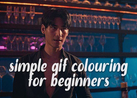
✨ Simple Gif Colouring for Beginners ✨
I wrote up my basic gif colouring process for a friend recently, but a couple of people here mentioned they'd also find it helpful! so, as requested, this is a beginner-friendly walkthrough of the way I colour my gifs :) it's aimed at brand new gif makers with no prior experience with photoshop or photo editing.
when I first started gif making I found colouring and photoshop in general suuuper daunting, so I've tried to simplify everything here as much as possible. hopefully this will be relatively easy to follow and not too intimidating!
a couple of things to begin with:
I'm only talking about colouring here - this is not a full gif making tutorial. I've linked to some of my favourites of those here!
I personally like to make bright, 'clean' looking gifs with vibrant but natural colours, so that is the style of colouring this tutorial is geared towards. most of gif colouring is subjective and about personal taste - the only thing that I'd say is possible to get wrong is skin tones, which I talk about a lot in this guide.
as I mostly gif Thai dramas, most of the advice is geared towards colouring for East Asian/South East Asian skin tones - but the techniques should be fairly universally applicable (and here are some tutorials that talk about gif colouring for other skin tones).
I'm not an expert! I'm not claiming this is the best or the only way to colour gifs - it's just how I do it.
this post is very image-heavy. if the images aren't loading (or the gifs are running slowly or cutting/looping weirdly), then try viewing the post in its own tab (rather than on the your dash or someone's blog) and refreshing the page.
okay, full walkthrough beneath the cut!
contents:
1. intro
a. natural gif colouring goals
b. very very basic colour theory
2. super simple colouring (the essentials)
a. curves
b. selective colour (and skin tone correction)
c. hue/saturation
d. saving and reusing colouring
e. another simple colouring example
3. other adjustment layers
a. brightness/contrast
b. levels
c. vibrance
d. colour balance
e. channel mixer
4. troubleshooting
a. curves
b. saturation
5. fin!
1. intro
the colouring part of gif making can be super overwhelming, especially if (like me when I first started!) you're completely new to photoshop and/or have no experience with colour theory or photo/video editing.
if you're opening photoshop and making gifs for the first time, I highly recommend getting used to making a few basic, uncoloured gifs to begin with. just to practice, rather than post anywhere (though you can always come back and colour them later if you want) - but it'll make the rest of the process much easier if you're already beginning to get used to working in timeline mode of photoshop. give yourself a bit of time to practice and get a feel for things like how many frames you tend to like in a gif, where you like to crop them for the best loop, what kind of aspect ratio you like etc* - so that you're not trying to navigate all of that for the first time on top of everything else!
* frames: for me between 60-90 frames is ideal, but 40-120 frames is the absolute min-max I'd personally use in a normal gifset
loops: for the smoothest loops, try to avoid cutting someone off mid-movement or mid-word if possible.
aspect ratio: for full-size (540px) gifs, I tend to go for either 8:5 (slightly 'skinnier' gifs), 7:5, or 5:4 (particularly big, thick gifs lmao)
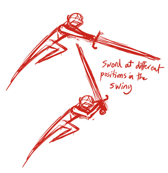
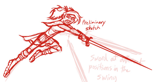
✨ natural gif colouring goals
part of what can be so daunting about starting gif making is not knowing where to start or what you want to achieve. this is definitely something that gets easier with practice - the more gifs you make, the more you'll get a feel for what kind of look you like and the more instinctively you'll know how to get there. it also helps to see if any gif makers you like have made "before and after colouring" posts - these can help with getting a sense of the kinds of changes made through gif colouring. here's one I made!
in general, I like to make my gifs bright and 'clean' looking, with vibrant but natural colours. these are the things I'm usually hoping to achieve with colouring:
brighten dark scenes
remove muddy, yellowish lighting or filters
saturate colours
correct any skin lightening filters or overexposure
make lighting and colours as consistent as possible between gifs within a single gifset, especially gifsets featuring gifs from multiple scenes/episodes/videos
this guide is focusing on natural colouring, but of course there are many cool ways to make stylised/unnaturally coloured gifs. imo you'll need to master these basics first, but if you want to learn how to do things like change the background colour of gifs or use gradients or other cool effects, then @usergif's resource directory has loads of super helpful tutorials!
✨ very very basic colour theory
[disclaimer! I don't know shit about fuck. I do not study light or art. this is just an explanation that makes sense to me exclusively for the purposes of gif making.]
the primary colours for light/digital screens are red, blue, and green. having all three colours in equal measures neutralises them (represented by the white section in the middle of the diagram).
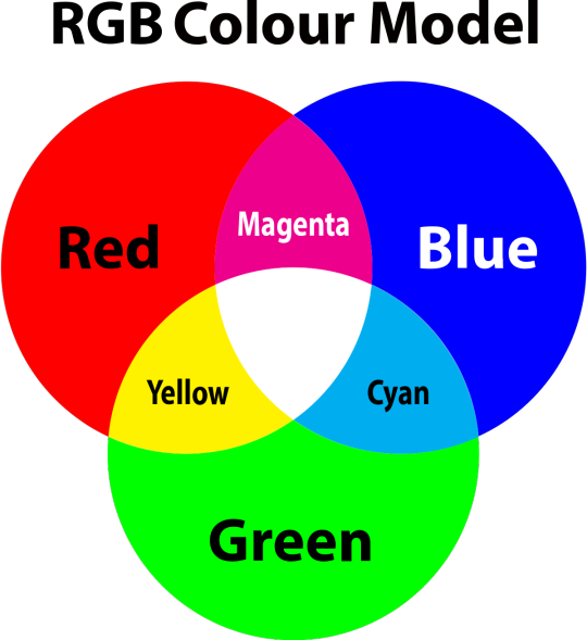
so to neutralise a colour within a gif, you need to add more of the colour(s) that are lacking.
in practice this usually means: the scene you want to gif is very yellow! yellow is made of red and green light, so to neutralise it you need to add more blue into your gif.
it can also mean the reverse: if you desaturate the yellow tones in a gif, it will look much more blue.
looking at the colour balance sliders on photoshop can make it easier to visualise:
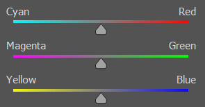
so making a gif more red also means making it less cyan.
removing green from a gif means adding magenta.
taking yellow out of a gif will make it more blue.
tl;dr:
neutralise yellows by adding blue (and vice versa)
neutralise reds by adding cyan (and vice versa)
neutralise green by adding magenta (and vice versa)
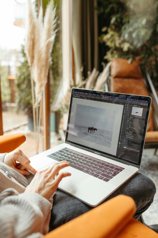
2. super simple colouring (the essentials)
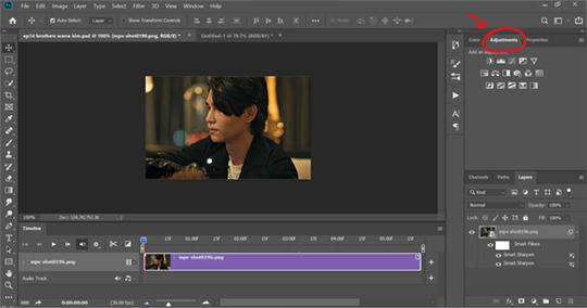
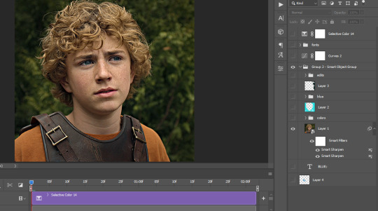
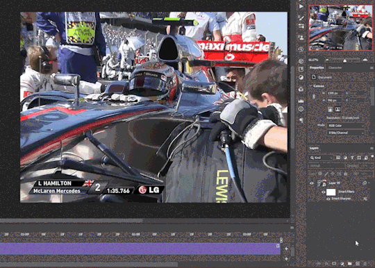
starting with a nice sharpened gif in photoshop in timeline mode. (these are the sharpening settings I use!)
some scenes are much harder to colour than others - it helps to start out practising with scenes that are bright/well-lit and that don't have harsh unnaturally coloured lights/filters on. scenes with a lot of brown/orange also tend to be harder.
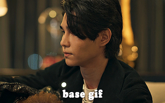
I usually save a base copy of my gif before I start colouring just in case I end up hating it, or find out later that it doesn't quite fit right into a set and need to redo it etc.
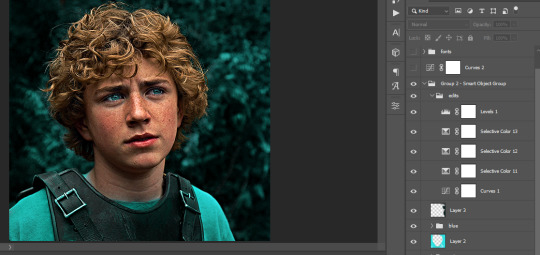
so here is my base gif!

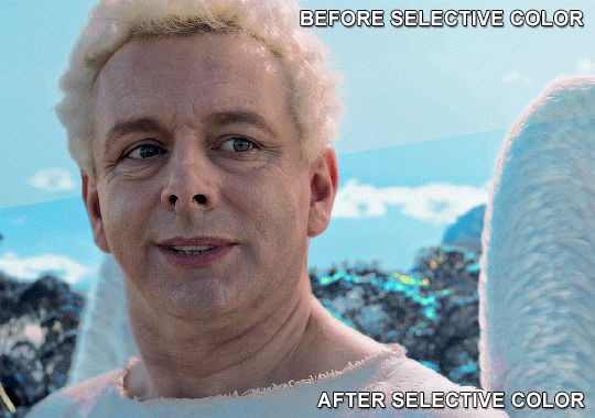
it's an okay gif, but it has a bit of a yellow tint to it that I want to reduce.
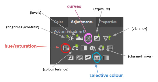
colouring is easiest to do in adjustment layers, which can be found under layer -> new adjustment layer - or for me they are here:
there are lots of different types of adjustment layers that do lots of different things - but for me the absolute essentials for colouring are curves, selective colour, and hue/saturation.
I also use brightness/contrast, levels, exposure, vibrance, colour balance, and channel mixer sometimes, depending on the gif - but I use curves, selective colour, and hue/saturation on every single gif.
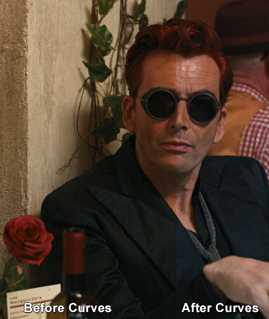
✨ curves layer
the first thing I always do is a curves layer. when you first open one it will look like this:
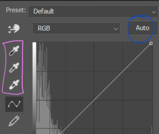
first I usually click the ‘auto’ button, just to see what happens. sometimes it makes a big difference (it usually brightens the gif a lot) - but on this gif it didn’t do much.
if it had made the gif look nicer then I would have kept it and added a second curves layer on top to do the rest of these steps.
the next step is selecting the white and black points with the little eyedropper tools.
the bottom eyedropper lets you pick a white point for the gif. click somewhere super light on the gif to see what happens - for this gif, I clicked on the lampshade on the left. if it looks weird, I just undo it and try somewhere else - it usually takes a few goes to find something that looks good.
here's what that did to the gif:

then I pick the top eyedropper and use it to pick a black point by clicking somewhere really dark, again playing around until I find a black point that looks good.
here's what the gif looks like after picking the white and black points:

this can take some experimenting, but you can make super easy drastic changes to your gif just with this. in this case, the curves layer took out a lot of that yellowy tint.
and this is what the curves graph looks like now:
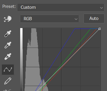
you can click and drag those lines to make further changes if you want - I usually leave them alone though. the colours of the lines indicate which colours have been changed in the gif - for example, you can see from that steep blue line on the graph that blue has been added to neutralise those yellows.
next I usually do another curves layer and just press the ‘auto’ button again to see what happens. usually it brightens the gif a bit more, which I like.
‼️if nothing is working: usually with a bit of fucking about a curves layer works well - but sometimes you can’t find a good white and black point anywhere, and instead your gif turns wacky colours and nothing looks good. this happens more often with very heavily colour tinted scenes :( the troubleshooting section at the end goes over some options, including starting with a levels layer instead.
✨ selective colour (and skin tone correction)
skin tones are made up of a mixture of yellow and red.
removing yellow (or adding blue or red) to a gif will make the skin-tones too red - and removing red (or adding cyan or yellow) to a gif will make the skin-tones too yellow.
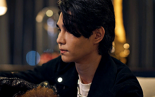
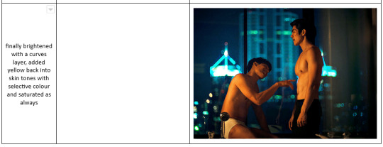
adding blue to this gif with the curves layer took out the yellowy tint, which I wanted - but it also took the yellows out of Kim's skin tone, which I don’t want. so I need to put yellow back into the skin tones specifically - without putting it back into the rest of the gif.
selective colour layers let you select an individual colour and adjust the levels of other colours within that colour. you can change how yellow the green shades are, or how much cyan is in the blues, for example.
I need to add yellow back into the red tones to correct the skin tones on this gif. this is the case for most gifs in my experience - the vast majority of the time, unless a scene is very heavily tinted in another colour, a curves layer will add blue/remove yellow.
in the 'colors' dropdown, select the 'reds' section and drag the 'yellow' slider higher - this will add more yellow into just the red shades within the gif.

the amount of yellow you need to add back into the reds depends on how much yellow was taken out of the gif initially - I just play around with the slider until it looks right. if you're not sure, it helps to have some neutrally-coloured (not white-washed!) reference photos of the people in your gif to compare to.
here's the result. Kim's skin is a lot less pink toned and much more natural looking:
✨ hue/saturation
this adjustment layer lets you adjust the hue and saturation of the gif as a whole, and also of each colour individually.
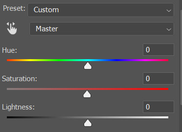
I don't use the hue or lightness sliders unless I'm trying to do something more complicated with the colouring.
clicking the dropdown menu that says 'master' lets you edit the saturation of each colour individually. this is useful if your gif is still super tinted in one colour.
I thought the yellows on this gif were still slightly too bright, so I switched to the yellow channel and desaturated them slightly. (remember if you do this then you need to go back to selective colour and add more yellow into the red skin tones to balance out the desaturation!)
then I increased the 'master' saturation of all the colours to +5:
I usually find the right amount of saturation is somewhere between +5 and +12, but it depends on the gif.
‼️if the gif feels undersaturated, but the saturation slider isn't helping/is making the colours worse, try a vibrance layer instead.
done!
✨ saving and reusing colouring
you can copy and paste adjustment layers between gifs to make your colouring even across each of your gifs for one scene - so if you're making a set of multiple gifs of the same scene, or you think you might want to gif the same scene again in the future, you can save it as a psd so you can reuse the colouring again later.
each gif's colouring will then still need tweaking - different cameras/angles/shots of the same scene can still start out with slightly different colouring.
I recommend uploading the gifs as a draft post on tumblr so you can see what they all look like next to each other and catch any inconsistencies.
✨ another one! (speedrun!)
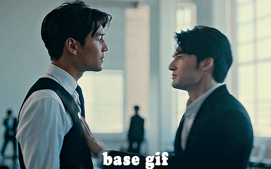
HI KEN!
the white point for the curves layer was in the window behind them.
the curves layer removes the muddy yellow tint, but again it makes their skin tones (especially Ken's) very red toned, which is adjusted by the selective colour layer.
3. other adjustment layers
imo many many gifs can be coloured really nicely with just those three adjustment layers, but some need different adjustments.
✨ brightness/contrast
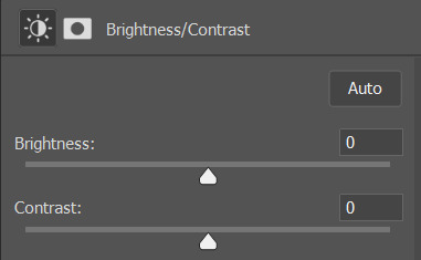
pretty self explanatory!
I personally usually avoid using the 'brightness' slider because I rarely like the effect - I only tend to use the 'contrast' one.
the 'auto' button is sometimes useful though, especially if you’re struggling with the curves layer.
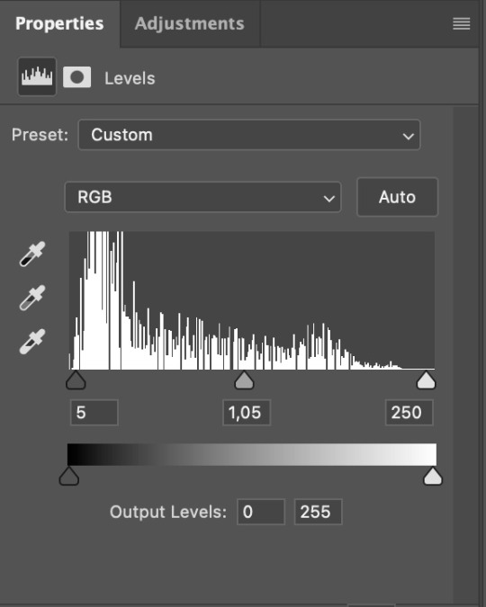
✨ levels

levels alters the white and black points of the gif, like curves - but unlike curves it doesn't also alter other colours.
use the sliders beneath the graph to alter how dark/light the gif is. you can slide the black slider further to the right to make the blacks darker, and the white slider to the left to make the whites lighter.
levels is a good place to start if your curves layer isn't working.
(I'm going to hit the image limit for this post lol so here are some screenshots of a table I made to demonstrate this rather than actual gifs. sorry!)
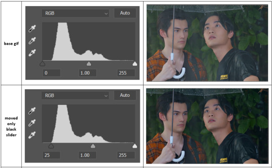

on both sides, I dragged the sliders up to where the big jumps are on the graph - this is usually a good place to start!
✨ vibrance
vibrance... makes the colours more vibrant. it's more subtle than saturation.
it's really helpful for gifs that feel grey. sometimes adjusting saturation just makes the greys kind of weirdly tinted, but a vibrance layer can fix that.
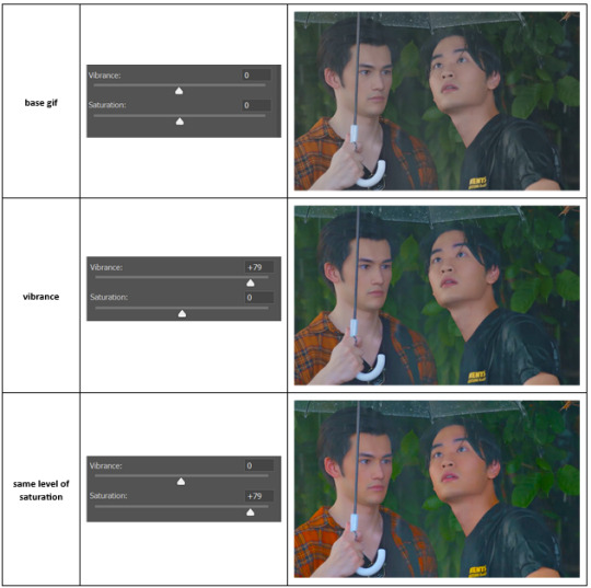
vibrance is much more subtle!
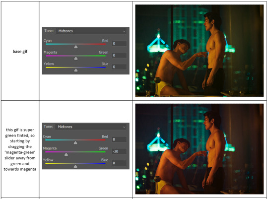
✨ colour balance
colour balance affects the overall balance of colours within a gif.
it's good for scenes with heavy tints.
I tend to stick to the 'midtones' dropdown, but you can also alter the colour balance within the shadows and highlights if you want.

✨ channel mixer
I avoided channel mixer for such a long time because it scared me. but it's great for scenes that are very heavily tinted in one colour.
basically, it works with the levels of red, green, and blue within a gif. you select an output colour and then play around with the levels of the colour you selected within each other colour.
kind of the reverse of selective colour?
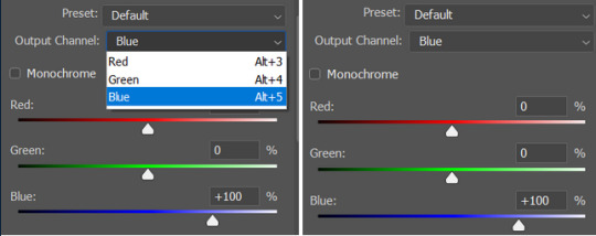
so in the 'blue' channel, the levels of blue are at 100%, and the levels of red and green are at 0% - but you can impact how much blue is in the reds and greens and blues.
this tutorial explains it well - but imo the best way to get to grips with channel mixer is just to play around with it a bit (sorry)
(when I made this guide for my friend, I also made a slightly more complicated gif colouring walk-through that included using channel mixer. there isn't space to include it within this post, but if anyone is interested I could always upload it as an 'intermediate' gif colouring tutorial - lmk!)
4. troubleshooting
‼️curves
usually with a bit of fucking about a curves layer works well - but sometimes you can’t find a good white and black point anywhere, and instead your gif turns wacky colours and nothing looks good. this happens more often with very heavily colour tinted scenes :(
for example, with this base gif:
using many of the brightest points as a white point turn it wacky colours, like this:

yikes :(
some options for these cases:
try brightening the gif first with the 'auto' button on the curves layer or with a levels layer. having a brighter gif to start with can give you better options for picking a white point.
try finding an alternate, whiter/brighter white point. look for places the light reflects - on this gif, using the light on Porsche's cheekbone works well as the white point. it also helps to find places that would be white if the scene wasn't tinted - the lightest part of a white shirt is often a good place to start, for example.
skip the curves layer, and instead use a levels layer to alter your white/black points, and colour balance or channel mixer to balance the colours.
‼️over/undersaturation
if your gif (especially the skintones) is looking a little washed out or lifeless, it might be undersaturated. boost that saturation - or if that's not working, try a vibrance layer.
oversaturation is often easiest to spot in the mouths and ears of any people in a gif. if the mouths are looking unnaturally, vibrantly red, then you've gone too far with the saturation.
5. fin!
and done! I hope this was coherent helpful to somebody.
if there's anything that I've missed or that doesn't make sense pls feel free to shoot me an ask or a message and I'll do my best to help! I've also collated a bunch of additional reading/resources below.
happy gifmaking 🥰
✨ some links!
photoshop basics by @selenapastel
gifmaking for beginners by @hayaosmiyazaki
gifmaking guide for beginners by @saw-x
dreamy's gif tutorial by @scoupsy-remade (includes instructions on how to blur out burned-on subtitles or annoying video graphics)
beginner's guide to channel mixer by @aubrey-plaza
how to fix orange-washed characters by aubrey-plaza
colour correcting and fixing dark scenes by @kylos
does resampling matter? by usergif
how to put multiple gifs on one canvas by @fictionalheroine
watermarking using actions by @wonwooridul
resource directory by @usergif
#i got a couple of asks about this so i figured i'd type it up as a post#it's been sitting in my drafts for a while now though i'm so sorry omg.#i had to replace my laptop and it took me a while to get round to downloading photoshop on the new one#but i hope this is helpful!!#gif making#tutorial#photoshop tutorial#colouring tutorial#coloring tutorial#gif colouring#gif coloring#photoshop resources#gif tutorial#gif resources#userbunn#uservik#darcey.txt#darcey.gif#usergif
619 notes
·
View notes
Text

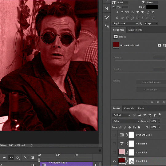
Thank you @cobbbvanth for asking me for this; I’ve never been more flattered! ☺️ I’ve only been making gifs for a little more than 2 years, so I’m really still only figuring Photoshop out, and my colouring owes everything to other people’s tutorials (some of which can be found here). To be honest, I was only asked some tips, but I have no clue what to include and what to leave out; so, here’s my complete (if random) colouring process.
NOTE: This is a colouring tutorial, not a gif-making one. The tutorial that taught me everything I know about that (and to which I am eternally grateful) is this one by @hayaosmiyazaki.
I. SHARPENING
My standard sharpening settings are:
One Smart Sharpen filter set to Amount: 500 | Radius: 0,4
A second Smart Sharpen filter set to Amount: 10 | Radius: 10
One Gaussian Blur filter set to Radius: 1,0 and Opacity: 30%
One Add Noise filter set to Amount 0,5 | Distribution: Gaussian
II. BASIC COLOURING
This is the part where I add most of the adjustment layers available and just play around with them. Obviously different settings work for different scenes, but I do have some standard ones.
Brightness/Contrast
I usually up the Brightness to +10-30, and the Contrast to about +10.
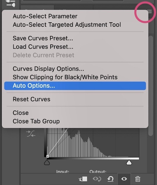
Curves
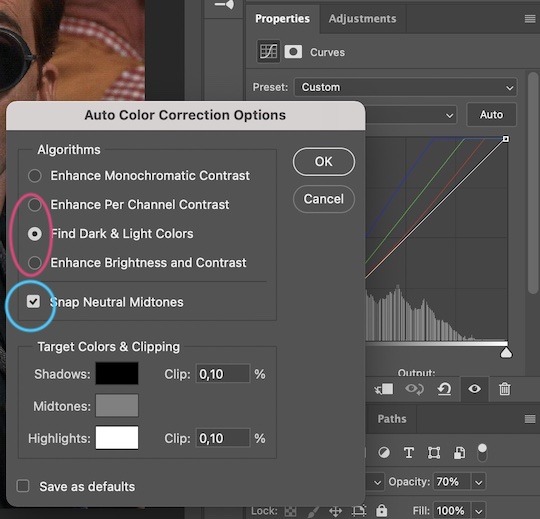
For the first Curves layer I go to Auto Options > Enhance Brightness and Contrast, and then adjust the opacity until I’m happy.
I might repeat the above step if the gif still looks too dark to me.
I add another Curves layer, I go to Auto Options and this time I pick either Find Dark & Light Colors or Enhance Per Channel Contrast, and check or uncheck the Snap Neutral Midtones option, until I see something I like. I will then adjust the opacity.
Levels
I add a Levels layer that usually looks something like this:
Exposure
I add an Exposure layer, where I usually set the Offset to around -0,0010.
Selective Color
To make the faces look okay, I create a Selective Color layer, select the Reds and usually add some Cyan (+10-20%) and play around a little (±5%) with Magenta and Yellow too. I might also add another layer, select the Yellows and make slight tweaks there too.
III. FUN COLOURING
About colour manipulation: PiXimperfect just uploaded a tutorial that explains everything so much better than I ever could, so I highly recommend you go watch it. It’s made for static images though, and things are more complicated with moving images, so I also recommend @elizascarlets’s tutorial.
The reason I usually go for a softer colouring is that a more vivid one requires a lot of patience and precision, and I honestly can’t be bothered. Instead, I try to tweak the colous only a little, so that the edges can be a little rough without it looking too wrong.
One thing to remember is that each gif is different, and there isn’t one foolproof way to do this, so you will need to use a different technique depending on the gif you’re working with.
Okay, so, after I’ve decided what colour I want my background to be:
1. I create a Hue/Saturation layer and change the greens, cyans, blues and magentas to that colour. That’s easy enough, since it doesn’t mess with the face colour. I then set the blending mode to Color. If your background doesn’t include any yellow or red, you might be done here, like in the case bellow:
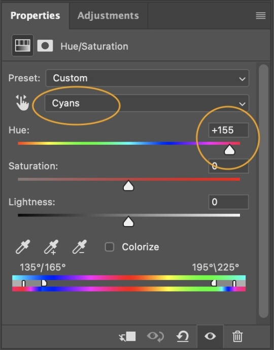
2. To change the yellows and reds, I create a new Hue/Saturation layer, select the yellows/reds, move Saturation to 100 (temporarily) and then play around with the sliders until the face colour isn’t affected. I then change it to whatever I’ve chosen and change the blending mode to Color.
3. If for whatever reason step 3 doesn’t work (the background is white or black for example, or just too red), I might create a Solid Color layer set to whatever colour I want, set the blending mode to Color and then select the layer mask and carefully paint with a soft, black brush over the people’s faces/bodies. I will then lower the Opacity, to whatever looks smooth enough. If there’s a lot of movement in your gif, you might have to use keyframes (see elizascarlets’s tutorial linked above). However, my main goal is to avoid using those; that’s why I try my hardest to tweak around as many Hue/Saturation layers as needed and not have to create a solid color layer.
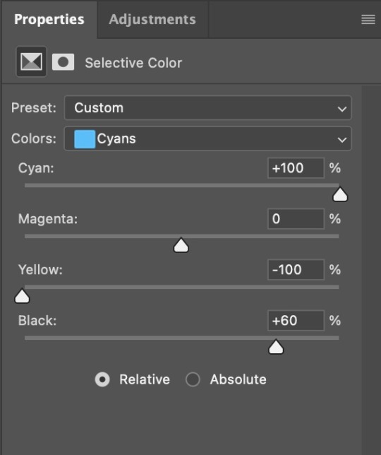
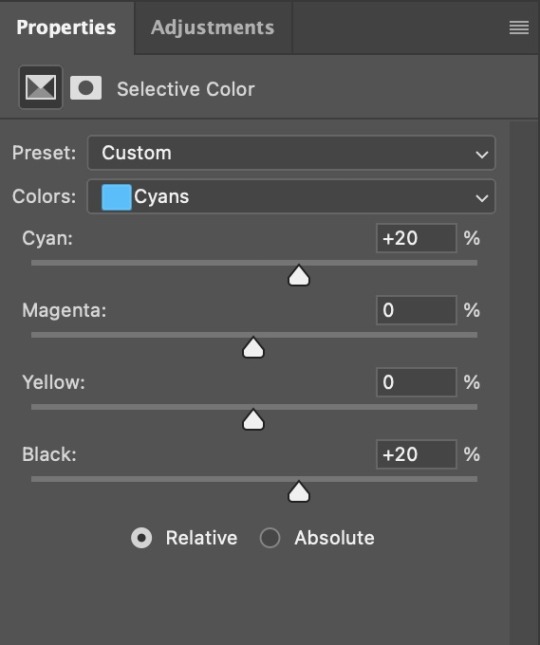
4. Once my background looks the colour I want it, I might add a Selective Color layer that matches my background color and then try to make it look more vibrant. For this Aziraphale gif below for example, I’ve selected the Cyans and then set Cyan to +100%, Yellow to -100% and Black to +60, then created another one, selected the Cyans again and then set Cyan to +20 and Black to +20.
5. If the gif has a white area, I create a Solid Color layer with a colour that matches the rest of the background and then set the Opacity low. I might also create a Selective Color layer, increase the Black and then play around with the colours.
IV. FINISHING TOUCHES
I create a Vibrance layer and set the Vibrance to around +30 and the Saturation to about +5.
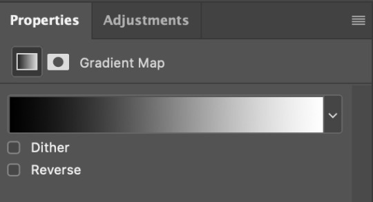
I create a black and white Gradient Map layer (with black on the left end of the spectrum and white on the right), set the blending to Luminosity and the Opacity to about 20-30%.
AAAND that’s about it I think! This ended up way too long and perhaps a little incoherent. I tried to make it as general as possible, so you might have to mix and match for best results. Feel free to ask me for further explanations about any one of these steps, and please tell me if you want me to go through the colouring of a specific gifset (although, as I said, I'm by no means an expert). Happy gifmaking!
#gif tutorial#allresources#completeresources#dailyresources#photoshop tutorial#minee#tutorial#tutorial*#chaoticresources#uservivaldi#userdanahscott#usersanshou#userfanni#userbuckleys#userrobin#tuserjen#userdavid#userzaynab#tusermimi#thingschanged#tuserju#usertj#userhallie
322 notes
·
View notes
Text
The silent art of gif making
The gif above has 32 layers plus 6 that aren't shown because this is part of a larger edit. I wanted to share it to give everyone a glimpse of the art of gif making and how long it usually takes for me to make something like this. This one took me about an hour and a half but only because I couldn't get the shade of blue right.
I use Adobe Photoshop 2021 and my computer doesn't have a large memory space (I don't know what to call it) so usually most of psds get deleted because I'm too lazy to get a hard drive. It doesn't really bother me that much because I like the art so when it's done, it's done. Off to somewhere else it goes.
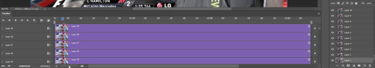
Here are the layers:

Everything is neat and organized in folders because I like it that way. I prefer to edit it in timeline but others edit each frame. There's a layer not shown (Layer 4 is not visible) and it's the vector art. Here it is:
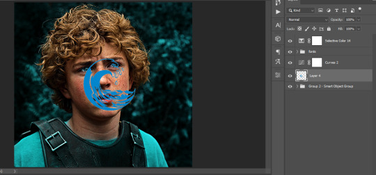
Now it is visible. I don't plan to make this a tutorial, but if you're interested I'd love to share a few tricks about it. I'm pretty new to the colors in gifmaking but the rest is simple to understand. Here, I just want to show how much work it takes to make it.
I opened Group 2 and here's the base gif. I already sharpened and sized it correctly but that's about it. Let's open the base coloring next.
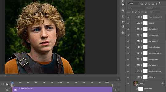
Yay! Now it looks pretty! The edits are in Portuguese but it doesn't matter. There's a silent art of adding layers depending on how you want the gif to look but you get used to it. The order matters and you can add multiple layers of the same thing (for eg. multiple layers of levels or curves or exposure).
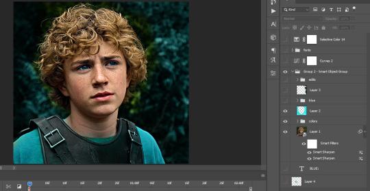
This was pretty much my first experiment with coloring so I don't know what I'm doing (this happens a lot with any art form but gifmaking exceeds in DIYing your way to the finished product) but I didn't want to mess up his hair, that's why the blue color is like that. Blue is easy to work with because there's little on the skin (different from red and yellow but that's color theory). I painted the layers like that and put it on screen, now let's correct how the rest looks.
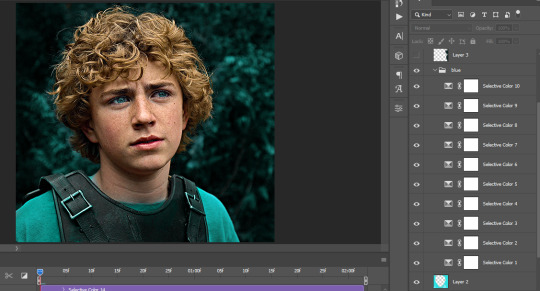
I was stuck trying to get the right teal shade of blue so yes, those are 10 layers of selective color mostly on cyan blue. We fixed his hair (yay!) we could've probably fixed the blue on his neck too but I was lazy. This is close to what I wanted so let's roll with that.
BUT I wanted his freckles to show, so let's edit a little bit more. Now his hair is more vibrant and his skin has red tones, which accentuates the blues and his eyes (exactly what I wanted!). That lost Layer 2 was me trying to fix some shadows in the background but in the end, it didn't make such a difference.
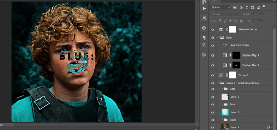
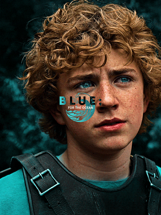
This was part of an edit, so let's add the graphics and also edit them so they're the right shade of blue and the correct size. A few gradient maps and a dozen font tests later, it appears to be done! Here it is:
Please reblog gifsets on tumblr. We gifmakers really enjoy doing what we do (otherwise we wouldn't be here) but it takes so long, you wouldn't imagine. Tumblr is the main website used for gif making and honestly, we have nowhere to go but share our art here. This was only to show how long it takes but if you're new and want to get into the art of gif making, there are a lot of really cool resource blogs in here. And my ask box is always open! Sending gifmakers all my love.
#gif making#gif tutorial#resources#completeresources#y'know what that post yesterday got me into this#i love creativity so i send all my love to gifmakers#this is HARD#my tutorials#tutorials
385 notes
·
View notes
Text
Redrawing Shadiversity's AI Piece
For context, check out this post here. This is, uh... It's a doozy.

Let's start with the main character of the image. The girl's pose looks very awkward and unrealistic for what she's doing. Her feet are dragging in two different directions that don't indicate the direction she's jumping in, and it looks like her top half is getting blown back in a wind tunnel. According to one of the reblogs on the post that introduced me to this thing, the pose wasn't the generator's doing, but the artist's. "He drew the girl and photoshopped in a picture of a lizard and a picture of a church and had the image generator "refine" it."

I sincerely doubt he used any kind of photo reference for this drawing, as it'd be uncomfortable for anyone's spine to curve backward like that while they're leaping forward and swinging a heavy sword. That just looks painful.
Let's explore some ways we could make the pose look more believable.
I think I'll go with a pose that's close to the original but makes a bit more sense.


It obviously doesn't have the same level of... "polish" the AI version does (we'll get to that in a minute), but the tilt of the spine looks much more natural for the direction she's leaping in and the way she's holding the sword.
Now that we have that out of the way, let's analyze more of the image as a whole.
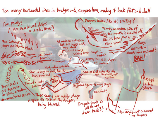
AI art handles detail in a way that looks good to the untrained eye, but falls apart in the eyes of experienced artists. These clothing folds, for example. There's no logic to the way they're shaped, and the shirt is randomly tight around the chest when it's loose everywhere else. Then there are the scales brought into sharp focus despite the rest of the dragon being blurred, the blood drips that look like stalactites, and so on and so forth. I'm sure there are things I missed, as well. If y'all find them, let me know in the comments!
Something to note about the sketches I made before the finished drawing: They kinda suck. And that's the point. The early stages of a drawing aren't meant to look pristine with perfect anatomy (not to say the finished product is anywhere near perfect, but still). What they are meant to have is energy. Purpose. Life. But AI bros are so afraid to make any "bad" drawings that they don't draw at all (or in cases like Shad's, they only draw the bare minimum).
I didn't make this post to dunk on AI prompters, but to encourage them to put in the necessary work that will improve their skills. And no, I'm sorry, typing words into a box won't make anyone a better artist. It might make them better at describing what they want when they commission an artist, but by and large it's like lifting a feather when you want to gain muscle instead of, y'know, lifting actual weights.
Obviously machine learning isn't going anywhere and it'd be nice to use as a tool to make different steps of the art process more efficient. It's good for silly memes, I guess. But we shouldn't treat the images it spits out as masterpieces, and, importantly, businesses shouldn't use it to replace real people.
Anyway, it's pretty easy to go to the store with five bucks and come back with a decent sketchpad and pens/pencils. Not to mention art programs like Krita and Blender are FREE, and there are plenty of tutorials on Youtube. Just sayin'.
Get drawing.
62 notes
·
View notes
Note
Sorry to be a jump scare in your inbox, but can you give a tutorial on how you made your hockey poem, because it’s gorgeous.
not a jump scare at all — i'm more than happy to share my process for the poem edit!!! though i want to say right off the bat that there are almost definitely easier ways to do a lot of what i did, because i continue to just teach myself how to use photoshop as i go. actual tutorial/explanation under the cut because there's a lot of screenshots!!

SO first of all i didn't like any of the readily available squares for thulium on google images, because i'm picky about fonts. i knew that i was going to use this specific font (mrs eaves roman all petite caps) for the haiku text itself because i'd recently used it for text in my dellyotter webweave & like the look of it. so i first made my own square; this allowed me to put all the information i wanted, like thulium's electron configuration, where i wanted it.

i used the rectangle tool to outline the square; it came out too thin on my first pass & instead of doing it again i just duplicated the original square four times and moved those duplicates around to get the line thickness i wanted. that said i figured i'd still share the settings i used.
once i had the element square how i wanted, i saved it, and then opened it as its own document. i'd found a picture of solid thulium i liked as a texture, so i placed it as an embedded object over the finished square & used a clipping mask to have it as an overlay on the square.

while i was doing that, i did the same with a version of thulium's bohr model that i'd found online in case i wanted to use it as an element in the edit. (i also updated the font of the text on a picture of thulium's crystal structure i'd found, but didn't end up using it on the final post)


while i was doing my prep work, i went ahead & wrote out the haiku in the font i'd used for the element square and then cropped each line into its own image and saved those, so later on i could just add the relevant lines of the poem as an embedded image.

now that all of that's done!! putting the poem edit itself together was the easy part because i already had all the component parts.
quick disclaimer that whenever i end up scrapping a coloring i like but don't love for a specific edit, i save it to keep playing around w in future edits, & layer over other psds or base colorings. the psd for the poem was something old that i've had for a while, so i don't remember the exact trial & error Process for this coloring!!
that said, for most of my more stylized coloring i mess around with levels, curves, & brightness/contrast to either up the contrast or flatten the contrast to my liking, then go into hue/saturation & selective color to get certain colors (green, in this case) to stand out how i want them, or be desaturated how i want; then layer a gradient map over it to soften things.
for the first image, i cropped a picture of jake & jason together that i'd edited back in april 2023; once i had it to a size i liked, i placed the thulium-patterned element square as an embedded image & manipulated the size and placement of it until i was happy enough with how centered it was.


the second image is a screenshot of jason watching otter get drafted from otter's draft video (i used this already-cropped version via @39oa); i placed my pre-edited bohr model on top as an embedded image & played around with placement, because i wanted it between otter & robo but didn't want either of their faces obscured. i then placed the cropped version of the first line of the haiku as an embedded image. i played around with the angle of it so it didn't feel like the poem was a continuation of the text at the bottom of the image.
because the coloring psd i'd used on the first image reacted well to pictures w green already in them, i had to further play around with the hue/sat & levels of the image to get it to the same vibrancy as the first image so it wouldn't look so dull in the final edit.


now. i AM SURE that the way i got the text to look like it does on the third image has to be the wrong way, so please bear in mind that you could probably figure out an easier way to do this! i just stick with what i know.
i picked the picture of jason & jake i wanted (another picture i'd already edited a while back), and then i made a new layer. on that layer, i used the curvature pen tool to make a path in a shape that vaguely looked like how i wanted the text to move. then i went to the vertical text tool, and typed over that path. this looks dumb at first!!!


then i went into the pen tool again, and started deleting anchor points. then i added them back in & basically used the anchor points to manipulate the path the text followed. at a certain point i figured the text was in the shape i wanted, even if it wasn't quite oriented right, so i went to edit → free transform and moved it around how i wanted.


this is what the path ended up looking like on the final post:

once i was happy with it on robo's side, i duplicated the layer with the text and went to edit → transform → flip horizontal and moved the duplicate layer so there was a mirror of the text on otter's side.
finally, i was torn between two pictures for the last image so i decided to use both!! for the one that i wanted in front, i used the polygonal lasso tool to outline otter & robo with jagged lines, to play with the 'extreme chemistry' line of the poem. i then cleared them out of the image using the layer masks tool.


i then placed it over the other image & used free transform to enlarge it and place it where i wanted before cropping both.

i placed a piece of thulium as an embedded image between the two layers, so that way there wouldn't be too much negative space on the final image's left side. i added the cropped last line of the haiku as an embedded image as well. but i didn't like how much the white background of the poem blended in with jake's jersey with the coloring, so in the final edit i moved the layer to be above the coloring so it would pop.


and that's it!! you can see what the images all end up looking like together in the final post.
i've never really done a tutorial or walkthrough before, & i'm not used to talking through my process/explaining how i navigate through photoshop (poorly!). so if you have any more questions or want something clarified a little more, please reach out again!!
6 notes
·
View notes
Text

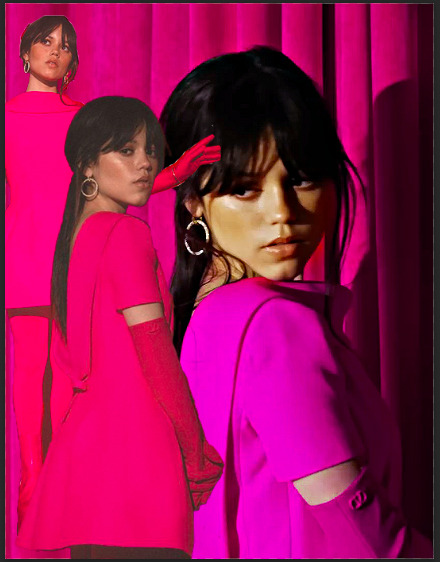
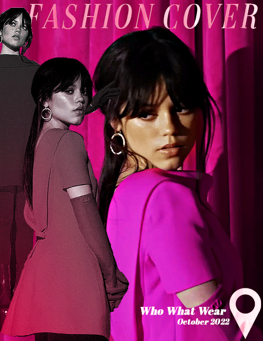
anonymous asked 💬 Hello there! Could you please make a tutorial on how you combined gifs and images in your edit THE RECENT FASHIONS OF JENNA ORTEGA? It's incredible. Thanks!
tysm for this ask 🫶🏼 below the cut is a step by step on how to do this kind of set. i will be using photoshop 2023 for this tutorial.
original inspiration was taken from sith-maul’s zendaya lookbook gifset !
step 1: cropping
for this style to work, your gif needs to be tall. the best dimensions are 540x700. make sure you don’t have too many frames because the bigger the crop, the bigger the file size !!
the other thing you want to do is crop it a little to the left or to the right, whichever works best. this is so you can slot in the photos of the outfit :)
step 2: colouring
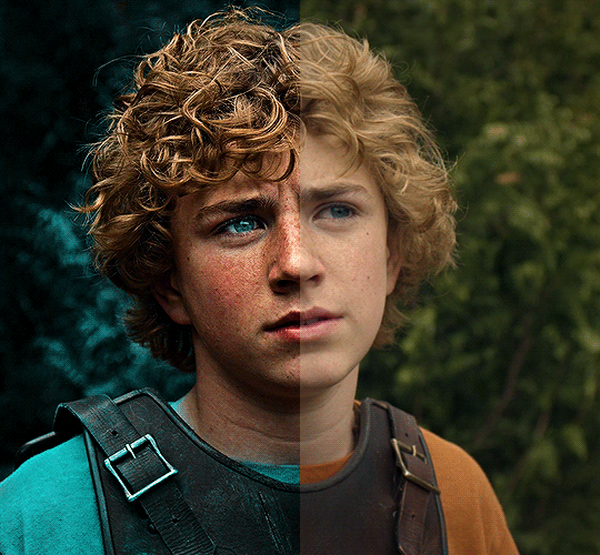
to make the whole thing more cohesive later on, how you colour your set is important. for the demonstration, i’m using a clip of jenna from her interview with who what wear, which has a lot of easy to manipulate colours. because the main colour is obviously pink, i’ll use a colour balance layer, a selective colour layer and a hue/sat. layer.
be mindful when using hue/sat and colour balance that you’re not whitewashing your subject or dramatically altering their skin tone. if there is low movement in the gif, you can use layer masks to prevent this.
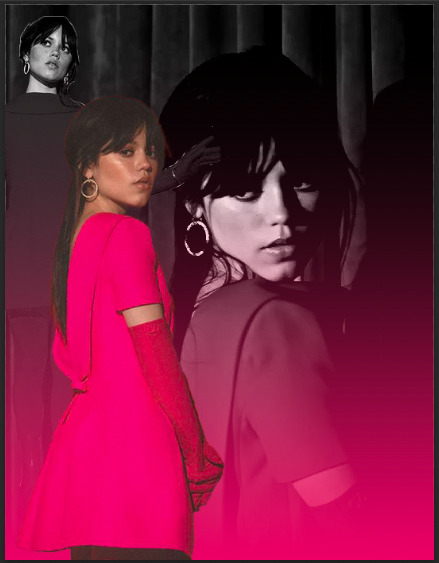
you can see here that there’s a huge difference in the old vs. new colouring, which is what we want !!

step 3: source your pics
probably the easiest step. you can either just google search for pictures [person] [event/photoshoot] is the best way to search for that, or you can search for something on pinterest. you want one picture that’s ideally head to toe, plus another showcasing the outfit from around waist up.
step 4: edit the photos.
now that we’ve got our photos, load those into ps. once loaded in, you’re going to want to go to select > subject and then go option + cmd + x (for mac, i’m sorry idk the windows prompt !) and then just paste that on a new layer.
depending, the photo may select some of the background. but there’s really nothing you can do about that, so you just have to tidy it up manually using the eraser tool.
now my photo looks like this !

crop the photo to the same size as your gif and repeat the same process for the other photo.
step 5: placement of the photos
first off, duplicate your photos onto the gif. then, resize them to your liking. ideally, you want the full shot going from top to bottom on the gif, and the medium shot positioned down from it.
i also make the medium shot a little bit smaller, so we can highlight the head to toe. as well as that, put the head to toe shot behind the medium shot by swapping their layer orders.
here’s a ss of what mine looks like, just to give you an idea.
step 6: colouring the photos
first stop: add a black and white gradient map. completely ignore the fact the gradient map will go over everything; we’ll fix it in one sec ! colour the photos as normal: curves, levels, anything you do in your normal colouring process. just make sure all the layers are underneath your gradient map layer !
on top of it all, add a gradient layer and change it to a colour in the outfit. you can click and drag it in all different directions to get to a good point. don’t forget to change the angle of it so it fits best !
for example, here’s mine:
you can see that the gradient gradually goes up on the outfit, leaving it almost half half.
now, select all the layers that are over the first picture and right click > clipping mask. this clipping mask will make sure that all your colouring layers ‘clip’ only to your picture. DO NOT select the picture layer as well. this should be what you have:

the arrows show that it has clipped to the subject.
now, just repeat those colouring steps on the other pic so you’re starting to look like this:

OPTIONAL: i usually change the blending mode of my gradient layer to ‘colour’ so it blends nicer on the picture, it’s not compulsory, but the result looks better. you can also choose to sharpen your pictures if you like !
step 7: typography
there’s two main things you want: the title of it (this could be a fashion brand or maybe a show/film name if you want to do this for a character) which will be in a statement font as well as the location or the date (could be the episode and the episode air date or the film premiere date) to start, create your layer above the colouring layers for the gif, but below the pictures of your person.
for this tutorial, i’m using the font ‘magazine’ but you can really use any font you want, as long as it stands out against the cover.

next up, you’ll want to search ‘map pin point png’ on google and get your little pin point icon. this will be so you can add the location and the date, or whatever you want to add. i change the font that i use for the subheading, just to switch things up ! you can do whatever you like though.

here’s what i’ve got for my subheadings. make sure that you’re placing it in the empty space on the bottom corner, not on top of your pictures.
and that’s it ! you can add any other finishing touches that you’d like, or do any other effects that you want. this is simply a base for you to work off, but you can change things wherever you deem it necessary to improve upon. apologies for this being so long 😭 hopefully it helped a little though !
#*tutorial#asks#gif tutorial#clubgif#userriel#tusercat#usercim#usersmia#userv#thingschanged#userzesty#userlp#userpjo
42 notes
·
View notes
Note
Hi Pooklet! :D I was wondering if you can point me in the right direction? I'm trying to make some makeup that can fit mutiple skintones but im having a hard time working with trappings actions? Like I need a base? How do I even go about using a base with the actions? I'm so lost and confused...

Hey anon! So, I'm not actually sure how helpful I can be with this, because I never use skintone actions. I find that they tend to be pretty limited in their selection of dark tones and that they make facial features really washed out and muddy the darker the color goes, since there's no easy way for an action to compensate for the loss of highlight and contrast. So I truly have no idea what sort of base is required by those actions.
Whenever I make natural makeup, I reference existing skins and do the colors by hand. I use Photoshop, so I'm not sure how to color stuff in other programs, but here are a couple tricks that I use:
Directly compare the makeup to the skin that you want it to work with by pasting the makeup over it and using the alpha as a layer mask. This is kind of hard to explain in text alone so I made a mini-tutorial on using alphas as layer masks to color-match makeup to skins.
Half tones. If I'm making lipstick and I have a red I like and a pink I like but no reddish-pinks that I like, I paste the pink over the red at 50% opacity and save a copy of the resulting color. I use this little cheat a lot, not just with makeup but with skins, to make sure there's no big jumps between shades.
For alien tones I do often just use my hair color actions and the Cosmic ones by @furbyq, because I know that the "base" those need is any texture has been colored with my Volatile action. The only thing that needs to be done by hand there is editing the initial texture to be around the same luminosity/brightness as one of my hair textures. If you run Volatile over a very dark texture, the colors won't come out the way they should. You'll need to brighten it up with something like Levels or Curves. Then run Volatile again. Then any of those actions will work on it!
Another anon asked me for a tutorial on making lip blends specifically and I'm not sure when I'll have a minute to sit down and do that but hopefully this is helpful in the interim!
12 notes
·
View notes
Note
dear kyle, please explain your gif making process! <3
dear nonnie, I sure will. I'm gonna explain how I made this:
(this gif is not pretty I know, thats not the point here)
I am however. NOT going to explain how I colour as that is a seperate thing on itself. this will simply be a basic gif tutorial. if you do want me to explain colouring all you gotta do is ask.
I use OBS (1920 x1080, 60 fps) and Photoshop. to make gifs.
I'm going to break this into 7 parts.
importing
fixing frames
timeline
sharpening
sizing
colour
export
now. onto the tutorial.
importing
so, I use, frames to layers, some people use timeline, everyone has different ways this just works best for me. so, for this you go to
edit -> import -> video frames to layers.
this is the view you will get when you do this.

the little nibs on the side you can use to make a selection of what part you want to gif.
then your gif is imported if you dont see this timeline on the bottom of your screen

make sure you add it by going to:
window -> timeline
make sure it's there otherwise you cant work with it obviously.
2. fixing frames
now you have a bunch of frames, here a BUNCH of choices come. how long do you want your gif to be, how quick do you want your gif to be etc etc.
tumblr does have a size limit so the more frames you add the smaller the gif has to be and the shorter the bigger it can be. I prefer my gifs to be from 60-100 frames per gif, this is the most satisfying for me.
also because I record in 60 fps I dont have to slow down my gif BUT if you do want to do that you can by clicking on the little three lines on the right of you timeline, click on 'select all frames' and then you can change the frame rate from 0,02 or whatever it might be to anything faster 0.01 or slower 0.05 (or more) eventually you'll understand the different effects this can have, this takes trial and error.

3. video timeline
now, make sure to delete any and all frames you dont want added if a gif is going to be devided in two I make sure its about 200 frames and I have my 100th frame selected.
when you're happy with how fast and long it is we're going to convert to video timeline. you do this by again, going to the little three lines and clicking on convert to timeline. you'll wait a second and then you'll see this
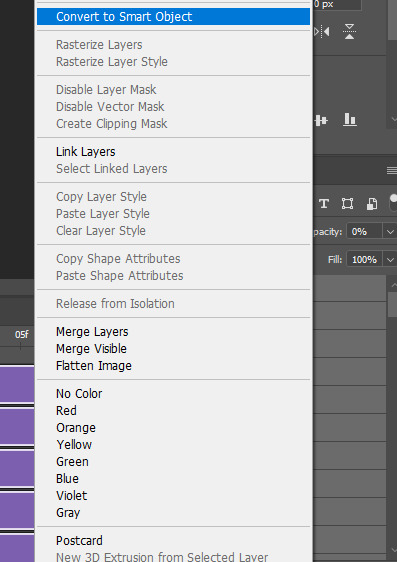
after you have your timeline, we're going to change all your individual frames into a smart object, we do this so its free for changes and edits. what you do is you go to your layers, select every one of them by clicking the bottom, holding shift and clicking the top layer. you right click and click on 'convert to smart object'
4. sharpening.
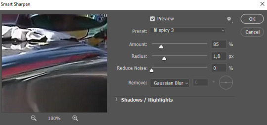
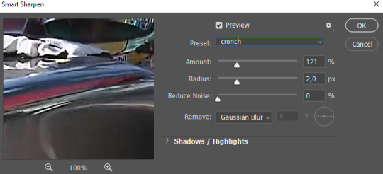
now this is where choice and style starts to come in even more. I personally like it when my gifs are crunchy and the sharpening is visible but smooth.
for sharpening we use 'smart sharpen' you get here by going to
filter -> sharpen -> smart sharpen
and here you kinda mess around with the look that you like, I add to levels of smart sharpen, which look like this.
5. sizing
so, tumblr hates us and has some very specific sized that it will accept, these sizes are 1:1 aka square and then 5:7 and 16:9
I normally stick to 5:7, I like this size and I can use it horizontally or vertically, try and stick to these sizes, they're fixed sizes on photoshop so you can easy use that to stick to them.

6. colour
so this is where I'm not going to go in to deeply, colouring is a whole genre of editing on its own but I'll give you some of my must know tricks.
LEVELS/CURVES
so, levels and curves are used to add depth and contrast, if you use the little pipet on the left side of the adjusment layers and use that to click on your deepest black it will do a lot of work for you (this works the same for levels as curves) I personally always start my colouring with this and they move around curves and levels to see what I like
COLOUR BALANCE
this is a basic colour fix, with this if a video is extremely yellow, you can add blue or when something is purple you can add green etc etc, this is basic stuff to neutralize your colouring
some of my favorite adjusment layers are hue/saturation, selective colour and channel mixer, I recommend trying some extreme colouring and doing a bunch of experience to get used to working with all these adustment layers
7. export
and now, last but not least, export, this is the 'easy part' if you go
file -> export -> export for web legacy
you get this screen. these are also my settings, play around with some of these and see what you like, you dont really touch
colours
web snap
preview
metadata
quality
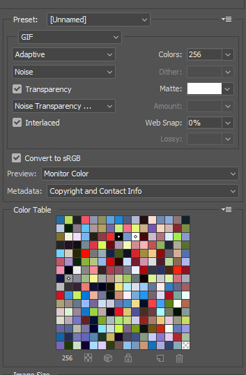
a lot of people change the size of the gif before export but I dont like how the gif looks when I do that so I go to this lil part of my export settings
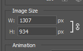
and I make them smaller, most of the time I start with 700 x 500 but I basically just look at this little part.
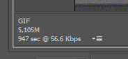
until the gif is under 8m
AND THATS IT!
make sure you click play during your export to make sure there are no mistakes or bugs in your gif.
good luck and I hope this helped
6 notes
·
View notes
Text
The Best Tools for Professional-Grade Photo Retouching
Introduction
Professional-grade photo retouching requires the right set of tools to achieve stunning results. Whether you're retouching portraits, landscapes, or product photos, using the best software and tools can make a significant difference in the quality of your work. This blog post will explore the best tools available for professional-grade photo retouching, helping you choose the right ones for your needs.
Adobe Photoshop
Overview
Adobe Photoshop is the gold standard in photo retouching, used by professionals worldwide. Its vast array of tools and features make it the go-to choice for detailed and precise retouching.
Key Features
Healing Brush and Clone Stamp: For removing blemishes and imperfections.
Liquify Tool: For reshaping and adjusting elements within a photo.
Adjustment Layers: For non-destructive color correction and exposure adjustments.
Advanced Layer Masks: For precise control over edits.
Pros and Cons
Pros: Extensive features, industry-standard, excellent support and tutorials.
Cons: Steep learning curve, subscription-based pricing.
Adobe Lightroom
Overview
Adobe Lightroom is perfect for photographers who need both powerful editing tools and robust photo management features. It excels in batch processing and non-destructive editing.
Key Features
Global and Local Adjustments: For fine-tuning exposure, color, and detail.
Presets: For quick, consistent edits across multiple photos.
Photo Organization: With tagging, rating, and collections.
Integration with Photoshop: Seamless workflow between the two programs.
Pros and Cons
Pros: Easy to use, excellent for batch processing, integrates well with Photoshop.
Cons: Subscription-based pricing, fewer retouching tools compared to Photoshop.
Affinity Photo
Overview
Affinity Photo is a powerful and affordable alternative to Photoshop, offering many of the same advanced features without a subscription model.
Key Features
Inpainting Brush Tool: For removing blemishes and objects.
Frequency Separation: For professional skin retouching.
Advanced Layer Support: Including non-destructive adjustments.
HDR Merging and Panorama Stitching: For creating stunning composite images.
Pros and Cons
Pros: One-time purchase, powerful features, supports PSD files.
Cons: Smaller community, fewer tutorials compared to Adobe products.
Capture One
Overview
Capture One is renowned for its superior color grading and tethered shooting capabilities, making it a favorite among professional photographers.
Key Features
Advanced Color Editor: For precise color adjustments.
High-Quality RAW Processing: For maximum image quality.
Tethered Shooting: For real-time edits during photoshoots.
Layer-Based Editing: For non-destructive adjustments.
Pros and Cons
Pros: Superior color grading, excellent RAW processing, powerful tethered shooting.
Cons: Expensive, steep learning curve.
GIMP
Overview
GIMP (GNU Image Manipulation Program) is a free, open-source photo editing software that offers a range of powerful tools, making it a great option for budget-conscious photographers.
Key Features
Clone and Heal Tools: For removing imperfections.
Customizable Interface: To fit your workflow.
Layer Support: For non-destructive editing.
Extensive Plugin Support: For added functionality.
Pros and Cons
Pros: Free, powerful features, customizable.
Cons: Less polished interface, steeper learning curve.
Conclusion
Choosing the right tools for professional-grade photo retouching is essential for achieving high-quality results. Adobe Photoshop and Lightroom remain industry standards due to their extensive features and integration. Affinity Photo offers a cost-effective alternative with powerful capabilities. Capture One stands out for its color grading and tethered shooting. GIMP provides a robust free option for those on a budget. By selecting the tools that best fit your needs and workflow, you can elevate your photo retouching to a professional level.
0 notes
Text
Top Content Creation Apps to Help You Create Killer Content
There is no shortage of content creation apps on the market today. With so many options, it can be difficult to know which ones are worth your time and investment. This blog post will help you sort through the plethora of content creation apps by highlighting the top three that are sure to help you create killer content.
If you’re looking for an app that will make creating visual content a breeze, look no further than Canva. Canva is an easy-to-use app that comes with a wide variety of templates for everything from social media posts to infographics and more. Simply select a template, add your text and images, and voila! You have professional-looking visuals that are sure to capture your audience’s attention.
Another great option for those who want to up their content creation game is Adobe Spark Post. Adobe Spark Post allows users to create stunning visuals with ease using its library of built-in templates, fonts, and photos or by importing their own assets. Once your masterpiece is complete, share it across all your social media channels with just one click – talk about efficiency!
“Best content creation apps for beginners”
Are you a content creator looking for some new apps to help you with your work? Or maybe you’re just starting out and are wondering what kind of apps are out there to help you with creating content. Either way, we’ve got you covered! Here is a list of our favorite content creation apps that are perfect for beginners.
1. WordPress: One of the most popular blogging platforms out there, WordPress is a great tool for anyone who wants to create written content. With an easy-to-use interface and plenty of customizable options, WordPress is perfect for those who want to get started with blog writing or articles without any hassle.
2. Canva: A drag-and-drop graphic design app, Canva is perfect for creating visuals for your blog posts or social media accounts. With over 1 million templates and tools available, all of varying levels of complexity, it’s easy to find something that suits your needs – no matter how simple or complex they may be. And if you get stuck, their extensive tutorials will help walk you through everything step by step until you’re confident using the platform like a pro.
3 . Adobe Creative Suite: For those wanting more comprehensive creative software suites , Adobe Creative Suite offers multiple programs in one package – including Photoshop , InDesign , and Illustrator . While geared more towards advanced users , Adobe Creative Suite still has features and tutorials available to support beginner level content creators . However please note that these programs can be quite expensive when purchased outright; luckily , many monthly subscription plans are now available which make this software much more affordable on tight budgets .
“Top content creation apps of 2020”
If you’re looking to create content that stands out from the rest, you’ll need to use apps that offer innovative and professional features. Here are some of the best content creation apps of 2020:
1. Canva – Canva is a user-friendly graphic design app that is perfect for creating images for your blog posts, social media accounts, or even marketing materials. With over 1 million templates and tools available, all of varying levels of complexity, you can create any kind of image you need.
2. Adobe Creative Suite – Adobe’s Creative Suite (comprising Photoshop, Illustrator, InDesign) is considered the gold standard when it comes to crafting visuals. If you’re serious about creating high-quality graphics and want access to professional-grade tools, then this is the app suite for you. It does come with a steep learning curve though so be prepared to invest some time into mastering its various functions!
“5 must-have content creation apps for any creator”
Content creation apps are a dime a dozen these days. But which ones are essential for any creator? Here are 5 must-have content creation apps for anyone looking to create great content:
1. Canva – Canva is a user-friendly graphic design app that is perfect for creating visuals for your blog or website. With millions of templates and tools available, all of varying levels of complexity, you can create anything from simple social media graphics to complex infographics with ease. Plus, their drag-and-drop interface makes the whole process pretty straightforward and fun!
2. Adobe Creative Suite – Adobe Creative Suite is a comprehensive set of tools for designers, illustrators, and photographers alike. While it can be daunting at first (due largely in part to its sheer versatility), once you get the hang of things there’s virtually no limit to what you can create with it. If you’re serious about content creation, then this app should definitely be in your toolkit.
“How to use content creation apps to boost your productivity”
There are a number of content creation apps that can help boost your productivity. Here is a look at some of the most popular ones:
Evernote: Evernote is a great app for taking notes and organizing information. It lets you create notebooks, which can be used to store anything from ideas to full-fledged articles. You can also sync your notebooks across devices, making it easy to access your information from anywhere.
Dropbox Paper: Dropbox Paper is another great app for taking notes and storing information. It offers a variety of features that make it ideal for content creation, including real-time collaboration, image embedding, and rich text editing. Plus, like Evernote, you can sync your papers across devices for easy access wherever you go.
Google Docs: Google Docs is a word processing application that offers all the features you need to create high-quality documents. It includes tools for collaborating with others in real time, as well as numerous templates to help get you started on your next project. And like Evernote and Dropbox Paper, Google Docs lets you sync your docs across devices so you can work on them anywhere.
“7 ways to make the most out of content creation apps”
When it comes to content creation, there are a multitude of apps available to help you get the job done. Whether you’re looking for something to help with brainstorming or something to assist with the actual writing process, there’s an app out there that can help. Here are seven ways to make the most out of content creation apps:
1. Use them for brainstorming: When you’re first starting out with a new project, it can be helpful to use an app specifically for brainstorming ideas. This can give you a place to capture all of your thoughts and ensure nothing gets lost in the shuffle. Once you have a solid foundation of ideas, you can then start fleshing them out further using other apps.
2. Take advantage of mind mapping features: Many content creation apps include mind mapping capabilities as well as traditional outlining features. If you find yourself getting stuck while writing, try utilizing these tools to map out your thoughts visually and see if that helps break things down into more manageable chunks.
3 . Find an app with built-in research tools: Trying to do research while also working on writing can be tricky (and often time-consuming). Luckily, several content creation apps come equipped with handy research tools so you can quickly look up information without ever having to leave your document open
” 3 expert tips on usingcontent creationapps like a pro!”
As a content creator, you know that apps can be a huge help in terms of efficiency and productivity. But with so many content creation apps out there, it can be tough to know which ones are worth your time.
Here are three expert tips on using content creation apps like a pro:
One way to make the most out of your content creation app is to take advantage of any built-in templates that it offers. This can save you valuable time by giving you a starting point for your project, rather than having to start from scratch each time.
Mostcontent creationapps offer some type of integration with other tools and platforms. For example, many will integrate with social media platforms or email marketing software. This can be extremely helpful in saving you time and helping you get the most out of your app. 3 . Automate where possible Another great way to make use of your contentcreationapp is to automate as much as possible . Many apps offer some degreeof automation , whether it’s through scheduling posts or creating drafts based on template s . By automating certain tasks,you’ll free up more timeto focus on other aspectsofyour business
Conclusion
When it comes to content creation, there are a variety of apps that can help you create killer content. Some of the top content creation apps include Canva, Adobe Spark, and Hootsuite Insights. These apps can help you with everything from creating graphics to analyzing your audience.
No matter what type of content you’re looking to create, there’s an app out there that can help you do it. So get creative and start creating some killer content!
The post Top Content Creation Apps to Help You Create Killer Content appeared first on SwiftCreator.com.
https://ifttt.com/images/no_image_card.png
https://swiftcreator.com/content-creation/top-content-creation-apps-to-help-you-create-killer-content/
https://ifttt.com/images/no_image_card.png
https://swiftcreatorcom.wordpress.com/2023/06/14/top-content-creation-apps-to-help-you-create-killer-content/
0 notes
Text
The Best Content Creation Tools for Social Media
When it comes to content creation, there are a lot of different tools that can be used for social media. However, not all of these tools are created equal. There are some that are better than others and this blog post will help you to find the best content creation tools for social media.
There is no doubt that creating content can be time-consuming and sometimes even frustrating. But with the right tool, it doesn’t have to be either of those things. The best content creation tools for social media make the process easier so that you can focus on creating great content instead of worrying about the technicalities.
Content Creation Tools for Social Media: The Best of 2020
As a business owner, you know that social media is a powerful tool to reach new customers and grow your brand. But what are the best content creation tools for social media?
There are many great options out there, but here are our top picks for 2020:
1. Canva – Canva is a user-friendly graphic design tool that’s perfect for creating images for social media. With over 1 million templates and tools available, all of varying levels of complexity, you can create any kind of image you need. Plus, their prices are very reasonable starting at just $9.95/month for the Pro plan.
2. Adobe Creative Suite – Adobe Creative Suite is a comprehensive set of tools for graphic designers and other creative professionals. While it may be pricey (plans start at $49.99/month), it includes everything you could possibly need to create stunning visual content, from Photoshop to Illustrator to InDesign.”
Content Creation Tools for Social Media: A Comprehensive Guide
As a business owner or marketing professional, you know that creating great content is essential to your success on social media. But what are the best content creation tools for social media?
There are tons of different options out there, and it can be hard to know which ones will work best for you and your business. That’s why we’ve put together this comprehensive guide to the best content creation tools for social media.
Whether you’re looking for ways to create more visual content, generate ideas for new blog posts, or automate your posting schedule, we’ve got you covered. Keep reading to learn about some of the most popular and effective content creation tools available today.
Content Creation Tools for Social Media: Top 10 Picks
Picking the right content creation tool for social media is key to success. There are a ton of options out there and it can be hard to know which one is right for you. To help, we’ve compiled a list of the top 10 picks for content creation tools for social media.
1. Canva – Canva is a user-friendly graphic design tool that’s perfect for creating images for social media posts and covers. With its drag-and-drop interface, you can easily create visuals without any prior design experience. Plus, there’s no need to hire a separate designer – Canva’s templates and easy-to-use tools make creating beautiful designs quick and easy.
2. Adobe Creative Suite – For those with more advanced design skills, Adobe Creative Suite (CC) is an industry-leading suite of creative tools used by professionals worldwide. Featuring programs like Photoshop, Illustrator, and InDesign, CC has everything you need to create stunning visual content for social media (and beyond). While some may find the learning curve steep, Adobe offers plenty of resources to help get you started – including tutorials, forums, and live chat support.
3. Buffer – A powerful yet simple platform helps manage all your social media accounts in one place so that you can easily publish great content when your audience is most engaged throughout the day.
4.< Sprout Social > Sprout – As well as helping users publish great content at optimal times ,Sprout also provides data analysis capabilities so that users could see how their posts areperforming .This valuable feedback allows users improve future post strategies . 5.< Hootsuite Insights >Hootsuite Another popular option ,Hootsuite insights goes
Content Creation Tips for social media success
As a business owner, you know that social media is a powerful tool to reach new customers and grow your brand. But what you might not realize is that creating great content is the key to success on social media.
There are tons of content creation tools out there, but which ones are the best for businesses? Here are our top picks:
1. Canva – Canva is a user-friendly design platform that’s perfect for creating images for social media posts and ads. With over 1 million templates and tools available, all you need to do is drag and drop your way to beautiful designs. Plus, it’s free to use!
2. Adobe Creative Suite – If you’re looking for more advanced features, Adobe Creative Suite offers everything from video editing software (Premiere Pro) to graphic design software (Photoshop). It can be pricey, but it’s worth it if you want professional-grade results.
3. Hootsuite Insights – As a business owner, you know the importance of analytics in making strategic decisions about your marketing efforts. Hootsuite Insights provides detailed reports about your social media activity so you can see what’s working and adjust accordingly. Best of all, it integrates with Hootsuite Analytics so you can get even more insights into your data! 4
Creating Engaging content with these tools How to Create Compelling content using these tools 7 Optimize your content strategy with these tools 8Choose the best creation tool based on this list 9Why most people fail at creating good content 10How to use repurposing techniques in your favor
As a business owner or marketing professional, you know that creating engaging content is essential to driving results from your social media campaigns. But with the vast array of content creation tools out there, it can be tough to figure out which ones are right for you and your team.
In this blog post, we’ll share five powerful content creation tools that can help you make more compelling content for your social media channels. We’ll also offer some tips on how to choose the best tool based on your needs, and why most people fail at creating good content.
1. BuzzSumo: BuzzSumo is a great tool for finding popular topics and ideas for your next piece of content. Simply enter a keyword or topic into the search bar, and BuzzSumo will show you the most popular articles and posts related to that topic. This is a great way to come up with new ideas for blog posts, infographics, whitepapers, ebooks, and more.
2. Google Keyword Planner: The Google Keyword Planner is another great tool for coming up with new topics and keywords for your next piece of content. Simply enter a keyword or phrase into the planner, and Google will show you related keywords as well as estimated monthly searchesfor those terms . You can use this informationto determine which keywords are worth targeting inyourcontent strategy In addition ,the Keyword Planner can also helpyou estimate how much traffic potential piecesofcontent could bringin if they rank highly in SERPS .
3 Quora: Quora is an excellent platform forcrowdsourcingideasforyournextpieceofcontent .Ifyouhaveaquestion aboutacertaintopicorindustry ,Chancesare somebody
Conclusion
In conclusion, the best content creation tools for social media are the ones that allow you to be creative and produce quality content. There is no one-size-fits-all solution, so find the tool that works best for you and your needs. With a little bit of creativity and effort, you can create stunning content that will help you stand out from the crowd.
The post The Best Content Creation Tools for Social Media appeared first on SwiftCreator.com.
https://ifttt.com/images/no_image_card.png
https://swiftcreator.com/content-creation/the-best-content-creation-tools-for-social-media/
https://ifttt.com/images/no_image_card.png
https://swiftcreator.weebly.com/swift-creator/the-best-content-creation-tools-for-social-media
0 notes
Note
i'm one of your anons who keeps asking about your gifmaking process, so sorry if this is bothersome! i have a couple of questions, if you don't mind.
the tutorials you've linked in your (very helpful) replies all seem to focus on photoshop. is that what you use exclusively?
and a more specific question, about your yr ball set from last week, can you give a basic overview of how you did your coloring? i saw that it took you many hours to do the set and the colors are beautiful. i just don't have any idea where to start and my dark scene gifs always look muddy even when i try to add color.
Hi anon! I don't mind answering your questions at all!
The first question is easy -- I use photoshop CC for all of my giffing and photo editing. I know there are other tools out there, some of which are free, but I don't know enough about them to make recommendations. If anyone reading this knows of a comparable alternative, please drop it in the notes.
Your second question is difficult to answer because every gif I make is hand colored, which means I start from scratch on each of my gifs and don't use saved color schemes. I can tell you the basics of what I did for one gif so you can see the process I follow even though the adjustment layers will be different for each gif in the set. We'll use this one as an example.

(This got long, so putting the rest under the cut.)
Since you asked specifically about coloring, let's assume we're starting with a basic, sharpened gif. The first thing I do is adjust the base brightness and contrast. In the above gif, I played around with using Exposure and Levels. I also often use Curves instead of (or along with) Exposure. It all depends on the scene. In this gif, I ended up using two Exposure layers with a Levels layer in between. My best advice is to always start with small adjustments and tweak up from there.

Next is Color Balance. I leaned heavily into Blues in this gif because I wanted to capture the color and texture of Wille's costume as much as possible. You'll see I also have additional blue selective color layers too.

Next, I adjusted the coloring using a lot of Selective Color layers. I like to use separate layers for each major color adjustment instead of doing several colors at once. Black for helping with contrast. Blue for the reasons stated above. Red and Yellow are what I mainly use to achive skin tone. A nudge of magenta can help with lip tone. Brightening or softening whites is great in a scene like this for Wille's wig.

Finally, I always finish coloring with Contrast and Vibrance. Values vary but I rarely adjust brightness or saturation here. I'd rather do that in the previous layers.
And my last layer on all of my gifs is either a black to white gradient layer (soft light, 3-5%), or a solid black or white fill layer (also 3-5%). Like everything else, it depends on the gif, but I find it adds a little extra crispness to the final product.

Sorry this got so long, anon, but I hope you find it helpful. As I said above, start with small adjustments. Use the slider to see what each contrast or color adjustment will do to your gif, then change values by a couple percent at a time. Sometimes nudging things up or down 1-2% can make all the difference. And brighten dark gifs slowly! Big brightness adjustments can lead to grainy, washed out final gifs in my experience.
Feel free to reach out again with additional questions, and you're welcome to tag me #userbarrow in your posts so I can reblog your creations! Good luck!
1 note
·
View note
Text
The best drawing and digital art apps available for everyone in 2022
Drawing on paper with a traditional pen or pencil has a certain satisfying feel to it. But command+Z doesn't work when you need to delete mistakes. You can count on technology to help you out. With the best drawing apps on a portable device, artists and designers can make quick changes and iterations on the go.
Which of the top apps for digital drawing should you use?
If you're in the market for one of those amazing drawing apps, it's worth your time to do some research to find the best fit for your creative workflow before making a purchase. Some of the things that modern digital art can do and how it works may come as a pleasant surprise.
Here are the best—there's something for everyone!
Drawing apps For Beginners
Here are some easy apps for beginners. These are easy-to-use drawing apps. They have many resources and a large community to support them as they learn.
1. Procreate
This app runs on an iOS device and can be scary for a designer who is just starting out. Explore the Procreate forums for more information on how to use the program. Anyone interested in digital art can find a lot of resources online, such as tutorials and videos from very skilled artists. Check out the animation tool; it will give your projects a whole new dimension.
2. Adobe Photoshop Sketch
The app is compatible with both iOS and Android devices. This drawing program has been used by artists for years. Like other Adobe products, Photoshop Sketch has a beautiful interface that is also straightforward and easy to use. The brush panel on the left and the few design tools on the right make a large digital canvas for painting. If you're a fine artist looking to incorporate digital elements into your work, you'll love this app! It's made with you in mind, with streamlined features that let you focus on making art.
3. Adobe Illustrator Draw
This program is intended for the graphic designer who already uses other Adobe products. Adobe Illustrator Draw on the iPad makes it simple to transfer your work to an open Illustrator file using CC Libraries.
The app takes a minimalist approach to Adobe Photoshop Sketch, and it's gorgeous to look at, but the learning curve can be steep for those not used to working with design software. The good news is that users of any experience level can take advantage of the app's extensive tutorial platform and active community. It works on both iOS and Android.
4. Adobe Fresco
There are some unique features in this program, such as live brushes that can be dragged across the screen, stunning vector graphics, and 3D-looking blending effects. Adobe Fresco can be sent to Photoshop for more advanced editing, and its simple interface makes it good for designers and illustrators who want to get their ideas down quickly without getting bogged down by extra features.
Digital painting and drawing have never been easier than with this beginner-friendly app. You'll need an Adobe ID to access it; it's available on the App Store and Windows.
5. Inspire Pro
An excellent way to get started with digital drawing is with Inspire Pro. The interface is easy to use and gives you access to a wide range of powerful editing and design tools. This app is a strong contender for the best drawing app on the App Store due to its quick rendering times. This app is designed for Apple's iOS and provides a basic set of tools for digital drawing.
6. Pixelmator Pro
Even though this app is more of an "image editor," it can still be considered one of the best digital drawing apps. It can add different effects to text layers, use vector graphics, change colors, and make clipping masks. This little app can make a graphic designer's or photographer's wildest dreams come true.
Pixelmator Pro is a photo editing app for iOS devices that, like Lightroom and Photoshop, focuses on providing a variety of options for graphic design.
7. Assembly
This app is classified as a "Mobile Vector Design" application. Assembly comes with elegant shape packs and a lot of other useful tools that would be welcome additions to the toolbox of any graphic designer or illustrator. The minimal design makes the most of the available canvas area. There is a sizable group of talented people already familiar with the app who are eager to share their knowledge, and there are also some entertaining tutorials available to help you get started.
With this iOS app, you can make vector graphics and use shapes to make illustrations.
Top-Rated Design Apps for Serious Artists
These apps have more features and are easy to use in a professional setting. People who have never dabbled in design before may find the learning curve more challenging, but the payoff is substantial once they do.
8. Autodesk Sketchbook
This is the app to look into if you need to create technical drawings or focus on minute details. It can scan your artwork and digitize it for you. Many industrial designers, architects, and other professionals use this handy little tool as part of their workflow. It makes it easy to draw and gives new users a smooth start with the Autodesk family.
Architects, industrial designers, and illustrators can all benefit from the precision and accuracy of Sketchbook's technical drawing tools. It's compatible with both iOS and Android operating systems.
9. Affinity Designer
When compared to Adobe's suite of design applications, Affinity Designer holds its own. The possibilities for its use are seemingly endless because of its powerful structure. More and more artists are using this tool in their work, and the tool itself has a huge collection of tutorials. This app has caught the attention of many people because it offers the best value for money among digital drawing apps, requiring only a single payment to unlock both the mobile and desktop versions.
This drawing app is an add-on to the desktop version of Affinity Designer, and it supports both vector and pixel art. It was developed for use with layouts intended for print or digital media.
Discover the best drawing app for your needs!
Whether you're an industrial engineer or a fine artist, you can find a drawing application that suits your needs in today's market. These art apps liberate artists from their desktops so they can create wherever they happen to be. With one of the aforementioned drawing apps, you can now make digital drawings wherever and whenever you like!
1 note
·
View note
Text
Adobe photoshop dawnload free
DOWNLOAD NOW Adobe photoshop dawnload free
Adobe photoshop dawnload free manual#
Adobe photoshop dawnload free software#
Adobe photoshop dawnload free trial#
Adobe photoshop dawnload free plus#
Adobe photoshop dawnload free professional#
Supports various file types on import and export.
Tools for HDR, panorama stitching, and focus stacking.
The other downside is that there’s no built-in file management system like you get with Lightroom. However, it lacks some of the advanced editing tools that its major competitor boasts. This is a major advantage over some of the other options on the market. Just like Photoshop, Affinity Photo supports layers, so you can do non-destructive editing. Photoshop finally released an iPad version in 2019, but with limited features. Affinity Photo is also the first pro-level photo editing app to work across Windows, Mac, and iPad, so you can edit the same file across all of your devices. One thing that Affinity Photo has that you won’t find in Photoshop is a dedicated frequency separation filter - a pretty neat feature for those who do a lot of this type of editing.
Adobe photoshop dawnload free software#
They look and feel very similar - and the software is the most similar in terms of usability and features, too. Users who are familiar with Photoshop will find Affinity Photo’s layout to feel like second nature. Affinity PhotoĪffinity Photo is part of a trio of apps by Serif that includes Affinity Designer (an Illustrator alternative) and Affinity Publisher (their answer to InDesign).
Adobe photoshop dawnload free trial#
⚠️ Free trial does not allow you to save or download your work.Īffinity Photo is a powerful Photoshop alternative that’s a great choice for photographers who want to create HDR images, create panoramas, or do focus stacking. Some tools like an Adjustment brush can be slowĪn abundance of tutorials available online Pro-level tools like Curves, Radial filter
Smart cropping, perspective, and lens distortion correction.
Odd objects removed in a few brushstrokes.
Color grading tools and a library of 3D LUT presets.
180+ artistic filters: HDR, vintage, Color splash, etc.
Easy background change, removal, or blurring.
Portrait auto retouch and face sculpting tool.
AI-driven auto-correction based on the photo’s genre.
The Face Sculpt feature is yet another tool that takes portrait retouching to the next level, as it allows to tweak the model’s facial features if they have been warped by bad lighting or a weird shooting angle. Thanks to PhotoWorks’ advanced face-recognition technology and a library of beautifying presets, this photo editor turns a tedious retouching routine into a one-click thing - without sacrificing the quality of the end result. One of the brightest features of PhotoWorks is its portrait retouching.
Adobe photoshop dawnload free manual#
It offers non-destructive editing, and an array of one-click effects, but does not shy away from old-school manual adjustments as well. PhotoWorks is refreshingly undemanding when it comes to hardware, operating smoothly even on low-spec computers. Supporting over 450 RAW formats, this photo editing software boasts a clear, intuitive interface and a wide range of tools – from basic to pro-level – aimed at turning your lackluster shot into eye candy. Perhaps the biggest appeal of PhotoWorks is its content-aware AI that significantly simplifies the editing process of both landscapes and portraits. Designed for both newbies and pros, this software offers all the essential photo editing features, along with some niche tools. PhotoWorks is a smart photo editor for PC that hits the perfect balance between user-friendliness and impressive functionality. You can take advantage of their free trials and, if they suit your needs, you can pay for them at a low price.
Adobe photoshop dawnload free professional#
Some Photoshop alternatives have become powerful tools with professional features that are the same or better than the Adobe image-editing package. Top Photoshop alternatives with free trials On the other hand, if you’re a digital artist that prefers to use Adobe Illustrator, you should check out this article on the best free Illustrator alternatives that you can start using right now. These free Photoshop alternatives are definitely a game-changer! Some of these work with Mac and are open-source, so you can easily achieve your small day-to-day editing tasks in a proficient manner. However, as the need for affordable gear increases, so does the need for more affordable software, including quality Photoshop alternatives.Īlthough they don’t provide all the same extensive functionalities as Adobe Photoshop, here’s our list of the best free photo editing software for 2022, that has similar features to Photoshop. And for good reason - the feature-rich programs are powerful tools for photographers.
Adobe photoshop dawnload free plus#
Are you on the hunt for a solution that’s just as powerful as the highly reputable Adobe Photoshop software, but without the high price tag? Great! In this post, we’ll be taking a look at the 10 best free Photoshop alternatives available, plus a few more with free trials.Īdobe Photoshop, Camera Raw, and Lightroom have been the industry gold standard photo editing software for decades.
DOWNLOAD NOW Adobe photoshop dawnload free
0 notes
Text
Affinity photo youtube
Affinity photo youtube for mac#
It’s full of cracking videos (currently over 170) covering the basics of photo manipulation, through to more in-depth tutorials for creating full. If you’re looking to master the art of photo manipulation in Affinity Photo on an iPad, then Bethany Acorn’s YouTube Channel is a must-watch. That is with powerful burn-up, clone patch, patch, dodge, blemish along with reddish eye gear. Affinity Photo image manipulation on an iPad Pro.
Affinity photo youtube for mac#
Affinity Photo Crack download also is for Mac features an entire retouching software library. The tool helps you edit and retouch pictures, create multi-layered full-blown compositions, and get loads more stuff done. Anyway, it’s possible to easily fix and enhance pictures with curves, levels, white and black, white balance, shadows, HSL, high lights as well as countless additional harmful modification tools. Affinity Photo is a professional image editing software comprising a large tool-set specifically designed for photography and creative professionals. This system allows one to utilize color spaces like RGB, CMYK, LAB, grayscale, and lots more. Ezra Anderson Affinity Photo YouTube Tutorials, After enrolling on the page, you will have access to every Affinity Photo video that we have on YouTube. Affinity Photo let me open a PSD file from Photoshop, and I found it easy to select, resize, and move a text box, but not actually edit the text. If you’re taking care of a new logo or perhaps an image endeavor. Affinity Photo Torrent is also a really useful graphic style and vector file endeavor PC software.
0 notes
Text
How to vectorize an image in photoshop cs6
#How to vectorize an image in photoshop cs6 pro
#How to vectorize an image in photoshop cs6 professional
Very often we do not need curves, we need cones. When we work with the pen tool we put some “anchor points”, and give the required curves between the two anchor points using the “handles”. Here we are going to make it easy the essential techniques of using the pen tool, which should led you in using it like a profession with the time and practice.
#How to vectorize an image in photoshop cs6 pro
And with the time and practice you should become more faster and a pro of the pen tool. With some patience and practice get started with the pen tool. People are often afraid of using the pen tool. Now we will select the man’s figure with the pen tool. If you are comfortable with other method, like pressing Ctrl and ‘+’ simultaneously to zoom in, and Ctrl and ‘-’ to zoom out, you can use that method. Like pressing Alt + Upward mouse scroll to zoom in, and Alt + Downward mouse scroll to zoom out. There are many alternatives of zooming operations. Press Ctrl + Alt + Spacebar + click to zoom out. Press Ctrl + Spacebar + click on the bottom left corner of the image to zoom in. Alternatively, you can click on File -> Open. Shortcut for a Photoshop document is to press Ctrl + O. We will change the background of this image. Click right mouse button on the image and selecting “Save image as…” from the menu. You can save the image to your computer to go along with me. Today we are going to learn how we can remove the background, and then add a new background.Ī lot of work? But I am going to make it easy by explaining the process step by step.įor this tutorial we are going to use the following image. Because a reputed firm will try to produce the best outputs for the price.
#How to vectorize an image in photoshop cs6 professional
If you choose a professional graphic design firm you may get some corrections for free. If you are not going to do the image manipulation yourself, be sure to make confirm whether the image manipulation company is going to do this, as well. Photographic corrections like brightness, contrast, levels, etc. Most of the time just replacing background is not enough. As a result, requirement for product photo background removal or replacement is increasing very fast. For a long time, a rapid increase of sell through e-commerce websites is taking place. need to do this before doing other types of photo manipulations. The various media of advertising like newspapers, magazines, fashion magazines, catalog, posters, flyers, etc. For advertising, it is very often the first thing needed. The most common photo editing required for advertising and other purposes is to remove or replace the background.
0 notes
Last Seen Blogs

fbi-agent-anderson
Man do I hate my job
mollyponkevitch
The Ecliptic

calligraphykalp-blog
CALLIGRAPHY
calligraphykalp-blog
CALLIGRAPHY

fuzzbitewolf95
FuzzBiteWolf95