#FrontMatter
Explore tagged Tumblr posts
Visit Tumblr Blog
Explore Tumblr blogs with no restrictions, modern design and the best experience.
Last Seen Tumblr Blogs


Fun Fact
Forty percent of Tumblr users are between the ages of 18 to 25.


Text
Maybe it's just me, but I find it rather weird/strange that the convention is
have a special "title" field in the frontmatter YAML, and then inject that into the published content as a header
rather than
read the first line of the content, and (optionally: only if it is header markup), use it as a title.
Just seems backwards to me.
I do understand that from a parsing perspective, it can seem cleaner if you're imagining the kind of use-cases where you only need to parse the frontmatter. But that strikes me as missing the forest for the trees. Sure it's cleanly decoupled in isolation, but typical usage isn't going to be decoupled:
If I already run code to parse and convert article content to, say, HTML, it doesn't trouble me to extract the title from the content.
Conversely, if I'm already hand-typing, say, Markdown, I find it cleaner, easier, and more (conventionally/idiomatically) visually representative of what the final result will be (whether visually or just in intent) if the title is the first line of the content using the same representation as I would use for other headings/titles in that content format/markup/language.
It's also not strictly better in composability and decoupling:
on the one hand, your title-extraction composes with any content format without coupling to parsing that content, but
on the other hand, your content authoring is coupled to frontmatter, and content which was written to work without frontmatter (title in the content markup itself) won't compose as nicely with a system which expects a title in the frontmatter.
7 notes
·
View notes
Text
What is this Calibre bug where it says it's compressed the images and made the EPUB smaller but it hasn't........
#and what is the deal with publishers including like 20mb of uncompressed images#many of them either splash images or actual fucking text frontmatter/endmatter#who is this for
5 notes
·
View notes
Note
hi - looking to get more into reading history books instead of just researching online… do you have any tips on vetting books/authors for liberalism, racism, etc… in the past i’ve found this very hard to do with nonfiction before actually reading the book. are there publishers, etc i should be looking out for? esp bc there’s ideas/trains of thoughts/scholars i might not recognize as biased, liberal, conservative etc. if i’m not well-versed in the discourse of the subject.
in general if you are looking for refereed (peer-reviewed) academic nonfic, you are going to have to assume the texts will reflect not only the ideological values of the institutions (universities and university presses) that produce them, but also the winnowing effect that ensures only a select few people even get the opportunity to publish this way -- these individuals also have class interests and those tend to overlap heavily with those of the institutions, both because people who can make it to this stage of an academic career tend to be bourgeois and petit-bourgeois to begin with, and because even those who weren't almost invariably come down with a case of temporarily embarrassed petit-bourgeois syndrome sometime in between phd candidacy and book manuscript submission.
which is to say I really cannot give you a good vetting list to eliminate liberals and racists from your academic nonfic reading. sorry! you will spend a lot of time reading people you disagree with, people who did valuable archival research but interpret it in chronically liberal idealist ways, people who are right on one historical point and wrong on all the others, &c. even when I read the rare communist historian I can't remember ever co-signing the entirety -- this kind of criticism is just part of the process.
I do think, though, there are some helpful things you can look for that can cue you as to whether a book is worth reading critically or is just straight up trash. ymmv and this is definitely a non-exhaustive list but here's some of what I look for:
read the methodology notes in the intro. phrases like "contextualist history" (= social and economic context) are a good sign. "history from below" or "social history" also tend to be helpful (read: this book talks about 'ordinary people' and labourers, not just heads of state and military).
intros should also signpost if the book deals with colonialism and/or imperialism; look for substantive statements about these.
in rare cases in certain subfields you may see references to a distinction between 'internalist' (idealist, whiggish, great man histories) vs 'externalist' (contextualist) approaches.
everybody in history footnotes foucault, so that means nothing in any direction. anybody who footnotes marx positively in the last 30 or so years is at least going to be a fun time, but is often also a dipshit. scan for other big 'theory' names you may recognise -- even before you know the historiography, this can help indicate what you're getting into
you can also read intro + conclusion first, and that can help you gauge whether the chapters are worth it. not always perfectly indicative, though
academic presses are all clowns but if you read a lot in specific areas you will definitely start to get a sense of certain clusters of clownery if you're paying attention to the frontmatter. like for example if a history text came out of berkeley in the 90s it might still be stupid but I do kind of know what flavour of stupid it will be and what I can expect to extract from it
on that note, it literally is helpful to skim the acknowledgments at the beginning and idk why more people don't do this lol. look for names of scholars they credit as having given feedback (on manuscripts or conference presentations), as well as the name of their advisor if it's a first book. the first few times you do this you won't recognise any names and that's fine, but when you start to see repeats or see names you've read before you actually gain a lot of information right off the bat on the author's ideological and political milieux lol
look at what journals it was reviewed in. again reviews in flagship journals don't automatically mean it's good but it tells you about the intended audience, with all the baggage that entails
books reviewed in mass media (legacy newspapers, etc) tend to be aimed at a popular audience and are intended to be more readable, with less dense scholarly references and often thinner primary source work. again this doesn't mean the academic publications are automatically good.
zero shame in reading book reviews, either before or after reading the book. reviewers are part of the same clown system as authors and publishers. but seeing how other scholars talk about the book and topic is very helpful for clueing you into what sorts of debates are happening in the field, what their ideological parameters are, and how the author in question comes down on them
you are allowed and even required to disagree if an author is wrong lol. I would say the no. 1 thing I run across in what I read is like, decent to good historical work on racialisation but the interpretation will be completely distorted by the author being a horrendous liberal who does in fact think that 'race' has some biological reality (while often not believing that they even hold this belief, lmao). when you start seeing arguments like this it's your cue to follow the footnotes and look at the data and archival material included in the book. and if there's none that's just bad methodology!
75 notes
·
View notes
Text
Obsidian Tutorial - Tags Basics
Did you know that Obsidian has tags? You do now! Here’s the basics of how to use them.

[ID - a purple decorative divider]
You can use tags in two places: in the body of your note, and in the properties.
You write them in the editor #likethis
You can add them in the properties sidebar by clicking add property, and then selecting the ‘tags’ property. Type your tag, then hit enter, and you’ll end up with something similar to this:

[ID - A screenshot of the Obsidian file properties sidebar, showing three properties. The tags property is marked out, showing that two tags have been added: tag1 and tag2]
You can also add them into the frontmatter inside the note. In that case, they should look like this, as a list:
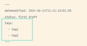
[ID - A screenshot of some YAML frontmatter in Obsidian, with three properties. The tags property is marked out, showing that two tags have been added as a list: tag 1 and tag2]
Some key points:
You can’t have spaces between the words, so if you want spaces, you’ll need to use underscores, hyphens, or some other way of separating the words.
You can use alphabetical letters, numbers, underscores, hyphens, and forward slashes in your tags - however, they can’t only be numbers, you need to have at least one non-numerical character.
You can nest tags with slashes, e.g. #character and #character/main which is useful for organising things.
Tags are case insensitive, so #tag and #TAG are identical.
You can search for tags! (see this post for search basics).
That’s the basics of using tags. There are loads of ways you can decide to utilise them in your notes, so if you have an interesting setup, please share!
[ID - a purple decorative divider]
check out my obsidian tag for more posts
check out the tutorials tag for other obsidian tutorials
obsidian resources masterpost
download obsidian
got questions? tutorial suggestions? want to say hi?
#obsidian md#obsidian.md#obsidian tutorials#writing tools#i used to use them more but i’ve kinda stopped#mainly i like using them to track plots and stuff using colourful tags
31 notes
·
View notes
Note
sorry i couldn't find out how to ask on your other blog.
that book binding you posted is gorgeous btw !!
I noticed that in one of the photos you included the disclaimer that you also edited it. I just had a question about how you formatted the text.
one of my biggest gripes with AO3 is text formatting (i often feel like i'm reading a legal document vs a novel/story) . Did you change how it is formatted on AO3 compared to printed?
I feel like i'm in the 0.5% that hate AO3 formatting but i thought i might as well ask in case you have any tips for that. >,>
(also how do you decide on the page size, do you just choose a standard size for all your projects? or do you vary it depending on what you are binding?)
thanks so much for taking the time to answer and for sharing your projects :) !!!!!!!!!!!
hey anon! I have asks turned off for the sideblog, but happy to answer here. Thanks very much!
I'm taking this opportunity to info-dump and link a lot of resources. I think they're useful for people new to either typesetting or bookbinding, but not all are directly related to your queries. That said, hope this is of use!
one of my biggest gripes with AO3 is text formatting (i often feel like i'm reading a legal document vs a novel/story) . Did you change how it is formatted on AO3 compared to printed?
I do a fair bit of editing when I'm binding a fic; typesetting is often the longest part of the process. Your mileage will vary depending on your experience with using word processor software, particularly the paragraph style and page style settings. Another factor is how simple/complicated you want your typeset to look. Replicating a published novel in format is difficult but learnable for a complete beginner.
I'm not equipped to give a full tutorial on how to typeset, but I'll point you towards some useful resources for ficbinding then talk about my own process.
ArmouredSuperHeavy has a tutorial on how to make Ao3's HTML downloads into a printable book in Microsoft Word. I use LibreOffice Writer myself, so this adaptation of the same tutorial is what I follow. Both are very helpful to reference as you're learning the typesetting ropes.
Personally, I don't mess around with HTML. I find it easiest to start by doing a Ctrl+A copy of the Entire Work fic view on Ao3 then pasting that into my word processor. This video tutorial by Beautifully Bound runs through how to do this in Microsoft Word using an AO3 fic as an example, including the associated steps needed to make the fic look novel-like. This is probably the best tutorial to address your gripe with AO3 formatting. Other than that, I'd recommend looking into videos or tutorials about typesetting novels for print. Same idea, and you may get more hits than searching for fanbind/ficbind typesetting tutorials.
More under the cut! Once I start yapping, it's hard to shut me up 🤷♀️
As a point of comparison, here's one of my fics on Ao3 and the corresponding typeset side by side:


Beautifully Bound explains this in far better detail than I will, but off the top of my head, the steps involved:
making a new document and setting the default page size to whatever size I want the book's pages to be (A5 or A6 usually). You can also set the margins at this point, taking account of your printer settings.
CTRL+A and copying the entire work's text on AO3 then pasting it into the document.
removing all hyperlinks and AO3 frontmatter, things like the author tags, summary, notes, etc as well as any website text that got copied over alongside the fic.
(optional) running a spell check and ensuring grammar usage is consistent. For me that's substituting em dashes for hyphens between clauses, enforcing curly double quotation marks for dialogue, etc. LibreOffice Writer automates a lot of this with customisable settings, via Tools -> Auto-Correct. Here's also where to make sure character names are all spelled right, convert the text to or from US to UK English, etc.
picking out fonts for the body text, headers, page numbers, etc. This is where you'll want to use paragraph style settings. Page style settings also comes in clutch if, for example, you'd like different headers on alternating pages. I like having the author on the right, the fic title on the left.
setting the body text first line indent to whatever makes sense visually). This in particular helps make the fic feel more like a novel. You can also play around with line spacing and space between paragraphs at this stage. For this A6 typeset, I had a 0.75cm first line indent, 1.15 line spacing, and 0.15 spacing between paragraphs.
(optional) formatting the first line of the work to use small capitals and to add a drop caps to the first letter of the first word. Again, this is a convention in publishing which add a novel-like feeling to a printed fanwork.
Inserting page numbers, adding images, coming up with how I wanted the "copyright" page to look—optional for the most part, but these are details that make a fic appear more like a novel.
For multi-chapter works, there's extra work in formatting chapter titles as headings so that they're referenced correctly in the automatic table of contents word processors can generate.
Once you have a typeset you're happy with, and if you're considering printing and binding it as a book, then you'll need to look into how to create and print signatures. Personally, this is something I had to actually try (and mess up a bunch of times) before I got to grips with it. Understanding how both your printer and your PDF reader work, particularly printer margins and booklet print settings, is key.
I won't go into as much detail on this, but if it's something you have an interest in, I'd recommend starting with DAS Bookbinding's tutorial. DAS has tutorials for everything bookbinding related so when in doubt, check his channel! Plenty of other YouTubers also have good videos on making signatures.
This resource is extremely useful once you've got your head around how to print signatures manually, so here's a link for anyone in that space: GitHub Bookbinding Imposer. Essentially, this does the signature creation for you, removing the need for booklet print settings in your PDF reader.
also how do you decide on the page size, do you just choose a standard size for all your projects? or do you vary it depending on what you are binding?
I have access to both A4 and A5 sized paper and my printer can handle printing on either size. In bookbinding, normally two pages are printed per side of the paper (which are then folded in half as part of a signature). That is, when I print on A4 paper, it's to make an A5 sized book. Printing on A5 paper will yield an A6 sized book.
Before I begin typesetting, I'll usually know what paper I plan to use, so the typeset will be one size down from the paper. So far, I've made softcover pamphlets at A6 size and casebound books in A5. No real method of choice for me, it's whatever I feel most suits the project.
---
If you made it this far anon, thanks for reading! Here's links to a few general resources if bookbinding is something you'd like to explore more:
DAS Bookbinding (YouTube, bookbinding in all forms)
Sea Lemon DIY (YouTube, bookbinding and other crafts)
bitter melon bindery (YouTube, bookbinding, particularly beginner friendly!)
Jess Less (YouTube, demonstrations of fanbinding and re-binding existing novels)
Papercraft Panda (blog, lots of detailed tutorial on bookbinding)
Renegade Bookbinding Guild (collective and website, loads of fanbinding-specific resources from their members and they have a helpful Discord).
24 notes
·
View notes
Text
Moby Dick frontmatter extracts supplied by a sub-sub librarian arguably the first tumblrina quote web
8 notes
·
View notes
Text
A New $upporter Perk Appears
tl;dr: $upporters (Patreon, self-host) can now vote on a special project to work on during my streams
January 29th will mark the first edition of the "$upporters-choice $tream"! I'll send out the final poll on Thursday, but first, a public, non-binding interest check! Note that all I’m promising is project progress, and the projects might take a few streams to complete.
Here's the projects you (and $upporters) can choose from:
Let’s Build a Guestbook Starter!: Missing guestbooks? Well, here’s your chance to help the “guestbook renaissance”. The final product of these streams will be a GitHub repository anyone can use (or copy) to build their own guestbook using Astro.
AO3 Downloader Obsidian Plugin: Wish you could download AO3 fics in markdown + frontmatter and add them to your Obsidian vault? This is the project for you! The first step of this project will be to extend AO3.js to support downloading the content of fics, which will unlock other projects! A website starter might be in the cards too…
Load Alt Text from File Astro Plugin: If you’re using Astro, you might find that adding long alt text to images makes your markdown hard to read. Luckily, someone (read: me), wrote code to fix that. In this stream, we’ll package my plugin to load alt text from a file, and put it up on NPM for everyone to install! If time permits, we might make some progress on the next step too: creating a plugin for any website that shows visitors any extra information you wish about your images (alt text, author, source etc.).
“RobinBoob Remake” Progress: As you might know, we’ve been making progress on rebuilding RobinBoob so we can add more cool, highly-requested functionality to it. Unfortunately, we aren’t done yet! This is your chance to “buy” extra time on this project, and get the new RobinBoob to the masses quicker!
Reblog this and let me know why you chose this option in the tags 👇 was it a close choice?
If you want to vote on the real, binding survey, become a $upporter before Thursday! (Patreon, self-host)
27 notes
·
View notes
Text
obviously lots of placeholders in the copyright still but heres the frontmatter! it's really happening you guys.............
#waiting for my next paycheck to buy the isbns and domain LOL#also theres one more front matter page but im not gonna spoil that one :)
10 notes
·
View notes
Text
Last Monday of the Week 2023-10-16
Another year older. Stealing the Untitled Wednesday Library Series format from Morrak for an open Reading section and then we'll get to the normal post.
Reading:
Untitled Monday Wednesday Library Entry No. 0
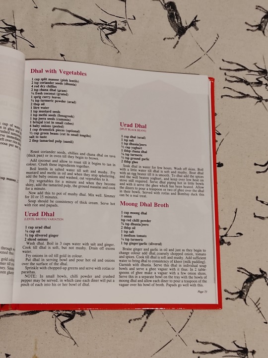
Do you like a recipe book? Do you like an unbearably comprehensive and frequently incorrect recipe book? Well boy do I have an item for you:

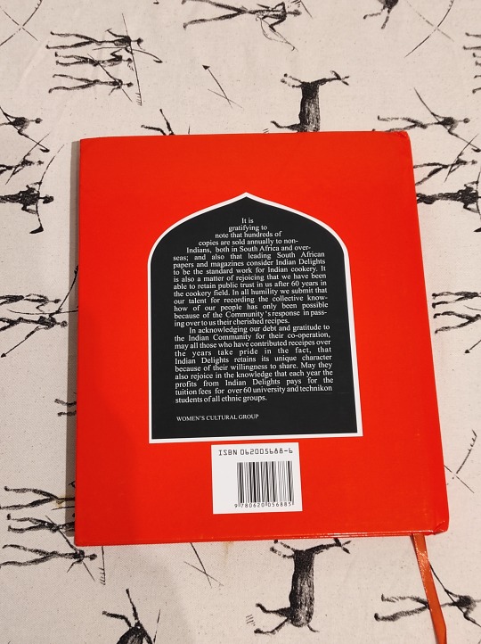
It's Indian Delights, the de facto standard book of South African Indian cooking. Assembled in the 60's by the Durban Women's Cultural Group and in print ever since then.
The How
A birthday gift from my parents, who sent it from South Africa.
There are apparently places that carry this book outside of South Africa but I do not know what those are.
The Text
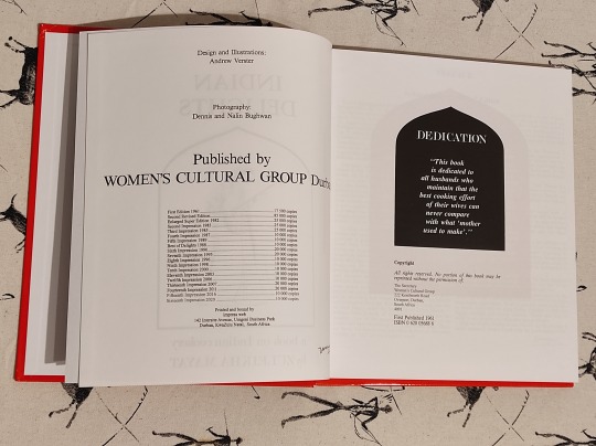
Dubious, but useful despite this. It was written in the 60's by a bunch of people who had never and would never again write a recipe book. You may note from the frontmatter that while it has had sixteen impressions since its first publication in 1961, there has only ever been a single revision of the book. There are numerous errors, omissions, and flaws. Recipes may list ingredients that are not used, call for ingredients in the method not given before, begin preparing components and never use them, or outright lie about the quantities of ingredients you need. A challenging exercise.
Any given individual's copy of this book is full of little pen notes, slips of paper, and scratched out experiments. I have a blank canvas.

It is absolutely stuffed to the brim with recipes from the then-almost-century of South African development on South Asian cuisine. It is intended as a one-stop-shop for cooking from a diaspora of extremely wide origins.
South African Indians arrived in South Africa as indentured labour for British sugar farms and could just as easily be from the relatively cold and mountainous North Indian regions or the low, rainy, hot coastal areas of South India. As a result you've had almost a hundred years of adapting to the locally available ingredients, intermarriages across wide geographic origins, and failing memories. There are frequently many duplicates of any given recipe, each with some unique variation of note.

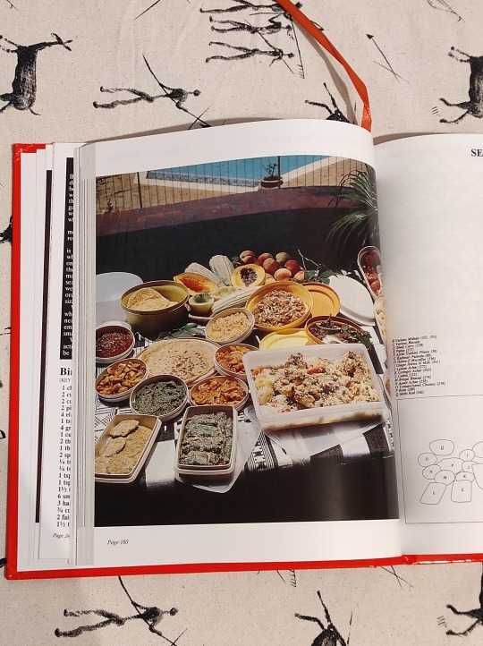
It is also extremely dated. It still lives in an era where "adding an elachi (cardamom) pod to your rice" is a luxurious choice that requires financial considerations, and where meat was still expensive. It also has a delightful section on mass cooking, such as the above "Biryani for 100 people" which has an additional note on the ingredients for a "Biryani for 800 people" on the opposite leaf. These things come up sometimes, although the largest biryani I've ever been involved in was for about 60 people.
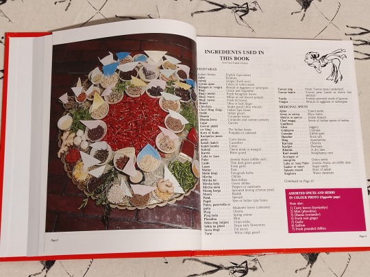
It is not really for beginners but it does have a lot of introductory matter, in part because it has to contend with the mishmash of languages and loanwords that exist. You don't know if the reader uses the hindi word for cumin, or the tamil word for cumin, or makes a formal distinction between roti and chapati. As a result, there are extensive opening tables of translations.
The Object

Big, blocky hardcover recipe book. Cheap but hardwearing coated pages. I have seen these in every imaginable state of disrepair, unfortunately I do not have a photo on hand of my mother's which is completely beat to hell.
I mentioned that there have not been many updates, and this continues to the outside. Not a single impression has, for example, corrected the misalignment of the spine and the cover that means it stands out on any book storage system.

Some damage to the cover from the rigours of air travel. It'll recover, or rather, it'll get beat up in ways that make that negligible.
The photography is antiquated, having been taken by a photographer who was certainly good but was operating a) with 1961 camera technology, b) 1961 photographic sensibilities, and c) no real experience in food photography. As a result the images can look somewhat alien if you're familiar with more modern food photograpy. Colours are not accurate, framing is flat, and composition is often packed.
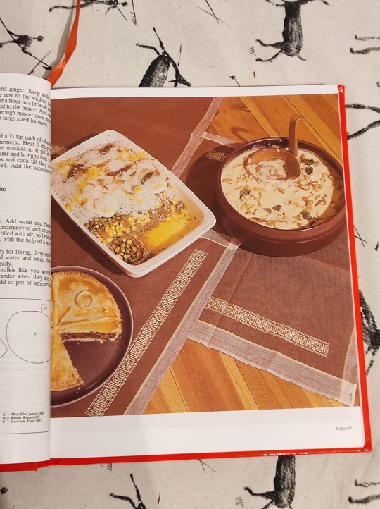
In addition to the colour glamour plates, there are black and white instructional photos, which are much more timeless.

The Why, Though?
Indian Delights is a very important cultural reference for the South African Indian population, and it's a pretty standard leaving home/getting married/leaving home and getting married gift. I've bought a copy for many friends and now this one is mine.
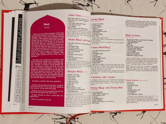
Will I actually use this much? Certainly not that often. My mother and her sisters learned to cook from this book, so it is the root of my personal culinary tradition. That means I already know a lot of what can be distilled from this for day-to-day recipes. Where it is handy is for more technical dishes, which require some guidance, or as an ingredient reference for something new you want to try.
In particular Diwali is coming up and while both my mother and I are staunch atheists, we will also take any excuse to make a ton of sweets for friends. If you are in Prague in the week of the 12th of November you can probably hit me up for something.
Listening: Acheney is a shockingly talented synth designer for the niche softsynth tracker sunvox, available now on windows, mac, linux, windows CE, android, and iOS. I was tooling around with their Guitar synths and decided to check out their music, which is a couple albums of very high concept EDM inspired ambient and/or noise stuff. Here's Euler Characteristic Zero
Watching: @humansbgone is an animated sci-fi series about intelligent giant arthropods and their attempts to deal with invasions of pesky little humans
youtube
Big spec-bio focus with a lot of end notes on the arthropods in question.
Playing: Played the Trans Siberian Railway Simulator demo, which I recorded and put up here, with crap audio because it's authentic to what I had lying around after I forgot my headphones at work.
youtube
Also: the digital version of the D&D themed agent placement game Lord of Waterdeep with my family, which works quite well. It's weird to have the game handling the admin of moving points around and automatically deducting resources, but it does make the game go very quickly, even if your parents are still figuring out the interface.
Making: Big cooking experiment with a slow roast lamb shank. Came out very well. Lamb shank definitely one of the more animal parts of an animal you can cook. Smells intensely of lanolin and other hair smells. Real greasy. Big honkin' bone. Smooth and fine but sturdy musculature. This thing used to be a very specific part of something alive and that thing lived the kind of life that develops the very particular smells of the insides of a sheep that are very close to the outside of a sheep. You will find some wool fibers in your pan from where the follicles reach down close to the bone and sinew.


Tools and Equipment: Easyeffects is the successor to PulseEffects and is a very complete set of audio tuning and manipulation tools for Linux. You can use it to process incoming and outgoing audio with basically any plugin you care to imagine.
#last monday of the week#Bandcamp#food#indian delights#south africa#recipe books#untitled wednesday library series
31 notes
·
View notes
Text
"buy this book for 157 american dollars" i just need to look at like 3 pages please "17 pages available through institutional open access" oh yay! which ones ? "frontmatter copyright and 15 pages of index"
8 notes
·
View notes
Text
More Refactors, More Features
Day 165 - Apr 18th, 12.024
Again, not a lot for today, but now the .mdparser can manipulate Markdown's frontmatter, so that's neat.

Today's artists & creative things Music: Ruler Of My Heart | Alien Stage - by STUDIO LICO
© 2024 Gustavo "Guz" L. de Mello. Licensed under CC BY-SA 4.0
4 notes
·
View notes
Text
My workflow for turning a thought into a Post now looks like this:
In Emacs (in vi command state, Evil with my customizations/code).
Hit " m" (space, m) to start a new Denote note (configured to use Markdown, not f.e. Org Mode format).
Hit Enter to accept blank Denote title, or first type title, if I already know I might want to keep/find this file. I can change the title later.
Optionally specify tags now. Narrowing search over existing tags in my notes. I can change the tags later.
Type thoughts/post, quality of life is profoundly better, almost strictly better (even on Android, in Termux).
"gh" to add tags. "gr" to remove. (This is the same keybind that I use to invoke or remove commands from history in shells/REPLs. These two bindings never collide in the same buffer, and are conceptually almost the same thing in the abstract.) I have wrapped Denote so that the frontmatter tag changes are saved without redundantly confirming (if there are no other unsaved changes and if the file on the filesystem hasn't changed out from under Emacs).
" zw" (space, z, w) to publish. It prompts me for the blog since it's a new post. Narrowing search on the list of blogs I set in my Emacs config. " zw" will also update the existing post once it's published. " zd" deletes the post from Tumblr.
Glance at the post on Tumblr. As I gain evidence that my code doesn't mess things up, I will naturally do this less.
When I decide I am basically done, if it's not one of my long-term canonical posts, delete the local file.
Not to overstate things, but I feel a great deal of looming joy and optimism about how this will make things better for me. It's not as certain as many other things I've built for myself, but it seems pretty promising.
8 notes
·
View notes
Text
Pathfinder Iconics Comparison Part 4: Classes Who Got Demoted
[Part 1: Classes with Different Iconics] [Part 2: Core Classes] [Part 3: The Remaining PF2 Classes] [Part 5: Prestige Classes] [Part 6: Who's left?] [Update: Rivani and Linxia] [Update: Lirianne] [Update: War of Immortals]
We've now seen all 23 of the character classes from PF2, but classes are only part of the story. PF2 is big on granular customisation and one of the big ways you can customise your character is with Archetypes.
Instead of taking abilities from your main class, you can instead opt to take features from an archetype, representing a more focussed area of combat or magical specialisation. A couple of the classes from PF1 exist as archetypes in PF2.
Arcanist

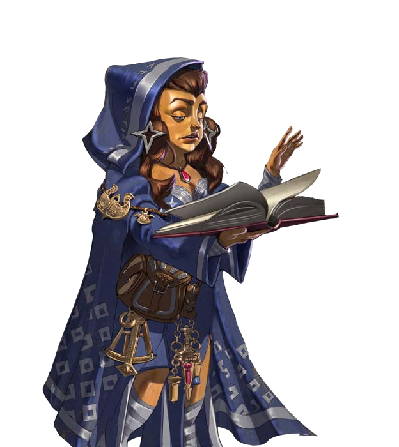
Enora (she/her, Halfling)
The Arcanist is an interesting case. In PF1, it was a Hybrid class that prepared spells like a Wizard but cast them like a Sorcerer. In PF2, it's been expanded into an archetype called "Flexible Preparation" that any prepared spellcaster can take, with "arcanist" being specifically the term used by Wizards.
I love the colouring on Enora's new artwork. All of her key features are here, from her cloak to her accoutrements. Looks like she has a sextant hanging off her belt. Although there is that green wand/staff that she seems to have misplaced between editions. Maybe she broke it (Arcanists in PF1 can destroy magic items to absorb their powers).
Interestingly, this specific illustration of Enora doesn't appear in the body of the book, Secrets of Magic, at all. Instead, it's only featured on the contents page. It might be the only illustration that doesn't appear at least nearby the rules it relates to. This is possibly because the Flexible Preparation archetype is pretty wordy and has a big table, so there's not space for a picture. Still, it's a shame that Enora has been consigned to the frontmatter, a fate I wouldn't wish upon my worst enemy.
The Arcanist appears in the Advanced Class Guide for PF1, and in Secrets of Magic for PF2.
Cavalier

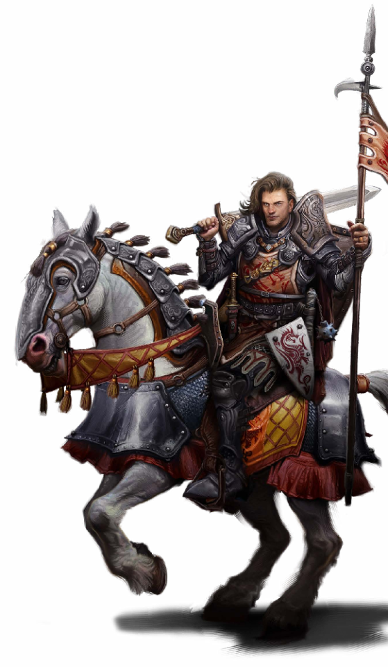
Alain & Donahan (he/him, Human [Taldan])
The main difference between Alain's PF1 and PF2 designs is that he isn't drawn by Wayne Reynolds. Most of the elements of his outfit and equipment are still present, but he's lost some colour in the transition to the new edition (which is the opposite of what we've seen for the Core classes). I do appreciate that Donahan, his horse, gets to share the spotlight in PF2, since his connection to a mount is kind of the thing that defines a cavalier.
The Cavalier appears in Advanced Player's Guide for PF1, and in the Advanced Player's Guide for PF2.
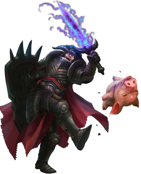
Vigilante

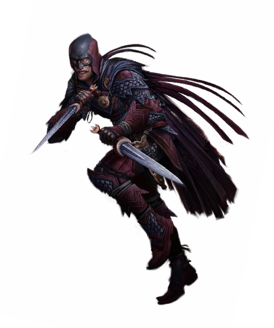
The Red Raven (he/him, Human, PF1 vs. PF2)
Of all the direct comparisons we've seen so far, this is the only one that I would say is a strict downgrade. For some of them, it's just a question of preference but the PF1 Vigilante art is so gorgeous. That vibrant red, the stoic expression, and all the weaponry, it illustrates everything you need to know about the Vigilante class.
The PF2 Vigilante is not just disgustingly coloured, but the expression is so ugly. The pose is slightly more interesting, looks a little bit more like a superhero rogue ("superherogue"?) but I don't think that's a fair exchange for what we lost.
The character's design hasn't really changed much. The design of the boots is slightly different but that might be a side effect of the funny way Wayne sometimes draws feet. He's got a new cloak clasp and he seems to have lost his whip, plus the specifics of his cloak are a little different, he doesn't seem to have the front piece.
The main "deal" of the Vigilante is a secret identity. The Vigilante is a masked persona that the character assumes, and they lead a double life. On a completely unrelated note, here's a human noble from PF1 named Aric. Don't know what he's doing here, he's clearly not the same guy as the Red Raven.
Aric (he/him, Human) (PF1)
The Vigilante appears in Ultimate Intrigue for PF1, and in the Advanced Player's Guide for PF2.
Antipaladin
Urgraz (he/him, Duergar [Deep Dwarf])
The Antipaladin is, as the name suggests, the antithesis of everything the Paladin stands for. While the Paladin is a paragon of goodness, a holy knight that fights on behalf of the downtrodden, the Antipaladin is selfish and craven, and will do whatever they can to get what they want.
In PF2, the Antipaladin isn't its own class. Like the Paladin, it exists as a subclass of the Champion, and like the Paladin it is only one of three Champions of Evil. A Lawful Evil Champion is a Tyrant, a Neutral Evil Champion is a Desecrator, and the Antipaladin is Chaotic Evil. There are also, apparently, Champions of Neutrality, but we don't have any rules for them as of yet, and given that the Pathfinder Remaster is going to remove Alignment, it seems unlikely we'll get them in so many words.
The Antipaladin is also interesting because, while the Iconic Antipaladin is officially Urgraz, as seen above, he's not the character used to illustrate the class. Instead, it's this guy.
As far as I can tell, this guy isn't a character. I don't know if he has a name (I'll call him Viktor for now, after the alias assumed by Clancy Brown's character, the Kurgan, in Highlander).
In PF1, Viktor seems to revel in being evil. He's a villain that's having fun with what he does. He seems to have lost his joie de vivre in PF2.
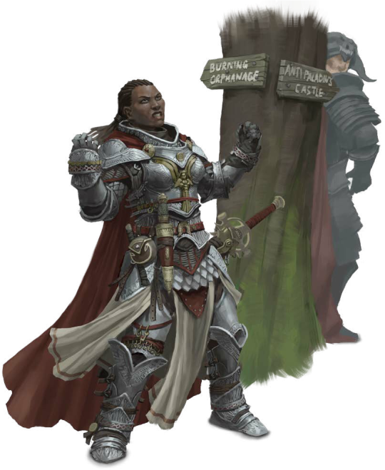
The second image here is one of my favourite PF1 illustrations. It just raises so many questions. It's supposed to show Seelah suffering a moral quandary, unable to decide whether she should go to the burning orphanage or the Antipaladin's castle, but
Who put those signs up? How long has the orphanage been burning that they felt the need to put signage for it? Unless that's its name, like it's the "Duncan J. Burning Memorial Orphanage" or something. Why is Viktor just standing right there?
The Antipaladin appears in the Advanced Player's Guide for PF1, and the Advanced Player's Guide for PF2.
Shaman

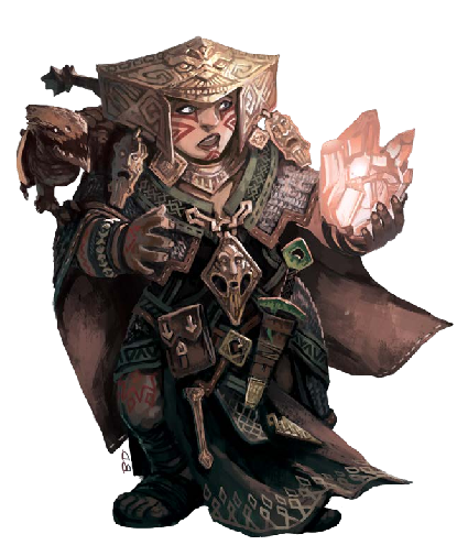
Shardra Geltl & Kolo (she/her, Dwarf)
This last one is sort of a cheat, since the Shaman doesn't exist as a character option in PF2. Instead, this illustration of the Iconic Shaman Shardra comes from Lost Omens: World Guide. She's used here as an example of a Rivethun Dwarf.
Most of her outfit is intact, she hasn't undergone too many changes. Her clan dagger and satchel are still very prominent on her belt, but she doesn't have her mace or censer with her. Her headdress and other accessories are all pretty much one to one.
In PF1, the Shaman was another Hybrid class. Its parent classes are the Oracle and Witch. The Oracle and Witch both gain their powers from abstract entities, and the same is true of the Shaman, who communes with the spirits of nature to gain its powers.
The Shaman appears in the Advanced Class Guide for PF1.
The PF1 Iconic Shifter from Ultimate Wilderness, Zova, also appears in an illustration in PF2's Lost Omens: Mwangi Expanse but it's not an individual character shot like it is for Shardra, so she's not included here. There might also be PF1 Iconics in other Lost Omens books, but I haven't looked through them all in great detail. Do let me know if I've missed something.
Next time we'll take a look at the remaining Prestige Classes from the first edition Core Rulebook. Like I mentioned in the previous post, they aren't characters per se, but it's interesting to see how the characters have been translated over.
14 notes
·
View notes
Text
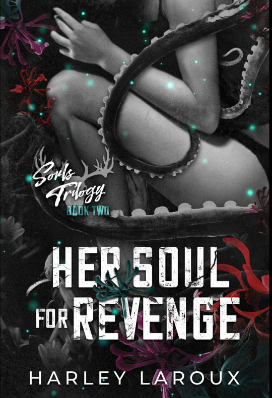

Rating: 5/5
Book Blurb:
Juniper After a cult tried to sacrifice me to their wicked God, I went on the run, doing whatever was necessary to survive. Until a demon offered me a deal: give him my soul and he'll help me claim the vengeance I seek. Blood will be spilled, and the monsters I once ran from will soon be running from me. But damning my soul was just the beginning - it's my heart the demon wants next.
Zane I've been hunting souls for centuries, but she's the ultimate prize - vicious and feral, with a broken soul as dark as my own. I thought claiming her would be a simple game, but Juniper is far from simple. I chose to follow her on a path drenched with the blood of her enemies, but it's our blood that may be spilled next. As an ancient God wakes from Its slumber, neither of us may survive.
Her Soul for Revenge is book 2 in the Souls Trilogy. Although all the books are interconnected, they are stand-alone and can be read in any order.
Content Note This book contains sexual scenes, kink/fetish content, horror elements, drug use, scenes of trauma, anxiety, and PTSD, and depictions of "hard" kink/edgeplay. A complete CW can be found in the frontmatter of the book.
Review:
After escaping and surviving a cult trying to kill her, Juniper wants one thing and one thing only, and thats revenge, and if that means selling her soul to a vicious demon who might want more than just her soul, then so be it, but there will be hell to pay. Juniper was kidnapped by a cult and was meant to be sacrificed to their God but she escaped, three years later a demon comes before her making her an offer: he'll help her get her revenge in exchange for her soul and her body. Juniper doesn't even bat an eye, she'll do anything to get revenge, she'll kill everyone on her list and destroy those who tried to destroy her. Zane is a demon who hunts souls, he collects them, and when he finds an interesting one he doesn't let go, so when he finds Juniper's soul, he is immediately interested in the girl who escaped the cult. Zane knows Juniper isn't simple, no, she is bloody, vicious, and a wolf who will tear apart anyone who gets in her path. She is everything he could ever want, so he makes her an offer: her soul and body in exchange for his help, but what he's beginning to realize is that he wants more than that, he wants her heart... and what his little wolf wants she'll get and he'll do anything to make sure she gets what she wants. Juniper is a survivor, I loved her immediately. She is hellbent on getting revenge, she's strong, she's determined, and she is everything. I love how much Zane took care of her, he couldn't help it. Zane is so soft for her and wants to help her in anyway he can and that was just so sweet. I am a sucker for a revenge story and Juniper's was a great one!
6 notes
·
View notes
Text
Obsidian Tutorial - Adding a Custom Font
One of the simplest ways to customise Obsidian is to change the default font. Here’s how to do that!

[ID - a purple decorative divider]
Open the settings menu, and head to appearance.
There, under the Font section, you have a few options. We’ll be looking at the first three.
There are three types of font you can change in Obsidian: the interface font, the text font, and the monospace font.
As you can see in the screenshot, these fonts apply to different aspects of Obsidian. The interface font applies to all of Obsidian; this will be the one you see in settings menus, tab titles, etc. The text font applies to editing and reading views; so, what you’ll be typing and reading your notes in. The monospace font applies to things like frontmatter and code blocks.
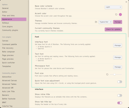
[ID - a screenshot of the Obsidian settings menu, with the Appearance options open. The section for Font options is highlighted.]
To change a font, click on the manage button to the right of the font you want to change.
This will bring up a menu where you can search for a font you have installed, and add it to Obsidian.
You’ll have access to all the fonts installed on your computer - if you want to install a new, specific font, this wikihow article has a step-by-step breakdown on how to do that.
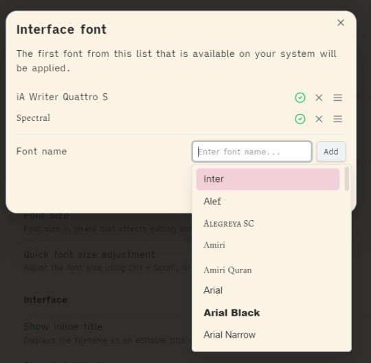
[ID - A screenshot of the Obsidian modal menu for changing the interface font. The font name entry box has been activated, showing a drop-down menu of font options.]
Once you’ve added the font you want, click Save to apply it to Obsidian. It should apply it right away, but if it doesn’t, try reloading the program.
You can repeat this process for each of the three font options.
You can add multiple fonts if you like, and then change their order in the list to switch between them - whichever font is at the top of the list will be applied, so long as it’s available on your system.
My font of choice is iA Writer Quattro, which you can grab from here if you like how it looks.
[ID - a purple decorative divider]
check out my obsidian tag for more posts
check out the tutorials tag for other obsidian tutorials
obsidian resources masterpost
download obsidian
got questions? tutorial suggestions? want to say hi?
#obsidian md#obsidian.md#obsidian tutorials#writing tools#have i ever used ia writer? no#do i love the font? 1000%#i have it as my main pc font also and my neocities main font#it’s just so nice to write in#i refuse to let being shadowbanned stop me from posting
20 notes
·
View notes