#Gerrit Noordzij
Text
Get ready for fall with Draw Down!
Framework 101
—Highlights the many ways students and faculty alike build and support one another by translating, creating, and articulating ideas and forms, and creates a valuable capsule for thinking about contemporary communication design practice and pedagogy in the 21st century.
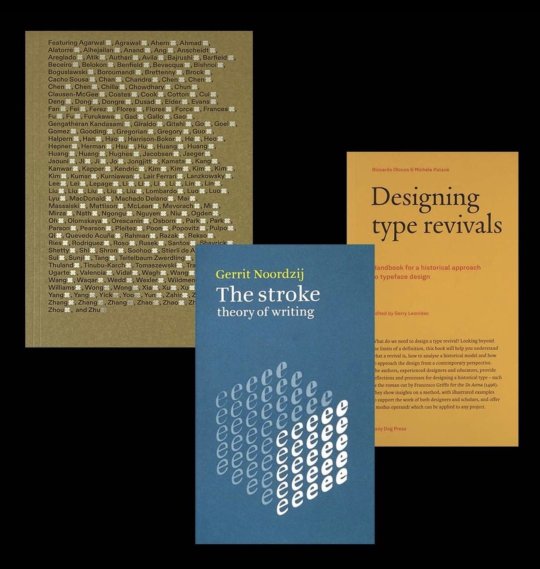
The Stroke: Theory Of Writing
—The most concise and powerful statement of Dutch graphic designer Gerrit Noordzij's theory of writing.
Designing Type Revivals
—Provides tools for researching and designing revival types
www.draw-down.com
#Draw Down Books#Framework 101#Parsons School of Design#The Stroke#Designing Type Revivals#typography#graphic design#type design#Gerrit Noordzij#Lazy Dog Books#B42 Editions
17 notes
·
View notes
Photo

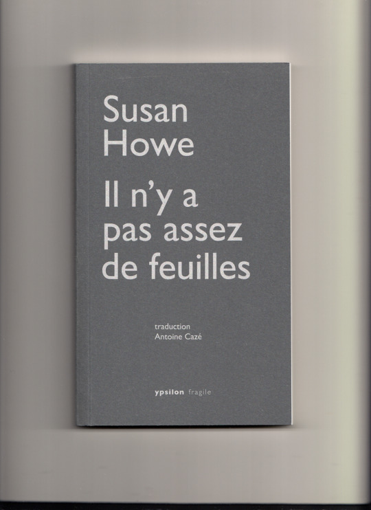
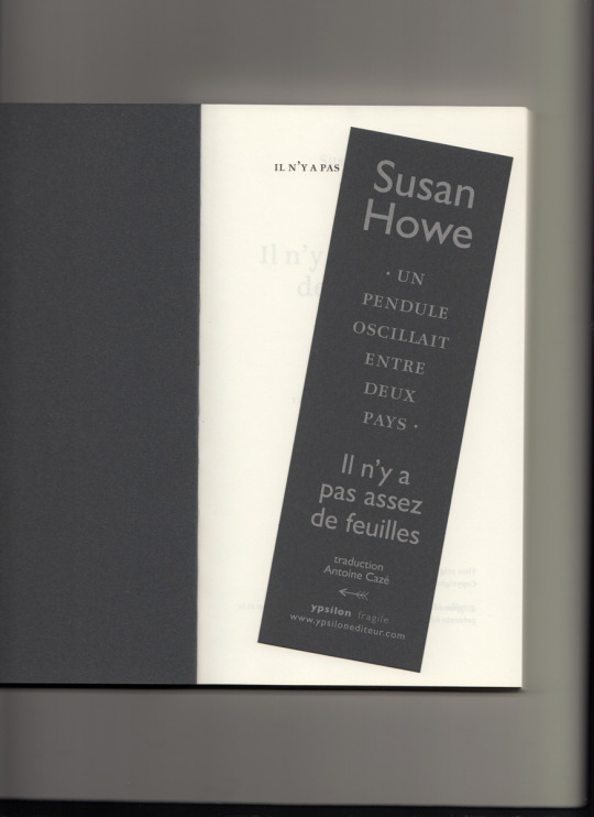
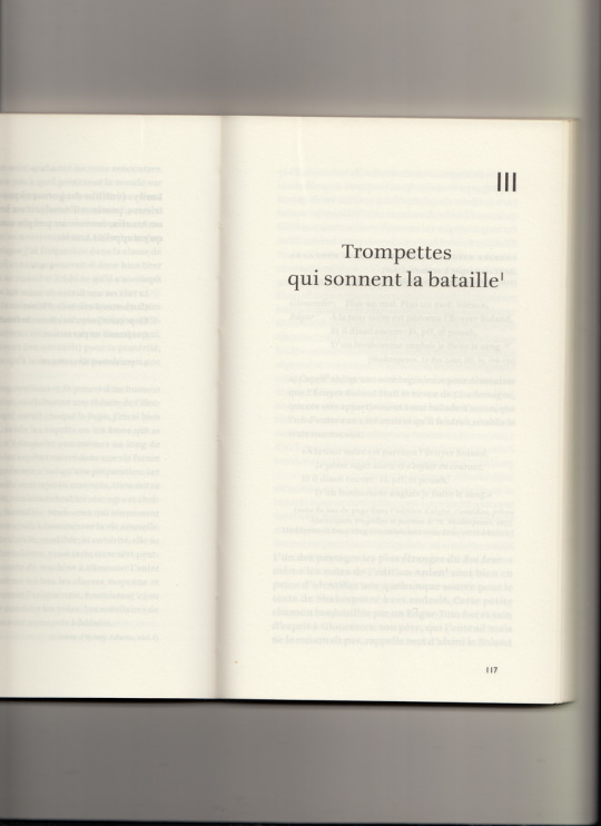
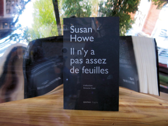

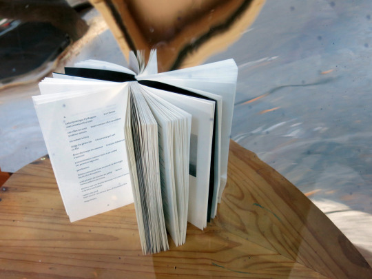
Susan Howe, Il n’y a pas assez de feuilles, trad. Antoine Cazé, Paris, Ypsilon éditeur, 2021 »
#susan howe#The Europe of trusts#Il n’y a pas assez de feuilles#Ypsilon#book design#book cover#typography#Gill sans#Ruse#Gerrit Noordzij#black#Thistle#fedrigoni#materica#ardesia#arena naturale smooth
0 notes
Photo
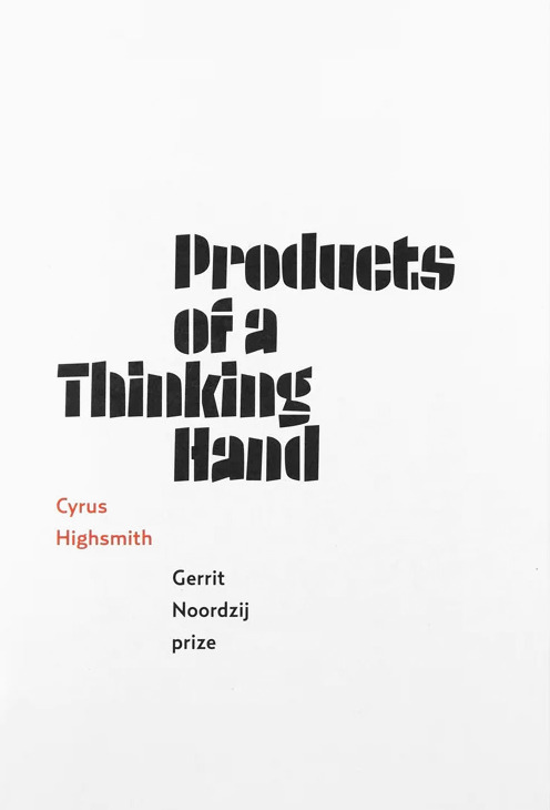


Cyrus Highsmith, Products of a Thinking Hand, Gerrit Noordzij Prize, With essays by Indra Kupferschmid, David Berlow, and Cyrus Highsmith, and a previously published interview of Highsmith by Jan Middendrop, Designed by Erik van Blokland and Peter Verheul, Royal Academy of Art, Den Haag, De Buitenkant, Amsterdam, 2018 [Draw Down @drawdownbooks]
#graphic design#typography#book#cover#book cover#cyrus highsmith#occupant fonts#indra kupferschmid#david berlow#jan middendrop#erik van blokland#letterror#peter verheul#de buitenkant#gerrit noordzij prize#draw down books#2010s
25 notes
·
View notes
Text
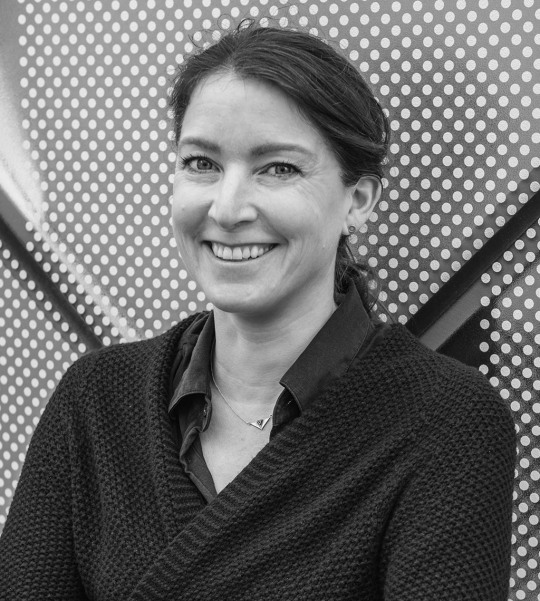
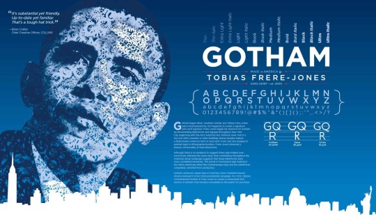
Speakers Research - Tobias Frere-Jones

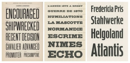

About Tobias Frere-Jones:
He was born in August 1970 in New York, United States. Tobias received a BFA in Graphic Design from the Rhode Island School of Design in 1992. He joined Yale University School of Art in 1996 and has lectured throughout the United States, Europe and Australia. He received the Gerrit Noordzij Prijs, the AIGA Medal, and most recently, Cooper Hewitt's 2019 National Design Award for Communication Design, recognition of his contributions to typographic design, writing and education. Tobias Frere-Jones has been in the industry for over 25 years ad has established himself as one of the world's leading typeface designers, creating some of the most widely used typefaces, including Interstate, Poynter Oldstyle, Whitney, Gotham, Surveyor, Tungsten and Retina.
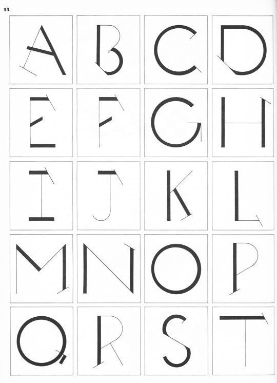
Above are some of his works from "Fifty Type Specimens",—a collection of postcards with historical typefaces selected by renowned designer Tobias Frere-Jones. Cards feature classic letterforms, pages from specimen books, and crops of letters presented in a box with the feel of an old specimen book.
Image Source:
Left Corner: The New York Times, Typography partners part ways in money fight, 2014
Right Corner: Typography Guru, Fifty Type Specimens: From the Collection of Tobias Frere - Jones, unknown published date
Bottom photo: Frere-Jones's website, Artist profile, unknown published date
Research Cited:
3 notes
·
View notes
Text
Tobias frere jones
Over 25 years, Tobias Frere-Jones has established himself as one of the world’s leading typeface designers, creating some of the most widely used typefaces, including Interstate, Poynter Oldstyle, Whitney, Gotham, Surveyor, Tungsten and Retina.
Tobias received a BFA in Graphic Design from the Rhode Island School of Design in 1992. He joined the faculty of the Yale University School of Art in 1996 and has lectured throughout the United States, Europe and Australia. His work is in the permanent collections of the Victoria & Albert Museum in London and the Museum of Modern Art in New York. He has received the Gerrit Noordzij Prijs, the AIGA Medal, and most recently Cooper Hewitt’s 2019 National Design Award for Communication Design, recognizing his contributions to typographic design, writing and education.
0 notes
Text
Tobias Frere Jones
Over the past 25 years, Tobias Frere-Jones has established himself as one of the best typeface designers in the world by creating some of the most well-known designs, including Interstate, Poynter Oldstyle, Whitney, Gotham, Surveyor, Tungsten, and Retina.
Tobias received a BS in Graphic Design from the Rhode Island School of Design in 1992. Since 1996, when he started teaching at the Yale University School of Art, he has lectured across the Americas, Europe, and Australia. His work is included in the permanent collections of the Victoria & Albert Museum in London and the Museum of Modern Art in New York. He has received the Gerrit Noordzij Prijs, the AIGA Medal, and many other honours for his contributions to typographic design, literature, and communication design.
0 notes
Text
TYPOGRAFIKA’24: Looking at Designers
Tobias Frere Jones

Tobias Frere-Jones has established himself as one of the world's leading typeface designers over the last 25 years, designing some of the most widely used typefaces such as Interstate, Poynter Oldstyle, Whitney, Gotham, Surveyor, Tungsten, and Retina.
Tobias graduated from the Rhode Island School of Design in 1992 with a BFA in Graphic Design. He joined the Yale University School of Art faculty in 1996 and has lectured in the United States, Europe, and Australia. His work can be found in the permanent collections of both the Victoria and Albert Museum in London and the Museum of Modern Art in New York. He has received the Gerrit Noordzij Prijs, the AIGA Medal, and, most recently, Cooper Hewitt's 2019 National Design Award for Communication Design, all of which recognise his contributions to typographic design, writing, and illustration.
0 notes
Text

GRAD603 - TYPOGRAFIKA ‘24
RESEARCH ON SPEAKERS
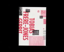
Tobias Frère-Jones
Over 25 years, Tobias Frere-Jones has established himself as one of the world’s leading typeface designers, creating some of the most widely used typefaces, including Interstate, Poynter Oldstyle, Whitney, Gotham, Surveyor, Tungsten and Retina.
Tobias received a BFA in Graphic Design from the Rhode Island School of Design in 1992. He joined the faculty of the Yale University School of Art in 1996 and has lectured throughout the United States, Europe and Australia. His work is in the permanent collections of the Victoria & Albert Museum in London and the Museum of Modern Art in New York. He has received the Gerrit Noordzij Prijs, the AIGA Medal, and most recently Cooper Hewitt’s 2019 National Design Award for Communication Design, recognizing his contributions to typographic design, writing and education.
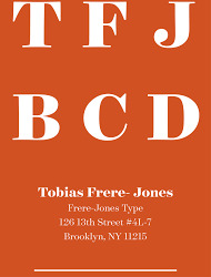
Frere-Jones Type is an independent type design studio in New York City, creating original typefaces for retail licensing and custom clients. The company is led by Tobias Frere-Jones, and builds on his three decades of experience in print and digital environments. Combining technical expertise with historical perspective, we believe that type exists to solve problems, and beauty is always part of the solution.


0 notes
Text
W02 SDL
02 Tobias Frere Jones
https://fonts.adobe.com/designers/tobias-frere-jones
“Tobias received a BFA in Graphic Design from the Rhode Island School of Design in 1992. He joined the faculty of the Yale University School of Art in 1996 and has lectured throughout the United States, Europe and Australia. His work is in the permanent collections of the Victoria & Albert Museum in London and the Museum of Modern Art in New York. In 2006, Royal Academy of Visual Arts The Hague (KABK) awarded him the Gerrit Noordzij Prijs for his contributions to typographic design, writing and education. In 2013 he received the AIGA Medal in recognition of exceptional achievements in the field of design.”
“Tobias is the founder and lead designer at Frere-Jones Type, an independent type design practice in New York City.”
“Over 25 years, Tobias Frere-Jones has established himself as one of the world’s leading typeface designers, creating some of the most widely used typefaces, including Poynter Oldstyle, Whitney, Gotham, Surveyor, Tungsten and Retina.”

Poynter OS

Whitney Bold

Gotham Black
0 notes
Photo

TYPOGRAPHIKA SPEAKER RESEARCH - Tobias Frere Jones
Over 25 years, Tobias Frere-Jones has established himself as one of the world’s leading typeface designers, creating some of the most widely used typefaces, including Interstate, Poynter Oldstyle, Whitney, Gotham, Surveyor, Tungsten and Retina. He joined the faculty of the Yale University School of Art in 1996 and has lectured throughout the United States, Europe and Australia. His work is in the permanent collections of the Victoria & Albert Museum in London and the Museum of Modern Art in New York. He has received the Gerrit Noordzij Prijs, the AIGA Medal, and most recently Cooper Hewitt’s 2019 National Design Award for Communication Design, recognizing his contributions to typographic design, writing and education.
https://frerejones.com/about
0 notes
Photo

All information found: https://frerejones.com/about
Over 25 years, Tobias Frere-Jones has established himself as one of the world’s leading typeface designers, creating some of the most widely used typefaces, including Interstate, Poynter Oldstyle, Whitney, Gotham, Surveyor, Tungsten and Retina.
Tobias received a BFA in Graphic Design from the Rhode Island School of Design in 1992. He joined the faculty of the Yale University School of Art in 1996 and has lectured throughout the United States, Europe and Australia. His work is in the permanent collections of the Victoria & Albert Museum in London and the Museum of Modern Art in New York. He has received the Gerrit Noordzij Prijs, the AIGA Medal, and most recently Cooper Hewitt’s 2019 National Design Award for Communication Design, recognizing his contributions to typographic design, writing and education.
0 notes
Text


“I have always loved to draw. When I first encountered type design, I discovered a very pure form of drawing. It’s about contour, and edges, and, most of all, shapes. Black and white shapes. For me, this is drawing distilled down to its essence.”
—Cyrus Highsmith
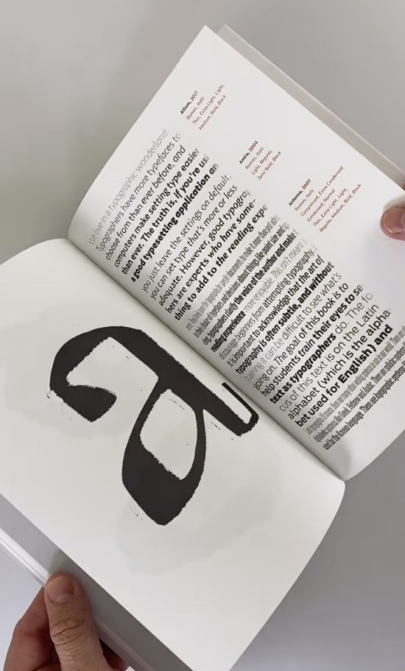
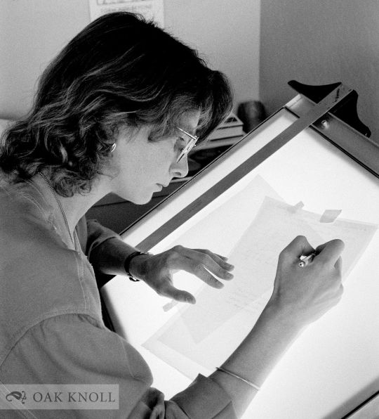
In 2015, American typeface designer and educator Cyrus Highsmith was awarded the prestigious Gerrit Noordzij Prize. Awarded every three years, the Prize recognizes type designers and typographers for extraordinary contributions to the fields of type design, typography, and type education. This book was published on the occasion of the 2018 prize exhibition which featured Highsmith’s work.
Highsmith is known for his original approach to drawing letterforms—as well as his work as an illustrator, author, and teacher—and this publication shares many spreads from his sketchbooks while tracing his career and approach to typography.
With essays by Indra Kupferschmid, David Berlow, and Cyrus Highsmith, and a previously published interview of Highsmith by Jan Middendrop.
Designed by Erik van Blokland and Peter Verheul
Published by De Buitenkant, 2018
Softcover, 64 pages, exposed sewn binding, b&w and full color images, 6.5 × 9.5 inches
Available at Draw Down Books
#Cyrus Highsmith#Occupant Fonts#type design#American typeface designer#typeface designer#Gerrit Noordzij Prize#graphic design#design books#2022#Draw Down Books
20 notes
·
View notes
Text
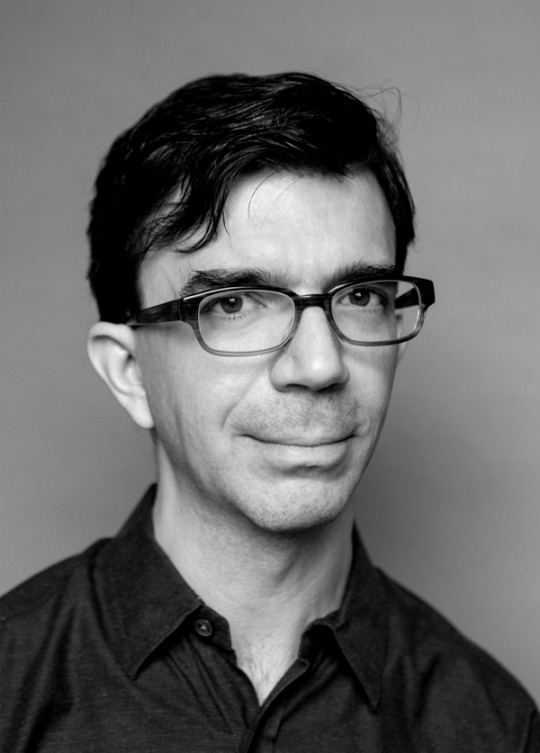
Tobias Frere Jones
TOBIAS FRERE JONES - (Educator and Type Designer)
Independent American type designer Tobias Frere Jones is based in New York City. For communication design, writing, and education, he has won the Gerrit Noordzij Prize, the AIGA Medal, and most recently the Cooper Herrits 2019 National Design Award.


0 notes
Text
Finalising information
I then put all the text and images I wanted to use in one spot so that it was easy to find and I had all the designers info ready. This also means I have the best design content ready available, and if I want extra photos I can always have a look at the other ones I have.
Joseph Churchward
Joseph is a samoan born New Zealand graphic designer who mainly focuses on typographic work - Joseph is best known for having designed 690 original typefaces. He attended Wellington Technical college at age 13 where he perfected his craft and love for design.
After graduating, Joseph went on to work as a commercial designer, starting up his own company in 1969 - Churchward International Typefaces - which became one of New Zealand’s largest typesetting spaces. Not long after this was established, leading German type company Berthold Fototypes accepted some of his fonts for international distribution, and they were soon in use throughout the world.
“His accomplishments are not only significant on a national scale, but place him highly on the global stage. He is a pioneer and I admire his continued dedication to the craft of design. He is a true inspiration.” - John Britten, Black Pin Winner (2009)
Information compiled from AUT Materials and Media lecture slides - 2023 3/23
“Designers Institute” 2009 - John Britten

David Bennewith – 20.10.2005 “Joseph Churchward in his home studio.”
Tobias Frère Jones
For 25 years, Tobias Frere-Jones has created a major and significant name for himself as one of the world’s most successful typeface designers, creating some of the most widely used typefaces, including Interstate, Poynter Oldstyle, Whitney, Gotham, Surveyor, Tungsten and Retina.
He gained a BFA in Graphic Design from the Rhode Island School of Design in 1992. Then joining Yale University School of Art in 1996 and has lectured throughout the United States, Europe and Australia. His work is apart of collections in Victoria & Albert Museum in London and the Museum of Modern Art in New York. He has received the Gerrit Noordzij Prijs, the AIGA Medal, and most recently Cooper Hewitt’s 2019 National Design Award for Communication Design, recognizing his contributions to typographic design, writing and education.
Alot of Tobias retro and vintage based graphics come from his love of collecting various antiques when he was younger - we can see the inspiration for alot of his work today from this.
Information compiled from Tobias Frere Jones website.
AUT Materials and Media lecture slides 3/23

Photos by http://www.grahammacindoe.com/ Uploaded onto Tobias Frere Jones website.
Verena Gerlach
Verena Gerlach was a photography instructor at the Hochschule der Künste in Berlin in 1991 and spent 1992 doing a first-year course at Glasgow School of Art. From 1993 to 1998 she then went on to study communication design at Kunsthochschule Berlin Weißensee and spent one year (1996) as an exchange student at the London College of Printing. FF Karbid, FF Sizmo, and Chambers Sans are some of the few typefaces she created, Verena has her own studio for corporate design in Berlin.
In 1998, Verena Gerlach began her studio for graphic design, typedesign and typography in Berlin. Since 2006, she has been consistently working as a freelance book designer for art book publishers like Hatje Cantz and Kerber Verlag. She began lecturing in type design, and typography in 2003,and currently gives lectures and workshops all over the world.
as well as designing corporate fonts for global companies, she also is working on the typographic production for international contemporary artists.
Information provided and uploaded on Verena Gerlach's website and portfolio.”Silk Screen posters” 2010
AUT Materials and Media Lecture Slides 3/23.
photograph by © Daniel Rodríguez - provided on her portfolio
Nadine Chahine
Dr. Nadine Chahine is an award-winning and very successful Lebanese type designer working as a UK Type Director and Legibility Expert at Monotype. She has an MA in Typeface Design from the University of Reading, UK, and a PhD from Leiden University, The Netherlands. Nadine’s research focus is on eye movement and legibility studies for the Arabic, Latin, and Chinese scripts. She has numerous awards including two Awards for Excellence in Type Design from the Type Directors Club in New York in 2008 and 2011. Her typefaces include the best-selling Frutiger Arabic, Neue.
Nadine’s work has been featured in the 5th edition of Megg’s History of Graphic Design and in 2012 she was selected by Fast Company as one of its 100 Most Creative People in Business. In 2016 her work was showcased in the 4th edition of First Choice which highlights the work of the 250 top global designers practising today. In 2017, Nadine was selected by Creative Review to their Creative Leaders 50 which aims to celebrate, educate and inspire those who are leading creative businesses, organisations and teams in the UK.
Nadine is a current CEO at I love typography.
Information compiled and found on
http://arabictype.com/about/ and Materials and Media AUT Lecture slides 3/23

Photo provided and uploaded onto Nadia Chahines portfolio website “http://arabictype.com/about/”
Carol Twombly
Carol Twombly is an incredible and unique creative force who is to thank for majority of the graceful characters found in several typefaces such as Trajan and Charlemagne. During Carols childhood in New England, she spent a lot of her time exploring several artistic techniques and composition. Having specific interest in sculpture, Carol followed her architect brother to Rhode Island School of Design (RISD). Once there, she changed her major to graphic design. Carol says, “I discovered that communicating through graphics - by placing black shapes on a white page - offered a welcome balance between freedom and structure.” Though graphic design became her career focus, Carol also specialises in basketweaving, drawing, painting, and jewellery making.
After graduating RISD and a year spent working in a small Boston graphic design studio, Carol accepted an invitation from Bigelow and joined a small group of students in a newly formed digital typography program at Stanford University. The program, which has been discontinued, awarded Carol and her colleagues Masters of Science degrees after two years of study in computer science and typographic design. Carol has designed a number of very popular and widely used text and display typefaces. Trajan, Charlemagne, Lithos, and Adobe Caslon are inspired by classic typefaces and characters from the past - from early Greek inscriptions, around 400 B.C., to William Caslon’s typefaces of the 1700s. Designs like Viva and Nueva explore new territory while maintaining traditional roots. In 1994, she received the Charles Peignot award from the Association Typographique Internationale for outstanding contributions to type design. She was the first woman and only the second American to receive this prestigious honor.
Information provided by Adobe Fonts.
“Carol Twombly” Image sourced by Oak Knoll Books - Stock-Allen, Nancy
Veronika Burian
Veronika Burian studied Industrial Design in Munich and worked in that space in Vienna and Milan over a few years. Discovering a true passion for type, she graduated with distinction from the MA in Typeface Design in Reading, UK, in 2003 and worked as type designer at DaltonMaag in London for a few years. After staying for some time in Boulder, USA, and her hometown Prague she is now living in sunny Cataluña.
Veronika Burian is a type designer and co-founder of independent type foundry TypeTogether. She has created award-winning typefaces and collaborating on specific typefaces for a large number of clients. She is involved with Alphabettes.org, a showcase for work and research on lettering, typography and type design by women. She continues to give lectures and workshops at international conferences and universities. Her typeface Maiola received, amongst others, the TDC Certificate of Excellence in Type Design 2004. Several other typefaces by TypeTogether have also been recognised by international competitions, including ED-Awards and ISTD.
She is also a founding member of typography platform Alphabettes.org created by and for women, being solely involved in mentoring program the GRANSHAN project for non-Latin fonts and typography, which is unique in the world, she engages in communication and sponsorship.
“Her typeface Maiola received the TDC Certificate of Excellence in Type Design 2004. Several other typefaces by TypeTogether have also been recognised by international competitions, including ED-Awards and ISTD.” - Type Together

“Veronika Burian” Image by Type Together.
Information provided by:
http://bitscon.asia/speakers/2016/veronika-burian
https://fonts.adobe.com/designers/veronika-burian
Jessica Hische
Jessica Nicole Hische is an American letterer, illustrator, and type designer. Jessica has spoken at over 100 conferences, colleges, and other design events on nearly every continent. Winning awards such as New York Times Best-selling Author, Forbes under 30, New Visual Artist, ADC Young GunGDUSA, Person to Watch.
When Jessica is not drafting letterforms, manipulating beziers, writing kids books, or letterpressing on my Vandercook, she spends her time trying to help others find the same happiness and fulfillment that she finds in her work.
Information compiled and found on https://www.jessicahische.is/afanofoxfam

Image by Helena Price.
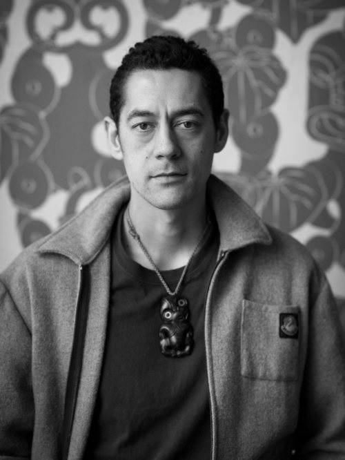
Johnson Witehira:
Johnson Witehiras work has the purpose of bringing all cultural aspects of Maori culture back into the lives of Maori and has alot of cultural responsive media and design.
Johnson lives in Wellington, where his work is prominent and successful there.
“My kaupapa (mission) as both an artist and designer is to bring Māori visual culture back into the lives of all Māori. This is done through careful consideration of how indigenous culture, design and technology intersect. We once created all the things in our world; the clothes, buildings, vehicles and tools. Nowadays everything is made for us. If we’re lucky we get to decorate. I want to put Māori back in the drivers seat, so we’re active participants in creating the tools and the world we want to live in.”
Overseas, works from Ko Aotearoa Tēnei (2012) series are on permanent display in a number of New Zealand Embassies and Consulates (Shanghai Consulate, NZ Embassy in Dublin, NZ High Commissionto Canberra and the NZ Consulate Hawaii). In 2015, the Land of Tara series was exhibited at the Talente Munich design Fair. He has also showcased in group exhibitions in Canada including; InDigiNous Aotearoa: Virtual Histories (Winnipeg, 2017), The Space Between Us (Banff, 2018) Gathering Across Moana (Tornoto, 2019) and REGENERATION: Breaking Time with Indigenous Video Games (2019, Vancouver).
Information complied via his website:
https://www.johnsonwitehira.studio
Johnson Whitera - Shown on his website and provided by https://semipermanent.com/profiles/johnson-witehira
0 notes
Text
Tobias Frere Jones
Tobias Frere-Jones has become recognised as one of the top typeface designers in the world during the past 25 years, designing a number of the most popular designs, such as Interstate, Poynter Oldstyle, Whitney, Gotham, Surveyor, Tungsten, and Retina.
The Rhode Island School of Design awarded Tobias a BA in Graphic Design in 1992. He began teaching at the Yale University School of Art in 1996, and since then, he has given lectures in North America, Europe, and Australia. Both the Museum of Modern Art in New York and the Victoria & Albert Museum in London have permanent collections of his work. In recognition of his contributions to typographic design, literature, and communication design, he has earned the Gerrit Noordzij Prijs, the AIGA Medal, and most recently Cooper Hewitt's 2019 National Design Award for Communication Design.

0 notes
Text
Speakers (Typeface Designer)
Joseph Churchward
Born in 1933, Apia, Samoa and moved to New Zealand in 1950s
Typeface designer, created over 570 typefaces
Typeface are characterized by bold, geometric and unique letterforms inspired by Samoan tattoo
Passed away in 2013 at the age of 80
https://fontsinuse.com/type_designers/649/joseph-churchward
Tobias Frere Jones
Born in 1970, New York
Typeface designer based in New York, created over 700 typeface
Taught at Yale School of Art, Rhode Island School of Design, and University of Reading in England.
Awards
The Prix Charles Peignot (1998)
The Gerrit Noordzij Prize (2004)
The Frederick W. Goudy Award (2006)
National Design Award for Design Mind (2010)
AIGA Medal (2013)
http://ideasondesign.net/speakers/speakers/tobias-frere-jones/
Verena Gerlach
Born in 1936, Germany
Typeface designer, calligrapher, and teacher
Taught at Academy of Fine Arts in Stuttgart
Passed away in 2013 at the age of 76
Awards
Gutenberg Prize (1994)
Honorary doctorate from the Academy of Fine Arts in Stuttgart (1999)
Honorary member of the Society of Scribes in New York City (2002)
Honorary member of the Association Typographique Internationale (ATypI) (2004)
Honorary member of the International Society of Typographic Designers (ISTD) (2012)
https://www.fraugerlach.de/
Nadine Chahine
Born in 1978, Beirut, Lebanon
Specialize in Arabic and Latin typeface design
Given talks and workshops around the world
Awards
Awarded the Prix Type Directors Club for Excellence in Typeface Design for Koufiya typeface (2008)
Letter.2 prize for Neue Helvetica Arabic typeface (2012)
Typographer of the Year Award from the Type Directors Club (2016)
Prestigious Prince Claus Award, recognizes individuals and organizations for their contributions to culture and development. (2018)
AIGA Medal, the highest honor in the field of design in the United States (2019)
Carol Twombly
Born in 1959, Concord, Massachusetts, United States
Worked at Adobe Systems from 1988 to 1999, and created Trajan, Myriad, and Adobe Caslon
Retired from typeface design in 1999, for other interest
Awards
Morisawa gold prize (1984)
Prix Charles Peignot, given by the Association Typographique Internationale (1994)
Honorary Royal Designer for Industry from the Royal Society of Arts (1999)
AIGA Medal from the American Institute of Graphic Arts (2006)
Honorary Doctorate from the Rhode Island School of Design (2014)
Veronika Burian
Born in 1973, Prague, Czechia
Worked as a freelance graphic designer before specializing in typeface design
In 2006, she co-founded TypeTogether with José Scaglione
Currently living in Spain
Awards
TDC Certificate of Excellence in Type Design from the Type Directors Club in New York for Maiola family typeface (2010)
TypeArt'11 Certificate of Excellence in Type Design from the Association Typographique Internationale for Brioni family typeface (2011)
Communication Arts Typography Annual Award for LFT Etica family typeface (2014)
German Design Award in the category "Excellent Communications Design - Typography" for LFT Etica family typeface (2015)
Letter.2 Award from the Association Typographique Internationale for Dione family typeface (2018)
Jessica Hische
Johnson Witehira
0 notes
Last Seen Blogs

my-egosyntonic
Egosyntonic

eyes-like-coal
"Books can't hurt you unless you care about them"

sweetestteapea
Sweetest

blueside-edits
Blue Side Edits

thatoneguyfromthevoid
Guy from the vøįð