#HTML CSS Nav bar
Explore tagged Tumblr posts
Visit Tumblr Blog
Explore Tumblr blogs with no restrictions, modern design and the best experience.
Last Seen Tumblr Blogs


Fun Fact
In Q3 of 2020, 31% of US users access the Tumblr app daily.
Text
did u know that instead of having the logo, search bar, and nav icons inside the header be 3 separate items they actually for reasons known only to them and god made the logo a child element of the search box
like
header
>search box
>>logo
>navigation
#i can switch the nav and search but the logo is INSIDE THE SEARCH BAR so i can't keep that on the left#i can't edit the html only the css i don't think you can relocate a grandchild to a different child within a parent
80 notes
·
View notes
Text
I feel like it took me too long to realize I'm primarily driven by internal motivations. And I think that's sort of because I did do well in school growing up?
School came easily for the most part, and I thought it was going to get me somewhere, so putting in the effort when I needed to was something I "wanted". And I think that made me believe I was motivated by external factors (grades, parental and teacher expectations, etc...) instead.
But gosh, in my last year of undergrad? When I realized I actually had nothing lined up and wasn't interested in jobs in my field and grades didn't matter anymore? I could not make myself care. At all. Like I almost failed two classes. On the other hand, I've tried multiple times to get into coding in the past, but it never worked out. I enrolled in a program once, but I felt like I was learning all these things I'd never actually use, and once again I couldn't make myself care. Now I'm teaching myself HTML/CSS/JavaScript/etc... (the motivation being that I want a job where I can work from home/have flexible hours) and I'm having so much fun with it? Because I'm choosing how I learn. And I have a tangible (and in my mind achievable) goal, so I'm actually excited about it.
(Also...obligatory something something about how it's never too late to change what you want to do with your life.)
#kayla rambles#i'm currently more excited about coding than writing?#i don't expect THAT to last but the fact i've gotten this far is still promising#and fanfiction is weirdly enough responsible for me wanting to possibly make a career out of this if i can#it made HTML/CSS seem less scary since i learned some for ao3#AND it taught me that i can actually finish projects without external deadlines when i actually want to#anyways i made a nav bar stick to the top of a web page today and got really excited about it#and like that's not HARD but i'm still new at this and it made me very happy and then i wanted to ramble here akjbdfsk
9 notes
·
View notes
Text
I've made my blog's sidebar so much sexier by the way. if you even care
#rambling#spent a few days suffering at the hands of CSS and HTML to add a little tag nav section#with little menus for all my tags#and also made the search bar look nicer and do a little animation when you click on it#the last bit i'm trying to figure out is how to make the sidebar only able to be dragged and moved around by one point#so the text within can be selected and such#right now i've only been able to make it not-draggable around the avatar section but i'll get there when i have the time!!!#another fun thing i wanna add is a little secret section somewhere to play secret fun music from :] but again when i have the time
2 notes
·
View notes
Link
Ribbon Style Navigation Menu
#css nav#css navigation bar#ribbon shape css#css ribbon tutorial#css navbar with ribbon#ribbon style menu#learn to code#css#html
1 note
·
View note
Text
Brower Electric - Commit #6 - Contact Us
This push, I added the Contact Us page.
On Desktop:
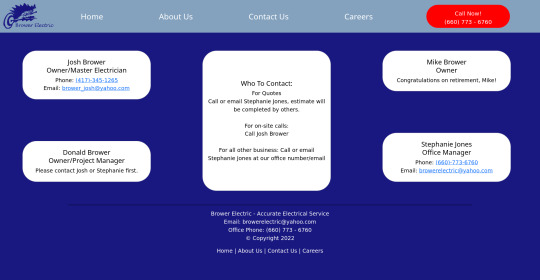
On Mobile:

The HTML:
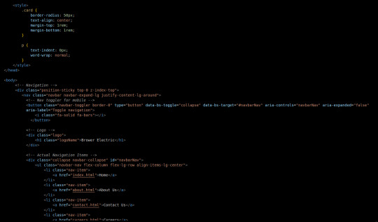
I used some internal CSS in the head tag because I wanted the cards and text on this page to look a little different.
Our nav bar (and this is standard on all pages) is contained in a div that sticks it to the top of the page, even as you scroll. The z-index-top class makes the z index 100 so it overlaps everything.
The rest of the navbar is the same as other pages.
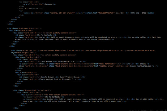
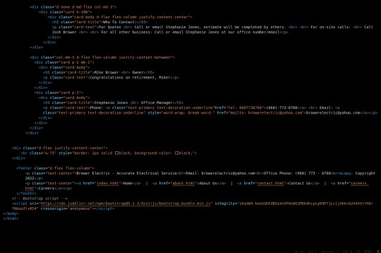
So the first div you see after the nav bar is only visible on medium screens and below. This div contains a card that has been flexed to center it's content. This card is the instruction card for who to contact. On bigger screens, a nearly identical one will appear in the center of the Contact Us grid.
Our Contact Us grid uses Bootstrap rows and cols. The row has a 100% width and a minimum height of 50% of the viewport. It justifies it content to the center of the column on mobile but otherwise it justifies content by the space around in a row. It aligns items center on mobile and stretches them out on other devices. It also has a margin on the top and bottom.
The cols are flex columns that justify their content based on the space between. That's how we get the vertical spacing on desktop.
The cards have some padding and a bottom margin, and the contact links are formatted.
The middle col only contains the who to contact div that reveals on medium devices and up.
The footer is the same as the other pages.
The CSS:
I did not add any external CSS for this page besides the z-index-top class I mentioned earlier. I'm pretty proud of this because it means that I am getting better at utilizing Bootstrap 5 classes.
Conclusion:
I should learn more about Grids. Their responsiveness is powerful because you can manipulate more than one direction at a time but I always find myself using Flexbox tools. Maybe it is because Bootstrap is built on flexbox or more likely because I like my comfort zone. Either way, I need to branch out.
12 notes
·
View notes
Text
Code Blogs | Auto-Scroll Nav Bar and Parallax Website
Code Blogs | Auto-Scroll Nav Bar and Parallax Website
Auto-Scroll Nav Bar: Auto-Scroll The ‘Auto-Scroll’ animation is a simple function where the navbar immediately scrolls up when you gently scroll down, hiding itself so that you browse the entire site without the navbar in the way. It is a very simple and cool function to have when trying to create a good cross platform Website. Here is the final product for now. Auto-Scroll Nav Bar: Messing…
View On WordPress
#3dso#3dsoli/o#application development#bootstrap#code#code blogger#code blogging#code blogs#coding#css#css code#css tutorials#html#javascript#make#maker#nav bar#navbar#navigation bar#parallax#programmer#programming#programming language#tinkerer#tutorials#web application#web design#web designing#web developer
8 notes
·
View notes
Text
Major HTML5 Tags
<html> It represents the major root element from which all other elements will descend.
<base> Shows the base URL in a doc.<head>Shows the document’s metadata, consisting of titles, scripts, and many more.
<link> Shows the relationship between the doc and external sources like CSS, favicon icons, etc.
<meta> Specify metadata of the webpage that <meta> can’t describe to the browser.
<style> Defines the style info like CSS of the document in the style element.
<title> Mentions the document’s title in the title bar or title tab.
<body> Shows the content of the document on the webpage.
<address> Contains the contact info of a person or an organisation.
<article> Shows an independent, reusable composition in a doc, site, or page. For ex: a product description.
<aside> Shows the content is indirectly related to the main content.
<h1>, <h2>, <h3> Shows three levels of sectional headings in the hierarchy.
<section> Shows a standalone section without any semantic element, usually a heading in the doc.
<header> Represents an introduction test to the main content.
<footer> Show the footer content to the latest sectional content.
<main> Shows the dominant content of the body in a doc.
<nav>= Shows the section with navigational links of the current or other docs.
<p> Represents a paragraph.
<strong> Shows that the content here is important and urgent.
<area> Represents the area of a predefined clickable image map.
<audio> Shows to insert the soundtrack in the doc using the source element.
<img> Represents inserting an image in the doc.
<a> Shows a hyperlink in the doc.
<hr> Shows a thematic change in the doc.
<ruby> Annoyed the ruby language codes for east Asian typography.
6 notes
·
View notes
Note
Hi! I don't know if you'd be the right person to ask this but how would I add a fontawesome icon before a link in the sidebar? Thank you!
Hi Anon!
My ask box is always open for Coding Questions in SugarCube (it's in my nav pinned post) :)
~~~~
The answer to your question will depend on multiple things:
Whether you use the built-in/base UI or a custom one.
Which type of passage you have put your link.
I will only answer there in the case of the base SugarCube UI, because I wouldn't know how a custom sidebar is coded without the code in front of me.
The Sidebar has multiple Special Passage Name where you can include content, whether it is text, images or links.
Note: Using the Inspect Tool of your browser is super helpful to find which class to target in your CSS/StyleSheet.
INSTALL THE FONT
You can find how to install a font in this ask.
Please note that Font Awesome requires a few addition for the icon to appear. The font family must be defined as follow: "Font Awesome 5 Free" (where the number is the version, with the current being 6). And when using it in css, you need to include the following rule: font-weight: 900; . For example:
story ul li::marker { font-family: Font Awesome 5 Free !important; font-weight: 900; }
Note: the !important is necessary when wanting to edit built-in icons (confirmed by TME in the Twine Discord). Also, if you do not have a Subscription with FA, make sure to use only Free icons (otherwise it won't appear).
For my own organisation, since I change a lot of icons, I will set the icon font-family and font-weight for all classes targeted, and then defined which icon for each class. It kinda looks like this:
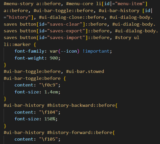
(I set up the family name in the :root {})
CHANGE THE BUILT-IN ICONS OF THE SETTING/SAVE/RESTART
All three are defined under the id #menu-core li[id|="menu-item"] a::before: #menu-core li being the list of buttons for those three API, a::before being the icon before the text of the link. If you are planning to change the icon for each of them, defined the font family/weight with this ID, before moving on to each button, being:
#menu-item-saves a:before
#menu-item-settings a:before
#menu-item-restart a:before
Within each, you need to define the icon name with the content rule, inside brackets (like the picture above). FontAwesome should give you the relevant code to include.
ADD ICONS TO THE STORYMENU LINKS
One passage which only accepts links is the StoryMenu. It is formatted similarly to the links in the section just before, but the class to target is this one: #menu-story a::before.
Note: defining an icon with this class will add the same icon to all links in this passage. If you want different ones for each link, you will need to use the :first-child, :nth-child() and/or :last-child selector.
ADD ICONS TO OTHER UI-BAR SPECIAL PASSAGE
For StoryAuthor, StoryBanner, StoryCaption, StoryDisplayTitle and StorySubtitle, there will be no need to fiddle with the CSS (unless you want to). Instead you just need to add the HTML markup of the icon of your choice before the link. For example:
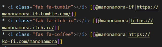
(I can't copy the code on Tumblr, but FontAwesome will have it for each icon).
If for whatever reason you want to edit the icon (colour, size, etc...) you'd need to target the i (for icon) inside the relevant id. Following the order of the Special Passage Names, it would look like:
#story-author i
#story-banner i
#story-caption i
#story-title i
#story-subtitle i
I hope this helps!
7 notes
·
View notes
Text
Responsive Collapsible Side & Tab Navigation In JavaScript/CSS
Responsive Collapsible Side & Tab Navigation In JavaScript/CSS
A responsive, mobile-friendly, collapsible/expandable sidebar & tab navigation written in plain JavaScript and CSS. Desktop: Allows you to collapse the navigation into an icon-only side menu. Mobile: Automatically converts the sidebar nav into a bottom tab bar. How to use it: 1. Code the HTML for the sidebar navigation. <div class="nav" id="nav"> <nav class="nav__content"> <div…
View On WordPress
5 notes
·
View notes
Photo

Hide Navbar on Scroll Down and Show on Scroll Up
#navbar html css jquery#Hide Navbar on Scroll Down and Show on Scroll Up#jquery nav#navigation bar#divinector#show hide menu on scroll
0 notes
Text
New Elements!
HTML is getting more and more interesting, but it is really tricky.

This week we have seen so many different elements and attributes. My mind was spinning at the end of the class. But let’s write it down to make it clear.
At first, we were seeing just the very basic stuff, like the website needs a head, then the title, then the body, and everything else goes inside the body. We can add paragraphs, pictures, lists, and links.
Now we need to separate everything in blocks, so more elements has to be there, and it doesn’t change anything on the appearance of the webpage, we need to organize it to make the design later on with CSS.
The tags (markups) are used to give information meaning and they will structure the website.
So, to organize the webpage we need to think about what is going to appear first. The most popular websites will have a <header> with the Logo of the website, a navigation bar <nav>, <articles> in which can be added pictures, <aside> bar with more content, and the <footer> finalizing the page with a few extra information.
We still have one little guy called <div>. This element has no meaning itself. It is used to make blocks when we don’t have any better option to use, as the specific ones: <article> or <footer>.
(To be honest, I still don’t understand when I need to use it, I need to start building my own page to see where it will fit.)
We also have inline elements such as <em> <strong> and <img>. They will be next to each other and inside the block.
Then we have ID and Class. These two fellas have the job to identify an element, making it special and different from the others.
Eg.: <div id=“branding”> and <div class="articlebody">
The difference between them is that class can be used more than one time on the same page and ID can be used just once.
Therefore a combination of elements, id, class and attributes can give a page structure and meaning.
And finally, we got the <meta> element that goes at the beginning of the page. It is a void element, it doesn't have any content inside and doesn’t need to be closed. These meta tags control the behavior of search engine crawling and indexing. The recommended attribute is <meta charset="utf-8">
After all of these, I have to say that I’m a little scared about HTML, but is still exciting to learn it.
Let’s see what Ruairi will bring next week.
1 note
·
View note
Text
Tutorial: ¿Cómo hacer skins sin morir en el intento? PT. 2
# Nuestra Barra de Navegación
Aviso previo: Esto no es un tutorial de cómo dar estilo a las cosas, sino una guía de cómo hacer una skin al modo de alguien que definitivamente no es la mejor opción. Para poder seguir este tutorial se deben tener conocimientos previos de HTML y CSS. Si no, esto tardaría mil años.
Seguimos con esta cruzada, ahora un poco más tarde que ayer. He ido de compras en la mañana y el peso me ha dejado lastimada la muñeca, así que escribir me duele un poco. Esta parte será un poquito corta por lo mismo, espero que se comprenda:(.
Entonces, vamos de arriba a abajo. ¿Qué viene primero? Así es, la navbar. Hay muchas formas de hacer una navbar, yo hasta hace unos meses solo usaba la variable del template tal cual y la editaba con JS. Sin embargo, la experiencia administrando me ha enseñado que hay momentos en las que esta suele mostrarse /rara/. Es por esto que hoy vamos a decirle adiós a la base de FA y a crear una desde el principio. ¿Por qué? Porque, ¿para qué hacer algo bien y fácil del comienzo si podemos complicarnos de más? Gracias a @mrd-design (espero que sea su tumblr actual, ops) por enseñarme a romper más aún las cosas.
Ahora, tiren esa cosa y abran el template del overall_header una vez más.
Mentira, vamos a usarla para algo igual, así que cortenla y péguenla por ahí, porfi, porfito. Es super importante que la corten, no la copien, porque si no les saldrá dos veces y adivinen quién estuvo media hora dando vueltas porque no entendía porque salía duplicado-
Vamos a empezar nuestra navbar de cero.
Para esto hay varias opciones. Puedes hacer la navbar e ir cortando los links según si pueden verlo o no los invitados, o puedes hacer dos navbars distintas. Yo me voy más por la segunda opción, principalmente porque en algunos skins, como en el de la preview de mi última comisión, quiero que cierto link quede al medio y se me hace mucho más cómodo.
Los links que nunca deben faltar en la navbar son los del índice, perfil, conexión, mensajería y registro. A mí me gusta incluir igual la lista de miembros y, si el foro que están armando tiene una página html con información extra, también es una buena idea incluirla aquí dentro.
Los por defecto que tenemos son los siguientes:
/{U_INDEX} - Índice del foro
/calendar - Calendario
/faq - Preguntas Frecuentes
/search - Búsquedas
/memberlist - Lista de Miembros
/groups - Lista de Grupos
/profile?mode=editprofile - Editar Perfil
/privmsg?folder=inbox - Mensajería
/login?logout=1 - Desconectar
/login - Conectar
/register - Registrar
Entonces, crearemos un enlace con cada uno de ellos, utilizando el típico <a href=“link”>contenido</a> para personalizarlos individualmente. A mí, al menos, me gusta además agregar el “title” en cada enlace, esto más que nada porque suelo utilizar muchos iconos y es la forma más segura de que no hayan confusiones para los usuarios.
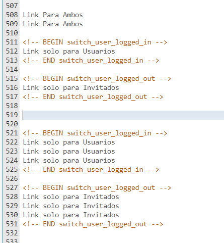
En esta ocasión no daré un orden demasiado rebuscado a los links, así que solo haré una lista y la separaré por visivilidad. A mí me ha quedado algo así.
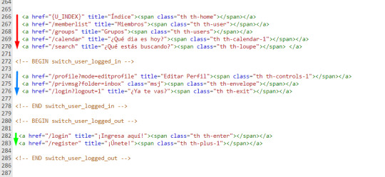
Los rojos son visibles a todos, los azules solo a los usuarios conectados y los verdes solo a los invitados. Los más atentos, igual, se habrán dado cuenta que hay un pequeño detalle en el grupo de los que pueden ver los usuarios conectados. Así es, nuestro link a los mensajes privados no tiene title, y en su lugar tiene adjuntada una clase. ¿Para qué es esto? Para lo mismo por lo que les he dicho que dejaran a un lado la navbar default de Foroactivo.
Vamos a tomar nuestro #nv-bar y vamos a abrir dos elementos nuevo dentro. El primero sera #mv-bar, donde colocaremos nuestra navbar personalizada, y el segundo #no-bar, donde meteremos la navbar por default. Tendría que verse algo así.
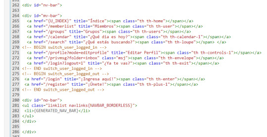
¿Para qué me haces hacer una navbar personalizada si igual vas a meter la navbar default? El motivo es simple: que feo es no poder recibir las notificaciones cuando tienes los pinches iconitos, ¿cierto? Mi método, que es bruto, de seguro tiene mejores opciones. Así que sí, además de hacerlos poner la navbar dos veces, ahora los haré esconder la default con un simple #no-bar, #mv-bar a img {display: none;} (El segundo es para borrar una imagen que aparecerá pronto, mejor lo borramos enseguida y nos ahorramos hacerlo después).
Vamos a guardar los cambios del template. Abriremos el CSS y también la pestaña de los js, para agregar el siguiente a nuestro listado de “Todas las páginas”.
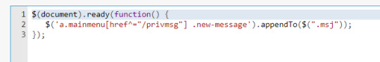
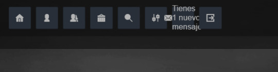
¿Qué hará esto? Pues que cuando vayamos a ver nuestra navbar, y nos llegue un mensaje, aparezca el texto de “tienes un nuevo mensaje” al lado. Podemos editar esto hasta hacerlo lucir como un contador o reemplazarlo por un pequeño ícono de aviso.
Vamos a ignorarlo momentáneamente, al menos lo suficiente para poner el resto de nuestro código bonito. Entonces, cuando no tengamos un mensaje nuestro código se verá así:

y cuando lo tengamos, se verá... así.
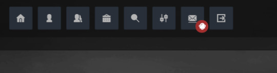
Ahora, es sumamente importante que nuestros links tengan el position relative dentro de sus estilos, ya que así nos aseguraremos de que podemos mover la notificación sin afectar al resto del link.

Al elemento .new-message le aplicaremos entonces un position absolute, para que no afecte el tamaño de su contenedor. Además, como yo voy a poner solo un icono de aviso y no un contador, también agregaré un font-size: 0px. Agregaremos el icono de aviso a través de un pseudo-elemento :before de .new-message, el cual quedará del siguiente modo:
Ahora, realmente quería hacer la parte de la navegación por foros también en este mismo post, pero tendrá que esperar porque la muñeca me mata. Gracias por leerme hoy también, nos vemos en los siguientes días para seguir con este paso a paso. Muchas gracias por sus comentarios y buenos deseos, sois los mejores <3.
++ UPDATE ++
Ahora que ya tengo bien mi muñeca de nuevo, vengo con la segunda parte de esta parte (valga la redundancia). Como es cortita, no veo conveniente hacer toooodo un post nuevo para ella, así que comenzaré desde aquí para que no se pierda.
Para que nuestra navegación sea más cómoda todavía, vamos a agregar los botones rápidos para movernos en foro > categoría > subforo. Esto podemos obtenerlo con el siguiente código, el cual, como siempre, voy a reconstruir para armarlo a mi gusto. Recuerden siempre encargarse de removerlo en otros templates para que no les salga repetido.
Pasaremos de esto:
A esto:
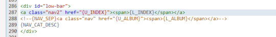
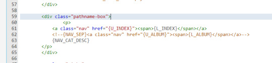
Ya sé que no es un gran cambio, pero habrán visto el nav2 en lugar del nav a secas y ya entenderán el por qué.
Para dar el estilo a esta zona tendremos que jugar un poco, porque la sección viene pre-fabricada por foroactivo y no permite que editemos los enlaces uno por uno. Por eso cambio la clase del contenedor de {L_INDEX}, ya que así me permitirá que el link del indice se vea distinto a los links de categoría y foro.
#low-bar {tiene que tener un font-size: 0px para que no se vean los puntos externos a los links} #low-bar a {debe tener el tamaño de la fuente, para que las letras} #low-bar .nav2 {es entonces la que cambia el enlace del índice. Si la hubiesemos dejado como .nav, nos cambiaría toooodos los enlaces}
Teniendo esto armado, ya podemos proceder con el estilo. Luego de azotar la cabeza contra el teclado por segunda vez consecutiva, podemos obtener algo como esto:

Ahora sí, muchas gracias por leer hasta acá, ¡nos vemos en la siguiente parte!
84 notes
·
View notes
Text
A Guide In Firefox to New And Creative CSS DevTools
Over the last few years, our team at
Firefox
has been operating on new CSS gear that address both cutting-edge strategies and age-old frustrations. We’re the Layout Tools team, a subset of Firefox Developer Tools, and our quest is to improve the modern-day internet layout workflow.
The internet has seen an first-rate evolution inside the final decade: new HTML/CSS functions, browser improvements, and design strategies. Our crew is dedicated to constructing gear that fit that innovation so that designers and developers can harness extra of the performance and creativity that’s now possible.
In this guide, we’ll proportion a top level view of our seven new equipment, with memories from the design system and realistic steps for trying out each tool.
1. Grid Inspector
It all started out three years in the past while our CSS format expert and dev advocate, Jen Simmons, labored with members of Firefox
DevTools
to construct a device that would aid customers in examining CSS Grid layouts.
As one of the most powerful new functions of the cutting-edge internet, CSS Grid had quick gained decent browser adoption, but it still had low internet site adoption. There’s a steep studying curve, and you nevertheless need fallbacks for sure browsers. Thus, part of our purpose turned into to help popularize Grid by way of giving developers a more hands-on manner to research it.
The middle of the device is a grid outline, overlaid at the page, which facilitates devs visualize how the grid is positioning their elements, and the way the layout modifications once they tweak their styles. We introduced numbered labels to identify each grid line, the capability to view up to 3 grids at once, and colour customization for the overlays. Recently, we also introduced support for subgrid, a modern day CSS specification implemented in Firefox and hopefully in extra browsers soon.
Grid Inspector changed into an idea for all of the tools that followed. It was even an notion for a brand new team: Layout Tools! Formed in late 2017, we’re unfold across 4 time zones and collaborate with many others in Mozilla, like our rendering engine builders and the best parents at MDN.
TRY OUT THE GRID INSPECTOR
In Firefox, go to our Grid example site.
Open the Inspector with Cmd + Shift + C.
Turn on Grid overlay through one of 3 ways:
Layout Panel:
In the Grid section, check the checkbox subsequent to .Content.Grid-content;
Markup View:
Toggle the “grid” badge next to ;
Rules View:
Click the button next to display:grid; inside
#page
-intro .Grid-content;
Experiment with the Grid Inspector:
Change the crimson overlay coloration to red;
Toggle “Line numbers” or “Extend strains infinitely”;
Turn on greater grid overlays;
See what takes place while you disable grid-gap: 15px in Rules.
2. The Editor of Form Path
The next project we have been working on has been the Shape Path Editor: our first visual editing tool.
CSS Shapes permits you to define shapes for textual content to drift around: a circle, a triangle, or a many-sided polygon. It can be used with the clip-path assets which permits you to trim elements to any of those equal shapes. These two techniques collectively open the opportunity for a few very specific graphic design-stimulated layouts.
However, creating these sometimes complicated shapes can be difficult. Typing all the coordinates manually and the use of the right CSS units is error-inclined and some distance eliminated from the creative mind-set that Shapes allows. Therefore, we made a device that allows you to edit your code through at once clicking and dragging shapes on the web page.
This kind of feature—visible editing—became new for us and browser tools in general. It’s an instance of how we will go beyond inspecting and debugging and into the world of design.
TRY OUT THE SHAPE PATH EDITOR
In Firefox, go to this web page at the An Event Apart website.
Open the Inspector with Cmd + Shift + C and pick out the first circular image.
In Rules, click on the icon subsequent to the shape-outside property.
On the web page, click on the factors of the shape and notice what happens while you drag to make the shape massive or tiny. Change it to a size that appears exact to you.
3. Text Reader
We have had a Fonts panel in Firefox for years which displays an informative list of all the fonts used in a website. We decided to convert this into a Font Editor to fine-tune the properties of a font by continuing our trend of designing in the browser.
A driving force behind this assignment become our purpose to support Variable Fonts at the same time that the Firefox rendering engine team changed into adding support for it. Variable Fonts gives font designers a way to offer fine-grained variations alongside axes, like weight, within one font file. It also supports custom axes, which offer each font creators and web designers an exceptional amount of flexibility. Our device routinely detects these custom axes and offers you a manner to alter and visualize them. This would otherwise require specialized websites like Axis-Praxis. Additionally, we added a characteristic that gives the ability to hover over a font name to spotlight in which that particular font is being used at the page. This is helpful because the manner browsers select the font used to render a bit of text can be complex and depend upon one’s computer. Some characters may be abruptly swapped out for a special font due to font subsetting. TRY OUT THE FONTS EDITOR
In Firefox, go to this variable fonts demo site.
Open the Inspector with Cmd + Shift + C and pick out the word “variable” within the title (the element’s selector is .Title__variable-web__variable).
In the 1/3 pane of the Inspector, navigate to the Fonts panel:
Hover over the font name Output Sans Regular to look what receives highlighted;
Try out the load and slant sliders;
Take a take a look at the preset font versions within the Instances dropdown menu.
4. Flexbox Inspector
Our Grid, Shapes, and Variable Fonts equipment can together electricity some very advanced graphic layout at the internet, but they’re still somewhat present day based on browser support. (They’re nearly there, however still require fallbacks.) We didn’t need to work most effective on new features—we were drawn to the problems that maximum web builders face on a every day basis.
So we started work at the Flexbox Inspector. Design-wise, this has been our most ambitious assignment, and it sprouted some new consumer research strategies for our team.
Like Grid, CSS Flexbox has a fairly steep learning curve while you first get started. It takes time to truely recognize it, and a lot of us hotel to trial and error to gain the layouts we need. At the beginning of the assignment, our team wasn’t even sure if we understood Flexbox ourselves, and we didn’t recognize what the main challenges have been. So we leveled up our understanding, and we ran a survey to discover what human beings wanted the most when it got here to Flexbox.
The outcomes had a big effect on our plans, making the case for complicated visualizations like grow/decrease and min/max. We continued operating with the community at some point of the task by means of incorporating remarks into evolving visual prototypes and Nightly builds.
The tool consists of two main parts: a highlighter that works just like the Grid Inspector’s, and a detailed Flexbox device inside the Inspector. The middle of the tool is a flex item diagram with sizing info.
With help from Gecko format engineers, we have been able to show the step-by-step size choices of the rendering engine to offer users a full image of why and the way a flex object ended up with a positive size.
Note: Learn the full tale of our design manner in “Designing the Flexbox Inspector”.
TRY OUT THE FLEXBOX INSPECTOR
In Firefox, visit Mozilla’s Bugzilla.
Open the Inspector with Cmd + Shift + C and pick out the element div.Inner (simply inside the header bar).
Turn on the Flexbox overlay through one of 3 ways:
Layout Panel:
In the Flex Container section, turn on the switch;
Markup View:
Toggle the “flex” badge next to ;
Rules View:
Click the button next to display:flex.
Use the Flex Container panel to navigate to a Flex Item known as nav#header-nav.
Note the sizes shown within the diagram and length chart;
Increase and reduce your browser’s width and see how the diagram modifications.
Interlude: Doubling Down On Research
As a small team and not using a formal person research support, we’ve regularly resorted to design-by-dogfooding: basing our critiques on our personal stories in using the tools. But after our achievement with the Flexbox survey, we knew we wanted to be better at collecting statistics to guide us. We ran a new survey to assist tell our subsequent steps. We crowdsourced a list of the 20 largest demanding situations faced by internet devs and asked our community to rank them using a max-diff format. When we discovered that the huge winner of the demanding situations was CSS Layout Debugging, we ran a follow-up survey on unique CSS insects to discover the largest pain points. We supplemented these surveys with user interviews and user testing. We also asked folks to rank their frustrations with browser developer tools. The clear pinnacle difficulty became moving CSS modifications returned to the editor. This became our subsequent project.
5. Changes Panel
The difficulty in shifting one’s work from a browser developer device to the editor is one of those age-old issues that we all just got used to. We were excited to make a easy and straight away usable solution.
Edge and Chrome DevTools got here out with versions of this device first. Ours is centered on assisting a wide range of CSS workflows: Launch DevTools, trade any patterns you want, and then export your modifications by means of either copying the overall set of changes (for collaboration) or simply one changed rule (for pasting into code). This improves the robustness of the whole workflow, such as our other format tools. And this is just a start: We recognize accidental refreshing and navigation from the web page is a huge source of facts loss, so a manner to bring persistence to the tool may be an essential next step. TRY OUT THE CHANGES PANEL
In Firefox, navigate to any website.
Open the Inspector with Cmd + Shift + C and pick an element.
Make some adjustments to the CSS:
Modify patterns inside the Rules pane;
Adjust fonts within the Fonts pane.
In the right pane of the Inspector, navigate to the Changes tab and do the following:
Click Copy All Changes, then paste it in a text editor to view the output;
Hover over the selector name and click Copy Rule, then paste it to view the output.
6. Inactive CSS
Our Inactive CSS feature solves one of the top troubles from our layout debugging survey on precise CSS bugs: “Why is this CSS assets now not doing anything?”
Design-wise, this feature is very simple—it grays out CSS that doesn’t affect the page, and shows a tooltip to give an explanation for why the property doesn’t have an effect. But we understand this can enhance efficiency and cut down on frustration. We have been bolstered by research from Sarah Lim and her colleagues who constructed a similar device. In their studies, they observed that novice builders had been 50�ster at building with CSS when they used a device that allowed them to ignore beside the point code.
In a way, that is our favorite sort of feature: A low-placing UX fruit that barely registers as a feature, however improves the complete workflow without actually wanting to be determined or learned. Inactive CSS launches in Firefox 70 but may be used now in prerelease variations of Firefox, consisting of Developer Edition, Beta, and Nightly. TRY OUT INACTIVE CSS
Download Firefox Developer Edition;
Open Firefox and navigate to
wikipedia.Org;
Open the Inspector with Cmd + Shift + C and choose the center content material area, called central-featured;
Note the grayed out vertical-align declaration;
Hover over the data icon, and click on “Learn extra” if you’re interested.
7. Accessibility Panel
Along the way we’ve had accessibility functions developed by means of a separate group that’s typically one person — Yura Zenevich, this year together with his intern Maliha Islam.Together they’ve turned the brand new Accessibility panel in Firefox into a powerful inspection and auditing tool. Besides displaying the accessibility tree and properties, you could now run different varieties of checks on a page. So far the checks include shade contrast, textual content labels, and keyboard attention styling.
Now in Nightly, you can strive the new shade blindness simulator which harnesses our upcoming WebRender tech.
TRY OUT THE ACCESSIBILITY PANEL
Download Firefox Developer Edition;
Navigate to
meetup.Com;
In the developer tools, navigate to the Accessibility tab, and click the “Turn on Accessibility Features” button;
Click the drop-down menu subsequent to “Check for problems” and pick out “All Issues”;
Take a have a look at the diverse contrast, keyboard, and text label troubles, and click the “Learn greater” links if you’re interested.
Next Up
We’re currently hard at paintings on a browser compatibility tool that uses facts from MDN to expose browser-specific problems for a particular element. You can follow along on GitHub to learn extra. The Future
We’re committed to helping the modern-day web, and that means continuously converting and growing. New specs get implemented via browser vendors all of the time. Guidelines and nice practices around progressive enhancement, responsiveness, and accessibility evolve constantly. Us device makers need to hold evolving too.
And what of the long-lived, ever-present troubles in creating the web? What ordinary user interfaces need to be rethought? These are a number of the questions that preserve us going!
What approximately a better manner to navigate the DOM tree of a page? That a part of DevTools has gone essentially unchanged since the Firebug days.
We’ve been experimenting with functions like again and forward buttons that might ease navigation between lately visited elements. A extra dramatic trade we’re discussing is including a compact DOM view that makes use of a syntax much like HTML templating engines. The attention could be on the most common use case—navigating to CSS—as opposed to viewing/enhancing the source.
We’ve additionally been thinking about a higher element selector. We realize how it can be more effective to work inside the web page, with much less jumping backward and forward into DevTools. We should make the detail selector extra effective and greater persistent. Perhaps it could choose whitespace on a page and tell you what causes that space, or it can shed mild at the relationships between extraordinary elements.
As a reputed Software Solutions Developer we have expertise in providing dedicated remote and outsourced technical resources for software services at very nominal cost. Besides experts in full stacks We also build web solutions, mobile apps and work on system integration, performance enhancement, cloud migrations and big data analytics. Don’t hesitate to
get in touch with us!
Source:
whizzystack.co
#b2b ecommerce
#b2b content marketing
#b2b seo
#b2b marketing blog
1 note
·
View note
Text
Back again!
Hello, my friends. With slight delay, I welcome you back to my weekly blog.
Today I will introduce some new tags to you, along with a few recaps of things we have already covered. Just so we’re all back on the same page. So, without further a-boo...
We know that we must nest our header in the navigation section. You have the content area and main content, sidebars for advertisements, links, extra information etc. This is what gives our web page structure, and the semantics we add gives it meaning.
Div tags (dividers) were used before in HTML, but things got confusing as each coder had different ways of defining the parts of navigation, which made it difficult for semantics to be made. Thankfully, they have now created a standard so that bots can ensure they find the specific elements and their true meaning.
The <header> element represents a group of introductory navigation aids. Many pages have a mast head in the header area, that may contain the site name, logo, search bar etc. The <nav> element represents pages that are a major navigation blocks (for example, a table of contents), by nesting lists in the element (for example, the header, footer or sidebar).
The <article> element can be a standalone tag in any section of the page. You can have multiple <article> tags on one page, or you can have <article> elements within an <article> (for example, a comment on a blog). The <section> element is similar to the <article>, but it doesn’t need to make sense out of context of the document. It represents a group of related content, so don’t use it for styling!
The <aside> element represents everything inside and related to the main content. It is used for when you want a sidebar, either on a page or within an article. However, make sure that the contents are related to the article.
The <footer> lies at the bottom of the page, and may include contact details, more advertisements, copyright information etc.
Back to our beloved <div> elements... They are used to group content together. Only use them to hook CSS where appropriate. They have no meaning by themselves. Avoid what they call a “div soup” by structuring your HTML document with identifiable sections, and remember, use semantic elements where you can. It helps the machines infer structure of content, and gives you a standardised vocabulary for organising your web pages.
Say your page had three sections, and you want two out of three styled differently. You would do this by putting a <div> outside the two sections, and nest the two sections outside to the div. REMEMBER: only use the div for layout purposes! You can use the <body> element as a natural wrapper for site content. If you wanted to style a particular block of content, a <div> is suited.
<div> elements are block-level elements, meaning they always appear on a new line and are 100% wide. Block boxes appear below the previous block element. The width of these boxes are set automatically based on the width of the container, which would be the full width of the browser page. The height, of course, is based on the content it contains.
Inline boxes don’t affect spacing. They are not for determining layout, they simply style the stuff inside a block, and the width is based on its contents. Inline elements will appear next to each other (<a>, <em>, <strong> etc.) which you will easily learn along the way!
<span> is a generic inline grouping element. It is used to contain a section of text where there is no suitable element to differentiate it from the surrounding text. It is mainly used to apply styling in CSS.
As we know, class attributes allow you to identify one or more elements in a document. They can appear multiple times on page, and one element can have multiple attribute classes.
As we know, the <main> element represents the main section of content. This should be unique to the document, excluding any content that is repeated across other documents. Using a combination of elements, class and id attributes give structure. Our <main> element can be placed in the main content section. We can have the <header> and <footer> inside an <article>. Oh, and one final recap, the <meta> element includes information about the document. It’s a void element, meaning there’s no content within, and it uses attributes to carry the information, and it must appear inside the <head>.
Well, that’s all for now... But don’t worry, there will be more.. much more!
BOO-bye now! Don’t forget to close them tags!!
3 notes
·
View notes
Photo

Toggle Sidebar Navigation HTML CSS Javascript
#sidebar nav#toggle sidebar navigation menu#navigation bar#sidenav#menu html css#html css#javascript#webdesign#frontend#frontenddevelopment#codingflicks
0 notes
Text
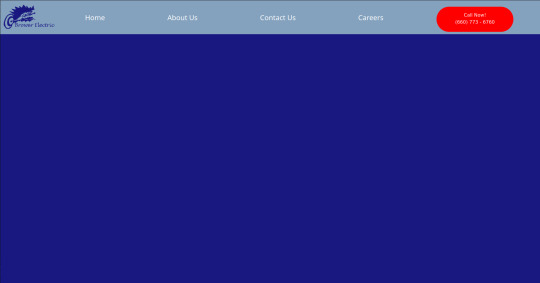
Brower Electric - Commit #1/1.5 - navbar
This commit, I built the navbar. I used Bootstrap 5 tools and flexbox to make it responsive.

The HTML
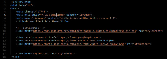
The head tag is basic. We've got our title and we've imported 2 stylesheets from the web. These give us our framework and the Noto Sans font. We also have our personal stylesheet.

The body tag has a basic Bootstrap Nav setup. The nav tag has the navbar and navbar-expand-lg classes since those are the two breakpoints I will use in the nav. On lg, we justify-content: space-around so that the items place themselves evenly across the top.
The logo is actually just a div with an h1 tag (for the browser/SE) with a background image. The positioning on that was fun, I decided to use a flexbox to make it.
The CSS:
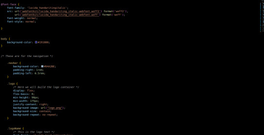
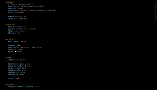

First, we add in the font we use for the logo. A lot of the custom css is related to margins, padding, and colors. The logo is a flex box (direction: row) with a predetermined minimum width that we justify-content to the right on. This keeps our text to the right. Then the text aligns itself to the bottom. Luckily we only had one flex-child in the container so the nonexistence of justify-self is not an issue.
Initially, I had used some relative positioning to do things (specifically the logo) before seeing that it made the width of the page wider than the viewport. At this point, I purged all relative positioning from my page and praised flex-box.
To make it attractive for mobile devices, it collapses to 2 top items on the bar: a hamburger menu and our logo. Our menu then displays the nav items and call button in a list below when clicked on. This kind of interactivity takes no time to build with Bootstrap 5 Collapse.
Next commit, I will add in a custom hamburger menu for the mobile version. I will also build the testimonial carousel and the services grid/tree.
You can visit the site's github repository here: https://github.com/Xacheri/BrowerElectric
9 notes
·
View notes