#css nav
Explore tagged Tumblr posts
Visit Tumblr Blog
Explore Tumblr blogs with no restrictions, modern design and the best experience.
Last Seen Tumblr Blogs


Fun Fact
130K people were victims of a chain letter scam that affected Tumblr in May 2011.
Text
Living with the Left Nav on Tumblr
So if you don't mind the left nav Tumblr has moved to, but feel it's annoying the way it squishes in on the dashboard, then I've got a few minor tweaks you can do with a simple css editor - like stylus.
.ZkG01 { justify-content: normal; } .ZkG01 ._3xgk { margin-left: auto; margin-right: auto; } [title~="Live"] { display: none; }
So what this does:
1.) Changes the page justification with the first section. This puts the left nav permanently on the left side of the screen. Where a left nav actually belongs, not crowding in on the center with space on it's left. It's a left nav, it does not need to creep inwards to make the rest of the page harder to read.
Except now the dash has crept over to the left too which is where section 2 comes in.
2.) Puts automatic margins on the dashboard area - this includes the search bar and all the clutter beneath it (x-kit rewritten is useful for hiding that clutter) - to both the left and the right. What this means is that the content will be centered with equal sized margins on either side. So the dashboard + margins will, together, fill up the entire space to the right of the left nav with the dashboard centered within that space.
That takes care of the page spacing concerns with the left nav... so what's that third css section doing? (I bet you can guess.)
3.) It also hides the tumblr live button on the left nav. Apparently the latest update from snoozing 7 days to snoozing 1 month has changed it so that it no longer hides the nav item. That sucks. But with this little piece of css + x-kit rewritten hiding the carousel... it's like Live doesn't even exist. Even when the snooze comes to an end.
This works great if you choose not to use the Tumblr Dashboard Unfucker script - I did use the Dashboard Unfucker for a while during the missing avatar phase and if the avatars go away again (or some other accessibility unfriendly decision is made) then I'll be using the Dashboard Unfucker again. But I'm actually okay with the left nav, aside from feeling it needs a few minor tweaks to be decently usable.
Tumblr has given in to peer pressure (current industry 'standard' UI practices) but it's not entirely bad. The old flow was better for noticing activity and messages, but the new flow makes it a lot clearer what the nav icons are for now that they have actual text. I'm also a lot less likely to click the wrong thing by accident as there was some hit-box overlapping in a few places when it was a top nav.
There are a couple of things, though, that I'd still like to see happen with the left nav. The first is a toggle of some kind for collapsing the left nav to just icons again. On small screens - but not small enough to trigger the collapse on its own - being able to toggle the menu open/close would be pretty useful to help conserve space for the dashboard. Second is moving the search bar into the left nav. It makes way more sense in the left nav than it does to the right of the dashboard. And that may wind up being what pushes me to give creating my own userscript a try, if I decide I want that search bar moved badly enough.
5 notes
·
View notes
Text
Código HTML encabezado con 3 imágenes de fondo, junto con un menú de navegación simple. He utilizado CSS para dar estilo al diseño y posicionar los elementos:
HTML <!DOCTYPE html> <html> <head> <title>Encabezado con Imagen de Fondo</title> <style> header { height: 300px; background-image: url('tu-imagen.jpg'); /* Reemplaza 'tu-imagen.jpg' con la ruta a tu imagen */ background-size: cover; background-position: center; position: relative; } header h1 { position: absolute; top: 50%; left: 50%; transform: translate(-50%, -50%); color: white; text-align:…
#accesibilidad#background-image#código#CSS#desarrollo web#Diseño web#ejemplo#elementos HTML#encabezado#enlaces#estilos#estilos CSS#header#HTML#imagen de fondo#lista no ordenada#menú de navegación#nav#personalización#personalizar#posicionamiento#position#responsive design#transform#tutorial
0 notes
Text
1 note
·
View note
Text
Small Rarebit basics to start your webcomic site
pt 1
If you are interested in having your own comic site you may have come across people suggesting rarebit. Rarebit is a comic template you can use to do so.
I do know some HTML and CSS, but even then back when I downloaded rarebit for the first time I was still a bit confused on where to start, so I hope this small guide helps anyone that is interested on starting their own comic site using it.
In this part I’m going to change the logo and navigation buttons on the site.
1.- Download Rarebit from: https://rarebit.neocities.org/ ← You can also read information about it in here and check out other sites that use it.
2.- You will get a zip file with the basic things needed to set up your comic site
3.- You will place these HTML files and folders in your Neocities site dashboard
4.- Changing your logo
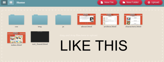
If you open the Index right now it will look like this:
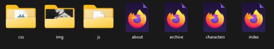
I started changing the img files that make up the site to mine for this, starting with the logo, you can find it on the img folder
Select manage, these are the contents of the folder:
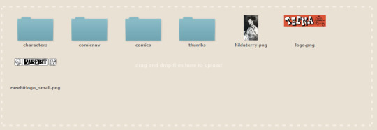
characters: stores the images for your characters page
comicnav: the navigation arrows for your site
comics: This is where you place your comic pages, your comic pages have to start with pg and then followed by a number, I will touch on that later.
thumbs: you can place thumbnails for your comic archive, this is optional and you can turn it off, personally I don’t use them but if you want them they are there.
Hildaterry.png: this is a placeholder image for the about page, you can delete it or replace it later on when you build your about page.
logo.png: What I did was open this file and replace it with my own logo, then overwrite, next time you open the index page it will have been replaced.
rarebitlogo_small.png: this is the image used in the credits to give credit to rarebit.
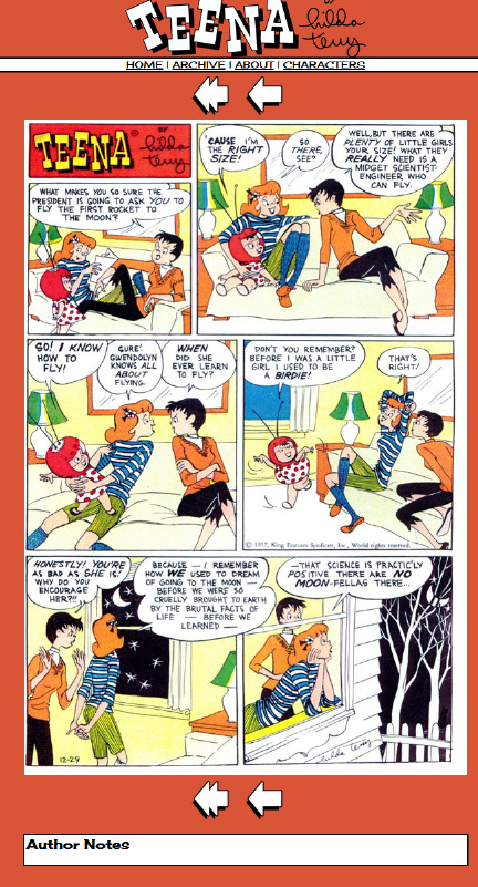
-Once you’ve replaced the logo file for your logo it you will notice the change in the index.
Note. The name of your logo file must have the same exact name of logo.png.
after the change:
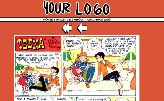
Good start isn’t it? You can do this with your nav buttons as well, just replace the files on your comicnav folder.
Rarebit Credits:
Rarebit site
Rarebit's creator's ko-fi and patreon
Part 2
130 notes
·
View notes
Note
I wish people who use css that removes every nav button from their profile and makes it so you have to type in the url where you want to go a very hot sweaty pillow for the next month.
🦫
8 notes
·
View notes
Text
Beta Update
Alright everyone! We've gotten started on fixing the Guild (though no official push yet), and we were able to get started on our bug report and task sheet we're going to publish. We made halfway progress on the support articles we'll be publishing, and we got through a good chunk of bugs today, including:
* An infrastructure error which was overloading the server with so many accounts, fixed many latent issues on the backend. Many of the errors you see are remnants of it, but things should be smoother from here
* Midwife freezing
* User profile CSS box display
* Users online counter (something quick we got working during downtime!)
* Got many users through onboarding and tackled a bricking issue
* Mobile formatting issues: currency, nav dropdown, and onboardingWe've requested server expansion from our provider, which should also help. And we've replaced a good bit of flavor text! We will continue the replacements in between the big tasks!
Hopefully we'll be able to complete those articles by tomorrow! Here is what else we'll continue working on when we're all back on the grind:
* Latent breeding issues
* Guild problems
* Metamorphic item issues (incense, breed changes, etc.)
* General item functionality issuesItem functionality is our next big step following the Guild!
As always, I'll return in the morning to attend to any issues cropping up and update in real time as we work! Though it's the weekend, so we may see slower updates on the development end as some of our team is off. I'll be here though! I'm fading a little right now, so it's time for some rest!
Have a good night and a good weekend, catfolk!
#paw borough#pet site#virtual pet#indie game#petsite#pet sim#pawborough#closed beta#development update#beta test
11 notes
·
View notes
Text
widowbase v3 and v4
Whooboi, there is a lot of discourse going on right now about JCINK coders. Perfect time for me to update some base skins!
For those who just want to streamline their coding process, I have updated my widowbase v3 to include a day/night theme toggle and made a few responsive tweaks to the vertical nav and sidebar. For those looking to learn how to use CSS grid and flexbox to create responsive forum designs, I added a new base, widowbase v4. This version includes some HTML templates that have a very ugly, extremely basic, but functional fluid grid layout. These templates also incorporate hidden divs (read as, display: none) that include the PHP variables frequently used inside those respective HTML templates, so you can easily delete everything I've done and start from scratch with your own. Then just delete the hidden div when you've used everything you need. Easy peasy!
For those of you just beginning your coding journey, I wish you the best of luck! It is such a fun and rewarding hobby. You are also free to rip apart any of the codes on my preview site and cobble them back together. These experiments can be a great learning tool! You are more than welcome to use any of my free resources as a base, as long as the finished product remains free. As for my actual skin bases (or template sets specifically labeled as bases), these can be used for free or paid skins. Make money or give it away, whatever works for you, just leave the credits given to resources intact so others can find out how to accomplish the same thing!
41 notes
·
View notes
Text
Hey there,
I just wanted to drop a quick note to express how grateful I am for each and every one of you who has subscribed to my content and given it some love.
This is my secondary Tumblr account, and I'm still figuring some things out, especially when it comes to responding to comments. So, I would love a little help on that !
I'd like to give a special shoutout to @variablecemetery for their comment on my introduction post.
And to @mousiecat, who asked about CSS selector priority – Here's your answer
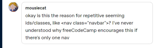
Adding a class like class="navbar" to a <nav> element in HTML, even if there is only one navigation element on the page, is a common practice in web development. This practice has several advantages:
Consistency: It helps maintain a consistent naming convention in your HTML and CSS. If you have multiple components or sections on your website that share similar styles, using classes can make it easier to manage and apply those styles consistently.
Reusability: If you decide to add another navigation element in the future, you can easily apply the same CSS styles to it by giving it the same class name (class="navbar" in this case). This makes your code more modular and reusable.
Specificity: CSS class selectors have a higher specificity than HTML element selectors. This means that if you ever need to style the element differently in a specific context or override other styles, using a class selector can give your styles higher priority without affecting other elements on the page.
Readability and Maintainability: Adding class names that describe the purpose of an element (e.g., class="navbar") makes your code more readable and understandable, which can be helpful when working on a team or revisiting the code later.
Documentation and Self-Documentation: Using class names like class="navbar" can serve as a form of documentation for your HTML structure. When someone else, including your future self, looks at the code, they can quickly understand the role and purpose of that element.
#code#codeblr#css#html#javascript#java development company#python#studyblr#progblr#programming#comp sci#web design#web developers#web development#website design#webdev#website#tech#html css#learn to code
63 notes
·
View notes
Text
As of right now (October 2024) what is the SHORTEST chunk of CSS necessary to make a page "responsive"?
In terms of font size and spacing changes for main body text (p h1 h2 blockquote li etc). There's no nav here. You're not going anywhere.
DO NOT USE an @ import of any kind you bitch of a FUCK !!! And NO LINK TAGS that's HTML
#i can SEE you ctrl+c ing that FUCKING BOOTSTRAP cdn !!!!#clear your clipboard or i empty my clip#css#html#coding
7 notes
·
View notes
Text
my neocities site used to have a bunch of javascript.
for example, i had a page that existed to load up chapters of various stories so that you could read all of the chapters in one page, sort of like ao3's view full work feature. because it was scripted dynamically, i didn't have to maintain a separate copy of the text, and it was actually more flexible than what ao3 offers, because you could read specific arcs, heck, you could read a specific sequence of chapters (e.g., 2-13 specifically)
another thing i didn't want to maintain by hand was header at the top of the page with navigational links, so i had a script that updates them on page load.
problem is, it kind of just feels bad to load a page, then see a visible delay before the header pops in.
i spent almost a year living like that, but i eventually stopped maintaining my html by hand, and learned the joys of the static site generator.
i didn't need the chapter loader anymore, either - i could code my site generator to concatenate chapters into a full-text page, and since it's static, it'd load much faster than make the user's browser stitch together the html every time they want to open that page.
slowly but surely, everything i might've used js for was getting replaced by simpler, faster, and easier means.
i don't make much use of it, but my site actually has discord-style spoiler text. blocks of text you can click to reveal (and the css is uses currentColor, so it works even on different themes)


i don't even need javascript for this; the way i accomplish it is a bit clever:

it's a checkbox! even if you hide the actual box, you can still click the label to toggle its state
this was something i implemented early, based on this blog post where a similar trick was used for a no-js dark/light mode toggle.
but i took this to a new height this year: i added fancy footnotes

but under the hood, it's the same principle

check box to toggle the state, then some fancy css it position it to float above the text.
but of course, if i'm doing all of this without javascript, what do i need javascript for?
and there was only one feature that stuck around. it's something that i think no one really used, but i'm attached to it.
you see, i'm notorious for writing long chapters. i could split them up, but i have particular stopping points in mind. still, i am merciful, so in my stories with consistently long chapters, i'm gone out of my way to insert break points, "subchapters" seamless into the main text.

those little roman numerals would trigger a script that reformatted the page to hide all the other subchapters, and reconfiguring the next/prev buttons so that clicking them takes you to the next section rather than the next chapter
in theory, you could read Hostile Takeover as if it were a fic with 72 chapters instead of 16.
now, this is a very complex feature. you cant use checkbox tricks to emulate this, unless you want to go crazy writing a dozen css rules for every permutation of checkboxes, or force the user to figure out an arcane system where you need to uncheck one section before loading the next
but it turns out, while i wasn't paying attention, the css committee added a crazy new feature. there are :has selectors, enabling you to style elements based on the properties of elements that come below it in the document.
the whole game has changed now.
couple this with learning about :target selectors courtesy of wonder how a couple of really ambitious ao3 fics do their magic, i had everything i need
all it took to make subchapters happen now a few simple rules

really, you only need that first line. it says "if main has a target element, hide all subchapters that aren't the target"
the other lines are convenience; they had the next/prev chapter buttons if you're in the middle of the chapter. there's a couple other rules (beside the subchap nav i added a button that takes you to the top of the page, which resets the anchor target), but overall, it was quick and painless. really, the actual struggle was teaching my site generator spit out the right html. (i spent five minutes tearing out my hair and rebuilding to no effect because i forgot i had two layers of caching. whoops)
this new approach does sacrifice the ability to make the arrow buttons do double duty, but i don't think it's a big loss when the subchapter buttons are right there, and arguably retaining the single function of each button is a win for usability.
the biggest loss is that there's no real way to style the buttons differently if they've been clicked, so you don't actually know which subchapter you're actually browsing.
(maybe if anyone i actually uses this feature, they can complain to me and i'll whip up a quick bit of js to patch it :v)
but until then, i'll take some satisfaction in delete my site's scripts entirely. in a way, that's the biggest loss, but it's one of i'm proud of
2 notes
·
View notes
Text
Código html con encabezado cuyo fondo sea una imagen
código HTML que crea un encabezado con una imagen de fondo, junto con un menú de navegación simple. He utilizado CSS para dar estilo al diseño y posicionar los elementos: HTML <!DOCTYPE html> <html> <head> <title>Encabezado con Imagen de Fondo</title> <style> header { height: 300px; background-image: url('imagen1.jpg'); background-size: cover; background-position: center; position:…
#accesibilidad#background-image#código#CSS#desarrollo web#Diseño web#ejemplo#elementos HTML#encabezado#enlaces#estilos#estilos CSS#header#HTML#imagen de fondo#lista no ordenada#menú de navegación#nav#personalización#personalizar#posicionamiento#position#responsive design#transform#tutorial
0 notes
Text
꒰ ͙ ❄ SHOW ME UR GIFFIES . ꒱
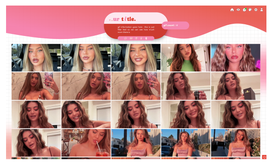
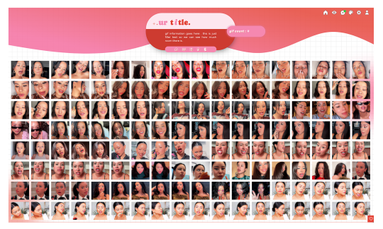
greetings , pookies ! SHOW ME UR GIFFIES is a fun , vibrant lil gem of a page to host and display all of ur beautiful gifs ! there are two versions available to download , one suited for gif icons and one suited for larger gifs . sizes were tested with 70 x 70 px icons and 268 x 150 px gifs but should be accommodating to various sizing discrepancies ! there are annotations through the page to help u get the precise look u want . as per usual , let me know if u encounter any errors and i will do my best to troubleshoot asap !
if u intend on using this theme or just want to be a supportive hottie , please give this post a like and a reblog ! stay hydrated and be sure to pet a cute animal today ! mwuah 💋 💋 💋 !

ⅰ. THEME FEATURES .
x. 100% java free x. cute , geometric grid line background x. aesthetically pleasing gradient wave header w / annotations to help change the colors + link to shade finder software to help u design ur gradient x. pill - shaped container to house ur title and other goodies x. designated area for ur description x. animated pill container to state gif count x. five links in mini nav hub ; one to redirect to ur main , one to go to ur inbox , one to link to ur main list of resources , one to direct users to ur commission info ( if applicable ) , and one to bring the user back to the dash . all of these links can be edited / deleted to ur liking x. detailed annotations to edit ur page's margins and padding x. optional ::before sector to add symbols / emojis before ur title that are customizable in the css x. links for various unicode character / emoji resources within the code to use for ur title x. for a more detailed compilation of credits and features , please see the google doc containing the code

͙ ❄ this page is a patreon exclusive : want access ? consider signing up to join the fam - a - lam to get ur hands on this theme as well as my entire coding catalogue . click here to learn more !
source link directs to a live preview of SHOW ME UR GIFFIES ! original gif icon drop of cierra ramirez can be found here .

#rph#rpt#indie rph#rp theme#rp page#gif page#mine#rec#for patreons#for patrons#round 2 bc my previous post wasn't appearing ???
22 notes
·
View notes
Text
How to show/hide elements.
Inspired by a recent conversation with someone on discord that prompted me to make a quick demo on codepen.io I thought I would try to make an actual tutorial out of it. So! For those that are interested, here's how to easily change what different groups see when they're logged in. This tutorial is geared specifically toward JCINK coders, but can easily be adapted to any forum or webpage. Keep reading to find out how.
The first step is to add the group id to your board's body. To do this you need to find the <body> tag in your board wrapper and replace it with:
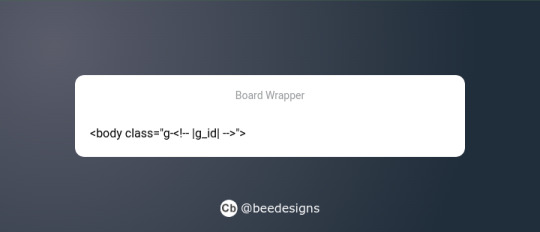
Now you have that in place, you can use it to dictate what different groups can and can't see. This obviously has a lot of use cases, from changing group colours to hiding certain information or forums. The most common use is to swap the navigation options depending on whether someone is logged in or not.
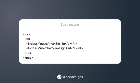
So, you've created your nav menu, and you want guests to see the "sign-in" link, but what about members who are already signed in? You want them to have the "sign-out" link instead. What we're going to do is wrap each link in a class that corresponds to who we want to see it.
Now, in the stylesheet, we're going to add the CSS to tell the board to show or hide the corresponding link depending on who is logged in. We're going to be using JCINK's default group ids #2 for guests and #3 for members.
First for guests:
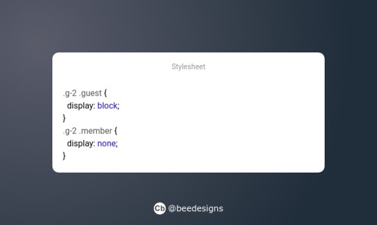
This simply says if a guest (.g-2) is viewing the page, then show anything using the class 'guest' and hide anything using the class 'member'.
Then for members:
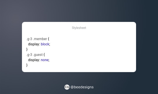
Much like the above, we're telling the site to show anything using the class 'member' and hide anything using 'guest' when the member group (g-3) is logged in.
And that's it! You can see it in action here, where I've combined it with a colour variable to demonstrate how this method can be extended to include pretty much whatever you want. Hopefully it all makes sense! This is my first ever tutorial, and I'm just a baby coder myself. So, if you see a mistake or something that doesn't make sense, please do reach out and I shall try to correct/clarify it. Thanks for reading :)
24 notes
·
View notes
Text
[life update: I entered a hackathon]
I entered a hackathon and one of the task is to build a site with only use HTML, CSS & JavaScript and also make the features and design pixel perfect lol. That’s the life update. I know I’m going to win but damn I’m stressed and I’ve barely completed the nav bar but I know I’ll win it.
21 notes
·
View notes
Text
STAGHUNTERS NEOCITIES WEEE
Figured I should make a new post at this point because the other one is getting too long to keep reblogging. I've been tinkering away at the site and it is shaping up! Here's a lil page by page tour under the cut
you can view the site here!

Splash screen!
It's a little bumper so the css can load without it scrabling the home page. It looks alright, but to add some more text to the image, I have to make a new one in the death screen generator, which is not ideal.
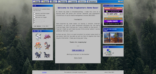
The home page!
I've changed the middle window so it fits in better with the rest. Not very visually exciting there in terms of color, but it is for now the best look imo. Text there is aligned justified, I've condensed it a bit more and added the randomized quote section underneath it instead of it being a seperate window on the side.
To do list needs an update but is still accurate. The team is still there, but on the other side, I have set the blinkies to be a bit larger. The music player has been removed because I couldn't find a way to add songs to it that weren't included on the source site. Snufkin is here now. The webrings will need some more. Retronaut is there, but not functioning as it should. it just forwards you to random sites in the ring instead of where it should be, but I can't find what exactly I'm doing wrong with the code.
Another thing that is not working on neocities itself is the "last updated" part. For some reason it doesn't display there what it does display on my local html. Maybe a bug at neo.
And icons at the top on the nav par! Adds some more flair to the place. The footer has also received a minor update: it now has a sitemap link instead of another back-to-home url.
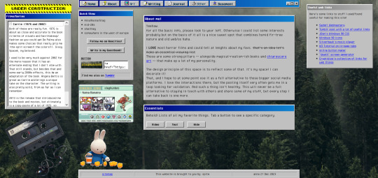
About!
I'm thinking of moving the small window with the short info to the right, but it is here for now. Links that are web-building related are on the right, also for my own referencing. The essentials lists on the left are hidden on load, but can be revealed by tapping the puttons. The lists are in tree-view and the window shouldn't expand over the cassette image once the construction sign is removed. Speaking of, the cassette has a lil playlist.
I might expand on the info a bit more, but that is for me to ponder. I liked including links to tumblr, the guestbook, and a button in case anyone wants to link my site on theirs.

Writing!
Hasn't really changed much. I've been looking at moving the sidebar info to be in the main section upon load, but idk if that would just make things more complicated. Right now it loads to an empty section there, stuff appears once you click a button. PDF support is only available once I'm a supporter of neocities, which i do wanna do but isn't a priority atm just for getting this part running. The links to ao3 will do just fine for now.
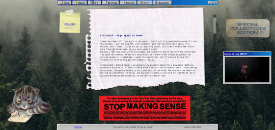
Journal!
The space for my rambling. It can be browsed by entry through the post-it, and all that seems to be functioning alright. Added a kitty and a sticker for decoration. The Stop Making Sense bumper sticker will now load a local video of the performance, but once again I won't be able to add this to the site until I get a supporter thing going. It plays/pauses on click, hehe.

Basement!
Decided to add a page for it. Basic info, schedule, link to the room, my letterboxd, and an overview of past movies. It's a nice spot on the site that is also the most cramped, but I like how it turned out.

BLUE SCREEN OF DEATH
In case any page/url error happens, you can send a movie recommendation to B (their askbox is linked when you open on desktop)


UNDER HEAVY CONSTRUCTION
The art and other pages are very much works in progress. Art can be up and running once I upload art to the site, but I'm not sure if I want to post full pieces here. Maybe I'll make it a space for sketch stuff that I'd otherwise discard.
As for the other page: I might be filing it under the writing page as a section, since the only thing here is WvW atm. It's cool that it has it's own thing, but I'm not sure if something that is basically a fanfic warrants such a space. That, or I keep it and drop all my other-media stuff in here so there's more to look at.
That's it for now! I got some ideas on how to continue, but they're not super-duper set in stone.
#stagcities#it's so much fun ough#takes time out of my other activities but certainly isn't a bore#neocities#web development
9 notes
·
View notes
Text
Day 2 of publicising my website recode
So yesterday, I began the redesign/recode of my personal site due to various reasons.
Yesterday, I tackled the navigation of my site as a whole and massively chnaged the navigation bar,
Today I finished up the nav bar(I did successfully make it hidden with the menu button using Javascript), messed with the general feel and layout of the site and added a site header I dont think I have settled on the overall look just yet but at the end of day 2, this is the progress thus far.
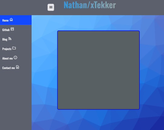
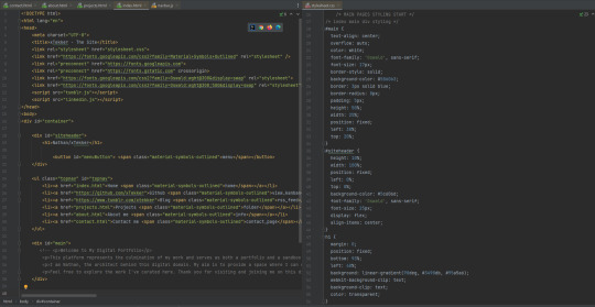
I used a CSS background generator from @xiacodes (She has some really cool webdev resources on her blog) to make the background and I changed some of the properties of the elements, tidied up the backend code and removed some redundant code which was messing with the navbar.
Overall, today was about finishing the nav bar with javascript, finding a decent background and tidying up the code.
Tomorrow, I shall tackle the projects page, I plan to display some of my java and python games/projects with a brief explanation of the process, some issues I encounted and how I solved them with a button to play that game yourself in a new window. I have a feeling this won't go as planned though.
24 notes
·
View notes