#How do you make things that aren't basic rectangles
Explore tagged Tumblr posts
Visit Tumblr Blog
Explore Tumblr blogs with no restrictions, modern design and the best experience.
Last Seen Tumblr Blogs


Fun Fact
Women make up for the other 50% of Tumblr’s audience.
Text
Novice sewing pattern: Cut out shapes. Line up the little triangles on the edges. Stitch edges together. We've also included step-by-step assembly instructions with illustrations.
Novice knitting pattern: yOU MUSt uNDerstANd thE SECret cOdE CO67 (73, 87, 93) BO44 (63, 76, 90) 28 (32, 34) slip first pw repeat 7x K to end *kl (pl) 42 * until 13" (13, 13, 15) join new at 30 pl for 17 rows ssk 27 k2tog mattress lengthwise BO and sacrifice a goat to the knitting gods. WHAT DO YOU MEAN YOU WANT "INSTRUCTIONS," I JUST GAVE THEM TO YOU
#knitting#no it's not a real pattern but I can't write one that makes sense because I have no freaking clue what any of that means#How do you make things that aren't basic rectangles#Why has every knitter I've asked for help just said 'patterns are easy; you just have to know how to read them' & then refused to teach me#Where do I even find a goat to sacrifice#How do I join the pattern cult#I am so confused#I've been knitting for almost a decade but I can only make scarves and potholders#I learned one (1) stitch by watching a YouTube video and none of my friends or family knit so I have no IRL resources#And nobody I meet seems to want to take the time to explain the rest to me#I taught myself to sew through trial and error but that doesn't really work with knitting because error is pretty much just... Unraveling?#Anyway sorry for the tag rant I'm just frustrated that I see pretty things I want to make but the instructions are in an alien language#And the gap between 'absolute novice' and 'intermediate' seems to be about 20 years of experience and formal instruction
2K notes
·
View notes
Text
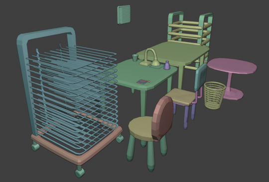
Steps of creating a 3D model replica from scratch
trace photos of character from available and cleanest angles. attempt to get a 90 degree*, front and back, side profile and straight on of the face. save additional reference photos such as bottom of body, back, and various extra angles without tracing which may help reference later on.
*more on angles later, but trying to get a 90 degree from each side is the most realistic and practical option if you dont actually have the character you're copying

2. block out the body and head


and by block i mean, yeah, its made out of elaborate rectangles


4 aha, you thought I would hand sculpt those? no. no. I used the curve tool to add these swirls. And yes i exactly traced them over the drawings to match the original as best as possible. The end of the curve tool is flat by default so I added a few spheres to make the ends nice and round. (there is absolutely a way to make the ends of curves rounded but I did not feel like looking it up or messing with the settings)
this wasn't mirrored to the other side- I traced both sides of the body and the front from photos and sculpted the swirls for each side. I couldn't get a single photo of the swirls at the butt area so I just winged it.

6 I am struggling to not make Cha Cha look angry.


I feel like the eyes are basically traced off the original and yet she looks so much grumpier. maybe it just needs to be smoothed out?

I added a little definition to the area around the eyes and I do think it looks a little better. The more definition I add in this stage the better, because I prefer this to sculpting. However, if you're more adept at sculpting you would probably not make this as detailed.


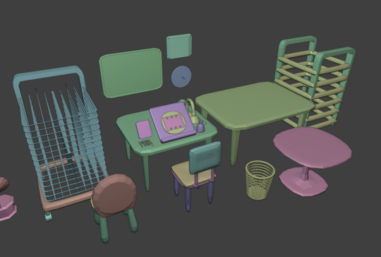
7 Here she is after smoothing everything out in sculpt after remeshing, in both Eevee (left) and Cycles (middle/right). still trying to figure out how best to render things. For some reason her nose ended up lighter in cycles but i cant be bothered to fix that rn
On the previous step I made the elements of her face + ears mirrored but once I start sculpting I'm not using the mirror tool. In fact nothing ends up mirrored, even the back right foot is slightly shifted in position.

this is probably not even the final version, I think i might redo the smooth/sculpt part and fiddle with the underlying shapes (basically go back a step)
Cha Cha's face. is one of the most difficult things to sculpt. It is extremely difficult to understand the shape of the underlying sculpt because there aren't any photos of her with the eye paint removed. There are so few of her out there I don't think anyone would willingly remove the paint to make a custom or anything unless it was in truly awful condition, and I dont think that has ever happened.


I have saved dozens of references from a number of different sites- these pics here are from etsy, the above was from the wiki. Her eyes are different from every single other pony and pony and friends- they're so bulging, so round, the eyelashes are longer. It's wild.


I can only see all the things that are wrong with it.


It's basically impossible to get something like this 100% perfect unless you have like, a set of turnaround photos all from the same angle that you can match up to the camera. You can basically overlap references with the camera view but you will never know the exact angle so if you make edits from multiple angles like this you'll inevitably not match each angle and then have to go back and adjust the angles and then you're fiddling with it infinitely. That's why I usually go for the "trace 4 angles and make the rest up as you go along" method.
I don't want to spend _too_ long on every model I make- the Takara pony which took 6 months really shows how far down the rabbit hole I will go with something like this, and it's just not practical. But I think with a slight amount of fiddling I can match the reference a little better.
388 notes
·
View notes
Note
hi quip! i really like your one piece comics and i am curious how you do them! i'm not good at comics and want to be better at drawing them! how do you learn how to make comics?
thank you!
uh oh... im afraid u have caught me at the perfect crossroad of "bored at work" and "unrelated task ive been meaning to do but keep putting off."
this is long. i hope you like reading (and grayscale progress pics). and of course!!! disclaimer before we begin that this is just how I, personally draw comics. there is no "right way."
quip's comic-making process!
Switching my typing to make this more legible...
My process can kinda be broken down into 6 steps:
Brainstorming
Thumbnailing
Sketching
Panels & Text
Lines
Tones/Colors
1. Brainstorming
My brain is a leaky sieve on a good day, so I sloppily jot down ideas in my phone notes the moment I have them. This helps me when it's time to draw too, because if I feel art blocked, I can look through old concepts and see what catches my interest.
Otherwise, I love drawing for other people's writing. :) And if worst comes to worst, doing manga/comic page redraws in my style teaches me new things every time.
Once I have my idea, I'll usually make a bulletpoint list of "plot points" or "story beats" I want. Then I plan the comic with this format that I've adapted from a tutorial I read once. I'm going to use my most recent comic (original comic post) as an example.

I start in the third column, writing notes of what I'd want to see in each panel. I also include the dialogue (in this case, I didn't have to write the dialogue! it's from the fanfic linked in the original comic post!). I usually write the whole name like [Luffy:], but at this point I've drawn so much of these guys, just the first letter works.
I like to handwrite these notes to get an idea for how much text I'm putting in a single panel.
After I describe all the panels, I go back and separate them into pages. I can't tell you how to know how many panels to a page. It's whatever works for you. I just kinda know about how big each panel will be, and so I can feel when I'm probably running out of space. (Also. You can change things later. I don't in this example, but I add/drop pages/panels all the time.)
2. Thumbnailing
Thumbnailing—as the name suggests—should be done tiny. Too tiny to accidentally get sucked into details.
This is about marking down blobs where items/characters go, and figuring out the paneling. I'll draw and redraw these a bunch of times too.
This is also the most time-consuming/brain-working part for me. If I were in a zine that did progress percentage, I'd try to finish thumbnailing around the 50% mark (but I'm also a moderately fast artist, so your mileage may vary).

I think the terrible quality makes them charming, actually. I really like how silly they look. :')))
I will add, when you draw your "page" rectangle, make sure it's the same proportions as your actual canvas for the final image. You want an accurate idea of how much space each panel will take up, especially if you have a lot of text.
3. Sketching
This is my most recent change to my usual workflow, and it's saving me a lot of time. I make my thumbnails a bit bigger (each one about half the size of the final canvas), and I sketch these basic body forms right over them.

It just helps give me placement for my actual lines!
I usually draw these in a paleish color so I can lower the opacity and not get distracted by them while lining. The random darker parts are to either help keep two forms separate (like when two characters have their limbs all over) or to better define sections that were too sloppy/poorly proportioned.
I also think this helps my poses stay looser, because I have more dramatic/wriggly shapes that aren't too bogged down by proportions yet.
Sidenote: I CANNOT show this here, but sometimes this is when I take videos. Of myself. I prop my phone camera up and shoot a video of me acting each panel. :/// It looks really dumb, but it also shows me fun body language ideas like hand gestures, expressions, weight distribution, etc. Just pretend you're an overdramatic cartoon character, and try not to worry about your roommates or mother walking in on you doing odd things. (You can also use the video for anatomy reference later, but I usually just capture the vibe and don't try to copy the actual video frame.)
4. Panels & Text
Oh, boy. So, the panels are usually just straight lines (though it's fun to make creative exceptions, like a round panel to mimic looking through a spyglass), but there are some fancy rules that I don't strictly adhere to.

I believe (I have no technical training in this. Take everything I say with a grain of salt) the vertical gaps (between two side-by-side panels) should all be a consistent width and the horizontal gaps (between two panels on top of each other) should be another. The vertical ones? Should be thinner? Because you want the eye to easily glide between them, whereas the horizontal gaps should be a visual barrier to keep you from jumping ahead. Just something I've vaguely noticed.
There are lots of fun "default layouts" you can look up. Or keep it a consistent grid. I think it's fun to sometimes have characters/objects sticking out of panels and overlapping others. This is just a matter of taste, creativity, and inspiration. (Read Witch Hat Atelier... It has some of my favorite paneling...)
You may also notice I have already done the speech bubbles. This is, to me, a crucial step. This helps me catch early if I don't have enough room for all the words. It also lets me plan the art in each panel with the speech bubbles in mind. There's nothing worse than working really hard on a panel, and then you realize there's no room for the bubbles.
I also try to lay them out in a way that guides the eye! Even without art, can people tell where to go next? Better yet, if I want people to look at panels out of order (aka not left to right, in my case), can I use the speech bubble path to make them? Here's just a vague example of what I mean.

As an added bonus, doing speech bubbles early also allows me to be lazy! :) Ignore the comic; I'm not supposed to post it yet oops,, There's a whole lot of drawing to do on each comic page, and I am not wasting my time on stuff that will be covered up. So yes, if I hide my bubbles, there are a lot of unfinished lines trailing off into nothing. (As a bonus, if there's a part of a character you're struggling with—and it won't look weird to do so—you can move speech bubbles to just hide the problem area yayyy)

Making the actual bubbles could be their own whole tutorial, tbh, but there are some general guidelines I use.
Zoom out when you choose your font size. You want to know how it will look to the average reader, so it isn't super teeny tiny or way too big. You generally want to keep the same text size for all your pages/bubbles.
When I draw bubbles, I try to size them about one vertical letter height (and some change) around the words [left side]. This isn't always the case though, because humorously large or funny shaped text bubbles can convey different feelings [right side].

On Procreate, I set my bubble lines to Reference and just drag-and-drop the white fill on a separate layer below the lines. (Remember to turn Reference back off again when you're done, or your fill bucket won't work right when you're drawing.)
To get the white outlines I use to keep the bubbles from cluttering up the art, I literally just Gaussian blur an all-white copy of the lines + fills... and then I copy and merge it 5 times until it's opaque enough. This is a terrible way to do it, but it works for me. :')

5. Lines
This is the part that I can't tell you how to do. I literally just. Draw right over my wacky sketched body forms. Boom. Comic drawn.

I'll make three suggestions:
Don't focus on making every panel perfect. Give a little extra love to big ones or ones you want people to linger on. Otherwise, know that people are typically speeding through the art. It's way more important to focus on storytelling than art technique. In my opinion, a good story that's told well will always be better than a beautiful one told poorly. (Some comics are beautiful AND well-written... Alas, I am just a hobbyist who needs to get the ideas out of my head at top speed.)
Put your background lines on a different layer. Put your foreground lines on a different layer too, if you have those. Basically, I try to keep the main part of each panel (usually a character or object) on my lines layer so I can erase background/foreground/etc lines to ensure clarity/focus.
You can make background lines lighter colors too. I have too many numbers sorry. (1) Background. The stuff that's farthest away. Lightest lines. Few details; more focused on shapes and the suggestion of a background (I'm not good at backgrounds). (2) Midground. Same distance away as the characters are. Lines can be black. (3) Also midground, and also the same distance away. But they're very detailed, so I lighten them so they aren't so distracting. (4) The characters. Black lines for focus. For people who haven't seen the comic, I swear they are just hugging. This is SFW. D:

6. Tones/Colors
Do not. Do NOT ask me. I don't understand colors. I hate working with them, but I try because I want to improve. I hate doing anything beyond the simplest grayscale shading. Please go elsewhere for your coloring/tone advice. This is how my color picker looks 95% of the time. I have pre-set "percentages" of black that I got by lowering the opacity of a black layer and just color picking it. I don't even know the exact percentages I used. Good luck out there. Be better than me.

7. Sharing
This is a bonus step that I didn't mention earlier, but it's actually the most important of all of them.
You need a friend. Or maybe a groupchat or discord. A family member or coworker if you're really close like that. I don't know.
Find SOMEWHERE you can spam wips and be cheered on. Drawing comics takes a while, especially if you're trying to tell longer stories than I'd dare to attempt. If I don't force someone to praise me for every line I draw, I shrivel up and die.
Also if and when you post online, add alt text. I'll admit I'm the first person to complain and drag my feet on this, and I literally use a screenreader myself when my eyes hurt (strong prescription glasses wearer). Comics should be accessible, because stories are fun and everyone should be able to enjoy them.
***
Learning???
And I guess lastly, how do you learn to make comics? Two steps: 1) read them and 2) make them. This is the tragedy of creating things.
1) Reading them: I grew up reading comic strips, western serialized comics, and webcomics. I've always loved graphic novels too. Then in late middle school, I started reading manga (Death Note and Haikyuu were my first two), and now I'm trying to read more webtoons (sorry im so slow bree)!
I also... mass-consume doujinshi, thanks to proxy mailing services and bilingual friends/Google Translate/knowing some Korean. (I have an entire bookshelf of doujin, actually,,)
The thing is, it's not usually enough to just read comics. You also need to be thinking. :/ I notice paneling, comic devices, clever comedic timing, etc. as I go. It's just a lot of studying/learning while also enjoying the story.
2) Making them: You just have to start. :( Even if you think they're "bad." My first comics were actually just drawings placed randomly all over the page, connected by speech bubbles (yay... I was already practicing how to place bubbles to lead the eye around the page...). I was going to post a pic here, but I'm a coward. Backscroll my account and you can find some older ones though.
I also know my art in general improved dramatically when I did ten comics in ten weeks for my friend's fic. Don't do this. It hurt my hands/wrists. But do practice in moderation.
***
If you actually read all that... I hope it made even a modicum of sense. And maybe it was even helpful? Just know at the end of the day, there is literally no right way to draw a comic.
And if you aren't ready to go for it yet, you can start by just adding a couple speech bubbles to your illustrations or doodles! It's a way to add storytelling and dialogue writing to things you may already be making.
Yay. I love comics. :))))
#art tips#ask#THANK YOU FOR ASKING THIS#PLEASE TALK TO ME ABOUT STORYTELLING AND ART AND COMICS#i have so much more i can say but i will not because this post is already way too dense#ive been meaning to finish/post this for so long im sorry#making comics is this fun blend of THINKING REALLY HARD AND WITH PURPOSE and doing things innately and you rly dont know why#reference#art reference#i dont remember my tutorial tag#oh. was it#tutorial#I DONT REMEMBER
98 notes
·
View notes
Text
okay. okay this is not a serious theory but every time I think about it I come up with new "evidence" for it. basically the gist of it is TAWOG'S SHAPE PEOPLE ARE EUCLYDIANS. maybe refugees? "but didn't everyone in eucyldia die?" ignore that. just pretend they skipped town before the fire or something, this is not airtight. it's not even close. it's basically a joke treated seriously. i know the shows are not in the same universe but
hear me out.

Part 1: At face value.
point numnber one: these guys are 2D. the gumball universe has 3D people and 2D people, and the Shape People are 2D, or drawn as opposed to modeled.
point number two: physical traits! other than the obvious 'they are shapes', some or all of the Shape People:
Lack visible mouths (mind you, these Shape People's mouths appear when they speak). Bill also lacks a visible mouth but very occasionally gets one (one page of the Book of Bill, a polaroid in the Weirdmageddon intro).
Can have one eye. the rectangle in the top image is a one-eyed shape person, but there's also this familiar-looking yellow one-eyed triangle Shape Person (who pre-dates Bill's first proper appearance, by the way):

They have noodle arms. little noodle arms
this one is hard to explain but the positions of their arms aren't fixed. this applies to all/most Gumball characters but not to all gravity falls characters. how do I explain this uhh

look at how one of his arms is attached to his bottom plane and one is attached to his side plane. sometimes both of them hang down at the bottom and sometimes both are on the sides. POINT IS-


look at that!
in the rightmost image above you can also see a tiny sliver of a 3D edge like Bill has.
Each Shape Person is also a single color.
Part two: Culture.
note: this one only really applies to the three shapeople i've been using as examples this whole post- Ed the triangle, and his black pentagon and rectangle friends? family members?
I know there are other shapes who look less like them and whom these things don't apply to, but we can blame that on interbreeding with Elmoreans/cultural assimilation or something. okay, let me begin.
point number three: Ed's group is implied to not be from Elmore. when we first see him he's mistaking a bus stop for another shape person:

he also-
point four: the Shapeople language includes one spoken(?) system with colorful squares representing it. on the TBOB website the words of Euclydians are written in colorful square substitution cipher. there are also other shapes for the shapeople, mind you.


back to point 3: not from Elmore. The next time Ed's group appears, they're framed like tourists and ARE HAVING TROUBLE MAKING SENSE OF A 3D (well, i guess 2d but in the other way) MAP.


Gumball tries and fails to talk to them in their language, and ends up making a cultural faux pas. and in Ed's final scene there's an interesting line...

my people? He could be talking about his species, but the existence of a culture implies to me that this line refers more to a homeland. in other words the shape people are from the same place, which we sort of knew because they speak the same language. also has bill ever been seen giving a thumbs up or down? i'm pretty sure he hasn't but maybe I'm wrong, someone correct me here.
point number five: grasping at even more straws.
Despite their origin, the one known named shape person's name is Ed, which falls into the same cultural sphere as Bill.
We know that Ed's type of shapeople are physically capable of speaking English because the black rectangle does so at one point.
one of the symbols in the shapeople language is a skull. we see that Bill's mind has a bill skeleton with a skull that also fits the humanoid-ish template.
final point that does not help the theory but is still weird: Bill's baby photo seems to have a live-action background?? and so does the image of teen/preteen bill? look at these. i'm not implying that elmore IS euclydia somehow, that makes very little sense to me as of writing (though i guess it was destroyed and now Bill has a fear of TV static, which, like, maybe I could phenagle a theory here if I really tried but it seems like even more of a reach than this existing theory.) I dunno, maybe Euclydians would have wanted another 'realistic' dimension to flee to.


(we also see this squishy rosy-cheeked shaperson baby at one point, make of it what you will).
#the amazing world of gumball#gravity falls#tawog#tbob spoilers#theory...#i have to stress how not serious i am about this#euclydia#shape people#postfallofit#postfallfallsfalsestarts#“but wouldnt this make gumball take place 1 trillion years before gravity falls?” yes#someone write a fanfic about this because i am not going to add yet another fic to this blog
166 notes
·
View notes
Text
I think telling people to learn how to sew garments when they care about fashion sustainability is not particularly useful. Sewing your own clothes is expensive, super time intensive, and it actually takes a really long period of practice to get good enough that what you make doesn't look wonky. If you're sewing garments that aren't constructed well enough for long term use or that you don't like enough to wear, it's actually way worse sustainability-wise than buying something professionally done. The most sustainable garment is one you love and wear for years, no matter the fabric content.
that said, i actually do really think it's valuable to know how to sew generally and have a machine around, for those times that stitching comes apart, when you want to improve a garment by adding pockets, or general repair. For example, I had a grocery pannier fall apart, so I removed the panel that was the issue:
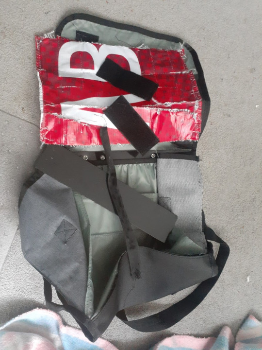
and I intend to sew a new piece from my dog's feed bag on in its place. I'm hoping it's not a difficult replacement; anyone who can sew a rectangle could probably do it. Thus I've rescued at least one thing from the landfill. I also was able to add side panels to some underwear I bought that was too small, thus making them large enough to wear. They aren't pretty, but if you return clothes they basically get thrown out, so this way they can be used before that happens (and it's underwear, so it doesn't have to look pretty, it just needs to be functional).
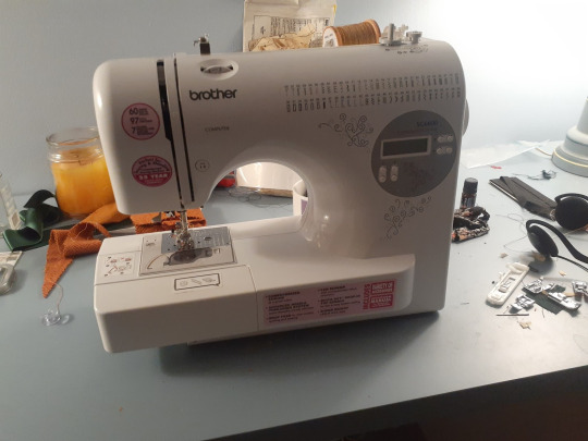
Machines can be expensive or they can be cheap, depending on what you want. My new Brother machine that I got from Sears back in 2017 cost me probably $150, and it works well enough for most things. It's also pretty light and portable.
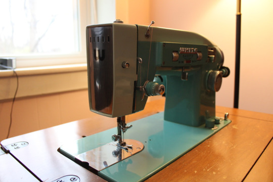
You can also get fully functional older machines via Facebook Marketplace. My machine Pamela cost me $85, and she works great, though she is NOT portable and weighs like 45 lbs lol. But she'll sew through anything.
A lot of older machines you can get for $50-$100, and honestly even if they just have a straight stitch, that works for 85% of garment construction applications and nearly 100% of all touch-up applications.
Anyway, while I've been loving sewing clothes, I don't think you should do it unless you're passionate about it. But I DO think everyone should know how to sew and have a machine around for those times you need it. Hand sewing is fine sometimes, but other times a sewing machine can turn an 30 minutes-long frustrating hand sewing job into a 30 second machine job.
#sewing#sustainability#i use my machines so much for things outside of making clothes#everyone should have one
62 notes
·
View notes
Note
I'm a trans man who can't transition medically. It's a long complicated explanation but I basically can't do HRT and can't have gender affirming surgeries for any of the foreseeable future. Binders and masculine clothes are the only gender affirming things I have physically. I'm really struggling with this right now, and I need so badly to have the male body I've always wanted.
So the reason I'm sending this is to ask you is so I can know something. Despite my curves and feminine face with only a binder to make me feel better, can I still be handsome? Can I still be a handsome man, despite not being able to change my body the way I want to?
Hello Anon, sorry to hear about that. Hopefully it works out for you eventually. In the meantime, I'll offer this advice, coming from someone who is married to a trans man, and grew up male for 26 years or so, and still "boymodes":
Men come in all sorts of shapes, sizes, and appearances. There's really short guys (Danny DeVito), tall guys (Dwayne the Rock is apparently 6 ft 5), fat guys, skinny guys, effeminate guys, super masc gym bro types, etc. Every single man, no matter their body, can be handsome. Handsomeness is something that comes from within, not from the exterior. A guy can hit the genetic lottery, and if he's a total ass and is insufferable, people will still find him unattractive. The same with men who aren't really the "ideal" man, as pushed by the media so much (much like you see with women having to be 5 ft 6, 36DD, curvy, etc, to be considered "pretty"), they can be considered incredibly handsome, if they're confident, and have a really good personality.
You can and will be handsome, no matter how you present, if you're a good person, and people can tell.
Personally, as a woman who is into men, I'd have absolutely no problems dating, or even marrying a man who is in your situation. So what if you're not on T and can only bind? I don't give a shit. I'll still treat you like the most handsome, important, and most masculine man I've ever met. If you're a good person, and you radiate confidence, that's what's handsome. You don't need to be covered in body hair, with a square jawline, rectangle body shape, beard, and be able to bench 225 lbs to be considered handsome.
Handsomeness is something that you do, not something that you are.
18 notes
·
View notes
Note
hi i just discovered your blog and i LOVE your art. can you do a tutorial on how you do your pop rocks colors? im OBSESSED with it.
(totally cool if not, no pressure! :] )
this is generally what i do , and it's rough since i rushed it , but this is generally how it goes
this is a normal sketch
messy lineart done with a deep blue hue
colors !!! with basic shadows included . shadows aren't done with multiply or any of that , i just make the color a lil more saturated and move the hue
on an (unclipped) layer on top of the lineart layer , i just color my lineart . very loosely . this whole style is loose most of the time . i also add highlights by lightening the base color and moving the hue in the direction that feels lighter . additionally , i outline my shadows with a slightly darker hue bc it looks cool
(on the same layer as step 4) this is where i go Nuts . the lightest colors of the highlights are always pure yellow and teal , as they're naturally lighter than the other colors , and the secondary highlights are usually a bit more saturated and are blue green and yellow green . for other colors that aren't highlights , i tend to mostly go over the shadows (and the shadow outlines we added in step 4) by picking a color i'm gonna be going over and shifting the hue until it's a similar value/until it doesn't seem lighter or darker to the color i picked . i usually stick to purples , pinks , and blues for this
other things to note:
i tend to stay away from pure red and pure green
i use firealpaca's marker brush , which is like your standard pen brush but it's shaped like a rectangle
i don't think too hard about where i'm placing colors . if i pick a new color in step 5 i'll just put it wherever looks good . don't think about it too hard
unless i'm trying to be cleaner with this , my stabilizer is usually pretty low . i have it set to 10 on firealpaca- for reference , my sketching stabilizer is around 5 (side note: i should also mention that comparing to a lot of my artist friends , i just have my stabilizer really low all the time . my lineart setting is usually like 15 and firealpaca can go up to 40)
^^ i should also mention that stabilizer levels are different between programs just go with what feels right for you
my colors here are always very saturated . they're always either tints or shades , but never tones . mostly tints
^^ i do make exceptions to this if i'm going for a less saturated look (like my gumigoo drawing)
#please ask me any questions you may have KJHDFKGJSFHDK i know i can be confusing at times#long post#bright colors cw#tutorial#kinda#anonymous#asked box#lightly salted art
30 notes
·
View notes
Text
wait fuck do i say oh my god or oh my gods now??? like yeah as a catholic you aren't supposed to say "oh my God" because that's using capital g God's name in vain but in my head i got around that because god ≠ God because god doesn't have that capital g and thus -> not referring to capital g God and using his name in vain. but since i'm polytheist now does that mean it'd be "oh my gods" instead?
and wait is god supposed to be capitalized in regards to other deities? like, when you're calling a deity a god of something. is gods supposed to be capitalized? because in my head god is what God is; God is his name, and what God is is god because. oh my god bflre it was God is god because there's only one, and since he's the only of his kind, what his "species" is called is just his name. like God is a being and god is the genre of being he is, and that genre of being is called god because there's just the one capital g God. but. i don't believe it's only capital g God now like i believe these other guys exist too. so i can't say that. all of the above is probably heavily inaccurate because i was raised catholic and when u're raised catholic there's just some things u never rlly actually look into because things just Are The Way They Are and for smaller stuff like that u kinda just use what u know.
i also realize what i said looks like it contradicts my initial thing abt god ≠ God so i have to explain even more. and what it boils down to is that god ≠ god. SO BASICALLY. the being God is, god, equals deity. god = deity. with oh my god though, you can't replace god with deity. like, oh my deity. nobody says that. god ≠ deity. it's like,,, two separate things. if god¹ ≠ deity, and god² = deity, then god¹ ≠ god². it's not quite a case of a word having two definitions, because the "god" in "oh my god¹" carries the same definition as god². they're just used in different ways which causes them to have different meanings. that sounds a bit contradictory but i think the point got across.
and wait now my brain has connected the dots on if god should be capitalized w other deities. it's a third god word. god¹ ≠ god² ≠ god³. because when a deity is being called a god of something it's a TITLE and god¹ and god² aren't used as titles. god² = deity = god³, but god² ≠ title while god³ = deity = title (because a god can be called "deity of..." instead). so god³ = God but also God ≠ God. if name ≠ title, and God¹ = name; God² = title, then God¹ ≠ God². i could say like — oh my god, that's a god, it's God, God of Everything — and all four instances of the word mean something different. if it's still hard to differentiate: oh my god¹, that's a god², it's God¹, God² of Everything. (ignore the god of everything part i'm still trying to work out what my religion is and how my belief in capital g God fits in with my belief in other gods, because i've been p sure that means im not christian/catholic anymore. but yea i just kinda wanted to make that example to get the point across).
SO TO RECAP:
God¹ = name
God² = title
if name ≠ title, then God¹ ≠ God²
god¹ = god used in "oh my god" = word
god² = deity = being
if word ≠ being, then god¹ ≠ deity; god¹ ≠ god²
if name ≠ word, then God¹ ≠ god¹; if title ≠ word, then God² ≠ god¹
God¹ is a god², or a being, but all god²s are not God¹; Apollo is a god², and Khonsu is also a god², but both of them aren't God¹, like how Khonsu and Apollo aren't each other, because all of them are different beings (aka god²s) and have different names.
-> like how all squares are rectangles but not all rectangles are squares. in this metaphor god²s are rectangles and God¹ is a square, which is also a rectangle. it might get the slightest bit convoluted to ppl not familiar with christianity once the Holy Trinity is thrown into the mix but meh that isn't what this post is about; it's abt the word god and capital g God whose name is the same as his and other deities' genre of being, gods, and his name is also the same as a title other gods are given, God. i am so sorry to anyone who might be getting a headache.
but yeah context/placement and/or capitalization make a difference in the meaning.
i feel obligated to say i am not a linguist or theologist at all i'm just some lesbian who was raised roman catholic, had a crisis, and is now polytheist. i have no clue if any of this has any basis in study or something it's just me and my funky ass brain over here
......how did i manage to make my small crisis of if i'm supposed to say "oh my gods" instead of "oh my god" into a whole ass linguistics post. how do i even TAG this. I STILL DON'T EVEN KNOW IF IT'S SUPPOSED TO BE OH MY GOD OR OH MY GODS... i was just gonna end the post after the first paragraph but right before i hit post the other thought occurred to me and things spiraled from there. i am a FOOL.
#none of this even helps me#actually no the epiphany i had with God¹ ≠ God² was actually rlly good#linguistics#i guess??????#polytheism#paganism#christianity#catholiscism#god#christian god#genuinely no fucking clue how to tag this#english#english language#words#grammar#language#i still acc wanna know if its oh my god or oh my gods tho#polytheist#langblr#when i made this blog i was thinking i was gonna be talking abt which deities i was gonna be looking into#so far instead i have that post of rhe belief system 5 yo me made up and this post abt capital g God and the word god#which i have no clue if any of what i just said has any basis in linguistics its just me and my funky ass brain over here#pagan#tagging a lot for exposure because i rlly do want answers on that omg/plural omg question#hellenic polytheism#eclectic polytheism#roman polytheism#pagan polytheism#kemetic polytheism#wiz wanders
7 notes
·
View notes
Note
Do you have any tips on how to draw different poses? Any kind of movement just fucks me up so bad 😭😭
hoo boy poses! an eternally difficult frustrating teeth clenching jaw aching part of drawing 🤩 JK but i def get where you are coming from. i was trying to think of the best way to reply to this and just ended up making a whole step by step of my process LOL
BEFORE WE BEGIN THOUGH i should mention that i am NOT a professional, nor have i learned these techniques anywhere other than the internet and so there's obviously room for improvement and this is not the end-all-be-all, just how i personally draw poses ATM.
now with that out of the way! keep reading for my tutorial on posing :D
i figured the best way to show this would be to take one of my old drawings and repurpose it. so:
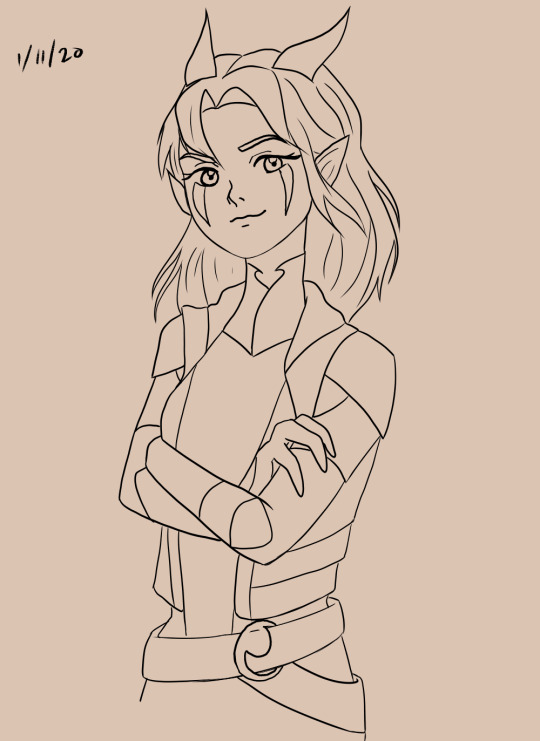
rayla. january 11 2020 rayla. she looks a lil smug maybe? a lil confident? her arms are crossed and her head is kinda tilted and her expression seems that way, but all in all it's kinda grey. this is the first thing you should do when making a pose for your character:
what is your character feeling?
define it clearly. are they angry? close their pose up, cross their arms. happy? open it up, give them big gestures. lazy or tired? slouching, etc. posing is pretty much just body language so figure out what you want your character to say when they aren't speaking.
now i'll just show what the base sketch for this drawing looks like:
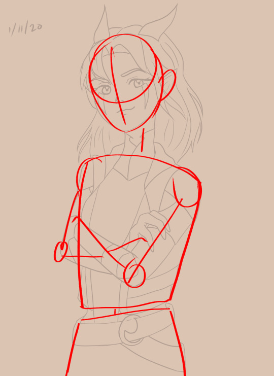
that's fine and all, the building blocks are there, but now i'm gonna redraw it and show what i would do differently now:
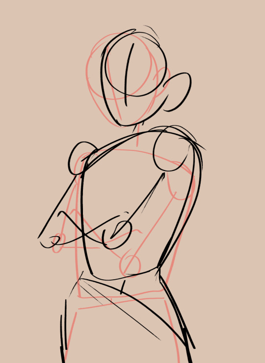
what's different about this sketch from the first one? three main things which i will break down!
The Lines
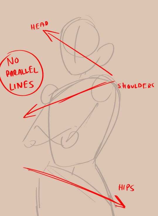
when i say "the lines", i mean the horizontal lines of the body if that makes sense? i'm sure there's an actual term or something, but basically, the parts of your body that can tilt. don't make these parallel! that can end up making the character look unbalanced and unnatural, or stiff if the lines are just flat. in the 2020 sketch, they aren't parallel, but they aren't exaggerated either. the more you exaggerate the differences in your posing, the more dynamic it will look. so in this sketch, i've exaggerated them more. gotta make rayla look real cocky yk
The Blobs

when i used to sketch bases for my characters, it would be a bunch of boxes and rectangles connected by sticks. i stopped doing that and it helped. human bodies are soft and squishy and curvy, we aren't robots with metal edges. drawing the base shapes as blobs personally helps me with getting rid of stiffness in the pose. lots of ppl make the boxy method work though, so if that's what you wanna do, by all means.
another thing i noted is "forget about the limbs". limbs are basically just branches, so if you get caught up in drawing them before their foundation (torso + lower half) is down, it could look wonky. get the basis down first, and then go on with the joints and limbs.
The Line (Singular)
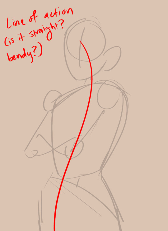
AKA the line of action, which is a very popular term + method for posing. this is basically a line that runs down the spine, and the more bendy/curvy it is, the more dynamic your pose will look. tbh in the sketch i did right now it's not very action-y, but rayla is also just standing there, so if you want to do a fighting pose or something similar make sure the line of action is hella curved. even for stationary poses though, a little curve is helpful.
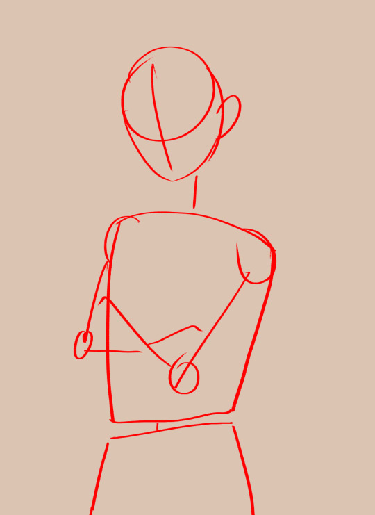
so! with these things in mind, i redid (extremely very roughly lol) the drawing. let's see the difference:
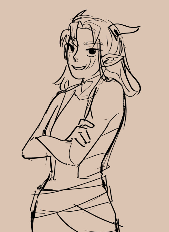
eyy hows that? she looks a helluva lot more arrogant! lol jk. but we can definitely get a better grasp of her character from the first image than the second. ofc there are other factors at play here like line weight and expression, but nevertheless, a few small tweaks go a long way.
anyways this got kinda long but i hope i could be of help!
139 notes
·
View notes
Text
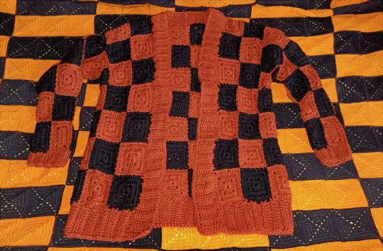
Idiot's first crochet cardigan made in less than two weeks, let's go
I was going to a Spoopy Convention where I wanted to wear something Spoopy. And I had wanted to make a granny square cardigan for a long ass time, AND I wanted to have a black-and-orange Halloween-y piece of clothing. All these things combined lead me to making this cardigan in less than two weeks (just barely in time for the convention)
Because I was bullshitting this together I figured the best way for me to go would be to just start making granny squares and sew them together as I go so I'd be able to see and measure how big it was getting while working on it. And honestly, this worked just fine for me. I know a lot of people tend to make the granny square sweaters and cardigans in panels (front, back, sleeves etc), but like... I make my blankets by sewing them together corner to corner, and I didn't see any reason why I couldn't do that with the torso piece. So for my fit I figured out 7 squares would be plenty tall enough, left an empty spot for the arm and continued on towards the back.

It honestly went really smoothly and soon enough I had the whole piece done! And then I realized I had made a grave error. I did not make the back wide enough. If I went and sewed the front of the cardigan to the back, I wouldn't have any room for my neck.
Fortunately this was actually really easy to fix. I also noticed the arm holes were MUCH bigger than they actually needed to be, so I just added six more granny squares to make the back wider. Crisis averted.
Aaand with that, I sewed the front to the back on the top and did some basic ribbing on the bottom and around the front. Now it did take me a little while to figure out how I wanted to do the sleeves... I don't like super pillowy sleeves, so I wanted to make sure they were more fitted. But I wasn't sure how to do that. I did some weird experimentation but ended up realizing that if I added stitches and decreased stitches on some of the granny squares, and made some rectangles, I could make the sleeves slim down!
(To be exact: the granny squares I made for this cardigan were 3 rounds, so 11x11 stitches. On the sleeves, from left to right, the stitch counts are 15 on the outer row (where it gets sewn to the body), 11 stitches between the first and second row, 9 stitches on second and third and 7 stitches on third and fourth. The fourth and fifth rows were 7x11 stitch granny rectangles (two rounds instead of three)) (And yes, doing this does mean that the granny squares on the sleeves that connect to the torso don't actually match in size, so the checker pattern doesn't transition smootly. Personally, I just believed it'd be easier for me to do this instead of trying to figure out how to make the decreases if the sleeves were 5x5 rows instead of 4x5)
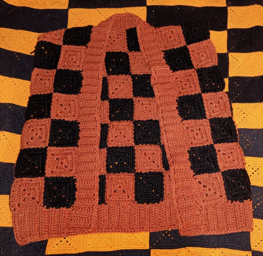
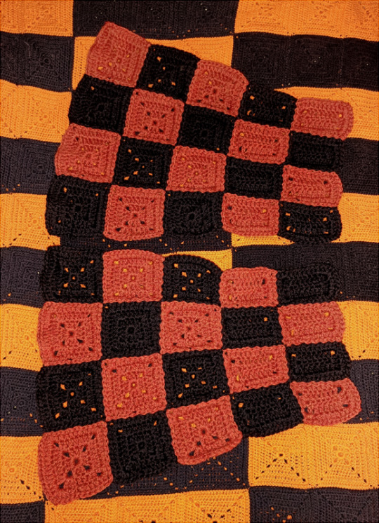
Forgot to take a separate photo but I did also make two extra rectangles that I put under the arm holes, just to make them smaller (by just half a granny square)
Now I will admit, I did make one big fuck up. You see, I thought I was being smart by making the checker pattern different on the two sleeves, thinking to myself I was making sure on the front of the cardigan the checker board pattern would continue uninterrupted (unlike on the back, where the orange and black squares go right side by side by other orange and black squares) But I forgot to take into account how the squares on the front aren't mirrored. So I was going to end up with a black square next to a black square and an orange next to an orange. On the front. That could not possibly do, so I ended up having to detach one of the four rows on the sleeves and moving it to the other end of the sleeve, just to fix that. All because I wanted to make sure I was sewing things on symmetrically on both sides. But once that was done, I sewed the sleeves on and did the ribbing on them.
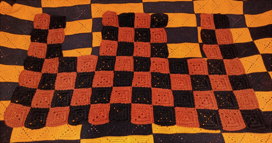
Anyway, couldn't get a good photo of the cardigan pre-blocking because Honey had hogged my whole bed when I went to take photos (I could not possibly interrupt her nap time), and I was in a hurry to block the fucker because there wasn't much drying time left (I finished the sweater on like the 23rd? And convention was on the 26th. Mind you, I was worried if I'd have to frog and redo something after blocking, and this fucker IS wool)
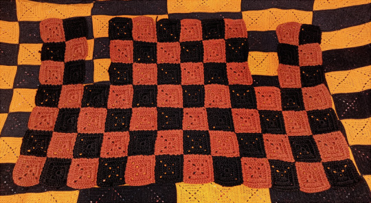
So you get a photo of the cardigan post-blocking, but also these try-ons pre- and post-blocking respectively. Yeah it stretched out a bit, but it's also so drapey now (where as before it was super stiff)
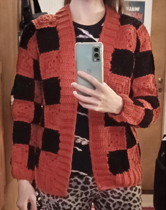
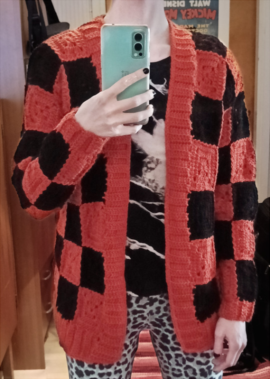
Also, yes, I did go and add some basic black buttons on there (I did make button holes in the ribbing though they're not noticable), but honestly the buttons aren't functional and I couldn't be bothered to take any more photos just for some buttons
So, there it is. Idiot's first crochet cardigan. It actually turned out pretty good! I'm happy with it!
Honestly, my only complaint about it is that... so I was looking for the cheapest wool yarn I could order fast to do this project very last minute, and what I landed on was Drops Nepal. Cheap as hell, wool/alpaca mix, not superwash, and had a good range of colors. When I ordered this yarn, the product photo for the orange was a lot more... middle-ground orange instead of this very red-orange. And I'm slightly annoyed as hell about that. Like, I don't hate the color at all, it does still read as Halloween-y, (and I take comfort in it NOT being some ochre/muted yellow-orange instead) but... it's so much more red than I wanted.... That just annoys me...
But, yeah, Drops Nepal. 65% wool, 35% alpaca, 75m(/82 yards) in 50 grams, reccomended hook size 5 mm. I sewed everything together with black yarn while the ribbing was all done in orange, and I was able to get about 8 granny squares per ball. The cardigan required 120 granny squares but 18 of those were indeed rectangles and 24 had some other fuckery with stitch increases/decreases. I used 10 balls of orange (color 2920 (dyelot 357320)) and 8 balls of black (color 8903 (483356)) with leftover from both colors. Did not check how much I had leftover because I went and made a shitty little knitted beanie with it lmao
That's about it. I now have a granny cardigan, it's really nice and I really like it (despite the color). I am pleased.
#Moon posting#Yarncraft Diary#Yarnblr#Crochetblr#Crochet#Getting the color of the yarn to come out right in the photos was so fucking hard man... The editing I had to do... Bleh#Pretty sure I still wasn't able to get the color to look right#So you'll just have to take my word for it when I say ''in person it looks borderline red''#Did not proofread we die like men
9 notes
·
View notes
Text
something something a mother's day fic set after Threnody. it has been at least 3 mother's days now. at this rate my gf's cats will call me mother sooner than this gets finished, so
"You looked troubled."
Seras blinked. Her master was in front of her with his torso sticking out of the ceiling.
"Eh." She did not reply any further than that.
"You know, I almost miss the high-pitched, annoying police girl. At least then you were respectful."
"I'm always respectful, Master," Seras said, wide-eyed and innocent.
Alucard disappeared and reappeared in the hall, standing properly this time. He looked bored, which explained his nosiness.
"Perhaps I may be able to dispense advice."
Yeah, sure. Dracula. Vlad the Impaler. Giving her sound advice. Great. She would have better luck summoning Walter on an ouija board.
"Has anyone told you how loud your thoughts are?"
Her eyes twitched. Alucard was trying, in his own dysfunctional way, to make up for his thirty-year absence. Which was all fine and dandy, but as usual he had the worst timing. "I'm sorry, Master. It's just something to do with Integra."
"Oh?" There was a distinct inflection.
Seras prided herself on not blushing. Ever since the day in which the office was not wrecked, the relationship between her two masters had improved. Too improved. Actually, even Pip was starting to avoid the walls near Integra's bedroom!
"Yes, well, it's Mother's Day soon."
Alucard stared, uncomprehending.
"And I want to get her a present, is all. The thing is, I've exhausted my options—"
"You want to get Integra a Mother's Day gift," he deadpanned.
"Yes. I do every year."
"Do you see Integra as a mother figure?"
"Yes? Oh! I know it's strange, since we're only three years apart, but that's easy to forget when she has those wrinkles—which are lovely on her," Seras added hastily, misreading Alucard's expression. "I know I tease her! But I told her, Master, go and apply those creams I got you for your fiftieth birthday if you're really that unhappy—"
"Then, pray tell," Alucard drew out, "what does that make me?"
Seras blinked again. Then it dawned on her.
"O-oh." She fidgeted. "I guess that would make you a, um."
There was a pause.
"To be honest, Master, you're, er, you've been away for so long—no offense! It's not quite—how should I say—" Seras coughed. "Um. I could—oh! Wait! Let me show you something."
She whipped out from her pocket a black rectangle.
"This is the modern phone, Master!" Seras explained quickly. "A smartphone! It can take calls, pictures, videos, go on the internet—do everything, basically. So, er, what I'm trying to show you is...there!" She swiped several times on the screen and then held it up.
Alucard stilled.
"It's Master Integra's old photos! There aren't a lot, she always gets so snippy when I try to take them..."
The photo on display was taken a few summers ago. It was a side profile of Integra, capturing a moment seconds before she had fully turned and swatted at the phone. They had taken a rare day off at the beach. She was gazing off into the ocean distance, and perhaps because of that, her one eye was a deeper blue, a depth that went to the far reaches of her thoughts.
"I almost burned that day," Seras said casually, next to Alucard's stock-stillness. "You can't tell, but she has on a blue sundress. She looked so pretty in it! I had to convince her not to go back and change, what was all that sun lotion I'd put on her for, then? And…" She trailed off. "Um, you need to use your bare finger, Master."
Alucard was attempting to copy what Seras had done and swipe for more pictures. Upon her input his gloves vanished. Seras did not miss how they had been blank.
Her eyes curved. You really are… "Wait."
She jumped and tugged at his sleeve as he began to walk away. "Master, you can't take it, that's my private phone!"
"Don't you think privacy is redundant when I can read your thoughts?"
"What? What does that even--that just means you shouldn't be doing either! Give it back! I--I need that to message Pip--"
"Your goose boy? Don't you two talk enough in your heads?"
"Never you mind," Seras screeched, and ripped the phone from his grasp. "Master, I promise I'll get you your own, just give me an hour!"
Alucard looked at her owlishly. "I want the photos."
"With the photos! God!" Seras darted into a wall to escape.
#Hellsing#hellsing fanfiction#this has been in my drafts for so long i get confused if i ever posted it or not#if i have pls ignore#seras victoria#Alucard#let's get my Hellsing writing mode up and running#alutegra
66 notes
·
View notes
Note
Hi! I was wondering if you were willing to share any tips/advice when it came to your art processes? Whether it be lineart or composition or anything else really! I’m obsessed with how good your art is dhdhdhd Thank you for your time!
HAKJSD THANK U!! i kinda do most things by vibe so idk how coherent this is gonna be but i'll try my best ajhsdha (these also aren't gonna be the traditional rule-of-thirds/color-theory type of advice because frankly i don't think i'm qualified to give advice on that stuff LMAO this is just what's sitting in the back of my head when i draw)
i'm probably not the best to ask about composition because 99% of the time i'll just be flipping through concepts in my head like a slideshow instead of actually thumbnailing things (which you should absolutely do to help you visualize things better if you're unable to in your head); i literally just operate on a scale of "i think it would look cool if i did this" either based on symbolism (ephemerweek 1 vs 7, for example, where it looks like ephemer is reaching out to bring player/the viewer towards the light behind him vs ephemer facing the light on his own without looking back — in both of these i wanted it to look like he was being blotted out by a harsh light, like when you try to hold an object up to the sun and it becomes impossible to see) or a neat concept (i.e using transparency to make it look like a character is coming through the screen, or something simpler like in my last skuld post where i vaguely wanted her hair to make the shape of a crescent). why am i already rambling. BASICALLY i encourage you to think about what exactly you wanna portray and the methods you can use to reinforce your idea; try to play with the medium if you can! think of themes! be dramatic!!
don't be afraid to mix up your lines when it comes to lineart! you can vary your lines depending on the piece to match the kind of tone you wanna use; sharp and bold for something that's energetic and flashy and colorful, light and thin for something that's melancholic, etc
doing a basic, quick skeleton sketch first to get an idea of the pose you want will save you so much time and headache good lord. i often still find myself getting carried away and not doing the basic sketch first because i wanna hurry up and get to the Fun stuff (especially if i have no specific plans and just wanna doodle), but having it genuinely makes things so much easier and also helps to avoid ending up with stiff poses; personally i like using planes/rectangles more than stick figures since it helps more with the actual figure (and use a box instead of a circle for the head, it's easier to visualize the exact angle you want that way). be better than me and remember to do the basic sketch
this is probably a personal thing but honestly there is nothing more important than having satisfying Shapes. i don't even know how to explain this but it's like . have you ever looked at how a line curves and thought "fuck that's a nice line, i like that line"? i sound insane i think i'll just put some examples under a readmore but i guess the gist is visual appeal?? like if something felt satisfying to draw, whether that's a curl in the hair or a curve in the silhouette or how clothing wrinkles flow, then chances are it'll be satisfying to look at, too (and on the other hand maybe you could take advantage of this to go the opposite direction to make something feel more unsettling?)
be aware of where the viewer's eye will tend to go first and try your best to do that part well; unless your composition is specifically pointing to a certain place or isn't character-focused, it'll likely be the character's expression/face
learn how to use gradient maps, tone curves, and color balance layers they will save your life when it comes to coloring
i think i'm running out of tips now but if you use clip studio paint, use this if you need help on figuring out perspective for objects or backgrounds
that's all i can think of atm HAKSJDHK hopefully some of this actually made sense !!
and here's some examples of lines or smth that i like that will hopefully make me look less insane. triangles are the best shape btw
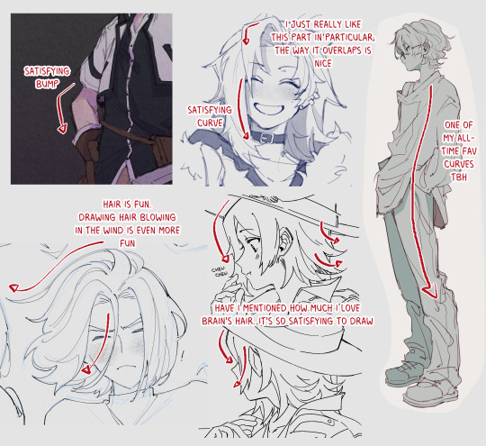
does any of this make sense. is this thing on
#i had another thing i was gonna say down here bc it wasnt really a tip but its been two hours and idr what it was .#anyway the shapes are very important imo#i think it works better w cartoonish styles (as exaggeration tends to do) but idk the lines just gotta be satisfying !!#asks
2 notes
·
View notes
Note
hi, your edit for wandee goodday is cool https://www.tumblr.com/spicyvampire/750559639385587712?source=share
would you please make a tutorials for those gifs?
Hi anon sorry for the long wait for this, unfortunately the more I looked at my psds for this gifset the more things I saw that just aren't like basic gifing knowledge. I simply did not know where to start. Anyways I tried to go and find the tutorials that helped me when I was just learning those techniques or wtv inspired me to use them instead, because they are all very details and explain way better than I could, along the way I'll give you a few tips to make your life easier
My very first tip would be to not do all those things at the same time, learn one technique at a time please, for your own sanity
Everything else under keep reading
STEP 0 : basic gifs
You need to have basic gifmaking knowledge, if you don't here's a good tutorial that pretty much touch everything
Gifmaking for beginners by hayaosmiyazaki
gif sizes and sharpening for tumblr by anya-chalotra
Here's a few tips for when you are about to start :
You need to have an idea of what you want to do before you start cutting anything aka
what's the theme of the gifset : that will help you separate how many concepts you gonna have because of that theme
once you have the concept : how many gifs are necessary to get the concept across and what lines from the show are you gonna use, how would you write those lines and your own comments to be as clear as possible (I advises test them by sending them to friends when you are done before publishing)
what is the layout of each gif gonna look like, do you need to search (pixabay or vectorstock) for some shapes in png
Once you have like most of that, you can start choosing scenes and cutting but not before because trust me you gonna over work if you don't do this
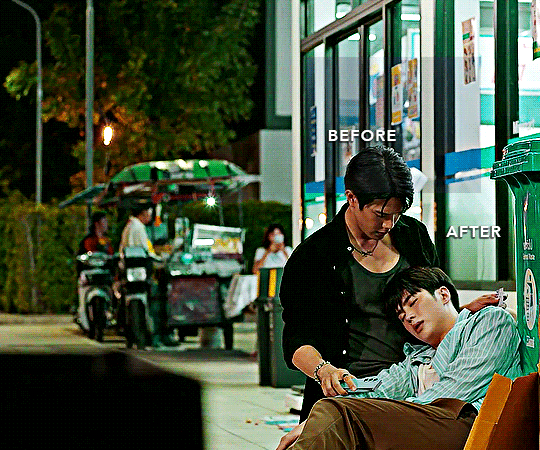
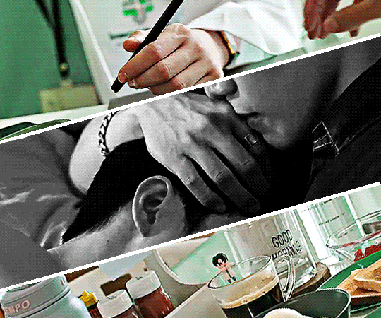
Example : So my theme was Yak being a green flag, I have 6 big gifs and 9 concepts, I fit a lot of those concepts together, but in total I have base 23 gifs
It is important that every gifs of a concept that is gonna end on the same background gif have the same amount of frames as the big gif
Make, color and save each gifs individually, so if you fuck up, you can always just go get your base gif again, name them in relationship of the final gif
Example : the final gif is named green1 so every gif in there are named green1,1 - green1,2 - green1,3
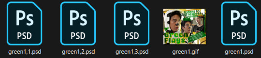
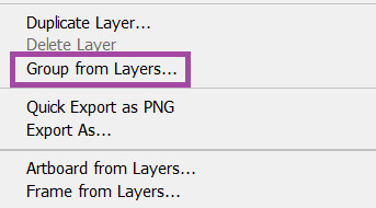
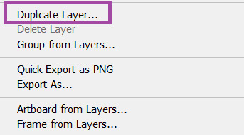
Please for the love of god, name and/or give numbers to everything and make groups in the PSD! You won't be able to find yourself in this mess if you don't do this : To make groups you can either, select what you want to group -> CTRL + G or select what you want to group -> right click -> Group from layers
You need to be able to manipulate colors, to enhance them, change them and neutralize them
becca’s mega coloring tutorial by nataliescatorccio
This was done with Step 4 of Becca's tutorial, because the colors of the scene was easy to manipulate
the beginner's guide to channel mixer by audrey-plaza
gradient map + gradient fill by ruanbaijie
This was done by making the gif as neutral as possible with channel mixer and then putting a gradient fill on because I was lazy, gradient fill is a mix of step 3 of becca's tutorial and hanyi's gradient fill, I usually do that when I can't just manipulate the colors the gif already has easily
STEP 2 : clipping mask
The easiest way to me to have a bunch of other gifs on a bigger gif in any kinda shapes to me is clipping
clipping mask + layer mask by usergif
Tips :
Start by making your shape on the background gif to know so you can play with the layout of everything and see what looks good before adding any gif
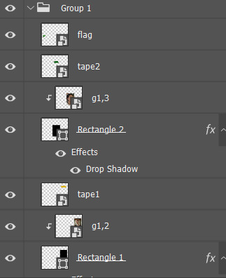
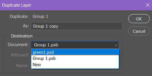
When you make shapes (in my case a rectangle) in photoshop it tells you the height and the width of the shape, so when you are gonna clip your gif to that shape, I suggest cropping it in your base gif around like 30px more than what those are before you duplicate it in your big gif, that helps to have room to move your duplicated gif around when you are done clipping it to the shape
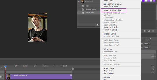
When you are done cropping the gif you gonna clip into the shape, convert to smart -> dupplicate in your big gif -> clip to shape
Example : the rectangle is around 150px width and 240px (or something), my duplicated gif was cut 180px 270px (or something) just so i can be free to move it when it's clipped

The yellow and green sticking out of the shapes are drop shadow added for drama and the tape is literally just searching for a tape png I put on it

STEP 3 : layout from scratch
The 3rd gif layout was made from scratch because I only had 3 gifs for that idea, and also I didn't want to look like the others so the gifset wouldn't be too one tone because I'm genuinely mentally ill
layouts from scratch by eddiediaaz
tutorial: using layer masks to format multiple gifs by yuutta
I used the 2nd tutorial like word of word and it gave me this
STEP 4 : fonts and other minor stuff
gradient text by anya-chalotra
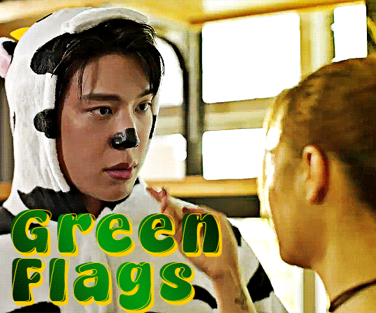
I'm only gonna explain the GREEN FLAGS text because all the other colored texts are just a variation of that without the outline and with a different font, Gradient text tutorial says it all, here are my settings for this gifset
Kate's quick textstyles tutorial by aubrey-plaza
I use the technique on Gif 3 from step 4 and on (minus the outer glow) of Kate's tutorial, and made the stroke layer italic to make the outline of GREEN FLAGS
In the end, the layers are stacked like this
Now for the rest there isn't really any tutorial but here goes nothing
For the white text, I just put enough drop shadow for everything to be easy enough to read, for that I play with the opacity of the layer
And the little white lines are made with the line tool, to make the line continues just hold shift while you are making them
I hope all of this made sense, my biggest tip for all of this is literally to play with every setting until you find something your eyes tell you looks good, If you need more advice on something in particular feel free to send another ask
4 notes
·
View notes
Text
It's Showtime! - September 2024 Devlog
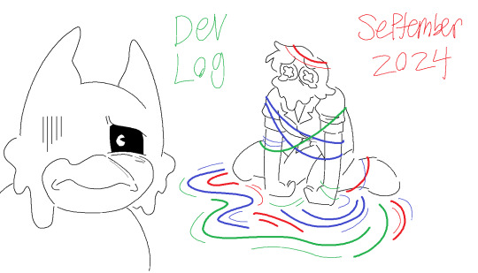
Howdy! Cobalt here, this month was a very busy month for me irl. I've been working on stuff like an Ebay I run with my mom, cleaning up our side yard and generally trying to give our house a deep clean since we want to be able to babysit kids for a source of income. That and a lot of driving practice since hopefully soon, I'll be taking my test. So I haven't been focused on game development, however I did get a ton done!
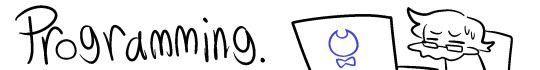
I've both added quite a few important scripts and cleaned up a few existing ones, to try and keep this simple here's a list:
Changed up how the ProgressManager keeps track of which character you are playing as. Mostly so that it can more accurately detect who you should be playing as currently, but also so I can customize freely the possible options of who you're playing as. With this new system it's very easy to add which points in the current level and/or chapter your character is changing.
ProgressManager script is no longer responsible for placing the right items in your inventory according to who you are playing as, that has been moved to be the function of the PauseManager.
Made a script for checking where the player is looking, I can change how close or far it detects the players gaze as well, which is gonna be super helpful for various things. There is another script called VisionManager that turns that one on and off, to make sure it's not running when not necessary.
Made a script for playing audio upon being interacted with and one for playing audio upon being looked at. These have been added to a few objects already and so Henry now has a few placeholder voice lines implemented in the game. With this I also added a function to the ProgressManager to keep track of which voice lines have been played and to make sure the same voice line isn't activated twice.
Tapes are now almost fully implemented programming wise. Upon picking one up, it plays the tape, shows you the name and description and the audioclip is stored in your tape menu. You can't play them from the menu yet and there's a few other things I'd love to implement, but for now I'm very happy to say they're working well.
I've rewritten how both objects that do something upon being interacted with and objects that do something upon being seen work. This method has removed the need for two scripts that made everything more complicated than it had to be and now if I want to add the ability to be interacted with, all I need is to add a word to it's inherited methods and a line of code saying what it does when it's interacted with/in sight. This makes the code much more readable and more simple.
Made the ProgressManager easier to access across different scripts due to how often it has to be accessed. Once again this makes the code more simple and easy to read.
simple door function for closing and opening a door, the animations are acting strangely but currently it is nothing more than a big placeholder rectangle so it works for now.
There's now an AudioManager script that makes sure voice lines and tapes won't play at the same time, it just makes all the objects that would normally play audio pause to let the current audio clip finish. So no overlapping voice lines or Henry speaking over the tapes.
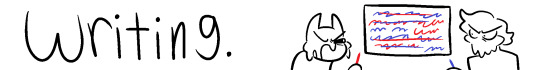
Not a lot here to note honestly, just more drafts of important dialogue to put together and more progress on getting chapter 1 fully written. I've been focused on 3D art and programming way more than writing this month. I'm sure I'll get back to it next month.
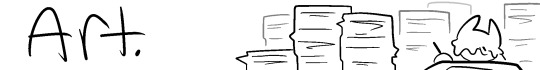
A lot of the basic more generic 3D assets are being made currently, here's how a few of them for the first floor are looking;
And here's some for the Music Department.
2D Wise mostly just more Character Designs have been done, hence why most of these assets aren't textured. But soon the studio should be looking a lot more swell and full of props.
Made a really exciting development in terms of figuring out character rigging. Got in contact with someone who has a really swell system for 2D facial animation and if we can work together to figure it out, I'm sure soon I'll have some of the major characters first models done. I've told them a lot of features that would help me if they could figure them out and what I'd like the rig to be capable of and they said they are fairly sure it should be possible and they'd look into it. They have been very kind and helpful for this entire project and I would love if any of you gave them support on their YT Channel and the videos showing off this awesome rig. If they could make a general rig for this sort of thing I'm sure it'd be super helpful to so so many people who make stylized characters in Blender for games. https://youtu.be/0hcZfr4f5cA?si=gb6VYNXi7G12a5iI https://www.youtube.com/watch?v=_knSIhLEGlw https://www.youtube.com/watch?v=D2rMoFWwYTc
For now, that's all, lots of exciting stuff going on! See you guys next month!
#it's showtime#not ask#Devlog#bendy and the dark revival#bendy and the ink machine#batim#batdr#Bendy Encore#Bendy fangame#queer horror#indie horror game#indie horror#mascot horror#mod whirly
6 notes
·
View notes
Text
I do not as a rule read a lot of fanfic. This is partly because I don't get much time to read, period, and partly because I still have a bit of a cringe reaction to the whole concept, but also because I will get turned off a story quickly if the author gets something wrong either about a character (which I gather is common) or about the broader themes or point of the original story.
This is by way of saying that, now that I've thoroughly outed myself as an unironic fan of French children's animated superhero show Miraculous: Tales of Ladybug and Chat Noir, I want to do what I believe is the next required step on tumblr.com: complain about something the fandom gets wrong.
Fair warning: this is not a meta-post about fandom or fanfic generally, this is 100% me, a nominal adult, bitching about People Being Wrong About Miraculous On The Internet. You stand at the Cringe Event Horizon; read on at your own risk.
So: the central interpersonal tension that powers the show is the "love rectangle" between the leads, where Marinette loves Adrien and Chat Noir loves Ladybug but neither knows the other's secret identity. The obvious solution is absurdly simple: reveal their identities and collapse the quantum superposition of crushes.
A ton of fanfic about the show does exactly that: contrive some scenario where they accidentally discover who each other are, they kiss, they live happily ever after (plus or minus one maniacally obsessed supervillain). And I get why, I think -- the show absolutely looks like it's going to keep this will they/won't they tension going forever, since it's one of its two central narrative motors, and a whole ton of early episodes play with one of the two trying to get closer to the other, failing, and returning exactly to the status quo. Given that, it makes sense why fans would want to just write the goddamn resolution already; it isn't until S3 that the two start making any real progress towards being together.
But. The problem, on many levels, is that the show's writers are smarter than that. Like on the very basic one, the show makes clear from very early on that the old master who gave the heroes their powers explicitly forbade them from revealing their identities, because doing so would let Hawk Moth find and defeat them. And this isn't like an arbitrary concern: Hawk Moth's whole deal is corrupting random people and getting them to work for him, so if he ever happened to even accidentally akumatize someone who knows their identities, that's more or less the whole ballgame. If you're writing a story where Ladybug and Chat Noir learn who each other are but they haven't defeated Hawk Moth yet -- and there are a bunch of these -- you have missed something rather crucial about why they couldn't just do that already.
(The first half of S5 -- which to be fair only came out a year ago -- does a very clever thing where it systematically explores basically every possible workaround to this issue, considering every new power or possibility opened up by events from across the previous four seasons, and methodically rejects each one by showing how it wouldn't solve the actual central problem. I bring this up not to throw shade on any fanfic authors, most of whom were writing before S5 released, but to credit (again) the show's writers for the depth of their understanding of what makes the show tick.)
More fundamentally -- and this is an insight very much stolen from that CJ the X video -- on a character growth/emotional level, Marinette and Adrian aren't ready to be in a relationship yet. Like, sure, they will be perfect for each other, but (at least for most of the series to date) they aren't yet. Marinette starts out with an extremely adolescent crush on a literal fashion model, and Adrien at first is clearly much more in love with his unexpected new freedom as Chat Noir than anything specific about his new partner. They are, to put as blunt a point on it as the show itself repeatedly does, kids.
And, critically, the show understands that they both need to learn to accept themselves first. From an adult perspective it's just duh that you can't have a mature romantic relationship without a solid sense of self (and self-confidence), but that's not remotely obvious to kids at the age of the show's target audience and it's genuinely refreshing to see it acknowledge and reflect that obstacle. One of the few active benefits of the show's extremely episodic pacing is that the writers have time to show both protagonists' slow but genuine character growth, Marinette building up her confidence in her own abilities and decisions and Adrien forging an identity separate from his father's business asset, until when they finally start building something real together in the fifth season it feels genuinely earned.
This emotional arc, in other words, is baked into the show's structure from the very beginning. Fanfic that tries to shortcut this process has, again, fundamentally failed to understand the characters it's nominally telling a story about. Like, I get wanting to experience the emotional high of seeing your favorite characters get their happy ending, but -- the fact that they can't just get that is kind of central to their entire characterization! Are you even writing about the same characters at that point?
#miraculous ladybug#chat noir#children's media#fanfic#stupid petty bullshit#there is plenty of actually good stuff out there of course#but man it's frustrating when an otherwise good story ends with this shit#like it's an afterthought#anyway I'm done posting about this kids show now#we started watching Avatar with her yesterday and she immediately declared herself to be a firebender/waterbender combo#so that's off to a great start
7 notes
·
View notes
Text
If you haven't been "blessed" yet with iPhone 16 ads...oh man. Are you in for some shit!
First of all, all of them are 3 minutes long, and are mostly some guy just saying things in front of a spa...? And the things he is saying are a parody of absolutely everything wrong with modern tech, and the shitty techbro demand that we all integrate their lying, incoherent chat-bot code into every aspect of our lives (and pay them for it, of course).
This ad blitz is unreal. I can't imagine how much they paid for this. ALL of my at-work, unsubscribed YouTube Music ads were this, for 3 hours. All of them, 3 minutes long. It put that inexplicable Donald Duck Hot Ones mini-movie to shame, in both length and sheer infuriating pointlessness.
"If you are replying to a Stack message from your boss, this fucking phone can rephrase it so it has a more professional tone!"
Yes, because the thing the world needs most right now is a robot that helps the most helplessly stupid people imaginable not say "buttfucker" in a work email.
Most of us already have human brains that can do this, with very little effort. How is "we will help unqualified dipshits keep high-paying jobs they suck at" a feature?
Grammerly has already been selling this "feature" for awhile now, and it begged the same question when they started this: why is tech specifically helping awful people keep jobs they clearly aren't qualified for, because they lack any basic interest in being professional to coworkers?
Why would techbros think THAT is a good idea? One wonders!
Serious, find these ads and watch them. No one will ever be able to parody this moment in tech as well as what Apple just seriously produced.
Also, think about this: you know how autocorrect is annoying, and you kind of want to turn it off most of the time? (And you should. It makes you a better writer. Try it.)
Now imagine that every time you write a thing on your phone, the phone stops you from sending / posting it, and a confused algorithm based on 200+ years of stolen books rewrites it for you. And you have to look over that nonsense before you tell it no, stupid, I'm not Mary Shelley writing a thesis paper to submit to General Electric's President in 1972. Because that is exactly what this shit is going to do to you. All the time.
And you paid for this. Because they told you they were smashing this garbage into your camera rectangle, and you paid $1300 or more for it. Because...you want to impress terrible people?
I'm an Android guy, so I don't ever understand why people buy Apple's overpriced equivalents (they ARE built better and DO last longer. But unless you plan to keep this phone for 10 years, and you do not, it doesn't matter.)
You buy an iPhone 16, with integrated Apple Intelligence, to impress other (white) people at the chain bars you go to in your pressed khakis and boat shoes. Because there needs to be more unwitting victims of your 45 seconds of sex. But outside of that very specific usage case, you will come to hate what this device does to your daily phone experience.
...Unless of course you are the type of person who routinely sends texts to the office cleaning lady, rife with racist sexual harassment. In that very specific situation, this WILL improve your life.
And we as a society should really stand up against these kinds of people ruining absolutely everything for their very peculiar benefit.
Because most of us know how to think, and at a professional level, know how to turn that into formal writing. Elementary schools teach that. Even the bad ones. No one needs tech to do this for us. Except the terrible people trying to flog these unnecessary phones to other sad fucking losers.
2 notes
·
View notes