#I don't need windows game overlay
Text
I've tried to run BG2 again (I need to finish my modded playthrough) and my laptop is in such a bad state it prectically lags BG2. BG2, which could be run on a determined microwave, on a laptop that has 8GB of RAM! It is heavily used and it has a lot of apps, but I've uninstalled everything I didn't use and cleaned the registry awhile ago. I suspected the antivirus, but the system manager shows it actually doesn't consume a lot of resources. It's not the disk space, since it's got plenty. It turns out it uses 100% of its disk all the time, and the main culprits seems to be.... *drum roll* system and Windows telemetry service! I now have to spend the evening elbows deep in frankly confusing system settings to find a way to turn the telemetry service off, and it may or may not improve the situation.
Once I finish this playthough, I'm definitely switching the laptop to Unix.
#personal#you know I'm annoyed by the number of completely useless apps win10 runs in the background#I don't need 5 processes of edge I really don't!#I don't need windows game overlay#or a separate service to launch office in one-click#also kudos to the designers for splitying settings into 3 different apps!#I've disabled animations and everything and it didn't improve things at all unfortunately#I don't want to reinstall the system just yet bc mods are easily messed up during reinstalls#but I bet. that this dying laptop will suddenly run like gold on unix#my old work pc did and it was two times weaker than this one in every possible aspect#thankfully I have a better computer now but it still annoys me to have a laptop I just can't use bc it effectively boots for 15 minutes#and lags afterwards#I don't know if it's planned obsolence or something#but I put a lot of energy in the maintenance of this laptop and I'm losing patience#if it is planned obsolence#then... well. I'm not going to buy a newer presumably more resource intensive system#for a laptop that wheezes in effort under an older one#oh no#If they make their product unusable I'll just cease to use it#I've got another pc on windows anyway
10 notes
·
View notes
Text
umineko opening live reaction post
due to spoiler avoidance this is now only happening after i'm already like two thirds done with episode one BUT thanks to the magic of trusted followers giving me beautiful spoiler free links (everybody say thank you to @coolstuffiseverywhere) i can now Bear Witness:
immediately noticing from the first three seconds that this is NOT the same opening/song i'm used to skipping. umineko project starts with a shot of i think a record being played?? and then i don't know the rest
this is a very hype-building type song for sure lmao
hi beatrice

the music is very much giving getting turnt at the medieval fiefdom. i'm kind of living for it????

is this what the og version's backgrounds looked like? very dreamlike water painting quality to them

SHE!!!! SQUISHY MARIA!!!!! I HOPE YOU ARE DOING WELL AND ONLY GETTING GOOD THINGS IN THIS WORLD!!!
a shadow falling over maria....how prescient

squishy battler......nobody understands how badly i need to put this boy in a microwave
suuuuper interesting that our first glimpse of george is fogged-glasses Adultsona george before the mask lifts and we see a friendlier face

clock striking twelve + the overlay of the first twilight's sacrificial/freedom magic circle + natsuhi in the corner....much to consider
weird pulsating heartbeat effect over what i think is the ushiromiya eagle? the symbol as the rotten heart pumping the poisoned lifeblood throughout the story perhaps?
failsibling void....mimicking the dining room's seating hierarchy?
them!!!! shannon!!!!! kanon!!!!!!!! of course they're presented as part of the Sus People slideshow but that's okay because neither of them ever committed a single crime ever <3

the failsiblings have Become The Joker
more seriously thinking about the comedy mask presentation here....multiple lies and multiple farces define the ushiromiya siblings so this is extremely apt

kinzo => blood splatter => the epitaph (?) is a Very Leading sequence of images. encouraging certain audience associations from the very start.

the image effect here is really making the mansion's windows look like a stained glass relief. evocative of church imagery. thinking about this in correlation with the floating topic of christianity. of the recurring motif of faith and the demonic. of the gospel house. rokkenjima as a corrupt altar.
it would be false advertising to call you game "when they cry" and not include anyone crying in your opening
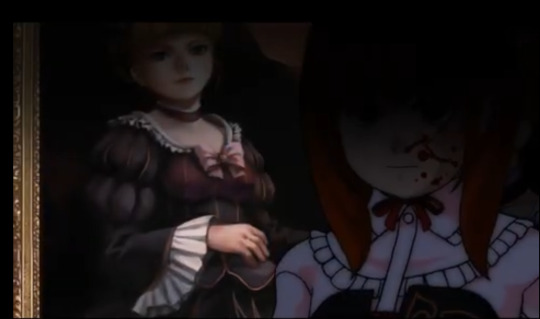
uhhhhh that's. that's. blood. on maria's sprite there. a bloody maria besides beatrice. symbolically a representation of maria's use as a pawn in the slaughter or foreshadowing some horrible thing that hasn't happened yet? hope it's the former because Maria Covered In Blood is incredibly something i don't need to think about lol.
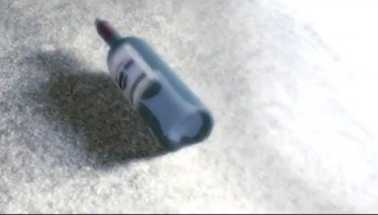
a.....bottle? wine bottle on the beach? with. is that paper in there? a message in a bottle? really conspicuous image when compared to the western style ornate envelopes that have otherwise been the defining method of written communication in the story. i can think of a couple of things a message in a bottle could refer to/be used for as fits both the witch narrative and the epitaph puzzle.
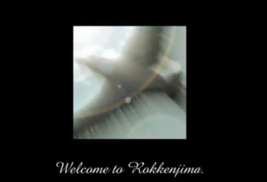
seagull sighting!!!! after so very very long the titular umineko reveals itself
so that was the whole opening! first thought is the song is an absolute banger and i WILL be extracting an mp3 file from this video because even listening to it a couple of times is super pumping me up to want to read umineko right now lol.
second thing is that i am very interested in the sequence of images/events portrayed in the latter half the opening. the first part clearly maps onto the failsiblings argument and kinzo's demon's roulette and the clock striking midnight ushering in the killing, feeding then into everyone being upset and arguing. but then we get a bloody maria by the portrait, a message in a bottle on a calm beach and an image of a seagull flying under blue skies. some kind of symbolic representation of how episode 1's gonna end? something Bad goes down with maria and the storm breaks and we get the final word via a message in a bottle and then the seagulls cry?
this is almost certainly something that will make an extreme amount of sense after the fact but mostly right now i'm instilled with a deep anxiety for maria. there were a lot of ominous shots of her in this opening. i worry.
but yeah!! glad to have finally seen this!
#umineko liveblog#more delicious imagery and symbolism to chew on....umineko is the gift that keeps on giving forever
37 notes
·
View notes
Text


ପ( ໊๑˃̶͈⌔˂̶͈)੭ ❀⠀𝑜𝑢𝑟 𝒔𝒖𝒎𝒎𝒆𝒓⠀!

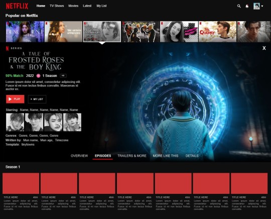
introducing our summer, the september google docs template from tinytowns. featuring a sleek design translated from a certain company's old website 'cause the new one pales in comparison. this document is three - pages long with a hefty amount of images, so it may take a while to load & also to edit. prior knowledge to google docs is likely needed, but help is always available through ask. the purpose of our summer is to showcase roleplay or writing projects as if they were tv series or movies. below the read more are image sizings, unique guidelines for usage of this doc, and general pointers. the doc can be found in the source code, or through a link at the end of this post.
✶ sizings
popular on netflix: 300x166 but here's a psd for your convenience.
big video: 818x533 - you might be able to go smaller
cast photos: 300x300
episode thumbnail: 176x100
title logo: 258x92
✶ guidelines
all popular on netflix images are to be changed as they do contain references / the names of my friends' projects & my own, among game franchises etc. regardless, they're my editing and i'd prefer them changed to your own stuff. this is non - negotiable, sorry !
mixing my documents is perfectly fine, as long as the other template is from my catalogue.
don't lift elements from my google docs & use them in someone else's template with no credit to me.
✶ tutorial
#01. go to file -> make a copy, in order to edit.
#02. to change the title logo double click & wait for the google drawings window to open up. when it does, click on my logo and hit 'replace image' with your psd.
#03. to change the popular on netflix thumbnails click them once and hit replace image: the selected thumbnail was edited in photoshop using layer style and has a stroke of "inside; 4".
#04. to change the big video's image click it once and hit replace image. there is a gradient overlay to the left of the image so be careful where you're clicking ! make sure you're hitting the right side of the big video when you're going to replace it.
#05. to change the cast photos & episode thumbnails just click them once and hit replace image.
#05. questions ? hit me up through ask, i'm always happy to help !
✶ general pointers
again, make sure you're not selecting the gradient when replacing the big image. hit somewhere under or around the "x" mark.
try and keep the description around three lines: if you don't, things in the document might move.
sometimes the white arrow under the selected thumbnail might go behind the gradient: to fix it, just select the gradient and move it slightly, then back into place.
when moving onto the next page remember to replace the thumbnails to the left, as if it's scrolling. for end - pieces i'd recommend looking at that psd i provided earlier and going into the shadows folder : apply left or right shadow depending on where the image is.
you can probably replace some images with gifs ! not sure how well it'd work, but worth a try. just remember to use your own gifs or ones you got permission to use.
✶ link
can't find the source code ? no worries, here's a link to the document.
any questions, just let me know through ask !
#google docs#template#gdocs#supportcontentcreators#rpc#rph#free#free rph#free rpc#google docs template#project sheet#oc template#docs#free template#tinytowns#m: gdocs#m: site based
553 notes
·
View notes
Text

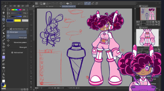


Overlays + Logo Experiments 2023 (Kuneho sa Kahon)
This is some old work that I did last year.
I'm not gonna call this stuff "scrapped," because I may still use them someday, it's just that I don't know if or when I'm gonna start streaming again.
I forgot how long ago I actually made these, but I do know that it was during a time when I actually sucked it up and sat down with Inkscape for a while. I've probably forgotten everything I learned since then, but I remember it not being as difficult as I thought it was going to be, so picking it back up again probably won't take too long.
Anyway, the actual notes...
I made 2 versions of the "Game" overlay, 16:9 and 4:3 to accommodate more gaming eras (the games shown are just placeholders). I'd like to have a dual screen overlay too, but it might have to be less "showy" to give the game enough room to actually be seen.~
It's mostly inspired by things like the Windows XP music player, just pinkified to match Kun3h0's aesthetic.

The message box is of course lightly tamagotchi inspired and is supposed to match with Kun3h0's GAB. (Well actually, I designed these overlays first, so it's the GAB that takes after the overlay, even using the same background image for her tummy screen).
There isn't a proper overlay for art streams yet. I'm always accidentally grabbing the edges of my workspace and resizing it, so I don't think a boxed overlay would work that well for it. Maybe just a border and a place to put the alerts would be fine, but I don't really have any ideas for it~
They aren't quite "finished" yet. There are supposed to be icons in the trio of hot pink buttons, but my placeholder ideas for them didn't look great.
(Icons originally from Icons8)
The idea was to bring in some more of that tamagotchi influence by having "care icons" that would allude to some of the features of Kun3h0's game, but I just don't think the icons I chose really work. Plus, I think they're just busy. I should probably just throw some hearts in there and call it a day~
Next are the logos. I actually really like the first one, but it's a little hard to work with.

All the empty space above the title next to the ears creates, well, an empty space when the logo is at the top edge of anything. It's just very ugly to me, but there's not much I could think to do about it.
So, I made the next iteration. It's a lot more rectangular, so it's easier to place in scenes, but I think the layering of the letters is a little off. I love the idea for it, but it's just short of being great. With a few more tweaks, I think it could really work.
But you know, I feel like the problem that almost all my logos have is that they're all bulky. There are just a lot of words in there since I include the English translation, but I figure that maybe I might be able to just condense everything into a single icon: like maybe the GAB Micro is enough of a symbol on its own to work? Maybe throw a couple of K's onto the screen, but otherwise I don't think I actually need much more than that. So, maybe I'll work on something like that soon.
The last thing is just some vector art tests I did. I tried remaking this faux vector art from a while ago. It was just a way to try and get used to the program. I also tried to remake my pictogram 1010s, to varying success.
26 notes
·
View notes
Text
Who mod creators inspires me?
This is a continuation of the previous post, but mods edition.
I've mentally thanked many creators for their work more than once, and I think this is a good opportunity to express it.
Because these people are a powerful contribution to the community and I want them to know that I appreciate it :з
Of course, there are many, many great creators, you can join my initiative if you want)
Maybe later I'll make another similar post, but about cc creators, because there are so many of them.
Well but now I will mention those whose modmakers I use the most.
Thank you all guys! You are wonderful! 💅👇
This is a huge contribution to the game and the gameplay of thousands of simmers. Thank you! The first thing I do after an update game is go check out this mod. It makes my life with ts4 much easier omg
Of course, I can't help but mention @deaderpoolmc 🤩 Who doesn't know about MCCC? I can't imagine the game without it.
Then there are those creators whose creations literally make me cry with happiness.

@twistedmexi and so many useful mods! I can't even remember all of them now, you are so talented modmaker! but TOOL and BetterBuildBuy it's one of the best things that could have happened to the Sims.
@simverses your cc is just magical! I don't know where else I would have seen such good thematic historical content and such a variety! And your mod.. A year ago, I swear, sometimes I was ready to throw my laptop out the window out of frustration 😁
Why? Why can't I do anything about these horrible high-rise buildings in the background, billboards and modern cars on the road when I need vintage?😖🤌Now I feel really free.... *-*
@awingedllama thank you for your Clickable world mod!! Thank you really very, huge very much ❤️ The limited worlds frames is another thing that REALLY upset me.
And I never realized before how many more opportunities it opens up for my stories!
Also your cc is really very nice, love it so much 😍
@zerbu is another creator I can't do without! ❤️ His mods literally expand the boundaries of the game and allow not to be tied to one world/town. It is simply an indispensable thing in my stories.
I can place a school in Komorebi instead of Copperdale, I can turn public lots into residential, I can live in vacation towns. This greatly improves the game experience. Thank you! ❤️
@twelfthdocttor I owe some very useful mods like Travel to venue (i'm really very grateful to you, that's SO useful) and also thanks to you, I love Batuu to a large extent because my characters can look the way I want them to look there ❤️
@luumia greatly improved the look of my game with No Blu Mod 😍❤️ and i think this plays a significant role in the quality of the images and gshade overlays 🫶
Also, this creator has a lot of great sliders and cc! You are great my dear :з
@buckleysims create totally awesome Camera Mod to which I have become so accustomed and saved many nerve cells!
Also I thank NANDO for beautiful Paris from Romance in France Mod that I used :з
Thank you so much all of you ❤️🫶
19 notes
·
View notes
Text
@dandenbo asked me for the art asks:
🎠What is a typical 'workflow' for a piece from idea to finished?
It turns out to be a long answer so here's its own post, under the cut to save your dash!
How I go from screenshot to painting:
(This is not intended to be a 'this is how you do it!' kind of guide. I absolutely don't do an optimal route, this is just how I go about painting and what works for me! I've done a workflow for a screenshot to painting as I do a few different things but this is one I could explain somewhat coherently. My comics tend to be created pretty chaotically lol)
1) I take an ungodly amount of screenshots while playing. Also pester friends for their screenshots or stalk the group discord for interesting shots.
2) Go through all those screenshots cursing why I took so many, looking for those great moments that I want to paint. I’m particularly looking for nice poses/captivating moments, dynamic lighting or interesting expressions, and they don’t need to have all 3 as we can fix some of that in the next step.
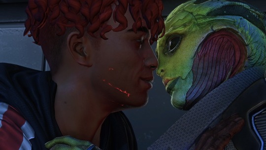
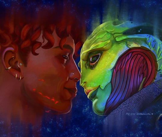
Here’s the screenshot I chose for my Keahi x Thane piece:
It was a cute, soft moment between them and I liked the highlight at the edge of their profiles.
3) Refine the screenshot.
I don’t use anything fancy for this. I game on windows PC, so I open up the screenshot with windows photo editor. I crop the image, play around with saturation, exposure, contrast, just basic editing until it looks tastier. For this piece I wanted it to be hyper colourful and vibrant, leaning towards warmer tones.
4) Decide what I will change, then gather references for those changes.
In this case I was fortunate that not a lot needed changing. I knew I wanted to move Thane’s eye position to looking at Keahi rather than the way he is slightly off focus, do a more realistic ear with earrings for Keahi, make Thane a little more smiley and lower his eyelid and give Keahi nicer eyelashes. I keep a whole bunch of art guides and tutorials on my PC so I grabbed the necessary ones and sent them to my ipad ready to have on hand for the sketch stage. I have Thane’s character model in XNApose, so I can check things like his eyelid specifically in that (this is actually for a different project but shows you what I mean)
If I was going to change up the lighting/shading I would also gather references for that. For example sometimes i’ll take screenshots of lighting schemes I love from films/tv shows (think the strong teal and orange scheme in Mad Max or the neons of Blade Runner). Or for precise shadows, I can again use XNApose. I also have a little 3d printed Thane head I can shine a torch at and take photos of to get shadow ideas. For humans there’s lots of reference to be found with online searches, I find pinterest more useful than google for this. For specific expressions or body parts, i’ll just take photos of myself (hand poses, smiling from the right angle etc.) My camera roll is an interesting place. I have drawn drell frills on my neck and on my chest before to see how the lines would fold at certain angles.
5) Setting up a canvas
I work in procreate. For a piece like this I try to go pretty big, say 5000 x 4000 pixels, then i’ll crop down later as needed. 300 DPI.
As I work, I’ll make duplicates and continue on the copy each fresh session. When i’m finished I make a backup save of the PNG and .procreate files on an SSD.
I immediately turn the background colour down to a more muted colour to not burn my retinas. If i’m using a textured background like an oil board i’ll insert it, and any overlays like canvas effects. Set up my layers from the start basically for easy toggling throughout. I try to be good and label things to make life easier, it doesn’t always happen though.
I don't wear a digital glove or use paper effect screens but I do have a bottle of screen cleaner and a microfibre cloth handy at all times.
6) Sketch.
I’m still very much learning to draw. I tried for a long time to do the classic ‘ball for a head, draw the planes/lines etc. It was a constant struggle and never clicked for me, the ball especially always made things much worse, turning a circle into a 3d image in my head just does not happen. I find it better to just start drawing and work things out as I go (I use procreates reference window to see my screenshot).
So I’ll have my sketch in one canvas, and i’ll also have a second canvas with the photo ref on it at the same size, and if I feel like something is really wonky and off i’ll test my lines over the photo to see what’s gone wrong, then go back to the sketch and correct the areas that revealed. Sometimes I’ll use the grid feature if i’m getting stuck.
Here's a few of the sketch stages:


Here I tried out the lines on the photo and noticed that Thane’s frills were a little too far to the left, and Keahi’s eyebrow needed to arch down towards the nose.In the next pass I correct these:

Also, and I know i’m gonna get side eye from some people for this but I really could not care less to be honest. On some pieces i’ll just trace the screenshot. Sometime I just want to get to painting, am not in the mood or mindspace for a learning experience, and this is a hobby. It’s my screenshot, no one is getting ripped off. My latest Javik piece was done this way 🤷♂️
6) Painting.
I’ll start by blocking in the background and the portrait flats, usually on separate layers. I try to have an idea of the background colour from the start as this can effect the whole piece overall, but sometimes you just gotta change it as you go so having it on a different layer makes this much easier.
The painting itself I’ll lay down wider areas of colours, then start going in and refining bit by bit, I tend to work on one area at a time, and sometimes I’ll get pretty well rendered on a small area before moving on, other times work on a wider area. It really depends on my mood and what i’m vibing with that day. Like you can see here I’ve done some general messy colouring all over Keahi, but done a lot of refinement on the eyeball:
7) Finshing the piece, uploading and testing:
When I’m sick of rendering the painting and don’t think I can add anything more to it without gnawing my own wrist off, it is time to finish up! I make sure I toggle all the layers I want on, add a top signature layer (lol I lie I forget this all the damn time). Then i’ll upload the piece to my google drive and open it up on my big 4k monitor on my PC, and on my phone, and see how it looks (my ipad is a 9.7inch air). I find that once off my ipad, it often looks a little less saturated and contrasting as it does in procreate. So I might go back and change the levels if it’s too big a difference until it looks decent across devices (it’ll never look perfect on them all though, just gotta find that happy medium).
8) Posting online
I really don’t have any strict steps for this. I know some people go for optimal posting times, and will make multiple copies of their pieces in different sizes to fit better on different sites (damn you instagram and your need for everything to be square). I… do not do any of this lol. I post when I’m done whatever time or day that is. I do tend to reblog/retweet etc before I go to bed, as I live in the UK and that will at least be getting into evening time in US. I reblog my own stuff a fair bit.
15 notes
·
View notes
Note
Hi dear. I'm at my wit's end with Reshade and humbly ask for your guidance. The latest Reshade is installed for TS4 on my PC and it runs smoothly up until I select literally any preset. Press OK or hit enter, and the game immediately crashes back to the EA app. Here is a [hopefully exhaustive] list of every solution I could find online and have executed so far:
Typed preset name instead of clicking
Changed fullscreen to windowed fullscreen and windowed
Deleted "Docking=" and "Window=" lines in [OVERLAY] section of Reshade.ini
Allowed full control in Security tab under Properties
Ran game as admin
Checked for any updates if needed
Uninstalled and reinstalled both game and Reshade files
Restarted PC numerous times
Repaired game numerous times
Renamed d3d9.dll to dxgi.dll
Installed DirectX End-User Runtime Web Installer
Checked for driver update
Checked for all preset version updates
Installed .NET Framework 4.8.1
Followed shader/texture installation tutorials on YT
Deleted Default.ini from Bin
Removed Tray and Mods
I'm sorry you're having problems, that must be so frustrating.
You've done really well with your troubleshooting so far. Crashing like this is a difficult thing to diagnose sometimes. You can try looking in your d3d9.log file to see what it says at around the time when you crash. It might give some hints as to what is happening.
Otherwise I would ask, have you tried a different version of ReShade? Also, what happens if you don't pick any preset at all (so reshadepreset.ini is auto selected) and just start enabling a few effects yourself?
7 notes
·
View notes
Note
How do you get such nice shots in captura? I wanna get better at it could you share some tips? Been trying to figure it out but I admit I'm not the most knowledgeable in photography etc.
Well.... It's a bit of a complicated process and it relies very very much on personal preference. Much like with any type of art there are different styles that each individual artist will gravitate toward. I can only show you how I do things, so I'd recommend asking other Captura folks on here about their own styles to see where our processes and preferences differ.
I'll also include some extremely helpful videos at the bottom, they go extremely in depth as to best practices and technical exploits.
Alright, lets get started with the background stuff... the tools!
ReShade: Shader injection, a MUST if you want to take dynamic and customized captura without using a program like Photoshop to do everything in post.
SRWE: Simple Runtime Window Editor.... the god among programs... It's an upscaler, allowing you to increase the resolution of the game beyond the bounds of your monitor. It's how I was able to get 15K panoramas at one point in time.
Any image editing software. Since I rely mainly on compositing to get the lighting I do, I need something to overlay and mesh the images with. I use GIMP cuz it's free, but even Microsoft Paint will work as soon as it add the ability to layer images.
Those are the tools... what about the tactics?
Well, I generally prefer moodier shots with the Warframe being the central focus (though, that's also the side effect of me cropping the image). Just a note! Moody doesn't mean dark, moody is the enigmatic space between dark and light where there is more dark than light... but there's still a good amount of light to be had. Occasionally you can have overexposure in a moody shot even.
Important to note, the overall exposure level of the environment, even is the scene lighting is low, will effect how brightly your Warframe can be lit. Both the Scene Light and Exposure sliders need to be fine-tuned otherwise you won't be able to light your Warframe at all.
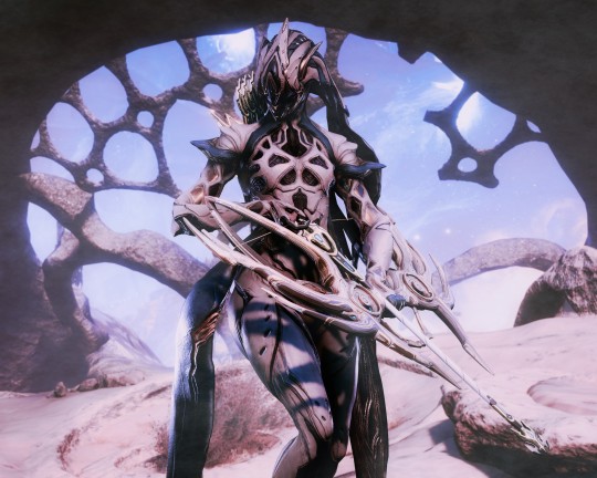
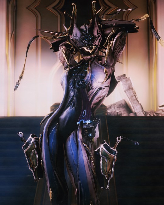
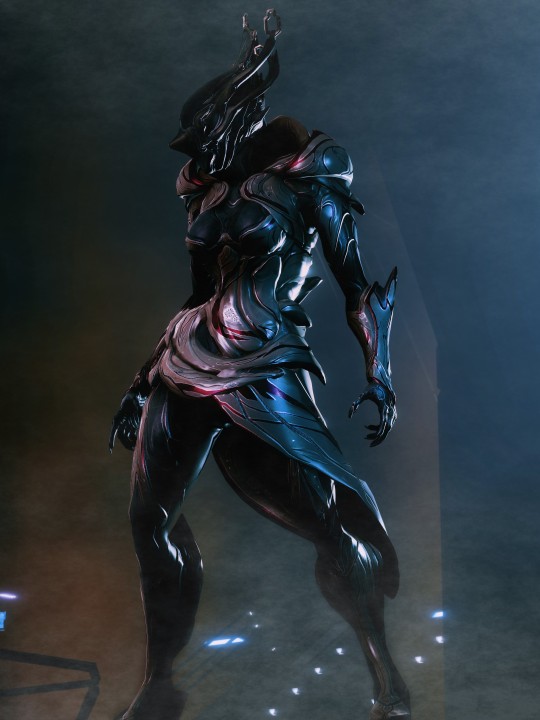
Now, for shot composition I prefer low angles with either a cluttered but familiar/recognizable background, or a simple but abstract background. The Subject, be it a Warframe, an enemy, or an NPC, reside in the center with their feet out of shot.
Like so:
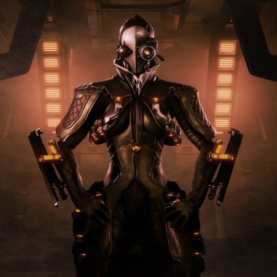
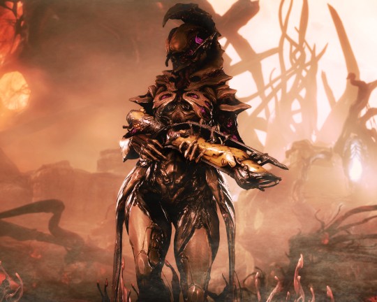
Each of these shots also demonstrate well the way I like to pose my subjects: Symmetry and.... not... not symmetry. The official term for this is Contrapposto, which is Italian for Counterpoise. Basically, even though the Wisp is sedentary, her body is still giving off the impression of movement based on how her waist is curving and hips are tilted, forming a loose 'S' shape. There's a handful of animation sets, Khora (Urushu) Noble, Mesa Noble, and Wisp Noble are excellent for this.
Some examples:
But... what about the lighting?
This is where things get technical.
So, the standard Captura's three-point lighting system is generally inadequate at properly lighting the entire Warframe. This is where compositing enters the picture, in a very literal sense. Each of these shots, shown above, are composites of between two and four separate images, each with different lighting angles. I actually have an example I made for an earlier explanation made already (thank goodness)

Getting the different lighting angles is really simple, just rotate the 3-way lighting without moving the camera. Then you overlay them in some photo editing software and just start going layer by layer, erasing bits of the topmost layer to reveal your desired highlights or shadows from the shot underneath.
Don't feel obligated to do this compositing process though! Sometimes the 3-way lighting works perfectly well for a shot or environment, don't feel obligated to complicate this process.
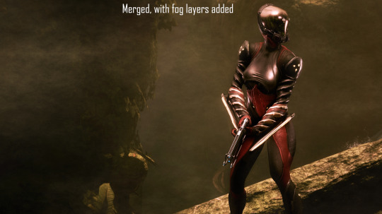
And this segues in nicely to the final part of the shot-making process, post-processing and fog layers.
Now, fog layers are important to the overall appearance and vibe of my Captura. They add texture the image that the game doesn't impart naturally, removing large swathes of solid color from the background and foreground. An added bonus is that the added texture makes the image look somewhat better (imo) when compressed, or when viewed at lower resolutions.
The same image with and without Fog
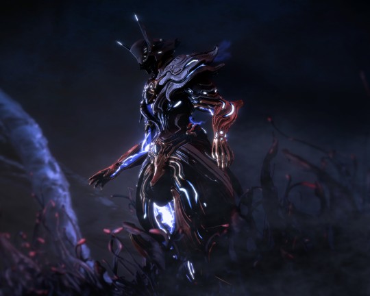
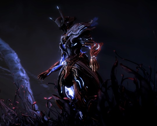
This shot contains two individual fog layers, one in the foreground, washing out the foliage, giving the general uniformity of it texture and implied depth, it also serves to cover up the manual blurring I did (poorly) around his legs. Then there's the background Fog, which is the deeper blue you see in the sky. It adds a more dynamic air to the generally dour set of greys. And, again, the fog is just something I personally like to add, even if it doesn't serve a practical purpose in a shot. No shade if someone feels the fog ruins the shot, I almost always keep a fog-free version about.
After the fog is added, blended, and blurred slightly, I will apply a few gentle blurring filters to remove any jarring or jagged pixelation from the shot, giving the Frame a somewhat smoother appearance and reducing the file-size dramatically.
That's just how I do it though, it's not a particularly popular style, but it's how I do it and how I love to do it! :3
Remember to ask around, I'm sure there's lotsa Captura Artists out there willing to explain their methods and processes.
Helpful vids!
How to Captura by Vash Cowaii
Hotsampling in Warframe for High Res Shots by PurpleFlurp
good luck, and happy snapping!
#warframe#captura#warframe tag#warframe captura#sorry for writing an essay... sometimes I don't know when to shut up#-_-
13 notes
·
View notes
Text
Photo Cards tutorial
aka PA shots, pashacolle/pashacore/pashakore, bromides, etc. EnStars format, suggest other versions if you're interested!
TLDR: Create an image with as many frames as will fit using the measurements below. Add card images and either signature images (both on the wiki) or name text in Futura 10.5pt with text spacing upped to 1. Get it printed on photo paper (at your local print shop, or buy photo paper for your printer) -
At CVS, the most cost-effective size was 12in x 8in, 9 cards for $5 ($0.55 per card) and that's what I used here
UPDATE: If you have your own printer and can use photo paper, that'll be cheaper per unit (try partially used packs on ebay too if you won't use the whole pack), more like $0.10 per card. 4x6 template coming soon since that's the cheapest kind

Long version:
Collect your resources. My .mdp template for 12in x 8in is here, I used FireAlpaca but other apps work. Go to the character's page on the wiki, download their signature from the summary sidebar, and get any card images from Gallery (submenu In-Game has bigger images, you could get transparents from Renders and edit them onto other backgrounds/cards). Make sure you click "See full image" when you're in the image preview so you get the highest quality image. You can search "webp to png converter" if you need one.
Put it all together. Collect pictures up in the "images" folder, and make sure to delete extra that's outside of the frame so you don't have lines of color in between your cards (or overlap with other cards). Duplicate the example in the "names" folder to type names, or insert the signatures depending on the style you want. Put some signatures in the bottom section under the frames to test on later, if you like.
Center text. On the "name boxes" layer in "tools", make a grey rectangle snugly covering the name text. Make the text itself invisible, and align the rectangle with the red lines, then move the text back under the rectangle.
Print & cut. When you're ready, make the "tools" folder invisible but make sure the alignment arrows are still visible. Once you get your print, score the center of each arrow by either cutting it or tracing it in pencil on the back of the print using a lightboard or window. Use a ruler to connect these scores to replicate the "picture alignment" lines on the back of your print, then cut them - I used a rotary cutter and a (metal-edged, plastic wasn't straight) ruler for precision but any variety of tools work.
Accessorize! This is the most fun part. Use the signatures you printed on that test strip and try paints, glitter and glue, embossing, any other color/texture work you can think of before applying it to your actual cards. I liked the look of embossing signatures (trace signature onto the back, lay it facedown on felt and "write" the backwards signature with any small-tipped hard thing - embossing tool, crochet needle, dead ballpoint, etc) and it looked best on thicker handwriting like Niki's or Kanata's. You can also try making paper frames, getting toploaders/cardsavers/penny sleeves (65mm x 90mm) and decorating those with paint, stickers, etc. If you want holos, get some self-adhesive holographic overlay (vynil should be the clear kind).
#enstars#ensemble stars#enstars merch#photo cards#diy merch#bromides#idek what people call these things theres so many words lol
60 notes
·
View notes
Note
ALT-Z? BELOW THE SURFACE? EXPERIMENTS? WILLEM AND THE DRAGON? I NEED TO KNOW ABOUT THEM
Also, from the fic list, if you don't mind saying their fandom: A World Without, Broken and Don't Give A Kid Tools
8D
Hi! Thank you for showing interest fchvgjhb
Alt-Z is about people who suddenly get powers resembling different shortcut keys - if you have GeForce on Windows, Alt-Z is how you open the in-game overlay while gaming. Our MC has become the ultimate vlog streamer lol
Below The Surface is pretty much fnaf if it was at a circus and not a pizzeria - but different? I don't really know how else to describe it other than think Black Butler: Book of Circus and Cirque Du Freak?
Experiments 8, 13, 27, 31 follows the lives of four kids stuck in a government facility and their eventual escape - think Stranger Things and Beyond Two Souls for general ideas.
Willem and the Dragon was fully based off the song Warrior of the Mind from Epic: The Musical. The Dragon's hoard is a small town she protects along with her magical library that she put Willem in charge of. Everything is provided for the town so long as no one leaves, and Willem will never age so long as nothing gets stolen from the library. Unfortunately, time causes people to forget - and the town slowly starts to fall to ruin.
Now for the fanfic- all three are Marvel fanfics. A World Without and Don't Give A Kid Tools are both Tony Stark-centric while Broken is Loki-centric.
Thank you for the ask!
2 notes
·
View notes
Text
Trigger Zones and Parallax Hell
If only you knew the pain I've been going through with cameras in Game Maker Studio for the past few weeks! But it's fine, I've got it all figured out now. This post is going to be a pretty long one. To be honest, there are a lot of little things I've done since the last post that I'm just going to either gloss over or save for a different post (maybe?) Primarily trying to standardize my code, resizing my sprites again, and hitbox thingzzz.
Anyways let's get into CAMERAS!
So game cameras were a little bit of an enigma for me going into this. From application surfaces to resolution, to window size... Quite frankly, they're very powerful tools when it comes to building a game, and all the stuff you can control with GameMaker's camera was frankly-
a massive headache.
Come down the rabbit hole with me-
TRIGGER ZONES
First things first, I had to get the camera set up. There are a lot of tutorials on this, all of which are slightly different. My code ended up somewhere in the middle of all of them. Here was the first tutorial I followed:
How to make a Camera for any GameMaker game in 4 minutes
by Shaun Spalding
So Shaun Spaulding's video helped me get the camera set up in the first place, although frankly, this method didn't last very long in my project. It was good and simple but for whatever reason, people really don't recommend you use GameMaker Studio's Room Builder's camera settings, but rather code them yourself. I'm not sure why else other than the fact you get a lot more control over your game's in-game camera, resolution, and window size, plus you can create cutscenes and stuff with it. Next was-
Smooth Camera Tutorial + Pan/Zoom [GameMaker Studio 2]
by Matharoo
Matharoo's code was more complicated at first but it gives you that level of control that I was just talking about, and it sets it up in mostly the same way. Although, my code now is definitely a mash-up of the two tutorials.
With those two tutorials, now our camera looks like this:
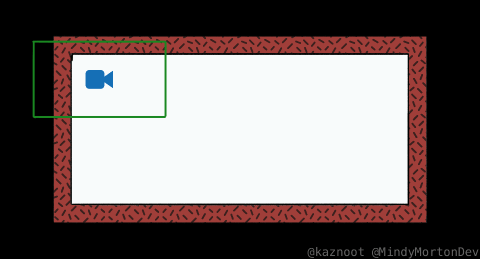
This is great! Now we have an actual camera instead of looking at the whole room! But if we look at our camera's view, we can see that the camera is seeing out of bounds. Matharoo's video may have actually covered this (you can watch it yourself) but where I found my solution was-
Camera Modes | GameMaker Studio 2
by FriendlyCosmonaut (this one starts at 14:33)
I did not watch this entire video but it looks like it has a lot of useful information in it. Even though she isn't making the same type of game in the video, she does cover the topic I needed, which the provided link will actually jump straight to that section of the video

This is solid! Now that we have one problem solved, it's time for another-
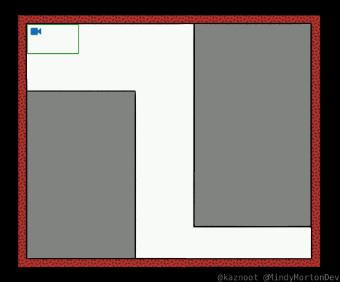
Unless you're going for something more old-school like Super Metroid, we're likely going to have big open rooms that twist in multiple directions. I had a pretty clear vision of how I wanted the camera to operate. My trajectory is in the direction of Hollow Knight, which has a simple yet complex camera system that is very well explained in this YouTube video:
youtube
This video sort of became my "mission statement" with all this. Unfortunately, I don't have a tutorial I can point to for how I coded all the stuff in this video, but I did realize Shaun Spalding briefly touched on his own solution to this kind of problem with what he called "trigger zones". This is a good way to describe my own solution. Essentially we're going to create an array of overlay objects, or "trigger zones" that will restrict the camera's movement to only being able to move where they say. This is more or less the setup we're looking at:
This is how Hollow Knight's cameras appear to be working in the video, and how we'll set them up too. I won't dive too deep into the nitty-gritty coding on this one, but basically, each of these trigger zones is an object in GameMaker that will bind the camera by their respective dimensions.
This gets very inter-relational with all these objects since each object needs to be able to apply its own unique dimensions to the camera boundaries. It did become a little bit of a headache managing what turned into 5 or 6 different camera-related objects which were all modifying each other.
Here are some pictures of how this looks in practice. Keep in mind that these would all be turned on at once to function properly:
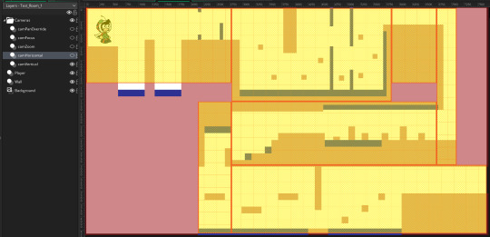
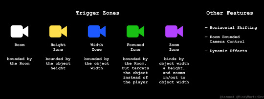
Vertical Trigger Zones
(the camera won't move above or below the zone the player is in)

Horizontal Trigger Zones
(the camera won't move too far left or right in these zones)

Zoom-In (or Zoom-Out) Zone
(the camera will zoom in/out as far/close as the width of this zone)
These are just a few examples but hopefully, the concept makes some sense to you! So finally, with these systems in place, our cameras will finally move like this:
And that is (mostly) the end of that. Scope creep has kept me coming back and adding incremental changes to all these features (specifically the zoom one). Fundamentally they will continue to work the same but it's easy to keep tuning things like camera speed and zoom speed.
Anyways, with this stuff done it's time to get to the next thing:
PARALLAX HELL
So the actual solution to this was straightforward--use a 3D camera and follow this tutorial:
From 2D to 2.5D: GameMaker Studio 2 TUTORIAL (Using 3D Camera) | Easy Parallax
by Matharoo
It's what Hallow Knight does, it creates a natural parallax effect, and it makes a lot of the artistic work pretty easy. But, the reason it took me so long to get here is a story that brings me great pain...
To start, I wasn't originally going to use a 3D camera because they sounded somewhat complicated. Even Shaun Spaulding sounded like he didn't recommend them in his tutorial that I shared above (although maybe that's just for beginners). What I was going to do could be called "interpolated parallax," where we are basically moving a bunch of image layers around relative to the position of the camera.
You can learn more about this in this video by Pixelated Pope.
That doesn't really need to make sense to you, but that's what I was doing. Now, this method could have totally worked theoretically if it weren't for the fact that GameMaker Studio 2 has actually removed certain coding properties from GameMaker 1.4, which makes this method kinda unreasonably difficult? At least from what I tested. It works great if your only intention is to have an endless runner game or if you want to accommodate for open space by drawing individual sections of background together in a giant 4k+ canvas.
It sounded messy and I didn't really want to deal with it. Eventually, I learned more and more about GameMaker Studio's 3D camera, which was easy to set up for my specific needs.
It did take a while to fine-tune it all but I did get there in the end. It did, however, break my zooming trigger zone. This post is already long enough but basically, I thought the solution would be needing to change the camera's field of view with trigonometry when it was actually just changing the camera's distance with a basic ratio...
Not my brightest moment there and it took a painful couple of hours of staring at the same code and Desmos to figure that out.
ANYWAYS...
The camera system is finished! Or at least, finished enough that I can move on to designing backgrounds, and just fine-tune this bit by bit later down the line.
Honestly, this was all very time-consuming, and the struggles with the zooming trigger zone were a bit demoralizing, so I'm ready to get back into the art generation side of things!
I also plan to spend some time beating Hallow Knight and maybe a few other platformers I can take reference from for backgrounds 😎
See you next time, everyone!
#gamedev#hollow knight#original character#coding problems#indiegamedev#parallax#hell#actually hell#gamemaker studio 2#art student
8 notes
·
View notes
Text
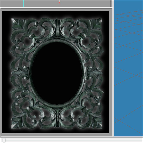
How to add correct drop shadows to objects - Part 2
The shape is a bit off, so let's edit the shape of the shadow plane. Go to the bottom-left window (with the 'front' view) and make sure 'Textured' and 'Wireframe Overlay' are selected. Move the vertices of the plane around so the shadow shape fits the frame. When you're done, it should look something like this (I deselected the wireframe again so I could see it better):
Export the mesh as a .simpe file and go back to the .package file.
7. Go to the GMDC files again, right-click on the mesh you extracted earlier (again, not the boundingbox one in case of a mirror) and replace it with the edited mesh you just exported from Milkshape. Don't forget to hit 'Commit'.

8. Now go to the textures and go to the shadow texture. In this case, the texture was one left from the Maxis mirror the object was originally cloned from, and it is a 64x64 size (while the one we made was 128x128). Use BuildDXT to import the new shadow.
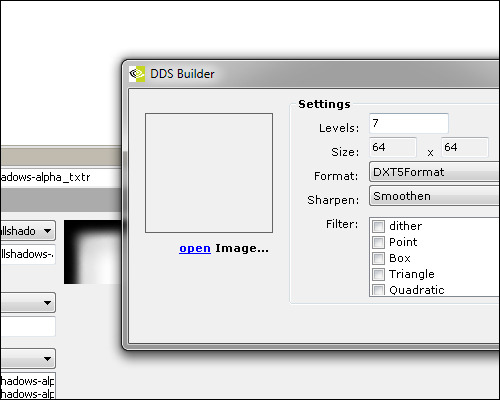
It's a bit blurry, so next we're going to 'Import' to select the shadow texture again. Right click and hit 'Update all Sizes'. Hit commit. Note that if the texture you have is the same size as the shadow texture that is already in there, you can skip the BuildDXT and only need to use Import+Update all Sizes.
The most important thing here is to change the format to ExtRaw8bit, or else you will get a black box instead of your pretty shadow.
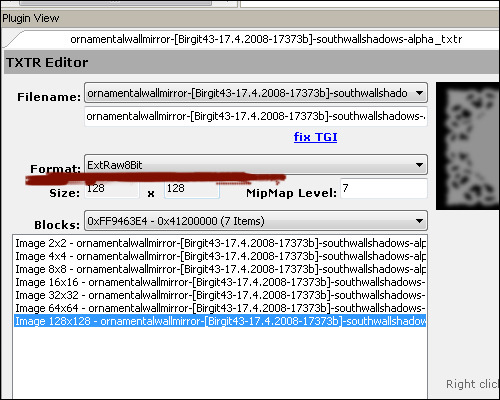
So let me repeat that: Change the image format to ExtRaw8Bit.
Again, don't forget to commit!
Now, save the package and test the object in your game. Go check if the shadow isn't disappearing in the wall (if it does, no sweat; just move it forward in Milkshape a bit). In the end it looked like this for me. Looks just a wee bit tidier, no?
Good luck!
You can get the fixed mirror here.
This wonderful tutorial was posted a long time ago by Yuxi.
All credit to him, obviously.
The only thing I did was rescue it and share it, since the images were lost on the original site.
Thanks to the Wayback Machine I was able to retrieve them and put them back in their proper place.
If you like, do not hesitate to share this publication, so that more people know this very useful tutorial.
Thank you very much Yuxi for your great contribution to the community!
29 notes
·
View notes
Note
i wanted to thank you for the additional perspective on the streaming ads post. i just hit affiliate and had no idea how to manage them and what system to use and the only response ive gotten is just that people hate them. its one of those situations where i dislike the system in place and wish that i didnt have to run ads at all but i do have to run ads so what now?
so hearing you say that not only have you been able to manage ads and the time they take up but also that youve been able to implement positive changes with them is awesome. i thought i read that you set a timer and just take a break during the ads. do you do that based off of when you start streaming? or do you get alerts when ads are about to run and go off of that?
hey, thank you! I'm glad it gave you some good info. so Twitch has an automatic timer (sort of) in the form of the Ads Manager (dashboard.twitch.tv/u/YOURUSERNAME/settings/revenue)
basically you just check the little thing that says "Ads" and then use Ads Manager to set the cadence at which they go, and then they'll go automatically. I have a Starting Soon segment every time I go live which is just a screen with music without me present; it's just so people have a bit to filter in without missing anything, and I have some extra time to get ready if I need it. I like to leave this up for 10 minutes. so, I have my Ads Manager start at 7 minutes, play ads for 3 minutes, and then I start the stream for real. after that, it'll do the 3 minutes of ads every 60 minutes by itself.
the real ~magic~ comes with the regular Stream Manager dashboard (dashboard.twitch.tv/u/YOURUSERNAME/stream-manager). I have mine set up so that I can see the Ads Manager out of the corner of my eye on my second monitor. I can see the little yellow ads segment creeping up, and one minute before ads start, the whole thing will turn a pretty bright yellow color and give a warning. I have mine at a minute, but you can change it in Ads Manager as pictured above. here's what my Stream Manager looks like in its entirety for reference. I have it set up so it takes up one half of my second monitor and I can see pretty much anything and everything important
if you don't have access to a second monitor, or can't fit this window + your game on a single monitor, then I'd probably recommend using LiveSplit? that's what speedrunners use to display their times, but you can have it as an overlay without disrupting gameplay, and without stream having to see it. you could set it up so that splits line up either with the ad break warnings or with the ads actually beginning, so you know when an ad is coming up. hope that helps, and feel free to ask any other questions you might have!!
4 notes
·
View notes
Text
I got the Xenia emulator running on my Deck thanks to a video guide. Of course, that introduced some more difficulties because 1) I didn't fucking think to use Steam's Proton by adding the executable as a non-steam game and 2) it was a Lutris entry which appears to be clunky to change command line arguments in (unless you could use something like `$1 $2` and just let Steam pass it through).
So, how did I fix this? Doing one of the two above? Pfft, no.
Instead I got Lutris to spit out its script for launching the game with:
flatpak run net.lutris.Lutris -b /home/deck/xenia.sh xenia
instead of doing the more sane thing.
And then going in with the Kate text editor to edit the shell script to add two arguments by writing $1 $2 at the end of the command in there (initially, I had one but a certain game necessitated me using a different GPU API due to crashing on d3d12 for some reason) and THEN pointing the steam shortcut TO that script and adding the arguments in Steam's launch commands.
So, yeah, it works, had to tweak the config to get certain things working properly but it runs fairly decently. Hitting at about 30 FPS according to the performance overlay, which sounds about right for the console's library. Some dips happen at times but I wonder if most of it comes from the typical shader caching or something else entirely.
Maybe next time I try to run a windows executable that doesn't need installing, I'll remember to try Steam's Proton prefixes...
Also, don't think the irony of getting Xenia to run on a Linux platform is lost on me. I find it mildly amusing that the almost-mascot and the emulation project shares the same name lmao.
1 note
·
View note
Text
[Review] Pac-Man & Galaga Dimensions (3DS)
Past, present, and future...
My AV receiver is in the shop, so in lieu of Sin & Punishment 2 I’ve skipped ahead to a portable rail shooter. Pac-Man & Galaga Dimensions contains six games, one of which is such. Out of the many Namco collections of classic games, this one takes an interesting three-era approach.
The token inclusion of the original arcade Pac-Man and Galaga aren’t very exciting. There’s a few display modes with upright and cocktail cabinet frames as well as a no-frills MAME-style window. You can’t credit-feed but you can choose to start from any round you’ve reached. The added inclusion of an achievement system on the bottom screen is a nice motivation to have a go and try different things, but I didn’t spend too long with these.
The collection jumps ahead now to 2007/8, with what were at the time five-year-old revival attempts: Pac-Man Championship Edition and Galaga Legions. CE is more engaging than the original to be sure with its dynamic dot arrangements and pulsing neon visuals, but it doesn’t have that many modes especially compared to its much-lauded sequel that predates this collection by six months. It’s a solid reimagining of the classic maze gameplay but doesn’t have much ambition beyond that.
Galaga Legions feels much more new, focused on a unique gimmick where enemies can flood the screen from any direction in swirling formations, and you can manually drop two turret pods facing in your chosen cardinal orientation. While the visuals and overlays can be disorienting, if you focus through it it’s pretty interesting. Likewise your shots must cut through the chaff and take out the larger pink ships to scupper whole formations, while the occasional black hole gives you a squad of enemy fighters to bolster your turrets as long as you conserve them. I found this one pretty cool but couldn’t get more than a few levels in before losing all my lives to the swarm each time.
The main reason to pick up this collection would have to be the two brand-new games, which uniquely use features of the 3DS while experimenting with new gameplay styles. Pac-Man Tilt uses designs from the then-upcoming Ghostly Adventures cartoon (there’s also a trailer for the show as a headline item in the menu… hrm), in the context of a side scrolling platformer with heavy use of a gyro-controlled gravity-tilting mechanic and some light pinball elements. For me this immediately called to mind Yoshi’s Universal Gravitation on the GBA, which I feel like got more fun out of the idea despite only having binary tilt states.
Pac-Man can move independent of the level of tilt, but his jump isn't worth a damn unless you're plumb-neutral. While tilted you can get into a rolling state, but can easily blunder into hazards, or get an angle off a flipper that's not exactly, precisely right and thus die. Pac only takes one hit to perish and although there are checkpoints, I rarely had more than two lives so when later levels ramp up the difficulty more and more I found myself redoing levels through gritted teeth. There's 25 levels in all plus bonus stages unlocked by getting medals for good/perfect?? performance, but I didn't finish them all. I couldn't! The idea has potential but it fails to account for just how dodgy motion controls are for precision; YUG simplified the degrees of tilt you had to deal with and was better for it. Also, the game is all about rating your run through of a level; it doesn't need a life counter! Get rid of it!
Galaga 3D Impact is more light-gun gallery shooter in feel than rail shooter since you don't control a character's movement. Rather, you move the 3DS around in real space (groan) to aim your crosshair on aliens passing by. But! Luckily, they've allowed for use of the circle pad as a crutch, which meant I played by holding my console as still as possible and just using the pad to aim, since you can't turn gyro off. It worked ok?!

With only five stages, it's nice as a little bonus game for this collection but don't expect anything too grand. Your ship moves along through spacey zones like a theme park ride, classic Galaga baddies fly past, and you shoot them. It actually does something really cool with the enemy types though. You have a sort of capture beam that has to be charged, but any enemy you hit with it gets absorbed (although I had trouble getting the right timing for the stronger types). Different varieties give you new weapons and tools, and further captures add to an experience bar to upgrade it. Each new ability (bomb, shield, time stop, etc.) gets a new button with its own cooldown, and as your arsenal grows you'll be juggling them all in a fun way while keeping an eye out for specific baddies to capture.
3D Impact was my highlight of the collection thanks to these fun mechanics contained in a very digestible arcadey campaign. Also, I could ignore the gimmicky motion controls! Do I have to mention how antithetical they are to trying to use the stereoscopic 3D visual mode? Pac-Man Tilt tries but misses the mark, while the creaky arcade games can be played a thousand different ways at this point. Pac-Man CE seems to have been obsoleted by its successors and even some ports have added modes not in this version; and Galaga Legions likewise got an expanded rerelease mere weeks before this collection came out. So it's an underwhelming selection, especially on the 3DS's dinky screen. And as solid as Galaga 3D Impact is, it can't carry a full-price game on its own... luckily, this game isn't for sale any more and it's easier than ever to try out things like this via alternate means. Wink. (I did buy this game on cartridge a few years ago, for the record.)
0 notes
Text
Capturing the ambience of Carmen Sandiego's Great Chase Through Time
This Mohawk engine game challenges the Time Scout stopping Carmen and her band of thieves, across space and time.
Running the game
Be sure to run the 32-bit installer, found inside Disc 1's Install folder. The default is 16-bit and won't run on newer versions of Windows.
However, for maximum accuracy I recommend running the game via ScummVM or with a Windows 95 ROM (on e.g. PCem).
Extracting sounds
While Carmen's frontend offers options to independently toggle sound and music, switching off music can disable ambience on some Cases. Therefore we'll need to extract and mix the isolated sound assets ourselves.
There are a few ways to do this, my personal favorite being mohawkrip. Use Visual Studio's Project from Existing Code wizard to load it into the IDE, remove all of the ENABLE_MOHAWK ifdefs (to replicate what the relevant Makefile mode does), and build the project. The resulting executable takes in an input file, and dumps BMPs and playable WAVs into the current directory.
There is also extract_mohawk as part of the ScummVM project. It capably rips all assets as binary files but does not currently support conversion for the game's IMA ADPCM sounds, or the game's bitmaps.
You can also try quickbms with the Mohawk script, or Watto's Game Extractor, but these solutions are also less complete than mohawkrip.
Capturing footage
By using mohawkrip, we can get all of Carmen's graphical bitmaps. We can overlay these onto recorded footage to "erase" unwanted elements, like the Good Guides. You will want to use high-quality or lossless capture settings, to ensure that your overlay has pixel-perfect alignment (e.g. the color palettes don't clash).
Putting it all together
Combine your footage, any overlays, and the ambient sound track into a 640x340 scene render.
1 note
·
View note
Last Seen Blogs

gayripley
Untitled

joyboybutimnotaboylol
ScottishStoner

loganondorf
hipster nonsense.

free-sort-guy
Untitled

mrscaffeina
Running in big city