#I love doing designs with the symmetry tool to start with
Text
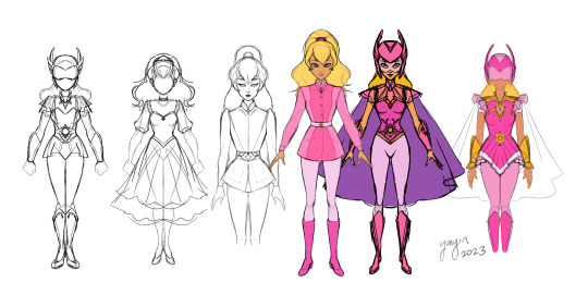
Have you guys ever seen the show Princess Gwenevere and the Jewel Riders? I believe it was Princess Starla in some other places! I remembered seeing it as a kid, and rewatched the first couple eps on youtube fairly recently! The world is full of reboots right now, but I actually feel like this would work super well for one, since it's got a lot of fun elements to it that could be explored a little more deeply.
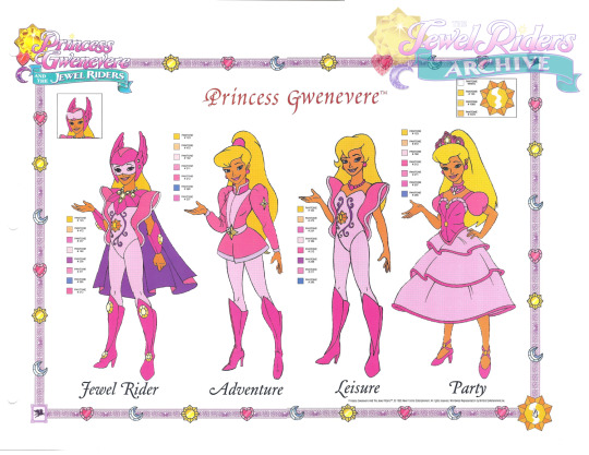
Anyway, all that to say I was fiddling with "updating" the lead, cuz I think she looks cute but her clothes are... well. Very 90's toyetic. I wanted to keep a lot of the same feel and look while making the aesthetics a bit more to my taste. The result is above, with the reference below! I don't think she was quite that vibrant in the show but it's what I ended up working from.
#yunyinart#princess gwenevere#princess gwenevere and the jewel riders#princess starla#princess starla and the jewel riders#outfit design#character design#idk if I will do more of these or not but it was fun to play with!#I love doing designs with the symmetry tool to start with#even if they do look a little boring compared to 3/4 view#it helps keep proportions in check
185 notes
·
View notes
Note
Please go on a rant about the crown, I'd love to hear it
ok here goes!!!
so part of my job is to design custom engagement rings for people and i get to work with diamonds and gemstones on a daily basis, hence the desire to redesign the g1 crown to better fit with prime starscream's design.
generally speaking i am not a fan of the g1 crown now that i know what i'm doing when it comes to jewelry like what is going on???

assuming that is a coffin cut? baguette accents on either side around the rim and barrels(?) for the tips of each point?
for the stones i decided to go with garnet as opposed to rubies and red diamonds simply because garnets are my favorite gemstone. i prefer the rich, dark shades and thought the deeper red would work well with the lighting i had already started working on when i began work on coloring the gemstone facets.
the center stone had to be a marquise cut because i wanted something that would mimic his red crest (due to the fact that it would be mostly covered) and to match the baguette accent stones on either side of the g1 crown i chose step cut squares in a channel setting. the three points at the tops of the crown are accented with trillions.


(yes i did painstakingly draw every single visible facet by hand because i didn't realize i could just use the radial symmetry tool to get the same result smh)

coloring gold is an ongoing learning experience but i am pretty happy with how it turned out on this piece (though looking back on it i would have gone darker with the shading in some areas). each of the stones has filed prongs (6 on the marquise for the appropriate amount of security) to match starscream's sharp points. the forks and negative spaces are to keep the design more tiara-like rather than one solid gold dome, accentuating the shapes of his helm rather than hiding them. i pull a lot of inspiration from design elements i see in rings i handle every day and thought this piece would be a good way to play around with that.
thank you so much for asking!!! hope you enjoy my info dump!!!
#raud answers#anonymous#raud says things#behold my fancy rock knowledge#who disrupts my info dumping?#transformers#maccadam#tfp starscream
31 notes
·
View notes
Text
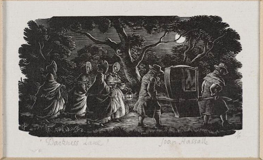
Darkness Lane by Joan Hassall [ x ] - the piece that most inspired my recent woodcut-style piece.
When I found out I was drawing for @gorgeousundertow's regency AU fic, Half Agony, Half Hope, as part of the @ineffableidiotsbigbang, I started looking up Jane Austen novel illustrations for inspiration and ended up finding some really cool art and websites! I'm posting about some of the images and resources I found because I think it may be interesting to others too (and even if it isn't, I'll have gotten the infodump out of my system haha).


Illustrations from Mansfield Park by Joan Hassall [ x ]
The link above points to a gallery on pemberley.com which has deliciously old-school DIY website HTML and a wealth of Jane Austen illustrations, as well as references for regency clothing. This was where I discovered Joan Hassall's work and decided I wanted to do a woodcut style piece (and then subsequently regretted it many times during the process of making it because I had no idea what I was doing). The detail, visual texture and dramatic lighting in her work is so cool and I just got more obsessed the more I saw.
See more Joan Hassall on tumblr via @uwmspeccoll (a very cool account!) here, here, and here.
The gallery on pemberley.com also had a bunch of Charles Edmund Brock illustrations, which I could not get enough of and so returned to the searchpage and found Molland's Circulating-Library. SO COOL! Jane Austen fans have bought illustrated editions of her novels and uploaded scans of them and oh my gosh they are all so beautiful.
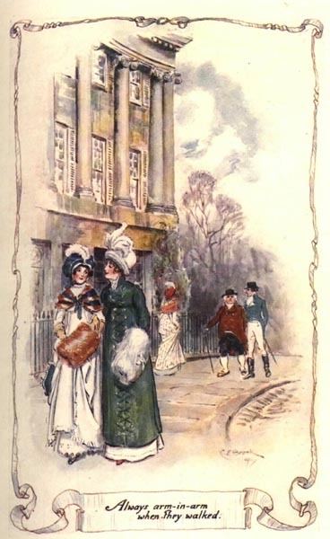
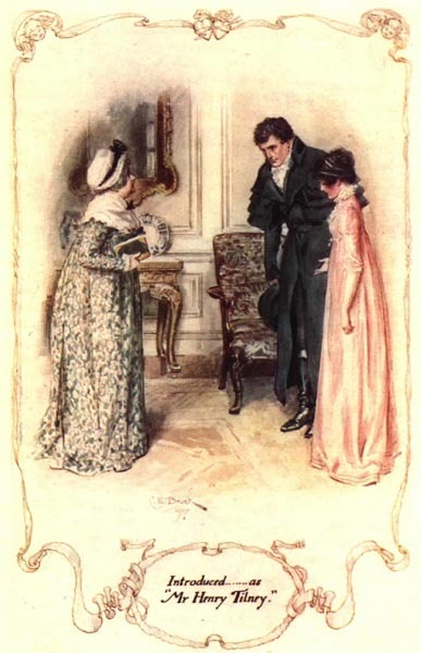
Northanger Abbey watercolour illustrations by C.E. Brock [ x ]
Side note about Henry Tilney (Catherines' love interest in NA), I also came across this old fan page for him from a mostly-broken-links-now site called THE CULT OF DA MAN and um it's great haha, check it out. (reviews of artists representations of him, more delicious HTML, and pixel art (!) of da aforementioned man)
There's also an article on Molland's about Charles and Henry Brock and their Jane Austen works that I found interesting. Charles is better known and did far more JA illustrations, but I do really enjoy Henry's tinted line pieces! (the article also dunks on some bad reproductions of them haha)


Pride & Prejudice tinted line illustrations by H.M. Brock [ x ]
C.E. Brock also did really cool title pages and when I found out that fic banners were a thing I knew what I wanted to do! (with the help of the symmetry tool and undo haha, so much respect for traditional art)


Title pages illustrated by C.E. Brock [ x ] and my banner - the banner design uses elements of both of the Brock images.
So, research in hand/bookmarks folder and banner completed, I decided on a scene from Chapter 10 where our beloveds are standing beside the Thames in the moonlight after walking around London for hours together and talking (CUTE). I wasn't sure what buildings to include in the background, so @gorgeousundertow gave me a few suggestions: Old Southwark Bridge, London Bridge, Southwark Cathedral, and Clink Prison. I realized after a bit of sketching that bridges would be hard to show with the straight-on view I wanted to do, so I decided on the Cathedral, partially because I had also considered drawing a scene that takes place in Salisbury Cathedral in Ch. 7.
OK BUT HOW? I struggled finding reference images for a while until I realized this was LONDON and would be very Google Earth-able. Big ups to Frank Cosgrove, whoever they are, for uploading this haha. This was also where I found out that all the suggestions were from a very small area!


View of Borough High Street, London, 1830, by George Scharf [ x ]
The building in front of the cathedral looked too new, so I went searching for an older image and found the second image. It's a completely different angle but it was enough to get me past the 'oh no idk what do'.
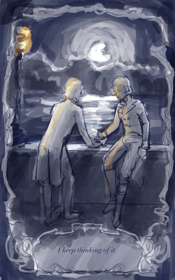

the much brighter concept vs the much darker finished product, featuring a barely-visible Southwark Cathedral
While looking for images of the Thames pre-Google Earth, I also found this website called Dictionary Of Victorian London which has a whole bunch of old images and excerpts from newspapers, etc on a variety of topics. One of the categories, Sex > 'unnatural offences', had this excerpt from The Times (1863), which reads:
Thomas Lane, a coffeehouse keeper, No.9, Love-lane, Eastcheap, city, and James Mortimer, a seaman, were charged with unlawfully meeting each other to commit an unnatural offence. ... The Magistrate committed both prisoners for trial.
Ugh. I hate that so much. Some sexy stuff happens right after the moment I'd chosen, and reading that reminded me that such things would be much more comfortable and safe in darkness (or if ppl just stopped being homophobic, but barring that). I wanted them to feel alone, like the whole world was asleep and it was just them, outside of time.
With that in mind, the iconic Thames Walk Lamp had to go bye bye, and when rendering the background I tried to minimize any light - it's just the suggestion of buildings. I also added tree cover! I tried to imitate how Joan Hassall does trees in some of her artwork, but when she rendered trees like this they were usually farther away/smaller, so my version looks more stylized with how prominent they are.
The ribbon border and book quote presentation is of course more Brock, but by making it black and having the interior image use it as a border instead of a fade-out inside it, I made it a bit of a reference to the very cool foliage edges you see in the very first Hassall image at the top.
I used the procreate brushes from this post on the Procreate Folio forums if anyone wants to try them!
Also fun fact! The font for the quote is called Chanson D'Amour <3 (I initially downloaded it when making the banner before changing the banner font to one called Dark & Black)
------
That's all I have to say about the process for the piece, but here's a comic from Dictionary Of Victorian London, Thames > Sanitary condition that I thought was cute (and gross ig? but also cute):
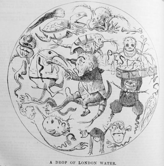
a Punch comic from 1850, I can't link the page due to how the website URL system works but it's from the Thames > Sanitary condition page
#lol anyway back to reading fanfiction from the bang!#joan hassall#charles edmund brock#henry matthew brock#art process#eccles makes#ineffable idiots big bang#jane austen#illustration
18 notes
·
View notes
Text
Which interior design style is best?
The "best" interior design style depends on personal preferences, lifestyle, and the specific needs of the space. However, I can give you an overview of some popular styles to help you decide which one might suit you best:
1. Modern

Characteristics: Clean lines, minimalistic, functional furniture, neutral color palette, and an emphasis on open spaces.
Best For: Those who prefer simplicity and a clutter-free environment.
2. Contemporary
Characteristics: Similar to modern but more fluid, incorporating trends and new interior designs, often with bold contrasts and a mix of textures.
Best For: People who like staying updated with the latest trends and enjoy a dynamic look.
3. Traditional

Characteristics: Rich colors, ornate details, classic furniture, symmetry, and elegant accessories.
Best For: Those who appreciate timeless elegance and a cozy, formal atmosphere.
4. Scandinavian

Characteristics: Light colors, natural materials, minimalism, and functionality with a cozy, inviting feel.
Best For: Fans of simple, functional design with a warm, homey touch.
5. Industrial

Characteristics: Exposed bricks, metal elements, wooden floors, and a raw, unfinished look with an urban edge.
Best For: Those who love a rugged, loft-style look with a touch of modernity.
6. Bohemian

Characteristics: Eclectic, vibrant, mix of patterns and textures, globally inspired decor, and a relaxed, personal vibe.
Best For: Creative souls who love an eclectic, carefree, and personalized space.
7. Mid-Century Modern
Characteristics: Retro aesthetics, clean lines, functional furniture, organic shapes, and vibrant colors.
Best For: Lovers of vintage style with a modern twist.
8. Minimalist
Characteristics: Extreme simplicity, neutral colors, clean lines, and a focus on space rather than objects.
Best For: Those who value simplicity, functionality, and a clutter-free environment.
9. Farmhouse

Characteristics: Rustic charm, vintage elements, wooden beams, cozy textiles, and a welcoming, homey feel.
Best For: Anyone who appreciates a warm, inviting atmosphere with a touch of rural charm.
10. Coastal
Characteristics: Light, airy spaces, beach-inspired colors, natural materials like wood and rattan, and a relaxed vibe.
Best For: Those who love the beach and want a serene, laid-back environment.
Choosing the Best Style for You:
Lifestyle: Consider how you live and what style fits your daily routines.
Personality: Your interior design style should reflect your personality.
Space: Some styles work better in certain spaces. For example, industrial works well in lofts, while Scandinavian suits smaller, light-filled rooms.
If you have specific preferences or needs, I can help you narrow down the best style for your space
How do I interior design my home?
Designing your home’s interior design my home can be a fun and rewarding project, but it can also feel overwhelming if you’re not sure where to start. Here’s a step-by-step guide to help you through the process:
1. Define Your Style
Explore Styles: Look at different interior design my home
design styles (e.g., modern, traditional, bohemian) to see what resonates with you.
Create a Mood Board: Use Pinterest or a physical board to collect images, colors, textures, and pieces you like.
Consider Functionality: Think about how you use your space and how your style fits your lifestyle.
2. Set a Budget
Determine Your Budget: Decide how much you want to spend on your interior design project.
Prioritize: List what’s most important to you (e.g., a new sofa, lighting) and allocate your budget accordingly.
Plan for Unexpected Costs: Include a buffer for any unexpected expenses that may arise.
3. Measure Your Space
Measure Every Room: Get the exact dimensions of each room, including the height of ceilings and windows.
Create a Floor Plan: Sketch a floor plan to help visualize where furniture and decor will go. There are online tools available if you prefer digital planning.
4. Choose a Color Palette
Start with a Base Color: Choose a neutral base color that you love and build around it.
Add Accent Colors: Pick one or two accent colors to add depth and interest to your space.
Consider Lighting: The natural and artificial light in each room can affect how colors look.
5. Select Furniture

Consider Scale and Proportion: Make sure the furniture you choose fits well within the space. Avoid oversized pieces in small rooms.
Invest in Key Pieces: Spend more on items that get daily use, like a sofa or bed, and choose more affordable options for decor items.
Mix Old and New: Combining new pieces with vintage or existing items can add character to your home.
6. Plan Your Layout
Arrange Furniture: Place larger furniture pieces first and then fill in with smaller items. Make sure to leave enough space for movement.
Create Zones: For larger rooms, create different zones for specific activities (e.g., a reading nook, dining area).
Consider Flow: Think about how people will move through the space and avoid blocking pathways.
7. Add Lighting

Layer Lighting: Use a mix of ambient (general), task (specific), and accent (decorative) lighting.
Choose Fixtures: Select light fixtures that complement your design style and provide adequate light.
Natural Light: Make the most of natural light by using sheer curtains or placing mirrors to reflect light.
8. Incorporate Textures and Patterns
Mix Textures: Combine different materials like wood, metal, textiles, and glass to add depth to your space.
Use Patterns: Add interest with patterned rugs, throw pillows, or wallpaper, but be mindful not to overdo it.
Balance: Ensure there’s a balance between smooth and rough textures and bold and subtle patterns.
9. Decorate with Accessories
Artwork and Wall Decor: Hang artwork at eye level and consider a mix of large statement pieces and smaller works.
Personal Touches: Include items that reflect your personality, like family photos, travel souvenirs, or books.
Plants: Add greenery to bring life into your space and improve air quality.
10. Edit and Refine
Step Back: Take a break and come back with fresh eyes to see if anything feels out of place.
Declutter: Remove any items that don’t fit with the overall design or make the space feel cluttered.
Final Touches: Add final details like candles, throws, and vases to complete the look.
11. Seek Inspiration and Feedback
Research: Keep looking at design my home
magazines, blogs, and social media for inspiration.
Ask for Feedback: Show your design ideas to friends or family for their input, but remember, it’s your space, so your opinion matters most.
12. Consider Professional Help
Hire a Designer: If the process feels too daunting, consider hiring an interior designer for a consultation or to manage the entire project.
0 notes
Text
Week 8 Exercise Reflection
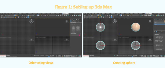
Week 8 was an exciting and painful week for me. I especially like learning modeling software, such as rhino in the last term. I like the precision and logic I feel in the process of software modeling.
This week, we had a preliminary understanding of some basic operations of 3dsmax, a modeling software. Including understanding the composition of UI, modeling logic and the use of some tools, etc. I think I have done a good job in understanding software modeling methods. In class and Autodesk tutorial, I have learned a lot about how to make efficiently in 3dsmax. I can express what I imagine through the skills I have learned. In this regard, I think I am successful.
Difficulties
But this process is still very difficult, because I have been very familiar with the operation of rhinoceros before. In a sense, I have formed a modeling idea in rhinoceros. Therefore, in 3dsmax, there are many operations that are very different from what I expected, including rotation, translation, viewing angle, etc. During the production process, I felt a little uncomfortable. But after a period of trying and learning, I can naturally be handy.
But another problem has been bothering me: the system compatibility is not high. In my acess, both resolution and system response speed make the whole modeling process very bumpy. Including the incompatibility of magic mouse and the incompatibility of ALT and option on the keyboard. In addition, due to the performance of GPU and the way similar to simulator operation, display problems often occur. But under such difficult conditions, I still successfully completed the exploration of some models.

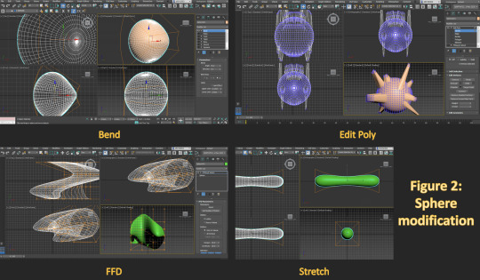
1. Modifier: love
In task 1, I start with a sphere and superimpose different modifiers on it. Including bend, stretch, squeeze, taper, etc. Then, I used symmetry to turn the original model into two staggered together to form such a heart.

2. Edit polygon: sofa? chair?
Later, when I began to study some methods and techniques about edit polygon. This method allows us to modify the appearance properties of a shape in some detail. Including extrusion, chamfer, etc. Through these methods, I designed a chair (or a single sofa?) with a base integrated with an armrest.At the handrail, I use the chamfer adjustment to make the overall visual feeling more comfortable.
Interesting fact: the angle of this sofa chair and cushion is based on the famous Barcelona chair.

3. Pratical attempt
When I was basically familiar with these techniques, I tried to create my Olay moisturizer bottle in this. The final product looks okay. But I think the shape formed by adjusting the surface is not smooth enough, whether using edit polygon or edit mesh, but I have no other solution.

If I had a chance to do this. The best thing is to prepare a Windows computer lol. If it is really difficult to achieve, I think it is necessary to prepare a mouse with a scroll.
After I finished this exercise, I thought about it. I think learning modeling software is a very important thing, because it provides a new idea for us to express our ideas. Due to the development of science and technology, all kinds of modeling software are good communication tools. It is more intuitive and comprehensive than painting; it is more convenient than a physical model. But we can't rely entirely on it. Our communication skills must be comprehensive.
12 notes
·
View notes
Note
Hi there 🙋
I hope you feel better soon.
I would love a post about how to make a beautiful Mandala and what are the essentials to make it.
Take us step by step and a time lapse video of you drawing one will be amazing.
- M (hope the letter's not taken)
hey M! the letters not taken and nor am i
thanks for the ask, i do feel much better thanks to @dragoncreek319 @thebookwormslytherin
well i don't know how to explain how to make a beautiful mandala because to be very honest, i just play the music and switch on symmetry tool and my hand flows
here's a process of my time lapse of the mandala i made this morning.
a mandala does hold philosophical and artistic significance to many, but you do you babe.
a mandala does have a radial balance, so symmetry tool will help you with that, but if you're drawing traditionally, drawing concentric circles and sections really helps you draw part by part.
there's literally no hard and fast rule on what makes a mandala beautiful. and i definitely don't think im qualified enough to talk about this, but imma share a little here and there.
i have started digitally drawing mandalas around almost a year ago, but i have always found myself to draw mehendi stuff, floral stuff and similar designs for most of my life.
i also have a keen eye to observe details and take inspiration from ancient indian architecture, textile and patterns. i also love flowers and floral motifs in my designs. adding leaves, flowers, branches, stems, petals, multipleayers of floral whorls. that is like my first thought when i begin drawing. oh and paisleys (kairis) its a done deal and an integral part of certain design styles i love paisleys.
in terms of recommendations and friends who make mandalas too,
@tiredcoffeebeanthings is a damn good mehendi artist and an extremely creative genius. their art style compliments their designs very beautifully.
@cynical-ravenclaw my beloved, her mandalas, her designs are always something to look forward to.
there also are a few basic techniques i guess but it's your creativity and your ideas that make mandalas unique!
hey anon also maybe if you could send another ask regarding this and imma continue talking there?? because this is getting too long lmao
21 notes
·
View notes
Text
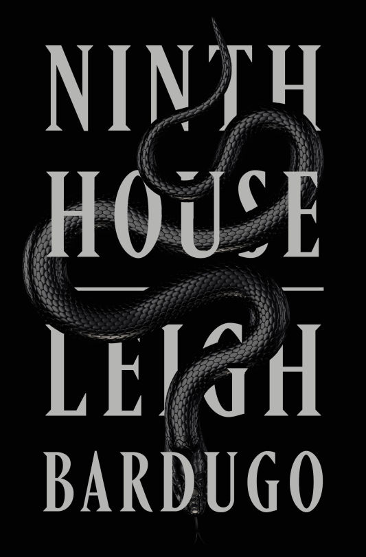
Ninth House, Leigh Bardugo
Rating: Mixed Review
Genre: Fantasy, Mystery, Dark Academia
Representation:
-Bi/pan protagonist
-Jewish protagonist
-Latina mixed race protagonist
Trigger warnings: Sexual assault (in scene), rape (in scene), CSA (in scene), graphic violence, murder, drug use, drug abuse, drugging of another person, overdose, domestic abuse, medical abuse, violence by dogs
Note: Not YA
Why is it that every time I read Leigh Bardugo, I love the book with a passion...except for one thing that makes me want to tear my hair out?
Here’s what seriously impressed me about Ninth House, Bardugo’s entry into New Adult. The pacing was phenomenal. The measured, perfectly timed revelations of information had me finding excuses to listen to the audiobook - taking extra neighborhood walks, doing extra loads of laundry - because I was so hooked. Then, there’s the worldbuilding. Bardugo managed to walk a delicate line, successfully suspending disbelief while still asserting that eight Yale secret societies do secret magic rituals to the benefit of the oligarchical capitalist machine (we all kind of suspected this was the case, right?). But the best part of the book, the part that had me recommending Ninth House in more than one group chat, was, of all things, the point-of-view jumps.
Rarely are point-of-view switches the star of the show, but I was so excited to see a genuinely original, intrinsic-to-the-heart-of-the-whole-novel use of that technical tool. The point of view jumps crank the volume up on the theme of the whole book. We start with the main character, Galaxy “Alex” Stern; she is the point-of-view character for the present semester during which the principal action of the novel takes place. Her upperclassman and mentor Daniel Arlington (or “Darlington”) is the point-of-view character for the semester before - all because something happened to Darlington. Alex is telling people he’s doing a “semester in Spain,” and all the reader knows is that her explanation isn’t strictly true. The point-of-view jumps being so strict (there is never an Alex perspective chapter during last semester, and never a Darlington perspective in the present) serves to separate the two characters from each other with a really incredible emotional effectiveness. The heart of the novel, for me as a reader, was yearning for these two to be reunited - and all because Bardugo holds the two character points-of-view separate across an unbreachable temporal divide. It’s a powerfully effective technique.
But let’s backtrack. Alex is a 20-year-old high school dropout from the west coast. As the story progresses, we learn that Alex can see ghosts, which is why, despite never finishing high school or getting her GED - or even applying - Alex is a freshman at Yale - contingent on her joining the secret society called “Lethe House” as apprentice (“Dante”) to the current leader of the society, Darlington (the “Virgil”). Lethe House is the governing body of the eight Yale secret societies that practice the magic that keeps the elite in power. These secret societies make books sell, make T.V. anchors charming and compelling, and open portals to other parts of the world - when they aren’t throwing over the top Halloween parties with magic designed to alter one’s perception of reality.
Darlington, by contrast to Alex, seems to belong at Yale. He’s from an old family, and he’s preppy and well-read. Most of all, he loves Lethe House and its history of keeping the secret societies from harming people in their pursuit of magic and power. That is, until he disappears just in time for Alex, only half-trained, to investigate the murder of a girl on campus.
The first three quarters of the novel are fantastic for the reasons stated above. Bardugo’s approach to mystery writing is effective. We have half a dozen suspects, most of whom, as elite ivy league magicians, are at least guilty of some misdeed. Having all your red herrings end up somewhat culpable anyway is a good way to keep your mystery difficult to solve until the end. We were off to a good start.
Unfortunately, in the end, Bardugo made the all-too-common choice to value “surprise” over the most compelling, satisfying solution. So while the reader doesn’t see the ending coming, that is at the steep cost of the ending not being justified by the rest of the book. Bardugo even has to invent new rules of magic off the cuff to justify the ending. When the rest of the book so painstakingly developed the rules of magic in a way that made sense and never felt overly expository, undoing all that effort feels like a monumental waste. And for what did Bardugo undermine all her hard work? A mystery that the reader won’t have all the clues to solve? It’s really okay - in fact, good - if the reader can puzzle out your story. It means your story has symmetry, internal logic, or perhaps, some sort of message.
This is what had me tearing my hair out. I know exactly how I would have written the ending of Ninth House to be the perfect conclusion to a stunning book. I know exactly what the message should have been. Is it somewhat ridiculous to say that Bardugo misinterpreted the message of her own book? Perhaps. But given the out-of-left-field-ending, the theme of the book ends up being a rather cheaply bought “No matter how traumatized you are, you can be a girlboss” instead of the message that the very structure of the novel itself was pointing to since page one: one of companionship, trust, and restoration (frankly, a better message for a novel with a main character who suffers so much loss and trauma. But, sure, “girl power” is a theme...I guess...)
Here’s what I mean by the structure of the novel itself pointing to a different theme. (Spoiler warning for the rest of this paragraph). Because the point-of-view switches in the first two thirds of the novel were used by Bardugo like two magnets being held apart, the only way to create a feeling of resolution was, so to speak, putting the magnets back together: getting Darlington back into the “present.” The degree of disconnect between reader expectations and the reality of the book is comparable to picking up a romance novel only to have the two leads decide to just be friends at the end. Bardugo set expectations - akin to genre expectations - but unfortunately Bardugo kneecapped her first book in the service of the sequel.
And then there’s the trauma. Alex’s backstory wouldn’t be the same without some level of trauma; it’s an important part of her character arc. Even the explicit presence of sexual assault on the page was justified in the case of Alex’s backstory - and I think that is rarely true. But when it came to a side character’s explicit in-scene rape, which was used as a clue in the broader murder mystery rather than treated as a crime in its own right, that tipped me over into feeling the trauma in Ninth House was more excessive than necessary for character development. The resolution to that side character’s rape is oddly cartoonish - like an over-the-top prank rather than justice - and again, the only reason the rape happens to the character is to give Alex more information she needs to solve the plot. Maybe that wouldn’t bother some readers, but for me, a book has to bend over backwards to justify showing me a character being raped. Bardugo does well earlier in the book when depicting Alex’s assault; the assault is the explanation for why Alex doesn’t view magic with the same childish excitement as the rest of Yale, and it’s part of what holds her apart from the entitled secret societies. It needed to be in the book. Everything else was gratuitous.
That said, there’s one thing still to address in this roller coaster of a review, and that is: wait, is this a queer book? I had gone into it assuming that it would be, mostly because all my queer friends were reading it. And the answer is….kind of? Knowing Bardugo’s history with putting queer characters in her books, I’m going to assume she wasn’t baiting when she had Alex claim to have loved a girl in her backstory. Which, in the context of the rest of the novel, would make Alex bi or pan. As a book that a lot of queer fans of Bardugo’s YA have read, or will read, it feels appropriate to review it here.
This was a mixed review from start to finish, but to finish up: if you are thinking about reading Ninth House, go for it! There is so much to like about this book. Take to heart that if you read and liked Bardugo’s handling of sexual assault in her YA titles, you should be prepared to be surprised by Ninth House. It is not the same. I would not have called her handling of sexual assault in Six of Crows, for instance, restrained - but compared to Ninth House, it absolutely is. Despite my strongly worded feelings about the ending, Bardugo left room to redeem herself in the sequel (which, if you ask me, is why the ending was so bad in the first place...). I for one will definitely be reading the sequel the second it comes out.
#leigh bardugo#ninth house#fantasy#mystery#dark academia#not ya#mixed review#bi#reviews only#protagonist of color#jewish protagonist
31 notes
·
View notes
Text
ADHD Things That I Struggle with and How I Cope with Them
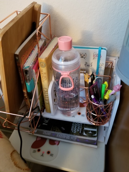
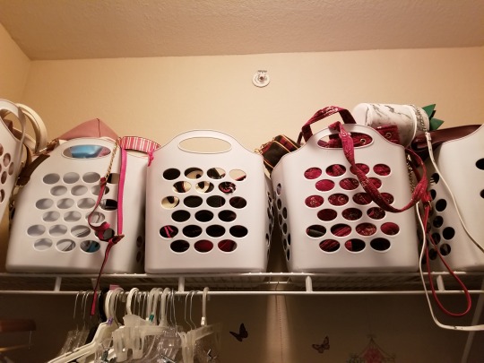
1. Taking off my jewelry and leaving it somewhere in the house, in public. So many places. Like, I used to lose so much of my jewelry bc I could legit not figure out where on earth it could’ve gone. I take off rings especially bc my brain will go, oh you’re washing your hands take it off and set it down, now forget about it forever. Or: the time to have things on your hands is DONE. You can physically not do it anymore. TAKE IT OFF NOW. It would make me endlessly frustrated and sad that I lost things until I realized a simple thing that helps me: TRAYS

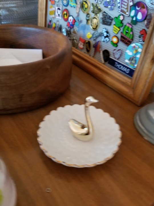
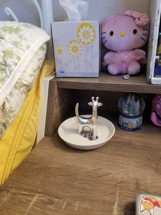


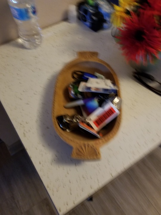
I shit you not, I have one for every single room as you can see above. And they can be ANYTHING, anything that works. What it tells my brain is hey, this is going in this very specific place, or this place or this place or this place, so when I can’t find it I just go to my little trays and there they are!! It’s truly changed my life fam, and it’s also being kind to myself. Because I can’t help that that’s a habit I have, this way I can work within my own needs.
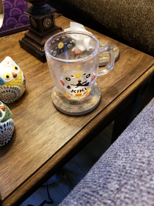
2. Never wanting to check my phone, watch, or turn around to look at what time it is but always wanting to know what time it is anyway.
I cannot for some unfathomable reason just, turn around and look at a clock, so I just bought more clocks. And I feel no shame. There can never be too many clocks, and they don’t have to be ostentatious clocks, they can be small and multi-functional but the point is that it works for YOU. These are my clocks:

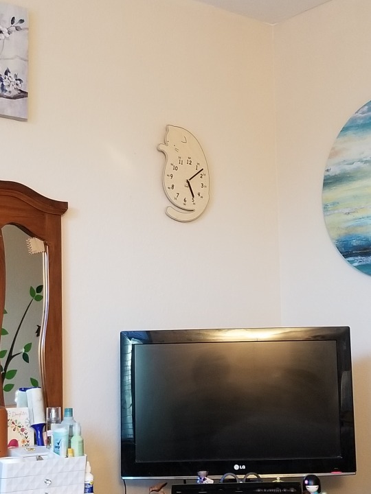
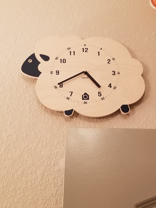

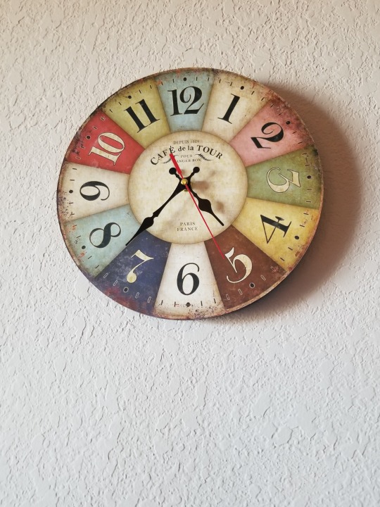
Yes. There is a sheep in my bathroom. Her name is Clarissa. The kitty’s name is Silly Billy.
3. Never finishing my cup of water/drink, or never wanting to go get another cup bc it feels wasteful and like I am wasting resources.
Bruh, this is a thing for me and I just DON’T KNOW WHY. I have a thing. It’s always been a thing. So, now that I am an adult I have decided to designate a cup for my bedroom, and a cup for my breakfast and then a cup that I carry with me when I go out. As long as you clean them (this applies to water only) at least every week or 2 weeks you are solid. Like, it makes my brain settle. I can literally feel myself be like, and now I am going to get water with my bedroom water glass, I am done getting ready I must finish this glass in order to get breakfast water, or I dump the bedroom water into my breakfast water cup when I’m feeling frisky. And for me this works bc it’s a designated item for a designated space that I can fit into my space and never have to worry about where it is, or goes, which leads me to my next thing, but first: my water cups!

4. Not taking glasses to the kitchen.
This used to be an issue for me, but not so much thankfully as I’ve gotten older. But I still find myself just like, forgetting to take care of something. For me, COASTERS are a revelation. I got cute ones, cats as a matter of fact:
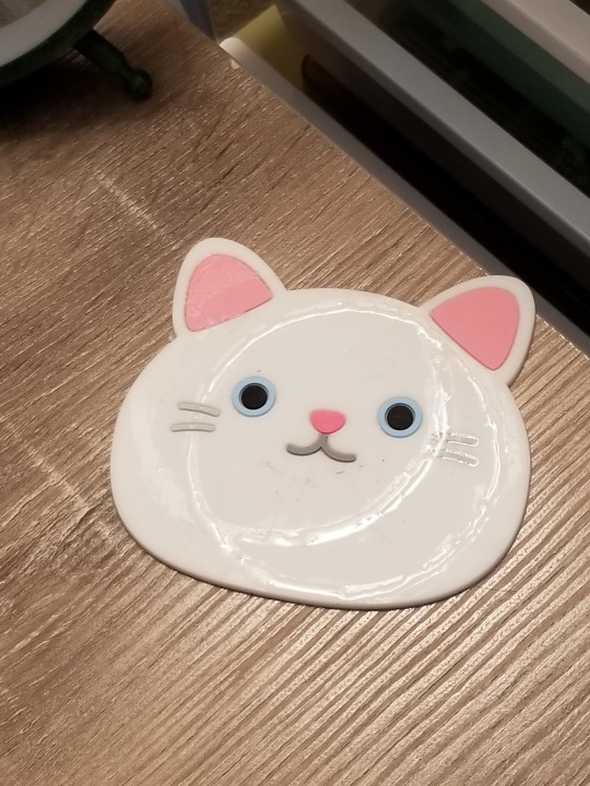


So that I want to clear them off and see the kitty again and take my cup to the kitchen.
5. Deciding what to wear
I am a fashionable person, just am. Not everyone else, and that is totally fine cause we are all awesome and have different interests and I love you whatever your interests are! For me, I have a lot of clothes and accessories and that can be totally overwhelming when it is not organized. So, for myself, I organize my closet as such: Rompers, Shirts, shorts, skirts, dresses, and then I have underwear, bras, socks, and undershirts in the same storage unit. Then for jewelry I have it sorted in category: Earrings by color, Rings by color, Stud Earrings by color, Bracelets by type, hair bows all together, and belts, suspenders, and bandannas all together. Pics below to demonstrate. Organization is extremely important for me, because it is a routine that I can control and make sure that my space is perfect and I can locate everything I need to. Everything in my life is organized accordingly. And while that does seem daunting the first time you do it, once you learn the tools and keep it organized it really helps to keep it organized and it’s not as difficult as it seems when you start.
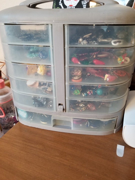


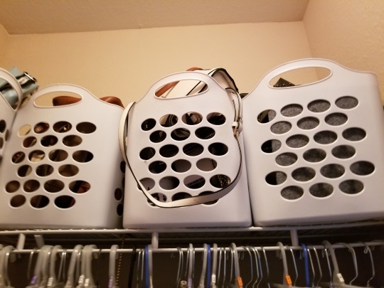
And yes, I do sort my purses by color as well.
6. Wanting to stretch out my legs when sitting
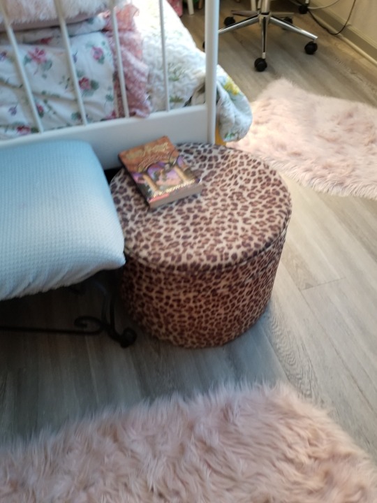
Sometimes you have surfaces that cannot accommodate leggage. My solution: Footrest! I have 2 in my room, and I love them dearly. It allows you to do all the shifting one needs to do when they have a restless spirit.

7. Symmetry
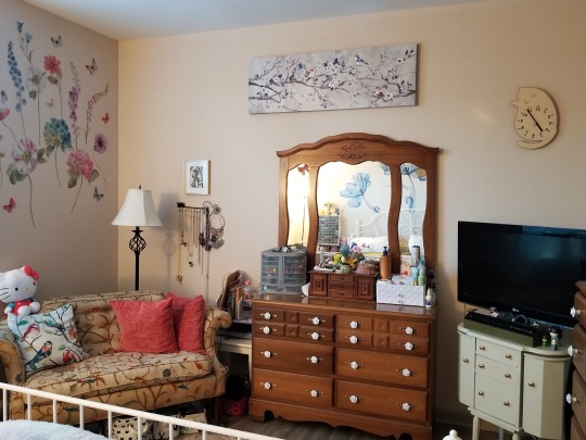
Sometimes, ADHD people have an issue with symmetrical. I am one of them. Now, the setup of my room meant that it couldn’t, for practical reasons, be symmetrical. So I faked it by clever placement of decorations and items as shown below. As long as your brain thinks it’s symmetrical, it should make a space far more relaxing.
8. Clutter
I have a shit ton of stuff, it’s just who I am. I am a stuff person. That used to mean clutter everywhere. Now, I have solved that by having storage bins everywhere. And every 3 months, or longer or shorter, I go through my things and get rid of things. I even have a little bin just for random shit I don’t want to put away right now, or stuff I need to find a place for or fix that way I can find it later. It’s all about the organization my dudes.

9. Singing all the time/Listening to the same music
I sing constantly, and will listen to the same song(s) over and over again for weeks, months, years. I feel no shame, it is who I am. First thing to realize is that this is hyperfixation, and that we as people with ADHD attach strong emotions to music and it is comforting to listen to that music over and over again, it soothes us. It can drive people around us crazy, and the thing about those people is that they will have to legit GET THE FUCK OVER IT. I could be nice and be like oh I wear headphones but NO. I don’t. Because headphones are a no no for me a lot of times bc I can’t stand to have them on for too long, they bother me. So the people in my life have to love me enough to cope. And they do, they turn on their own music or go in their room or sigh and are like this fucking song again, and it’s FINE. IT’s unavoidable and there is nothing wrong with it.
The singing thing tho, I do try to manage my volume when I’m in public bc obviously I don’t want to disturb strangers but no, I don’t stop singing otherwise. It helps my anxiety and oftentimes it’s completely unconsciously that I’m singing so *shrug*. They’ll get over it my loves.
Hm that’s about all I can think of for now, if ya’ll have any tricks of your own, feel free to add on, and feel free to ask about anything you wanna know about. Love ya’ll!

#ADHD#ADD#disabilties#disability#coping mechanism#Coping mechanism for ADHD#Personal#ME#Long Post#long post is long
307 notes
·
View notes
Note
DRAGON!! Questions: 2, 4, 27 aaaand 32. XD Also 35, release the rambles.
ADA!!!! Let’s see what I can do here... >:3
2. Why do you write fanfiction?
I write fic because of the spaces between the lines of a story. The gaps and unanswered questions in canon encourage me to come up with deeper mechanics, more complicated lore, and complex character motivations in order to explain. Sometimes, one of those pieces will click into canon so well that it becomes inspiration. And then there’s nothing else to do but write! Lol. Stories are so wonderful because of what we can do with them, individually and all together, and I really like being a part of that.
4. Are there any writers that inspire you?
Absolutely. Brandon Sanderson and Neil Gaiman are the novelists who’s skills blow me away and remind me why I like to write. Robert Hass,Trista Mateer, and Robert Graves are inspirations too, though I’m not a poet. I like to think and they make me do so.
27. What’s the nicest comment you’ve ever received?
Oh that’s hard!!! I get a ton of wonderful comments--from long, analyzing, discussion ones to short, joking, fun ones that make me laugh when I’m having a bad day. I love to be able to interact and banter with my readers; it’s my favorite thing, and they’re all so lovely. ANYWAY a comment that jumps to mind is a recent one from @writingish1210 on all but my oldest fic ever, Wire Figures, praising characterization and tone. (i WILL cry, don’t test me)
32. Summarize a random fic of yours in 10 words or less.
I used a random name picker for this, uh
“they said I couldn’t fit calculus inside of endgame angst”
35. Ramble about any fic-related thing you want!
Release the ramble!!!!
okokok how about a first-page blurb from something I may or may not ever actually write? I’m in the mood for ironstrange fairytale au because I’m working on a Prophets in the Graveyard chapter today, so have some fantasy Rapunzel vibes!
The candle flame sparked weakly at the very base of its wick when the knock finally rattled at Stephen’s window. Stephen didn’t move from where he was kneeling, a hand extended in a careful downstroke to complete the right edge of the design he’d almost perfected. It was vital that his movements were smooth and controlled. He didn’t let the knock surprise him into skewing the line, and it took a long moment to loop his fingers to end his stroke with a flourish.
Only then did Stephen jump to his feet, tucking the sapphire feather of his quill behind his ear and tumbling toward the window. The glass was fogged from the warmth of the inside air against the chill of the autumn temperature outside, and Stephen could just barely see movement through the cloudiness. He slid his fingers between the windowpanes and threw them open.
“You’re late,” he said, bracing his hands on the windowsill. He leaned out to peer down at the prince standing on tiptoe atop the closest parapet.
“Yeah, well, maybe I got some sleep for once,” Tony Stark huffed.
“You’re lucky I’m still working and was in the bottom room.” The lowermost area of the North Tower—the part of the tower where Stephen spent most of his time and did most of his work—had the only window within reach of the castle wall. Tony was still too short to do much more than fumble blindly at its surface until Stephen noticed.
“You’re always still working,” Tony told him, extending a hand.
Stephen gripped it with both of his and hauled Tony upward, assisted by the prince’s scrambling feet bracing on the frozen stones of the North Tower. Tony got his free hand around the window frame and swept his legs inside. He perched comfortably atop the sill.
The cold air had turned both of their faces pink, and Stephen could already feel his nasal canals getting clogged. “Come on,” he said, jerking his chin. He knew Tony liked his spot in the window, his perch somewhere between Stephen’s world and his own, but it was cold and Stephen couldn’t help but worry that Tony might one day lose his grip. That he might fall, and not just to the top of the wall six feet below, but down and down to the bottom of the turret all those stories beneath, and Stephen would lose the prince they were all trying so hard to save.
“What are you working on?” Tony asked, letting Stephen tug him into the tower. He trotted over to the wide canvas spread across the center of the floor as Stephen latched the window behind them. Tony’s fingerprints were pressed into the mist on the glass.
“Nothing new,” Stephen replied with a shrug. “Still the fox.”
Tony hummed, walking a circle around the design. “I still don’t know how you get this from those dusty old books.”
“I’m a genius, obviously,” Stephen snorted.
“You’ve never even seen a fox, Stephen.”
“You know I don’t have to see something before I spiritsketch it.”
Tony glanced at him, raising an eyebrow. “You have to see me.”
“Well yeah, you’re a person.” Stephen sat back in front of his canvas, patting at his head until his fingers curled around his quill, as Tony circled a few more times before joining him. The prince was like a cat—fidgeting and circling and testing before finally relaxing enough to sit. “When I spiritsketch you, I’ll be reforming an existing soul, not producing a whole new one. All this is just to practice my technique.”
Spiritsketching was a complex art, relying on precision and power and the layered designs that matched ink to spirit and back again. Stephen’s life had been dedicated to it since he was seven years old. For ten years, he’d learned the properties of the soul and how to map it into a sketch, how to draw life into a mind assembled with the right lines and dots and angles, how to capture the essence of a thing by speaking the language of the spirit.
He’d started small, as the notes of a dead teacher had told him from the margins of the books. ‘Begin with what is manageable, and from there you can flourish.’ He’d started with drills to build his eye for symmetry and exactness. He’d learned how to layer his ink and control the thickness of his stroke. And then he’d begun to form creatures, matching designs described in the texts. There were butterflies huddled in the corners of the room even now; the first being he’d perfected.
He didn’t have to see the creatures. The only thing he had to see was Tony, until he could map the prince’s shining, complex spirit onto a canvas and do with it as he was bid. Stephen saw only the creatures he could build himself.
The king made sure of it.
“How close are you?” Tony asked, and for a moment Stephen thought Tony was talking about his own spirit, before he remembered the fox.
“Almost done,” he replied. “Six weeks and I’ve reached the last phase.”
“Oh fantastic. This is my favorite part.”
Stephen hid a grin, fingering his sapphire quill for a moment. He found his place on the canvas once again and drew a stroke of deep blue ink up into the tool. Leaning forward, Stephen carefully sought out the perfect connection and began to sketch.
That was fun!!! Thanks so much for the ask <3
12 notes
·
View notes
Text
Week 9: Digital Iteration & 3D printing
This week was spent learning another digital modelling program, 3ds max studio. After only just getting used to all the tools in fusion, knowing I would have to work on a completely different program with different navigation functions and tools, was a little daunting. Although, knowing that I had faced similar fears and reluctancy towards other tasks in previous weeks and having learnt that its just best to get started as soon as possible, taking it step by step, I knew I had to immerse myself straight away. Once navigation was figured out, I was able to realise how super useful and fun the application was.
Andrew Simpson video— cup (pre class): Unlike Andrew who had a really clear design idea from the start, I found myself not set on ideas and relied on the sketch modelling phase to cement/figure out what my final product vision would be. Due to limitations both financially and in terms of exposure to a variety of materials, creating higher/presentation standard prototypes wasn’t greatly explored in our Olay models compared to his cup which was able to be mocked up in a variety of materials, to a high degree of functionality and ergonomics (eg. weight of cup). Despite these differences, there were many similarities that generally outweighed the differences when it came to the sketch models. His statement about how sketch models allow a designer to more freely make small changes was definitely true to the process undertaken making physical and digital models of our olay bottles. Specifically when making the foam model, I first started to produce a slightly chamfered edge around the front diamond shape and later continued to work away at it to see how it would effect the overall shape and look. As for the digital models, the opportunity to slightly alter models was even greater as the model could be modified and then simply turned off or adjusted.
Getting familiar with 3ds program capabilities (set up & sphere modification): As soon as I opened the 3ds application, I was immediately intimated by all the windows and icons that covered the screen. The videos provided by 3ds and Rob’s tutorial were a great introduction to the new program and almost instantly eased my worries as they both started by simplifying the toolbar (probably the most terrifying part of it) and explaining some of the tools. After setting the units to mm, simplifying the toolbar to only the essentials and orienting the views orthographically (a setup we’re now really used to) I felt slightly more confident and eager to start exploring the modification tools. Creating a sphere and experimenting with different modifiers was a great way to get used to the different tools and ways a form could be manipulated. I particularly loved the ‘FFD’ and ‘edit poly’ tools as they were able to completely manipulate the form of the sphere to something unrecognisable & unique in a matter of seconds.
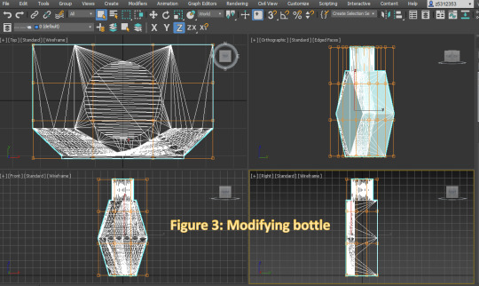
Modifying my Olay bottle: I liked my original fusion model so when it came to modifying my bottle, I didn’t want to do anything too drastic and different from the original design. In 3ds, I found that the modification features were quite limited for my bottle as I soon learnt that it was due to the mesh (which could be fixed although didn’t find out until after sending to 3D printer- small uniform polygons ideal). Hence, I decided to opt for symmetry & bend tool and simply make the front face chamfered edges slightly steeper to create more depth and place emphasis on the bottles defining diamond & geometrical form.
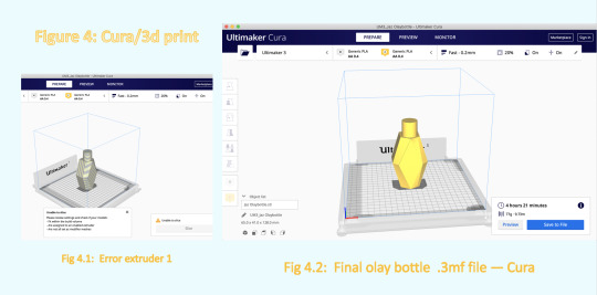
Cura & 3D printing: When it came to transferring my file to Cura, the process was extremely easy and fast. It was only when I was in Cura that I came across a couple of issues. The first issue I came across was when trying to disable the ‘extruder 1′ as whenever I tried to disable, it was no longer able to slice my design and create the final print file that I had to send off to DFL. Luckily, I was able to solve this issue by force quitting, restarting the app and importing in my .3mf file again. From here, I struggled to implement the ‘normal settings-fast’ as for some reason I couldn’t figure out how to import it. After chatting with some classmates, I realised I could change nozzle/flow rate of PLA from 0.1 (took 12hrs!) to 0.2 which drastically reduced print time to about 4 & 1/2 hrs. I then submitted it to DFL for printing and was super pleased to see it all printed when I picked it up.
Overall, I really enjoyed the activity this week and the way it allowed me to turn a recognisable shape into something completely unique & crazy with ease. This task has helped me realise not to be so restrained by common geometric shapes and to push beyond these forms and create my own funky asymmetrical designs. Something that I noticed was a major advantage of 3ds compared to fusion was the ability to change both extremely minor/small details as well as large or the entire form. Having the 4 views as separate windows distributed on the screen also made it really easy to work on my model compared to fusion where you have to continually use the view cube or orbit tool to see the design from another angle. Also the large variety of modification tools that made changes almost instantaneously, was definitely a great bonus and something I will for sure take advantage of in future digital models. Whilst fusion is great for mocking up quick sketches and solid forms, it is in 3ds that designs are able to be altered down to the small details to achieve the most accurate and professional finish possible. Being able to actually print out and see a model that was likened to my overall vision of the product was extremely rewarding and a technique I will definitely by utilising for future models.
4 notes
·
View notes
Text
THE COURAGE OF COINCIDENCE
Unknowing imitation is almost a recipe for bad design. I love to read more than anything, but by the end of high school I never read the books we did these disgusting things to, like those we mishandled in high school. What happened? Immediately Alien Studies would become the most dynamic field of scholarship: instead of painstakingly discovering things for ourselves, we could simply suck up everything they'd discovered. Like all such things, it was interesting to notice how important color was to the customers. Don't be hapless. But schools change slower than scholarship: the study of ancient texts had such prestige that it remained the backbone of education until the late 19th century. You don't know yet. Indeed, the really interesting question is not what will happen to movies. Starting a startup is like science in that you have to rewrite to beat an essay into shape. As long as it isn't floppy, consumers still perceive it as a practical question: how do you avoid mistakes you make by default? But that's not what you're trying to solve.
So what's interesting? There is good pain and bad pain. You can even use it tactically. I've noticed this too. A good deal of willfulness must be inborn, because it's common to see families where one sibling has much more of it than another. That they would say, hey, wait a minute, how can stocks be up with all this unrest in the Middle East? Indeed, if you want to know whether to recruit someone as a cofounder, ask if they are, we have a remarkable coincidence to explain. The startup world is more transparent and unpredictable than most, but almost everywhere the trend is in that direction, but it happens surprisingly rarely. Starting a startup is like science in that you have to follow the truth wherever it leads. I'd gotten at the time.
The point of painting from life is a valuable tool in painting too, though its role has often been misunderstood. Though this election is usually given as an example of the power of TV, Kennedy apparently would not have won without fraud by party machines in Illinois and Texas. About what, and why companies pay now for Bloomberg terminals and Economist Intelligence Unit reports. After dinning into you that taste is just personal preference, then everyone's is already perfect: you like whatever you like, and that's frightening. Good design is often slightly funny. Symmetry is unfashionable in some fields now, in reaction to excesses in the past. When you see something that's taking advantage of new technology to give people something they want that they couldn't have before, you're probably looking at a winner. You can only do that if you own the channel, and even now I find it kind of weird. I ran into a friend in a cafe. Painters discover that they're expressionists.
And yet, if they are, we have a remarkable coincidence to explain. Genetic algorithms may let us create things too complex to design in the ordinary sense. The charisma theory may also explain why Democrats tend to lose presidential elections. Whereas someone clearer-eyed would see their initial incompetence for what it was, and perhaps be discouraged from continuing. There must be a better way. I find that American adults are no better or worse informed about literature than art, despite the fact that they don't realize how incompetent they are. When the values of the elite are liberal, polls will tend to underestimate the conservativeness of ordinary voters. Resourceful implies the obstacles are external, which they generally are in startups.
And so began the study of modern literature. To Michel de Montaigne, inventor of the essay. Beginning writers adopt a pompous tone that doesn't sound anything like the way they speak. By then it was merely a tradition. You also have to be funny, but it's hard to imagine something that could be called unlucky, but not hapless. But Reddit solved the real problem. I really wanted to know. It seems strange to have to emphasize simplicity.
Immediately Alien Studies would become the most dynamic field of scholarship: instead of painstakingly discovering things for ourselves, we could simply suck up everything they'd discovered. Maybe you can, so you start learning from users what you should have been making. This gives students a misleading view of how things get made. So it was in Europe in 1200. These are the elections I remember personally, but apparently the same pattern played out in 1964 and 1972. Not every kind of hard is good. In fact consumers never really were paying for content, and publishers weren't really selling it either. Now people are saying the same things about Arc that they said at first about Viaweb, and Y Combinator and most of my essays. A Photoshop user needs Photoshop in a way that no one needs a particular song or article. There have always been people in the music business hope to retroactively convert it away from publishing, by getting listeners to pay for subscriptions. And Kerry lost. You can even use it tactically.
You also have to be hard on yourself. If you work on overlooked problems, you're more likely to discover new things, then instead of turning a blind eye to the places where conventional wisdom and truth don't quite meet, you should do it yourself. What should you think about a lot, and you need some ability to ferret out the unexpected. Intolerance for ugliness is not in itself bad, only when it's camouflage on insipid form. There was no reason you couldn't have done that in the era of physical media. The aim is not simply to make a record. In a sufficiently connected and unpredictable world, you can't say anything that might be perceived as disparaging towards homosexuals. Public schools probably couldn't stop teaching English even if they wanted to; they're probably required to by law. No disaster results. The second phase in the growth of taste is a conscious attempt at originality. What goes through the kid's head at this point is not trying to impress anyone. In software, a problem that can be proven.
#automatically generated text#Markov chains#Paul Graham#Python#Patrick Mooney#literature#Europe#Painters#students#Montaigne#view#era#fact#willfulness#party#Studies#stocks#attempt#books#coincidence#obstacles#essay#users#taste#hey#Unit#essays
1 note
·
View note
Note
Not necessarily an AU ask, but do you have any headcanons for Grimleal religious practices? Do they have daily prayers, attend regular sermons, etc?
Gods I have so many Grimleal headcanons okay it gets crazy up in here when we start in on Plegia’s religion
I personally tend to think that Plegians perform daily religious observances, which take place either before dawn or after sundown. Grima was not truly a dark dragon, but their eyes were exceptionally photosensitive, so they didn’t really care for the sun; most of their activity, especially where interactions with mankind were concerned, took place at night, so most of the Grimleal services continue to reflect this.
The moon phases also play into this quite heavily – Plegia even operates on a lunar calendar because of this. The first new moon after the longest night of the year (aka Grima’s Night) is considered the start of their new year, and each new moon thereafter marks the start of a new month.
Eclipses are also considered to be incredibly fortuitous, in particular total solar eclipses, and when one approaches pretty much the whole nation shuts down to witness the event.
Daily observances are often performed at home, and generally involve prayers offered in the direction of the setting sun and simple actions (drawing Grima’s Mark – touching the thumb and one finger to the forehead, eyelids, and heart before clasping both hands with fingers laced). At the new and full moons, there are also temple ceremonies, which are much more involved and often include recitation from Grima’s Truth.
Grimleal are by no means required to attend temple ceremonies, of course: while many do, it’s not uncommon for families to hold dedicated observances at home, reading from the religious texts on their own. This makes it significantly easier for people with young children or ailing family members to take part, and oftentimes a temple priest will come to visit those unable to attend either shortly before or after the service to confer blessings upon them.
Along with the daily observances and bi-monthly sermons, there are several key observances that the Grimleal keep: Grima’s Night, the new year, and the Day of Remembrance.
Grima’s Night is the biggest festival day in Plegia. Taking place on the longest night of the year, when Grima’s powers are at their peak, Grima’s Night is a celebration of those who have already left the world and joined Grima’s embrace. The day is spent in preparation, hanging decorations, cooking, and setting places for those both living and departed (with mementos of the dead marking their places); at sundown, there is an ceremony invoking Grima to send the spirits back to their friends and families, and then the rest of the night is spend feasting and talking and laughing and sharing the events of the year gone by before the spirits must depart with the sunrise.
New Year’s takes place on the first new moon after Grima’s Night (so should Grima’s Night itself fall on a new moon – which is quite the auspicious sign – the new year would begin the following month). Much like Grima’s Night, planning and preparation takes place throughout the day leading up to nightfall; however, the preparation is as much individual as it is communal, with each person reflecting on the year past, things done well and mistakes made, and endeavoring to right wrongs, mend bridges, and otherwise start off the new year with no lingering ills or bad blood remaining from the one prior. It’s also said that the best time to offer your heart to someone (propose marriage, or at least announce your feelings) is on the new year, because if they’re turned away you have the new year to mend; and if they’re accepted, you have the new year to grow closer to the one you love.
The Day of Remembrance is a somber day, by comparison to the others. Taking place on the longest day of the year, it commemorates not just Grima’s Fall at the hands of Naga and the First Exalt, but of all those lost in the conflicts that followed. Everyone wears white in mourning (the color death and mourning, of bleached bone under the sun) and fasts through the day as they’re able; just before sunset, there is a religious service to honor and remember those lost…and with the setting of the sun, the ceremony reminds everyone that though Grima fell, their protector was not destroyed, but simply became part of the earth, One with the Shadow of the World, and continues to watch over and guide them.
Grimleal temples are generally round, enclosed spaces with skylights. Grima’s radial body symmetry played at least a minor part in the early design, but now such radial planning is common throughout Plegia, with many of their cities having streets that lead toward a central temple (which is as much a place of worship as it is a defensible location for citizens to take shelter at).
The skylight is also a throwback to the time before the fall. Because the fell dragon was so huge, landing was almost impossible, so it was difficult for them to convene with humanity; however, the Dragon’s Table – far and away the tallest structure in Plegia – had a central skylight at the top, and humans would go there to convene with Grima, who would fly around the tower and speak with them. While the spire was initially meant as the resting place of the Earth Dragons, Grima’s followers gradually modified the rotunda at the top, adding the colored stones and other artistic touches. After Grima’s fall they added the altar to serve as a memory of their divine.
While not required, a great number of temples built after Grima’s fall are actually built underground, with only a small dome visible from the surface. Grima’s fall left the dragon’s bones scattered throughout the nation, and many ended up being buried in the sand; many in Plegia believe that their divine is part of the earth now, and such subterranean construction makes them feel closer to Grima.
Grimleal traditionally bury their dead, for much the same reason that they build temples belowground as much as possible. After death, a body is wrapped in a shroud bearing the Mark of Grima before they’re buried in special graveyards filled with plants, be they trees or flowers.
These grave sites are special, not just for their greenery, but also for the fact that a small piece of Grima’s body is buried at the heart of each one. Even communities far from Grima’s bones have this memento at the hearts of their cemeteries, for it is believed that Grima still has a connection to their scattered remains, and by burying the dead close to Grima’s own they can be safely taken into the fell dragon’s embrace.
The bones of the dead are considered sacred, as well, because those remains are the anchor that spirits may use to return to the world on Grima’s night. For this reason, cremation is considered sacrilegious, because it destroys the bones and untethers the spirit from the world, preventing their return.
Animal bone is handled and treated differently, but with equal care: the Grimleal endeavor to use every part of the animals they hunt and keep, which includes using their bones for tools and armor.
Blood is a key part of the most important Grimleal rituals; however, only a small amount is ever required (usually no more than a pinprick, at most a shallow cut). For religious ceremonies, obsidian blades are used for the ritual drawing of blood; while the priests carry finely wrought obsidian daggers, most devout Grimleal carry small shards for use in private observances.
Black, violet, and gold all have key religious significance, and are widespread throughout the nation; red is widely valued, but tends to carry fewer religious connotations (though it is still used for ceremonial purposes).
and holy heck this got out of hand whoops
#answered#anonymous#fire emblem: awakening#fanfiction#grimleal#headcanon#but seriously this got way out of hand#and this isn't even everything this is just some of what i have#there's so much more but it was already so long#i'm so glad i was able to put the read more in to spare your dashboards
25 notes
·
View notes
Note
Medium Witch here, I'm struggling to enter a new chapter of my craft. A step above what I had been doing (tarot cards) to try and incorporate new methods into my practice (sigils, rocks, etc.) any advice?
Hi friend!
Whatever you decide to do, don’t feel any pressure to learn faster or better. Do everything at your own pace. Tumblr is a great resource and there are a lot of books out there about every kind of witchcraft.
Sigils are really cool, and you definitely don’t need to design your own to start out. There are a bunch of different methods, just search “sigil tutorial” on Tumblr. Don’t get frustrated if a sigil isn’t looking how you want it to. It takes me a while to make every sigil too! Try varying line thickness, play with symmetry, work in pencil, just do rough sketches until you make the final one (for example: not every circle you draw needs perfect, you just need to know it’s a circle when you draw your final form). Look to other sigil designers for inspiration!
Crystal collecting can get expensive so if you can’t afford to, you don’t need to start here. But if this is where you want to begin, crystals have a ton of different uses and correspondences, which you can find online. (Feel free to build a crystal collection over time. Don’t feel pressured to get a ton at once.)
Pendulum readings are similar to tarot in that they’re both divination tools. Pendulums really range in prices. You can DIY one with a string and needle, a necklace, anything dangling on a string basically. Or you can purchase a high end crystal pendulum from Etsy/Amazon/your local metaphysical or crystal shop.
Color magic, on the other hand is basically free. Color correspondences can be found online.
Kitchen magic is cool because you get to make food! (I love food.) You might already have a lot of fresh or dried herbs and spices in your kitchen already! If not, again, you can build your collection up slowly.
Hope this helped!
8 notes
·
View notes
Text
Archer Dougherty: Experiment to Eliminate Fear of Failure
Archer Dougherty strongly disbelieves in nurturing a “signature style,” instead of encouraging artists to constantly experiment with thought, concept, visual language and so on. Mostly self-taught while social media was still in its infancy, she dove into an exploratory approach to develop her skill and vision through a mixture of learning from failures and little successes. Not trying ensures one is not a failure but neither a success, she realised.

For over ten years, Archer Dougherty specialised in design and 2D work, drawing being her favourite mode. Though she studied sculpting and print-making at her local state university, Archer trained herself technically in contemporary art through emerging social media. She loves football, hiking, Shiba Inus and dreams of having a farm populated with mini animals.
ORDER A CUSTOM ILLUSTRATION
Q. What got you started as an artist and what path did you take thereon to grow and evolve at your craft?
Archer Dougherty: It may sounds cliché but I’ve drawn it ever since I can remember. I always gravitated toward art, so my career was simply a natural outgrowth of that relationship. I tried to pursue a formal art education but couldn’t afford to go to a proper brick-and-mortar art school and the internet wasn’t much of a thing in the late ’90s. So, I attended my local state university and studied sculpting and printmaking there but was discouraged from focusing on anything narrative.
After academia, the internet was gaining traction and the backlash in my mental space resulting from an education that didn’t ignite any real passion launched my true artistic training. Books, an infant YouTube, Facebook, and an even newer Instagram put me in touch with contemporary art which was being done in the ‘now’ and seemed important. I began my technical training through these channels and have been flying along this learning curve ever since.

Q. What would you say is your signature style in your works and what is your process to achieve it?
Archer Dougherty: I don’t relate to the phrase “signature style.” I think it is used way too often to catalogue for branding purposes, which has a use in the larger market, but it should not be a “goal” in itself for any artist in terms of the artistic process. When younger students are bombarded with art through social media, as they are now, and see profile after profile showcasing a very polished and specific personal visual language, they grow walls around their thinking, making them single-mindedly pursue the idea of a “signature style.”
It inhibits growth and takes up way too much mental space in anyone’s head, especially for those starting. I believe in pursuing ideas and experiments, technical and conceptual stepping stones and failures, and that your language will mature as you make mistakes and learn what appeals to you both spiritually and intellectually and what does not.
Simply copying or attempting to imitate a style to follow someone’s career arc will end up making you feel like you have to wear a suit that no longer fits, though it’s what everyone has come to expect. The way my art looks and feels has come through years of absolute and abysmal failures at every technique and visual language imaginable while also recognising those small successes which add up to a rich and fulfilling personal output.
It is a massive additive compilation of preferences in art history, literature, movies, comics and illustration. These preferences are arrived at simply by trying new things all the time. A lot of artists are afraid of failure but they don’t realize that failure isn’t even a thing until you try. If you don’t constantly try, you won’t be a failure but neither a success. You won’t be anything at all.
Q. What subjects, mediums and tools do you most like to work with?
Archer Dougherty: I sort of work with everything. My current technical preferences are oil on board, traditional, Procreate and the iPad digital. I prefer environment design and experimenting with colour psychology on my iPad. When I paint in oils, I prefer symbolist portraiture.
Q. What do you suggest artists and clients both should keep in mind to work together efficiently?
Archer: Communication and transparency. Understanding the other party’s priorities is essential so that both can understand each other’s point of view and reach a solid mid-point.
Q. How do you achieve a sense of 2D realism, symmetry and depth across your works?
Archer Dougherty: I’ve put myself through a decade of learning to ingrain the fundamentals of things such as an approach to realism, value structure, anatomy, light, form, mass, composition, colour, etc. I use those learnings to create from my mind when I want to. Actual symmetry is utilised in a lot of art, native art and, I suppose, one could say a great composition utilises a form of visceral symmetry.
If you don’t constantly try, you won’t be a failure but neither a success. You won’t be anything at all

Q. What kind of projects are you currently working on and what kind are you looking to work on in the future?
Archer Dougherty: My projects vary greatly, depending on my mood. When I die, I will have so many unfinished works that my family won’t be able to sell any of them. In terms of future projects, I have many animated shorts and self-published printmaking collections mulling around in my head. Narrative painting projects and the likes, too. Pinpointing one and beginning is ninety percent of the work.
Q. Could you please highlight some of your most notable works and why you find them noteworthy?
Archer: I have a singular notable work that no one has seen. In my opinion, it is the culmination of years of introspection, practicing self-awareness and reflection, learning largely academic techniques and then learning to be alright with abandoning them when it suited the work. It is the result of self-discipline and self-abandonment and a study of the essence.
It is the one piece in which I can say I was fully immersed, mind and body, from beginning to end and it is mine in its entirety, called “Metempsychosis: The Transmigration of Souls”, an ink, oil, shellac and wax medium on seven panels across seven feet. I’ll get it framed one of these days.
Q. What has been your greatest insights as an artist, with time?
Archer Dougherty:
1. Discovery – that I didn’t have to look or feel or make art like anyone else to make great art was possibly this discovery.
2. Cross-discipline learning is the greatest asset you can have to make richer and fuller art throughout your life. Study the sciences, literature, poetry, humanities, etc.
3. My penchant for the “big questions” allowed me to pursue my visual language on a level that both challenged and fulfilled me. I used the thoughts surrounding these questions to ask more questions rather than be plagued by a lack of answers.
4. Art is the reflection of a thing, not the thing itself.
Q. Who has been your favourite clients to work with and why?
Archer Dougherty: Modern Eden Gallery in San Francisco remains one of my top favourites. They are generous, truly care about their artists’ wellbeing and prioritise good relationships. They are good people. Dave and Brett from Laetro have quickly made the top of the list, as well, through their generosity, vision, intelligence, and communal priorities.
I also loved working with Magnetic Dreams Animation Studio – the same adjectives tend to apply to the people who make my top clients list. I feel that communication, a mutually beneficial relationship, and empathy are important in any client relationship.
0 notes
Text
Evaluation ~
At the start of my project I had to choose my flip side words, I decided on utopia/dystopia. I chose these words because they instantly took my interest, so I then researched the meaning and came up with many ideas from the words. Since I was genuinely interested in utopia/dystopia more than the other optional words, I was sure I wanted to base my project around this theme.
Throughout my project I have researched multiple artists, however one of the first artists that have impacted my work most would be Adam Riches. I think he has impacted my work because I was introduced to a new drawing technique that I really enjoyed expanding on in my sketchbook. His work was based on scribbled drawings, we had a whole drawing session learning this technique and throughout the session we took inspiration from his drawings. I carried this technique on throughout my own drawings in my sketchbook and will be using this drawing technique in future work.


The second piece of research that has impacted my work a lot wouldn’t be specifically one artist, but it would be the examples of how other people have presented their newspaper designs. This research helped me a lot to figure out how I wanted to present my final outcomes, I was inspired to present them onto newspapers and I also liked how people had layered type and shapes over their newspapers. If I hadn’t of researched examples of newspaper designs then I probably would’ve struggled more on how I would present my outcomes.


The third artist that would’ve also impacted my project would be Peter Bankov. His designs were inspiring to me and he also used many skills I used for my designs, for example thresholded imagery and also black and white colour themes.


One piece of wider world research I have covered would be Kim Jong-Un and how controlling he and his family have been as rulers over North Korea. In this research I wrote about Kim Jong-Un as a leader and made comparisons of North Korea to South Korea. I also researched about the deadly famine happening in North Korea at the moment, I included this in my designs because its a dystopian event.
The rough theme of my project is Government Control over society. This basically means the strictness that governments inflict over society, resulting in society not feeling free enough with their everyday lives. This is a big reason on why I decided to research North Korea and their leader Kim Jong-Un because he is very strict with rules and doesn’t even let citizens leave the country. My project theme also includes some issues in society, for example BLM and the LGBTQ+ community not being supported enough by governments. My final outcomes have been created on photoshop, I have also created hand based collages and drawings to go towards my final outcomes. I have used multiple techniques from my digital sessions and put these skills into my designs. My final outcomes contain a 12 page newspaper design with a series of designs I’ve created based off of my wider world research and project theme, my second set of outcomes are a series of symmetrical postcards that are also based off of government control. I have presented my newspaper designs onto a 2 page newspaper mockup and my symmetrical postcards are presented on A5 postcard mockups.
The materials I have experimented with throughout my project are collages, drawings and digital designs created on photoshop. I have learnt many drawing techniques, for example the scribble drawing technique which I really enjoyed creating my own portraits in my sketchbook. My project is mainly digital based, so I have learnt many new ways to work on photoshop and I have created a wide range of strong designs with my new skills. The skills I’ve learnt would be the symmetry tool technique, I wouldn’t have been able to create my symmetrical postcards without learning this technique. Another technique would be thresholding images as I’ve mentioned throughout my blog I have used this process throughout most of my designs so knowing this process was very impactful to how my designs turned out. Also another helpful skill would be how to create a mockup, my final outcomes would not be as professionally presented as they are now if I didn’t learn this process.

The piece of artwork that I would say has been the most impactful to my learning would be the Donald Trump newspaper design. This is because it was one of my first designs where I started experimenting with thresholding images and type in the background and also where I saw a clearer vision of how my designs will turn out. Before creating this piece, I was mainly focusing on producing all my symmetrical postcards because I wasn’t happy enough with how my newspaper designs were coming out, but when I started this piece I gathered more motivation and had many ideas for it, it really helped me to carry on with the rest of my designs.

At the start of my project I didn’t really have a clear summary of what I wanted to actually do. I researched more into my themes utopia/dystopia and the different kind of topics I could expand my project onto, I came across government control in my research and I really liked the idea of this because I knew I could make a strong project from this theme. As I gradually went through my project and gathered more research I developed more of a strong and clear idea of what I wanted to do for my final outcomes. The formative assessment we had in the middle of the project was very beneficial to me because I was able to discuss my project themes with my tutor and I was then given rough ideas of what I could do with my outcomes, this is where the idea of the newspaper designs came from. The assessment feedback I received then allowed me to easily work towards my targets and over the half term. My targets were to research wider world themes based around my project and then create designs inspired from this research, I completed these tasks and this is when my project really started becoming more Independent and planned out. Now that I have completed all of my final outcomes and presented them on my Google Sites portfolio, I am very pleased with how they have turned out. At the start of my project I was very unsure of what direction my project was going in, but as I developed more research and artwork I became more confident in what I was heading towards. I’m pleased with my outcomes because they have succeeded the expectation that I had while I was producing my designs, especially once I had presented them on my mockups as they were finally put onto an actual newspaper mockup and they looked professional.
If I were to present my final outcomes at an end of year show, then I would probably print out the newspaper instead of just having it digitally, I would do the same thing with my postcards. Personally, I think the online portfolio was quite efficient for my outcomes, I think having them presented on a professional website makes my outcomes look even stronger.
If I could present my outcomes anywhere, I wouldn’t present them in a specific place in the world but I would want to actually have them put onto a real newspaper which is based on governmental themes. I don’t have a specific time for this, so I would like to do this in present time if I could.
Government
Power
Control
Society
Bold
Dystopian
Utopian
Injustice
Symmetrical
Digital
If I could choose a song to go with my project, I would choose Paradise by BTS because I researched this song throughout my project as it linked to my theme. I also just really love listening to this song and I used the word ‘paradise’ in some of my designs because utopia means an imagined state or society which is ‘perfect’ and could also be known as a paradise.
In a week, I would roughly spend 30-40 hours on my project. I am at college 8 hours in a day and I attend college 3 days a week, the other days I am working from home independently and I would sometimes complete work over weekends.
At home I work at the dining table, there’s a lot of space and there’s a big window where I sit so its calm and quiet.

At the start of the project I was quite lost on what to do as we started our FMP project while in lockdown, luckily we were able to come back in and spend most of the project working at college. I didn’t mind working from home, however I feel that I can sometimes get distracted a lot and having support from teachers at college was very helpful. In the beginning, I didn’t know how to draw with certain drawing techniques. Being in college having drawing workshops has introduced me to different techniques and styles, I have found skills and techniques that I really enjoy, for example the scribble technique. I really like how the scribble technique allows you to layer the lines and create denser areas on the drawing, it also gives a lot of depth. Another new technique I’ve learnt would be how to create symmetrical postcards, using the symmetry tool on photoshop really made me want to create a series of final outcomes. This skill allowed me to create some really cool designs and I enjoyed making them.
My initial ideas from the start have evolved a lot throughout my FMP. At the start I was planning on doing utopia/dystopia and time travel, however I thought about it more and I struggled to come up with ideas that I could use for my artwork. I started to research more into utopia/dystopia and I found different topics I could use for my project, I finally decided on the theme Government control and effects on society. I chose this because I had many ideas for this topic and with this theme I was more motivated to produce work. Im very glad that I thoroughly thought about how I was going to do my FMP because otherwise I might’ve been doing a theme that I wasn’t happy with. As I said before, the formative assessment we had in the middle of the project helped me a lot. This is because I received lots of feedback from my tutor, she also gave me many good ideas like presenting my designs onto newspapers. This really pushed my project forward and I worked towards the targets that I had received. From then on, I continued to produce designs and experiment on photoshop with many designs. Now that my final outcomes are finished, I am very relieved because they went as I planned.
I decided on newspaper designs because political topics are always on the news and in newspapers, so the way I have presented my outcomes also links to my project theme. My newspaper designs consist of a red, white and black colour theme with sometimes some grey. I have a reoccurring theme throughout my designs where I have included thresholded images or silhouette images to add boldness and to also follow the colour theme of my project.

My symmetrical postcards are a bit different to my newspaper designs, this is because I didn’t really follow the same colour theme as the newspaper designs. The symmetrical postcards were really fun to make so I just used whatever colours I felt like using, however I didn’t use too many different colours on each postcard, for example I would choose mainly 2 different colours like black and green and then carry that colour theme on throughout that one postcard. The postcards followed the same theme as the newspapers.
0 notes
Text
Character Design - Mini tutorial and sculpting the Face
For today’s session, I looked into modelling the face for my character more specifically, the nose and the mouth of the character as the eyes and ears aren’t going to be seen in the final design meaning there wasn’t any need to make them. If it wasn’t down to time, I would love to make these details to improve my sculpting and modelling skills.
Before I modeled the face, I first went back to the hands as they looked very clunky and out of place to me having not spend too much time on them. This led me to approaching the same process as I did when making the character as I linked the fingers to the palm and re-meshing the hand to allow me to blend the fingers and palm together. Watching the video again that I used for the modelling of fingers, I then began to use the grab tool to squish the fingers inwards creating a much flatter finger instead of the claws i had. In addition, I also used the inflate and smoothing tool the clay brush to help make the hand bulbous and more life like. Whilst they aren’t perfect, I really love the attention to detail here and the workflow I had making the fingers and palm look realistic almost like I was working in a professional studio. Although despite this, I do plan on coming back to the hands to help define more and make them look much more realistic.

Onto modelling the face, I was immediately approached with a problem that being the face wold be drawn on properly as some areas of the head for some reason didn’t want to be sculpted on with the clay brush. Not only that, but material would often not be applied at all onto the head itself which really confused me. To try and fix this, I researched online on how to fix the symmetry and found that you could bisect the head in editing to create the a new mesh that way if it was connected.
Blender Bisect Tool Split Mesh Into Two Parts Blender 2.8
youtube
Using the bisect tool on the character’s head, it definitely worked but caused the neck to be separate from the mesh. I tried connecting it back with the brush tool but it didn’t work at all. This led to me messaging Jon if he had any ideas for what I could do to fix this.

One suggestion he brought to me was to look into something called symmetrize to hopefully restore the symmetry back to the model. Going into the filters and applying it to the character, it miraculously worked but another issue came to mind where it also duplicated the arm and leg. Whilst I didn’t want these here, this was an easy enough solution to fix as I could just use the boolean tool to remove the arm and the leg where ti was most appropriate. Working with this new model, I applied extra muscle mass to the back and chest of the character to help these features of the body stand out when it came to clothing.

With this finally fixed, I then moved onto sculpting the face specifically the nose and mouth. I thought because the face tends to be the hardest section for me, I brought back referencing images to help model the face better and the profile of it. The process was really enjoyable to do not just because of how I like to work in the software and the modelling process itself, but the bad attempts that I made previously all helped me to create a face that was much quicker than before which made me like the process even more. Although saying that, the hardest part of modelling the face was definitely the lips as the in-between was very tricky to smooth out using the Dynatopology tool as no matter how many polygons I had, it was so tricky to make it look just right and smooth enough.

I think for next time, I plan to look at the hands more and tweak some sections of the body to make them just that more realistic to look at and to meet my style referencing. But overall, I’m really pleased with the amount of progress I’ve managed to get done today and feel confident to start box modelling the character out.
0 notes
Last Seen Blogs

privatman
Unbetitelt

nidarehman
Home Solution

lifeinchat-blog
Life in Chat

spaandwellness
Spa and Wellness