#I make sketches and slap tons of textures on it
Explore tagged Tumblr posts
Visit Tumblr Blog
Explore Tumblr blogs with no restrictions, modern design and the best experience.
Last Seen Tumblr Blogs


Fun Fact
There were a total of 171.5 billion posts on Tumblr in 2019.
Note
I'm genuinely so fascinated with your art! it's got an interesting texture if that makes sense.
I remember on Instagram you saying digital touch ups/mixed media but I have such a hard time telling what's digital and what's traditional because it all gels together so well!
if you've ever made a post about your general process that I've missed, I'd love to see it!
anyway thanks for the transformers content, it's feeding my family out four rn
Awh omg thank you so much ! Yes, I've been doing a lot of mixed media lately and I'm glad people think my mixed media art looks seamless ! I'll take you on a journey down my mixed media process ! More below the cut !
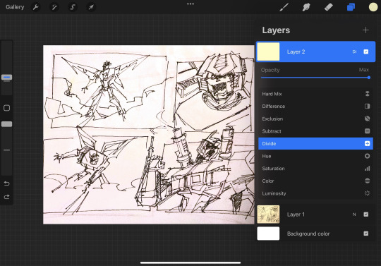
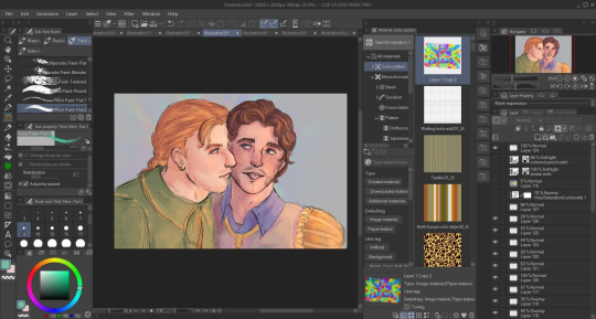
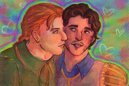
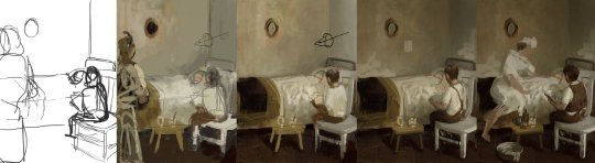
I start out traditionally ! I sketched this piece with a colored pencil and went over it with a very thin fine point sharpie (I don't have microns </3) When I'm done I take the picture on my iPad, depending on the room lighting or time of day results vary, but it doesn't really matter how bad the lighting is as long as the lines look crisp.

Then I crank the hell out of the exposure and play around with the photo settings, lighting things up until it looks like this

I don't have exact specific settings for this since it varies depending on how bad the lighting I started with was so I just play around until it looks relatively good. I'm going for bright background with no shadows and crisp lines. Then I pop it into procreate !
First order of business after importing, new layer, color pick the background, fill the layer with the background color, then put the blend mode on divide ! This will get rid of the yellow lighting.
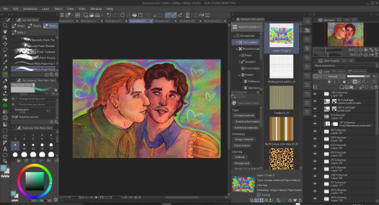
I use Procreate's halftone feature to apply it to my lineart before I color, it just gives it a fun effect.
For coloring, I go on a new layer and put that blend mode on multiply, this lets me color within the lineart, I block out my shapes (usually characters) in one solid color and then as I continue to color I just add layers and clip them together.

Here's a speedpaint for this piece, audio warning for music and flashing warning, especially at the end when I play around with blend modes + gradient maps
The brush I use for drawing over my lineart is Procreate's default gel pen, I slightly adjusted it so that it has a rougher look that blends in with the traditional lineart (the only thing I changed is the jitter amount)

Other brushes I used include; Abbie Nurse's Pan-Dem-Ink's Brushset (Skadouche and Blotto) for my onomatopoeias + blood, paper textures are from one of thedawner's procreate brush packs (I believe volume 3 or it might have been the mixed texture pack, the brushes are just called paper tex 4 and paper tex 5), 1 also use true grit supply's procreate texture bundle a ton for the ink splatter look next to some of the lines as well as the blood (drrty detail 4 + grunge shader - detailed)
For paper textures, I kinda layer them on and play with the opacity to give the piece an almost withered or worn out effect
When I'm done with the piece I slap more halftone on it and play around with the opacity until I'm happy
That's essentially it ! My process is mostly lost of experimenting and playing around until you find that sweet balance
121 notes
·
View notes
Text

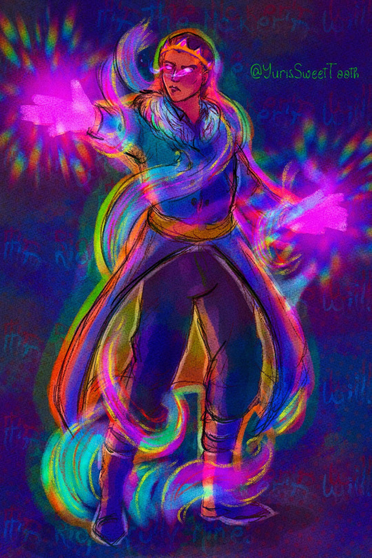
My 2024 Art summary (with Strade tentacle mpreg jumpscare) Constantly learning and trying new things. I'm still figuring out what type of style I'm the most comfortable with, but I shifted slightly to using more soft shadows while rendering. Also, the art collection shown above feels a little underwhelming to me, but I keep drawing art for Awful Kidnapper, so that's just mainly what I was able to make in the meanwhile, aside from a few commissioned artworks. A big art achievement for me this year was switching to Clip studio around July. It made me realise how many "quality of life" features I was missing out on while using my old drawing program. I began experimenting a lot more, and getting more confident with my "drawing flow". I feel like letting go of the strictly clean lineart in many of the drawings let me embrace some more of the messier, but more expressive sketches. Other than that, I slowly started using more and more texture and "decoration" brushes, and it made me enjoy drawing backgrounds and landscapes as I had fun slapping a ton of foliage on the canvas and sculpting things from that. (slightly visible on the December art, which is still a wip oops) I can't wait to launch the Awful Kidnapper update with Kaleb's intro soon! It's a matter of around a week from now, and you'll be able to see many cool looking things I made. I'll let u all see one spooky cg as an example!

18 notes
·
View notes
Text
Blood moon Take a second look. But beware! You might not like it.
#I don't draw finished art#I make sketches and slap tons of textures on it#it's more about the mood than accuracy#also my patient and my drawing skills dont match so they meet in the middle#let me have my vague outlines and messy painting#Stephen Strange#Doctor Strange#speedpaint#Master of the Mystic arts#Sorcerer Supreme#my art#SpaceMermaid#Janora#Doctor Stephen Strange#dark doctor strange#dark stephen strange#sinister strange
73 notes
·
View notes
Text
My Typical Art Process✨🌈
Was gonna reply to anon with this, but figured it was a bit too unrelated so I'll make a separate post! I do kinda wanna share my process anyway for anyone curious. I made something similar for twitter once but I no longer use twitter and my style has changed since then so here's a new one!
Tl;dr I draw for fun only and I have learned that textures and overlays and post-processing can do a LOT when it comes to making something look more "complete" while also not taking a lot of additional time. This is just my personal style spawned from my laziness and my love of harsh colors😆

I'll put it below the cut because it's long!
So to begin with, when I doodle (as opposed to a proper drawing that I take my time on) this is my typical "lineart":

I just draw the… what do you call it? The under parts… Like the circle and shapes, etc. to get the pose. Then lower the opacity and do another sketch on top of that. Then I lower the opacity of that and do ANOTHER sketch on top. 😆 I do that as many times as necessary until it looks like something. I don't worry a ton about anatomy or messiness or stray lines, it's just for fun to get an idea out of my head :)
Sometimes I also leave the under-sketches in or sometimes I turn the layer off. For this one I left them in.

Then I turn on all my textures, overlays, and H/S/L correction layer and crank the saturation up. The selected colorful layer was something I made once and saved it as an image material so I can just slap it on any time as an overlay. You will see it in almost all of my art, she's my beloved crutch and also I just like it lol. Other than that, I sometimes use paper textures that CPS came with and sometimes I make a perlin noise layer with the smallest grain size and set it to 'soft light'.
I also have recently been using a manga screentone overlay that comes with CSP.
Then I start coloring underneath!
This is how it looks without all of the blinding colors and textures I put there to distract you from the mess lol
Even in ones where I DO put in effort and try to use better anatomy and clean up a lot of the scribbles I pretty much never use clean lineart simply because I cannot be bothered 🤷🏾♂️ I don't really do anything different here, I just spend more time one it:
Also, even then the overlays and textures do a lot of the heavy lifting. Some of the overlays and effects I draw myself like the rainbow boarders around them and of course the doodle hearts. I don't draw backgrounds very often but I don't like an empty background so overlays or little doodles or text effects typically go there.

I should also mentions that I use the lightroom mobile app to further enhance all of my art, as shown above in the before and afters. I don't really have much to say on this point. I used to use lightroom mobile a lot when I did doll photography and I pretty much just wing it based on what I learned doing that. I like to mess with the texture settings and do masking edits to change the foreground and background independently to get better color balances. Like a bozo I pay for the subscription but I bet you could use any old editing app.
Oh, and I do pretty much everything with these brushes here. I got them a while back when they were free for 48 hours but unfortunately they are no longer free and cost 80 clippy now :( Should also warn you that they saturate any color and idk how to stop it from doing that so I just adjust the color accordingly before using or edit in post. Very nice though!!
Some other (free) things I like and use a lot:
Warm color set
Watercolor paper texture (free)
Cloud brushes
Watercolor auto action
Real paper textures
Prism brushes
Freckle brush
Aaaaand that's basically it!
#eye strain tw#we do not discuss my 100+ layers...#long post#artists on tumblr#digital art#jun rambles
11 notes
·
View notes
Note
Hello, I’ve just started oil and digital painting but having issues figuring out the process and as you are my main inspiration, just thought I’d ask if you feel up to doing a detailed breakdown of your paintings/process. Thank you for your time :>>>
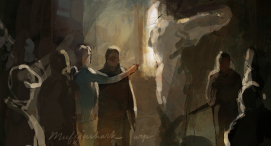
sure! I can't really give a detailed breakdown of the actual painting/rendering part because that's mostly experience gained from trial and error and also way more information than I can really put down here re: values, color, general technique, etc. (there are tons of speed paint videos on youtube that I would really recommend watching if you want to get an idea of how other people paint) but I can sort of... go through all of the steps of a painting from beginning to finish under this cut:
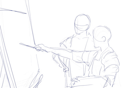
1.) thumbnails: after I know what I want to paint, I'll start with rough sketches on scrap paper to figure out composition, image dimensions, etc. I'll then do a small sketch in photoshop, and block in general colors and an idea of the lighting setup.
I tend to throw away the scrap paper after I finish a piece, so I only have the thumbnail sketches for the piece I'm working on atm:

2.) research and reference gathering: this step happens pretty much side-by-side with step 1. I collect as many references I can to help me with likeness, lighting, clothing, etc. etc. etc. If my piece is set in a specific time period (lately it’s been the 20s-40s nyc lmao), I'll research period-accurate clothes, interiors, props. Sometimes if I cannot get the right reference for the pose or lighting, I'll take a picture of myself. I know a lot of artists use PureRef, but I just dump all of the references I collect onto a huge photoshop file for easy access while I paint.
If you’re painting realistically, this is an important step! It is extremely difficult to paint realistically from your head. All of the old portrait paintings hanging in museums were painted with live models as reference. Professional artists use photo references all the time (you can actually find some of the reference photos that illustrators like Norman Rockwell and Alphonse Mucha took and compare them to the final illustrations). It will make things MUCH easier for you, and you will improve much more quickly as well.
3.) full-size sketch, color block-in : I'm more of a painter than a lineartist/draftsman, so my sketches tend to be pretty shitty, but all they really need to be is a guide for where to put the colors as they will eventually be painted over anyway. (The only exception to this is portraits; for those I will often do a detailed sketch with accurate proportions so I don’t have to worry about whether an eye is too high or if the nose is too long while I’m actually painting) I draw my sketch on a separate layer, set it on multiply, lock it. Then on a layer underneath, I paint in rough colors. Sometimes I'm lazy and will just enlarge my color thumbnail and use that instead of painting it over again.
sketch:
color block-in:
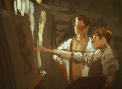
4.) merge sketch and color layers and start to paint: once I'm satisfied with the sketch and colors, I duplicate the sketch layer, lock it, and set it to invisible just in case I ever need it later as a guide. Then I merge the remaining sketch layer with the color layer, and lock the resulting layer. That's my base. I create a new layer over it and start painting. From here, it's just a lot of noodling around, rendering, and refining to get to the final painting! I know a lot of painters tend to keep all their elements on separate layers, but I like to work with as few layers as possible as it more closely resembles how I would paint in oils.
here's a wip of my current piece as well as a progression wip for an older one:
my actual painting process is just: slap down the colors i want, and slowly add more detail and shading until it’s rendered to to something that isn’t awful and messy haha
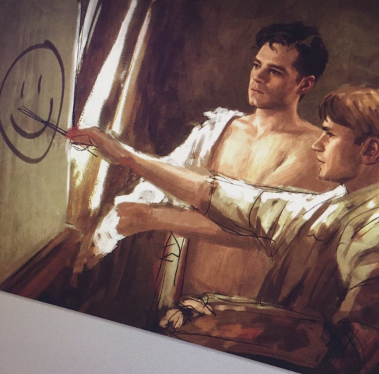
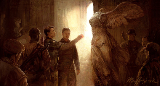
5.) textures, color adjustments: I generally don’t like the smooth, polished look digital art can lean towards, so I also add on textures and noise to make it look rough and imperfect and more like traditional media. Also minor things like fabric/wood textures that would take me a long time to paint freehand and just isn’t worth the time to do so. Then I play with color adjustments. Sometimes at this point in the painting process I’ll have changed my mind and want a slightly different color scheme/mood than what I started out with, or sometimes I’ll have migrated a little too far from the initial colors and want to go back --color adjustments are perfect for this.
initial thumbnail colors:
final colors:
aaand that’s basically it!
#anonymous#asks#hope this helps!#also for some reason my theme no longer displays read mores and instead just directs you to a blank page#so if the 'read more' directs you to a blank page on my tumblr please click the 'view on dash' eye icon on the top right corner :#all these new updates have made my ancient theme basically unusable 😔
234 notes
·
View notes
Text
A Grimoire Tutorial - Simple Textured Backgrounds
Hello all! One of the main things I do as a part of my practice is work in my Grimoire. Art is a huge part of my spiritual path so it was obvious to me when I started that I was going to take on making my Grimoire as an art journal as well. Alright, enough about me, you came here for a tutorial! So first things first I’m going to be showing various techniques I use that you can then use in your own book. I use a blank mixed media sketchbook, that part is fairly important because I use a ton of paint, watercolor and acrylic, and regular sketch paper just isn’t made for that. Here you can see some of the other things that I find useful when making a page. I don’t use all of them in this tutorial but I’ll be using them in the next one!
So, for this page I used:
- Acrylic Paint
- A paint mixer (If you don’t have a fancy one you can use an old gift card, or even a scrap of cardboard, you just need something to scrape paint with)
- A plastic bag (It got cut out of the picture, oops! You can really use anything that crumples and can get paint on it)
- Markers
- Any pretty bits you like (I used an old envelope but I’ve also ripped up old books, magazines and even plain old trash for pictures or words!)
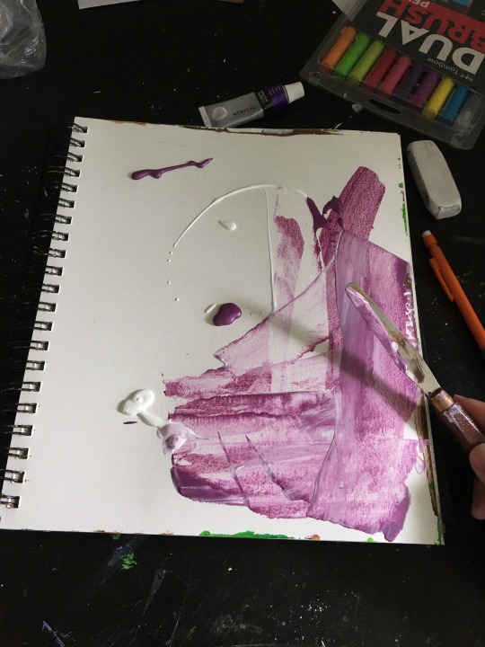
Step 1: Move that paint around
I like to just plop some paint on the the page and start scraping, remember you can always add more later if you didn’t put enough. You can mix as much or as little as you want, you’ll most likely end up with extra paint on your scraping tool, you can either whip that on a towel or slap it right back on the page. If you make a mistake, let it dry and then you can put more paint on top of it. But I promise it’s hard for this to not look cool!
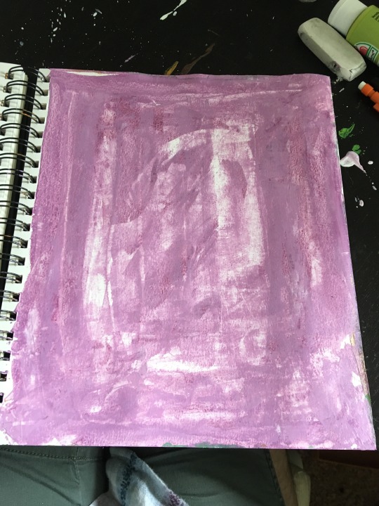
Tada! You should have something like this when you’re done. Now you can stop here if you want but I like layers on my page so I’m going to do another step.
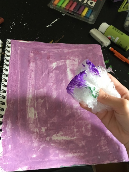
Step 2 - More texture!
Remember the plastic bag? Crumple that bad boy up and dip it in an accent color, I chose a darker purple but you do you! For aesthetic reasons, I just went around the edge a bit because I will be putting the majority of my content towards the middle of the page, the darker paint will highlight this.
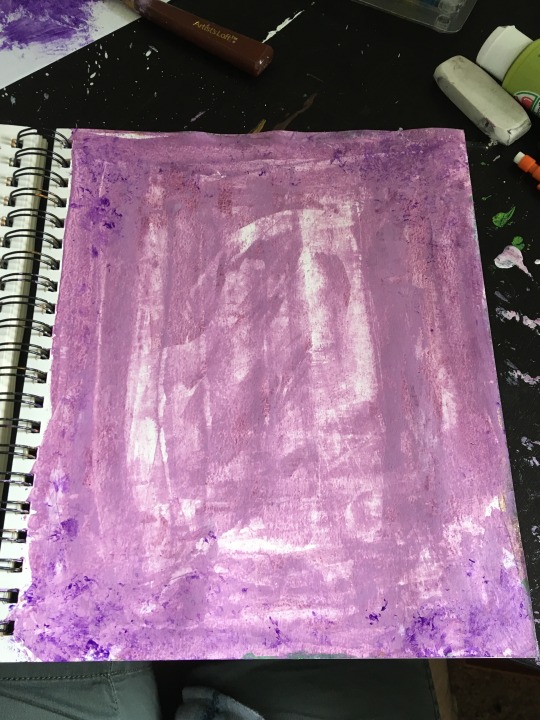
There! It’s subtle, but they key here is layers. Layers add depth which makes a page look better, in my opinion anyway ;)
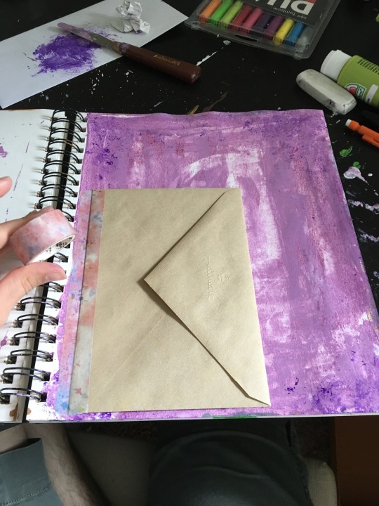
Step 3 - Final touches
Alright, this page is far from its final form, but the base is pretty much done. One of the things I’ve found helpful is to prep pages with backgrounds so that when I have an idea I can just open my book up and start writing. For this page I think I’ll be using it as a herb reference page for lavender, hence the purple. I taped an envelope in to hold note cards with spells and maybe some dried lavender.
And that’s it! That’s how I prep a page for Grimoire work. If you found this helpful, please feel free to follow me! I’m going to try to post more things like this because I know a lot of people would like to keep a pretty Grimoire but may not know where to start.
#grimoire#tutorial#artjournal#painting#purple#my art#junkjournal#witchcraft#book of shadows#witch#witchblr#babywitch#greenwitch#hedgewitch#kitchen magic#spiritual#art#witch tutorial#long post
23 notes
·
View notes
Text
Can confirm, I worked in the education department for a while working with particularly vulnerable children, and this issue is MASSIVELY over-represented in kids from lower income backgrounds, minority groups (including the children of refugees and the children of LGBTQIA+ parents as queer parents are less likely to make an income equivalent to straight cis parents), and other cohort groups of at-risk kids.
It’s not just a lack of nature, but a lack of money for appropriate toys or other things that could help development.
Obviously this was also an issue that appeared more commonly in urban/city-dwelling children, compared to their rural counterparts within the same age groups-- This is likely related to a more typical lack of access to nature in urban areas, but the problem has way more than just one single cause, so it’s worth pointing out the
If you are worried about a younger relative etc. possibly developing this kind of issue but don’t have easy access to nature, then here are some things you might be able to do:
Please note: I’m aware not all of these will be options for everyone, but I want to provide a range of suggestions because this is a real issue and it’s not too hard to help prevent this if you get a little creative!
Remember: The goal is TACTILE, PHYSICAL INTERACTION WITH OBJECTS.
While some of these things may be easier, cheaper, etc. to do on a screen, and there are real economic concerns that make apps etc. more appealing to parents, it is important to seek out financially doable physical activities, tasks, and toys.
Not all of these suggestions are appropriate for all children, so use discretion as necessary. For example, a neurodivergent child might find textile textures to be overstimulating or uncomfortable, and that’s OK-- Try something else, there are lots of things you can do! :)
Follow any age recommendations and safety info that might accompany any materials, toys, etc. and be safe!
-Arts and Crafts!
Drawing, painting, sketching. Finger painting with young kids is a great way to develop grip/motor skills/hand-eye coordination. Even just slapping paint around on a paper is more tactile than opening a sketchbook app on an iPad or similar device.
Crafting with dry spaghetti shapes, pom-poms, or other tactile materials are fantastic and often very cheap.
-Musical instrument lessons!
Guitar, piano, accordion, and violin in particular are great for developing fine motor skills and muscle tone, but any instrument is fantastic.
Instrument toys can be excellent for developing strength in the hands, coordination, etc. for kids who may be too young to deal with a real instrument, or if a real instrument/lessons may be cost prohibitive.
Light up piano keyboard toys are great for this, and can provide additional audio/visual stimulation as well, if this might be extra-helpful for a given kid!
-Complex toys or puzzles!
Transformers are particularly great, because they’re basically just puzzles which also involve lots of thinking, instruction following, pattern learning, and other complex thinking which kids find appealing because it’s easy to remain motivated even if they might get a little frustrated because the reward is having a cool ass robot and/or vehicle toy once they figure it out.
Help them if needed, but also be careful not to interrupt their exploration of the toy. Let them try a few times and experiment with trying to transform it without using the instructions at first, for example.
Rubik’s cubes are also great for this. Any toy that involves touching, twisting, pulling, placing parts together, or physical manipulation of the toy itself is good.
If appropriate, LEGO are famous for being good for this, as are Lincoln Logs and other building block type toys.
-Make a rag doll toy!
Using fabric scraps, you can find tons of tutorials on making no-sew rag dolls with kids.
This is great, because textures and fabrics are a great tactile experience for young kids, and knotting threads/ribbons/etc. encourages the use of fine motor skills and grip development.
Use different types of fabrics as scraps for the rag doll. For example: Corduroy, denim, cotton, velvet, nylon.
Use different ribbons, like ones with flat edges, ones with loopy edges, ones with embroidery, etc. to add even more texture stimulation.
If it is appropriate for the child’s age etc., using different size buttons can be a fun way to build on this: Oversize buttons can be less of a choking hazard and encourage more grip development, for example, but again, this may not be appropriate for all kids so use discretion and be safe while crafting! <3
-Play ball!
Even a little lightweight plastic inflatable ball is great to bop back and forth with a young child to encourage grip and arm/wrist/hand strength (catching and throwing the ball), etc.
If a child is resistant or unwilling to let go of an iPad or digital device for a moment, it’s likely that this is because information and stimulation is obtained faster via digital means, and non-digital means may already feel “slower” to them, to some degree.
To show that non-digital play can be engaging as well, it helps to do something like play ball, as this takes at least two people and also introduces in-person interaction with another human being, so this can help increase face to face exposure to other people and social/shared play as well.
---
Obligatory disclaimer: I’m not a child psychologist, child behaviour expert, physical therapist, or any other type of paediatric health professional! I worked in education with many kids who had this type of issue, so I’m only speaking from my own personal experiences from when my team had to get involved in certain cases like this. In the cases we were involved in, these types of suggestions or activities tended to be helpful, although of course, each kid is unique etc. so none of these are universal fix-its!
The above are just some very broad suggestions, but my point is that doing things that involve physical tactile engagement and interaction with physical things of a variety of dimensions and properties is almost certainly going to help avoid this type of issue in a lot of kids.
It’s not universal, nothing is universal, but I hope these suggestions are at least helpful for thinking about ways to potentially prevent or address this kind of concern. <3
not to be like "millennials vs Gen z" ageism but I don't think it's possible for a human child to develop normally without having even played leaf stick and rocks? Never made a mud pie or carved sticks into walking staves? Never played with a June bug in a mystery stream all afternoon, or pulled out the hose to make the mud clay softer to build with?
Something has to be weird about the first generation of kids to have almost 100% tactile outdoors play replaced by almost exclusively 15 second meme videos. And that's not even to say anything about the total disappearance of the middle grade chapter book genre.
40K notes
·
View notes
Note
i was wondering if you have any tips for digital painting? i rlly love how your lineless looks and i wanted to try a cute style like that
waaa first of all thank you for your patience bc i know ive taken forever to answer this as i always do with tutorials…oops…..and also thank you im glad you think my style is cute!!!! im gonna do my best to help you out with lineless so here we go! LONG POST UNDER THE CUT!

to start i mainly use these two brushes (yes…just two…) from kyle webster’s gouache pack which is only available to adobe cloud subscribers now, but im sure a quick google search for gouache brushes for (insert program you use) can find some that will work just fine. these two look pretty similar but the difference is the one on the right is a bit softer and more easily opaque so i use it for light shadows, blush, etc. i think textured brushes like gouache paint and dry media ones make lineless look extra cool but thats just me!
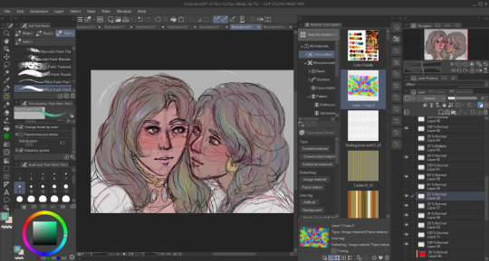
OK ON TO THE TUTORIAL i know you just asked for tips but i was doodling a girl for a warm up and i thought id just take you through how i colored her. started w a sketch + set that layer to 23% opacity and laid down flat colors below it

after i set my base colors i turn off the sketch and start workin on shading! im startin with the hair here bc i think it can be harder to paint and work with in general for lots of ppl

i used three colors here for the hair:
- the lightest color is the base. pretty simple
- using the middle color, took gouache blair brush and made light strokes downward following the flow of the hair from the root to the tip. make sure you think about where the hair begins on the head and follow the direction it goes from there when shading/making lines/making highlights!!
i kept it simple for tutorial’s sake, but play around with how dark you want the shades to be and how much shading you want! (also these aren’t shades per se since they arent shadows being cast, just a darker color to give the hair a little variation in texture and color and to create a kind of shine effect but idk what else to call em! i guess theyre highlights! i just know it looks nice!)
- took a slightly darker color and added some lines here and there to break things up and further show the direction the hair is moving in
for a little more visual on the direction thing see this handy graphic i made:

i didn’t write DONT and DO bc my way is not like…the ultimate Chosen way…if you wanna go for a style with the shading i did on the left then totally do it but personally i think it reads better this way so ya!! theres no right or wrong way to make your own art but there are ways that can make things a bit more interesting and clear if you choose to use them!
and yeah i basically use the same methods to paint skin and fabric and even backgrounds. it’s really just as simple as keeping things flowing in a natural direction and picking colors that u think look nice to paint with!
FINISHED PIC:
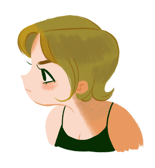
i dont wanna make this tut super long and ramble forever so here’s the last things i did to finish up!
- turned the sketch back on momentarily to draw in the eye, mouth, & eyebrow (no painting or shading involved there usually)
- used gouache a go go brush (or a softer/less opaque brush of your choice) to add a bit of blush to the cheek. i usually add blush with a light circular motion bc it gives them a nice rounded look. i use light pressure because a) more pressure means darker color and i want the blush to be subtle and b) more pressure also means less texture and more solid color, and i prefer having the scratchy look with the base skin color showing thru.
- used more pressure and a darker, more orange color to create a sharp shadow on the skin + define the neck & inner ear shape with lines
- added desaturated aqua blue over the top of the hair to create a shadow effect and add another color to the palette
- added the same blue color very lightly on the neck & blended it with the orangey shade (in other words, lightly brushed over it with the orange) to make the shadow more interesting. layering in multiple colors can always help make lineless things look more detailed even if its just a tiny bit!
i hope this doesnt seem like a ton of steps added on at the end bc it took me like way longer to write this (because i ramble) than it did for me to draw it! i love working with lineless because of how easy it can be to slap on some varying colors and defining lines to make something look a lot cooler and more detailed. as long as you keep your shades and stuff on separate layers its easy to try out things and see what you like best so i encourage you to do so! best of luck!
#starrymelons#long post#art tutorial#art tips#tutorial#lineless art#ask#I SUPER SUPER HOPE THIS HELPS!!!#i used no pink in this tutorial are you proud of me#i did that bc i love pink but i use the same colors too much while i neglect others...so im paying attention to yellows and greens#also i definitely accidentally drew more of her and made her into an oc whoops#I REALIZED I FORGOT HER LITTLE HAIRS STICKING UP IN THE BACK IN THE FINAL...SORRY.............
238 notes
·
View notes
Photo
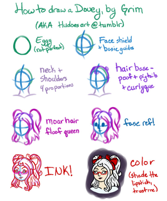
A quick and dirty tutorial of how I draw the trash child! { @pyrocicle } Click that readmore for some elaboration on each step
Some quick notes before we get into the steps themselves.
I work entirely in SAI; if you’re using another program the brushes will probably be different.
I sketch using the marker tool at size 10 for sketch lines. As you can see, this produces a thick line of varying intensity. There’s enough detail to be useable, without feeling like you’re tracing.
The obnoxious colors are deliberate; I use them to track layers! Normally several of these steps would all be on one layer, but I separated them out to make it easier to see what I was actually doing.
For inking, I use the pencil tool, also set to size 10, with minimum size 0 and pen pressure only affecting width. I like thick lines with significant variation, and the pressure I use when drawing produces a line between 7 and 5px most of the time. Use whatever settings create the kind of line you like.
The writing is a custom pencil brush; Minimum size 60%, with the Noise texture at 50% and “paper” paper type at 95%. I know I snitched at least half of this from somewhere but it’s been at least three years. All I know is it’s a perfect pencil for actually writing on a tablet!
THE ACTUAL STEPS HOLY SHIT
Step 1: Eggy; you’re gonna erase this entire thing later so don’t make it perfect. You also really don’t want a perfect circle here; you want a slightly oval shape!
Step 2: Face shield + basic guides - More art advice snagged from tumblr like... 5 years ago. Wow I feel old. Anyways, draw your bilateral symmetry division line [the vertical one], and then draw your face shape. Don’t draw the eye/ear reference line until you’re happy with the face shape! The eye/ear line goes with the top of the cheekbone, aka where the cheek meets your eggy, and goes at a gentle curve [dependent on the angle of the face; I default to chin sliiiightly down-tilted] through your vertical divison and comes out at where the chin meets the hairline on the other side - which also happens to be where your ear goes.
Step 3: Draw the rest of whatever anatomy you’re drawing. For a bust this is neck and shoulders. You need to get everything proportioned to the head itself, not the head plus the hair. The shoulders here are actually a bit narrow for Dove but it’s 5 am and I don’t give a flying fuck.
Step 4: Plops some hair on that skull! Hair doesn’t lie flat, no matter how straight it is. That’s because there’s a ton of hair under it, that pushes it just slightly up. Dove is a floof queen so if your character has straighter hair they might have a bit less poof, but not much - those pigtails are pulled pretty tight. I usually draw the eggy big enough to cover this, but until you’re really familiar with the character you’re drawing, I’d do it in separate steps to save yourself some headaches. This is also the step where you figure out what you’re doing with the hair - in Dove’s case, placing her pigtails.
Step 5: Draw the rest of the hair. Dove is a floofer, there’s the loose hair, and then the pigtails on top of that, and then her bangs. Dove’s hair should be as wide as her shoulders, even with part of it pulled back.
Step 6: The part every “how to draw manga” type book tells you is step 3; put in your facial reference points. For Dove, I plop in the eyes, then that big ole nose, then the mouth.
Step 7: Everything look good? Ink them lines! This is the step where you refine things and put in details!
Step 8: Slap some color under those lines!
Ta-da, you have a frumious bandersnatch in need of a shirt.
7 notes
·
View notes