#MysticsObscutober
Explore tagged Tumblr posts
Visit Tumblr Blog
Explore Tumblr blogs with no restrictions, modern design and the best experience.
Last Seen Tumblr Blogs


Fun Fact
Tumblr has a 66 index score for customer satisfaction in the US.
Text

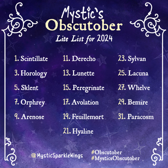
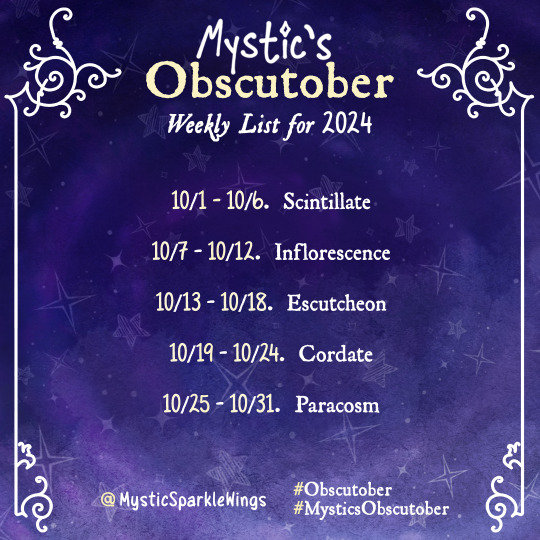
Obscutober 2024 Prompt List(s)!
Anyone got room for yet another October Prompt List? 😉
I really wasn’t feeling the Official Inktober Prompt List this year & deeply miss the Obscutober lists nikolas_tower used to post over on Instagram, so I decided to break from tradition even more than I usually do & make my own! ✨
The main idea is each prompt is an Obscure Word, but I did get a little choosy & try to put a bit of my own spin on it!
Click the "Keep Reading" and we'll talk more about the details + Definitions if you need them. ✨
⭐️ Like My Art and Want to see more of it? Here's All My Links! ⭐️
----------
Before I get into my usual long-winded description, if you want to actually follow this prompt list—Or the Lite or Weekly version—here's what you need to know:
Here's the "Official" Definition list so you don't have to spend time looking up the words yourself if you don't want to...But also, if you do want to, feel free! The "official" definitions are intended as a time-saving guideline!
The list is open to all mediums! "Typical" visual art (Digital or Traditional), Literature, Sculpture, Crafts, Coloring Pages—whatever you want!
The word itself does not have to be directly included/related to what you make; You can just take inspiration from the way it sounds or looks, or something the sticks out to you in the definition, etc.
If a word or two doesn't work for you for various reasons, feel free to swap-in a different word—Either another "obscure" word of your choosing, or a word from another prompt list that you like better.
I've provided "Lite" and Weekly versions of the list in case the full 31 is too much, but you can pick-and-choose words from the full list however you'd like if you're not crazy about the words I picked for the shorter versions, or if you want to shorten the list in a different way.
Tagging me is appreciated, but not required!
Remember that my views on these Month-Long Daily Challenges is that it's about the challenge of completing a certain amount of creative pieces in the time given...And that's pretty much it, so as long as you're doing that and having fun, I'm really not bothered about how you choose to follow the list! My Inktober motto has always been "work smarter, not harder," and this is no different!
----------
Well, well, Sparklers—I assume this is quite the surprise coming from me. 🤭 Both because I've been awfully quiet over the past couple of months and this is what I come back with. [And for the record, I intend to explain more about where exactly I've been in a Museletter, but I wasn't able to get it typed up and ready-to-go today; Once I get it ready I'll add the link here.]
Not that me disappearing for a while and coming back with something not necessarily expected of me is all that abnormal, but rather if you've followed me for a while, you might remember I'm not normally super-keen on everyone and their uncle's mother's brother's sister making their own Prompt Lists.
So then, Mystic, what gives? Why make your own Prompt List now?
You can thank nikolas_tower on Instagram for that, actually. 😆 Some of you might also remember that I follow his Obscutober list in October 2021, and I've also swapped in an Obscutober word a couple of times when one of the "official" Inktober words didn't work for me.
I've explained before how much I love the Obscutober concept to its core, so I won't re-hash all of that here. The important part is that I do love it, but to my great sadness, 2022 only got an abbreviated Obscutober list (2 words per week), 2023 didn't get an Obscutober list at all (though I didn't really need one for 2023 because I was busy enough as it was following two other prompt lists at once) and considering just how close we're getting now, I really sincerely doubt Nikolas has/had plans for a 2024 one. Add to that: I was not super jazzed about the official Inktober prompt list for this year. Now, don't get me wrong—I'm normally not thrilled with every single word on the list (and if you've followed my Inktobers' past, you know I say as much during the month!), but I'm not sure I've ever felt quite so unenthusiastic about the whole list before.
Additionally still, some of you might remember I did talk a little bit last year about some...struggles I supposed is the closest word, that I've had with the past couple of Inktobers I've done. And generally, I've had some ideas for really shaking up the way I handle October for the past couple of years.
While, granted, my main "shake-up" idea is totally unrelated even to this list and I never seem to be able to get the necessary prep work it would require done in time, I think the main takeaway is a I've had a low-grade yearning to do something different...but I do still want to stick to my "tradition" of handling Inktober unconventionally.
So in the end, it kinda just made sense to at least try making my own Obscutober-style list this year. It's something different and I've missed the Obscutober lists, so why not?
Worth noting that I did try to put just a little of my own spin on it in my choice of words. While already I did try to stay away from words Nikolas already used for all 4 of his Obscutobers, I also had a couple of "rules" with the words I picked:
No words that are "Obscure" purely because they're not English/aren't found in English dictionaries. For example, "Lunette" is a French word, but it appears in English dictionaries with a definition that's more than just "the French word for..."
The word must have a definition that's relatively easy to find and/or appears in well-established English Dictionaries like Dictionary.com or Merriam-Webster. This rule exists because I noticed pretty quickly a lot of "aesthetic" definition images on Pinterest either don't turn up any other reliable results that a word even exists, or the word may exist but the Pinterest definition is straight-up wrong.
No overly gross/medical/NSFW words. (This wasn't a problem with any of Nikolas' Obscutober picks, this is just a personal preference that did shape my research a bit.)
One of my problems with the Inktober list for this year is too many words feel like synonyms/too closely related, so I wanted to avoid that. A couple of words are still kind of close in the end, like "Vitrine" and "Hyaline" or "Escutcheon" and "Orphrey, but they're still more different from each other than some words that I considered and ultimately turned down. [For example, I considered "Lambent" and "Clinquant" but decided they were too close in meaning to "Scintillate."]
Likewise, aside from the theme of being Obscure, I tried not to lean to heavily on words that fit a particular theme or idea
I tried not to pick "obscure" words that have become decently well-known or popular because they're obscure. The best example is "Aglet" wasn't even considered because it's been mentioned in multiple TV shows that I know of. "Scintillate" might push that boundary a little, but it is one of my personal favorites.
I also tried to pick words that had a little variety in definition length and not pick too many that had really short definitions, which ties into my next point...
More abstractly, I tried to pick words that feel like they both lend themselves to a really solid image but also leave room for interpretation of that image. Historically I've had problems with Inktober words feeling too much like they really only fit one specific interpretation of the word or they only have so many ways to represent the idea. And on the flip side, some of Nikolas' Obscutober picks (at least when I participated in 2021) felt a little too abstract at times. Ultimately, this feeling is probably highly subjective, but I tried my best to find the right balance anyway.
While not perfectly balanced, I did try not to lean too heavily on one type of word, as in Adjectives/Nouns/Verbs. There are still less verbs overall because it was just harder to find verbs that fit what I wanted, but if I hadn't consciously paid attention there probably would've only been 1-2 verbs and like 20 adjectives.
Not really related to adding "my own spin," but also worth noting that it was also important to me to provide "Lite" and Weekly versions of the list the way that Nikolas did for Obscutober II to make it easier for people that just don't have one-thing-every-single-day kind of time to feel welcome to still participate in some way. As stated in the description for those, you can just jump around the list however you like, but I know sometimes it's just easier if someone already lays things out that way for you instead of having to remember to leave things out and such.
And then for the visual list design, I did a mixture of Nikolas' Obscutober list style and my own more typical branding elements, which ended up working out much better than I expected; I wanted the "spirit" of the list to be recognizable to fans of Nikolas' lists without being an exact copy/looking too much like I was trying to "pretend" to be him or something, and I think I landed in a pretty good place. [And in case anyone is wondering, yes I did use my own template to make the list!]
I do have to admit to you Sparklers though that despite going through all that trouble, I'm actually still not 100% sure I'll be following the list myself. 😅 I've gone back and forth over how exactly I want to handle October at all this year so much...I definitely want to (and intend to!) do a Daily Challenge, especially given how spotty my uploads have been over the last year, but I just can't seem to settle on one full-fledged plan that I'm completely satisfied with.
I do have one potential idea I'm considering that already has a very specific alternate list, but pretty much all of my other ideas would normally use the official Inktober list, and so since that list isn't on the table for me this year, and it's really looking like DeviantArt isn't doing Drawtober again this year—Which I find incredibly sad, by the way!—I need another list on-hand that I know I can use and be reasonably happy with.
And for the record, I'm being intentionally coy about that one specific idea and not sharing that list because it's highly specific and if I do decide to go that route in some way, I'd like the main idea to be a least a little bit of a surprise.
But even if I don't use this list myself, I thought at least a few other people might enjoy giving it a try. After all, I wasn't the only one that enjoyed Nikolas' Obscutobers—I originally found out about them through another person entirely. So maybe a few other people are feeling that Obscutober void, or maybe you're just a big Word Nerd™ like me, or maybe you just want something that's a little different still from a lot of the more typical alternative prompt lists that have been floating around.
So, whatever the case, here the list is (and the Lite and Weekly versions, too); Let us all do with them what we will! 😉
Before I go, I will offer an apology to anyone who's disappointed or frustrated that I'm posting the list so close to time to use it—Believe me, if I'd been 100% sure I wanted to make it in the first place sooner, I would have gotten it out much sooner, too! But I'm doing the best I still can by getting out with this very tiny 2-day cushion instead of just dropping it right on the 1st. If the list turns out to be something you Sparklers want to see again next year, I promise I'll do my best to get it out with a lot more advance notice next time!
With that, there are still two days left in September and as semi-implied already, I still have a ton to do to be anything close to ready for October, so I'll leave you Sparklers to the list and your own October plans, whatever they may be; Hope to see you all again hopefully very, very soon...! 🤗
----------
List Design © me, MysticSparklewings
Obscutober Concept Inspired by nikolas_tower
----------
⭐️ Like My Art and Want to see more of it? Here's All My Links! ⭐️
#xxmysticwingsxx#mysticsparklewings#obscutober#mysticsobscutober#inktober#inktober2024#drawtober#dralloween#art challenge#october#prompt list#resources#art resources#obscure words#rare words#obscutober2024#art prompts#prompts#october challenge
104 notes
·
View notes
Text

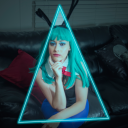
Obscutober Day 1 - Scintillate
From @mysticsparklewings prompt list!
#obscutober#MysticsObscutober#artists on tumblr#drawtober#goldfish#commissions open#artober#inktober
63 notes
·
View notes
Text
Inflorescence
The first thing any Ashari druid learns is how to make a flower bloom. It’s a holiday, almost, the day when children learn to make a bud split open. Grandparents smile and toddlers stuff their mouths with petals. Parents look forward to off-season bouquets, teens to the teasing exchange of tulips and daisies from friends and classmates and crushes. There are picnics at graveyards, and scavenger hunts for bulbs hidden for this exact occasion. It’s not just druids who learn, either; if a Zephrahn or Pyrahn or Terrahn or Vesrahn can cast one spell, it is this one.
Orym is not Ashari by blood; his mother settled in Zephrah, his father wandered on. But he is Ashari, and nothing connects him more to his culture and his people than pulling summer from dew-coated capsules or smiling in time with a sudden blossom. He spreads his fingers as the petals of a pansy unfurl, and sprinkles them onto his mother’s baking; he harvests sunflowers to toast on warm days, no matter the month. His mother can’t cast the spell, but she loved flowers, loves watching him birth color and petals and beauty.
He pulled up their irises from the box beneath his window after Will died. They were half-browned, lackluster; he blessed them back to bloom. Only the best for his husband. Only the best to be buried with his father, only the best to be salted with his grief. He finds a packet of seeds Derrig had given them for housewarming in the cupboard; he brings them to inflorescence in the time it takes his watering eyes to form tears.
The streets feel empty that night, and it’s not just because so many have huddled in their homes, drawing relatives close in fear. All the flowers have been shuttered, gently closed. It feels as if the entire city is holding its breath in reverence to those they have lost. Zephrah knows how to bloom, and Zephrah knows how to grieve.
He moves back in with his mother. A bouquet is waiting to welcome him home, white petals already beginning to droop and fall. Snowdrops. He looks out the window, towards the manor where he has reported for duty day after day, time after time, and it’s all he can do to stop from crying again.
The flowers in Alma’s garden don’t open until spring, that year. They feel so young and soft against his fingers, but he doesn’t pick them, and when they close and fall, he returns them to bloom.
My second piece for the weekly version of @mysticsparklewings's obscutober.
#orym of the air ashari#obscutober#mysticsobscutober#inflorescence#critical role#ficlet#the language of flowers#orym cr#will of the air ashari
29 notes
·
View notes
Text
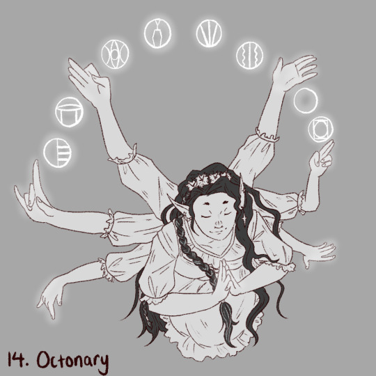
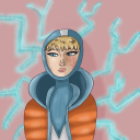
#Obscutober day 14:
Octonary (adj. Or n.) Relating to or based on the number eight; consisting of eight; in sets of eight a stanza or group of eight verses
——
Anya, The Weaver - the embodiment and goddess of the Weave. and therefore the eight schools of magic!
(prompt by @mysticsparklewings )
#obscutober#mysticsobscutober#drawtober 2024#dungeons and dragons#dnd art#dnd#dnd character#npc#the weave#dungeons and dragons art#my art#digital sketch
15 notes
·
View notes
Text

Obscutober Day 3: Horology
-the science of measuring time
-the art of making instruments for indicating time; clockmaking
this word is so Time Balance Department coded
the list, and the list maker: @mysticsparklewings
croitime shippers dni
#metamorphias creations#cookie run#cookie run ovenbreak#obscutober#mysticsobscutober#cookie run tbd#baguette cookie#croissant cookie#string gummy cookie#timekeeper cookie#dark fondue cookie#coffee candy cookie#marble bread cookie#schneeball cookie#maple taffy cookie
28 notes
·
View notes
Text

#Obscutober day 11:
Derecho ( n.)
a widespread and severe windstorm that moves rapidly along a fairly straight path and is associated with bands of rapidly moving thunderstorms.
——
when purging Adrasteia of the cursed Koilosion root, the party accidentally released Typhon who was slumbering under Prometheius‘ flame. he was eventually defeated after Cyaro summoned the Chthonic deities which is definitely not going to cause any problems down the line….
(prompt by @mysticsparklewings !)
#obscutober#mysticsobscutober#obscutober 2024#drawtober#typhon#dungeons and dragons#dnd#dnd art#art#sketch#my art#greek mythology
11 notes
·
View notes
Text
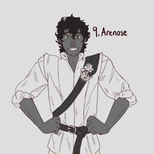
#Obscutober day 9:
Arenose (adj.) Sandy, gritty; full of sand
——
Marquess Tristain Lyonesse of Bawic pictured as how the party first met him - a fighter stationed in the sandy beige desert watchtowers of Sterling Watch.
(prompt by @mysticsparklewings !)
#obscutober#mysticsobscutober#obscutober2024#drawtober#dnd#dungeons and dragons#dnd art#dnd character#artober#dungeons and dragons art#artists on tumblr#npc#fighter#my art
12 notes
·
View notes
Text

Obscutober 2024 Day 22: Adust
----------
Adust (adj.)
scorched; burned
dried or darkened as by heat
----------
#Obscutober 2024 Day 22: Adust 🔥
I can’t believe we’ve only got 9 Days left to go of October/Inktober. 😵
I also kind of can’t believe I’m as happy as I am with how today’s art turned out since it’s not a very “me” palette or concept, but here we are! 🙌
Click the "Keep Reading" and we'll talk a bit more about my general thoughts/process. ✨
⭐️ Like My Art and Want to see more of it? Here's All My Links! ⭐️
------
Some of you may remember that yesterday I mentioned today would be another day I have to fit Obscutober in around some IRL things; For that reason, I decided it would be best to keep the concept simple and just do my best to add details where I could to make it feel more complex than it actually is.
[This is also why this is going up later in the evening tonight; I actually had the art done earlier, but I didn't have time to sit down and write this description and the cross-posting caption until many hours later. 😅]
Naturally, the most obvious thing I thought of was fire. There are other things that can burn or scorch of course, like the sun or even hot water, but fire was the path of least resistance and something I haven't really touched on in previous Days, so that's what I went with. But I did do my best to not focus so much on the orange and the flames themselves.
I did still rely on shapes that felt "fiery," or in some cases "spiky," because I was thinking about the spiny, blistering pain that a burn or scorch would come with, and I played just a tad more with line texture for the same reason.
It wasn't fully intentional, but I think the outer edge with the cross-hatching kind of came out looking like that area was actually burned by the fire, so that was nice! My goal was just to try and get some mroe darkness/black as things tend to turn when burned in without having to rely on black much for the actual background colors, so the texture working out well in another way was a nice bonus. 👍
I also didn't intend for the angled lines in the ring closer to the center to look sort of like firewood, but that's what happened! I was just going with a zig-zag (...although in hindsight, it's really just the "zig" I guess) because I thought zig-zags felt kind of spiky and they mimic the movement of a flame without being too obvious.
The centermost ring was intentionally supposed to kind of look like a stone ring like you might find placed around a fire. I couldn't think of anything else that felt like a genuinely good place to start, and that was reasonably simple to do, so it won by default. 🤷♀️
And while I don't think it's doing as much as yesterday, I think today's color scheme is still doing quite a bit to really tie everything together. As I mentioned, I tried to be careful about how much orange and brightness I gave to the fire since the word is more about something fire does than fire itself, but it was kind of unavoidable/inevitable that some would be included and that it would steal focus from the colors that are actually more "adust"-related. At least the way my brain works, it was.
That wasn't helps by the fact that I'm just not generally drawn to browns in a color-palette anyway; I prefer bright and unnatural colors. 😆 But today was not the day to try and experiment with a magic-fire palette instead of a natural one.
It did take a little patience to get the balance of the darkness and the placement of the darkest browns just right, but it really wasn't that bad, especially given had tired I was at the time I got to that stage. [This is was in the early morning hours before I'd gone to bed.]
And...I think that's everything. A bit short and sweet for tonight, but like I said, I purposefully kept things simple and tried not to get too caught up in the conceptual details because I had other things to worry about today.
All things considered, I think it could have certainly turned out much worse, so I'm satisfied with my efforts. 🙂
It was never going to be in the running for my favorites based on color palette alone, but it's definitely not my least favorite—I like it about as much as I reasonably could with the palette and concept I ended up working with.
Now the real "fun": Seeing if I can be equally satisfied with my cross-posting experience and get to eating dinner in a reasonable amount of time. 😅
See you Sparklers tomorrow as we count down the final 9 days to go! 👋
----------
See the Prompt List
Artwork © me, MysticSparklewings
Obscutober Concept Inspired by nikolas_tower
----------
⭐️ Like My Art and Want to see more of it? Here's All My Links! ⭐️
#inktober#mysticsparklewings#xxmysticwingsxx#drawtober#illustration#procreate#digital art#obscure words#mandala#rare words#obscutober#inktober2024#mysticsobscutober#obscutober2024#adust#burn#scorched#fire#flame#mandala art#artists on tumblr
8 notes
·
View notes
Text

#Obscutober day 1:
Scintillate (v.) ✧
To give off sparks; to shine as if emanating sparks; to twinkle or glow
Of a star or other celestial body: to vary rapidly in brightness; to twinkle
my beautiful ranger, cyaro child of nyx, is the perfect pick for this prompt!
——
attempting to do a drawtober this year using dnd characters from the various campaigns im in! found this AMAZING prompt list from @mysticsparklewings of obscure words and am very excited for what the month has in store!
#obscutober#mysticsobscutober#dnd#dungeons and dragons#dnd art#dnd character#art#dungeons and dragons fanart#ranger#nyx#drawtober#obscutober 2024#my art
9 notes
·
View notes
Text

Obscutober 2024 Day 2: Littoral 🏖️
----------
Littoral (adj.)
of or relating to the shore of a lake, sea, or ocean
----------
Good News, Sparklers: I’m still happy with this as my #Inktober approach so far! 🎉 (Hopefully that continues🤞)
This one definitely turned out more “general beach/ocean” than “shoreline,” but oh well! 🤷♀️
Click the "Keep Reading" and we'll talk more about my thoughts/process for this piece (including part of why this word made the prompt-list cut)! ✨
⭐️ Like My Art and Want to see more of it? Here's All My Links! ⭐️
----------
Well Sparklers, I seem to once again be writing this description (and therefore posting the art) later in the day than expected again today, but y'know I'm still early enough I don't feel such a rush to just get everything done, as was an extremely bad habit for me during Inktober last year...But we're only on Day 2 so it's still very possible I'll end up in that situation at some point later in the month. 😅
Either way, since we covered I think what was left of the background information for my how/whys for October this year yesterday, I think today I'm free to focus just on today's piece.
And I'll start with the admission that one of the primary reasons this word made the cut when I was putting together the prompt list is because I personally find it more amusing than I probably should that "Littoral" can very easily sound like "Literal" depending on your accent/pronunciation; And while I haven't figured one out, I just know there's a delightful pun or wordplay hiding somewhere in that association. 😆
Does that have anything to do with my choice of shapes for the mandala or colors for the background? Not consciously, no. But I mention it just in case someone for some reason finds the idea as funny as I do!
That said, this one is—at least I think—a lot strong on the specific images in the mandala that tie back to the theme than yesterday's. Granted, I probably leaned a little more heavily on general beachy/ocean themes than is really appropriate for a word that's really more about shorelines for multiple kinds of waterbodies...
In my defense, I started working on this one around 2-3 a.m. before I went to bed and was struggling to stay awake for the area between the inner circle of seashells and the round with the tail-fin shapes. What were supposed to look more like fish scales underneath those fin shapes came out looking a lot more like the edges of stacked sand dollars as a result. 😅
That might kinda be for the better though because I think if they did look more like scales, the tail fins might be a little too mermaid-y. Sand dollars probably fit a little better for a shoreline focus. Or, this way they kinda also make me think of like...ridged rocks that you might see either along lake edges, or as like the "drop off" point where the ocean shore "ends" and the deep sea more or less "begins," if that makes any sense.
I also tried something...I want to say "different" but we're only on Day 2, so that feels a bit odd. 😆 But it is something I don't usually do with mandalas when I make them. You'll notice that the round with the tail fins features only 2 additional sea shells, not 4, 6, or 8 as would be more typical for a mandala pattern, and on either side of that same round where you'd expect another pair of shells to be are instead some different wave shapes.
This was just a small experiment in what I'm going to do "non-traditional symmetry" (because "asymmetry" isn't quite right). So far I'm just using Procreate for these, and Procreate's built-in symmetry tools can only be pushed so far vs. an app made more specifically for mandalas, so I was trying to get a feel for where exactly my boundaries with Procreate's tools are. Obviously I didn't get too crazy with it because I was tired, but I did learn a few things and intend to carry them forward.
To that end, for what it's worth, I am considering trying a mandala-making-specific app, but I haven't pulled the trigger just yet. I thought I'd try a couple more with just Procreate and see if I still want to. I have a feeling even if I do try another app, I'll end up tracing over whatever results I get in there in Procreate anyway just to make sure all my Obscutober pieces are stylistically consistent. [That's a me thing, I don't expect anyone else to care about the style consistency even half as much as I personally do.]
I will also say the "splash" shapes that end everything off weren't really what I originally had in mind, but I'm not bothered about it because I think they came out great and give the effect that I wanted really well. 😄
Oh, and before I move on from the mandala part: If you look closer, you can also see I tried just a little bit of hatching on this one. I wanted to "fill in" some more of the mandala lines for visual interest, but I didn't like the solid-fill look in those areas when I tried it. It's still not quite what I wanted but I was too tired to be bothered re-doing it. I'm also not sure how much I'll use hatching (or other "traditional" inking techniques) for the rest of the month, though it is a tool I'll be keeping in my metaphorical back pocket just in case.
This may as well be a good time to mention that not necessarily every Obscutober piece will use white mandala lines; I don't want to overcomplicate my choices too much, but I am planning on allowing black lines as well, if they'll suit that day's themes better. So far we've just had two days in a row where I thought the white worked better. 😉
As for the background: This one is one of the things that motivated me to go with this particular format for this year. I didn't start working on this piece until after the decision(s) had already been made, but during those last couple of days of September when the mandala idea finally started to form, I was going back and forth over the words and landed on "Littoral" again; The idea of having a kind of "island" in the middle surrounded by "water" for the background popped into my brain—Nothing but shoreline all 360º around. 🤗
That wasn't the deciding factor alone, but it was definitely a strong nudge in that direction! This background was also a good "test" in that it pushed me to consider there might be days—like this one!—where it's tempting to color the background less abstractly and more tied to whatever is happening with the mandala lines. Somehow, I hadn't really considering that yet. From that, you can see I decided that some spot color is okay, but for consistency purposes, I am still going to keep it largely soft and abstract. Since I'm toying with the idea of making coloring pages out of the finished mandalas later anyway, if I really want to color right inside the lines, I can worry about that after Obscutober.
Besides, keeping it abstract will be faster anyway; I have a tendency to get way-too-perfectonist when coloring inside of digital lines. 🫠
The longer I think about it, the more there are things I might do a bit differently if I gave the mandala part another go. I am still happy with how this one turned out and think the background is really solid, it's just that usual "hindsight is 20/20" artist problem—Sometimes great ideas for a piece only come after it's already done and you really don't feel like going through the trouble if changing what you have!
Ah well. Maybe I'll have more ideas actually come to me in-the-moment if I can be bothered working on the future mandalas when I'm not falling asleep at my desk. 😆 It still beats being wide-awake because I'm rushing to get it done at all, but it's definitely not the ideal way to be! 😅
In any case, aside from delays in writing this description, I've been enjoying seeing a few people (mostly on Tumblr) decide to try out the Obscutober list for themselves, so the month is off to a pretty decent start as far as I'm concerned! I hope it is for you Sparklers too, or that if it isn't, that things get better soon! 🤞
I'll leave you Sparklers with that for today, and hopefully see you again in cheerful spirits tomorrow. Toodles! 👋
----------
See the Prompt List
Artwork © me, MysticSparklewings
Obscutober Concept Inspired by nikolas_tower
----------
⭐️ Like My Art and Want to see more of it? Here's All My Links! ⭐️
#inktober#mysticsparklewings#xxmysticwingsxx#drawtober#illustration#abstract art#procreate#digital art#inktober2024#obsctuober#mysticsobscutober#obscutober2024#rare words#obscure words#littoral#wordoftheday#mandala#mandala art#beach#ocean#water#waves#seashells#seashore
8 notes
·
View notes
Text
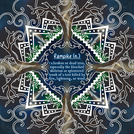
Obscutober 2024 Day 10: Rampike 🥀
----------
Rampike (n.)
a broken or dead tree, especially the bleached skeleton or splintered trunk of a tree killed by fire.
----------
Maybe the most October-appropriate word on the list so far! 🎃
This one came out more simple kind of by accident, but it works because I’m still pleased with it & have some IRL things to work around today.
Click the "Keep Reading" and we'll talk more about my thoughts/process for this piece—Simple or not, I still have plenty to say! ✨
⭐️ Like My Art and Want to see more of it? Here's All My Links! ⭐️
----------
After a brief break from the nouns yesterday, we're back with what I would say is one of the more "useful" words that made the prompt list. In nothing else, this is almost certainly the most "October-appropriate" word so far.
Also, Fun Fact: There actually two trees in my yard that if they're not "rampikes" already, they probably will be in the future. It was a dark and stormy night (literally!) back in July, and around 3 or 4 in the morning, there was a massive CRACK of thunder—easily the loudest I've heard in my life—and I legitimately thought at the time that it felt like the lightning had struck our property specifically. Sure enough, the next day when we went outside, there were very visible scars scorched into the upper halves of two dizzyingly tall pine trees that stand together, like twins, in the backyard.
And believe it or not, that didn't really cross my mind when I picked this word out for the list. I did have the passing thought, "Oh hey I guess we kinda have one of those," and that was it! My main motivation for putting it on the list when I was going back through the word candidates I'd picked and making cuts was actually the spooky/October connections.
But hey, it made for a fun story! 🤗
As for the art: I kept things simple for today, but that was actually mostly unintentional for a change. But it does work out because (as I believe I mentioned yesterday) I have some other IRL things I'm having to balance today's Obscutober around. And I do kind of prefer having more simple results but feeling like I covered everything I wanted to vs. having a super detailed mandala where I'm still not sure I accomplished everything I wanted to.
I started with, of course, the split trees, because it was kind of essential they be included and be very prominent (at least in my book). The rest of the mandala was built around them; squiggles to represent the roots, a bit of grass-like representation near the base of the trees, then the larger triangles can either be more vegetation or maybe distant mountains—you decide!
I did pause for a moment after that, unsure of what to do with the empty space that was left and definitely did need something for filler.
Fortunately, the definition helped me out—I opted to do some swirls that are meant to be either wind or a representation of the storm clouds wind strong enough to break big, old trees would come with.
After that, the color scheme was easy. I went for mostly stormy blues, but also I tried to get kind of a lightning effect—but intentionally still abstract/loose—to highlight the splits in the trees, and I did let the tree trunks and the "grass" have touches of color just to help sell the imagery a bit better. It was at this stage that I decided I'd previously added too much hatching to the trees and the dotted triangle borders. Since I have a lot of thinner (white) lines here and was going for a stormy look, the extra white was just competing too hard for visual attention and made the whole thing look way more crowded than it actually is. You can see I left a little hatching on the trees for texture, but that's alk the hatching that survived.
...And that was it! And I don't feel like I really left anything out or missed anything! Unfortunately this is one of the words that I think maybe would have benefitted more from my usual mini-magnet shenanigans more than this mandala one. That's not to say I'm unhappy with how this art turned out—I like it a lot, actually! I just think the concept of broken trees brings out more of the poet in me than the artist, so I'm left wondering what I could've come up with in that other format that might have been deeper/had more substance to it.
Maybe that's something that could be properly explored at another time, but you Sparklers know how I am with hypothetical future projects like that. 😅 I'm going to focus on finishing what I've already started here first!
And I do think that finishes up what I wanted to tell you Sparklers about this piece today. Simple and more to-the point, which is kind of a nice change. They don't all need to be super complex!
So you Sparklers enjoy, and now I get to see how much trouble I have trying to do the cross-posting between those IRL things I mentioned working around. Somehow, I doubt that process will be as simple as the mandala itself was...🙃
----------
See the Prompt List
Artwork © me, MysticSparklewings
Obscutober Concept Inspired by nikolas_tower
----------
⭐️ Like My Art and Want to see more of it? Here's All My Links! ⭐️
#inktober#mysticsparklewings#xxmysticwingsxx#drawtober#illustration#procreate#digital art#inktober2024#obscutober#mysticsobscutober#obscutober2024#rare words#obscure words#rampike#trees#lightning#storms#stormy#nature#mandala#mandala art
7 notes
·
View notes
Text
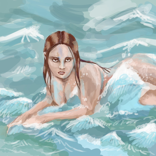
I would avoid the water if I were you
Obscutober Day 2 - Littoral
From @mysticsparklewings prompt list!
#obscutober#MysticsObscutober#artists on tumblr#drawtober#commissions open#artober#inktober#mermaids
7 notes
·
View notes
Text

Obscutober 2024 Day 3: Horology 🕰️
----------
Horology (n.)
the science of measuring time
the art of making instruments for indicating time; clockmaking
----------
I assume real clock-making is rather time-consuming 😉 Making a clock-making-inspired mandala sure was!
...It took more time than I care to admit to come up with that joke. At least the art turned out nice? 😅 Bad puns aside: Click the "Keep Reading" and we'll talk more about my thoughts/process for this piece ✨
⭐️ Like My Art and Want to see more of it? Here's All My Links! ⭐️
----------
I'm a little bit conflicted with this one, Sparklers. (But hey, at least I should be getting this one posted a little bit earlier! 🤷♀️ ) I am happy with how it came out, and I was pretty excited to see what I could do with the ideas of gears and metal that immediately sprang to mind for this word, however...The act of making said metal and gears ended up being a lot more trouble than I anticipated. 😅 Those emotions are so equally matched it's hard to separate them. The biggest hurdle was the fact that in order to look "right," I had to be more careful about getting curves looking circular-ish and uniform with each other. For full circles, that's generally not so bad. For semi-circles and arcs, it tends to be a big pain. 🙃
It also didn't help that I chose to make the outer ring of gear teeth a size that was really "too small" for Procreate's symmetry tool to help me out as much as I needed it too. So I also had to be more careful with those as I worked me way across what area the symmetry tool wouldn't fill in for me. The background was a bit more challenge than I expected, too. If anyone remembers how I mentioned yesterday I had decided some spot color "within" the mandala lines is okay but I still want to keep things loose: This one definitely pushed the boundaries on that. I tried leaving things more abstract, but I kept going back and re-defining certain color areas because it felt wrong otherwise.
I think that's a conflict between the general clockmaking concept and the abstract nature of how I'm approaching these prompts; Clockmaking, or at least the physical components needed to do it, is so very rigid and precise. Although, on the other hand, there's a kind of irony in that, isn't there? Since the way we humans measure time is something we made up—it's pretty arbitrary as far as nature is concerned.
...I seem to be wandering away from talking about the art and into higher concepts I am really not an expert in. 😅 Let me try to get this derailed train of thought back on track...
My point was that it felt like I needed more color, placed more carefully, to help with the definition between the different gear and cog pieces. This was not helped by how a lot of the images I kept seeing when I looked up clock/watch insides did usually have pieces that stood out because they were differently colored metal. Two related asides: 1. I apologize to anyone that does work with watch/clock components and may be getting a headache from my lack of proper vocabulary to describe said parts...Or the general lack of sense the "clock parts" I tried to draw here make compared to the actually insides of a time-telling machine. Many, many artistic liberties were taken! 2. I do actually kind of recommend looking up watch/clock insides sometime when you get a chance if you're not familiar with what that looks like; I found a lot of the pictures oddly soothing for reasons I don't fully understand. But even so—A lot of them are pretty even though I don't think they're trying to be. The screws on this one make me think of tiny gemstones! [I did consider adding some spots of color to background to mimic that jewel-like feel I just mentioned, but ultimately I didn't want to over-complicate the color palette.]
Anyway, going back to the lines/mandala portion for a moment: I knew going in that the fact I'm taking up the center for the word definitions would make a time/clock-themed one more difficult. After all, one of the primary things you think of with those concepts are the clock hands in the center of a clock face. Usually, even if you don't read analogue clocks that often that's still true!
For that reason, while I normally make the mandalas from the inside-out (aside from adjustments/tweaks that happen later), this time I started more on the outer edge. The clock hands hanging out there were still one of the very last things, but the gear teeth and general round "clock border" were the first and I more or less worked my way inward.
And at a certain point I realized so far I really just had a "gears" or industrial-themed mandala that showed no hints of being tied to clocks specifically. 😅 You can see from that, I ended up opting to put roman numerals in the 4 primary "clock" positions—12, 3, 6, 9. If I'd had room, I might have gone for the full set of 12, but by that time (ha-ha) I'd spent way too long making those four "gear spoke" semi-circle things that hang over right where most of the other numerals would go and I was not of a mind to either re-do or erase them. 😵💫 I then spent way too long trying to figure out how to "compensate" and fill the "clock face" just a little bit more because the big 4 numerals weren't quite enough for me. It's not very exciting but I landed on just some small lines—Tick marks, you might say. 😃 You may also notice that, true to something else I said yesterday, this is now the first example of one of the Obscutober mandalas in black rather than white. I did start out with it in white, but as I was moving into work on the background I thought the white was coming off a little too "soft" or too much like the mandala was glowing. Black felt like a better fit for the illusion of depth and the more "rigid" feel overall.
Although while I was in the process of changing the lines from white to black, I was very tempted to leave it in a half-state where some of the uppers layers were in black and the lower ones were still white. That got vetoed for consistency's sake, but it did cause me to go back and play with some of the contrast in the background a little more to kind of echo the idea.
I was also very tempted to try dark brown or sepia lines for this one, but, say it with me: I decided not to to keep things simple and consistent.
The final product doesn't necessarily look that much like what I originally had in mind...But to be fair, my original vision was pretty fuzzy. At least unlike yesterday, there isn't too much I feel like I'd change or do all that differently if I had to do it over.
I do hope I can say at least that much about tomorrow's piece—Tomorrow is shaping up to be a busy day in my offline life, so I'm a little bit concerned about how I'm going to fit Obscutober in...But that's a key point of the challenge, right? 😅
There's definitely a joke in here somewhere about "use your time wisely," but I can't quite put it together, so you Sparklers will have to think on it and let me know if you can figure one out. 😉 Until tomorrow, Sparklers... 🤗
----------
See the Prompt List
Artwork © me, MysticSparklewings
Obscutober Concept Inspired by nikolas_tower
----------
⭐️ Like My Art and Want to see more of it? Here's All My Links! ⭐️
#inktober#mysticsparklewings#xxmysticwingsxx#drawtober#illustration#abstract art#procreate#digital art#inktober2024#obscutober#mysticsobscutober#obscutober2024#rare words#obscure words#horology#watches#clocks#clockmaking#clockmaker#time#watchmaking#wordoftheday#mandala#mandala art#gears#steampunk#industrial#cogs
7 notes
·
View notes
Text

#Obscutober day 2
Littoral (adj.)
Of or relating to the shore of a lake, sea, or ocean
——
explanation: this depicts the scene of one of the Primal 7 player characters burning the evidence of his family‘s secret worship of the titan Atlas, whom he is sworn to. Khantos did this by burning the Evergreen manor, his family home in Shorevale.
bit of stretch but this was great practice for buildings!
(prompt by @mysticsparklewings !)
#obscutober#mysticsobscutober#dnd#dungeons and dragons#dnd art#dnd character#art#artificer#triton#my art
7 notes
·
View notes
Text

#Obscutober day 13:
Lunette (n.) [from French, “little moon”] Any of various objects or spaces of crescent-like or semicircular outline or section; the figure or shape of a crescent moon [architecture] (in the plane of a wall) An area enframed by an arch or vault a painting, sculpture, or window filling such an area.
——
of course for this i had to draw Celea, the Moon Elf Twilight Domain Cleric from the Four Horsemen Campaign. originally she worshipped the moon goddess Linair and Annir, though her faith has been tested…
(prompt by @mysticsparklewings !)
#obscutober#mysticsobscutober#obscutober2024#artober#lunette#cleric#moonelf#dnd#dungeonsanddragons#dndart#dndartist#sketch
#obscutober#mysticsobscutober#dungeons and dragons#dnd#dnd art#dnd character#my art#art#moon elf#cleric
6 notes
·
View notes
Text

Obscutober 2024 Day 4: Apricate ☀️
----------
Apricate (v.)
to bask in the sun; to expose to sunlight
----------
Hope you’re all feeling as good as a cat sleeping in the window on this 4th day of Inktober 😉
I’m not really because it’s a traveling day & those wear me out, but hey could be worse! 🤷♀️
Click the "Keep Reading" and we'll talk more about my thoughts/process for this piece ✨
(Apologizes in advance for any formatting issues; I wasn’t able to draft the Tumblr post before we got on the road and I am so not used to doing this on mobile. 😅)
⭐️ Like My Art and Want to see more of it? Here's All My Links! ⭐️
----------
I apologize for the lack of my normal description today, Sparklers. As I mentioned yesterday, I've got on my plate today and I just don't have the time to get into the details right now! I'll see if I can come back in the evening and flesh things out more, but for now I'll leave you with just some bullet point thoughts:
My primary inspiration was kitty cats basking in "puddles" of sunshine they find on the floor, or sitting in sunny windows, etc. Hence the cat-window-silhouette thing happen as sort of the main focus of the mandala.
I also thought of sunflowers, and coincidentally sunflowers are non-toxic to cats, so it would be acceptable for a kitty to sit in a patch of sunflowers while both flowers and feline face the sun.
More obscurely, to help fill space and add contrast, I thought of these things.
I tried to go for a little bit of an effect with the background like the sun is actually shining through the windows, but I'm not sure I pulled it off correctly.
I was 95% done with this piece when I realize it looked much more washed out on screens that were not my iPad, so I had to back track a bit and try to fix it. Now I think it looks too dark with how low I keep the brightness on a lot of my device screens, but I think a lot of people keep their screens brighter than I do by default (at least during the day) so I'm sticking with it.
I'm still not really happy with the "red" for the curtains. I was going for a kind of desaturated dark coral, but it kept coming out either too pink or too dark. Ultimately I settled for too dark because it went better with the sun-through-windows idea, where the curtains would be more shadowed anyway.
White might have been the more natural choice for the lines, but then you probably couldn't see the cat silhouette and I could not be bothered going back and changing it to outlines. [And it looked kinda weird as outlines when I first started drawing it, which is largely why I ended up filling it in the first place.
----------
See the Prompt List
Artwork © me, MysticSparklewings
Obscutober Concept Inspired by nikolas_tower
----------
⭐️ Like My Art and Want to see more of it? Here's All My Links! ⭐️
#inktober#mysticsparklewings#xxmysticwingsxx#drawtober#illustration#procreate#digital art#abstract art#inktober 2024#obscutober#mysticsobscutober#rare words#obscure words#mandala#mandala art#apricate#basking in the sun#cat art#silhouette#sunshine#sunny#sunlight
6 notes
·
View notes