#Neue Haas Grotesk
Explore tagged Tumblr posts
Visit Tumblr Blog
Explore Tumblr blogs with no restrictions, modern design and the best experience.
Last Seen Tumblr Blogs


Fun Fact
Tumblr was named as a finalist in Lead411’s New York City Hot 125 in Aug 2010.
Text

Studio Fables
#Studio Fables#design#studio#Montreuil#portfolio#typography#type#typeface#font#Neue Haas Grotesk#2024#Week 23#website#web design#inspire#inspiration#happywebdesign
20 notes
·
View notes
Text

instagram
7 notes
·
View notes
Text

Die Neue Haas Grotesk
15 notes
·
View notes
Text

based on this post by @dear-ao3. but I'm not satisfied yet so more versions will occur. I mean I only did it like this for a last minute assignment but it's really giving christian minimalist decor
#my art#art#every time i look up#space#pink#text art#school#fonts for those wondering:#neue haas grotesk display pro 15 ultra thin#helvetica light
1 note
·
View note
Text
neue haas grotesk is like if helvetica went raw
and baby… it feels amazing
5 notes
·
View notes
Text
This is Helvetica, also known as Neue Haas Grotesk.

5 notes
·
View notes
Text
Helvetica - The Documentary
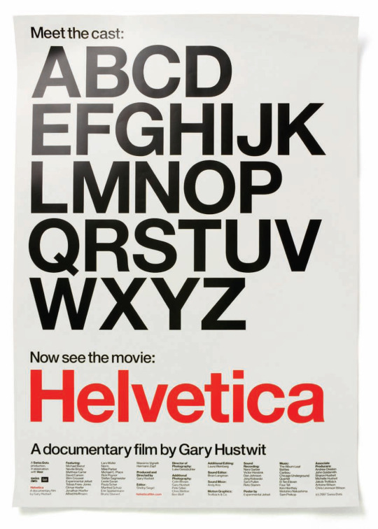
The Rise, Flatline, and Fall of the Modernist Movement's Darling Poster Child
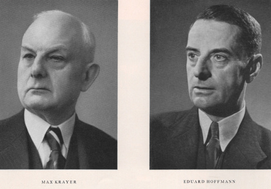
Name: Helvetica (Die Neue Haas Grotesk) Parents: Max Miedinger and Eduard Hoffmann Nicknames: "Perfection" / "Ubiquitous" / "Air" / "Ultimate Typeface"
1950’s - post-war period - feeling of idealism
Social responsibility for designers
More democracy, clarity, rebuilding
Early experiments of High Modernist period - Swiss style
1957 - HELVETICA IS BORN !!! - rational typeface for all kinds of information to present ideas in intelligible/legible way - loud and clearly modern
Interesting that early modernism (dadaism, futurism, surrealism) was more subversive and that functionality emerged later

Would you use Helvetica in your designs?
I don't have particularly strong feelings toward it. Jonathan Hoefler says "it's like off-white paint" and many of the other designers in the documentary say it's like air. It's just there. I would use it if it matches the look that I'm going for, but I typically prefer more expressive typefaces - I'd probably manipulate the original form, at least. It's ubiquitous, versatile, and functional, sure, but why would I use it when there are so many other typefaces. Bit corporate. Bit SnoozeVille.
Like Rick Poynor put it (regarding designing with Helvetica over a period of time), “There’s a law of diminishing returns”. More exposure -> more use by designers -> more predictability -> uh oh it's dull now.
No flavour is the point but that doesn't mean I have to love it.
It's ok but why limit yourselfffff (to one type family). I guess to push your ideas as a designer. But experimenting outside that seems more fun to me. Some people favour restrictions though, so to each their own.
My view leans towards that of Erik Spiekerman (Gemini King), who says “[Type] just makes my words visible” and that “A real typeface needs rhythm, needs contrast; It comes from handwriting. That’s why I can read your handwriting, and you can read mine. And I’m sure out handwriting is miles away from Helvetica… But we can read it because there’s rhythm to it, there’s a contrast to it.” Obviously, you can't always read handwriting, but personally I'm pretty good at it and find it much more compelling than consistent, uniform typefaces. Spiekerman on letters designed to look the same: "Hello??? You know, that’s called an army. That’s not people.” This sentiment is interesting and appeals to me, because I like it when type has personality, as it's a means for social communication -- informed by people. Then again, uniformity is just another style. But, I personally like when you can tell that a human being made something with heart and intention, and if you can do that with Helvetica, then knock yourself out ig. Michael C Place expresses that though he doesn't know the fancy type terminology, he values the emotional response that type can bring and enjoys "the challenges of making Helvetica speak in a different way”. I can admire that idea: Originality with Helvetica depends on execution.
I do like how the designers in the doco describe the typeface in regard to the space between characters as opposed to the space that the characters fill. Mike Parker says “It’s not a letter that’s bent to shape; It’s a letter that lives in a powerful matrix of surrounding space”. The negative space is said to contain the characters which is an effective, formidable way to put it. Similarly, Massimo Vignelli says "typography is really white" which I find to be a refreshing perspective.
Would you use Helvetica for one context (type of work/audience) but not another?
Yes, as long as it suits the content, my vision/the client's vision. It would not be my first choice unless I was going for that neutral look, modernist style, or just maximising attention to the actual text, rather than its appearance.
Not as passionate about this topic as some designers involved in the documentary but it's fun/ny to watch them talk about it with such vigour.
____________________________________________________________
Michael Bierut: “In Helvetica. Period. Any questions? Of course not”
Wim “Gridnik” Crouwel:
“But if I see today's designers, they use all typefaces-one day one typeface, the other day the other typeface, all in favor of a certain atmosphere, I'm not... I don't like that... The meaning is in the content of the text, not in the typeface.”
Why must the meaning derived from either or be mutually exclusive ? Surely both the content and typeface can be used to amplify the message. It's about feeling and communication. Typefaces are just tools. Ricky P says type gives words "a certain colouring" which conveys a sense of a ranging intensity.
Paula Scher: "I was also morally opposed to Helvetica because I viewed the big corporations that were slathered in Helvetica as sponsors of the Vietnam War." <- Personal, moral implications.
Massimo Vignelli: thinks postmodernism is a DISEASE
Tobias Frere-Jones: Type Expression = important
“The same way that an actor that's miscast in a role will affect someone's experience of a movie or play that they're watching. They'll still follow the plot, but, you know, be less convinced or excited or affected.”
David Carson
“Don’t confuse legibility with communication.” I agree.
“If something is a very important message and it’s set in a boring, non-descript way, the message can be lost.” I neither agree nor disagree. Depends on execution.
Questions:
Why are there so many Michaels?
How was Erik's birthday?
Why do I prefer this typeface to Helvetica? It's cuter.
✋︎ ⬥︎♋︎■︎⧫︎ ⧫︎□︎ ⬧︎♏︎♏︎ ⧫︎♒︎♏︎❍︎ ❍︎♓︎⌧︎ ♋︎■︎♎︎ ❍︎♓︎■︎♑︎●︎♏︎ ♌︎♏︎♍︎♋︎◆︎⬧︎♏︎ ♓︎⧫︎ ⬥︎□︎◆︎●︎♎︎ ♌︎♏︎ ♐︎◆︎■︎■︎⍓︎ ✏︎

12 notes
·
View notes
Text
Font, Display Font, Groovy font, Fancy Font,

font, free fonts, font style, dafonts, fontgenerator, helvetica, whatthefont, graffiti font, calligraphy fonts, cool fonts, font online, find font, cursive fonts, tattoo fonts, letter fonts, handwritten fonts, font aesthetic, find font from image, helvetica font, gothic font, font text, fancy fonts, fancy text, cute fonts, bold fonts, montserrat font, font styles names, stylish text, calligraphy lettering, text style,
Read more here ==>> font style
poppins font, times new roman, bembo, tattoo font styles, font meme, meme font, what de font, font id, bubble lettering, bold text, bold text font, comic sans, comic sans ms, cool text symbols, cool texts, discord font, fancy font style, font poppins, fonts for discord, avenir, gotham font, logo fonts, gilroy font, retro fonts, font creator, modern fonts, vintage fonts, free fonts for commercial use, univers font, custom fonts, font design, script fonts, neon font, helvetica neue, best fonts for websites, wedding fonts, the seasons font, 3d fonts, best fonts for logos, typography design, groovy font, different fonts, frutiger font, best fonts, bubble font, lettering styles, stencil font, christmas fonts, western fonts, luxury fonts, baskerville, lucida, serif fonts, sports fonts, art deco fonts, 70s fonts, typewriter font, font cloud, proxima nova font, nexa font, elegant fonts, avenir font, futuristic fonts, signature font, baseball font, halloween fonts, fancy letters, fun fonts, typography fonts, futura font, proxima nova, varsity font, frutiger, font types, neue haas grotesk, sans serif font, script letters, sans serif, new fonts, professional fonts, 80s fonts, downloadable fonts, fire font, blackletter font, y2k fonts, bubble letter font, 90s fonts, writing fonts, different font styles, number fonts, fonts art, death metal font, gothic letters, optima font, comic book font, times new roman font, fancy writing, fonts style designs, brush font, rounded fonts, star wars font, word fonts, arial font, drip font, display fonts, collegiate font, barcode font, metal font, typeface, bauhaus font, beautiful fonts, grunge fonts, comic font, chalk font, helvetica neue font, block letter font, garamond font, art nouveau font, minimalist fonts, medieval font, free fonts online, cyberpunk font, nice fonts, akzidenz grotesk, tattoo lettering fonts, chalkboard font, stamp font, pretty fonts, heavy metal font, tattoo script font, baskerville font, special fonts, eurostile font, balloon font, metropolis font, different letter fonts, classic fonts, spooky fonts, font styles free, harry potter font, block font, cooper black font, alphabet fonts, rockwell font, punk fonts, pirate font, calibri font, font names, bodoni font, cinematic fonts, tech fonts, water font, friends font, outline font, roman font, brush script font, italic font, calligraphr, copperplate font, gaming fonts, didot font, font style online, different types of fonts, canva fonts, merry christmas font, chicano font, lobster font, century gothic font, glacial indifference font, digital font, garamond, font from image, vogue font, newspaper font, text aesthetic, bookman font, bluey font, cool letters, movie fonts, floral font, akira expanded font, royal fonts, cool text fonts, horror fonts, lettering tattoo, toy story font, trajan pro font, fantasy fonts, great vibes font, myriad pro font, georgia font, square font, roboto, big font, rubber stamp font, tattoo fonts cursive, video game font, lemon milk font, circular font, playfair display font, gangster font, algerian font, flower font, verdana font, spiderman font, gill sans font, best tattoo fonts, impact font, scary fonts, jersey font, pixel font, san francisco font, roboto font, simple fonts, poster fonts, font family, palatino font, super mario font, myriad pro,
3 notes
·
View notes
Text
Helvetica: A Deep Dive into the World’s Most Ubiquitous Typeface
Helvetica, a typeface synonymous with clarity and modernity, reigns supreme in the world of design. Its widespread use, from iconic brand logos to everyday signage, speaks volumes about its enduring appeal and versatility. This blog post will explore the origins, characteristics, and lasting impact of Helvetica, tracing its journey to becoming a global design phenomenon.
Swiss Origins and Design Philosophy
Helvetica emerged from the heart of Swiss graphic design in 1957, born from the collaboration of Max Miedinger and Eduard Hoffmann at the Haas Type Foundry. Switzerland, renowned for its precision and efficiency, provided a fertile ground for this revolutionary typeface to flourish. At its core, Helvetica embodies the principles of the International Typographic Style (also known as Swiss Style), which emphasized cleanliness, readability, and objectivity. This movement embraced the use of grids, sans-serif typefaces, and asymmetrical layouts to create balanced and harmonious designs.
The Making of a Masterpiece: From Neue Haas Grotesk to Helvetica
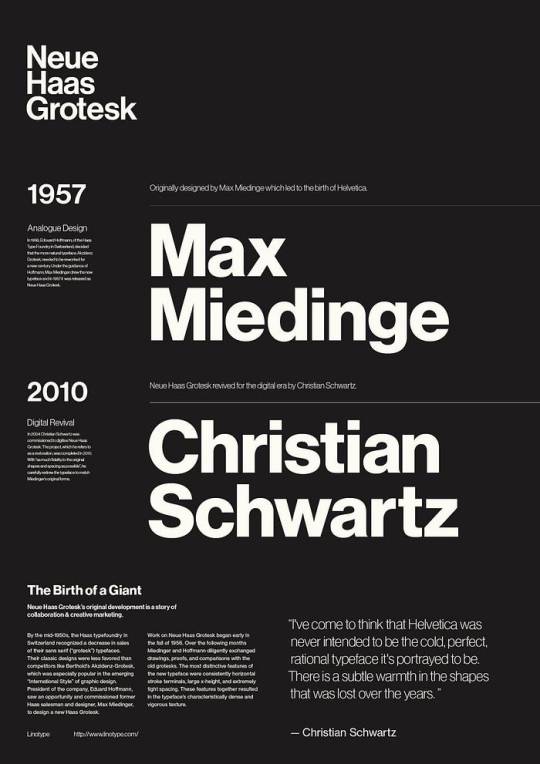
Helvetica’s journey to becoming a global icon involved a series of pivotal moments. Initially christened Neue Haas Grotesk, the typeface was a refined interpretation of the earlier Akzidenz Grotesk typeface. In 1961, Stempel, the parent company of Haas Type Foundry, strategically renamed it Helvetica, meaning “Swiss” in Latin, to broaden its appeal in the international market. This decision proved to be a masterstroke, as Helvetica rapidly gained traction worldwide.
Anatomy of Helvetica: Decoding its Visual Language
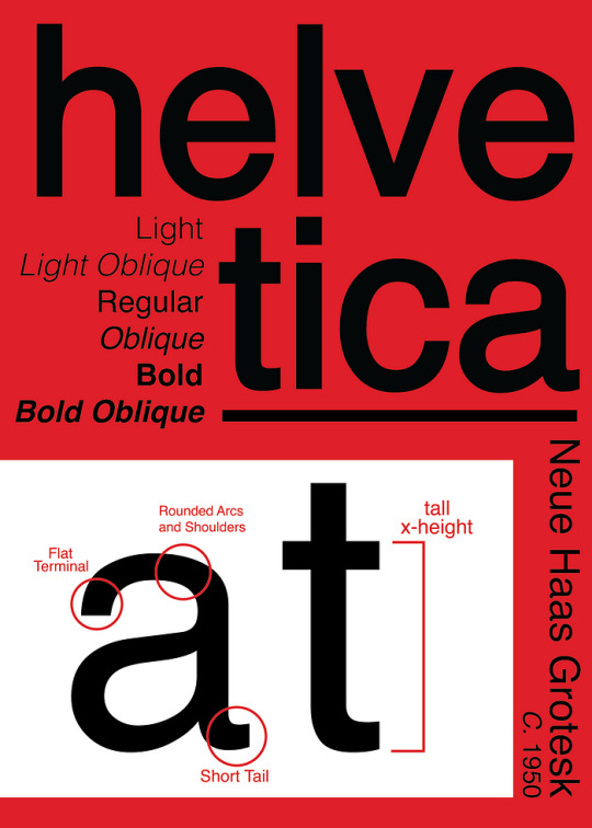
Helvetica’s enduring allure lies in its meticulously crafted letterforms and distinctive characteristics. Its simple, geometric shapes and uniform stroke widths contribute to its exceptional legibility. Key features include:
Minimal stroke contrast: The difference in thickness between the thickest and thinnest parts of a letterform is subtle.
Horizontal and vertical cut-offs: The ends of strokes are cut straight, creating a clean and crisp appearance.
Tight spacing between letters: Letters are set close together, resulting in a compact and unified look.
Large x-height: The height of lowercase letters is relatively large, further enhancing readability.
Closed apertures: The enclosed spaces within letters like ‘a’, ‘e’, and ‘o’ are relatively small.
These carefully considered details work in harmony to create a typeface that is both aesthetically pleasing and incredibly functional.
Helvetica’s Enduring Legacy: A Testament to Timeless Design
Helvetica’s influence on the world of design is undeniable. Its neutrality and versatility have made it a go-to choice for a wide range of applications, from corporate branding to transportation signage. Iconic brands like Knoll, American Airlines, and Panasonic have all harnessed the power of Helvetica to communicate their brand identities effectively. The typeface’s presence extends beyond the corporate world, finding its way into film title sequences (Goodfellas, Split, Alien) and even becoming the official typeface of the New York City subway system. Helvetica’s ability to transcend cultural boundaries and resonate with audiences worldwide is a testament to its timeless appeal. As Wim Crouwel, a renowned typographer, aptly stated, “The meaning is in the content of the text and not in the typeface, and that is why we loved Helvetica very much.”
4 notes
·
View notes
Text
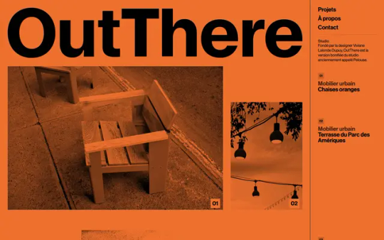
OutThere
#OutThere#design#studio#objects#mobilier urbain#espace public#Montréal#Canada#portfolio#orange#typography#type#typeface#font#Neue Haas Grotesk#Tobias#2024#Week 06#website#web design#inspire#inspiration#happywebdesign
40 notes
·
View notes
Text

instagram
5 notes
·
View notes
Text

Sisters Hope → Site of the Day for August 23, 2023
Fonts: Tobias, Neue Haas Grotesk
6 notes
·
View notes
Text
Final Final Final

2.8 Rationale This design visualised the unique movement of the site of connection - Lower Albert Street bus stop. The unique movement includes the rapid and slow motion practised by passengers waiting for their buses and the people running to catch their ride. The dominant colour, navy, hints at the site as a bus stop, and the yellow highlighting suggests human energy within the site. The human energy may be interpreted as the noise from chatting or the number of people. Since Neue Haas Grotesk typeface was used to convey the neutralism of the site, the bold weights are used for the names and to deliver the static aspects of the site. On the other hand, the lightweight variations are used for numbers and to deliver the dynamic aspects. The key visual elements in this design, the wavy abstract lines, are employed to emphasise its continuous movement, making it possible to metaphorically represent the fluidity of pedestrians.
0 notes
Text
sunday blasting off in excitement after seeing generic neue haas grotesk font for the millionth time
1 note
·
View note
Text
Helvetica Notes
Typefaces express mood and atmosphere
People use Helvetica because its ubiquitous (found everywhere)
Helvetica = modern
Creating order = typography
Helvetica characteristics include horizontal terminals on lowercase a, c, e, and g
Helveticas original name is Die Neue Haas Grotesk
Supposedly Eduard Hoffman, bodd of Haas type foundry wanted to modernise Akzidenz Grotesk, a 19th century German sans-serif
Max Miedinger made drawings for Helvetica
Helveticas design is about the interrelationship of negative shape
Miendinger originally worked as a salesman for haas before designer
Helveticas name came from ‘Helvetia’, Latin name of Switzerland
Since Helvetica is heavy in the centre, it requires white space around it, examining weight gradations
The way something is presented will define the way you react to it
Helvetica is a club, marking membership in modern society
Typography can have and convey personality the way drawing can
The movie ‘Helvetica’ explains the importance and affect a single typeface has had on society since its invention. Many of the featured in the movie agrees Helvetica is ubiquitous (found everywhere), and that it’s the symbol of modern society. The draft designs of the popular typeface ‘Die Neue Haas Grotesk’, now known as ‘Helvetica’, name originating from Latin, were made by Max Miendinger, collaborating is Eduard Hoffmann to create the type seen today.
Since the beginning of typography, people believe that typography can express mood and atmosphere, and can convey personality the same way drawings can. When Helvetica was first introduced, society loved it for its modernity and large range of uses, however now that it’s normalised and seen everywhere, people recently recognise it as a basic and overused typeface.
0 notes
Text
wk03 / helvetica (2007) --- gary hustwit / notes + quotes
peer discussion about the film:
discussed and shared my opinion on helvetica with a classmate. both of us came to the conclusion that it works in certain contexts (e.g. professional settings or for long pieces of script), but for all else, there are definitely better options out there. we also both thought that while it was modern, it is overused and a bit boring / bland.
notes:
a ubiquitous typeface generated by a desire of having better legibility. inspired by swiss modernism design trends in the early 50s.
considered a rational typeface - is neutral and can be used for all identities.
originally called die neue haas grotesk, however was changed as it would be difficult to read for english speakers.
was a modernised version of a pre-existing typeface called 'akzidenz grotesk' (a traditional german sans-serif).
designed by max miedinger in 1957, created by eduard hoffman, director of swiss foundry 'haas' in műchenstein, switzerland.
is now owned by linotype (a german foundry which owned 'haas')
focuses on the interrelationship of negative shape, the figure ground relationship, the shapes between and within characters.
quotes:
'most people who use helvetica, use it because it's ubiquitous. it's like going to mcdonald's instead of thinking about food. because it's there, it's on every street corner, so let's eat crap because it's on the corner.' (erik spiekermann)
'the meaning is in the content of the text and not in the typeface, and that is why we loved helvetica very much.' (wim crowel)
'type is saying things to us all the time. typefaces express a mood, an atmosphere. they give words a certain colouring.' (rick poyner)
'if l see a brochure now, with lots of white space that has like six lines of helvetica up on the top, and a little abstract logo on the bottom, and a picture of a businessman walking somewhere, the overall communication that says to me is, "do not read me, because l will bore the shit out of you".
'if you want to evoke a sense of warmth, humanity, or personality, helvetica is not going to do it for you.'
'it's ubiquitous; it's a default. lt's air, you know, it's just there. there's no choice. you have to breathe, so you have to use helvetica.' (erik spiekermann)
'as is always the case with any style, there's a law of diminishing returns. the more you see it, the more the public sees it, the more the designer uses those typographic and graphic solutions, the more familiar, predictable, and ultimately dull they become.'
'the image of helvetica as the corporate typeface made it the so-called typeface of capitalism, which l would actually reject and say it's the typeface of socialism because it is available all over and it's inviting dilettantes and amateurs and everybody to do typography'.
Hustwit, G. (Director). (2007). Helvetica [Video file]. Film First Corp.. Retrieved March 26, 2025, from Kanopy.
1 note
·
View note