#PriceMovements
Text
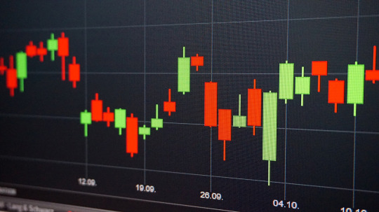
How to Read and Interpret Candlestick Charts
Unveiling the Secrets of Candlestick Chart Interpretation
By Amir Shayan
Candlestick charts are a fundamental tool in the world of financial trading. They provide crucial insights into the price movements of various assets, helping traders make informed decisions. Understanding how to read and interpret candlestick charts is a skill that can greatly enhance your trading acumen. In this article, we will delve into the intricacies of candlestick charts, unraveling their significance and guiding you through the process of deciphering their patterns.
The Language of Candlestick Charts
Candlestick charts originated in Japan centuries ago and have since become a cornerstone of technical analysis. Each candlestick represents a specific time frame, whether it's a minute, an hour, a day, or longer. The chart consists of individual candles, and the patterns they form can reveal potential trends, reversals, and price movements.
Anatomy of a Candlestick
A single candlestick consists of several key components: the body, the wick (or shadow), and sometimes the tail. The body represents the difference between the opening and closing prices during the given time frame. If the closing price is higher than the opening price, the body is typically colored or filled. Conversely, if the opening price is higher than the closing price, the body is usually empty or transparent.
The wick or shadow extends above and below the body, indicating the range between the highest and lowest prices during the time period. The tail, if present, extends from the body's top or bottom, signifying the range beyond the wick.
Common Candlestick Patterns
Doji: A Doji occurs when the opening and closing prices are very close or even identical. It suggests uncertainty in the market and a potential reversal.
Hammer and Hanging Man: These patterns have small bodies and a long lower tail. A Hammer appears after a downtrend and implies a potential bullish reversal, while a Hanging Man after an uptrend can indicate a bearish reversal.
Bullish and Bearish Engulfing: A Bullish Engulfing pattern occurs when a small bearish candle is followed by a larger bullish one. The reverse is the Bearish Engulfing pattern. These suggest a reversal of the current trend.
Morning Star and Evening Star: The Morning Star is a three-candle pattern featuring a large bearish candle, a small bearish or bullish one, and a large bullish one. It indicates a potential reversal from a downtrend. The Evening Star is the opposite, signaling a potential reversal from an uptrend.
Interpreting Candlestick Patterns
Candlestick patterns provide valuable information about market sentiment and potential price movements. For instance, a series of bullish candlesticks indicates a strong uptrend, while a succession of bearish ones suggests a downtrend. Reversal patterns, as the name suggests, may indicate an impending change in the current trend.
It's important to note that while candlestick patterns can offer insights into market movements, they should be considered alongside other technical and fundamental analysis tools for a comprehensive understanding.
Conclusion
Candlestick charts are a visual representation of market dynamics, revealing the battle between buyers and sellers. By understanding the patterns they form, traders can gain a deeper understanding of market sentiment and potential price movements. However, like any tool, candlestick charts are most effective when used in conjunction with other forms of analysis.
Learning to read and interpret candlestick charts takes time and practice, but it's a skill that can greatly improve your trading decisions. As you become more proficient in deciphering these patterns, you'll be better equipped to navigate the complexities of financial markets and make informed choices that align with your trading strategy.
Read the full article
#candlestickcharts#candlestickpatterns#Chartinterpretation#financialmarkets#marketanalysis#marketsentiment#PriceMovements#Technicalanalysis#Tradingpatterns#tradingstrategy
0 notes
Text
First Trade | AUD/USD Price Movements | Golden Cross Formation

As the first trade commences, the AUD/USD currency pair is under close observation for its price movements. Traders are particularly interested in the recent Golden Cross formation that occurred on the pair's chart. The Golden Cross is a technical indicator where the 50-day moving average crosses above the 200-day moving average, signaling a potential bullish trend reversal. This occurrence is viewed as a strong buy signal by some traders, as it indicates that the short-term price momentum may be gaining strength over the long-term trend. Market participants are closely analyzing the AUD/USD pair's price action and monitoring key support and resistance levels to make informed trading decisions. As the trading session progresses, the impact of the Golden Cross formation on the pair's price movements will be closely monitored.
#FirstTrade#AUDUSD#CurrencyPair#PriceMovements#GoldenCrossFormation#TechnicalIndicator#BullishTrend#MovingAverages#TradingSignal#ForexMarket#MarketAnalysis#TradingStrategy#CurrencyTrading#ForexTrading#TraderInsights
0 notes
Text
"XO Volatility Indicator: Advanced Tool for Analyzing Market Fluctuations and Trend Strength"
The XO Volatility Indicator measures market volatility by analyzing price movement and trade volume. It helps traders gauge market conditions, identify potential breakouts, and manage risk by highlighting periods of high and low volatility.
0 notes
Text
On May 5, the price of gold has maintain... #declines #Economicconditions #economicindicators #EconomicOutlook #Economicstability #Economictrends #FederationofNepalGoldandSilverDealersAssociation #Financialanalysis #Financialmarketupdates #FinancialStability #finegoldpricenepal #Finegoldrates #gold #GoldinvestmentNepal #Goldmarketconsistency #Goldmarketinsights #Goldmarketstability #Goldmarketupdate #Goldpricestability #Goldpricetrends #Goldrateconsistency #Investmentdecisions #Investmentstability #Investmentstrategies #marketanalysis #Marketassessment #marketfluctuations #Marketmonitoring #Marketobservations #marketperformance #Marketpredictability #marketstability #Markettrendsanalysis #marketvolatility #May5goldprices #Nepalgoldmarket #nepalgoldprices #Preciousmetalinvestments #Preciousmetalrates #Preciousmetalstability #Price #Pricefluctuations #Pricemovements #Pricestability #Silver #Silverinvestmentopportunities #Silvermarketanalysis #silvermarkettrends #silverpricedecline #Silverpricedip #SilverpriceNepal #SilverrateNepal #stable #Tejabigoldprice #Tejabigoldrates
0 notes
Photo

What seems cheap to Britons may be costly to Americans. Hence, when you trade matters in forex too. Here is an indicator that provides the OHLC of the market which could change the way you see the market.
Get it now.
https://wetalktrade.com/mt4-trade-session-indicator/
#sessionindicator#forexsessions#minutecharts#tradingconfidence#pricemovements#tradingstyle#breakouts#pips#wetalktrade
2 notes
·
View notes
Photo

Technical Analysis: Introduction to Trend and Trendline
https://tradersir.com/forex-technical-analysis-trend-trendline/
0 notes
Photo

A winner in CAD/JPY. 103+ pips scored in just 2 days. Our experts nailed it again. We alerted the users just at the right moment to catch the momentum. Want to have us by your side every day?
To Get accurate analysis, Use the app and upgrade to premium now!
Android: https://play.google.com/store/apps/details?id=com.traderpulse.analysis
IOS: https://apps.apple.com/app/forex-analysis/id1358603638
Web: https://analysis.traderpulse.com
#forexanalysis#momentumtrading#pricemovements#CADJPY#trendfollowing#traders#money#technicalanalysis#economiccalendar#movingaverage#traderpulse
0 notes
Photo

#Candlesticks#IndicatorsMetatrader5#Volume#BigPlayerCandles#candles#candlesticks#Price#PriceAction#PriceMovement#PriceTrail#wicks
0 notes
Photo

👉 #Lameloball #rookie #hoops #basketballcard price has dropped 2/3rds in the last 3 months. 📉 Could it be due to the injuried wrist which caused him to miss significant playing time or is this part of a larger industry price correction? 🤷🏻♂️ #tradingcards #basketball #nba #pricemovement #sportscardinvestor #sportscardinvesting https://www.instagram.com/p/CO9HY-xMoYl/?igshid=1bc38hilsrn23
#lameloball#rookie#hoops#basketballcard#tradingcards#basketball#nba#pricemovement#sportscardinvestor#sportscardinvesting
0 notes
Photo

EPA-EFE/PETER FOLEY Dow falls 300 pts premarket after jobs data [5/14/20] 13:50:00 The Dow Jones Industrial Average index dropped 300 points in premarket trade on Tuesday after the United States Department of Labor reported that 2,981,000 people have applied for unemployment benefits in the week ending May 9. Also, US President Donald Trump stated that Washington is not going to renegotiate the trade deal it reached with China in January. The Dow Jones fell by 1.31%, or 304 points, at 8:55 am ET. The Nasdaq 100 was 0.76% down at 8:56 am ET. At the same time, the S&P 500 declined by 1.1%. The euro was 0.28% lower against the dollar to go for 1.07884 at 9:03 am ET. The Xtreems #xtreems #2020vision #2020 #money #Finance #technology #crypto #digitalcurrency #fridaysforfuture #business #design #dowjones #NASDAQ #euro #dollar #s&p #market #news #pricemovement https://www.instagram.com/p/CAK2lJOH-K6/?igshid=tuat5kzusc1z
#xtreems#2020vision#2020#money#finance#technology#crypto#digitalcurrency#fridaysforfuture#business#design#dowjones#nasdaq#euro#dollar#s#market#news#pricemovement
0 notes
Text
How to Read and Interpret Candlestick Charts

Unveiling the Secrets of Candlestick Chart Interpretation
By Amir Shayan
Candlestick charts are a fundamental tool in the world of financial trading. They provide crucial insights into the price movements of various assets, helping traders make informed decisions. Understanding how to read and interpret candlestick charts is a skill that can greatly enhance your trading acumen. In this article, we will delve into the intricacies of candlestick charts, unraveling their significance and guiding you through the process of deciphering their patterns.
The Language of Candlestick Charts
Candlestick charts originated in Japan centuries ago and have since become a cornerstone of technical analysis. Each candlestick represents a specific time frame, whether it's a minute, an hour, a day, or longer. The chart consists of individual candles, and the patterns they form can reveal potential trends, reversals, and price movements.
Anatomy of a Candlestick
A single candlestick consists of several key components: the body, the wick (or shadow), and sometimes the tail. The body represents the difference between the opening and closing prices during the given time frame. If the closing price is higher than the opening price, the body is typically colored or filled. Conversely, if the opening price is higher than the closing price, the body is usually empty or transparent.
The wick or shadow extends above and below the body, indicating the range between the highest and lowest prices during the time period. The tail, if present, extends from the body's top or bottom, signifying the range beyond the wick.
Common Candlestick Patterns
Doji: A Doji occurs when the opening and closing prices are very close or even identical. It suggests uncertainty in the market and a potential reversal.
Hammer and Hanging Man: These patterns have small bodies and a long lower tail. A Hammer appears after a downtrend and implies a potential bullish reversal, while a Hanging Man after an uptrend can indicate a bearish reversal.
Bullish and Bearish Engulfing: A Bullish Engulfing pattern occurs when a small bearish candle is followed by a larger bullish one. The reverse is the Bearish Engulfing pattern. These suggest a reversal of the current trend.
Morning Star and Evening Star: The Morning Star is a three-candle pattern featuring a large bearish candle, a small bearish or bullish one, and a large bullish one. It indicates a potential reversal from a downtrend. The Evening Star is the opposite, signaling a potential reversal from an uptrend.
Interpreting Candlestick Patterns
Candlestick patterns provide valuable information about market sentiment and potential price movements. For instance, a series of bullish candlesticks indicates a strong uptrend, while a succession of bearish ones suggests a downtrend. Reversal patterns, as the name suggests, may indicate an impending change in the current trend.
It's important to note that while candlestick patterns can offer insights into market movements, they should be considered alongside other technical and fundamental analysis tools for a comprehensive understanding.
Conclusion
Candlestick charts are a visual representation of market dynamics, revealing the battle between buyers and sellers. By understanding the patterns they form, traders can gain a deeper understanding of market sentiment and potential price movements. However, like any tool, candlestick charts are most effective when used in conjunction with other forms of analysis.
Learning to read and interpret candlestick charts takes time and practice, but it's a skill that can greatly improve your trading decisions. As you become more proficient in deciphering these patterns, you'll be better equipped to navigate the complexities of financial markets and make informed choices that align with your trading strategy.
Read the full article
#candlestickcharts#candlestickpatterns#Chartinterpretation#financialmarkets#marketanalysis#marketsentiment#PriceMovements#Technicalanalysis#Tradingpatterns#tradingstrategy
0 notes
Text
Ethereum rally sparks renewed hopes for a continuation of the DeFi bull run
Ethereum rally sparks renewed hopes for a continuation of the DeFi bull run

Ethereum has seen some incredibly strong price action throughout the past 24-hours, which has allowed it to erase a good bulk of its recent losses.
This upswing has led the second-largest cryptocurrency from lows of $320 to highs of $380. Its momentum stalled once it hit these highs, and its price has been consolidating ever since.
It is important to note that this latest ETH pricemovement has…
View On WordPress
0 notes
Photo

Know what you're getting into.
#forex#highrisk#tradeideas#scalping#tradingstyle#pricemovements#pips#pullback#eurusd#microlot#wetalktrade
1 note
·
View note
Photo

What Kind of Trader Are You?
https://blog.iqoption.com/en/what-type-of-trader-are-you/
#Scalping#tradingstyle#Swingtrading#stoplosslevel#Positiontrading#longtermtrades#pricemovements#Forexmarket#tradersir
0 notes
Photo

Are you a newbie? Want to know what are your choices in the Forex market? Then here is it.
#daytradingmethods#forexmarket#investment#momentumtrading#trend#scalping#reversetrading#pricemoves#traderpulse
0 notes
Text
Goldman Sachs Warns Investors of Bitcoin ‘Bubble’ in New Report
Goldman Sachs Warns Investors of Bitcoin ‘Bubble’ in New Report Goldman Sachs has claimed that bitcoin is a bubble bigger than the dot-com era and the famous Dutch tulip mania. In a research letter to investors, the banking firm’s analysts warned about the increase in cryptocurrency values, highlighting the pricemoves in bitcoin and ether, as well as the… The post Goldman Sachs Warns Investors of…
View On WordPress
0 notes
Last Seen Blogs

elkane
Elkane You Know It

happyfairyskeleton
May all the beauty be blessed

nerumyn
Sem título

labyrinthofkpop-blog
Labyrinth of Kpop

severefunpizza
Untitled