#Ratio Proportion and Variation
Explore tagged Tumblr posts
Visit Tumblr Blog
Explore Tumblr blogs with no restrictions, modern design and the best experience.
Last Seen Tumblr Blogs


Fun Fact
The total number of visits Tumblr.com received during January 2021 is 327 million.
Text
Assorted Tetrox Sketches and Poses

A couple unique genetic variations can seen across these individuals, such as eye and belly patterning, shape and size of the head-tentacles, muscle to fat ratio, body proportions, etc. Examples of sexual dimorphism are also present, with females having noticeably shorter vestigial back-tentacles, about 1/3 the length of their tail.
#my art#digital illustration#creature design#worldbuilding#scifi worldbuilding#speculative biology#original species#xenobiology#poses
156 notes
·
View notes
Text
From the Slang Dictionary
part 3
Cheugy - a slang adjective mocking someone or something as “uncool”—they are out of touch with current trends or trying too hard to be trendy. It is often used ironically.
L + ratio - used as a mocking insult on social media, often in reply to a post or opinion considered particularly bad. The letter L is used as a slang term for loss (as in the opposite of win). The word ratio is used in its social media sense referring to a situation in which a post has a high proportion of replies compared to likes or reposts, which usually indicates a barrage of negative replies criticizing and often mocking the post.
Let him cook - a slang phrase that means to freely let a person do something they are good at. It is one of many variations of the phrase let X cook that is used to refer to letting someone do what they do. Some other examples of variations include let her cook, let them cook, and let us cook. The phrase is often used to express a desire that another person be given free rein to do something or not to be held back.
Mlem - in the internet slang of DoggoLingo, mlem is the sound a dog (or other animal) makes when they stick out their tongue to lick something, especially their own nose or chops.
Rizz - a slang term for skill in charming or seducing a potential romantic partner, especially through verbal communication. It is most commonly applied in the context of men pursuing women, but not always. The term is thought to be a shortening of charisma. It is typically used in the exact same way as the older slang term game.
Sealioning - a critical term for a form of trolling that involves relentlessly pestering someone with questions and requests (such as for evidence or sources), typically with the goal of upsetting them and making their position or viewpoint seem weak or unreasonable. It is typically applied to online contexts, such as social media, forums, and message boards (although it can also happen offline). Sealioning often involves giving off the impression of sincere curiosity and an open mind, using polite-sounding language, and framing the questioning as part of honest intellectual debate. However, the real goal of such behavior is to irritate the other person until that person gets angry or upset, thus allowing the questioner to portray themselves as a victim as an attempt to diminish a position or viewpoint they disagree with.
Snowga - the practice of doing yoga in a snowy environment.
Sploot - slang for the pose an animal, especially dogs, cats, and other four-legged pets, makes when it lies on its stomach with its hind legs stretched out back and flat. The term is especially associated with Welsh corgis and is used affectionately in the internet slang of DoggoLingo.
The ick - a term used in dating to refer to a sudden feeling of disgust or repulsion to a dating partner someone was previously attracted to.
Word up - a slang phrase used to show agreement, approval, or excitement.
Source ⚜ More: Word Lists ⚜ Writing Resources PDFs ⚜ Part 1 2
#requested#slang#writeblr#writing reference#langblr#word list#writing prompt#spilled ink#dark academia#writers on tumblr#literature#linguistics#language#internet#creative writing#writing inspiration#writing ideas#dialogue#writing resources
128 notes
·
View notes
Text
I figured out the hypothetical distances between locations in ffvii

See below for rationale and Methodology and potential in gameKilometre/Mile error. Note about Banora Location, and analysis
Corel - Midgar 340 km
Corel - Nibelheim 88 km
Cosmo canyon - Nibelheim 140 km
Cosmo Canyon - Midgar 569 km
Cosmo Canyon - Gongaga 155 km
Costa Del Sol - Midgar 200 km
Costa Del Sol - Nibelheim 222 km
Costa Del Sol - Bone Village 170 km
Gold Saucer - Costa Del Sol 185 km
Gongaga - Junon 310 km
Gongaga - Icicle Inn 672 km
Gongaga - Nibelheim 3.5 cm 259 km
Icicle Inn - Northern Crater 155 km
Icicle Inn - Nibelheim 347 km
Icicle Inn - Midgar 347 km
Junon - Midgar 133 km
Junon - Bone Village 281 km
Junon - Costa del Sol 185km
Mideel - Gongaga 488 km
Mideel - Midgar 392 km
Mideel - Wutai 983 km
Midgar - Gongaga 421 km
Midgar - Kalm 88km
Nibelheim - Wutai 333 km
Nibelheim - Midgar 421 km
Northern Crater -Temple of the Ancients 695 km
Rocket town - Wutai 273 km
Rocket Town - Midgar 451 km
Rocket town - Nibelheim 67 km
Wutai - Midgar 702 km
Banora - Nibelheim 628 km
Banora - Junon 297 km
Banora - Gongaga 458 km
Banora - Midgar 369 km
Banora - Mideel 30 km
Methodology

What we know
We can see the sign here says Junon is 133 miles away and Kalm is 51 miles away from this spot in midgar
Method
I used the standard method of determining distance via scale of map. I am taking GIS and Remote Sensing classes and this is a part of my major and just to double check I asked my professor if this method was correct and he said yes. (No, I didn't say it was for FFVII) So I printed out two maps of the world of FFVII


And made sure to keep their proportion as given in the image size which gave me two different image sizes to compare to make sure that the scale remained the same. It did surprisingly. That was where I was concerned that if the maps aren't drawn to scale then there is no way to determine these measurements. However I will note that we don't know the true scale of Gaia and videogame maps aren't meant to be cartographically correct so take this all with a grain of salt and know this is all for fun
Banora is not listed on the map but this map shows the location of Banora so I added it to my map and measured from there

Measurements and Variation between Metric and US systems
On the maps I found the distance from Midgar to Junon to be 1.8 cm and the distance from Midgar to Kalm to be 1.2 cm
But wait these numbers don't make sense given that 1.2 : 1.8 or a 2/3 ratio doesn't give you the numbers given above.
If we use the ratios given above with miles we get
Midgar to Kalm 53 miles
Midgar to Junon 76.5 miles which is less than the number given
However if we use kilometres we get
Midgar to Kalm 88.6 kilometres
Midgar to Junon 133 kilometres
Which leads me to believe one was converted to while the other wasn't.
Even though the sign says miles, in game uses metres and I use metric so I went with the Junon measurement.
The Scale
So now it's a matter of scale if 1.8 cm is 133 kilometres then the approximate scale is 1: 73.9 kilometres
Also note that I drew straight lines connecting locations to measure them. So actually distance traveled may vary depending on what route you can actually take
Banora - Junon 4 cm 297 km
Banora - Mideel 0.4 cm 30 km
Banora - Midgar 5 cm 369 km
Banora - Gongaga 6.2 cm 458 km
Banora - Nibelheim 8.5 cm 628 km
Corel - Midgar 4.6 cm 340 km
Corel - Nibelheim 1.2 cm 88 km
Cosmo canyon - Nibelheim 1.9 cm 140 km
Cosmo Canyon - Gongaga 2.1 cm 155 km
Cosmo Canyon - Midgar 7.7 cm 569 km
Costa Del Sol - Nibelheim 3 cm 222 km
Costa Del Sol - Midgar 2.7 cm 200 km
Costa Del Sol - Bone Village 2.3cm 170 km
Gold Saucer - Costa Del Sol 2.5 cm 185 km
Gongaga - Icicle inn 9. 1 cm 672 km
Gongaga - Nibelheim 3.5 cm 259 km
Gongaga - Junon 4.2 cm 310 km
Icicle Inn - Northern Crater 2.1 cm 155 km
Icicle Inn - Nibelheim 4.7 cm 347 km
Icicle Inn - Midgar 4.7 cm 347 km
Junon - Costa Del Sol 2.5cm 185 km
Junon - Bone Village 3.8 cm 281 km
Junon - Midgar 1.8 cm 133 km
Mideel - Wutai 13.3 cm 983 km
Mideel - Midgar 5.3 cm 392 km
Mideel - Gongaga 6.6 cm 488 km
Midgar - Kalm 1.2 cm 88km
Midgar - Gongaga 5.7 cm 421 km
Nibelheim - Midgar 5.7cm 421 km
Nibelheim - Wutai 4.5 cm 333 km
Northern Crater - Temple of the Ancients 9.4 cm 695km
Rocket town - Nibelheim 0.9 cm 67 km
Rocket Town - Midgar 6.1 cm 451 km
Rocket town - Wutai 3.7 km 273 km
Wutai - Midgar 9.5 cm 702 km
Note again for all we know these sign distances could be completely made up and in general this map doesn't make much sense as Gongaga and Icicle inn are only 532 kilometres away the equivalent of (Suwałki to Gorzów Wielkopolski or Suwałki Poland to Ternopil Ukraine) and while you see some temperature variation you don't go from polar glaciers to tropical rainforest in a matter 500 kilometres unless the planet is really small of image itself is 17 cm in length which means the distance from one edge of the map two the other is 1263 km which mind you is the same distance between Trywieża Podlaskie Poland and Kırklareli Türkiye.
Listen it makes sense for an rpg to have a world the size of Saudi Arabia but it doesn't make sense IRL so like take all this with a grain of salt. Also if we kept irl scale, the places on the maps wouldn't for the most part vary drastically and as a result it would get quite boring after visiting the same 20 some mountain villages. It would be a pain in the ass if Gaia was a similar size to the earth with similar distance between regions because well I took two places that kinda remind me of Nibelheim and Gongaga (Banff Alberta and Ahuachapán) and thats about 4,700 kilometres and 54 days in walking nonstop.


So I think there must be other continents in this world or least potential.
30 notes
·
View notes
Text


The Dutch Benedictine monk Hans van der Laan (1904-91) is primarily known for the four abbeys he designed in the Netherlands and Sweden as austere environments and representatives of a fundamental architecture. Completely tailored to the requirements of a monastic community they nonetheless have become admired buildings of a specific atmosphere that to a great deal is shaped by the rough materials used, their sublime colors and the precisely coordinated relation of every element. The latter is the result of Van Der Laan’s sophisticated proportion system that he developed and refined over a long period of time and in exchange with his courses on church architecture which would become the birthplace of the so-called „Bossche School“. Among the graduates of these courses taught by Van Der Laan from 1945 on in 's-Hertogenbosch were Jan de Jong, Jos Bijnen or Jules Kirch who would carry further the ideas and lessons imparted in the courses.
Over the course of his career Van der Laan didn’t limit himself to building abbeys but also turned towards residential buildings, a development that is closely linked to his research into Roman architecture in the wake of his book „Architectonic Space“ published in 1977. Van der Laan’s houses have received significantly less attention than his ecclesiastical works but „A House to Live With: 16 Variations by Dom Hans van der Laan and his Companions“, edited by Caroline Voet and Hans W. Van der Laan and published late last year by Park Books, fills in this blank: in keeping with its title the book doesn’t exclusively focus on Van der Laan but also takes into account those built by attendees and graduates of his 's-Hertogenbosch courses. The book synthesizes long-term research by Caroline Voet and others in a comprehensive volume that gradually leads the reader from theory towards built object. This theoretical and intellectual journey covers the formation of the „Bossche School“, Van der Laan’s numerical theory and the plastic ratio as well as his deep dive into Roman architecture. The second and larger part of the book is then devoted to the 16 houses by Van der Laan and his companions and explores the fundamental qualities a house should possess as well as its dialogue with the garden.
“A House to Live With” is an outstandingly profound book, beautifully designed and as such a worthy appreciation of Dom Hans van der Laan and the “Bossche School”!
#dom hans van der laan#bossche school#architecture book#residential architecture#architecture#netherlands#monograph#park books#book
31 notes
·
View notes
Note
Hey there! I'm here to simp for Garret, as usual, but I have another reason to gush today—I absolutely adore your drawing style! Whether it's the colors, the character designs, or the scenes, I just love it all. One of my favorite things, though, has to be the characters' facial expressions—they are all just beautiful!
Marcelo's surprised face? Perfect. Rita's blushing cheeks? Adorable. Camilla's entire design? Has a special place in my heart. And don't even get me started on Teagan's smile—it's so cute, it's almost unfair. But, of course, my ultimate favorite is Garret. I can't handle it when he furrows his eyebrows, whether he's pissed off or has that smug look like he's just hit the jackpot. It's all just so perfect!
Anyway, I do have a question for you—do you have any tips for creating character designs? I feel like the way your characters look perfectly matches the vibe they give off, and I'm starting to work on my own visual novel, but I'm having a hard time nailing down the character designs and I felt I could find good advice from you.
Additionally, I apologize in advance for all the fangirling and for my poor English. I hope nothing I said came across as rude or inconvenient, truly 🙏.
Thanks so much, and I hope you have a fantastic day! ❤🌻
Thank you so much for your incredibly sweet ask! Please, please, please NEVER apologize for gushing about characters for fangirling over them! It always brings a massive smile to my face and I really appreciate hearing how much you enjoy them! <3 I'm incredibly flattered that you reached out to me for advice on character creation and I'll do my best to share my process with you! Granted there are a million different ways to do things so these are just a few things that I've found that helps me in the creation process.
I'll give you a little background about me and my character/story creation journey so you can get a better understanding of my background in writing/character development.
You see I've been a huge fan of text roleplay for the majority of my life. I actually started roleplaying on gaiaonline when I was 12 and I've been doing it ever since. ( Almost 20 years at this point! damn am I old lol) As a result I've had a lot of practice creating and interacting with different kinds of characters in different settings. I've also been playing DnD on and off since high school. That being said, I've had time to refine my craft and create characters that I personally really enjoy and align with to some degree. ( And hopefully you do too!)
That being said, I'll list a few tips and tricks I've picked up over the years below!
Anatomy is key! Yes, my characters are stylized, however I spent a long time studying anatomy and getting a solid sense of proportions, ratios, and musculature. Am I perfect? Absolutely not, but I'm at the point that I can usually notice if there's a glaring error/ something looks really off.
Make sure to put all of the characters in a line up once they're designed! Are their heads the same size? What about their hands and feet? Some slight variations are natural, but if one character's head is noticeably larger than the others, then I'd take the time to adjust. The same could be said for colors. Is one character SUPER saturated while the others are more muted? Unless they're supposed to stand out, consider reworking the colors to make them feel a bit more cohesive.
A basic understanding of color theory is always a bonus in my book! I'd also consider making a general color palette for your game. That way it'll help you make sure everything looks and feels as though it's in the same world.
When I first create a character, I try to think of a general concept of what I want them to be. What's their general vibe? What do they look like? What's their personality like? Ect. Once I have a general vibe down, I try and do a bit of visual research on tiktok, pinterest, tumblr, google, ect. For example, I might have a general idea of what a typical frat bro or sorority girl looks like, but until I actually do the research and look into the kinds of things they wear, how they speak, and their general lifestyle, and real life examples of these kinds of people they'll feel like a flat caricatures of what they actually are.
Then, once I have the general vibe nailed down I start doodling them and playing around with different hairstyles, outfits, body types, ect. I actually have a few different different versions of all of the characters for Crimson Hydrangea! I rarely end up going with my first sketch/ concept when it comes to most of my characters. I also like exploring with different skin tones, colors, and textures/designs.
It takes a lot of thought and trail and error, but once I finally create a character that I'm visually happy with, I really start delving into their personality, backstories, and general psyche. What are their likes, dislikes, positive traits, and flaws? What are their motivations, fears, and traumas? How self aware are they? Then I start asking myself slightly more introspective questions to help me relate to the characters a bit more. What about this character resonates with me? How can I make this character feel more real? What are some traits that we share? For example, Garret inherited my unhealthy perfectionism, Marcelo inherited my love of food and desire to make sure those around me are happy and comfortable, Camilla inherited my sarcastic sense of humor, Rita inherited my unyielding sense of responsibility and unhealthy work-a-holic tendencies, and Teagan inherited my deep rooted insecurities. Granted most of these characters take it to a completely new level than I do in my real life, but at least on a basic level I can relate to them and understand their motivations. That being said, I don't think all of your characters need to inherit a specific trait of yours, it's just something I recently realized I tend to do on a subconscious level to help me write them with a bit more depth.
Let your characters develop a life of their own within your story. It's okay if they end up changing from your initial concept. People in real life are complex and don't always fit into a specific mold no matter how hard they try. They grow and change over time, sometimes for the better and sometimes for the worst. Do what feels right for the story you're trying to tell. For example, Garret was originally supposed to be more calculated and methodical. Marcelo was originally supposed to be a lot more laid back and go with the flow. However when I actually started writing them in specific scenarios I realized that they're far more complex than a simplified list of traits. Flaws and weaknesses make them feel so much more real than a "perfect" gary/mary stu.
When it comes to facial expressions, I usually have a small mirror on my desk to observe and reference specific expressions I'm trying to convey. In addition to using the mirror as a reference point, I also tend to make whatever face I'm drawing as I'm drawing it. It's a little silly, but I find it really helpful feeling my facial muscles recreate the same expression. It helps me figure out what the brows, eyes, and mouth are doing at the same time. It's gotten to the point of doing it subconsciously whenever I work/animate/draw. (Fortunately I usually work from home so no one has to see my weird expressions lol)
I think the final and most important tip you should take to heart is to create characters you genuinely enjoy. It'll also help you stay motivated to keep writing them and developing the story, especially early on in the creation process.
Hopefully you found my rambling helpful! It ended up being a bit more of a brain dump than I originally intended haha. That being said, I'd love to see what kind of characters and game you end up creating in the future! <3
#yanderes#yandere#original character#yandere visual novel#crimson hydrangea#yandere vn#ask#crimson hydrangea vn#visual novel#male yandere
40 notes
·
View notes
Text
Jun's Intuos2 XD-608-U Review

Since I couldn't find many online and I think its fun to talk about. (This is a personal review, general info can be found here)
From 2001, this tablet boasted 1024 pen/eraser/tilt pressure levels, much less than the average of most modern tablets. While noticeable in feel, I'm not a stickler for detail or line variation so it better suits my personal taste. The matte surface has a moderate amount of friction while being very smooth, making drawing feel nicely hefty and direct compared to what I'm used to. The proportions fit a 4:3 display but can be adjusted in the driver. Small movements will cover a larger amount of distance on a higher aspect ratio but the feeling is up to taste (I had an Intuos3 with similar measurements on a 16:9 display and I might've just gotten used to it). The material is nice and dense, the tablet tends to suction itself to flat surfaces after a while and doesn't move easily. the pen stand and cord/battery-less mouse also have soft bases to prevent slipping and scratching!


A menu strip is on top with editable functions in the driver. It shows what number you're hovering over onscreen so you don't have to look down. (Its a bit tricky to feel out though, so I look anyway ^^;)


The last 3 buttons are pressure settings that alter your pen sensitivity, you can also fine tune them in the driver. Selecting "firm" makes clicks harder to register, but it can be fixed by sliding the "Click Threshold" left. Before and after:
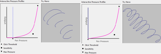
The 2D mouse works by dragging it over the tablet, It tends to skip when slowly dragging due to the friction of the fabric and hard surface and doesn't have any particularly unique features. I suggest a regular mouse and pad for smoother navigation instead.

Overall, Its a wonderful relic of the early digital art scene that still holds up quite well for its early creation. IMO its one of the nicest feeling tablets I've used, its very much tailored to my personal use. I think I'll be sticking with this in the far future!
#The user manual also has discs for the driver and a set of drawing programs to start off with#I tried running the programs but only 1 worked which was a whiteboard app that was buggy when drawing directly on the screen#Genuinely love this thing so much its like looking into the squinted eyes of a newborn puppy for me
15 notes
·
View notes
Note
Hello! I'm here to cheer you up. Your vent caught my eye, and while emotionally I get it (we artists generally fear stagnation), I want to help you dispel the assertion that you haven't improved. I have both visual proof (your own art + a timeline) and the credentials to back up my claims (digital art commissions from 2014-present, digital art from 2012-present, watercolor/pencil/ink since at least 2004-2015, attended formal classes and workshops in visual arts from 2006-2010.)
As an illustration (lmao) of my argument, I'm going to compare your art posts from June 1 2025, May 29 2025, May 27 2025, and October 4 2024. I've chosen these pieces for my argument because they feature the same character (Kon), largely similar overall composition (bust with 1 hand visible), similar technique (colored digital art), and are within the time frame you're concerned about.
If you've forgotten the posts in question (mood, I've been there), I've also provided links below.
Fig. 1: June 1 2025 image Fig. 2: May 29 2025 image Fig. 3: May 27 2025 image Fig. 4: October 4 2024 image
I understand that art is subjective, so I'm going to break down my thoughts on some objective criteria, and then add some thoughts at the end about more subjective criteria. Objectively speaking, I'm going to discuss the consistency of linework, application of color contrast, accuracy of proportion/anatomy, and representation of volume and texture. I'll start from figure 4 and work my way up the timeline.
OBJECTIVE ARGUMENTS:
Fig. 4: October 4 2024 - good understanding of the material, but hampered by an overall lack of conviction.

The lineart makes use of very short, sharp, inconsistent strokes using what appears to be two brushes with no taper and a large disparity in size. While not a bad technique if applied with purpose for an intended effect, there are a number of erasure marks on the hand and sleeve that suggest there was considerable conflict between vision and final result.
Putting the image in greyscale shows that the colors are very close in level of contrast, which makes it harder to understand the details even while shaded and suggests a lack of confidence in placement of shadow and light.
Proportion is ok; the ratio of hand to head size is fairly accurate, eyes and base of the ears are lined up properly, and while his face is long and thin (foxlike) it is within appropriate ratios. Ratio of hand to arm is skewed, however, as is ratio of head to body.
Anatomy shows an interesting focus on small details; there's bounce light within his eyes, his fingers have visible knuckle joints, and there's a shadow reaching up from his elbow that shows the line between the muscles. Larger areas, however, are more loosely defined.
Finally, although shaded, the image shows little variation in depth and texture; head, hair, and arm are clearly defined, and the hair has a visible softness compared to everything else, but the body is very loosely suggested.
Fig. 3: May 27 2025 - VAST improvement in pretty much every aspect.

The lines are more fluid and confident. There's tapering and weight, the unbroken lines are longer, and there's more variety in the style of the strokes (curved vs straight). Even within the lines that don't taper, or with the lines that are short and sharp, there's a clarity of purpose and vision.
Color contrast and balance is much clearer; there's more variety in the colors used, yes, but more importantly they divide the image into easily-readable figures. His hair, hand, body, and face are immediately discernible even in a small thumbnail view, and he is immediately recognizable as Kon.
Proportions haven't changed much, but they have improved anyway; the ratio of head to body is more realistic, as is the placement of the lines connecting his neck and jaw. Anatomy has improved too; he now has eyelashes and visible eyelids, his ear is more detailed, and the articulation of his hand is more defined.
Finally, although there is NO shading, the sense of volume and texture are much clearer. His hair and clothes puff outwards from the denser areas of his body, and have a very noticeable softness conveyed by the clusters of curved lines.
Fig. 2: May 29 2025 - How did you do that in two days??????

Not only are the lines more visibly fluid, you managed to convey more information with less of them overall, and improved upon the earlier technique of using differently sized brushes; while Fig. 4 showed the disparity in a way that suggested a lack of confidence, Fig. 2 show the disparity used as a purposeful tool to create variety in visual effect, and even the "broken" lines have the sense of being used to create a specific visual balance. The lines don't taper as much as in Fig. 3, but now the areas where they DO taper convey more meaning.
Color contrast is still sharp as in Fig. 3, but has softened very slightly to create a sense of overall harmony instead of opposition, and the areas of high contrast convey more accurate information about the character, such as his bright eyes and red highlights, both of which were muddied in Fig. 4. His makeup is also more accurately conveyed.
Proportion and anatomy have also shown marked improvement. Eyelids and lashes now follow the shape of the eye and face, ear placement is back in the right place, and while his eyes are bigger, they are very clearly drawn that way on purpose. Even the less defined areas such as his neck and hand are drawn with an underlying comprehension; you know what a hand looks like in that pose, and you managed to convey that in such a way that it immediately reads as a hand posed in 🤞 even when the details aren't fully drawn, to the point that my brain fills in the gaps.
You might think that texture isn't going to be touched on because of the overlay, but you actually did clear it up using the aforementioned line weights. His hair looks fluffy and dense through the use of long, narrow curves with thick lineart, and his clothes convey the silkiness of the fabric with the same narrow curves but in tapering lines. Again, like the hand, you only suggested the shapes, but you did it in such a convincing way that every visible aspect is clearly understood. Volume too has improved; his hair is clearly a different material from his skin, clothes, and even eyelashes, and his clothes are shaped in such a way that we understand he not only has a body beneath them, but more layers of clothing not shown.
Fig. 1: June 1 2025 - YOU KEEP GETTING BETTER????

The style of the lineart is largely the same as Fig. 2 but with a more consistent placement of tapering and less breaks between lines overall. There's also less disparity in the size of the brushes, which makes the whole thing feel more coherent overall, and the figures are more cleanly divided; most evident in the lines of the hand and the rope over his shoulder. You also completely eliminated the areas where elements overlap when they shouldn't!
Clothing contrast has softened again but that actually works even better for it because all the colors are now more vivid but still harmonized. Of particular note to me is the shade of purple and green you use for his kimono and the teal of the background; they're very saturated, but you balanced them in such a way that doesn't cause eye-strain. Additionally, his hair and skin are very clearly different even while close in contrast, which makes his makeup and highlights more noticeable. His upper lip is also better defined than in the three previous images; he is more recognizeable as himself.
Proportion is slightly less realistic compared to Fig 3, but in a way that emphasizes certain aspects of his design; his eyes really capture the viewer's attention now, especially with the very subtle line of his nose, and the way his hair hides his mouth. Anatomically, his eyelids and lashes are more naturally placed, and his hand is much clearer than in Fig. 2 without losing that stylized softness, and even the size of his fingers in relation to his palm is more convincing.
Finally, texture and volume. Of particular note to me, you already nailed them by the time of Fig. 2, but now you've added the dynamics of weight and movement. His hair isn't just fluffy, it's also being carried on a wind. His clothes aren't just wrapped around him, they drape over his arms and shoulders, and stand at his collar, and droop over his forehead. His hair is even affected by how tightly his bandana is tied!
You also nailed perspective, as it's very clear his hand is in front of him, his hair is in front of his face, and even his kimono and bandana occupy a 3d space.
SUBJECTIVE ARGUMENTS:
This part is mostly just because I'm familiar with Mononoke and I love Kon, so I have to say that your understanding of his character has also visibly evolved and improved through your art. Fig. 4 isn't bad, but feels a bit like a pose study; by Fig. 3 you have a sense of life and purpose in his eyes and gestures, by Fig. 2 you convey a more unique mischief, and by Fig. 1 you've nailed the mysterious sensuality and faintly forbidding seriousness that makes him Kon, especially in the lines of his mouth and eyes, and the slightly off-center composition.
Also the colors, as you've gone on, have felt more and more in-line with Mononoke: Bright, vivid, sometimes even garish, but in a way that makes a coherent, beautiful whole.
CONCLUSION:
I think in the end only you can decide whether or not a factual argument for your improvement is worth anything. You control your artistic journey! You are absolutely free to ignore this long-winded rant from a stranger on the internet.
But I also think you're doing yourself a disservice if you look down at your own hard work. You've earned the right to say you've improved, and you've earned it in your own blood, sweat, and tears.
omg thank you for taking the time to write everything (o;TωT)o if im being honest i wasnt really worried about my art not improving as i dont really take it seriously, but recently someone pointed out to me that i havnt improved at all and that made me feel really bad abt it for whatever reason which made me write the vent lol ;; it means a lot to me and im so grateful for this\(@;◇;@)/
2 notes
·
View notes
Text
On Baneful Magics
I'm going to kick the hornet's nest again today.
Many magicians hold to an ethical code whose basis is some variation of "harm none". Many, like me, do not. I believe that if we all lived by our True Will, there would be no need for baneful magics. However, reality paints a different story. Thus, persons may need to protect themselves or retaliate against someone who has done them harm. These are valid uses of baneful magics.
Despite this belief, I do not condone using baneful magics as a standard response to situations. There are several qualifications I feel must be met before I will perform such an action:
Harm: any harm is valid, though it should be above the level of annoyance unless it is a persistent annoyance over a long enough period.
Proportionality: the desired outcome of the magics must be in proportion to the harm done.
Damage: the magician takes care to not cause collateral damage; note that this does not include emotional fallout from the desired outcome.
Sacrifice: the beneficiary (on whose behalf the magician casts) must be willing to sacrifice something proportionate to their desired outcome.
If these four conditions are met, I reserve the right to perform baneful magics at my discretion.
Speaking of which, most baneful magics fall within three categories: jinxes, hexes, and curses. Jinxes are at the lowest step of the ladder. They generally inflict discomfort rather than pain--often cast in passing when reacting to an inconvenience. For this reason, the sacrifice needed is usually small. However, the harm done with a jinx is rarely worth the time or effort.
Curses, on the other hand, sit at the top of the ladder. They are often premeditated and inflict great pain upon the target. These last until a specified time (often indefinitely) and require great preparation and sacrifice. These should be reserved for the gravest transgressions, as the energy and commitment required is absolute. As Peter J. Carroll once said in Liber Null, "the protagonist who is psychologically unprepared to do these things physically will not accomplish them psychically." (Carroll, 2022, 107). In other words, to lay a death curse you must be capable of murder yourself. Something to reflect on, anyway.
Hexes sit in the middle. They typically last until the target has learned a desired lesson or otherwise changed their ways significantly. Because hexes are contingent upon this outcome, they are usually proportionate to the harm done by default. Because they are also in the middle of the pack, so to speak, they tend to have a palatable sacrifice to outcome ratio. All of these factors make hexes easier to stomach for beneficiaries or magicians who may bristle at the thought of using baneful magics.
At the end of the day, what matters are intentionality and mindfulness. Slinging baneful magics for every inconvenience is not only a waste of resources, it also sets up an environment that disrupts Natural Law. Natural Law favors balance, which happens when persons act according to their True Will. The more baneful magics you engage in, the less you are following your True Will--or so the theory goes. All I can say is that in my experience, this has been the case.
I have been a "kill the mosquito with a cannon" kind of guy in the past. It's a lot of effort, and it generated an aura of misfortune around me. Much of what I was putting out into the Aethers was reflecting back into my energies, causing a vicious feedback loop. It wasn't until I got a little older that I realized what was happening. I introduced the above code of ethics into my use of baneful magics, and over time things cleared up.
I'm not going to pretend that it's all my gain, to have things cleared up. I had a lot of help from the gods to gain some sense of normalcy. It was they who led me through the fog of my own magics and helped me clear it up. This isn't to say you can't do it on your own, but I couldn't, and the gods made all the difference there.
Okay, I digressed a little. Let's recap: baneful magics are powerful and dangerous. Using them requires some mindfulness and restraint. That's all I really wanted to say.
Thank you for reading. As always, stay safe and stay tuned. Blessings~
6 notes
·
View notes
Text
Graphical design principles in ancient Indian art
The Golden Ratio and its prevalence in Indian architecture: The Taj Mahal and other structures demonstrating the principle of perfect proportions.
The influence of symmetry and asymmetry in ancient Indian art: How balance is achieved through both repetition and variation.
Understanding the concept of "rasa" in Indian art: How emotions are expressed through visual elements and color palettes.

Visual Communication
Purpose: To convey information visually rather than through text alone.
Application: Logos, posters, websites, packaging, ads.
Working Principle: Use of imagery, typography, and layout to quickly attract and inform the viewer.
FIRST PRACTICAL KNOWLEDGE 👈.
Process Workflow
Brief/Objective – Understand the goal.
Research – Study the target audience, competitors, and theme.
Concept Development – Sketch ideas and layouts.
Design Execution – Create digital or physical artwork.
Feedback & Revision – Refine based on input.
Final Output – Deliver in proper formats (print, web, etc.).
Second Practical Knowledge 👈.
Get more video lesson on @technolandexpart
#ai image editing#ai generated art#ai artwork#ai generated#ai image#ai generated content#ai generated picture#ai generated images#ai model image#3d ai image#3d animation company#3d animation#3d animation studio#image processing#ai image creation#ai image generator#ai image processing#color art
4 notes
·
View notes
Text


100 days of productivity challenge
here is a snap of flocus website and my notes on ratio, proportion and variation. never thought rnp could be this tough. 🫠
#study blog#studyblr#academic aesthetic#study motivation#university#college#dark academic aesthetic#studyspo#student#study notes
11 notes
·
View notes
Text
It's sometimes helpful to point to a few core ideas and then build outward from those.
That φ thing, that mathematicians and "mathematics is the secret code of nature, and the Golden Ratio is the secret code" underlies a lot — like, A LOT — of temple construction around the world. Even five hundred years after England's era called "The Dissolution of the Monasteries" when Henry VIII stole most of the wealth and all of the land from 95% of England's abbeys and friaries and nunneries, it's often possible to identify the site of old churches by the shape of the courtyard left behind after the building was completely removed. It's easy to lay out a Rectangle in the Golden Section, and thus to make a Rectangular Prism for a temple... or a tower... or a dome... but other shapes are possible, like nested octagons (Dome of the Rock) or nested hexagons and triangles (common in a number of shrine types across the Bantu regions of Africa)
So does the Golden Rule, phrased differently in different religions, but usually the same basic core ideas: "do to others as you would have them to do you." Or, phrased negatively, "Do not do to others what you would find hateful when directed at you."
These have been used in the past to advance the cause of something called Perennialism — the idea that all religions, everywhere, are simply variations or fallings-away from the One True Religion -- that there is some True Religion that underlies all these others, and that all the other religions are simply efforts to capture, or re-capture, those essential truths. This is a blog post, and really a response to someone else, so there isn't much cause to go into why Perennialism is a Bad Idea™ in modern cultural and historical studies... but it's enough to say, for the moment, that certain elements of Mathematical Precision ("these proportions are beautiful and useful") and certain elements of Cultural Meaning ("be nice to each other") are found in every religion.
You can also take a leaf from astrology. Your world has a time-keeping system of some sort, with a Sun and maybe a Moon, and maybe 4-8 visible planets. If you reach far enough back in your world's time, there was an era when humans or elves or dwarves looked upon those moving bodies as extraordinary phenomena... and each of those planets (or two of them together) may have captured religious attention to launch a religious movement. In shorthand, here's what each planet might contribute to that conversation:
Saturn: Death, Solitude, Austerity, self-reliance
Jupiter: Generosity, Law, Abundance, Wealth, Gifts
Mars: conflict, contention, battle, war, force,
Sun: excellence, glory, light, leadership, rulership
Venus: beauty, love, aesthetics, women, delight, music, dance
Mercury: expertise, business, trade, fraud, communication, LGBTQ issues, debate, argument, medicine, money
Moon: children, motherhood, imagination, storytelling, community
Every religion is going to have Opinions® and Theology™ and Scripture/Doctrine© to cover these topics... so you can use the planets to make a kind of "checklist" of things each religion feels.
Related to this, Saturn and Jupiter have a conjunction with one another every 20 years, and for about 240-280 years those conjunctions take place in signs of the same element — Earth, Air, Fire, Water. We're all familiar with the idea of eras of time in which one Great Power is dominant over others, of course — Avatar, the Last Airbender has got some of this idea, right?
But... both for out-of-world planning, and in-world consciousness, some astrologers and wizards may be aware of this cycle, known as the Great Conjunction Cycle — and know that when a Fire Age begins, (called the Grand Ingress), that a period of wars, conflagrations, and unseasonable heat is upon us, and mountain nations thrive. When the era shifts to a Water Age, then naval powers predominate, whirlwinds and waterspouts and tidal waves and sea-quakes trouble the oceans; and exploration and trade are common. When an Earth Age follows, infantry forces from the rolling hills conquer territories and build roads, and earthquakes cause terrors and collapse cities, while volcanic activity buries them. In Air Ages, horse-lords from the steppe sweep out of the northern realms to raid and pillage and collapse the land-claiming empires of the Earth nations; and the tundra expands southwards into grasslands, while windstorms and tornadoes shake down palaces and cities. Many ancient astrologers were of the opinion that many forms of magic became abrogated or obsolete after one Elemental Age ended and another began — and that the start of a new cycle meant that new magics had to be learned and studied; and that new prophets and new gods would be born into the world as old ones passed away.
Two cycles of 240-280 years is nearly 2000 years... Four such cycles, or 4000 years, is more than the lifetime of the oldest elves in Tolkien's framework or in Dungeons and Dragons... and provides an elegant plot hook. If your world is right at the transition point from one age to another... or even at the Grand Ingress when one Air Age ends and a Fire Age begins ... the world is about to get a lot more tumultuous, and your players (or protagonists) are in a good position to slow down the change, or speed it up, or be themselves the heralds and creators of the change.
I get a lot of questions about religious world building. I tend not to answer them (because I charge by the word) but lemme give y'all some advice:
Make sure your religion would still be interesting if gods and magic weren't real. The real-world Catholic Church is interesting because of how social and political power flows through it. Judaism is interesting because of the history and culture it represents. Islam is interesting because of the non-religuous innovations that it fostered. Et cetera et cetera. Real world religions are varied and complex in a thousand different ways.
9K notes
·
View notes
Text
Top 10 Technical Facts About Stone Textures: Enhance Your Designs with Quality Insights
Resolution Matters: High-resolution stone textures are essential for realistic rendering in 3D models. Aim for a minimum of 2048x2048 pixels for crisp detail.
Seamlessness is Key: Seamless stone textures allow for easy tiling across surfaces without visible borders, enhancing the visual fluidity in design projects.
Scale Accuracy: Maintaining real-world scale in stone textures ensures the texture's pattern density matches natural stone surfaces, crucial for authenticity.
Color Variability: Stone textures often exhibit natural color variation, adding to the realism. Incorporate subtle color shifts to mimic this trait effectively.
Surface Reflection: The roughness and glossiness settings in textures control light reflection on stone surfaces, impacting realism in lighting scenarios.
Normal Maps Usage: Normal maps enhance the perceived depth and detail on stone surfaces without adding additional geometry, making them indispensable.
Quality Compression: Using lossy compression can reduce texture clarity; opt for lossless formats like PNG for maximum quality retention in stone textures.
Detail Preservation: Capture minute details such as grain, cracks, and imperfections in high-quality stone texture photography for a lifelike appearance.
Lighting Compatibility: Ensure textures complement different lighting conditions through testing in various environments to maintain visual consistency.
Texture Proportions: Maintain proper aspect ratios for stone textures to avoid distortion, keeping their appearance natural and undistorted on models.
0 notes
Text
Tired of Inconsistent Concrete Quality? Try Ready Mix Concrete in Karachi
In the construction world, consistency is key. A single weak batch of concrete can jeopardize an entire structure’s integrity, delay project timelines, and lead to financial loss. If you've ever faced these issues on a project site, you're not alone. Many contractors, developers, and homeowners in Pakistan especially in bustling cities like Karachi struggle with inconsistent concrete quality. The solution? High-quality Ready Mix Concrete in Karachi by Allied Materials. We’ll explore why ready mix concrete (RMC) is transforming the construction industry, why it’s the smarter alternative to on-site mixing, and how Allied Materials is raising the bar with quality, reliability, and unmatched service.

Inconsistent Concrete Quality
Traditional, on-site concrete mixing has long been the norm in Pakistan. While it's familiar, it comes with serious drawbacks:
Manual errors in proportioning materials
Variation in water-to-cement ratios
Inconsistent mixing techniques
Dependency on untrained labor
Weather-influenced curing and setting times
The result? Unreliable concrete strength, weak foundations, structural cracks, and increased maintenance costs.
In a fast-paced, high-stakes construction environment like Karachi, this just doesn’t cut it anymore. Whether you’re building a home, commercial plaza, or a public facility, substandard concrete quality should never be a risk you're willing to take.
The Solution
Ready mix concrete (RMC) is a pre-mixed batch of concrete made at a dedicated plant and delivered to construction sites in a ready-to-use state. It is made under controlled conditions, ensuring consistency, strength, and durability.
Benefits of RMC Over Traditional Mixing:
Accuracy in cement, aggregate, and water ratios
Time-saving, since concrete is delivered and ready to use
Reduced material wastage
Improved worksite efficiency
Higher compressive strength and durability
Cleaner and greener process
It’s no wonder that across the globe—and increasingly in Pakistan—RMC is becoming the preferred choice.
Why Choose Allied Materials for Ready Mix Concrete in Karachi?
Allied Materials stands out as a market leader in the supply of Ready Mix Concrete in Karachi. With decades of industry experience, Allied offers products and services that meet global standards while addressing local needs.
Here’s what makes Allied your go-to concrete partner:
1. State-of-the-Art Batching Plants
At the heart of Allied Materials’ success is its fully automated batching plants equipped with modern mixing technologies. Located strategically within Karachi, these facilities ensure fast production and timely delivery to any construction site in the city.
2. Quality Assurance and Testing
Allied runs a dedicated quality control laboratory that rigorously tests every batch of concrete for:
Compressive strength
Workability
Water-cement ratio
Setting time
Durability under local weather conditions
Their adherence to international standards such as ASTM, BS, and ACI ensures your structure stands strong—year after year.
3. Custom Mix Designs for Every Project
Every construction project has unique demands, and Allied knows that. Their team of concrete experts works closely with clients to create custom mix designs for:
Residential buildings
High-rise structures
Roads and bridges
Warehouses and industrial facilities
Foundations, columns, slabs, and more
From M10 to M60, Allied delivers precisely what your project needs.
4. On-Time Delivery Across Karachi
Allied operates a robust fleet of transit mixers and concrete pumps, ensuring that your concrete arrives fresh and on schedule. They value your project timelines as much as you do—and their logistics team plans accordingly.
5. Trained and Certified Technicians
Mixing concrete is both a science and an art. Allied’s team of engineers, plant operators, and site technicians are trained professionals who understand how to meet site-specific requirements without compromising quality.
Applications of Ready Mix Concrete
Residential Projects
From foundations to rooftops, Allied’s RMC provides long-lasting strength and durability to homes and apartment complexes. The controlled mix ensures no risk of structural failure or early deterioration.
Commercial Projects
Malls, office buildings, and high-rises in Karachi rely on strong, high-grade concrete. Allied Materials delivers performance mixes for load-bearing columns, beams, slabs, and other structural components.
Infrastructure & Public Sector
Allied has also contributed to Karachi’s civil infrastructure—roads, overpasses, and drainage systems—where performance and reliability are non-negotiable.
The Environmental Advantage
In a city as densely populated as Karachi, sustainability matters. Traditional concrete mixing is often messy, loud, and wasteful. Allied’s ready mix concrete is produced with a smaller environmental footprint:
Less dust and noise pollution
Optimized resource usage
Reduced carbon emissions through efficient batching
Cleaner construction sites
If you’re looking to meet green building standards, RMC is the way to go.
How to Order from Allied Materials
Allied makes the ordering process simple and efficient. Here’s how:
Step 1: Visit the Website
Go to Ready Mix Concrete in Karachi to learn more and submit an inquiry.
Step 2: Discuss Project Requirements
Speak with a sales or technical expert to share your site details, volume needs, and timeline.
Step 3: Receive a Customized Quote
Get a transparent cost estimate based on your specifications.
Step 4: Schedule Your Delivery
Pick a date and time that fits your project schedule.
Step 5: Fresh Concrete Delivered
Your ready mix will arrive on-site via transit mixer—ready to pour.
Tips to Maximize RMC Efficiency
Prepare formwork and rebar in advance
Ensure smooth site access for transit mixers and pumps
Have a skilled team ready for pouring and leveling
Don’t delay pouring after delivery to preserve workability
Cure properly after placement to enhance concrete strength
Frequently Asked Questions
Q: Can I order small quantities? Yes. Allied serves both small-scale and bulk orders with the same dedication.
Q: Do I need to visit the batching plant? Not necessarily. All communication, quotes, and scheduling can be done online or by phone.
Q: What if I need concrete urgently? Allied’s quick-response team can often arrange same-day or next-day delivery, depending on availability.
Conclusion
If your project suffers from delays, material waste, or inconsistent concrete strength, it's time for a change. Allied Materials is redefining construction standards with top-grade Ready Mix Concrete in Karachi. Reliable, consistent, eco-friendly, and tailored to your needs RMC is not just a better choice, it’s the smart one.
0 notes
Text
Using Random-Maturity Arbitrage to Price Perpetual Futures
Using Random-Maturity Arbitrage to Price Perpetual Futures Traditional futures contracts have maturity dates, upon which the futures price converges to the spot price. In the cryptocurrency market, the most popular contracts do not have a maturity date. They're called perpetual contracts. Unlike fixed-maturity futures, perpetuals do not expire. This feature enhances the liquidity of the contract. Because they have no set expiration date, perpetuals are not guaranteed to converge to the spot price of their underlying asset at any given time, and the usual no-arbitrage pricing formulas do not apply. To minimize the gap between perpetual futures and spot prices, long position holders periodically pay short position holders a funding rate proportional to this gap, incentivizing trades that help narrow it. Typically, the funding rate is paid every eight hours and approximately equals the average futures-spot spread over the preceding eight hours. How do you price a perpetual contract, given that the usual no-arbitrage condition does not apply? Reference [1] proposed the use of random-maturity arbitrage to price perpetual futures. Basically, random-maturity arbitrage generalizes traditional arbitrage by allowing for a positive payoff at an uncertain future time. The authors also developed bounds for the random-maturity arbitrage price and used these bounds to construct an arbitrage strategy that delivered a high Sharpe ratio. They pointed out, In an ideal, frictionless world, we show that arbitrageurs would trade perpetual futures in such a way that a constant proportional relationship would hold between the futures price and the spot price. In the presence of trading costs, the deviation of the futures price from the spot would lie within a bound. Motivated by our theory, we empirically examine the comovement of the futures- spot spread across different cryptocurrencies and implement a theory-motivated arbitrage strategy. We find that this simple strategy yields substantial Sharpe ratios across various trading cost scenarios. The evidence supports our theoretical argument that perpetual futures-spot spreads exceeding trading costs represent a random-maturity arbitrage opportunity. Finally, we provide an explanation for the common comovement in futures-spot spreads across different crypto-currencies: arbitrageurs can only accommodate market demand if the price deviation exceeds trading costs. As a result, the overall sentiment in the futures market relative to the spot market is reflected in the spread. Our empirical findings suggest that past return momentum can account for a significant portion of the time-series variation in the futures-spot spread. An interesting conclusion of the paper is that overall sentiment in the futures market relative to the spot market is reflected in the spread. Empirical findings suggest that past return momentum accounts for a significant portion of the time-series variation in the futures-spot spread. Let us know what you think in the comments below or in the discussion forum. References [1] He, Songrun and Manela, Asaf and Ross, Omri and von Wachter, Victor, Fundamentals of Perpetual Futures (2022). https://ift.tt/VxgeXYU Post Source Here: Using Random-Maturity Arbitrage to Price Perpetual Futures via Harbourfront Technologies - Feed https://ift.tt/DqL3UTI June 08, 2025 at 09:12PM
0 notes
Text
Epoxy Flooring Failures: Causes and How to Prevent Them

Epoxy flooring is often praised for its durability, aesthetic appeal, and resilience, but let’s be real—it’s not foolproof. When installed incorrectly or under the wrong conditions, epoxy flooring can fail, leading to cracks, bubbles, peeling, or worse, a total flooring disaster.
If you’ve ever seen an epoxy floor go wrong, you know the frustration of uneven surfaces, strange discoloration, or peeling like old wallpaper. But fear not! This guide will walk you through the common causes of epoxy flooring failures and, more importantly, how to prevent them.
Common Causes of Epoxy Flooring Failures
1. Poor Surface Preparation: The Root of All Evil
Imagine painting a wall without cleaning or priming—the paint wouldn’t stick properly, and the finish would be uneven. Epoxy flooring works the same way. If the concrete surface isn’t properly prepared, your epoxy won’t adhere well, leading to peeling or chipping.
The Culprits:
Dust, dirt, grease, or oil residues left on the surface
Moisture or dampness in the concrete
Failing to roughen the surface with mechanical grinding or acid etching
Prevention Tips: ✔ Clean thoroughly – Sweep, scrub, and degrease the surface to ensure maximum adhesion. ✔ Test for moisture – Use a moisture meter or perform a plastic sheet test to check for dampness. ✔ Roughen up the surface – Concrete is too smooth for epoxy to bond properly. Grinding or acid etching helps create a grip-friendly texture.
2. Moisture Problems: The Silent Destroyer
Moisture is a sneaky troublemaker in epoxy flooring installations. Excess moisture can cause bubbles, lifting, or peeling, ruining what should have been a flawless finish.
The Culprits:
Concrete floors that haven’t fully cured before epoxy application
Humidity in the environment interfering with the curing process
Water seeping from below the concrete due to poor drainage
Prevention Tips: ✔ Wait for concrete to cure – New concrete needs at least 28 days before applying epoxy. ✔ Use a moisture-blocking primer – A vapor barrier helps seal the surface against unwanted moisture. ✔ Ensure good ventilation – If working in humid conditions, use dehumidifiers or fans to control moisture levels.
3. Incorrect Mixing: Chemistry Matters
Epoxy flooring requires a careful ratio of resin to hardener. Too much or too little of one component throws off the chemistry, leading to soft spots, improper curing, or surfaces that never fully harden.
The Culprits:
Not following manufacturer’s recommended mix ratios
Inadequate mixing, leaving unmixed portions in the batch
Applying too much product at once, causing an uneven cure
Prevention Tips: ✔ Follow mixing instructions exactly – No shortcuts! The resin and hardener need precise proportions. ✔ Mix thoroughly – Use a mechanical stirrer to ensure an even blend. ✔ Work in layers – Don’t dump all the epoxy at once; multiple thin coats cure more effectively.
4. Temperature Troubles: Too Hot or Too Cold
Epoxy flooring is sensitive to temperature changes. Applying it in extreme heat or cold affects curing time, adhesion, and overall finish.
The Culprits:
Applying epoxy in temperatures below 50°F (10°C) – Can slow down curing, leaving a tacky mess.
Applying epoxy in extreme heat – Can cause rapid drying, leading to bubbles or a brittle surface.
Not considering seasonal variations when installing outdoors.
Prevention Tips: ✔ Check temperature recommendations – Most epoxy manufacturers suggest applying between 60°F to 85°F (15°C to 30°C) for best results. ✔ Use fans or heaters if necessary – Keep conditions stable to prevent curing issues. ✔ Plan around the weather – Avoid applying epoxy during extreme heat or rainy days.
5. Bubbling and Air Pockets: Trapped Trouble
Few things are more frustrating than watching beautiful epoxy flooring get ruined by bubbles. These pesky pockets form when air or moisture gets trapped beneath the epoxy layer.
The Culprits:
Air trapped in the concrete pores escaping during curing
Mixing epoxy too aggressively, leading to excess air in the batch
Applying epoxy over a porous surface without a proper primer
Prevention Tips: ✔ Use a primer coat – This seals the concrete and prevents air pockets from rising. ✔ Mix epoxy gently – Avoid whipping air into the mixture like you’re making a cake. ✔ Roll or squeegee the epoxy smoothly – This removes trapped air and ensures even coverage.
Final Thoughts: How to Ensure Epoxy Flooring Success
Epoxy flooring is a fantastic choice when done right, but as you can see, plenty can go wrong if proper precautions aren’t taken. Whether it’s bad surface preparation, sneaky moisture, incorrect mixing, temperature woes, or trapped air, every mistake can lead to an epoxy flooring failure that’s costly to fix.
The good news? Most issues are preventable when you follow best practices and work with skilled professionals. If you’re considering an epoxy flooring project, you can also check Epoxy Flooring Contractors in Hyderabad for expert guidance and top-notch installation.
Author: Sarath
#Epoxy Flooring Contractors in Hyderabad#Epoxy Flooring Contractors#Epoxy Flooring#vdf flooring#VDF Engineers
0 notes
Text
Design and Functionality of Pressure Reducing and Desuperheating Stations

Superheating stations play a crucial role in processes that include the use of superheated steam. These heat exchangers help regulate the temperature and the phase of the steam through the injection of a specific quantity of cooling water into the stream.
Superheated steam, having high temperature and pressure, can be potentially hazardous for the downstream equipment, designed for saturated or slightly superheated steam. They are used in power generation, chemical processing, and other industries where maintaining a consistent temperature of the system is crucial for the quality of the end product and efficiency of the process.
A PRDS working principle represents a highly technical balance between many aspects, from safety and regulatory ones to purely technical and economical ones. Indeed, a PRDS is very important in applications where the steam has to be conditioned for use—specifically, to reduce its pressure and temperature to satisfy process requirements. This blog explains the necessary critical considerations in designing such a system.
Flow Requirements
The design of the system must be based on maximum and minimum flow rates of steam to be handled. Peak flow rates need to be ascertained that can ensure stable conditions in the PRDS even when the conditions vary concerning loads.
The number of the flow range that a system can handle without losing its efficiency or control is known as the turndown ratio. Proper design with adequate turndowns ensures smooth operation over a wide range of flow conditions.
What is required here is accounting for the variability of process demand so that the system can be designed as responsive to changes in immediate downstream pressure and temperature requirements.
Pressure and Temperature Ratings
Functionality of Pressure Reducing station should be done in such a manner so as to handle the peak upstream pressure with downstream pressure at the desired level. The pressure ratings of the valves, pipes and fittings shall be chosen in such a way so as to meet the operating conditions of the system.
This desuperheating section shall be capable of cooling steam down to rated levels. Materials and parts that will be at the different levels of temperature are rated for those same temperatures so thermal stresses don't damage the system. Since safety is optimized by maintaining the design pressure a little higher than that required at normal operating pressure, plus 10 to 20%, this buffer space takes up any unforeseen surge.
Material Selection
Materials such as stainless steel are selected due to their resistance properties, mainly when steam has various contaminants or condensate that could corrode the system. Materials chosen offer resistance against extremely high temperatures and pressure conditions without deformation and degradation with time. Some of these examples include some alloys applied in the high-temperature usage of chromium-molybdenum steel.
Desuperheating stations' valves erode due to high-velocity steam. Hard-facing alloys or materials, such as tungsten carbide, can be applied for extending valve life and minimizing maintenance.
Control Systems Design
The system has to use modulating control valves to regulate steam pressure according to the variations in process demand. Such valves are pneumatically or electrically operated. The minimum requirement for desuperheating is the precise injection of certain quantities of water to cool down the steam. Thus, such control systems have to be fitted with temperature sensors and actuators to monitor and regulate the flow of spray water so that the appropriate amount is mixed with the steam.
Advanced control systems employ PID (Proportional-Integral-Derivative) controllers to fine-tune the process of steam conditioning in such a way that energy use is reduced but efficiency is gained.
Safety Features
Pressure relief valves are an essential part of avoiding overpressure conditions. They open and allow steam to vent when pressures become so high that they exceed the safe limits, thereby avoiding damage to downstream equipment.
Automatic Shutdown Systems allow for the isolation of the PRDS in the event of failure, such as from main leak or malfunctioning equipment, in a way to prevent further damage and ensure safety. Safety interlocks can be fitted to prevent water injection when the temperature falls below a critical value and thus effectively avoid water hammer and/or condensate formation that can harm piping and equipment.
Regulatory Compliance
Safety is important in Pressure reducing design consideration. Most of the places require designs of PRDS to abide by the ASME requirement of the American Society of Mechanical Engineers on the pressure vessels and piping systems.
Most steam and pressure system codes vary from one country to another. You are therefore advised to reach out to the concerned office and find out their requirements in terms of the system and whether it meets those requirements. There must be adherence to the emission standards, particularly condensate release and steam venting, to ascertain control over environmental effects or avert litigation.
Energy Efficiency
Today, the most important goal is energy saving and reduction of energy usage and its impact on the environment. Energy conservation measures, when adopted in industries, provide numerous advantages, such as cutting down costs, enhanced productivity, and environmental sustainability.
Energy efficiency measures range from improving industrial practices to using clean energy; they enhance sustainable practices, lower the emission of greenhouse gases and create a basis for a sustainable world. Energy efficiency is not just an economic opportunity but rather a moral obligation and a responsibility that lies in the hands of every individual towards our planet and future generations.
Integration with Steam Systems
Desuperheating stations are designed to blend with steam systems and offer control of the superheat temperature as well as improve efficiency. By controlling the temperature of superheated steam, such special systems provide safeguards for the critical parts from thermal stress to guarantee the operation reliability and safety.
There are specific points in the steam cycle where desuperheating stations can be located to effectively control the enthalpy of steam and increase the efficiency of the system. With the integration of desuperheating technology and steam systems, the efficiency of the energy used, the durability of the equipment, and the control of the process improve, making it a crucial part of modern industrial applications that require high-temperature steam.
Conclusion
In the constantly changing industrial processes, pressure reducing and desuperheating stations appear as essential tools to address heat and temperature issues. This in turn means that industries need to tap the best of the manufacturers and the state-of-the-art technologies to get the best out of these systems. Desuperheating stations are instrumental in protecting equipment, enhancing procedures, and minimizing harm to the environment, which creates a solid foundation for progress and profitability.
By understanding the importance of energy saving and environmental protection in industries, the addition of desuperheating stations is not only the need for innovation, competition, and development of industries but also a responsibility to provide a better future for future generations.
0 notes