#Reconfiguration of Layout
Explore tagged Tumblr posts
Visit Tumblr Blog
Explore Tumblr blogs with no restrictions, modern design and the best experience.
Last Seen Tumblr Blogs


Fun Fact
Tumblr’s reach among the 26-to-35-year-olds in the US is 11%.
Text
How Automation Affects Your Floor Space
One of the areas often overlooked when planning for automation is the way automation changes the floor space inside a metal fabrication company. It’s not exactly an issue of more space vs. less space, it’s a different way to use the same space. For example, you might have to think in a “cell” fashion rather than in a linear fashion, where next steps succeed each other literally down the line.
Here are some of the areas to consider when planning for automation, and the ways it can potentially change and make use of your space:
Efficient Space Utilization: Automated equipment can have a more compact and efficient design compared to traditional machinery. This can lead to better utilization of space, allowing more operations to be conducted in the same area. For example, automated storage and retrieval systems can utilize vertical space more effectively than manual storage. This three-dimensional thinking is still somewhat new in our business.
Reconfiguration of Layout: Automation may require a reconfiguration of the shop floor layout. Machines might need to be arranged differently to optimize workflow and accommodate automated systems. This might involve centralizing certain operations or creating specific areas for automated processes.
Reduction in Storage Space: Automation can lead to a reduction in the amount of space needed for storage. Automated systems often include just-in-time manufacturing processes, which minimize the need for storing large amounts of inventory on the shop floor.
Increased Safety Zones: Automated machinery might require additional safety measures, such as barriers or designated safety zones, which could take up additional floor space. This is necessary to ensure the safety of workers operating near automated equipment.
Decreased People Zones. Because of the additional cages and safety areas, “people” zones will shrink, and that must be considered when planning traffic through a shop. This is particularly true when considering the lanes for bringing 10 x 5 sheets of steel through the plant.
Room for Expansion: With automation, some processes become more efficient, potentially freeing up space that was previously used for less efficient processes. This space can be repurposed for new machines, expansion of existing operations, or for processes that are still manual.
Integration Space: If automation involves the integration of different machines and systems (such as conveyors linking different production stages), additional space might be needed to accommodate these integrations.
Space for Control and Monitoring: Automated systems often require spaces for control units, computers, and monitoring equipment. This might mean setting aside areas for control rooms or stations.
Potential for Scalability: Automated systems are often more scalable than manual operations. As the business grows, it might be easier to add new automated units or scale existing ones within the same space, rather than having to expand the physical footprint of the shop.
In summary, automation in metal fabricating can lead to more efficient use of space, require reconfiguration of the shop floor, increase safety zones, and potentially change storage and control needs. The overall impact on floor space can vary depending on the specific type of automation implemented and the existing layout and processes of the shop.
#Automation Affects#Floor Space#planning for automation#Efficient Space Utilization#linear fashion#more space#less space#Reconfiguration of Layout#Increased Safety Zones#Decreased People Zones#Room for Expansion#Integration Space#Space for Control and Monitoring#Potential for Scalability#physical footprint#manual operations#business grows#Automated systems#control rooms#monitoring equipment#control units#computers#planning traffic#safety zones
0 notes
Text
occasionally reminded i have sims and have not progressed relationships for a majority of my f/o households so im gonna go do that starting with connor
#hannah babbles#i just never play it often because i always have to reconfigure my Very Legally Acquired dlc#fun fact pyg!s/is apartment's layout is based on the 702 zenview apartment in san myshuno
5 notes
·
View notes
Text
Casa Amani : a Midcentury Home in Copperdale (NO CC)
SPECIAL EDITION: Casa Amani is reviewed and architect approved by Jakarta based architect and urban planner, Alyssa Wibowo.

Casa Amani – A Midcentury Jewel in Copperdale
Perched atop a serene hill overlooking the misty waters of Lake Copperdale, Casa Amani is a masterfully restored midcentury modern retreat that effortlessly blends natural tranquility with sophisticated design. Originally constructed in 1964 by Lesmana and Sons Co. , this home was thoughtfully renovated in 2024 by Lesmana Enterprise, preserving its original soul while introducing warm, modern comforts for a new era.
With its flat rooflines, expansive glass walls, and natural stone detailing, Casa Amani exemplifies midcentury architecture’s love for harmony between structure and landscape. Inside, the earthy palette and rich wood tones create an atmosphere of warmth and calm. From the handcrafted stone fireplace to the built-in shelves lined with books and records, every corner tells a story.


The red-toned blinds filter Copperdale’s golden hour light, casting soft shadows on heirloom rugs and polished teakwood furniture. Large floor-to-ceiling windows bring the outdoors in, allowing the surrounding pine forest to become an ever-changing backdrop.


A Home Designed in 1964, with the Comforts of the 21st Century.
Lesmana Enterprise approached the renovation of Casa Amani with deep respect for its 1964 midcentury roots—preserving its architectural charm while reimagining it for modern living. The exterior was subtly refined to harmonize with the forested landscape, while the interior was thoughtfully updated with warm wood tones, renewed midcentury furnishings, and contemporary comforts. Every detail, from the lighting to the layout, was carefully planned to meet today’s aesthetic while honoring the timeless soul of the original design.


Carefully Planned Living Quarters that Blends with Nature
The living quarters were reconfigured with intention, offering a layout that suits the needs of a small family. Communal spaces like the open living and dining area encourage togetherness, while private corners and a spacious bedroom ensure comfort and quiet. It’s a home that balances nostalgia with functionality—perfect for those seeking a peaceful retreat with room to grow.


Outdoor Living, Elevated
Casa Amani’s outdoor spaces are designed for both relaxation and year-round enjoyment. A heated swimming pool invites quiet morning swims or moonlit dips, while multiple balconies offer sweeping views of Lake Copperdale and the surrounding pines. An intimate outdoor fire pit area creates the perfect setting for cozy gatherings, storytelling, or simply unwinding beneath the stars. Thoughtfully integrated with the natural terrain, the exterior is as much a retreat as the home itself.


Currently listed at §160,000, Casa Amani is more than a home—it’s a lifestyle of slow living, mountain air, and curated peace. Whether you're a writer, a creative soul, or simply a Sim who craves a break from the noise of San Myshuno, this hilltop haven offers a timeless escape.

Technical Information
Packs used


Download
Via SFS : Download
Note from OP
Hi there! OP here. Apologies for the late upload! Casa Amani takes a long time to carefully plan and build, taking into accounts realistic layouts and interior. Enjoy the build!
#simblr#lesmana-enterprise-ltd#download#sims 4#sims 4 aesthetic#sims 4 screenshots#ts4 simblr#sims 4 no cc#sims 4 build#showusyourbuilds#sims 4 cc#midcentury#sims 4 house build#residential#30x20
674 notes
·
View notes
Text
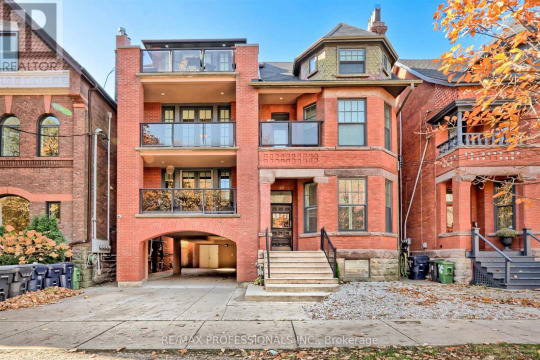
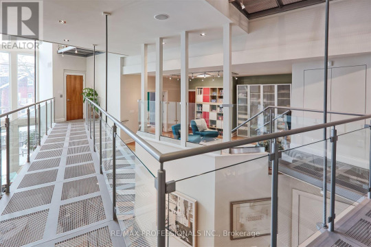
People are going mad w/these reno's. I thought I found a lovely brick Victorian in Ontario, Canada. 5bds, 8ba, 4 levels, 7,000sqft living space, $5.859m. It must've been 3 separate units converted to a single family. But, I NEVER expected the interior.
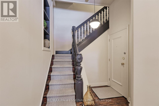
Original entrance hall. You can see that there is still a separate unit on the 1st fl. We're going upstairs to the main unit. On the left, we can see that there's a built-in shelf (very convenient).
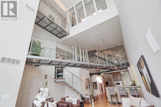
We open the door to the unit and Bam! Metal catwalks! This is insane. Now I can see why they want so much for it- this was lot of reno.
The entrance. They just made enough space to open the door, then you go up a few steps to a raised floor and note the catwalks above.
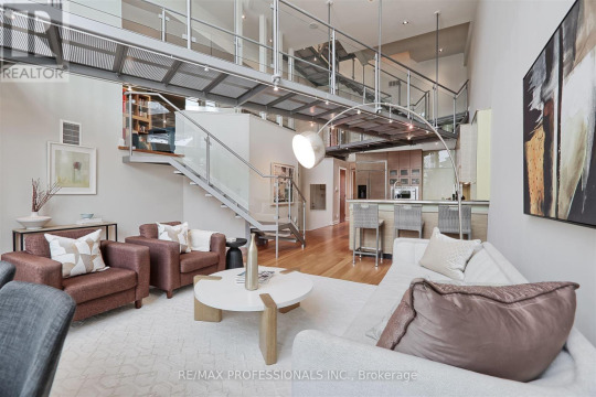
Everywhere you look, there's an intersecting catwalk. This is the new open concept living room/kitchen configuration.
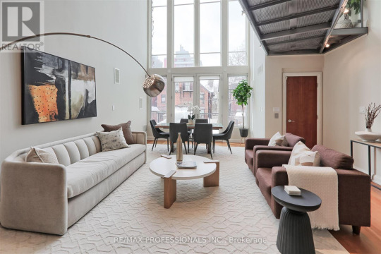
They have a dining area at the other end in front of the window. (Too far to carry everything to the table, though.)
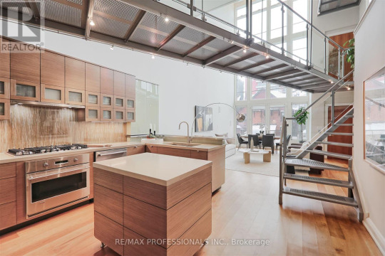

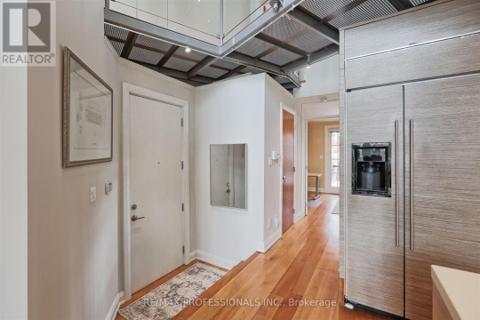
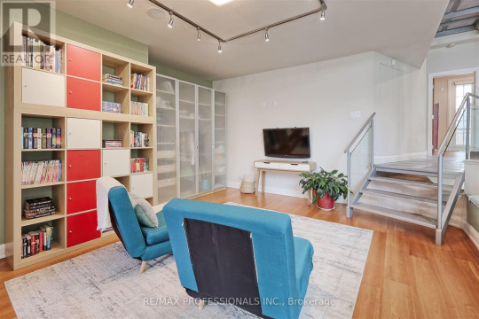
Large modern kitchen. The cabinets are nice. Those catwalk floors are open mesh- debris can fall on the counters.

Here's a little den with doors to a terrace.
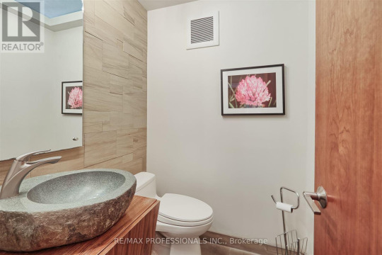
The powder room has a stone sink (maybe it's resin, who knows anymore?).
Then, we're up on the catwalk. It has white mesh flooring. How do you mop that?
Then down some stairs to a TV room.
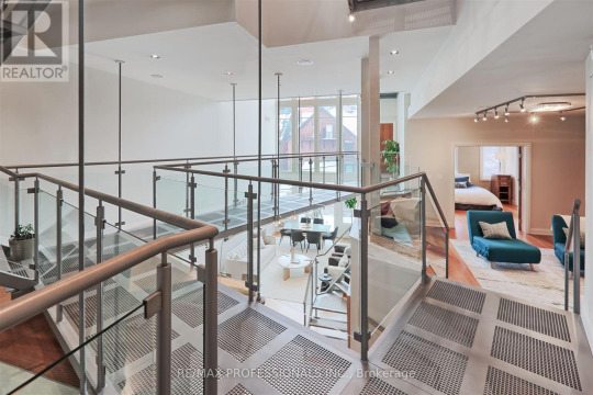
There's a bedroom behind the TV room.

It's a suite with sliding doors to the bath.
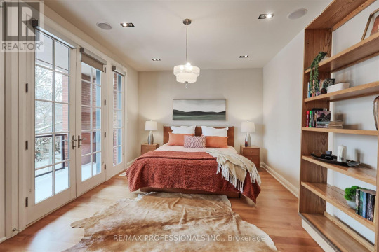
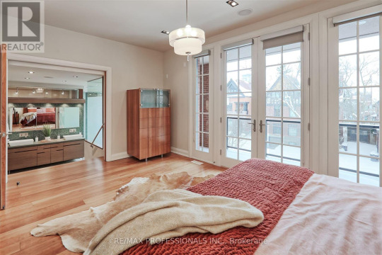
The primary suite is arranged the same way, but has doors to a patio.
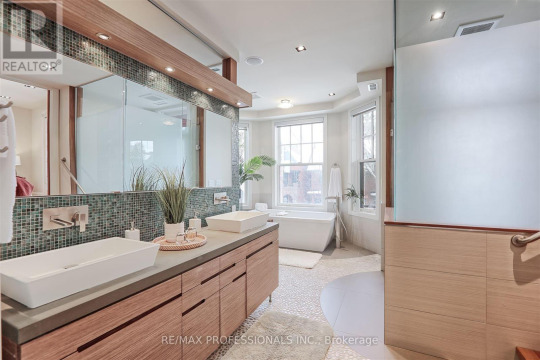
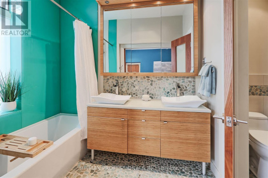
Large ensuite with stairs. I'm not seeing a walk-in closet. Who needs such a huge bath?

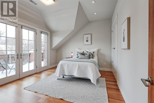
The stairs lead to another bedroom with doors to a terrace. Kinda weird layout, to have to go thru the primary ensuite to get to your bedroom.
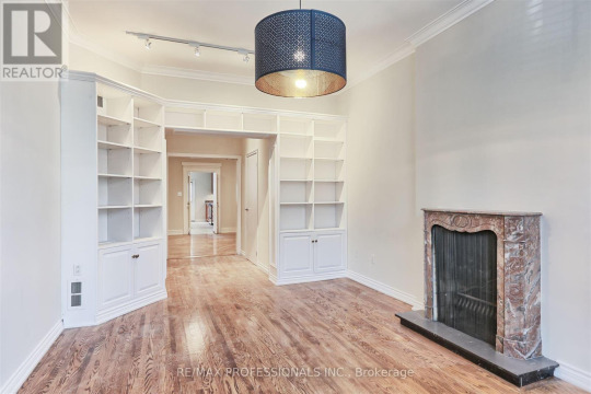
They say it's a single family, but there's a whole 'nother apt. in here. They put in a little marble fireplace. Doubt if it's original.
I'm confused. Another kitchen.

Bedroom with mirrored closets and an open bath.

This must be the finished attic on the 4th level.
It has a family room and full kitchen, I guess. Unless it's a separate unit.
There's also a bedroom up here.
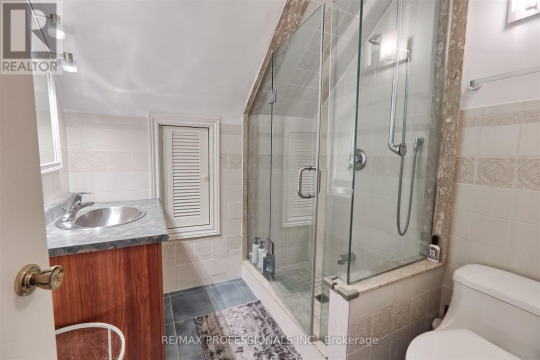
A shower room.
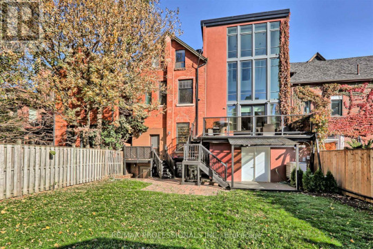
In the back fenced-in yard, you can see the glassed tower that they created for all the extra rooms. Now, I see where they got 7,000 sqft of living space- it's like a commercial building.
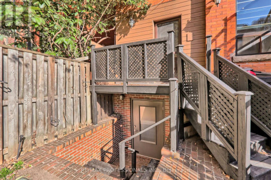
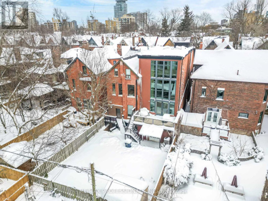
They really gutted and reconfigured this place. No wonder it's over $5m. Land Size 40 x 127 FT
https://www.realtor.ca/real-estate/28096162/90-madison-avenue-toronto-annex-annex
152 notes
·
View notes
Note
How do you think multi-use public restrooms could be reconfigured to better accommodate wheelchair/crutch/cane users in a roughly modern setting? (By multi-use, I mean the ones with a line of stalls rather than a whole room with one toilet).
I always thought it ironic that the large stall tends to be at the end of the line and believed it may be better to have that reversed (large stall first). Is that a sensical thought? What other suggestions would you have besides a lower sink and, of course, room to move the wheelchair/crutch/cane?
Although this setting is roughly modern in terms of technology ability and knowledge, feel free to provide your most creative answers. I'd even appreciate a difference between slight changes in real universe that would make an impact vs alternate modern universe where accessibility was thought of by default. All stalls are large? Better layout than a single file line of stalls? Etc.
Thank you for your time!
Hello!
I have... a LOT of thoughts about this. For reference, I use a cane full time and have used a wheelchair in the past when it was needed, though I no longer have access to it (I was borrowing my boyfriend's old one but have since moved cities).
So a few things:
Grab bars in every stall. These are the metal bars along the side of the stall that you usually see in accessible stalls. They're used to help people with stability/balance issues sit and stand from the toilet. There are a lot of people who only use the accessible stall because they need the support of the grab bars. If these were in every stall, it would open up the larger accessible stall for people who need it for the other supports (More space, the emergency call cord, etc.). These are relatively cheap and easy to install too.
Hand sanitizer dispensers in the accessible stall or, ideally, in every stall. These are another thing that's relatively cheap and easy to install and would benefit everyone. I usually carry hand sanitizer on me anyways because I dislike the idea of using my cane before washing my hands. This would also help people who have the same problem with their wheelchair (Not wanting to touch the wheels before washing their hands), people with sensitivities to hand soaps, and even just people who want to use them.
More accessible stalls. This one is a bit less realistic to hope for as it would be more expensive and difficult to change but it would also be one of the most beneficial, especially in places where there are lots of disabled people coming and going at once. I'm thinking places like hospitals, school accessibility offices, etc. but also places with large amounts of people in general like stadiums and event venues.
Also just more stalls in general. Especially in the men's washroom. I keep meaning to write a post about this for my own blog but it's an issue I think about a lot. It's 2024 and there's STILL a lot of men's washrooms where I live that either only have one stall (Usually an accessible stall) or don't have stalls at all. I'm sure it's some sort of 'ADA/AODA/whatever it is where you are' violation but it's also a problem for trans people, people that are shy, kids, people that just prefer to sit, the elderly, etc. It's kind of ridiculous that this is still a thing in 2024.
More actual fully accessible washrooms. These are not at all feasible for a multiuse washroom (The kind you're referring to) but should be in addition to one. With this, I'm referring to a large washroom with adult-sized changing tables, emergency call cords, lots of space, large garbage cans, sharps containers, etc. This is something that I rarely see even in hospitals but it's so important for people that have caretakers and need that extra support. As for the sharps container, it can be very beneficial for people that need to inject medication and it's something I wish that more places had. (My general alternative is to cap the needle and return it to my "pouch" in a separate pocket from the unused ones)
Having everything in reach of the toilet. By this, I mean things like toilet paper, garbage bins, sinks (If they're in the stall), hand sanitizer dispensers, etc. This is usually already the case with toilet paper and such but it's incredibly annoying and difficult to navigate when this isn't the case.
Also just having garbage bins in all stalls (Or, at least, in all washrooms). A lot of women's washrooms already have this in some capacity but most men's washrooms don't even have a garbage bin in the main section of it (Outside the stalls). This is another thing that would be incredibly easy and cheap to do and would help so many people including disabled people that need to discard medical supplies (Catheters and incontinence supplies are the big ones that come to mind since it's not sanitary or easy to discard of them elsewhere whereas you can easily pocket an empty medication bottle or bandage remnants to throw away later), people who need to throw away sanitary products, even just people who use toilet paper to blow their nose or something. There's literally so many uses and I don't see any downside to this at all.
More hooks in stalls to hang things like jackets and bags. This is something I see a lot in the regular stalls but strangely not as often in the accessible stalls. Which... seems especially odd to me as a lot of us rely on things like small, over-the-shoulder bags and fanny packs as we don't always have access to both hands to carry things. These would also be beneficial to hang things like canes (I'm mostly thinking of white canes, which usually have a fabric loop on the end) while using the toilet. This is another super cheap and easy thing that can be done and would benefit everyone.
More accessible doors to washrooms. For whatever reason a lot of the multi-use washrooms where I live don't have accessible doors and it's incredibly frustrating and inconvenient to be fighting for my life to open a door when I already need to pee. Just... not fun.
The placement of the accessible stalls is an issue too, just usually not in the way most people would assume. At least for my boyfriend and I, it's more of a problem when the washrooms are crowded. I'm thinking of our recent experience at a concert where we had to navigate through the crowd to reach the very far end where the stall was. Not a huge thing or something that happens all that often, but it is annoying.
The other thing that comes to mind is lower sinks and also having the paper towels, hand dryers, or what not closer to the sinks. It's incredibly annoying and uncomfortable to have to use a cane, wheelchair, or crutches when you have soggy hands just to get to the dryer. This isn't something that's too hard to implement in most cases but it could be expensive depending on what drying method is used (Such as hand dryers versus paper towel dispensers). This is another reason that I usually use my hand sanitizer instead.
Aside from the facilities themselves (And this is less for mobility disabilities and more general accessibility), things like having braille on the signs as well as clear symbols if the washroom is separated by male vs female. None of those minimalistic aesthetic ones. Not everyone can differentiate by those.
There are countless others but I think I've spoken enough about this for one post 😅. Hopefully some of this is helpful.
Cheers!
~ Mod Icarus
161 notes
·
View notes
Text
replaying super paper mario, sporadic thoughts post-chapter 2:
very easy so far--& although ttyd was also easy, spm's gameplay is sadly substantially less rich thab ttyd's was
having said that the game design in spm is! unrelentingly charming!! the use of platforming as a framework for a varied stream of stage styles (straightforward levels, dungeons, towns, the entire 2-3 Situation) is creative in a way that imo predicts the sort of things the mario maker community later ended up making. chapter 2's set pieces in particular are extremely quirky (the rooms with traps, the rubee thing, the mazelike basement, the merlee game show lmao)
few platformers have boss fights that feel like genuine Combat, so that's pretty cool
i will confess that as a First Dungeon, yold ruins doesnt have half the sauce of hooktail castle--it's much more linear in layout, with far less of that zelda-y "explore & comprehend the space" principle that made ttyd's dungeons hit
in a similar vein, it's kind of crazy how tippi has like a fraction of the personality that goombella had. it's a bit sad for the character doing the vast majority of the talking to just.... not really have any opinions on anything
the momentum of the chapters likewise means very few npcs ever get to stick out. like, even the "first town crotchety old mayor" character was a total one-and-done, one dialogue and you never have a reason to speak to him again (mostly just speaks to the game structure, which is as mentioned a bold enough exercise that i feel i cant really fault it for that)
bringing up a menu to use items In A Platforming Context is not at all natural to me, so im finding myself just not really using them
this game is a masterclass in visual design imo. the npcs & enemies & pixls being made of primitives that reconfigure themselves into different shapes really elevates the interplay of 2d & 3d, the backgrounds/environments are extremely aesthetically satisfying (the Mathmosphere in lineland, the optical illusion in the sky in gloam valley, all of castle bleck), & i love how the constant "digital/tech" motif (eg the "dragging selection boxes to flip/teleport", the trees & shrubs looking like something youd make in ms paint, etc) is an ingenious progression of paper mario's core aesthetic design
dimentio is so fun
i ADOOOORE nastasia
the inter-chapter dialogue flashbacks are surprisingly earnest? for such a tongue-in-cheek game where almost every line of dialogue contains a joke of some kind, those exchanges feel humourless & sincere. that probably contributes to the Space the game occupies in all of our memories lol
likewise it was really interesting how peach's "escape" sequence after chapter 1 was (while, again, still extremely sardonic) aesthetically & narratively framed with such a sense of Hopelessness. that's not to say like "woahh this mario game is 10x darker than you thought!!!!", more that it's just not a space the series commonly ventures into
the Ancients stuff is being leaned into extremely hard lol. ttyd mostly teases at that kind of "mysterious rpg lore" thing peripherally (the riddle tower inscriptions, grifty, etc) so it's interesting how spm puts it front & centre in contrast, without ever sacrificing the sense of mystique
this game really highlights how interesting the wiimote is as a controller--pressing the A button while holding it sideways (ie removing your left thumb from the direction input to press a button) is something that i cant think of any other controller doing, & it projects onto that button a really interesting sense of, like, Valence
it's the kind of game that seems to beg for one of thsoe posts like "things that ACTUALLY HAPPEN in _____"
120 notes
·
View notes
Text

STND Apartment is a minimal apartment located in Tel Aviv, Israel, designed by Salty Architects. The architects have approached the renovation as a careful negotiation between past and present. The standard partitioned layout, typical of Tel Aviv’s pre-war residential architecture, has been reconfigured to accommodate contemporary living patterns.
42 notes
·
View notes
Note
In the Taken AU, did the Titan ensnare more Cybertronians to increase it's population? Or work on creating a hot spot to spawn more citizens?
And I'm morbidly curious to know of the extreme measures it stated or will be willing to take to keep it's citizens within it? Cables lurking to snatch up misbehaving/uncooperative citizens to "re-educate" them? After all, it only wants to keep them close. 👀
Unfortunately, that Titan had been stripped and drained by the Quintessons that the sheer length of abandonment had allowed it to recover enough to fly away in its terrible state.
Earth may be plentiful, but it will need a really, really long time before it could ignite a hotspot. As in several generations after the war between the Autobots and Decepticons ended.
It's not afraid to reconfigure its layout. In fact, June scolded it for wasting fuel, especially since she's trying to fix it up, but it refuses to let Megatron bully his way on its caretaker. Megatron is well-acquainted with the numerous and filthy chutes it has. The Titan shall put the garbage where it belongs, even if said garbage scrapes its walls like a wild animal.
The Titan has been coaxed to allow the Darbys to leave its vicinity since it's able to hack its way into any and all security measures on Earth. It uses its extensive cable networks to tap into Jasper's electrical grid and networks.
#ask#transformers#transformers prime#tfp#the taken au#titans#june darby#megatron#yandere#maccadam#my thoughts#the titan is nameless is awaiting for June for a designation#cybertronian biology#titan with the darbys: MINE MINE MINE MINE
39 notes
·
View notes
Text


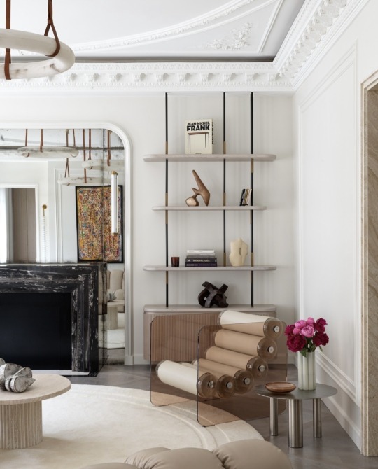

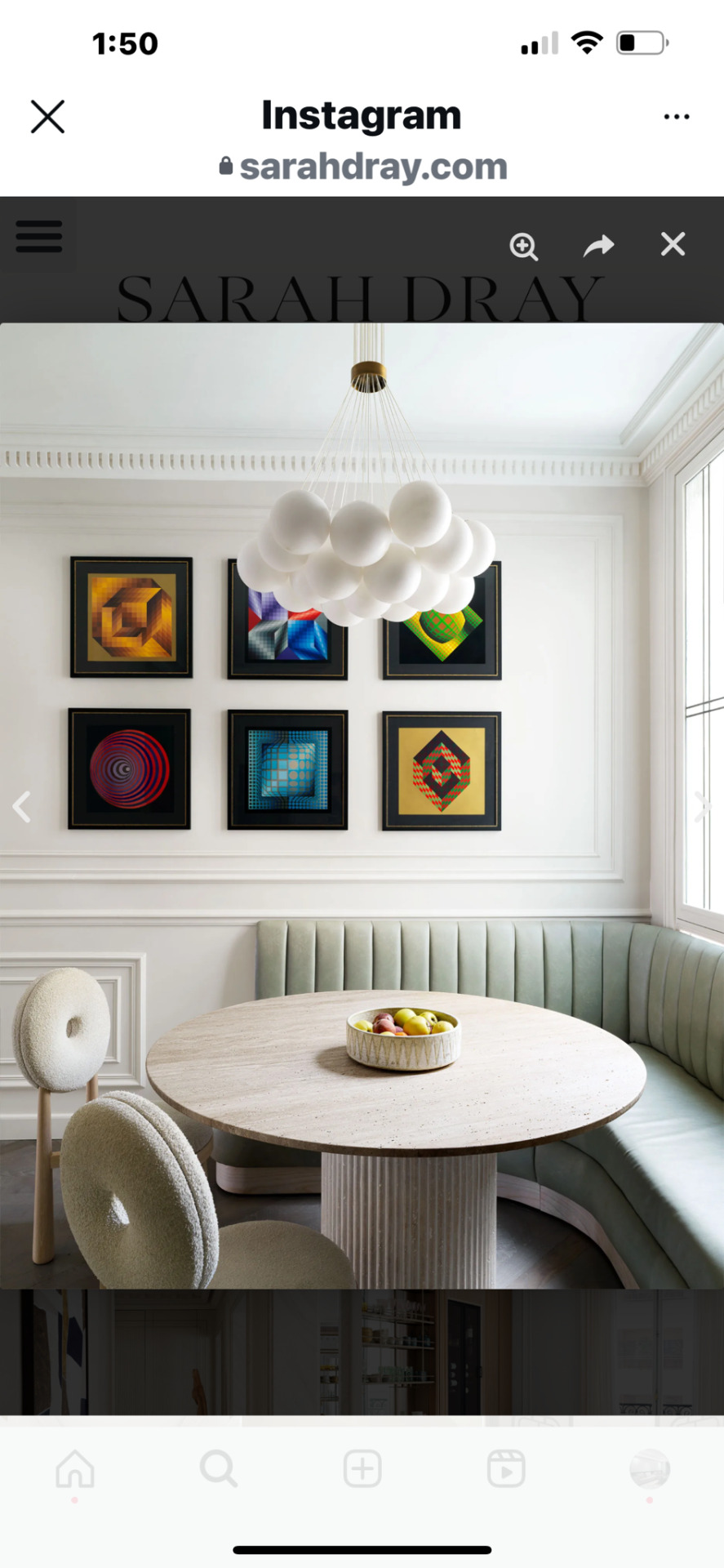


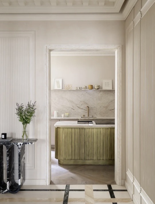

Showcasing @sarah.dray's stunning design!
"In a spacious sitting room, a vintage de Sede modular sofa takes center stage. Dray notes, 'It has incredible character; for me, it’s like a piece of art.' A testament to how dramatic gestures in design can elevate a space.
The dining room features sculptural alabaster ceiling lights, a custom table, and elegant chairs, complemented by luxurious fabric curtains.
In the kitchen, a table pairs beautifully with a custom leather and oak bench, alongside chairs and an alabaster pendant. Dray's thoughtful layout reconfiguration enhances the space, reinstating architectural details that resonate with her love for strong axes and fluted walls. A perfect blend of elegance and rhythm!
#moderndesign#designers#modernhomes#miami#contemporarydesign#furniturestores#sofas#modernfurniture#interiordecoration#interior design miami#contemporary decor#contemporary design#custom furniture#furnishings#miamidesign#architektura#architecture blog#design interior#interieur#interior designer#interior inspiration#interior design#furniture design#furniture#furniture store
7 notes
·
View notes
Text

You choose! Vote now!
Hello, gentle reader! As you know, Luca and Ali are teaming up and looking for a new residence. And guess what? YOU get to choose where they live! Yes, you! There is a poll at the end of this post, so please don't forget to vote. There are six lots in my save they are able to afford. I've provided a few pics and a description of each. Whatever lot you choose, I'll redecorate it and they'll move in shortly.
One thing I'd like you all to remember as you're making your selections, this save is very sims, so I don't put the same travel restrictions on them like in The Piersons & Friends. So even though a world might seem far to you, it's not far to them.
ALSO, I keep mentioning room/no room for Alessia. Let me just mention, at this point I have no plans to move her back home. But stayovers are a thing, and I think sims can ask if they can move in now(??). So...consider her in your deliberations or not. The choice is yours.
Let's get to these houses!
1. Sketchy shoebox
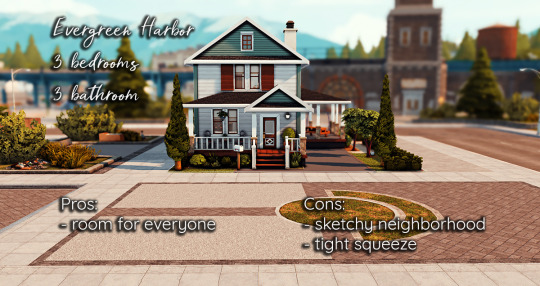

If Ali would like to stay in Evergreen Harbor, he could live here. He likes that there is a 3rd bedroom in case Alessia wants to come home, but the rooms are really tiny. Also, the neighborhood can be sketchy at times.
2. Abundant apartment

This is a 3 bedroom 1 bathroom apartment in the arts district. If you guys pick it I'll turn the fake closet in the master to an en suite. This apartment is spacious and very affordable. But Ali isn't sure about city living, and when he dies he won't have anything to leave Luca and Alessia.
3. Spacious oasis


This house is setup for two roommates and will give our guys the privacy they need. It's big enough for them to not be on top of each other, and the office could be converted into a 3rd bedroom. There's only one bathroom though. And this house sits at the top of their budget and will be a stretch. Plus Ali isn't sure he'll like the weather.
4. Copperdale cubicle


This little cottage has the nerve to have two bedrooms lol. The neighborhood is nice, quiet, and close to attractions. But those attractions can get loud.
5. Sans cons


There honestly isn't anything wrong with this property. There's more than enough room for everyone, and if Alessia doesn't come home, maybe it'll be too big for our guys. It's affordable, the neighborhood is nice and quiet, and it has a big yard. The upstairs bedrooms are too small for an adult, so I'd have to reconfigure up there to make Luca comfortable. That could inflate the cost a little but not much. It could also make it cheaper! Just depends on what I do.
6. Cute ranch
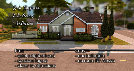

I think this house is super cute and possibly one of the best houses Maxis ever made. Even though it's small, the layout won't leave them feeling cramped. The courtyard is cute, and they still have a little yard left. But there is only one bathroom and no room for Alessia.
ROCK THE VOTE!!
45 notes
·
View notes
Text
MTA Unveils New NYC Subway Map For The First Time In Nearly 50 Years — But Straphangers Aren’t Thrilled: ‘This Map Sucks’
— By Desheania Andrews, Valentina Jaramillo and Anna Young | April 2, 2025 | The New York Post

The MTA on Wednesday unveiled a new “easily readable” New York City subway map for the first time in nearly 50 years — but straphangers knocked the redesigned graphic as a “complicated” brain teaser and a “waste of money” by the embattled agency.
The revamped design replaced Michael Hertz’s well-known spaghetti diagram launched in 1979 with a new map featuring bright, bold lines against a white backdrop that identifies each subway route in the Big Apple, with markings specifying free out-of-station transfer hubs and accessible stations.
The new layout also changes the outlines of the boroughs into graphic shapes instead of using their topographically accurate borders seen on the old version.
“The new MTA is focused on a quality, 21st century customer experience, and it’s about time our map caught up,” MTA Chair and CEO Janno Lieber said in a statement.

The MTA unveiled a fully redesigned subway map for the first time in nearly 50 years. X/@MTA
“The new version is much easier to read while also reflecting all the enhancements we’ve made over the years.”
Scores of straphangers across the city didn’t realize there was a new diagram until The Post told them, and scorn was swift.
“I would prefer to see more working elevators or less homeless on the trains, or even bring some of those newer trains to all the lines,” Allison Graham, 40, said at the Astoria-Ditmars N station in Queens.

Scores of straphangers across the city didn’t realize there was a new diagram until The Post told them. Christopher Sadowski
“The map update could’ve waited. There are other things that need to be prioritized.”
Michelle, another rider at the station, snarked that the redesign was “really nice … if you’re a tourist. I don’t hate it but I probably won’t ever look at it again.”
Bronx resident A.J., who was rushing to catch his train on Canal Street in Manhattan, echoed her sentiment.
“Seems like a waste of money. It’s not even for New Yorkers, New Yorkers don’t need that,” he said.
“I hope this is not why they are raising the fare again. Is this where it goes?” rider David R., 45, wondered at the Broadway station in Astoria.

Some NYC residents believed that the new map change was a waste of money. Christopher Sadowski
The latest layout is reminiscent of Massimo Vignelli’s short-lived 1972 metro map, which was retired after only seven years following concerns that it was difficult to understand and didn’t reflect the street-level geography of the city.
“It’s always funny that the MTA has been desperately trying to implement this exact map for like 50 years and nobody has ever liked it,” one X user commented on the newly unveiled design.
Straphangers familiar with Hertz’s long-standing street grid slammed the reconfigured map, complaining that the updated design is geographically confusing and makes subway transfers more difficult to decipher.
“Oh dear! That’s much more complicated than it needed to be!” one person commented on X. “Looking at the benefits of other metro/subway maps across the world would have been helpful.”
“The city looks distorted. This is not an improvement,” another replied to the new map.
A third person said the new graphic looked like a “video game” screen.

Transit officials believe the new map is easier to read and will help riders better navigate the underground rail system. Getty Images

Straphangers, however, feel the latest graphic is confusing and complicates their travels. Universal Images Group via Getty Images
Many commenters questioned the cost behind the MTA’s latest move — which the agency hasn’t disclosed — and called for the restoration of the old map, which transit officials said would remain available online.
“This map sucks,” another X user said. “It uses way too much space for lines instead of making use of the redundancy of lines on shared tracks. This leads to crazy distortion of distances above ground.”

The new graphic will be featured in every train car and rail station in the coming weeks and months. Getty Images
The new layout, designed by the MTA’s Creative Services Mapping Department, also features nearby Amtrak, Metro North, Long Island Rail Road and PATH system routes.

The latest layout is reminiscent of Massimo Vignelli’s short-lived 1972 metro map, which was retired after only seven years following concerns that it was difficult to understand. Christopher Sadowski
The map will be added to every train car and rail station in the coming weeks and months.
“This map rollout is utilizing the dedicated space in every subway car and the thousands of digital screens in the transit system to provide customers with detailed and up-to-date service information,” said MTA Chief Customer Officer Shanifah Rieara.

Older Map is Gazillion Times Better Than The Newly Released Piece of Shit 💩 Map.
“I want to thank our customers for their input and the creative team for their years of work to update this iconic piece of the New York City Subway system.”
2 notes
·
View notes
Text
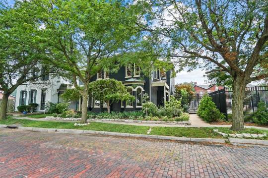
I don't know what to think about this renovated 1890 Victorian in Dayton, Ohio. On one hand, I love what they did w/the decor, but on the other hand, it's no longer an historic Victorian. It has 4bds, 2.5ba, & has a sale pending for $950K.
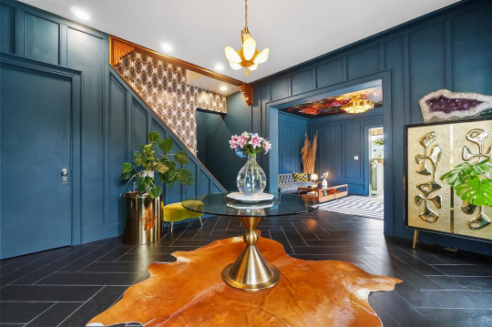
This is the new entrance hall. So, you would have no idea, walking in here, that it's an 1890 Victorian.

The new sitting room. Okay, I do like the ceiling. It appears that the room layout was definitely reconfigured.
Here's another sitting room with an exposed brick wall painted white and a funky mural going up to the ceiling. Those look like new modern windows over by the window seat.
This house was gutted. Look at those 3 greenhouse windows. There's a new door to the patio, ultra modern walls, ceiling, and floor.
This, I hate. They put a hi-end stove in the middle of the floor w/o an exhaust hood.
Cool fridge is tightly fitted into the wall. There's no space for air to flow around it.
Eat-in kitchen places the table in front of the patio. Instead of standard cabinetry, there's a tile wall with one long "sideboard" style cabinet and a wooden countertop that looks more like living room furniture.
Outside the kitchen is a coffee bar setup.
Ultra modern guest powder room.
The TV room also has new windows.
The original architecture remained, but it was completely modernized. The original molding was replaced, too.
New walls, new molding, space reconfigured to make a sort of pantry and laundry room.
Gone are any traces of the original stairs. Note the Lucite bannister.
There's a family room up here.
Bedroom with a retro vibe.
Main bedroom. Clearly all fireplaces were removed from the home. In the bedroom, a retro style yellow model decorates a corner.

Sometimes, when you knock down walls, it appears that more, smaller ones emerge to create a maze-like effect.
Completely modernized shower room. Do you think that where the shower is, was where the original claw-foot tub once sat?
The old tub was replaced by this sunken one. It places the toilet and plant in a precarious position, especially if you're feeling a bit tipsy.
A smaller, 3rd bedroom or home office with a bold graphic.
Attractive checkerboard patio out by the pool.
The yard from above.
Looks like there's an industrial type business next door.
At night you can see the new clear glass windows.
80 notes
·
View notes
Text
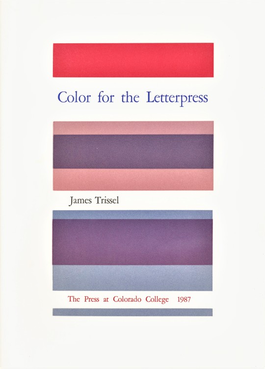
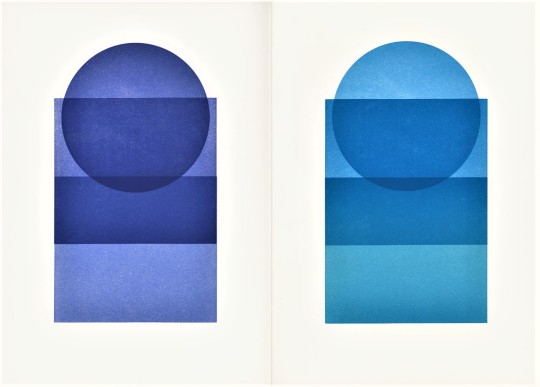
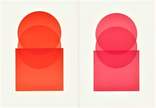
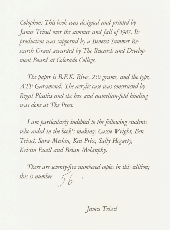
James Trissel's Color for Letterpress
After being away from UWM Special Collections for the first part of the Summer, I was delighted to spend some time looking through some of the gorgeous work we recently acquired from the estate of Dennis Bayuzick. I was particularly taken by Color for Letterpress, published in an edition of seventy-five by The Press at Colorado College in 1978. The book was designed and printed by founder of the press, Jim Trissel. Over two decades, Trissel raised the press to a level of excellence attained by only a handful of academic letterpresses in the United States.
Jim's son Ben, who worked beside him at the press, reflected on his father's exacting standards in a memorial essay shortly after his death in 1999: "I remember once abandoning the initial layout of the Color for Letterpress book because the registration was off by a 1/32 of an inch. He stopped the press run, reconfigured the book's enture structure, and printed it right."
Color for Letterpress was printed on a Vandercook Universal Power 3 press. Trissel used mostly lithographic inks on BFK Rives paper from Arches, which he describes in the introduction as "very white," and "dimensionally stable." The book consists of an introductory text and three sections of plates housed in a white acrylic case. The plates of the first section, The Quartered Spectrum, utilize single hues with variations in density and temperature. Families of Analogous Color, the second section, "contrasts hues by temperature but prints individual hues in closely related groups or families." The last grouping is called Six Complementary Pairs and shows contrasts in both hue and temperature. "The book is accordion-bound," writes Trissel, "to permit an easy display of the plates."
Check out more from the Collection of Dennis Bayuzick here.
Find more Decorative Sunday posts here.
-Olivia Hickner, Special Collections Graduate intern
#Decorative Sunday#Color For Letterpress#James Trissel#Jim Trissel#The Press at Colorado College#Letterpress Printing#Vandercook#Arches#BFK Rives#letterpress#fine press books#fine press printing#color theory#Dennis Bayuzick#olivia#decorative arts#decorative plates
69 notes
·
View notes
Text
Siheyuan 四合院
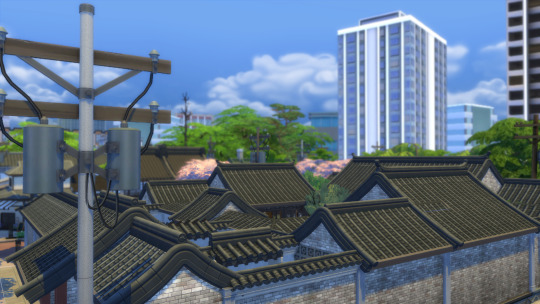
The sprawling traditional Chinese courtyard home, known as the Siheyuan features several buildings built around a series of courtyards.
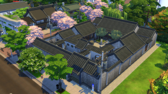
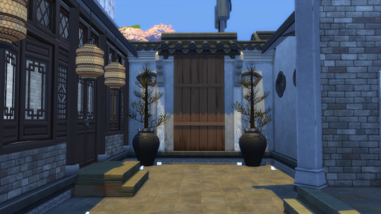
The main door of the Siheyuan is usually located in the lower south corner of the house, and opens to a forecourt that leads to another centrally located doorway that leads to the house proper. This stops passersby from being able to look into the main spaces of the house.
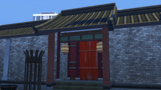
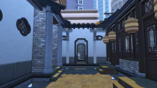
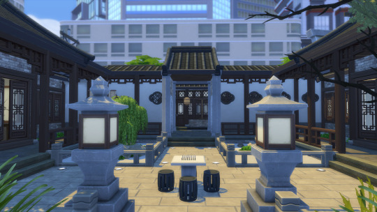
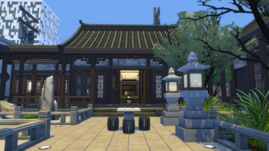
This property, known as the Austere Official's Home, has been restored and given a modern facelift, while still in keeping to its classical roots. Much of the home's layout is based on ancient beliefs of how energy moves in a space, while the overall home itself represents the Chinese obsession with walled spaces, with a Siheyuan often consisting of walls within walls of walled yards, gardens and liminal spaces, connected by a covered walkway.
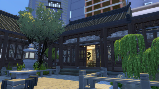
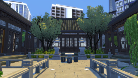
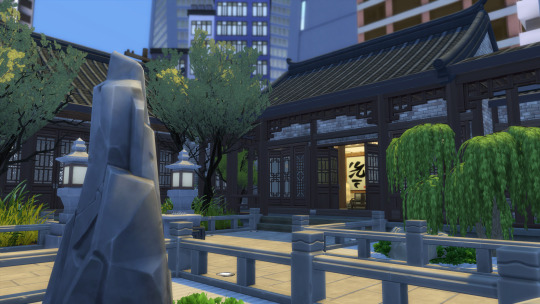
Contemporary Chinese interior design is a fascinating design niche, that can draw on design principles and material use anywhere from the Qing to the Han Dynasty, and Chinese aesthetics can be anywhere from ostentatious and overwhelming to refined and restrained.
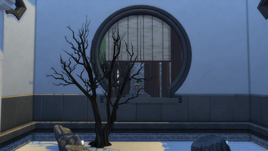
Many associate Chinese interior aesthetics with red lacquer, silk furnishings, whimsical carpentry and gilded surfaces in excess but more often than not, classical Chinese interiors are more likely to feature more sedate tones of dark grey, black and deep brown, with hardwood furnishings in clear lacquer, with grey brick walls. or white plaster walls, as well as stone floors and granite paved exterior spaces.

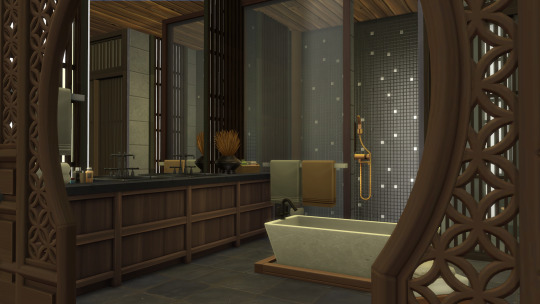
The Austere Official's Home's makeover is based on a popular movement in Chinese interior design that draws on more consistent and refined use of materials and colours, with a recognisably Chinese aesthetic, while incorporating more contemporary ideas on the usage of space. A style popular with hotels in particular, being fairly accessible to international palettes while still being "Chinese" in feel.
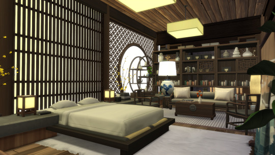
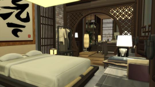
Many Siheyuans require a lot of retro fitting and renovation to match our modern use of interiors, however. For instance, classical Chinese homes did not have living rooms, or dining rooms, or in fact, rooms at all. Chinese architecture typically does not rely on load bearing walls to support the structure, and as such, do not have the division of space seen in Western builds. Chinese spaces are therefore riddled with supporting wooden columns, which are joined by dividing screens and folding doors that create the "rooms" of a building, with the whole carpentry being held down by a wonderfully heavy and graceful roof. This actually makes them fairly earthquake resistant structures.
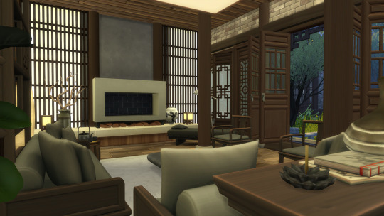
Typically this means a building in the Siheyuan is all encompassing in its function. It features a bedchamber, a study and a reception hall. Things like dining and ablutions are restricted to furniture and wherever they are placed. How this translates into a modern restored interior is interesting. For this build, much like a shell challenge I kept the structural pillars intact, while moving around the divider walls to reconfigure the space, while buildings can now be repurposed to house the rooms modern inhabitants would need.
Thank you for reading! 谢谢
30 notes
·
View notes
Text

Loft Charlie is a minimalist apartment located in Paris, France, designed by parages. Despite its compact size, this apartment undergoes a transformative renovation that redefines the use of space. The renovation centers around a strategic reconfiguration of the apartment’s layout. Service rooms, including the kitchen and bathroom, are consolidated towards the core of the apartment.
74 notes
·
View notes
Text


Museums / Cultural Centers No: 164 Toronto Reference Library Location: Toronto, ON, Canada Year: 1977 Architect: Raymond Moriyama The Toronto Reference Library (TRL) is the flagship of the world’s busiest urban library system. Occupying over 416,000 sqf, it is a centrally located landmark which opened its doors in 1977. Designed by architect Raymond Moriyama, the robust five-storey building was clad in red brick, its mass scaled back by terracing the façade along the diagonal. Bands of mirrored glass suggested an inner world within. The narrow corner entrance, flanked on two sides by a colonnade, drew patrons into the building’s soaring interior. With escalating demands on the library system, the TRL recently completed an extensive five-year phased revitalization led by Moriyama & Teshima Architects, though its cofounder Raymond has since retired. The building buzzes from top to bottom. It is centred on a vast tiered atrium inspired by the Hanging Gardens of Babylon. The interiors are bright, airy and uncluttered. A double-height rotunda dedicated to special collections reinterprets the romantic feel of old libraries with a distinctly modern material palette of concrete, titanium and dark wood. The building employs concealed mezzanines to maximize overall storage capability, amplified through the use of space-saving compact shelves. Open-plan layouts were rezoned for easier self-navigation; stacks were reconfigured to facilitate research. The library continues to explore and adopt emerging technological tools to better monitor collections and support learning and discovery.
20 notes
·
View notes