#This design is a visual statement of survival
Explore tagged Tumblr posts
Visit Tumblr Blog
Explore Tumblr blogs with no restrictions, modern design and the best experience.
Last Seen Tumblr Blogs


Fun Fact
The average Tumblr user visits about 67 pages every month.
Text


"MY DEEPEST DISCOVERY" ALT tee + Digital Album
2 Store Reviews
from $50.00
This design is a visual statement of survival, identity, and power. Wrapped in the American flag but engulfed in fire, this hand-drawn artwork captures the paradox of being seen but not protected—burned but still rising.
Inspired by the album My Deepest Discovery, this piece represents the tension between patriotism and pain, Blackness and boldness, history and healing.
Alternate Streaming Version of the Album, will be emailed to user upon purchase.
#“MY DEEPEST DISCOVERY” ALT tee + Digital Album#2 Store Reviews#from $50.00#This design is a visual statement of survival#identity#and power. Wrapped in the American flag but engulfed in fire#this hand-drawn artwork captures the paradox of being seen but not protected—burned but still rising.#Inspired by the album My Deepest Discovery#this piece represents the tension between patriotism and pain#Blackness and boldness#history and healing.#Alternate Streaming Version of the Album#will be emailed to user upon purchase.#kanyewestgraduation#kanyewest#kanye#kanyeweststyle#graduation#ye#kanyewesttypebeat#yeezy#kanyewestshoes#kanyewestfashion#kanyewestedit#hiphop#donda#typebeats#kanyewestv#takashimurakami#kanyewestart
4 notes
·
View notes
Text
Why Hunter doesn't have rot
Spoilers for Hunter / Survivor / Monk / Watcher
Just to clarify before even going into this I’ll be treating Downpour as it’s own separate universe thus not making it cannon to Vanilla. This is in no way to discredit Downpours story (I love it myself, I think it's a really powerful narrative) But considering it was not written by the Vanilla team I’d prefer looking at it as an AU for my Vanilla analysis ! This also leads me to treating Watcher more cannon than Downpour since it was written by the original team, but it will only be used to reinforce smaller points.
Now with that said despite Downpour popularizing the idea that Hunter has rot Vanilla in no way supports this. The reasoning is quite simple there's no mention of it whatsoever beyond pebbles making a remark of “We both have something... unfortunate growing in us.” which if you want to interpet as we have the same thing growing in us you could say he has the rot, but this is a sympathetic statement. Pebbles is simply (for once) empathizing with something for having a similar-ish experience that is some form of disease spreading in them respectively. But Hunter is a normal animal he is much more likely to have a normal disease like cancer / tumour.
Where would have Hunter even gotten the rot from? By Downpour standards the rot does not survive outside of Pebbles. He also for all we know is not from anywhere near Moon / Pebbles having been sent by NSH / Pebbles not seeming to recognize him either. We’ve also never seen an example of rot taking over a creature anywhere in Vanilla, not even in Downpour (ignoring Hunter ofc) If the rot was powerful enough to infect animals already there is no reason most creatures around Pebbles should be as healthy as they are. We’ve only seen creatures be infected in the Watcher which also shows insight into what it would look like.
All rot Hunter depictions have the rot be his fur color / generally blend into his body seamlessly that we see in the Watcher would not be the case. The rot well, rots the animals it infects distorting their colours and malforming them. The inner cores glowing the colour of the rot since it is a foreign object consuming them rather than a part of that creature. Even in different regions the rot stays black with only the inner core of it changing colour. The single evidence I’ve seen of Vanilla Hunter having rot is his sleeping sprite which I’ll break down why I do not believe is rot with an anatomy breakdown.

Their body is one big banana shape with limbs attached on top of it.

Tho sometimes drawn as a ‘single toe’ we could safely say that is for simplifying the drawing process.
Why are these important?
Apologies for messy visuals. But what people interpret as a rot cyst on Hunter's back is in fact just his hind leg with some unfortunate perspective. What Hunter does when sleeping is curl their tail all the way below their chin while laying down flat on their stomach which is bound to contart their body in funny ways leaving their leg to really only do 1 of 2 things, be smushed under his tail (what Survivor and Monk does) or above his tail that he does in his prite.

If that’s not enough we also never see hunter with any sort of cysts on his back any any other art of him. But we do see 1 other art of him have scars on his hind legs.

Considering his eye scar is depicted everywhere since it is a big part of his design (even really fainting on the last pick it’s more visible on the other ones tho) A less reliable but worth to mention thing too his eye scar is visible in every merch (again it’s his main design beyond being red) yet he has not even a scar on his back since it was uneseceary detail (one of the poster arts does have him with an x scar on his side tho without cysts as per usual) If he truly had rot I don’t see why such a huge detail would not be included in multiple sprites of him and even as a small detail on his merch (remeber they have all of spearmasters tail holes embodered / inv's sketchy eyes being kept they don't cheap out on details) So in short. We have no reason to believe normal rot we see in Vanilla can infect creatures like the sentient rot in Watcher. We also do not have real evidence of him visually having rot for the only depiction in my opinion is just confusing a sprite of his for something it is not (some of the what seems to be early art can be a little janky since they were still figuring out how to draw slugcats) We also know for a fact he is not from near Pebbles thus not having a real way of catching rot unless the sentient rot has spread in the world already.
Worthy mentions I couldn't fit neatly anywhere else: - I’m aware that in the last slide him is having his illnes disolved out of him but just before that he's simply seen swimming without anything affecting him and we do not see any growths on his back. which would've been a perfect placement to show it be removed from him. - his death sprite also doesn’t have any rot sprouting out from him which would be very important if he did have it. - This isn’t to say I don’t like the Hunter rot theory but to me it’s just a really popular fannon that got slightly out of hand to the point people think it’s fully cannon. - I also think the hunter rot theory is really cool to explain how he can have extra spears. I’ll admit I have no idea how he does that without having rot. Maybe his fur is just so thick it gets stuck in it /hj
If anyone has counterpoints or supporting point I’m very interested to listen !
#coco rambles#rw slugcat#rain world#rw#rw hunter#rw watcher spoilers#rw discussion#rw theory#rw vanilla theory#rainworld hunter#rain world hunter#rainworld#slugcat
84 notes
·
View notes
Note
Please tell me about the great emu war of 1932 :3
"Haha Australia lost a war to emus twice"
NO BUT YOU DON'T UNDERSTAND!!
Here's why:
First, I don't believe foreigners know how BIG emus are, and how much of their stocky main body is just layers and layers of feathers
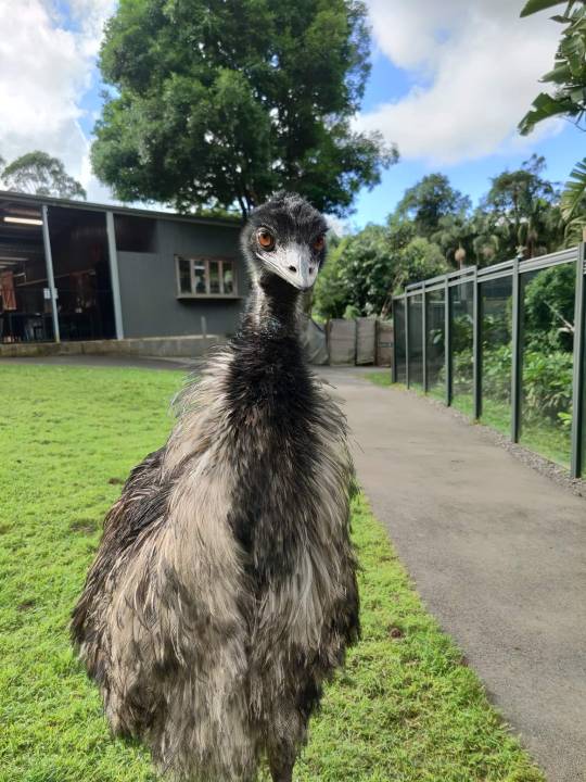
This is Peck. He doesn't actually Peck but he LOVES the LADIES and for reference, that's me as he's uh... trying to woo me. I'm 4'11 / 149cm tall and in that photo he's not standing at full height either because he's preparing to get lower and ahem, grind. He is also a juvenile.
Emus are typically 5.7 feet/1.75 meters tall, but they have been recorded to get up to 6.2 feet/1.9 meters.
So imagine you've got this big ass dinosaur bird with the most t-rex looking feet perfectly designed for running. Yeeting. Skeeting. Killing you maybe. And now take into account these flightless fucks can run up to 62 Kilometers per hour. THATS 39 MILES PER HOUR TOP SPEED.

Now add 20,000 emus.
So 20,000 emus against poverty-stricken farmers with failing crops, farmers WHO WERE MOSTLY WW1 VETERANS BY THE WAY. Yeah nah.
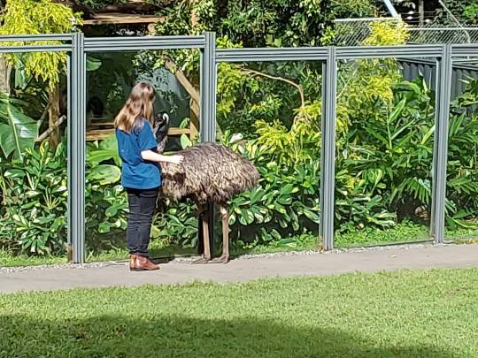
Here's a visual to help y'all understand how insanely large emu groups get.
Onto why the hell were there so many emus on the farmlands (even tho... yknow... the emus and the local indigenous were there first but we won't get into that.)
Basically a big drought made the horde of emus move away from their usual dwindling territory, onto the sprawling Australian "farm lands" and remember I mentioned their feet before? BIG STOMPY. Whatever crops that had somehow managed to survive the severely vitamin-deficient soil and grow, did not in fact, survive the dinosaur feet as the emus strolled through, pecking and foraging the ground along the way.
The plight of the veteran farmers didn't fall on deaf ears, but the Australian government severely underestimated the power of 20,000 emus by a LONG shot. Plus they weren't all that interested either, until at least it was reported that the emus were destroying the Rabbit Proof Fence. What legends.
For the first "war" the government sent 3 men.
Yep. You heard me. Three guys. Major Meredith, Sargeant McMurray and a soldier by the name of O'Halloran.
They had one truck with a machine gun, and probably other guns, but between them roughly 10,000 rounds of ammunition.
So off they went. To wage war against the progressive emus breaking the symbol of "White Australia" AKA the Fence. Oh and also I guess the starving vets.
This is it. This is what they had.
Locals from all around joined in the fight and tried to herd the roaming groups of emus into the murder range but the emus had a tactic. One that us Aussies use at bush doofs when you hear police sirens- and that is to SCATTER.
They only killed "a dozen birds" from a group estimated to be around 1000. It didn't help that the machine gun jammed during this organised ambush.
And by then, the Emus clicked onto what was happening. They split up into smaller groups, observed to be led by the largest sized male who kept an eye out for the enemy. Never again did they risk coming together as seen before.
The war was lost. Only a few more attempts were made that had little success and Ornithologist Dom Serventy concisely summarised the whole operation.
I want to remind you all that this is a recorded statement, kept on file in legal military documentation
"The Emu command had evidently ordered guerrilla tactics, and its unwieldy army soon split up into innumerable small units that made use of the military equipment uneconomic. A crestfallen field force therefore withdrew from the combat area after about a month."
Let's move onto Emu War Part Two: Unsuccessful Boogaloo
Heads up by the way, TW below.
Emus were still, y'know, Emu-ing about and the drought didn't let up either. People were still dying of starvation, becoming homeless and committing suicide. It took the Premier of Western Australia, and a Base Commander in the military penning letters and using media pressure to finally convince the government to give it another go.
Major Meridith returns to the War and having learnt from practically everyone's past assumptions of the highly intelligent sonic-speed bird, brought success. And by that I mean, more success than the previous war.
Ultimately only 5% of the 20k Emu Army were ever killed, and even that is debated since it is more than likely they inflated numbers of kills to lessen the damage of being completely inferior to the superb qualities of the Emu.
A Federal parliamentarian (like a senator) when asked about whether there should be a medal made for the conflict, he replied with:
"Any medals should go to the emus who had won every round so far."
And of course in true Aussie fashion, the Defence Minister who supported and approved for the Emu War 1 and 2, was given the title by the Australian public, and international conservationists of ‘Minister for the Emu War’.
Ouch, but also, Not Every Problem Has To Be Solved With Guns.
Ironically what worked far better was the implementation of fences to keep the Emus OUT and unfortunately, a bounty system that saw many locals and professional hunters alike have FAR more success than an entire military operation. 57,000 bounties were claimed in a six month period after it being introduced in 1934.
Thus concludes the Great Emu War of 1932.
If you're asking why I know this, I studied it when I was 16, and made an entire poster to which I gave it to my Japanese Teacher. For context: I was living in Japan. Going to a Japanese School. And teaching my poor English teacher about this Emu War that he only believed once he looked it up. As a parting gift I gave him a poster. Shout out to Kawamura-Sensei you tried so hard not to laugh at the poster but I won that war.
Here it is. All the quotes on there are real too!
#emu war#great emu war#the great emu war#emu#australian emu#australian army#australia#australian#emu meme#australian fauna#long post#history#australian history#major meridith#aus gov#aus history#auspol#bush doof#doof#aussie culture#aussie#animal death#birblr#bird#birb memes#bird death#animals#animalblr#wild birds#wild animals
136 notes
·
View notes
Text
One of the many knock-on effects of Marvel making post-credit scenes a feature of the studio’s cinematic universe is that fans get a glimpse of just how many “below-the-line” workers it takes to make all that superhero movie magic. Production designers, hair and makeup folks, camera operators, the lists run on and on. Amongst them, usually toward the end, as theatergoers are eagerly anticipating that tease for the next MCU movie, are lists of the visual effects studios—places with names like Framestore, The Third Floor, Cinesite—that created all of those space scenes and Wakanda visuals. But unlike most of the other names in those credits, the ones attached to VFX artists have never been in a professional union.
On Monday, some folks at Marvel made a move to change that, with a supermajority of Marvel Studios’ VFX crew signing cards saying they want to be represented by the International Alliance of Theatrical Stage Employees (IATSE).
To be clear, the Marvel team is a small faction of a huge industry and doesn’t represent all those outside VFX houses that also work on MCU films. But their move marks a huge shift in Hollywood at a time when people in other industry unions—the Writers Guild of America (WGA) and the Screen Actors Guild—American Federation of Television and Radio Artists (SAG-AFTRA)—are on strike to get better deals with the major studios. VFX workers have been talking about unionizing for more than a decade, says Bilali Mack, a VFX supervisor who has worked on everything from The Whale to The Flash. The fact that one group, albeit a small one, has taken steps to unionize is “huge,” he says.
This moment has roots in 2013, when Life of Pi won the Oscar for Best Visual Effects just as the company that worked on those effects, Rhythm & Hues, was facing bankruptcy. When the movie’s VFX supervisor, Bill Westenhofer, took the stage to accept his award he said the traditional thank yous and then added “Sadly, Rhythm & Hues is suffering severe financial difficulties right now. I urge you all to remember …”—at which point his mic was cut off and the theme from Jaws began to play.
Rhythm & Hues wasn’t the only VFX studio facing troubles. Some 21 similar companies shuttered between 2003 and 2013, due in part to production delays and the fact that many jobs were going to companies based outside the US, where tax subsidies and incentives give VFX houses a better shot at survival. Attempts to organize have been bubbling up ever since, and this week they bubbled over. “We are witnessing an unprecedented wave of solidarity that’s breaking down old barriers in the industry,” IATSE president Matthew Loeb said in a statement. “That doesn’t happen in a vacuum.”
Loeb was, of course, talking about the fact that the unionization effort at Marvel is happening amidst the SAG and WGA strikes, which may be emboldening folks in other Hollywood sectors. When the Marvel news came, I called Dave Rand. He’d worked on Life of Pi at Rhythm & Hues and had helped organize a protest outside the Oscars on the night the movie won. He agreed that the current strikes played a role but added that the VFX workers who are laid off or on hiatus amidst the strikes may be hesitant to organize because they’re worried about landing their next job. Still, he added, “it’s a step in the right direction, and it can set an example.”
Considering artificial intelligence has been a major point of contention in the Hollywood strikes so far, I asked Rand and Mack if it might be on VFX artists’ minds as well. Both agreed that it was, adding that AI can be a tool for VFX artists, but it will still always require a human to guide it. Is it possible, I asked Mack, that studios would try to create shots with AI and then have human VFX artists clean them up?
“A hundred percent,” Mack replied. “That’s a legitimate worry. Because there’s a saying in visual effects, and I think in a lot of other industries, which is that the first 90 percent takes 10 percent of your time, the last 10 percent takes 90 percent. They’re gonna spit it out, it’s gonna be a piece of crap. Then they’re just gonna be like, ‘We just want it to look perfect and feature film quality,’” and then a VFX company will get called in to spend 90 percent of their time to get paid for 10 percent of the work.
Whether that scenario plays out remains to be seen. The National Labor Relations Board still needs to do due diligence on the Marvel VFX team’s request. Only after that’s complete will all members of the eligible Marvel team be able to vote on whether they want to join the union. And only then, presumably, will it be known whether the other visual effects studios in the MCU credit sequences follow in their footsteps.
116 notes
·
View notes
Note
examples:
“he's extremely fashion forward and wears brighter colors and more adventurous color combinations than his straight black peers, he wears little silk scarves and keeps his nails well groomed which his mother literally calls effeminate, he had a conk and finger waves in the 1910 when most black men at the time wore their natural hair but short, similar to styles we see today like the low taper, his mannerisms like placing his hand on his chest, his hand gestures when he talks, the way he walks and his posture, the tone and cadence he speaks with, the way he sits with his legs crossed at the knee or the ankle, are all traits and behaviors that are seen as feminine in black culture and yet people will dismiss those behaviors as evidence of him being masculine because they will not take the time to think about how the lens of blackness changes gender presentation” source: https://www.tumblr.com/nashvillethotchicken/770145454745911296/people-are-misunderstanding-this-post-so-let-me
tweets such as this thread and the tweets it’s qrting and their replies: https://x.com/gaptoothsupreme/status/1873769507980034438?s=46
jacob basing louis’ mannerisms off of two black women (eartha kitt & grace jones plus david bowie, a gnc man) see - https://x.com/maymayamai/status/1867911021438095557?s=46
plus you have armand clearly mocking louis’ fem mannerism in 2x05, etc��
Thanks! I'm replying to this in good faith, anon, so I hope that you take it that way, but to start with, the costume designer, Carol's talked pretty specifically about the influences for Louis' style, and that person's right, he's very fashion forward and stylish, but the reason he stands out more against the other men on the show is because Carol deliberately dresses the humans down to make them look like livestock and the vampires stand out. She talked about both Louis being stylish and the background actors in this Q&A on the AMC website here. I've included the specific quote about her influences and choices below:
Q: Since there are large time jumps that happen within Season 1, did you earmark certain decade specific fashion statements that you just had to include? A: Yeah, for sure. One of the ways that I approached the vampires was looking at what was going on across the board during that period. New Orleans was a very different slice of life than the rest of the United States. Fashion was coming out of Paris, then even New York was just a step behind Paris, but down in New Orleans they were a few steps behind New York as far as being fashion-forward. One of my concepts for the background actors was to create this feeling that they're all on the menu, they're all basically mammals. So, I cultivated this look for them that, no matter what time period they were in, they always kind of felt like livestock. They always had a very pedestrian look of the day that showed that it was hard living in New Orleans. Their clothes were well-worn. They were kind of sweaty and their life was gritty. There was a very warm and textured reality to them. That allowed our vampires to kind of dance across the top of them as the stars, as the movie stars, as the most elegant. For Louis starting out, he had several iconic looks. His fashion showed how he was struggling between two sides of himself when Lestat found him. He had a Booker T. Washington look, a look that showcases the entrepreneurial spirit and celebration of education and Black business owners, and it was a more austere look. Then for his nightlife look, I was inspired by Black vaudeville. Not what the men were wearing on stage, but what the men were wearing in their lives, which Louis would have been aware of. They were extremely dapper men, and they had a celebrity air to them. In order to survive, Louis has to be impeccable. He has to have a showmanship about him that serves as a layer within his defense mechanisms. There were so many pieces to the puzzle that got us to where we were visually with both of Louis and Lestat.
Silk scarves were also extremely common for men in the 1910s. There's an article here about men's fashion in this era, if you're interested, which includes an entire section on it, and some examples of men's scarves and tie ads. I've included the pic of the two of them below:

And the point about Louis' hair having fingerwaves or a conk is a really interesting one, but I Googled out of curiosity, and it was apparently popular by the 1920s, which accounts for a lot of the Rue Royale era, even if Louis was an early adopter.
As for the nails, that scene happens after he's turned and he literally has claws? I've always taken that to be less about his grooming and more the fact that he suddenly has long, pointed nails which - - yeah. Further others him from his mother who's clearly already unable to accept the fact that her son is gay and living with another man.
As for the traits and movements, that's pretty hard for me to comment on, because you're asking me to take that post at face value because they're not providing any evidence to back-up what they're saying, and conducting my own research in the last twenty minutes has already shown me that what they've said isn't entirely accurate. But, y'know, if you interpret those traits and movements as femme or indicative of femininity, great, that's a cool read others seem to agree with! I just don't think it's fair to say that things like putting your hand on your chest or crossing your legs can only be indicative of femininity, and it certainly isn't fair to say that by not seeing them as feminine, people are seeing him as a 'brute'.
Louis basing his mannerisms off Eartha Kitt, Grace Jones and David Bowie though (who's absolutely not gender non-conforming, anon, by the way, he adopted a persona as a marketing tool and it worked. You can read about that here) is amazing, and a fact that I love, but my interpretation of that is that all three performers have ways of moving and otherworldly qualities to them that make sense for an actor playing an immortal creature. I've also said this before, but men can and do derive inspiration from women creatively all the time, and I think there's a bit of a dangerous line to walk there to posit the argument that a man inspired by a female artist is, as a result, feminine.
Again though, none of this is a criticism of your reading, this is just me reflecting why I have a different one. I think Louis is an intelligent, sensitive queer man with a lot of different facets to him, and I love that we get to see all the ways Jacob, the show's writers and the artistic teams bring him to life.
#louis asks#that whole interview with carol is so great actually#highly recommend giving it a re-read like i just did!#(this kind of feels like dropping a bomb and i just hope it isn't seen that way)#(because i honestly do mean this in good faith anon)
12 notes
·
View notes
Text
Ladies in Ontario be careful. This freak was let loose
By Anna Slatz September 13, 2024
A violent transgender inmate has been released on parole after serving his sentence in a women’s federal prison in Canada. Cassidy Honsinger, 29, stabbed a teenager repeatedly in a park in Cornwall, Ontario.
Honsinger was first arrested on September 10, 2022, after attacking a 17-year-old girl he had no prior interactions with. According to Parole Board of Canada documents provided to Reduxx, the girl had been sitting with a friend at a local park when she saw Honsinger riding his bike nearby. For reasons that are unclear, she began to call at Honsinger, who then responded by approaching her, pulling out a steak knife, and stabbing her repeatedly. Police were immediately called.
Witnesses observed Honsinger casually walking to his nearby home from the park, exiting shortly after to dispose of his knife in a sewer drain on the street. Honsinger was arrested shortly after, and the knife was retrieved from the sewer.
While the victim survived the attack after being rushed to hospital and treated for quarter-inch punctures on her body, she would later provide an impact statement to the court revealing that she was suffering from limitations in using one of her hands as a result of her injuries. She also spoke about her fear of going out following the attack, and had to begin a medication regimen to combat the night terrors she suffered due to trauma.
Honsinger was ultimately sentenced to two years in federal prison for aggravated assault. During the hearing, it was learned he had a previous “not criminally responsible” designation as he had a number of “mental health challenges.” The designation was applied in 2014, after Honsinger was charged with four counts of assault for strangling his own mother.
The Parole Board of Canada document reviewed by Reduxx notes that Honsinger had been formally diagnosed with “schizophrenia, anxiety, Post Traumatic Stress Disorder (PTSD), Anti-Personality Disorder, Borderline intellectual functioning, Cannabis Use Disorder (possibly in remission), and Attention Deficit Disorder.” It goes on to state that, when not on medication, Honsinger becomes “paranoid, experiences auditory and visual hallucinations, and becomes violent toward others and property.” It adds that he has expressed threats of violence and death to others.
But Reduxx has now learned that Honsinger had been housed at the Grand Valley Institution for Women for a portion of his sentence.
According to Heather Mason, a Canadian advocate for incarcerated women’s rights, a source at Grand Valley told her that female inmates had been “walking on eggshells” around Honsinger.
“My source revealed that he had significant mental health problems, including schizophrenia, and the women were concerned that he might experience an episode and become violent towards them,” Mason explained. “She pointed out that they were extremely vigilant and kept their distance from him, changing their routines and demeanor to minimize contact and prevent provoking him.”
See rest of article
7 notes
·
View notes
Text

it rains the creator
Hi! My name is Rayne Blakeman. I am an artist living in Pittsburgh, PA.
Welcome to my Creative Counseling landing page.
Connect Ask (Tumblr users only) Services Portfolio Testimonials
Below, you will find some information about my background in creativity, my beliefs about creativity as a universal need, and my goals as a creative counselor.
Thank you for being here!!!
My background in creativity reaches far back into my youth, when I needed to be heard by someone, anyone. That someone ended up being myself, and I learned that I could express myself through art and music. I tuned in to the “little voice”, my child self that just wants to love and be loved and have fun. I would take songs I loved and change the lyrics to tell my story. I would draw little comics, my favorite characters from cartoons, and I’d draw what I imagined I would look like as a teen and an adult. Expression quickly became my best friend and the way that I would survive, and the way I could imagine a future for myself. What started as a coping mechanism became the greatest gift I would ever find. I kept listening to the little voice, and I kept choosing self expression again and again, through my art, my drawings, my words, my fashion, and my voice. I got a ukulele at age 12 and it became my favorite way to express my thoughts and feelings. If there wasn’t an outlet for my creativity to be shared, I would create one. I facilitated a talent show at my middle school just so I would have a chance to sing my songs on stage. Shortly after, I started playing local shows, and started building a foundation in my community in my town and online to share my songs and art with a larger audience. My first self-published music project was called Human Petting Zoo, and that project would go on to completely transform my life.
I carry this gift of creativity into my adulthood. I spend time writing every day, taking any preoccupied thought and getting it out, so I can let creativity flow through me with the least resistance. I am a singer and songwriter, playing many instruments and taking a liking to guitar in the last few years. I have done guest vocals on songs and albums of my friends and contemporaries. I (still) produce all of my own music and record it at home, DIY style, and distribute it myself. I am a seamstress, creating garments from my imagination or using patterns or clothes I already have to bring my ideas to life. I'm a visual and graphic artist, playing with Gimp (a photo manipulation program) and drawing with pens or colored pencils. I have taken an interest in interior design and decoration since buying a house two years ago, and have turned my office space into a haven for sacred creativity. I’ve designed a color palette and whimsical paint job for my friend’s coffee shop. I have been studying calligraphy and illuminated manuscripts, reading works by mystics of various spiritual backgrounds, learning about astrology, the human shadow, archetypes, working with tarot cards, and much more. I’ll play with whatever I can get my hands on to express myself and my unique (and in some ways universal) experience of being here.
Wherever the joy is, I follow it, and that is a creative decision I choose to make every day. I believe creativity is a key to transformation, and that creativity is a universal need. In an energetic ecosystem, each part of the ecosystem plays a vital role, just by being perfectly itself. A flower being a flower, a blade of grass being a blade of grass, a tree being a tree… You being yourself. These creative acts of authenticity bring life force into the larger whole.
I knew I had to become a creativity guide when I would hear friends make statements along the lines of, "Nothing I am making is good enough to share," or, "It's not worth the embarrassment," or, "It's not really art, I'm just a fake artist," or, "I could never make music again after what happened to me." Hearing these statements made my heart break. Whoever told them that their self expression wasn't good enough, that the way they related to the world was wrong or invalid, that they simply aren't creative, is just wrong, and probably blocked creatively themselves. Every single person, every single being, and the universe itself, is creative. Breathing is creative. And when I start to look at life through this lens, I see that even things like doing your taxes is creative, as rigid and soulless as it may seem, some people find their flames aglow from the process.
Anything can be creative if you let it flow within you, and then without you.
My main goal as a creative counselor is to guide people out of the darkness of "I'm not creative" and into the light of "I am creative, and I'm doing it right now". I will create a judgement-free space for others to be themselves unapologetically, to express things that they thought would be better left buried inside, to explore parts of themselves they might have overlooked or cast aside, and to experiment and play with possibilities never considered. Together, we will use discernment to find the paths that seem most interesting and exciting. We will learn together that our jobs as artists and creators is to create, not to judge our creations. A song is a song. In our shared experience of nurturing and recovering our creativity and finding the ways we have been blocked by past experience or by our own fears, we will both do a lot of growing and reflecting together. And so, part of my goal is to continue to grow as an artist myself through this practice. I view my life as an art project about becoming more free, and the goal of becoming more free is woven into everything I create and everyone I interact with.
Thank you for taking the time to read a bit about me. You will find more information about my services in the services page, located in the sidebar/top bar.
2 notes
·
View notes
Text

Mastering the Elements for Avatar: The Last Airbender
Michael Goi, ASC, ISC was not planning to be one of the series’ cinematographers when he signed onto Avatar: The Last Airbender as an executive producer and producing director, but the need for such expertise became apparent very early on in prep — well before any cinematographers had been hired.
The Netflix production is a live-action adaptation of the popular animated series by Michael Dante DiMartino and Bryan Konietzko, and it called for a combination of backlot, traditional-soundstage and Vancouver-based location work — as well as additional capture on an 80'x27.5' ICVFX stage built by Pixomondo and William F. White International at the Canadian Motion Picture Park in British Columbia.
For the ICVFX work, “some of the visual assets had to be lit approximately one year before the show was to be filmed,” Goi recalls. “I emphasized to production that a cinematographer needed to fulfill that responsibility. I said, ‘We can’t light the environments without a cinematographer.’”
Series showrunner Albert Kim, who brought him onto the project, suggested Goi could provide that expertise. The cinematographer recalls responding, “Only if I’m credited, paid and acknowledged as being the director of photography.
“It was important to me to make the statement that you need to have a cinematographer involved at the very beginning of a virtual production, when the lighting is being designed,” he continues. “You don’t want the cinematographer to come in later and be relegated to simply duplicating visual approaches that were arbitrarily made long before they were hired. Cinematographers have a creative contribution, and it should come at the beginning of the creative cycle. Happily, the production agreed.”
Ultimately, Goi directed and shot Episodes 1 and 2, and the series’ cinematography team was rounded out by Michael Balfry, CSC (Episodes 3, 4, 7 and 8) and Stewart Whelan, ISC (Episodes 5 and 6). “I was looking for cinematographers who could embrace the varied styles of the worlds in the show and give it an epic look,” says Goi. “Because of the ages of some of the actors, the cinematographers also needed to be able to work quickly despite the large number of technical challenges. Michael Balfry and Stewart Whelan checked all those boxes and were able to accommodate the checkered prep schedule required by the virtual-production asset development.”
The other directors were Jabbar Raisani (Episodes 3 and 4), who doubled as an executive producer and visual-effects supervisor; co-executive producer Roseanne Liang (Episodes 5 and 6); and Jet Wilkinson (Episodes 7 and 8).
Avatar is set in a fictional realm where humans exist in four nations, each based on an element of nature: Water Tribes, Earth Kingdom, Fire Nation and Air Nomads. Within each faction are “benders,” who can manipulate their respective elements telekinetically. An Avatar is a bender who has mastered all four elements. Twelve-year-old Aang (Gordon Cormier), the last surviving Air Nomad, has been determined to be the next Avatar.

Goi, a longtime fan of the animated series, was keen to “make sure we made something the hardcore fans would appreciate and embrace,” he says. “In my pitch session, I talked about the essence of the show and what I wanted to make sure translated into the live-action version — like how the fights were choreographed, how they were composed, and the color palette of certain scenes.
“I always loved in the animated show when there’d be this big fight going on, and they’d go to this high-angle view and you’d see the two different-colored beams of telekinetic elemental energy colliding in the middle,” Goi adds. “Those were things I wanted to make sure were represented in the show.
Traditional Techniques Another creative choice of Goi’s was to root the visual approach in traditional cinematography methods — some dating even to the silent era. “I’m a huge fan of silent movies, and I’m a big fan of doing things in-camera,” he says. “I never went into Avatar thinking that everything was going to be a huge digital effect. How we shot the show was going to be, for me, a mix of high technology and cut-and-paste filmmaking. Keeping a hands-on approach made me, in some ways, feel closer to what the characters were experiencing.
“Also, as visual processes become more perfected, I love embracing non-perfection as a way of helping the viewer feel that what they are watching was created by people, not machines.”

Elaborating on some examples of his “cut-and-paste” approach on Avatar, Goi continues, “I used foreground miniatures in some instances to create a sense of size and scope while also doing the work primarily in the camera. The statue of Yangchen was a bust that was only 2 feet high, but it looks like a 40-foot statue in the final shots. This was accomplished by using a 10mm lens at T22, so that everything from 10 inches to infinity was in sharp focus.
“Similarly, when our heroes travel to the island of Kyoshi in Episode 2, the statue of Kyoshi is intended to be 150 feet tall. To create that impression, we put a miniature bust of the statue on a high-roller stand and used a telescoping crane to circle the head and look down at actors walking below, again using a 10mm lens.”

Goi’s love of Buster Keaton movies came to the fore in planning an Episode 1 sequence in which Katara (Kiawentiio) and Sokka (Ian Ousley) are in a boat that gets swept up on a wave and carried into a massive ice cave, where they’re ejected from the boat as it hits an ice shelf.
“In our preproduction talks, I was told that was potentially the most expensive shot in the entire episode,” Goi recalls. “I said, ‘There’s not going to be any CGI in this shot.’ And they said, ‘How can you do that?’ I said, ‘It’s very simple: We have the boat, a physical piece with stunt performers in it; we have the ice shelf, a practical build by production designer Michael Wylie; and we have the ice cave on the LED wall, a virtual-production asset we’ve already accounted for. All we do is put the boat on some wheels, tie a rope to the wheels, have a couple of crewmembers pull the rope, and the boat slides across the studio floor, hits the ice shelf, and then the stunt people are ejected out.’

“They said, ‘What about the water?’ And I said, ‘We build a 4-by-4-foot water trough and put it in front of the camera with a 70mm lens with a split diopter on the bottom — probably a +2 — and then we pan across with the water in the foreground and the boat farther back, but both appearing onscreen to be at the same depth within the frame.”
“When they said, ‘What about the wave that propels the boat?’ I said, ‘Two crewmembers with 5-gallon buckets of water stand on the side, and on “Action,” they pour the water into the water trough, creating the wave — and the other crew pull the rope to move the boat.’
“And they were like, ‘Really? This is going to work?’ And I said, ‘Yes, it worked in the 1920s for Buster Keaton. It’ll work!’
“So, that’s what we did, and it ended up being the first shot on the very first day of filming. When we shot it, everybody’s eyes were glued to the monitor. At the end, when the stunt performers got ejected, everybody applauded, and they said, ‘Wow! It’s great that you knew how to do that!’ I said, ‘I’ve never done that before. It seemed like it would work in theory, and it certainly seemed like it would be much more fun than doing it another way!’”
Complementary Anomalies After testing a variety of cameras, the production chose the Sony Venice, which Goi favored “because I like the color space, and it gave me a built-in level of contrast that I felt was easiest to work with.” The three cinematographers also agreed that shooting anamorphic would “give us the kind of visual anomalies that complemented the feel of the show.”
After choosing Panavision T Series lenses “for their high resolution and visual perfection,” Goi started seeing “a lot of moiré in our virtual-production tests — regardless of focal length, regardless of distance to subject. I was told VFX had a provision in their budget for digital fixes, but I was concerned that this was happening in almost every shot. So, I called [ASC associate and Panavision’s senior vice president of optical engineering and lens strategy] Dan Sasaki. Dan said, ‘Pack up all your lenses and send them to me.’ We did, and he tweaked just the right element at just the right angle and sent them back, and we had virtually no moiré issues from that point on! And we had full resolution, which is what we wanted. It’s not an understatement to say that Dan Sasaki saved the production millions of dollars, because that would have been a lot of digital fixes!”

The show’s final 2.20:1 aspect ratio was an evolution of sorts. The filmmakers originally wanted to frame in 2.39:1, but Netflix requested 2.0:1 to accommodate their various markets and distribution platforms. “Ultimately,” says Goi, “the show was distributed in 2.20, which helped deliver the big-screen look we wanted without compromising their distribution platforms.
“Light It Like a Normal Show” Cinematographer Whelan was new to shooting on an LED volume and excited about exploring its potential. First, though, he needed to familiarize himself with Avatar’s source material. “It was super exciting when the project came across my path,” he recalls. “I had to go and watch [several] years’ worth of animations, which was a lot of fun!
“I just loved Michael Goi’s approach to the show,” Whelan continues. “He said, ‘You just light it like you’re lighting a normal show.’ They had the stage in a constant prep/test mode with a full kit and crew there with a camera, so we were able to go in and see through our lenses what the virtual sets would look like on the LED walls.”
He observes that the Panavision T Series anamorphics were particularly well suited to the production. “The combination of a little-bit-older anamorphic glass with the Panavision characteristics and bokeh — the sheer beauty of those lenses — softened the image, but created a very authentic feel for the in-camera composites. I felt like I was living in these environments and able to take the audience to places that we could never actually go with a camera.”

On the experience of virtual production and ICVFX with LED walls, cinematographer Balfry says, “It’s really nice to have your set or location there behind you [when you’re shooting], because then you know how it feels. When you’re doing greenscreen, you’ll plan the motivating light, but once [the shot is] out of your hands, you just hope there’s continuity between the lighting and what they create in the background. It was really fun to be able to see our [virtual] sets while we were shooting. I felt like I was part of the whole image process.”
Whelan strove to incorporate as much film lighting as possible. “The screens are very useful, but I think it’s a misconception that you can light [entire scenes] with them,” he says. They’re great for the wide shots, but as you come in, you end up using a lot more traditional lighting.
“The stage ceiling had a beautifully devised latch system where you could hinge up the panels, and above that was a complete lighting rig,” Whelan continues. “We plumbed that rig for every kind of light we wanted — a Fresnel or an LED, and big guns like Creamsource Vortex8s and Arri SkyPanel 360-Cs, four to eight of them in a bank to create volumetrics of light. In addition, [key grip] John Westerlaken put in rigging that allowed us to put up flaps, even in front of the lighting, and drop in diffusion like 40-by-40s, 40-by-20s or 40-by-12s underneath the lighting to soften things in a very natural way.

“Also, the lighting units were built on scissor rigs so they could be lowered in below the ceiling when we needed. We’d use the walls for the wides, and when we went in for close-ups, the rigging would drop down behind us so we could light quickly with movie lighting from lower down without bringing it in on the floor. I didn’t steer away from hard light, either — I just made sure to never pollute the screens with it.”
Maximizing Space The production’s massive LED virtual-production stage occupied almost two-thirds of the stage space, leaving little room for production designer Wylie and his crew to change out practical sets.
“The general rule of thumb in OSVP stage construction is that the LED volume should occupy only one-third of the total stage space to allow room for production and sets that will be swapped out,” Goi says. “But Vancouver was a very busy town, and stage space was at a premium. Changing out the practical sets became a delicate scheduling issue with the art department, because there were not enough practical locations to jump to while a swap was happening, and [when] you have to change out the entire floor from a forest setting with trees to a snow setting with igloos, it takes time.”
Consequently, the production built a second, smaller LED volume on an adjacent stage and used it primarily to shoot smaller scenes and most of the Appa flying sequences.

Offering Insights Virtual production has grown in popularity in recent years, but Goi is quick to point out that Avatar: The Last Airbender was ultimately a mix of traditional visual-effects work performed after principal photography as well. “Some of the virtual environments were just not ready to be photographed for different reasons, and we shot those scenes on greenscreen,” Goi says. “When you’re creating a show with fantasy locales, it’s not a simple matter of just importing stock backgrounds — everything has to be built from the ground up. So, traditional VFX work still dominates much of the final show.”

So where does virtual production fit in the visual toolbox today? “The reality is, cinematographers have been doing virtual production for more than a hundred years,” Goi says. “Every time we’ve had to shoot a window with a fake background outside and make it look real, every time we’ve had to perfectly balance a blue- or greenscreen so things could be composited in there later, we’ve been doing virtual production — and that’s throughout the entire history of motion pictures. The difference today is that the tools are much better, the resolution of the screens is much higher, the color fidelity of what we’re looking at is much more stable, and so on. But the concept is the same.”
Goi adds that his work on this project “was the fulfillment of my initial love and respect for the original animated series. Being able to bring these characters to a new generation of viewers was the opportunity of a lifetime, and I hope the images that I and my fellow cinematographers created will resonate with the audience for years to come.”
Recalling Kurosawa
“Production designer Michael Wylie did a brilliant job on this show — his sets were truly wonderful,” says Goi. “I provided some inspiration for one of them: When we were discussing the look of the village for Episode 2, shot on location [in Maple Ridge, Vancouver, Canada], I mentioned that I’d like it to have the feel of the village in Akira Kurosawa’s Seven Samurai. Michael was very excited by the idea and used the inclined topography of the location for maximum depth, making the look of the houses in line with that classic film. We built the village to take advantage of the natural direction of the light, and then we added hazy fog and the homage was complete!”

VFX and Post
As the scope of Avatar: The Last Airbender evolved during postproduction, executive producer/episode director Jabbar Raisani was asked to help oversee the expanding visual-effects work. “I have a heavy VFX background, coming from shows like Game of Thrones and Stranger Things, and Netflix was looking for some of that expertise as the plan was reshaped in post,” Raisani explains.
The eight episodes of Avatar’s first season included more than 3,400 VFX shots handled by more than 20 vendors. Post-production spanned September 2022 to February 2024. Key providers included Scanline VFX, Image Engine, Framestore and Important Looking Pirates.

Some of the series involves fully digital actors and environments, but most of the VFX required live-action elements. For the VFX imagery, Raisani’s crews did their best to emulate the original cinematography. “Michael Goi [ASC, ISC] directed and shot the first block [of episodes], so he set the look,” he notes. “For each subsequent block, we always looked at what each cinematographer brought to the set and tried to match their lighting. Even if we wanted something like brightness to pop on a shot, we’d match the plate first and then address it in the DI with our colorists. If we didn’t match the plate material, our VFX work would inherently stand out differently.”
Another challenge was conforming the VFX to the look of the original animated show. “We’d always look at any sequence that had been established in the original animated series and try to be truthful to the framing they intended in the original 2D space. In post, we’d even have the animated series in the temp cut and then try to create VFX representing the same concepts. We’d send that out to the vendors to communicate the feeling we were looking for.”

Real-world references were key in creating effects for the elemental battles in which the benders wield fire, water, earth and air as weapons. “For fire, we tapped a reference library built during research on flamethrowers for Stranger Things,” Raisani says. “Water was more challenging because we needed it to act in ways water doesn’t normally; we looked at footage of how it behaves in zero-g to get ideas.”
Most of the simulations were created using SideFX Houdini combined with proprietary software such as Scanline’s Flowline simulation tool. Nuke performed most of the compositing, and Maya rounded out the majority of the 3D work across the different vendors.
A traditional performance-capture volume was built and used for complex martial-arts sequences, but the team also leveraged Move AI, which offers a camera-based AI-enhanced video mocap tool.

Another capture technique involved volumetric methods. “Scanline’s Eyeline is a performance-capture tool that captures video as three-dimensional geometry,” Raisani says. “We used it for a scene during the Agna Qel’a siege. The system is an array of cameras facing inward, so you get live-action performances as 3D models. You can then drop them into a completely CG scene and move the virtual camera around them.”
Raisani was also tasked with conforming all the VFX into a coherent color-finishing pipeline as final delivery approached. “[Creative post council co-lead] Siggy Ferstl at Company 3 set up the show LUT in prep, so every VFX vendor would apply that to their shots, and Siggy used that as a starting point. We tracked the dailies color all the way through post. Siggy also did a lot of pre-grading and could send frames to the vendors for reference; it wasn’t baked in, but it helped everyone understand where their shots would fit into the final.”

#natla#atla#avatar the last airbender#netflix avatar#netflix atla#avatar netflix#atla netflix#the american society of cinematographers#american cinematographer#michael goi#michael balfry#stewart whelan#jabbar raisani#interview#article
4 notes
·
View notes
Text
The Essential Guide to Picking the Best Indoor Trees for Your Living Space
Introduction
Indoor trees are not just trendy, they are transformative. They breathe life into your home, purify the air, and create a serene atmosphere that can elevate your mood. Whether you live in a small apartment or a spacious house, adding the right indoor tree can make your living space more vibrant and inviting. But how do you choose the best indoor tree for your needs? This guide will walk you through everything you need to know, from the benefits of indoor trees to the top options and care tips.
Why Choose Indoor Trees?
Benefits of Indoor Trees
Purify Air Quality
Indoor trees are natural air purifiers. They absorb carbon dioxide and release oxygen, improving the overall air quality in your home. Certain indoor trees, like the Rubber Plant and Dracaena, are particularly effective at filtering out toxins such as formaldehyde and benzene, which can be found in household products.
Boost Mental Well-being
Having greenery in your home can reduce stress and boost your mental health. Studies have shown that being around plants can help lower anxiety levels, increase focus, and promote a sense of calm. The presence of indoor trees creates a connection with nature, which is especially beneficial in urban settings where natural greenery is limited.
Add Aesthetic Value
Indoor trees add a touch of elegance and sophistication to any room. They come in various shapes, sizes, and colors, allowing you to choose one that complements your interior design. Whether you're looking for a statement piece like the Fiddle Leaf Fig or a more subtle addition like the Olive Tree, indoor trees can enhance the visual appeal of your space.or more tips on incorporating indoor trees into your home decor, check out Garden Guffaw
Factors to Consider When Choosing Indoor Trees
Light Requirements
Different indoor trees have varying light needs. Some thrive in bright, indirect light, while others can survive in low-light conditions. Before choosing an indoor tree, consider the lighting in your home. For instance, a Fiddle Leaf Fig requires bright light, whereas a Snake Plant can tolerate lower light levels.
Space Availability
The size of your living space will determine the type of indoor tree you should get. Large trees like the Bird of Paradise or the Rubber Plant can make a bold statement in spacious rooms, while more compact options like the Money Tree are better suited for smaller spaces.
Maintenance and Care
Consider how much time you can dedicate to caring for your indoor tree. Some trees require regular pruning, watering, and attention, while others are more low-maintenance. If you're new to indoor gardening, you might want to start with an easy-to-care-for tree like the Yucca or Dracaena.
Top 10 Best Indoor Trees for Your Home
Fiddle Leaf Fig
Light and Water Needs
The Fiddle Leaf Fig is a popular choice due to its large, glossy leaves that make a bold statement in any room. It thrives in bright, indirect light and requires moderate watering—about once a week or when the top inch of soil feels dry.
Styling Tips
This tree is perfect for creating a focal point in a living room or office. Place it in a decorative pot and let it stand alone to showcase its striking leaves. Keep it near a window with filtered light for optimal growth.
Rubber Plant
Ideal Environment
The Rubber Plant is known for its deep green leaves and can adapt to a variety of indoor environments. It prefers bright, indirect light but can also tolerate lower light levels. Ensure it is placed away from direct sunlight, which can scorch its leaves.
Growth Potential
With proper care, the Rubber Plant can grow up to 8 feet tall indoors, making it an excellent choice for filling empty corners or adding height to your decor. Regular pruning can help maintain its shape and size.
Areca Palm
Benefits and Features
The Areca Palm is a beautiful, tropical tree that adds a touch of the tropics to your home. It is known for its feathery, arching fronds and can help to humidify the air in your living space.
Placement Suggestions
Place the Areca Palm in a spot with bright, indirect light. It's perfect for living rooms or bedrooms where you want to create a relaxing, tropical vibe.
Dracaena
Easy Care Routine
Dracaena is an excellent choice for beginners due to its low maintenance needs. It can tolerate low light and infrequent watering, making it one of the easiest indoor trees to care for.
Best Placement in Home
Dracaena works well in almost any room, from living rooms to offices. Its slender profile makes it ideal for narrow spaces like hallways or between furniture.
Olive Tree
Light Requirements
Olive Trees are a unique choice for indoor gardening, offering a Mediterranean flair to your home. They require plenty of sunlight, ideally near a south-facing window, to thrive.
Unique Aesthetic Appeal
With their slender, silvery leaves, Olive Trees bring a touch of elegance to any space. They work well in minimalist and modern interiors, adding a subtle yet sophisticated touch.
Norfolk Island Pine
Festive Charm
Norfolk Island Pine is not just for the holidays! While often used as a living Christmas tree, it can be a charming addition year-round. Its soft, needle-like foliage adds a unique texture to your home decor.
Caring Tips
This tree prefers bright, indirect light and a cool environment. Keep the soil slightly moist, and mist the leaves regularly to mimic its natural humid habitat.
Umbrella Tree (Schefflera)
Best Growing Conditions
The Umbrella Tree is known for its umbrella-like leaves, which fan out from a central stalk. It thrives in bright, indirect light but can also tolerate some shade. It's a fast grower, so be prepared to prune it regularly.
How to Prune for Shape
To maintain its shape, prune back any leggy growth and trim the tips to encourage bushier growth. This will help keep the tree compact and well-formed.
Money Tree
Symbolism and Benefits
The Money Tree is a symbol of good luck and prosperity, making it a popular choice for homes and offices. It's also known for its braided trunk, which adds an interesting visual element to your decor.
How to Maintain Healthy Growth
Money Trees prefer bright, indirect light and moderate watering. Avoid letting the soil dry out completely, but be careful not to overwater, as this can lead to root rot.
Bird of Paradise
Light and Watering Needs
Bird of Paradise is a showstopper with its large, banana-like leaves and potential to produce stunning flowers. It requires bright, direct light and regular watering to thrive.
How to Encourage Blooming
To encourage blooming, ensure the plant receives enough light and humidity. Bird of Paradise may take a few years to flower indoors, but the wait is worth it for its dramatic blooms.
Yucca
Low Maintenance Appeal
Yucca is a hardy indoor tree that requires minimal care. It can tolerate low light and dry conditions, making it ideal for busy households or those new to indoor gardening.
Ideal Spaces for Placement
Yucca's striking, sword-like leaves make it perfect for modern or minimalist interiors. Place it in a sunny spot, such as near a window, and let it add a bold, architectural element to your space.
How to Care for Your Indoor Trees
Watering Techniques
Proper watering is crucial for indoor trees. Most trees prefer their soil to dry out slightly between waterings. Use a moisture meter to check soil moisture or feel the top inch of soil with your finger.
Fertilizing Tips
Fertilize your indoor trees during the growing season (spring and summer) with a balanced, water-soluble fertilizer. Reduce fertilizing in the fall and winter when the trees' growth slows down.
Pruning and Shaping
Regular pruning helps maintain the shape and size of your indoor trees. Remove any dead or yellowing leaves and trim back overgrown branches to encourage healthy growth.
Pest Control and Prevention
Indoor trees can attract pests like spider mites, aphids, and scale insects. Keep an eye out for signs of infestation, such as webbing or sticky residue on leaves. Use insecticidal soap or neem oil to treat affected plants.
Repotting Guidelines
As your indoor trees grow, they may need to be repotted into a larger container. Repotting is typically needed every 1-2 years, depending on the tree's growth rate. Choose a pot that is 2-3 inches larger in diameter than the current one and refresh the soil with a high-quality potting mix.
Styling Your Living Space with Indoor Trees
Matching Trees with Interior Design
When choosing indoor trees, consider how they will fit with your existing decor. For a modern look, opt for trees with clean lines and bold shapes, like the Fiddle Leaf Fig or Yucca. For a more traditional style, consider softer, more rounded trees like the Norfolk Island Pine.
Creating Focal Points
Use indoor trees to create focal points in your rooms. A large tree in the corner of a living room or next to a sofa can draw the eye and anchor the space.
Using Trees to Define Spaces
Indoor trees can also be used to define different areas within a room. For example, a tall tree can be placed between a living and dining area to create a natural division while maintaining an open feel.
2 notes
·
View notes
Text
"MY DEEPEST DISCOVERY" ALT tee + Digital Album
This design is a visual statement of survival, identity, and power. Wrapped in the American flag but engulfed in fire, this hand-drawn artwork captures the paradox of being seen but not protected—burned but still rising.
Inspired by the album My Deepest Discovery, this piece represents the tension between patriotism and pain, Blackness and boldness, history and healing.
Alternate Streaming Version of the Album, will be emailed to user upon purchase.
High-quality print on 100% organic cotton
Artwork created by JHarry himself
No restocks – once it’s gone, it’s gone
Available in Black and Red colorways
Ships worldwide from Detroit with love
#JHARRY#my deepest discovery#my deepest discovery alternate version#streaming version#alt tee#stargazing#you ain't saying nothing#krs-one#hip hop#dj mic jack#codee#new music#new music friday#new music monday#spotify#rap caviar#apple music#rap life
3 notes
·
View notes
Text
because I am a Very Normal person who does Extremely Normal and Understandable Things
I finally watched the Amazing Maurice animated movie and had a little cry near the end. it was so clear that at least a few key people on the art team had an intense love for the source material - a reverence, even. I mean, there’s even a reference to Dibbler’s invented toilet dragon as the fountain in the town square, which is such a throwaway line that I can’t actually remember which discworld book it’s from without looking it up (but I -think- it might be a Watch book). The Morpork owls as a recurring motif. Twurp’s Peerage and the bat-embroidery on the chair in almost all of the scenes from which Malicia is narrating. Obviously the bust of Pratchett in the mayor’s office. There were so many visual references to the whole body of work, not just the exact source material, that I can’t even remember them all. I could feel the love coming from the art/design team.
And then the script itself betrayed so much of the original narrative’s purpose that I ended up crying a little (you can’t judge me, remember we already established I am Incredibly Normal and thusly Not Weirdly Emotional About Inconsequential Things). It did not strike me as a movie that would have survived into being made had Pratchett been alive - which is not surprising, he pretty famously rejected scripts, especially regarding Tiffany Aching. But I also remember the animated versions of Wyrd Sisters and Soul Music, and how utterly tickled Pratchett was in interviews regarding them — I especially remember how twinkly and pleased he was with some of the artistic direction taken with Cliff, particularly his voice direction and the sound effects used for his movement. So while Pratchett did have a reputation for rejecting film adaptations of his work, he clearly wasn’t impossible to please. I just, in my bones, in a totally Normal And Not Weirdly Sentimentally-Driven Way, do not believe he would have approved the final version of -this- script.
Primarily because it was a children’s book on purpose, and the book spends a lot of time respecting its intended young audience by posing a lot of questions without bothering to provide definitive answers. And so when there is one theme/moral that feels very deliberate and intentionally blatant within the novel, that feels incredibly important to me. To wit: This book makes a very clear statement about how evil is a creation, an action; evil is something concocted by people and put into the world. It is not an accident, it is not happenstance, and most uncomfortably, it can thusly usually not be entirely undone. In my opinion, Spider/The Rat King could not be a clearer way to communicate this concept.
Yes, Spider is evil, and yes in typical Pratchett fashion he indicates that evil is a bit of an expansive concept that cannot be contained within the simplified notion of “doing bad things,” and he very poignantly wraps this into the concept of creating/exploiting fear. But as a rat king, Spider’s existence is intentional and unnatural. Rat kings are a real, “historical” concept insofar as they have existed as a myth for a very long time. I remember reading about them in my wee years, when rats and rat-keeping became admittedly a special interest of mine. The concept of them in Pratchett’s book mirrors almost exactly their concept in real life: They are a human invention, and the only “evidence” of them has always just been evidence of the extent of human cruelty, largely in service of making a buck. Pickled rat kings were a common sight in early sideshow exhibitions, and you’ll even still find some modern references to or models of them in similar settings today. But they are simply an impossible concept when considering them as “natural” phenomenons — The Amazing Maurice (the book) explains that petty well via Keith’s knowledge of rats and their habits, but even that leaves out the obvious explanation of the fact that rat tails are bony structures that simply do not have the ability to bend into any conceivable knot-shape without being intentionally broken for that purpose. For a book that doesn’t shy away from the carnage and cruelty humans otherwise enact on rats historically, I have to wonder if that was simply the point at which Pratchett himself shared his much-written sentiment of “not wanting to draw you a picture.” Either way, readers of course find out that Spider in particular was created as a “masterpiece” by one of the resident rat-catchers in order to secure entry into the local rat-catching guild. As a result, Spider is both creation and burden to the rat-catchers.
But this entire discussion of rat kings as evidence of cruelty, this whole allusion to evil being a human-made thing, is mostly thrown away in the film. The film takes away both Keith and Malicia’s knowledge of rat kings (the practicality of them and the mythical reputation of them respectively), instead gives both halves of the knowledge to Maurice, and then claims that the rat catchers did not intentionally create the rat king. Rather, while carelessly storing rats they had caught, the two men simply tossed a few rats temporarily into a pot, and upon later lifting the lid to retrieve them, discovered a rat king had been formed — conceding every possible falsehood about rats, their anatomy, and the history of rat kings that Pratchett spent the bulk of a chapter meticulously refuting.
And I, as the Incredibly Normal And Not At All Weird Person we have already established that I am, had a good cry. I was so sad that whoever was in charge of these changes to the script simply did not respect their child audience the way Pratchett himself did. How can you claim to honor or even love his work if your retooling of it is so fearful, so dishonest? The message of “evil is something you put into the world, not something natural to be observed” is such an important concept for children of all ages to be exposed to, and it’s such a narratively satisfying climax to reach after the buildup of sympathy for this rough and tough rat colony who already navigate the casual and perhaps even somewhat “justifiable” cruelty foisted upon them merely for existing in the shapes they have. And while there are a lot of changes in the script that I found disappointing or un-artfully implemented, this particular change felt utterly cowardly. Of course, if as an executive or screenwriter in charge of what gets finalized in a script, your goal is rooted in creating something to mass-produce and sell, then I understand why arming an audience of children with the idea that evil is an action and not a circumstance would frighten you to your boots. But then I have to wonder: Why take this work to adapt? It's not as if it's incredibly well known outside of a somewhat niche and probably slightly older audience. What was there to be gained by taking such a lovingly crafted, respectful narrative aimed at younger people, only to dismantle and subvert the very clear message it contained? By review standards, this film was kind of a flop. So what was the point?
Mostly, again because of how Deeply Normal I am (such that it obviously doesn’t even bear repeating), I felt a lot of sadness for the art team. At least a handful of people in charge of the artistic direction of the film had a deep connection to the Discworld series, and I have to wonder if any of them felt disrespected or otherwise unhappy with the final product they ended up being party to, especially with the love and dedication to visually crafting this story being so apparent on screen. And while I feel personally that there are valid and constructive criticisms to be made about Pratchett’s work, and perhaps more largely about the specific perspective from which he wrote, something that has always struck me about his novels aimed at young readers is the sheer amount of respect he always had for them. This movie carrying a weirdly clear bias of believing that children would only be -seeing- the movie, engaging with it on a strictly visual level, while adults would be the only ones actually -listening-, felt like such an absolute disregard for the love Pratchett clearly had for young readers that it actually made me angry.
There’s not really a larger point to this essay on something as inconsequential as an animated rat movie, but I’ve been thinking a lot about it, and I can’t help but cling to the idea that I’m not the only Really Very Ordinary And Not At All Strange person who had this sort of emotional reaction to this piece of media. Somewhere out there in the wild world of tumblr, someone else might see this and go “yeah…yeah!!!” To which I want to answer, in total commiseration, “yeah :(”
#don’t even get me STARTED on how HARD they had to work to do Rat Sexism via Peaches#or how they just decided Hamnpork was apparently not narratively important enough to make it into the film at all?????#you’re going to tell me Dangerous Beans can’t have his crisis of faith while being supported by his dedicated acolyte Peaches#AND we can’t have Hamnpork discover evil through the relatable eyes of an old set-in-his-ways man????#frothing at the mouth (in a totally normal way)#long post#(I haven’t looked into the production history but I get serious Ordered To Rewrite vibes from like the whole latter half of the movie so)#(but also how did whoever was in charge of these decisions get the rights to this??? h o w did this happen???)
2 notes
·
View notes
Note
I've read the WarWorld saga and I love the twins. However, like Chris, they are also sidelined and underdeveloped. Otho is the only one with agency, while Osul feels like another version of Chris. All three characters needed more time and development beyond Clark rescuing them.
Regarding Zod and Ursa's abuse, I understand this may not be what you meant, so this isn't an attack on you, but rather a statement. No child abuse ever makes sense. There is no justification for a parent to hurt their child. Ever. Unfortunately, there are people who want kids and still end up abusing them. Abuse never makes sense—some people are just awful. Zod and Ursa are simply terrible people. A wanted child doesn't always equate to a loved child, which is a sad reality. Zod and Ursa are just bad parents—monsters without any real motive, just inherently cruel. Just like all real-life abusive parents. There's no point in trying to rationalize their abusive behavior because there is no reason parents should ever abuse their child.
Anon, again oh god I hope this does not come off as me condescending to you. I have no personal anything for Chris. I'm mostly indifferent to what he is to people in fandom, all of ym gripes lie with writing decisions. I personally disagree about Otho, Osul and Chris being similarly dismisses, and I think I have textual proof Otho & Osul got more investment as characters independently, and as children to Clark more than Chris ever was, and with more intention behind WHY they act the way they do. This will not be about Chris or Osul or Otho as characters, but about how Geoff Johns wrote Chris & PKJ wrote super twins. I'm doing this to dissect storytelling and characters. I genuinely wish you all the happiness and fun for liking Chris. I am personally simply not compelled by him and I think the text doesn't provide me nearly enough of him in comparison to his counterparts and alternatives. That's all, this is just me showing why.
Right off the bat, introduction scene; this is pivotal, this is where your character makes an impact & shows us what they're about. How they talk, what they do on the regular. This is the establishing moment.
PKJ with Otho & Osul's very first scene:


I don't need to speculate or think too hard to know that Otho's the hardass who doesn't give a crap- she's resourceful, motivated entirely by survival and being warzoon. Osul's the more empathetic one, he tries to be the same kind of tough his sister is with the way he sneers and talks, but he tells her to go easy and is clearly the more open and kind one.
Sibling dynamic establish. Individual character and action established(along with individulistic design).
What was Chris's introduction scene? I'm dismissing the very first page we get of him in the pod because he isn't really a character there, but going to the scene where he does something character-wise

K, nice dramatic shot. What does this tell us about Chris Kent? He's smiling as he says "I'm hungry" and lifting up a TV set. What does this tell us? What does this mean? Why is he doing this?
In-text, this entire issue, I don't get an answer for this. We can speculate, but it's not factual. I can make up that he's lifting the cabinet to draw attention because he comes from an abusive home but I can also just as easily defy this by saying Zod & Ursa would never allow this level insubordination and disobedience by randomly lifting objects. I can say whatever I want to explain this behaviour of smiling, lifting an object and saying hes hungry but in-text, in canon, we are given no explanation for why he does this as a character.
This scene is actually in service of the audience. This is just to show us the reader, a kryptonian feat, which is simply visually repeating a thing Clark's already verbally confirmed.
But I do have a answer for why Otho & Osul said every single thing they did in their introduction scene, down to their expressions. Otho's cool with Clark being dead because dead people have resources on them she can steal to better defend herself. She's sneering because she doesn't give a crap if he's 'Superman'. Osul is looking unimpressed up there because Clark is looking rough & he is in disbelief that this is apparently the famed "Superman" who they held admiration for. His expression softens because yeah Superman is weak, but he still admired him at some point & he's trying to calm Otho. I don't need to dig or search because the writer is telling us "hey this is their deal". Otho's the more aggressive one and we spend more time with her because she's taken on the role of being the tough one, protecting Osul.

Chris? We never learn why Chris acts the way he does. In fact, we see a page immediately after the cabinet scene that puzzles me as to why Chris was lifting it in the first place. He doesn't KNOW he has these superpowers, he tries to fly like Clark and almost falls. So why is he smiling? Is he happy he's strong now? I'm purely guessing because the writing and art don't convey anything congruent. He says he doesn't have a name. He is entirely unfazed. And we never get an actual, canon explanation for why. We need it though, because these things are character defining and this behaviour especially is highly odd for a kid who just landed in a planet he doesn't know, away from the only world he understands, among complete strangers crowding around him to observe. The entire time, he smiles serenely and for some reason, trusts Clark after an extremely brief conversation. It can't be just because he's kryptonian because Zod & Ursa are also kryptonian.
Otho & Osul's reason for trusting Clark? Established immediately in the next two chapters. Otho & Osul are the most precious things to each other > Mongul says they must kill each other > But Clark says absolutely not > Twins like Clark better than Mongul because they figure out if they must become the people Mongul wants, they must destroy one another which is NOT on the table > Clark's the better bet. This is why Otho chooses to somewhat warm up to Clark and Osul goes from "hesitant" to "yeah I trust him entirely". Their trust in Clark develops slowly, we know why they're hesitant, and we know why they open up.
Chris? Why does Chris trust Clark? Is he the first kind person he encountered? What did he mean when he say "you don't belong here either, do you?" Again I can personally hc a bunch of things but it is not clearly intended by the text. GJ doesn't ever allow Chris to talk. And when Chris does, it's singular words and are rarely insightful into Chris's psyche, even in Kryptonian. Like why does Chris want to be adopted by Lois & Clark, specifically Lois, when he himself says "Lois doesn't like m" and Lois does nothing on-page to subvert this? If kindness is what made Chris attach to Clark, shouldn't he be averse to Lois the entire time?
Chris is entirely well-adjusted with Clois. We see no evidence of abuse, the stories never discuss Zod & Ursa, or what Chris specifically thinks about them. There's nothing reflected in his behaviour or character other than "he's nice". Which is fine, but again, why?
Even Jon, who experienced extreme abuse for years is now very nice. But there's an in-text reason for this. Jon refused to bend to Ultraman and kept fighting, and this meant holding onto hope. He refuses to be unkind because then he'd become like Ultraman(which was Ultraman's point). He also shows the after effects of this time through his insecurities with his powers and abilities as a hero.
Chris? Where? I read the action comic arc and the Tim stuff, there's little to nothing. He's got your typical kryptonian struggles but every Kryptonian's got em and after that it's up to the chraracter to react how they do. Otho was frustrated and immediately getting into fights, Osul was trying but still not getting the hang of it and both of them exhibited their inability to adjust through a penchant for violence because of Mongul. Chris just, he just says "this is difficult" without any unique expression as to why. He just says it's hard and reports generic symptoms.
Otho and Osul each got a separate arc btw. Otho got the final PKJ arc with the Blue Earth Movement with Ra's Al Ghul's alternate dimension granddaughter trying to force her further into being a ruthless warrior. Osul got the opening arc on Earth where he had an entire go inside him and Mongul's lackeys were hunting after him.
Chris got.....afaik, individual arc only after his spontaneous age-up. I'm not counting it because atp he's not Clois's kid anymore.
Onto the next point.
Abuse itself is senseless, but we are not dealing with real people here. These are characters, and characters have motives, that's their entire deal. Zod isn't just generically evil, he's like that because he wants Kryptonian supremacy dictated by violence and might. Same goes for Ursa. You cannot just say "these characters are simply evil" because then I can replace Zod and Ursa with two robots if all we need is "generic evil person".
Characters, be they good or bad, stand for something. They have to, otherwise it's just bad writing.
These character motives define actions. So when I say the abuse doesn't make any sense, I'm talking about it in terms of character, and what the writers and creatives intended to tell the audience through these choices. Zod and Ursa arent just inherently cruel, there's a reason for why they're like that. Their families value military might and strategic importance, they consider kryptonians to be superior to humans and shun any intermingling with "lower species". If you paint Zod & Ursa as just "simple evil", then you dismiss the message CLARK is trying to convey by defeating them.
When Clark defeats Zod, it's not just "good guy defeats evil". It's showing that this kind of exceptionalism and what's basically an analogy for racism and colonization, THAT is what is bad. If Ursa and Zod are just evil, it's not about child abuse as a story arc. It's just "child suffers under villain".
If the message was "abuse bad", it was lackluster and stating the obvious. We all KNOW parental abuse is bad. Now what does that mean for Chris Kent? How is he impacted? You can't say Ursa and Zod abused Chris and then not explore such a severe topic. The entire Chris arc in Action Comics fully ignored this aspect until the final 2 issues, and even then it didn't show Chris's turmoil. He had all of 10 lines across the issues dealing with his abuse. There is no exploration, no insight, no genuine engagement by Geoff Johns with the topic of child abuse.
I am saying all this not because I think Ursa and Zod can in any way be justified. I want to reiterate that, nothing will justify what Ursa and Zod did. With that in mind, an explanation for their abuse is NOT a justification.
Abuse and its cruelty makes no sense. But every abuser has an explanation for why the do it (again this is not a justification, this is still bad, explanations don't make a single thing better). The point of a story is to give a believable explanation for the things that happen and Geoff Johns didn't even TRY to explain.
I feel like I grew less and less coherent as the post continued but I hope I got my point across. You are not going to make me enjoy Chris as a character. And in turn I am not going to make you hatete Chris as a character. That's not what I want, I don't care about asserting which character is better. My current favorite is an anime character who showed up for 4 episodes in a 40 episode anime who people say I need to move tf on from. I am doing this not to bash Chris, but to bash Geoff Johns, who failed to deliver a compelling story.
This is again, a criticism of writing. You can love Chris all you want, I just don't think the Chris arc is a well-crafted story, and there aren't enough well-crafted stories of him for me to try to like him.
5 notes
·
View notes
Text
A New Personal Journal Post
Exploring Public Records for Community Journalism: Expectations, Reflections, and Preparedness
As a community journalist focused on the struggles and resilience of Black communities in Chicago, public records are invaluable to my work. Public records — such as city council meeting minutes, police misconduct reports, housing violation complaints, and education statistics — provide concrete, verifiable evidence to support stories that need to be told. Through this course, I’ve gained deeper insights into how to find, evaluate, and incorporate these sources into compelling narratives.
Expectations for the Public Records Assignment
For the public records assignment, I expect to identify and analyze records related specifically to police accountability, public housing developments, and school closures in majority-Black neighborhoods. I plan to use these documents to trace patterns of systemic neglect or bias and to give voice to the impacted residents. My expectation is not only to gather data but to contextualize it through storytelling — connecting the cold facts with real human experiences.
This will involve requesting police disciplinary records through FOIA (Freedom of Information Act) requests, reviewing city budget allocations for public housing, and accessing public education performance records from the Illinois State Board of Education. I expect challenges in accessing some documents or encountering redacted information, but I’m prepared to persist in order to uncover the truth.
As journalist Shaya Tayefe Mohajer explains, public records are the “cornerstone of watchdog journalism” and are especially critical for covering “issues that disproportionately impact marginalized communities” (Mohajer, 2019). This resonates deeply with my mission.
The Role of Infographics in Understanding Data
Infographics have emerged as essential tools in community journalism, allowing complex or overwhelming data to be presented in a visually digestible and emotionally engaging way. For example, in one of the infographics studied during this course, the distribution of funding between Chicago’s north and south sides was depicted in a simple bar graph. Instantly, the disparity became undeniable.
Good infographics incorporate clarity, accuracy, and storytelling. According to Alberto Cairo, a leading expert on visual journalism, “good visualizations must be truthful, functional, beautiful, insightful, and enlightening” (Cairo, 2016). The course infographics embodied these principles, showing me how to merge design with data to better engage readers.
I plan to use infographics in my final project to show the number of evictions by zip code, overlaying them with racial demographic data. These visual aids not only support my argument but help make abstract statistics personal and impactful.
Reflecting on Interviews and Humanizing the Data
Equally important to public records and data are the lived experiences of individuals. Conducting interviews brings essential context and emotional depth to stories. In interviewing South Side residents affected by public housing demolitions, I’ve learned how institutional decisions translate into day-to-day struggles for real families. These voices validate and humanize the data pulled from public records.
Through interviews, I also uncover perspectives and facts that may not be documented officially. For instance, one resident’s account of being displaced despite meeting income requirements shed light on unofficial practices and potential discrimination not captured in public records.
As sociologist and journalist Katherine Boo emphasizes, “Official records may reveal what’s happened, but they rarely explain why or how people survive it” (Boo, 2012). This statement underscores the value of personal narratives in contextualizing public data.
Preparation for a Journalistic Career
This course has significantly strengthened my journalistic foundation. I’ve learned to navigate government portals, write FOIA requests, vet the credibility of sources, and visualize data effectively. Most importantly, I’ve learned to center community voices alongside official data — making my reporting both accurate and empathetic.
One key takeaway is the importance of persistence. Accessing public records isn’t always easy and creating data visualizations that are both informative and accessible takes time and revision. But these are the exact skills needed to produce journalism that can lead to awareness, dialogue, and change.
As Sarah Cohen, former data editor at The New York Times, put it, “Data journalism is not just about numbers — it’s about what the numbers mean, who they affect, and how the story touches real lives” (Cohen, 2014). That guiding principle will continue to shape my journalistic practice going forward.
References
Boo, K. (2012). Behind the Beautiful Forevers: Life, Death, and Hope in a Mumbai Undercity. Random House.
Cairo, A. (2016). The Truthful Art: Data, Charts, and Maps for Communication. New Riders.
Cohen, S. (2014). “What is Data Journalism?” The Data Journalism Handbook.
0 notes
Text
Make a Statement with Virasat Furniture’s Outdoor Garden Sofa Sets
Having a cosy and beautiful outdoor living area can significantly change your everyday living experience. Most people struggle to find furniture appropriate and sturdy enough to survive outdoor weather. Whether your outdoor living area is narrow and enclosed, a patio, or a large and open garden, finding the right furniture can be challenging for you. But no more, Outdoor Garden Sofa Sets are your answer to this issue.
Not just does a properly conceived sofa set convey cosiness and convenience, but it also portrays your style. It creates a cosy place to relax, serve your meals, or host your guests. In this blog post, you will learn the way the proper outdoor sofa set can help you achieve a chic, weather-durable and restful outdoor living space you will love enjoying in the years to come.
Why Invest in Outdoor Garden Sofa Sets?
Outdoor Garden Sofa Sets are more than just furniture pieces to fill the outdoor space. They enable you to build a lifestyle and turn your outdoor area into a multi-use zone. Great outdoor furniture can:
Give you a calm refuge from your hectic day
Design a work-from-home system in the sky
Serve as a social space where one can bond with family and friends
Maximise the look and upgrade your outside atmosphere
Virasat 2 Seater + 2 Single Seater sofa Set and Centre Table
We should take a closer look at how this sophisticated range from Virasat furniture outshines the rest in terms of comfort, beauty, and durability.
Total Flexibility through Modular Design
One of the standout features of this collection is the modular design. The pieces are easily reconfigurable to suit your mood or the event. Require a corner setup for private conversations? No issue at all. Have a family celebration or party? Just extend the design.
Perfect both for small patios and large gardens
Flexible enough to suit different occasions
We can add additional pieces later without moving the entire collection
Space Optimisation in Every Garden Size
Not everyone has a large garden, and we don't judge! This sofa suite is designed to make the most out of the space you do have available to you.
Ideal for small spaces and corner gardens
Light and easy to transport
Offers plenty of seating without looking bulky
Durability, Standing the Tests of the Elements
Outdoor furniture must be able to withstand harsh weather conditions. Weatherproof materials, solid frames, and easy-to-clean upholstery make up our Outdoor Garden Sofa Sets.
Designed to accommodate the climate in India
Low-maintenance with detachable and easy-to-clean covers
Replaceable modules to reduce the long-term expense
They bring chic comfort to the great outdoors
Not only does this collection look fantastic, but it also feels great.
Deceptive visuals
The 2 Seater + 2 Single Seater Sofa Set with Matching Centre Table gives any outdoor place a touch of sophistication.
Streamlined style in neutral tones
Luxurious finish through high-quality upholstery
Ergonomic seating for hours' worth of comfort
Whether you prefer a modern style or a classic style, this collection beautifully complements your look and invites you to spend more time outside: reading, entertaining, or relaxing.
Simple maintenance
Virasat understands the value of low-maintenance care in outdoor furniture.
The collection incorporates rust-free metal frames and removable and washable covers over the cushions that are easy to maintain.
Easy to store in case of inclement weather.
Individual parts are easily exchangeable.
Conclusion
If you're planning to upgrade your outdoor space to the next level, Outdoor Garden Sofa Sets at Virasat Furniture are the smart and stylish choice. The 2 Seater + 2 Single Seater Sofa Set with Matching Centre Table offers flexibility, sturdiness, and style. Whether you're creating a cosy reading spot, a social entertaining area, or a home-working area, this range adapts to your needs. Visit the showroom at Virasat Furniture today to view the whole collection and embark on your journey to making your garden your outdoor heaven
0 notes
Text
Step into the Urban Jungle with Loco Bear Bangalore
Enter the Wild Side of Streetwear – Loco Bear Bangalore Roars Loud
Loco Bear Bangalore is more than a fashion label—it's a movement for the bold, the raw, and the unapologetically urban. If Bangalore is a jungle, Loco Bear is the beast that rules it. Here’s why stepping into the urban jungle with Loco Bear is the realest vibe in streetwear today:

🐾 1. Streetwear That Commands Attention
Loud graphics, fierce silhouettes, and bold colors that scream individuality.
Every piece makes a statement—whether it’s rebellion, hustle, or freedom.
Perfect for those who dare to stand out in a world of followers.
🌆 2. Designed for the Bangalore Beat
Inspired by the city’s vibrant subcultures—from graffiti art to underground rap.
Captures the chaos, rhythm, and beauty of urban Bangalore life.
Tailored for city dwellers who live fast, think free, and wear fearless.
👕 3. Raw Designs, Real Energy
Collections include oversized tees, utility jackets, graphic hoodies, cargo pants, and snapbacks.
Each drop features wild patterns, edgy typography, and urban-inspired prints.
Styles that fuse street toughness with everyday wearability.
🔥 4. The Loco Bear Symbol – Untamed and Unfiltered
The bear isn't cute—it's powerful. It represents inner strength, chaos, and authenticity.
A reminder to own your vibe and lead your pack.
The logo itself is a badge of fearless self-expression.
🛹 5. For the Skaters, Creators, Hustlers, and Outlaws
Whether you're grinding rails, spitting bars, or designing graffiti, Loco Bear fits your hustle.
Built for movement, comfort, and confidence in high-energy city zones.
Not just fashion—gear that moves with your lifestyle.
🧱 6. Built Tough for the Concrete Jungle
High-quality, breathable fabrics that withstand the city’s grind.
Durable prints and stitching to last through Bangalore streets, monsoons, and madness.
From street sessions to late-night hangouts—this gear never quits.
📸 7. Perfect for Visual Culture
Bold enough for reels, sharp enough for stills.
Loved by photographers, influencers, stylists, and fashion-forward thinkers.
Lookbook-ready pieces that pop on camera and in real life.
🌍 8. Rooted Locally, Respected Globally
Crafted in Bangalore but designed to compete with global streetwear giants.
Infused with both desi grit and global flavor—Tokyo, NYC, LA vibes.
Streetwear that proudly says: “Made in India. Ready for the world.”
🎧 9. Culture Meets Clothing
Loco Bear collaborates with local rappers, DJs, digital artists, and dancers.
Not just about what you wear, but the community you’re part of.
Join events, pop-ups, and collab drops that celebrate Bangalore’s underground.
🚪 10. Step In, Stand Out
Wearing Loco Bear is stepping into your own power.
It’s more than a brand—it’s your tribe, your roar, your story.
Final Roar
Step into the Urban Jungle with Loco Bear Bangalore—because in this concrete wild, only the bold survive, and only the fearless thrive.
find more information you can check our full Blog
0 notes
Text
Inside MIC Electronics Ltd: A Fundamental Analysis of a Display Tech Pioneer
MIC Electronics Ltd, a name once synonymous with innovation in LED display systems, continues to attract attention from both seasoned investors and emerging market watchers. Founded with the vision of becoming a leader in the electronics and digital display industry, the company has had a rollercoaster journey marked by phases of expansion, innovation, financial setbacks, and ongoing attempts at revival. This fundamental study explores MIC Electronics Ltd through the lens of its business model, financial performance, market positioning, and future prospects, offering a comprehensive view of where the company stands today and where it could be heading.
Headquartered in Hyderabad, MIC Electronics Ltd made its mark early in the LED display sector by offering end-to-end solutions, from design and development to installation and servicing of electronic display systems. Its products catered to a wide range of sectors including railways, airports, sports arenas, advertising, and transport infrastructure. Over the years, the company diversified into areas such as solar lighting and embedded systems, riding on the growing wave of public infrastructure digitization and renewable energy adoption in India. This adaptability and domain expertise positioned MIC as a promising mid-cap player in the electronics and technology segment.
However, the company’s growth trajectory has not been without disruption. Financial turbulence struck when MIC Electronics struggled with debt and operational inefficiencies, leading to its inclusion under the corporate insolvency resolution process (CIRP) initiated by the National Company Law Tribunal (NCLT). For a time, this clouded the company’s outlook, with many stakeholders uncertain about its survival. But MIC managed to pull through—undergoing debt restructuring and bringing in new management support that laid the groundwork for its eventual revival.
From a financial perspective, MIC Electronics' fundamentals reflect a company in transition. Over recent quarters, there have been visible efforts to regain profitability and streamline operations. The company's revenues, while modest compared to its pre-CIRP days, have begun to show signs of recovery. Efforts to reduce debt and improve cash flow management are evident in the more balanced financial statements. That said, margins remain under pressure, and the company continues to operate in a highly competitive market where technological innovation and pricing power play crucial roles.
What works in MIC Electronics' favor is the tailwind from India’s increasing investment in smart infrastructure and digital signage. As urban centers adopt more technologically integrated solutions, the demand for LED display systems, public information boards, and real-time data visualization tools continues to grow. MIC, with its legacy of expertise and product development, is strategically placed to capitalize on these trends—provided it maintains agility and invests in R&D.
The company’s leadership has also shown signs of strategic pivoting, with greater emphasis on international collaborations, component-level innovation, and energy-efficient display technologies. With sustainability becoming a key factor in procurement decisions, MIC’s past investments in solar-powered solutions and low-energy display units could become a future strength, especially in government and smart city projects.
Investor sentiment, meanwhile, has been cautiously optimistic. MIC Electronics’ stock performance on the exchanges has reflected the broader market's wait-and-watch attitude. Volatility remains high, largely due to its checkered financial history and the ongoing transformation efforts. However, the stock has found support from value investors who see long-term potential in its turnaround story, especially with a leaner operational model and reduced debt burden.
Regulatory compliance and corporate governance are areas where the company has made visible strides post-CIRP. Disclosures, board compositions, and transparency in shareholder communications have improved, restoring some degree of trust among institutional investors. The company's focus on aligning with SEBI regulations and maintaining timely disclosures has played a role in rebuilding its credibility.
In conclusion, MIC Electronics Ltd represents a classic case of an Indian technology company navigating the complex terrain of innovation, market volatility, and financial restructuring. While the road ahead is not without challenges, the company’s foundational strength in the LED display segment, combined with improved fiscal discipline and market tailwinds, paints a cautiously promising picture. As India’s appetite for smart, digital public infrastructure grows, MIC Electronics might yet reclaim its space as a key enabler in the country’s digital transformation journey.
0 notes