#UI design
Explore tagged Tumblr posts
Visit Tumblr Blog
Explore Tumblr blogs with no restrictions, modern design and the best experience.
Last Seen Tumblr Blogs


Fun Fact
1,644 Tumblr posts in 1 second.
Text
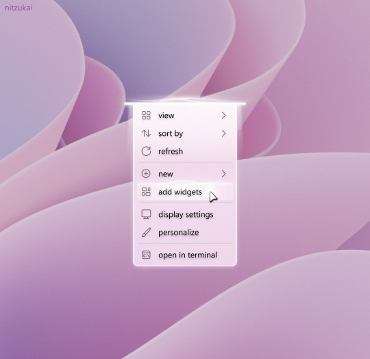
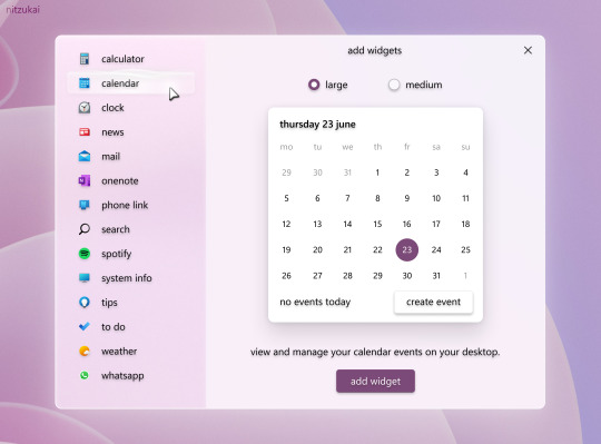
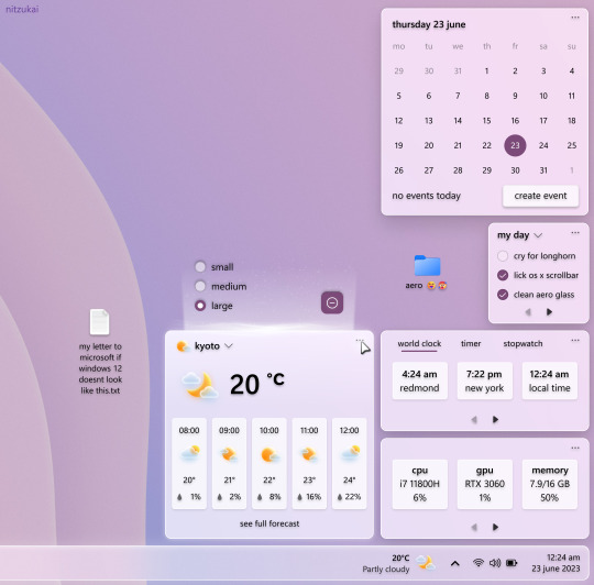
Windows 12 Desktop Widgets [Concept]
#ui#ui design#user interface#ux#ui/ux#windows#microsoft#desktop#graphic design#ui ux design#uitrends#os#operating systems#oc#oc art
101 notes
·
View notes
Text
If you can play as Dean he needs to be mewing consistently or if you press a specific button he flashes you with the blue steel this is a necessary feature
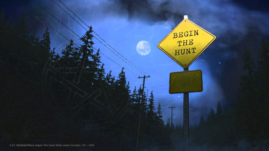
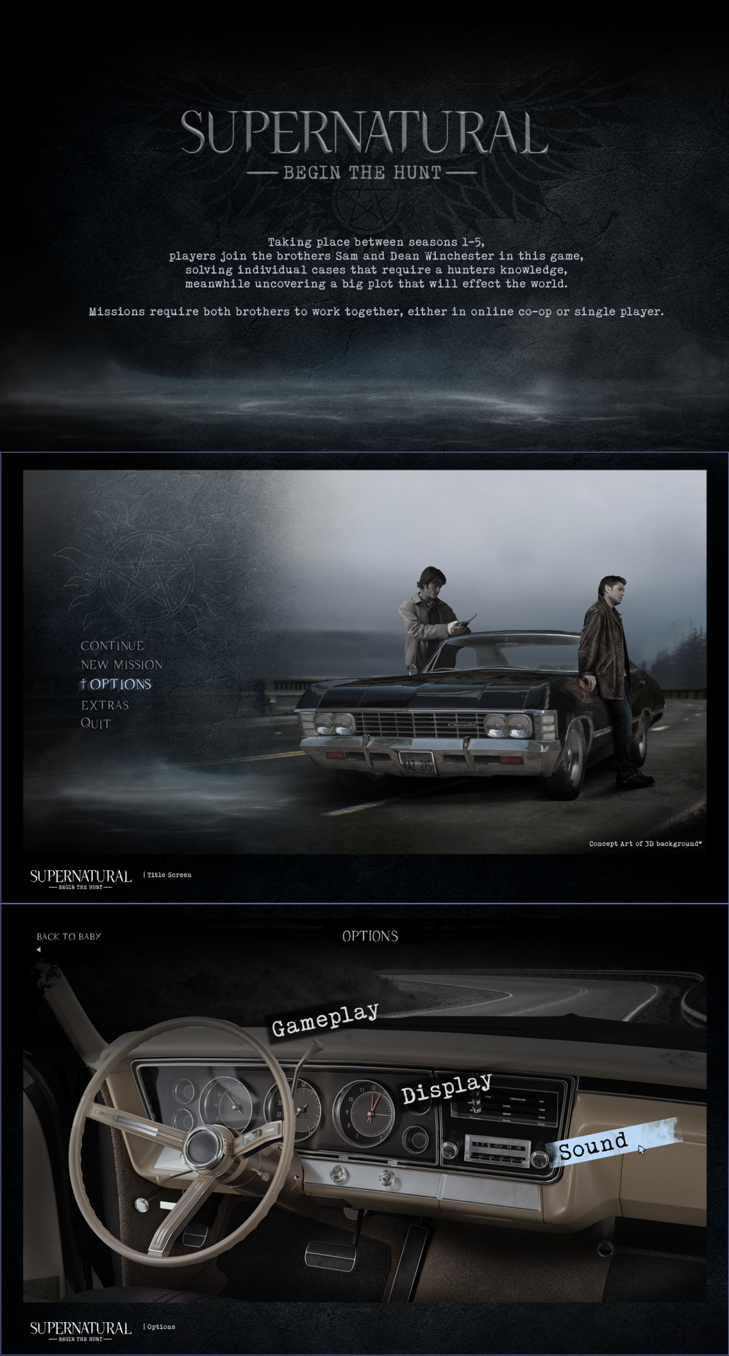
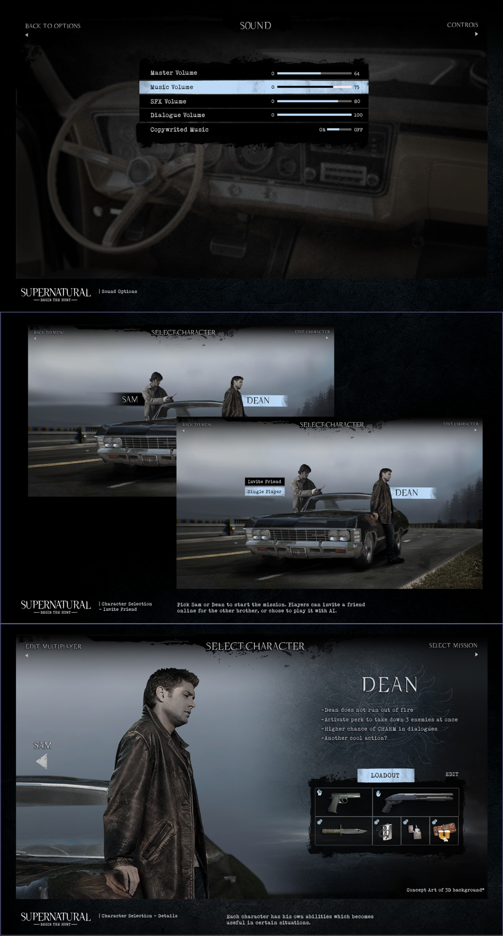
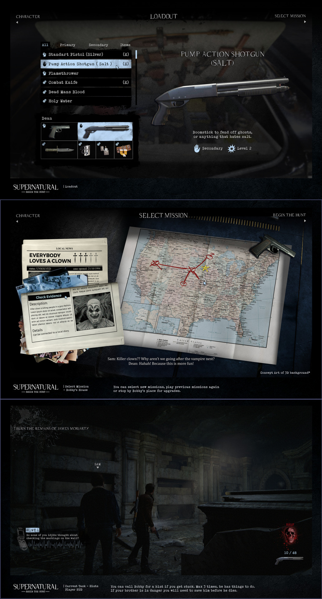
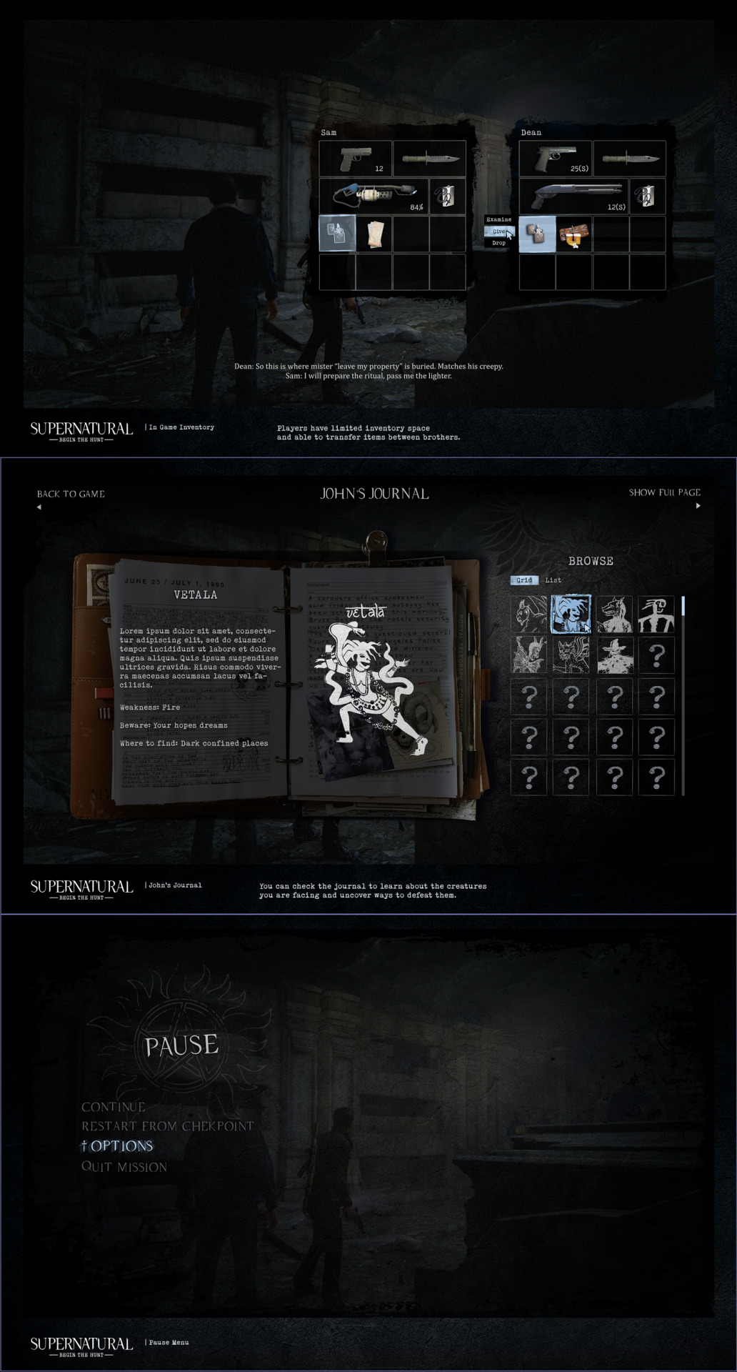
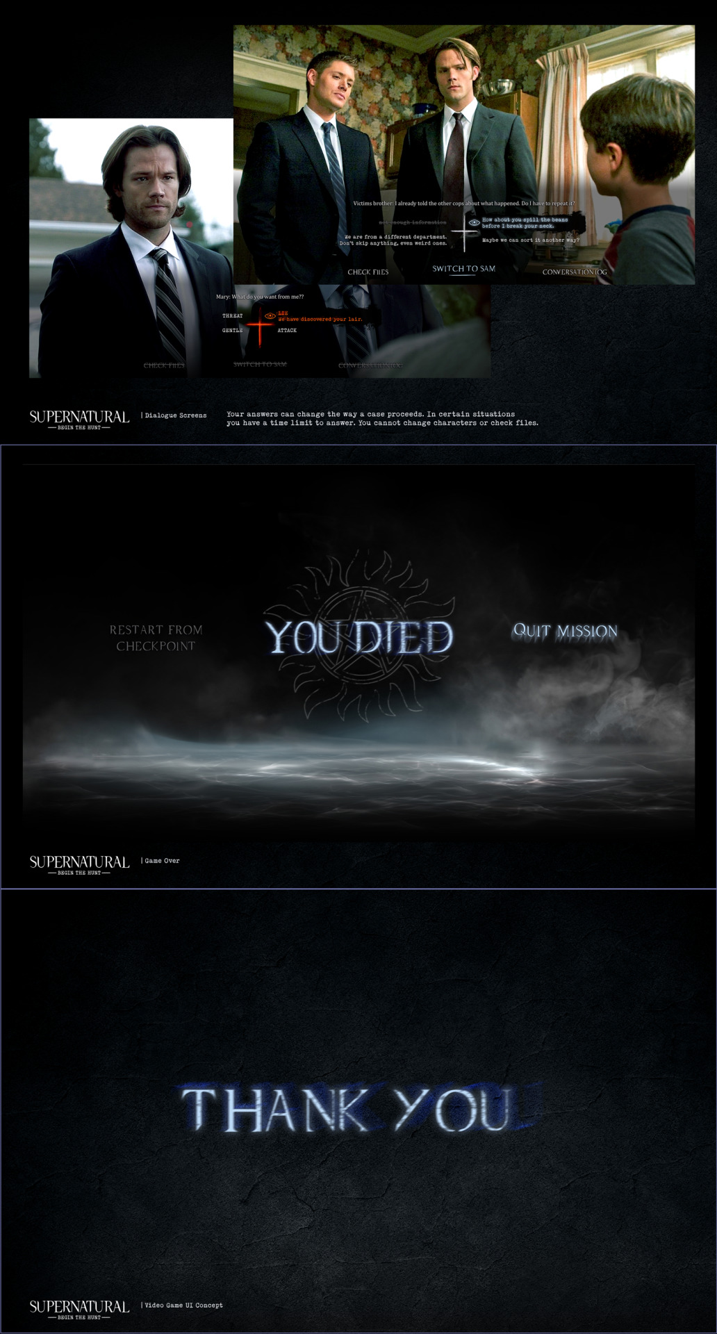
Supernatural Video Game UI Concept
Here I am with another "how come this doesn't have a video game??? fine, I'll do it myself" concept :D Because a co-op game where you play as either Sam or Dean, solving cases, hunting things together sounds so much fun! You can check the link for the individual images, apologies for the long a** post :D
#supernatural#spn#dean winchester#sam winchester#spn fanart#video game#video game concept#ui design#personal project
178 notes
·
View notes
Text
does anyone else feel pure unfiltered rage towards the new samsung ui update? everything is rounder and uglier. not to mention the amount of ai they're using and promoting. i dont think ive ever hated an update more
#autism#adhd#audhd#neurodiversity#neurodivergent#samsung#one ui 7#i just want my phone back#this is not what my baby looks like#user interface#ui design#ui#how do i go back
20 notes
·
View notes
Text
It's kind of funny how Teams users have been complaining for the better part of a decade that the minimum width of the dockable chat windows is too wide, and Microsoft has basically been telling them to get fucked, then they discontinue Skype and tell all of its former users to switch to Teams, and within 72 hours of Skype going down for good, Microsoft suddenly pushes a "critical" update for Teams that gives it more flexible dockable chat windows.
4K notes
·
View notes
Text

#motion graphics#art#graphic design#ui design#animation#scifi art#cyberpunk#cyberpunk art#futuristic#ui#ui ux design#uidesign#black and white#monochrome#gif#dark aesthetic#dark scifi
1K notes
·
View notes
Text
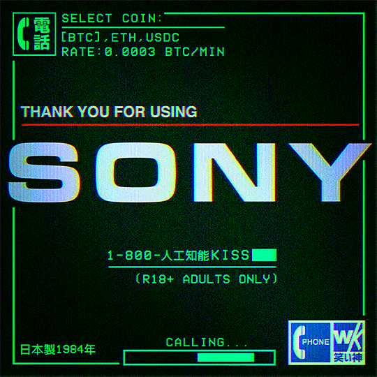
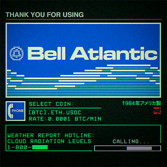
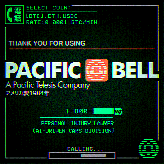
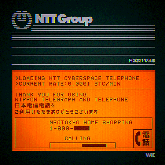
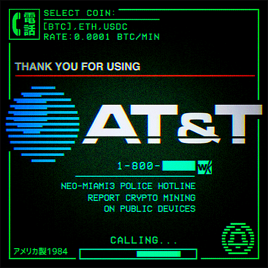
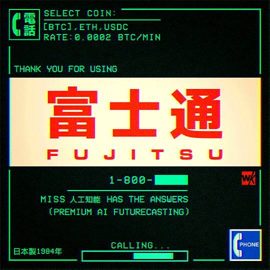
Cyberspace Telephone
#cyberpunk#bladerunner#retrofuturism#neotokyo#scifi#retro computer#pop art#retro computing#science fiction#dystopian#post internet#ui design#cyberspace#cyberart#animation#looping#80s#1000#2000#album post
3K notes
·
View notes

Text
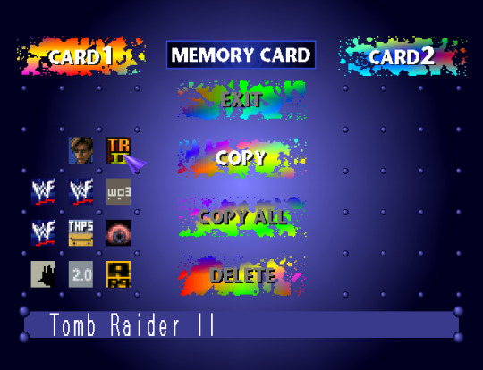
PlayStation 1 (1994/1995) - Memory Card
#psxui#ps1 aesthetic#bios#memory card#playstation#ps1#psx#psone#playstation 1#sony#ui design#retro gaming
618 notes
·
View notes
Text
Y'know what'd be a great UI improvement?
Categorization of fonts. Especially if it's user-controlled. Put that shit in folders.
"Standard", "Web-safe", "Script", "Headers", "Retro PC"...
66 notes
·
View notes
Text
my tether indicator! an important bit of UI to get right in the big catch.
it not only communicates the distance from the tether as you approach, but also accommodates for several different states (locked on, tethered, offscreen, etc)
all of the big catch's UI is actual geometry driven by shape keys and physics springs!
83 notes
·
View notes
Text


my favorite type of ui design is @osustream
9 notes
·
View notes
Text
Ghost in the Shell SAC_2045 (2020)
#cyberpunk aesthetic#cybernetics#ui design#user interface#ux design#surveillance#ghost in the shell#high tech#gist#cyberpunk anime#data visualization#heatmaps#real time tracking#scifi anime#graphic design
69 notes
·
View notes
Text


I want a Moon Knight game!!! So I designed a game UI for it 😂
Come on producers, you are sleeping on this character!
You can see all screens in the link.
#moon knight#moon knight video game#marvel moon knight#steven grant#marc spector#khonshu#marvel comics#moon knight Netflix#video game#video game ui#ui design#concept art
69 notes
·
View notes
Text
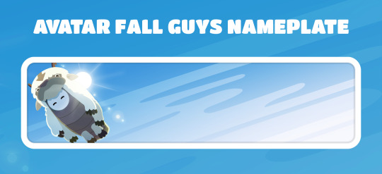
The nameplate I made for ATLA is in the Fall Guys store today!
#fall guys#avatar the last airbender#appa#this was a fun one to draw!#i based it on a screenshot from the show#myart#ui design
26 notes
·
View notes
Text
I kind of love it when websites both display relative timestamps for an unreasonably long span of time before switching to absolute timestamps and use unreasonable units for the span in question. "This post was made 37 weeks ago" under what conceivable circumstance is this a useful way to communicate that?
4K notes
·
View notes