#User Interface Design
Explore tagged Tumblr posts
Visit Tumblr Blog
Explore Tumblr blogs with no restrictions, modern design and the best experience.
Last Seen Tumblr Blogs


Fun Fact
12.7% of mobile users access Tumblr.
Note
hi i just want to say i stumbled on your blog and i dont know about vintage computers but i feel quite passionately about Internet and tech without knowing all that much honestly so im thankful to your blog being an exciting place of exploration. i love your website too and i look forward to seeing more of your projects. i also wanted to ask because i found your blog from a post about windows ui, do u have more resources on that that u recommend? thank you so much <3
Thank you! I try to expose folks to the cool aspects of the hobby where I can, and show how much more faceted it is than one might see on the surface. The aesthetic is cool and all, but there's so much more to appreciate if you take the time to explore.
Apart from The Windows Interface Guidelines for Software Design, not really. I'm more of an enthusiast with opinions™ about things. I think there's an early one about Mac OS UI development prior to OSX that's worth its salt too, but I'm not an Apple fan.
However, I'm sure a few folks in the mix may have some recommendations. Suggestions are welcome!
20 notes
·
View notes
Text


Bionix - Bold Inktrap Font
https://www.behance.net/gallery/193146761/Bionix-Bold-Font
Bionix is a sans display font made with a bold and modern impression, equipped with inktrap which adds personality to this font. This font is suitable for designs that require a strong and clear impression when used in media but is still modern and fun. Bionix is suitable for headlines, posters, banners, logos, etc
#strong font#Fat font#headline font#typography#font#sans serif font#display fonts#futuristic font#poster font#bold font#Free font#display font#Graphic Design#Design Inspiration#Typography#Font Design#Logo Design#Creative Design#Visual Design#Graphic Art#Web Design#Poster Design#Minimal Design#Modern Design#Illustration#User Interface Design#User Experience Design#Digital Art#Branding Design#Magazine Design
9 notes
·
View notes
Text
(deep long sigh)
Reminder that when you implement 2FA setup, you should let people optionally get the same code that the QR image contains as plain text.
This allows, for example, setting up 2FA through a browser on the same phone that contains the authenticator app.
9 notes
·
View notes
Text
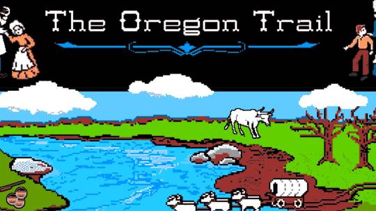
Comparative Analysis: The Design and Impact of "Oregon Trail" and "Papers, Please"
Introduction In the world of video games, few titles manage to transcend the boundaries of entertainment to offer profound insights into the human condition and historical contexts. “Oregon Trail” and “Papers, Please” are two games that do just that, using the medium to educate and provoke thought through the lens of resource management and ethical decision-making. This essay explores the…
View On WordPress
#"game design#educational games#ethical decision-making#game analysis#game development#game mechanics#indie games#interactive storytelling#narrative games#Oregon Trail#Papers Please#player agency#resource management#user interface design#video game education
5 notes
·
View notes
Text
#User Experience Design#User Interface Design#UX Design Company India#Visual Design Solutions#Branding and Usability#UX Research and Analysis
0 notes
Text

Incipient Infotech is a trusted technology company and software company based in Klemzig, Adelaide, offering innovative custom software development, web development, and mobile app development services designed to propel businesses into the digital future. Our dedication to quality and innovation makes us one of the top Australian companies in the software development industry.
We take pride in following an agile methodology that incorporates agile project management and agile project methodology, focusing on iterative progress, collaboration, and rapid response to change. Our teams are well-versed in the systems development life cycle, ensuring projects follow structured phases for maximum success.
Clients who are searching for how to make a website, a best website builder, or a professional website design company Sydney will find tailored solutions with Incipient Infotech. Our website builder tools and web developers near me services help you establish a compelling online presence with easy-to-use, scalable platforms.
The heart of our work lies in exceptional UI/UX design. We specialize in creating visually appealing and functional interfaces that enhance user experience, combining user interface design principles with strategic UX design approaches to engage your audience effectively.
In addition to traditional development services, we offer expert digital transformation consulting and technology consulting to guide businesses through adopting digital marketing consultant tactics, AI marketing, and artificial intelligence consulting for superior results. Our capabilities in SaaS & AI development allow us to build intelligent software products incorporating ai customer service and ai for data analytics that empower businesses with actionable insights and automation.
Whether you are an emerging startup or an established enterprise looking for expert web developer, developer for software, or simply curious about how can we create a website, Incipient Infotech delivers personalized services with a focus on growth and long-term support.Choose Incipient Infotech for dependable website development, agile software development, and comprehensive tech solutions that keep you ahead in a rapidly evolving digital landscape.
#Web Development#Mobile App Development#UI/UX Design#Custom Software Development#Digital Transformation Consulting#SaaS & AI Development#Website Builder#Agile Methodology#Free Website Builder#Web Design#Technology Company#Best Website Builder#How To Make A Website#Agile Project Management#Software Development Life Cycle#User Interface Design#Agile Approach#How To Create A Website#Web Developer
1 note
·
View note
Text
UI/UX Design Services Company | InStep Technologies
#ui ux design services#ui ux design company#user interface design#user experience design#mobile app ui design#web ui ux design#ui ux consulting#wireframe and prototype#intuitive ux design#custom ui ux solutions#ux design agency#ux testing and research#website ui design#app ux design
0 notes
Text

#CMS web design#HTML web design#small business website design#corporate website design#portfolio website design#SEO-friendly web design#creative web design#user interface design#user experience design#web design services#professional web design#website design agency#Phoenix#Tucson#Mesa#Chandler#Scottsdale#Glendale#Gilbert#Tempe#Peoria#Surprise
0 notes
Text
Improve Your User Experience: Tips and Strategies
In today’s digital landscape, creating a positive interaction with your product or service is crucial. As Don Norman, the pioneer of user experience (UX) design, once emphasized, UX encompasses all aspects of a user’s interaction with a company, its services, and products. A well-designed product not only looks appealing but also provides an intuitive and seamless interaction, leading to…
#A/B Testing#Content Hierarchy#Conversion Rate Optimization#Interaction Design#Mobile Responsiveness#Performance Optimization#Usability Testing#User Interface Design#Website Navigation
0 notes
Text


LT Serif Font
https://www.behance.net/gallery/196257949/LT-Serif-Modern-Serif-Font
LT Serif presents a modern, minimalist, and elegantly crafted serif font, featuring distinctive alternatives for select capital letters with stems. This versatile typeface is inclusive of uppercase, lowercase, symbols, alternates, numbers, and supports multilingual characters.
#modern font#Serif Font#luxury font#elegant font#beauty font#cosmetic font#typography#brand identity#branding#Free font#Graphic Design#Design Inspiration#Typography#Font Design#Logo Design#Creative Design#Visual Design#Graphic Art#Web Design#Poster Design#Minimal Design#Modern Design#Illustration#User Interface Design#User Experience Design#Digital Art#Branding Design#Magazine Design#Book Design#3D Design
7 notes
·
View notes
Text
Touchscreen integration with vi on a phone turns out to be really nice UX actually. (I'm using Termux+Emacs+Evil.)
Unlike a mouse, your fingers are already right there on the touch screen. The travel distance is much lower, barely more than typing.
You can put the cursor on exactly the target line without line counting or picking a search string or whatever motion. Drag to scroll. It's a nice option, faster in some cases, and often mentally lighter.
3 notes
·
View notes
Text
The Psychology of Colors in UI/UX Design

When it comes to UI/UX design, color isn’t just a design choice; it’s a powerful tool that impacts how users feel and interact with a product. Understanding the psychology of colors can help you create a more effective, engaging, and user-friendly interface. Whether you’re designing a website, mobile app, or digital product, the colors you choose can influence the user experience (UX) in ways you might not even realize.
For more articles please visit: https://pixelizes.com
In this blog, we’ll explore how colors can affect user perception, behavior, and emotions in UI/UX design.
Why Colors Matter in UI/UX Design
Colors have a significant psychological impact. They can trigger emotions, influence behavior, and even drive decision-making. In the context of UI/UX design, your choice of colors can:
Enhance usability and navigation
Improve readability
Set the tone of the design
Influence conversions (clicks, sign-ups, purchases)
Red: Energy and Urgency
Red is a color associated with passion, action, and urgency. It’s bold and attention-grabbing, which is why it’s commonly used for calls-to-action (CTAs), like “Buy Now” buttons or error messages. It can stimulate the senses and increase heart rates, making it perfect for encouraging immediate action.
When to Use Red:
To create urgency or excitement (e.g., discounts, limited-time offers)
To highlight critical actions (e.g., delete buttons, error notifications)
Caution: Too much red can be overwhelming, so balance it with neutral tones for harmony.
Green: Calm and Trust
Green is the color of nature, growth, and balance. It’s often used to communicate trust, sustainability, and health. In UX design, green is commonly used to signify success or positive outcomes (e.g., “Success” messages or confirmation buttons). It is also associated with ease of use, so it’s a good choice for buttons or elements requiring user interaction.
When to Use Green:
For positive actions (e.g., “Submit,” “Confirm”)
To convey eco-friendliness or sustainability
For calming or soothing experiences (e.g., wellness or meditation apps)
Blue: Trust and Professionalism
Blue is known for its association with trust, calmness, and professionalism. It’s one of the most commonly used colors in UI/UX design for industries that require a high degree of trust, such as banking, healthcare, and technology. Blue evokes a sense of security, making users feel confident and safe while navigating your interface.
When to Use Blue:
In forms, navigation bars, or CTA buttons that require trust
For backgrounds or sections where you want users to feel calm and assured
In corporate websites or services where professionalism is key
Yellow: Optimism and Attention
Yellow is the color of optimism, creativity, and happiness. It grabs attention and stimulates mental clarity, but too much yellow can feel overpowering. Use yellow sparingly to draw attention to important elements or to add a pop of energy to your design.
When to Use Yellow:
To highlight important actions or notifications
In small doses to evoke positivity and enthusiasm
For calls-to-action that want to stand out (like “Subscribe” or “Learn More”)
Caution: Ensure it doesn’t dominate the design; too much yellow can cause eye strain.
Purple: Luxury and Creativity
Purple is associated with luxury, creativity, and innovation. It’s a great color for conveying sophistication, elegance, and originality. Purple is often used in industries like beauty, fashion, and high-end products. In UI/UX design, purple can be used to create a sense of exclusivity or to enhance the creativity of the interface.
When to Use Purple:
For premium products or services
In creative fields like design, fashion, or beauty
To add a touch of luxury or elegance
Black & White: Minimalism and Contrast
While not technically colors, black and white are incredibly important in UI/UX design. They represent simplicity, clarity, and contrast. A monochrome color scheme can help create a clean, minimalist look, and the stark contrast between black and white enhances readability and focus.
When to Use Black & White:
For minimalist designs that prioritize clarity
To create visual contrast and make other colors pop
In sophisticated and high-end brands looking for simplicity and elegance
Pink: Playfulness and Femininity
Pink is often associated with playfulness, warmth, and femininity. It’s commonly used in designs targeting young audiences or those in the fashion and beauty industries. Pink evokes positive emotions and can create a welcoming, friendly experience for users.
When to Use Pink:
For apps or websites targeting a younger, trendy audience
In creative or fun products
For enhancing the aesthetic of fashion, beauty, or lifestyle sites
Tips for Using Colors in UI/UX Design
Contrast is Key: Always ensure there’s enough contrast between text and background for readability.
Consistency: Stick to a cohesive color palette to keep the user interface consistent.
Accessibility: Use color contrast checkers to ensure that your design is accessible to those with color blindness.
Cultural Relevance: Different cultures may associate different meanings with colors, so always consider your target audience’s cultural background.
Final Thoughts
Understanding the psychology of colors can help you make more informed, strategic decisions in your UI/UX design. By carefully selecting colors that align with your brand’s values and the emotional experience you want to evoke, you can enhance usability, guide user actions, and create a more engaging and effective interface.
Remember: Colors are not just visual elements—they’re an integral part of the user experience!
#UI/UX design#Color psychology#UX design tips#Color in design#User interface design#Color theory#Emotional design#Web design#Mobile app design#Color contrast#User experience#Branding and color#Design for accessibility#Color palettes#Conversion optimization#Visual design#Design aesthetics#User behavior in design#UI design trends.
1 note
·
View note
Text

Ta-Da! Tweaked Fallout 4's Pip-Boy UI, into an Email Client for fun and practice for UI Design.
1 note
·
View note
Photo
There is a large contingent of people on this website who have spent the last few weeks complaining about the concept of any ui redesign whatsoever, making the example of ao3 as the PERFECT website because it has not been significantly redesigned at all since its release. Now, I will willingly admit that redesign for its own sake is the enemy of usability.
However.
If a large part of a user base cannot find and/or make use of a feature, that's not on them (the same is true for the debate about dark/light mode a few years back - it doesn't matter if a custom skin exists, if it's not called "night mode" and sits in the header, footer, or a settings menu, it may as well not exist.) The fault isn't the user's. It is true that ao3 was an absolutely golden example of usability when it started (I'll link the video of that one talk if I find it) , but that was fourteen years ago. Its audience has grown, has changed. Standards for user patterns have changed. Clearly, the language and/or ui needs a revamp every so often to keep it current and we're seeing the fallout of that here. I don't know exactly what needs to be done, presumably some research, polling, and a/b testing

But it does.
39K notes
·
View notes
Text
UX vs. UI Understanding the Key Differences for Better Design
UI is all about the looks and the features like buttons, colors and layouts, while the UX is about how the product feels like and how it makes the end-users comfortable. This is because the knowledge of these differences enables the borrowers to make reliable and efficient design interfaces that not only look good but also work well.
0 notes