#Color in design
Explore tagged Tumblr posts
Visit Tumblr Blog
Explore Tumblr blogs with no restrictions, modern design and the best experience.
Last Seen Tumblr Blogs


Fun Fact
Tumblr has been providing a Korean-language service since 2013.
Text
The Psychology of Colors in UI/UX Design

When it comes to UI/UX design, color isn’t just a design choice; it’s a powerful tool that impacts how users feel and interact with a product. Understanding the psychology of colors can help you create a more effective, engaging, and user-friendly interface. Whether you’re designing a website, mobile app, or digital product, the colors you choose can influence the user experience (UX) in ways you might not even realize.
For more articles please visit: https://pixelizes.com
In this blog, we’ll explore how colors can affect user perception, behavior, and emotions in UI/UX design.
Why Colors Matter in UI/UX Design
Colors have a significant psychological impact. They can trigger emotions, influence behavior, and even drive decision-making. In the context of UI/UX design, your choice of colors can:
Enhance usability and navigation
Improve readability
Set the tone of the design
Influence conversions (clicks, sign-ups, purchases)
Red: Energy and Urgency
Red is a color associated with passion, action, and urgency. It’s bold and attention-grabbing, which is why it’s commonly used for calls-to-action (CTAs), like “Buy Now” buttons or error messages. It can stimulate the senses and increase heart rates, making it perfect for encouraging immediate action.
When to Use Red:
To create urgency or excitement (e.g., discounts, limited-time offers)
To highlight critical actions (e.g., delete buttons, error notifications)
Caution: Too much red can be overwhelming, so balance it with neutral tones for harmony.
Green: Calm and Trust
Green is the color of nature, growth, and balance. It’s often used to communicate trust, sustainability, and health. In UX design, green is commonly used to signify success or positive outcomes (e.g., “Success” messages or confirmation buttons). It is also associated with ease of use, so it’s a good choice for buttons or elements requiring user interaction.
When to Use Green:
For positive actions (e.g., “Submit,” “Confirm”)
To convey eco-friendliness or sustainability
For calming or soothing experiences (e.g., wellness or meditation apps)
Blue: Trust and Professionalism
Blue is known for its association with trust, calmness, and professionalism. It’s one of the most commonly used colors in UI/UX design for industries that require a high degree of trust, such as banking, healthcare, and technology. Blue evokes a sense of security, making users feel confident and safe while navigating your interface.
When to Use Blue:
In forms, navigation bars, or CTA buttons that require trust
For backgrounds or sections where you want users to feel calm and assured
In corporate websites or services where professionalism is key
Yellow: Optimism and Attention
Yellow is the color of optimism, creativity, and happiness. It grabs attention and stimulates mental clarity, but too much yellow can feel overpowering. Use yellow sparingly to draw attention to important elements or to add a pop of energy to your design.
When to Use Yellow:
To highlight important actions or notifications
In small doses to evoke positivity and enthusiasm
For calls-to-action that want to stand out (like “Subscribe” or “Learn More”)
Caution: Ensure it doesn’t dominate the design; too much yellow can cause eye strain.
Purple: Luxury and Creativity
Purple is associated with luxury, creativity, and innovation. It’s a great color for conveying sophistication, elegance, and originality. Purple is often used in industries like beauty, fashion, and high-end products. In UI/UX design, purple can be used to create a sense of exclusivity or to enhance the creativity of the interface.
When to Use Purple:
For premium products or services
In creative fields like design, fashion, or beauty
To add a touch of luxury or elegance
Black & White: Minimalism and Contrast
While not technically colors, black and white are incredibly important in UI/UX design. They represent simplicity, clarity, and contrast. A monochrome color scheme can help create a clean, minimalist look, and the stark contrast between black and white enhances readability and focus.
When to Use Black & White:
For minimalist designs that prioritize clarity
To create visual contrast and make other colors pop
In sophisticated and high-end brands looking for simplicity and elegance
Pink: Playfulness and Femininity
Pink is often associated with playfulness, warmth, and femininity. It’s commonly used in designs targeting young audiences or those in the fashion and beauty industries. Pink evokes positive emotions and can create a welcoming, friendly experience for users.
When to Use Pink:
For apps or websites targeting a younger, trendy audience
In creative or fun products
For enhancing the aesthetic of fashion, beauty, or lifestyle sites
Tips for Using Colors in UI/UX Design
Contrast is Key: Always ensure there’s enough contrast between text and background for readability.
Consistency: Stick to a cohesive color palette to keep the user interface consistent.
Accessibility: Use color contrast checkers to ensure that your design is accessible to those with color blindness.
Cultural Relevance: Different cultures may associate different meanings with colors, so always consider your target audience’s cultural background.
Final Thoughts
Understanding the psychology of colors can help you make more informed, strategic decisions in your UI/UX design. By carefully selecting colors that align with your brand’s values and the emotional experience you want to evoke, you can enhance usability, guide user actions, and create a more engaging and effective interface.
Remember: Colors are not just visual elements—they’re an integral part of the user experience!
#UI/UX design#Color psychology#UX design tips#Color in design#User interface design#Color theory#Emotional design#Web design#Mobile app design#Color contrast#User experience#Branding and color#Design for accessibility#Color palettes#Conversion optimization#Visual design#Design aesthetics#User behavior in design#UI design trends.
1 note
·
View note
Text

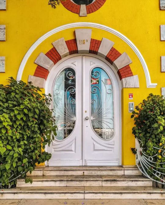
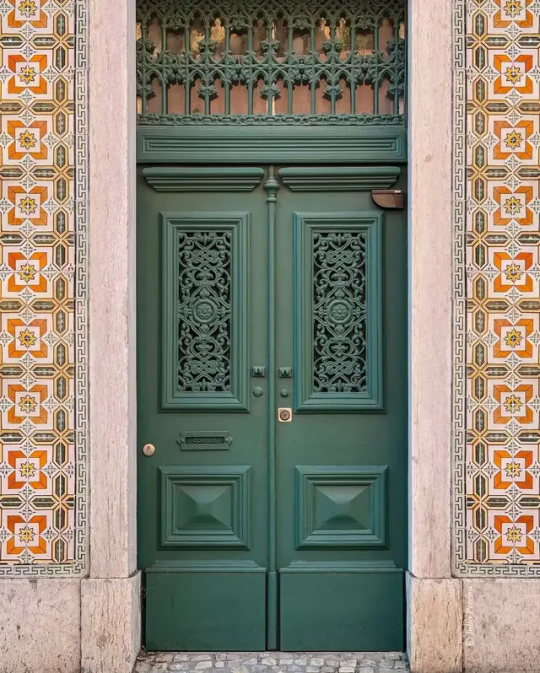

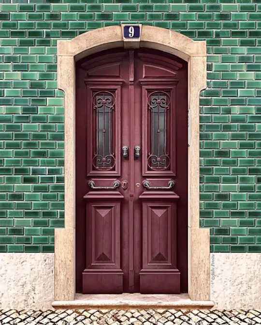
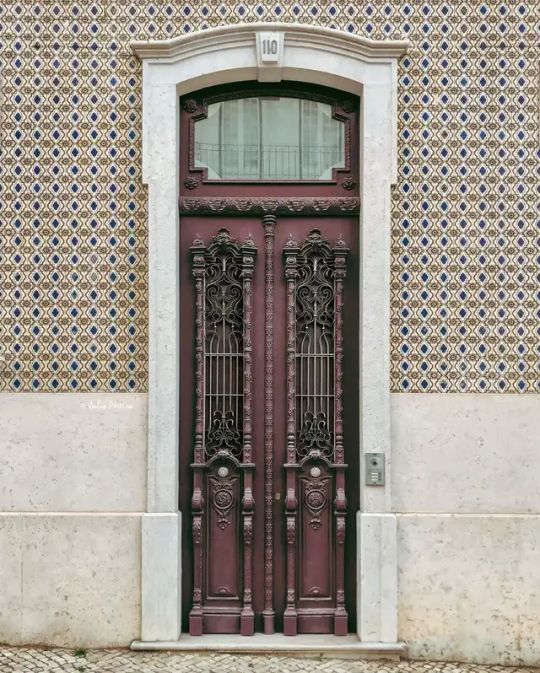
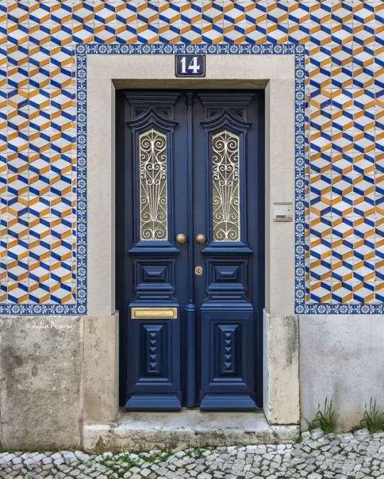
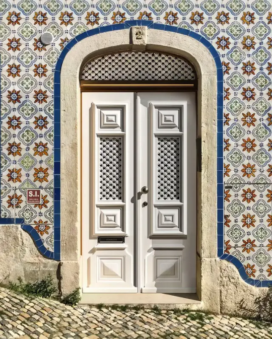
The Vibrant Doors of Lisbon
#light academia#dark academia#classical#academia aesthetic#escapism#academia#books and libraries#classic literature#books#architecture#place#travel#destination#object#lisbon#doors#vibrant#colourful#colorful#beautiful#design#exterior#royal core#cottage core#aesthetic#artistic#aesthetics#mood#vibe#tumblr
9K notes
·
View notes
Text

you have burn in, old man. admit it
#my art#deltarune#tenna#tenna deltarune#shuttah#shuttah deltarune#this was supposed to be quick and instead i spent hours angrily color correcting before giving up and graying it lmao#straight up made me not wanna post it#but here we are#the point is: funny character design gag#i may have copped shuttah's hand design from tomatertate also i hope they won't mind if they see this :')
6K notes
·
View notes
Text

The sky falls and the tides rise, for Odysseus of Ithaca.
Inspiration taken from: @anniflamma 's sandwich art Enjoy <3
#time check: 4 AM.#I HOPE. YOU ALL ARE HAPPY#genuinely though this was a fun excuse to color my designs..AND YOU FINALLY GET TO SEE ZEUS#epic the musical#epic musical#epic the musical fanart#manwhore au#epic odysseus#epic zeus#epic poseidon#zeus#odysseus#poseidon#mansplain manipulate manwhore#poseidon zeus and ody in that order i think
9K notes
·
View notes
Text


skyhold maid to a dreadwolf hunter? never underestimate a lesbian
#dragon age#dragon age the veilguard#my art#neve gallus fans where are you!!!#neve gallus#artists on tumblr#bioware#digital art#dragon age inquisition#da fanart#dragon age fanart#character design#elves of color#rook#dragon age rook
14K notes
·
View notes
Text
"so grunkle ford how do you know bill?"

"... that's not important."

#so they got heavily drunk and sung karaoke and 'one thing led to another' yeah mhm stanford pines i know what you are#they're so awful for each other i hate them so much#something about loving you like an alcohol addict idk#irls keep scrolling shh i'm okay dw#stanford pines#ford pines#bill cipher#<- i accidentally twinkified him in this angle i swear his full design is neat this is my first time coloring human him 🙏#whoops#billford#the book of bill#book of bill#gravity falls#gravity falls fanart#i'm so good at posting miscellaneous sketches and making them cohesive guys trust#s0up1tart
11K notes
·
View notes
Text


NEW GUY IS HERE!!!!
#my art#the band ghost#ghost fanart#papa v perpetua#nameless ghoulettes#papa v#nameless ghouls#era 6 ghouls#satanized#ghost spoilers#kinda changed up his eye color a bit. i think it compliments nicely with the violet#i had fun coloring that first one. its sorta my ...freeform coloring style#also yes i very much simplified the mitre design lol#i should create a stamp#also the GHOULETTES!
5K notes
·
View notes
Text


He's joking, guys-
Idk what this is. I've had this comic idea in my notes for literally a year, so I used it for color practice XD
#scheduled post#my art#shitpost#comic#undertale#papyrus#classic!papyrus#undyne#classic!undyne#I finally have a Classic!Undyne design yippeeee#And I'm finally getting confident in drawing muscles lol#Underwizard comic? Oh uh yeah uh- I'm coloring the next pages. Learning stuff before continuing. This is why I'm practicing.
5K notes
·
View notes
Text

🦑
#wow it’s been a while since i’ve drawn anything related to malevolent#and here i am in my pre convention crunch#with another acrylic charm design#had a lot of fun with colors here#malevolent#malevolent podcast#malevolent fanart#arthur lester#john doe#king in yellow#my art#digital art#fanart#illustration#sketch
9K notes
·
View notes
Text
I've been thinking about it for a bit (and it's probably obvious) but did you notice the giant frog and the tentacles are basically clown fish and anemones? I only realized once someone pointed out to me that the giant frogs have clown fish colors.


And then I realized the tentacles are also classified as "anthozoa" in the AB which is the the class anemones are a part of


The comment about nematocysts is also how it works for anemones, Kui draws a pretty cool graph of how it works too (a little different real ones but conveys the idea well)

I just always thought that was a pretty cool detail that I missed for a while! It's very cool how inspired by real animals Ryoko Kui's monsters are, I'm always amazed by how much sense they make.
#idk how obvious it was to other people especially after the anime where their colors are pretty obvious but I'm bad at paying attention ok#Kui making monsters so 'grounded' while also being fantastical creatures is great#Dungeon Meshi#Monsters#Giant Frog#Tentacles#dunmeshi thoughts#clown fish#anemone#anthozoa#monster design
4K notes
·
View notes
Text
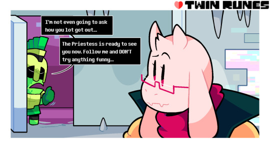


Told ya they should've come up a plan B
FIRST - PREVIOUS - NEXT
MASTERPOST (for the full series / FAQ / reference sheets)
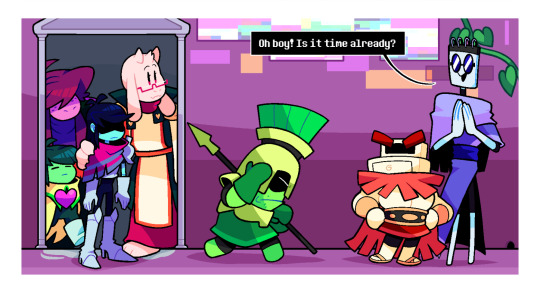
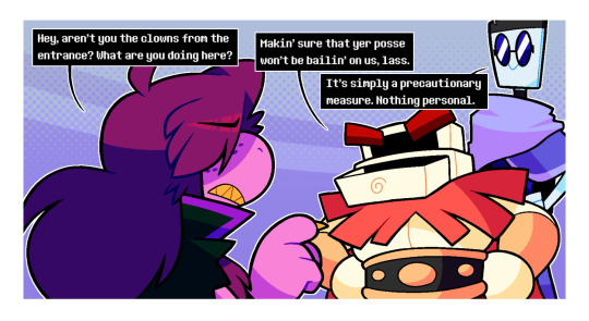
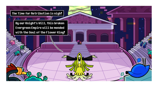
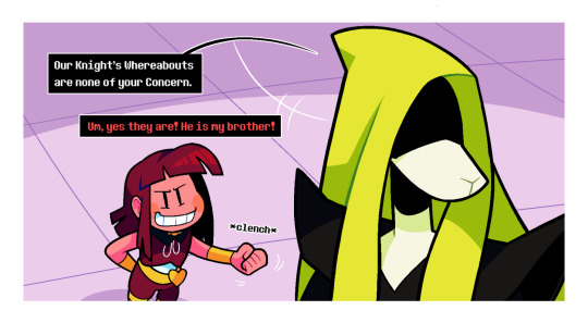
#undertale#deltarune#utdr#crossover#crossover comic#undertale fanart#deltarune fanart#twin runes#twin runes comic#twin runes au#my art#kris dreemurr#frisk#chara#ralsei#susie deltarune#toriel#asgore#priestess#okay not gonna lie#this page took me forever#have I ever told you that I don't like drawing crowds?#or backgrounds?#it might kill my motivation but boy is it one hell of an exercise#also lookie here now we actually get a full look at the priestess#actually pretty happy with this design#the hood transitioning into hair with the tattered dress looking like scrolls#and the shadowy face making her look like Justitia#which fits with the yellow which is the color of justice and all#the original design used to have antlers to make the deer connection to mayor holiday stronger
3K notes
·
View notes
Text
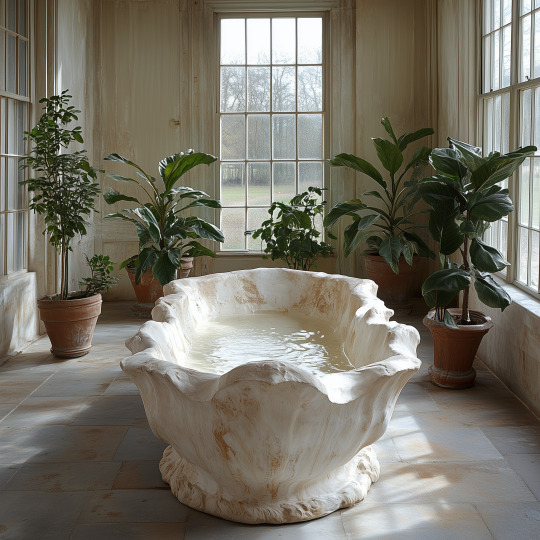

#aesthetic#ai art#digital art#colors#lofi#nostalgia#retrowave#video game#concept art#art#dreamscape#unreality#vibes#dreamcore#liminal#pastel#Vaporwave#dreamy#liminal pool#poolcore#green#plants#interior design#bathroom
6K notes
·
View notes
Text
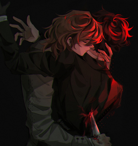
11/20
#big day for doomed yaoi enjoyers#(me)#i’m never ever doing this again i was screaming every minute coloring this i literally cannot do hard light#biggest case of “trust the process” i’ve ever experienced in my life#also i was gonna originally do a gun instead of knife to keep it canon but i quickly learned i can’t in fact draw guns#a knife is more symbolic anyway. stabbed in the back. yk#(trying to comfort myself that i can’t draw firearms even after eight years of art)#i remember playing this scene for the first time and actually breaking down at 2am bc that betrayal STUNG#i actually had no remorse for akechi after that 😭😭 i actually felt like a sadist for enjoying beating his ass in shidos palace#akechi as a character was specifically designed to make me go through all five stages of grief within a matter of minutes#absolute rollercoaster of emotions#ANYWAY IM FINALLY FREE TIME TO NOT DO ART FOR THE NEXT FOUR MONTHS 🙏🏼🙏🏼🙏🏼🙏🏼🙏🏼🙏🏼#persona 5 royal#persona 5#p5#p5r#ren amamiya#akira kurusu#goro akechi#akechi goro#shuake#akeshu#lotus draws
7K notes
·
View notes
Text


#maviyenot#photography#nature#naturecore#landscape#pretty#travel#traveling#photographers on tumblr#sky#trees#forest#style#grandmacore#nature colors#exlore#thunder#vintage#view#colorful#green#nature photography#mountains#motivation#design#autumn#fall aesthetic#leaf
5K notes
·
View notes
Text


Martin Knife Blackwood
#i may have ssssort of changed his design from the last time i drew him#(you cant really tell bc this one doesn’t have colors)#this one is the final version guys i swear <probably lying#my art#tma#the magnus archives#tma fanart#martin blackwood#martin k blackwood
3K notes
·
View notes