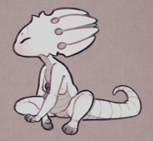
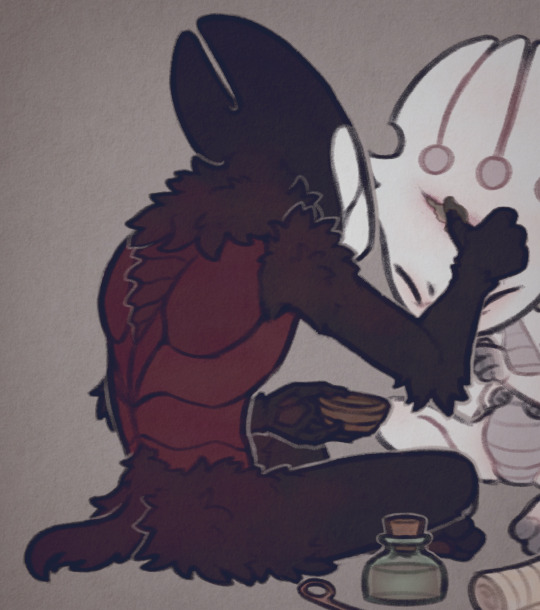
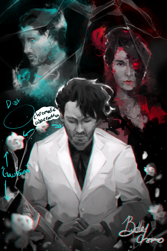
#all this in colored pencil which is Very Hard to erase
Text
wish i could finish some art
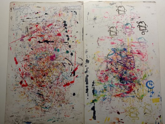
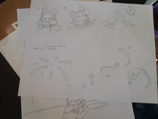
#the bin#idk. ive sketched lots of stuff recently. mostly touhous. but posting them is hard bc it looks really bad in pictures#i used to press down real hard with my pencil which was bad bc its hard to erase and ive fixed that and now use it very lightly but i think#maybe i use it too lightly. the sketches that have dark lines are the ones ive gone over so many times and so they accumulate#im inking them and maybe ill color them but id rather not bother esp bc my hands are super shaky and so i tend to mess up the lines a lot#its not something that can be helped. no amount of practice will change the fact my hands shake a lot. digital art fixes this bc i can just#undo the mistake but ive been struggling with digital recently. idk. i just feel like i have to at least color all my digital stuff#im gonna work on just making silly digital sketches and let that be that though
0 notes
Text
「 txt in kindergarten 」 。。。


𐙚 SOOBIN
• Passes by his friends’ houses to collect them, walking together to school
• Pouts whenever someone else takes something he’s set his eyes on but doesn’t say anything about it. He tells himself it’s fine, as long as they're happy
• Only brings essentials to school, but overpacks on situational things he might need like band-aids and bug lotion/patches
— “What if I get bitten by a THOUSAND mosquitoes today?!”
• Loves to play with house toys, such as kitchenware with fancy wooden stoves. A bit stressed when someone comes along and plays beside him.
• At the playground he tries to conquer the seesaw. Unfortunately he is afraid the person on the other end might not let him down or catapult him into the air, so he just sits on it with nobody on the other side.
• Lunchbox has every food group, sometimes even gets dessert when he’s behaved enough. Eats the longest because he may have to force himself to eat whatever he doesn’t like.
• Favorite time of the day is nap time! Everyone is quiet and he gets to sleep, no complaints here
𐙚 YEONJUN
• In charge of looking both ways when crossing the road, grips hard when holding hands.
• Overpacks toys and stationary, but still capable of forgetting something mildly important.
• Loves to play with building blocks and matching games/puzzles.
• At the playground he’s at the top of the slide, ruling over his minions and most likely hogging it.
• Likes to trade lunches with other kids, particular about the quality to quantity ratio. Expert at haggling.
— “I’m taking more from you because my dish is harder to prepare and has more ingredients! Maybe if you give me a piece of your sides, I’ll consider it.”
• Favorite time of the day is recess! Likes mingling with other kids, there is no set agenda so he could talk about or do anything
𐙚 BEOMGYU
• Strays and wanders away from the walking group, sometimes gets lost.
• Things are heavily personalized, same unsure handwriting that says "beomgyu" on every item he owns, and as much as possible they’re all the same color or have the same character.
• Erasers are the gel fruit ones that get lost (or eaten)
• Loves to play with very select plushies, may throw a tantrum if he doesn’t have it with him
• At the playground he can be found in sandboxes, making castles and pretending to be a monster.
• Steps on other kids’ work in the process. Sometimes it’s an accident, most times it's intentional
— “I didn’t destroy your castle because it’s better than mine, which is a lie. I destroyed it because I’m godzilla.”
• Brags about all of the snacks and candies his parents gave him (or what he takes from the cupboard)
• Favorite time of the day is arts class! A subject where he can be as loud and messy as he wants for the sake of whatever project he’s making that day.
𐙚 TAEHYUN
• Has a map in his bag in case they forget the route
• Loves to talk about his surroundings, eyes glistening when others ask follow up questions
• Always asks questions in class, he’s so attentive !!
• Complete stationery set, including a cool pencil case with a built in sharpener. Will let others borrow but will ask why they need it, asking every other second if he can have it back because he’s afraid they’ll lose it or keep it
• Loves to play with interactive books, pop-ups and especially ones where you can feel the texture of things.
• At the playground he loves being on the swing sets, telling other children to wait their turn or when 5 minutes have passed to let others have a chance on the swing.
— “Your time was up two minutes ago! Why am I still here? I’m the reason you get turns in the first place!”
• Always eats whatever his parents have prepared for him, boasts about being healthy and outliving everyone else.
• Favorite time of the day is math class! Since math class is technically indirect and simple arithmetics, such as adding apples, sometimes it’s easy to cheat (count on his fingers)
𐙚 HUENINGKAI
• Stops to look at all the fauna and flora, squealing and telling those around him. My little arthropod lover!
• Extensive art set that gets everyone's attention, other kids love to borrow from him and he can be kind of a pushover. Unfortunately, they end up losing them.
• Loves to play with anything colorful that makes sound, such as a rainbow xylophone
• At the playground he loves the roundabout, but he’s too shy to get on. He patiently waits for someone to invite him to ride, so instead he pushes the others around.
• Tries to eat his lunch quickly in case someone might ask him to share. He will, but he will sulk a lot. It was prepared for him!
• Favorite time of the day is music class! Generally this is a time where everyone just makes noise, but most eyes are on him when he learns a new toy instrument. He doesn’t like the attention, but it’s not so bad either.
— “This? Oh, I guess it’s just easy for me. wait, sorry! I didn't mean to brag.... When I want to hear a sound, my hands move on my own to do it! Teach you? Um I’m not really good at that… But sure!”
i saw that pic of them in the unifs and imagined little tubatu crossing the street hand in hand :(
thank you for reading! feedback, reblogs and tags appreciated♡
#꒰💭꒱ thinking ⋆˚࿔#txt fluff#txt fanfic#txt fanfiction#txt imagines#tomorrow x together#tomorrow x together headcanons#txt headcanons#txt drabbles#beomgyu fluff#soobin fluff#yeonjun fluff#taehyun fluff#hueningkai fluff#beomgyu headcanons#yeonjun headcanons#txt x reader#taehyun headcanons#hueningkai headcanons#soobin headcanons#yeonjun x reader#soobin x reader#hueningkai x reader#taehyun x reader#beomgyu x reader#txt x you#꒰🍥꒱ ot5 ࿐#txt soft hours#ot5 hc#꒰🩰꒱ compositions ⊹˚₊
108 notes
·
View notes
Note
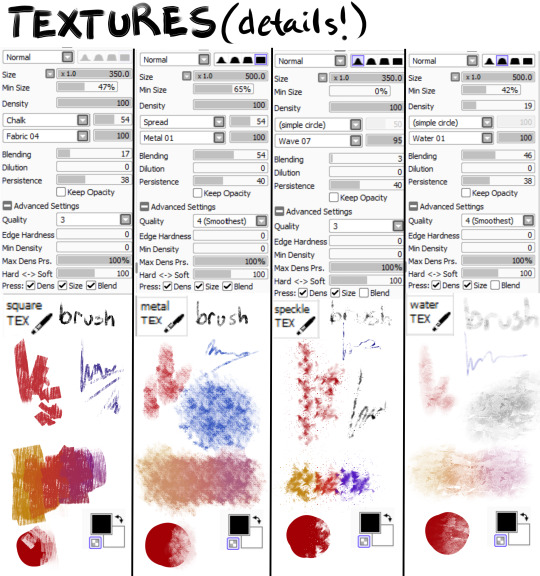
Hiya! Hope this message finds u well :3 I absolutely love your art; found you from insta! Quick question also; I’m not sure if you’ve answered this before, but which brushes do you use for ur digital art? I love the textures they’re so crunchy (endearing)!! Have a lovely day!! :D
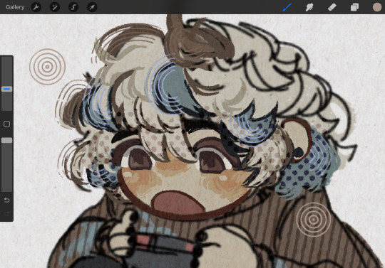
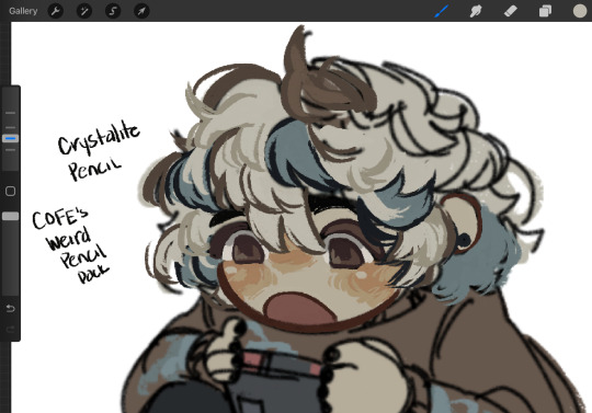
hello!! here's a little brush tour ft. this half rendered martin.
also, a great app for ipad artists who really want to dig into texture is art set 4. i swear by it and i've been using it for about two years. none of my more recent art uses it, but that's just because i'm experimenting with my process rn
so here's a list of my most used brushes lately, and there will be links to all of them at the bottom of this post.
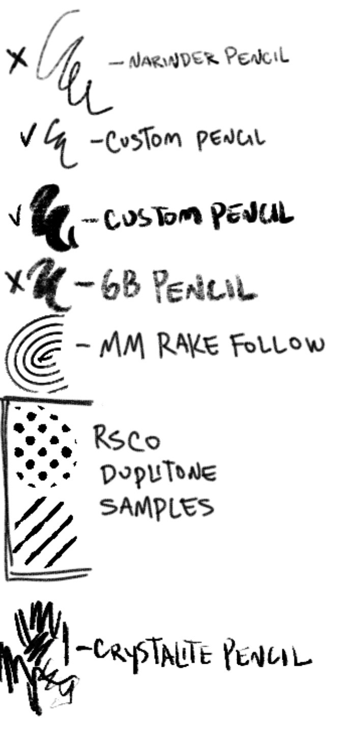
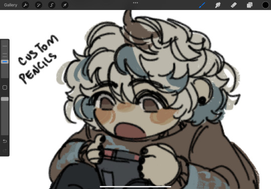
the two labeled "custom pencil" are both my own personal modified pencils (both sourced from the 6b pencil) but the narinder pencil and the vanilla 6b pencil are both very similar to them. i use these two for sketching and flat color specifically, and if you do specifically want these two brushes then i'd be happy to upload them somewhere for you to download, but they're not really necessary for texture
i also use G&B halftone brushes sometimes! but i greatly prefer the RSCO sample pack, and i cannot find the link to the G&B brushes no matter how hard i google, and pretty much any halftone brush set will do the same job
and here's what they look like in practice!
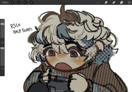
(i like to set these halftones to color burn. color burn is my most used blending mode, even for shading)
and then i hit "copy all," paste, and duplicate it. so you should have two layers of just your entire canvas. then import a paper texture
i'm partial to the set i'll link down below, my favorite is #5. you should absolutely check out the rest of the free texture packs on their website if you're wanting to diversify your texture process btw, all of their stuff is fantastic.
to use that texture, your layers should look like this!
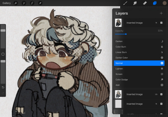
on the layer set to the linear burn, i also like to go into the adjustments menu and bump up the brightness until all of the colors are at similar values to what they were before. and the normal layer on top is just to control the intensity/opacity of the paper texture!
after all of that, sometimes i'll go in with brushes like MM rake follow, or more from COFE's weird pencils, on top of all of those layers for finishing touches.
definitely play around with it, try new free brushes all of the time (i heavily recommended subscribing to Manero. they have a lot of free stuff and it's all fantastic) and see what works for you <3
here are the links to the brushes in this post, as well as some extras! some of them are paid and some of them are completely free. + it wasn't mentioned here, but i use the tatyworks linen fabric brush for blending! for any of the paid brushes, i'll try to link some free alternatives
paid brushes:
alternatives to paid brushes:
free brushes:
extra goodies:
#procreate art#procreate brushes#art tutorial#artists on tumblr#digital art#digital artist#art recommendations#art resources
63 notes
·
View notes
Note
third one. sorry. you can ignore all of these if you don’t like them.
mike “training” fit with sex toys and machines and his hands. mean dom. he’s just trying to make sure fit is good enough for his pac, that’s all! that’s why he’s ruining him!
bonus points if fit isn’t used to sex toys and the unrelenting pleasure they bring.
- ✒️
This one got a bit away from me okay...if this does well I'll post the rest of it. I kind of went a little insane about this prompt.
Pac is Mike's soulmate.
It's a fact that every person on the island knows, like they know the sky is blue and the Feds are bastards.
Since Pac is Mike's soulmate, no one can blame him for wanting to ensure Pac's life is as good as possible.
It's put Mike in some interesting situations, good and bad. He'd say this is one of the better situations he's been put in. Fit is tied to a chair in Chume Labs, naked and half hard against his thigh. Mike must admit he's a lovely sight, with all muscle, scars, and power: exactly Pac's type and Mike's favorite kind of person to break.
He can't let himself get distracted.
He's got Fit here for a reason, after all, to test him. If Fit and Pac are going to be together, Mike needs to make sure Fit is good enough and can handle everything Pac can throw at him. Mike grins, putting his inhumanly sharp teeth on display, and pushes his glasses up.
"Are you ready?" He questions, dragging the eraser of his pencil up Fit's cock and watching the way it twitches at the sensation. Mike notes Fit's reactivity on the clipboard in his lap and then looks back up at Fit.
"As I'll ever be," he sounds breathless already, and it's kind of doing something for Mike. Fit's inexperienced with most things intimate, and Mike is so excited to push him to his limits. Mike nods and reaches for the tray he had set out, grabbing a blue and green fleshlight with the tazercraft symbol molded on it, and a bottle of lube.
"The first test is to see how long you can last; I'll dock two minutes from your overall time to account for the fact that this isn't the real thing," Mike explains and waits for Fit to nod his head before he pours the lube straight on Fit's cock, reveling in this choked down gasp and the way his hips try to twitch away. Mike wraps his hand around Fit and strokes him a few times lazily before he presses the fleshlight down over his dick and clicks the button on a timer off to the side.
Fit gasps like it's a real cunt he's fucking, and Mike laughs, cooing condescendingly at Fit and starting to move the toy over his dick, mean and fast, to begin with. Mike catalogs all of Fit's reactions, watching his muscles flex and pull at the restraints holding them like he can't help but want to grab and touch. Fit squeezes his eyes closed, and Mike tisks at him softly.
"Oi, open your eyes, cachorro. Pac likes being looked at," Mike scolds, moving his hand faster in punishment. Fit cusses, and his eyes fly open to look directly at Mike, wide with his pupils so dilated that there's barely any color left. Mike laughs and slows down his movements, pushing the image over to Pac through their link. He feels the hot wave of arousal that spreads through Pac's body and gets some very choice words spat at him before he closes off the connection and cackles out loud.
Fit is a fucking mess, and Mike is loving it; he alternates speed and marks down little notes here and there. He constantly teases Fit, making fun of how he whines and squirms. Mike knows he can be mean, which makes this all so fun for him. Plus, Fit doesn't mind one bit. Every mean word Mike spits makes Fit twitch in his hand.
Mike files that away mentally for later.
Twenty minutes later, Fit gasps sharply, and his hips fuck up into the toy in Mike's hand as much as they can. Mike holds it, and once Fit finishes, Mike clicks stop on the stopwatch. He pulls the toy away and laughs at the pathetic, oversensitive noise Fit makes. Mike sets the toy aside and writes the time down.
"Above average, you're ranking in around Philza and Bad. The longest was Etoiles; he's got crazy stamina, but you're not too bad." Mike downplays Fit's time and watches the way his brown furrows. In reality, he did very well. It's much better than average, ranking up with hybrids and actual demons as a human. Mike sets the toy aside and smiles at Fit; when they lock eyes, fear flashes in Fit's eyes, and Mike feels a spike of arousal.
"Have you ever been fucked, Fit?"
#qsmpnsfw#f1tmc#m1ke#mike is so mean#fit is so into it#fit is a high stamina king#oh also mike has done this to like#everyone on the island#he has a spreadsheet <3#little freak#he's so creature to me
64 notes
·
View notes
Text
Tutorial for @mimssides
How I draw with alcohol markers. Beginner edition
First off all I want to specify: this is based on my experience only, so take it with caution. This is also my first tutorial ever.
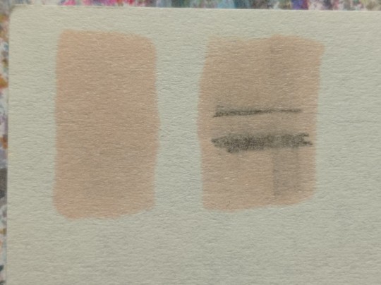
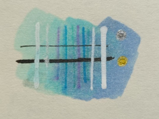
1) Have an underpaper.
Unless you use some really thick paper, markers will bleed on your next page or table ( depending if you're drawing in a sketchbook or not). I recommend to have one list of some decent paper under the page you're drawing on. Decent means thicker than office paper, can be watercolor paper, it usually perfect for it. It's reusable and over the years mine two look like this:
( you can see there's a lot of stuff going on there)
2) Always, and I mean ALWAYS erase your sketch.
If you're doing a quick try out of color combinations you can skip this step, because you don't need the aesthetic or anything. I'm not sure how useful this tip is for colored pencils ( cuz I never sketch with those), but with regular graphite pencil it's very much important. Graphite smudges your markers, and not only that. It also gets trapped if you go over it with a marker, meaning you wouldn't be able to erase it and it's going to leave you with gray smudges all over. Truly awful.
3) Have your pallets on the same paper you draw on. Or simply - have pallets!
Colors can show differently on different paper, that's why it's important to do color swatches once you buy your markers. They are designed for specific paper, and on your paper they can look a lot darker or really pale. I recommend testing colors before you buy them, it's usually an option in the most craft stores. If you're buying a set just take 30 minutes to do all the swatches and naming them. It also helps visually to see what colors you have.
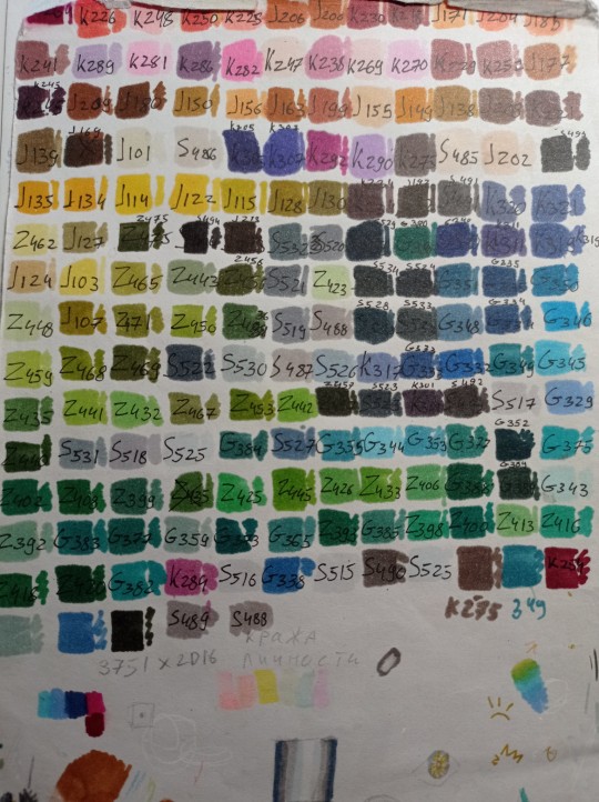
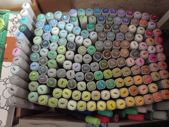
(I have a lot, but you don't need as much, there's like 60 colors I use usually and the rest are on rare occasions. Build a set you're comfortable with)
4) Make sure your materials all work together.
We already talked about graphite swatches, not the worst thing that can happen to you. Mainly you need to make sure how your materials work together, how they lay on top of each other. Make sure your lineart won't react to your markers, there's special waterproof liners and those are the best for markers ( mine are Pigma Micron from Sakura). See how your pens and liners act before and after you apply markers.
Decide which is better to use before and which after markers
5) No black.
I don't use black in any of my drawings. All you see is different shades of gray. It looks much more pleasant with the rest of the colors and it allows for my lineart to be visible underneath. Sometimes even those grays are too dark and I need to add more shades or white lineart to fix it

6) How to shade.
This is a very subjective thing to talk about. You can shade how you want. I will talk about two ways I shade.
1. Same marker. Markers dry. And when they do you can go over them another time. Usually that makes a darker shade of the same color and it's a pretty safe way to do the shading if you don't know which colors can go together. It doesn't work as well on the light colors and difference can be barely noticeable. It's a nice way to get soft shading
2. The pure chaos. Just kidding... Different color marker. It's hard to explain, and yo always need to test what works for you. If you want sharper shade you need to grab a different color, can be from the same hue ( for yellow - orange, for red - burgundy) or something a little more spicy. You can add different hues to your colors with different shades ( your black with red shades is suddenly looks burgundy, or purple, or blue). Experiment! Fail! Find out which combinations work and which don't!
If color seems a little darker than you expect you can go over it with original color, which might lighten it up. This tip doesn't always work

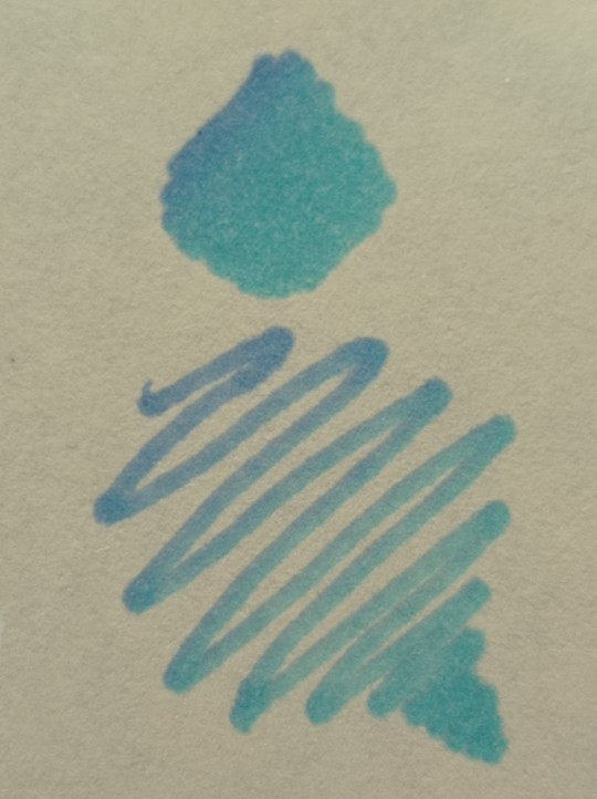
7) How to do gradients.
1. Choose your colors beforehand, see how well they work together. It's easy to do a gradient from red to pink, but not so much from orange to blue. You might need to choose lighter colors, because if you want smooth transition from one color to another you will need to go over them a couple of times and that will darken them.
2. Add a middle color. Not every gradient needs a middle color, but with it you can make your gradient much smoother, it will be more noticeable the bigger aria you cover. The more middle colors you have the more harder gradients you can do

( without and with a middle color)
3. Act quickly. Markers dry relatively quickly so you need to add colors one after the other, you can't go away before you're done.
4. Blend with the lighter color. You can also start with this color as a base but that doesn't work for all color combinations. Lighter color will go in top a darker and flow into it making it lighter and transition smoother. ( example: you go from red to purple to cyan, you will need to start with red, then purple going over red to soften it, and finally the lightest cyan going over purple and maybe even a little red). You always put darkest first and go over it.
There's other methods of doing the gradients. They are very similar actually, but for second one you will need a blender. For the first one grab two markers you want to use ( more if you're feeling risky) turn one of the markers upside down and touch their tips. Now use your understanding of gravity. Color from the top marker will go into the bottom one. The longer you wait the longer the gradient will be. Usually I don't need to wait longer than 3 seconds.
And you can do the same with a blender
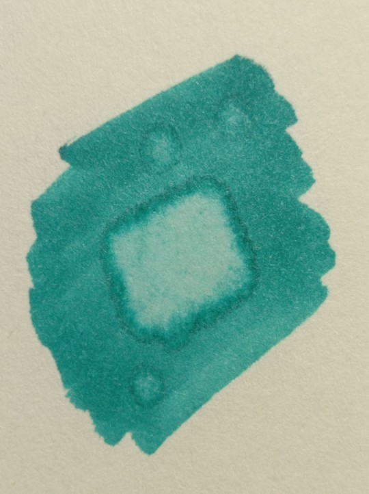
8) How to use a blender.
Blender is a marker with no color. Usually it's named B000 (I recommend buying a blender with brush tip). There are many ways to use it.
Gradients: you can use two markers technique with a blender making gradient fade on one end, or you can mix colors inside the blender.
Fixing mistakes: blender will make a white show through your color, you can use it to get rid of the wrong color. But it doesn't work without some problems. Of course darker colors will likely stay, even if much lighter, and your previous color will try to flee ( likely to other sides, if you're lucky it will go on your underpaper)
That's all I have for you today. Experiment and learn something new. Hope that helps
114 notes
·
View notes
Note
Hey yo!! I was just lookin over ur sketchbooks stuff, which is,,,,so grand and soulful I can’t put much words to it and wanted to ask do u use a specific type of pencil? Or any special thing like that?
thank you so much!! <3 ;0; my sketchbook is my safe place rn, so this means a lot.
and i do! i have a lot of specific pencils.
i have a series of tools that are in my everyday artbox, and i've narrowed down a collection that's been pretty reliable for me.
i can introduce you! :)
...ok but r u ready for a infodump because

ok
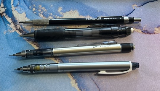
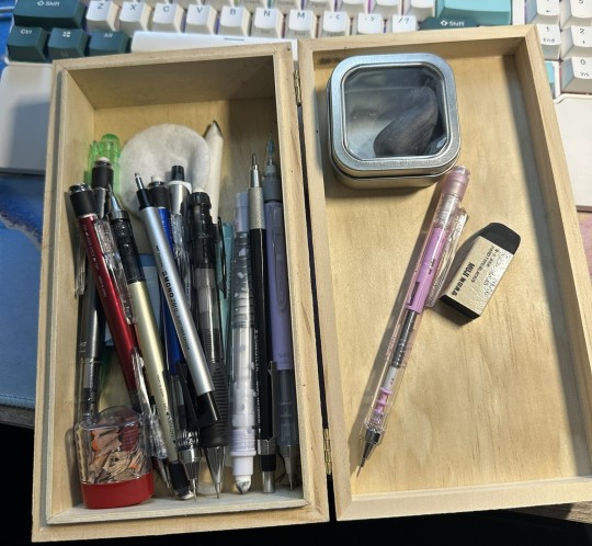
this is my everyday Graphite Mechanical Pencil Squad. I always have them in my box and i use them for just about every pencil drawing in my sketchbook.
(I added a post break because I didn’t think about it before :3 )
from top to bottom:
- Steadtler: Mars Technico 2.0 -> used for longer pencil studies and anatomy stuff, as well as experiments with comic-style hatching. has a tiny built-in sharpener! I like using this for drawing the base for portraits coz it's got a real consistent value
- Sakura: Sumo Grip 0.7 -> comfy. :) big. :)
- Tombow: Mono Graph 0.5 -> my current baseline. I've used this pencil since 2021 when i first started recovering from burnout. I really like its weight balance, as the feed end is quite heavy. This pencil was engineered for writing though, so while it has a "rotating lead mechanism", it doesn't activate while I'm drawing. Apparently it's supposed to rotate the lead as you write so it stays sharp. :0
- Uni: Kuru Toga 0.3 -> very lightweight, sometimes feels fragile but is durable as hell. I use this for really fine lines, like details in the eyes or hatching around the nose in really small portraits. I used to use this size more in college, but I use it less nowadays.
speakin of that damb MonoGraph, i have
S e v e r a l
I have six currently, which feels like a bananas number of mechanicals to carry at one time, but five of them carry different color leads that i use super regularly so i ignore this.
you probably are familiar with my multi-color sketches with blue and red and pink n stuff, and these are what i use for that. sometimes i use light blue to sketch, then clean it up with the dark blue, and then add portrait details with red. Other times i sketch with pink and then define everything with purple.
anyway
i load them all up with Uni Nano Dia color leads. Historically I've used Pentel red leads and Prismacolor Col-Erase wood pencils, but these are my favorite now. They are all erasable and erase pretty well! (The lavender does not specify that it is erasable, but i assure you, it will submit to an eraser.)
speakin of erasers. This has actually been the most difficult squad to narrow down, as erasers are all super different from one another, even within the same brand. Sometimes they smear my shit, sometimes they rip up the paper, sometimes they lift okay but still leave a ghost.
not these.
These guys are reliable. They help me move. They text me back.
- Muji: plastic eraser, hard type, black -> this was my biggest most recent surprise. Muji has very affordable minimalist materials that can look cheap on the surface level, but tbh I've never had an eraser serve me so well. When it comes to erasable marks, it lifts EVERYTHING off of my Talens sketchbook. I wish it came in a stick format for more control, but the brick will have to do for now.
- Tombow: Mono Stick, plastic eraser -> bless. Soft to the touch but doesn't need a shit ton of pressure to lift stuff out and clean up. Performs consistently and creates a super clear surface. My favorite standard-sized stick eraser, hands down.
- Tombow: Mono Knock -> badass. I've had this thing in my arsenal since 2008. I found my first pink one in Japantown San Francisco and carried it all the way to QC with me in 2020. It was finally put to rest after it broke in 2022, and was immediately replaced with the green one. It's kind of hard for an eraser, which is good because the skinny ones can tear under pressure, but it's precise, clean, and usually lifts everything out. Excellent for portraiture. It's also great for drawing on its own and I'll draw highlights or carve out shapes in big smudgy fields of grey. I highly recommend this tool.
- Tombow: Mono Zero, elastomer eraser -> weird. so smol. does cool shit tho. This is my smallest eraser ever, and it took a while to find one in stock. It is so very fine that it has its own refill method and part of it is reinforced with plastic. It's clean tho, and so goddamb precise.
- Kneaded eraser, brand ???? i dont remember, probably Mars : I love my kneaded eraser. I've always used it to press and lift when it comes to sketchbook stuff, but i recently learned that you can just kinda ROLL IT across your surface and it will lighten EVERYTHING, EVENLY. I lost my shit tbh, nobody ever told me I could use it like that and now I get legit excited to use it. Very satisfying. But also very sticky and sometimes Bad Texture, so I keep it in a little tin.
along with the whole series i described, I also carry these with me in my box. Just misc tools that also live here. Tiny sharpener, blenders, supplementary erasers and pencils.
I also have a small frame-style box that I keep my basic wood drawing pencils in, as well as the tiny eraser and the 2.0 pencil because they fit. :)
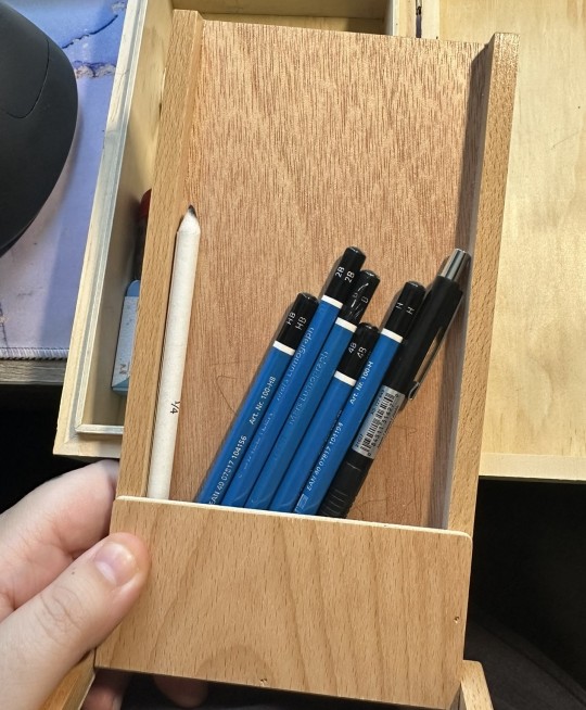
Everyone lives in here, and i like that the box can sorta serve as a work surface too, using the lid like a lil table. It's also easy AF to just toss everything in there, so cleaning up my workspace takes less than a minute now.
i use all of these whenever doin sketchbook stuff. I always keep them in my newest travel box, which has served me very well when going down the avenue to draw outside.
:)
i hope this gives u some feedback for choosing your own tools! :D I get my materials from all over the place, but when I was picking up the Mono Graphs en masse I was getting them from Stationery Pal at a pretty significant discount.
thank u for ur interest. :3 I have been wanting to assemble a post like this for a while and it felt good to just sit n think about my tools for a little bit.
anyway. :3 take care. thanks <3 Hope this answered your question! (and hope it wasnt too much lmao sdfjkgskdjhfkjshd)
21 notes
·
View notes
Note
the way you color stuff is AMAZING!!! I MEAN IT!
mind explaining how you make colors look so good?? its ok if you dont want to :)
Hi, thank you so much!!! <3
Generally, I try to go for softer, more pastel like palettes, and that helps make the drawings seem more "consistent" and pleasing to the eye.
First tip: if you use Clip Studio Paint, definitely get this tool. It saves so much time on filling out lineart, and it's crazy accurate. If you're having trouble figuring out how it works, here's how I do it: I put the lineart layer in a group, add another layer below it (still in that group), and then use the tool on that new layer. Make sure the tool is set to refer to layers in a group though. Then I erase some areas that were "enclosed" by the lineart.

As for the actual coloring process. First of all, I use the mechanical pencil brush from Clip Studio Paint, the same one I use for the lineart, except this one has random color jitter per stroke. It adds slight variety to the base colors, which helps making them look less flat.
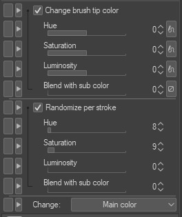
Here are the settings I use, but I recommend playing around with them if you want less subtle results.
For a comparison, here is one of my drawings with regular flat colors vs one colored with the brush I mentioned:
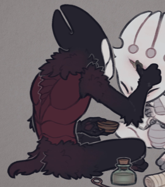

A pretty important part of the process isn't actually related to the coloring itself, but the layer effects I add to the finished drawing, as well as the paper texture (which you can see in the background; I add it twice, to the background and on top of all the layers).
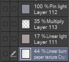
Here are the layers I usually go with, I'll explain each of them below.
I'll start from the bottom. The paper texture is almost white with some very subtle warm tones, and it's set to linear burn, which works the best for this kind of texture. Like I mentioned, I use this overlay twice, but both use the same layer mode.
Next is the brown-ish linear light mode layer. This is to give the drawing more subtle contrast while also tinting it with a sepia-like tone. You can use any color for this, but I find this light brown color to work the best for my artstyle, since it makes the drawing look softer and gives it the old photograph kind of look which I tend to go for.
The multiply layer is mostly transparent aside from the edges. This is for the vignette effect, not much aside from that. It's definitely a personal preference thing.
Lastly, there is the pin light layer. This one is a bit weird, but I really like the effect. It's hard to explain it, but I use it to tint the dark tones of the drawing with a slight blue color. You'll see what I mean in the examples below. Occasionally, I'll add another layer with a darker base color, since pin light kind of works in reverse: if you use a light color, it will target the dark shades on your drawing, but if you use a dark color, it will instead only go for the light shades. Note that it's pretty strong in this drawing in particular, I usually make it a bit more subtle. If you look at my recent drawings you'll see it.
Here is the same drawing, with each of the layers applied in the order I listed (left to right order):


I'd also like to mention the lineart, which actually plays a big role in making my drawings look softer. I color the lines on the "inside" with a darker shade of the base color, though I often make it more saturated to really bring them out.
For example, here are the colors I use for FPK's lines. Not including his eye colors or the tips of his fingers/feet, since I don't color the lineart there. And a comparison of what he looks like with and without those lines colors, just to show how big of a difference it makes.

And to go back to the previous drawing, here is a similar comparison.
One thing to note is the additional white lines on the darker areas of Grimm's arms, the lines blend with the base color so I like to make them slightly lighter to help them pop out.
And lastly, I'll mention the light outlines you probably noticed by now. I add them as the final touch, they're the same color as the background though I sometimes lower the opacity if I feel like they're too much. They're meant to help with colors that blend together too much, and to highlight the silhouettes of the characters, as well as adding more dimension to the drawing. I think you'll see what I mean when I hide them in this final comparison:

Hope this is helpful! Sorry if you didn't expect that long of a post, I wanted to go through each step in my process so that I can explain it the best I can haha
40 notes
·
View notes
Text
My Paint Tool Sai Brushes/Painting Process Tutorial!
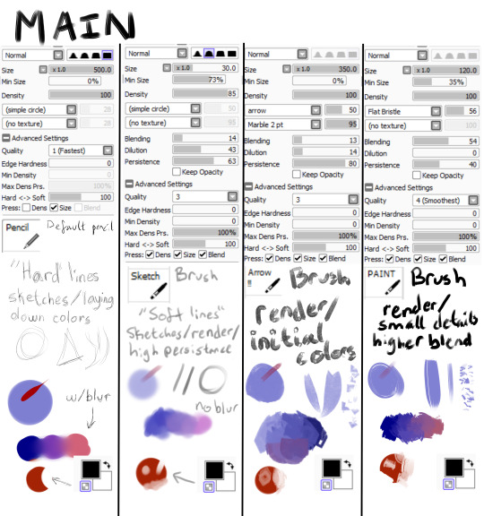
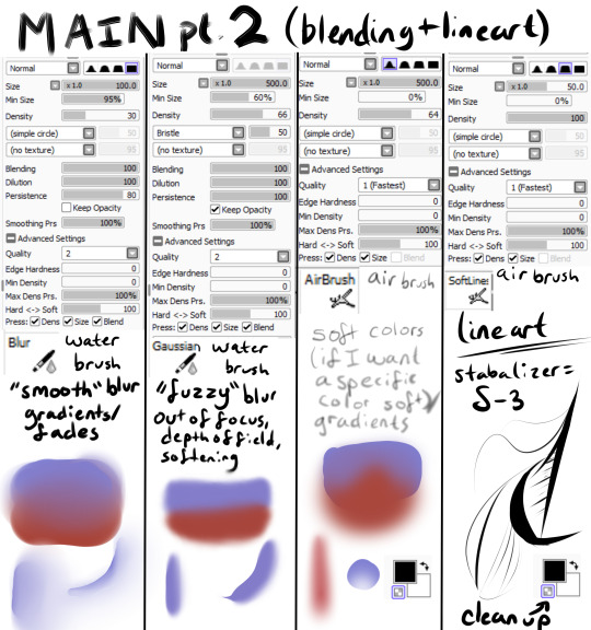
Explanations and Examples down below
Disclaimer: long post
Hello! I wanted to first thank everyone for liking/reblogging my most recent art piece (the Darkiplier one) It has become my first post with over 1000 notes which is just insane for me. I just wanted to do something to thank you guys for that.
Anyway, this post will be divided like this, so scroll to the title if you want specific things
Introduction
Brush textures/shapes for download
Overall process
-> Terms and Definitions
How I use each brush (+ examples)
-> Sketch
-> Lineart (only do this sometimes)
-> Rendering
-> Textures + Post Processing
Conclusion
Introduction
This post is mainly for me in the future to look back on how my painting process was. My process changes ALL the time, sometimes I use lineart, sometimes I paint, sometimes I don't use textures, sometimes I have 100 layers, sometimes I have 1. It just changes depending on the piece. There is no "correct" way to do art. Do what you want!
Second of all, I feel I should point out you don't need fancy brushes or many brushes to make good art. I painted this piece with 1 brush.
That's right, 1 brush (it was the P A I N T brush shown in main). I didn't have a sketch, I didn't have any lines, I started with big shapes and went from there.
Third of all, I use Paint Tool SAI (the first one). So this will be specific to that program. I'm sorry, it's just what I know how to use.
Brush Textures/Shapes
You may see in my brushes that there are textures/shapes that don't come with the standard SAI program. I tried to find the links for you to download them yourself.
Arrow: https://www.deviantart.com/digikat04/art/Custom-SAI-Brush-I-265506547
All texture brushes: https://painttoolsaibrushes.splstc.com/painttool-sai-textures/
For some reason I can't find where I got marble pt. 2 or chalk so here's the png files. (You can convert them to .bmp files) (Hopefully that works!)
Chalk : Marble pt. 2

Overall Process
Before I go over my process I'm going to define some terms I'll be using and what I mean by them:
Flats - base colors
Rendering - Includes shading, lighting, small details, and texturing to define a form
Blending - mixing two separate colors together
Reduction - Once you've made a line/shape, reduction is the act of erasing part of it
-> At the bottom of my brushes (in the images up above) you can see a checkered box which makes your brush transparent. I use the erasing brush to Reduce the red circle.
Persistence - How well the brush can create a new shape/color on top of pre-existing colors (If the brush blends a lot on top of other colors it has low persistence)
"Hard" vs "Soft" brushes - How well defined an edge is on a brush
Stabilizer - Turns trembly lines into smooth lines
So, I draw a different way each time. My canvas size is normally between 2500 pixels and 4000. I usually do around 3000 though. In general for my paintings I usually do
A sketch
Flats
Hue Shifts
Lighting/Shadows
Brighter Light/Deeper Shadows (Highlights/Ambient Occlusion)
Smaller Details
Texturing
Post Processing
For my bigger compositions, I make thumbnails. And for my "comic book" style I use lineart and layer modes (like multiply, luminosity)
How I Use Each Brush (+ Examples!)
Sketch
I have 2 sketch brushes. "pencil" and "sketch" For most of my life I have been using the default pencil brush on size 1. But recently I have been using this softer "sketch" brush on size ~20 or so. Either way works, but I find that the "pencil" brush is easier for linework and the "sketch" brush is easier to blend into paintings
"Pencil" : "Sketch" examples
Lineart (opt.)
Nowadays I don't use lineart that often, but if I do it's with my "Softlines" brush. It's great for both very thick and very thin lines. I lower the opacity of my sketch and put lineart on a new layer on top of it
"Softlines" brush examples

Flats
With lineart I seperate each new color with a new layer. For painting I'm now using one color as an underpainting color and working on top of that layer. So I render one thing at a time while working on the same layer.
I lower the opacity of the sketch and create a new layer under my sketch. I use my "pencil" brush to lay out the underpainting color and "blur" for hue shifts. And then I reduce it to the silhouette using my "sketch" brush (This gives a softer outline)

Rendering
This would take way too long to explain every step of how I do it. So I'll explain how I use my brushes in this step.
"Arrow!!!" - I use this brush for laying out intial shapes, big areas of color, shading, lighting. The arrow shape has a point on the end that's really great for triangular shapes. It's not very good at small details because of the texture applied to it.
"Sketch" - I use this brush during the rendering as well. It's great for small details that you want a softer look of. It has a high persistence so it's great for working on the same layer.
"P A I N T" - This is a brush that's good at very many things. It has higher blending than "sketch" or "Arrow!!!" and it's shape is square. Great for blending, general painting, small details, reduction, etc.
"blur" - great for gradients or to smooth something out a lot
"Gaussian" - is a gaussian blur. Great for making things out of focus or fuzzy
"square TEX" - texture brush that has high persistence with some blending
"metal TEX" - texture brush with high blending and a spread shape.
"speckle TEX" - texture brush for kind of a sparkly look. High persistence
"water TEX" - texture brush that works kind of like a glaze. You can use for flair/fun
example

Post-Processing
Typically I use more filters for this. Paint Tool Sai has sliders to change hue, saturation, brightness, contrast, luminosity, and color deepen. So I tend to mess with those. I also add effects like chromatic aberration
The tutorial I follow for chromatic aberration in Paint Tool Sai: https://www.youtube.com/watch?v=thmaephD9Ec&t=169s
I also add particles like dust and other objects.
Finally I use my Gaussian blur to make things out of focus/motion blur
Conclusion
I hope this helps! I feel like I'm at a point in my art journey where I'm good enough to give advice. So hopefully this helps someone out there with their art journey! Obviously I have a long way to go, but I'm pretty proud of where I've come. I remember watching speedpaints and tutorials trying to become better at art. So I kind of want to add to that cycle for artists. :D Have a great day!
23 notes
·
View notes
Text
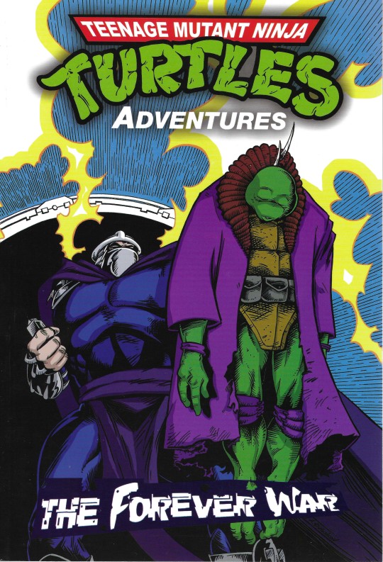

TMNT ADVENTURES: THE FOREVER WAR (kind of FAN MADE)
April 2024
By Steve Murphy, Chris Allan, Andrew Modeen, Artem Tsarkov, Arseniy Dubakov, Egor Prutov , Jon D'Agostino, Dmitry Bobrovnik, Yuri Kochin, and Jim Lawson.

The Shredder finally succeeds at erasing the Turtles from history and conquering the world. But the Turtles and Splinter will try to defeat him and ensure their existence in this conclusion of the iconic Archie series.
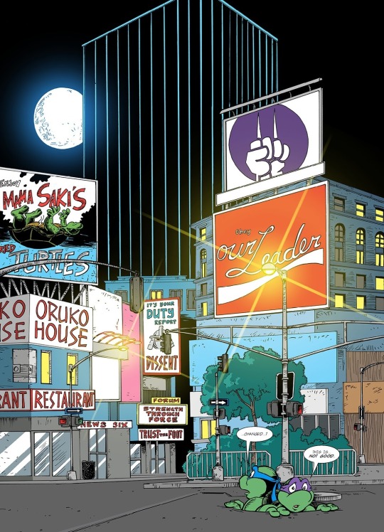
SCORE: 8
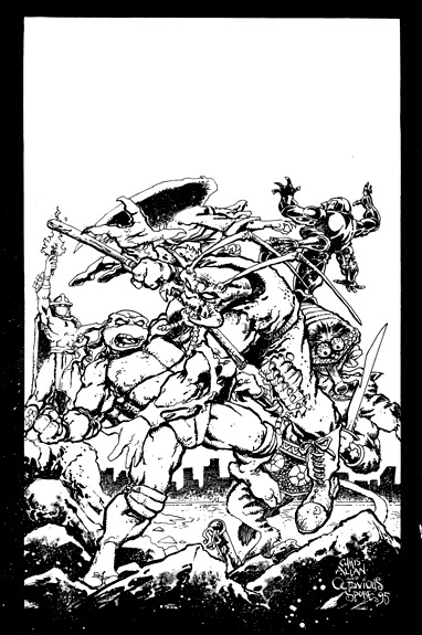
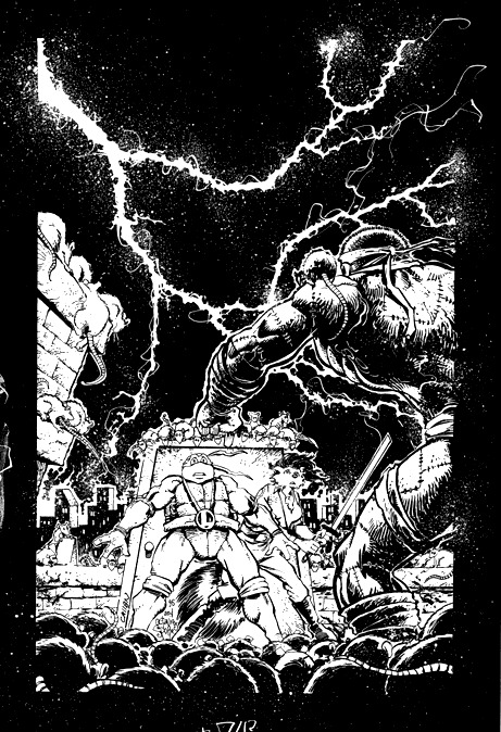
You'll have to forgive the lack of images, but it is very hard to scan this book (I'll see what I can do for the video review, but I may need to work with photos of it). In any case, this is another of those fan projects by Arseniy Dubakov and Andrew Modeen... but with some interesting twists in its genesis.
You probably remember that this saga was announced in 1995 before the Archie adventures were canceled, and fans have been speculating forever about how the story ended.
In 2009 we almost got the conclusion by the original team (Steve Murphy and Chris Allan), but the turtles were sold to Viacom and the plans never materialized. In any case, Murphy couldn't remember where he was going with the story, so it would be fair to say that it was never going to be the same arc.
More recently, Chris Allan met Arseniy and the two got together to make this project happen. The first chapter (which was made public at some point in the past few years), was mostly recovered from 1995, but it had been colored and edited by the new team.
As far as I know, the second chapter was plotted by Steve Murphy, and I can say that the two first chapters feel the most like the original book... with some annoying differences.
After that, the book does its job, and the story works very well. The project was promoted as "closing all open plots" of the original series, but fortunately, it only tried to solve a time paradox that has always been a problem in that book. I applaud the restrain of the writers from bringing up every single plot point just to let readers know they read the book (as is usually the case with these projects).
The art is probably the most spectacular aspect of the book. It's an updated look for the Archie adventures that for the most part, looks like a continuation of the story. There are some stylistic differences when it comes to inking after chapter one, but you get used to them after a while.
The book comes with two back-up stories. One penciled by Jim Lawson that tries to make sense of the convoluted Archie timeline (specifically about which Shredder you were looking at in each adventure). The second backup is some sort of epilogue to Forever War that will leave you with more questions than answers.
For me, the weakest point of the book is the "overwriting" from Andrew.
It's hard to explain, but Andrew goes into these long narrations directed at the reader that just feel overproduced and underproduced at the same time. There is an overuse of "Modeen" expressions that can be said by any character at any time. Perhaps because he is not doing the writing/plotting alone, this is his best story yet. We know Andrew is a fan, an we know he can write. But it would be nice if he could work on his dialogues and... I'm going to call it now... think twice before adding an unnecessary celebrity quote at the beginning of each chapter.
I am not sure if this was in the original plot, but some elements in this story were even darker than the original series (like slashing a classic character in two). I get that we all grew up and we can take it, but this should be a continuation of that book, and I feel that it wasn't this bloody (most of the time).
But again, this story worked for me, it didn't bring up characters and plots just for the sake of it, and the turtles were front and center.
Should we consider this an ending for the Archie series? Well, just like it happened with Volume 3 before Urban Legends came out, this is all we can get. It's technically just the story, and not a proper ending, so you could still consider "Year of the Turtle" the final story (I assume that it not being referenced was intentional). There is one reference to "TMNT: Odyssey" (because for some reason, all these projects need to share the same multiverse), but it can be easily ignored... I think.
Maybe one day IDW will decide to do their own version of Forever War, but I don't think Chris Allan would go through this ordeal again... I think it could be published as is (fourth-wall monologuing included). Perhaps censoring some of the blood, to keep it consistent with Archie guidelines.
Now, let's take a look at those spoilers after the break...
You guessed it, most of the chapters take place in an alternate timeline. This allows for familiar characters to return even if they were already dead. And also introduces Carter to the Archie universe... and he may be British... I don't know.
Most characters show up to die... which isn't unusual on alternate timeline stories, but feels like a waste. Carter and Claire had very little time to do anything, and Claire being April's sister is an interesting twist... but I wonder what caused it? It is implied that they may have been separated at some point, but the existence of the same photograph without her suggests there wee further alterations to that timeline.
The Mutanimals play the bad guys... probably for the better. I wonder if the reason they didn't undo their deaths, or brought back Cherubae, was so that it could all tie into "TMNT: Odyssey"? Whatever the reason was, I appreciate it.
Perhaps the biggest reveal was that Chet was the Rat King. While this is a fun twist, some things are a bit too convenient. Why did he choose the H'antaan name? And why didn't he ever mentioned this to anyone in the original timeline? (Apart from the flashback in this book).
Overall, Shredder's plan makes sense (for once), although he somehow recreated all the mutants from the original series, even the ones that weren't mutants (like Katmandu)... perhaps he and Al'Falqa simply joined the cause.
There isn't much characterization for the turtles, but I think is in line with the original book as well. And to be fair, the main focus is the story.
The Jim Lawson back-up also introduces another problem, a Shredder that finally remember everything (this may be the one in "Year of the Turtle"). Mr. Null decides to share all of this, searching for the Turnstone (a "TMNT: Odyssey" plot). I don't like these fan-projects being all connected, but I appreciate the long explanation of the Shredder paradox in the Archie adventures. It also officialized that Armaggon created the Archie universe.
I would have appreciated a Mr. Null origin story... but I guess that would have clashed with "Odyssey" (and this is why I don't like them being connected).
I may sound negative, but my nitpicks only took two points from the overall score. I am happy with the results, and I think we can now stop wondering what it could have been.
Although... can you imagine what it could have been in 1995?
That my friends... is the forever war.
[Include some super serious celebrity quote here]
#comics#review#tmnt#teenage mutant ninja turtles#post modern age#archie comics#2024#1995#teenage mutant ninja turtles adventures#the forever war#fan fiction#chris allan
12 notes
·
View notes
Text
Ian Duncan x Reader
S3lf harm comfort, father issues comfort
No use of Y/N | GN reader
Requested
Part 1 | Part 2
"First, I just want to say, you're very brave for coming here."
The small collection of clocks ticked out of sync, but they all showed the same time. Five-thirty-three.
Your professor, who had just patted your back essentially for walking from your last class to his office, was sat with his legs crossed in a brown and gray ensemble. The color hues hardly matched.
He was holding a college ruled journal and a sharp pencil. The journal was new it seemed, but the inside papers were coffee stained and wrinkled. The pencil however, was ready to do what it was made to do: write. Even with the bite marks across it and its missing eraser (it wouldn't be able to help fix its own mistakes. The pencil would need something else's help for that, or cross them out and keep writing as if they never happened.)
"I'm sorry we had to meet so late. I've been busy. Not that your health isn't a priority," He finished speaking by cautiously saying your name, as if guessing who you were.
"It's okay," You mumbled, rubbing your legs subtly, nervously.
He wrote that down.
Oh boy.
You took your mind off of it by looking around at the exotic decor he chose for his already cluttered office. There were masks and drums and other instruments you wished you had the capability of identifying the origin of.
He spoke again. "I'm proud of you for coming here. To visit a psychiatrist means you acknowledge you need help. Acknowledgement is the first step to recovery, they say."
You nodded your head. That's part of twelve-step, no doubt. Great. Your little habit knocked you down to the level of an alcoholic. No offense to the man sitting in front of you.
Trying to ignore the realization that your own addiction may be as crippling as his, you focused on the other part of his statement. He was proud of you.
This may be something he says to all his clients, or students, or whoever visits him, but the important part was that he said it to you, too. And seemingly meant it.
"It's been two months since your last relapse? Since we spoke?"
"About, yeah."
He nodded, writing that down.
"And how've you been doing since then?"
You did the best you could while explaining. You gave him some backstory on your childhood, specifically your father, and how his behavior affected you today. He listen to every word and to make sure he didn't miss anything, would occasionally cease your talking to write for a minute, which he did almost nervously, understanding that it's hard to stop and start again when it comes to these topics.
But he cared enough to try to get every detail in the best way he knew possible.
When you were finished, he calmly stared at you before nodding again and reviewing his notes.
When he spoke, he kept his eyes on the paper."
The actions of your father seem to affect you still today, as you've said yourself, but I want to reassure you that your intrusive thoughts are just that. He is not you, and you are not him. You can be better, and, in my personal opinion, you already are." He smiled. A small one, but his dimples still showed prominently.
#john oliver#ian duncan#community nbc#professor ian duncan#ian duncan x reader#ian <333#i may be cringe but i am free#Tw self harm mentions
8 notes
·
View notes
Text
Stitches
Luisa's birthday was coming soon. Mirabel needed something special for her.
Maybe Luisa didn't need a skirt decorated by her, but Mirabel wanted to make it anyway
Mirabel squeezed the dark blue fabric in her hand. Luisa's birthday was coming in a few months, and the idea of embroidering the skirt for her got to Mirabel pretty suddenly. She started to get interested in embroidery a couple of years ago and has made some significant progress since then. It was a good way to express herself, some way to outstand. Even if it meant nothing, compared to the wonderful gifts... It was a way to express herself, and it worked for Mirabel.
Part of her was worried, Luisa had her gift, unlike Mirabel; she didn't need any outstanding handmade patterns; after all, she had a lot of clothes that showed her strength already and were made by professionals. Mirabel was just a little girl; there was no way she could make something even close to that. Would Luisa even care about this skirt? Or at least keep it? Surely Mirabel couldn't move the mountains and make something incredible, but the determination in her veins pushed her forward.
Making design wasn't that hard, after all, Luisa preferred simple clothes that could survive a long working day. There was no way Luisa needed her entire skirt painted like Mirabel; the embroidery would probably end up unraveled. Mirabel often had to hem her own fancywork, even without all the manual labor Luisa did. So there was no way Mirabel's work would be steady enough to windstand such a busy schedule. The best way she could imagine was to decorate the skirt hem, a part that won't actually be touched by anything. Of course, it had bigger chance to get dirty. But again, Mirabel didn't actually expect Luisa to wear it even once. There were a lot more people who were professionals, unlike Mirabel.
Dumbbells were an obvious choice. Madrigals' clothes had to display their gifts, and Mirabel once sewn a dumbell on her own skirt to show Luisa like she did with other family members. But she didn't feel that it was enough. Luisa had a lot of skirts with those. Even if there was no way the older girl would ever touch, let alone wear it, Mirabel still wanted to give it her all and make something unusual.
She spent hours in the library, trying to find anything that would go well with her idea, until a photo showing off some traditional patterns appeared in front of her eyes. A line of geometric shapes
"It may work." She muttered to herself, studying the colorful images and how it was supposed to look. Another week was spent making the perfect pattern, for that matter.
"Maybe like this...?" Mirabel whispered, looking at the paper in which she had drawn yet another design. "Ugh... No, it doesn't match well..." She grabbed the eraser, rubbing away the weak pencil mark. "Fix there a bit... Now move it a little right..." Her palms got grubby from sweat. "Yes, that's better... Just a little bit smaller..." She finally looked at the best idea she could get. Mirabel clapped her hands in excitement.
With that, Mirabel was ready to start her work. The first step was to dye the fabric, making the allocated part a lighter shade of blue, which was also the hardest part. Mirabel might have some silly experience in embroidery, but she never painted actual clothes before. But again, her family deserved the best. So any attempt is worth it. It took several attempts and almost five days to finally understand what exactly she had to do. At least now the color looked clear, not brighter or darker in any place, and smooth without sliding to the side.
Mirabel examined her work very thoroughly, making sure there weren't the slightest deviations. She would look like such an awful sister if she gave her sister some lazy, sloppy garbage. Of course, it wasn't Isabela, so she would probably still react politely, at least in front of Mirabel. But it didn't give her the right to make something bad as a gift.
Now it was time to actually get to the embroidery. Luckily, it wasn't such a problem, even if Mirabel wasn't used to make small patterns at all. Dumbbells were easy to make; the geometric shapes hovewer.... They were so small. And bad sight definitely didn't help. Even with her glasses, Mirabel just wasn't used to focus on such tiny details. She wasn't going to stop; this skirt had to be done.
She finished by sewing ribbons in, visually separating the needlework. And with it, almost a month of work was done. Part of Mirabel wanted to rip it apart, feeling like this thing looked awful, and alter her needlework for like the thirtieth time. She stopped herself because there wasn't really enough time to do that.
Yet, Mirabel hoped that Luisa would at least count this present as something normal. Not good; Mira couldn't even wish for it—just something not too bad, deserving to at least lie in the closet.
***
Luisa's eyes widened as Mirabel handed her a skirt unsurely. The younger girl looked down, avoiding her sister's gaze. She was worried; it was the first time she made an embroidery for anyone except herself.
"You made it... yourself?" A hint of disbelief appeared in Luisa's voice. Tears of happiness appeared in her eyes as Mirabel nodded.
A second later, Mirabel found herself being grabbed from the ground and squeezed into a suffocating hug. Maybe Luisa didn't think about this gift that badly after all. She chuckled, feeling her body being held in the air like a stuffed toy.
"I love it!" Luisa mumbled, sounding like an excited puppy, despite the fact that she didn't even have a chance to see it properly. Mirabel could never explain how happy this response made her. "Thank you so much!"
"Really?" A relieved smile spread across Mira's face. Maybe making this wasn't such a stupid idea after all. And a little, naive part of Mirabel just hoped that Luisa might wear it at least once.
10 notes
·
View notes
Note
Colored Pencils, Eraser, and Palette for Nikoletta!
Thank you!!
OC/Writing Art Asks (that I created lol)
Colored Pencil: if given the choice, would this character splurge on an expensive (but potentially worthwhile) branded product, or buy a low-budget alternative even if the quality suffers?
Low-budget by far. She's been under the poverty line almost her entire life, and is more used to having to skip meals because she can't afford them than even thinking about name-brand products. Even once she has a little more money to spare, it's still hard for her to give any thought to quality instead of just necessity.
Eraser: what's one way this character has changed over time? Either over the course of their story, or over the course of designing them as an author.
Oooooh now she's an interesting one for this question. Big ramble incoming...
When I first designed her back in 2021, Nikoletta was a very different character. She still met Abner back in Belle Reve, she still operated at the Queen of Belle Reve and had partially contact-based powers, and she still got her powers from STAR Labs at about the same time Abner did.
However, her powers were completely different, and they were much more lethal. Originally, she was given this sort of nightmare-illusion power, where anybody who looked her directly in the eyes or touched her skin-to-skin would experience a waking nightmare that inevitably ended in a brain bleed/aneurysm.
However, some people were mysteriously immune to her powers, with no apparent pattern to them. This would be a big mystery for a while, until it was finally revealed that her powers caused people to imagine unspeakable mental trauma until their brains overloaded, and the people who were immune were the ones who had already experienced extreme trauma in their lives and had learned to process it without being overwhelmed- like war vets, or some of the metahumans in Belle Reve with particularly tragic backstories.
Her appearance also changed quite a bit. Part of her abilities included a sort of demonic appearance to most people, and the ones who were immune to her powers were also immune to that illusion, and could see her for how she looked before she was sent to STAR Labs.
The one other detail I had that changed is that while in the final version of her story, Nikoletta escapes STAR Labs years before Abner burns it down and only realizes much later that their time there overlapped, the original version of the story had them interact much more while in STAR Labs and escape at the same time. The idea was that they were friends while they were there, would talk through the vents and try to comfort each other through the experimentation, but they never learned each others' names or met face-to-face.
Then it would be a reveal in Corto Maltese, they're in the jungle talking about STAR Labs, and Nikoletta pulls up her sleeve to reveal a burn scar on her arm in a perfect circle (where she was singed by one of the polka dots when Abner burned down the lab), which leads to them realizing they'd actually met years before and didn't know it.
In the end, I changed up her powers to "ground" her a little more. I wanted her powers to be more dangerous on reputation than on actual ability (i.e. how her shadows themselves don't actually hurt people at all, she just builds so much reputation around them while in Belle Reve that they seem dangerous), and I thought having her interact with Abner in STAR Labs just... didn't line up as well as I wanted it to, the more I thought about it. I think the original version of her character was cool, and still fit with the other metahumans in the DC universe, but her final version feels much more dynamic and human to me.
Palette: list four of your character's primary skills, then share at least two ways these skills might blend or overlap
She's great at keeping her emotions in check when assessing a problem, manipulating social situations, breaking down a problem into manageable facets, and generating mystique around herself.
All of these skills were built from her becoming the Queen of Belle Reve and generating her reputation there. Manipulating social situations and generating mystique was how she was able to take that mantle to begin with and turn her relatively harmless powers into something that could keep the whole prison in line. Keeping her emotions in check and breaking down problems are what helped her maintain that persona in the long-term, since it allowed her to keep that position of power and quell dissent in a way that kept most of the other prisoners in her favor.
5 notes
·
View notes
Note
Heyyy Wisy, love your artstyle sm 💖
So, about the post where you ask subscribers to send you their pieces of art and you'll comment on it. I would like to try it with my Atem sketch, it can be either compliment or constructive criticism, it's for you to decide ~
Thank you for this btw ❤️

Heya!! Thank you so much for sharing your piece. And another pencil artist here, makes me so happy!
Let's see...
First of all, I love the eyes, very beautiful eyelashes. We're at the same club of pretty eyes.
Also big kudos for painting skin, it's so hard to make it look colored instead of simply dirty. You're so brave!
I'd love to know too what type of pencils you use so we can compare tools haha.
Okay here is my take on the hair. It looks kinda messy, not for the shape but for the strokes. But I have my doubts tho, I don't know if those lines are part of the sketch or made on purpose. I can see that you keep many of the lines of the original sketch, which is fantastic, nothing more beautiful than the sketch still alive under the drawing.
But I still think, at least for the hair that too many lines doesn't help to the movement of the long bangs. Maybe less can help to create a more sense of movement.
I'd love to have an example for that cos in my own experience I tend to erase many of the lines of the sketch for cleaning purposes, I noticed myself that they were more annoying than helping on the cause. But I don't have one of Atem himself, but here's another I'm currently working on.

You can see how in some parts of the sketch you can't understand much what's happening but in the part of the head is more clear what's going on.
So from my persective my advice could go for maybe turning the sketch a bit cleaner. You can clean the sketch until you feel it's the right moment to start doing the lineart. Also helps having a good idea of what you want to draw, sometimes we tend to go for the "hand does its work" but in other ocassions having a clear idea helps more, at least it does to me.
Hope it helps you! And thank you for sharing ^^
7 notes
·
View notes
Text

And here we have it: the final cover. It's a new "improved" version of the previous two. Yikes.
There's a certain aesthetic to the font and color, which I think is OK. It looks a bit distinctive from other book covers, and is miles better than the unprofessional font in the last two. I'm not a huge fan of purple and yellow, but I don't want to knock this. The yellow rectangle is a bit too high, but apart from that, I'd say this aspect is fine.
But Theresa.. I mean look at that face. It looks flat, like she's made of paper. The nose is so odd with its grey lines. It seems he drew it in pencil and then never filled in the line work. Maybe he was worried about "ruining" it. Or maybe he drew a face he didn't like, and then erased/filled with paint and drew it all over again. The impression is very uneven. Remember Theresa is supposed to be super beautiful, and when you write a character like that - not saying you should - the expectations are high. And at least for me, this doesn't do it at all.
The first cover showed a happy, proud looking woman who actually had expressive eyes It felt more natural, while these later covers seem so tortured. He probably toiled for hours and hours to make her look "just right", but it just turned worse and worse. Drawing, trying again, coloring, erasing. Over and over. Sitting up late at night in your room, frantically drawing more and more, in a frenzy of having to make it better.
Her hands bother me the most. They're completely different sizes. They look like mannequin hands, and the fingers are oddly bent. Salad Fingers meets Vincent Adultman. She also seems to have very old-fashioned red nails. I guess long nails would make the fingers look even worse, but there's something so dated about her whole look.
And then there's her torso. The breasts are super far apart, but at least they're not unrealistically huge this time. The rest of her body is just completely flat. No hips. I thought she had a sexy butt, which she admires herself in one chapter. Usually that would include big hips, but maybe that's too "fat" for Norman.
The microphone is now red and less disturbing than the neon green one, but it's still very small and looks like Norman drew it with a single line. A black, sturdy microphone would look much better. I bet Norman doesn't watch any modern videos, because most streamers use proper headsets.
Somehow the soldiers turn into dogs, then spiders. The buildings get smaller, except for the one that's randomly slightly bigger. Norman needs to learn about perspective. You'd think there are art guides all over the internet for this kind of thing.
Not the worst version, but it's a hot mess. I give this 3,5/10 HALs.
I'm very curious to see if he will make a new cover some day. He seems to have trouble letting go of the book, probably because he sees it as his life's work, and it's hard to stop working on it. Maybe he feels empty and like something is missing. He should try to write another book. Many people would buy it, just to see how bad it is.
2 notes
·
View notes
Text
Working on Magical Friends: Doki’s animation “pipeline”
…Since this is still an incredibly basic 1.5-man operation, it’s not much of a pipeline. ^^; But I wanted to put together a little thing to show the public how I do what I do, and if this sounds doable or interesting to you, I’m always on the lookout for more volunteers! [email protected] is my official ‘art business’ email, just FYI~
So let’s start by taking a look at this GIF preview of a finished scene:

I chose this sequence because it’s probably the longest and most complex one I’ve done so far. The character rotates, the scene pans up, I got some spinny light effects in there, lots of weird stuff I’ve never done before. (●u●;;) But it came out alright in the end, so let’s examine it.
So before I start thinking about animating, I refer to the work of my storyboard volunteer, Greytan. They actually gave me just one simple shot:
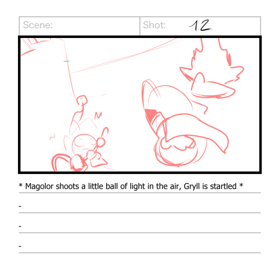
Which I extrapolated into…what I did. ^^; I don’t mean to ‘ignore’ their boards, and I hope they don’t feel slighted when I do things like this, it’s just that they are genuinely a much more skilled and more professional animator than I am, and our brains just don’t work the same way so sometimes I have to diverge a bit. :P Or, y’know, sometimes I come up with a great idea of my own that I really wanna try, which is probably what happened here.
Anyway, my first step after looking at boards is to grab a pencil and paper and draw the shot: a picture that lays out what the scene will look like, with either the starting frame or a key frame, and the background included. As you can see, I doodled some of my ideas for how the sequence would progress, which is good, because after drawing this I wouldn’t return to this shot for like 6 weeks. ^^;
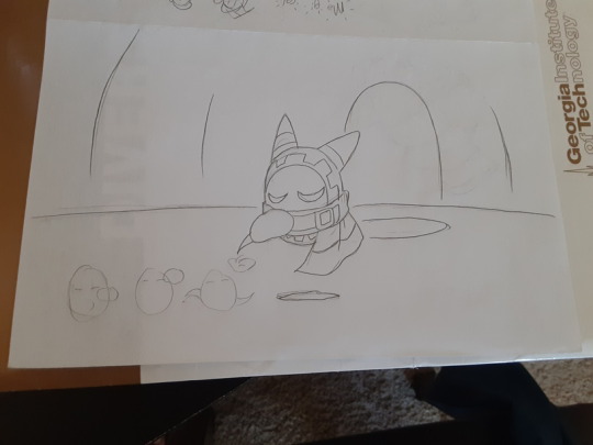
When I finally did get back to it, I grabbed a second piece of paper for Step 2, which is the actual ‘animation’: using the shot as a base to draw the rest of the frames that will go into the sequence. This is where my lightbox comes in handy, although usually I can see through the paper well enough to just draw wherever. ^^
[Fun fact: in my early days, I would just scan the original shot, erase it, and replace it with the next frame, drawing each new frame on the exact same piece of paper. I am…very glad I don’t do this anymore]
Now, animation is mostly guesswork for me. ^^ I mean, my guesses are pretty good, but they’re still guesses, which is why I call myself an amateur. It’s not me downplaying my skills, it’s just me admitting that they aren’t based on solid expertise or experience (yet).
When I animate a shot, I try to make sure each frame looks like it has movement in it all by itself. Gesture drawing, dynamic posing; those are things I’m already good at, so when I animate I make ‘em work hard for me. >:3c
The end result comes out looking kind of like a sprite sheet:
And I do use these drawings kind of like assets; Step 3 is to scan them (along with the initial shot) and use them to ‘construct’ the frames that go into the video editor. This is the step that takes the longest, where I clean up the sketches and color them and paint the backgrounds (separately, if necessary). It’s not as difficult as Steps 1 and 2, but it’s a lot more tedious.
So naturally, sometimes I like to make sure my sprites actually work before I start all that…work. ^^ So I throw together a test animation based on what I have:
And this did help-- it assured me that the first half with Mago would probably look fine, although the second half with the magic light-thing probably needed to have a cleaner sense of direction and more frantic movement as it ascended. When you’re working with a low frame-rate, you generally want things to move a LOT or hardly at all; you don’t want any of that in-between stuff. So I took that into account when preparing the “finished” product.
I put “finished” in quotes because I’ll probably adjust the timing of the frames a little when I move to the video editor (Step 4, which I’m not going to talk about here). But yeah, that’s pretty much it. ^^
Generally when I think about adding artists to the team, I’m thinking about them doing Step 1, Step 2, Steps 1 and 2, or Steps 1-3 (so basically, completing a full sequence of frames that I can just add in). For me to hand sketches to someone and expect them to do Step 3 alone would require a level of trust that I’ve never had in any fellow artist before…but idk, anything can happen in the future. ^^;
#if you like any of my strategies feel free to gank them for your own projects#knowledge is power#kirby#animation#magical friends wip
45 notes
·
View notes
Text
"I neeed to creaaaate". But first I must gather.
One of the biggest hurdles to creating things with my hands is the process of gathering supplies. It saps me of the motivation to actually do the thing the supplies are for.
The reasons behind this are probably ADHD and dopamine related, but that's for another post.
But yesterday I had a revelation.
looong post with images under the cut!
TL;DR Make baskets or boxes that have all the supplies you will need for a single type of project, so they can just be picked up and used.
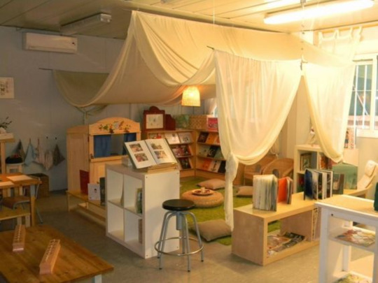
So we all know that being organized can make things easier. But when the ADHD strikes, no amount of organizing can solve the issue completely.
Case in point. All of my art supplies are organized by type. All of the alcohol markers, felt tip markers, fine liners, colored pencils, regular pencils, brush tip pens, pastels, etc are mostly on one shelf (frequently used are in a desktop carousel), all of the paper is organized by type: card stock, (further organized by plain, textured, or patterned, and all are color sorted, etc) blank printer paper, origami paper, velum. Below that are the notebook/pad style art papers, watercolor, sketch, bristol, plus canvases, and sheets of watercolor paper. All adhesives are in one drawer. There is a "idk where the fuck this belongs" drawer with those odds and ends that are important but solo in their class. There are magzine holders full of journals and sketchbooks, reference books
blahblahblah
(those totes in the left cube are not transparent. the table reflection makes them look that way though)
Great! Yay! Hooray! You can find what you need pretty quickly!
:|
Yes. But.
Art making and crafting isn't a mono medium. You see posts that say things like "all you need is a pencil and paper!" and sure yes, that's technically true. However my brain fills in with ....and an eraser, and you need a flat surface, and the paper has to be the right kind, the right size, what kind of sketch is this? what hardness of pencil do you need? Is there enough light in the room? Do you need references?
(yes I even torment myself with the "well akshully" stuff)
The art I make is rife with "parts", like painting (paints, palette, water, brushes, paper towels, surface to be painted on, apron) collage (base medium/substrate, image sources, adhesives for different types of paper, scissors, craft blade) sewing (fabric, shears, needles, thread, buttons, elastic, zippers, velcro, hook and eyes, snaps, ribbon, lace...) , etc.
(I do have most of the printmaking stuff in one container so that's a start...)
what's that saying about how a messy desk is the sign of a creative person?
The process of "shopping" my shelves for what is needed seems to derail any motivation. It feels like maybe my brain is happy with the idea of creating, and that's good enough. Like gathering the stuff is the goal, and having satisfied that, my brain dumps dopamine all over. Which is way less than ideal. (I am very guilty of the "I thought about doing it and am just as satisfied as if I had done it." thing. It's awful.)
SO. Then yesterday, while looking for something else, I came across a wire basket full of the supplies I had gathered to do a sewing project in bed, and I thought, that was so smart. how handy.
And I realized that I could do that with ALL of my supplies! Or at least, make up some project baskets with everything one would need to do that thing, all ready to go. So when an idea comes to mind I can just grab the basket and sit down for some art time, instead of chipping away at the urge one shelf at a time.
I sort of did this with a tackle box style of art tote, and a bunch of collage images, pens, and stickers, but it's not quite there.
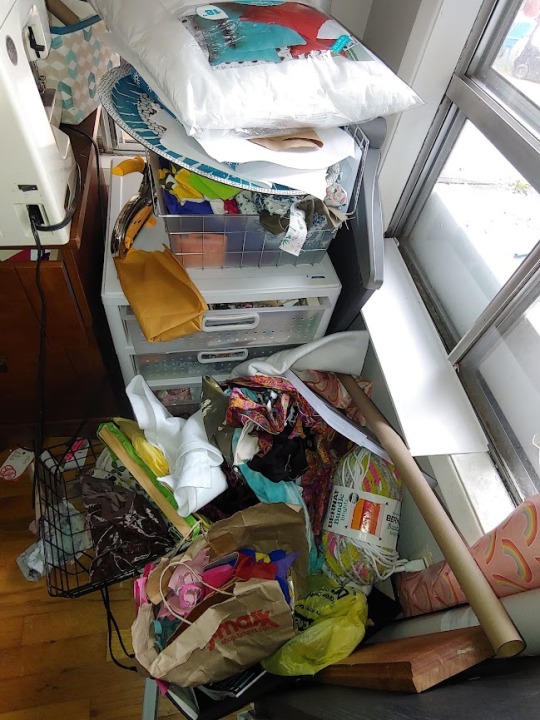
(pictured: a halfassed unintentional attempt at this idea. plus a bunch of scraps that were pissing me off and got tossed in "rage")
It will be great for those times when the urge to make something comes up, but not a specific thing, just that "I neeed to creaaaate" blinking neon sign that can be so fleeting. Grab a basket and satisfy the need without distracting faffing about.
Obviously I'm not the first one to ever do this, and pre-school teachers are probably giggling at me for only just now thinking of this, but hey. We all learn at different speeds :p
(Oh, and I promise the fabric and desk will be at least a little bit less messy this weekend :3 )
#Beating the ADHD motivation sapper#Make craft project baskets!#Art#Art supplies#Motivation#Creative#Creativity#Create#Headspace for creating#ADHD#Paint#sewing#collage
5 notes
·
View notes
Last Seen Blogs
saucybrtt
britt
benryzhik
Fulda Foundation

notanactingblog
Not an acting blog
celebsinpantyhose
Celebs in Pantyhose - Nylons - Stockings
just-my-own-world-blog
- My world -