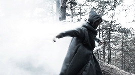
#also a little bit more saturated lol. but also not enough to blend in too much with her cloak thingy? eh I’ll play around with that
Text
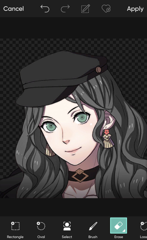
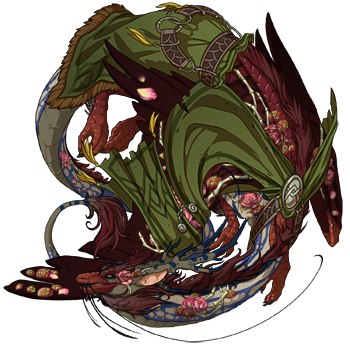
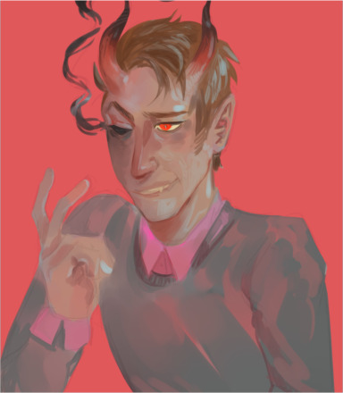
Otohan Thull. How does your hair work
#I think I need to make their hair thicker perhaps?#also mess with the colors a bit since it’s more silvery and less grey which is fine I guess just not quite how I’m imagining them#also mess with their skin tone ‘cause my current thing is more orangey than I’m imagining and I’d want it to be more red#also a little bit more saturated lol. but also not enough to blend in too much with her cloak thingy? eh I’ll play around with that#actually thinking about it I should probably make a reference sheet for her#and liliana too while I’m at it ‘cause why not#also otohan’s armor is fun to draw and I already did a bunch of sketches that also kinda double as a turn-around? The poses aren’t great fo#that but I still think it’d be fun. also I should rewatch the description of her backpack contraption thingy because I want sketch it more#anyways that’s that for tonight’s late-night art ramblings lol#art ramblings
0 notes
Text
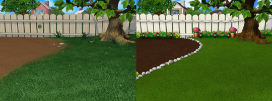
4 Seasons Back Yard Remodel + Crystal Yard
My 4 seasons remodels of the Petz 5 Back Yard are now available for download! And because I went on a bit of a side-quest, I’ve also made a bonus version, a fantasy, crystal back yard!
You can read my creator's notes below:
I somewhat wonder if it's fair to criticize the original Petz 5 playscenes too harshly. It's possible that the development team faced tight deadlines or budget constraints, factors that may not have been entirely within their control. However, regardless of the circumstances, the end result was a disappointingly sloppy product, and it's difficult to ignore some of the glaring flaws. While I can understand that the developers were working with dated software, there are certain flaws that can't be attributed to software limitations. Rather, they seem to reflect a clear lack of attention to detail. Here's what I mean.
The more you look at it, the harder it is to decide which flaw is the worst. The blatant MS paint spray paint "touch-up" in the upper left, that there was no effort put into blending in the skybox, or that they neglected to add textures to the roof.
Alright, enough ranting there. None of this is to say my playscenes are perfect either, but they were a labor of love and I hope that this is evident in the final results.
SPRING
I smoothed out the grass texture to give it a more velvety, manicured lawn appearance. I brightened up the dingy looking fence to a more brighter white. The original playscene had a hole in the fence, and while it might add "character", I opted to cover over it for a more polished look. I added bushes behind the fence to cover up the skybox and to conceal the bottom of the houses.
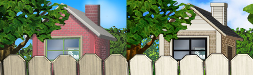
Speaking of houses. Wow these needed a big work-up. The texture work (or lack of) on these is just bad. I'm no expert in house construction, but even mostly-brick houses will have some accents like trims to break up the monotony of a fully-brick façade.
Because of how fuzzy the brick texture is in the original, I drew in the mortar lines of the bricks to enhance the texture. I added roof shingles, siding, and trim boards to the house to make it look more like a typical suburban house. Despite these edits, it's still not a "great" house - the way it looks through the windows, it looks like the house is one room lol. I wish I could put better houses in the backdrop but because Tinker doesn't allow me to edit the animated blinds, I'm constrained to keeping them the shape that they are. Oh well. We can use our imagination.
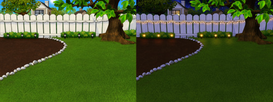
I added landscaping rocks to make the flower bed look nicer. I also added some landscaping details like bushes, garden lights, and string lights for ambiance.
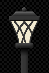
[ Enlarged picture of the garden light I made ]
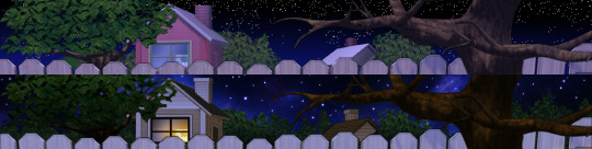
I also worked to improve the skyboxes in all 4 seasons of the of the Back Yard playscenes. It would be lengthy to get into the details of all that but here's a before and after of the night skybox. You got to love them high-quality MS paint stars in the original.
SUMMER
I had a hard time with the summer one because it was hard to come up with ways to make it look different from the spring version. I did make the grass, bushes, and tree leaves slightly more vibrant. Originally I had some flowers by the bushes but I just wasn't really happy with them. At the last minute, I made the decision to remove them entirely. This makes the playscene a little more "plain" but I think some people may want a more "plain", undecorated version so that they can dress it up how they want with toyz.
FALL
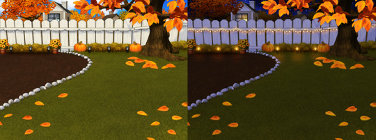
Fall is my favorite season, so this was a joy to make. I toned down the color of the grass and added fall landscaping motifs. Recoloring the tree's leaves was done by using Photoshop's gradient map feature. If time permits, I may do a tutorial on this in the future.
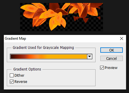
Gradient mapping is a powerful tool for recoloring almost anything. It can give way better results than methods such as hue/saturation, replace color, etc. And thanks to photoshop actions, applying this recolor to all the animation frames took just a couple of minutes.
Unfortunately, the fall leaves look "bright" in the nighttime version of the playscene. There does not seem to be a way to implement a darker version of these leaves for the nighttime playscene. If you look at the sprites in Tinker, you'll see that there are two sets of animations for Leaves A, B, and C and they're labeled "PropsAd" and "PropsAn", which would lead you to think that the developers originally intended for there to be a set of leaves for the day time, and a darker set for the night time. I guess the developers scrapped this idea because this does not work in the actual gameplay. When I experimented with this, the game appears to randomly display the nighttime sprite even during the day time, effectively ruining the intended affect. I'm not sure why the developers scrapped this. Either they had issues coding this properly or were just didn't want to put in the effort to make two sets of leaves.
WINTER
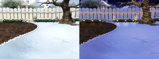
Instead of doing recolored leaves for this scene, I made all the leaves transparent and added holiday lighting to the tree. I know the lights aren't perfect - it was kind of hard to make out which direction a branch was going, so it has hard to maintain 'perfect' perspective.
CRYSTAL YARD
This is a bonus playscene that I made because I got a little side-tracked as I was working on the 4 seasons back yards. This is inspired by the Suramar zone from World of Warcraft, so it has a bit of that fantasy, night-elf feel and color scheme. It's been years since I've played WoW but I still appreciate the enchanting aesthetic of the elven zones.
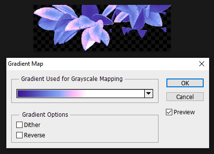
I used gradient mapping again to recolor the leaves to give it this lavender, shimmery, iridescent look. I did a little bit of gaussian blurring and layer effects to make them look a little more "glowy" than the originals.
As before, Tinker won't let me edit the blinds, so it limited what edits I could do to the houses. I would love it if I could have done curtains instead or something. I did my best to make these houses look a little less suburban and more elven. It's not perfect but it was rough working with what I had.
KNOWN ISSUES / THINGS I COULDN'T EDIT
As far as I'm aware, there is no way to turn off the snow effect for seasons like summer where it wouldn't make sense. This probably involves some code-editing that is beyond my technical skillset.
The winter playscene still has the green grass footprint when your petz walk. The sprites for these are not housed within the .env itself but in the Petz 5 Rez.dll file. It would probably involve a bit of tweaking in the code to switch the sprites to something else.
The fall leaves are "bright" in the night time version because there is no way to implement a second, darker set of leaves.
I cannot edit the blinds animation. Tinker gives you an error when you try to edit this sprite. This unfortunately limits what edits I can make to the house and the fence because of where the sprite is positioned.
If anyone does know of solutions to these, do let me know as I'd love to enhance these scenes further!
ICONS
Making the icons for these was also a fun little project. For some odd reason though, the game puts a stray pixel over them when I import them through LnzPro. I did my best to disguise them but there does not seem to be a way to fix that.
BEFORE / AFTER
With all that rambling out of the way, visit my main page over at Magnolia Road > Resources > Playscenes to download the goodies!
25 notes
·
View notes
Note
If this is ok to ask do you have any tips on coloring art? Yours is amazing :)
thank u!! it's always okay to ask me abt art stuff!! I'm gonna assume that by coloring u also mean shading and rendering too. i have a post here explaining some color theory stuff i utilize a lot, so I won't talk abt that on this post. This, uh, got long......
first thing i’ll say is, if you struggle with color, don’t get too down on yourself. it's a deceptively complicated subject. It's easy to look at other people's art and get discouraged by how effortless they make it look, but chances are there was a considerable amount of effort involved. I still struggle with color, constantly. That being said, some stuff that helps me out is:
1. check your value structure. if your piece is turning out muddy or lacking depth, sometimes the problem is not necessarily the hues you've chosen, but that there's not enough contrast between lights and darks. I'll usually check this by throwing a black and white gradient map over everything just to see (this isn't a perfectly accurate way to do it, but it at least gives me the gist).
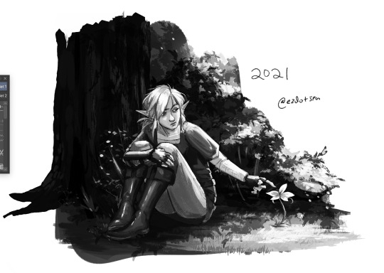
I was taught to thumbnail in 3 tones- black, white and gray. If your background is black, your midground should be gray and your foreground should be white. or any combination thereof, but the point is that they should contrast. These are general ballparks of what range of values each area should stick to. Here are some examples of ones I did in school (these have a bit more than 3 tones bc I do not follow rules lol):
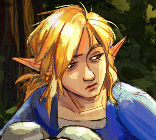
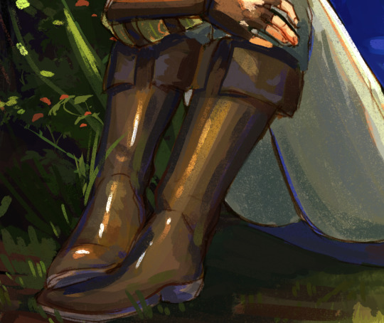
I don't always thumbnail, but I do keep this concept in mind as I color. Basically, it's about making sure the eye knows where to go. In the case of that link piece, the general gist is, where the sunlight hits is the lightest value, shadows are the darkest, and link is mostly midtones where highlights don't hit. It keeps the focus on link and the flower. Even this piece is a little imperfect with the way the boots start to blend into the tree and dirt bc they're too close in both hue and value, but still.
Obviously, it's not value alone that makes the image work- Link's tunic is maybe a bit too dark in the black and white, blending with the tree, but it stands out in the color version bc it's so violently blue.
2. optical mixing!! basically, it's the way that adjacent colors blend to create a new color. It has a lot of uses in painting, but one of the best examples I can give is this Wayne Thiebaud painting:
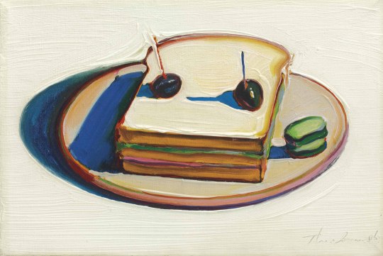
Look closely at the edges. Look at the hints of bright red, magenta, blue, and green peeking through where they don't necessarily belong. you don't notice them at first, right? they blend in and aid in the overall light quality of the piece. they add life. they tie the palette together. that's one use of optical mixing! Wayne Thiebaud's paintings in general are great to study for this.
For a less perfect example, here are some places in my own painting where I use this. Look at where I place bright reds, blues, desaturated greens, etc. You can also achieve this effect by setting your background layer to a bright color, and letting it peek through (like an underpainting!)
Optical mixing is also related to the concept of avoiding overblending. I struggled with this so much lol. It's okay for your shadows and highlights to have hard edges. it's desirable even, because cutting them in the correct shapes can go a long way in describing form. All of this, of course, is a stylistic choice i prefer, and you can apply it however you like
4. make limited, intentional color choices. You don't always need the entire color wheel. Like i've said before, an apple doesn't have to actually be colored true red to read as red. Decide what tone and mood you want your piece to have, pick a general range of colors that reflect that, and try to stay within that range.
Like, this is a silly example lmao, but in this piece, everything is between yellow, orange, and blue-green. saturation and value varies, but the hues generally stay in that ballpark. it keeps things harmonious! if you color picked say, wild's skin, it'd be way too aggressively orange to be a real skin tone. but it works in context, because there's not a more accurate true-to-life color in the palette to compare it to. your brain just accepts it. This lends to the sense of warmth in the piece.
5. In digital painting, don't be ashamed of using gradient maps, overlays, etc. All of the above info can help minimize a reliance on them, but they're still helpful tools! I use them all the time for final tweaks and lighting effects. my personal secret is grabbing a bright yellow or orange, getting a big giant airbrush brush, setting the layer to add/glow (i use clip studio, not sure the photoshop equivalent) and just very lightly painting it in the direction the light is coming from. i'll turn down the opacity if its still too strong even with a light hand, because the add/glow layer can just shoot things to overexposed white really quick. It creates a nice glowy lighting effect :-)
6. this is gonna sound like total garbage, but, just, look at stuff. like, seriously, put on your artist hat in every day life and observe things. take careful note in your mind of what color shadows are, what shape highlights take on different materials, how objects change color when lighting conditions change. do some studies, from real life or from photograph. studies don't have to be perfect- just try to block in basic shapes and colors, and zoom out to check whether it's creating the right overall effect.
hope some of this is helpful!!
363 notes
·
View notes
Note
hey! I love your art so much! I'm currently doing watercolors for class and was wondering if you had any Hot Tips! :)
Ooohhh okay yeah!! I dunno how much you already know so forgive me if I’m being too condescending!! Also most of my knowledge has just been turned into like muscle memory so I’m just gonna shout out some things that I think might help?
Alrighty so the thing with watercolors is that they’re a kinda tricky medium (but I’d never trade those finicky bastards for the world <3) and one thing that’ll happen is if you paint a stroke and wait too long to continue it, you’ll get all these weird lines and stuff in your painting, so unless you don’t want a clean coat, I’d move quick!!
Second tip! Just kinda for art in general I guess, use blues and purples for black and stuff!! Like maybe combine em with the black, but I think that helps with your piece being more colorful (or so I’ve been told lol I’m still learning too)
If you don’t have a palette, use any light-toned flat surface to blend colors! I use the glass and the white background from a big ol frame to mix paints!
I’m not sure what paper you’re using, but I discovered that with the sketchbook paper I use it absorbs like,, skin oil? and it makes the watercolor not really adhere to the paper so just be wary of that! I just put a little scrap of paper under my hand as I sketch and paint and it prevents that from happening!
I’d say try not to overload your paper with water! I’ve heard people will wet the paper before painting and then also wet the back to not make it warp, I myself don’t really do that since I paint in a sketchbook, but I think that could help?
When mixing colors, instead of using black to darken them, try using color theory! I am extremely not an expert in it but like if you google a color wheel and see the colors opposite from eachother, usually if you wanna darken one color, you can add a dab of the opposite one! I use this a lot for that overcast grey color in a lot of my pieces by using blue and adding a bit of orange!!
Also I think I’ve found that some colors dry less saturated than they appear, so when like for instance painting a dark skin tone, use a reddish brown with a touch of blue and it’ll dry a medium brown. But always test and do swatches of your colors first before painting!! That definitely helps me.
I think that’s it, I’ll reblog and add more stuff if I think of it! I hope this helped a bit!! Oh and last hot tip: if you fuck around for long enough, you’ll find out! I’ve been using watercolors for a few years and it probably is a thing that comes with a bit of practice, but I truly believe in you!! You’re going to be amazing, and also feel free to send anything you’re proud of to me!! I’d love to see it if you’re willing to share <3
44 notes
·
View notes
Note
a tutorial, if you don’t mind? 👀
well i do suck at explaining things like these lmao but i’ll try and give it a go!!
so i guess to begin your sprite edit first you go and get your sprite you want to use and go on picsart
i usually begin by pressing tools in the bottom left corner and press the selection button
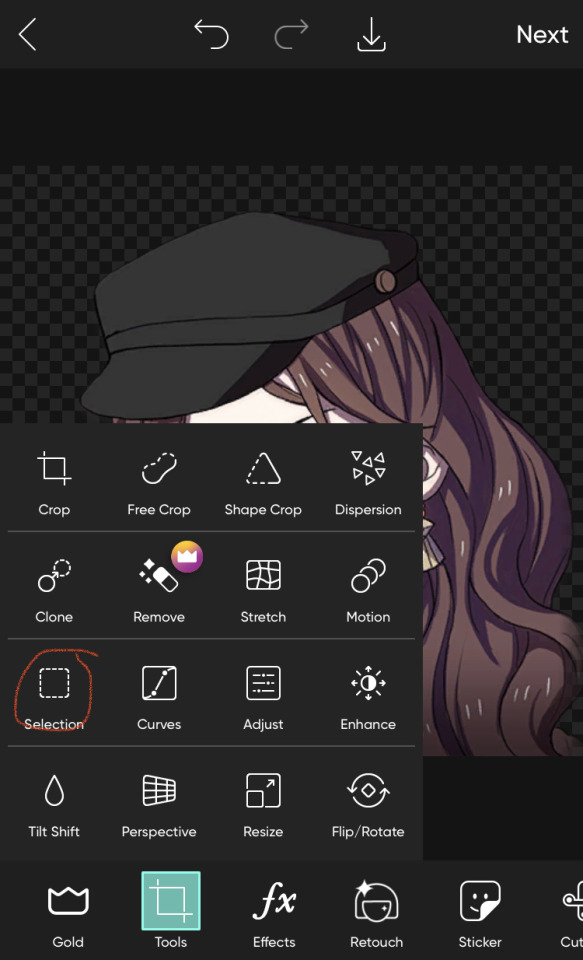
after that i pick brush and i guess select everything i want to recolour/change the palette of (if your recolouring edelgard/lysithea’ shake or anyone with more greys or whites for hair colour you don’t have to do that!) it would end up i guess looking a little like this
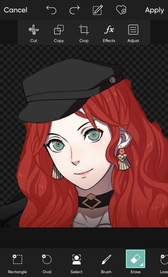
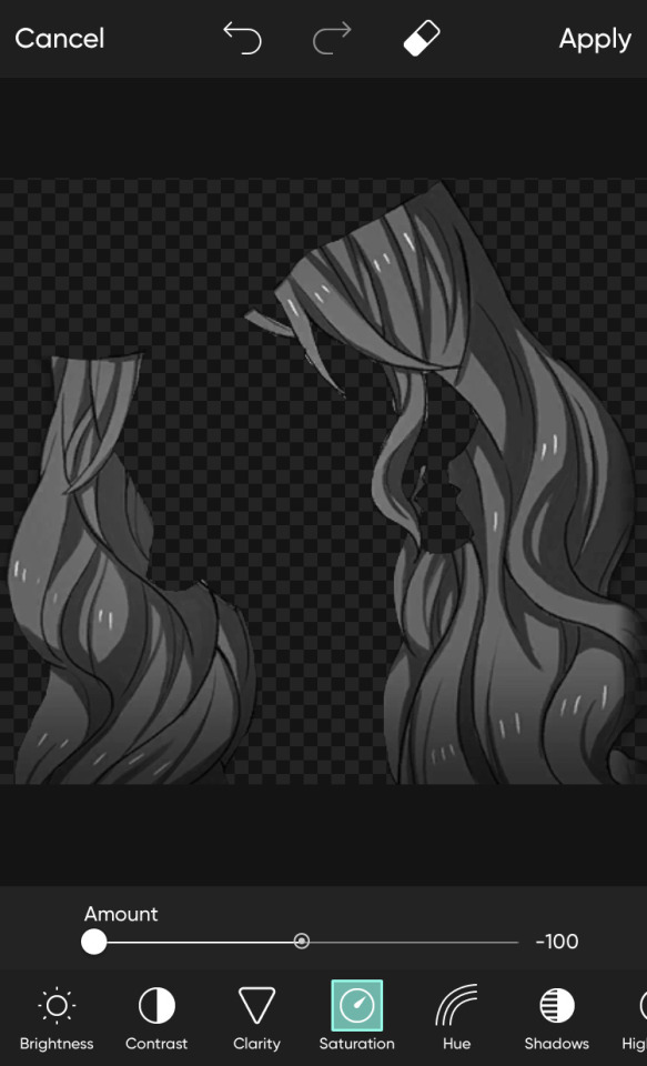
now that i’ve selected everything i want to recolour, i go and press adjust above and make the saturation the lowest i can get (you can adjust the brightness too if it’s too dark). you can also use fx for it as well, though i personally find adjust easier
now it should look a bit like this
now i press apply in the top right corner and it should look like this
now i’ve done that i press draw and choose whatever colour i want to recolour with and start drawing over it (try stay in the lines cause if you don’t it will show)
so i quickly draw the colour i want and then i go and hit the layer button
then i hit that bar thing (idk what it’s called lmaoo)
and i press blend at the bottom and i choose whatever option makes it look the best i guess! (i usually use multiply or overlay but there are a lot more to choose from)
so then you keep colouring in until it’s completely recoloured and then you are done!!!

the same goes for pride edits too (i just colour pick the flags and recolour from then on!!) but here you go! a tutorial on how to make your own sprite edit lol
i hope that’s clear enough, thanks for asking <3
#sprite edit#sprite edits#tutorial#sprite edits tutorial#anon ask#idk if this even makes any sense lol#oh well#i tried
12 notes
·
View notes
Note
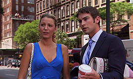
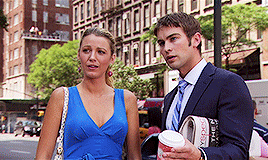
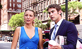
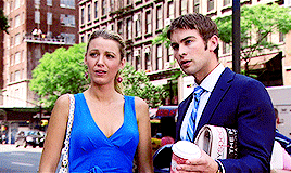
hi, just wanted to say that i love your tutorials! you have helped me improve so much in photoshop, i cant thank you enough. I was wondering if you know how to archive this edit? (riddlemarvolo(.)tumblr(.)com/post/189886322626/after-all-this-time-always) do you think you can make a coloring tutorial about it? i've tried myself to do it but i don't know how, it never looks like that.
Yes I can! Tutorial on how to get these gifs below:

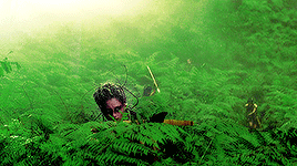
There are a few ways to get these kind of gifs, I will show a few different ways. My main tip to achieve these gifs is to choose scenes that can easily be manipulated. Don’t try to make a bright yellow gif out of a dark scene. It may be frustrating if you have specific scene, but it will pay off in the end.
On to the first way to get this look and also the easiest, and that’s to focus on the color that’s already predominantly in the scene (like grass is green, fire is red, oceans are blue, etc).
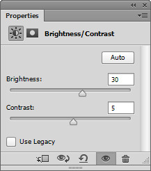
This is my first gif, with sharpening only:
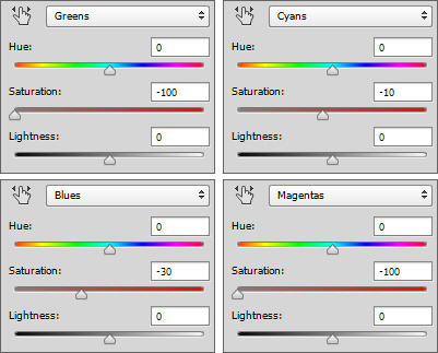
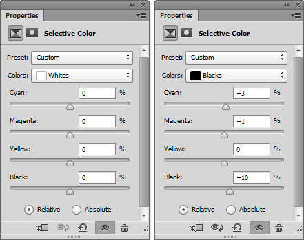
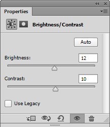
As you can see that main color is green, so instead of changing that to blue, I want to enhance the color. To start I’ll just a few brightening layers. A “Brightness/Contrast”, a “Levels” and an “Exposure”. It doesn’t really matter what settings you use as long as you gradually brighten up your gif. I also want to edit the blacks and whites with a “Selective Color” layer. I won’t show these settings, but I have tutorials on literally everything here.
So here’s my edited gif:

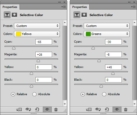
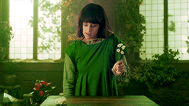
I didn’t add to the colors, saturation or vibrance, but to achieve really solid colors, I want to start with a “Selective Color” layer. I will edit all the colors a little bit, but I want to focus on my main color, green. Here are my settings for the yellow and the green:
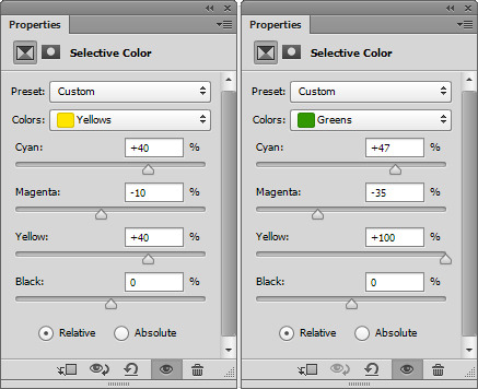
A tip for green is to add to both the “Cyan” and the “Yellow”, that way it’s more green then orange-ish. I also edited the yellow since yellow and green colors tend to blend together.
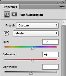
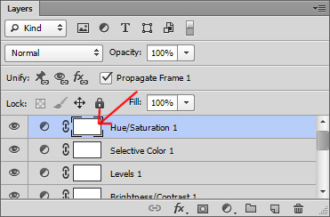
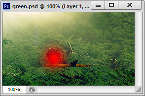
I also want to add a “Hue/Saturation” layer and on the main slider, slide it just a bit to make the overall color green (or whatever your main color is), here’s my setting:
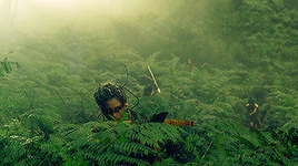
And my gif now:
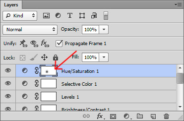
Since this changed the skin color as well, I want to use a soft, round eraser brush and on the layers, click on the alpha layer of the “Hue/Saturation” layer, this will allow you to edit where the adjustment layer shows on the gif.
For tutorial purposes, I’ll show you with a color layer where I used the eraser:
And the layer now:
Now my gif:
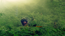
You can also edit the skin tones (and other non-main colored areas) and use the alpha layer to erase everything but the skin.
Now to make the color pop, add a “Selective Color” layer editing your main color, mine being green. Then duplicate this layer a few times for an intense look. You can do this for any color, edit the “Red” for reds “Blues” for blues and so on, then just duplicate the layer.
Now to really make the colors pop, I want to add another “Brightness/Contrast” layer and really brighten the gif. Here’s my settings:
Here’s my before gif:
And after:
Here’s another gif I did, this time instead of focusing on green, cyan and blue was my focus:

The second way is to change the color that’s already predominantly on the gif (like changing a blue sky to pink, or a light blue snowy scene to dark blue).
This is pretty easy after the first tutorial. Once you have your gif ready and up to the “After” step above, you can use a “Selective Color” layer and a “Hue/Saturation” layer to alter the color of the gif. It can be something simple like green to yellow or more advanced like green to red. In either case, make sure to gradually change the color, rather than one big jump.
Here’s my gif:
And here’s my gif now using the steps above to bring out the yellow:
Now, I want to change the yellow to something more appealing (lol), so I want to go to red. First, I want to add a “Hue/Saturation” layer, only edit the channel of the color you’re editing, so for me, I’m only working on the “Yellow” channel. Here are my settings:
And my gif:

So if you make a drastic change, the skin might need help, but just do the same thing as above where you click on the alpha layer of your “Hue/Saturation” layer and then erase the part over the skin if needed. My gif now:

Se how the whites look pink-ish and the blacks look dull? To make the gif look “less edited” you might want to touch up the blacks and whites of the gif using a “Selective Color” layer. Basically if the whites or blacks are too toned to a color and it’s obvious then edit the whites and blacks. Here are my settings for both:
and my gif now:

Now just finish off with another “Selective Color” layer and duplicate it a few times like above and your done! Here’s my before:
And after:

And another gif where I changed the red to green. Here’s the before:

and after:
The last way is to completely change a color to match your color scheme (like a green forest to blue or a beige paper to purple), but there’s two ways to do this. Either your scene is already extremely tinted to one color (like a neon pink lighting, or a blue underwater scene) or to use editing to change the color using color layers and adjustments.
The first is an overly saturated, one or two tone gif like this:

For that, all you need to do is use the first part of the tutorial to make the main color pop. Here’s my gif after that:
Now, add a “Hue/Saturation” layer and edit only the channel needed, mine being red. Here’s my settings to turn the red to purple:
And my gif now:

If like my gif, your color got too wild, just turn the opacity down to your “Hue/Saturation” layer and use a “Selective Color” layer to finish the job. Here’s my settings:
And my before:
And after:
To use color and adjustment layers to change the color of you gif, use the first tutorial to generally brighten the colors of your gif. Here’s mine without singling out specific color:

Now you want to decide what color you want to do. I’ll do green since it’s an easier match. So start to add a “Selective Color” layer to boost your selected color. You may also need to add a “Hue/Saturation” layer like the second tutorial. Here’s my gif:

Now to really get the color you want, add a new layer and using a soft, round brush, color over your gif where you want to change the color like this:
Then you can either set that to “Softlight”, “Hardlight”, “Color” or “Hue”. Here’s mine set to “Softlight”:

Once you get a color you’re happy with, you can use a “Selective Color” layer to make the color pop. Here’s my settings:
I also added a “Brightness/Contrast” layer to brighten the scene up, here’s my gif:
Now just finish off with a final “Selective Color” layer, editing all the colors. Here’s my before:
And after:

Here’s another gif that has a more drastic change. The before:
After:

And to get the white and black gifs (and the gray in between). All you need to do is find a neutral colored scene. Here’s my two gifs, the top being my white and the second my black:

For both of these, you want to start the first tutorial up until the color selecting. Here are my edited gifs:

Now for the white gif, you want to add a “Hue/Saturation” layer and set the saturation for most of the colors to -100. Don’t do this on the red, maybe the yellow channel because you don’t want to ruin skin tones. Here’s my settings:
and my gif now:
I also want to add a “Selective Color” layer and darken the blacks and brighten the whites by adding to the whites. Here’s my settings:
and my gif now:

Now for a final “Brightness/Contrast” layer:
And my before gif:
And after:
And for the “Black”, you want to really brighten and add some contrast. Here’s my setting for a “Brightness/Contrast” layer:
and my gif:

You may need to add a “Hue/Saturation” layer to remove any unnecessary colors like we did for the white gif above.
The final layer for this is a “Selective Color” layer. You really want to darken the blacks, here’s my settings:
And the before:
And after:
I hope this tutorial helps! I don’t make these kind of gifs, but if any of you need help, feel free to message me!
#gif tutorials#gif tutorial#coloring tutorial#completeresources#itsphotoshop#my resources#anon#answered
385 notes
·
View notes
Text
gossip girl colouring tutorial
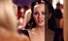
hello! i’ve gotten a few asks about how i colour gg. my colouring has gone through a bit of an evolution since i started this blog and has slowly gotten better i think (i hope!). so this tutorial will cover the typical way in which i currently colour. i do tend to just colour each gifset from scratch (although i do have a few psds saved that i sometimes use as bases), meaning the process might vary from gif to gif. so i’ll take you through the process of 2 gifs of different scenes so that you can get a feel of my general technique and adjustment preferences!
FIRST GIF:
so the first scene i’ll gif is from s1. this is an indoor scene which is a bit tougher in terms of maintaining quality while brightening (outdoor daytime gg scenes are, like, the easiest thing to colour ever i think lol). this is what my gif looks like resized and sharpened without any colouring:
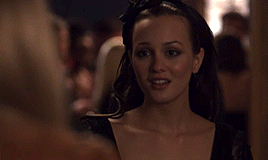
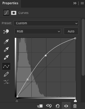
so i ALWAYS start with a curves layer. pull it upwards near the middle to brighten the midtones, and pull the bottom left point to the right just a touch to deepen the shadows slightly. sometimes for dark scenes, i’ll brighten some mid-shadows with another point, which you can see near the bottom left.
then i just kind of add a smattering of brightening layers as i see fit. here, i did another curves layer in which i brightened the highlights a little with a point closer to the top right (not too close though lol), an exposure layer with +0.34 exposure, a levels layer (to brighten, drag the middle point to the left; to deepen shadows a touch, drag the left point into the middle), and a brightness layer. this is the gif after the first round of brightening:
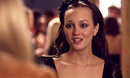
next, i’m gonna add a black and white gradient and set it on the luminosity blending mode. this deepens shadows, takes away a bit of saturation, and adds some contrast. to tame it down, i’ll add a brightness/contrast layer and lower the contrast. then, i’m gonna add another curves layer to keep it bright.

now, i’m gonna do a bit of actual colour adjustments. my personal favourite is colour balance, but some people prefer levels or curves, and i use those too. play around with the tones in colour balance until it’s what you want it to be, but don’t go overboard! i think i rarely go over, like, 8-10 on any colour. and i stay away from the highlights tones at all cost. i already like the colouring of this scene so i’m not gonna do that much, just make sure no colour is too dominant.

to finish it off, i’m gonna do a bit more brightening, very lightly. (note: sometimes with a gif like this i might add a dark brown photo filter, which just really neutralizes all of the colours in a way that i like, but i chose not to for this one.) here’s the final product:

SECOND GIF:
now an outdoor scene from s6! resized and sharpened, no colouring:
again, literally always my first step, starting with a curves layer, brightening midtones and deepening shadows:
again, adding a bunch of different brightening layers until i like it. here, i added a second curves layer, an exposure layer, and a levels layer.

then, black and white gradient on luminosity and a levels layer.
a vibrance layer because this gif is colourful enough for a vibrance layer to look nice, and because it’s a daytime scene and an outdoor scene, it’s bright enough that it won’t look weird. i lower vibrance and up the saturation; makes it much more colourful than just directly upping the vibrance. then i add a colour balance layer and a levels layer to play around with colours! i’m also gonna add some greens, yellow and blues with a selective colouring layer to brighten the trees in the background and serena’s dress. just for fun!

the contrast in this is now a bit much due to so much colour, so i’m gonna lower that a bit, add a levels layer to brighten midtones juuuust a bit more, and a selective colour layer to restore as much of the colour lost in the brightness/contrast layer as i can without bringing the contrast back... if that makes sense. and then we’re done! here’s the final product:
#gossip girl#colouring tutorial#i didn't think i would get to this this week but i finished school stuff earlier than anticipated so i had time today!#i hope this is helpful#please ask if there's anything that's confusing
12 notes
·
View notes
Note
New beginnings is sooooooooo good, the whole world behind it seems so fascinating and can be built up so well!!!! Can you describe what each member looks like as a wolf? You made them very distinct , but I just can’t remember who’s who when they’re wolves lolol, good job tho!!!! 💖💖💖
omg i’m so sorry for not explaining enough (or at all?? i can’t remember, i think i only described a couple of the characters wolf appearances), that’s totally my fault. i guess i just so caught up with everything happening I just wanted to focus on guk and the oc’s relationship rather than get sidetracked with the rest of the pack.
I dont want to put pictures since I really just merged a bunch together to form my own take on their fur, and i want you to be able to use your creative intuition to fill in any gaps. But here’s how I imagined them:
Namjoon - He’s a little bit tricky. Most of his fur is an off white color, not too bright but not gray either. There’s some light blonde plastered across his shoulders, lower back, snout and ears. It’s not too saturated though, almost like a pale sand color? You wouldn’t be able to distinguish it too much at first look. The back of his ears are dirty blonde, as well as a patch on his lower back. He has red eyes, same as Guk’s.
Yoongi - Almost similar to Jk. He’s black, but not ‘pure’ black I guess you could say. Underneath the sun he’ll shine brown-black, and has various shades of gray and white splattered on his neck, underbelly, shoulders, and crotch. Once again, they’re not too harsh (you know when a dog starts to get old the fur near their snout will gradually turn white? think of that). His eyes are blue.
Hoseok - He’s a healthy mix of everything lol, i don’t really know how to describe him if i’m being honest. The fur on the back of his neck, shoulders, legs, and tail are red, but that’s also blended with a dirty brown/gray and dirty blonde. His entire underbelly area is dirty white, as well as the underneath of his snout. The top of his face is dark brown. His eyes are blue, as well. (I used a singular reference for this one, and it’s very hard to put into words so if you’re still confused you can send in a private ask and I will leave the picture I used.)
Jimin - Also kinda hard. He’s brown all over, but not solid. There’s varying shades of gray and brown all over his body, mainly the back of his neck, shoulders, and snout once again. His eyes are yellow because my baby cares about his brothers so much 😔I also used a singular reference for this, so if you want you can send in an ask I will show you if you’re having a hard time visualizing.
Taehyung - He’s an earthy brown color, not ashy brown like Jimin but more dark like Yoongi’s. All over his snout is a mix of tawny and cream white which follows only onto his underbelly, legs and one ear (🥺), while almost the entire upper half of his fur is dark. His markings are a little more harsh, more visible rather than fading and blending. He has blue eyes my sweet little beta boy.
Seokjin - He’s an ashy gray color, the darkest part of his coat being an ashen black that decorates his upper back and a travels down a line down his forehead and snout. His underbelly is considerably lighter, and he has yellow eyes.
Jeongguk - As you know, he’s a deep black color all over because he’s intimidating like that 😔He has red eyes too my alpha baby boy
I hope this helped!! As always you’re welcome to envision the pack however you want, this is just what i imagined when I was writing them. 💛
13 notes
·
View notes
Text
Lair Review!
Five dragons for @santana-fr below the cut!
Jaqen
I never would have guessed that chartreuse would go so incredibly well with crimson, but here’s living proof. And I don’t usually like scales, like, at all, almost never, but it’s very subtle on her!! It blends well with chartreuse’s accent color, and is hidden somewhat by the accent in the best way possible.
Speaking of the accent, wow. It’s incredible. Props to the artist for one but for two, the orange-gold accents on the body of it really complement the gold trimming on the wings and tie it into the almost yellow underbelly from the poison! The blue provides good contrast, and I love the way you’ve broken it up a little with the scarlet wooly coat. The flowerfall helps keep the whole outfit balanced, preventing the underbelly from being too prominent and out of place. Lovely dragon!
Tuyet
It is. So hard to only choose five dragons of yours lol they’re all so lovely!! But Tuyet caught my eye because of her simplicity. You can’t even see her secondary, and I didn’t check her tertiary lol. She’s so pretty! The white/grey combined with the pale tans and browns is something I never would have thought of. The accent is one I actually used to have and didn’t like very much, but I adore the way you’ve utilized the cloudy wing apparel. It keeps it visible so that it doesn’t overpower the whole wing! The Ice Tome would usually be a bit out of place purely because of its green-blue edges, but alongside the blue in the wings (not to mention her eyes) and silver anklets it melds with the rest of the outfit astonishingly well.
The pearly earrings are really nice. I honestly was expecting the silver recolor based on the rest of her color scheme, but it’s a very nice touch! It’s slight enough to avoid being a centerpiece but different enough that it doesn’t blend in. And I’m always a sucker for antlers, lol
Zale
Oh man. I saw him and was just blown away. The fins from his accent match the edges of the fin jewel apparel and make the lack of wing apparel irrelevant. The gold jewelry adds something I’m having trouble describing, something that stands out from the rest of his outfit without throwing a wrench into it. It helps to tie in the green in the accent without simply being more green.
Also, I don’t know if this was intentional or not, but the color of his spines and legs matches the silver in the fin jewels almost perfectly. Were it not for that, the silver lining of the jewels would be almost jarringly out of place.
And the stained is so subtle!! I didn’t think he had a tertiary at first, but when I saw that he had stained I went to scry what he would look like without it. The difference is subtle for sure but I really like it! It mutes his primary and secondary just enough to keep him from being brighter than his apparel.
Aya
Again with the use of scales!! Not usually a fan but it’s well done here, giving her more expression. I absolutely adore the barbarian’s clothing on her; they’re definitely large, bulky pieces, but they keep her from being overtaken by just her primary and secondary colors. Beige poison can be super tricky to work with, so well done to you!! Keeping it in check from being too busy via apparel and a plainer secondary was a good move imo. (also, it brings out the flecks of green in the accent!)
I’m not sure if this makes sense, but in my opinion, the green ties the whole dragon together beyond just keeping her from being super busy; it’s as if you’ve taken the whole rainbow and lowered its saturation. The red, the “yellow” (beige), green, and blue just work together. A fascinating dragon all around.
Tybalt
I gasped aloud when I saw him. Noxtide is a top-tier gene, lionfish can be tricky, and I’m so, so weak for ghost, lol. The power pack matches the necklace and tail rings super well, and the ridged brows it gives him are perfect for the faceted eyes, as well as the ghost. It’s really-- I’m in awe of how incredibly well coordinated he is. The apparel matching the accent of lionfish, the underbelly of the lionfish being ever so slightly off from the color of ghost so they both remain distinct from each other yet still match, and the flowerfall and fairies blending in so well that, despite being on a spiral, he isn’t overly busy or hard to see in the slightest.
2 notes
·
View notes
Note
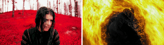
I really want to know how to make stuff like you made on ghostwire tokyo i really love it
Hi, anon! I’m not sure if you had a specific part of that edit you wanted me to talk or about, or how many details you want so I went ahead and summarized what I did. I’ll try to be detailed and concise as much as possible. Long post + heavy text below.
Fun fact: there were actually four posters but I only posted 3 (for some strange reason). The fourth one is included at the very end :)
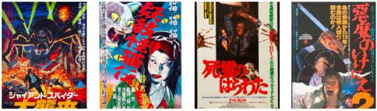
INSPIRATION: It’s a mix of everything but most importantly, I wanted to mimic the style of vintage horror movies. I also learned this effect from reddit that fits the retro feel really well.
THE PROCESS: I start by studying a lot of vintage horror movie posters. What are the patterns? What makes it retro? How did the designer use colors and space?
You’ll notice that pretty much all posters have a copious amount of text and colors. Like, A LOT. Here are some examples:
Next, I try my best to pull some decent screenshots from the reveal trailer. I never have the end product in mind so I took scenes that looked cool or wasn’t too grainy.
For the red poster, I mashed together a few shots of the lady in white and adjusted the lighting. I wanted the colors to really pop so any dark scene that has a little bit of light, I cranked that shit up lol. I slapped on the effect that I mentioned earlier from reddit. I put some colors over it and saturate it just enough so it’ll grab someone’s attention.
Now, regarding the Japanese fonts. I know very basic Japanese. My original goal was to make the poster crowded as much as possible to match the posters that you see above. Unfortunately, with my limited skills, I can’t really write complex sentences without sounding like a slightly improved google translator. So I decided to include shorter phrases instead.
To finish it off, I added some paper texture to add that gritty, grungy feeling to it.
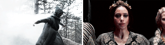
For the blue poster, I did a double exposure edit with the demon guy and the umbrella scene. He was the coolest part of the trailer so I made him front and center. His clothing was black and felt empty, so I went ahead and added an overlay of the umbrellas. Finally, I put on some film grain filters and blurred it a little to give it that mysterious feel. Modify the lighting a little and slap on that blue color.
For the green poster, I went the simple route and had two scenes that blended in the middle. This one is more simple than the other one as I only added colors, the effect from reddit, and film grain. Because it was so simple, I went ahead and smudge the left lady’s eyes to make it more creepy:

(I kinda wish I exaggerated it more, though.)
CONCLUSION: there ya go! I hope this helps somehow. I really wish I included screenshots of the actual process but that would have taken forever. I also don’t have access to photoshop anymore so that’s another reason :(
Overall: I maintain consistency with the effects (film grain, bold colors, and slight blurriness). There was supposed to be a lot of text but I realize I wasn’t proficient enough in Japanese so I improvised as much as I humanly could :p
If you need me to focus on specific aspects of it or any other edits, please let me know! I can make another post!
Anyway, here’s the last poster that never saw the light of day (that I really loved too, ironically).

5 notes
·
View notes
Text
Coming Attractions!
First Monday of the month, woohoo!
(And also kind of a NaNo roundup post because that was last month, after all…)
NaNo:
Sooooo I didn’t finish, lol. Not that I was…super expecting to, exactly, but I was hopeful! I think I just missed too many days in a row and lost all my momentum.
In terms of my goals, I was hoping to write:
1. 20-25k on Precipice
2. 20-25k on our faces like a mirror
3. 10-20k on Other Projects.
4. 50-70k total
In terms of what I actually accomplished:
1. 9,241 on Precipice (Sooooooo....about half of what I’d hoped, a little less. But I still got a fair amount done/prepped for upcoming chapters, plus a couple chapters actually posted, even while doing other stuff, so...go me!)
2. 9,043 on our faces like a mirror (Again, a bit less than half of what I’d hoped for, but I got enough done for the story/etc. to take a real Shape in my head. ...ish. See the specific OFLAM stuff later on in the post...)
3. 10,601 on Other Projects (Hey, I actually met this goal! ...barely, but still! Mostly thanks to the Nikita/Rebels crossover, lol...)
4. 28,885 total
Original Fiction:
I got a decent chunk of a big backstory piece for Lux done (in the form of a “then” and “now” set of scenes/vignettes for the five Archangels)--that being said, I’m not sure I actually like what I have there, lol. I know more or less what I need to cover, but the details are fiddly. Also not sure whether I should refer to Lux by her current name, for consistency’s sake, or use a different name (either Lightbringer or just Lucifer) since she does technically reshape her name after being released when the main Apocalypse storyline kicks off…also debating whether Lux should be/present as female way back when--angels don’t really do gender the way humans do in this ‘verse, but the closest human term for Lux would be genderfluid, sooooo IDK. Also also, for the ‘Now’ part…ehhh, I’m not sure I should have this be the first thing I post involving Trixie…but I’ll keep poking at it and see what comes out.
(I’d also planned to work on the big Kesshare character study saturation for The Farglass Cycle this month, and maybe go back to my untitled first-contact story, but neither of those happened, lol.)
Precipice:
We’re in the home stretch! Kinda. So to speak. Probably three to four more chapters in Arc Seven, which I’m hoping-fingers-crossed I’ll finish by the end of the calendar year??? (But given how much other stuff I hope to work on (see Other Fanfic Projects for more details…)
At that point--and I know I’ve said this before, and I’ll probably put it in an A/N in the next chapter or so, but following the end of Milestones, I’m planning to break off into a second/sequel fic, working title Protectors. This is at least in part because length (over 200k wtf I was anticipating 50-75k, maybe 100k, for these seven arcs @.@), but also was sort of planned even without the Length issue, due to some thematic/structure shifts following a six-year timeskip. Which, if you do the math, you can probably figure out where that’ll land us and why I might be structuring it this way…
Anyway, I’ve increasingly realized that there’s some stuff I should probably set up that I’ll need for later arcs in Part 2 involving some Rebels characters, more with the Last Batch, plus a Sith Apprentice who needs to turn up and die (although the gap between Infernalis and the next apprentice I actually care about/have a name and some kind of Plot for is only about four years in my mental timeline, so maybe there isn’t an active Apprentice in that period*…hmmmmm…), some background about the Hands, etc. But I feel like it’s all a little too disjointed for an entire additional arc. So, Arc 7.5, tentatively titled Preludes, is also going to be a thing XD I don’t think I’ll have a fixed schedule for that vs. the main storyline--and, honestly, it’ll probably work more like a collection of one-shots taking place during the timeskip than a proper Arc, but a little more Relevant than stuff that goes in Bonus Content, if that makes sense? It’ll probably be posted alongside at least arcs 8 and 9. Which, incidentally, take place more or less back-to-back and cover a fairly short period of time, but there is A Lot of plot/setup that goes into them. Like. If I tried to do it all as one arc, it’d be at least twice as long as any of the other arcs I’ve done, possibly including Arc Four--certainly over twenty chapters, I think--plus there’s a good (and by good I mean Horrible) place where I can split the arcs, so…we’ll see how that goes.
(…still not sure what to do with Maul, lol. He may just be Sir Darth Not-Appearing-In-This-Fic, or he might turn up in arc 10/11/13, which are the sort of vaguest of the next seven arcs which make up Protectors, in terms of how much I have planned out…)
(*On a semi-related note, I’ve been asked about Inquisitors a couple times in comments lately, and…well, I’ll probably mention this when I reply to the commenter in question, but I figured I’d set it out here as well, in case anyone else was wondering the same thing but doesn’t read other peoples’ comments. Like I’m pretty sure I mentioned at the start, when I plotted out** the bulk of this fic, I hadn’t seen Rebels yet. I’ve since decided to integrate a few characters/plot points (Kallus and Zeb will feature prominently in a subplot in arcs 13 and 14, for example), but, as a rule, characters and plot points from Rebels haven’t been taken into account unless I Really Like Them and/or they’re a good way to fill in a plot hole in a later arc, as with Kallus and Zeb. So, for example, when I include Thrawn, I’m writing more towards Legends!Thrawn in terms of personality, though the two have blended a bit in my head and I do reference specific events in Disney!Thrawn’s personal timeline; and b) more relevantly, I hadn’t made any plans to include Inquisitors, and that…hasn’t really changed. So, I might have them in Preludes, but they almost certainly won’t show up on-page/be super-relevant in the main arcs of the fic, sorry :/ )
(**Loooool I say “Plotted Out” like I’m the kind of author with a Master Plan or at least an outline. But I did have a general idea of the Major Plot Points going in, such as when Rex and Ahsoka would turn up, Luke’s storyline with Lavinia, how many Apprentices I would need to make them work, etc., and I’ve had parts of Arcs 8, 9, and 14 written for like at least two years now, so I know more or less where I’m going--though they’ll be edited once I have more of the connective tissue in place, in case I’ve accidentally Jossed myself…or I change my mind, which is becoming A Possibility with a major event set to happen in Arc 14, so…we’ll see.)
Aaaaaanyway. Exciting times ahead, I hope!
Other Fanfic:
This month, I finally posted another AU outline, woohoo! …I mean, it was a super-niche Nikita/Rebels crossover with a handful of OCs thrown in but who’s counting XD (I do actually intend to finish Let’s Go Steal a Crossover and update the Ventress one at some point but…yeah).
I also put out a Kallus one-shot that I think turned out really well. May do more of those at some point, who knows…
I made some significant progress on our faces like a mirror, as mentioned above! But now I’m waffling a little bit over structure. Basically, the fic covers Bo-Katan’s backstory from the time Satine becomes Duchess, through the Civil War, and eventually leads to Bo’s eventual break with her sister to join Death Watch. It comes in two pretty distinct halves--what I call the Fugitive arc in my notes, which covers the Civil War, and the Breakdown arc, which is everything after her return to Sundari.
So, my original plan was--prologue covering at least part of the final Epic Screaming Match that leads to Bo’s departure; jump back to the Fugitive Arc; and then follow through until we catch up to the prologue, with a coda/epilogue with her and Pre Viszla. The problem is, there’s…really not a lot to connect the two halves??
I’ve got a couple options on what to do about this, but I’m not sure which would be best.
Option One: Keep the structure as-is and just let it be episodic.
Option Two: Keep the structure as-is and find some way to connect the two halves (i.e., a recurring antagonist; I do have an idea of who this could be, but the problem is, it takes away a good chunk of the focus from Bo and Satine’s relationship for the Breakdown Arc…which I don’t really want to do.)
Option Three: Remove the framing device and focus on the Breakdown Arc, and include the Fugitive Arc as flashbacks, since the Breakdown Arc can’t really stand on its own. (The main issue I have with this one is that, if I want to actually write out future chunks of Bo’s life later--meaning, her time with Death Watch, and getting her from TCW to Rebels--I won’t have these flashbacks and I don’t want to change the structure too radically for any eventual sequels? Also, I’m not sure how I feel about a flashback structure for this fic in general…)
Option Four: Remove the framing device and focus on the Fugitive Arc, ending the story with Bo’s return to Sundari. (Two issues with this one--I really do want to go into the Breakdown Arc; that’s where my interest in this story started. Also, due to the constraints of setting and so on, Bo interacts with…like…two canon characters over the course of the Fugitive Arc? And while I don’t really have a problem writing a story that’s essentially a Backstory Epic for a tertiary character, populated by about 90% OCs, I’m not sure anyone actually wants to read that, except as the lead-in to the Breakdown Arc??? But maybe I’m overthinking…)
…so, yeah. Any thoughts/opinions on which option would be Best? (I may make a separate post asking the same question later, but figured I’d lay it all out here, too!)
Also, I’m working on a Secret Santa project, and probably not going to use OFLAM for SWBB, which means I need to come up with and write a different plotline of some kind, so back to the drawing board on that one…
Also also, I do genuinely plan to get Distaff off hiatus At Some Point, especially since I’ve gotten some new comments/responses lately…but given how much else I have on my plate, writing-wise, that probably won’t happen until next year, alas.
Anyway, the long and short of it is--lots of writing planned for this month! Now let’s see how much I actually get done XD
What about the rest of you? What’ve y’all been up to/what do you have planned for next month?
#coming attractions#miscellania#shadowsong writes star wars#shadowsong writes original fic#shadowsong writes crossovers#shadowsong writes self-indulgent bs#feedback greatly appreciated#our faces like a mirror#precipice verse#nano2019
4 notes
·
View notes
Text
process of the demon shane painting
I’ll put it under the cut bc there’s steps and pictures which make it. Long
First off, i do a messy sketch with a big brush, like what i do with lined art.
Then, I go over that (i lower the first sketch’s opacity) with a smaller brush. I sketch in more detail and add some stuff like horns and whatever. This sketch is my guideline for the painting.

I turn off the first sketch layer. Then i lower the opacity on the second sketch to about 10%. On a layer under it, I block in the shape of the figure. I use grey bc it’s a good neutral and i use bright colors in my flats so the grey cools em down a bit.

Slap in a bg color to 1. Make you figure out the colors you’ll use and 2. make it easier to see an off mark like uh. A dot that shouldn’t be there.

Lock the grey layer’s opacity and start slapping colors on there, it doesn’t need to be clean but it’d sure make it easier when you’re painting. Have fun! Choose some silly colors like pink and bright blue! Bright blue is a fun color for highlights bc blended out on a warm color, it goes grey. Grey against red and pink looks blue.

Add some dark edges like the lines between the fingers, the shirt collar, the nose bridge. The places where it should be darkest. Clean up your messy flats a little bit too. I also fixed the nose position here bc it looked wrong.
Keep on trucking, adding dark colors where they are needed to make the form less flat, highlights next to shadows for visual interest. I used to, when i needed a darker shadow, just go dark and dark. Hell, black wasnt dark enough for what i needed to do! But now, I realized you can put a light spot next to it and make it look darker than it is by contrast.

Here, i changed up the colors to fit the bg better (and suit my own taste) using the hue and saturation sliders. They’re under the filters panel in most programs. Play with em and see what you like. (it’s a tiny bit pinker, see)
i turn off my sketch layer after this point bc i know where everything is now.

I copied (duplicated) the layer and get into rendering! This is where I begin blending my flat colors with a softer brush and my standard painting brush to make it cleaner looking. The only real change is in the face, where I spent most of my time working lol
I changed the eye’s look and the face highlighting, painted the ear and kept on smoothing my flats. I also added more detail to the smoke from the left eye, make the horns more detailed, and painted the hair. Big long step, lots of effort.
There’s. A lot of stuff going on. Go crazy! Add highlights in darker spots to show the form without using crazy dark colors. Painting the hand was an ordeal that I don’t want to get into. Here’s where I started painting the sweater and shirt collar in earnest.
The last step, i just fix little problems like the edge of the shirt collar, the button color, the highlight above the brow. Little stuff. Add your watermark and ur pretty much done. That’s all, folks!

11 notes
·
View notes
Text
i recognize that these happen at the beginning of the season but no i gotta share my unnecessary opinions
as the season draws to a close, i now present a ranking of the 18/19 epl kits:
1) spurs
the blue gradient to the home kit is a nice touch and i love the collar
not the biggest fan of the red sponsor but it’s not Too Bad
very sexy away kit, just look at the stripes and that navy
third kid is questionable imo,,, it’s just So Bright compared to the other two,,,, i do love the general design of it tho,,, Still Sexy
home kit shorts are so nice, i love how the top blends in
can we have collars on all the kits next season Please
9/10 would not mind if we kept the same designs for next year
2) man united
the home kit got a lot of negative feedback from the fans but i do think that it grew on ppl as the season progressed
their third kit is the best fucking thing ever do u see how perfect mata looks in that gorgeous blue and gold
pink away kit doesn’t really match with the others, it’s kinda ugly
did lingard dirty with the promo photoshoot though
don’t like the black shorts, not sexy
7/10 but a 100000/10 for just the third kit and mata
3) wolves
very sexy colour for home kit compared to their previous one
white away kit also sexy
v good touch w/ those subtle stripes on the away kit
sponsor also fits in seamlessly unlike Certain Teams
just not that ~eye popping~ and p standard
real excited to see their 19/20 kit though, lots of potential
6.5/10 lots of potential
4) manchester city
AWAY KIT SO SEXY OH MY GOD SO SEXY
their away kit is probably my favourite kit of the entire season because god is it beautiful
those green and blue stripes against that dark shirt is just *clutches chest* perfection
wish the same people made the third kit though lol
what is it with clubs and their third kits (not u man united though, ur perfect)
again with purple and orange ??? disgusting i cannot say a single nice thing about it
home kit is p standard (and boring),,, two-tone blue is nice though
6/10 absolute monstrosity of a third kit drops all of ur points
5) fulham
BEAUTIFUL HOME KIT HOLY FUCK
love that stripe,,, now This is how u add stripes
that black and white is just so nice
if only their away kit was just as good,,,
kinda looks like an offbrand man united third jersey but with an uglier shade of yellow for the sponsor and a questionable texture
5.5/10 stunning home kit good job adidas
6) leicester city
i have literally never seen such a sexy away kit holy fuck
it’s So Sexy oh my god that grey and gold is just So Nice
not a fan of the home or third kit tho
it’s just so boring wish there was more yellow
5/10 what a gorgeous away kit
7) chelsea
white and red stripes on their home kit is a welcome change
home and away kits both have a really good base colour
but away kit is just yellow, there’s literally nothing else special about it,,, boring
again, third kit is So Ugly
it looks like someone drove over wet cement and slapped that design onto a jersey
i hate it and the white sponsor name hurts my eyes
4.5/10 two decent jerseys
8) crystal palace
thank u puma u did wonderfully with the home kit
yellow accents with red and blue stripe into gradient is so so nice
wish sponsor was smaller though
away kit makes them look like a tidepod
third kit is a big yikes the gradient doesn’t work at all
4.5/10 home kit is cute
9) west ham
a good effort on umbro’s part for these kits !!!!
definitely better than burnley sorry
subtle stripes and excellent colour choices with the home kit
only crime is not enough of that light blue accent
away kit is kinda ok ? i’m not the Biggest Fan of the red collar or the really faint red sleeve band
yellow accents pair beautifully with the socks though i love
third kit is kinda plain but i like the blue and red gradient,,, not a fan of the blue socks though
4.5/10 for the most part the kits flow very well
10) liverpool
dark red home kit is epitome of sexy
i have a Thing for collars, i like it
purple and orange for their away kit is a very questionable combination
definitely not a fan of how saturated the orange is
ugly third kit !!!! kudos to them for trying something new but i hate it
4/10 saving grace is their home kit
11) arsenal
everything is ugly like their team
no but home kit is cut off strangely by the white, not a fan
away kit is,,, a little bit sexy,,, but only a little !!! reminds me of psg
shorts r nice i like em
third kit ugly, it’s such an odd and dull shade, collar is cute tho
3.5/10 would be lower if it weren’t for their stunner of an away kit
12) newcastle
why do the stripes change direction in between kits
i do like the home kit though the black and white is rather nice
yellow puma logo seems like a bad choice as it blends in with the white
love colour choice for the sponsor though
i don’t ever really like consistent stripes
not a fan,,,,
i don’t want to talk about the third kit i like the texture but nothing else
3.5/10 cute home kit,,, not so much with the others
13) burnley
away kit sexy i like gradients and light grey accents
thank u puma u did good here
not the fucking home and third kits though
colour choices aren’t bad but it’s just that fucking sponsor and how LARGE it is
slight textures in the third kit make it more appealing but man do u have to squint to even notice the changes,,, perhaps too subtle ???
3/10 meh
14) everton
u know me, i love collars, but no
home kit literally look likes it’s about to choke the players
also those sleeve bands are so so so so ugly especially in the away kit
and of all the sponsors, angry birds is perhaps one of the worst to feature on ur sleeve
EXCELLENT EFFORT WITH THIRD KIT THOUGH
it’s so cute i love it,,,, it does look a bit dull though
appreciating the pink and black for the away kit but a touch of white would make it pop,,,
3/10 i guess
15) bournemouth
red and black stripes match perfectly with the sponsor, no complaints
ugly sleeves like everton but definitely not as bad
don’t like how the sleeve band design doesn’t wrap all the way around though it hurts my head
more gold Please
did u guys just forget to design ur away and third kits though
they’re so unbelievably boring
even the shorts don’t match,,, how,,, it’s not that hard,,,,
i hate it so much,,, sponsor name clashes a lot too
2.5/10 good effort w/ the home kit
16) watford
black and yellow stripes seem very,,, aggressive,,,,
gap between vertical and horizontal stripes throws me off
not really a fan of the away kit
stripes are too obvious and there’s too many of them
i do like the accent stripes around the collar and shoulders though that was a very nice touch
2.5/10 doesn’t stand out
17) brighton
i’m so sorry i love u guys for making arsenal look like fools but god
please don’t cut off ur stripe like that to fit in the sponsor
sudden disconnect is godawful
?????? at that red nike logo
pleasant looking green for the away kit but that’s literally it
cuter designs next season please x
2/10 nuh uh
18) cardiff city
sweet sweet cardiff what the fuck happened
i like the subtle stripes on the home kit but wish there was more going on
things rapidly spiralled with ur away kit, poor colour choice for the sponsor and just so plain and boring
also i’m gonna comment on the ugly ugly stripes for the goalie stuff because i can’t ignore it,,, way too many stripes,,,,
2/10 no comment
19) southhampton
Ugly Disconnect
my head hurts i hate how the stripes suddenly end
sponsor is also so large
away kit white accents look like sweat stains
not a fan at all sorry
2/10 not for me
20) huddersfield
newcastle but in blue ???
no no no no @ the sleeve band
looks exactly like bournemouth with their away kit no thanks
doesn’t really pull of that neon highlighter look with the third kit either
1/10 whole thing is kind of a mess
#these r just my own thoughts idk#looking forward to reviewing the kits on time for next season though lol
3 notes
·
View notes
Note
How hard is it to choose colours for your (and my favourite) art style?
Eheh, well I canonly speak for myself, not for whoever you’re flattering by callingyour favorite, so I’ll stick to that! ;)
I suppose theliteral answer is “Usually not too hard?” but that’s boring solets see what I can ramble about color choice and such! Also I’ll put some links to James Gurney’s stuff because he is amazing and I cannot recommend his books enough!
(This’ll be in 3 sections - Color schemes, Contrast and leading the eye, and picking colors for shadows~ from longest to shortest too)
Part 1: COLOR SCHEMES
So I used to bereally bad at this until I got really into pixel art where I learneda few important lessons. First, the entire color palette workingtogether is what’s most important, not any single color, and second,colors work together in surprising ways COMPLETELY dependent on what’s around them!
For example, this isthe color palette for the Commedore 64 from back in the day. All whopping 16 colors the system could possibly display:
Individually thosecolors look pretty muddy, muted, and dull. But when you put them alltogether in an image they actually work pretty well together, because none of them completely break from the others. Usingmy own stuff as an example, I used the C64 palette to challengemyself with remaking a very colorful, very saturated screenshot from the Nintendo 64game Mischief Makers (because I love that game and both systems have“64” in the name so why not~)
So I turned this: (Nintendo 64 version, with waaay more colors available)
Into this:

Now, there’s clearly a BIG difference in the colors used, but I feel like everything still looks fine on its own. The muddy colors look a lot more harmonious when seen in an image than individually, with the brighter colors, such as the gems, even popping quite a bit.
For that second point I mentioned about colors working differently based on the colors around them, look at the character’s green hair, the green gem, and the green on the top of the blocks. They are all the exact same color. The green gem and hair, though, are shaded with a deeper, more saturated green and contrasted with a bright white, making it appear more saturated than the exact same green on the platforms, because the platforms’ green is surrounded by duller colors.
So it’s important to keep in mind that not only is each color important in the context of the whole, but also that what’s immediately around a color will massively impact how they appear, even when they are the exact same!
Important things to consider when picking colors is how close/far they are to each other in hue (the color itself, represented by the outer wheel in the image below), the saturation (how much gray is in the color, which effects how vibrant it is, which is the left->right in the box) and value (how much black is in the color, which is the top->bottom in the box).

Essentially the further away two colors are from the each other in any of these 3 directions the more they will stand out from each other. I’m not much of a teacher for color theory in general, so the best advice I can give is just to practice and to check out limited palettes other people have made and see how they handle it. In general, though, I try to keep most of the colors relatively close to each other in saturation and warm/cool colors, and then use one accent color that stands out in small amounts to make certain bits pop~
Links time!
Gurney’s post/video on Color Gamut, or manually limiting colors and how surrounding colors alters our perception of them (check out what appears as yellow in the cool colored image as opposed to the warm)
Gurney’s post on color in context and how many colors still register as bright yellow
Fun little tidbit about old cartoons made with limited palettes
Part 2: Contrast, and leading the eye!
Okay, so these other two might be a bit shorter. Basically, when you’re picking colors you want some to stand out and some to fall back. If everything is competing for attention it can be really hard to look at and the eye doesn’t know what’s important! One of the main things to look out for with this is contrast, as the eye is easily drawn to areas that are different than their surroundings.
Let me use two designs I’d had for my character Caelia - the left is her old color scheme and outfit and the right the new one:
Now, aside from minor differences in saturation, they’re actually pretty similar, but the one on the right I think works a lot better. In both of them the yellow acts as a strong accent color that can pull the eye, but on the old design on the left it pulls your eye in two directions - towards the headband and the coat trim, neither of which are actually important. Almost the entire rest of the design lacks that yellow so your eyes are actually drawn -away- from the character’s face and body. Imagine the coat being blown behind her as she’s doing an action pose and, yeah, the accent color doesn’t actually help anything.
The new design, I think, fixes that. Even though it remains an accent color the yellow now appears throughout the design. Her hair is now a lighter shade of yellow which is distinguished from the yellow on the clothing while also framing her face. Her torso now has a yellow accent on it so it draws the eye and, combined with the hair, has a strong distinction between her upper half (which is more yellow) and her lower half (which is mostly red). And finally what was the coat now wraps around her with an additional little strip on a waist sash. Now the yellow trim can easily allow the eye to figure out how her legs are positioned by how they wrap around them, instead of just hanging behind them.
It’s also important to point out that the hair is less saturated along with being lighter than the rest of the yellow - it both looks a bit more natural, blends with her skin color more, and also doesn’t compete with the high saturation in the clothing.
None of this is to say the left one is necessarily a bad design or conveys information poorly, just that the right one is a more unified design that is easier to understand at a glance. It’s something to keep in mind, but not a hard rule or anything. But remember that if EVERYTHING tries to stand out you’ll just end up with a mess.
LINKS!
Gurney on leading the eye with contrast and why what everything I just said might be bunk but might not be and also I think what I said applies better to simplified, cartoon forms as opposed to realism, since lines and blocks of color read differently than natural forms and lighting.
Spokewheeling - a composition technique that can be applied to character design as well.
Shapewhelding - another composition technique to think about, and can be important to AVOID at times (happens a lot in pixel art - dont want things melding together accidentally)
Gurney on why all of that might be bunk for general art composition anyway but might not be, but again I believe is still important for more stylized art
Part 3: SHADOWS!
Okay, so it’s nearing 1am as I write this and I’ll be honest I have the absolute least technical knowledge on this part, so I’ll tell you how I go about it but I STRONGLY suggest reading Gurney’s information on it (Again, seriously, I love his books, and “Color and Light” in particular is amazing and contains many of these posts and more)
When it comes to shading I have a pretty quick and dirty way to figure out what to do:

in case the text isn’t legible:
Choose a color for all shadows to move towards (usually a purple or blue)
Grab the base color for the thing I’m adding shadow to
Shift the color towards the direction of the shadow color I chose, and then make it darker and more saturated
And I do the exact opposite for highlights - I move away from the shadow color and then make it lighter and less saturated
Usually, anyway. And this method works best on the kind of color wheel I have there, but it can be adapted to most anything. And how far you move towards the shadow color and how dark/saturated you make the shadows will change the mood of the piece a lot. The colors in the screenshots are for a pretty light colored, low contrast piece.
I would go on more about it but I don’t actually have solid reasoning behind it other than it tends to look alright and I don’t want to spread incorrect thinking. Just… for the love of all that is colorful, DONT just shift the color towards black or white. It looks muddy and gross. Please. I beg you~
ON THE PLUS SIDE, Here’s a slew of awesome links!
Gurney and Chromatic Shadows Part 1!
Chromatic Shadows Part 2!
Relative color on skin tones!
Complementary shadows!
Induced colors! (or how our eyes can make highlights appear as different colors)
And I cant stress enough how great Gurney’s Color and Light book is for this stuff. I just can’t explain much ‘cuz I’m bad at actually studying this stuff well enough to talk about it!
Anyway, that about does it for my waaay longer than I thought and hella reply to a single sentence question! Hope that helped you, or SOMEONE at least! It was fun to ramble on about regardless~ (oh geeze yeah maybe rambling after midnight was a bad plan? Hopefuly this actually makes sense lol. If anyone needs any clarification just let me know!)
Cheers! (ノ◕ヮ◕)ノ*:・゚✧
132 notes
·
View notes
Note
oh okay i'll send my ask again!! so this might make me sound rly dumb but basically i was looking through ur ps help tag and i kept seeing people asking for the psd you use and i was wondering what that means exactly?? like i know psd is the file extension for photoshop files but what exactly does it mean when you use a psd for gifmaking?? i hope that wasn't worded too confusingly jfkljsld
yay okay so!!! (if you view this on desktop i think my theme cuts off the large pics so i recommend checking this post out on mobile haha)
idk how proficient you are already so i tried to be as descriptive as possible + a lot of visual aid!
the first step of giffing is importing a scene from a video, resizing it to tumblrs format and setting it’s timing right? (if u need help with any of these too hmu im always glad to help u can even do it off anon in pms)
but the thing is that even though the video itself might look good and have nice color grading etc, in gif form it looks kinda boring and bland..
maybe it doesnt Look like that but since ppl edit their gifs so much on here it’s now considered bad taste to gif without any PSDS on top. so it has become a custom in the gifmaker community to add a lot of Adjustment Layers to the gif, which in total are called a PSD.
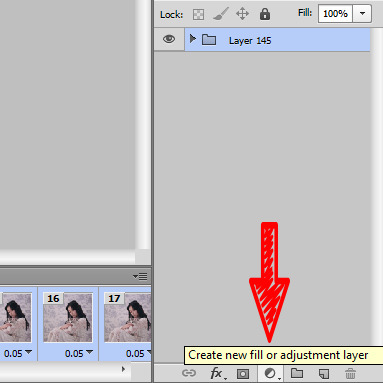
so you click this button
and it gives u a list of various things you can do to change the look of a gif. The most simple to understand is i guess Brightness/Contrast, where moving the handles adjusts the brightness and contrast of the gif:


so for my first step i slightly raised the brightness and lowered the contrast (it doesnt mean you always have to do that it’s just whatever the gif is, or the look you want to go for!)

and this is the result

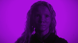
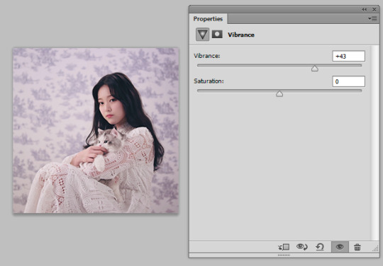
Hmm.. Now let’s say that i feel like i want the purples in this gif to me muuuuuch more vibrant, so i make a layer of Vibrance and raise it a bit to make the colors pop more
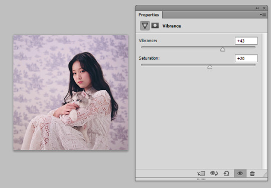
and maybe raise the saturation just a liiiiiitle bit
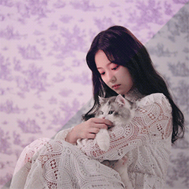
I still feel like it doesnt look cool enough.. Like i dont want a subtle soft purple from the original i want it PURPLE with a capital P and capital every other letter lol. There’s a bunch of fun ways to get that effect that you’ll get after playing around with those Adjustment Layers.
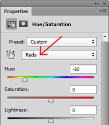
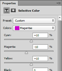
I went into Hue/Saturation aka my fav tab, and made the settings for Blue and Magenta just a bit to the right of the spectrum and more saturated (it might not seem like a big diff but those little changes pile up to give the gif a distinct look)

then i went to color balance and changed it towards slightly more red and magenta
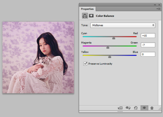
this is all the work we have done so far, it’s pretty visible already i would say
Now what i showed so far is i guess the more like bare simple ways of color manipulating ur gif. It’s nothing crazy but it already gives it a distinct and more pleasant look!
There’s so many of them that tbh there is no One tutorial, it’s just about experimenting with each of these options and seeing what kind of results you get! Because there’s sooo many possibilities in adjustment layers that i haven’t even started describing the tip of the iceberg. some examples:
I made a Solid Color layer in a darker purple shade ur seeing in the little box, set its Blending Mode (the lil box next to opacity) to Luminosity and changed the Opacity to a lower one bc it looks crazy on 100%, and achieved this nice toned down effect to the gif if you’re going for this kinda look! i also like it cos it returns some color to her skin shade
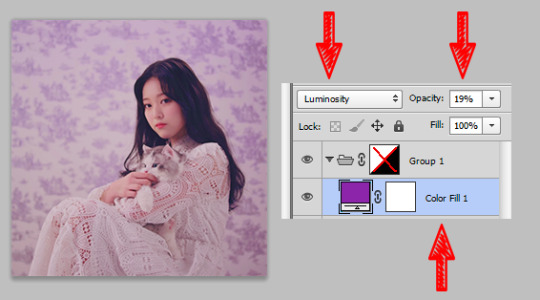
another cool feature with like .. endless possibilities is the Gradient Map. With this one you also gotta use Blending Modes and lowering the opacity of that layer so that your gif doesnt end up looking crazy... ooh also play around with Photo Filters, those are really easy to grasp and have already st presets that can make the photo colder/warmer/etc!
after playing around some more this is my final result lol...
before

after
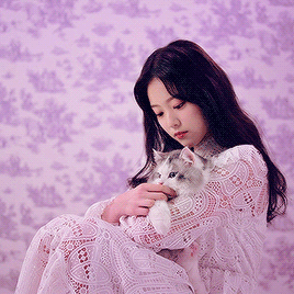
(i also sharpened the final gif)
So if you take all these adjustment layers and group them in a folder, it’s called a PSD! A lot of people share their psds online as do I! Not every psd works for every video, but some might be more universal than others, and you might just have to tweak it a little bit to look nicer! So to use someone else’s PSD on your gif you just open them in Ps side by side and drag the folder with the PSD on top of your gif!
22 notes
·
View notes
Link
For this reflection paper, I will be mostly commenting on the "How social media makes us unsocial" video, as that was the video that struck a chord with me the most. Before I do, I would first like to make it clear that I, a person that has grown up in this era myself, am conscious and aware about the very worrying and very present drawbacks that social media has brought upon our society. This is why I do not find much fault in the other video, as it tries to give the other sides of things, a benefit of the doubt at the least. What bothers the most about the woman is how she attempts to relay these problems. I would also like to add that the paragraph limit is far too small for me to properly get into a lot of points that I would like to make, and the lack of space for nuance may lead to me repeating the exact things about the video that are causing my frustrations.
The whole video is just riddled left and right with fallacies. There are hasty generalizations thrown everywhere. Saying that people can’t go an hour without their phones despite the average person - in 2014, so data available when this video was released- spending a meager two hours and 42 minutes a day on their phones . She includes this strawman about being expected to know about the state of a person based on their Facebook post is somehow a huge point of conflict in her life. There’s this bit where she complains about her mother asking her to text her the information so she could remember it better after which she turns around and complains that she feels dread whenever she hears the cellphone ring is contradictory at best and confusing at worst. People don’t have the time to drive by or write a letter every time they need to ask you something. Adding to this, it seems that, in a good chunk of the video, she’s the one that doesn’t want to communicate with people. That little passive aggressive hypothetical call with Tiffany being a great indicator of her personality. How people can’t take a vacation in peace because they have to answer work emails as if the inability of companies and workers to set and respect boundaries is somehow the accessibility’s fault. She also thinks that abbreviations such as ‘lol’, ‘omg’ and ‘wtf’ somehow depreciates language. To quote; "So when we abbreviate our vocabulary what we risk is losing the nuances, subtleties and intimate parts of our personalities that make up our very rich American Vocabulary.". First of all, social networks don’t only involve Americans, and though this was a speech made by Americans, for Americans, by 2014 the internet was so saturated that the blend of different races has already been established enough that regardless of how innocuous this throwaway line was, it nevertheless was a distasteful thing to say. Second of all, shortened words are a part of language. Auxiliary verbs, abbreviations, and acronyms have always been around. She even uses it in her speech. Third and lastly, calling a clear evolution in language ‘risking losing the nuances, subtleties and intimate parts of our personalities’ is an unusual slippery slope that borders on fear mongering. Later on, she mentions in her video about how we’re so addicted and/or reliant -she doesn’t really specify which is which- on our phones that we turn our cars back around just to get our cellphones whenever we forget them. See, the thing about this is the reason why we need our phones is because of convenience. In our phones are our calculators, our dictionaries, our notes, our schedules, our wallets, and many more. Having the ability to have all of those features without actually bringing all of them and not using it is you’re prerogative. If her argument is that she doesn’t like how it’s so convenient and therefore ‘addicting’ to her then that’s her problem. Let her bring a whole carload of stuff when she goes out. Speaking of convenience, she also criticizes the frailness of phones these days. With her story of going to a store and slamming her blackberry on the ground and being all smug about how didn’t break and how people can’t find that kind of sturdiness nowadays. But the thing is, she most definitely can get a phone like that these days. She’s just in the wrong store. She also has to give up the amenities of the new generation of phones but by the way she talks about them I doubt she uses them that much. The speaker has really weird ideas about human behavior too. Blaming human being’s natural tendency to be vain on selfies and the facade they can portray online. As if people haven’t paid good money for portraits of themselves for centuries. As if people aren’t pretentious and putting up faces in real life, casting away the people they love because their actions ‘taint’ the family image. Human behavior hasn’t changed at all, the only difference is the way they can express it. While I do admit that she alludes to good points, such as distracted driving being one of the leading causes for car crashes (which, by the way, was not in fact the leading cause of vehicular accidents or vehicular deaths during the time like she claimed. The leading cause was speeding ), they get completely overwhelmed by her other opinions. Refusing to put in any helpful or insightful ideas in favor of pandering to the obvious majority of her current audience. The most ironic part about this video is that it tries to convince people that social media is bad by using social media as the mean to spread it. Just gives of the same vibes as Plato and Socrates being against writing things down and fighting against it by writing papers against it. Following this, the whole thing feels like a poorly written informative skit of some sorts, exacerbated by the video that she made us watch in the first half, which obviously tries to depict a society that puts a little too much value in their internet – which, just like what I said before, even though it is correct and something that I’ve personally seen myself in real life, is another point of contention for me because of the dramatics of it. Overall, I prefer the other video that was shown, as it gives an unbiased and constructive narrative despite also being mixed in with humor, something that "How social media makes us unsocial" tried and failed to do. Maybe she wasn’t serious. Maybe she was just taking the uncertainty about the changing of times and spinning it into a satire. But it’s infuriating to see someone with a big platform fearmonger like that. I won’t get into the TEDTalk formula of content, but the script, though well written, is poorly researched, sanctimonious and all in all just aggrieving to the people on the other side of the spectrum. She says that “I think we would all live life better if we had hands to hold rather than keys to click.” Yet she condemns the very medium that allows us to stay connected to people who we may have lost, or may not have even found, without it.
0 notes
Last Seen Blogs

nightterrors
Count Of Casualty
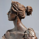

pollstuck
Pollstuck

scoundrels-prefer-redheads
trufax

gugobewu11
how to open a slot machine business