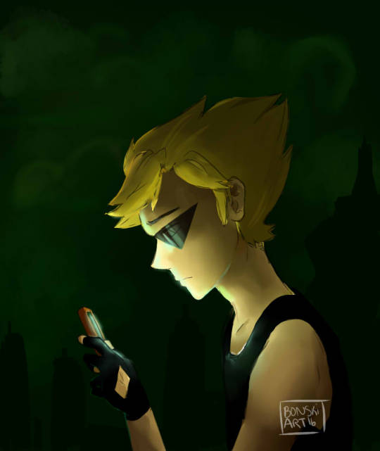
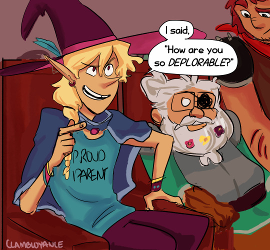
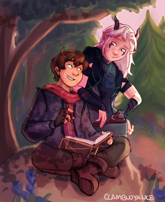
#also did more of a painterly style as well
Text

without the sour the sweet wouldn’t taste
why are you as a man eating another man’s ear after you failed to make him eat his ex girlfriend. 🤨🏳️🌈⁉️
im allowed a bit of toxic yaoi. as a treat
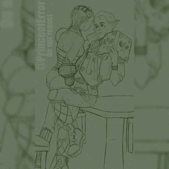
process discussion utc ⬇️
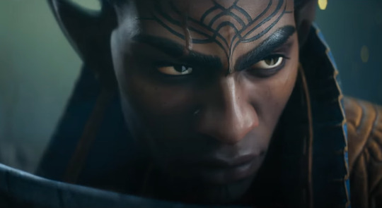
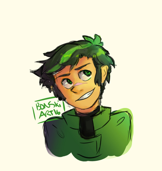
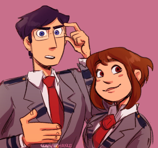
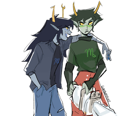
for those familiar with my work you’ll know that i like trying a lot of new styles and experimenting in order to achieve a certain vibe. usually those are heavy painterly styles such as the sunday art inspired by Yuming Li, which is what i’m familiar and comfortable with, both traditionally and digitally
what im NOT familiar with is watercolour. i’ve never had a good time with it 🥲 i just cant seem to wrap my head around the process since its requires me to work backwards (light to dark vs dark to light)
for this piece i just couldn’t imagine myself rendering it in my usual style. i needed to do something new so that i’d stay invested enough in the piece considering that it has two people, meaning double the work. for some reason i thought it’d be fun to do double the work with a style i am completely uncomfortable with but oh well!! i managed to do it 🤷♀️ i was specifically looking at the works of Ko Byung Jun, an artist i’ve seen all over my pinterest feed
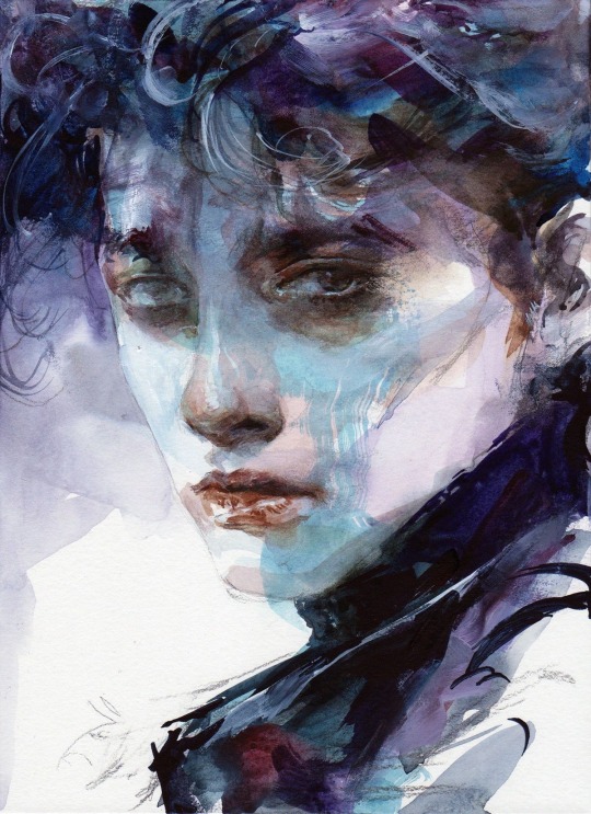
while i didn’t end up really following the style super closely i still learned quite a lot just by looking at it while i drew. i tried my best to stick to watercolour brushes and an ink pen but as i was nearing the end i needed to make some alterations that i wasn’t bothered to try fixing with the watercolour brushes so i just went over it with my digital ones 🫡 i did my best that’s what matters!!!
i had to repaint rody a few times cause i just couldn’t get it right and the colours never ended up matching vincent. i painted them separately and i think i got possessed while painting vincent cause it happened in like. 40 minutes. and i couldn’t get it to happen again 😔 it didn’t really matter cause i ended up going ham with the curves tool as always but you know 🤷♀️
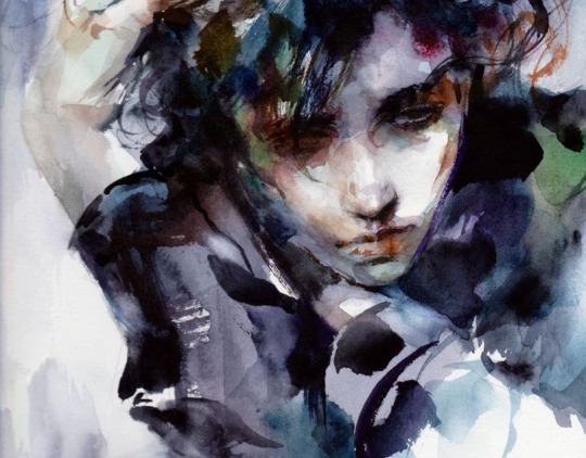
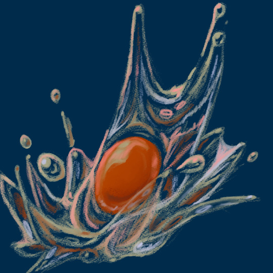
here’s the image without all the effects:

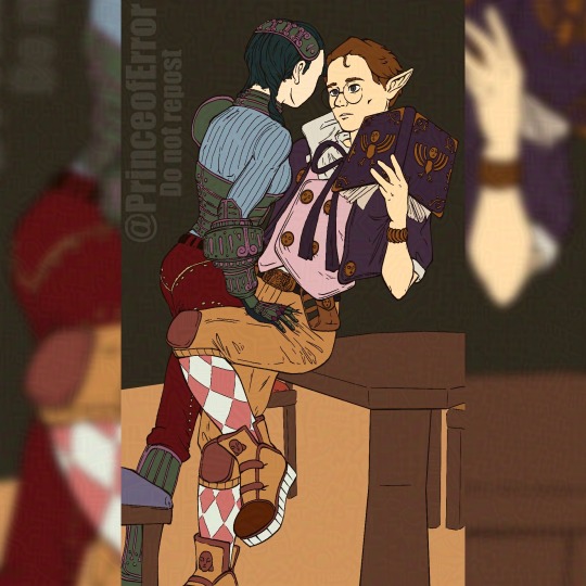
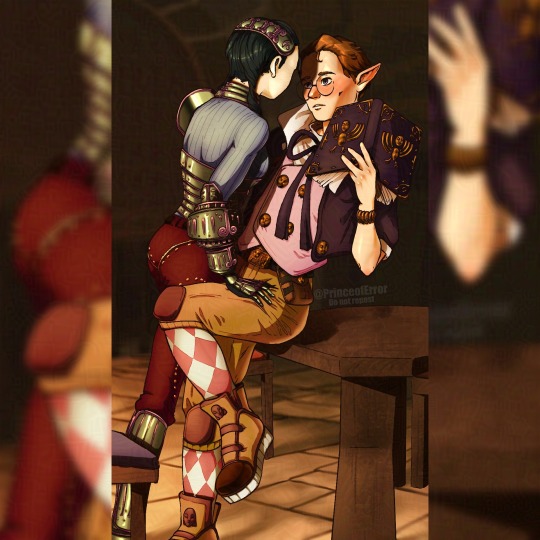
i find lately it’s been more and more common for me to be sketching several iterations of a concept for days, even weeks before i land on something i like. i have an entire separate canvas that i’ve spent 5 hours just doing thumbnails trying to figure out how i wanted to pose these two in a way that would showcase the characteristics that mattered in the story of this piece.
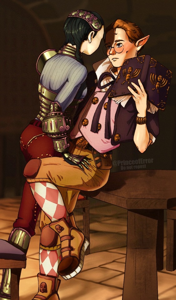
that’s my process for coming up with drawings: i find inspiration somewhere, i figure out the key concepts/characteristics/symbols etc i want highlighted, and i work around those. sometimes i have a composition in mind or just a general vibe i want to portray. for this one i wanted to make sure the towel, rody’s injured finger and vincent’s face could all be clearly seen, while also portraying the fight scene and the vibe i get from the reference song. almost all of my work revolves around a specific lyric from the song which drives the story of the piece. here i interpreted the line “without the sour the sweet wouldn’t taste” as a connection to all the little actions vince takes with rody that can be seen as “sweet.” drying rody’s hair, bandaging rody’s cut. i then asked myself how i could take those actions and make them “sour” or show them in a different light, in which vince is biting the finger he bandaged and pulling rody closer, preventing his escape with the towel he used to dry his hair. what im trying to communicate in this illustration is the idea of “if it weren’t for how i’m treating you now, you wouldn’t understand how kind i was to you then” in an attempt to illustrate the complexities of the way vincent acts towards rody.
i’m truly in love with the story telling of this game. it’s hard to really say anything about how the characters acted during the story because it’s so complex in how it’s done. it’s very hard to summarize their relationship because there’s so much about it i can’t explain without just quoting the game directly. i think it’s such a beautiful portrayal of obsession and just being fucking weird about someone. i wanted to ensure the elements i mentioned in the above paragraph because i didn’t want to be portraying vincent as solely a villain and rody as a victim. i wanted the storytelling of this one illustration to live up to my impression of this beautiful game and i hope i did it justice.
thank you for reading this if you’ve made it this far. i love rambling on all my art posts cause i think it’s so valuable for artists to expand on their work outside of the result alone. i hope what im saying is at most helpful to someone and at the very least a good read. i’m probably gonna take a bit of an art break after this since it took a lot out of me, plus im on the last days of my trip. thank you again for reading!
here’s my dog
#my art#fanart#dead plate#dead plate vincent#dead plate rody#dead plate fanart#dead plate game#vincent charbonneau#rody lamoree#digital art#artists on tumblr#digital illustration
69 notes
·
View notes
Text

(Click the image for better quality)
Yipeeee that Keiki and Mayumi fanart I posted the WIP of is finally done woooo- This piece was a very experimental one that I'm kind of OK on. Maybe because I've just gone insane looking at it for so long and I'm my own worst critic lol.
Artist's Notes;
So I've once again been playing around with my rendering style, mainly because I have been wanting to improve my lighting for a while now and as I was just scrolling through Tumblr, I saw some of the official art for that one webcomic-turned-animated-TV-Show Lackadaisy and was immediately inspired. I also have seen a technique a few times in the past where the lineart and shading are merged together, so I've been meaning to try that for a little while.

I did some experimentation on this one sketch of Keiki I posted in my sketch dump and I really liked the results of it, so I carried those over to this piece.
I ended up scaling up Keiki and Mayumi from the original WIP because I felt like they were both getting lost in the composition, and I'm glad for that because I think it works a lot better. I'm not a fan of how Mayumi's sword turned out at all, but it's not really meant to be the focus of the piece so eh. Overall, I think I could do better with my colours, probably because with Keiki and Mayumi's colours, I did them flat in greyscale and then used a brush on the overlay blend mode to colour all of them over, after which I changed the base layer for their colours from white to yellow and then lowered the opacity so it all went together better. I also decided to use gradient maps for a lot of the background elements, mainly to experiment with getting in my values first to make them pop out more. I ended up finding a really nice sky gradient on Clip Studio Paint that I really liked, and that kinda helped to establish the colour scheme of the background a lot. I think the whole "start in greyscale then colour" thing really works better with painterly styles rather than more illustrative ones, and while it is good at making sure your values are more readable, I honestly don't think I have the skill level to pull that off yet. Honestly, I think I've been looking at this drawing too long or maybe I added too much to it, but I wish I could've made the colours less monochromatic, but I'll just save that for the next piece I do.
I do love how the flame (...well it's more of a weird space rift than anything in this piece) and the lighting turned out, those were fun to do. I was initially struggling with the flame and how Mayumi is positioned in front of it before realizing "Oh wait! This is a weird abstraction of a weird creature! I don't have to follow the laws of anatomy!" and just dislocated it's flamey bottom jaw from the main body. I also changed the colours of it since I was really not liking how incredibly bright it was when it had lighter colours. Again, the gradient maps served the more painterly style of the flames well.
I also love how Mayumi turned out. I could do her sleeves better but that's more of just me needing to study how those types of sleeves fold in that position more. I'm also very happy with the posing, the technique I used for that was taking photos of myself in the positions I wanted, blocking in the silhouette and then modifying that by adjusting it to my lines of action that I drew on top of the original photos, and then sketching over the silhouettes and drawing in the shapes of the hands overtop of the photo if I needed to get the fine details right. As for what I do to take the pictures myself, I use a tall chair I have, prop up my phone with a phone stand, put on a ten second timer and scramble to get in position. Yes, I did have to use a bunch of thin markers I had to try and get the hand positioning on Keiki's pose right, yes I do have a fake sword that I used to get the positioning of Mayumi's arms and hand right, the sword was for an old Halloween costume from several years ago. I really like how both Keiki and Mayumi turned out in this drawing, I'll have to play around with these designs for them more in future drawings.
Also, if you wanna know why I draw buildings like that, when I watched Fantasia 2000 as a kid (One of the Disney movies where they make really beautiful animations to classical music) the way they drew the buildings in the first few sections Rhapsody in Blue segment (the jazz one with the cities) changed my brain chemistry and now whenever I need to draw buildings really quickly, I refer back to that. Since the buildings aren't really the main subject, I didn't put much thought into them.
As you can tell I am very tired of this piece, mainly because I made things harder for myself by overcomplicating the process compared to what I usually do, mainly with the whole "starting in grayscale then adding colour." I'd honestly just prefer having a black layer set to colour that I can just toggle on and off when I need to see the values, but it was good to experiment. And that was mainly the point of this whole drawing, to experiment. I'm definitely going to have to play around with this new style I'm going for, mainly because I liked how it turned out a lot in the augmented Keiki sketch, and also because I want to find ways of making it suit my style more. I also really want to keep experimenting with my lighting like this, it's very fun. Last but not least I am never starting in greyscale again because dear god I do not like the workflow it forced me into. I don't have a problem with the method itself it's mainly just a skill issue lol.
If you wanna read my headcanons for these two, I put them in my WIP post, so you can read them there if you want to. The more I look at this the more I prefer the simplicity of my WIP. I might go back to this and just take away the fancy colours and effects to see what it looks like without all of that stuff and reblog this post with that drawing, but for now, I don't think I can look at this drawing again for a while.
#touhou project#art#fanart#touhou fanart#touhou 17#wily beast and weakest creature#keiki haniyasushin#mayumi joutougu#haniyasushin keiki
114 notes
·
View notes
Text
I’ve been on a nostalgia trip for teenage Canadian sitcoms, specifically My Babysitters a Vampire.
And even more specifically my favorite goofy funny side man STILES STLINKYPLINKY!!!

Jk, but Benny and Stiles are literally so twins. They even have the same angry evil version. COMMENT DOWN BELOW WHO WOULD MOP IN A FIGHT, VOID STILES OR PHOTO NEGATIVE EVIL BENNY!!

He’s such a creepy goofy dumbass, but we all love ignoring red flags in favor of adoring silly men 😍

I have more screen caps I wanna do that include everyone else. This is a break from my Descendants work so I don’t burn out. I’ve actually had these finished from the past two days I just didn’t post.

This one I’m really excited about but I’m not done yet ofc. If anyone wants an art tutorial I’d be happy to make one. I have a process for coloring and design as well as simplifying faces so that it’s an easier process to redraw a design I make. I actually didn’t study Ethans face like Bennys so his features are a bit wishy washy.

This is actually a cinematic version of this screen cap, I use the “flat” versions of my art as a color reference for my designs. I also do extra stuff like making differences between characters more obvious. Ethan is more pale due to his seer shit being connected to vampires closely and the fact that I think he’s more of a reclusive gamer boy than Benny. So he gets less sun.
Here’s some old ass study I did of Benny about 6 months old

I think you can tell that my consistency with features is a bit better now a days. If anyone wants an art tutorial I’m down 🥺. I have a process for doing fanart of characters and just my different study styles I do in general. It takes too long to do my painterly style for every character so it’d probably be a simple stylization. What I do to stream line design and stuff. Lemme know if you wanna see that or summ.
(PLEASE ASK ME STUFF, about art, Descendants, MBAV, bro funny stuff or whatever, I just want more asks or like reblog comments pleasssssde 🥺)
#disney#my babysitters a vampire fanart#my babysitter's a vampire#mbav stuff#ethan mbav#benny mbav#sarah mbav#erica mbav#rory mbav#benny weir#ethan morgan#sarah fox#rory keaner#erica jones#my babysitters a vampire#mbav fanart#descendents fanart#disney descendants#disney channel#disney fanfiction#descendants
69 notes
·
View notes
Note
Your art is so pretty!! I especially love the way the thinner, more subtle lines work with the light colors! It makes everything look very soft and dreamy in a really pleasant way.
I also adore the painterly style in some of the illustrations accompanying the Finnish poetry. You also did a great job with the translations, Finnish is my native language and I know how hard it can be 😭.
Anyways this isn’t really an ask im just excited and glad to find another cool person. Also, suomi mainittu is just a plus.
Thank you! I originally started to use the chracoal/soft pencil like brush for my digital art because I wanted to teach myself to focus on bolder shapes rather than very tiny details (that took a lot of time!!). The texture of it is much more forgiving than sharp line art pens' and I also really like how it looks 🧡
And, tbh, English is bit harder to me than Finnish because another native Finnish speaker here! I tried to study to be a translator, but switched to just studying English literature. I do still enjoy translating things for my own amusement, but oh boy translating is harder than it looks! There're some small things I would change in those translations from Moonday Letters but oh well, those have already circulated kinda far.
Ja kiitti myös suomeks! 🧡🦢

#torille 💃🏼#also the texts from Moonday Letters/Kuunpäivän kirjeet are very poetic but it is actually and entire novel!#ask
68 notes
·
View notes
Photo
“I know I can never defeat you Lobo, but I will never stop fighting for this life.”
[ID: A digital Persian Miniature styled art of Death and Puss In Boots’ final battle on the Wishing Star from the movie Puss In Boots: The Last Wish. The background is a blue with darker cracked textures signifying the area of the star, and the borders are purple with pink and white flame patterns across. Death can be seen raising his sickles at Puss with a feral snarling smile on his face, meanwhile Puss is knelt in front of him holding out his sword as his terrified expression is reflected on one of Death’s sickles. End ID.]
A Persian Miniature-esq styled art of Death and Puss’ final battle on the wishing star. This took me a long time to finish but it was a blast to paint!! Both Puss and Death ended up looking more 3D than what is typical of the very flat and 2D styles of Persian Miniature art, but I feel I managed to capture the energy and ‘flow’ of them well enough!
I adore the use of fairy tales and folklores in the Shrek universe and so I thought the idea of using the Persian Miniature style would have fit along with it, as these artworks were often used for book covers and illustrations. I’ve also wanted to create art with more influence from my culture and background, so I thought it’d be a perfect fit!
This was digitally painted with Krita, did I manage to make it look ‘traditional’ and painterly enough despite the digital medium?
#my art#puss in boots#puss in boots the last wish#puss in boots death#dreamworks#fanart#krita#Persian miniature#persian#persian artist#Iranian artist#iranian#digital art#digital painting#dreamworks puss in boots#pib death#the wishing star#flames#artists of color#artists on tumblr#sickles#wolf#cat#spoilers#puss in boots the last wish spoilers
638 notes
·
View notes
Text
Eggtober 6th 2023

"Splat" or "Fun with Colors": Raw Egg.
(Clip Studio Paint, Gouache Brush, Pencil brush for details and highlights. 12 colors, I think? 1 Hour.)
I actually really liked the rough version I made, so you're gonna get that one at the end as well, for anyone who also likes the rough one better than the smooth one.
But first... I finally discovered a feature of CSP, so now I am unstoppable and I will NEVER AGAIN have to ask myself "How the fuck did I do that?"
Because now I have EVIDENCE. Now curious friends, followers, and my forgetful ass, can watch the full process of how I made a thing. Including what references I used so it's clear how much is iterative and how much I am drawing directly from the visual reference. Today I had to do a lot from imagination because I couldn't find an exaggerated splashy egg, but sometimes I really am just making a study and trying to do a one-to-one recreation of a reference. So now y'all get to know all my filthy little secrets. I was intending to grab footage starting with Eggtober 1, 2023 but OBS needs a version of an NVIDIA driver that will absolutely wreck my computer with BSODs because I own a junker apparently. But it turns out CSP (or at least V2, IDK if it was in V1) has a way to capture a speedpaint natively when you create the file.
Now I am unstoppable, powerful. No more taking a break from art when life gets busy and coming back to pieces I drew 10 years ago and wondering "How the hell did I manage that?" I can just check. It's over for all of you. Once I practice anatomy again and start being able to draw shapes and volumes perfectly from imagination, I will become all-powerful. I will ascend. Hell, maybe someone might even pay me if I learn to draw anything that isn't an egg or a meme. XD Radical self-confidence, baby. I can art now, and I have evidence. My horizons are infinite!
And now, hopefully, any baby artists that are just starting out can get an idea of how I do it from this and future pieces so I can pull you all up with me in a bid of apotheosis. For the EGGsthetic! (Aesthetic.)
I wonder which version of this egg @lady-quen's breadbugs will snap up?
And I wonder which one @quezify will like best? My money's on the sketchy one.
I can't tell which I like better honestly. The smooth one us much more "My aesthetic" because it matches how I render eggs but... The rough pencil-y gouache lines you get with light pressure really remind me of how the classic modern quezify eggs look, and I of course only started doing eggs because of the first Eggtober so, like. On the one hand, smooth and painterly look that goes with all but one of my previous eggs (Eggtober 1, 2023 was a study from memory of quezify's style, after all). But on the other hand... dramatic color changes! Textrure, shine! Colors that aren't in the actual references! EXPRESSIVENESS.
Two different moods on the same egg art and I really dig both of them honestly.
164 notes
·
View notes
Text
hi everyone!! my wrist is too sore to draw today, so instead i thought i'd share some of my favorite csp assets + how i like to use them! i also linked some procreate brushes at the end of the post!!
lineart brushes:
SU-Cream Pencil: i swear by this brush and i use it very often!! if you lower the pen density and use a gradient map over it when coloring your drawing, it has a nice effect. that's what i did in this drawing here! i also use this brush like i would draw on paper, so as a sketching tool. recently i've been enjoying blending it for shading. the pics below are drawn on one layer; left is more manga style while the one on the right is from a WIP of my singer sargent study, so it can be used for more realistic styles pretty well!


Found Pencil: another pencil brush that feels really nice to use, created by @/pigpenandpaper.
PS style brushes: a recreation of photoshop's (i believe) default brush. very versatile and also blends well!
analog wind variant pen: a nice pen that i like to use for lineart that is intended to have a bit of a sketch look.
zakutoro real g-pen: i used it for the lineart of this piece. although, it was drawn before i started using 600dpi in my works, so the lower resolution might make it look a bit unclear.
sets of rough pens: great for manga lineart with a rougher vibe; some of them have varying line weight.
coloring brushes:
zaku brushes: very nice and painterly mixing! i definitely recommend it for those who like to leave their colors a bit unblended.
softie marker: as the name implies, it's very soft! i like to use it for blush in chibi illustrations.
analog watercolor brushes: realistic-looking watercolor brushes. i recommend using it with csp's default paper textures, or those i linked below!
993 coloring pen: it's very soft and watery, though it can be made more solid by adjusting the paint density. i actually think it works very nicely for lineart too.
rock dog pen: another soft marker brush i like, that i once again also use for lineart and doodles.
thick coating brush set: recommended for paintings that show brush strokes.
cartoon cloud: don't let the name narrow your vision!! this has to be one of the BEST brushes for painting in my opinion, and of course it's great for clouds and explosions but so so much more!! and it's FREE try it try it!!
decoration/miscellaneous brushes:
neon pen
paper textures
symmetry move brush
close and fill without gaps
rope brush
sphere fisheye guide
flash balloon
speech bubble set: a lifesaving collection for comic artists!! dimensions and line weight can be adjusted by using the operation tool.
gradient map to use in color mode at 15% and another gradient map to use at 20%: the percentage refers to the opacity of the gradient map layer, but they are just the creator's recommendation and i tend to actually increase it. to use gradient map efficiently, i recommend putting all your colors (and lineart if you want) in a folder. then, right-click the folder, select "new correction layer" and then "gradient map". this allows you to modify the gradient map without worrying about affecting the original colors in case you decide not to use it in the end. to import a gradient map from your downloaded csp assets, click the wrench icon next to the name of the gradient set that's currently in use, then select "add gradient set".


you'll also notice that the creator recommends to use their gradients in "color mode". of course, this is also only a recommendation and i suggest trying as many layer modes as you like! to change a layer's mode, simply highlight the layer and click on "normal" (the default mode) and csp will display the available modes.

fruit ninja gradient map: fun to use if you want really drastic/vibrant colors! the names of the gradients are cute too, as you can see in the above screenshot!
BONUS: jeremy fenske's free photoshop brush pack: these aren't csp brushes per se, but they can be imported into the program! excellent for environments, i recommend watching fenske's video on how he uses the brushes to get a clearer picture since there are so many in this pack!!
BONUS 2: my good friend clem has a few brush packs for procreate that are ideal for painting,decorating drawings, and y2k-inspired illustrations, i definitely recommending checking out her shop!
in conclusion i hope this post can be helpful to you!! i tried to explain how to use the brushes as best as i could, but feel free to let me know if anything is unclear!! i hope you will enjoy using them! :D
#clip studio paint#clip studio paint brushes#csp#csp brushes#procreate#procreate brushes#brushes#tutorial#art tutorial#sort of hehe
53 notes
·
View notes
Text
Ashei x Shad
Any other Shad x ashei shippers out there?!
Commission info | Buy a Print! | portfolio | twitter | insta | Discord server
Progress pics below!
Sketch:
Oki so first up I found a reference I liked off Pinterest which had some interesting vibes I wanted in my piece. While drawing the two in these poses I realized just how many oocca faces Shad has on his design, it's actually awful. Shad I love you but this is disturbing.
Line art:

For the line art Ive tried adding more detail here just as I'm still playing around with what I want my art style to be. I think this part turned out rly well, I got the line weights down nice and the details really work.
Flats:
The flat colours do look a bit strange on their own, if I was planning to leave this piece at this stage I would move the colours over to be warme. I planned to do a lot with the rendering so it's not an issue here.
Finished render:
I didn't initially plan to return to my more painterly style, I was going to cel shade it like the pieces in my recent posts, but I'm so glad I randomly decide to. The high contrast of shadow, especially the cast shadow Ashei is making, really adds some depth I think my art hasn't had for a while. The details of the brush strokes add more visual interest to the piece and can imply more form than just flat cel shadows. The background also turned out really nicely being lineless I think that helped to not steal any attention with unnecessary line art.
This is my new favorite piece I think this shows some really nice progress in my artistic journey. I can't wait to immediately use this style for putting master kohga in a banana dress but unfortunately you will have to wait til next Saturday for that so make sure you're following as to not miss it.
Thank you so much for reading if you did! If you'd like to buy this as a print it'll be up on my inprnt, I also have commissions open if that's something you're interested in
Oki bye!
#zelda#The legend of Zelda#twilight princess#Zelda twilight princess#Loz#The legend of Zelda twilight princess#zelda fanart#Zelda art#Twilight princess fanart#Twilight princess art#Shad#Ashei#Shad x ashei#Ashei x Shad#zelda ashei#Zelda Shad#twilight princess Shad#Twilight princess ashei#art#illustration#digitalart#procreate#artwork#fanart
47 notes
·
View notes
Text
i'm still holding off final judgement until the gameplay today, but seeing some stills on twitter kind of helped me solidify what i found so off-putting about the style in the companion trailer
although before i post those, a few counter arguments because i'm already tired of ppl bashing the ppl who aren't vibing with it, and my head is clear enough to put these thoughts down:
"cinematic trailers rarely look like the actual game" - true to a point. however:
1) typically cinematic trailers strive to look like a higher definition version of the game, which seems to be the opposite here. in the case of DAO and DA2, i would say the cinematic trailers actually strived for more realism, not stylization, as that was the trend at the time.
2) this is a cinematic trailer, but it is also done in the game engine so it's not unreasonable to assume that the end product is gonna look somewhat similar
3) this was supposed to be their best foot forward so suddenly going "don't worry, it's gonna look better in-game" is just a bad marketing move. it's not on the audience to give this company the benefit of the doubt (particularly in light of all the shit that has gone down there in the past decade)
"not everything has to be super realistic!" - agreed! not liking elements of this particular style doesn't mean i'm opposed to stylization in DA at all. i think DA2 is much more stylized than DAO, and not only does it look nicer, it looks more distinctly dragon age. DAO visually is also very generic, especially for its time. i still love the almost painterly look of DA2, even all these years later
and i think DAI has issues with the character models, especially the uncanny valley disconnect between the really stiff animations and realistic faces (having played it within the past year, they've aged pretty roughly), but in terms of environment and armor and whatnot, it did build off the style presented in DA2 in a way that effectively modernized it for that era. it did go for a more realistic look, but it was cohesive and still distinctly dragon age
"people reacted like this to DA2 and DAI's trailers too" - no, they did not, lmao. DA2's trailers were the reverse--they looked more realistic than the actual game. now there was some backlash against the stylistic choice in the actual game. i remember david gaider talking about it in a panel at dragon con in 2012--apparently ppl were upset that the companions looked like they were made with cosplayers in mind, which i thought was an interesting criticism. but no, the trailers did not get this sort of response.
and DAI's trailers used a lot of in-game footage, and the cinematic ones were both pretty accurate to the game and well-received by the audience. DAI's marketing was also absolutely bonkers and nonstop for like 9 months before the game was released, which in hindsight i think was way too much, but in terms of visuals, we knew exactly what we were getting.
"you guys just think anything with a style to it looks like fortnite" - lmao, okay, yeah, describing it as fornite is probably unfair and inaccurate, but i know for me, i kind of use it as a shorthand to reflect my general dissatisfaction with the way so many 3D styles (in both games and movies) just have this bland, cartoonish look to them. the pixar-ification of everything. i just don't like it.
and the logo with the bright purple and overly smooth text doesn't really help here either. i think a less saturated and darker purple paired with a grungier font would also help in making this feel like less like fornite season 3458345: dragon age avengers.
plus it was originally gonna be a live service game and i think that it still has some of that dna artistically
SO ANYWAY
these stills, which i think are also in-game engine but im not entirely sure if they're from cinematics, gameplay, or just renders but they seem to be in-line with the trailer:


and seeing emmrich and to a lesser extent neve in these pics solidified why the stylization didn't work for me on a visual level (never mind it being paired with the light-hearted planning-for-a-silly-little-heist vibes)
so when i first saw the trailer, and i saw varric, i was like "nice"

he looked like a higher definition, older version of a DA2/DAI hybrid of his model. he looked really good. i thought harding looked good, too. it did take me a minute to realize who she was, but it really wouldn't be a DA trailer if we weren't left wondering who tf a returning character was lmao (remember the confusion over alistair's appearance in one of the DAI trailers? this is actually tradition now)
but as the trailer goes on, the style doesn't even stay consistent--it just gets progressively more cartoonish right up to emmrich, which is the exact moment that made me go WHAT
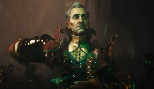
he looks like a cartoon character. the hard lines in his face, the stiffness of his hair, his overall proportions--he looks like he should be a villain in a pixar movie. like i'm digging his overall vibe and as a concept of a character design, i love it. but this execution of it next to fellow old wrinkled man varric looks so off
and then we go right into davrin who is beautifully rendered and designed--he doesn't look out of place next to varric or harding
some characters have the soft, wispy hair while others have hair that looks like a hard shell with lines carve into it. some characters have finely detailed wrinkles while others have thick, cartoonish ones. some characters have realistic proportions while others have more exaggerated features.
stylization is only effective when it's purposeful and consistent, and from what i've seen so far, it's not. it's all over the place.
so there's my thesis about why i dont like the art direction in the trailer lmao
and like i've been saying since it dropped, i am reserving full judgment for the gameplay reveal, but based on the other stuff bioware has teased, i'm not expecting this aspect to change too much. i've seen other ppl who were on the fan council thing say the tone in the game is more in-line with the tone in the other games, so maybe that'll help smooth out this disconnect
33 notes
·
View notes
Text
THIS DAY IN GAY HISTORY
based on: The White Crane Institute's 'Gay Wisdom', Gay Birthdays, Gay For Today, Famous GLBT, glbt-Gay Encylopedia, Today in Gay History, Wikipedia, and more …
September 16


1856 – Baron Wilhelm von Gloeden (d.1931) was a German photographer who worked mainly in Italy. He is mostly known for his pastoral nude studies of Sicilian boys, which usually featured props such as wreaths or amphoras, suggesting a setting in the Greece or Italy of antiquity. From a modern standpoint, his work is commendable due to his controlled use of lighting as well as the often elegant poses of his models. Innovative use of photographic filters and special body make-up contribute to the artistic perfection of his works.
Von Gloeden was a minor German aristocrat from Mecklenburg who, suffering from what appears to have been tuberculosis, came to Taormina in Sicily in 1876. He was wealthy and provided a considerable economic boost in this comparatively poor region of Italy, which might explain why the homosexual aspects of his life and work were generally tolerated by the locals.
Von Gloeden, who in the 1880s had started photographing boys, but had also made portrait studies of local peasants and engaged in some landscape photography, turned his hobby into a profitable business in the 1890s when his family fell on hard times financially. Already a local celebrity in Taormina, his work (and his models) drew to Sicily such luminaries of the times as Oscar Wilde, the 'cannon king' Alfred Krupp, Richard Strauss, as well as the German Kaiser.

The bulk of von Gloeden's work stems from this time period up until the beginning of World War I. His idyllic 'illustrations of Homer and Theocritus', i.e. pictures of skimpily clad boys in classical poses, were also reproduced as postcards and enjoyed popularity as souvenirs for tourists.
Von Gloeden generally made different kinds of photographs: the ones that garnered the most widespread attention in Europe and overseas were usually relatively chaste, featured clothes such as togas and generally downplayed their homoerotic implications.
More explicit photos in which the boys were nude and which, because of eye contact or physical contact were more sexually suggestive were traded by the Baron 'under the counter' to close friends.

Still, considering the prudish and homophobic atmosphere of the time, it is remarkable that von Gloeden and large parts of his work were generally accepted and respected. The popularity of his work in Germany, England, and America can possibly be attributed to four major reasons:
- He was a consummate and talented photographer.
- The Classical and painterly themes in which his work wreathed itself served as a cultural 'badge of protection'.
- At that time male-male-love 'did not speak its name' and was thus totally unthinkable to many who saw his images.
- New printing technologies enabled the mass reproduction and sale of his work in postcard form.
In total the Baron took over 3,000 images, which after his death were left to one of his models, Pancrazio Bucini, also known as Il Moro for his North African looks. In 1936, over 2,500 of the pictures were destroyed by Mussolini's police under the allegation that they constituted pornography. Most of the surviving images therefore come from private collections.


1906 – Maurice Sachs, born Maurice Ettinghausen, (d.1945) was a French writer. He was the son of a Jewish family of jewelers. French writer, adventurer, worldly, careful observer of intellectual and political life of the 20s and the Occupation, collaborator of the Gestapo, Maurice Sachs was the author of the Sabbath, a largely autobiographical novel.
Sachs was educated in an English-style boarding-school, lived for a year in London and worked in a bookshop, and returned to Paris.
In 1925 he converted to Catholicism and decided to become a priest, though this didn't last upon meeting a young man on the beach at Juan-les-Pins, with whom he had an affair.
After involvement in a number of dubious business activities, he traveled to New York, where he passed himself off as an art dealer. Facing prosecution for fraud, he returned to France, having given up everything except the young man who accompanied him, Henry Wibbels, who was his lover from 1933 to 1937. Returning to Paris, he associated himself with leading homosexual writers of the time - Cocteau, Gide, Max Jacob and Proust - with all of whom he had stormy relationships whose precise nature is unclear. At various times he worked for Jean Cocteau and Coco Chanel, in both cases stealing from them.
He associated with Violette Leduc who describes her friendship with him in her autobiography La Batarde. She describes the writing, and her reading of the first version of Le Sabbat in La Batarde and how she tried to get him, unsuccessfully, to remove harsh references to Jean Cocteau.
Sachs was mobilized at the start of World War II, but was discharged for sexual misconduct. In 1940, Maurice Sachs spoke live on Global Radio on a Resistance program intended to convince the United States of America to go to war against Germany, which puts him on the German kill list. During the early years of the Occupation, he made money out of helping Jewish families escape to the Unoccupied Zone. But he may also have been an informer for the Gestapo. In 1943, to survive, under a false name, he offered his services to the Gestapo to infiltrate the gay community; however, he only stole from the Gestapo, lied, and refused to denounce gays. He was finally arrested and imprisoned in Fuhlsbüttel.
In 1945, before the advance of British troops, the prison of Fuhlsbüttel was evacuated and its inmates moved to the city of Kiel. The evacuation consisted of a long march that took many days to complete. On the third day of the journey, April 14, 1945, at 11:00 in the morning, Sachs became too exhausted to continue the march. He was killed by a bullet through his neck, and his body was abandoned at the side of the road with the body of another "companion of the same misfortune."

1922 – Lord Peter Henderson of Brompton (d.2000) was a hero of British gay rights. With his wispy white hair, wrinkled brow, weak voice, and even feebler body, Lord Henderson of Brompton was not a heroic-seeming figure, but he was one of the House of Lords' under-sung heroes. In 1944 he had been dragged from an Anzio minefield and, having lost the use of many of his internal organs, was signed off from the forces as "100% disabled" - which, he joked, should have meant he was dead.
Educated at the Dragon and Stowe schools and Magdalen College, Oxford, he completed his English degree post-war under CS Lewis, despite pain and operations. After a brief spell at Lloyd's, he became a clerk in the Lords. By 1960 he was private secretary to Lord Home, then leader of the Lords. In 1974 he took the top job, clerk of the parliaments, and was knighted in 1975. Quite exceptionally, on his retirement in 1984 he became a crossbench life peer.
His battle for gay rights - as against article 28 - was part of his crusade for those underprivileged by discrimination, including young criminals, schizophrenics and homeless mothers with children.In 1996, in resisting the Armed Forces' anti-gay discrimination he referred to his wartime command of a platoon, he recalled:
"Two men in my platoon were obviously in love. I took no action, partly be it noted, because everyone in my platoon was quite happy about the relationship, but also because we were about to go into action. Both of those men behaved in a conspicuously brave manner in a particularly nasty night attack. But early in the morning, when we were all cleaning our weapons, two other soldiers, whom I particularly trusted, committed self-inflicted wounds, one in the foot and the other in the trigger finger. Perhaps I may ask the admirals, generals and air marshals which of those four men presented a grave risk to good order and discipline?"

1954 – Writer Michael Nava, author of award-winning mystery novels with gay themes, has increasingly been recognized as an important novelist whose mature work transcends the limited expectations of a popular and highly specialized genre.
Nava was born on September 16, 1954, in Sacramento, California, the second of six children in what he calls a "tragically unhappy" Chicano family. He was the son of a man with whom his mother, then married, had had an affair, and though he was given his stepfather's last name, he knew from an early age that his mother was not married to his father, who in effect abandoned him.
Molested by a family member at age eleven and realizing his gayness at age twelve, Nava knew that he had to escape his mother's religiosity and his stepfather's physical abuse. The one path open to him, an intellectually precocious student, was education. Determining early on that he wanted to be both a writer and a lawyer, he attended Colorado College on a scholarship, earning a B. A. in history in 1976. He then went to law school at Stanford University, where he earned a J. D. in 1981. All the while, he was writing poetry and fiction.
In 1980, Nava met Bill Weinberger, who became his first lover. He lived with Weinberger until 1989. Moving to the Los Angeles area in 1984, he practiced law and began working for the California Court of Appeals as a research attorney. After dissolving his relationship with Weinberger in 1989, he met Andrew Ferrero, and in 1995 they moved to San Francisco, where he now writes and practices law.
Nava is editor of Finale: Short Stories of Mystery and Suspense (1989) and co-author (with Robert Dawidoff) of Created Equal: Why Gay Rights Matter to America (1992), but he is best known for his seven-novel mystery series featuring gay Chicano lawyer Henry Rios: The Little Death (1986), Goldenboy (1988), How Town (1990), The Hidden Law (1992), The Death of Friends (1996), The Burning Plain (1997), and Rag and Bone (2001). Five of these seven novels have won the Lambda Literary Award as the best gay male mystery of the year.
Rios is in the mold of the American hardboiled detective who stands outside society and, as a consequence, sees more clearly than most its dark side. He is doubly an outsider in all of the worlds that he lives and works in. First, he is a Chicano in an Anglo society and an Anglo profession. Although he is a criminal lawyer whose brilliance is widely recognized, he often feels uncomfortable with and condescended to by his clients and his professional associates. Second, he is a gay man in the highly macho and Roman Catholic Chicano society, despised by his father for not being manly enough, and distrusted by other Chicanos because of his education, his profession, and what they perceive as his collaboration with the Anglo society at large.
In 1995, Nava collaborated with history professor Robert Dawidoff on the nonfiction book Created Equal: Why Gay Rights Matter to America. Basing their arguments on sound legal and historical analyses, the authors persuasively make the point that the denial of equal rights to glbtq people threatens the future of basic constitutional principles of individual freedom and liberty for the nation as a whole. They contend that the struggle for equality for glbtq citizens matters to everyone because it is a test case for equal treatment of all citizens.
His contribution to the gay mystery is immense; and despite his tiring of the form, it enabled his growth as a writer. Still a young man, Nava may well establish himself as a mainstream novelist, as well as a chronicler of the gay male and Chicano experience within the boundaries of mystery fiction.

1972 – Mike Doyle is an American actor, screenwriter, director and producer. He may be best known for his role on Law & Order: Special Victims Unit as Ryan O'Halloran.
On the set of Oz Doyle met George Morfogen, whom he would cast in Shiner, a short film written, produced and directed by Doyle that debuted at the 2006 Tribeca Film Festival. Doyle also wrote and produced the 2003 limited-release film Cutter. Doyle also appeared as Jamie Pearse, a small-time crook, in the 1996 television Mini-Series Titanic.
Doyle played Lt. Cmdr. Tom Palatonio in the 2005 action film Phantom Below, which is notable for having been released in multiple versions under multiple names which included or excluded gay content depending on the edit (the gay-themed edit was released under the title Tides of War).
The death of his character in the season 10 finale of Law & Order Special Victims Unit ended a successful six-year run as forensic tech Ryan O'Halloran on the show. He guest starred on episodes of Criminal Minds and In Plain Sight.
He appeared alongside Nicole Kidman and Aaron Eckhart in 2010's Rabbit Hole. In 2011, the feature film Union Square, co-written and directed by Sundance Film Festival's Grand Jury Award Winner Nancy Savoca, was premiered at the Toronto Film Festival. He also starred in The Orphan Killer as Marcus Miller Sr. in 2011. He then joined the cast of A Gifted Man as Victor Lantz, an anesthesiologist. He had a recurring role in the 2012 ABC television series 666 Park Avenue.
In 2014, he portrayed songwriter and record producer Bob Crewe in the film of the hit musical Jersey Boys, based on the story of Frankie Valli & the Four Seasons. In 2016 Doyle will star as Greg Forrest in the upcoming psychological thriller, Amy Makes Three.
Doyle formerly dated actor Matt McGrath. Doyle has been linked with actor Andrew Rannells since 2011. The pair share an apartment in New York and a house in Los Angeles.
Doyle is openly gay. He directed 2019 independent film Almost Love with openly gay actors in the leading roles.

1978 – Brian Sims is a Democratic member of the Pennsylvania House of Representatives. Elected in 2012, Sims is also an American lawyer, politician, and activist on LGBT civil rights
Sims was born in Washington D.C., as the son of two Army Lieutenant Colonels. Sims lived in seventeen states before settling in Pennsylvania in the early 1990s. He later completed his undergraduate studies at Bloomsburg University, in Bloomsburg, Pennsylvania in 2001.
In 2000, Sims was the co-captain of the Bloomsburg University football team, and was recognized as a scholar athlete. Following the longest season in the Division II schools history, Sims came out as gay. In doing so, the regional All-American and team captain became the only openly gay college football captain in NCAA history and the most notable college player to ever come out.
In 2011, Sims announced his intentions to run for the Pennsylvania House of Representatives, 182nd District. Sims received the endorsement of the Gay & Lesbian Victory Fund. He did not face a Republican challenger in the November election and was elected.
Sims was the first openly gay person elected to the Pennsylvania General Assembly. Because Pennsylvania State Representatives' legislative duties begin on the first day of December following their election, Sims shares the designation of being its first openly gay member with Rep. Mike Fleck, who came out in a newspaper article published later that day.
In June 2013, after the Defense of Marriage Act had been ruled unconstitutional by the Supreme Court, Sims tried to make a speech in the Pennsylvania House supporting the decision. Daryl Metcalfe, who was one of several representatives who blocked Sims from speaking, said "I did not believe that as a member of that body that I should allow someone to make comments such as he was preparing to make that ultimately were just open rebellion against what the word of God has said, what God has said, and just open rebellion against God's law.".

1987 – Travis Wall is an American dancer and dance instructor, specializing in contemporary dance and jazz dance. He is best known for his 2006 appearance as a competitor on the second season of the television show So You Think You Can Dance, which airs on the Fox Network. As of 2012, he is currently a choreographer for the show. In 2011, he was nominated for an Emmy for his work on the show's seventh season.
Wall was born in and grew up in Virginia Beach, Virginia. His mother, owner and operator of the eponymous Denise Wall's Dance Energy, recalls putting him in a walker and watching him imitate the dancers. He began dancing at the age of three, training at his mother's studio, and competing in a number of conventions. His professional career officially started at the age of nine when he appeared in a Dr. Pepper commercial.
In 2007, his adoptive brother Danny Tidwell was a runner-up of the third season of So You Think You Can Dance. He, too, had trained with their mother Denise Wall, who also trained Jaimie Goodwin, a Season 3 contestant. Wall is openly gay.
In 2012, he starred in the reality show All The Right Moves on Oxygen, where he, Teddy Forance, Nick Lazzarini and Kyle Robinson attempt to launch their own dance company called Shaping Sound.

1990 – General Motors issues an apology after one of its commercials refers to trucks made by foreign companies as "little faggot trucks."

1994 – Richard A. Heyman (b.1935) dies. He was mayor of Key West, Florida from 1983 to 1985 and from 1987 to 1989. He was one of the first openly gay public officials in the United States. He was reported as a mayor who happened to be a gay man, rather than a gay mayor.
He did not, however, ignore gay civil rights. In his second term as mayor, before he learned he had the virus that causes AIDS, the Key West City Commission passed a resolution barring the city government from dismissing an employee with AIDS. "If there was a gay issue, he was there," according to June Keith, who was Mr. Heyman’s assistant in office and who confirmed to The New York Times that his death at age 59 was due to pneumonia caused by the AIDS virus.
His papers are held at the Cornell University Library in Ithaca, New York. The Richard A. Heyman Environmental Pollution Control Facility in Key West was named in his honor.
In 2010, a documentary about Richard Heyman’s first term as mayor, directed by John Mikytuck, entitled The Newcomer, was released. Heyman’s long-time partner was artist John Kiraly.

2013 – Israeli couple, Yuval Topper-Erez, a transman, and his husband Matan, became the first to be jointly recognized as biological fathers.

15 notes
·
View notes
Text
DTIYS RESULTS!
ITS TIME, FOLKS! GET READY GET EXCITED! I for sure want to host something like this again, it's been a total blast seeing how creative everyone's been (as well as seeing ppl draw more lab clothes emiri... ehehe -⩊-)
NOW FOR THE RESULTS! Proceed UNDER THE CUT!
For 3rd place iiiiiits....
@hoshizoraorchestra!! (view entry here!)
AMAZING use of textures and a sick as hell spin on the color palette!! :D Seriously love how intense it is it gives it such a unique vibe while still retaining a lot of the spirit of the original! (as well as all the little alterations to her outfit... big fan there ehe)
Your prize is an uncolored doodle from me of anything you'd like!
For 2nd place iiiiiits....
@zepplinswraith!! (view entry here!)
INSANELY FUN STYLE! such a good balance between sharp stylization and more painterly aspects and rougher textures, so obsessed with how creature-y the wrigglers look too! not to mention how cute maple and shin ai are.. im gonna bite em
Your prize is a colored doodle from me of anything you'd like!
And finally, for 1st place iiiiiits....
@generaterandom!! (view entry here!)
WHERE TO EVEN BEGIN!!! already such a cool twist with the angle change, rly gives a different energy but with the same elements! The wrigglers frame everything so well here, SUCH a cool way to use them for composition!! the ais are drawn so fun and shape-y i love how they look.. insane work on the clothing folds also theyre so intricately done!! so so so good ur style is seriously such a treat to see :3
Your prize is a finished drawing (full shading and highlights) from me of anything you'd like!
The top 3 winners can dm me their request for their prize and I'll get to them as soon as I'm able! Also a note for the prizes is that I'll draw a max of 2 characters and dont mind doing fullbody/waist-up (this goes for all prizes!!)
and of course, please show some love to everyone else who participated too! It was seriously tough choosing winners out of all these entries because everyone did something interesting in their own way :3 so many fun details and easter eggs... its all so impressive <3
#SO sorry this is late ive been travelling all day#hope the winners dont mind me tagging em i just wanna make sure they know they won :3 ehehe#emiri harai#sue miley#vivi art time
21 notes
·
View notes
Text
...I just remembered I wanted to make my own statement on the AI thing. ^^;
So you've probably heard, but in case you haven't: Tumblr just sold out everyone's data to the AI trash compactors, they probably did it long before they gave us the option to opt out, and even if you do opt out they're probably still taking and using your work anyway (telling people to opt out instead of actually asking for their permission is already scummy business practice, but when it comes to AI it's functionally meaningless. :/ It's always "well, we're telling them not to use these people's data and we're hoping they'll be nice and go along with it" with no regulations or consequences if they decide to just steal everything indiscriminately...)
Despite that, I am not leaving Tumblr anytime soon. I'm looking into other sites*, but at this moment in time, I have nowhere else to go. ^^;
Besides, I still like it here. When I left DeviantArt I was already getting sick of the place, having my art stolen regularly by "fans" and paradoxically getting less and less interest in my work over time. By the time the devs turned the website into eye-blinding slop with Eclipse, I was more than ready to move on.
But I still enjoy using Tumblr. I like writing long text posts that no one would bother to read anywhere else, I like answering asks, and I like the unique sense of humor and style among the users here. ^^ It would take a lot to force me out.
Also, I can take a little solace in the fact that AI-bros do not value "low-quality" art like mine. ^^; If messy cel-shaded sketches with visible pixels ever become popular, then I'll worry, but for now I think it's highly unlikely that anyone will want to wholesale regurgitate my art.
If anything, I think prioritizing it in their datasets would only make them worse...and on that note, if you do have "high quality" detailed/painterly/semi-realistic art that would be targeted, I'd recommend 'poisoning' it with Nightshade/Glaze.
Although I heard a rumor a while back that AI is "building immunity" to Nightshade and already learning to work around it, but I'm really hoping that was just a wishful lie from the trash compactors themselves. I haven't heard it repeated since then, so I think it's still worth a shot. ¯\_(ツ)_/¯
So anyway, like the post I reblogged said, I think the best thing we can do now is to make it clear that WE DON'T WANT AI ART. We don't care how easy it'll be to instantly generate thousands of hours of mindless 'content' to look at; we don't want it.
Since regulation is lagging so far behind (wanna know why Disney's copyright hounds didn't shut this down on sight? Most likely, they're hoping to profit from it down the line) the only way to fight this right now is with individual litigation and consumer demand.
Don't support projects made with AI**; don't hate-watch them or spotlight them. Focus your energy on the millions of human artists who are still here, and need your support now more than ever.
*I've heard people mention moving to Twitter and/or Artstation: fam, you're jumping out of the frying pan and into the fire. ^^;;; IIRC, Arstation was one of the FIRST art sites to start flirting with AI, and Twitter has been selling off its users' data for several months already. Go there if you must, but don't go under the impression that it's "safer".
**Please keep a cool head when discussing AI art, and keep in mind that it used to mean something other than "mass theft". Artists have and still do create AI tools that are built on limited data sets with permission/compensation, that are used to aid them in their work and encourage human artistry (Vocaloids and DAW's, for instance) rather than stamp it out.
Until a specific word evolves into popular use for exploitative AI, we're kinda stuck with this confusion, so remember to get the facts before you speak out.
P.S. Praying every night that this is a dumb fad that will soon die and go to the same hell as NFTs. >_< Praying every morning that the influx of AI art into its own datasets will eventually corrupt itself and make it useless. >_< >_< Praying every afternoon for both at once! >_< >_< >_< Like to charge, reblog to cast, all that
34 notes
·
View notes
Text
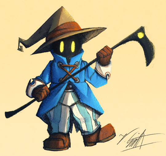
I've crawled out of my cave after playing Final Fantasy IX for a long ass time what have I missed?
Artist's Notes:
I'M BACK BABY! A while back I made a post with a new style experimentation thingy but I ended up deleting it because it was just kind of a boring face thing, I was planning on doing more art but then I started playing Final Fantasy IX and uhhhh yeah so that game has kind of taken of my brain for the past two weeks and I am 20 hours into the game because I love it so much. I wanted to draw Vivi because Vivi is just really fun to draw ok? I've kinda been feeling really burnt out with my lineless style, mainly because of how hard it was to do lighting. I'll show one of my initial art style tests on the bottom of this post. Again, used to have it be an individual post but it was just one face so it was kinda boring, so might as well include with this one on the subject of art styles. I wanted to kinda mix some aspects of my older style with the sketchy shading lines with a more painterly way of doing the lighting (mainly in the shadows). All in all, I think that's my favourite part about this drawing, it feels nice to finally be able to do some proper lighting again, and I want to experiment even more with my lighting and rendering in future pieces. Also, part of the pant shading got kinda lost in the sketchiness, so for next time I'll probably focus on the clarity of the more sketchy parts of the drawing, since I did go with my initial sketch for the final drawing. I also gave up on the background since I had no idea what to do for it, and I didn't put too much detail into the staff as I forgot which one I gave him in my current playthrough and I didn't want to risk spoiling myself via looking up references, but that's ok I like how the singular yellow circle on it matches Vivi's eyes. Also I was having a bit of trouble figuring out how to draw his body and how to pose him, but I like how the pose turned out a lot. It was inspired by his idle animation when in a battle in game where he does a little shimmy.
Ok I need to talk about Vivi's design because I love it so fucking much oh my god-
I absolutely love how his face is just in complete shadow and only his eyes stand out, it's so cool and unique and I love how they recontextualized the original black mage design from the classic Final Fantasy games. How they did it I won't say because I don't wanna spoil the game, but someone give this poor baby a therapist because he goes through a lot. Actually, same can be said for all of the FFIX cast, they all need therapy (again, I won't spoil anything, please go play the game for yourself).
While I do love almost all the characters in the game, even though Vivi is most fun to draw, my favourite character has to be Zidane (the main protagonist of the game). He's a really fun protagonist, and they could have easily written him as a misogynistic jerk who doesn't respect women but they didn't, and I really appreciate that. He's just an overall cool dude who's a really nice older brother figure to Vivi and also just has a cool character design (who I also want to draw eventually). Initially in the game I was planning on grinding levels for Vivi to make him the tactical nuke of the party, but then that title went to a different character (who was initially multiple levels behind the group since I grinded the party in the starting area way to much before they joined, but now they are two levels ahead of everyone and have pulled the team through a lot of tough battles, again I won't say who it is because it is kind of a spoiler and the way the gameplay actually ties into their character arc is just so good omfg). Once I eventually finish the game I'll probably write a full review on here, so no spoilers until then lol
Also, I've kinda been burning out a bit with making Touhou art, which also made me a bit burnt out with Touhou stuff in general (although I will continue keeping up with the manga) so getting into other things (i.e. Final Fantasy and even Fallout since I've watched the first season of the TV show which is a whole other post for another day) has helped me refresh and given me something new to think about. I've ended up in the exact place I feared ending up, where I would start drawing fanart for it not because I wanted to but because I felt like I had to, so I'm taking a bit of a break. When I do draw Touhou fanart again I'll try to draw for the sake of myself, and to all the other artists and fanartists on this platform (and on any social media for that matter), take care of yourself and don't forget to take breaks when you need to!
(Ok part of that last paragraph was definitley influenced by the good ol' "it's 9:00pm and I need sleeb, but the message at the end still holds up, always take care of yourself)
Oh yeah, and here is that one style experiment I did btw
Man I really fell down the "Yoshitaka Amano art enjoyer" to "Final Fantasy fan" pipe line didn't I?
18 notes
·
View notes
Text


I did a redraw of this older artwork of mine recently.
I think it’s super interesting to see how my style has evolved over the years. It used to be a lot more messy with lots of tiny strokes everywhere. I became more confident in my art, but I also moved away from the impressionist painterly style that I used to do in the beginning.
By becoming my Patron you get early access to all my artwork, as well as some behind the scenes, step by step processes, original .psd files and more!
131 notes
·
View notes
Note
I really like your style. Was it intentionally designed, or did you just sort of fall into it over time?
I wouldnt say I intentionally designed it, as in I haven't sat down and Engineered a specific style, and instead it was more of me finding what I liked and wanted to incorporate into my style.
You could probably trace my style back to its influences. I used to draw really round shapes (I still do but like they were just ovals and circles...I guess i just like that shape) until I started watching How to Draw Anime tutorials in middleschool T-T (shoutout to Mark Crilley lol)
But when I first joined social media back in 2016, I found all these crazy artists with really unique styles that really influenced me. I was drawn towards artists like star_bite/prince_canary and rawrgyle/grassflu who have very dynamic expressions and character poses :0 (also they ended up working on a Batman and Superman project respectively and how wild is it that my icons from forever ago now work on projects aligned with my current interests!!!) And as you get exposed to different artists you get exposed to the many ways you can Draw things and along with your natural affinities towards certain things (such as me being attracted to Bright and Bold colors and Shaped styles) you kind of naturally build a style.
And part of that is also just having fun Trying things out? Sometimes I wouldnt even try to emulate their style as much as I tried to just...do what they were doing? As in making my ocs and putting them in fun poses, and doing color palette trends and such etc.
I hope that helped! If you're curious I can break down some of my style checkpoints over the years. As you can see there was still some major anime influence in my style back then when I first joined social media around 2015/2016
Around that time, I also discovered the fandom around the Cartoons popular at the time, so I drifted away from anime and drew things like gravity falls/steven universe/otgw etc etc so it got Rounder I guess. I really liked how stylized characters looked and got obsessed with Shape Language and assigning characters distinct Shapes (box vs triangle vs circle etc). I also read a lot of webcomics and stuff like that so those played a part I guess


And then around 2019 I saw more artists drawing anime fanart with really sharp angles, which was completely different but so cool to look at so I tried to incorporate more angles into my art. I still had that very cartoony style but tried to push the Sharpness a tad bit more if you can tell. (I think the name of the artist I liked was jeluto?)


I think around this time I also focused a lot more on color as well and did a lot of paintings then and whenever I did more Painterly stuff I tended to switch Styles into something Less Cartoony T-T

Then by 2020, I revamped my ocs, actually tried to break down and study my own style and how I would draw them, and my style kinda fell into a mix of round vs sharp edges I guess. I tried to give myself Rules which I would follow when stylizing a character to keep it more consistent and intentional.


Then in 2021 some of that Fun Part of stylizing characters into something more Cartoony kind of took a backseat as I focused more on Pose Work and Body Expression instead which I think helped a lot :0

And here's some recent stuff from the past year! Still very cartoony, but less so than 2016 I'd say, and still using really bold colors!! Still love my Soft Vs Hard angles B]
And overall have stronger pose work :) I'm sure my style will evolve as I learn more and experiment more, because one thing I want to focus on is backgrounds and environments :0


62 notes
·
View notes
Note
i noticed you appear to have been trying out different brushes lately (i think it was very noticeable with that art of Spyke you did a little while ago?) and wanted to ask what brushes do you use? also, what are your art inspirations? that painterly style is very cool and it would be very cool to be pointed in the direction of more people who do something similar to that.
oh yeah i have been! thank you for noticing! i want to do it more but ive been sooo busy shdhjwhdhw
SO FOR THAT PIECE, the ikkan and callie peices as well, i use this brush! (for clip studio) i adjust the opacity n such when i need to :]

here's the link as well!
truthfully alot of my painterly works have been heavily inspired by my bestie @neopeixes cuz alot of her lineless painty stuff is absolutely flawless...
18 notes
·
View notes
Last Seen Blogs

minibear2031
mini bear

dijualrumahdisidoarjo
Call 0822-4447-1166, Rumah Dijual di Sidoarjo

pretasantos
Sem título
