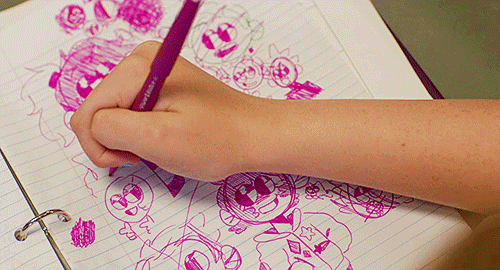
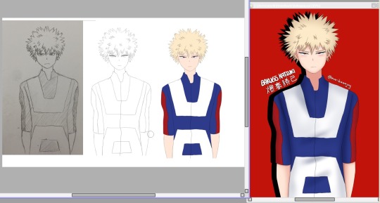
#also me getting an ipad has made drawing in line art style a LOT more convenient/fun haha
Text
Since it's a movie already about a bunch neurodivergents, please bear with me as I go off about micro culture and The Mitchells vs. the Machines.
So a lot of people can already note the memes in the movie are very dated internet humor. I don't think I saw a joke that lived past 2011 in it. But I can't help but to also feel cognitive disconnect at the idea Katie is supposed to be born in 2003 when everything about her and her family makes her a millennial.
Before I get way too deep into it, this is just more observation on teen identity than some shitty which generation is better debate. Sociology is extremely fascinating and it's just fun to pick apart elements in film.
So like I was saying, TMvsTM feels very, early 2010s. Pretty much the only thing taking it out of that element is the wide use of smartphones and mommy blogging but even then, you could push back the time frame to 2011 and still be pretty on the mark. Siri had just come out and iPads the year before which at the time was treated as the most unneeded invention. It's pretty much around this time that the smart tech boom took off and we started to see movies make the "big tech company" story. You know exactly the one: A Steve Jobs character, some joke about a needless technological advance, the main characters wowed by shiny expensive devices, and in the end usually we realize silicon valley are too disconnected from humanity. Honestly though if you've seen the Soylent guy, they might be right. An aspect I wonder about is how LA and SanFran feel about each other. TMvsTM gave the slightest inkling of bitter resentment towards it's northern neighbor and I can't help but to wonder if the constant use of the Steve Jobs storyline is maybe a hint of a general feeling LA has.
Speaking of LA, it's pretty clear that Katie is going to Calarts. One of the reasons I think it's so dated is Animator's tendencies to rely on their own experiences; Alex Hersh making a story about twins when he himself is a twin or JG Quintel literally just making himself the main character in every series he makes. Michael Rianda was born in 1984, and while that puts him on the earlier end of millennials, it isn't hard to believe the late 00s would be a defining era of his life. Many young film and arts students flocked to YouTube in it's early years to share their creations. Again the aforementioned Alex made off the wall, Nathan of Nathan for you's various skits, and so on. And again looking at the memes used, they are specifically the type that would have been created by these film students.
So let's look at Katie's art. It tends to be mixed media collages with a sketchy hand drawn style that makes you think of Napoleon Dynamite, and the movies themselves are reminiscent of campy action hero films. She puts in a lot of dazzle effects, typography tends to have these perspective lines, and the artwork flourishes tend to be stilted and looping almost as if they were gifs on Tumblr. There's a distinct one during a still frame and I swear to God, the jittery movements while flipping it back and forth feels like it has to be a Homestuck reference. Either way, all of this points towards 80s revival, something that was in full force in the 00/early 10s. You could pull a page out of my sophmore notebook and it would easily fit in. Katie distinctly draws like a millennial teenager. This isn't to say that there are zoomers drawing this way but I think No Burnham's 8th Grade shows a nice contrast in art style.

I remember seeing this scene and the old familiarity of seeing younger kid's art in fandom tags. Where late millennials where inspired by early millennials' 80s nostalgia and adventure time adjacent cartoons, early zoomers were in turn influenced by late millennials' new grounds/YouTube flash animations and 'Calarts style' series. We each appropriate and remix our predecessor's works and the general style morphs as we go on.
The mitchells environment is also distinctly 80s. They love in a worn down one story and the interior has a lot of kitsch with it's wooden panelling and furniture, courdory couch, and even a hand knit blanket. Naturally their car is also from the 80s. We can extrapolate in general that the Mitchells are not the richest family. If you pay attention to the furniture; it's pretty clear that most was likely made by Rick. On the other hand, Calarts tuition is 50k and in one of the most expensive cities to live in and that never seems to come up as an issue. However there's one thing I'd like to point out, major property tends to reflect when a kid is born. For instance, growing up my mum drove a 90s ford taurus where my younger cousin's family drove 2000s vehicles. Cars in particular can only make it so far before needing to be replaced and that tends to hit in a 15-20 year period of regular use. Despite being called a 1993 model, the Mitchell's car looks extremely 80s and a listicle even identifies if looking more like a 1988 GM celebrity. We can see how Rick and Linda struggled financially when Katie was born but it's still a surprise they have it in 2021, 33 years and definitely over 200k miles. I also want to point to Boyhood for a moment. A great aspect of this film is we see time as it happens, and we get an honest image of life in the mid 2000s. Prior to the housing bubble, we had a period of middle class affluence where consumerism was at an all time high. The image of suburban living would have been a beige carpeted room, Ikea furniture, and a saggy microsuede couch in front of a theatre system.
5 notes
·
View notes
Photo
Featuring Mo @archangelgabriel today for the artist highlight! Read on for their thoughts on art, and you can find all of their wonderful artwork here!
🎨 When did you start creating art for the Inception fandom, and what is your inspiration?
i started making art when i joined the "you're waiting for a train" discord server, so i want to say… 2019? some of my inspirations have gotta be the wonderful whirl @noitsnacktime, who is an awesome person who makes awesome art, and salt @ffc1cb, whose artwork and poses and expressions are just so lovely and fluid. another inspiration of mine who i followed really closely back in my supernatural days (which are not very far behind me) is @clickbaitcowboy. he has this awesome rendering style and way of drawing bodies that i definitely try to imitate sometimes.
🎨 Tell us about your creative process, and which part do you enjoy the most about it?
oh, god. i have so many different styles and i make art so haphazardly that it's hard to say. first i generally have a dumb idea, and i try to get it down as soon as possible so i don't forget it. a lot of the time i don't have drawing materials with me, so I end up writing it down. then generally i do a kind of "thumbnail", which for me is usually just a stick figure i draw to get my poses down. then, i blow up my stick figure to the full canvas size (thank you digital art!) and i draw a sketch directly on top of it. depending on what kind of look i'm going for, after that i either line over my sketch or i just start a new layer and go straight to painting. i'm a psychopath who can't ever keep my layers organized, so i often do all my painting and rendering on one layer, and make more as needed.
my favorite part is probably rendering skin and fabric. i draw a lot of people and not much else, so other materials (including HAIR) are generally hard for me. folds are tricky but when painting you can kind of bullshit it until it turns out alright.
🎨 Link us to your first and latest artwork, and how your style has evolved since then?
my actual first digital artwork has definitely been lost to time. i might have a couple of old sketchbook gems i can pull out for y'all.
oh yeah, baby. none of my sketchbook pages are dated, but i'm pretty sure this is from when i was ~13. i think it's supposed to be me? this one is from when i was 11. look at that shitty anime! also from when i was 11, i remember my best friend signing the adjacent page of this in the courtyard, actually.
but for what i'll call this phase of my artistic life, my oldest artwork on tumblr is… pretty recent, actually. probably this drawing of castiel from mid-late 2019. my latest artwork on tumblr would be these arthureames sketches and i guess my latest artwork ever would have to be this drawing i did of a character for artfight just last night (5/29), though it was pretty rushed and low-effort. [find me on artfight under icedhotcocoa, btw!!]
i can't really pinpoint what's changed as i'm kind of constantly changing and growing, but i'm definitely more comfortable with drawing now. i'm also way better at using reference and capturing likeness. plus, i know my strengths and i play to them more! portraits and more sketchy, loose styles are honestly way more for me than anything as cleanly lined as that cas. switching from autodesk sketchbook to procreate was a pretty significant jump for me, actually, and i think i really started putting more effort in then. that castiel was the last sketchbook drawing i ever did. sayonara, autodesk.
🎨 What is your absolute favorite piece of art that you've made, and why?
sadly, i have chronic "don't post art" syndrome and a lot of my artwork has been lost in the great art purge of 2020 (I left my ipad in a rental car and never backed up any of my work so it's gone forever). but i think i can scrounge something up.
since i actually finish works semi-infrequently, my favorite art always tends to be my most recent art as i'm still studying! I think this welcome to night vale portrait or this arthureames drawing are my top two, both from mid-late last year.
i'm now realizing i've only made one actually complete 100 percent finished artwork this year. that's bad.
🎨 What is something about Inception that you really want to make art for someday, and why?
OH! I've actually always wanted to make fanart for some of my favorite fics, but i get insecure because part of me is like "mo this fic is from 2011 what are you doing". i know, it's dumb. a couple i have in mind are orbit by @finelydressedspacemen, and my most favorite fic of all time, through centuries of nerve by ester_inc.
🎨 Give a shoutout to your favorite Inception artists here!
AH FUCK! well, the aforementioned @noitsnacktime and @ffc1cb. i've never spoken to @mizunoir personally but their art is just jaw-dropping, and an artist i've just discovered on tumblr is @birdlawco, whose work is really cute and wonderful.
🎨 Anything else you'd like to talk about art and the Inception fandom in general ❤
art is hard, and awful, and terrible, and i hate it. but also art is wonderful and amazing and incredible and i can't think of anything else i'd rather do, and every time I say "UAGHRGEU I HATE ART I'M NEVER DRAWING AGAIN!!!" someone always says "no you don't, no you won't" and it's true! so to all my lovely and talented artists and fanartists out there, keep on keepin on!
just struck me that i joined this fandom when i was 14 and i am, like, fully 17 right now, which is crazy. i'm still pretty young compared to a lot of veterans, but this fandom has been a pretty massive part of my teenage development as much as the fanart i've made for it as a part of my artistic development. stay awesome, yall. thanks for the years. happy dozenth inceptiversary, gang!
33 notes
·
View notes
Note
Asking so many questions because I’m curious af. Get ready.
1, 5, 10, 11, 12, 13, 14, 18, 20, 27, and 28 for the art asks.
How many works of art have you made this year?
If we're also counting unfinished pieces, 121. I've never made more art in a year than I did this year. The iPad has made art so much more accessible for me!
5. What work are you most proud of?
I can’t show you your Christmas present yet, which is truly the one I’m most proud of, so I’ll put dad’s Christmas present here. I used colored line art instead of just black, and did a lot of playing around with layers. I’m very proud of it.

10. What inspired/motivated you this year?
Lots of challenges. I've been doing art challenges like MARTch, Swordtember, and now a Christmas Bingo. I also did art for Whumptober and different color palette challenges. I think it's really helped me stretch my skills.
11. What pairing/character/subject did you create the most for this year?
I did a lot of HTTYD art this year, but I also did a lot of art for my original writing, which I think is very cool.
12. Favorite pairing/character/subject you created art of this year?
Hiccup, I think. I've gotten super great at drawing him... even his hair! His hair can be quite the challenge.
13. What pairing/character/subject/body part/object gave you the most trouble this year?
Any of my Elder Scrolls pieces. I really like them, but I see where I could have done better, but struggled to.
14. What's one pairing/character/subject/body part/object you want to explore next year?
Answered here
18. What work of yours do you go back to admire the most?
I think I admire this one a lot because of the emotion I put into it. I just really like this piece.
20. Is there anyone you'd love to collaborate with next year?
@mdoodlerfandomart and @ivygeorgi! I admire their art so much, and I feel like working with them would be the coolest thing ever!
27. Biggest surprise while creating art this year?
I'm actually good at hands. For years hands were a really tough subject for me or something I tried to avoid. This year, however, I tackled hands head on. I've drawn quite a lot of them, and they look good! Like, I'm so surprised by how easily hands come to me now!
28. Did you learn anything about your art/process/style this year?
I learned that my sketches usually turn out really great and people want to see those along with the finished piece. Line art is the hardest part of the process for me, due to my hands shaking, but the coloring is the easiest.
3 notes
·
View notes
Text
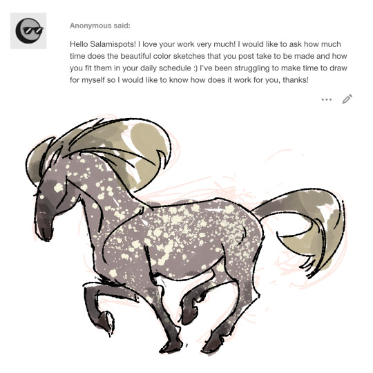
Hullo anon, and thanks very much! : ] The color sketches are spitpaints! There’s a group on Facebook called Daily Spitpaints where they post daily topics and you basically pick a topic and draw something in 30 minutes based off that topic. I don’t do them everyday haha (more like every other day?); there’s days where the topics don’t really interest me so I skip them. On the days where I do do them I try aim for at least two or three mainly so I can post stuff for yall on sundays haha. Tbh even if it’s a little bit of time to draw for yourself that’s progress :0 I know some people say draw every day for a certain amount of time but I’m definitely not one of those people haha so I think it’s more of figuring out what works for you and also not putting pressure on yourself (idk when I had the ‘oh no I have to draw something today’ thinking it ended up putting more stress and made me not want to do any art). Unless you were talking about more of time constraints and less of of what I word barfed above hahaha in which case again maybe a little bit of time like 5-15 mins of doodling for yourself while you’re watching a show or something can help getting into the habit? huahah hope that was helpful on some level anon
SO I actually have an ipad 6th generation (no cellular, 128GB, 9.7 in) because expensive hahah and after talking to other friends who got the same one; I got mine off of ebay for $325 w/shipping (the seller was chill to lower the price a little when I sent them a counter offer message) but then you gotta add in the apple pencil and if you get a case plus a screen protector. I use it for all the linework stuff and sometimes sketchy things; coloring and painty stuff are still on photoshop. It’s definitely worth it for me haha; still like photoshop way more in terms of painting plus they have the lasso tool which is kinda a must for me haha, but if you’re looking to get an iPad I guess it’s more of what your budget is? like if you have enough for a spankin’ new one then nice :0 but if not looking at older models is an option; I know Bestbuy for a while would have sales where they sold the 6th generation for $299, not sure if those are still happening. So I guess keep in mind size, how many gigs, if you want cellular or not, if you’re cool with one that’s refurbished or new or used, and model/make? hope that was a little helpful anon!
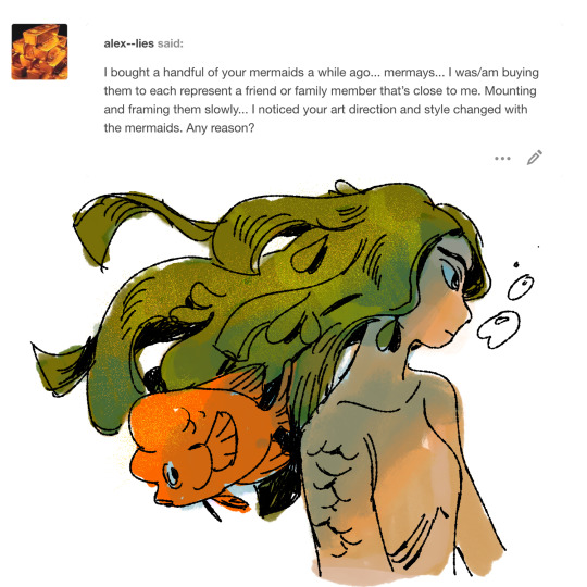
@alex--lies oh thank you! :0 and if you’re talking about for this year got a bit of art anxiety/frustration hence the style skipping all over the place (and now I’m just viewing this year’s mermay as more experimental/do-whatever-I-want haha). If you’re talking about in general hmm I like trying to do something different each year? Or at least change or alternate styles every mermay.
#technically this year's mermay was supposed to be a painty style but uhhh that's postponed to next year haha#also me getting an ipad has made drawing in line art style a LOT more convenient/fun haha#saturday asks#art asks#sweet potatoes#wAOW I talked a heckin lot today hhhjffd#come back later for a merm#wanna squeeze one in before tomorrow if not it's on monday
201 notes
·
View notes
Text
Before you apply for an apprenticeship!
There's lot you need to consider before going for a tattoo apprenticeship, you have to plan ahead before diving head first into one
Money
You will likely not get paid! It's as simple as that. Alot of tattoo apprenticeships will not pay you to come into the studio no matter how much work you're doing. Its a hard pill to swallow but if you want it you'll find a way to do it!
If your going to go into an apprenticeship then you need to plan for at least a year down the line. Some advice I'd give is get an apprenticeship a year after you decide that's what your going to do. Work a full time job and save every bit of money you can. This is going to help cover some expenses. Tattoo apprenticeships usually last around 2-4 years so you need to be able to support yourself through it. Also during this year try and get a few side hustles going in order for you to make money both in this year and later on. There's a few things you can do here In terms of side hustles
Sell your artwork as commisions- This should be a good way to make money before and during your apprenticeship! Not only will it bring you in some income, it'll also help you by making you practice drawings and building up a social media presence in the meantime which Is essential for when your a tattoo artist to reach your desired clientel.
Sell your artwork on prints! This one is alot more passive than selling commisions but you'll need a bit more of an online presence. You can get this through posting your art, doing commisions ect in order to build up an audience before you do this (I'll talk about social media later) use a print on demand service in the begibibg that way your not keeping inventory on things that your testing the water on. Keep in mind though when looking for a print on demand service that you look at the fees as this may affect your income also list then on places like etsy where the seo is done for you and you can really mark up the price for your products!
Learn to fix phone screens. I know what your thinking this has nothing to do with tattooing but hear me out! You can watch YouTube tutorials on fixing things like iphones and it's actually easier than you think! You can buy the parts and the tools dirt cheap on ebay and aliexpress and then fix them for a decent profit! It's a good way to make money through friends and family and word of mouth but it also means if things you need for your apprenticeship break like your phone or ipad you won't have to pay nearly as much to fix it! Which if your clumsy like me then you can save alot of money!
There's alot you can do in the year before you go for an apprenticeship! You just have to think back to ehen you were a teenager saving up for the latest thing you wanted and finding random jobs to help get pocket money! It might sound all a bit much but you have to set yourself up financially before you go for an apprenticeship. I wish someone told me some of this before I went and got one as before I started piercing at the studio (nearly a year in) I was broke as shit.
Research
You need to do your research before you apply to any studio! It's not like you can throw a dart on a map and see where it lands! Go on their social media platforms, look at their stories (this is a big indicator of what the studio has produced throughout the day! See if its busy or not).
Have a look through the artists work! If you wouldn't want that quality or standard of work on your body don't apply! Also have a look at the styles the artists use, this isn't exactly essential but it can help you if you want to specialise in a specific area! If an artist uses mostly black and grey and tattoos animals then it's a bonus if that's what you want to do to! If not this isn't the end of the world as you cam learn alot and you won't be made to go into that specific style! The best thing to look for is a varied style! An artist or studio that does all different things so you can learn how to become a more well rounded artists as if you can do bits of everything then your going to get more clients. Remember "Jack of all trades a master of none, often times better than a master of one"
Artwork
It comes as no surprise but you have to understand at least the basics of how to draw and how to apply different media. This year is a perfect opportunity to polish up and refine your art skills and creating your portfolio! I'll touch on art skills and portfolio work in a another post!!
Feel free to add your own advice in the comments!
Look after yourselves~ ❤
#tattoo apprentice#blackandgreytattoo#tattoo design#tattoo advice#tattoos#tattoo artist#tattoo apprenticeship
11 notes
·
View notes
Note
I love your art, it is very detailed in a neat way. Was wondering how you got started making it as a source of income? How did you get your first paid work, I'd love some advice on how to get started, if that's ok
Thank you. Of course it's okay, although I doubt I have enough work experience in art to really delve into this. I only went full freelance this year, and had been juggling art as a side hobby until then. If you're still interested in my somewhat narrow perspective, and are okay with my long-winded rambles, I'll give it a shot:
So to answer your question fully, I'll describe how I started and move into personal advice and learnings later on. As a disclaimer, I am a white cishet dude in my late twenties with a moderate cocktail of mental illnesses, but overall I can pass for a functioning adult so a lot I have to say may come laced with privilege I cannot fully identify.
So uhh I began drawing in around 2012? I think? Maybe halfway through 2011? And I mostly made fanart for things I enjoyed and tried to branch out in communities that felt nourishing to my style and interests (I caught a bug for alt posters and enjoyed mainstream movies so I spent a long time on posterspy early on). There were a handful of opportunities that came from there but I could only accept a couple because of primary workplace commitments. Still, it showed that networking in a focused community was definitely a good place to start; I myself have huge trouble committing to social networks and really staying socially active, but I knew it was an essential ingredient in succeeding so I tried to make myself be involved in challenges and art support trains etc. as much as I could.
In parallel to all that I also ran a few third party online stores (redbubble, teepublic) for disposable income and would sometimes, if rarely, hit around $100-150 a month from those sources combined. It is a sort of thing that requires helper accounts on other social media sites to promote it on, because the stores themselves have a huge volume of content that translates into low organic discoverability. Obviously it was never gonna be the way towards financial independence through art, and with community projects being few and far between, I opened private commissions in around uhhh 2017 I think, focusing on offering a few styles I knew I could do well, and sometimes operating in individual fandoms (it was mostly a bioware thing to be frank). But I had to close them back down after a year or so, again because of work-life conflict and how badly it was burning me out. The reason I kept trying to monetize this hobby is because I honestly hated what I did for my main job and wanted to see a way out in some shape or form in the future.
And then in 2020 I had to quit my main job altogether because of *gestures at pandemic* and deal with a mental breakdown from all the wonderful things it did to us and me specifically. I took a short break and decided to give art a shot full-time, and that was around May this year. I was planning on opening up commissions again (and I still am), but a few sudden opportunities that fell in my lap moved that timetable down and now I'm grateful to even be doing something I am getting adequately paid for.
So, with that somewhat limited perspective, here's what I've learned that I'd tell myself if I was just starting out:
1. Being a fan of something can be a shortcut towards effective networking kickoffs. Which are important evidently. If you love something and enjoy making content for it, join communities, settle into a combination of social media websites that feel right for those interests + your body of work + your inner rhythm, and try to play to content discovery as much as your mental health allows you to. Like I said, I know that I myself am incredibly bad at self-motivating to talk to people, so I found that synergizing common interests into fanart - which I enjoyed making anyway - could be a way to give myself a gentle nudge forward and build those bridges leading to community activities, which then net experience and coverage. Sometimes even freelance projects from official avenues. Again; picking the right spaces for what you're after is key. Companies roam twitter, concept art recruiters scour artstation or linkedin etc, instagram can land you private commissions and collab opportunities, so on and so forth. Find your niche and try to kick up dust. However...
2. I do not believe that any social profile can replace a good portfolio. The thing that made an immediate difference to me this year was building a coherent, simple website with my best work front and center and a contact form on top. Every single opportunity I got came from that form (maybe via twitter or instagram initially, but always sealing the decision after going through the website), so I firmly believe that showcasing your skills and portfolio in a visually arresting and user-friendly way is a big priority. I had some reservations about tackling that task but fortunately I had help from a savvy life partner and we slapped it together via wordpress in less than a day. Twitter/whatever social media is prevalent in your target groups is definitely important to get the right eyes on your shit, yes, but those eyes will then look for a second stop where your work and rates are more clear and concise. Simplicity is key imo, I cannot overstate this. So make a cute, simple portfolio!
3. Your skills and rates will grow and change as you do. Let them. Over the years I built several lasting professional relationships from my obsession over mass effect and kept getting opportunities both from bioware and their partner companies, some small and some a bit bigger. A one-off job earlier this year opened an unexpected door to another much larger commitment, and then the work I did there brought some attention from small businesses looking for commercial commissions. These were all incredibly different projects in terms of scope and budget, and I've been tackling them all on a case-by-case basis and slowly coming into my own irt my needs, rates, and SOW thresholds. It is still a work in progress (and a LOT of literal work as well), and very much a thing I struggle with in publicly marketing, which is why I felt a tad underqualified to answer your question in the first place (obviously I did not let that stop me). But what it means for me now is that I am rapidly developing into whatever my "version" of a functioning freelance artist is, and when the conditions for that guy are met, I need to be able to confidently plant myself and operate from that space despite past precedents. Do not let anyone bully you into downpricing what you yourself perceive as legitimate products of personal growth and development. Speaking of which...
4. The shitty challenge of turning envy into inspiration, and paddling outside your comfort zones in full riot gear. it is hard, but realizing that being a miserable, self-hating artist in my early days got me nothing but more misery back was the first real step I took and what truly blew the hinges off. I was just not pleasant to be around, I would badmouth my work all the time, and it all somehow made sense in my broken mind because the validation I sought was purely external and the way I sought it was through eliciting sympathy via self-victimization (even when I made something objectively nice). It all led fucking nowhere. Except perhaps to my own narcissism that I one day managed to identify and start managing. So I started looking at things that made me seethe with envy and calmly deconstruct and figure out their inner workings instead, do studies, and find nuggets of inspiration or discover new ways to approach rendering or building up specific elements. It was an application of analytical diligence to what I wanted to be a purely emotional, esoteric workflow, but that I deep down knew wasn't. Art is a discipline and a skill, and maybe it isn't a straight line, but you gotta find some line to thread nevertheless. Being self-hating was almost an identity I had to break out of, and despite it still being like, 4-5% there? I realize its cause and effect on me, my work, and those around me, so it is with a conscious choice that I gently set it aside when I work and especially when I learn. It won't always stay quiet, but the effort is the difference. Your doors towards accepting true growth and venturing into uncharted territories, art styles, and networking will really open from there. But there's a huge caveat...
5. Toolsets, accessibility, privilege, and all the good things that enable artistic expression and profitability are not given equal to all. you might do all the mental work I mentioned to be ready to rock and roll and learn and draw your way out of anything, but digital art is a fucking money pit that asks almost too much at times. I don't got a good case study here but identifying and ensuring accessibility to the tools you need to do your best work is, like, super important. The ergonomics can improve as you make money and settle into the job, but the basics have to be made available to you. And some of that might not even be under your direct control. That can be anything from pen tablets to software subscriptions to opportunities in hiring sullied by sexism or what have you. You gotta navigate all that through careful networking and money/time management. I don't do a good job of devoting specific slices of time to work/study, and my primary clutch is iPad software which went from a good deal to a nightmare scenario over the years. So all I can say here is do what I didn't; network, invest in a PC/tablet, and pick a software you'll learn that won't burn a hole in your pocket.
6. Be nice to work with? This one is hard to articulate and has landed my own ass in hot water in my early years because of how socially inept I am, but nothing is more worthwhile than being.. like. a good person to work with. That can be anything like meeting deadlines, or sometimes missing them but eloquently articulating why, being generous in early stages, being communicable and not too wordy in your emails, having a good grasp on abstract artistic concepts and how to describe them in simple terms, having a clear, laid out framework of your working rates in commercial and non-commercial projects and sticking to those guns with grace, understanding when you need to say no and saying it well, the works. Just being nice. Sometimes that might mean going headstrong with something you believe in, or simmering down and sucking up to the big man, all relative and adaptive. Part and parcel of the service provision dance that we all have to do in order to make bank. Know your lines here, obviously, and don't like. work for nazis. or uh.. *shudders* exposure. but be nice and empathetic and communicable and word will travel eventually. Skill may be in abundance these days, but good people are most certainly not, and capitalism has a way of bubbling up scarcity. Grim, but uh, them's the breaks.
I know I'm ultimately telling you to like. Have a body of work, make a portfolio, grow, and network. But that's really how I see it for now. And being nice can be a cherry on top that sets you apart, along with the inherent irreplaceable voice of your artwork. I think I rambled on enough, but if there is something specific you need my help with, even if you want to come off anon and talk in private, please feel free.
17 notes
·
View notes
Text
2020 in perspective...
i originally got into south park in 2010, left the fandom in 2011, then nearly a decade later in december, 2019 i came back again.
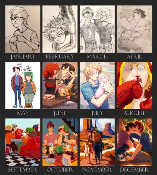
January: butters sketch
i hadn’t been in a serious fandom for years, hadn’t drawn or written anything seriously in years. i went on a trip to denver, colorado, and came back ready to get fucking into it. i started writing the longest single work i’ve done to date, Ecstasy (130k, not yet posted). this piece was the first drawing i did this year, while riding the train home from my internship. a shitty little sketch of butters from the fanfic, with mohawk and glasses.
February: latex tweek
still traditional art only. started getting serious about shading, and drew LATEX TWEEK (also from Ecstasy). Finished the 1st draft of the fanfic this month and went into the editing phase.
March: juggalo stan and kyle
why? did i forget to mention everyone in Ecstasy is a juggalo? long story. finished the current (final?) draft of Ecstasy.
April: stan and mpreg kyle
STILL doing traditional art. started working on my next fanfic project, a prequel to Ecstasy--BUT FIRST i read @blesspastacraig‘s fanfic Best Laid Plans and it inspired me to write my oneshot Our Fish Alien (2k, complete). Got my Ao3 account this month and decided to post it with some art. hence, style mpreg art. started incorporating prop elements (hospital bed), but still too spooked to try backgrounds.
my friend @cola-fiend convinced me to make a tumblr and post some sketches, ergo here we are. this eventually lead requesters to ask for more mpreg, which snowballed until i made a fucking discord server for it, but i’m getting ahead of myself.
May: fat kyle
the last time i did digital art was 2015 when my tablet broke, then in may i found out there’s free phone apps for drawing. so my first digital drawing in half a decade was fat kyle and his skinny boytoy 😂 by now i’d scrapped my plans for an Ecstasy prequel and had started writing Eat That Lunch (27k, complete), and wanted the art to look better. i started by drawing the lines traditionally then coloring the picture digitally 😬 yikes
June: crimson dawn
now we’re cooking with gas. i watched a few art tutorials and tried drawing something serious with digital line art. i was working on my tiny fucking iphone 5 screen and this piece took over 35 hours 🤘😔 no backgrounds yet
July: tweek and baby
my first commission! @blesspastacraig and i are now collaborators and friends and i got to illustrate some of her fanfictions. this one’s from Algorithm! (which i totally helped inspire >_>) blurry ‘baby’s first’ background in there too. i also started writing the sequel to ETL this month, What They Say About Us (50~k, incomplete), but didn’t publish it until september.
August: boxer tweek
first attempt at a lineless, painting style. did this one for tweek’s birthday. not a great first piece for a new art style, but a very important design shift that’s changed how i color completely. also switched to an ipad instead of my small-ass phone screen phew
September: boys eat at shakey’s
posted WTSAU! i wanted to make this fic look super fucking good and probably put more effort than i should have into all the art. BUT, forcing myself to illustrate it is what’s really helped me gain more artistic skills. this is my first scenic piece with full color background. i also started writing my next big fic, Wayward Son (50~k, not yet posted), based in the same universe as @blesspastacraig‘s fanfic Hungry. it was supposed to be a oneshot and now it’s 95 pages long dammit!! 😭
October: broflovski passover
resumed online classes and creative progress suffered for it 😔 i still managed to put out a lot of work i’m proud of, like this seder scene from WTSAU chapter 3. full background and 8 characters? pssh, can’t scare me. i showed this drawing to my boss, who named it ‘the confused gentile’. oh stan.
November: gunslinger kyle and stan of many moons
honestly? not sure how i survived this month. but i knew the start of december was gonna be worse so i jumped on style week as soon as they put the prompts out (this was the second one i drew). at this point i enjoy painting backgrounds more than the figures in them.
December: style clubhouse
i drew so much stuff this month it’s hard to pick one thing to represent it all, but--the seventh day of style week has a bit of everything i’ve learned. background. colors. lighting. concept. crazy when you compare it to january.
now i’m back to work on putting out WTSAU chapter 5. after that’s done i’ll pick which fanfic to post next and get cracking on art for that. Wayward Son’s in it’s final pages, so i’ll be picking up a new fanfic project in the coming weeks too.
overall? 2020, you were a wild south park year, just like 2010. i honestly can’t believe how far i’ve come as an artist considering i spent the first 1/3rd of this year sketching on napkins and shit, and here we are. looking forward to all the improvement in 2021 💚💙
#muh art#and never fear drawing backgrounds!!!#ecstasy#our fish alien#eat that lunch#what they say about us#wayward son#muh fanfic#i've written other fanfics during this time but they aren't as big as the ones mentioned#sorry Anomaly 😢
50 notes
·
View notes
Text
my relationship with digital art and how BNHA salvaged it
I just wanted to let out my thoughts but I can only do it here :>
This might be a downer for some people but I’d like to share it with people here. BNHA means the world to me and this is why.
I first started drawing when I was 7 years old in 2006
I think it’s ugly now, but 7 year old me remembered being so proud of this because this is a drawing of my stepfather. This is the only drawing I have that was from my childhood. I think the aim here is to draw in anime style BUT I didn’t even watch anime back then. I had a classmate who loves anime and she taught me to draw in school. Drawing became a favorite hobby immediately after that.
Then it was 2013 and I was 14 years old. Drawing is still my favorite thing to do besides being on the computer. I love anime at this point too. My parents bought an iPad for the whole family, but I was almost always the one using it. I discovered an app called ArtStudio and thought “Wow, I can draw without making a mess and with only my fingers” because I was always too lazy to take out my drawing materials and clean up afterwards.
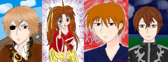
These were my first digital drawings. The pirate one was the very first. I got obsessed real fast. I can color so easily, undo any mistake, layers are a blessing too. There was just so much more freedom. I always sucked at coloring in traditional art and I didn’t like the mess (idk my hands get so messy traditionally)
The next year, it was 2014, I was 15. My birthday is in a couple of months and I knew my parents were planning to buy me something pricey (I think it was a laptop) so I approached them and asked if they could just buy the Wacom Bamboo as a present which was cheaper anyway and I even explained how it works to them and how it would allow me to draw on the computer instead of the iPad. I tried really hard to be convincing. I would have prepared a powerpoint presentation if I had to.
They did give me the wacom as a present. They even gave it to me months before my birthday so I could use it already. I thought I was the luckiest teen in the world with my parents.
These are a collection of my favorite works from 2014 to 2016. The middle one was my second drawing using wacom and Paint Tool SAI. I was a part of a lot of fandoms in those years lol
It gets downhill from there :/
April 2016, my mom and I moved to Japan, while my stepfather and siblings stay in my country. It was tough. For someone who is obsessed with anime, you’d think I’d be thrilled to live in Japan.
I was. Though only at the first few months. It’s not the same as it’s portrayed in anime (I should’ve known but I used to be blinded by anime). It was just lonely. The language barrier sucked and then lots of financial and family issues until my parents split. I got my first boyfriend too and I thought I was blessed by the nicest boy, but the relationship became extremely toxic but I didn’t have it in me to walk away.
All the shit that happened affected me mentally and emotionally. My biggest outlet which was digital drawing, was also out of the question because I did not have a computer/laptop when we moved to Japan. We left it in our home for my stepfather and siblings, even the iPad. I have my wacom with me, but no computer/laptop to use it with. I couldn’t draw.
I tried though. I used my phone to draw, but it wasn’t the same. Then the life problems got piled up, things got worse, and I just lost motivation in anything. Literally anything. From 2016 to 2019, I stopped watching anime, I dropped out of all the fandoms I’m in, I stopped watching my favorite TV series or movies, and I stopped drawing. I even got a bit disconnected with my friends who lived in my country (we talk regularly online). My family was broken so I gave all my attention to my toxic relationship as well which made everything worse too lol
I didn’t draw besides from a few scribbles and the drawings above. I did try digital art on my phone a couple of times again and even posted them on my IG, but they weren’t any good. Eventually, I got mentally and emotionally drained and dropped out of senior high school. I just stayed home for almost a year, leeching off of my mom. I felt even more worthless and my life had no direction at this point. Nothing mattered anymore.
April 2019 or so I think, my (ex)bf bought me a laptop. He says it’s a gift, but I think the real reason was to make up for something horrible that he did (which is stupid because money /gifts won’t resolve anything). I have a laptop. I can draw again, but I didn’t. I didn’t care, I wasn’t interested in drawing anymore anyway.
Welp. June 2019, I went back to my country. My (ex) bf stayed in Japan. The distance helped me end the relationship and my friends were there (they always were) to help put me back together along with two trips to therapy. I went back to finish my senior high school in my own country this time. That said, I have to stay in my country for school (but I was happy because I didn’t wanna go back to Japan yet when the breakup was still fresh and with going back to school, my life has a direction again.)
It was weird. I remember just being sorta lost and confused because I used to put my time, effort and everything into my previous toxic relationship, which was now gone. I was free and I had so much free time that I didn’t know what to do with it. I got so used to doing nothing and being nothing.
This is where BNHA enters.
Dunno when it started, but I started seeing Bakugou frequently online. It’s usually just Bakugou. I knew who he was because my friend suggested BNHA to me back in late 2018 I think but I didn’t watch it since I’ve lost interest in everything at that point in my life.
But ye I thought he hot af but I still didn’t watch BNHA.
But then for some reason he REALLY kept appearing in my social medias and it was really frequent. The last straw was when I saw a pic of him in UA’s gym uniform and thought “damn boi aight imma watch bnha for u” (y’all gotta admit he looks good in those colors with his combat boots XD )
I watched BNHA. Fell in love with Iida along the way. Then I switched to Tokoyami (but Shoji was hot too so aaaaa), but then angry emotionally-constipated sea urchin head caught my heart again. But oof. BakuDeku moments really made me feel some type of way I haven’t felt since I moved to Japan. It felt new but nostalgic. I fell hard in that ship.
I started obsessing. From memes to posts to fanfictions to buying merch to filling my room with BNHA posters. I realized I was reverting to my old self from the time I was still happy and it was thanks to BNHA (and the good people who helped me through the worst too)
Shit I wanted to draw BNHA, I thought.
I mean, I have a laptop, I still have my wacom and drawing softwares. I could totally draw digitally again if I wanted to.
But guess what
I can’t :c
My hand physically cannot draw. My drawings don’t look the way I want them too. 3 years of not drawing really destroyed any skill I had. I was back to square one.
September (yeah they’re ugly, I laughed at it). If you’re wondering why I drew on paper, it’s because, for some reason, I really CANNOT draw digitally. I mean it. I can barely sketch digitally at this point. The lines and shapes just doesn’t come to life. They’re just scribbles. But somehow, I can kinda draw on paper with a ballpoint pen. But yeah, that was the best I could do at this point in my life
After that, I still tried to draw, to regain my old art style, but it didn’t happen... It just doesn’t look or feel the same. Drawing used to be fun. But during this phase, it felt like my ugly drawings were just mocking me (probably was just too emo that time lol)
Weirdly, around a week or two I think, after my half-assed attempts at drawing, I managed to draw digitally somehow o.o
I did a Midoriya and Todoroki drawing like this too. It was my first post here on Tumblr I think. The annoying part here is that I cannot draw digitally unless I draw on paper first, take a pic, and then trace the lineart. I couldn’t draw directly on the computer. Granted, drawing on paper and drawing on digital is very different for me in the first place anyway. But it was still a pain. And it still looked like shit. I can only draw stiff poses :/ it seems like my brain decided to delete all data about anatomy and posture and backgrounds. My lineart here is even messy af. It still really not the same as my old style.
By 2020, I think I got my old art style back. On March, I made this. This took me 27 total of hrs to make.
Right now, I think it’s not bad, but back in March, I was disappointed with the result. This is when I finally broke down crying because it didn’t look good enough and I hated that it took me 27 hrs to draw “bullshit.” I was angry at myself for losing interest in drawing for 3 years when I could’ve used that time to improve. I had to start all over again and it still didn’t look good. (Current me thinks that the drawing above is alright. I was just a lot harsher to myself back then. Used to have a lot of issues but I’m doing great now)
I cried myself to sleep that night. Woke up wanting to cry again. I wallowed in sadness for a couple of days. Eventually told my friends what’s up. Got some pep talk. Even talked to my sister (she’s great, she always hypes me up with my stuff and sometimes I think she’s my biggest fan with how she appreciates my drawings and I’m really grateful for that).
My world turned a 180 and I was weirdly positive after all that crying because brain chemicals and shit. I had a revelation. If I hate how my art style looked so much, then I should have been putting effort in changing my art style, not trying to regain my old art style (that I don’t like anymore)
I researched a lot. I analyzed different art styles and anatomy again. I did everything I could think of to find a style that works for me. I might have even neglected school for a bit to focus on digital art lmao
After all that work, I posted a fanart of middle school BakuDeku in their classroom. I love that fanart so much even if I probably have better ones by now because that was the first fanart I made that I felt like I could be proud of and it was the first one I made in my new art style. It was a milestone for me.
March 2020, I moved back to Japan and without the toxic relationship, I’m a lot positive now. Happy. I’m myself again after the previous bad years. I’m still continuously learning though, trying to improve, but at least, now, I found my own art style :) I really suck at interacting with people online, but I’m always grateful for the support everyone has been giving my fanarts. I’m happy when my content makes people happy.
This is why BNHA is important to me. The series is great alone, but it’s not just that to me. BNHA is so much more. It’s what made me find the passion to create again, only this time, it’s focused on drawing (I used to write, but now I just draw, but maybe I’ll write again for BNHA).
My family is supportive with my love for BNHA, but I think they don’t know the deeper reason why I love it. Sure, I was fine living on with nothing much going on in my life. I’ll finish school, get a job, work until I die or something. It was okay. It was the way of life. But BNHA gave my life color again. I wasn’t just blindly going through life anymore. I have something to look forward to everyday now. BNHA even became a bridge to other things. Ever since then, I’m a lot more open to people, to try new things, to explore and not just live through life and waste away. I got better at leaving my comfort zone. I’ve never been happier in my life :D
Thank you for supporting my fanarts. Thank you so much for giving me a chance to express myself through BNHA. I hope to make more content in the future and improve even more :)
30 notes
·
View notes
Note
hiiii! i just wanna say, i adore your art. second, im teaching myself to draw and while i can draw simple basics (mouths and sometimes eyes if im lucky), im still a beginner. ive watched many art videos and im still a bit confused on wtf im doing. so i just came here to ask if you had any words of wisdom for beginners? could be anything from what tablets to buy to simple mistakes to avoid. ive read some of the other posts here and have found it all extremely helpful so far! Thx for all you do!!
Hey there! Thank you so much!
I would put a read more but tumblr is broken. I’m trying to cover a lot of varied thoughts in little points, so if there’s anything you would like me to elaborate on or otherwise have questions on, feel free to shoot me an ask or dm me!
General
I think the biggest thing to remember is not to compare yourself extensively to others. A little bit of comparison is healthy... But too much will destroy your confidence, motivation, and take the fun out of art. Particularly if you are comparing yourself to someone older than you (life experience and coordination come into play here) or that has been drawing much longer (practice).
Additionally... If you’re not having fun (and you’re not getting paid to do it), don’t force yourself. If you find yourself being frustrated or bored with art, don’t force yourself to do it. That’s how you burn out and get art block! This applies to parts of a peice, too! If you don’t feel like drawing a face or a hand today? don’t force yourself to finish it. Come back to it later when you aren’t as frustrated or are getting better results. Even if its a week or a month from now. Honestly, at any given time I have probably ten headless bodies in my drafts. That’s okay! I just come back to them when I’m ready to do the face. And don’t be afraid to abandon something if it doesn’t feel right!
Something that also doesn’t get said enough.... take care of your body! I never knew when I started art, but artists are supposed to do warmup sketches and stretches and muscle exercises! I didn’t do any of this, and i went through a period of a few months where I was drawing for 5ish hours every single day. I developed carpal tunnel from it! So remember to take care of yourself. Take breaks, stretch, remember to eat.
Practice
Practice!!!! Even if its just for fifteen minutes every day. Or twice a week. But if art is something you really want to get good at, you have to put in the time and effort!! You can’t expect to draw an hour per month and be on the same level as someone who draws an hour a day!
I know I say this a lot but I think the biggest thing is just reference! If you don’t know what something looks like, look at a picture of it when you draw it! To go hand in hand with that, though, don’t just copy what you see! Learn from it and apply it! So take, for example, a shoe! pay attention to the way the heel is shaped, the location of the eyelets for the laces... how large the toe is, how steep the top! While you’re at it, look at other styles of shoes as well, and compare them! See what makes it look like a boot versus a trainer! And then the next time you draw it, hopefully you’ll remember all the things you learned the first time around!
I do lots of studies that serve no purpose other than to teach me things! I use referencing/studies to learn about color theory, shapes, and anatomy in a real environment. For example, hands or fabric folds! Oftentimes I’ll do them timed (20 or 45 minutes) so that I don’t fixate on perfecting things, just on the process itself and what I can learn from it. This also helps with getting better acclimated to your software and more coordinated with what you’re doing. Repetitive learning, like with playing sports.
I’ve realized a lot of people don’t quite understand what a study is? Basically you just look at a photo and try to replicate it so that you can learn about lighting or color theory or textures or anatomy or whatnot. So here’s an example of a timed study.
Additionally, don’t avoid!! We, as humans, have a tendency to avoid things that make us uncomfortable or are difficult. But it will make you a better artist in then end. When I first started, I absolutely hated doing fabric. I felt like I wasn’t good at it. So instead of avoiding drawing clothing, I sat down and did studies and sketches of different kinds of fabric. By the end of this learning period, I became comfortable with it and grew to enjoy it. These days, I adore sketching clothes, and it’s why my pants and shirts and things tend to be detailed instead of stylized in line art. If you don’t like drawing hands because you feel like you aren’t good at it? Sit down, look at a bunch of pictures of different hands, and practice it. By the end, you’ll be more comfortable, you’ll have learned something. Even if you feel like the drawings you ended up with aren’t good, you’ll still have learned, and that’s what matters!
Style
I worked on basics before I tried to develop a style. I made sure to start with a very realistic method at first, so that I could be sure I understood how fabric folds, anatomy, and realistic expressions worked before I tried to stylize them. I think in the long run this approach really paid off for me. It also allowed me to be conscientious of what elements I was absorbing into my artwork. I hear from so many artists that they started drawing when they were younger and into anime or cartoons or things like that, and tried to emulate it. Because those styles became so ingrained into their artistic skillset, it becomes near impossible to iron out those influences and get rid of them later. So starting with realism is a way to ingrain proper anatomy and other good practice into your artwork.
One way to develop style is to take a look at the artwork of someone you admire, and try to list out the things you like form their style - perhaps the thickness of their lines, or the way they do eyes. Do this with several artists, take all those little details you like and try them out! See if you enjoy using them in your own drawing process! Think of it like a grab bag or a pick-n-mix, sprinkling in the elements you like here and there to create something new and your own - not just copying another artists style word for word.
Don’t worry too much about it though; don’t allow yourself to become anxious or fixated on “achieving a style”. Its a natural ever evolving process that comes with time and practice. I know a lot of people get hung up on style, but just take it one day at a time!
Also try to keep in mind what style you’re going for as you begin drawing. And I don’t mean that like sailor moon vs. ghibli. I mean that as in, is this piece going to be a painting, a lineart, a lined painting, cell shading...? It will help you in the longrun if you narrow down the broad kind of style you use, and refine from there.
Workflow
My workflow for paintings is very different from my workflow for lineart and cell shading. A full tutorial on how I do paintings can be found here! A process video for how I cell shade can be found here!
Everyone is going to have a different method that works for them! You just have to experiment and find out how you like to draw! For me, personally, I use color blocking for painting (see the tutorial above) and a spine method for lineart. How the spine method works is that I will draw lines that represent the legs, arms, back, etc. so that I can determine the placement, length, and composition. From there, I’ll add a dark outline that actually shows the shapes of the body. Then, I’ll use thinner lines to add details. This is the method I’ve found that works for me. Another commonly used method that I’m sure you’ve seen is representing body parts with cylinders and cubes. There are lots of good tutorials out there on breaking down bodies into shapes like this!
Something that I do is if I’m not quite happy with a part of a drawing, I don’t just erase it. I duplicate the layer so that I always have the original copy, and then I make changes from there. Sometimes I can end up with five or six different versions of the same arm or face that i’ve made minor changes to. And then I compare and pick the one I like best, or condense all the parts I like from each version to make a “best” version.
Tools
Currently I use Procreate and the standard Ipad with Apple Pencil. Prior to March I was using a Wacom Bamboo Touch and Photoshop Elements 2008. I find its harder for me to do full paintings in procreate, but its made my life a million times easier for lineart and cell shading. The pen pressure is phenomenal, and I also adore that its wireless / active screen instead of plug in like the wacom. The programme itself is intuitive and easy to get the hang of; it simply lacks a lot of the neat tricks that photoshop has, like rendering (lens flares, for example), gradients, and gradient maps. Try testing out different trials of programmes... firealpaca, photoshop, autodesk, whatever it may be! What works for me may not work for you!
285 notes
·
View notes
Photo
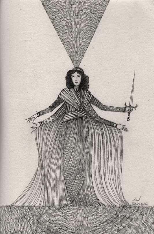
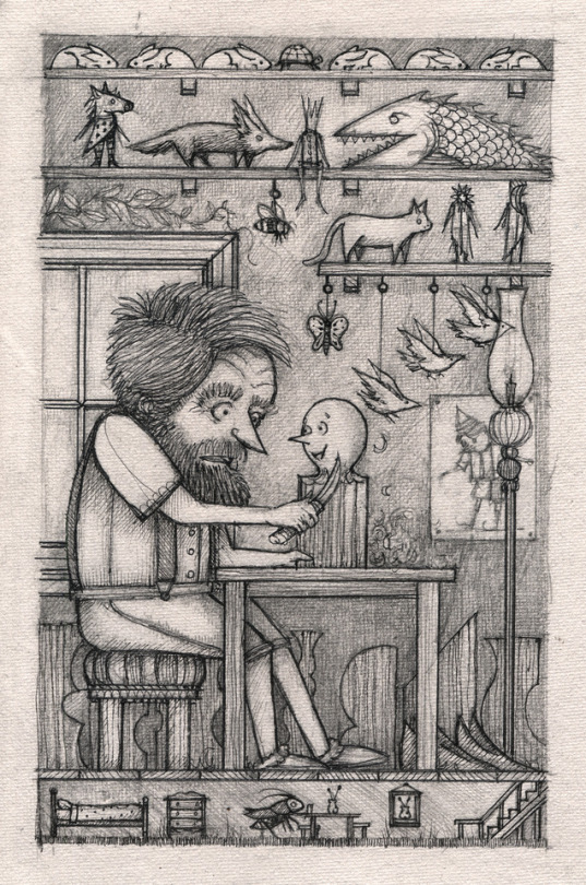

ART SCHOOL | INTERVIEW WITH JON CARLING
Scratchy black and white drawings and the ink meanderings of artist Jon Carling have always caught our eye. They’re like something out of a weird dream or out of an ancient children’s book–,and they’re always captivating. We’ve been following his prolific drawing career for a long time and recently caught up with Jon to find out more about his inspirations, his early artistic influences, and his recent dip into animating his beautiful works.
Photographs courtesy of the artist.
Introduce yourself? And where you’re from or currently residing? What’s your favorite thing about the city?
My name is Jon Carling. I am an independent artist living in Oakland, California.
I love the landscape. The beauty of the Northern Californian coastline is a life long inspiration to me.
How would you describe your work to someone who is just coming across it?
Scratchy ink drawings, some scribbling, mostly black and white. Weird children's book art.
How did you first get interested in drawing or figure out that you had a knack creating awesome art?
I have always really enjoyed making stuff. Drawing is really a habit from childhood, I would escape into my sketchbook, and my imagination, making up worlds. It is an awesome feeling to manifest ideas with some degree of success. That feeling is what keeps me doing it after all of these years.
Who and what were some of your early artistic influences? What artists inspire you these days?
Early on, I loved Saturday Morning Cartoons, After school Cartoons, Fucking Sesame Street. All the 80s kids' stuff. Garfield Volumes, The Far Side, and Calvin & Hobbes.
When I was 6 or 7, a comic book store opened near my house, and that had a huge impact. The dude who ran it, Butch, was an old hippie dude who also had a huge collection of Japanese comics and toys.This is when Voltron and Robotech had just started airing in the U. S. . It was perfect timing to be exposed to all that incredible art.Greek Myths by D'Aulaires was my first book, and basically my bible. I think you can see the influence on my work from that book.
These days, I have been studying animation, so, I have been admiring the classic cartoons and animation from early film, all the way up to today. I have been reading 'Elemental Magic' by Joseph Gilland.It is a book all about traditional animation special effects. Amazing.
Not only do you produce a lot of drawings, but also create zines and now dabbling in animation. Tell us a little bit about how you ended up animating your drawings?
Obviously, I have a love for cartoons. Creating a cartoon of my own has been something I have dreamed of forever. I have created short animations over the years using traditional methods: Paper and pen on a light table, scanning everything into photoshop, and putting it all together in there. It takes forever, and it can be pretty discouraging when you are sitting there doing data entry for hours.
Recently, a friend let me try out his Ipad Pro, and I am blown away by how much better the pen interface has become. I got excited about the possibilities for animating and started researching tablets. And, after years of being very reluctant to using digital tools to make my work, I finally got a drawing tablet. I ended up getting the Samsung S4 tablet instead of the Ipad Pro because I feel like the pen and the screen are better suited for me and my work.
I am using it everyday, I love how fast and clean the process is, while keeping the feel of my lines. Now I have a Huion Kamvas monitor for my computer too, I am getting the feel for the whole process, but, I am excited about what I can do now.
As exciting as it is, pen and paper is always closest to my heart.
What are your essential art tools and materials?
I really just need a sketchbook, a pencil (Sumogrip .5) , and a pen (Pilot Hi-Tec-C 03). If I have that with me, I am quite happy.
How do your ideas take shape? How do you get from start to finish? What’s your process?
I love to daydream. I have a bunch of ongoing stories in my head that I always turn to if I want to go somewhere.Other times, I just draw without any idea or expectation. I follow the pencil and start fleshing things out.I love phrases, sometimes out of context. A simple phrase can be the spark for a huge idea.
How has your style of drawing changed or evolved? What allows you to grow artistically?
I don't know what is changing exactly. The cross-over digital art is new, so, I am sure it will alter my work to some degree.I feel like I am always refining and hammering out a more perfect version of the world in my head.
What has been the most challenging project you’ve worked on?
Last year, I had the opportunity to illustrate Carlo Collodi's 'Pinoccio' for an Italian publisher.It was almost 200 illustrations with a tight schedule. It was just an epic amount of drawing, and when it was finished, I was able to travel to Italy for the release, and it just turned into a really magical experience.
What was the hardest thing about it and the most rewarding?
The discipline to complete the work, while maintaining quality that honors the book. It was a grind for large portions of the work, but, the end result made me realize how much good comes out of genuine work applied to a dream.
What was your last adventure that showed up in one of your illustrations, thematically or just visually?
Oh, it probably had something to do with a dream that involved a bird headed soldier dragging my injured body off the battlefield.
What advice would you give someone who wants to follow in your footsteps and pursue art?
Make sure you are doing it regardless if it is your "job". I am passionate about drawing, it is what I do, I don't see it as my career. First and foremost, I do it for myself.
What’s your best Art School tip that you want to share with folks?
By all means, enjoy yourself, and the time you have. I would make sure you have put yourself in the direction that fits best with your specific way of creating.Art School costs so much money, I don't think a truly determined person needs to go at all. If you love art, and the creative process, you will seek knowledge.The debt from art school can crush any hopes for a fulfilling career in the field.
What are your favorite style of VANS?
I love the ComfyCush Era style and fit. They are extremely comfortable and look super cool.I also love the traditional white slip-ons, they are the best shoe in the world to draw on.
Anything you can share that is coming up?
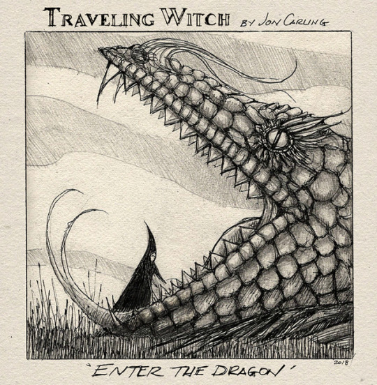
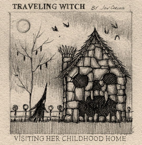
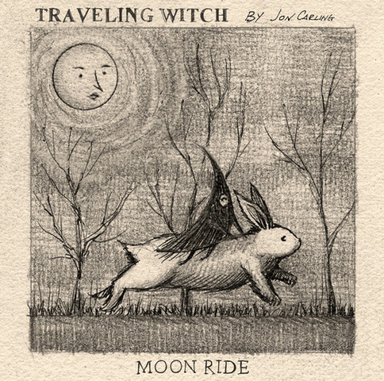
Last year, I created a limited hand cast resin figurine of my 'Traveling Witch' character. You can purchase the second edition in my Etsy store, along with other witch loot.
FOLLOW JON | WEBSITE | INSTAGRAM | SHOP
389 notes
·
View notes
Text
Diary Post: My Thoughts and Processes on Making “Silent Strength”
It’s lengthy, taking place over long period of time. Mainly written for my future-self to remember what I went through, but also for anyone who is curious. Now that the project is over, I can post without reservations. There are certain things I need to keep secret though, so if I’m vague I do so intentionally!
Basically, a lot of number-crunching, physical labor, and psychological labor.
It started off as kind of a joke tweet I made. I had enough content to make a Tales Of art book and people were receptive to it. So… I thought maybe I could go somewhere with this. A few weeks later, I suddenly had a lot of Kratos art. Like. 80% of all my Tales art was Kratos. It didn’t make sense to make a broad Tales Of book when really most of it was Kratos.
I hadn’t made a book since I was in college despite it being one of my favorite things to do. They were never art books, just some editorial design projects that totally didn’t count. This book… would be my first-ever art book.
Several times, I came close to having enough art to print a book - the last time was my large collection of Yusuke Kitagawa, but the quality wasn’t where I wanted. At that time, I was still experimenting with my iPad Pro and figuring out Procreate, so that was what I used him for.
NGL, I was pretty afraid of looking like a clown. After doing all this work, what if no one actually buys it? I was talking to some friends and they said they would buy it. It was enough for me. In the end, I’m creating something that I love.
-
The first thing I really wanted to work on was the cover. It needed to be epic but also mysterious (lol)… It was a good time to practice lighting and backgrounds. The cover had to be freaking Fantastic. I spent 3 days drawing nonstop. I was on vacation so I could spend full days just drawing. It was really intense. I would stop in the evenings to go for a run or else my legs would never get circulation again.
The hardest part was keeping it secret. I wanted to share it with the world right away bc I was so proud of it. Well, all I could do was show it to my parents and some close friends. They didn’t know who Kratos is, but it was obvious I was crazy about him.
Initially, I was doing some hand-lettering for the zine title instead of using a typeface. Tbh, I was so sure I was naming this zine “Blame Your Fate!” bc that is such an iconic line. But it just didn’t work with my cover, which looked… a little too serene for that. So… Silent Strength or Divine Strength? I asked around and got my answer.
But what size? All of my art has been on letter canvases. I wanted it to be large so you could see the details in the art. I’ll just start with that.
-
Luckily, I had all my Kratos-related art in one place. I started my InDesign file and threw everything in there just to see what it looked like. Man, I draw a lot of boxes… But I didn’t want them all next to each other. I also wanted to kinda organize it by the people Kratos hangs out with. There’s a Yuan section LOL… and a Lloyd section… and an Anna section. Idk, I tried to get some kind of order in there with a sprinkling of full spreads here and there to keep it fresh and interesting for the eyes.
I hadn’t worked with InDesign on such an intense level since college. I forgot all of the tips and tricks we learned in class. Spent some time reading on how to do things again… like adding page numbers.
-
I started drafting my pre-order form. It’s my first time making a google form like this. It’s kind of fun? I spent a long time on it, despite how simple it was. This was going to be my “Store” so it had to look and sound good.
-
My friend introduced me to charm-making. It seemed easy enough, and I wanted to give my zine more oomph. Besides, I’ve always wanted to make a charm.
I remember someone saying they’d buy a book of just the 4 Seraphim if it existed. I like them too and they lack art imo. In the end, I decided to do a polaroid charm. It’s not really that unique but I wanted Kratos to have actual friends to hang out with for once LOL.
She was going to do a group order to try to reduce the costs. I thought maybe 4 weeks would give me enough time. In the end she said I only have 2. I work well under pressure, so needless to say, I did make that deadline. I actually sketched the whole thing on the plane headed home.
-
After playing the game the second time, watching the OVA again, and reading “Offerings to a Star,” I have gained a real soft spot for Yuan. My friend once said, “If you weren’t stolen away by Kratos, you would be in love with Yuan.” Lol. I’ve been in a “Kratos and Yuan hanging out” mood lately, so of course I needed something good for the zine. They’re so cute together! Now… what is the bro-est thing I can draw?
I was currently in Florida for my friend’s wedding. I was friends with the groom and his best man since high school, so that makes it 10 years now. Seeing how they’re still friends after all this time, despite living in opposite sides of the country, was really moving to me. Of course, me being me, I could see Kratos and Yuan’s long friendship being similar to this, if they had gone to school together. I just had to draw it.
-
When I got back from vacation, I did some research on zine sizes. Mine was HUGE compared to others. I just didn’t quite realize it until I held a magazine in my hands. It really is huge…
I settled for a medium size. 7x9. I really liked how it looked. Petite but not too petite. Unfortunately resizing my book had messed up my artwork placement so I spent hours rearranging all the text and resizing my images. I found out afterwards that there’s a way to retain the format while changing the document size. Gee, that would have been helpful 4 hours ago.
Sadly, choosing a custom size booklet makes printing more expensive. But I wanted it badly enough that I’d be willing to pay for it. Letter size is just too large…
-
I decided to stop dragging my feet and post a promo. I just really needed a deadline for myself to get this all done before July ended. I’m happy it was well-received. A lot of people like Kratos huh…
Anyway, the pre-order is due in a week and I still don’t know what all the costs are yet. I need a physical proof ASAP to weigh at the post office!
-
Something possessed me one day to do another drawing. I don’t usually do painterly style (mainly because it’s really difficult and takes 10x longer) but I just REALLY wanted to push myself on this Final Piece to the zine. I wanted it to be… radiant. Almost religious. I worked on it obsessively. From breakfast to sundown. The only time I would stop was at 7pm to go running or else my legs would give out on me.
Call me crazy, but I would save my progress on my phone so I could examine it for errors during my warmup. I also spend an hour examining it for errors before going to bed. It’s a miracle I hadn’t dreamt of the painting.
-
I sent my files in on Sunday in hopes that they start working on it first thing on Monday…. and it HAPPENED! They finished before I even woke up. I think they start work at like 6am…
Of course, I drove over there as soon as I heard so I can get a look. “Please… please let the colors be okay,” I prayed as I was driving. I barely remember driving there, I was so lost in thought. It would be another long ordeal if I had to fix all the colors.
Thank the stars. The press proof looked BEAUTIFUL!! I was screaming to the client coordinator how much I loved it. I mean, I worried for a looooong time that everything would turn out too dark (it usually does) but it was PERFECT. I was especially worried about the cover, which contained a lot of yellow and I def did not want it to come out mustardy… But it was great in the end!
The press operator is a quiet man. He’s got a scary face and never smiles but I think he’s secretly nice. He has done a lot of favors for me in the past without my asking. He was the one to print, bind, and trim the book for me. Obviously he had to have seen what I was drawing. I wonder what he thought of it…? He walked away before I could express how happy and thankful was. He didn’t need to hear it. It was like he already knew. So cool…
I immediately took it to the post office to weigh it. I needed as much info as I could get and plus, I was dying to know for myself. This is the week I was supposed to open pre-orders and there was still a lot I needed to do. Take pictures, create mockups, pricing, etc.
NGL, all of these costs were building up fast. It was so darn expensive to make a zine while also keeping prices down. But I wanted so much more for my baby. Extra glossy cover, perfect binding!! I knew by the end of this, I probably wouldn’t make much money. It hurt a little, but I tried to think that it was for the greater good. Learning experience and all that. And creating something beautiful. Especially something beautiful of Kratos.
-
Pricing was really the hardest part. I pretty much threw profit out the window. However, I definitely did not want to be losing money. My dad and I had worked together to create a spreadsheet of expenses to make sure my head was above water. I followed it… loosely.
My friend came to talk to me at the right moment. I was sort of panicking at the prices. She made me realize I was thinking way too hard about it and gave me some tips based on her own experience. It really put my mind at ease talking to someone who understands my woes.
The truth of the matter is, the book is wonderfully made and has a lot of pages - countless hours of drawing. There is only so much I can do about pricing. It is what it is… I just needed to come to terms with my own worth.
-
Boy, what am I going to do once the zine is done? My friend says that I’ll be so over Kratos that I’ll stop drawing him (but the love remains). It’s like… all of the intense planning, working, struggling nonstop will just suddenly… stop. TBH, I’m running out of ideas. I spent it all on the zine.
-
Photoshoot today. I had to paint my nails purple for this occasion.
Unfortunately, I couldn’t get the look I wanted in the apartment. It’s just so naked without props. I think I’ll take it to a cafe for some nicer backgrounds. I talked it over with my friend and decided to do a quick flip-through of the zine as a promotional video. I used the most professional video program I had on hand… Snapchat. It actually turned out pretty legit and of course I slapped stickers on there because it’s Snapchat.
I had to tape/hide some of the pages for the video because I wasn’t actually done with the drawings. I had the printers print it anyway so I could examine it for color accuracy.
I’m really stressed about pricing now. It turns out I had a lot more international fans than I anticipated. I wish I took notes on interest earlier in the game to cater to them. I had a list of “possible buyers” and I only just now decided to check where they live? Foolish.
I did another cost analysis on paper to figure out what my goal was to make up for the charms. Right now they’ve cost me a fortune for something that was supposed to be giveaway. Other things that rack up are packaging costs, PayPal fees, and some other supplies I needed for this project.
Maybe I shouldn’t have made it 40 pages. It is an impressive number, but no one is really paying for quantity. I think 25 is a better number lol. If I had done that, I could have had my super-gloss cover like I wanted. :’(
There is hope though. And I’ve placed it in the hands of my followers to come through for me. I think I’ll open pre-orders on Saturday or Sunday, depending on what I finish.
-
“Losing your cool will only lead to poor decisions.”
Thanks, Kratos twitter bot. You always know what to say.
I read this post today on what makes people buy zines. Very interesting!
https://twitter.com/andythelemon_/status/1141469048653398019
-
Photoshoot part 2 today. My friend and I went to a cafe nearby that had some nice atmosphere in hopes of finding the right shots. I brought all of my Kratos merch just in case. I’m glad I did though, since the tables were pretty sparse and it was difficult to capture the backgrounds without getting a bunch of random people in it too.
I would have been the photographer, but I definitely wanted my hands in the shots. In a way, it was meaningful - to show that this was made by my own two hands. Plus, I wanted to depict natural interaction with the product. It made it feel real.
The photos were cute! I feared it would look a little amateurish with all the merch in there, but I think fun was what I was really going for, not “professional.” And plus the flip-through was a Snap anyway LOL. As long as the photos have good lighting and tasteful composition, you really can’t go wrong with “fun.”
Now that I’ve finished editing my photos, there really isn’t anything holding me back from opening pre-orders. I’ve pretty much come to terms with my pricing. If I fail to break even, I’ll just have to open commissions to try to make up for it.
I was telling my friend on the way home, “I gave this zine EVERYTHING I had to give. So at the very least, I won’t be disappointed in myself.” No stone left unturned, no detail left unchecked. It was perfect according to my standards. I really love my zine okay?!
I thought I was crazy for not only choosing a small fandom, I narrowed it down even further by picking ONE GUY to make this zine about. She replied, “Even if it’s small, those people who love him now must be EXTREMELY LOYAL to still be in love with a character from a 15-year-old game. All of them will want your zine.”
-
I went to bed that night with the intention of making the pre-order post live in the morning. I was so nervous I couldn’t sleep. I was wide awake until at least 5 or 6 am. Luckily, I was able to doze off for a an hour or two before I would shake myself awake again. It was a mixture of anxiety and excitement. It was the moment of truth - to see if all my effort made a difference. Was it going to sell?
-
The pre-order post looked really freaking good. I’ll give it that. I even made a YT account just to post that darn preview video on tumblr lol. It was definitely fun seeing everyone’s excitement and we all just freaked out together.
I broke even! That’s what really matters. Honestly at this point, I couldn’t care less if I made profit or not. I now know how much people really like the zine and that alone made me so happy I could die.
I was particularly fascinated at Google Form’s ability to transfer all the data collected into a spreadsheet. That is extremely helpful. I spent hours organizing the data. It was really fun…?! Now I can tell who gets invoiced and who paid and separate them into categories. IT’S FANTASTIC!
Stayed up late researching how much adding tracking could be. I had a slight panic attack thinking “what if my books got lost in transit?” It would really hurt me to have to reprint books and ship them again. And then I realized I will need to fill out customs forms for all international orders. Yikes, I’m gonna be living at the post office lol. You can print them out at home if you fill out the form online but there are still some things I’m uncertain about. I may visit the post office later this week to ask all my questions.
-
This morning I sent out everyone’s invoices. I gave the international people the option to purchase tracking. It’s expensive… but I need to provide that option just in case.
I received a nice message from someone who offered to advertise for me on Instagram. Of course, I gave them the OK! I’m really so shocked they would do that… They said the liked the zine so much it deserved more exposure. My dude… I love you… T_T
I thought about advertising on insta myself earlier in the week. For some reason I felt it was going to be fruitless since I don’t have an art account on there with a following. So, I gave up on the idea. Hey it worked out in the end.
I’ve never been so organized in my entire life. I want this zine experience to be perfect. The people have placed their trust in me, so I cannot mess up.
-
Edited some pages in the zine. The typography must be perfect… It made me think back to undergrad days in graphic design school. Man, if only I can present this as a project - photos, videos, matching accessories and all. I’d probably get an A lol.
-
Orders slow down after the first day. The rest is just about getting new people to see the post and giving other people more time to decide.
I finished my Kratos stationery today. It’s going to be so cute. My friend said people would want to buy it but I don’t have it in me to do more products at this time. Plus, I want it to be a surprise.
Why make stationery? Well my real job (no, I don’t draw Kratos all day for a living) is a stationery designer! It would feel really wrong not to put into practice what etiquette I’ve learned in this business. Plus, I felt that it was necessary to properly thank all those who ordered. And it’s fun?
I started designing the shipping labels for the domestic orders since I don’t need to fill out a customs form for those. I wish I had sticker labels but… it’s okay. It will still look good in the end.
-
Every so often, I would get nervous at the amount of money I’m responsible for. Perhaps, if I had a store with existing products I wouldn’t feel this way, but the fact that the books haven’t been printed yet made me scared. I know, I need this money to even print the books in the first place, but I’m just baffled at my customers’ trust in almost a total stranger. I felt pressured that I could not let them down and lose that trust. It probably didn’t help that I watched a documentary on Elizabeth Holmes (Theranos) that day.
So, I prayed every single day that nothing would go wrong. I’d check my spreadsheet constantly for any mistakes. It was a little obsessive, but I would rather be that than overlook something.
I began collecting cardboard boxes. My plan was to cut them up to protect the books during transit. I would have preferred hard envelopes but they were a bit pricey. If I have to do more work myself, so be it.
I’ve been getting nice DMs from some buyers. I think my invoice due date scared them… I really did not intend to be strict, but I wanted people to pay now if they can rather than forget about it. This happens at work all the time, so the best thing to do is have it due immediately. It would not look good to have to wait on stragglers when I close pre-orders, so I’ll probably reach out when there is one week left.
-
My Kratos stationery arrived! Aww it is SO CUTE!!! My babies…
I have a lot of notes to write so I got started right away. It’s going to be a lot of work trying to come up with creative ways to say “thank you,” but I don’t mind. I said I was going to put my all into the zine experience so I will.
At long last, the charm order has been put in motion. My friend said it could take a while… I hope it won’t be longer than 3 weeks. I really do not want to keep everyone waiting. I may ship out the ones who did not win a charm first. I mean, there is no reason to make those guys wait. I should ask the charm winners if they still want to wait and see if anyone wants to give it up for someone else who is more patient. Hm.
-
I finally stopped by the post office today to collect customs forms. I have my work cut out for me since I’m filling all of them in by hand. D:
I’m not used to international addresses so I think I’ll ask for help in checking them for spelling errors and typos. Heaven forbid I mess up on the very last part of the zine experience.
In my nervousness, I decided to reach out about invoices early on. If someone wanted to cancel, I would rather find out sooner rather than later. Everyone was really nice about paying and thank goodness they’re still excited.
Feeling kind of overwhelmed by all the things I need to do, but it’s a good thing. If I don’t know what to do, I can either: cut cardboard, write letters, type shipping labels, draw more Kratos for a… possible volume 2? Someone I talked to today already said they’ll pre-order a second book if I make one. Omg I think I’ll die. But we’ll see. It’s just a joke right now haha…
-
Preorders end today. I had another nightmare last night that the books could not be printed properly and there was nothing I could do. Why do I keep getting nightmares about the zine! I had one a few days before about people canceling their orders when I asked them about the invoices. I’ll take these dreams with a grain of salt. I’m probably just stressed/worried but everything is going to be okay. When I open my eyes, nothing is on fire.
I received my final proof a few days ago. With all of the artwork completed and changes applied. The book looks good, no doubt about it. There was only one thing I was nit-picky about but it can be fixed. The press operator offered to print another book for me to inspect. I’ll go see it on Monday and then submit the rest of the orders. I also asked to to have a meeting with the press operator so we are on the same page. It would be beneficial to have an understanding of how my book is made so that I may be more helpful to him.
I spent the day preparing shipping labels. I hate to admit, I am not too familiar with the format international addresses so I had an address validator open as I was typing them in. For the most part, everyone was helpful in already formatting their addresses in the preorder form!
-
My parents called me the day after preorders were closed. They wanted to say congratulations on my success. No one thought it would do this well. I couldn’t be offended by that since I was also guilty of it. I’m happy though. It feels like my love spread across the world and was contagious.
I tried to think of what advice I would give to others. Obviously, genuine love for the subject and hard work were a necessity. But it would be good to consider value. If I were selling it at this price, I had to make sure my pieces and presentation looked the part. I ask myself, if someone else sold it, would I buy it?
I sent out messages to all the charm winners in the morning. I wanted to apologize profusely at the ridiculous amount of time it has taken to get them made. But no, I’ve got to stop apologizing. I stated the facts and left it at that. Everyone was really kind and patient—to which I was thankful for. I don’t usually get that when I’m working customer service.
-
All the books were done printing in one day. Wow! I went to pick it up immediately of course. I can’t believe all of this is coming to an end. I finished preparing the mailers. All that was left was to stuff and seal the domestic orders. They were the easiest to do so I’m going to ship those first. The rest will need customs forms, which I haven’t filled out just yet. It’s going to be a while for those…
The mailers were quite sturdy with the cardboard cutouts I slipped in them. I have nothing to worry about. I’m sure my babies will be okay!
-
I took a whole box of domestic orders to the post office today. Wasn’t sure what to expect. But my clerk had to input every single address one at a time while I checked for errors. Omg, why are the post office shipping labels SO HUGE. I thought it was going to be half the size. And they’re ruining my designer labels! Slight panic but oh well…
I had a long long line behind me. I’m so sorry, people. Luckily there were two clerks or I would be really sweating. Despite my intimidating box of zines, the clerk and I had Synergy and we managed to ship all of these in about 15 minutes. I received a very long receipt and quite the bill lol.
-
Shipped the international orders today. I was kind of a mess since I had no idea what to do. I keep wondering if I can help speed up the process in any way but I don’t think I have the option to ship first-class at home.
When shipping international, keep the post office copy of the customs forms together with the package since they use that to type the address info into the system. Also, we get free tracking, which I did not know about. The other clerk told me that we did not get tracking for international first-class but I guess he was misinformed. It’s good to know for next time.
-
The charms finally arrived!! And THEY’RE HOLOGRAPHIC?! It was pretty awesome, but it makes picture-taking kind of difficult!! Anyway, I was a tiny bit disgruntled that they got my order incorrect, and I even asked for a reprint. But they said no, so I left it at that. Besides, it seems the holographic effect was well-received.
I like this size that I made. It’s really cute! Larger than your normal charm but not too huge. It’s almost like an Instax photo!
-
There was one customer who I found lives near me! I asked her if she wanted me to hand-deliver it to her in a public setting and she agreed (to my amazement). We finally met a few days ago and talked for hours and hours lol! I’m glad to have finally made a new friend here in this town but of course she’s moving away in two weeks. <:’3
We’re going to meet again to make the most of her time left.
-
I shipped the rest of the orders on the following Monday. I HAD to get these out. The poor guys have been waiting over a month! I think I picked a bad time to go because I had a huge line behind me and only one guy working. People in line were getting antsy or mad. The clerk at the other post office was super fast but not this guy…
For some reason shipping to the UK and Japan nearly doubled in price since the last time I checked. RIP. T_T
-
Omg I finally made a mistake. I wrote a letter to the wrong person. And the contents of that letter are too personalized!!! I am dying of embarrassment!!!!! Screams!! Had to apologize to both customers too!!! Luckily they were good sports about it but I’m seriously kicking myself AAAAAAAA!!!!
-
The most rewarding part after sending all my babies away is seeing the commentary on my project. It is so so nice to receive positive feedback. People are happy! Happy with something I created out of thin air. Everything was worth it 1000 times over. I can die happy!
I’m especially thankful to those who show understanding for how much effort went into it. It definitely wasn’t easy and I poured way too many hours into it… not that I regret that.
I don’t want to jump the gun but I would really love to make a volume 2. Because I know I can do better than last time. New and improved art and comics! But we’ll see if I make enough pieces for another book. I was against printing 40 pages before but now I kind of like it. It feels more worth it than a 25-page zine. If i’m going though so much effort, might as well bring in the entire package.
I’ll be printing more of this volume for Aselia Con 2020. Now I know people will appreciate it.
16 notes
·
View notes
Text
Lars Kenseth.
Bio: I’m a cartoonist and writer living in Los Angeles. I love being creative, but cartooning was my first love. My mom always tells me how much I loved the “marker table” at Montessori School— I was obsessed. That obsession never waned, as much as some of my teachers wished it had. I grew up all over New England, moving towns almost every year. Drawing cartoons was the one constant. Somehow, I got into Dartmouth College in New Hampshire. I discovered the animation department in my Junior year and finally found a way to keep drawing, while still technically earning a degree.
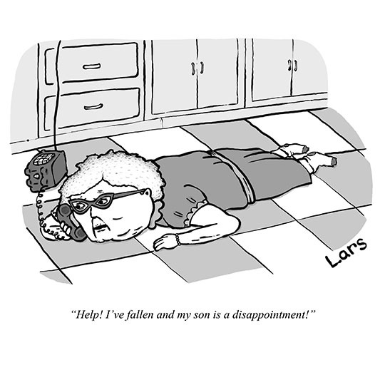
Find this print here!
To be honest, I never really thought I was good enough for The New Yorker. My dad introduced me to Charles Addams and Sam Gross when I was very young, speaking of them with a kind of reverence usually reserved for the Framers or the 1970 Boston Bruins. But, eventually I got over myself and decided to go for it. Now I’m happy to say I’ve been published in The New Yorker, MAD, Playboy, Esquire, Barron’s, Alta Journal Of California and The American Bystander. It’s stupid that I get to do this.
Me hosting an NCS-LA meeting with Ann Telnaes of The Washington Post!
Before I ever mustered the resolve to submit to The New Yorker, I made my living (and still do) writing comedy for TV. I’ve written for shows like MTV’s Popzilla, Voltron and Norm Macdonald Has A Show for Netflix. Currently, I’m developing Chuck Deuce, an animated TV show I created for Adult Swim.
One other tidbit, I’m the current Chairman of the National Cartoonist Society - LA Chapter. We wear plaid, sing, and have fun guests speak. If you’re a cartoonist in LA, swing by.
Tools of Choice: I really only have one tool. My Apple Pencil. I’m almost exclusively on the iPad these days. I used to use a Cintiq, which I did love. It was an old, glitchy unit, from around 2007. The stylus would often skip. But, I give that skipping stylus a lot of credit for how I draw today. Since I have an animation background, my drawing style always used to be a little too “mainstream”. Closer to Simpsons than Steig. So before I started submitting, I took some time to work on my style. I was trying everything - long heads, squat bodies, pointy noses, etc. But one afternoon, that stylus just kept glitching out… and I kind of liked it. I was getting this variable line quality that I thought was really unique. So I went with it. The Apple Pencil lets me get the same line variability, but with a lot more control.
Me drawing at home on my iPad. Which, to be honest, looks a lot more like a Grizzly Bear trying to drink a Capri Sun.
If I ever do an original, I’ll use the Rotring Art Pen. It uses an ink cartridge. I like it. And it’s the only thing I’ve been able to find that can even get close to replicating my line style. Although, sometimes I have to go over a line a couple times. Or hover the nib over the paper a little to get more ink to come out. If there’s another way, I’m open to suggestions, by the way.
Tools I Wish I Could Use Better: Dip pens. Sigh. I dunno, I’m just such a fuck up with dip pens. I’m a messy artist anyway, which is partly why I love digital, I can undo all my mistakes. But using dip pens to me, it’s like trying to break a wild stallion. And I’m a rodeo clown in this scenario, so. You can guess how that would go.
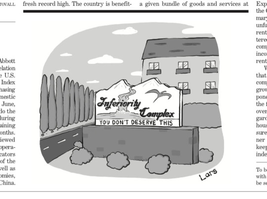
Here’s the one cartoon I got into Barron’s before they shut the door!
Tools I Wish Existed: I just wish there was some kind of ink pen that better replicated what I do digitally. It just seems impossible. Again, open to suggestions. It’s strange - I’m tech obsessed, and I also love the environment. So saving a lot of trees with the Apple Pencil is something I enjoy. However, I love the feel of paper. I miss it.
Tricks: If your hand gets tired or hurts using the Apple Pencil, I recommend getting some pencil grips. I like the cheap foam grips you can get on Amazon. I’d say get them at Blick or somewhere, but honestly, I haven’t found them in stores. I tried ripping the comfort grip off of a BIC pen, but it just didn’t feel right. Also, it’s a strangely brutal task. I don’t recommend it.
Don’t get too fancy with the ergonomic grips. In my opinion, you sacrifice too much control in the cause of comfort. I can’t even with those things.

A cartoon for Mad.
Misc: I love making pizza. I’m obsessed with great pizza. The greatest is Pizzeria Regina in Boston’s North End. And that’s the North END OF DISCUSSION. Here are some shots of pizzas I have made…
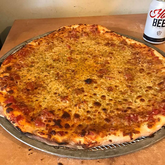
My standard thin crust.
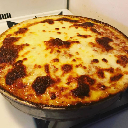
The above is a clone of Spontini pizza — a deep dish place in Milan that is INCREDIBLE.
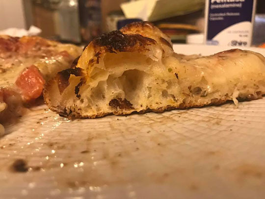
Ooooo check out that gluten development! All hail gluten!
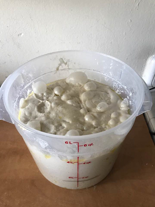
Anyone for bulk fermentation?
Website, Etc. Follow me on Instagram: larskenseth
Or, go to my website that’s sorely in need of updating: www.larskenseth.com
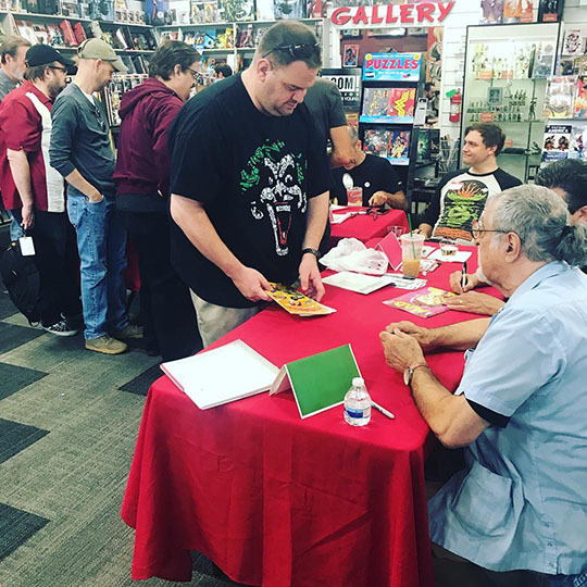
Me at the signing of MAD issue No. 1 - after the reboot. That’s Sergio Aragones in the foreground. That’s me smiling idiotically at the line.
Find more posts about art supplies on Case’s Instagram! There is a Twitter as well. If you like watercolors of baby animals, I recently created a professional Instagram for my own art, which you can find here!
If you enjoy this blog, and would like to help me do things like renew the domain name etc, there is also a Patreon! Thank you!
Hope you all are having a wonderful Holiday Season!
#lars kenseth#lars kenseth new yorker#New Yorker cartoons#tnycartoons#how to be a cartoonist#how to be a New Yorker cartoonist
14 notes
·
View notes
Text
My Creative Year in Review 2018
stolen from but also requested by inspired by @drstrangewillseeyounow

Preface: This will be a bit of a mashup of two things; art and writing. But I’ll be clear. This is also a long post, I’m very sorry. Apparently I don’t shut up.
Total number of creations? (Or a rough guess!)
Art - Finished; 221 (not all published)
Art - WIPS; 25
Writing - Published; 4
Writing - WIPS; 9 ?
Was there a project that you didn’t get around to?
In terms of starting or finishing? Lol. I didn’t get around to publishing the first chapter of the MU fic, which I desperately still want to before S2 starts. Because I keep writing all the middle bits instead. Nor did I get around to start writing the “winter fic” beyond plot points and a few little scenes.
There’s a looooooooooooooot of art I didn’t get around to either starting properly or finishing. Lol. I have a L’Rell piece I really want to do, as well as [another] mirror Stamets piece I want to do.
What was the creation you had the most fun making?
Art: Oh that’s hard. A lot of things for a lot of different reasons. I enjoyed the Holiday artworks because they were….really out of my depth and fun. Mostly I loved sending them out on cards to friends.
More recently I had a lot of fun doing the Patroclus and Achilles piece. Loved using golden hues.
Also have a lot of fun with Not Safe for Work-Viewing pieces, but those will never be published here. :D Sorry.
Writing: I had a surprising amount of fun writing the Vampire AU fic [Just a Taste] for Halloween. Which I never expected to write anything vampiric, ever, and also it came together really quickly. Building the world in that short fic was a lot of fun.
Any surprises? (E.g. a character or ship you never thought you’d create for or a project that came out of nowhere?)
Well honestly this whole revival to art and writing came as a surprise, I hadn’t done either in many years. I was also never a Star Trek fan prior to Disco, nor have I ever been a part of a fandom before. This is my first! So that was surprising, also surprising was how massively obsessed I became and how important it became to me.
But the best surprise out of all of that is the connections to people I’ve made and the friendships that have come from that. ily. <3
Also not going to lie, pretty surprised that suddenly my art has become mega-fuckin-colourful. Where did this love of neon come from??? Wtf
What was the hardest creation to make?
Writing; MU fic - hands down. I have pages and pages and pages of resources. Not only is it going to be a long story (I endeavour and hope) but also from the amount of which I am pulling from and want to align to canon as as best I can as well. Being a new fan to Trek also... it’s been pretty overwhelming to get these details right. But at the same time, really trying to flesh out a character we never met or saw in the show, and have them interact with the established canon and have that all make sense… That and have the science in it make as much sense as possible, I’ve based a few new things on scientific principles and things that exist and just trying to elevate them to a cosmic scale… and hope I can pull that off too. It’s pretty intimidating. Not going into it, but the way the story weaves and intersects with a few different genres.. I just want to have it make sense in it’s self contained body of work.
Yeah it’s hard. Lol. Biggest thing I’ve ever tried to do. But, I love it, truly. I think about this whole project an inhumane amount of times every day, and I love that.
It’s also hard because I’d love to be a linear writer, but I am not. At all. I’m constantly writing ahead, well and truly ahead, but then coming back, adding to and editing earlier bits and rewriting and rewriting….rewriting… ugh
The subjects and themes are also a little heavy, and it’s cathartic to write about, sure, but also wanting to do those moments justice and with respect and integrity - because that’s important to me too.
The whole thing is just a lot of fuckin work, lol. But I really love it. Already - and it’s nowhere near done.
Art; Probably the one where Paul is laying down [crying] in the spore chamber. It was my first return to trying to paint semi-realism, and... it didn’t work out. I’m not happy with it anymore, but also proud that I pulled it off. That pose? Hair? HAND? UGH those took me too long to get right. But, overall it certainly taught me a lot to use on future more realism-ish pieces such as the Cosmic/Celestial pics of Hugh and Paul [which I love.]
What inspired you the most this year?
Oh, easy. Discovery. Hugh and Paul, hands down both of those things. But also to the endlessly talented people who I’ve come to know and also enjoy the works of - be it written, art, or otherwise. Creativity inspires creativity.
What are you most proud of? (A creation, something you learned, etc)
Art: The Cosmic/Celestial pieces. Very proud of those. (So much so I made metal prints of them and they sit on my bookshelf between a salt lamp.) I really love how they came out, and really the original (Cosmic Paul) was kind of an accident, a happy accident if you will.
Also the piece of Anthony I did for Anthony’s birthday. That was a lot of fun constructing something visually representative of a person.
Any goals/plans/ideas for next year?
Fucking get some headway on my MU fic so I can stop being so annoying by just talking about it, and fucking start publishing it already - for then it then it would EXIST in the word. LOL. Ugh. That’s the only big plan, that’s all I want to do. Whatever art I will do - I will just find inspiration in the moment to do. No plans, other than the L’Rell piece and a couple other WIPs - maybe.
Honestly just that and trying to keep improving, both in writing and in drawing. I feel like I’ve improved over this past year, so would love to just continue on that trajectory.
Pick your favourite creations! (Post links and tell us why you love them!)

The Cosmic and Celestial Series
I just love how these turned out, especially because it was such a surprise how it turned out originally. But being able portray this cosmic divinity of which I uphold them both to be in my mind was really awesome to pull off. The colours, and dramatic light, this whole thing was so fucking fun. The whole painting with colours as highlights / shadows / dual light source was a huge experiment for me and it taught me a huge amount, so I really love it for many reasons.

The Song of Achilles
I started sketching this while I was listening to the audio book and while I fell in love with these two. Please, again, do go read this book. But the detailing on the spear, the auras and Achilles hair were my favourite bits. Oh and the gold blood. Of course, lol. Loved doing the symbolic imagery

Anthony Rapp’s Birthday Portrait
Because this man means a whole lot to me, and it was nice really nice for a change of pace to try and depict him and things that are important to him. Also really proud of that shoe, ngl.
& And MU Stamets and his Mycelium Sun
Huge experiment in terms of colour and lighting for me, and I love love love how it turned out. Even if it’s a little rough. This one was so much fun, and I also printed this out on metal actually lol. Looks pretty cool.
& First MU Culmets Work
Still in my heart, even though it’s a earlier work, because it was the first exploitation of this duo for me, and how they might be together. Also where I came up with the HC for his facial scar, which I always will include in any MU Hugh depiction of mine. But I still really like how their characterisation translates in this one.
Writing
Nomenclature.
The archaeology AU story I wrote for 30MinuteLoop. Also well, this is the only one that’s safe for viewing that’s published, lol, but I am genuinely really proud of this and seeing it through to completion.
But also the MU story is a fave, but this is the only published section so far:
MU Snippet
(These next couple of questions are directly from @drstrangewillseeyounow sorry I’ll be so literal in their structure, lmao)
How you decide on which style to use for individual pieces?
Unless it’s something very specific in mind (like the holiday pieces) I just kind of let it take a life of its own. See what it evolves into. I might have one idea to where I want it to go before I export it to PS, but once in PS it might take a whole new life (prime example if the original Cosmic/Celestial Paul. The original was very flat, and pretty boring lol but really became something else in PS. Actually it was supposed to be originally a visual piece to accompany my Vampire fic - and Vampire Hugh picture. But that changed entirely once I got it into PS.)
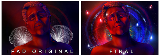
(It’s hard to see but there’s a bite mark on the original side.)
I'd also know more about your literal process, as in: what's your hardware set-up, what software do you use?
I have a weird all over the place set up. Lol.
So I do the majority of the work on my iPad, up until a stage where I don’t think I can go any further with it (or need more than 6 layers at my disposal) and then export it to my PC (either work or home) and then work on it further in Photoshop. Of which it then gains infinite amount of layers, lmao. Oh god.
As for the file on the iPad, when I’m working on that I can only have 6 layers. So usually will do sketch/line-work on one (or two, if I have to work a problematic bit but then merge it with the rest) and same with the colour/painting. That’s always on one layer, which I’ve grown to really like working like that. I might do skin on one, then clothes on another, but eventually will merge them.
If it’s a full paint (or even half paint maybe), the colour and line layer will eventually be merged as I erase the lines I no longer need as I go and blend that layer more seamlessly into the painted layer. It just ending up a purely painted file without the original lines. Another layer may be added for more delicate details such as eyelashes and eyebrows, things like that.
Everything I do once exported to Photoshop is just with a mouse, I have a Wacom tablet… But I don’t use it, because I haven’t been bothered calibrating it with my dual monitor setup, and am happy doing most of the work on the iPad anyway as it kinda acts like a Cintiq in that regard. But localised. (Plus I can take it anywhere with me, interstate, overseas, to work, to the park, etc. I love that mobility.)
Depending if I need a certain element that’s vector based, I’ll make it in Corel Draw or Illustrator, too. I also have Corel painter....buuuuuuuuut still haven’t used it. That’s a goal for 2019 for sure, lmao.
Very occasionally I will physically sketch out the idea (like the holiday pieces) scan, and rework, redraw, line it, or whatever in the iPad then go forth with all of the above processes.
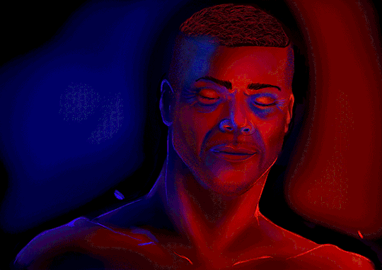
How long does it usually take you from start to finish?
Art: How long a piece takes really varies lol. Sketches can be between 1 - 4 hours on average, sometimes more. Flat colours will be a couple hours more. Half paints usually 4-8 more hours. Full paints and more realism stuff like the Cosmic/Celestial is total of 18hours+ but those times are just a rough idea, sometimes something just works out a lot quicker. Sometimes longer.
Writing: FOR FUYCKING EVER. I’m the slowest writer ever.
Do you have art WIPs and what do you think keeps you from finishing them?
I have a lot of art WIPs lol I think just losing drive or inspiration to finish them is what mainly kills them, or me getting frustrated that it isn’t working out like I wanted. Sometimes I just forget they exist.
Probably same goes for writing, too. Lol. Also it could be that I’ll dream up the entire (or mostly) of the story, but then getting it onto the page is hard. I want to work at getting better at that.
Do you do any non-fanart, too?
Sure. Although not often anymore, I’m honestly just inhumanly obsessed with Hugh and Paul.. Even when I start a project that isn’t centric to either or both of them… Often it will kind of morph into them. oops.
I want to say yes to fic too...but That’s a project I haven’t worked on in fucking years and years, so I doubt that really counts anymore.
//end
Wow I am so sorry that was me just rambling on. Anyway, cool. Hi to anyone who made it this far.
I’ll also parrot the line of: Everyone who created/posted art, fic, gif-sets, vids, cosplay, etc., consider yourself tagged if you’d like to be. I’m curious! (I’m fucking serious, P L E A S E D O.)
7 notes
·
View notes
Text
Coloring in grey scale
So, hey, this is somewhat of a tutorial for those curious about some of my coloring and blending. I made this especially for anyone younger than me and is exploring digital art, but this is also for others who are curious about what I do. I love reading other artist’s comments and looking at their WIPs, so why not.
Another reminder: if you’re looking for my artwork, please follow @rainbow-illness and not this blog. All of my finished stuff goes there; usually, my works in progress (WIPs) or Angry Doodle Corner go here. Sometimes I use this blog to repost my art, but that is my official art blog, no this one. Not unless you like nonsensical posting and metal, then have at it. If you have any questions, don’t be afraid to hit me up, I love talking about art.
So I can’t always sit down and talk about my processes and how I go about doing them, but I was able to sit down and take some screencaps while I was working on my iPad Pro. Using the iPad is actually my first choice to draw on because of the convenience of carrying it around like a sketchbook, whereas my laptop isn’t always easy to carry around--it’s a big laptop. While I use my iPad, I also like to go back and correct things, recolor, re-proportion, or spend more time privately working on a drawing. I have my iPad with me, all the time, so I’m out in places usually like Starbucks doing this. I also struggle with pretty bad PTSD and agoraphobia, so having my iPad out with my headphones on gives me an excuse to put my mind elsewhere to calm down. My family just usually looks at me and goes “oh, she’s working on her art again”; I did this as a kid, too, only with sketchbooks.
I do not have a Cintiq either, though I would absolutely love one. This laptop is capable of using a stylus, but I think I need a better one to do it with. All I’m using is a cheap Wacom Bamboo tablet that I’ve had for five years, that’s it. Everything I’ve done on this blog has been on a small surface. So if you’re just dabbling into art, don’t beat yourself up for having the small stuff, I’ve worked with small stuff and still do. The only thing I have that’s not small is, well, the space and processor on my laptop are much faster than any other laptop I’ve owned, bought especially for graphic design classes and my artwork.
So, that being said lemme just forewarn some of you guys. My artwork is all done in two to three layers! Yes, you read that right! Why? When I was 16, I didn’t have a Wacom tablet to mess with, so I had to use a mouse and learned from there. When I turned 18, I got my first Wacom tablet while working my first official job and the family computer didn’t have a good processor. So when I got my first official laptop, it was basic and not made to run anything beyond the web browser and such, it could barely handle Photoshop. It did, however, run Paint Tool SAI with no issue (which is why I still prefer it over anything I use), it just couldn’t handle more than five layers. After losing my drawings constantly and not being able to do anything in the prized software I’ve been eyeing since my Sophmore year of high school, I found a workaround with it.
And that’s what I’m going to write about here. With that in mind, no, you do not have to limit your layers! I’ve taken traditional art classes so my first instinct is to literally paint over my stuff like I would on a canvas. If you don’t want to do that, you don’t have to! Yes, I am nuts.
That being said, let's do this.
If you haven’t taken traditional art classes, that’s cool! I’m going to be using some art terms you haven’t heard of, but you definitely will when you take your first ever drawing class. These terms are foreground, value, negative space, contour, and weighted line (I’ve seen it called line weight too). For the more experienced art students who are likely groaning over that stupid contour practice from that book “Drawing on the Right Side of the Brain”, I’m sorry, guys. Newbies, you are going to know this.
And you are going to hate it. While I still hate it and, yeah, my eyes are rolling into my skull right now just even talking about it, there are some useful practices in here that I... actually use. Who would have thought? At least we’re not talking about still lives.
Anyway, here’s what I’M going to say that some art teachers will not tell you but I want anyone to read this to know:
- Do not obsess over your drawing to look exactly like your reference. Just don’t. Forget this completely, worry about it later or don’t even worry about it at all. This is your style, your interpretation.
- Digital art is hard. Art is hard! Practice makes perfect and you learn over time just by studying (looking at) other pieces of art. It took me like well over 10 years to find my own little niche and I’m still playing around with coloring styles. I have a lot.
- If you’re just starting to draw with a tablet of any kind, play around with it. My first official program was a cheaper version of Paint Shop Pro and when I first got it when I was 14, I sat around and experimented on layers to see what it would look like. Explore!
- When you start drawing figures or faces, try not to think of it as, well, face or a figure. Reduce it to basic shapes, like squares, triangles, and circles.
Greyscale can establish light source, value, scale, and negative space.
I don’t always use greyscale for my art, but when I do, I appreciate it because it makes my life easier. For example, Alphonse Mucha’s pieces here from his “Slav Epic”.
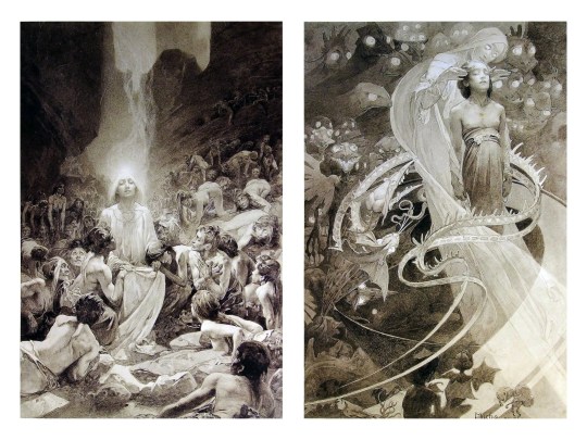
Chances are, you’ve seen Mucha’s art nouveau on prints, fanart, fabrics, and all of that. But Mucha did so much more and he is a huge influence on me for a reason. By the greyscale we see here, we can see foreground/subject with each illustration. Mucha is using value (that’s shadow) to emphasize this, in addition to negative space (background) to draw you in, just by using black and white. Notice how the other subjects don’t have such a powerful contrast and light source versus the other, especially the woman on the left. Mucha made his art pop by his understanding of contrast.
For this first part of this entry, I’m going to be using Papa Emeritus II from “Ghost”... who is a good example of how to draw faces, too. Huh. Regardless of what drawing program you’re using, keep your opacity low, at 50%.
Simplicity at its finest
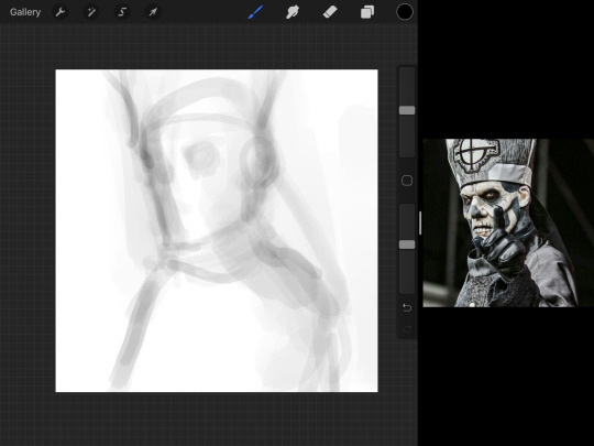
Instead of focusing a lot on Emeritus’ face, I’m going to focus on the negative space behind him. I’m using this to define his figure. This is a good picture because of the stark contrast, though, it’s a little tricky because it is really contrasted and you can’t see where the light source really is. But that is okay! I am going in and just using this negative space, the contour of his head and torso. Before I even think of a face, I want to softly go in and use black (or grey) to fill up that negative space. Keep it simple and work your way up.
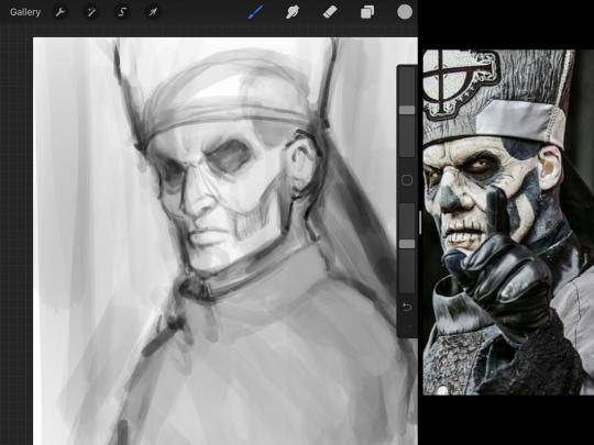
After I lightly fill in the negative space around him, I can start lightly going in and establish his face by blocks of shadow. And this is why Emeritus II is such a good example for this kind of work. I don’t usually start going in and drawing eyes, I rely on the shadows of the face to see where their eyes, ears, lips, and such lie.
Here’s another example (though, it’s old):
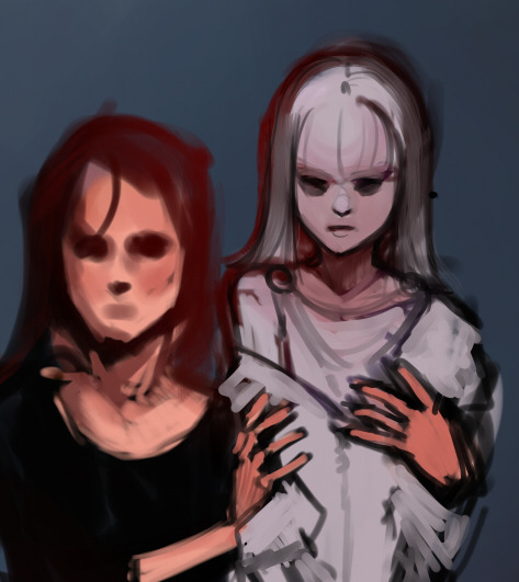
This is in my maroon style underpaint, which is what I post most of the time. For their faces, I just used basically eye sockets to start working on their faces, like Papa Emeritus II down below. Again, this dude is a great example.
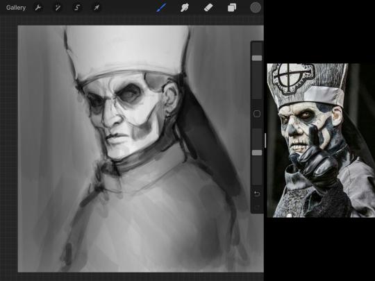
Here is where it may get a little funky. I created a new layer and set that layer to Multiply, still keeping that opacity low. Since I have no light source and I just want to create a really dramatic lighting, I made a vignette with a simple airbrush tool.
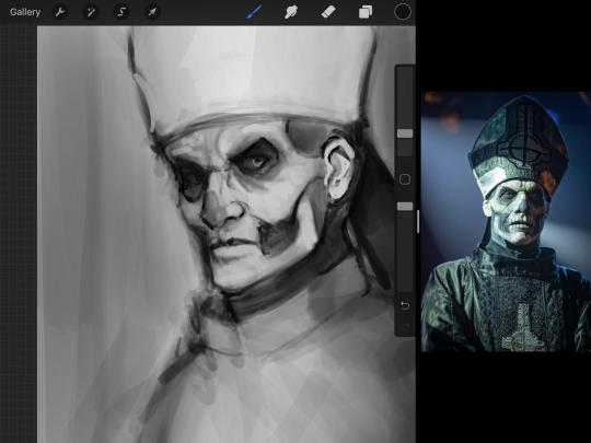
With that little vignette, you can create a new layer (unless you’re me, I just merge it down because of that constant fear of nonexistent software crashing) and I’m using the color pick tool to go back and forth to start using greys to really get into Emeritus’ face, especially his wrinkles. I’m painting over it constantly, switching back and forth between a paintbrush tool and color pick tool to blend. Again, keep your opacity low... unless you’re me and you’re feeling adventurous. You’ll also notice here that I have more than one photo reference. I use several for a lot of my art, so I encourage you to do the same. I had no idea what his jaw looked like, so I grabbed a second photo. Now that I have a better idea of where his hat ends on his forehead and how his nose looks, I start doing a weighted line.
Weighted line and Contour
Now is the dreaded talk. Of contour.

Welcome to Drawing I hell. This cursed image is from the book “How to Draw on the Right Side of the Brain” and if your teacher does not talk about this in your first drawing class, I am going to eat my hat... I have a hat lying around here somewhere. ANYWAY, the contour line exercise is basically you just using a neverending line for a drawing. I don’t know who drew this (and tbh, thanks a lot for every single boring assignment I’ve done in drawing classes), but this guy used contour lines for his drawing. I’m having war flashbacks over here, but I managed to find an art teacher’s page talking about different types of contour. My god, they are evolving.
Going back to our dear friend Papa Emeritus II, I used weighted line to start adding in little shadows to his face. Weighted line goes hand in hand with contour; it is a great technique to not only add details, but add little bits of shadows.

This is a simple example; the thicker line is adding to the shadow of the apple, giving it value!
Papa Emeritus II is such a good reference... I used him as inspiration for King Melwas here.
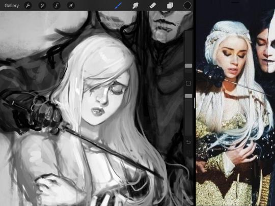
Gwenhwyfar is also a good example of weighted line. Gwen is essentially a very, very pale character. In contrast to Melwas, who is in darker clothing, Gwen is soft, she is the focal point in this drawing. For the little pieces of her hair, the corner of her lips, eyelashes, and her fingertips, I used a weighted line to establish these things, otherwise, Gwen is so pale, she’ll easily be washed out completely.
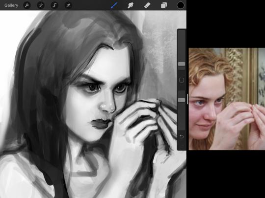
This drawing of Alice, which I’m still messing around with, is another example of how effective a weighted line can be with depth. The lines I added into her face, eyelashes, creases, hair, and fingers add those little details since everything I’ve done before like Papa Emeritus II was so soft with a low opacity on the brush settings.
Layer masks and curves
There are two ways you can color greyscale images.
You can do this by going into Layer > Adjustment Layer > Curves (this is how it looks like in Procreate).
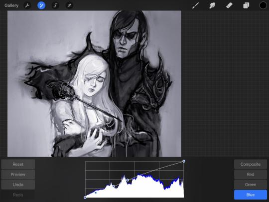
This gives you a neat ol’ base color! I am playing around in the blues, adding soft hues of blue in their figures and the white in this picture can either turn blue, cream, or even green. You don’t have to use Blue, you can use any of the other colors. For me, I’m always drawn to blues. Another cool thing to play around with is Color Balance, which is underneath the same function as Curves.
But if you don’t have any of these, you can add a new layer, and do Multiply.
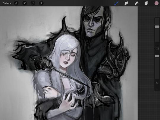
The only drawback to this, of course, is how destaturated (the lack of color) it looks. And yes, that’s an issue you will have and I did run into this while doing this. How I combat this is using additional layer masks. Believe it or not, Alice here was once at a grey scale, looking even more desaturated than Gwen.
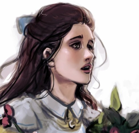
For Alice’s face, I went in and use:
- Soft Light because she needed more peach and roses in her skin. Omri’s original drawing gave her a light rose blush so I wanted to do the same.
- Overlay to mask out the black lines from the greyscale I had.
- Lighten which I used to make her lips pinker, her apron’s shadows lighter, and parts of her hair brown.
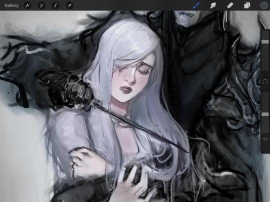
The same went for Gwen, who is, again, very pale. But while she’s supposed to be pale, I didn’t wash her out completely. To add more saturation, I used a combination of Soft Light over my Multiply layer and Overlay to start working at the highlights on her hair, nose, and shoulder.
This little walkthrough isn’t as visual as I like, but with limited software like Fire Alpaca, GIMP, or Paint Tool SAI that don’t have the abilities of Photoshop in terms of color correction and playing around with colors, I really encourage you, readers, to play around with these tools. Using the color picker back and forth, especially after using layer masks, gives you an ability to mix and blend colors. The reason why I work with greyscale or a maroon under paint is that you can create brilliant colors and make a new palette; the trick is to constantly mess around with them. I never go in and flat out color anything, with the exception of things like “angry doodle corner” which is basically what I call my lazy drawings, drawings where I’m just honestly goofing off with.
So in summation...! Or me trying to summarize this.
Experiment and explore with layer masks and adjustments. Whoever says that using these tools isn’t real art, they’re wrong. And please don’t ever be afraid of using references of any sort! Alphonse Mucha is saved ten times over on this computer.
#my art#tutorial#i think#an attempt was made#digital art#procreate#ipad drawing#ipad pro#Alice madness returns#alice liddell#american mcgee's alice#alice asylum
7 notes
·
View notes
Text
Business Card Project - Part 1
Around the time this module started, I got back into contact with someone by the name of Josh Hitchcock who I met and worked with back in college. We met when we were 16 and worked on several projects with each other during our year studying photography together, I learned a lot from Josh and we’ve stayed loosely in contact ever since leaving school but haven’t collaborated on anything for around 5 years despite having always had similar interests, styles and aesthetics. Josh is also still pursuing his passions and talents in visual communication and is beginning to build a portfolio with the aim of applying for a BA, just like I was doing this time last year. Alongside getting himself prepared to do a degree, he has been expanding his online presence and slowly establishing a business and brand identity for himself. He reached out to me originally to ask if I could potentially create him a logo that he could use across all of his platforms which he needed fairly quickly as he was building a website, unfortunately I couldn’t meet the turnaround deadline and so he commissioned someone else to do a logo, later reaching out to me again to ask if I might be able to create business cards instead.
Josh had already started sketching out ideas and so he sent me his drawings as a starting point for the design
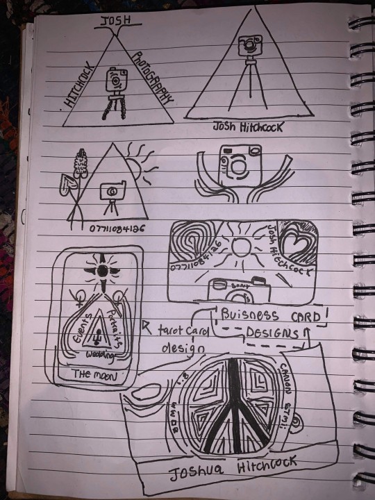
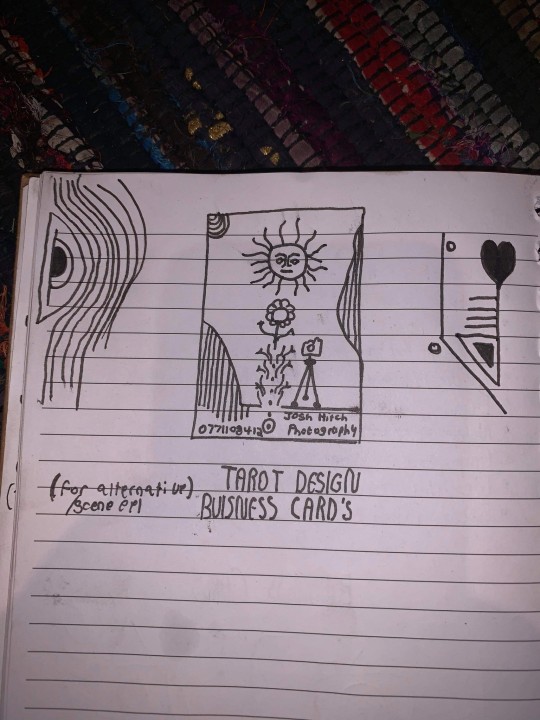
After some discussion and a little bit of time, Josh came to the decision that this was his favorite prospective card design and even began experimenting with it's colors.
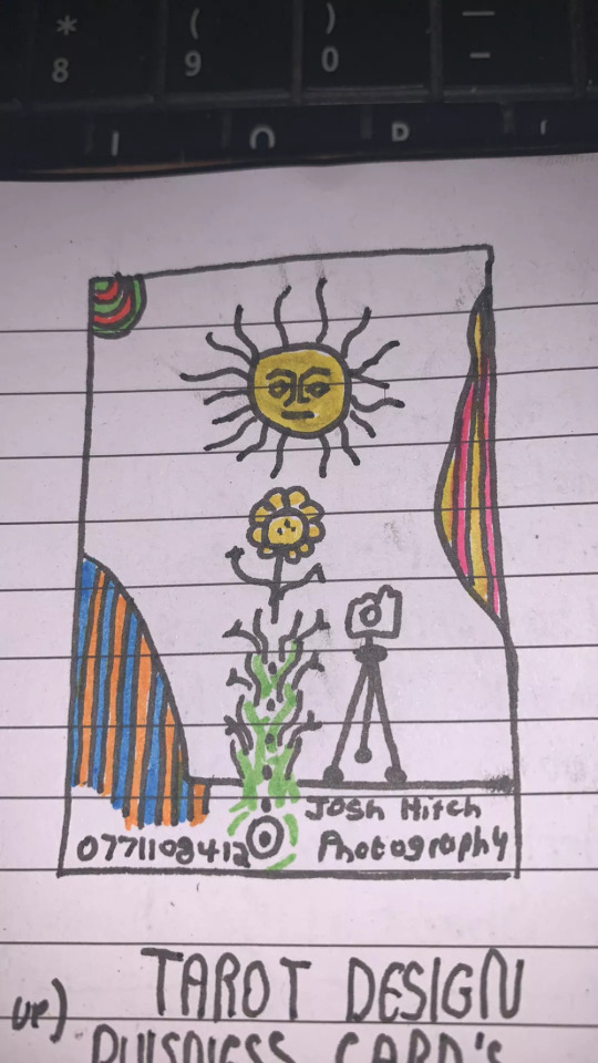
It was at this point that I asked him to create a Pinterest board to help gather all of the ideas together which he promptly delivered on. Pinterest’s description of the board “Clean, simple doodles. Photography orientated based on nature and ancient art. A perfect combination of tech, nature and aesthetic.” sums it up perfectly. This was a really strong starting point for the overall design as it includes everything from small decorative graphic details such as flowers, vines and suns; to a concise range of colors for the palette of the art itself. The board isn’t overcrowded, it's clearly well thought through and does good job of clearly communicating the kind of style that I was expected to reflect in my design.
Coincidentally around the same time I started this project, I decided to treat myself to an iPad Pro and Apple Pencil to support my University work, these have become increasing popular in the art world because they are incredibly powerful creative tools, I chose to invest in it mainly for it’s capabilities in creating digital art using the Adobe suite and Procreate using the pencil which is exclusive to iOS and has is slowly becoming the standard for digital drawings.
Having recently attended the Illustrator workshop, I thought that I would experiment with using this software both on my iPad and computer as I figured if I could learn to use them in conjunction with one another from the get go, I would be in a better position overall later on; but in doing so, I threw myself two learning curves at once as I was not only dabbling in software I wasn’t comfortable with but also using that software on a device that I am a complete beginner to which was a definite challenge for myself.
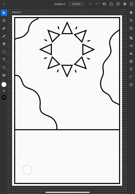
I started out by doing a Google search to find out what the standard size is for business cards and found out that is generally 3.5 x 2 inches (1050 x 600 pixels at 300 DPI, which is the standard DPI for printing). This is how I decided to set my document up which is what gives me the white rectangular shape that you see me working on to start off with.
To begin the design, I picked out my favorite things from Josh's sketch which were the wavy line details and the bohemian style sun. I created some simple outlines using the line tools on iPad Illustrator starting with the border and dividing horizontal line where I intended the design to end, from this I was able rough out where patches of lines would go and add the sun. For the sun, I originally tried to draw one with wavy points but I was struggling to get it proportionate, even when I'd figured out how to use the reflect tool to make my drawing symmetrical, it seemed to be throwing the design off and so I threw this idea out and went for a pointed sun design instead. I chose triangles for the points as a subtle reference to the exposure triangle which is a rule that dictates camera settings when it comes to photography so it ties in with the business well and was also a concept that Josh was trying to reflect in his logo. I achieved the geometrically accurate shape of the points around the sun by creating the very top triangle and then using the Radial Reflect tool whilst using my iPad which automatically created the rest of the points for me with even spacing and perfect symmetry; all I had to do then was resize the points as I pleased. Once I had done this, I decided to repeat the process but with a small line between each point to give it an extra beaming sunshine look, this also fits in with how some of the sun's and graphics are drawn on the Pinterest board that I'm referring to as I design this.
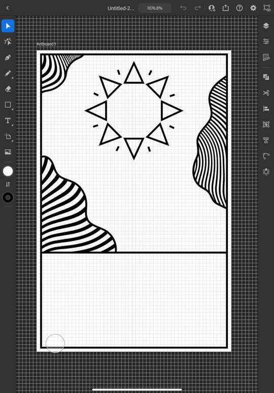
Once the outlines were complete, I started experimenting with filling in the patches with lines, this is an effect that is featured on the album art of one of my favorite albums of all time, Currents by Tame Impala which I previously learned how to do using a vector pack from Spoon Graphics as I did work inspired by it for my University portfolio. Although I have used these particularly line textures before, I have only used them in Photoshop and not Illustrator so I haven't actually used the vector versions of them up until this point. I inserted these into my work using my computer as that's where they were saved, I was able to use Adobe Cloud to sync my work between my PC and iPad making it easy and convenient to switch between the two whilst working. Adjusting the waves worked similarly to how it does when I use them in Photoshop, I just added them in as a layer and then used direct selection mode to delete the extra lines around the outlines and border that I’d drawn in leaving me with what you see above. At this point, I sent what I’d done so far to Josh so that I could begin to get his feedback and make sure that what I was doing was in line with his vision.
Whilst I was waiting for him to reply, I started experimenting with adding color to the design hoping that it would help us visualize it better; I used colors directly from the Pinterest board for my palette by taking a screenshot of the webpage, opening it up in Illustrator, swatching all of the colors and adding them to my Color Library so that they could be easily accessed whenever I needed them.
At this point, I just filled in the colors according to what made sense to me, blue for the sky, yellow for the sun and something contrasting for the wavy lines, honestly, I chose orange because it’s my favorite color and I really like the way that the purple looks next to it, especially against the blue background where it appears slightly more subtle whilst still being effective at breaking up the image in the way that it needs to.
I continued to add colour, changing every other point on the sun to be red to give it more dimension and incorporate more of the colours from the chosen scheme; I then added green to the bottom section which I chose because I thought it would represent grass and fit in with the sun and sky theme that seemed to be emerging. I also added some small stars as I was experimenting with the shape tools dotting them into some small empty spaces on the design so that they line up in a triangular shape which is another subtle reference to the expose triangle.
Then I started experimenting with adding text and social media icons, Josh had told me that he wanted his name, website and social media information on the card, we decided to leave his phone number out as he only has a personal mobile number and didn’t want to risk handing it out to strangers. I chose this Art Deco style font for the name because I liked the lines in it and thought it went well with the lines in the top half of the design which are probably my favourite thing about it at this point. I didn’t use the same font for the website because it doesn’t look as good when it’s small, you can’t really see the lines and it made the website hard to read so instead I chose this glyph font which I thought Josh would like based on some of the imagery from the Pinterest board; I was unsure about this choice at first but it quickly grew on me as it’s subtle and yet it makes the website look bold on the bottom of the image which draws your eye down to it when you’re reading the information. I also added some social shapes to the front keeping Josh updated on my progress as I went along.
It was at this point that I started to receive some feedback from him, he was really happy with the first impressions of the design but did want to make a few changes. He started out by asking if I could change the green on the bottom to the orange colour in the waves with the hope of giving the card a more uniform look which we both agreed looked much better. He then asked me if I’d started designing the back which I hate to admit that I hadn’t actually thought about at this point and so we started discussing the layout; collectively agreeing to move the social media information to the back of the card and have that there along with some sort of bio which I much preferred the idea of as I wasn’t too keen on how the social shapes looked on the front of the card and I was worried about how I was going to fit all of the contact details on without making it look messy.

Originally we thought it might be nice to add some floral details to the front of the card where the space had now been freed up but we quickly decided that this didn’t look quite right.
0 notes
Text
Meet The Artists – Beugism

Alexander Beuge or ‘Beugism’, is one of the most recent artists to join The Artworks! Based in East London, Beugism is a digital Illustrator with a love for character, colour and humour. He has worked with clients such as The Guardian, The Times, The Independent, BBC, Visa, Facebook, Red Bull and Nobrow Press.
We had a chance to chat to Beugism and find out more about his life as an Artworks artist…
Where do you live?
I currently live in St John’s Wood, that’s close to Baker Street.
Where is your studio located?
My studio is located on the top floor of a cinema near Hackney Central station.
Can you describe your creative process?
I used to draw everything by hand, using french curves and Rotring architectural pens which had the smallest nib ever. The disadvantage of that was that I had to scan portions of my artwork and piece it together again afterward in Photoshop. Today I do all my sketching on an iPad Pro using Procreate as my go-to drawing app. Most of the time I’ll do an initial sketch, lower its opacity and draw a final draft on a separate layer. In order to vectorize my designs, I’ll place the image into Adobe Illustrator and draw the Bezier curves on top of it. If the timeline of the project allows for it, I’ll add some texture to my illustrations in Photoshop.
What does a typical working day look like?
I usually think about what I am going to work on that day during my morning walk which leads me past Regent’s Canal and through Regent’s Park. It’s a win-win situation, I walk my 10,000 steps that are recommended by the NHS and at the same time I get some headspace as an added bonus. With a bit of luck, you can occasionally even spot Stephen Fry doing the same walk in the early hours. A lot of the time commuters will pass me by either jogging or cycling to work. That’s when I feel lucky to be able to work remotely and do something creative for a living. After returning from my walk I shower and have breakfast, not at the same time though. I’ll pack my laptop and iPad into my backpack alongside provisions for the day. I commute to my studio in Hackney from St John’s Wood. There are about four different routes I can take to the studio, I like to keep things interesting for myself. Once I am at the studio, typically around noon I’ll answer emails and do admin stuff like researching art directors and updating spreadsheets. At 2pm I’ll start sketching or vectorizing. I have never been a morning person and I can’t do any creative work in the mornings. I recently read Daniel H. Pink’s book ‘When’. According to his findings, my chronotype is a dolphin, which means that my productivity peaks in the late afternoon. I work in green tea infused sessions of 25 minutes so I don’t tire myself out too soon. I’ll typically stay in the studio until 8pm to 9pm.
Do you listen to music or the radio whilst you work? If so, what’s on your playlist?
Most of the time I am listening to my ‘Gym playlist’ on Spotify. It has a lot of Vocal House, which helps me ease into the workflow as it’s quite upbeat. It’s a bit cliché because there is this stereotype of how German people only listen to electronic music. When I am bored of that I’ll switch to an interesting podcast or listen to an audiobook.
How long have you been with the Artworks for?
I have been with The Artworks for one year.
What drew you to Artworks?
The Artworks have been on my radar for a while. What I like about them is that compared to other bigger agencies their roster is quite small ensuring each artist gets the attention they deserve. I met Steph, one of The Artworks’ agents at a portfolio review back in 2018. To me, she seemed very confident and I remember thinking ‘ If anybody can negotiate a good deal on my behalf, it’s definitely her!’.
What books or programs did you love as a child? Have they influenced your work in any way?
When I was a child I loved watching a TV program called ‘Der Sandmann’ (The Sandman). The program was aired at 6pm every day and showed good night stories for kids using stop motion animation. At the time this program was the coolest thing I could think of and I would always try to work out how they made the characters move.
If you weren’t an artist, what would you be instead?
When I was little I always wanted to be a horse. So if the illustration thing hadn’t worked out I would maybe work on an interesting movie set somewhere as a stunt horse.
What was the most important lesson you learned at Art School, if you went!
I have studied at several universities in Berlin, Bilbao, Warsaw, and London. Each university would have its own methods and claim to possess the holy grail of how one should draw. After graduating from Central Saint Martins I realised that you don’t actually need to study to become an illustrator. All it takes is drive and perseverance.
What inspires you the most to create?
In one word, people. I am a keen observer of my surroundings and love watching how people interact with each other, the things they do and the way they dress. My illustration practice is all about characters and what would be a better place to be than London which is home to so many interesting characters.
Name three artists that you admire.
Olaf Hajek (German illustrator), Neo Rauch (German painter), John Singer Sargent (American painter)
What kind of commissions do you enjoy the most?
My favourite commissions are the ones where the art director is open to ideas and lets me bring in my sense of humour into the project.
What would your dream commission be?
It would be amazing to be commissioned to paint a mural in my style for every stop of the London Central line. It would probably take me a lifetime to finish the project but millions of people would get to see my illustrations.
Do you have any pets? If so, what and what are they called?
When I was younger I had a little blue budgie called ‘Bubi’. He loved sitting on my head when I was drawing. He also loved chewing away at my books and leaving his droppings on top of them. One day I stupidly left the window open and Bubi was never to be seen again. I’d like to think that he joined the parakeets in Hyde Park.
What 5 things could you not live without?
My girlfriend, my family, green tea, my iPad and emojis.
What is your very favourite meal?
It is really hard to choose just one dish because there is so much delicious food out there but if I had to choose one meal to eat for the rest of my life, it would be ‘Ghormeh Sabzi’. It is an Iranian herb stew that doesn’t look very appealing but tastes amazing.
What do you like to do in your spare time?
I am very fond of martial arts, sketching people, cycling, eating out and traveling, I also love learning new languages (which is a really good way of doing something useful during your commute).
What is your current dream travel destination?
My current dream destination would definitely be Japan. In many ways, it’s exactly like Germany and in so many ways it’s the total opposite. I used to practice ninjutsu when I was a teenager and it would be amazing to visit one of the ancient martial arts schools in Japan.
See more of Beugism’s work here.


#illustration#art#illustrator#design#alex beuge#beugism#political illustration#meettheartist#meet the artist#meet the maker#the artworks#illustration agency
0 notes
Last Seen Blogs

sysepro
Pro System
coastxlwaters
CoastalChaos
ossielv
Ossiel V
whathepineapple
Amber J Liu
louandaidens
Lou&Aiden's (L&A's)