#also the centers tutorial needs some work imo
Explore tagged Tumblr posts
Visit Tumblr Blog
Explore Tumblr blogs with no restrictions, modern design and the best experience.
Last Seen Tumblr Blogs


Fun Fact
69% of Tumblr users are millennials.
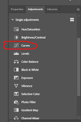
Text
I'm not entirely convinced this is the *best* beginner tutorial for solving a rubik's cube, but it is really cool from a technical standpoint
Not only does it solve cubes with any number of layers, but it does so using only two (pretty simple) algorithms (plus the mirror of one of them)
I also love the attention to detail with how the algorithms are chosen; the first alg is usually R' D' R D in beginner tutorials, but they went with D' R' D R since they're using a variation on niklas to permute the corners and D' R' D R solves that case faster. And speaking of niklas, they're again using the inverse so that it makes solving the centers more familiar
#cubing#rubik's cubes#okay so it's just spamming commutators#i still think it's cool#also the centers tutorial needs some work imo#i might make a flowchart-type thing for people who just want to solve their cube without having to memorize a bunch of stuff#i feel like this method could work well for something like that
9 notes
·
View notes
Text
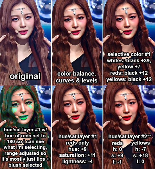
hi i was asked by @haumkwak for a gif coloring tutorial :)
some disclaimers
i don't actually know what i'm doing. all of my photoshop knowledge comes from the one (1 🤓☝️) semester i spent as an art major, clicking and sliding random things to see what happens, and two youtube tutorials i watched
this tutorial is mostly for live performance gifs. if i'm giffing mvs or other videos i use waaaayy less adjustments but the logic is pretty similar
i don't use all of the adjustments mentioned in the order i mentioned them, since it really depends on the source video. for this reason i'm not gonna color a single gif throughout the tutorial and instead i'm going to use gifs i colored before to show how i used the adjustment i'm talking about
this is my first time trying to write a tutorial and i suck at explaining things and writing concisely so this turned out to be basically word vomit. if anything doesn't make sense, there's a tl;dr at the end with some videos i recorded of myself coloring a couple gifs to hopefully make things clearer lol
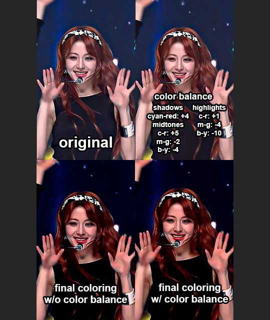
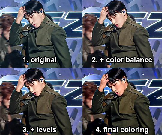
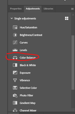
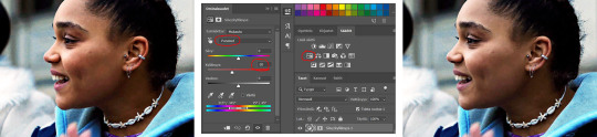
1. color balancing
color balance and/or curves is usually a good place to start considering all the different colors stage lighting can have. i don't always do this first though, i may do it at a later step depending on the lighting. i also sometimes do multiple color balancing layers throughout my process if the colors are really strong
color balancing is also v helpful if a stage looks dull and grayish (usually m countdown and sometimes music bank look like this imo)
1a. color balance
pretty straight forward i think so i won't yap about this too much since you're just sliding the sliders to the opposite of whatever color you're trying to get rid of. but here's an example of how i use color balance to make a gif look less dull/gray. it's kinda subtle but it makes the shadows in the face and skin overall a bit brighter & warmer:
from this set
(i'm gonna include links to the sets the gifs are from bc sometimes i feel like my colorings look ugly on a still frame until i see them in motion lol)
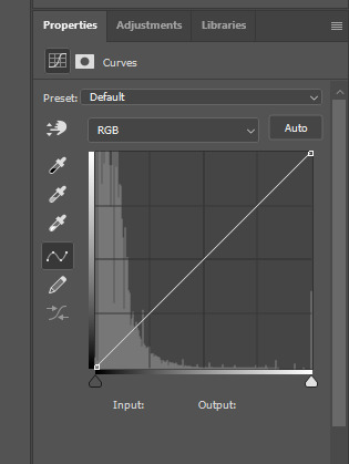
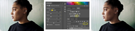
1b. curves
i don't usually use curves by itself for color balancing unless i'm only doing some very light balancing in the hair/shadows. i'll usually just use the black eyedropper tool to select the blackest point in the hair (or clothes... whatever's darker). sometimes i'll use the white eyedropper and set the white point instead, it depends on what looks better.
if i'm using curves to make a gif appear less dull/gray, i'll start off with the red curve and click on the finger tool thing that's above the eye droppers and then adjust the curve by clicking directly on which spots i want to add red to (usually the shadows in the face), then do the same with the green & blue curves to balance if needed.
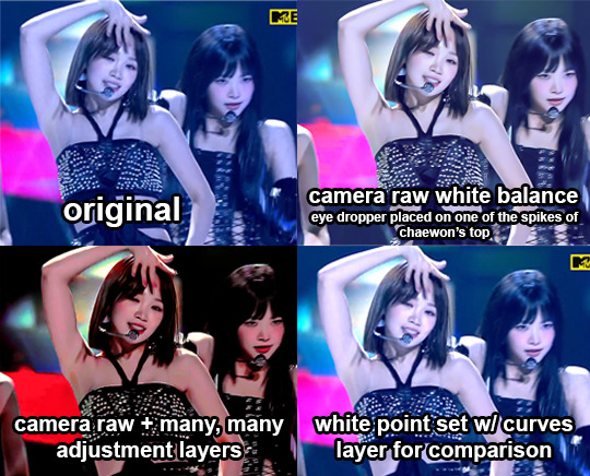
1c. camera raw filter's color/white balance
if the stage lighting is just way too strong and i'm having a hard time with color balance and curves, i'll open up camera raw to see if i can get a better base to work with
i basically just select the eyedropper tool that's next to the white balance under the "color" menu and click on what should be the whitest point, adjust the sliders if needed, then convert back to frames and continue coloring with the regular adjustment layers.
(from this set)
i included a comparison of using white balance in camera raw vs setting the white point in curves just for funsies to show the difference between the two. in both, i set the white point on the center of the same spike of chaewon's top and i feel like camera raw does a better job at neutralizing
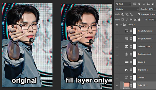
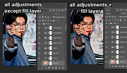
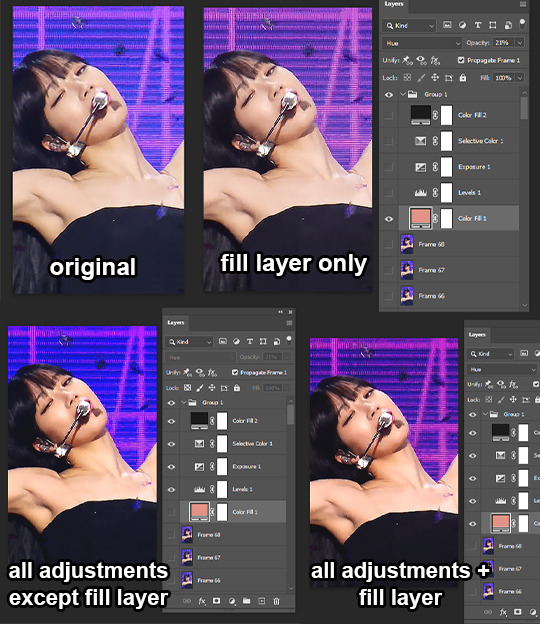
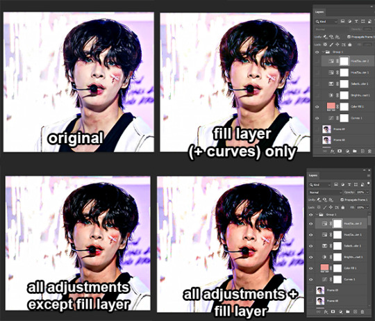
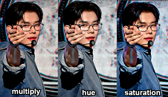
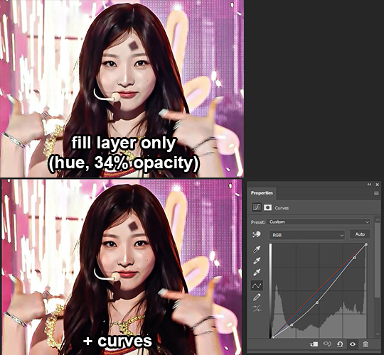
2. fill layer
ok next if the skin looks super pale & washed out i'll use a fill layer (layer > new fill layer > solid color...) and set it to either multiply, hue or saturation at about 20 - 35% opacity and pick a pink, peachy, brownish or orangey color depending on what looks best
i'll go through all three of the blending modes and pick whichever looks best but in general:
multiply: i think this one is the most effective at giving skin some color but i don't always like how it looks, especially if there's a lot of whites and light colors in the clothes and background since it'll color them too
from this set
hue: makes colors more toned down and similar, and can make the skin stand out a bit more in comparison, so it works best if the skin isn't too washed out. if i'm having a hard time removing unwanted colors from the skin during color balancing this can also help with that
from this set
saturation: the setting i usually go for just bc it looks cooler lol. it can bring out a lot of different colors, especially in the hair, which i think is pretty neat. i also just think that it looks nicer than if you were to use hue/saturation or vibrance/saturation sliders
from this set
and just for funsies... here's a comparison of the final coloring on yeonjun but with the fill layer set to different blending modes:
they all look pretty good, hue & saturation would just need more adjustments to get the skin looking like it does with the multiply option, but i feel like multiply just gives off a nicer vibe overall
3. lighting
3a. curves
i do the same thing that i said i do in 1b, where i use the finger tool to adjust the curve by clicking directly on the spots i want to adjust rather than using the actual curve itself.
i'll start by clicking on a dark spot in the hair and dragging it down to make it darker, then clicking somewhere on the background and dragging up to make the image overall brighter. then i'll mess around in the face and drag up and down depending on what makes the skin look bright but doesn't wash it out even more. i do this on the RBG curve.
if i skipped using a color fill layer or using curves for color balancing earlier (or if i just think the skin still needs more color), i'll adjust the other curves too depending on what colors i think it needs
from this set
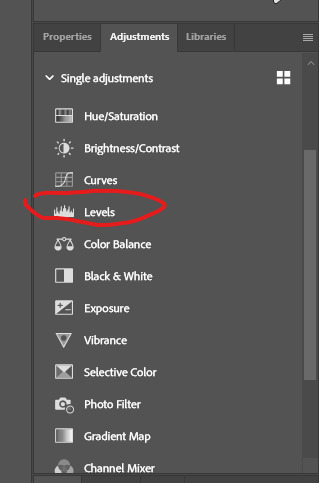
3b. levels
i mainly use levels for minor adjustments or fine-tuning what i did with curves, but i'll use it as my "main" adjustment layer for lighting if the original lighting isn't too bad
from this set
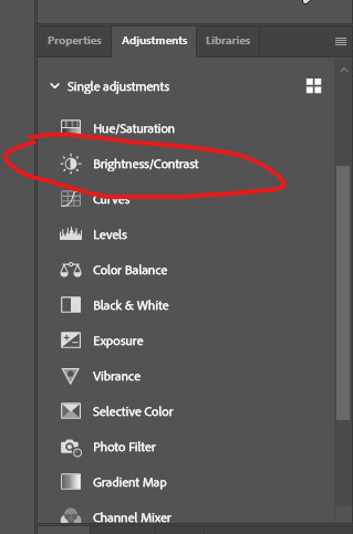
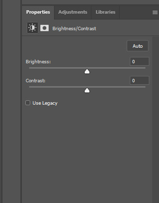
3c. brightness/contrast
i don't use this adjustment much but if i do, i'll also use it more for fine tuning whatever i did with curves and/or levels
3d. exposure
i rarely use exposure since i feel like it's easy to go overboard with it so i'm not sure how to explain when i decide to use it and how lol. i think i mostly use it if a clip is pretty dark & gray looking or for fine tuning if i want to intensify how black any dark colors are.
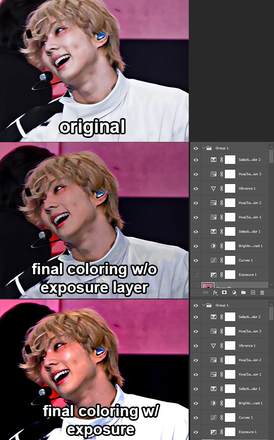
from this set (looking back at this i actually think i went overboard with the exposure lol)
4. hue/saturation and selective color my beloveds!!!!!
4a. hue/saturation
i prefer to adjust the saturation with this layer rather using the vibrance & saturation sliders so that i can choose how saturated each color is individually
the colors i mess with most are the reds and yellows to color skin, and i adjust the sliders based on what makes the skin look more vibrant. i'll adjust other colors too, depending on what colors are in the background and/or clothes
i almost always do a second & maybe third hue/sat layer and adjust the range of reds selected so that only the lips and/or blush are selected. then, i adjust the sliders so they can either stand out more, or if the blush is too bright or making the face look too red, i'll adjust them so that it matches the skin more.
4b. selective color
the colors i adjust the most with this adjustment are white, black, neutral and sometimes red & yellow, depending on how much adjusting the skin still needs at this point. i really only increase the blacks for all colors but if i feel a certain color needs more balancing i'll add other colors too (ex: if the blacks are still too blue/purple from lighting or just look kinda faded i'll increase yellow, if the skin still looks very dull i'll increase yellow & magenta and decrease cyan in the whites and/or reds and yellows)
depending on the colors in the clothes & background i may mess around with the other colors too depending on what i'm trying to do
from this set
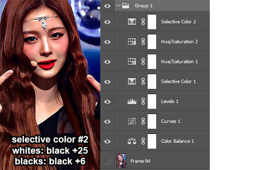
**: i also adjusted the cyans + blues in this layer to make the background darker but didn't include the settings for that since my main focus in this step was the skin
5. camera raw
i don't use camera raw a lot but if i'm having a hard time coloring a gif using the adjustments above or if i think a clip would be a good candidate for the type of coloring i was talking about with anon here, i'll open up camera raw
i don't save my camera raw colorings for very long so i can't show any before/afters but my general process is:
light: increase exposure, contrast, highlights & whites, decrease shadows & blacks
curve: sometimes i adjust it, but not always
color grading: set highlights & midtones to something orangey, set shadows to something blue or more neutral or just leave them alone, depends on the clip. then mess with the sliders below each color wheel and the blending & balance sliders
mess around with the color mixer & calibration sliders until i get what i'm going for
do some further adjusting with the regular adjustment layers once i've converted back to frames
here are links to sets i've colored with camera raw: 1, 2, 3, 4
6. tl;dr
if u made it this far and none of this tutorial makes sense (sorry :( ) or just don't wanna read all that here's a folder with some videos of me coloring a couple different gifs so hopefully that makes things a lil clearer. they're sped up so slow them down if needed. they also got sims 2 salsa music for bgm so plz enjoy
also i save all of my psds so if u ever wanna see a specific one you can always ask me off-anon and i'll share it w you!! just pinky promise that u won't use it without crediting
and... yeah that's it i guess. bye
22 notes
·
View notes
Text
How to make icons like these:
Flags: Idol system, Bubblegender, Musicstar
Warning: This tutorial relies on the idea that you have some understanding of how to use photoediting software like photoshop, however if something that doesn't make sense then feel free to ask and I will explain it as best as I can.
All the icons we made for this can be found here! Thank you for reading, please consider reblogging this post and the icons because this took forever to write up and the icons take a LONG time to make.
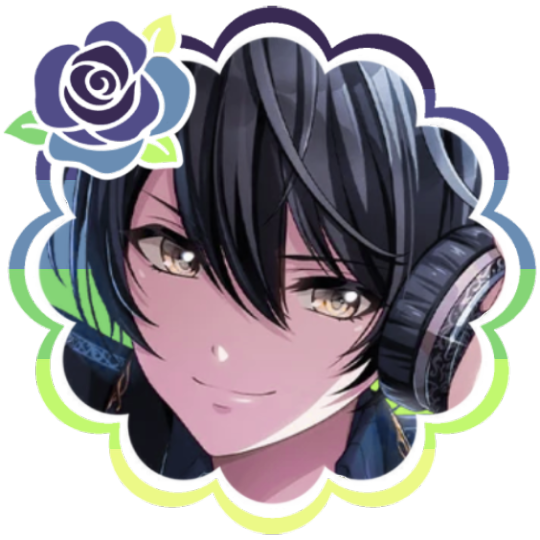
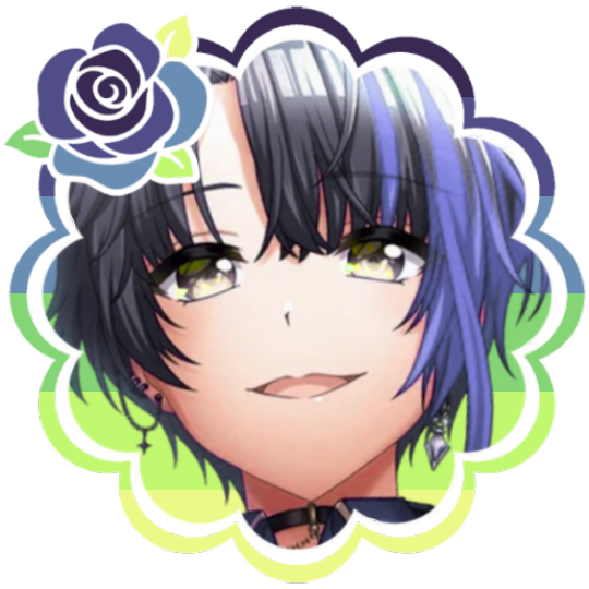
In this tutorial I will make DID/OSDD Aoi Miyake icons.
Anyway let's get into it!
Step one, choose what you're going to make (and gathering resources)
This may seem obvious, but going in with a plan makes these so much easier.
In this stage we consider three things:
The flag and/or colors we want to use in the icon, this is important as it can affect the images used or even the character depending on how similar their colors are
Character and the general colors associated with them, this is important as it can makes the filtering stage easier (or harder) and can make an icon look 'wrong' or 'right' sadly
The border of the icon and how that will affect the icon itself, sometimes they're easy to work with, others not so much. Our method differs from a lot of other peoples so we take more time with them than most others
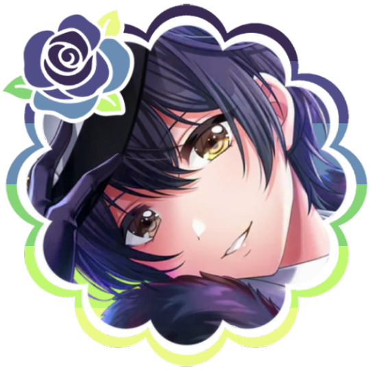
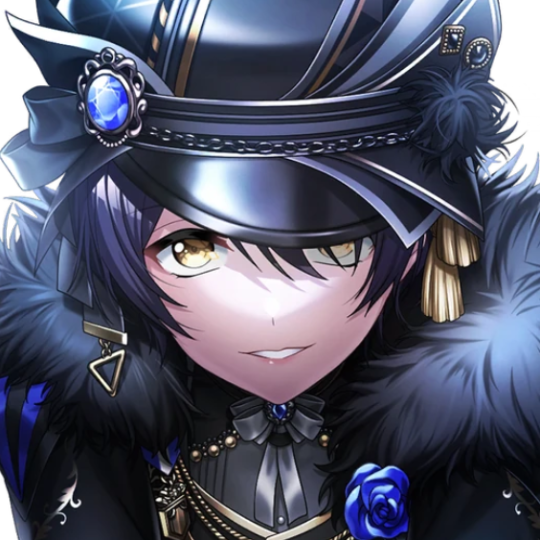
In this case I will be making DID icons of Aoi Miyake from D4DJ, however due to how most of her cards have a blue tint I will be using the plural peafowl flag by m0dem0n than the original DID flag- This is to save time and make th icons look more harmonious.
We will also be using this mask by i'mjustchillinghere as the icon base


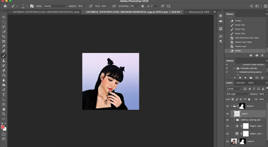
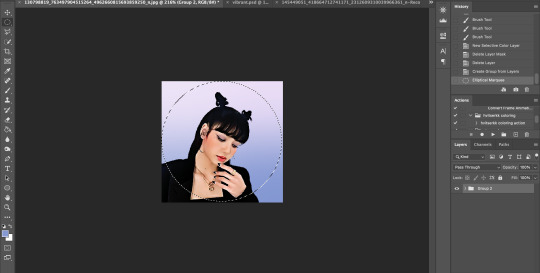
Step two, coloring the middle image (optional step)
This is a lot of guess work and everyone has a different process for this. Essentially we're going to make a PSD that makes the image look better with the colors of the flag.
As shown above we have the flag and the character image, but they don't match completely. The rose and other blue accents are too saturated compared to the flag and the black is too black and the wrong blue hue, the eye could also be a bit greener and saturated imo.
What I like to do is open the image with the flag behind or infront, so I can see the colors I'm working with.
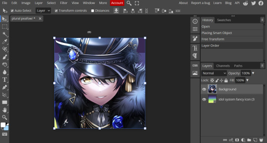
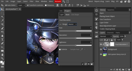
Then I open the hue editor layer (Layer > New Adjustment Layer > Hue and Saturation). It's very important to clip the hue layer to the image so it doesn't start messing with the colors of the flag (we've had this happen many times before it's very awkward trying to match a color that keeps changing) to clip right click 'Clipping Mask'.
Your screen should then look like this:
Okay so if you need to adjust the screen to get the icon in the center so you can see everything do this now.
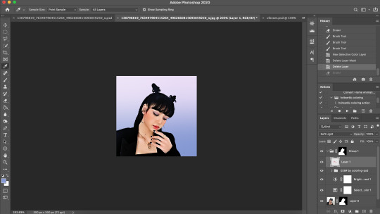
Next where the box with the hue options says master, click it.
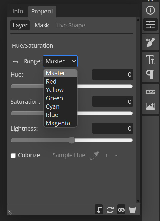
These are all the color options you can change, in this we'll mostly be using, yellow, green and blue. For other projects blue and cyan sometimes get 'mixed up' and can control both shades so be careful with that.
Other color settings we personally use are: Vibrance and Selective Color (both are located under the Layer option), but in this case I'm happy to just use Hue and Vibrance.
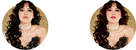
This is what the icons look like:
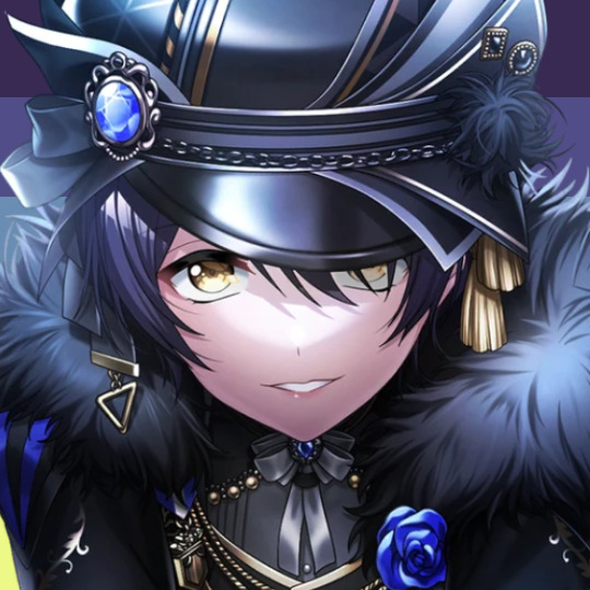

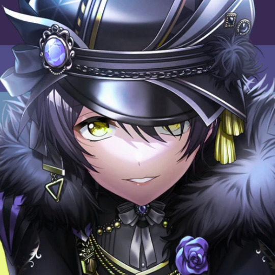
No color editing | Just Hue and Saturation | Hue and Saturation + Vibrance
Now your middle icon is ready turn off the background layer and save the image as a transparent png!
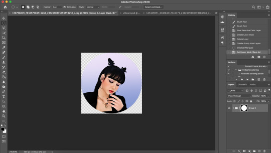
Step three, preparing the mask for use
So the mask is the base of your icon, however if you clip all aspects of your icon to the mask it looks like this and you can't see the flag.
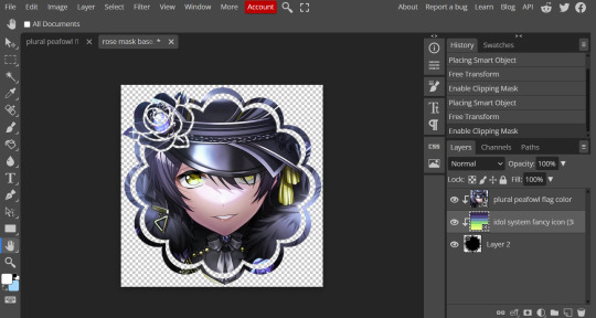
So what you need to do is layer the mask. This will vary in difficulty, it can depend on how far apart the pieces of the mask are and how they interlink. You could erase the border parts but that takes a lot of time.
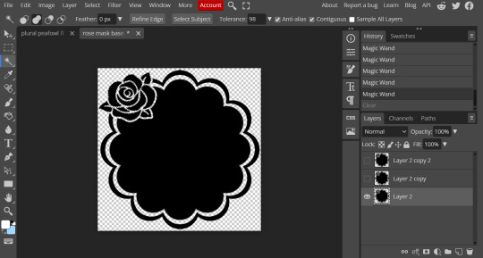
This icon is simple because to me there's three clear sections, the middle part, the border and the rose. What you need to do is copy the layer three times and get the wand- I would reccomend having the wand strengh over 100 or else black lines may remain, but this will depend on how close the black parts are.
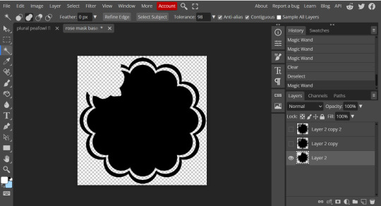
Hide the top two layers and work from the bottom up. Select all the areas you want to delete, in this case I can only delete the rose (the border is too close to the middle part and would delete that as well) and then hit delete.
In this case, I will just erase the border by hand, and then BOOM, you have a base!
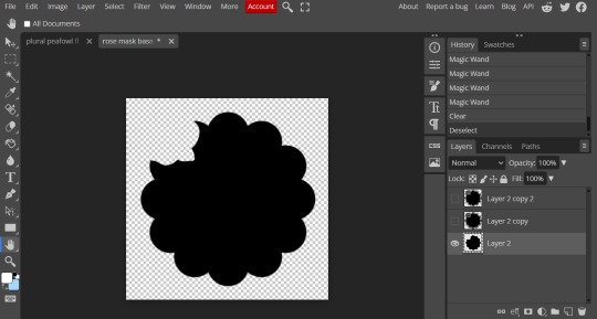
Hide this layer and move to the next, for this one I'm removing the middle and the rose.
For the next layer you can select what's in the layer below and delete it without it impacting the border, which makes the icon process easier, however in this case I'm going to give out the border layers for you here!


Step four, using the mask
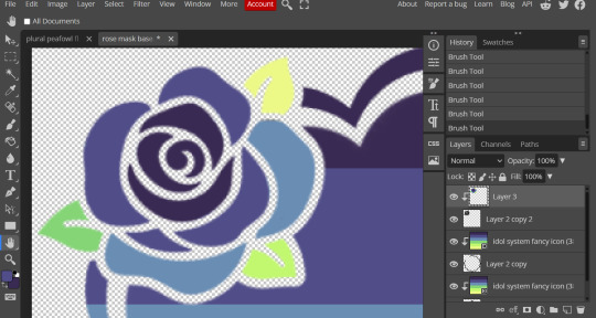
NOW you can clip the flag to the layers! We always clip it to the base and border layer.
As for the rose... We make a seperate layer and clip it to those rose. Then (using the eye dropper tool) pick colors from the flag to use to color it in! As shown:
Next step is to add the image you colored!
Go to File > Open and Place and then choose the PNG from your gallery and place it in the icon. Once it's there fiddle around with it until you get the image you want and then BOOM!

Now you have a singlar icon!
Feel free to repeat this as many times as you want and make as many icons as you want.
-
All the icons we made for this can be found here! Thank you for reading, once again please consider reblogging this post and the icons because this took forever to write up and the icons take a LONG time to make.
100 notes
·
View notes
Text
Photoshop coloring tutorial!
how to go from the original (left/bottom) to my coloring (right/top) - at least my method, as there are countless ways to adjust the coloring. this is gonna have a bunch of screenshots and gifs so under a cut to spare ppl's dashboards 😅
so let's start with the original gif:
obviously this coloring isn't ideal -- the dark colors of Gabi's basement don't offer much contrast with Gabi's skin tone, and the left side of her face is hidden by shadows. but I also want to do my best not to alter her skin tone. so I'm going to mess with a few options in adjustments. first, I definitely want to up the contrast
brightness can also help if the lighting is really minimal, but I usually find that messing with contrast is good enough! if you want to increase contrast, move the slider to the negatives; if you want to lessen contrast, move it to the positives. as I said, I want to up the contrast, so after doing that:

ok contrast has helped quite a bit! part of Gabi's face is still being obscured by shadows tho, so let's move on to curves -- this involves a lot of messing around, usually I go for a bit of an overcorrection, and then I can mess around with other adjustments to get it back closer to the original.
to mess with curves, just pull the line up or down in certain spots -- pulling it above the original line will increase brightness, pulling it below will decrease brightness. I usually end up with something like this -- pulling it up in the center and then back towards the original line near the ends.

it really is something you'll just have to experiment with -- be careful tho, the coloring can get so distorted if you stray too far from the original line or there are too many points where you alter its path. it's also the step that I'm most likely to exclude, it's one of the more finicky adjustments and can make too big of an alteration sometimes. given the original coloring being so dark for this scene tho, I wanted to use curves to help out with the contrast settings. anyway, the result after upping contrast and messing with curves:

this has done some more brightening! imo this is a huge improvement on the original, but I'd like to work on it a bit more. next I like to mess around with vibrance, just to make the coloring pop.
oops! Gabi is glowing, but now the background is looking a little weird (i.e yellowish)! let's do some color correction!
so depending on lighting in the actual piece of media, usually the original coloring leans yellow or blue (altho it may not be noticeable before messing with vibrance). if it leans yellow, I will up RGB; if it leans blue, I will up CMY. I've found it pretty rare to use other combos. usually, I think the coloring starts looking wonky if I pull the sliders much more than 20 in any direction, and it is color balance, I try to keep the three sliders within 5-10 notches of each other.

now the background is looking better! but levels can help us get a bit closer to the original, while still making things easier to see than the original video.
I usually pull the center slider up or down, depending on if I think I need to increase or decrease the brightness. usually I keep it within 0.80-1.20. the result after messing with levels:

and voila! we have reached the end result!
I hope this was interesting and/or helpful as it's my first time making a tutorial 💗
6 notes
·
View notes
Text
chaiNNer (AI) Upscale Basics
This is covering the basics of the chaiNNer layout. This is not meant to be a comprehensive guide on how to use chaiNNer (like photoshop and blender it has many different uses, many of which we don’t use or need most of the time) this is meant to show you the layout, quick features and upscale chain. This will mostly be useful to people that have some experience (AI) upscaling already but have never used chaiNNer.
For an extensive guide check out Kartoffel’s video series/tutorials on video game upscaling. https://trello.com/c/myNZJEBQ
First step before you do anything is make sure you have a model(s) ready. I have mine in a folder under documents, it doesn’t have to be in a specific place you can load one straight from the downloads folder. Download models from the database here look for pytorch models primarily but you can play around with NCNN too I’ll explain the different step for using those later. I use pytorch models 99% of the time so I’ll be using pytorch for this.

chaiNNer link (chaiNNer git link with install section) is easy to install now, it’s fairly plug and play just download, run the installer and then download dependencies through the app.
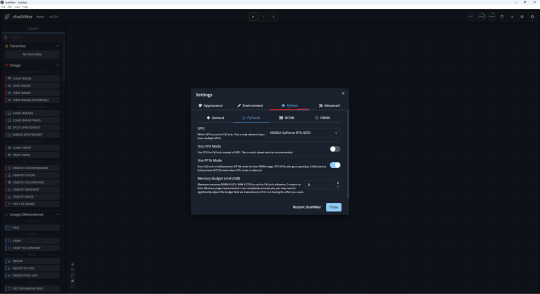
If you have multiple GPUs or want to use your CPU/memory limit. Those are all located under the settings gear icon (top right) and the Python tab. You can also enable system Python here, if you already have it installed, over downloading the integrated version (check github page for more info).
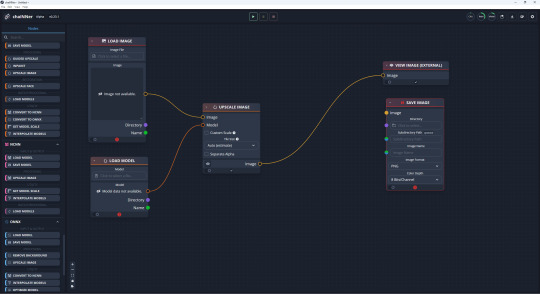
Onto the good stuff, these are the nodes you will be using most of the time. You can use the search bar on the top left or the scroll bar. You can also right click anywhere on the grid to bring up a mini version of the node panel, search bar included. The tabs we will be pulling from are Images and PyTorch.
You can drag and drop the nodes onto the grid, create links to connect nodes. Click on the lines to break them or drag and move them somewhere else. You can also start to create a link and drop it on the grid instead to bring up a list of other nodes it could connect to. (if you need to delete a node select it and use del key)
If you look to the left bar you’ll see tabs separating PyTorch/NCNN/ONNX these are what you use if you want to use an NCNN model for example over PyTorch in your upscale. The nodes that are orange in the pic below are the ones from the PyTorch tab (red is Images) you would just swap them to nodes from one of the other tabs mentioned.
The chain is centered around the Upscale Image node, the only other nodes we need are the ones that fulfill what it requires. Being an input model and image and specifications for an output image. Since you’ll be loading a PyTorch model, you need to grab the Load Model node for PyTorch. Since you need to load an image and preview it we grab the Load Image and View Image (External/ is not required but it pops it into a separate window which looks nicer imo) when you are satisfied with your upscale you would switch out the View Image for Save Image node and specify format/save location/name.
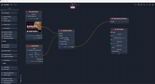
When you have your path/chain set up hit the green play (Run) button at the top (F5 key works too). Depending on your setup, and how large your upscale is (I get lag at 5k but used to get lag at 2k and up on my old laptop) it could be very quick or a longer wait, check the top right corner to see how much resources it’s consuming. That’s it that’s the basics on setting up a chain and running it to get your upscale.
There’s many extra nodes you can use to get the results you want with upscaling. There’s nodes for transparency, interpolating models, (pre/post upscale) resizing, batch upscales etc. It's important to remember that the nodes before the upscale image node are affecting the image before the upscale the ones after the node will be affecting the upscaled image.
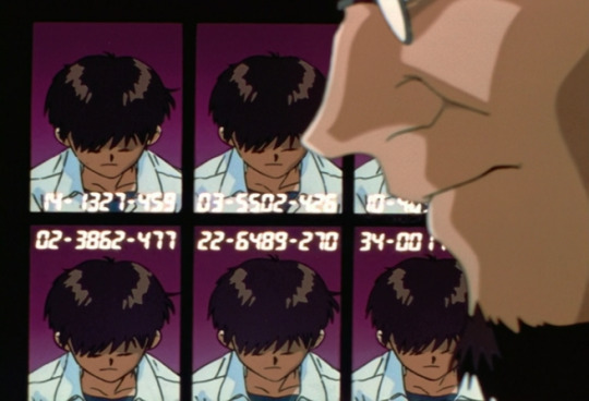
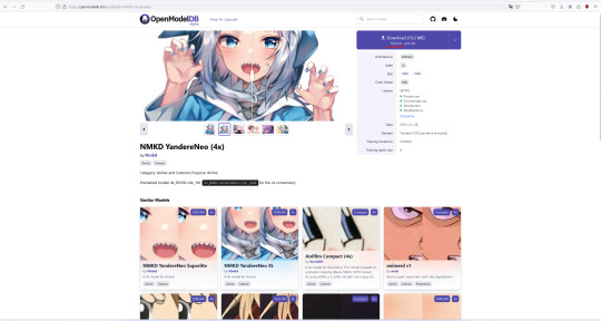
before (429KB / 656 x 447)

after (5.34MB / 2624 x 1788)
model used / NMKD YandereNeo 4x
I don't know where exactly the top image image was from, it has a bunch of different sources. I can tell you it's a frame from EP1 of NGE.
0 notes
Note
Do you have a mod list for the sims 2? I plan on undergoing the project of getting it and the mods it needs to run but I don’t really know any other mods that would be decent
it depends on what you're looking for in your gameplay tbh! A good chunk of my mods I got from a a popular Sims streamer's mod recommendation list, I cherry picked what seemed fun and left out everything else.
In general the ones I ended up liking a lot and will suggest to add because they either improved the game or made it more fun for me personally are:
Autonomous Casual Romance (ACR): this one is a classic, it gives the sims unbelievable autonomy in searching for romantic relationships, deciding whether or not to woohoo and/or try for baby etc. It also gives the opportunity to add specific gender preferences to the characters, to the townies and to have the sexuality on your kid sims randomized for them when they grow into Teens. There's a couple switches in the mod that I find questionable (like the possibility to add teen/adult romance to the game), but you can just switch them off and move on imo. The one true downside to ACR is that it's damn hard to set up, and I had to look up a tutorial for it.
Auto Breakup & Engagements: this one is so much fun paired up with ACR. Sims will autonomously engage or break up with their significant other. It's chaos. I love it.
Just Be Friends Social: another one that I like paired up with ACR. Works wonderfully when I set a Sim as gay (or they rolled as such) but still has a partner/crush of the opposite gender.
Sim Blender: great for using cheats without having to enable and disable cheats, I mostly use it to add family ties that are missing or change sims names that I don’t like.
SimPE: so this is not a mod but it's a tool I suggest downloading. You can do a LOT on it, from changing Sim names to making specific mods and tweaks work, adding family ties for Sims who are related but the game doesn't flag them as such etc. It's a bit hard to use, also back up your game files before using it because I already corrupted shit twice while using it.
Monique’s Hacked Computer: it puts in the Buy Mode a couple PCs with advanced options, like looking for roommates, set up bank accounts for sims (even kids), and order food or pay bills directly from PC.
Job Seeking Notice Board: an item you can use in community lots (and also residential but I like putting it in like a neighborhood employment center) to immediately choose the job your sim wants instead of waiting days for the journal or pc to roll it out of all the options.
Multiple Pollination Technician Mod: this is so useful when you have a lot of people who get kidnapped by aliens. normally there's one PT for neighborhood, so all alien spawns turn out to be half-siblings because of that. This makes it so there are 4 possible PTs, who also look better than the OG one.
Gender Transition Potions: this is just fun. it changes a Sim's gender in game, gives them the memory of their happy transition, and it also includes a tutorial on how to change a Sim's body type on SimPE so that the transition fully takes place.
Last Name Chooser: you can decide which last name the sims get after getting married.
Baby, Toddler and Pregnancy Mods: fixes preexisting issues with babies and toddlers, allows interactions which were supposed to be in game, such as breastfeeding.
More sensible "Can my friend come over, too?": when inviting a Sim over, they’ll tell you which friend they want to bring over as well instead of making you guess who the fuck it’s going to be.
also some generic mod that fix problems I kept having with the game BEFORE i modded it:
Sim Shadow Fix removes the black box that appears instead of a shadow to sims
Date/Outing Stood Up Timer Fix: GET THIS. I kept having sims stand up their dates despite having them right next to the car before the date, this resolved the problem.
Aging Baby to Toddler Fix: you can find it in one of the download files of the mod, it fixes the issue in which sometimes baby bug out and don't age when they should, making the entire household bug as a consequence
Engagement Memory Fix: prevents a sim from randomly getting a bad memory from their engagement when they shouldn't.
No Death Type Loss when Moving Tombstones: prevents the sim from re-getting the memory of loss of a loved one when you move their tomb somewhere else.
I think this is all. You’ll see I don’t use like graphic change mods or any clothes/buy/build mods because 1) I like the way the game looks, and 2) I’m too lazy to try and understand how meshes work.
9 notes
·
View notes
Note
hola! cómo le haces para que tus icons te salgan en buena calidad?
Hi! I apologize but I cannot speak Spanish, so I am going to have to translate your ask through Google Translate. Which I know isn’t the best method, I’m sorry!
According to Google Translate, you’re saying “wave! How do you make your icons come out in good quality?”
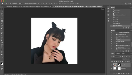
Hopefully, that is close enough to what you’re saying and if so, first off, thank you for saying they are good quality! Secondly, I’ll walk you through my icon making process. It’s actually very simple and fast (at least IMO lol I can make an icon in like 5 minutes but I also use PS for a living so I’m pretty used to the program)
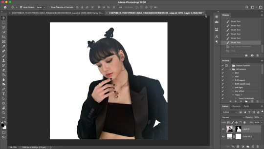
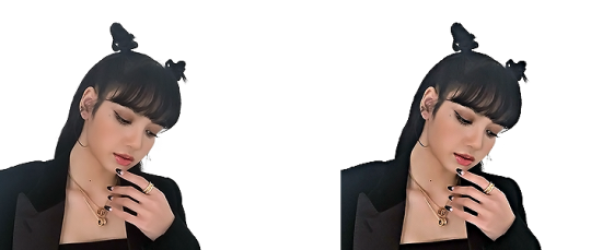
I’ll show you how to go from this random image from Lisa’s Instagram:
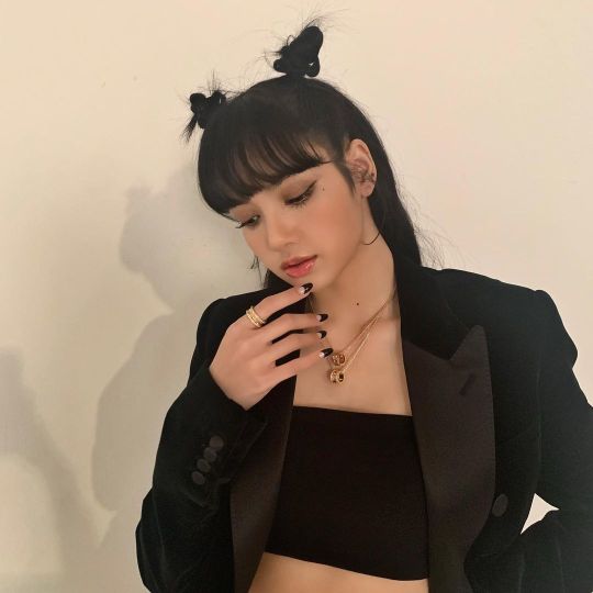
to this icon

FULL TUTORIAL UNDER THE CUT
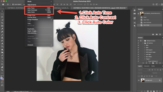
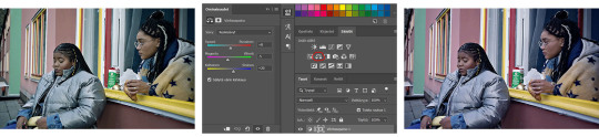
First off, open Photoshop and drop in your image (I have Adobe Cloud PS 2020) Then I want to clean up the colors of the image, because the image is too yellow, and was clearly taken in bad lighting.
1. Click Auto Tone 2. Click Auto Contrast 3. Click Auto Color
That should help give the image a much nicer, natural color, as shown below:
4. Select the Selection Tool 5. Click Select Subject
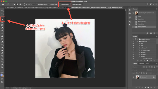
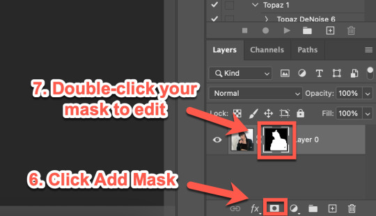
6. Click Add Mask 7. Double-click your mask to edit
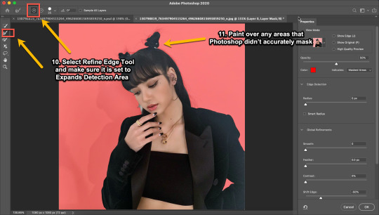
8. Click View, then select Overlay V (this will help you see where you need to clean up your image) 9. Adjust settings to the image (This part really just depends on your image. Generally, I always set the Shift Edge to -50%, as it helps take away any white fuzziness around the image. Smooth obviously smooths the edges, Contrast helps sharpen them, and Feather...feathers them....just don’t use Feather okay?)

10. Select Refine Edge Tool and make sure it is set to Expands Detection Area (aka the + symbol lol) 11. Paint over any areas that Photoshop didn’t accurately mask
12. Select your mask again 13. Select your Paint Brush tool (make sure it is set to Hardness 100 and an appropriate size for your image) 14. Set your Foreground and Background colors to White and Black (Just click the little black and white boxes above them)
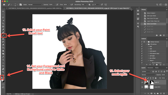
15. Using your paintbrush tool paint in (or out) details you need (In this case I just need to paint her face back in, so I use the brush tool set to white and paint where the pixels are distorted)
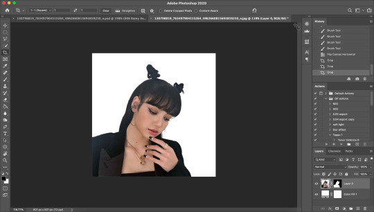
Now she is ready to be cropped and edited.
16. Flip/crop/adjust the image as desired (My best tip is to use the crop tool and put the focus of the image in the center of the grid)
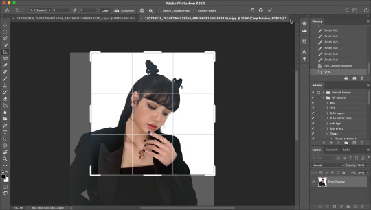
Here’s the final cropped image:
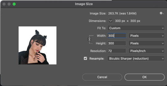
17. Click Image>Image Size
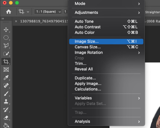
18. Set the Image Width to 300 Pixels, check Resample, and set to Bicubic Sharper (Reduction) and click OK
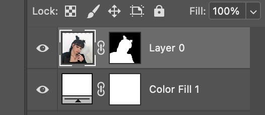
19. In your Layer Panel, select your Image, NOT your mask (nothing will happen if you edit your mask lol)
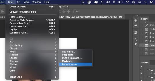
20. Click Filter>Noise>Reduce Noise...
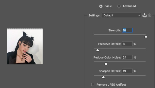
21. Adjust to the following settings (or whatever you prefer to get the image looking smooth) Click OK
Now my image is smooth and free from noise and grain, but I want her to be more in focus.
22. Click Filter>Sharpen>Smart Sharpen
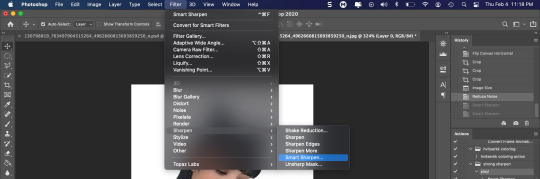
23. Use the following settings
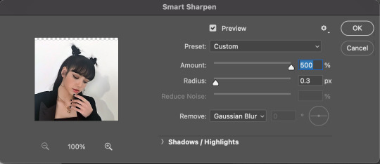
This is a basic sharpen that many editors use for gifs, edits, icons, etc, and you can just stop there for the sharpening step if you want, but I prefer my icons sharper, so I click Filter>Sharpen>Smart Sharpen again and this time, I use these settings:
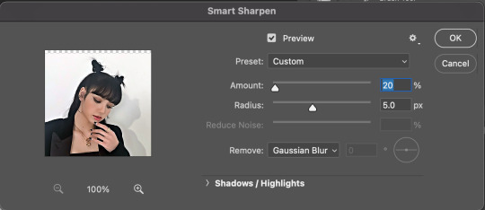
You can see the differences below. The left side has just the basic sharpen, and the one on the right has both sharpens (you can clearly see the difference)
Once you’ve sharpened as desired, we’re ready to finally get to the fun and colorful part!
24. Add a gradient bg below your image (There are tons of free ones you can download from Tumblr or Google, or you can just make your own with the a gradient layer)
This next step is optional as not all images need it, but for this image, I need to do some badly needed image adjustments
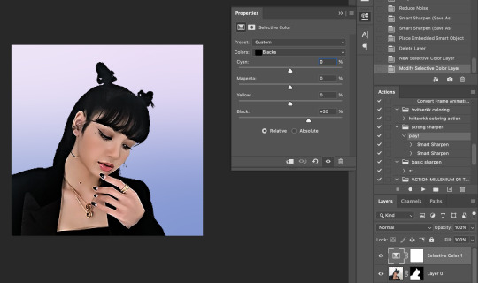
First I click the adjustment layer on my layer panel and click Selective Layer

Then I set the colors to Blacks and drag the Black to +35 to darken up the blacks on the image and give it a nicer contrast (selective colors are great, mess around with them as much as you want until you find a look you like!)
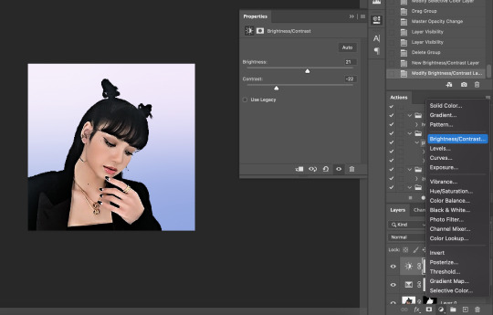
Then I make a Brightness/Contrast layer and adjust to what I feel works best for the image
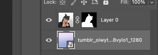
26. Create a folder (if you did the above step, select the layers and then click the folder icon, it’ll just put them in the folder)
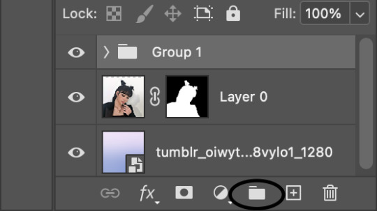
27. Holding down the alt key on Windows (or the Option key on Mac) click and drag your mask to the group layer. Now you have a folder that you can put PSDs and adjustment layers in without affecting your gradient background
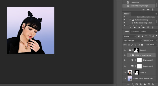
28. Drag your PSD of choice. I am using this amazing PSD that is perfect for pale photos. I set the PSD to 50% opacity and it looks like this
Now, I could stop here, but I’m extra so I want to doctor up her face a little.
29. Above your PSD folder, create a new layer and set it soft light
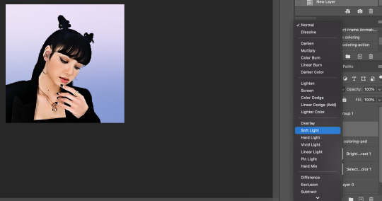
30. Select your brush tool again, and pick a color that will work for enhancing an area of the photo. Then paint over that area.
Lisa is already pretty pale here, so I won't paint over her skin with a nice peach color like I do sometimes in darker photos. But I will add a nice pink flush to her cheeks and her lips.
Then I will use a lilac purple to paint over her eyeshadow. This brings an element of the background onto her face.
There’s not a lot that needs to be added to this particular photo, but here’s an example of another icon without and with soft light painted layers:
The left has no soft light painted layers, the right does. You may be thinking it looks too gaudy, but icons are tiny! Adding strong colors will help painted areas stand out. However, this is a completely optional step of course :)
31. Back to our current icon. Select all your layers, and click the folder icon again to place them all in a folder
32. Select your Elliptical Marquee tool and make a circle over your image
33. Click your mask button in the layers panel, and tada! You can now save out your icon and put it to use
Here is the completed icon:
If you got this far, thank you for reading, and let me know if you have any questions!
#ggnet#kgirlsquad#blackpinknet#idolady#femaleidols#lisa manoban#photoshop tutorial#icon tutorial#photoshop#tutorial#icon#icons#if this type of post doesn't belong in any of the group tags just let me know and i will remove the tag#wasnt sure if tutorials counted lol#Anon#ask
103 notes
·
View notes
Text

Okeyy here it is!! I decided to put together a step by step (gif) coloring tutorial where i list the layers i use and how i've so far made them work for me.
I've been giffing for 2 years now (i'm using PS CC2019, the example pics are in finnish but icons and placements should be the same) but it's an ongoing learning process.
My coloring style is quite natural, i don't do fancy stuff often and i mostly just want the colors to look as true to real as possible but better than originally. And for this kind of style i've found the steps below working for me.
I also don't have any base psds or anything that i'd often use. I always start the coloring for each set from the scratch because, to me, it's the most fun part of giffing. I have 6 layers I use every time and then some random additional ones that i often add too. None of this is me saying what you should do, this all just me explaining what i do and hopefully this can be helpful to someone.
Ok ok time to get to the point so:
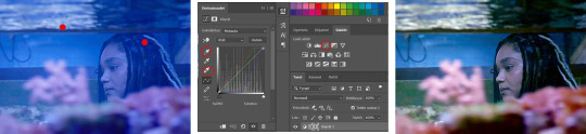
1. Curves
I always, like literally always, start with this layer
Sometimes i just drag the line upwards to brighten the gif but very often i use the eyedropper tool
Choose the white tool, pick the whitest (but not 100% white coz then it won't do anything) spot and it will make that the whitest part of the gif. It also works great at correcting the colors, sometimes you need to try multiple different spots to get the best result
The black dropper tool works the same way, only opposite, so clicking on the darkest spot you make that the blackest part of the gif
If the effect is good but a bit too much, you can lower the opacity of the layer, or the other way, so if it did well but not enough then duplicate the layer
Example: the difference between the left and right photo is 2 clicks and this, my dudes, is why i worship curves. I chose the white eyedropper tool and clicked on that light spot visible in the water, then i chose the black eyedropper and clicked on fatou’s hair and that’s it. Needs more work, but that’s a pretty allright (and easy!!) start (zoom to see better)
2. Levels
I drag the left and right sliders a bit to the center to get contrast (left ~5-20, right ~240)
The eyedroppers work on this layer pretty much the same way as in curves, but i'm more used to using them only with curves
3. Black and white gradient map
I set the blending mode to soft light and lower the opacity to ~10-30 %, this brings some depth to the colors imo
4. Vibrance
I usually add ~20-60, it really varies tho and you can just wing it most times
5. Exposure
I set the top one (exposure) to 0,1 - 0,2 and bottom one (gamma) to 0,97 - 0,90. This is an effective layer so better not do too much
6. Color balance
Owing my life to this layer
I add this layer at around this point of coloring but i drag it to be the bottom layer, since when it's under the rest of the layers it's more effective
In the midtones, i always drag the bottom slider towards blue, something as small as +2 might work, sometimes you need to go +15 or so. I might drag the middle slider slightly to the left to reduce the green tones, and the top one on either side depending on the tone of the gif
Example: this one doesn’t have any of those other 5 coloring layers i always use so it needs more work but also it shows how effective color balance is. I added more blue than normally, at least with one layer, but this one needed it imo. Love to see the green go whoosh
At this point the coloring might be done (jk it likely isn’t) but if it needs some more work then i might try one or some/all of these:
7. Photofilter
I mostly use either warm orange filter to bring some warmness to the colors or cold blue filter to correct yellow/green/red tones
8. Hue/saturation
I choose red and drag the middle slider (saturation) to -5 to -20, this helps to reduce the orange/unnatural skintones
Example:
9. Selective color
Playing around with whichever color i want to add or reduce, if i feel like the gif needs more contrast i choose neutral and/or black and drag the bottom (black) color to the right.
If sometimes the whites are too blinding, i choose white and then the bottom option (black) and drag it to the right ~10 -20.
If the skintones are too yellowish, i choose yellow and go -40 / -40 / -80 and leave the blacks at 0. If it does too much, i lower the opacity of the layer, or in case i want it to be more, i duplicate the layer
Example: (zoom and cry happy tears over the ugley yellowness being gone)
10. Gradient map
For example blue-white gradient to get to colder tones, yellow-white to brighten/soften the colors or smth like pink-blue if you want to get fancier (the options are limitless tbh)
I set these to soft light and lower the opacity, usually to less than 40%
If i want the color to strongly affect the entire gif, then i leave the blending mode to normal or choose color
11. Brightness
Adding this if some more brightness is needed (i don't use the contrast option here but go to levels instead, if needed)
_________
Tips with poc!!
Some things i've found to be helpful when wanting to bring color back to the skintone after brightening or other adjustments have taken some of it away:
a. Check the points 8 & 9
In selective coloring choosing neutral or black and then black in them and dragging it to the right helps to darken the skintone
Try choosing red or yellow and then yellows or blacks in them and dragging the slider either to the left or right, depending if you want to add or reduce the yellow/red tone
Honestly the best advice i can give with selective coloring is to just simply play around, choose a color, drag them sliders to the left 'n right and see what happens
b. Go to channel mixer and add a little bit of red (+101-105)
c. Add levels or contrast or vibrance layer
d. Choose a warm colored photo filter
e. Be careful with exposure and too much brightness
_________
Soooo yeah, these are the layers i use, sometimes you can't do everything with the same layer so for example i might add one or two more curves to get brightness, or multiple selective coloring layers or add another color balance etc.
Generally i like to do small changes with one layer and not everything all at once.
_________
As for when saving the gif for web, these are my settings. I translated the one’s that aren’t obvious but everything else i’m assuming doesn’t need translating since this view always looks the same.
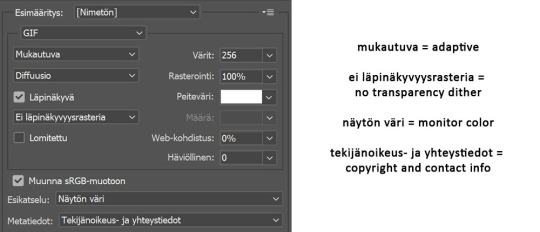
I use diffusion 90% the time, but when it doesn’t look quite right i try pattern. And sometimes when the gif has been really dark originally (😩) and has needed tons of brightening layers, noise might be the best option.
At the bottom i have the quality set as “bicubic”.
_________
So that’s it! If you made it this far, thank you, ily <3 Lots of stuff i’ve learned along the way and lots of stuff to be learned. Hoping that maybe you got to learn something from my way of coloring, too. And if not, thanks for reading anyway 😌✌🏻
#here it is 😳#i've never done posts like this but i tried to explain stuff as shortly but clearly as i could#hope it's easy to follow#and that i didn't forget anything crucial jdjdkdkd#gif tutorial#coloring tutorial#mp
49 notes
·
View notes
Note
Do you have any tips for people new to pixel art?
This lil guide will be focused on Photoshop since that’s the program I mainly use. I also use Aseprite primarily for animating complex pieces and using the seamless tile features. Aseprite is cheap if you don’t have access to photoshop, but I’m not proficient enough in it to offer much advice so you’ll have to experiment on your own. You can get a trial of it too.
Back to Photoshop! Knowing Photoshop well will make things a lot easier for you. I won’t be covering how to use most features so if I bring up anything unfamiliar, look around for general tutorials about it.
Set Up:: You will need to change some of these settings back when you’re no longer working on pixel art otherwise your other photo editing / digital art will get pixellated unintentionally.
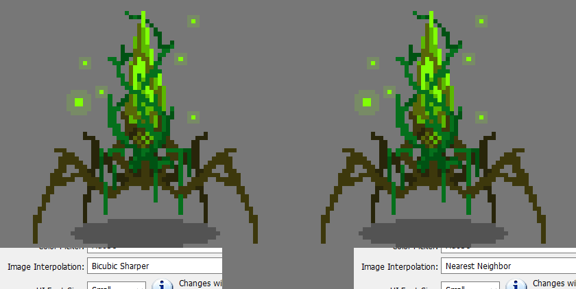
Image Interpolation:
Edit -> Preferences - > (General) -> Image Interpolation -> Nearest Neighbor
This change will allow you to resize anything will retaining the pixelly quality. Without this setting, resizing your pixel art will make it blurry.
When using the Resize function, you’ll also want to make sure the Resample option is listed as Nearest Neighbor.
Turn off Anti-Aliasing
Aliasing is when an edge has these stair-step lookin’ edges. Those edges are desirable in pixel art, but less so for other kinds of art. Photoshop uses anti-aliasing to soften those edges so they appear smoother.
For any Selection tool you use, uncheck the Anti-Aliasing option. Now when you use selection tools, you can be certain only the selected pixels will move and no blurry shearing will happen.
Pixellated text can be made by selecting “None” for the anti-aliasing on text. A lot of fonts will not look great so select something without too many frills. I usually draw over or tweak this text after the fact as it rarely looks good as is.

Workflow Notes
Use the Pencil brush tool. In my version of Photoshop, it is a subset of the Brush tool.
Stroke is a function I use constantly to quickly and cleanly outline things.
You can find this in Edit -> Stroke
It will outline the currently selected area OR the current layer if there is no active selection.
How the outline applies will be changed by the “Location” option. This tells the function to put the lines outside, inside, or centered along the selection lines or transparency boundaries. The Centered option only really applies if you’re using an outline larger that 1px. I only use 1px for pixel art outlining.
Above are examples of outlines-
A: Blue selected, INSIDE stroke
B: Blue selected, OUTSIDE stroke
C: I selected the TRANSPARENT parts with the magic wand and used an INSIDE stroke. This is the one I use most because it gives the effect of an outside stroke but looks better because it’s less chunky. Compare B and C to see what I mean. NOTE that with this method, it will also outline the perimeter of the entire image, so you’ll need to erase that too. (Also worth noting I’m using an ancient version of photoshop, and its possible newer photoshop does better with outside strokes lol)
I personally don’t work much larger than 400x400 (at 72 ppi). IMO, anything with too big a resolution & canvas tends to stop looking like pixel art and tends to look more like regular digital art that just has a crispy quality to it. This is especially the case for pixel art newbies. Until you know what you’re doing it can be hard to fill out those large parts of the piece. The smaller you work, the more care you’ll need to put into the placement of every single pixel - which is an excellent way to learn little nuances of the style. If you want pixel art to cover a large area (for, say, a desktop wallpaper or a website banner) you should work at a quarter or less of the size you need, then when complete you can just quadruple (or more) the size.
Other areas to study:
Search for more guidance on these topics on your own: there should be plenty to find on the internet. These are functions I regularly use when working on pixel art.
Clipping Masks
Layer Masks
Patterns
Hue/Saturation
Levels
Adjustment Layers (Gradient Maps and Posterization layers specifically)
Selection tools (Also get to know methods of subtracting selections and stuff)
HOTKEYS!!!!
In terms of basics, thats all I can think of right now!
Found this useful? Like my work? Consider pitching in a tip on Kofi :)
241 notes
·
View notes
Photo

Thank you very much! It’s always really nice when people like my work. I hope you dont mind me posting this instead of answering privately, when thinking about how to answer I realized I would probably write a lot and need link and the ask box is really small compared to saving an ask as a draft then editing from there.
First things - Materials. Someone I used to hang out with had been working with Sintra and said it was working very nicely for them, and even sent me a link to a good deal on Amazon. It’s way more than I need for just Krem but the extra at such a good price when I haven’t worked with the material before was A+. I also picked up a heatgun because while some tutorials I found said they used the stove top or oven I wasn’t about to get bad burns from cosplay, I got enough finger sizzling from hot glue. Plus the heatgun lets me control the exact area i wanted heated. Throw in a hot glue gun, a thick towel, an exato knife with extra blades and some cardstock and I think that’s about everything for the basics?
Patterning and by extension making - There are dozens of tutorials for this out there, just google something like “sintra armor tutorial” or “cosplay armor patterning” I got a lot of my ideas from craft foam armor tutorials and just tweeked them a bit. For patterning I personally used cardstock since its not as thick as cardboard, not as thin as printer paper and I had a ton on hand. I’d say you could maaaybe get away with heavier weight construction paper but I found cardstock was really nice for keeping shape. It took a lot of time and just as much tape but basically I looked at other peoples wip of armor, tried to see what shapes they used and experimented.
But one you have the shape and everything of the paper pattern you want down all you really need to do is undo the tape an trace the pattern onto the sintra. BE VERY CAREFUL WHEN CUTTING IT OUT. I essentially made a groove with my pen as I traced to get a ditch to cut into, but even then if I went too fast I cut off mark. Once the piece was cut out, on most of them I beveled the edge by being super careful and shaving at them at an angle with the exacto knife. Not needed but I thought it was a nice touch imo (like the gauntlet portion I shaved the inside of one piece and the outside of the other).
When the shapes are cut out, plug in that heat gun and get ready to shape! Please make sure you’re wearing nice thickness gloves and covering any body part you’re going to use for shaping with a nice thick towel or something. Example for the forearm portion of my armor I wrapped a thick dish towel around my arm and taped it in place, slowly heated the center of the piece I was working with on both sides and pressed it against my covered arm, rinse and repeat till you get the full shape you want!
Then hot glue the pieces that need to go together together, prime it, paint it and seal it!
For the straps and things since I also dabble in leather working I used those skills as well though you can probably just cut a piece of vinyl or pleather or whatever and either set them with grommets like I did (punched a hole with an awl and set them with my mallet and grommet tools) or use something like office file brads to keep the pieces in place.
Honestly my BIGGEST help was this person right here - http://tatjna.com/
They have both a Grey Warden tutorial and, the most helpful thing EVER since their armor is pretty similar in most spots - a Knight Captain Cullen tutorial. They broke down the build into several in depth tutorials and I totally had this open the entire time I was working on Krem.
So far the only things that tutorial hasn’t helped me with is the odd shapes for Krems knee and elbow guards, which I’m still puzzling over.
I hope this helped! If you need any more assistance my inbox is always open! (my chat box should be as well? I think) I’m more than willing to poke through my saved and bookmarked tutorials for other armor guides to send your way if you need them. Happy building!
6 notes
·
View notes
Text
7 Key Ingredients To Build the Perfect Creative Brief
Yet another article freshly published by Kapost. IMO one of the most knowledgable suppliers of free tutorials on YouTube.
The never-ending quest to improve productivity can have a fairytale ending when teams maximize a simple and powerful tool: the creative brief outline.
One of the biggest challenges for collaborators in any business is to get—and keep—people on the same page. A creative brief exists for just that purpose. It provides a medium to clarify project goals and details and share them with key team creatives while putting in place key “cover your butt” measures. A creative brief outline also provides a way to navigate the messier parts of collaboration on big, complex projects with multiple moving parts and people.
In fact, Ad Age surveyed more than 1,200 C-level agency executives around the world and asked them to rank clients on topics including integration, procurement, compensation, and consolidation.
When it came to creative briefs, those surveyed said, “Agency assignment briefs were a major problem area, highlighting the old ‘garbage in, garbage out’ mentality. Most agencies reported some level of frustration regarding the quality of assignment briefings: 53% found briefs complete but lacking in focus; 27% found them incomplete and inconsistent; 20% found them complete and focused most of the time; and zero respondents found them complete and focused all the time.”
Now, more than ever, teams need to orchestrate and distribute brand campaigns that include multiple media options, timed deliverables, and collaboration efforts with creatives located all over the globe.
So is your team doing all that?
Where to Start
If you want to improve the creative working relationships you have with internal teams, it’s easier than you think.
At the start of any project, ask a few essential questions of key content stakeholders before you do anything else.
What problem needs to be solved?
Who is the target audience?
What product, service, or solution will solve the core problem?
Clarity around these aspects is at the heart of any project success. These questions work for any project type and help get everyone on the project aligned with the main objectives.
Clarifying this step first makes it so much easier to map out goals and specific strategies to meet core objectives. In addition, a creative brief outline helps team members manage multiple projects clearly and effectively, which is often part of a normal workload in creative marketing teams.
At its simplest level, a creative brief outline is like framing for a house. Without a solid foundation, nothing will stick! So, how do you want to build your house? Here are some tips.
7 Elements of a Kick-Ass Creative Brief
Even with the best of intentions, it’s easy to fall into the trap of making a long, sprawling creative brief with too much detail and unnecessary information.
A good creative brief outline should guide creatives to stay focused on core project goals. It should also serve as a go-to document for project details while inspiring people to take ownership of their roles. With a main objective front and center in the document, start setting other essential support goals for deliverables, timelines, resources, and talent to meet it.
Think of it as the gatekeeper of a communications and marketing goals. What action do you want people to complete, and how can you outline it in a way to make sure it gets done? How can you write clear directives and organize information within the creative brief outline in a logical order of getting things done?
Remember, with the fast pace of digital marketing, it’s essential to make this type of anchor document easily accessible and ensure each team member is responsible for updating their portion with the latest developments as needed.
1. Short and Sweet, Please
Perhaps one of the biggest challenges is to keep your creative brief, just that—short, sweet, and to the point. To put your best foot forward, start with core blocks of essential information. Then set specific goals and responsibilities for each.
In other words, take those three key questions you asked stakeholders (listed above) and use the answers to distill down the details into workable components.
2. Documented Communication Style
Each target audience requires a particular communication style that should be included in the creative brief outline. Spell out the specifics so they can be reworked to build the key messages that set the tone for all communication tools.
Be sure to include any specific keywords and concepts that further support the overall voice and tone. Include details that help guide basic requirements for the graphic design, photographs, videos, and social media that you’ll use to execute and promote the project.
Together, all of these independent things need to be saying the same thing in the same tone to provide a clear, consistent picture in all media channels and provide relevant calls to action.
3. List Key Stakeholders
Projects need experts and someone to take ownership to lead the way. A creative brief outline should clearly indicate who’s steering the boat and who’s a direct connection to much-needed guidance in case there’s a snafu.
Don’t leave people guessing who they need to turn to, and don’t overload already busy managers with more stuff to oversee.
Choose stakeholders that will be an active part of the process, and ensure they’re listed in each corresponding section.
4. Find the Talent
A job well done is only as good as the talent who created it. Be mindful of what type of creatives you need to meet goals quickly and easily. Are those people available on-staff? Do you need to hire freelancers with certain areas of specialty?
At the bare minimum, brands will need a graphic designer, copywriter, web developer, videographer, social media strategist, and marketing person who is a pro at building effective sales funnels.
With lots of creatives in the mix, a creative brief outline becomes invaluable in keeping people in their lane and providing the details they may need from a team member to complete their task.
5. The Devil’s in the Deliverable Details
Here’s the area of the creative brief where it’s time to document exactly what needs to be created and who’s going to do it.
Do the deliverables match a specific project goal? Who’s responsible for completing one phase and passing it onto the next person? How many revisions are needed and who’s going to complete and approve them?
An easy way to approach this is to call out each large deliverable then add a bulleted list of what’s needed and by whom for each.
Example Website Copy:
Two to three paragraphs of text, three sentences in length
Use main keyword three times
Pass along to the manager for revisions
Additional specs
Due date
Some deliverables are more complex than others and need a lot of detailed specs like color palette for brand materials, image sizes, or logo specifications. If your brand does not yet have a style guide, think of creating one to simplify processes and save time.
Which brings me to one of the cornerstones of a creative brief…
6. Reasonable Timelines
Timelines are the backbone of a project and should be laid out plainly in a creative brief.
Include time windows if specific days are not possible, but each deliverable needs to have a due date, as well as a sign-off date. These will signal to teammates what needs to be done to hit the deadline and how things may be delayed if something is not completed for the next phase of development.
7. A Budget You Actively Manage
Nothing gets done when the money runs out, so brands need to set budgets to guide the workflow. In life, some things may pop up unexpectedly, so it’s important to have a little give in the budget. In turn, some areas may end up costing less than expected, so they can pad the budget.
It doesn’t have to be extensive, but managers need to know how much to spend on hiring talent and reaching out for specialty items like printing or trade show booth preparations.
No matter how your team approaches a creative brief outline right now, these tips can get you thinking about ways to improve or streamline the process. Start simple and use this outline as a tool to make sure your team develops a document that serves a purpose and doesn’t add to the marketing noise.
[Read More ...]
********************************************************************
Hope you found that useful information that they provided.
Leave us your feedback down below, write a short comment.
Let me know what things you want us to write about in our posts.
********************************************************************
0 notes
Text
Online Tutors | Online Tuition Teachers | Online Classes. Online Classes LIVE tutoring website with Best Teachers for CBSE, ICSE, IGCSE, IB & State Boards for class 4th to 12th. 1 to 1 Live Coaching for Math, Science, Physics, Chemistry, Biology. Free Trial Class
Teaching Care provides TUITION, TUITION TEACHERS, TUTORS, COACHING, TUTORIALS, ONLINE TUITION, ONLINE TUTORS and LIVE HOME TUITION for ENGLISH, MATHEMATICS, SCIENCE, PHYSICS, CHEMISTRY, BIOLOGY, ACCOUNTANCY, BUSINESS STUDIES, ECONOMICS for CBSE, ICSE, IGCSE, IB, STATE BOARDS, NTSE, OLYMPIADS, JEE main, JEE advanced, NEET, Foundation, NTSE, Olympiads, assignment solving etc at TeachingCare.com by best quality teachers/tutors from all over India & abroad. ASK DOUBTS DURING LIVE CLASS. Live Face to face Tutors with Online two way Interactive whiteboard. Automatic class recording for revision. Tuition fee 1/3rd of offline Tuition rates. Quality Teachers from IITs, NITs, AIIMS, Delhi University, J.N.U., Kendriya Vidyalayas etc. selected by proper screening, tests, demo & interview. Learn at your own convenience at your own timings.
Sign up now for free trial class at https://www.teachingcare.com/ or call 9821126195, 9811000616 or email us at [email protected]
WHY TEACHING CARE
• HIGHLY EXPERIENCED BRANDED TEACHERS: The Online Live Tuition & Coaching Classes at Teaching Care are taught by personalized tuition teachers who are highly experienced & TRAINED TUTORS. All the teachers are from Top Coaching Institutes of India as well as from the best schools from all over India. Most of the Live Tuition Teachers also have Home Tuition experience. All the tuition tutors at Teaching Care Online Live Classes have HIGH EXPOSURE. Many of the tutors on Teaching Care live Classes portal also run their offline tuition centers.
• STRONG EDUCATIONAL BACKGROUND OF TEACHERS: The online tutoring teachers at Teaching Care Live Classes portal have educational qualifications from premier institutes of the country like IITs, NITs, AIIMS, KVs, J.N.U., D.U. etc.
• VERY HIGH-QUALITY TEACHERS AT LOW RATES: The tuition fee charged by tuition teachers at Teaching Care's online Live Coaching portal is merely one-third of the prices charged by these teachers in offline home tuition.
• BETTER PRESENTATION & BETTER LECTURE DELIVERY IN ONLINE LIVE CLASSES: Audio Videos presentations, powerpoint presentations, Images, PDFs, Animations and Youtube videos via virtual whiteboard make the live classes an easy to understand online tuition experience far better than the offline home tuition.
• 1 to 1 LIVE CLASSES WITH PERSONALISED TUITION TEACHER: With only one student in the class, 1 to 1 Live Classes with Private Tuition Teachers make it a personalized learning experience for the student with full individual attention by the tutor uniquely tailor-made based on student's unique learning needs and pace of learning in the class.
• COMFORT & SAFETY: Best Teachers are available at unbelievably low costs for online live tuition classes at the comfort of your home, students don't have to go to Delhi or Kota. The Online Tuition Classes with 1 to 1 Live Tutor save student's time, money, transportation costs, lodging & food costs. Secondly, the homesickness, safety & security issues are also addressed by online classes, especially for girl students.
• TUITION FOR ALL SUBJECTS UNDER ONE ROOF FOR ALL CLASSES & ALL BOARDS: The online live classes portal of Teaching Care provides Tuition Teachers for CBSE, ICSE, IGCSE, IB & State Boards for class 4th to class 12th. You get TUITION, TUITION TEACHERS, TUTORS, COACHING & TUTORIALS for ENGLISH, MATHEMATICS, SCIENCE, PHYSICS, CHEMISTRY, BIOLOGY, ACCOUNTANCY, BUSINESS STUDIES & ECONOMICS. ONLINE TUITION, ONLINE TUTORS, ONLINE HOME TUITION and LIVE CLASSES for JEE main, JEE advanced, NEET, Foundation, NTSE, Olympiads, assignment solving, Aptitude, Reasoning, Spoken English, IELTS, TOEFL, GRE, CAT & SAT are provided by Teaching Care by best faculties.
• EASY ACCESS TO RENOWNED FACULTIES: Any renowned expert from any part of the country teaches students at unbelievable low costs.
• ANYTIME ANYWHERE LEARNING: You can get the teachers for live tutoring Anytime, Anywhere for live classes based on your availability for online learning. Teaching Care staff co-ordinates with you and your online tutor regarding fixing the weekly class schedules. The teachers and students mutually discuss & finalize their weekly class schedules. In this way, the teachers and students conveniently carry out the process of e-learning via live classes at Teaching Care's Online Tutoring Live Classes platform.
• TRAVELING TIME SAVED: Another advantage of studying with teachers on Teaching Care's online classes portal is that you don't have to waste your precious time in unnecessary traveling for coaching classes & tuition centers. The time saved by not commuting to coaching classes & tuition centers can be utilized for your studies or play.
• NO MORE STUCKING IN TRAFFIC CONGESTION: Your studies with teachers via online tuition classes keep you away from tiring traffic, traffic snarls and polluted outdoors. Avoiding outdoor pollution on account of online tuition classes also contributes to long term health benefits.
• ENERGY & FUEL SAVED: Commuting to coaching classes & tuition centers for tuition teachers or tuition classes wastes your energy as well as vehicle fuel. Online Tuition classes or online coaching via Teaching Care's Live Classes platform saves you from unnecessary wastage of fuel. In some ways, you are contributing to saving the environment by saving energy & fuel on account of online learning via Live Classes.
• MONITORING OF LIVE CLASSES BY PARENTS FOR BETTER FEEDBACK: Parents can monitor their child's Online Live Tuition Classes, Online Live TUITION TEACHERS & LIVE COACHING Tutorials at the comfort of their home during the class as well as after the class from class recording.
• DEDICATED SUPPORT TEAM: Dedicated Support Team: There is 24x7 dedicated support staff for any assistance to students, parents, & teachers during the Live Class as well as after the live class is over.
• FREE TRIAL CLASS: Teaching Care provides a free online live class with a private tuition teacher so that the student can understand the importance of Online Live Classes, Online Home Tuition, Online Coaching & Tutorials for smart learning.
• BETTER RESULTS: Individual attention by private tuition tutor, only one student in Live Class, Best Quality Tuition Teacher, right teaching methodology by online Live tutoring teacher, comfort & convenience of online home tuition and flexibility in online live classes schedule bring better results and success for Teaching Care's students.
Get Best Teacher for Online Tuition on Teaching Care's Online Live Tuition Classes website for 1 to 1 Live Tuition and Live coaching by private tuition teachers right at the comfort of your home just like private home tuition by a private home tutor.
Teaching Care LIVE Online Tuition Classes are a superb personalized tutoring platform for you, while you are staying at your home. Teaching Care Online Live Tuition Classes portal has grown to be the best Online Tuition Website in India with immensely talented Master Tuition Teachers, from the most reputed institutions & coaching institutes of the country as well as tutors from abroad.
The online live tuition classes services provided by Teaching Care are year-long structured coaching classes for CBSE, IGCSE, IB and ICSE Board as well as for JEE and NEET entrance exam preparation at affordable tuition fees, with an exclusive session for clearing doubts, ensuring that neither you nor the topics remain unattended.
The Online Live Tuition platform at Teaching Care encourages your Online engagement with the best quality Master Tuition Teachers. Revision notes, study notes, study materials, worksheets, questions, tests, and formula sheets are shared with you, for grasping the toughest concepts. Assignments, Regular Home Works, Subjective Tests & Objective Tests promote your regular practice of the topics. The academic progress report is shared during the Parents Teachers Meeting. The live class tuition Sessions get recorded for you to access for quick revision later, just by a quick login into your account. The interactive approach during the live class establishes a well-deserved academic connect between you and Master Tuition Teachers. Teaching Care is the first choice of students aspiring to score full marks in their CBSE, IGCSE, IB and ICSE Board or to crack any competitive exam like IIT JEE (Mains & Advanced), Kishore Vaigyanik Protsahan Yojana (KVPY), National Talent Search Exam (NTSE), International Math Olympiad (IMO), International English Olympiad (IEO), Math tuition, Science tuition, Maths tuition teacher, Science tuition teacher. Hours and Hours of Study with no fun, is a bad idea for you, foreseeing the long run. To ensure that motivation is stirred in the best proportion for your clear understanding, a good number of online quizzes and Objective tests are organized to impart knowledge and reward the best performers. Online Live Classes Master Teachers cater to teaching Science, Mathematics, Physics, Chemistry, Biology, Business Studies, Accountancy, Economics, Commerce for 6th to 12th grades across CBSE, IGCSE, IB and ICSE Board. To promote talent and potential, the Prices for Online Live Master Coaching Classes are very affordable. FREE Sample Papers and Important questions are extracted, solved and discussed during the live tuition classes, ensuring that you are 100% prepared before any exam. CBSE, IGCSE, IB and ICSE Board Classes rank as the best LIVE and Online Tutoring Website in the top ten cities of India- Delhi, Mumbai, Patna, Kolkata, Pune, Chandigarh, Bangalore, Hyderabad, Chennai, and Jaipur. In Gulf Countries and Singapore, Teaching Care is among the most recommended educational websites for an online home tutor at the very lowest tuition fees. Teaching Care knows the value of your time and strives hard to deliver the best and invest in it with precision. PDFs, video, animations, images and power points of exhaustive subject material for the preparation of the target exams like JEE Main, NEET, KVPY, NTSE, Olympiads, CBSE & ICSE Board exams & School exams, are used during live class lectures to you during live online tuition sessions at Teaching Care. Teaching Care LIVE Online Master Classes is cemented by rigorous hard work of Master Tuition Teachers, complemented by the best study material during live classes along with FREE Books, Free Solutions of NCERT, RD Sharma, RS Agarwal, and HC Verma. Free video lectures, free study material, free study notes, Free e-books, etc are also given on Teaching Care's Live Tutoring website.
youtube
#online coaching classes#online tuition website#math tuition near me#science tuion near me#cbse tuition
0 notes
Text
The Occupational Perspective #1
The first module for my OT course was all about the ‘occupational perspective’. The course really stresses seeing the world from an ‘occupational lens’ - which pretty much means seeing the way people ‘do’ things and considering the howwhenwherewhy. The most important thing to observe through the occupational lens is the relationship between occupation and health. How does an occupation benefit or disadvantage the individual? What would the individual’s health be like without it?
Each OT module typically consists of a video lecture and a reading which I’ll break down in each post. All the titles of the readings and any literature I’ve used will be listed at the bottom!
Learning Outcomes
By the end of the module, we were expected to be able to describe an occupational perspective of humans and health as well as identifying the key differences between a biomedical perspective and an occupational perspective.
Perspectives
An occupational perspective of health involves viewing humans as occupational beings which have the need for and capacity to engage in and orchestrate daily occupations in the different environments over their life span.
The occupational perspective of health is based on evidence that people need meaningful and purposeful occupations for their health and well-being. It focuses more on what keeps people well, rather than what causes illness.
A biomedical perspective of health looks at the structure and function of the body, with most importance placed on disease and treatment. Essentially, the biomedical perspective supports the idea that all illness is caused by disease and the removal of the disease will result in health.
A biomedical perspective is seen in most forms of health care. Patients receive passive health care with minimal resistance; however, they are often dis-empowered through this process. The applications of a biomedical approach are limited in ways. Think of things that can’t be solved with medicine or diet changes.
Reading Notes - Virginia Dickie (What is Occupation?)
Think about what you’ve done in the last 24 hours. How did you do those things? And when? What did those things mean to you? How much attention did they require? Who was involved in them? At what expense did you carry those actions out? How have those activities changed over time?
All of those things that you’ve done - they’re occupations (eating btw is totally an occupation). Everyone, everywhere participates in occupations throughout their life. Funnily enough, different people can do the same occupation yet it may mean something completely different to each of them. This is because only an individual performing the occupation can know its true meaning.
Many occupations are ordinary and exist as part of day-to-day life (showering, driving, studying). Some are not. Occupations become ‘special’ when they occur infrequently, carry symbolic meaning or are given importance within routine (e.g. celebrating a birthday/anniversary or reading a child a bedtime story).
Occupations are a part of identity (Imagine giving up doing something that you love to do - reading, dancing, playing with siblings, chatting to friends) and are often good predictors of the activities you like to engage in.
Finally, occupation is a biological imperative. People have a ‘physiologically conditioned need’ to work as an act of self-preservation to meet survival needs. Cavemen had to hunt to survive. We have to eat to survive.
Occupations are also generally:
self initiated
goal directed
based on experience or observation
behavioural
socially valued
influential of health
essential to quality of life
classified as a from of either self-care, leisure or productivity.
Extra
During a tutorial, we went over the knowledge, skills and attitudes for competent practice. This includes
context of practice
person/occupation/environment relationship and health
relationships with clients and with other occupational therapists
knowledge of the therapy process
professional reasoning and behaviour
The End
Yay that’s all of module one done! Taking concise notes from the reading was definitely hard but I think I got everything I needed to. I’m also dead tired as I type this (lack of sleep is way too real imo) so that’s the end of this one for me.
Rest up guys,
Sai
Resources
Reading: Dickie, V. (2014). What is occupation? Pg 2-8. (From the textbook ‘Willard & Spackman’s occupational therapy’)
Occupational perspective: Australasian Occupational Science Center. (2008). Position Paper on An Occupational Perspective of health Found: https://ahsri.uow.edu.au/content/groups/public/@web/@chsd/@aosc/documents/doc/uow094068.pdf
#studyblr#studyblog#occupation#occupational therapy#studypost#study post#study session#occupationalperspective#OT#theotstudent
0 notes