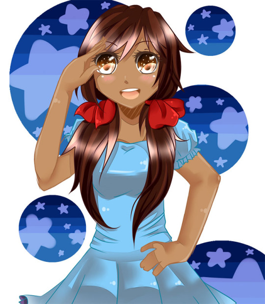
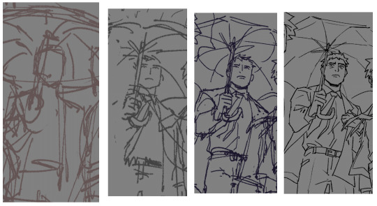
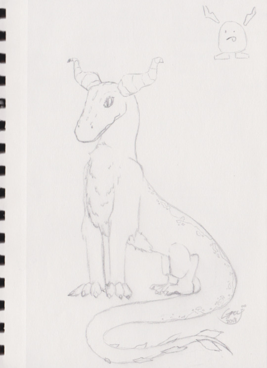
#and I also used a slightly different art style that's a little easier for me for this one since there were so many characters to draw
Note
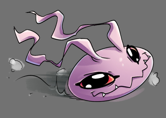
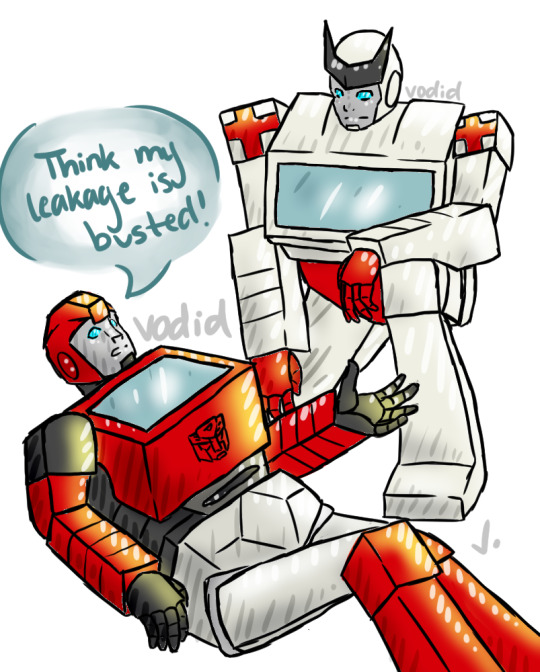
Are you waddle dees friends with susie and taranza ?


Bandana: Marx is a lot of fun to hang around! ...as long as he's had a snack not too long beforehand, anyways. We pull pranks together all the time!
Sailor: Well... yeah... but sometimes his pranks are pretty mean...
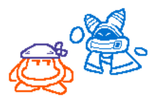
Bandana: As for Magolor... I don't know. It's still hard to get over everything he did... But Kirby and Dedede trust him, and he hasn't tried pulling anything big recently, so... I guess I can tolerate him.
Sailor: I haven't met him myself, but Sir Meta Knight and Bandana are wary about him... That's enough for me.
Bandana: Susie's in the same boat. She and Kirby look like they get along, but if she tries to pull anything around here again, I'll be ready for it.

Sailor: Miss Susanna Haltmann is not legally permitted within 200 yards of Sir Meta Knight or the Halberd.
Sailor: Oh, Taranza is really nice, though! Sometimes when the Halberd is docked in the area, he teaches me gardening tips over some tea!
Bandana: ...Yeah, he's alright. I feel bad for him sometimes, given everything...
...He looks like he's doing better now.
#Mod Eggie#bandana dee#sailor dee#marx Kirby#magolor#susie kirby#taranza#combined two asks for this one since#I figured they were similar enough#and I also used a slightly different art style that's a little easier for me for this one since there were so many characters to draw#lmk what y'all think of it!#posting this one later than the others have been bc I didn't finish it in time to queue it last night lol
24 notes
·
View notes
Text
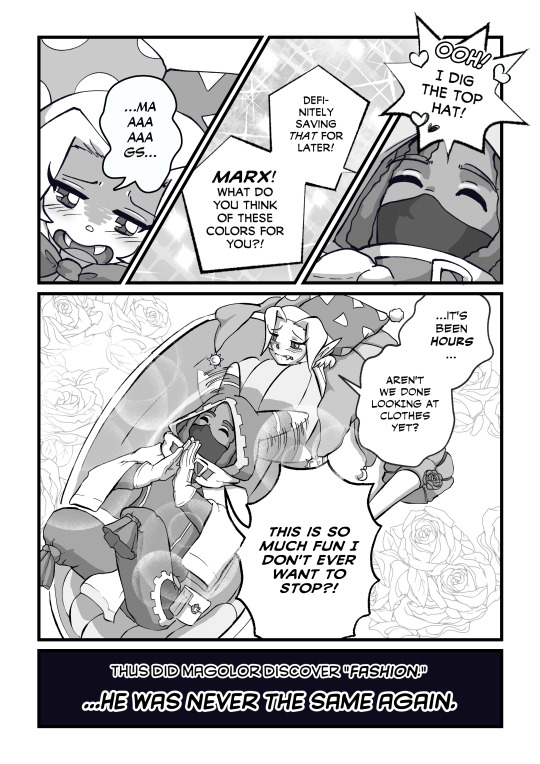
Marionettes' Pavane Bonus Story
"Style Savvy" (3 Pages)
-
“MariPav” is a strangers to friends to ……… fan comic about Marx and Magolor’s meeting and their zany adventures in the days before Return to Dream Land. It was written before RtDL DX came out, so expect inconsistencies with current game lore!
[Previous]
[Main]
---
AN: It is finally upon us. The promised "costume change."
I debated with myself for a while about whether I even wanted to change their costumes, since these were based so heavily in their canon designs. If I changed them, would they still look like Marx and Magolor? (As much as they do now, at least.)
But I also designed these costumes back when I was ju~st starting out as an artist, and in many ways they're unrefined and clunky. And even though, or perhaps because, I'm better at drawing, I find the old costumes slow me down and trip me up in annoying ways.
Plus, I think MariPav!Magolor and MariPav!Marx have distinguished themselves enough in five chapters that they'll still be recognizable!
(And not only does this addition help narrow the gap between MariPav!Magolor and RtDL DX!Magolor, who is an obvious fiend for fashion with the number of different outfits he sports, it opens the door for further dramatically-timed costume changes! ^_-)
-
Speaking of changes, you might notice that everything looks approx 30% lighter than it did before. Been studying screen tone (even though I didn't use it here ^^; ) and this was a test on my part. Kind of hoping that this is a) makes the dialogue stand out a little more b) lets me fool around with more dramatic shading options and c) keeps the characters from blowing out the background elements due to contrast. Right now, it feels slightly easier on my eyes overall, but we'll see if I stick with it. (I do want to work more contrasty colors back into the comic once I know how to use them better. That's what happens when you dive in on a major project at the same time that you're trying to teach yourself everything about art from zero. ^^)
-
With that done, it's onto Chapter 6!
[Previous] [Main] [Next - coming soon]
#kirby gijinka#MariPav#Magolor#Marx Kirby#kirby#Marxolor#...at some point in the future at least#(Although Magolor's already picking out his CLOTHES so!)
68 notes
·
View notes
Note
how draw in the cs style im taking notes
OOOOOO i've been waiting for someone to ask me this!!
this will be pretty long so bear with me :'D
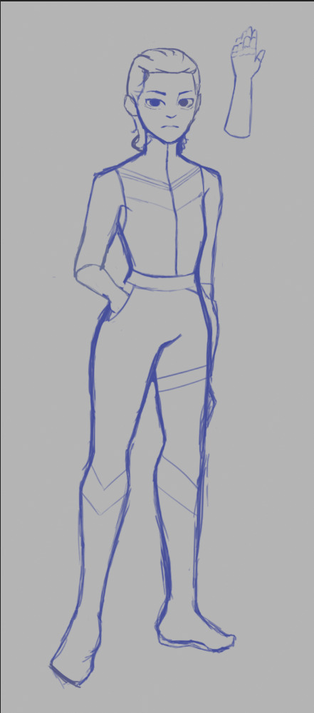
Firstly, The Sketch (ft. sleep deprived looking sketch)
personally i chicken scratch my sketch when it comes to base layers, but when it comes to more detailed parts, i still chicken scratch it but i tend to clean up the sketch more (to make it more refined and make sense)

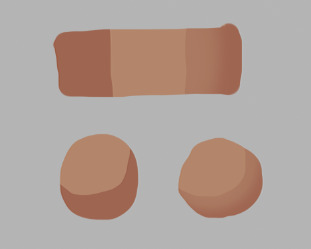
secondly, The Base Colors
Stick to simple colors that are easy to be read by the eyes before adding any eye catching designs! the CS style is pretty simplified (for example, carmen sandiego's eye catching Red fedora and Coat)
Less is More in the CS style! so use more simple and refined shapes!
i noticed that in the CS style, the characters in the show are drawn with easy to identify shapes, there are points in the style that are sharp, sometimes rounded, it's always sharp, simplified and kinda cartoony.
the way you design and assign colors in your art is IMPORTANT!
for example: my oc here Blank! i stuck with a bold and easy to identify color on Blank's attire to take attention away from the face (because he's a master of disguise, the way people would interpret him is through what he was wearing. making him harder to find when he's in disguise)
in short, assign your colors well to fit your character's design and how the viewers would see them!

Third, Catchy Details :D
Like i said before, LESS IS MORE
on my oc here, i put a few details on his upper clothing to also attract abit of attention.
USE CONSISTENT YET SIMPLE DESIGNS
(either rounder or sharper details)
AVOID ADDING TOO MANY DETAILS
adding too many details can be hard to process to the viewer's eyes. and in the CS style, you'll notice that most designs on characters are always simplified.

Fourth, Shadows
i noticed that in the CS style, most of their shadows are blocky instead of faded/blurred like an air brush's effect.
the shadows bit are a little hard to explain by Word so i'll give you a visual example
This is how i draw CS styles use shadows.
even if it does have a faded effect, the shadows always have a sharper look to it.
These 2 types of shadows you can use in the CS style, Hard shadows and Slightly Faded shadows (and rarely any faded shadows)
i added a personal detail that i think i can sometimes see in the show's artstyle, specifically when looking at the lower portion of the characters.

idk if it's just me but i personally like adding this. it looks more interesting :'D
LASTLY, DON'T LIMIT YOURSELF TO MY METHOD OF DRAWING THE CS STYLE!!
everyone has different methods and styles of drawing this kind of artstyle, limiting yourself to only my method keeps you from experimenting with easier ways for you to draw in this style.
so that's how i draw in the CS artstyle! if you have more questions, don't be afraid to ask!!
#carmen sandiego#carmen sandiego netflix#carmen sandeigo 2019#10leon13#self insert oc#blank#carmen sandiego 2019#carmen sandiego art style#art style#artstyle#how to draw in CS artstyle#tutorial
152 notes
·
View notes
Note
Do you have any art tips for beginner artists?
hi! i'll do my best to list the most useful ones for me from the top of my head! but if you're asking about something specific, lmk too!
always use references! this is 100% the fastest way to improve quickly! and don't forget if you're posting artworks using references, to always ask for permission if needed and to credit the reference! here's a very good post with links to various art tutorials and references :) try to do things out of your comfort zone!
i remember my sister drilling this into my head as a kid lmao: if you're going to draw people, make it a habit to draw the whole body, not just a face or bust. this way you can improve drawing the face and body at the same rate, rather than perfect the face and have like. a shoddy body HAHAHA (<- speaking from experience - my sister warned me but i still did not listen) here's an example from when i was 12 lol i went so hard on the eyes but my anatomy wasn't great so the drawing looks kind of goofy
if i'm being honest nothing has really changed even now HAHAHA you can still tell i spend too much time on the faces and neglect my anatomy studies a lot 🥲
3. don't worry too much about building a signature art style if you're a beginner! experiment and imitate art styles that you like, and it'll eventually develop into something you're comfortable with
4. speaking of art styles, Naoki Saito-sensei does very in-depth art videos for people looking to develop and improve their art, and he covers a variety of different topics! the link i provided is for his new YouTube account, since his first one was unrightfully terminated :( since it's new, there aren't a lot of videos up yet but he'll be re-uploading all his old ones soon
5. this video by tppo is also a useful tutorial/explanation for style breakdowns, using Mika Pikazo-sensei's artworks! also another good reference for building art and colouring styles
6. unless you're going for a specific art style, try not to use black colours for shading. Instead, try using a darker version of your base colour with the hue slightly adjusted. it's a little difficult to explain so i made a tiny diagram underneath:
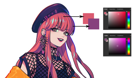
it makes the colours pop a lot! Kurahana Chinatsu-sensei and Akiakane-sensei are really good at doing this 😭💖 that can also apply to lineart! but again, only if you're going for this kind of colourful art style :') do what feels right to you!
7. lastly try to enjoy drawing! if you do what you enjoy, learning and improving will come so much easier to you :) i can understand the urgency to improve (it's like my default state of mind 🥲) but if you keep focusing on that, drawing will eventually just start to overwhelm and frustrate you. try to combat it by doing something self-indulgent! i like to draw my ocs whenever i start getting burnt out :')
8. actually i lied this is the last one!! never give up!! it's so easy to feel bad or frustrated about your art no matter where you are in your art journey, so what i like to do to try and fight that is to look at my old art and compare the improvements! here's one of the earliest oc drawings i could find from my childhood vs my most recent oc drawing :pensive:

#this is a tiny psa to please dont bully me for my incredibly early 2000s core naruto oc i was a victim of the times#/lh#i hope this helps a bit! i'm really bad at making these lists im so sorry 😭#but from the top of my head these are the most helpful tips that have rlly stuck with me since i first started drawing#also confession#i'm actually very guilty of rarely using references bc im lazy#thats why my art sucks!!!!!!! dont be like me#also i'm so sorry for this incredibly late reply#!#ive been thinking for the longest time on how to answer it and this is the best i could come up with 🥲#za answers#Anonymous
216 notes
·
View notes
Note
Hey Neyla! I hope it’s ok that I ask but is there a brush setting you prefer on procreate? I’ve been inspired by your art for eons but I can’t comprehend photoshop. You can totally disregard this if you don’t use procreate though!
Hello! I don't know how long this message's been sitting in my inbox because i didnt check in for a while 🥺 I hope you get to see this either way!
I don't use procreate unfortunately, but I can explain the settings I use for my brushes on CSP in general, and if it works like any other art software then you should have similar settings on procreate
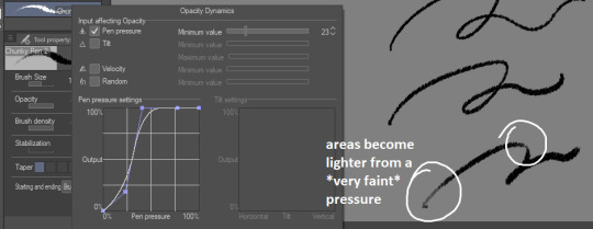
for sketches/linework, I will very often use an opaque & slightly textured round brush. the most important for me is for the brush to have that fuzzy sort of texture that gives the impression of using a pen/marker on paper.

note that i am actually terrible when it comes to line weight, it's definitely not something i work on a lot other than in backgrounds, so I don't actually bother too much with pen pressure settings.
the only rule I abide to is to always set the minimum value above 0 (anywhere between 20-30 is what I use). this is because when I started drawing, I used to be very heavy-handed and would wear out my pens too quickly-- so setting a minimum can help you become more aware of how hard you're pressing on your pen and make gentler strokes.
another fun little setting i use is opacity: like I said, I use opaque brushes for lines, but I like to reduce a tiny bit of opacity when brushing very lightly to give that impression of pen on paper.
There's a couple more brushes I use for coloring or rendering; the major sticking point being that I don't use pen pressure to control brush size that much. If I want to make thinner/smaller strokes, I'll simply reduce the brush size because it's easier for me to control!
(also, opacity is something I'll use a lot more when I'm working on colors)

just know that this is my way of handling it, and it may not suit your style. pen pressure may be another artist's best friend, so please make sure you try out what works best for you :)
finally, some art softwares come with stabilization. I don't use it personally, unless i'm actually trying to do really smooth curves (which is practically never). stabilization can also make CSP lag a lot with higher values and large brushes. the use of stabilization doesn't make you a bad artist or a lazy one, and not using it can make your lines look a tiny bit wobbly if you're not used to doing quick strokes. use stabilization at your own leisure!
on a different note, i know this wasn't part of the question but I'm bringing this up since it's something I tend to hear from people who say they were inspired by my art (thank you by the way🥺💕!!) : don't be misled by artstyles that "make it look easy"! my sketches may look very simple and natural because i'm more adept at bringing out the essential and discarding details in a design. this is not necessarily what you want for your art style; maybe you like drawing details a lot, maybe you prefer the lazy way out going straight to the point. neither are good or bad, only what you like to do matters.
also, if you're frustrated by your work, don't be afraid to draw over it as many times as you want, adjusting things with the lasso tool or deform if something feels off then drawing over again. sometimes you'll be satisfied with your first take, and sometimes you'll need 3 bases before its acceptable (examples below)-- it all depends on your mood, energy, motivation, desired outcome, format, or even just randomness
oh and, sometimes the best way to enjoy drawing..is to find something to obsessively draw (,:
take care!
252 notes
·
View notes
Note
i love your expressions and your art style! they're really good, if you don't mind me asking do have any tips how to improve in drawing expressions? your art is very good and I enjoy it very much, have a delightful day/night!! :)
Thank you! I’m not a pro but I can share some small things that help me. I think there are 3 essential points you can twist to create different expressions: eyes, eyebrows and mouth. You can combine and mix different shapes and get quite a range. And I think out of those 3 the eyes sometimes go overlooked, but they are really important and help to create a more believable emotion! I drew a small tutorial to show how you can create a lot of different emotional undertones just by slightly changing these 3 points in the same base sketch.

Plus the face muscles are connected and changing one thing can slightly affect the connected muscles and overall face shape. Like when we open our mouth in amusement our chin goes down, when we smile wide it affect the cheeks and the eyes, when we raise the eyebrows in surprise it wrinkles the forehead etc etc. This isn’t a strict rule but you can see what works for you.
Plus! Wrinkles are just one more way for you to give some unique details that reflect your character. If they smile a lot they might have crow’s feet in the corner of the eyes, for example. When I draw Narvin I usually add a creek in-between his eyebrows from frowning a lot :D
Also don’t be afraid to use references and break down the work of artist whose expressions you enjoy. For example, I love looking the concept art for the Disney cartoons because they have expression sheet for the characters. With 2D characters it’s usually easier to break down the expression than with 3D objects because the drawing is already simplified for you. You can even trace the drawing to make it more obvious what works for that particular sketch and learn from that.


Gesture drawing websites are also a good practice also for catching the expression fast. You can set your timer for 30 seconds-1 minute to not give the sketch too much of a thought. Here is a website I sometimes use. It even allows you to sort out which emotion you wish to sketch!
Also your face is a good reference and you can fool around with a camera or a mirror.
I’d also say that you shouldn’t get sad if it doesn’t work out the first time, give yourself a time to warm up a little bit!
Hope it helps you!
#my art#gallifrey#narvin#gallifrey audios#tutorials#drawing#sketching#art tutorial#honestly I love making tutorials so if you want me to do more you can always write lol
39 notes
·
View notes
Note
hey just wondering, how do you draw daroach? i wanna figure him out for myself but dont feel like i get down how he looks well enough. thanks for the help if you have any, if not then thanks for just answering
Thank you for the question! And, yeah, I totally get it - that rat can be a nightmare to draw sometimes, haha. I definitely struggled with him a lot at first (you can kinda tell if you compare my earlier works to my recent ones). I think it’s because so much of him is obscured by his outfit in official art? The way the brim of his hat dips over his face or how his cape likes to defy physics - all in service of a cooler silhouette, sure, but taking away a lot of readability and foundation to work from in the process. I’ll try to offer some tips that work for me (though I’m hardly an expert on this, and teaching's not exactly my strong suit, so please bear with me if things get muddled, haha).
The main piece of advice I can give is gather and study as much reference as you can. Official art, concept art, promotional stuff, sprite sheets - whatever you can find, just grab ‘em and put ‘em somewhere you can easily pull up when you’re drawing. I get most of mine from Wikirby, Spriter’s Resource, and official sites like the Kirby JP Twitter, as well as screenshots taken directly from the games (a great way to get in-motion poses and back views, I’ve found). Here’s what my ref sheet for Daroach looks like (I also have a separate one for color swatches):

Kind of a mess, yeah, but very worth it, I assure you. The more visuals you have to work off of, the easier it will be to detect consistencies in design. Which brings me to my next point: shapes!
Most Kirby characters are, at their core, just a buncha simple shapes. It can be hard to tell sometimes when they wear clothes (like with our rat buddy here), but they still have similar foundations of circles and other rounded features. A way I've found that helps with this is to try redlining (that is, take a piece of reference and trace over it for the purpose of study, learning where lines connect, how silhouettes look, how different parts overlap, what shapes are used, etc.). Here’s an example:

This is a great way to find those design consistencies I mentioned before. I did these a bit messy for a better sense of movement (and ‘cause I’m practiced enough to sketch a little quicker), but you can always start slower and cleaner if it helps you see the shapes and layers more clearly. You can even do them multiple times to familiarize yourself with the design and eventually try copying them without tracing, like doing gesture drawings or life studies.
In Daroach, I’ve found that his head isn’t a perfect circle shape, but more like a rounded diamond, with his ears connecting at or just above the “points” on the sides. His body is a bit smaller than his head, and his snout smaller still, each having sort of a teardrop-like shape. His eyes are bigger than I expected them to be, half circles tilted down slightly, often cut off by his snout and hat to create a shaper angle (meant to make him look more intimidating perhaps?). His ears are taller than his hat, though they can tilt back to look shorter. There are also a lot of arcs and triangles present in his design, especially in his cape when it sits across his form or flares out, and the brim of his hat pointing down from just past his ears to right over his snout. Also, unlike many Kirby characters, he does in fact have a neck - it's just hidden behind his collar and bell most of the time (don't ask me why I spent so long verifying this, no I don't have ulterior motives, don't look at me).
Of course, these observations aren’t set in stone. Kirby characters rarely stay perfectly on-model (see Dedede for proof of that), and Daroach is clearly no exception. I mean, just look at these official pieces (all collected from Wikirby):

Even the folks at HAL Labs are not immune to style inconsistency. And that’s not a bad thing! We love a little personal flair in this house. There’s nothing wrong with altering the design a bit to fit your own style - in fact, it’ll probably happen naturally the more you practice, especially once you’re comfortable enough to work without a guide. Here’s some studies I did recently, no tracing, just observation (with different colors used to help me figure out layering):

I’ve seen other folks take their own designs even further than this, adding more fur or sharper shapes or even realistic rat features to our favorite thief. Nothing like stretching those creative muscles once you’ve got the basics down! On that note, don’t be afraid to be inspired by unofficial sources as well. If an artist you like draws Daroach (or any character) in a way you find appealing, ask yourself what it is you like about it, study it as you study official works, and find ways to incorporate elements of that into your own art - “steal like an artist” as the saying goes.
Another thing I recommend for Daroach specifically is studying how real top hats and capes look, especially from various angles and poses in motion. I find it helps to see exactly how fabric sits on a figure or what sides show at different positions. It might seem weird to use human reference for a cartoon rat, and it might take some finagling to get proportions right, but it’s surprisingly effective. I do this with fighting and athletic poses all the time to help figure out weight distribution and line of action. Don’t be afraid to expand your art repertoire into other fields - you never know when it might come in handy!
And, of course, the key thing to hammer home here is practice, practice, practice! Do studies, do gestures, draw with and without references, build muscle memory, do sketches you show to no one, draw memes, draw angst, take your time, fill pages with messy doodles or just drop one in a corner and call it a day. The more you draw this smarmy rat, the better you’ll get. That’s the long and short of it with any skill, creative or otherwise. You gotta try in order to get good, you gotta make mistakes in order to improve, you gotta be kind to yourself in order to do what you love.
Anyway, I think that’s all I got for now. Forgive me if this got a bit rambly or incoherent - I have trouble putting my thought process in words sometimes, haha. I sincerely hope this helps, and I wish you the best of luck with your own future rat-creating endeavors!

Sketch started and finished 06/14/24.
#veins answers#veins in dream land#veins art#veins sketches#veins fanart#fanart#kirby series#kirby#daroach#art thoughts#art advice#art tips#asks#anonymous#description in alt text#veinsfullofstars#thanks for the ask!
9 notes
·
View notes
Note
HII I’m not sure if this is the right blog but I’m so curious about how you color artwork, like what brushes you use, I really love your style and have thought about taking some inspiration from it
Hi! :D This is fine, I'll reblog it to my art blog so it can be easier to find, no worries.
I'm not the type that uses too many different brushes! I ended up comfortable with just a single brush for most of my work unless the style calls for something else (like soft look of Rain World, which I did a little step by step for here~)
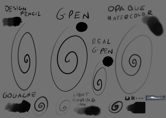
The main brush I use for just about everything is Design Brush. I use it for sketching, I use it for lineart and I use it to add shadows and highlights! I also like to mess with the backgrounds with it
I got hooked to Real G-pen recently for fun lines and texture! Opaque watercolor is what I use for soft rendering like slugcats~ Gouche is very fun to paint with also because of the texture! I haven't used in awhile tho. Light running ink is what I use for smokey effects, clouds, stuff like that! I love the brush! And uh... the last brush is called *checks the source* Nouchika Square Brush. It's free! It's square! It's new to me! very fun to use!
Details about the steps with Design pencil:
After sketching, I basically just lineart with the same brush in a different layer (or multiple of them, if needed!). Once done, I also duplicate the lineart layer to make the previous a little sharper, since depending on the pressure the brush can be faint or very strong, which will come in handy with colors later!
Single layer VS doubled:

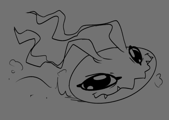
Next, for easy color in, I select the areas outside of lineart, invert selection and even shrink it by 1 pixel. Then, I color the new layer bellow lineart flat with one base (in this case, Koromon's pinkish color)
Above it, I hand fill other colors and yes, there are probably easier ways to do that but I am way to used to the hard way XD Note that I rely on this: Hold CTRL and click on base color layer to select everything in that layer, then make a layer and color within that, so I don't cross the border/lines.

I usually lock layers for the next part but you can also just make a new layer above.
Use gradient tool (with which ever options) and select colors that are slightly shifted in hue and saturation from the base color picked one and toss in a bit of gradient shadow and highlight in each locked color!

Remember, color picker is your best friend ever to befriend in any art program! it will help you find hues in this gradient you can work with to add to the shape while doing the simple render!
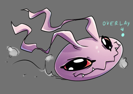
Now, I use the same brush still but I change sizes depending on which area I'm going to go across. Nice part about it is the aforementioned pressure that can apply less or more color depending on how much you press down. I go with the light strokes over first and then stronger ones above! you can get softer shading this way! Same with highlight~ If something feels off somewhere, color pick the nearest hue and stroke the mistake away~ You can do the same if you want to use any present hue in another part of the figure

after that's done, I then tend to put another layer and select Overlay option on it to add at least a little bit more shadow or highlight (I chose highlight in this case). There is no background for this drawing so I figured it would be nice to add a little bit of cold colors to the warm ones Koromon is made of.
You can play with other layer options or even edit and color adjustments like tone curve, color balance and brightness/contrast, with any color layer! I do it a lot actually~
You add some extras if you want and you're done~
There is not much to it, so I use this for a simple style commission!
#ask#my art#sorry if something sounds odd it's a little later here as I toss this together dfgjgh#I dunno how good is to use the brush I use I'm just a bit too used to it with how I handle my pen pressure#I noticed it has a different(?) texture on my older tablet somehow?#might be the dps difference between tablets#but anyway#that's how I roll~
14 notes
·
View notes
Text
well, it is star trek update time. last night we watched ds9's "whispers" and tng's "lower decks."
whispers (ds9):
this episode was really really really really good but it sent me into an absolute existential FIT
i don't usually like episodes where they string us along and don't give us enough clues to figure the thing out for ourselves. and that's what this did because really WHO could predict that. however the ending did gut punch me so i forgive them except i never want them to do that to me ever again
red herring with the coffee. he ordered it so many times i was sure there was something in his coffee
i feel so bad for the replicant. i feel SO BAD FOR HIM. also, did you know this is the only time in trek they use the word replicant
action hero obrien, even under false pretenses, was very very very good. he literally can kick ass and he's smart as hell too like he's so cool???
"tell keiko i love her" JESUS CHRIST. anyway!!!!!!!!
lower decks (tng):
this episode was ALSO pretty good...i really loved especially the dual poker games
i also love the waiter in ten forward who got to go to BOTH poker games, king, but where tf is guinan?? i miss her sm
riker is your worst nightmare. alexa play poker face
worf was also very good in this...he loves and supports his little guys so much. siskocore.
picard was as usual the devil incarnate. i cant believe he yelled at this girl just to see if she could take the pressure of a dangerous mission because he had RACIALLY PROFILED HER and then he, who has been tortured by cardassians, let an ensign SEVEN MONTHS INTO HER FIRST ASSIGNMENT do this covert ops shit. AND THEN SHE DIED!!!! i hope he feels bad forever
i liked her so much :( which i know is the point, but
i kind of wish that unlikable guy who was trying to suck up to riker had died instead because that would be a gut punch in a different way
ALSO NURSE OGAWA'S MAN RUNNING AROUND ON HER?? and then beverly is like oh thank god he proposed GIRL that doesn't mean you didn't see him talking to another woman! just bc you let picard do that shit does NOT mean you don't let alyssa know what you saw!!! smh
i'm still not looking forward to the show lower decks...the art style is so fucking ugly and reminds me so much of family guy, the unfunniest show ever to air on television. as in, even south park was funnier. but maybe if the plots are a little like this it will make it slightly easier to tolerate
EDITED TO ADD: i nearly forgot to mention, the vulcan this episode was CHANNELING mister leonard nimoy. i recognized so many of his little acting tics. absolutely delightful.
TONIGHT: ds9's "paradise" and tng's "thine own self" which i know has AMNESIA!!!!!! i've been in bed since i got home from work but i got out of it specifically for this reason. it better be good
7 notes
·
View notes
Note
Hi. As someone who hopes to one day start my own webcomic, I'm fascinated by how your deleted scenes archive features almost complete art that follows a widly different route that that of the final narrative. It's a bit mindblowing to me, honestly.
If I may ask, how does your process work? Do you follow the conventional script -> sketch -> final art workflow and just take "kill your darlings" to heart regardless of which step you're in, or do you use the art itself as part of your writing (and consequently rewriting) process?
My process is very unconventional and also very flawed in a lot of ways. But it's the process that works for me. Sometimes.
(This is gonna be really long by the way and also it's probably gonna be wonky and messy so be warned lol)
When it comes to making a chilli issue, and just most of my comics in general, I don't write scripts. Would making comics be a lot easier if I did? Probably. Certainly. Absolutely. But it's not my process. At some point I'd like to start writing scripts before I work on an issue, but it always just felt easier not to.
Instead of a script, I write a very rough outline in my sketchbook, with notes so illegible only I could read them. I often deviate from these notes as I'm making pages however. Sometimes I'm about to hit a story beat and I decide it can be done in a slightly different way, so I do that instead. But I don't differ too much from these notes. For the most part.
When it comes to dialogue, it's very on the fly. I may have specific character quotes in my head when I'm planning out an issue, but most of it is only written in the moment when I'm actually making the page.
In terms of art, Chilli has a very "simple" style, and that was on purpose. I used to draw final lineart in my webcomics, and I found it very tedious. What I'd often find is I'd like the undersketch of a panel more than the final art. So when I started making Chilli, I just used the undersketch AS the final lineart, and I developed and refined that style as time went on.
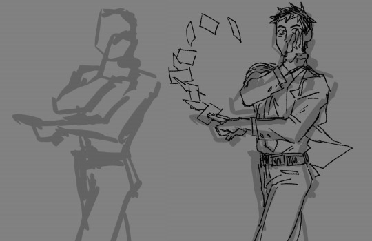
When actually making an issue, I start off by figuring out the panel layout of a page. Sometimes this can be edited as I work on a page, but this is where I visualize the panels ahead of time. Once the border is done, I begin to draw the lineart. Sometimes I make a rough undersketch for a panel if it's particularly complicated, but usually I don't do that.
Once the lineart's done, I go back and give a thick outline to all the characters, and any other elements in panel, to make them pop from the background. It also makes it easier to color the page. Because the coloring process in Chilli is so simple, I often just use the paint bucket tool.
Now for dialogue! Again, this is usually only written at this point in the process. Even if I know what HAS to be said, HOW I say it can be tricky to figure out. Once the dialogue's done, I create the speech bubbles, and then boom! Finished page.
On an average day, I can draw four pages of an issue, but this is far from my limit. If i really wanted to, I could make 5-6 pages a day, but my wrist would absolutely not like that lmao.
And so day by day, I work through an issue, four pages at a time, until eventually, I have a finished draft! Does this mean the issue is finished? Nope!
Once a draft is complete, I do a mini "round of edits," where go through and make little changes fit to my liking. This could range from editing dialogue to make it less clunky, to redoing an entire panel. Once this round is finished, I set the issue aside. I don't work on it. I don't even look at it. I need it fresh out of my mind.
Eventually, usually about a couple weeks before it's released, I go through the issue and do an even bigger "round of edits," rewriting even more dialogue and redrawing even more panels. I do at least a few more rounds of edits until I'm finally satisfied, and that's when the issue's released.
Sometimes however, things can go horribly wrong.
Issue 12 was supposed to be a completely different issue. It was supposed to be the start of a new arc, but as I was making the issue, I just found myself unsatisfied and not that confident in the story I was setting up. So I scrapped that attempt halfway through, and instead began work on the issue 12 that would eventually release.
"Red Meat" in particular was a very troubling arc to make. I made probably about 300+ pages for that arc, and I ended up scrapping over a third of that. I did not do a good job at planning out the story for that arc, and it ended up biting me in the ass later when I realized I didn't like where the arc was headed.
Issues 25 & 26 were both drafted at this point, and I didn't like either of them, issue 26 specifically. The problems they had couldn't really be fixed in rounds of edits either, they were fundamental problems. If I wanted to fix them, I'd have to scrap a lot of what I'd already made.
So I did.
I redid a lot of issue 25, and I scrapped that version of issue 26 entirely. It was for the best ultimately, but in the moment it felt very demoralizing having to scrap so many finished pages.
Issue 27 also ended up being way too long (like almost 70 pages) so I had to cut a lot of (finished) pages in that one too to keep the pacing up. I cut out a lot of good stuff from that issue, but it was for the best. Even after those cuts the issue's still tied with issue 12 as the longest chilli issue.
What happened in Red Meat was a worst case scenario though, and going forward, im gonna make sure that something like that never happens again. Because, fuck. It didn't feel good scrapping those finished pages lol.
My process is very messy and slightly taxing, but it's the process I'm familiar with. I would not recommend doing what I do, especially if you've never made a webcomic before, but instead to try and develop your own method that works for you! Different processes work for different people
Thank you for your ask! Good luck on your webcomic journey, wherever it takes ya!
5 notes
·
View notes
Note
my toxic trait is looking at your art and thinking that i could do that too. everytime i try drawing Transformers it ends up lookin like a pile of metal that got ran over by two semi trucks blasted to cybertron and back then got the shit beaten out of it by Optimus Prime himself 😭
but fr though, how do you do it? like what kinds of shapes are they made of? how do all their weird alien metal parts move?
what may work for my style might not for you, as i've unfortunately learned through my years of yearning for/trying out another artist's skill, and that's okay. but i am very honored to be that kind of artist to you 💗 beating yourself up for not being like me won't help you, though 🥹 your art is great, regardless of if it looks like mine or not. i'm going on 7 years of doing this after all! (also i started with bayverse of all things 😵)
and honestly, a lot of it is just experimenting and finding what's right for you, what you need to improve/improvise on, and what you want out of your art. for me, i found that i have a very difficult time actually getting that sharp, blocky industrial style of robots down and eventually opted for a more organic, squishier look. but i do maintain their proportions as they're wildly different from a human's ghsdfsjs
you're already off to a great start doing exactly what i did to learn: redrawing screenshots from the shows. i learned most of what i know from tfp, with a lot of bayverse and g1 mixed in there. it took me about two years of that before i felt confident enough to start making original art consistently. it takes time (and tbf, i was still learning how to art in general when i started. so you really are off to a great start)
this is the kind of art i made in 2017:
massively different from my art now, right? through all these screenshots, i'd test out new ways to draw and color. at one point, every piece i made was trying something new. and it was okay if it didn't work out. means i know what not to do next time lol generally though, i'd NEVER do lineart. i mostly focused on building up my sketching and coloring skills, as seen here in my 2018 art:
and that kind of fucked me over for life so now i am left with painting over the sketch 😂 i digress though
in all honesty i've spent my entire art career figuring out how the fuck all their weird alien metal parts move 💀 a lot of it is BSing, some is recycling the same poses to make things easier on yourself and the rest is studying studying studying. cannot tell you the amount of times i've rewatched certain bayverse scenes frame by frame to figure out how all their parts move in tandem — i still don't know! 😅 g1 was a nightmare to figure out because of its blocky simplicity and limited range of motion. it's still a struggle to this day haha
it's really difficult how to explain how exactly i draw transformers, as it's just... something i do nowadays. there's not a ridiculous amount of thought put into it since i've built up my skill. but here's generally how i sketch their bodies and what shapes i use:
the first is slightly different as its a more detailed approach than g1 so just imagine the arms are a little rounder — "marshmallow," as my brother would call it — like the sketches in the second (even if those are a little more advanced in the process than the first)
my best advice to you is to learn their proportions and articulation via redrawing screenshots — various ones! i chose the most dynamic poses for my megatron practices in 2018 to nail it in my head lol but yes shows like tfp and earthspark are great for that (you could probably even do with looking at the storyboard animations for earthspark to help!)
and remember, i'm still learning too! i'm not gonna pretend like i know what i'm doing. but i'm glad i inspire you :)
12 notes
·
View notes
Note
hi! i love your art style!! i was wondering if you had any tips on practicing figure drawing. i understand the like “a person is about 7 heads in height, and this is where joints should go on the chart,” but i find when trying to draw dynamic figures, i end up lengthening limbs to the point of uncanny valley. i know practice is Thee One Big Thing, but i was wondering if you had something more discreet. like practice is the staircase but are there any steps you’d recommend to getting to the top of the staircase, which has “get a little better at figure drawing” at the top? thanks so much!
ahhh thank you so much!!! i'm so glad you like my art!!
my advice for figure drawing is still 'practice' but maybe the advice i have for practice will help out a little? i guess we'll find out aldskfj
first though, proportion rules are super helpful for more static poses, but can definitely be harder to use in active ones. i actually learned most of mine from cyberchase (thank you pbs kids) hilariously enough, but others you can sorta figure out for yourself just by seeing what is (approximately) the same size!
for arms my big one is always that from your shoulder to elbow is about the same length as your head and neck. and then from your elbow to your wrist is slightly shorter than that. you can test this for yourself by holding up your arm and resting your forearm on your head, or touching your fingers to your shoulder! of course, this isn't always true for everyone, so you can play with that, but if your arms are looking too long, that's my big one!
for legs, i do something kind of similar, where if i pull my leg to my chest, for me, my leg comes just past my armpit, so my hip joint to knee is slightly smaller than my torso (and same for the bottom of my leg). again, this isn't exact, but i find it easier to do how bigger body parts are proportional to each other (sections of leg to torso, parts of arm to head) opposed to like 7 heads for the full body, and i find it a little easier to use for poses and moving limbs around
for practice i super recommend both references and drawing from life!! if there are any classes near you with a live model, i personally recommend it because i both think it's a lot of fun (i like the mindset long study sessions like that put me in) and i think that it gives you a lot of good experiences with body types and poses and angles you might not think of!
since those are not always accessible though, drawing from photos is also great! the site line of action is my go to, because it allows you to set different a time limit for your drawings and gives you options like the models' ages, genders, and if they're clothed or nude. since you have no other control over what images you get, it gives you poses that you might not've tried before!
(this site also has expressions (i love that section), environments, hands and feet, and animals!)
also reference photos are my best friend (i say, not using them as much as i should). there are SO MANY people who post reference photos for artists doing all sorts of poses, with all sorts of props, and it's great. the one that i can immediately find is adorastock which i highly recommend clicking through even for some inspiration!
if you can't find what you're looking for, taking pictures of yourself or people around you is always something you can do as well. i am constantly taking pictures of my hands because i can't figure out the right angle of everything. for the piece of leesia and teddy where leesia is lunging with knives, i took a photo of myself at like 3 am to get that one. for my final project in a drawing class, i took a picture of my sister wrapped in a bed sheet because i couldn't figure out how to make the fabric draping look right
piggybacking off that one, those final pieces were actually based on john william waterhouse's paintings. (the assignment was to i think remake/modernize a piece) i think doing studies of other people's art and even tracing sometimes, can be really beneficial. i know there are a lot of thoughts about tracing, but i think that if you just don't post it... it's fine. older, famous artists have studies and redrawings done all the time of their work (j.c. leyendecker is a favorite for people's studies)
so yeah!! that's all the advice i've currently got. and also... sometimes proportions....are a little fake. sometimes it's just your style. or it just kinda...looks better wrong. a lot of my drawings of people in long dresses have them with legs that are actually way too long because i like how the longer skirt looks. so none of the rules are hard and fast
good luck!! i hope something in this answer helps you out a little bit!!
3 notes
·
View notes
Text

Presenting my revised redesign for Griffin the invisible man from Hotel Transylvania!
As I'm starting to get into the Halloween spirit, even though it's the end of August, I felt like revising my version of Grif. There's not too many differences from the version I posted in January. but I just wanted to share the ideas I developed in the months since and flex my improving digital art skills (I now have a Huion tablet so it's a lot easier!) As I did before, I tried to retain the art style from the movies. I also clearly am not the best at drawing slightly crusty middle aged dudes but I tried. I thought it would make sense and also be funny if his hair got really long over the course of the movies and came down to the middle of his back or longer by the time the fourth movie rolled around. I feel like he'd be the kind of guy who grows his hair out just because he likes it that way, and also, being invisible, he'd most likely forget to cut it or not worry about getting regular haircuts. I did consider putting a few gray streaks in there, but I'm leaving it as is for now. My version also has invisible clothes that he was able to make using his invisible serum - here's my reply on someone else's post where I go more into detail about this.
For all those coming at me and saying I'm fat shaming, being superficial, etc. because I drew him as a slimmer and more attractive man, hear me out:
I was honestly expecting a dude who physically looks like he's middle aged and past his prime - he's voiced by David Spade FFS, who is nearly 60 now - and I wouldn't have minded if he were balding or graying or a little out of shape. But what we got was not only absolutely painful to look at and anti-Semitic, at least according to some people, it completely disregarded all the hints that were dropped about Griffin's physical appearance and outline in the first three movies - TRUST ME, THEY'RE THERE. It's like the writers and character design didn't even watch the previous movies, and it was obvious enough due to the fact that they Drac and Johnny learn to appreciate each other all over again instead of further developing their relationship. Regarding Griffin, there were several instances in the first three movies where the outline of his body was hinted at, whether he was wearing visible clothes or wrapped in glowsticks, and ALL of them portray him as a slender man of average build and average height. There's also some promotional material for the first movie where he's wearing clothes and we can clearly see that he has a slimmer figure. We also saw that he has a jaw and neck, and even saw a partial outline of his head and face in HT3. NONE OF THIS lines up with what we got in HT4.
I have absolutely nothing against body representation in the media. In fact, I am ALL FOR IT. But if the HT crew wanted Griffin to be fat, they should have established that from the beginning. They just went ahead and completely changed his entire body, both his size and his height, just for cheap laughs and shock value. I should also say that Griffin's larger body in HT4 was NEGATIVE representation. They had him dressed in these horribly undersized clothes, including a shirt that looks like it was made for a little girl, for the bulk of the movie, and didn't even have him in proper clothing ONCE. Also, it all seemed to connotate that fat was equal to ugly. It all just felt extremely mean-spirited. Oh and did I not mention that he was much taller here too! He towered over Wayne, Murray, Drac, practically the whole gang, and he was just a head shorter than Frank if I remember correctly. AND it made NO SENSE that he didn't know he was balding!! He has hands, it's not like he couldn't have touched his head every once in a while! OH, and his torso was way longer and he had these little stick arms and legs! You know what, I'm just going to have to make a drawing comparing what he was supposed to look like and what he looked like in HT4 just to make it clearer.
But yeah, they messed him up badly, just for the sake of unfunny jokes, and he. deserved. so. much. better.
I'm hoping to tackle the other three guys (Murray, Wayne, and Frank) soon! ESPECIALLY Murray, because they did him just as dirty as Griffin.
Commissions info
#hotel transylvania#griffin the invisible man#griffin hotel transylvania#my art#the invisible man#sony animation#halloween
33 notes
·
View notes
Photo

I'm having a bit of art block at the moment. So I thought this might be a good time to go back and talk about the 3 games I released this year to give them one little bit of love before the year ends!! As well as some thoughts on where they'll be going next year!
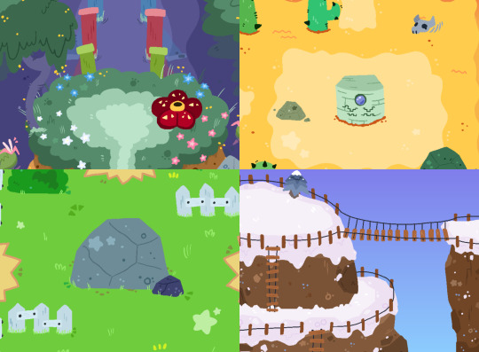
First Up: Released August 10th, BOYZ: WORLD WIDE WEST! (x)

This was a "pseudo-multiplayer" quickdraw game. Make your very own BOY, and battle foes in quickdraw matches! The big draw was using codes from other's wanted posters to duel their BOY in your game!
This was the game I actually planned to make at the start of the year. I had the idea in my head for a bit, and I think it came out pretty good! Sadly very few people actually participated in the #BOYZWWW tag to share their wanted poster. But I stand by this concept! I've got ideas for updates to make to this game in 2023. I would really like to add real back buttons to each option so it's easier to enter codes and build a boy. But I think there's also potential to touch up some menus and make them look more original and less like RPGM menus. I wouldn't hold my breath for it coming out any time soon. But yeah... I do already have a small idea for a sequel to this game! It's a bit more ambitious than I can do at the moment, but I'll keep my mind on it. This was my favorite game I made this year!
Next: Released November 6th, DaRoach! (x)

A maze running arcade styled game. Play as DaRoach and try to collect gems and treasures! There's a 10 stage arcade ladder with a small story, and an endless mode with various layouts to try and master!
This game was something I wasn't planning at the start of the year, but randomly I had the idea that I could make a simple arcade game pretty easily. It took a bit to figure out what it should be about and how DaRoach should look, but I think it came out pretty good! This game really needs to get touched up a bit in 2023. Thanks to SumRndmDde's custom menu plugin I can FINALLY add a score present during gameplay. But I also would like to potentially touch up tilesets and gameplay to look and run a little better. I know this sounds silly. But I already have plans for the next 3 DaRoach games. I'm not joking. The whole DaRoach lore is already figured out. 3+4 won't be able to be made soon. But DaRoach 2 isn't entirely out of the question eventually. But I'd still need help to get it done.
Lastly: Released December 13th, FLYTRAP! (x)

FLYTRAP is a simple Game & Watch styled game where you control Marty the Flytrap and stop flies from biting your stem! It's a simple blocker game, jump in front of the flies before they reach the center!
This game was completely spur of the moment. After playing Garden Gaurdian and redrawing old G&W fanart. I realized I could make a GW game pretty easily. And people seemed interested so I sat down and made it quickly over a weekend. I'm still shocked by the love this one got! There's not a whole lot to the game that can be cleaned up in 2023. But I certainly think there's room for improvement with playing on phones. However my main goal is to add additional game modes that make the game harder/slightly different since it's easy to edit. I do have an idea for a sequel to FLYTRAP but it'd be more of the same. Nothing too fancy. I don't know when I'll get around to it but it's one I could even potentially do in RPG Maker. Maybe. We'll see. No promises.
---
And that's all the games I made in 2022! Thank you all so much for your support, and thank you for playing anything I put out there! It all means the world to me! As always, these smaller games are leading up to me finishing Once Upon An Adventure, my full scale RPG. I don't know when it'll will be done. I'm at a point where I'm pushing myself to just be happy with what I am making currently, I want this to be the last round of asset making I do. I don't think it'll be done by 2023. But I'm hoping I might be able to show more videos by then. Currently Im working on the maps! I'm on the second to last chapter for dungeons. Then I can do towns, then hidden areas! Once that's done I can build them all in game, then start working on overworld sprites and then when its all put together I can record footage of maps! There's still a LOT of work to do on Once Upon An Adventure, but please look forward to it and please look forward to more updates in 2022!
I do still plan on doing 1 short game per year. And I have a couple of ideas. I'm thinking of maybe letting people decide which one I should attempt? We'll see. A big goal I have for game making in 2023 is to try and enter some game jams. I've made games in really short times already so I think entering game jams could be a ton of fun. So don't be surprised if you see stuff like that from me. And as always I'm working with @CloudyGamesLLC and @SeafloorGames for various projects. Please check them out!
Once again, thank you all so much for your continued love and support. I hope I can make even cooler things next year! Here's to a great 2023 with many more video games to come!
15 notes
·
View notes
Note
YOU!!! I WAS DISTRACTED BY SPACE GAME BUT
1. Your first OC ever?
4. A character you rarely talk about?
13. Do you have any troublemaker OCs?
43. Do you have any certain type when you create your OCs? Do you tend to favour some certain traits or looks? It’s time to confess (i bet i can guess something for that one kldgj)
ME!!!!! >:3
1 - I think my first ever OC that i can remember was this little dinosaur fella I would draw all the time in paper margins way back in middle school, I don't actually have any pics on my computer but I doodled him real quick for ya
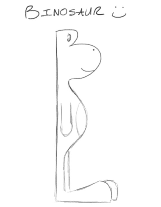
Binosaur cause his head is just the letter B fdkjgjhgfdkfdg
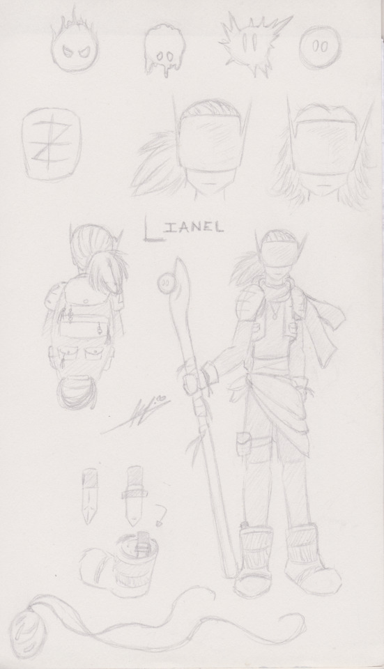
4 - Lianel!!!!! I don't think I've ever shared them anywhere?? I made them back in highschool (hence the old signature, I went by a different name back then), I actually made a short little comic of them exploring this ruined world that I can't find >:( It's hiding in a sketchbook somewhere i hope and I just haven't scanned it. But anyhoo! Lianel is on the run for space crimes!! Jury's out on whether or not they actually committed said crimes or were framed though. They found their ancient armor from the ruins of a resistance organization that died out a long time ago, but when you're on the run you take what you can get. They've got a funky staff that an even funkier little magic blob lives in, so long as Lianel takes them on adventures, since the little blob can't travel on their own. In return the blob lets Lianel use some of their magic when they get into trouble. I don't think I ever named the blob??????????
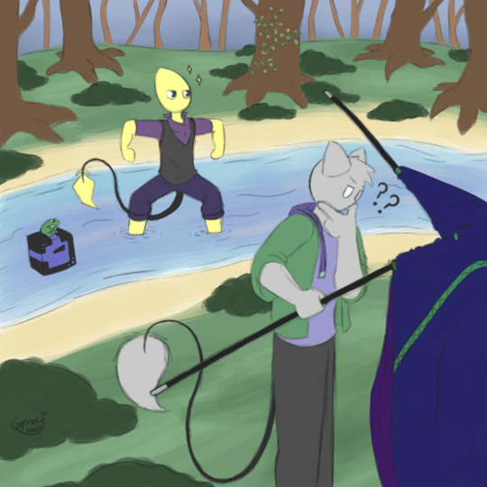
13 - Hehohoho!!!!! >:D This is Calcifur!!! They look small and unassuming but they will steal your wallet fhgjhkgfjklhgf

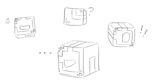
Cal loves being gay and doing crimes, especially graffiti in places they're not supposed to, although after they met Lato they toned it down a lot and now stick to mostly silly pranks. Calcifur is one of the main three fellas I used to draw a whooooole lot before I fell out of doing art for a good while, and i will definitely be using this as an excuse to talk about them gjhfijhgfd but first, more about Calcifur! Cal's skin glows and changes color with their mood, (neutrally they're blue) and they've got a nifty pair of headphones that can transform into a stylish neck kerchief. They can speak, but can only be heard by people they want to hear them. And now the trio!


MY MAIN BLORBOS..... I LOVE THEM
Ok so the other two are Lato and Cube (bet you can't guess who's who lmao) Lato is my fluffy puff ball sweet boy, friendliest fella you'll ever meet. He's naturally very curious and aims to be pals with everyone he meets. He's semi aware of his being an artistic creation, though he's pretty chill about it. Cube on the other hand, is fully aware and somewhat peeved at me about it jhgdkhgdjkjhgfd Cube is a straightforward know it all with a short temper and vast knowledge. Originally I made him to be a companion to Lato, to keep him company in the void (since I was very bad about never drawing any sort of backgrounds lmao) and to answer Lato's many ceaseless questions for me. He often shows up doodled in the margins of whatever I'm working on to make snide jokes about something or other or yell at me to stay focused. Now a days the three live together in a nice house out in the forest and have fun domestic style shenanigans. I could talk about these three for a thousand years so I'll stop here because this whole ask has already gotten slightly out of hand kgfdhlkdjgfhgj
43 - (Looks at my crew of just the silliest lil guys. Jokesters and pranksters abound) Idk can't think of anything
dkhfjhlgdgljgfh I do really like silly characters, and characters with more simple designs that are easier for me to doodle here and there without taking too much time or energy. Cube is VERY popular in my notes and sketchbooks. Funny enough a lot of sillier characters are more recent creations, characters I made in highschool and earlier had more tragic / serious backstories. Oh, I also draw a LOT of little creatures, just strange monster things. Not sure if they count as OCs, most aren't even named or I only drew once or twice, but I do love me a creature


#oh whoops I've been making this post for. over an hour djhkfghfdjfdg#those image IDs man#but if i dont do them right away i forget about em#anyhoo thanks for the questions :D my brain blorbos. i love them dearly#holding them out in the palms of my hands#waugh i want to draw my main trio now but it is past bedtime kfdjgkgjhfdf#eyndr does art#OCs#♥️mutual shenanigans♥️#♥️kibbits♥️#grah tags idk i'll come back and fix tags later i gotta go to bed before Moon gets my ass jhgfhkgfjd#paper airplanes#oc cube#oc lato#oc calcifur#oc lianel#oc binosaur
4 notes
·
View notes
Text
i need yalls opinions on something please!!!
in mirrors, i started using a slightly different art style for the last couple pages ive posted. the main differences are that its a little more towards the "realistic" end of the style spectrum than the "cartoony" one, i no longer color the lineart, the lineart is way thinner and less tapered, and the shading is much simpler. it kind of looks like an animated show more than an illustration!
i was wondering which style yall preferred for the comic :3 i made the decision to change the style to see if itd be easier on me (which it kind of is) but also i dont want to sacrifice a good-looking polish even if it takes a little more time and a couple more layers
examples of both art styles:


6 notes
·
View notes
Last Seen Blogs


installaptopmakassar
HP/WA 0811 4452 206, Instal Laptop Di Makassar

ponchobosco
AAAAAAAAAAA
inviisiiblelee
* INVISIBILITY

pmanifoldevadacemy
pManifold EV Academy