#and it was just jarring that it was 3d animated
Text
I got my tablet to finally work on my new pc >:)
Flashback to when I was trying to troubleshoot it

#the issue? resolved itself?#just kind of randomly too#but WHATEVER im not complaining. maybe i will become more productive#i can finally figure out how to 3d model >:)))) and maybe animate but thats wayyyy down the line#jarbo buys a gaming pc to run blender. call that productivity#jar talks
15 notes
·
View notes
Text
Okay one bit of drama i never understood while it was going on and still dont get is after the sims team changed their rules to not allow paid mods/cc except for a small time frame pre release (which sure whatever its their ip ig) everyone immediatly started saying how horrible of people paid cc creators were and how we should hate them and download their stuff for free from these links (which i saved idc i have no stake in this but still ^_^) and we should mass report them to ea immediate even though it had been 12 hours total since the announcement I just never got thr message on why uhm. Creators charging for some of their content is a bad thing? This clearly wasnt a moral issue regarding ea because everyone fucking pirates the game in thr first place anyways so like. For your immediate reaction to be to tell ppl to mass report these creators was sooo funny (not actually it was so fucking weird)
#mm like. i genuinly do not get it. i understand being frustrated if a cc dress you like is pay only but okay. there are thousands of cc#dresses either pay the few bucks for their patreon or find another lmfao??#i will never understand just playing angain and going through some cc reminded me. sigh#like ik tip jars and early access is the norm but im not going to fault someone for making some pay only if they know ppl are going to pay?#its diff than those ppl who sold like animal crossing villagers and items for irl money to me because that was just a hacked switch buying#in game stuff while this is like someones 3d model/mesh they put work into. mm idk
8 notes
·
View notes
Text
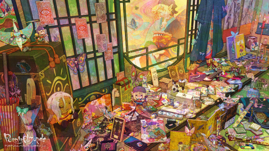
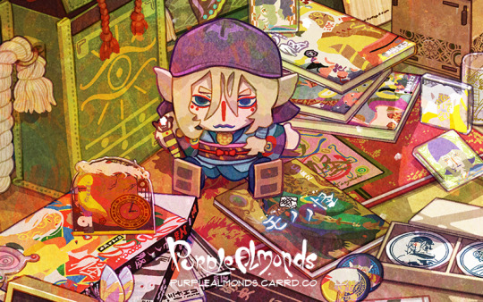


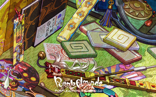
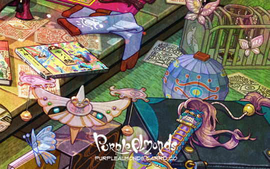
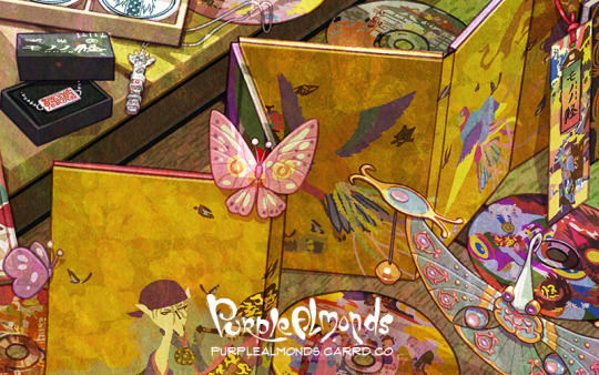
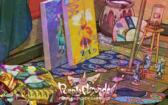
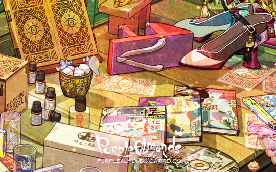
Finished this just in time for the new trailer drop! This is my Mononoke illustration featuring assorted merch from the anime, movie, and stage play! How many can you recognize? ⚖️👹
(Yes, please send answers in the replies! Answers, progress pics, artist commentary will be drafted on a separate post when I'm less tired)
⭐️ UPDATE 04/03/24: Abridged artist commentary is now available under the cut! For the full version, please see the Google Doc linked in the replies.
👁️Overview
Late last year, I rather belatedly discovered Mononoke’s 15th anniversary came and went, and with it, an entire swath of new content to manically pore over. This is an illustration of the various Mononoke merchandise, props, and set dressing I discovered.
---
🔎Scope
Some fun facts regarding the work that went into this illustration!
Not including research time, this project ran for roughly two months, consuming much of my waking hours outside of my full time and freelance jobs.
While the illustration does not depict all of my findings, it does feature over 120 unique props and set dressings!
The majority of the props and set dressing were modeled to varying degrees of detail in SketchUp.
To model prep, I often put together schematics on Photoshop or Illustrators. Some were created from scratch. Others were created with the liberal usage of the Photoshop transform and perspective warp function.
The master file is 1.5GB. The dimensions are 6400x3600 at 300 dpi, and contains over 2,200 layers.
Near the end of production, the master file became so unwieldy I created a separate working file. This way, I could create assets lag-free then import the layers into the master file.
---
Past this point is where most of the commentary cuts were made for the sake of brevity. Again, look in the replies for the Google Doc link containing the full version with a table of contents for easier navigation!
---
🗳️3D Layout
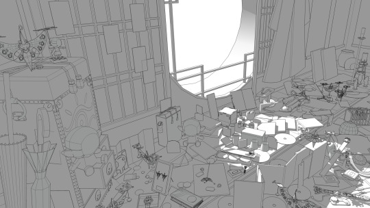
As you can see, the backbone of this illustration is the 3D model. I spent perhaps 30-40% of my production time on this stage.
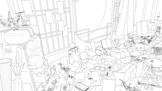
And this is the lit version. The lighting ultimately got downplayed in favor of showcasing the vibrant colors. I like how simple it looks though!
---
🎬Production-Based Set Dressing
In addition to merchandise, I wanted to insert set dressing and props from the various Mononoke productions.
🦊Kusuriuri
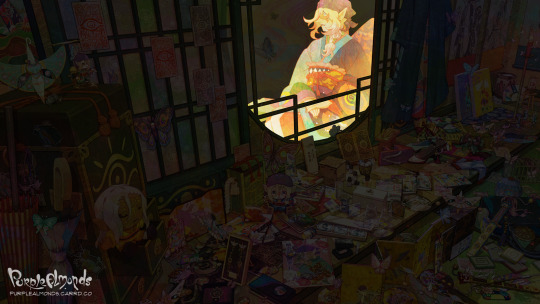
It’s odd to have a section dedicated just to him, but his unique appearance warrants it. His garb and overall appearance is an amalgam of the anime and movie. The original intent was ambiguity– kind of like the blue/black vs. yellow/white dress phenomena a few years back. But after doing the color flats, I rather liked how the rich, unaltered colored fit with the overall composition so it became more blatant. I’m surprised that nobody has commented on this since I published the illustration. Maybe because I didn’t feature him in a close-up?
🐈 kai ~Ayakashi~Bake Neko (2006)
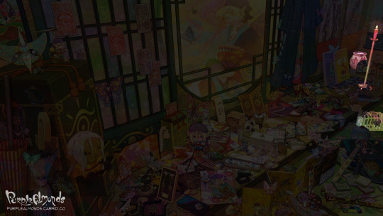
Finding props iconic to this story arc (outside of the Kusuriuri’s tools of trade, of course) was somewhat difficult. While the environment was richly decorated, it mainly consisted of 2D artwork which I wasn’t keen on retracing. I opted to paint objects that characters interacted with or featured heavily in the show.
Salt Jar
Candlestick
Rat Trap
🦋Mononoke (2007)

The props fall into three distinct categories here: Kusuriuri’s tools and trinkets; things featured in the opening and ending credits; and objects iconic to each of the five story arcs in the series. I tried to keep most of them clustered on the tatami, but as space grew scarce some props trickled up onto the deck as well.
Medicine Box
Exorcism Sword
Tenbin
Paper Talisman
Mirror
Ring
Geta Sandal
Necklace
Paper Umbrella (Zashikiwarashi)
Daruma Dolls ( Zashikiwarashi)
Gunpowder Ball (Umi Bozu)
Smoking Pipe (Nopperabou)
Genjiko Blocks (Nue)
Train Ticket (Bake Neko)
Lantern (Anime OP)
Butterflies (Anime EP)
☂️Mononoke: Karakasa (2024)
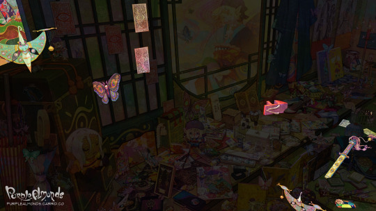
Pretty slim pickings for the new movie since I only had the teaser, first trailer, and movie poster to reference from. Kusuriuri’s tools of trade were a given, but finding memorable and narratively significant objects was a tad troublesome.
Thankfully, the set dressing ended up (however subconsciously) strikingly similar to the movie’s environment design, down to the green tatami and multicolor shoji screen. I suppose at this point I was so immersed in Mononoke content that its aesthetics subconsciously informed my design choices!
Exorcism Sword
Tenbin
Paper Talisman
Comb
Movie Poster
Butterfly (Custom design)
---
🪭Official Merchandise
Goods related to canonical narratives and/or productions.
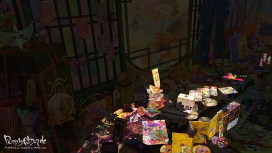
🎊15th Anniversary
Mononoke Shu - A light novel by Hideyui Niki & illustrated by 2964_KO
Whiskey Glass & Box
📖 Key Frame Art Books by Hashimoto Takashi
Ayakashi Key Art Frame Book (2010)
Key Frame Art Book vol.9 (2017)
📚Manga by Yaeko Ninagawa
Kai Ayakashi: Bake Neko Vol. 1-2
Kai Ayakashi: Mononoke Prequel
Mononoke Vol. 1-10
🎭Butai Mononoke
Bakeneko Pamphlet
Zashikiwarashi Pamphlet
Zashikiwarashi Acrylic Standees
Zashikiwarashi Manegi
💿Physical Media
Official OST CD
DVD Box Set
Yokai Pattern Fabric
---
Common Collab Merchandise
This category consists of goods that are generally more affordable and feature graphics from the source material with minimal alterations.

Amnibus
Wall Scrolls
Tenugui Fabric
Shot Glasses
Minoyaki Bean Plates
ANIGA-TER
Stickers
Can Badges
Canvas Prints
Anique
Diorama Acrylic Stand
Acrylic Blocks
Challenge Kuji
Kusuriuri & Hyper Clocks
eeo Store Online
Folding Fan
Keychains
Can Badges
gj character G
Cushion
Acrylic Charms
Neo Gate
Satchels
Mini Badges
Mini Badges by Mame Shinoda
---
High-End Collab Merchandise
Goods which derive motifs from the characters, props, and patterns from the production and transform them in an elevated manner through abstraction or usage of precious materials.
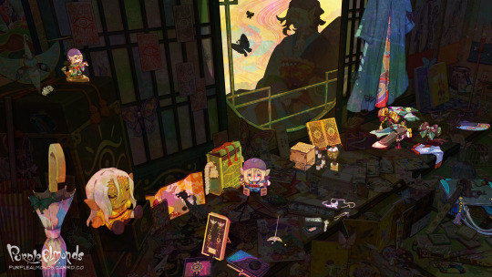
gj character G
Exorcism Sword Ring
Goodsmile
Kusuriuri Nendoroid Figurine
Folding Screen
Kusuriuri & Hyper Plush
Tote Bag
Kaya
Umbrella
Tenbin Kanzashi
Tabi Socks
Dress
Kotobukiya
Figurine
Mayla
Pump Heels
Kusuriuri & Hyper Hairpins
Tenbin Earrings
Hyper Earrings
Noitamina Apparel
Perfume
Tenbin Necklace
Folding Fan
Super Groupies
Purse
Wallet
Watch
Tsumuji Design
Exorcism Sword Necklace
Ofuda Bracelet
Useless Use Lab
Fragrance Set
Air Purifier
Three-Sided Mirror
#mononoke 2007#mononoke 2024#mononoke fanart#medicine seller#kusuriuri#モノノ怪#mononoke anime#薬売り#mononoke#fan art#purplealmonds#2024
937 notes
·
View notes
Text
The 3D fallouts just show a cinematic death animation of you getting owned when you die but the 2D fallouts are like
You have died. Your body got eaten by one million rats. Your entire city died and nobody was left to mourn you. You died before you got to try putting your hand into a jar of peanut butter. The last person you had sex with will only remember you by how bad you were at it. Your bad vibe has poisoned the water supply.
323 notes
·
View notes
Text
Here’s a personal take!
The Sonic Prime 3D models have the best facial expressions seen from the modern cast. Why? Well, I’ll explain with my 0 experience in 3D animation. I’m only explaining as an observer. Not a professional. Anyways, onto the fun.
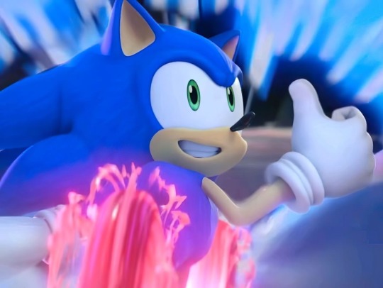
First of all, let’s talk about the current models in the games. The animators became better at animating them in Sonic Frontiers.

You can tell effort was being put in, but Frontiers still has limits due to the structure of Sonic’s face and eyes. I’ve seen fan animations with this model which animates him wonderfully. But no matter what, he’s still going to have limitations because his hands are too big, eyes are too far apart, mouth looks like it was made to only stay on the side, and more issues. The design frankly looks dead. Even in motion.

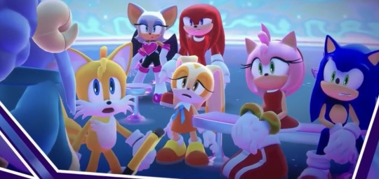
In all fairness, this character was built for a 2D design due to it being inspired by Mickey Mouse. But Sonic Unleashed (because they used different models like Dream Team) proves this character CAN be expressive in 3D with a good workable model. It’s not the animation that’s the problem in Frontiers. Here are similar expressions from Sonic Prime and Frontiers.
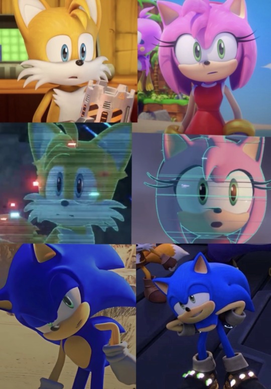
See how wider the expressions are in Prime? It allows their faces to be more flexible and warped. Prime!Sonic has rounder eyes making his head look easier for his facial structure to have an array of expressions. It’s kind of close to Sonic Dream Team with the minor tweaks of the OG models. Which is why the expressions in that game looked so good. ESPECIALLY when animated.
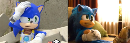
It’s even why other designs are able to have great facial expressions. The eyes being close together just works. While the OG looks like he’s pushing expressions that’s near impossible to push. Yes, it’s still expressive, but you can see how limiting it is because the eyes aren’t supporting the face. And his mouth is always stuck to one side.
Onto more compliments to the Sonic Prime models. They emphasize the hight differences too. I personally think Sonic and Shadow look like mixtures between their 06, modern, Boom, and movie designs. They have long quills like 06. Their entire look is inspired by the modern designs. Their eyes are shaped similar to Sonic Boom and they have cool textures like in the movies. Other characters count but it most notably is for the two hedgehogs.
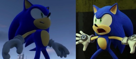
The hands are smaller like in the movies and Boom. The pupils being bigger gives volume to the faces. I also adore their fur and quill patterns to give the designs flare. Their gloves have little details too. I especially love how they can change the quills for Sonic and Shadow and make them look similar to a 2D style. Usually they’d make the quills smaller in the games to get that 2D look but Prime Shadow and Sonic are able to have long quills while the animators adjust them however and whenever they need to.
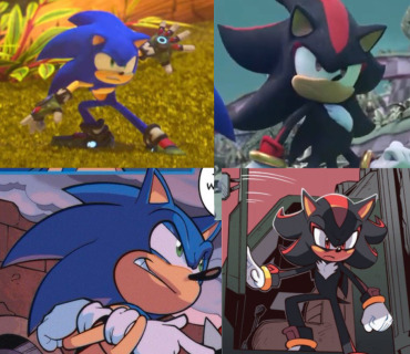
Their mouths are also well animated and smooth when transitioning to different sides of the face. The characters body shapes are also 100% better. While the Game model looks too straight the Prime model has a pear shape torso that are also given to Boom and Movie Sonic respectively. The Prime models look like they were made for action scenes.
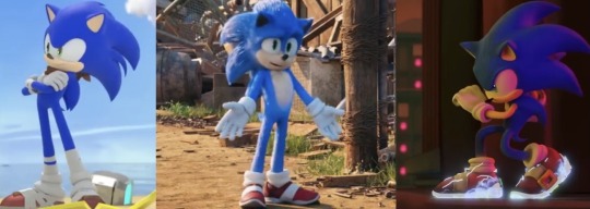
I know some people complain about the eyes not going down, but honestly it’s what makes the expressions weaker when used in 3D. I’m glad they have a balance of it sometimes to allow the expressions to get their points across. I really appreciate the colors on everyone also. They look lovely and bright with help of the lighting.
The few critiques I have are due to multiple watches but they’re not a HUGE deal.
1. I can easily see their necks at points.
2. The mouth animation looks weird when characters makes an O shape and the tongues/teeth are jarring.
3. I wish their hands weren’t so flat and skinny. Other models had their hands shaped like Disney characters, but Prime’s hands can look flat sometimes.
These are just nitpicks though.
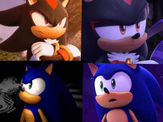
Even compared to the CGI cutscenes while still good I think Prime conveys a subtly previous models didn’t do too often. Of course the CGI looks amazing and it still holds up, but the nuance in Sonic Prime cannot be ignored. Hope my take makes the slightest of sense.
Stay Creative! 💜
#sonic prime#sonic the hedgehog#sth#amy rose#amy rose hedgehog#shadow the hedgehog#shadow the ultimate lifeform#miles tails prower#tails the fox#sonic wachowski#movie sonic#sonic movie#Sonic boom#boom!sonic#sonic idw#sonic frontiers#prime!shadow#knuckles the echidna#cream the rabbit#rouge the bat#chip sonic unleashed#Sonic unleashed#shadow games#sonic 06#sonic games#sonic animation#animation#character animation#character design#sonic art
197 notes
·
View notes
Text
"old" villains

Yana did an illustration of King Magnifico from Wish! It made me realize… all of the characters we currently have are from “old” properties??? As in, they’re all from the 2D animated era of Disney. The most recent movie that the TWST cast pulls from is The Princess and the Frog from 2009 (Sam, twisted from Dr. Facilier).
We’ve yet to have any characters twisted from villains (or even heroes, if we’re counting those too) from the 3D era. This is true even if you count the added Halloween characters, Rollo, Fellow, and Gidel. It is also true of the one instance so far when TWST introduced their actual animated characters (Stitch and Gantu) to the students.
I wonder if the devs are ever going to have characters twisted from the 3D era in some official capacity??? (They’ve definitely made references to various Disney properties in the design and lore, regardless of if they’re 3D or 2D.) It’s been 3, close to 4, years now, and at this point the decision to only explicitly show 2D inspired characters feels deliberate 🤔 though I guess maybe part of the reasoning is that the 3D films (especially the more recent ones) have less significant/comepelling villains or no real villains at all either that or “twist” villains already which aren’t that good… It’s also the older films that have the more “iconic” villains (and thus have the added benefit of nostalgia). Or maybe it’s just jarring to incorporate 3D villains into a game with 2D artwork??
Idk, that’s some food for thought~
#twst#twisted wonderland#disney twisted wonderland#disney twst#The Princess and the Frog#Dr. Facilier#Sam#notes from the writing raven#Stitch#Gantu#Rollo Flamme#Fellow Honest#Gidel#disney wish#king magnifico
570 notes
·
View notes
Note
Wait but how do you draw faces???? ): Do you have more suggestions for that sort of thing?
oh faces! i'm going to assume you're drawing in a semi(?) realistic/ anime-ish style? that's kinda the style i'm familiar with, if you're going for a super 2D graphical style then a lot of my advice won't really apply! i'll put it under the cut
1) I think the most important thing for faces is to always keep in mind the 3D form and planes of the face. Looking at a lot of simplified art (like anime) is a little detrimental for this because it's easy to think the features of the face are just kinda pasted on
Here's a tool from William Nguyen that lets you play around with any angle and light source you desire for heads! It really emphasizes the 3D form and especially the planes of the face. It's helped me out a ton!
Sinix has a video on drawing faces from any angle from imagination (no reference), again focusing on the 3D nature of faces. For individual features of the face (eyes, nose, mouth, etc) he has a playlist of anatomy tutorials!
- I advise against turning to memory and iconography for features of the face (like 👁️ and 👄) Icons like these are useful when the 2D shape is more important for communicating information quickly like in standardized hazard signs. But for more realistic drawing, you want to rely on the 3D form so these simplistic drawings can be jarring in certain styles when in the context of a full human face. This Proko video mentions that you should treat the features of the face like the eye as just another abstract form and not think of it specifically as an "eye" (Proko's channel is also a good general art resource)
2) basic proportions
This is about where specific features of the face are located. I never really studied this on its own, but I think drawing a lot just got me familiar with it. I'm hesitant to link a specific resource here because I didn't really use any myself;; while this isn't as exhaustive as I'd like, I like how Marc Brunet explains it! (Although I'm not a big fan of how he delineates male/female faces and facial features so black and white...? like don't feel obligated to stick to that specific face shape for female characters TTOTT i think it can get pretty redundant compared to the diversity of the male faces he draws)
- Facial proportions change with age! So you should be mindful of it depending on how old the character that you're drawing is
3) expressions
Drawing faces means you're gonna have to draw expressions, even if that expression is a neutral face. I'm admittedly not the best at this, but try pushing the expressions to their extremes to make them more interesting (of course depends on context). 2D disney expressions/concept art accomplish this perfectly and are a good reference to study from (I personally enjoy Shiyoon Kim's concept art!)
- Note how when you cry, the entire face (+body) moves to create that expression. It's not just a tear falling down the cheek, it's the eyebrows furrowing, the muscles around the eyes scrunching in(?), mucus running down the nose, mouth and lips tightening, eyes and nose becoming red, shoulders hunching up, etc.
- as a small aside I want to emphasize the importance of eyebrows because I avoided drawing them/ moving them around more when I started learning to draw, don't do that!! they're crucial for drawing expressions!
4) diversity
Try depicting facial diversity to make a character unique and more interesting!
- semirealism helped me turn away from the hyperstylization of certain anime styles where a lot of these unique features are smoothed away. Things like wrinkles around the brows/eyes/mouth, eye/nose/mouth shape and size, facial bone structure, facial hair, etc really help to individualize a character/ capture their likeness
- also people of different races have different facial features that you should be mindful of. I don't feel knowledgeable enough to give specific advice on this, but if you're unfamiliar with something please use references!!
This can be challenging especially in stylized drawing, since you tend to have to pick and choose what you choose to depict. For example, I find that trying to draw out all the wrinkles of a character, while it may be accurate, it just doesn't fit my style. I therefore have to balance the amount of details to include to achieve a character's likeness. However, stylization also allows you to emphasize those unique features which makes a character more memorable to me!
as another example this is a personal trick i use but i've found drawing the bottom lip helps make a more masculine face, and drawing the top lip as well for a more feminine face...??? idk why this works for me (and it may not work for you!) but yeah try playing around with what details you include/exclude and see what you end up liking!
okie I think that's all I have for faces..? hopefully i'm not missing anything... again I prefer to let actual teachers give specific advice on how to draw, I feel more comfortable talking about general ideas and referring you to better sources that you can learn from first-hand!
also I think in my efforts to explain the key aspects of drawing faces I've kind of made it seem like I follow strict delineated steps... no I truly just wing it every time I draw TTOTT I just think these points are important to keep in mind so that when you amass more knowledge about them you can internalize it to become a habit!
enough yapping from me thank you for your ask! i hope this can be of help to you 🫡💞
#my asks#art resources#edit just realized this may have been more about how i draw faces like step by step and not so generalized TTOTT#i'm sorry if i didn't really answer your question correctly TTOTT;;;
79 notes
·
View notes
Text
Shop Fusion Collab - Splatoon 3
Hooooh boy, I have a lot to say about this one.
Let me preface this part by saying that this section would straight up not exist without the talented work of my teammate Nico. Not only did he model/rig Cordelia and the background, but it's thanks to him that I was able to learn the Blender animation pipeline. He was extremely patient with me and answered every question I had, and for that I'm extremely grateful.
For this section, I animated the shopkeeper Cordelia, from the game Dead Estate! While developing this part, I pitched the idea for a Splatoon 3 section and agreed to do the art for it regardless of what game it was paired with! That game ended up being Dead Estate, a game I had never heard of up to that point.
So, what followed was a period of deep research into the game as well as Cordelia, so I could get the best understanding of how to portray her in the Splatoon universe. First thing was first, I had to redesign her. Even for SiIvaGunner projects, humans existing within the Splatoon universe is a bit jarring, so I decided that for Cordelia's model sheet, I would try to jazz her design up to make her a better fit for this artstyle!
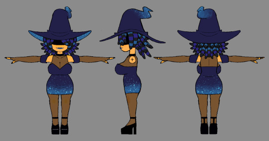
I explored some potential species design before deciding to make her an urchin, as I felt like it'd be the coolest way to adapt her hairstyle. I made some minor changes to her outfit and passed it along to Nico for modeling!
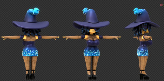
(image from Nico's Twitter post on his contributions, def check it out)
Needless to say I was blown away with how well he adapted the design. It came out better than I could have imagined. What soon followed was me forcing myself to learn the Blender animation pipeline from scratch!
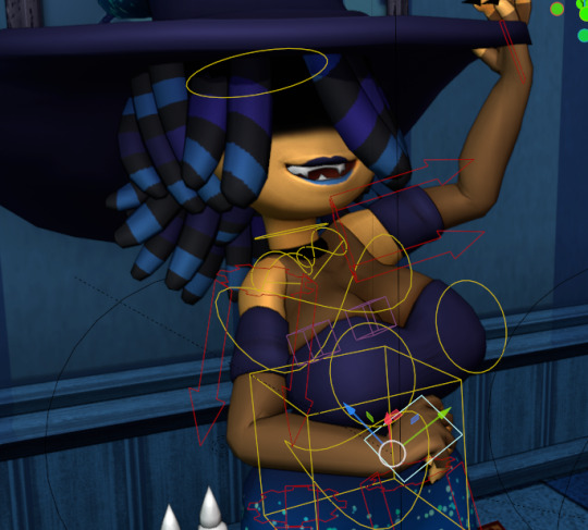
It was a very interesting but invaluable process. I am a 2D animator by trade, with very little interest in expanding to 3D, but the more I was exposed to Blender, the more natural the process came to me. I was very surprised. I think the animation took me about a month in total to create, as I was balancing it with schoolwork at the time, but I'm very happy with how it came out considering my 3D experience level.
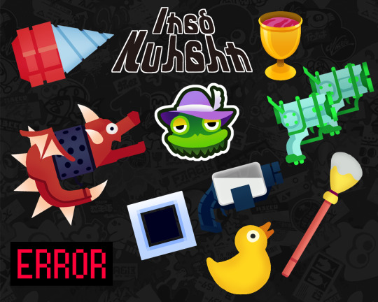
Beyond the 3D animation side of things, there was also the 2D assets needed for the UI, which I recreated from scratch through editing software with the help of some gracious Splatoon modders who were willing to help me rip UI and SFX from the game. All of the unique 2D weapon icons were drawn by me, each being direct callbacks to actual weapons from Dead Estate! Eagle-eyed viewers also may have caught that I snuck in a teaser for Prince Fleaswallow's upcoming section in the top right of the UI, which required me to make a Splatoon-styled head icon for him!
Overall, this one was a blast to work on. Everyone was surprised to see it being one of the earliest sections finished for the collab. We made sure to get it locked down because we knew we were in for a labor-intensive time if we wanted it to look just right.
286 notes
·
View notes
Note
I dont have anything against 3D animation, and it CAN look really good in maps, but half the time it's just one random part in 3D while everything else is 2D and it's so jarring
44 notes
·
View notes
Note
I am having a hard time understanding and drawing mouths. If it's not too much of a bother could you impart some wisdom on how to draw them?
Thank <333
@bonetiger Also asked about how to draw a face, so I'm just gonna answer to both.
Here's a little video showing how i dissect the face into easier shapes to understand perspective, both eye line (horizontal) and the line in the middle (vertical) help you understand how the head is placed/where it will face.
If you struggle i highly recommend to draw guidelines above your reference.


For mouths, i personally analyze 2d Animation for something very expressive, if you look up any concept art it'll help alot! You can also look at yourself in a mirror for the expression you desire.

Remember that the teeth do not move, you're moving the lips above the skull, they're also tied to perspective. If the head tilts, you'll see the arch of the teeth, 3d models of skulls are useful.
Here's some videos if you want even more info:
youtube
youtube
youtube
I hope my explanation was useful! :)
Tip jar
383 notes
·
View notes
Note
What's your opinion on the Sonic Prime series don't skip any details I love hearing people's opinions
Aight, buckle up. You asked for this haha!
So, Sonic Prime.
I really think this series was really well done. I like it overall!
Its strengths are plenty, ranging from animation, characters, and colors. Specially colors. Im an illustrator, like, colors are important to me yk?
I'll start with the animation, i think they really went full cartoony on it. And I like it very much! Though at first i found it pretty jarring that Sonic was bonking his head on every place. But like, now i get it.
They wen't for a more comedic and cartoony approach, and that's fine. I personally wanted something more... I don't like using "serious" to describe Sonic X but like. Yeah. Sonic X took itself kinda serious when it needed to. Either way it was clear that wasn't how the series was formatted, and thats FINE.
I like that the characters are bouncy and adding references to other games in some action sequences is pretty neat. It shows that the team was putting some love into the show.
Characters? MMM.
Like kind of a hot take, but i think everyone was handled GREAT except... Sonic. Which upsets me so much?
Everyone was pretty on character, including the shatterfolk. But like SONIC?? He was so far from the sonic in the games LOL
I think Game!Sonic, DIDN'T need to learn the lesson of listening to his friends. But then again, i know this show was meant for a younger audience and Prime!Sonic was kinda meant to be like the self insert of some kids. So.
But except from Sonic, i think everyone is VERY in character! Finally! Some Justice for Rouge and Shadow!
OH AND LET'S NOT FORGET NINE.
Edgy tails is not something i thought would exist, but im not complaining. Though that's a discussion for another day.
The voice actors did a great job too. Let's never forget the voice talent.
And finally, Colors and composition.
This aint something that much people are talking about, but like. The designs on characters and backgrounds is very cool, and the color palettes are an important play on that. Every location has a distinct color that makes it unique. And Green Hills looks AMAZING.
I love when people reimagine Green Hills in a 3D environment.
I just know that this show had some care put into it. Ever since like 2020? *checks notes* Yep 2020, that this series was announced i was very hype. Yeah, it has flaws, but come on. What videogame adaptation is perfect?
Tldr.
I like this series a lot, i just wish Sonic was written a bit better.
#Thanks for the ask!#sonic the hedgehog#sonic#sth#sonic prime#sonic prime season 3#no spoilers#i think#ask#AkariDraws#akarianswers
40 notes
·
View notes
Text
The Castlevania: Nocturne discourse is stupid
It’s not that Castlevania Nocturne is a perfect show. Not by any means. It has a lot to criticize.
But it also has a lot to praise and grapples with historical AND still relevant issues unapologetically in a way you rarely see in media.
And yet discourse has been so, so stupid.
Why are there gays?
People angry about gay characters, as if vampires aren’t inherently gay as hell. Look at them! Do vampires scream “tough, gender conforming dude bros”? Or Christian good boys?
No! They’ve always been gender bending, rich and bitchy little deviants who will fuck and eat anything.
Annette bad!
People upset a black lady character exists and is allowed to be angry after having escaped literal chattel slavery.
Even though she isn’t some pandering palette swap, she is organically relevant to a story set in the French Revolution dealing with themes of oppression and class.
Richter is a weak soy boy bitch! The downfall of masculinity! Other fragile bullshit!
People upset our protagonist man has realistic PTSD from watching his mother be violently killed right in front of him as a small child.
He represses himself, goes with the flow, and doesn’t lead for himself. Still he is brave and skilled until he is triggered and set on a path to rediscover his agency and true potential. A story of overcoming not with physical strength alone, but with spiritual and mental strength as well.
What do they call such a fleshed our character?
“A little bitch who needs women to boss him around”.
I just…?
Is media literacy THAT friggin dead?
Is it really?
Or is everyone only half-watching the show while on their phones?
I can’t even begin to explain how demoralizing it is to see so many people so upset about mere aesthetics while completely missing the point.
In conclusion…
Nocturne’s pacing is whack and the 3D animation can be choppy at times, which is all the more jarring when the animation gets smooth and gorgeous. Almost as if they’re skimping out on some of those other scenes to save budget for the big set pieces.
Still worth the watch.
There’s an Aztec vampire that can turn into a giant feathered snake and is generally against all factions and just wants to live his best life and I never thought my werewolf-named self would relate to a vampire of all things, but I love him.
Sorry, Richter.
87 notes
·
View notes
Text
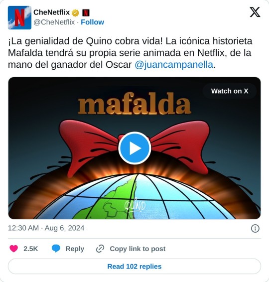
so this is happening.
for those who are not argentinian and lack context, mafalda is a comic strip from the sixties similar to peanuts, if peanuts was, let say, a hundred and sixty seven times more overtly political. its an absolute classic here and a staple of everyone's childhoods.
and its getting an animated adaptation in netflix. i will proceed now to explain all the reasons why this is a terrible idea: (most of these reasons will be either a) it will never do justice to the experience i had as a kid reading the comic and b) i dont trust the argentinian animation industry to do a good job with it)
first of all, and the author agrees with me on this one, mafalda cannot be voiced. she has the voice of whoever reads her in their mind. if she were to be given the voice of a specific 6 year old girl that would no longer be mafalda
second, mafalda is too of her time, she is a girl from the 60's, growing up in the specific political context of the 60's. but noone will have the balls to actually set her show in the 60's because current generations of children "would not find it reletable" or some other such bullshit. we will see mafalda with a smartphone and im going to kill myself when that happens
third, i have to keep on stressing about the politics of mafalda, she was contantly talking about communism vs capitalism, about cuba and fidel castro, about the pope, about the vietnam war, about the economy, about poverty, about goberment corruption, about nuclear war. again i dont see any studio with the spine or the guts or the most basic piece of human rectitude to actually touch on those topics the way they deserve
fourth, it will not be animated properly. mafalda was strictly a black and white comic, it was never colored, so the jump to color is going to be jarring. on top of that quino's line art was very characteristic and an integral part of the comic style, that wont translate either. but most important of all, from what we can see of that teaser, it looks like they are going to do it in cel shaded 3D. which is just. no. absolutely not. it kills the entire spirit of the original comic. is going to look like shit. in the last couple of years animation studios have pushed cel shaded 3d anmation to its limits, giving us masterpieces like spiderverse or the puss in boots and even the latest fairy odd parents show. argentinian animation is not there yet. is not even close. we are not getting that. we are getting the cheap ass, ugly ass, basic bitch 3d cel shaded of a shovelware anime pushed out by some third rate anime studio.
i just dont see any way this can be good. its going to suck and the world will be a worse place for it.
18 notes
·
View notes
Text
My thoughts on the new LMK season
With no (or at least very minor) spoilers
TLDR: Its easy to focus on the drop in quality of the visuals since we can't focus too much on the other aspects of the series due to the language barrier, the english fandom will likely start having a more positive reaction to the season when the eng version drops and we can focus on character interaction and story.
RIP The YT channel hosting the episodes I will edit this post if it comes back up or someone reuploads them.
I'm probably gonna talk about the animation the most as I'll have to wait for the eng version to come out before I can talk too much about the story.
Also all of this is my opinion if you don't agree that's fine, make your own post with your thoughts.
Like most people, I don't really like the new animation, which sucks because WB is capable of good animation (some really good animation) but because LMK wasn't designed for puppet animation and WB was likely pushed to get this season out, the quality suffered. Some of the animation looks pretty good but a lot of it is stunted and some characters look out of place. It also doesn't help that a lot of older animation was reused (for flashbacks and such) which makes it a lot harder to adapt to the new animation style.
I'm not one to notice mistakes in animation so I wasn't taken out of the experience every time a character is off model but if you are you might have a hard time watching it.
The 3D models are also especially rough this season, there's one that keeps appearing (likely due to a tie in set) but it looks bad and it's really jarring
But I think "give workers more time to create higher quality products" is like, the coldest take in the world and I think most people wish FB had stayed or a studio that works with hand drawn animation was picked as a replacement. I think WB can do some great stuff and if they animate the next season I'm sure it will look better and I hope that lego will give the studio more time to work to achieve that polished look.
Pacing is a potential problem I'm noticing as well. I feel like some characters show up for like a minute and then disappear which is fine for some cameos of fan favorites but its frustrating when new characters that showed up in the trailer barely had any screen time (it really sucks because some of them are really cool looking! and I wanted to see more of them)
I can't talk too much about characterization but there are some things that definitely feel out of character, most notably something that happens towards the end of episode 1, I've seen some people refer to this as fandomization of the character but I'd need to wait for the eng version to come out before I can say yes to that. I think it's much more likely they just needed that character to do something and figured it could be a way to show how that character has changed although I do think it needed more buildup maybe that will change when I actually understand what's happening though lol.
Other than that I think the characterization is mostly intact (again will need to see the eng version) but its the same writers so I don't see why characters would act strange. There does appear to be some super interesting stuff that happens towards the end can't wait to figure out what thats about.
Plot is hard to follow (again language barrier) but seems fun if a little generic, I can't talk too much about it because I don't really know whats going on and this is spoiler free
New characters seem fun! Wish I knew what they were saying though! I wish some of them stuck around a little bit longer as some of them are only shown for a few minutes which again sucks! because some of them have really cool designs and I would have liked to see more of them.
#lego monkie kid#lmk s5#I'm enjoying it so far but man#Don't point out any typos I'm tired and all my brain power is going towards school
13 notes
·
View notes
Text
Sofia The First Review/Thoughts (I watched the prequel movie and 8 episodes of season 1)
Started watching Sofia the First yesterday (I don't really know what compelled me) but it's pretty good actually??? Like... I thought I would regret starting it bc I'm not 5 and I'm certainly was never a girlie girl (hence why I probably never started it when I was 5) so I thought I'd be not interested but it's nice actually??
Other than the admittedly weird/jarring animation (not saying it's bad it just confuses me because sometimes the way the characters are drawn make it seem like 3D animation trying to be 2D but it also doesn't?) the show is good!
It's also a musical which surprised me a lot tbh, and the songs are actually certified bangers who is singing these. I've watched like 8 episodes and genuinely found 99% of the songs to be catchy af?
Sofia's singing voice is a bit annoying (to me, in my personal opinion) if you hear it often (eg. binging episodes like I have) but it's alright and boy are the songs good for a show like this
Also, inevitably, let's talk about Cedric. Unsurprisingly, I assume he's probably been popular in whatever fandom this show has (confirmed by a mere glance at the StF Tumblr tag). He's built like a twink, seems to have canonical daddy issues... set up to be the fan favorite fr fr. Also he's clumsy as hell which is so relatable
He just... has his parents on the wall of his lair sorcerer's room thingy. Like his parents are so fucking weird like his dad is literally the best sorcerer ever and his mom is just... supportive? of ANYTHING he does? he could be plotting to take over a castle and bro is like "you go boy!"???
There's an entire scene where the dad is the angel on his shoulders and his mother is the devil. I got a good laugh out of that for sure LMFAO
On another topic, Sofia has an interesting family. So basically her mom and her married into royalty because the mom gave the king some cool shoes or something? epic I guess? And then the king has two children and now they're her step siblings which is cool I guess. Amber's kind of a bitch though tbh but James is kinda cool? How do you raise 2 completely different children in the same home. What was their bio mom like.
On the other hand, what happened to Sofia's bio dad? mmm burning questions that will probably never be touched by canon by beloved <3
9 notes
·
View notes
Text
I love how the dragons in the new season look! It can be hard to mix 2D and 3D animation in a way that doesn’t look super jarring but they managed it! And they move so fluidly and I love the way their mouths look when they talk and these are just some WELL ANIMATED DRAGONS okay
#critical role#the legend of vox machina#tlovm#Brymscythe already looked good but the other dragons look even better!#you can tell the budged was upped a bit here lmao
163 notes
·
View notes