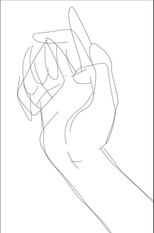
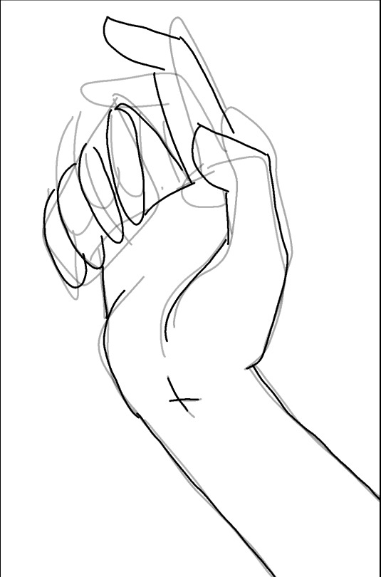
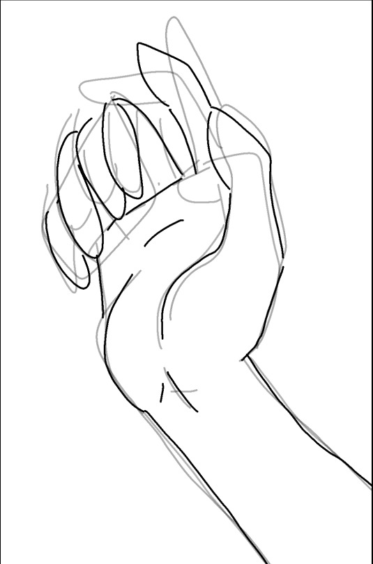
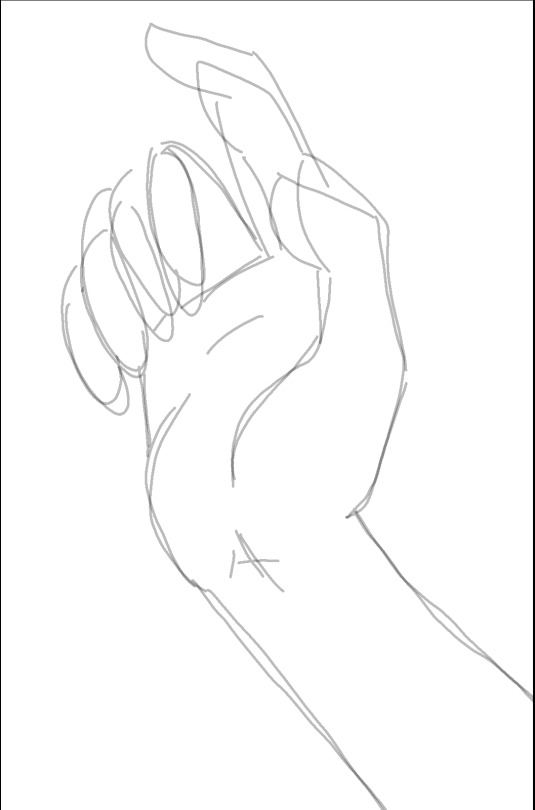
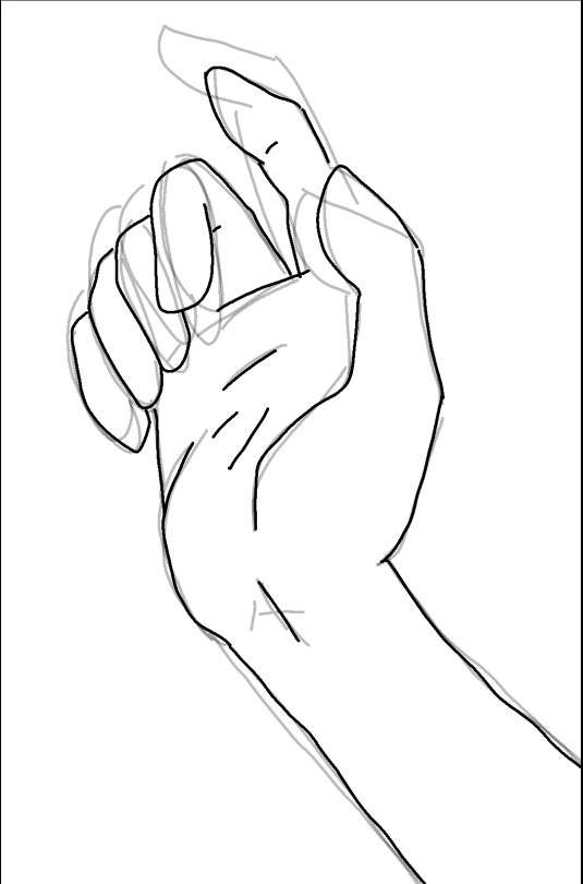
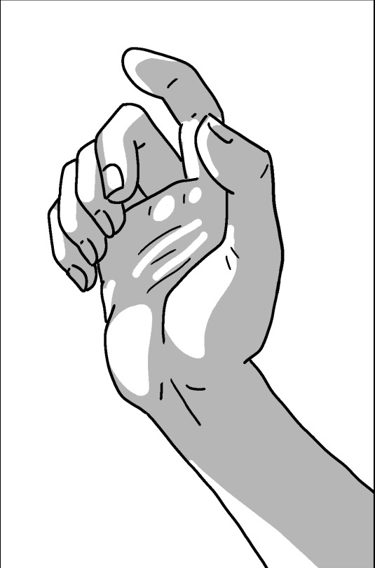
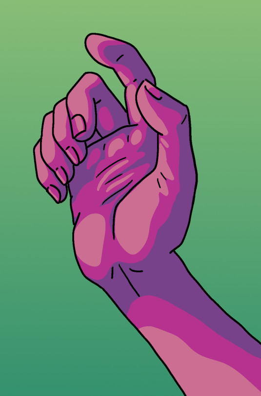
#another colouring method for the tutorial
Explore tagged Tumblr posts
Visit Tumblr Blog
Explore Tumblr blogs with no restrictions, modern design and the best experience.
Last Seen Tumblr Blogs


Fun Fact
BuzzFeed published a report claiming that Tumblr was utilized as a distribution channel for Russian agents to influence American voting habits during the 2016 presidential election in Feb 2018.
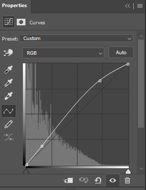
Text
🌿 How to draw simple grass for a game

Thank you kind asker I will make a tutorial below for grass. I'll do shrubs and trees in another one, because it's a different method and it got pretty long.


🌿 How to draw grass tiles: step-by-step
Each box is 16x16, the same size Stardew Valley uses. Make it tile (how to do it depends on your software) so we can see if our edges match up nicely.

Draw 1 simple blade of grass. Many options for shape but I like this one. Feel free to copy me directly
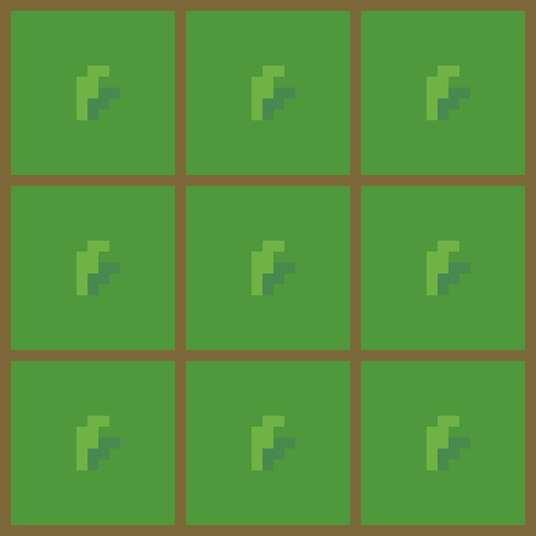
2. Give it a shadow. Wow !!!
3. Give it a highlight! OMG!
4. Add another grass
5. Do it over and over and over and over and over
Literally just do the same or similar blades of grass, give them all little shadows, highlight a few if you want and there you have it! So easy.
It looks really complicated like this, but its literally just a few steps, repeated over and over.
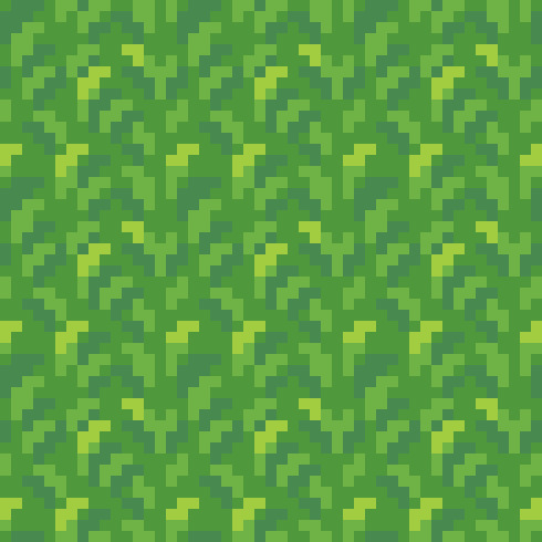
Many games use this technique and it would be perfectly serviceable for a base grass tile.
Personally, I prefer lower contrast grass. This tile will likely be used for large areas, so ideally you don't want it to be too busy or eye-burning to distract from the character.
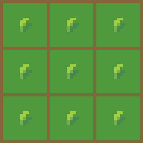
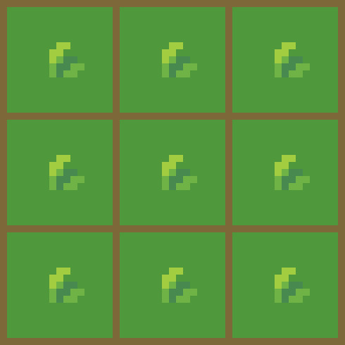
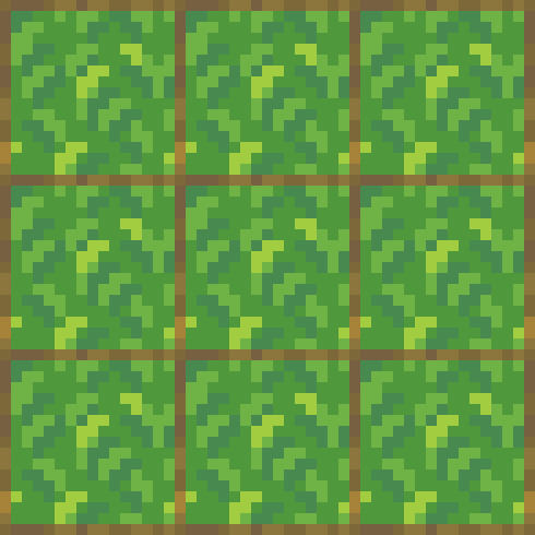
🌿 I'll show you how to do a different type of grass now that is a little more complicated.
Midtone grass colour

2. Add some lighter and darker patches touching each other (not too high contrast!)
3. Use this shape (or your preferred, but this is how I did it) on the top edge of your patches. Colour them with the middle colour from each patch.

4. Do it again a lot (this is very tedious)
5. Add some highlights

6. Add some fun extra stuff

We're done! Have fun everyone, show me if you try it!
Pixel Art guide by me: link
#tutorial#pixel art tutorial#so you want to learn pixel art#pixel art#pixel artist#artists on tumblr#pixel landscape#pixel background#pixel environment#pixel illustration#environment art#landscape art#background art#pixel scenery#pixel graphics#pixel#pixelated#pixelartist#grass tutorial#pixel art grass
2K notes
·
View notes
Text
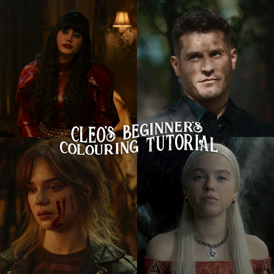
here is the colouring tutorial i promised to go with my beginner's gifmaking tutorial.
to save image space, i've written up a simple explanation of how each adjustment layer works here, so i'm just going to over my colouring for these 4 different gifs.
as always, very image heavy underneath
there are many ways to get the same results and i'll use various methods usually just based on what i'm feeling at the moment. some of it is a little convoluted, but hopefully this will give you a rounded idea of how it all works so you feel more comfortable playing around with your own colouring
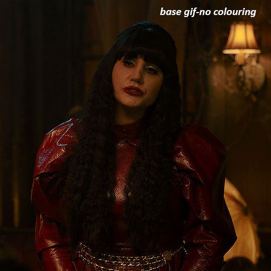
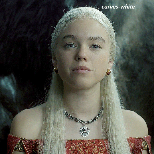
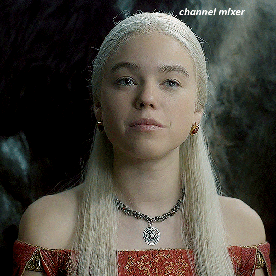
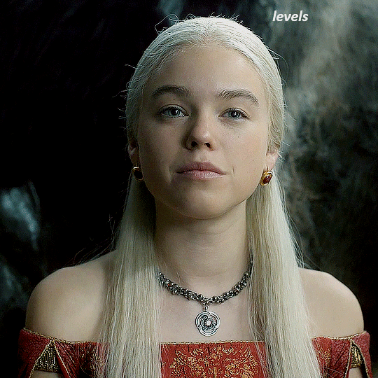
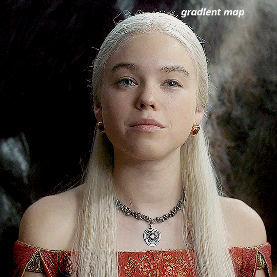
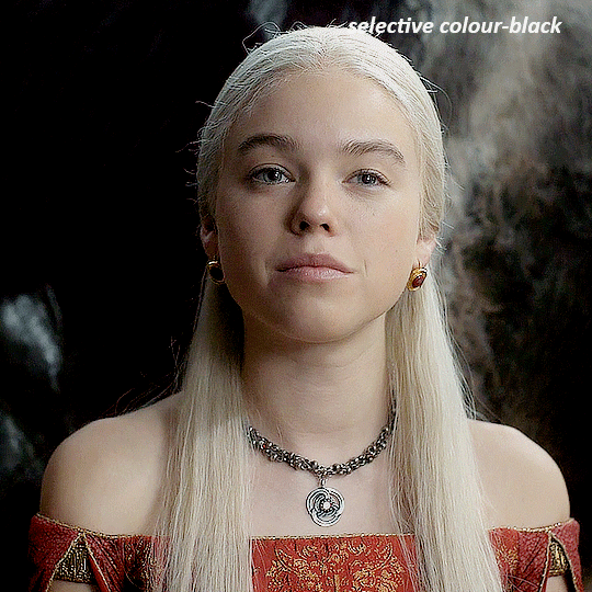
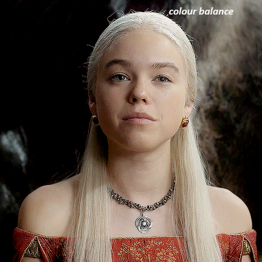
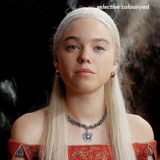
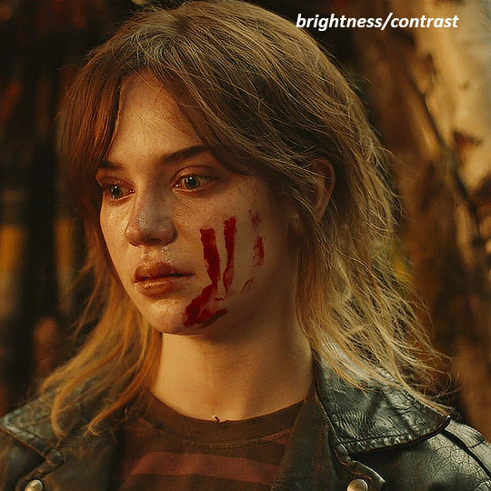
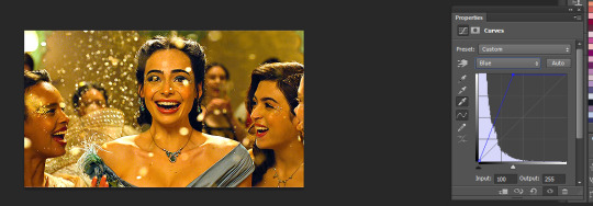
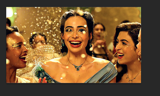
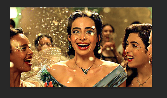
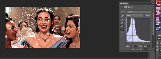
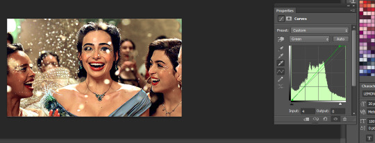
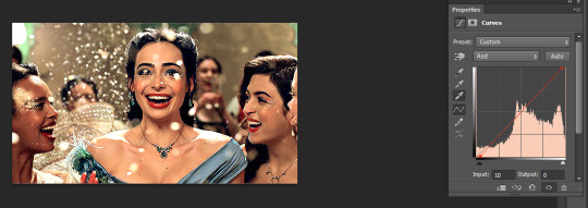
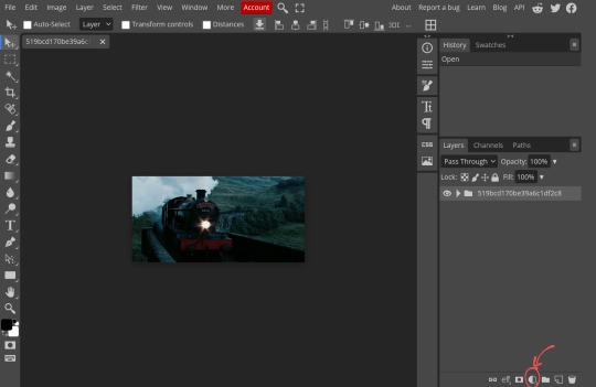
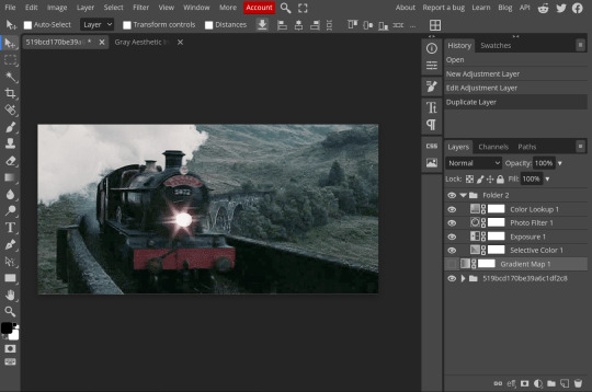
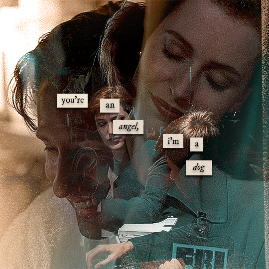
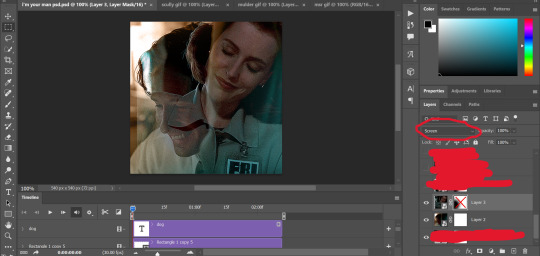
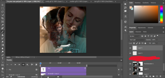
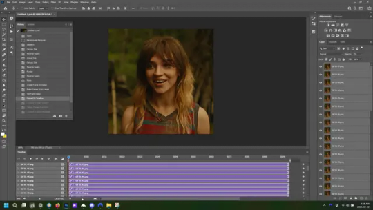
NADJA
this is the base gif with zero colouring adjustments, just resized and sharpened.
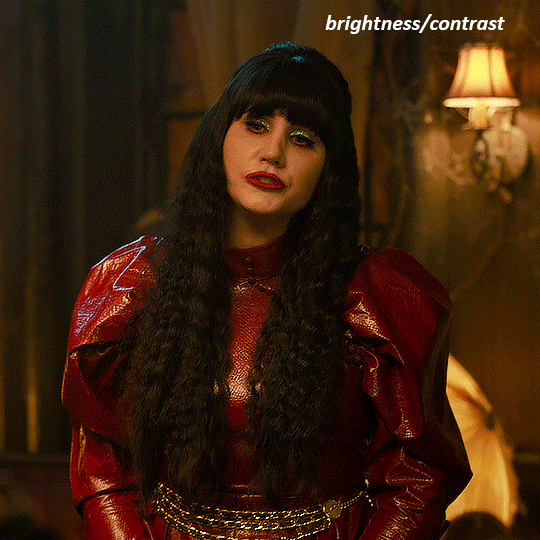
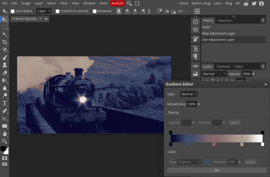
unless the base gif is already very bright, which doesn't often happen because directors nowadays are allergic to light, the first layer i add is always a brightness/contrast layer. i don't adjust any of the sliders, i just change the blending mode to "screen", and then adjust the opacity if needed. this gif was pretty dark, so i left it at 100%,
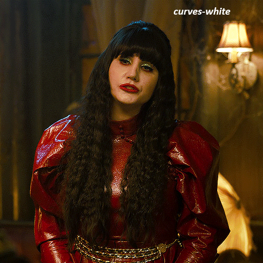
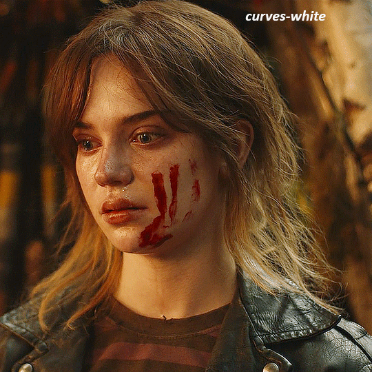
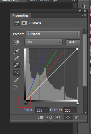
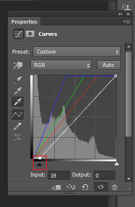
my next layers are always curves to even out the white and blacks. i use two curves layers, one for white and one for black. i used the white drop-picker and selected just below the lightshade on the lamp behind her, and for the black drop-picker i selected her hair near her neck which gives us this
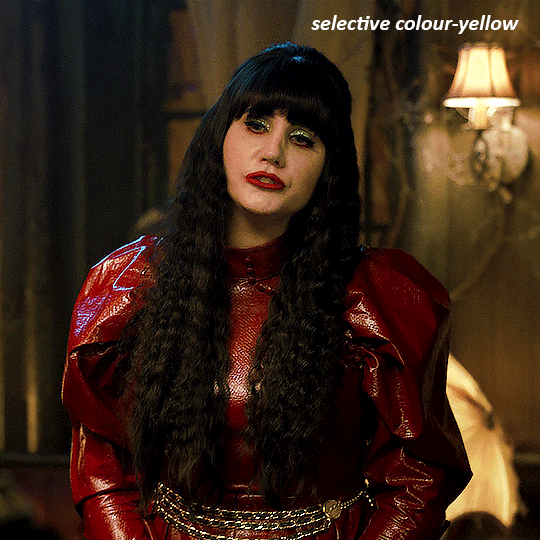
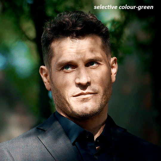
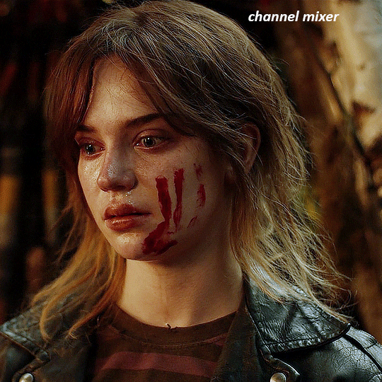
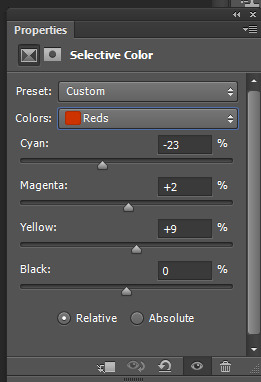
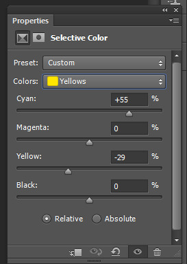
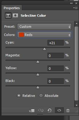
it's already looking much better, it's not as green tinted, but i want to make the red of her dress pop a bit more. in order to do that without making her face too red, i'm gonna remove some of the yellow. so next i'm gonna add a selective colour layer, and under the yellow channel i moved the yellow slider to -5 and the black slider to -52. now
now that the yellow is reduced, i add another selective layer, and under the red i move the cyan slider to -66 and the black slider to +29. now the red of her dress pops and her face is still a realistic tone. when i first made the gif, i added the red selective layer first, then added another selective layer under it and adjusted the yellows to offset it. you can always shift layers around or add a new layer underneath as you go.
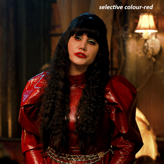
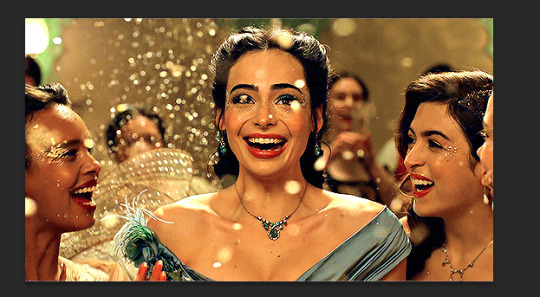
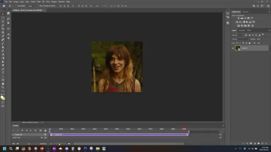
voila
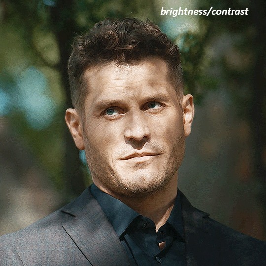
TOMMY
here is our base gif

this scene is better lit than the nadja one, but i prefer bright and colourful gifs, so i'm gonna once again add a brightness/contrast level and keep it at 100%
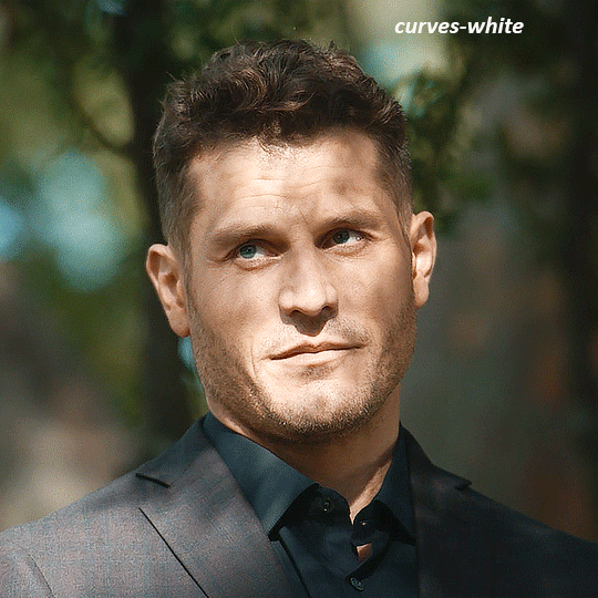
and then the curves layers to even it all out. since there isn't a spot that is immediately noticeable as white, you can hold the alt button with the white dropper selected and it will highlight all the white/very near white pixels. you can also zoom real close in to select specific pixels. i selected a from the white area around his chin/mouth. the same process works for finding a black spot with the black dropper, and for that i selected from a dark spot in his hair
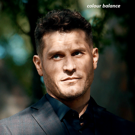
the curves layers evened it out but also made the gif a bit more red and warm toned, and since i've decided i want the end result to be more blue/green, so i'm gonna add a colour balance layer. in the shadows channel i moved the cyan/red slider to -16, and the yellow/blue slider to +11
now the gif already looks great, it's bright, skin tone is accurate, he's not washed out, but like i said i like my gifs colourful, so i'm gonna add two more selective colour layers. in the first i'm gonna adjust the greens, bringing the magenta slider to -87, and the black slider to +81. in the second layer i'm gonna adjust both the blues and cyans, because when you see blue in a gif it's rarely ever straight blue or straight cyan, so always adjust both. (you could adjust the blue and green in the same layer, but i prefer to do them separately in case i need to move the layers around)
now finally i'm gonna add a hue/saturation layer because i think the blue of his suit is too blue when the sky behind him is more cyan. (also, since you only have 256 different colours to work with, you don't want too many different colours otherwise it will distort the colouring.) in the blue channel i move the hue slider to -12 to make the blue a bit more cyan, and i also move the saturation to +38 to make it pop more
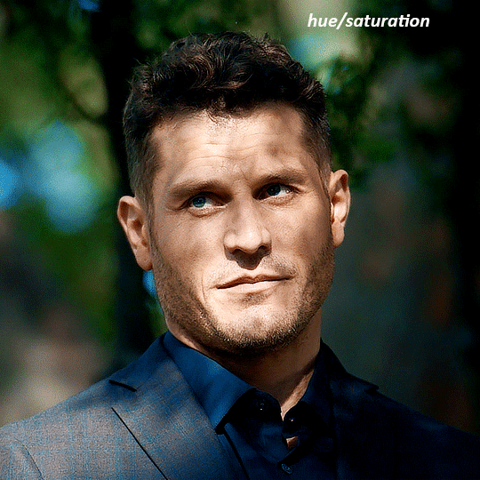
and voila
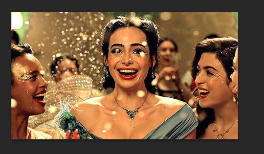
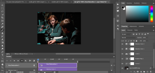
RHAENYRA
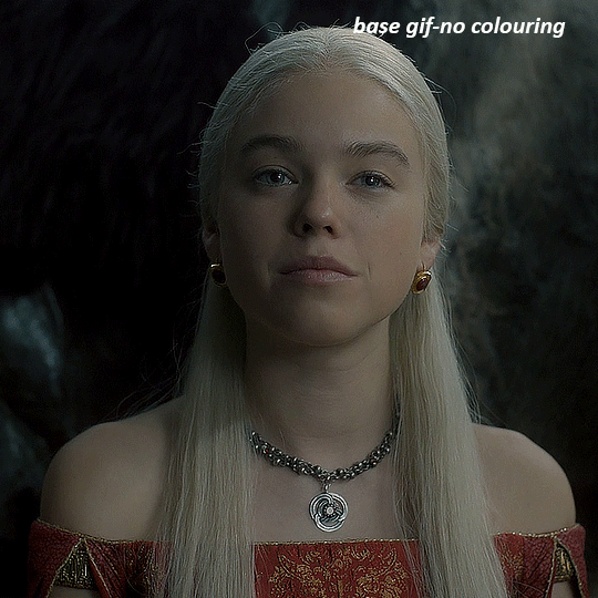
here is the base gif (this one is going to get very convoluted and imo best exemplifies what colouring gifs is like most of the time)
as always, a brightening layer set to screen
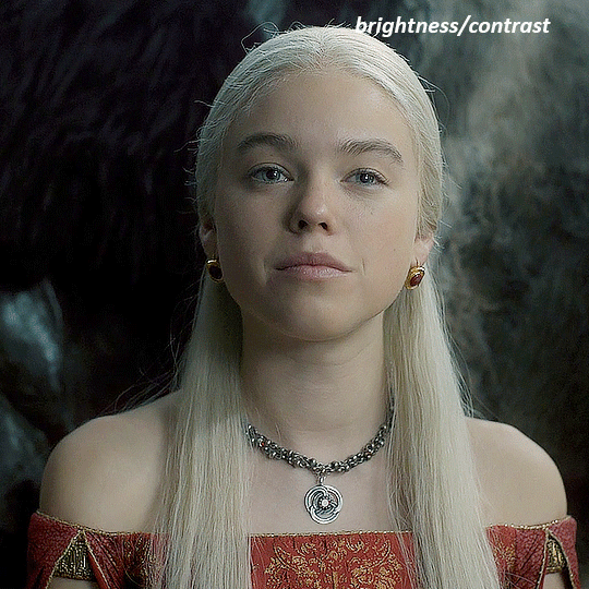
now the curves layers. for the white i clicked on her hair at the top of her head, and for the black i i clicked in the shadows to the left of her.
but as you can see, while it added contrast, it also made the gif more green tinted than it was. you could click around more, or manually adjust the red, green, and blue lines on the curves until it looks better but i decided to add a channel mixer layer instead. in the green channel i set the greens to -95, and in the blue channel i set the blue to -97
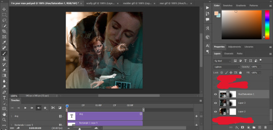
next i wanted to add a little contrast, but i find that using the contrast in brightness/contrast can saturate it too much, so instead i added a levels layer. first i adjusted the bottom bar, moving the right slider to 230 which reduces the overall brightness of the gif, so when i adjust the top bar it doesn't brighten the gif too much. on the top bar, i moved the right slider to 212, and the left slider to 9
now, i'd like it to be not exactly warm toned, but less cool, and while i could use colour balance or a photo filter, i'm instead going to add a gradient map, using the default gradient pink 08, and setting it to blend mode soft light at 50% opacity

next i just want to increase the blacks a little, so i'm gonna add a selective colour layer and under black i'm gonna set the black slider to +10
it's still not as warm as i'd like, so i'm gonna add a colour balance layer, in the midtones setting the cyan/red to +10 and the yellow/blue to -5
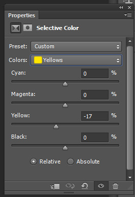
we're almost done, but i want to make her dress pop a bit more, so first i'm gonna add another selective colour to bring the yellows down a bit, setting the black slider to -15

and finally one more selective colour layer, in the reds, setting the cyan slider to -50, the yellow slider to +10, and the black slider to +15
voila
NATALIE
here's the base gif
as always the brightness/contrast layer set the screen
now the curves layer. for the white, i zoomed in and selected a pixel on her cheek under her right eye. for the black i the dark spot just above her head
now she's very yellow, so i added a channel mixer layer. in the red channel i set the reds to +88. in the blue channel i set the reds to +10
she's still a little too yellow for my liking, so i'm gonna add a hue/saturation layer, and under the yellows i'm gonna adjust the saturation to -60
finally, i want her to be a it brighter, so i'm gonna add another curves layer, but instead of using the drop, i'm going to manually adjust it. the two points along the line are where i selected it and then i dragged until it looked how i wanted. i start with the upper dot, which made it brighter and moved the line into an arch, and then selected at the lower end of the line and dragged in back closer to centre to add some darkness and contrast
voila
and that's how i do my colouring. it's generally all trial and error, using a layer to fix one thing and then needing another layer to fix something the previous layer did.
play around, have fun, see what works for you and what doesn't. it will take a while for you to develop your own method and style, and even then you'll come across scenes that make you question if you have any sills at all. you do, directors just hate us
have fun and feel free to ask any questions
#tutorial#gif tutorial#colouring tutorial#photoshop tutorial#gifmakerresource#completeresources#*tutorials
278 notes
·
View notes
Text
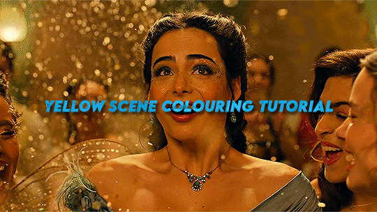
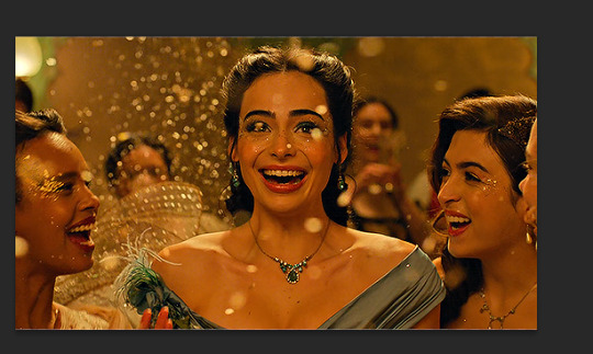
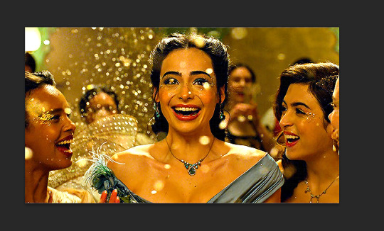
Hi everyone! I got an ask from @adamusydneys about how I coloured the scene from my header.
The scene in question started with an ugly yellow filter which can be super annoying to colour correct. Luckily I still had the psd open with all my colouring layers so should be easy to go layer by layer with what I did
Tutorial below the cut as this is screenshot heavy
Full disclaimer - there is no real set method for what I do to colour my gifs, as it changes depending on the gif and my mood. In the case of this gif I used lots of selective colour layers, but I have also used channel mixer in the past to correct similar issues or have done most of the correction in curves (like in my basic gif tut). I will also add in the case of my header gif, I applied the previous colouring from my theolizzy gifset, so I'll try and recreate how I got the curves but it may not be exact.
Step 1: Start with your base gif sharpened and ready to colour
I always start any gif with a Curves layer.
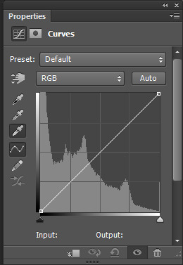
I select the white eyedropper tool and select a white point on the gif to get a base to begin my colouring.
For this gif I selected the bit of confetti in the red box
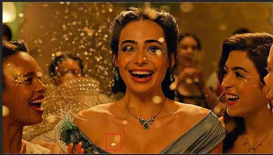
This is what the result of the curves was there
As it can be seen this added some brightness but the scene is still very yellow
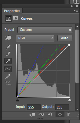
To start with I go into my curves layer and start by manually adjusting the RGB channels.
Normally to get rid of yellow, I would add more blue. But this will not work for this scene. This is what happens when adding more blue:
So instead of just adding more blue I go into each channel and adjust to get a better foundation for what I can colour later.
I started with the green
Then added more red in
then added a bit more blue
After that I went into the main channel and dragged the little black slider down to add some depth/contrast
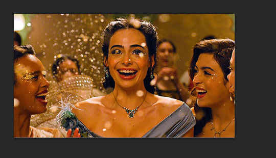
This is what my final curves layer looked like
My next step is to add a Vibrance layer (which I do for all my gifs)
After that I started working in the selective colour layers. As the tint is quite strong I used a lot of layers and built upon them.
For the first selective colour I adjusted the reds and yellows
These adjustments resulted in this, which is already looking more natural but needs some more adjustment still
I went back in the reds and yellows again and adjusted further
leading to this which is a pretty good result:
The gif now is mostly colour corrected but I still want to do some minor adjustments (cos I'm a perfectionist) so I make another selective colour layer.
This time I just add some more cyan to the reds, which is a small change but neutralises a bit of the shadows which were too bright for me
Next I take out some more yellow as the tint is still there a bit
The above is pretty good, but I decided I wanted to do another curves layer on top to do a final bit of colour correction.
I manually went into each colour channel and adjusted as so:
I started by adding more blue as now I can use this to get rid of the remaining tint without it looking weird
the gif was now slightly magenta/pink so I added a bit of green to balance it out and slid the bottom slider a bit to add some depth back into the shadows
Then I added some red. I also dragged the black bar at the bottom to add a bit more depth/cyan to the shadows.
This is the final result of the basic colouring for the scene I did.
Since you also asked about the header in particular I'll expand on how I did the pink colouring for the header. tumblr is telling me this post has too many images so i'll include this info in a reblog as part 2 :)
#*mine#request#gif tutorial#resources#ps help#photoshop tutorial#usergif#allresources#yeahps#completeresources#resourcemarket#dailyresources#userelsbeth#usersavana#useraurore#userrobin#usersole#uservalentina#tuserheidi#usernivi
186 notes
·
View notes
Note
Your gif blending skills are *chefs kiss* so, so good! Any tips/tricks you could maybe give for a seamless blending? Thank you! 💕
Thank you for the kind message!! I'd be happy to share how I blend my gifs! I did a basic blending tutorial here that just covers how to put two gifs on top of each other on the same canvas, but I can explain more about how I clean up my blends and make them seamless.
The key components are black brushes, the eraser tool, and layer opacity

So the below gif is what I get when I simply put my two gifs on top of each other and position them the way I want, but I want it to look a bit cleaner.

This is how I have my gifs set up, with the gifs and the colourings within separate folders (b for Buck on the left, and t for Tommy on the right).

And this is what it looks like when I open up one of those folders.

Now when I blend, I add a new layer within each folder on top of all the colouring layers, (the layer blend mode is set to normal), and I do the same thing in the Buck folder

Painting with black brushes
So now I use a big, soft, black brush to paint on this new layer I created. Wherever I paint is the area I hide. Since I'm starting in the Tommy folder, I'm going to paint over the areas from the Tommy gif that cover Buck, so that these areas get hidden.

I want to hide that bright spot on top of Buck's face (which is coming from the tommy gif) so I take a brush that roughly matches the size of the area (the circle that I drew). So in this case I'm using a 300px brush at 0% hardness set to black. And all I do is move my brush to the area I want to cover, and *CLICK ONCE*. I don't drag the brush, I simply move it into position, click once, and let go.
Here you can see the before and after


As you can see, Buck's face is a lot clearer now. And this is what my layers panel looks like.

Let's say I want to hide a little more, and clear up Buck's face even further. I simply create another new layer within the folder (above layer 4 in my screenshot) and again, click once over the desired area with my brush.

This is what it looks like now, but let's say I want to add some of that texture back. I simply go to the layer, and reduce the opacity. I usually play around with anywhere from 20% to 80% opacity.

Now I do the same thing for the Buck gif, but this time I paint over Tommy's face, meaning that I'm hiding the areas of the Buck gif that are covering Tommy's face.


This time I clicked twice with my black brush because I didn't feel that one click hid enough of the gif. Also, if you feel like you brushed over too big of an area, just take your eraser (usually the same size as/slightly smaller than your brush, also at 0% hardness) and CLICK TO ERASE. This is the final blend that I'm happy with.

Final comments
I found that this is the easiest way to blend, because other methods using layer masks sometimes leave you with those transparent pixels to deal with. Just make sure to CLICK with your brush/eraser and NEVER DRAG. This method is also super helpful when you have two "incompatible" gifs, such as when one gif is really bright. By clicking with a big soft brush you can still show the gif behind it while not making it look too disjointed, like I did here:


Here's another tutorial that I find helpful, which goes over using the dark spots in your gifs to help with the blending. Hope this helps!!
#answered#tommykinardbuckley#*tutorial#useraljoscha#userchibi#carolook#userbaz#userahri#userrobin#userwintersoldado#userbunneis#tuserheidi#usermibbles#usertj#wardengrill
183 notes
·
View notes
Note
Hi there! I was wondering if you would mind explaining how you do this, please? I'd love to try it! "Adoption: Adopted children have combined genetics of two townies who are chosen at random to act as the ‘biological parents’" Thank you in advance!

Hello lovely! No problem, sorry for the delay but here's a tutorial :) ⬇️
For anyone curious, anon is referring to my 'gameplay rules' page for this ask!
Important Note: Since I installed LazyDuchess's Random Sim Fixes this method isn't really an essential for me anymore, as pudding face is no longer an issue (which was my main reason for doing this in the first place) - however, making a note of an adopted sim's bio parents can still be quite a fun way to enhance your gameplay, as you can create storylines where they meet their bio parents later in life etc. So I do still prefer it over adopted sims just spawning in w. no previous family relations lol
To get started, you’re going to need Nraas Master Controller to follow this (here’s a tutorial for how to install mods if you’re new to TS3)
Adopt the new addition to the family as you normally would - this sim can be any age or gender

Once the adopted child arrives on your lot, click on them, bring up the NRAAS menu, then follow this string:
Nraas -> MasterController -> Advanced -> Play with Genetics
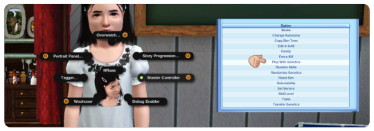
This is now going to bring up a big menu where you're selecting the parents for the sim - you can select from any sim in town by choosing '(Test Full Family)', however I like to use townies because they usually have no other relations - if you're selecting from the whole town I still recommend filtering by age using the 'Type of Sim (and)' menu detailed below:
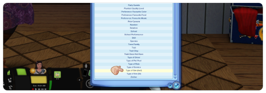
You can choose one of the other options, or to only bring up a list of townies, choose:
Type of sim (and) -> 'Homeless Non Service'
This is going to bring up a huge list of townies, I literally just close my eyes and scroll my mouse around a bit to pick one 'randomly' but you could also use a random number generator or something similar if you wanted to!
You're then going to be brought to a little screen where it shows the two chosen parents & your adopted sim - just like if you were creating a child of two parents in CAS
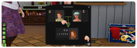
Randomize the genetics however many times you wish to get the outcome you want
It's worth noting that altering the 'age' of the sim on this menu has no affect on them in-game, so if you want you can randomize the genetics w. the sim as a young adult to see what they're going to look like when they get older
When you're happy, press the 'tick' button to accept the changes
It might take a second in-game to load up the changes, but your adopted sim should now have the genetics of the two townies you'd chosen!
The only thing it won't change is the hair colour - so make sure you make a note of what the hair colour you want for them is and change it in CAS
I'd recommend making a note of the parents somewhere, so if you do want to incorporate them into your story at a later date you can do so
I hope this was helpful, if you have any other questions feel free to send me another ask / comment and I'll try and help! :)
130 notes
·
View notes
Text
A few people have asked me about kitbashing art from retrograde minis so I decided to make a tutorial on it!
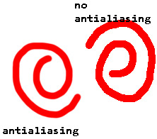
First off I recommend installing paint.net, I find it has everything I need for what I make but as long as you have some sort of art program that has layers it will work. But I'll be showing stuff in paint.net since its what I know. Here's the link to paint.net, its free! https://www.getpaint.net/ First step you need to do is to make sure antialiasing is off, just select the paintbrush or eraser and select the following two options:
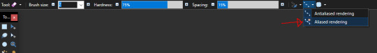

This will give the paintbrush and eraser a hard edge, which are vital to working with pixel art. Heres a comparison:
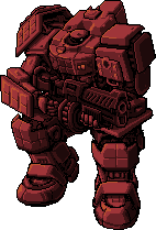
Now we can get to the actual kitbashing. There are two methods I know of, the first is the one I primarily use and the other my lovely girlfriend @gay-dollish-catgirl uses. Both are useful for different circumstances so I encourage mixing them up! The first method is what I called layer and erase and I find it is the easiest. First get the two colours you want for your mech, usually the base colour and then the accent colour. You can get these by downloading from retrograde minis, taking a screenshot of the web page, or using the All++ option if you have patreon membership, which I personally recommend to support the creator! For this example I'll be using this tortuga in platinum and scarlet:
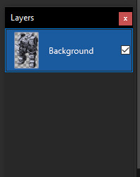
I recommend fiddling around in paint.net to get used to the tools, especially the magic wand tool, I could do a tutorial on that alone, and if anyone wants that I can! For now we will focus on the kitbash. Next you want to put these in the same image and layer them on top of each other. First add a new layer, which you can do in the layer window here:
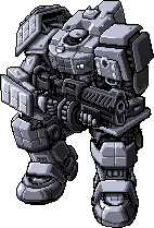
This will create a new layer above the selected layer, which you can then drag around above or below the existing layers. Next, take your other coloured mech and place it above or below the current one, with the base colour you want being above the accent layer. In this case I want the platinum to be the base colour and the scarlet to be the accent so Ive organized them like this:
Now we can actually get to doing the kitbash, and from here its simple. All you do is erase from the base colour layer to reveal the accent layer underneath, make sure you have the base colour layer selected too, other wise it will seem like nothings happened... that happens to me a lot. But if you did it right erasing the top layer should reveal the bottom layer and cause it to show through like so:
From there just continue to do so for any other parts you want to be the accent colour
Once you have all the parts you want coloured done, merge the layers together with the following button:
Once its merged you can just start over with a new colour, doing the same technique to continue adding to the mech until you are happy with the end result! I recommend experimenting with the tools and shortcuts in paint.net! Now for the other method which admittedly I'm not as good at but I wanted to show off anyway! This method involves creating a colour palette and manually replacing the colours. First find the part you want to replace, which in my case is the top of the mechs head

If you look at the colours on the head you can see there are actually only really 4 different colours, which if I colour them differently you can see:
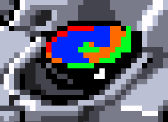
It looks a bit weird but can help visualizing that there are only 4 different colours. What you then need to do is make a palette of 4 different colours to replace the existing one. This can be done several ways, by taking the existing colours and tweaking them, taking them from another image, or just playing with colours and eyeballing it. I find the first option to be the best for me
Eventually youll get something like this! It will take some time fiddling with colours to get it exactly right but once you do you can make some pretty funky looking colours with this technique! As an end note be sure to save the files in PNG and not the PDN format, the PNG format is more widely supported, and PDN should only be used when you want to keep the layers, which can be useful if you want to reuse stuff from a mech for later! once again Im not an artist, so Im not sure how helpful this will be, but if it gets a few more people making mechs then that is my goal! If anyone has any questions please feel free to send me and I'll answer them as best I can! If anyone makes any mechs using my techniques please lemme know so I can check them out and reblog them too!
60 notes
·
View notes
Note
hello! Is it alright if you would show me a tutorial on how to recolor gifs and put them on a graphics? Thank you!
I. Recolouring GIFs
I use photopea to recolour and edit gifs. To recolour, I use two methods — gradient map and psds.
Method 1: Gradient Maps
This method is simple as its name. You import a gif, create a gradient map, and export. You can find gradient maps if you click the button that looks like a first quarter moon (🌓) on the bottom right corner.
Method 2: PSDs
This method requires you to use a Photoshop document (PSD), one that consists of settings you'll need to colour or adjust images and GIFs. There are several PSDs online and on Tumblr which you could use, but I'm personally demonstrating an example using what I made.
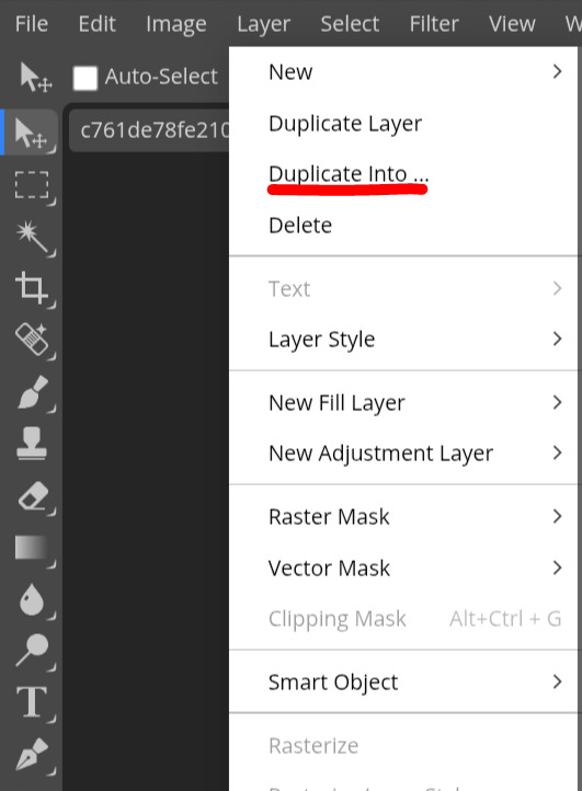
First, you load your gif. Then, you open your PSD in another document. After that, you duplicate the folder containing the settings into the other document.
Once you do, adjust the layers and make sure the folder is above your GIF. You should be able to export your GIF afterwards.
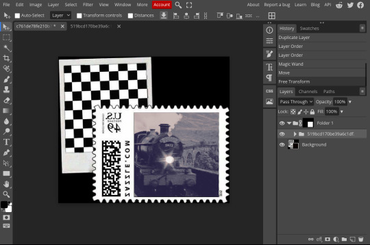
II. Adding GIFs into graphics.
Adding GIFs into graphics is pretty simple. I'll teach how to add transparent GIFS and how to add GIFs into masks.
Transparent GIFs
First, you load your picture. Then you open your transparent GIF in another document. After that, you duplicate it into the picture's document. Adjust to your liking and then export.
GIFs in Masks
To add GIFs into masks, first, you open the image you want to use as a mask. Then, you either select the pixels of the area you want to be a mask with the magic wand, or right-click (long press on mobile) to select the pixels of the layer.
Once selected, make a folder and then add a mask to the folder.


Open the GIF you want on another document and then duplicate it into the file just like in the previous text. Once you do, put the GIF's folder into the folder with the mask. Move and adjust the GIF as needed, and then export it once you're satisfied.
Unfortunately I've run out of images I can put here but I will reblog the finished product. I hope this tutorial helped! If you're still confused on some aspects or there's some things in the tutorial that you don't understand, don't be afraid to reach out for clarification.
:)
22 notes
·
View notes
Text
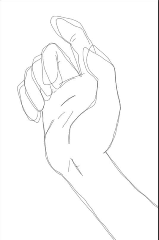
Random sketching thing I digitally do: Whenver I've got a rough sketch, and I'm not sure how to do something right, I put the rough sketch to 50% and then draw over it on another layer twice, making two just-about-as-rough and usually completely different guesswork sketches:
And then take those two rough guesswork sketches, put them to 50%, merge down, and repeat the same, by drawing their rough average twice
And then just keep repeating that - drawing according to the line that looks right/better wherever I see one, and going by the rough average where I can't tell where the good line is.

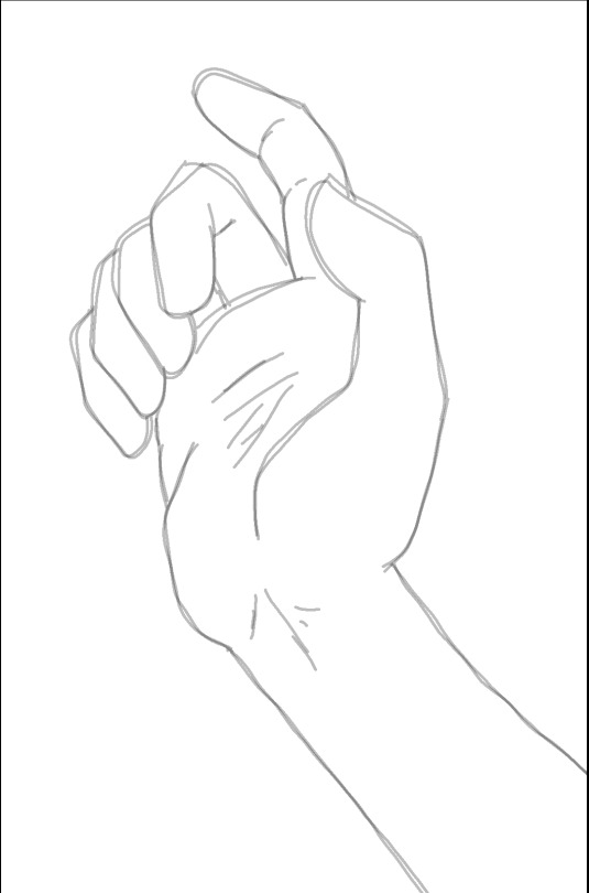
Just averaging out the combination of guesswork and working over the guesswork that I got right the last time, until I've got something I'm satisfied with, and then clean up the lineart and add details.
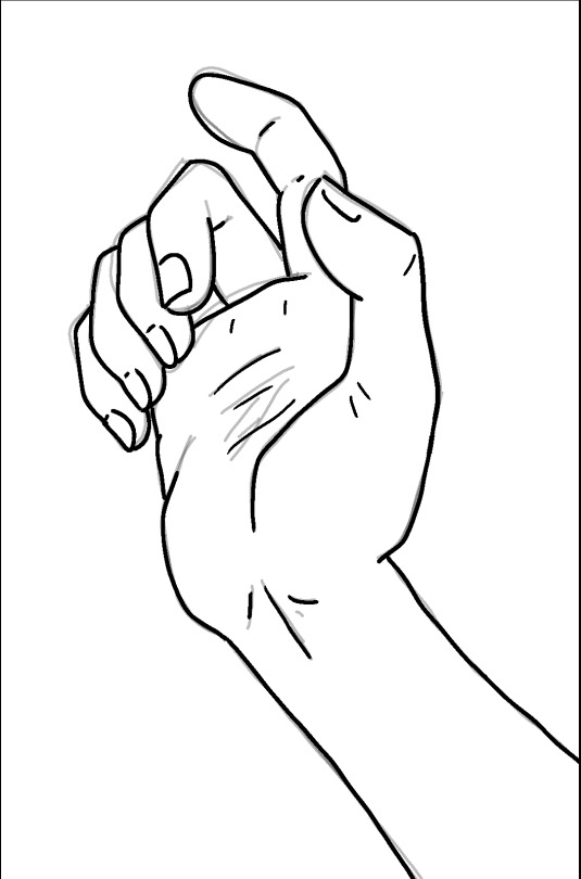
Then I do the same with shading. Make two layers with a rough but unrelated guesswork of where the shadows should be, and then average them out.
And after some clean-up, it's time to add some colour and final highlights. I'm not good with palettes so forgive the eye strain.
I wasn't planning on making a whole-ass tutorial out of this, I only meant to do a quick post about my lineart sketching method, but I got distracted and didn't have anything more important that I should have been doing so there you are, I guess.
229 notes
·
View notes
Note
hiiiii vivi do you maybe know of any tutorials on how to start giffing
hello lovely!! thats such a good question and im also so excited to see your gifs if you start! i know it looks incredibly overwhelming at first and like a lot to handle, but just remember to have fun experimenting and trying everything out and very soon it will feel like second nature! and take things step by step, you dont have to have everything figured out immediately.
this here by @hayaosmiyazaki is an amazing and detailed tutorial for beginners! it explains about everything you would want to know when you're starting out. this is another lengthy tutorial that uses the "import video frames to layers" method instead of screencaps, it all depends on what your photoshop can do and what you prefer (if you need a ps link dm me).
when it comes to colouring i think this is a great tutorial on colouring east & southeast asian celebs and how to avoid white-washing. here is also a nice compilation of anti-whitewash tutorials! just in general @usergif is an amazing place when you're looking for resources and tutorials because they have basically everything. here is their resource directory.
this lovely tutorial here is very similar to what i do when it comes to sharpening my gifs.
aaand finally this is a nice compilation of different basic gif making tutorials and resources!
i hope this helps you at least in some way, dont hesitate to reach out if you have questions, and most importantly have fun!!
#WAIT#i thought i had posted this already until i found it in my drafts i am aosososososo sorry#asks.
16 notes
·
View notes
Text
People were intrigued by doing sleeves two at a time on one needle (magic loop). There are MANY magic loop tutorials/videos that exist, so this is not a full tutorial, just progress pictures because I was picking up sleeves anyway.
You're going to want a longer circular needle for this - 32" ( I think, hard to measure after I've got the sleeves on it). You also need two balls of yarn (unless you work from the outside and inside of one ball of yarn like I do for socks but really I don't recommend following my example on that).
Step 1: Pick up the top of the sleeves. I started about 10 sts from the armpit. Do both sleeves. You're just sliding the stitches onto the needle (I keep my life line/waste yarn in when I do this).

Step 2: Push the work toward the other end of the needle so you leave a gap when you start to pick up the bottom part of the sleeve. You could join your yarn here if you want, but I like to make things difficult for myself and put the join at the underarm, so again, I am just slipping the stitches onto the needle until I get to the underarm. If you join the yarn earlier, go to step 3b
Step 3a: Use knit cast on for under arm stitches.
Step 3b: From this point on you need to knit the stitches onto the needle. This is much easier if you slip the stitches onto the other end of the needle. Don't worry about the stitches from the other sleeve yet because they'll all be transferred to the right needle. Knit until you have knit the remaining stitches from that sleeve

Step 4: take a breath, you've got one sleeve picked up! Now if you're not used to magic loop, you need to make sure when you move your work on the cable you don't pop out that loop (the purple cable sticking up in the above picture). If you did 3b, skip to 5b and use your second ball of yarn.
Step 5a: Slip the other sleeves stitches onto the cable until you get to the underarm, use knit cast on for your underarm stitches with your second ball of yarn.

Step 5b - pick up the other (left) needle, make another loop in the cable, and pick up the stitches that you will need to knit. All of the stitches are now on the needle. There is a loop of cable on the left, the needles meet for the left sleeve, then there is the right sleeve and another loop of cable. Each sleeve is joined to a different ball of yarn

Step 6 - knit the stitches on the left hand needle until both needle tips are on that side and there is still a loop on the right side of the work

Step 7: Flip it over, carefully pull out a loop of cable like you did in step 2, and keep knitting. Don't forget to change yarn strands when you get to the other sleeve.

I will typically put a stitch marker on the sleeve that I cast on first, just so I remember and don't make one sleeve a row longer than the other.
From this point, you'll knit the top of sleeve 1, top of sleeve 2, bottom of sleeve 2, bottom of sleeve 1, then repeat until you're done.
The benefit of this method is that if I do any patterning or changes or follow any whims (cables! Lace! Decreases! Colour changes!) I can do it on one sleeve and then immediately do it on the other. You will also continually work both sleeves - in order to skip one sleeve you'd have to start purling.
When it's time to cast off, you can put a stitch holder in the stitch from one sleeve while you work on casting off the other.
You do have to do some yarn management, but you get used to it and it's not so bad.
#knitting#knitting technique#knitting magic loop#magic loop#the word stitch has too many contestants#this may not make sense#it's been a long day#two at a time knitting#two at a time sleeves
15 notes
·
View notes
Text
gif tutorial
@bakedbakermom requested a tutorial on how i made the gifs in this set, so i've put together a little walkthrough of the process for this gif under the cut!
(disclaimer: this tutorial assumes that you already have basic photoshop/giffing knowledge - i.e. how to make and colour gifs using correction layers, how to use things like layer masks, etc. if you don't, i recommend these tutorials, they're very comprehensive)
alright! so as stated before, i'm not going to go in-depth here on the basics of gifmaking. for this one in particular, i blended three gifs, but we'll get into the third one later.
(i should also mention that blending gifs as i did here is usually easier if you have scenes with shadowed/dark areas like the ones above, so to keep that in mind when picking your scenes! i also find it easier to use scenes where there isn't a whole ton of movement going on- again, not a requirement but it's easier to plan and position gifs if the characters aren't moving across the whole canvas)
first, i started by making the base gifs of mulder and scully in "paper hearts". both are cropped to 540x540 px, and the same length (around 50 frames). i did some standard sharpening, brightening, and adding contrast (my usual process is curves, a b/w gradient map set to "soft light" at around 20% opacity, and messing with the levels a bit) before using selective colour and hue/saturation layers to highlight the teal and peach colours in the gif. sometimes this is enough colouring on its own, depending on the gif and the look you're going for, but in my case i wanted to add more.
so, on top of my colouring, i used a combination of layers set to "colour" and "hard light" to paint over the background of my gifs in teal and peach. on mulder's gif i also used a gradient fill layer in the two colours set to "colour" and used a layer mask to erase anywhere i didn't want the colour to be. the opacity levels for all of these layers again just depends on how vibrant you want your colours, i just mess with that on a gif-to-gif basis.
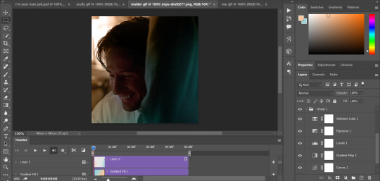
so we have our two gifs, cropped and coloured to fit the palette we want. next, i converted each coloured gif into a smart object, by selecting all my layers, right clicking, and hitting "convert to smart object."
once that's done, you should be able to click and drag one of the gifs onto the other gif's canvas, so that it's sitting on top. then change the blending mode of the top gif- most people use lighten or screen, this again depends on the look you want and the gifs you're using. for this one, i used screen. it'll probably look something like this:
at this point you can move your gifs around and position them as you like. for mine, i just moved scully a little off to the right, as you can see. in order to get rid of the part that's covering mulder's face, i added a layer mask to the scully gif and used a large, soft brush set to black to erase it.
(another note: i didn't need to do it here, but if you want to move/erase parts of your bottom gif, add a layer of solid black underneath both gifs.)
usually i would stop blending here, but for this set i decided to add a third gif, so i made and coloured the gif of mulder and scully holding hands, using the same methods as the first two. this one was cropped to 540x405 px to make it fit better on the canvas, since i knew i only wanted it to cover the bottom part.
i converted it to a smart object and dragged it onto the same canvas as the other two gifs. this time i used "lighten" as my blending mode, positioned it in the bottom right corner, and again used a layer mask to brush away the parts i didn't want.
on top of all three gifs, i then used layers set to "normal" and "hard light" to brush some extra colour onto the gif. this part i also just play around with on a gif-to-gif basis, but for this set i mostly used a combo of colour, hard light, and normal layers at varying opacities until i got the look i was going for. i generally just like to use big soft brushes to add colour around the edges, as i did here.
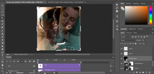
now, i have a bunch of texture/grain pngs saved on my laptop that i like to add to gifs for some extra flair, so i opened one of those and cropped it down to 540x540px. i then added a gradient map to give it that peach colour. (any textured png/jpg should work fine for this, as long as you have your gradient map set to black and white/your accent colour)
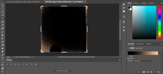
like i did with my gifs, i converted the texture + gradient map to a smart object and dragged it onto the shared canvas. i set the blending mode to "screen", with the opacity at 70%. i like to put these textures underneath the extra colouring i've done on the gif, as seen here. i don't always do this, but i feel like it sometimes helps the texture blend into the finished gif. you can also use a layer mask if needed to erase any unwanted parts of the texture.
now for the text!
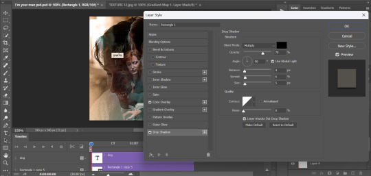
for these gifs i used the font "IM FELL DW Pica" in both regular and italic, in black, at 16px. i didn't do anything fancy with the text itself besides adding a drop shadow in the blending options (right click on the text layer and hit "blending options).
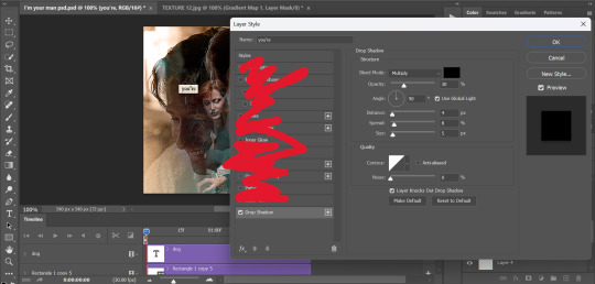
then, underneath the text layer (i was working one word at a time) i used the rectangle tool to draw a small rectangle around the text- i wasn't too picky about the size or evenness since i was going for a collaged look. i set the colour of the rectangle to a light cream colour, and added a drop shadow in the blending options.
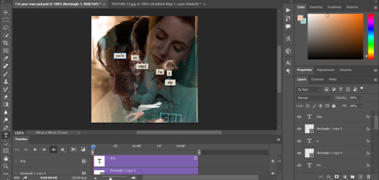
then i just selected both the text and rectangle and duplicated them using ctrl+j, changing the text for each word and adjusting the size of the rectangles as needed. once i had all of the words on my canvas, i just moved them around until i found a positioning i liked. again, since i was going for a purposefully scrapbooked look, i didn't overthink this part.
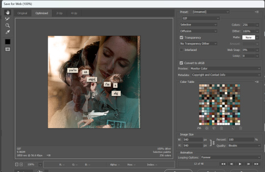
i exported my gif the way i usually do, with these settings:
and that's it! i used pretty much the same process for all the gifs in this set, give or take. hopefully this little walkthrough made sense, but i know i'm not always the best at explaining my process, so if anything needs clarifying feel free to shoot me an ask or dm!
90 notes
·
View notes
Note
How do you do your vhs effect?
using a handy dandy program for computers called ntSCQT... it's designed to render realistic VHS effects for images and videos!
but here is the simplest way. i made this pic for the same question that was asked sometime ago by some friends, but now i get to show it again! the emoji is a very BAD demo image i think, but you know what looks best when you get to it yourself.
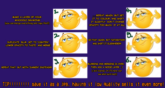
basically blur and merge the lighten and darken layers until you have some blurriness to it, and the colour and saturation layers are the same, except move them a tad for colour bleeding! i might make another better tutorial later
my method is a mix of many, look for other people who do the same!
10 notes
·
View notes
Text

i told my friend i would find him some beginner’s giffing tutorials, but all the one’s i could find were either years out of date, used a method that made me go “huh”, or incorporated ready-made actions. all perfectly fine, but if i’m sending someone a tutorial i’d rather it be one for a method i understand enough to help with.
so, here is a beginner’s guide to giffing, as told by cleo, a neurotic, detailed, and organization happy individual. there will be many pictures.
this tutorial will strictly cover the gif making portion of the process, from getting your screencaps to importing in photoshop, resizing/cropping, and sharpening. i was going to briefly go over colouring, but tumblr only allows 30 images and i ran out of space, so i'll have to do a separate colouring tutorial (which also means i can go into more detail, yay).
downloading the videos, whether direct downloads or t*rrents, is also another tutorial. but make sure you’re using at least 1080p, and the bigger the file the better. a single episode of a ~45 minute show should ideally be 2gb at minimum. a full length movie should ideally be at least 5gb. imo 2160p/4k files are not really necessary; the quality increase is negligible, and it takes a lot longer to screencap them. if you do use 2160p/4k files, try and make sure it is not HDR, as those videos are often washed out and require a different screencapping program to fix.
Programs
I am using a cracked version photoshop 2022, but whichever version you use should be pretty much the same
Actions. not a program but a function inside photoshop, where you essentially record a series of steps, and then you can simple play that action when needed and those steps will repeat, which saves considerable time when giffing. I will note which parts of the tutorial are best saved as actions, and explain how to create actions at the end.
For screencapping i use kmplayer it’s free and very simple to use
not at all a necessary program, but i use freecommander instead of the regular windows file explorer as i find the dual panels very helpful when moving the frames around
Screencapping
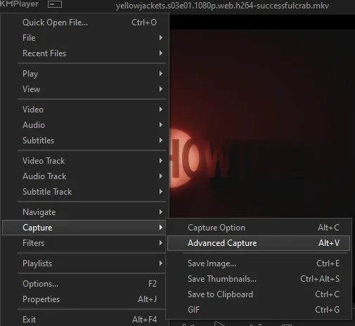
there are many programs you can use to get the screencaps from a video, a lot are basically the same, some are better suited for particular video file types. kmplayer is a very simple program to use, but afaik the capture function only works on mkv. files (the only other file type i’ve tried is mp4, which plays but does not capture)
once you open your video file in kmplayer, we’re going to open the advanced capture window, found under capture→advanced capture, or alt+v
the window should look like this
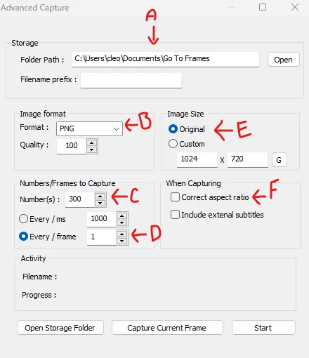
A-this is where all your screencaps will save to. i recommend making a specific folder for all your screencaps
B-make sure this is set to png for best quality
C-this is the number of screencaps you want to take, guesstimate how many you will need, keeping in mind that most videos are approx. 25 frames per second, and you should always cap a bit more than you think just in case
D-make sure “every/frame” is selected and set to 1
E-make sure “original” is selected, resizing will be done in photoshop
F-make sure “correct aspect ratio” is unselected
go to the part of the video you want to gif, and pause it just slightly before that part starts, then select ‘start’. the screencaps will start to save to the file, no need to play the video, and will automatically stop once it has capped the number of frames you have chosen
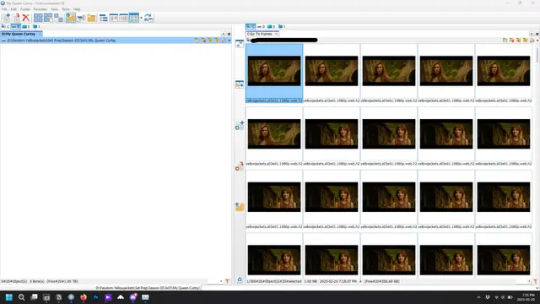
and here is how they look inside freecommander. i have already made a folder for this gifset, which is on the left. now you’re going to make a folder for each individual gif. i’ve decided this one will have four gifs, so create four folders (i just label them gif 01, gif 02, etc) and then move the frames for each gif into their respective folder
while you can always delete frames once the gif is made if it’s too big, i prefer to make sure i have the correct number of frames before i start. the gif limit on tumblr is 10mb, so it’s good to look at the scene/shots you’re giffing and decide approx. what dimensions your gif will be. full size gifs have a width of 540px and your choice of height. if you go for a square gif (540x540) you can usually fit 40-50 frames. if you’re planning for a smaller height (such as 540x400) you can usually fit more around 50-60 frames.
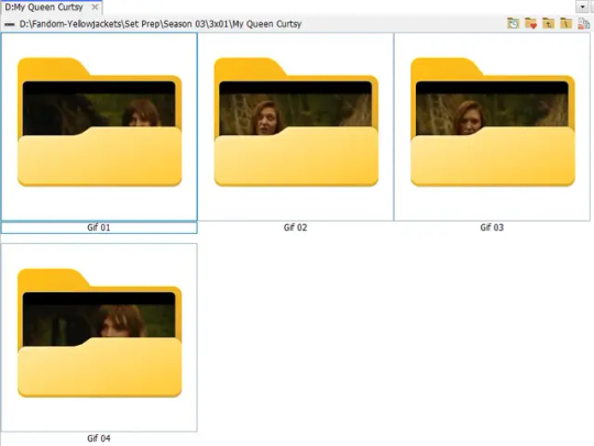
and here are the caps inside the folders. another reason i like freecommander is it’s ability to “multi-rename” files. the default file explorer can do so as well, but you have to do each folder individually and you can’t customize the new names as much. either way, i prefer to rename the files to each gif just to scratch my organization itch.
Introduction to Photoshop
NOTE: i have changed many of my keyboard shortcuts in photoshop to ones i prefer, so any you see listed in the menus of these screenshots are likely not the original shortcuts. you can see and change them yourself under edit→keyboard shortcuts

quick run-down of the photoshop interface. i have adjusted placement of some things from the default so this isn’t exactly how your photoshop will look when you open it, but everything is labelled, either on top or by hovering over the element. once you’re more familiar and have your process down i would recommend adjusting the workspace to suit your process.
A-your main tools and colour selector. almost all the tools have either several tools in one, or have alternate options which can be accessed by right-clicking the tool. you can also hover over each tool to get a pop-up with a quick explanation of the tool
B-additional “windows” such as history, properties, actions etc. can be opened from the window menu at the top and moved around with click-and-drag. history and properties should already be there by default, but probably on the right hand side instead. each window opens and closes with a click
C-the timeline window where the gif is made. the white square is a single frame of a gif, and on the row below is the play controls. this will not be there by default and will need to be opened from the window menu
D-adjustment layers for colouring
E-layers box. this is where the screencaps will show, along with adjustment layers, text layers, etc.
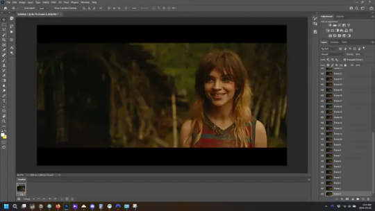
Opening Screencaps in Photoshop
go to file → open navigate to the folder for your first gif, select the first screencap, and check the image sequencing, and click open

a window will open labelled frame rate. set it to 23.976 and select ok
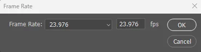
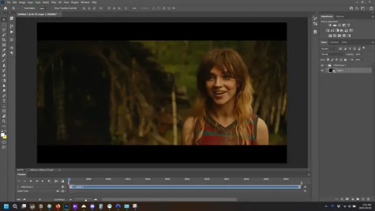
the screencaps will open in the timeline view, seen as the blue panel line at the bottom, and the screencaps are combined into video layer in the layer panel on the right.
Creating Frames
technically, you could go right into your cropping/resizing and sharpening from here, however if you do that directly then you have to keep the screencaps in the folders you have, otherwise if you save and re-open the gif it won’t move.
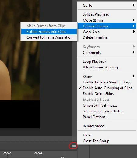
this next part should be made into an action.
at the top right of the timeline window, click four vertical lines to open the menu and select convert frames → flatten frames into clips. depending on how long the gif is, this can take a minute.
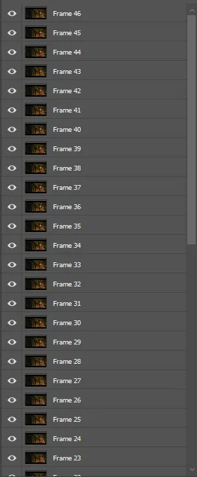
the layers panel should now look like this, each frame of the gif is now its own layer.
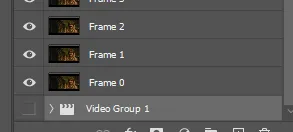
the very bottom layer will be the video group. this can be deleted as we’ve made the frames from it
in same timeline menu as before, right under “flatten frames into clips”, select “convert to frame animation” and the screen should now look like this. this will be the end of this action.
Cropping and Resizing
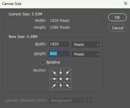
with widescreen footage, sometimes it’s just shorter than 1080p, but most of the time it will have the black bars on the top and bottom, and frustratingly, they’re not always the same size. it’s good to save the most common sizes as actions.
to find the size of the actual screen you turn on the rulers under view→rulers and check the height. then open your canvas size dialogue box under image→canvas size and change the height, making sure pixels are selected in the dropdown. yellowjackets is what i call “xtra wide” which is 800px. “normal” widescreen is 960px.
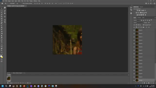
next we’re going to resize the caps. i also make actions for this, one for each potential gif size. open the image size dialogue box under image→image size and change the height of the image to your desired height plus 4 pixels. these extra pixels are to prevent a line at the top and/or bottom of your completed gif. now re-open the canvas size box, change the width to 540px, and the height to the desired, removing those 4 extra pixels. i have set this one to 540x540. this is where you would end the resizing action.
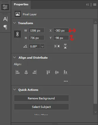
and as you can see she is off-screen. select the top layer, hold down shift and select the bottom layer to select them all, and with the move tool (the very top one) activated, click and drag to move it left to right as needed to centre the figure/s. as you move it a box will appear telling you how far you are moving it in any direction. make sure you are only moving it left or right, not up or down. to be certain of that, open the properties tab.
the y axis is your up/down, x is left/right. for this gif the y needs to stay at -98. you can also manually change the x axis number instead of dragging the image. also helpful for making sure multiple gifs of the same shot are all positioned the same.
the layer are currently ordered with the 1st at the top and the last at the bottom. with all layers still selected, go to layers→arrange→reverse. the last layer will be on top now. if there is movement in your gif, check if you need to alter the position again to make sure the movement properly centred. but once you are satisfied with the position, the layers should be in “reverse” position, of last layer on top. this is to ensure that the gif plays forwards.
Converting Gif
this should also be made into an action, going through sharpening process
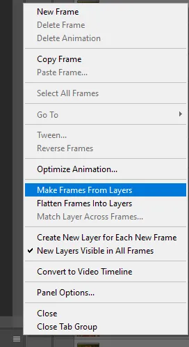
in the timeline menu, select “make frames from layers”
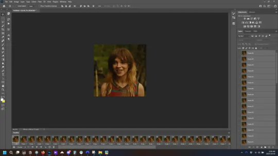
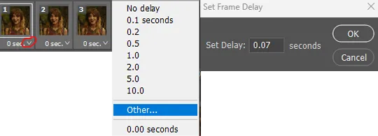
the frames are now populated in animation window. in timeline, click select all frames. go to any of the frames on the bottom and click the little arrow beneath it, select other, and enter 0.07 seconds. this is not a necessary step, as we will have to adjust the frame rate at the end, most likely to 0.05, but if we don’t change the frame rate here, then when we play the gif while working on it to check how it looks, it will play very fast.
in the same menu at the right of the timeline box, select “convert to video timeline”
then, making sure all layers in the panel on the right are selected, go to filter→convert for smart filters. this turns all the layers into a single smart object.
but if you look where i’ve circled, it says the gif is 99 frames long*, when in fact there are only 47. if you are making regular “scene” gifs, basic colouring and maybe a caption, this is fine and does not need to be fixed, it will play at the same speed. if you want to change it to display (approx.**) the correct number of frames, go to the timeline menu on the right, select “set timeline frame rate” and change it from 30 to 15
*if it does not list a frame number by 4 digits but instead says 5f, 10f, 15f, etc. go to the timeline menu on the right, select panel options, and change timeline units to “frame number”
**the reason why this is only approximate is because the actual frame rate is not a a whole number, so when changing the frame rate it isn’t a 1:1, and 47 frames becomes 50 frames. the extra frames are removed at the very end, but if you are not doing any edits that require working frame by frame, there’s no need to change the frame rate here at all
Sharpening
this is, as it sounds, making the gif look sharper. to start go to filter→sharpen→smart sharpen and this window opens. play around with the dials to see what each ones does. the below settings are good for most high quality footage.
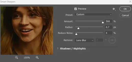
Amount-basically, how sharp do you want it
Radius-hard to explain, but this essentially sets how deep the lines of the sharpness are
Reduce Noise-smooths the pixels
once you click okay your single layer should look like this.
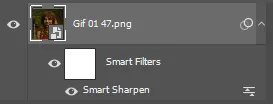
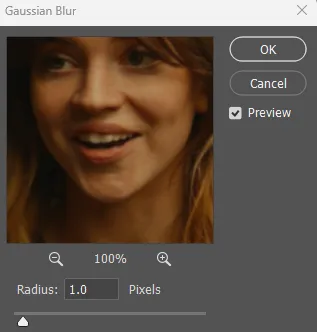
you’re going to then right click the layer and select duplicate layer. with the top layer selected, go to filters→blur→gaussian blur and set the radius to 1.0 pixels.
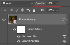
then change the opacity of the top layer to 10%. this is to essentially soften the sharpening a bit, as if it’s too sharp it can make the colouring wonky. this opacity level can also be changed depending on need.
finally, select both layers, right click, and click “group from layers”. your gif is now fully made and sharpened.
Colouring
yeah. ran out of image space. but this is where you would do your colouring and add a caption or any other text.
Converting & Exporting
when all your colouring is done, you’re ready to start saving your gif. you can do it directly from your current file, but that means essentially losing your colouring, as all those layers will be merged together. i am someone who likes to save my psd’s (photoshop files), at least until i’ve posted the gifs, in case i need to fix something in the colouring. if you’d like to keep yours as well, open the history tab and select the first icon at the bottom “create new document from current state”. this will open a copy of the file in a new tab. save the original file and you can close it, continuing all work on the copy file.

select your all your layers, convert them into a smart object from filter->convert for smart filters, then follow the same steps from Creating Frames above. once you're back in frame animation, select Create Frames From Layers, and once again set the frame animation speed.
most people set the speed to 0.05. i personally set it to 0.05 or 0.06 depending on the length of the gif. check how it looks at 0.05, if it seems too fast, try 0.06.
now to save. go to file->export->save for web (legacy). the number is the lower left corner is your gif size, it needs to be under 10mb or else you'll have to delete some frames.

the right panel is your save options. the preset dropdown has some built-in settings, but you won't use them because (at least on my version) the presets only go up to 128 colours, instead of the full 256. the 3 i've highlighted in green are the only one's you'll adjust as needed. the settings below i use for i'd say 90% of my gifs. i'll sometimes change the adaptive dropdown to one of the other options, ocaissionaly the diffusion, and rarely the no transparency dither, but play around with them and see how they change the look of the gif.

when you're satisfied with the look of your gif, click save at the bottom right of the window.
voilà! you now have a gif.
Actions
this is your actions panel. the triangle on the left side is the button to open it. remember, if it's not already there, go to windows->actions to open it.
the buttons on the bottom, left to right, are stop recording, record action, play action, new folder, new action, and delete.

as you can see, i have different folders for my resizing, sharpening, captions, saving, and my 1 step (temporary) actions. to run an action is very simple; click the action, and click play.
to create an action, click the new action button, a box will pop up, give the action a name, and click record. the record button at the bottom of the action window will turn red. now perform all the steps you want it to record, and click stop recording. keep in mind it will record every single thing you do, including in other open files, so if the action you plan to record will have a lot of steps, it might help to write them down first.
to modify an action, select the step in the action above where you'd like the new step to be, hit record, perform the step, stop recording. select the step you'd like to delete, and click the delete button.
steps within the actions can be clicked and dragged, both within that action and moved to other actions. actions can also be moved between folders.
282 notes
·
View notes
Text
Time for another lace style...
We will eventually get around to learning all of these, which one do you want to learn first?
Also we have many more styles planned, these are just the styles we have good tutorial resources for so far.
These styles all require some specialty tools/supplies, which I've listed below the cut in case that's a deciding factor for people. Pretty much everything can be DIY'd or repurposed from some other common objects, and this information will be shared as part of the lace-along :)
Bobbin lace:
Thread (e.g. sewing thread, embroidery floss) (edit by mod Rex: crochet cotton or perle cotton preferable for beginners)
Bobbins (24 for the sampler we will do)
Bobbin lace pillow
Pattern printed or drawn out
Pins with small heads (a whole lot of em)
(edit by Mod comfy: I dipped my toes in this already, you can use clothespins as bobbins (basically everything that holds some thread and can be moved around comfortably), and some sturdy cardboard as a pillow. Your "pillow" just needs to be sturdy enough to keep the pins in place for the time you work on the lace, so if you have a couch pillow that could work, go for it)
Drawn thread lace:
Plain-woven linen or cotton fabric, with large enough threads you can comfortably see individual threads at a comfortable working distance
Sewing thread in the same colour as your fabric
Fine blunt-tipped needle
Fine tipped scissors or seam ripper and a steady hand
Lacis/ filet lace
Sturdy thread/ twine/ crochet cotton
Netting shuttle/ netting needle
Netting gauge/ mesh stick (e.g. dowel, knitting needle, smooth popsicle stick or similar)
Blunt tapestry needle
Some method of tensioning the net for embroidery: mesh frame/ embroidery hoop/ stiff paper to tack net down to
Needle lace:
Paper pattern printed or drawn out
Backing fabric (e.g. sturdy medium weight calico) (will not be part of finished piece)
Sticky backed plastic/ clear packing tape
Lace thread (e.g. crochet cotton, perlee, stranded cotton, silk thread)
Regular sewing thread in a contrasting colour for tacking down pattern (will not be part of the finished piece)
Sharp needle to tack down pattern
Blunt needle to make lace
Tweezers
Fine tipped scissors
Thimble (optional)
Sprang:
Sprang frame (e.g. empty backless picture frame, DIY frame made of sticks, two dowels tied to sturdy objects an appropriate distance apart)
Sturdy cord or crochet cotton
Smooth dowels/rods, 4-6 of them?
#lace race 2024#lace along#lacemaking#lace making#bobbin lace#drawn thread lace#lacis#filet lace#needle lace#sprang#poll
89 notes
·
View notes
Text
Crochet corner
It's time, my dear internet people! It's time for me to babble about one of my numerous hobbies. And as the title arleady suggests, it's creative in nature, involves copious amount of yarn and often robs my bank account at gunpoint.
Yes, it's crochet! My beloved! That one activity that I have neglected for the past... who knows how many months.
But! I'm back! And I'm here to share my projects and progress and just generally ramble about fiber arts.
I won't do this in any particular order. I will talk about current, past and future projects. I will most likely complain about my inability to count and read crochet patterns. If it's in my ability to do so I will also share the patterns and tutorials I used to make my stuff, in case any of you people want to join me in doing fiber arts. (Please keep in mind that some of my patterns are in German, so I will probably only share the english ones unless requested otherwise.)
Now, let's jump right in the yarn pool with my current project (@upsilambic I'm tagging you since you seemed interested in my crochet adventures)
Triangle scarf for my mum
So, here I was chilling in the yarn store, two skeins for my planned project (mesh gloves) already in hand after consulting with the store clerk, fully intending on just buying those and instantly leaving before all the fiber goodies seduce me into making another purchase.
My mum had other plans though since she was already inspecting some of the bags that where spread out on a table. Each bag contained a set amount of skeins in prepicked colours and a pattern on how to make certain items. My Mum was intrigued... the colours spoke to her... and yes, you might have already guessed, dear reader, we walked out of that store not only with my yarn but also with one of those bags. The pattern was for a crochet scarf and my mum asked me if I could make it for her. I took a look at manual and was confronted with the absolute gibberish in the form of an unfamiliar crochet pattern. My brain offered me the nostaligic tones of the old windows shut down noise in response, so naturally the answer to my mum's questions was yes. (The motto of any fiber artist: Fuck it we ball.)
Once again I talked to the delightful sales lady, asking questions about the pattern and she was a great help. Let it be known that yarn stores are fucking awesome! I have never been in a yarn store where people weren't kind and welcoming and sweet. It's like entering a different world, one full of peace, fluff and most importantly: yarn! A yarn store is one of my favourite places to be right next to a bookshop and my bed.
Anyways, we got my stuff and we got the additional stuff (that I thankfully didn't need to pay for 🫡👍🏼)
It did take me a lil bit to fully puzzle out the scarf pattern but with some trial and error (I needed to frog once because I forgot in which row I was and tired evening!Lix didn't write it down) I'm now in the game.
Here my current progress:
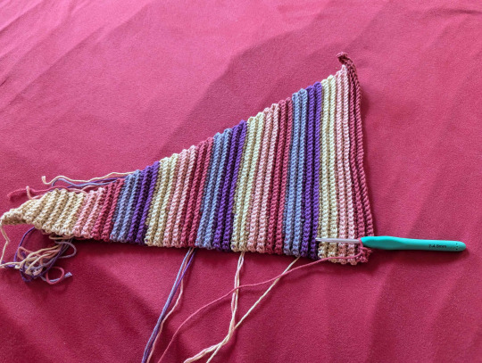
The colours are more intense irl but no matter.
I will need to weave in so many ends after finishing it, I'm already regretting all my life choices *traumatised stare into the distance*
Weaving in ends is one of my many evil foes and unfortunately I still haven't defeated that one yet (I doubt I ever will). Everytime I reach that step in my work I want to set myself on fire because after couple dozen times it really does get quite tedious. It also doesn't help that I still haven't found a method where you really can't see that you have weaved in the ends (and is also secure).
But this will be a concern for future Lix 👍🏼
I will continue to crochet and watch my Let's Player (Magemasher22 on Youtube and Twitch, yes I will namedrop him, I love this guy so fucking much. He's a gem) play Honkai Star Rail.
If anyone has any questions you know where to find me 🫡
29 notes
·
View notes
Note
hello! I was wondering how do you make gifs? I'm not a very social person in any of the fandoms I've been/am in and I haven't written in years but I guess I wanted to contribute more to fandom. I also see people lament the fact that there aren't that many gifmakers anymore so I thought maybe I should be the change I wanna see in the world! all the best! ☺️
Hey!
First of all I love that you are interested in/making an effort to put content out there and are not just moaning about it like some people do. Unfortunately there aren't enough active gifmakers around, a lot of them have stopped making content because it's a terrible era for us at the moment with the dire like/reblog ratio and other issues we have to deal with. But I'm supposed to be encouraging you not discouraging lol, so I will pop some information below that will hopefully help you out!
Fun fact, this is how I started out making gifs. I came onto tumblr and found zero content for my interests so decided to take it upon myself to learn and here I am all these years later.
I personally use photoshop, but I know it's not easily available to everyone you either have to pay for it or obtain it by 🏴☠️. If you are able to access it here is a beginners tutorial to help get you started.
The next best option to photoshop is photopea which is basically the web based free version of it's predecessor. It can do the majority of things that photoshop can from what I remember, but the finishes just aren't as sharp, but i would definitely recommend. The website can be found here and a tutorial here.
Final option is another web based version called ezgif, now this is the one I would recommend the least as it really can only do the basics ie produce a gif and the finished product is mostly grainy and not the best quality. I don't have a tutorial for this but if you do a search online or on youtube you should be able to find one.
Whatever option you use, to ultimately make a gif you have to either upload a video to the software and then take screencaps, or take screencaps and then load them in. I use the screencap method and use kmplayer as my chosen software found here for download.
p.s Just remember that it will take time and practice to get into the swing of things, so don't be too disheartened if you don't always get it right. The basic fundamentals of simply producing a gif is hard enough before you get into the colouring/sharpening of it all.
Also the tutorials are just here to help you begin, you don't have to stick to them as time goes on you may find an easier/better method to the one offered, so go with what works for you. I have definitely got my own own tailor made gif method that I love.
I hope any of these options are of help to you, and wish you well on your gifmaking endeavour!
#soph asks#gifmaking resources#gifmaking asks#all the luck to you and maybe i'll see some of your creations around the dash
9 notes
·
View notes