#anyways I had so much fun making this!! I really love lineless art - and the art process meshes with my way of drawing well I think ^w^
Explore tagged Tumblr posts
Text

Shoelaces
I'm doing an art trade with the wonderful @tokyogruel and this is my piece for them!
They wanted "haruka and mikoto interacting Brothers style" and my mind immediately went to this... T2 art makes me want to sit them both down and sort their fucking shoes out!! but for now. at least One of them will no longer trip over 💜 nature is healing guys
#milgram#haruka sakurai#mikoto kayano#listen. I may have Exaggerated how bad mikoto's shoes are but do you really think they're going to be fixed any time soon??? EXACTLY#and don't get me started on haruka's shoes... oh my god this boy Will give me a migraine. I bet no one ever helped him with laces before :(#but not anymore!! I'm here to fix that!!!#anyways I had so much fun making this!! I really love lineless art - and the art process meshes with my way of drawing well I think ^w^#I'd much prefer to think in shapes and blocks of colour than try to draw the perfect line 500 times and cry of frustration asdfghjkl#I Love these two interacting... I can't explain it in words so I hope I conveyed my feelings well!! they deserve to be happy ;w; 💜#my art#ミルグラム
173 notes
·
View notes
Text
I think im a pretty good artist i think I'm hot shit right so i feel like
Idk seeing artists online especially in the fanart and character illustration/OC department, seeing those newer artists who are maybe just getting in to digital art or drawing in general i feel like...
One like slooow down brother there's no need to be making stickers or doing commissions or having a patreon just yet, let's walk before we run ok? Of course you can do, people can do whatever they want with their free time but you have to understand a lot more about art, marketing online, self promotion, and social media trends to get the kind of traction you're expecting. I feel like theres this pressure for newer artists to legitimize themselves thru like, monetary means ("if ppl subscribe to my patreon, it means I'm good at art") and social media capital ("likes are nice, but they dont do much; please reblog!")
And like yeah everyone wants that but... If you're drawing solely for those reasons and are disheartened by lack of interaction or traction in the markets, what are you even doing? I been doing this a long time, 20+ years at this point. Not commissions or anything, just drawing. I been drawing a long time and I always do it for the love of the game. I do it because it keeps my mind and hands busy, it brings me joy, and i like to create. I enjoy translating the real world into lines, in stylizing, in pushing. I just like it and yk what, thats how I've had this longevity and thats how I've gotten to where i am. I have sketchbooks full of work no one has ever seen, not just studies but all kinds of work.
If your drive to to do the thing, or to improve at a craft or whatever is external, you can't keep it up. Thats nothing to say about learning to enjoy observation and the importance, even in stylized work, of learning how to look at something and how to just observe and notice the things we see. Idk so much of my growth and skill has come from an internal drive to improve for myself, because getting better is a challenge i want to overcome, and doing the less-exciting stuff like drawing a fuckin building. I've been to probably idk dozens of life drawing sessions because i wanted to grasp anatomy better. In university, i took courses where we looked at bones and skeletons so that i would by proxy have a better anatomical grasp. I learned to map my knowledge and the things I learned about applying making or working out back to drawing. Idk man i dont know how to tell you how to love something
And thats all not the point anyway cuz the point is
Two, i think some new artists don't really... They're not interested in finding a personal style? Or if they are they're not sure how to get there? They see the work that does numbers on insta and twitter and stuff and they wanna draw like that, so they do what those artists do. Admirable! But also they do it without understanding the underlying principals. This artists blocks their characters out like this, so i shall too. That artist uses lineless painterly style with heavy realistic rendering, so shall I. And idk everyone enjoys that style the idk Popular Style of anime realism or whatever its fine to look at but dont y'all ever want more??
And like idk do you enjoy the process or are you doing it that way cuz thats how your fave does it?
And idk like.... Two works can be of equal technical skill level, but the one that plays with style and understands underlying principals of lighting and colour and shape and line, the one that is bold with their vision, is always gonna be better than the one that's trying to be popular and do numbers yk?
Like if thats the style that speaks to you, go for it, but fuckin Go for it yk? Dont try and be like everybody else or the big time players cuz if you're trying to master someone else's style, you're not gonna be able to master the things that make art fun and interesting and challenging and engaging yk
And also a lot of art is about vibes and if you're not channeling the vibes its gonna look bad you gotta focus on the vibes not on being like your fave!!
And if i see one more person say "i spent so long rendering this 🥲" when its fucking cel shaded I'm gonna lose my frickin MIND I SWEAR BROTHER I'M NOT MAD I LOVE CEL SHADING BUT CHRIST ON THE CROSS USE THE RIGHT WORDS FOR THE THINGS YOU MEAN
#also some ppl are more naturally gifted at observation and interpreting than others and that's ok too#like i cant stress enough how if you struggle with attention to detail and observing the world you're gonna struggle with drawingz#or at least improving your drawing#and so you have to focus on learning observational skills like if you're not naturally good at it#i swear im not being mean i will HELP YOU if you want it but like#yeah just drawing from your brain or from another picture is not gonna help you as much as you'd like it to#IN MY OPINION#ALLEGEDLY#LEGALLY THIS IS A JOKE#if anyone says anything mean to me about this I'll nuke this entire internet#i am by no means the best artist but i am significantly better than the average person and thats thanks to#natural talent and focused effort#and time so much time years of time#don't give up cuz its hard!!!#i didnt give up#not because i knew i couldn't#but i hate being beat and i would not let the art beat me#i was stubborn you have to have a certain level of stupid stubbornness#fall down 7 times get up 8 or whatever#but more dumber
0 notes
Text
DO YOU WANT TO READ MOON KNIGHT?
are you a show fan who's learned about how terrible the MCU did moon knight and you want to check out the comics? did you see him in a teamup book and want to know more about him? are you just looking for more comic recs? are you just interested in the character? then you're in the right place!
okay, to begin, i want to say that this is a character that has had a... varying history. there are no moon knight comics you can enjoy without extensive criticism. critisizing the things that you enjoy is good and gives you a better understanding of the work. please do not idolize any of these comics and please work to be kind to the many minorities (jewish people and systems, primarily, but classism, racism, xenophobia, and homophobia are all explored throughout MK's publishing history) that these comics represent. anyway.
MOON KNIGHT 1980 -
tws - doylist racism (racist villainous charactictures, mostly. a lot of this), ableism (outdated terminology for systemhood, occasional slurs), and sexism. extensive discussion of anti-semitism, specifically neo-nazism, in issues 37 and 38.
what happens - moon knight 1980 is a 38 issue comic book centering on the ex-mercenary and now hero moon knight. almost entirely episodic but there are occasionally multi-issue stories.
moon knight, in the day, is the millionare socialite steven grant, and, at night, the hero moon knight- moon knight also "uses" jake lockley as an informant. marc spector was the mercenary moon knight ran away from. doug moench was NOT intending to write a system at this point- steven and marcs relationship is meant to represent one mans struggle with guilt- but its really really easy to gel this with their current situation of being alters in a system and also some of the specifics of their whole thing make me fucking insane. jake is also there and i love him even if he isnt really a major part of the moral conflict
please dont read all 38 issues- attatched is a list of my personal ratings. everything later calls back to this so its best practice to read it first but its very much a slog if you arent already attatched to this character so make your own choice

nothing from 1980 to 2014 is particularly good (you can read it if you want but i havent) but knowing what happened is pretty important to understanding the later modern runs so a runthrough. throughout the 90s mk continued in the 80s status quo but in 2006 he 1. cut off bushmans (remember that guy from 1980?) face 2. was given a tendency for violence and and 3. became significantly more tense with marlene and frenchie. by 2014 they had completely fallen out. thats all we can continue with the recs now
[Image ID: A list of Moon Knight 1980 issues colored based on their quality. Issues 4, 7-11, 15, 17-20, and 28 are marked as "not good." Issue 27 is marked as "not good makes me insane though." Issues 3, 5, 6, 13, 16, 21, 34, and 35 are marked as "fun." Issues 2, 12, 14, 22 to 26, and 29 to 33, are marked as "good writing." 37 and 38 are marked as "genuinely essential." 1 and 36 are not marked. 29 is denoted as "slightly weird about his DID" and issues 6, 21, and 22, are denoted as "racist." End ID.]
WHAT HAPPENS IN BETWEEN -
MOON KNIGHT 2014 -
tws - graphic violence. do not buy the book new, warren ellis is an awful person. brief (doylist) ableism.
what happens in it - the first six issues are the warren ellis/declan shalvey run, which is what im reccomending. read the rest if you want, its mediocre but i like it
moon knight 2014 is 6 episodic issues centering on a now alone marc spector. steven and jake only show up twice, both lineless appearances in the back of panels. most of the issues are significantly more violent, dark, callbacks to old 1980 issues. most of the run is silent violence from marc but all of the stories are really good and the art is breathtaking.
MOON KNIGHT 2016 -
tws - unreality. mental hospitals. both doylist and watsonian ableism.
what happens - i am reccomending the lemire/smallwood + co run, the 15 issues before the numbers shoot up. i have not read the bemis run.
moon knight 2016 is 15 issues situated in a hallucinatory version of NYC, following moon knight as he struggles against khonshu's attempts to possess him. the thing is a lot of things in 2016 piss me off so i cant exactly sing its praises but its super important to modern moon knight so just. slog through it. highly reccomend reading after 1980 because it refrences A Lot.
MOON KNIGHT 2021 -
tws - violence, discussion of anti-semitism in issue 5.
what happens - i am reccomending the first 16 issues. the annual sort of triggered a falling off for the series and so i have not read after #16. read the later issues at your own risk
moon knight 2021 follows moon knight as he opens the midnight mission, gains multiple new side characters, and reckons with the consequences of the age of khonshu (an event in jason aarons avengers which is explained fine in 2021 so you dont have to read it). most of the series is typical action juxtaposed with MK's SHEILD-ordered therapy sessions. issues 14 and 15 are possibly the first time jake and steven have been written well since 1980. unfortunately, the annual is deeply xenophobic (villianizing the only romanian hero in marvel) and i have stopped reading the series due to this. the first 16 issues are really good though
MOON KNIGHT BLACK WHITE AND BLOOD -
tws - violence.
what happens - mkbwb is 4 issues consisting of 12 noncanon moon knight stories, as is typical for bwb series. most of them are pretty good and fun and also really pretty.
OTHER MOON KNIGHT STUFF -
- ms. marvel and moon knight
- devils reign: moon knight - tw violence, prisons
- west coast avengers 1985, issues 25-41
- hulk 1978 issues 11-20 (not #16), b stories.
- moon knight 2006 issue 3 - for frenchies coming out scene, which is good. not anything else
- heroes for hire 2011 - hes only in a few issues but im not saying which ones because i want you to read the whole thing. because its good
- defenders 1972 issues 47-51 - its Very 70s but its cute and i like it :)
- werewolf by night 32 and 33 - his first appearance!
ENDING THOUGHTS - please god listen to and make a point to be kind to systems and jewish people when you talk about MK.
43 notes
·
View notes
Text
Art Dump #1
I have some time on my hands today so I decided to compile a small post with some drawings/sketches that I've made but never officially posted on my blog! Some are pieces made for friends and others are just drawings I made for no reason lmao
I decided to do this to feed yall some content but also so I can appreciate my art a bit more because right now I'm not all that happy with it kawjshdg
Anyways here we go! (imma also explain some of them cuz I wanna)
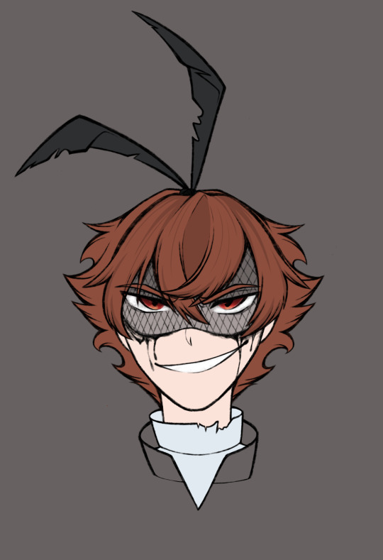
so this was a drawing i tried doing of an overblot!Ace design made by my very lovely mutual @ai-0uch !! I had this whole idea of what I wanted to do but then I realized something- I did his design wrong aKWEJHGRH. He has a flower over one of his eyes and I didn't realize it until After I started coloring. Not to mention the fact that for some reason this drawing is too intense for my laptop to handle??? Every time I try opening it to work on it it just closes the app. So I'm physically unable to work on it
Still love how I did his hair though. And I may actually redo this since I'm still so in love with this design
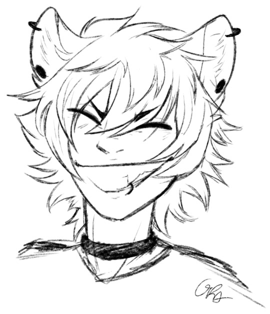
Punk Ruggie!! This was a sketch that was inspired by the Punk!Ruggie design created by my lovely mutual @minccinoocappuccino !!! I loved how scrunkly he looked and just Knew I had to sketch him
This sketch is actually what made me adopt and more sketcher style! My "sketches" are usually always filled with clean and neat lines which kinda defeats the whole purpose. So this little doodle was great because I got to have fun with it and make it as wild as I wanted
And I really like how it came out!! His nose and smile are my favorite part of this one
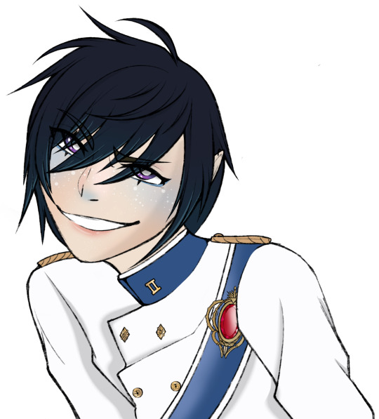
This is a little fan art I did for another one of my mutuals, @twisted-lusty !! I remembered seeing his post about this guy n went "oh he's horrible. I must draw him" and this was the result
I actually don't hate it??? There is def a lot I could fix about this but I liked the eyes a lot!! I had such a fun time that coloring this in was very enjoyable. And that's hella important to me because coloring in my drawings is my favorite part!!!
Usually, during my drawing process, i color in the eyes mid-sketch so I don't get bored. And I take so much time coloring since it's very relaxing for me to do
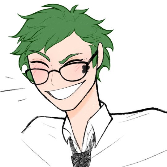
oh this fucker
Okay, this is just a silly little doodle that I made for an ask but I still love how it came out??? His face shape, the perfect head-to-neck ratio, his smile??? mwah mwah
It might not seem all that important but unfortunately, I have the terrible habit of pointing out every flaw in a drawing after I finish it and it usually makes me dislike what I made. I'm working on not doing that dw, but I actually like this one. Not to mention, the lineless look of his hair??? Woah that's new
ok so this is getting long so I will be making a second part soon
#ruin nonsense#art#twisted wonderland art#mutuals#just silly little moments#trey looking Much better than his first sketch of him that I did#thank god#twisted wonderland
40 notes
·
View notes
Note
How do you ink and color? Any tips? I love your art! 💜🖤
oh shit i got this ask months ago and forgot to answer
inking: god i hate lineart so much. the trick is to not do it 😂 unfortunately, i still find myself spending hours on lineart all the time @_@
the biggest thing i’ve found is making your lines varied in thickness. it adds to the interest. i also try to make my outside line thicker than my inside ones to break up the figure from the background. don’t be afraid to skips some lines and imply them with shading instead. i will color over my lines at the end to make them not as strong, but i’ve learned to still keep some lines black for extra emphasis.
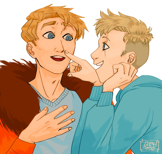
^ here’s one of my older pieces that i’ve been considering redoing. it has very little line variation, ALL the lines are colored so there’s no solid black, and there’s very little hard contrast in shading values. overall, it looks flat and uninteresting and if i had the time i’d redraw this one.
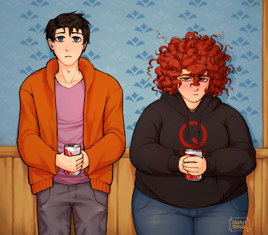
this is a more recent example of lineart that i think works a lot better. the characters are really well defined with a strong outline, but the inside lines aren’t harsh and distracting. you can see i recolored the lineart in kyle’s hair to be a dark red, and in some places it blends with the shadows to imply areas with more highlights. stan’s pants don’t have and lines in them, just the outside shape and pockets.
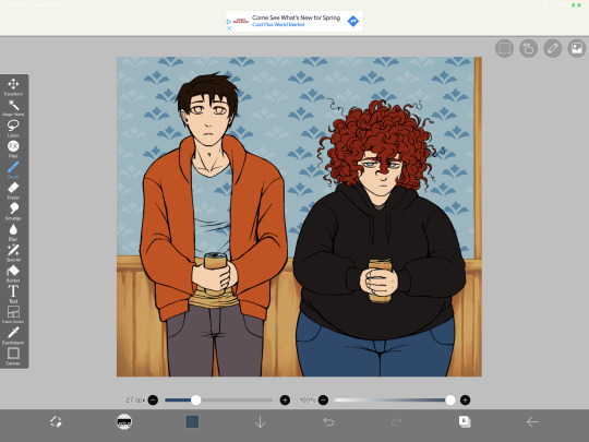
you can see in this wip what the lineart looks like before i do all the shading and fancy stuff. stan’s pants look totally flat and straight until i start shading.
a lot of the time though i won’t even do lineart, especially if it’s a big scenic piece. the more zoomed out less detail you can convey, and lineart takes up a lot of space.
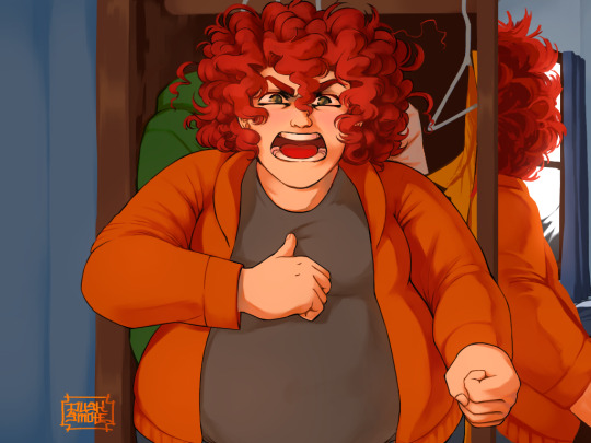
^ this piece is an example where i do both, lineart and no lineart. the mirror image of kyle isn’t the focus, and i honestly didn’t feel like going in and drawing exact lines because they’d probably look fucked up anyway. i typically don’t put hard lines in backgrounds because it would take FOREVER and just be distracting.
the one thing you do have to be careful of with lineless art is contrast. hard lines are good contrast that show you what you’re looking at, and without them your image can blend together.
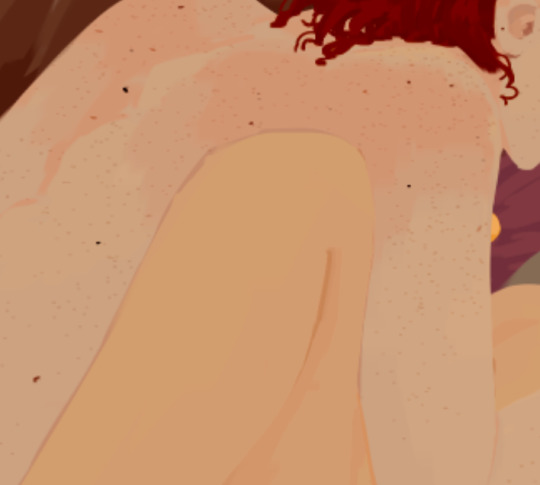
here’s part of a painting i did last august, when i was first experimenting with lineless styles (full image on my NSFW twitter). can you tell what’s going on here? i sure as fuck can’t. there’s no contrast, and it makes all the skin tones blend together in an unintelligible mush.
contrast has always been one of my biggest weaknesses as an artist, so i’ve been trying to improve over time. here’s a more recent lineless drawing:
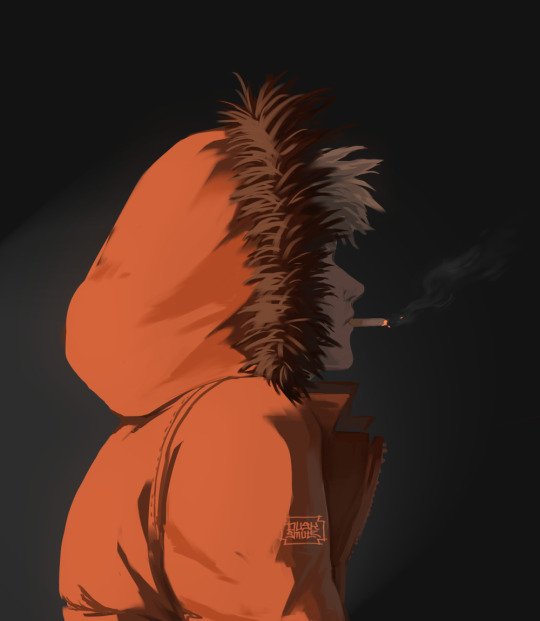
this one works because it had high contrast. the highlights are really bright and the shadows are really deep. you can still make out the facial features too, but there’s no ‘lineart’ layer’. everything was painted on in the same layer.
-
-
coloring: oh my god i love coloring. it’s my favorite part of drawing and the reason why shit takes forever. a lot of the same stuff from before comes into play, like contrast. you can also portray some really interesting moods based on colors if you’re being stylistic, but also pay in mind to your environment.
i always color my background first. in fact, a lot of the time i’ll do the entire background before coloring a piece. the environment establishes your light levels and light source, and it’s typically easier for me to tweak colors on a figure than the ones in the background. in the above example with kenny, the background is a mostly solid black with a beam of light from the left. i picked kenny’s colors to fit in this environment.
it’s also important to use references.
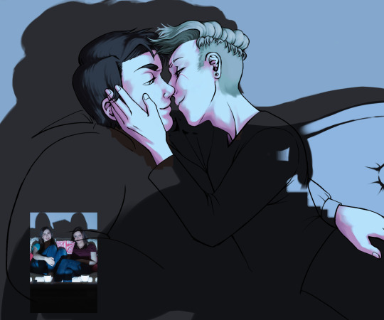
you can see in this wip i’ve got a reference image for how light from a TV looks against figures and the way their shadows are cast across the wall. it also helped me figure out what colors to use in this situation.
a lot of coloring is just trial and error to see what works. i usually start with a flat base color and add value to it. if you put all your colors on different layers it’s really easy to change them quickly.
here’s an example:
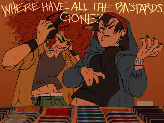
i got my base colors down and here i can see the skin tone is blending with the background, so i lightened it up for better contrast
i typically shade the skin first, then clothes. you can see here i did a dull skin tone with a bright colored shadow. this adds more contrast and interest. i always try to avoid doing dull shadows where you shift toward black. black shadows are really uninteresting and they can make your piece look muddy. i’ll typically shade with an orange, red, blue, or purple.
the final piece has a really bright highlight on it coming from behind. this just adds more visual interest and contrast. you can also see i’ve gone back into the pink shadows and added an even lighter, brighter peach value in places to show reflected light. this also gives the darker pink shadow an added outline effect, because it touches the base skin tone but looks lighter within.
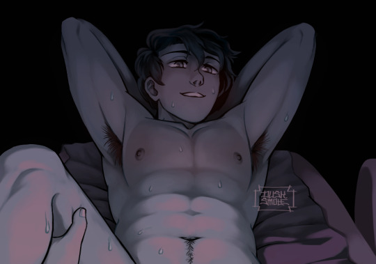
^ this one’s a good example of light and shadow (full image on my NSFW twitter lmao). there’s not a lot of color because it’s dark out, so everything had to be conveyed in values. there’s hard light across the stomach and then a shadow over the chest, but there’s still light being reflected up into stan’s face that lets us make him out. the rest is deep shadow and unimportant, so it’s all black.
that’s the other part, color and value determine where your eye is gonna look, so consider that when drawing.
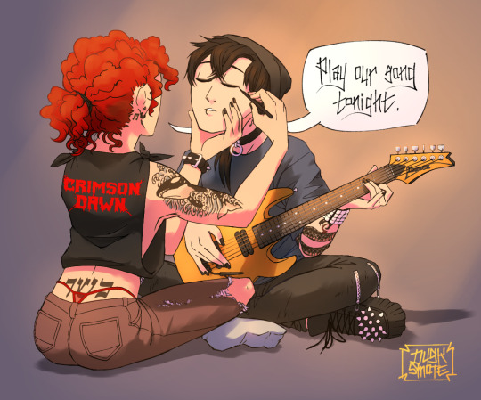
^ consider this piece i drew like a year ago. it has a lot of blues and reds, and originally i was going to make stan’s guitar blue. i don’t have the wips anymore, but it didn’t stand out and it didn’t look right with the image. after a lot of playing around i went with yellow because it’s bright, it breaks up the image, and it adds another color to the piece to balance it out.
the same thing happened when i was working on the cover image for What They Say About Us.
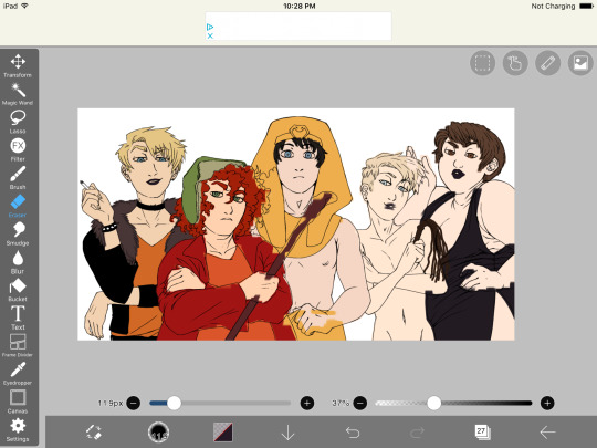
you can see in this really early wip that i’d blocked in the colors and butters is totally naked. for one, i was like “damn that kid is WAY too naked in this image” and he also blended in with stan and cartman. additionally, there was a lot of warm colors on the left, a lack of color on the right, and an overall lack of blue.
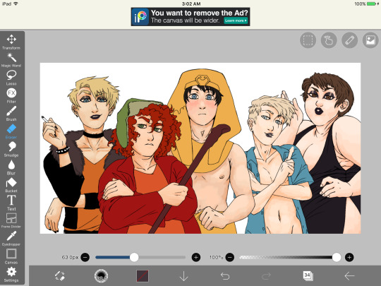
first change i made was throwing a shirt on him and it made a huge improvement. the image looks much more balanced now and he’s not super distracting with his naked-ness.
other than that, coloring is just picking your base colors, blocking in shadows, adding highlight, and cleaning it up. if you wanna improve, look at photo references. look at other people’s art and examine how they use color and value. practice practice practice. have fun with it. the most fun i have coloring comes from figuring out interesting textures like the pharaoh headdress or kenny’s leather jacket.

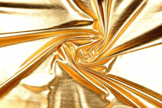
i find stock photos like this and study them to see how the light works
other than that, the rest is just playing around, seeing what works, and making things up as i go!
70 notes
·
View notes
Note
aaaa hello, i recently found your blog and fell in love w aa again bc of your retro brushes! if it's alright to ask, what are the other brushes you've used like for your lineless art? the subtle textures and edges are so sweet and i'd love to experiment ^^
Ooh hi !! It's totally fine to ask about my other brushes :D I'm putting this under read more because of how long it got though lmao
Thank you for liking my retro brushes! The ones I uploaded aren't actually all the ones I used in that piece. They're actually missing the textured brush I used to recreate the ink texture that riso printing has. I also had to make these brushes myself, but since I used a texture pack that's been uploaded to csp assets (This one, I used the one called solid-uneven tones, which is actually really good on its own!), I wasn't allowed to upload them without violating the rules on the csp site, but you can get it from my google drive here! I could have just used one brush for all four colors considering there's no halftones, but observe:

On your left, the irregularity you're going for would've been the same on all layers, which creates a lot of blank white spots that might be pleasing for some, but it wasn't what I was going for... plus if you move the layers around it sort of creates a 3d effect that might be cool but also ends up being a bit distracting, so I just duplicated the brushes and set the texture rotation to different angles ^^ In the end it's really up to the look you're going for, though. So feel free to experiment!
I also used this vertical line brush that's super fun to play with. You can see how that looks alone in here (I changed the texture's scale ratio, the actual brush has thicker lines and a wider gap between them):
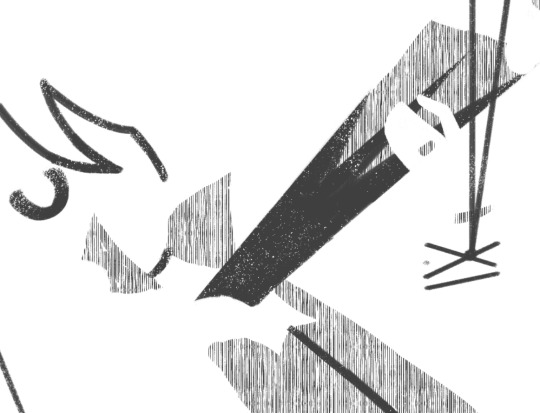
As for most of my lineless art, I actually only use four brushes!

This, for example, was sketched with a modified colored pencil brush that comes default with csp 1.10.9 which you can find here, since it's gone by the version 10.10 update
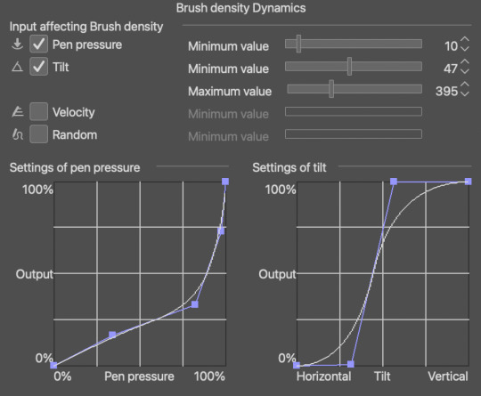
if you want the exact modifications I did, (since the default brush comes out super light no matter how hard you press) just go into brush tip > brush density > brush density dynamics and change the settings to these! Or however you see fit. The brush engines in csp are surprisingly easy to get the hang of once you've been doing it for a while
I color with two to three brushes! depending on if i want to put in the extra effort or nah
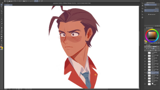
The main brush i use is the flatman soft from @/frenden's megapack which you can find in this post ! It costs maybe 15 bucks? But I believe it's worth it! It might actually be the only brushpack I'm willing to spend some cash on. You get access to so many brushes + any future updates (aka more brushes) so it's a pretty good deal hihi
For softer edges (like blushes, and the fur on this girl's hoodie wahoo) I use either the colored pencil brush from above or the flatman hard from the aforementioned megapack, depending on the kind of "soft edge" I'm going for. colored pencil brush is for anything fuzzy and the flatman hard is good for blending two colors together!

Last brush is the SU-Cream pencil! You can get it over here. I mostly use this for details, like adding lines and drawing the eyes, nose, mouth... the larger it gets the fuzzier it is, too! So you can just as well use it for soft edges if you don't dig the former two brushes
For adding texture to things, I just use this noise texture and the paper texture from this material catalogue ^^ I don't use them much, but I tend to combine the two, and it ends up looking like this, which I think is p neat:

Lastly, did you know you can import abr files to csp? and that adobe gives photoshop subscribers free access to a ton of brushes? and that I don't believe in the inherent elitism and capitalism and anti-ownership mindset that adobe's subscription service model perpetuates?
Anyway, unrelated, but here's a google drive of all the brushes offered by an unnamed over-charging company that I hate that you may or may not be able to use in programs like krita, csp, and procreate
Have fun!!! I'm sorry this is really long I just like handing out brush recs :3
#filing this under uhh#resources#and#brushes#i hope this helps !!!#ask#anonymous#edit: I FORGOT TO ADD TBE LAST LINK F.... but i put it in just now lmao
18 notes
·
View notes
Text
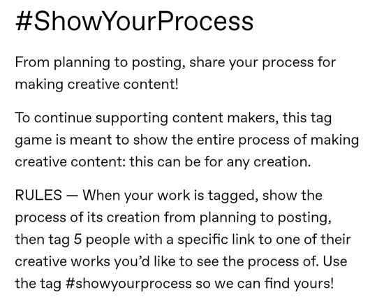
the always wonderful shelley @shanheling tagged me to do this thank u so much!! i think that everyone i wanted to tag has already been tagged to do this but if you feel like doing this feel free to consider urself tagged by me!! im putting this under a readmore bc its long and i ramble a lot
the piece i was tagged to explain my process on is this oc piece! unfortunately i have a habit of deleting my original clip studio file once ive finished my art and saved it as a new png file, so i dont have the file to show the sketch and different stages of this piece. but I still can go through my general process and talk about how i did that piece!
1. planning
honestly i think about the art that i want to do a lot, and in this last year or so ive thought about the art i want to do more than ive been able to actually create and finish that art that i want to do. for my planning i tend to do a lot of different thumbnail sketches for the art im thinking of
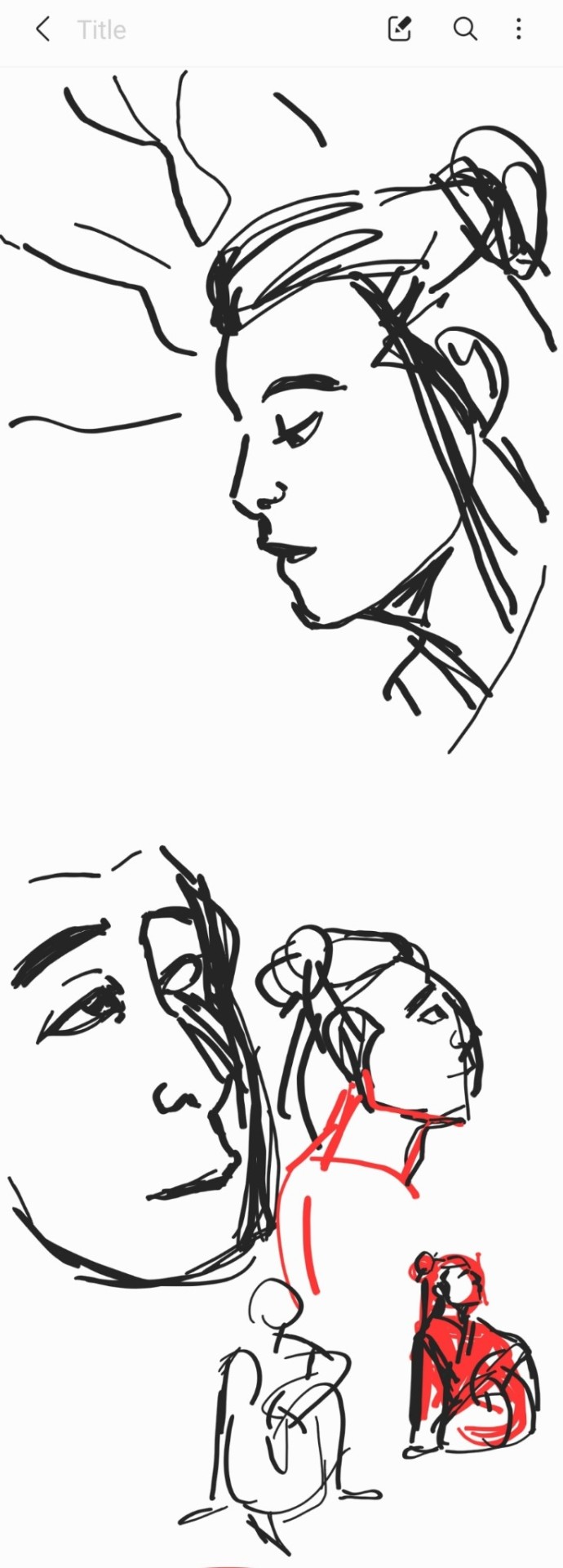
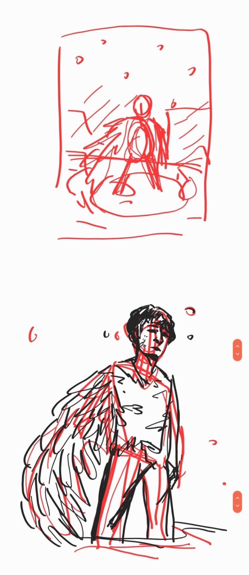
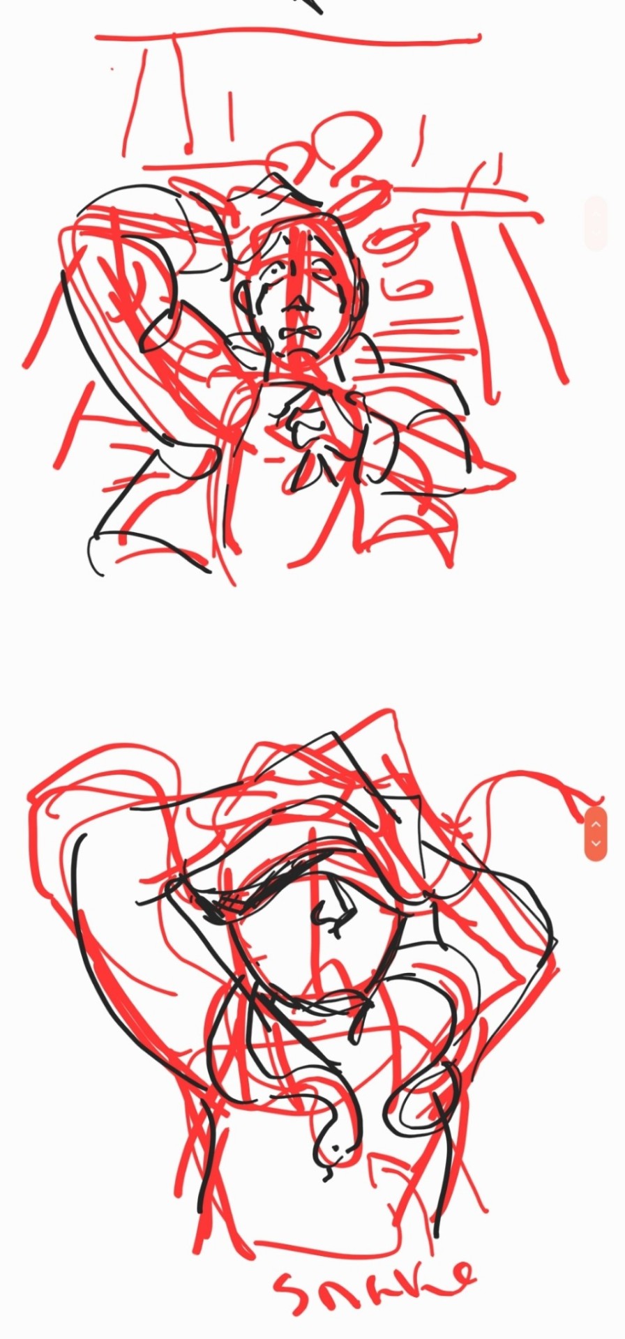
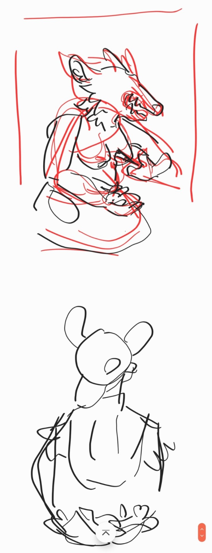
these are some examples of thumbnails, a lot of times ill do thumbnails just on pencil and paper and with some of these theyre done quickly with my fingers on my phone note function on a day where i was feeling too bad to get up and draw on paper but still wanted to get the thumbnail ideas down. two of these are for the same songxiao piece that i still havent finished and i have more thumbnails digitally on clip studio for the same piece, i do a lot more thumbnails when a piece isnt working the way i want it to and theres times where ill completely scratch a thumbnail or a sketch and start over in order to do more thumbnails because i dont feel happy with some aspect of it.
two of these are small gouche painting thumbnails for two pieces i did maybe a month or so ago, i did the thumbnails and then tried to expand on them digitally and im wanting to do more thumbnail paintings like this in the future because it was fun
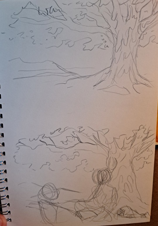
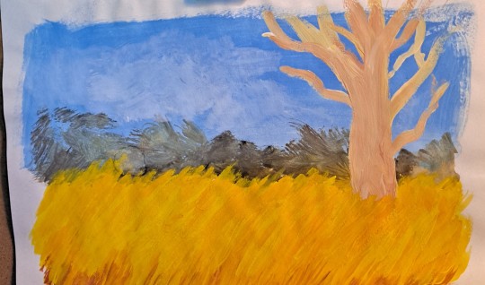
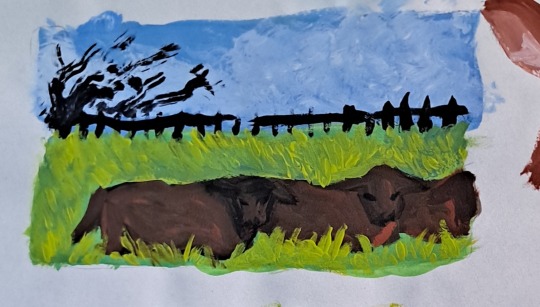
for the piece of my oc trio it was based off a series of ask prompts i got for a few different outfit prompt memes i had reblogged, so i based their outfits on the ones in the meme. when im drawing figures i tend to try and get the movement down in the poses when im sketching, i do several rough sketches of the pose before beginning to start setting down lines (if im doing lineart at all because sometimes i dont like doing lineart and do a more lineless painting kind of style). i really try to get my art to convey some kind of emotion, in the oc piece i wanted it to feel fun and like youre seeing three best friends while theyre out on the town having a fun night
2. creating
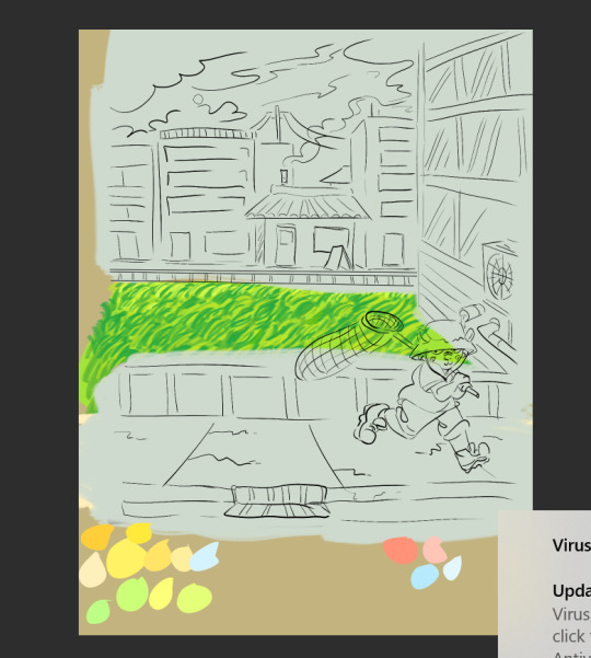
this is the only real example i have of a piece in the middle of being filled in and created, this piece is one that im really not very happy with & have had lying around for a while and ill probably scrap it and try to come at it from a different perspective at some point. but anyway it still shows what i do, i lay down a kind of neutral gray color underneath my final sketch/lineart if im doing lineart in that piece and then i start picking out the colors that i want for the piece and kind of setting out a pallette for myself. i dont do this color pallette thing 100% of the time but i do it really often, especially if im working on a commission or a larger piece where i know theres going to be a lot of colors or if its a piece where im not sure exactly what color scheme i want so laying out the colors together helps me kind of decide what kind of scheme i want. i am sooooo picky about my colors in my art i am genuinely obsessed with colors in art and there are times where i really have to stop myself from working on something forever just constantly adding more colors or putting little tiny changes and gradients in the colors.
after ive got the colors i want down i tend to try and block out parts of the piece with the base color for that section, and then i start to paint with the colors that i want to go on top of that base color from there.
once im satisfied with the colors/shading/rendering and everything ill go back and look over things and will fix things that look off or sometimes completely redo segments if they dont look right to me. when i was younger and mainly doing digital art using my phone and my fingers i would use a lot of filters and overlays on top of my art once i was done, and honestly im glad to not be doing that anymore because i dont think it made my art look any better. i do color adjustments and sometimes will put on a color overlay or a layer to emphasize the shadows and the light in the piece, but i try to keep those layers to a minimum and like i said before i have a tendency to obsess over the colors and ill spend a good amount of time in the color adjustment tool of clip studio and then ill just decide "actually it looks fine as it is" so yeah!
3. posting
i feel like i dont have a lot to say here gbfm i mean i honestly have a lot of thoughts about the relationship between artists and social media and how social media changes our views on art including our own art and how we can feel like we constantly need to be posting new art and just become content machines churning out new stuff. but ill save that rant for another time. i used to be really concerned about how many notes my art would get when i was younger, and i dont at all blame anyone who still is very concerned about that bc it sucks when u work hard on something youve created and then you dont get a lot of recognition for it, but honestly within the last two years or so i feel like ive begun to have a lot healthier relationship with posting my art. i really just post my art on my art blog, reblog it to my main blog, and then thats that yknow! i do really appreciate any and all support people give me, it means the world to me, but for me having the mentality where i dont need to post all the art i make and i dont need to be posting every day or every week or every month even has been a lot healthier for me because then im not constantly asking myself why didnt this get notes is my art awful??? and yeah i just kind of post it and my brain goes okay were done with that art we gotta make more
ive honestly been struggling a lot with art thru the pandemic and if youre reading this and have been struggling with creating in any way recently or even before the pandemic, please know theres no shame in having trouble creating and it doesnt make you bad at whatever it is u create!
thank you for reading this, feel free to consider urself tagged by me again if u want to do this!! love u all
6 notes
·
View notes
Photo
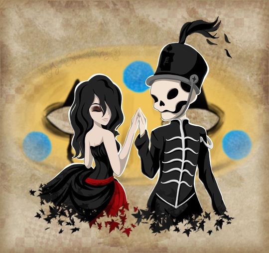
I will be with You
When you go, just know that I will remember you If living was the hardest part, we'll then one day be together And in the end we'll fall apart, just as the leaves change in color And then I will be with you, I will be there one last time now --My Chemical Romance, "It's Not a Fashion Statement, it's a Deathwish" ____ It's rare that I'm this proud of an artwork I've created. ^_^ Usually, there's some glaring issue or just an assortment of small things I'd still change if I had the patience and/or artistic ability to do it. Or even just some things that I feel like could've been done better, even if I know it did the best I could. This time? No. Not right now, shortly after it's been completed, anyway. I'm sure years down the line from now I'll look back and feel at least slightly different. But as it stands now, while I'm sure it has its faults, I am truly happy and truly proud of what I've created here and whatever faults are there aren't bothering me at all. So what then is this, exactly? This my dear Sparklers is a visual love letter to the band I discovered just a little too late but was still there for me when no one else was all the same. Earlier this month, I uploaded a different piece of art to celebrate the announcement of My Chemical Romance's Return, but even when I uploaded that one I was already thinking of doing another one, this time something that was more obviously fan art. But not just fan art as I've done for them in the past (Exhibit A, Exhibit B, and Exhibit C), but something extra-special and fun. I really did go into creating this wanting it to be as I described it above; a visual love letter to this band that I love so much and could not be happier that they're back. As such, I've squeezed in as many references as I could: 1. The female figure is molded after Helena from the album Three Cheers for Sweet Revenge 2. The male/skeleton figure is supposed to be Pepe (that's what Google said his name was, anyway), the icon and seemingly marching band conductor from The Black Parade album 3. On Pepe's hat, I replaced the usual symbol with the Candle symbol that's been featured in the band's Return artwork 4. They fade into leaves based on the line from It's Not a Fashion Statement, It's a Deathwish (a song from Three Cheers) that I quoted at the top of the description 5. behind them is Party Poison's mask, as featured in the Danger Days music videos 6. on the mask, I replaced one of the black triangle shapes with the hanging man silhouette from I Brought You My Bullets, You Brought Me Your Love 7. The rest of the background is inspired by the covers for the Conventional Weapons releases (which in my mind I count as essentially an unofficial fifth album) (Debatable) 8. Their touching hands could be an indirect reference to the line "And as we're touching hands, and as we're falling down" from Demolition Lovers, a song from Bullets. That's at least one reference each (Three Cheers technically got two) for each of the main releases, plus one directly related to this new era we don't know much about yet. It's not an exhaustive "spot the reference" game, but I'm glad I was able to incorporate as many as I did. Now that I've explained them, maybe I can talk about my process without having to stop to re-explain each reference as they come up. After some brainstorming, I got this image in my head of Helena and Pepe in this pose (inspired at least partially by this pre-existing fanart I've seen many times before) , which to me is a "renaissance dancing" pose but I'm sure there's some other better way to describe it I haven't thought of. I tried for a very long time to find a reference image of this exact pose to help me get the proportions and general anatomy right within my own stylization, but for the life of me, I couldn't find anything close enough to suit me and I really didn't want to have to settle for something else. As such, I'm sure the proportions and anatomy are off, but even so, I think I did pretty good considering. The main issues I ran into during sketching were mainly balancing the energy between the two characters--which I do think I managed in the end--Helena's skirt, as she's supposed to be holding onto it with that hand you can't see, and Pepe's torso. Originally, I was planning on doing this piece traditionally, but once the sketch was finished it almost immediately clicked into place that I'd be better served to do it digitally, considering what I wanted to do with the mask in the background already, as well as the leaf-fade. (The Conventional Weapons reference hadn't been planned yet, and it was technically only made possible later on by this piece being digital.) Luckily, doing things digitally meant that Pepe's torso was fixed pretty easily. It was too thin in the sketch, but all I had to do was select the right lines and move them out a bit in Photoshop. He's still a bit thin and not super buff, but personally I'm letting that go because...I mean, he's at least part if not all skeleton. If anyone's going to be too thin, wouldn't it make sense that it's him? Helena's skirt I did end up happy within the sketch but...we'll come back to the skirt in a moment. Pepe's...face? looked a bit odd in the sketch, but other than that, once I was happy with that foundation, I scanned it in and got to work on digitizing everything. I went over my lines for Helena and Pepe the way I normally would for something like this if a little intentionally messy instead of trying to get them super clean--as I thought that might be appropriate here--and then I paused with them to work on the mask behind them. The mask admittedly came out very poorly in the sketch, just because I bothered to look up no references for it whatsoever once I decided I was going to make this digital and I knew I could just draw half of it and flip it over. And I'm glad I didn't start trying to follow my sketch lines for it at all because looking up actual references showed me that would've been way off. While I had my reference up, I ended up going in and basically full-coloring and detailing the mask right then. That's the beauty of digital work; a lot of steps can be done basically out of order from how you'd have to do them traditionally and it doesn't matter because you can just move layers around and adjust effects later. I went with this pseudo-soft shading based on the colors and shadows I was seeing in my references, even though I wasn't sure yet exactly how I was going to shade Helena and Pepe. I figured that even if I used a different method for them that I could either go back and adjust the mask as necessary or that it wouldn't matter since the mask was part of the background anyway. Once that was done, I went back to ponder my two figures and the leaf effect that I wanted to do with them. And again, I went a little out of order here, as I ended up filling in the silhouette of Helena and Pepe with a blanket layer of gray so I could see how them blocking the mask was going to look (and I figured based on past experiences I might need the blanket layer in white later). From there, I went into working on the fading-to-leaves effect. My logic was that I'd need mostly the silhouettes of the leaves and then I'd get what I wanted after playing with layer effects or something. This assumption ended up being correct, but we're not there yet. As I worked, I kept looking at my "finished" messy lines. Something just didn't feel right. Honestly, I couldn't tell you where the idea to do this lineless look came from, but it got in my head as I was working and I kept looking at the lines I had and not being happy to just color those in as I normally would, shade it, and call it a day. I tried. I tried really hard to ignore the urge to at least try it and carry on as I was. I'd already come this far, and I'd be done so much faster if I stuck to the plan...But!! Clearly I lost that argument with myself. You know what though? I'm glad I did! I don't think I've ever done lineless art like this before, not counting my watercolor work where that's just part of the process to me. But digital? Certainly not. Human figures? Also no. I've come close in the sense that I've shaded my art before, turned off the line layers before, and thought, "oh hey that almost works without the lines because of the shading," but not much farther than that. Naturally, I wasn't even sure how or where to begin, so I went with what came naturally to me. I started by just filling in the lines as I normally would have, and then I went back layer by layer and went back and forth between having the line layer (with the opacity brought down somewhat already so I could sort of see what I was doing) on and off to try and balance the shapes between what they looked like with and without the lines. It's weird because if you ever try this, it's a little like having to figure out a bunch of individual silhouettes that make one whole one, except you need them to be a little more defined if you want them to make visual sense. That step and the next one, the shading, are tied in my mind for which one took me the longest. For the shading, I really just went in blind, using hard-edge cell shading, though originally I planning to come back with some soft shading in certain areas later. The soft shading ended up not happening partly because I liked it much better than I thought I would without it, and I thought the hard-edge shading made the figures pop a little more compared to the background. The thing about this was the same issue I run into with my lines nowadays; to get smooth shapes I spend a while going back and forth between putting color down and erasing it, and sometimes undoing and redoing the same line a dozen times to get it right in one stroke. But that's really my own fault for being stubborn and trying to work solely within Photoshop and not use other programs, as I know good and well I'd have less of that issue if I'd hop into Paint Tool Sai and use the linework layers in there. What can I say? I live up to my Capricorn sign by being as stubborn as a goat. Anyway. The biggest challenge to figure out the shading for was Helena's skirt. I think I would've still had issues with that though even if I colored and shaded my normal way, with the lines and everything. It's just the position it's in that complicates things. I actually did a good amount of shading in reverse here, where I'd make the base layer the shadow color and then the layer on top would be the regular color, as in some cases it just seemed easier to do that than the other way around. The part of Helena's dress around the top, for example. Or Pepe's pants (what little you can see of them). Additionally, I ended up leaving the feather attached to Pepe's hat alone and not really smoothing it out, as I thought the roughness and inconsistencies worked really well to make it seem more feathery. With enough patience and persistence and much back and forth among the various layers, I made it through all of that. I was a little concerned at first about some of my color choices and if the shading was too harsh in some places or not, but I mellowed out as I worked and ended up not making make adjustments after the fact. For instance, originally I thought I'd go back and make Pepe's...skin? closer to a true white and this fleshy off-white color was more of a placeholder, but the longer I worked with it, the more I didn't want to change it. It actually makes sense, given that his hands are normal (as they are presented in official artwork and other fan art not made by me) and that bones usually are naturally more of an off-white color. And I also think it just looks really good next to Helena's pale skin. The hands were a special challenge in regards to both shading and coloring, as hands like to be the more complicated part of a drawing more often than not, but even that I managed to get through with a lot more ease than I would've bet on. The other thing about that is that I was surprised once I got through the steps at how much better Pepe's face looked in comparison to the rest of the drawing. As I mentioned before, it looked odd in the sketch. But one I had most of the colors for him and Helena filled in digitally, the contrast or something just made it look infinitely better. (Combined with a hefty dose of earlier back-and-forth making adjustments to his jawbone area.) Originally, I thought I might use the same cell shading for Helena's eyeshadow. However, while I was still thinking of adding some selective soft shading, I added it using one of the brushes I'd used on the mask earlier. It looked so good to me that even after I tried added the soft shading with it like I planned and decided I didn't want/need it anywhere else, I kept it. And for the record, Helena's hair is kind of the wrong texture (it's officially more straight than this) and she's missing this little netted veil thing she's supposed to have, but I had a very specific vision in mind, so those were the two creative liberties I took with her design. I say it's fair game since I took a liberty with Pepe's hat to get the Return reference in. And besides, those two details being off doesn't make her totally unrecognizable if you know who Helena is in the first place. Once they were done, I spent longer than I bothered to document playing with the leaf layer I'd made earlier to try and figure out how to get the effect I wanted. Sparing you the boring details of my trial error, as I'm sure this description will be long enough without them, I eventually determined the best thing to do was to have one layer of the leaves on top set as an "overlay" layer, and another behind/beneath Helena and Pepe. Then I went back and extended my color and shading layers to extend down over the leaves, and I arranged and clipped the layers accordingly. Technically, the overlay layer wasn't necessary, but it added a little extra dimension that I really liked. By that point, it was my second day of working digitally and getting late, but I had to do one more thing before I could go to bed with my mind at ease that night. With Helena and Pepe done, I turned the mask back on (I'd turned it off so I could focus on them without it distracting me or otherwise getting in the way) and I felt like they weren't standing out enough against it. The bright yellow color was competing too much for my eyes' attention. So, after trying the "stroke" blending option in white and that looking God-awful, I added a new layer between them and the mask and manually gave them a white outline. It wasn't a perfect solution, and I knew that even then, but it was enough that I could sleep soundly knowing how far I'd gotten with the artwork. The next day I had to take a break from working on this to bust out a painting for the challenge I decided to take on this month, but I went back to this as soon as I could after that was taken care of. When I came back to it, I acknowledged that I technically could've left it as it was and call it finished. But I still didn't like how obnoxious the mask seemed for a background piece and it felt...I don't know. Almost hollow, in a way. It was a cool graphic, sure, but I wanting something more than that. Again, I'll spare you most of the nitty-gritty details. But long story short, I played around with layer effects and filters for a while until I had blurred the mask out just enough that it wasn't so obnoxious but also so looking at it directly didn't make me nauseous, and the edges were softened so it felt more like a true background piece and not just an accessory that had been plastered carelessly back there. It was only after I started saving off versions with different backgrounds--one with no background, one with white, one with black--that I realized I was missing a golden (semi pun intended) opportunity to incorporate a Conventional Weapons reference/allusion. Which was exciting because I'd previously been disappointed that I couldn't think of a good way to do that. I went back and forth on layer styles and adding texture with brushes and things for a while on that too, but you can see what I ultimately settled on. It's not a 1:1 to the CW covers, but I'm really pleased with it anyway. I did end up adding a bit more to the white outline in a few places and adding a drop shadow to Helena and Pepe so they'd pop a bit more (it almost makes them look like paper cutouts to me!), but really the only other thing I had to do after that was add my watermark. It took roughly 3 days of work from start to finish, but I was honestly surprised by how fairly smooth the process went. Especially considering the new things I'd tried along the way. I can only assume it's because of just how much my heart was really into making this piece. As I said before, I am truly proud of how this piece turned out. I love it. I love it, and I love the band that inspired its creation. Even the title says a lot here, I think. I picked this line that's repeated at the end of It's Not a Fashion Statement, It's a Deathwish, as it was a leading inspiration with the leaves and everything, and after looking at the lyrics I realized how fitting that line is for this. I discovered My Chemical Romance two years too late, two years after they broke up in 2013, but I've stuck by them ever since, and I will continue to do so, with whatever the unwritten future holds. They've changed, as anyone would over the course of six years, but they came back anyway. Even if it's just for a few shows and they're gone again. Or if it's going to be so much more than that. They. Came. Back. And that's not an easy thing to do a lot of the time. And so, I show my solidarity. I will be with you, MCR, no matter what comes next. You were there for me, and now it's my turn to be there for you, even if it as just another fan among the crowd. And that's really all I have to say on the matter. ____ Artwork © me, MysticSparkleWings ____ Where to find me & my artwork: My Website | Commission Info + Prices | Ko-Fi | dA Print Shop | RedBubble | Twitter | Tumblr | Instagram
#mcrmy#mychemicalromance#mcr#helena#the black parade#three cheers for sweet revenge#danger days#thetruelivesofthefabulouskilljoys#killjoys make some noise#conventional weapons#return
7 notes
·
View notes
Text
OH HAY for the toonblr positivity event i got @onelinerminers !!
STRATO!!!!!!!! youre one of those ppl i really need to try to talk to more cause i think youre REALLY epic but from the conversations we have had, ive noticed youre super chill and fun and nice!
your sense of humor is really good OIDSJGIOSDJGSLJK i love it when i see you pop in streams and stuff cause im like "YEAH ITS PARTY TIME" !! your presence just over all is really good, you just radiate a really good energy if that makes any sense? like when youre around its like, ultra fun & at the same time im not stressed out at all? like sometimes my brain fries itself when too many people are talking but i dont get that problem when youre around :^0
also god from all of this i realized i wasnt following you for some reason? like i had been wondering why i havent seen you around so much but then WOW im just boo boo the fool
ANYWAYS!
your art?????? Your Art?????? is AMAZING hello?? i could go on about this one all day AAAAAAAAAAAAA i LOVE how cute and smooth your art is ;o; you do a fantastic combination of rubberhose + your own unique thing! i really like how you draw fluff and ears in particular... plus your expressions are really energetic and fantastic!! the way you are able to convey so much emotion in the eyes alone is really inspiring
and youre ultra skilled at both lined and lineless so [rubs my eyes all over the screen] id almost be jealous if i wasnt so happy and proud of how talented u are :^0!!!
your character designs & concepts are AMAZING too, so youre really out here creating OCs that your epic art style does INCREDIBLE justice & vice versa <3 __ <3
i really appreciate that you branch out and do different species and variations too! like, i think about the fossa & lykoi cat you did SO much... theyre so precious plus the fact that your sona is a pine marten is SO good HALE YES <3 __ <3 pine marten are really unappreciated animals + one of my friends who i like a lot also has a pine marten as one of their sonas so whenever i see one i think about him and im like "hell yes..."
i really want to learn more about your art and ocs (caradog is literally precious ;; and jillian is SUPER interesting, if you like OC interactions i also have a nasty jerk magician + another magician who isn’t a nasty jerk i could throw her way [eyes emoji]), but from what ive seen from them so far im already super in love & interested!! youre doing amazing ;o;;
im really glad i got you for this event cause it made me realize that i hadnt been following u before, so now i can actually see more of your art/ocs if you decide to post stuff!! which is epic >:D plus youre just a cool person in general ik we don't talk much but i love seeing you around!!
have a nice day !! ^^
10 notes
·
View notes
Text
star wars creator meme
tagged by the always wonderful @coffeeandtin ! thanks so much :D
You’ve been tagged in the Star Wars Creator meme! Pick 1 - 10 works you’ve created (fic, art, gifsets, aesthetics, videos, playlists, etc) & tell us why you’re proud of them! Then tag your friends!
This will mostly be artwork, haha
Nik Walker as Aaron Burr - Recently I got to see Hamilton, and Nik Walker really impressed me, so I did some artwork. Not only am I happy with how it turned out (especially since I don’t do lineless paintings very often), but HOLY CRAP when I posted it on twitter and tagged Nik Walker, he was so sweet about it. He said “HOLY HELL THAT’S AWESOME”, retweeted it, then asked me if I had an instagram so he could give me a shout-out on there. I sent him a PM that said, “Thank you so much! You made my week.” He replied, “You made MINE!” Anyway, I just about died. :P
Faraday and Vasquez - My second Mag7 drawing! I’m happy with all my artwork for Mag7, but this one just stands out to me. Drawing more than one person is always intimidating for me, particularly when I’m doing a detailed drawing, so this was an accomplishment.
Moana - The second (shared) piece that I drew with a tablet. Before that, I literally did all my digital art with a mouse pad, and my hands probably wanted to murder me. It was so much fun learning to draw with different tools, and I really love how this one turned out.
Star-Lord - An earlier example of my work with digital painting. It’s more detailed than a lot of the stuff I did back then, and even knowing I could do better now, I still look back on it with pride.
Claire and the T-Rex - Sneaking an 11th one in here by giving two links, because I did fanart of two different shots from the same scene in Jurassic World. Proud of both because of the amount of time and effort I put in. The first one has more vibrant, contrasting colors than I ever attempted back then, and they both have a more extreme approach to shadow and light than a lot of my work normally does.
Witch - A rare example of original art, haha. I love how it turned out, and though I generally prefer making fanart, it’s a nice feeling to do original stuff from time to time.
Disney!Style Peter Quill - Haha, I basically just mashed up Peter and Prince Eric, ending up with a couple of stylized drawings that I’m really happy with. Like, I think I did pretty well getting that Disney vibe, as well as showing Peter’s personality.
Time Traveler AU - Just went ahead and linked to the whole tag on my blog, since I’ve only posted a few things for it. This is an AU I will probably never write, but feel free to read my long, rambly post about it, haha. Honestly, I’m more proud of the artwork and moodboard thing I made for it, since those are a bit more put together.
Borrower AU - Again, linking to the tag. It’s hard for me to choose anything in particular, but I’m proud of myself for not remaining shy about this random idea. One day I just decided I would jump into it and not worry about anyone finding it weird, haha. And now I’m tweaking some of the fics and posting them on AO3, so that’s been fun. ^_^
One Heart Beats, One Heart Breaks - The other day I realized I haven’t updated this story in half a year, so... there’s that. :P But I’m still really proud of it! It’s the first thing I posted to AO3, and I’m determined to finish it. With the first chapter, I was surprised at how happy I was with it, and that’s part of why it’s taking so long to write the second chapter. No matter how slowly, it’s gonna happen!
@oddly-drawn-thoughtss @yersifanel @cambetaut @zexeos-gx @consultingzoologist
6 notes
·
View notes
Photo
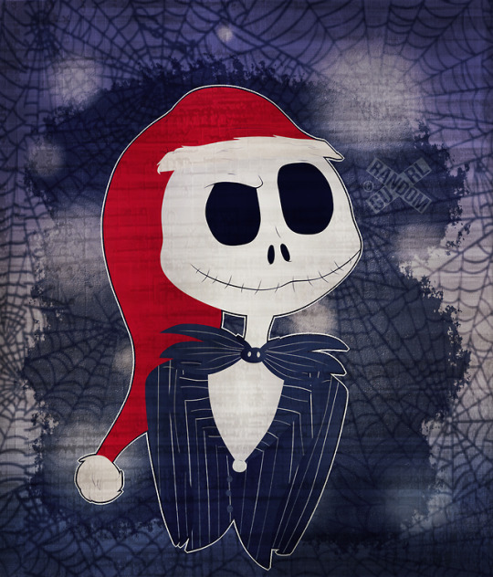
What’s this? A Skellington in June? :O
Hmm, I'm not sure how I'm going to talk about this. But at the same time, I needed a purpose that wanted me to draw this! This is more of a gift that I wanted to make for my language arts teacher, and since Nightmare is one of her favorite films I can't help but budge in making this! And since I'm all for loving my teachers that I had this year, I would never think that I'm their teacher pet (well, except for my case carrier lol). And even though junior year was more of focusing getting good grades, at the same time it felt a bit mediocre. Anyways, I plan to give her the artwork as an end of the year gift tomorrow! And the artwork? Now to do something different, I wanted to do more of a lineless style, but having the shading and lighting (especially with the same colors; ex. Jack's top) mixed in with the other parts was hard. Even with the process was hard to go through with my computer running a bit slow and school stuff that I have to get ready for the end of the year (more on that later!). Also I'm sorry if the BG is shit, I was trying to go with a grey color but it didn't click. So might as well go with more darkish tones to give it Nightmare vibes, right? And hey, don't make fun of me for posting this in June either! Ughh idk, even though adding the same features to my backgrounds for my artworks is fun (bokeh especially), I'll admit that I'm a bit tired of it since I'm trying different styles and then I go disapprove it! Dx So before I end this, I apologize for not posting much atm. I even had to go through a small art hiatus to focus on school and I couldn't decide on what to draw next either. With having a lot of ideas that I've been cooking, I really can't forget about doing this one. So I do plan on posting something later this week. One more week of school, second semester finals, and I'm out! Thank you, and I hope y'all enjoy~ ^.^
1 note
·
View note
Photo
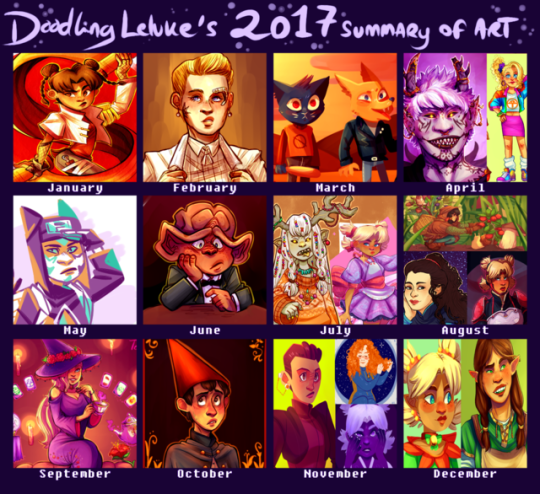
a bit later I usually am with these, but here’s what I’ve been up to in 2017. While I feel like my improvement isn’t as obvious as ith as been in previous years, I still feel like this was a really good art year for me. I actually did a lot of pieces that I really liked and actually still like months later! that is a completely new sensation for me! I feel like I’m really getting to where I want to be with my art, so hopefully this will continue in 2018.
for the first time I feel like commenting on my choices for this thing, mostly cause I just want to but also in case someone wants to know how I feel about my own art. but because theres a lot of drawings here that’ll continue under the cut
wow I use red and pink/purple hues way more than I thought. anyways.
january - this year I wanted to get better at doing at least somewhat interesting backgrounds (even if it just means a simple colour) and experimenting more with different textures and styles, and I still think this tenten was a good start. I had been wanting to draw something like this with her for ages and I’m glad I finally was able to pull it off.
february - february didn’t really have any drawings that stood out to me, but this month I started drawing a lot more “casual” trek stuff, as in stuff that doesn’t need to have a punchline. I see a lot of problems with it now, but I really liked this seven when I first drew it.
march - again, not a month where I found anything particularly good, but it was the month when I got into night in the woods (still a big fan of it) and this was honestly the best of the nitw art I did.
april - I am pretty sure the demon kankuro was a redraw of an older, shittier demon kankuro I can’t be bothered to find. Its a bit messy and his facial features are off, but I still think theres some nice details and colours. At this point I had also started to use a bit of after effects (the blur around the edges). the 80s ino is part of a konoha girls in vintage clothes thing that admittedly isn’t all that good looking, but it was a lot of fun and probably my favourite outfit drawing.
may - I spent most of this month doing art memes inbetween exams and dying, but this random kankuro somehow found its way in. yeah its not spectacular or anything but it kinda happened on a whim and its not a style of colouring I use very often. I don’t remember what brush I used but I love how it looks. pardon my french but I’m pleased with how this turned out.
june - I moved this month so I’m surprised I had time to draw at all. this sad nog represents my inner turmoil and stress at the time. probably. anyways, I feel like this was the first time I was able to cartoonify a ferengi somewhat successfully. I also finally started toning down my exessive highlighting.
july - I spent most of july stuck in the mountains with no internet, yet somehow I still managed to draw a bunch of shit I still really like. The magical girl temari was the first time I tried to do a combination of solid and blended shading. I’ve had issues with my shading for a long time and I think this was a step in the right direction. It was mainly inspired by how much I liked the solid shading of the other one, which is also the only good drawing I’ve ever done of that oc.
august - what the fuck how did I draw so many things I like in august. For the deanna I just suddenly got the idea to try something art nouveau, and while its not perfect I’m still happy with the result. The hair took forever but I’m still in love with it, and I’ve been incorporating some of those elements into my art ever since. The temari REALLY benefited from solid shading instead of me drowning it in exessive layers of purple like I usually do when I shade. idk what to say, I love it and I genuinely think its one of the coolest things I’ve ever drawn. for the top one I wanted to do something original and different from my usual stuff. The background is a bit messy but I still like the overall result and it has inspired me to draw more casual stuff that doesn’t necessarily need to be posted here.
september - no contest here, the konoha witch series took a lot of time, but I’m still happy with the result.Well for some of them at least. Ino is hands down my favourite and I think its obvious that shes the one I put the most thought and effort into (even though it started with a random sketch of tenten). Apparently I have some kind of bias towards pink and purple, which might explain why I think Ino just ended up with the nicest looking colours out of all the girls.
october - I didn’t have time to do a big halloween piece this year, but this wirt was still pretty halloween-y. the colours turned out better than I expected, especially the shading on his face. The background doesn’t really make sense, but I think it looks nice so ya know, whatever. This was also the first time I watched over the garden wall so this also has some sentimental value I guess.
november - Huevember month! which meant a lot to choose from! the kira I did on the last day of november is honestly my favourite out of all the huevember drawings I did. I don’t do a lot of drawings with the light source in the back, but I think it really worked here. idk I just think the colours and the style look really neat. It feels weird being so positive about my art hah but I don’t have anything I dislike about this one. I do have a few problems with the temari, but I just really like the colours, and I like that I did something interesting with the colours for once in my life. The tilly is in all honesty not a fave of mine, I actually kind of dislike it BUT it did get featured on after trek so I feel like it was a significant part of my ~art year~
december - I’ve had a lot on my mind this month, so sadly I’ve been really inactive here. The elf temari isn’t really all that special, but then again I don’t think its directly bad and I think the colours turned out better than what they usually do when I try shading my lineless art. The other one is a redraw of a drawing I did back in may, and while I (as always) have some problems with it I do think its a big improvement over the old one (which is so ugly that I was genuinely surprised to find that it was drawn...this year).
thank you if you bothered to read all of this! I know this was completely pointless but at the same time I’ve found that artists often hav completely different opinions on their art than others do so there might possibly be something a little bit interesting here. just a tiny bit.
#listen its late as hell im the only one still up and i felt like blathering#summary of art 2017#something happened over summer idk what but from july and onwards ive started to really like my art
17 notes
·
View notes