#barplots
Explore tagged Tumblr posts
Visit Tumblr Blog
Explore Tumblr blogs with no restrictions, modern design and the best experience.
Last Seen Tumblr Blogs


Fun Fact
In 2020, Tumblr had 29.4 million users in the US.
Text
I swear to god this assignment is gonna kill me. I need to be able to like understand how to interpret dartR (R) SNP call rate by locus/individual but like there’s nothing out there to explain how to do that and my teacher is fucking useless. I don’t understand :(
#yes I need to choose a treshoald#no I don’t know how#not with the table not with the barplot or with the smearplot
2 notes
·
View notes
Text
Bashing Fics in the 9-1-1 Fandom
Inspired by @beforeastorm‘s very neat look at 9-1-1 bashing fics in August and in September 2024, I took another look at the numbers yesterday (23rd January 2025) and… it’s been interesting.
Methods and materials:
For that I selected the 9-1-1 (TV) tag on ao3 while logged into my account and thereby ensuring I would see both public and locked fics; beforeastorm only considered public fics so by god I hope that some of the increases can be explained by that. Then I used the Include filter function to search for [Character Name] Bashing. Where this returned nothing I employed the Search within result function to search for “[character name] bashing”, trying out variations (last or first or nickname). To double-check I also did this search for characters with established bashing tags, using the Exclude filter to ensure that I would not count any fic twice.
Some characters have a bashing tag for themselves and a couple bashing tag. For example: if you search for Margaret Buckley Bashing, you will be offered two tag: Margaret Buckley Bashing and Margaret Buckley and Phillip Buckley Bashing. As far as I could tell, searching for the individual bashing tag also always counts the couple bashing tag, so the couple bashing tags could be disregarded. A list of the characters I looked at is under the cut.
The numbers were collected in an excel file and assigned the characters categories: main (meaning main adult character), family, love interest and other. I also took note of the gender. I did some analysis in excel before having the smart idea that I might as well use this as a training exercise for R (and I am very bad at R).
Disclaimer: this will not include all bashing fics because sadly some people are not familiar with tagging or love letting people run into a fic they will not enjoy. Also while I much prefer it when people tag bashing, some are overly careful and may use bashing tags when not really needed. Still, I much prefer that to people not tagging.
Results:
Disappointing but hardly surprising at this point: the extremely dubious honour of being the most bashed character goes to Tommy Kinard with 660 bashing fics to his name. That obviously makes him the most bashed character of the love interest category, followed by Ana Flores (241) and then Taylor Kelly (118 ^^). The most bashed characters of the family category are the Buckley parents (347 and 325) followed by the Diaz parents (238 and 176), with the mothers being given more bashing fics than the fathers. In the other category, Vincent Gerrard leads with the 66 times his bashing tag was used. Chase Mackey is in third place with 26 fics, and in second place is the Firehouse 118 Crew (45) which probably could be rather counted to the main character category.
Which brings us to that category. Chimney has been bashed in 317 fics, making him the most bashed main character. Followed by Maddie with 223 fics and Bobby with 163. Out of all the main adult characters, Buck is the only one without an established bashing tag. There are 7 fics out there that you can find if you employ a variation of queries with his name + bashing; that is if I have made no mistake. Because honestly? Finding Buck bashing fics is hard. Athena and Buck are the only main characters with less than 10 bashing fics to their name.
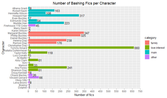

Fig. 1: This fucking barplot was a pain to make but here we are! Characters on the y-axis and number of fics that use respective bashing tag on the x-axis. The total number of respective fics are shown next to the bars; colour indicates the category the characters have been placed in. Top: continuous x-axis to allow for an easier overview of the proportions of the bars, bottom: x-axis with a break to allow a closer look.
Dishonourable mention: why the fuck would anybody write a fic with Christopher bashing?
Honourable mentions: Boeing and dolphin bashing. It did make the otherwise pretty depression task of data collection much better.
Gender-wise there are more bashing fics about men (54.3%) than there about women (44.3%) (of course I did not look at every character so I will have missed a few bashing fics). If nobody was writing Tommy bashing fics, that would be flipped (male: 43.0%, female: 55.3%).
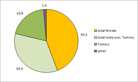
Fig. 2: A lovely pie-chart showing the bashing fics per gender, with male subdivided into Tommy, and the other male characters.
Which brings us to the tragedy that is the hate this fandom has for Tommy Kinard. If you add up all the bashing tags I found (which does not equal fics, some people are happily bashing away in their fics), then his account for about 20%. Which is insane, wtf.
Discussion:
This was really depressing tbh. I showed the bar plot to my sister and she asked me what bashing is. She’s been in fandom for years; she was in the supernatural fandom and has read fics and somehow I still had to explain bashing to her. So really: yay for us, this fandom really is something.
If you look at beforeastorm’s tally from August, you’ll see that Tommy bashing fics began popping up in April 2024 and since then he has become the most bashed character (out of those I looked at, I’m pretty sure that this holds true).
Now you may be wondering why these characters are being bashed. Warning: the following part is based on my opinions. I did not read the fics of all 3291 bashing tag instances that I found.
In some cases it seems pretty straight forward: Vincent Gerrard, Chase Mackey, Doug Kendall and Olivia Ortiz need no further explanation. Other “villains” such as Jeffrey Hudson and Jonah Greenway have no bashing fics that I could find though.
The Buckley and Diaz parents getting bashed is also not surprising. Can’t say that I’m wild about it since my experience with reading fics that tag bashing was usually “here’s a random evil person I made up and then gave the name of an existing character”, but I understand where people are coming from.
Now the main characters… I’m just gonna say it: it’s people who have wronged Buck – according to some of the fandom at least. Chimney’s crime: the punch (no, I’m not defending it, but some people really have run with this). Maddie’s crime: not telling Buck about Daniel and then wanting to talk to him about it when he didn’t want to. Bobby’s crime: not allowing Buck back to work. Hen’s crime: idk, being Chimney’s bestie?
As for Eddie: I guess he’s a misogynist now, if you ask some people? Idk, it’s not like I read the summaries of all the fics because there are too many and also just no.
The love interests – which yes, in this case all happen to be Buck and Eddie’s love interests, imagine my surprise – happen to be “in the way” of shipping I guess. I did look at other love interest or ex-relationships and could find nothing.
Tommy’s crime: loving Evan.
Conclusion:
If you write bashing please keep tagging it.
Appendix:
All the characters I looked at: characters with no bashing fics I could find, characters with an established bashing tag, characters with no established bashing tag but bashing fics can be found
Main adult characters:
Athena Grant, Bobby Nash, Hen Wilson, Chimney Han, Evan Buckley, Eddie Diaz, Maddie Buckley.
Recurring characters, family:
Michael Grant, David Hale, May Grant, Harry Grant, Beatrice and Samuel Carter, Emmett Washington;
Marcy Nash, Tim Nash;
Karen Wilson, Denny Wilson, Antonia Wilson, Nia and Mara;
Albert Han, Chimney’s father/Sang Han, The Lees, Jee-Yun Buckley-Han;
Margaret Buckley, Phillip Buckley, Daniel Buckley, Doug Kendall;
Christopher Diaz, Isabel Diaz, Helena Diaz, Ramon Diaz.
Recurring characters, love interests:
Tommy Kinard, Natalia Dollenmeyer, Taylor Kelly, Lucy Donato, Ali Martin, Abby Clark;
Kim, Marisol, Ana Flores, Shannon Diaz;
Eva Mathis;
Tatiana.
Recurring characters, others:
Firehouse 118 Crew Bashing;
Chase Mackey, Vincent Gerrard, Jonah Greenway, Jeffrey Hudson, Councilwoman Olivia Ortiz;
Josh Russo, Lena Bosko, Ravi Panikkar, Claudette Collins, Brad Torrance;
Boeing, Dolphin.
#statistics#911#911 abc#911 fandom#discourse#911 discourse#bashing fics#fanfic discourse#911 fanfic#txt
172 notes
·
View notes
Text
Mastering Seaborn in Python – Yasir Insights
Built on top of Matplotlib, Seaborn is a robust Python data visualisation framework. It provides a sophisticated interface for creating eye-catching and educational statistics visuals. Gaining proficiency with Seaborn in Python may significantly improve your comprehension and communication of data, regardless of your role—data scientist, analyst, or developer.
Mastering Seaborn in Python
Seaborn simplifies complex visualizations with just a few lines of code. It is very useful for statistical graphics and data exploration because it is built on top of Matplotlib and tightly interacts with Pandas data structures.
Also Read: LinkedIn
Why Use Seaborn in Python?
Concise and intuitive syntax
Built-in themes for better aesthetics
Support for Pandas DataFrames
Powerful multi-plot grids
Built-in support for statistical estimation
Installing Seaborn in Python
You can install Seaborn using pip:
bash
pip install seaborn
Or with conda:
bash
conda install seaborn
Getting Started with Seaborn in Python
First, import the library and a dataset:
python
import seaborn as sns import matplotlib.pyplot as plt
# Load sample dataset tips = sns.load_dataset("tips")
Let’s visualize the distribution of total bills:
python
sns.histplot(data=tips, x="total_bill", kde=True) plt.title("Distribution of Total Bills") plt.show()
Core Data Structures in Seaborn in Python
Seaborn works seamlessly with:
Pandas DataFrames
Series
Numpy arrays
This compatibility makes it easier to plot real-world datasets directly.
Essential Seaborn in Python Plot Types
Categorical Plots
Visualize relationships involving categorical variables.
python
sns.boxplot(x="day", y="total_bill", data=tips)
Other types: stripplot(), swarmplot(), violinplot(), barplot(), countplot()
Distribution Plots
Explore the distribution of a dataset.
python
sns.displot(tips["tip"], kde=True)
Regression Plots
Plot data with linear regression models.
python
sns.lmplot(x="total_bill", y="tip", data=tips)
Matrix Plots
Visualize correlation and heatmaps.
python
corr = tips.corr() sns.heatmap(corr, annot=True, cmap="coolwarm")
e. Multivariate Plots
Explore multiple variables at once.
python
sns.pairplot(tips, hue="sex")
Customizing Seaborn in Python Plots
Change figure size:
python
plt.figure(figsize=(10, 6))
Set axis labels and titles:
python
sns.scatterplot(x="total_bill", y="tip", data=tips) plt.xlabel("Total Bill ($)") plt.ylabel("Tip ($)") plt.title("Total Bill vs. Tip")
Themes and Color Palettes
Seaborn in Python provides built-in themes:
python
sns.set_style("whitegrid")
Popular palettes:
python
sns.set_palette("pastel")
Available styles: darkgrid, whitegrid, dark, white, ticks
Working with Real Datasets
Seaborn comes with built-in datasets like:
tips
iris
diamonds
penguins
Example:
python
penguins = sns.load_dataset("penguins") sns.pairplot(penguins, hue="species")
Best Practices
Always label your axes and add titles
Use color palettes wisely for accessibility
Stick to consistent themes
Use grid plotting for large data comparisons
Always check data types before plotting
Conclusion
Seaborn is a game-changer for creating beautiful, informative, and statistical visualizations with minimal code. Mastering it gives you the power to uncover hidden patterns and insights within your datasets, helping you make data-driven decisions efficiently.
0 notes
Text
Here I am, fighting my urge to burn down my college carrer because of programming.
I don't get rstudio, I don't like it, it's easy, I know but I'm error 404 in all this.
Funniest thing ever? It's because of a simple dataframe of three variables, and I want to make a barplot, I'M STUPID I KNOW BUT GODDAMIT!
And this is just this

0 notes
Text
STAT240 - Homework 2 Solved
Preliminaries This file should be in STAT240/homework/hw02 on your local computer. If you want the barplot from problem 2to render in the knitted file, download exampleBarplot.png to that folder as well. While you should create your answers in the .Rmd file, homework problems are better formatted and therefore easier to read in the .html file. We recommended frequently knitting and switching…
0 notes
Text
The Art of Data Exploration with Seaborn
Data exploration is an essential step in the data analysis process, and Seaborn is a powerful Python library that can help visualize relationships between variables and provide insights. Here's a guide on using Seaborn for effective data exploration:
1. Getting Started with Seaborn
Install Seaborn: pip install seaborn
Importing Seaborn: import seaborn as sns
import matplotlib.pyplot as plt
2. Visualizing Univariate Distributions
Histograms: Show the distribution of a single variable. sns.histplot(data, x="column_name", kde=True)
plt.show()
Boxplot: Display the distribution summary (median, quartiles, outliers). sns.boxplot(x="column_name", data=data)
plt.show()
Violin Plot: Combines aspects of boxplot and KDE plot. sns.violinplot(x="column_name", data=data)
plt.show()
3. Visualizing Bivariate Relationships
Scatter Plot: Shows relationship between two variables. sns.scatterplot(x="column1", y="column2", data=data)
plt.show()
Pairplot: Visualizes relationships between multiple numerical variables. sns.pairplot(data)
plt.show()
Heatmap: Shows the correlation matrix between variables. sns.heatmap(data.corr(), annot=True, cmap='coolwarm')
plt.show()
4. Categorical Data Exploration
Barplot: Compares categorical data. sns.barplot(x="categorical_column", y="numerical_column", data=data)
plt.show()
Countplot: Displays the count of observations for each category. sns.countplot(x="categorical_column", data=data)
plt.show()
5. Multivariate Analysis
FacetGrid: Allows you to visualize how a variable behaves across subsets of another variable. g = sns.FacetGrid(data, col="categorical_column")
g.map(sns.histplot, "numerical_column")
plt.show()
6. Time Series Analysis
Line Plot: Displays trends over time. sns.lineplot(x="date_column", y="value_column", data=data)
plt.show()
7. Advanced Visualizations
Regression Plot: To explore relationships between two variables with regression. sns.regplot(x="column1", y="column2", data=data)
plt.show()
Jointplot: Plots both univariate distributions and their relationship. sns.jointplot(x="column1", y="column2", data=data, kind="scatter")
plt.show()
8. Customizing Plots
You can customize various aspects of Seaborn plots using arguments like:
hue: Group data by a categorical variable.
palette: Change the color scheme.
style: Adjust plot style.
size: Control plot size.
aspect: Aspect ratio of the plot.
Example with customization:
sns.scatterplot(x="column1", y="column2", hue="category", data=data, palette="coolwarm", style="category")
plt.show()
9. Saving Plots
After creating a plot, you can save it using:
plt.savefig("plot.png", dpi=300)
10. Data Exploration Workflow
Step 1: Start with univariate visualizations (e.g., histograms, box plots) to understand the distribution.
Step 2: Explore relationships between variables using scatter plots, pair plots, and heatmaps.
Step 3: Investigate categorical variables with bar plots and count plots.
Step 4: Dive deeper into multivariate and time series analysis if relevant to your dataset.
Using Seaborn, you can quickly explore your data visually, uncover patterns, detect outliers, and generate insights to guide your analysis.
0 notes
Text
Déclin des insectes : une base de données mondiale passée au crible montre l’urgence de revoir l’évaluation par les revues scientifiques
See on Scoop.it - EntomoNews
Face à la crise écologique, les bases de données se multiplient pour mesurer les tendances de la biodiversité, mais elles ne font pas l’objet d’une évaluation systématique.
Université de Montpellier
Communiqué de presse
Publié le 8 octobre 2024
"Laurence Gaume du laboratoire Amap (UM, CNRS) et Marion Desquilbet (TSE, INRAE) se sont penchées sur InsectChange publiée dans Ecology, compilant des séries temporelles d’abondance et de biomasse d’insectes à l’échelle mondiale. Leur analyse complète met en évidence plus de 500 erreurs de nature à remettre en cause les résultats obtenus à partir de cette base de données, notamment ceux de la méta-analyse publiée dans Science en 2020. Elle apporte aussi des éléments essentiels à l’amélioration d’InsectChange. Leur étude, recommandée par Peer Community in Ecology et publiée dans Peer Community Journal le 8 octobre 2024, pointe le problème de qualité des grosses bases de données. Tout en ouvrant des pistes méthodologiques, elle appelle les revues scientifiques à mettre en place des mesures protectrices contre ces effets délétères pour la science et la connaissance.
Le déclin des insectes génère des enjeux environnementaux, économiques et sociétaux majeurs. Une nouvelle publication scientifique tout juste parue dans Peer Community Journal identifie plus de 500 problèmes dans la base de données temporelles mondiale sur les insectes InsectChange, publiée dans Ecology en 2021.
Cette base de données s’appuyait sur une méta-analyse publiée dans Science en 2020 selon laquelle le déclin des insectes n’était pas aussi important qu’on le pensait et que l’agriculture n’était pas une des causes de ce déclin. Malgré des critiques internationales émanant de 65 scientifiques, seul un erratum minimaliste avait été publié, laissant les résultats de cette méta-analyse inchangés et fortement médiatisés, (...)"
------
NDÉ
L'étude
InsectChange: Comment - Peer Community Journal, 08.10.2024 https://peercommunityjournal.org/articles/10.24072/pcjournal.469/
Mots clés : Insects, Terrestrial invertebrates, Freshwater invertebrates, Insect abundance trends, Insect decline, Time series meta-analysis, Methodological biases, Agriculture, Landcover analysis, Ecological data, Database quality assessment
Image : Distribution of the types of problems encountered in the InsectChange database (details in Problems.xlsx).
Comparison of the mean number and distribution of problem types per dataset between freshwater and terrestrial realms. The problem type related to cropland cover, which was only assessed for the terrestrial realm, was not included in this comparative analysis, as well as the general problem of data heterogeneity. White stars were placed in the ‘Freshwater’ barplot when, on the basis of binary logistic regression, the problem type affected significantly more freshwater datasets than terrestrial datasets (Appendix 1). Terrestrial datasets were never significantly more affected by a given problem type than freshwater datasets were.
Bernadette Cassel's insight:
En relation
Vive controverse autour du déclin des insectes - De www.lemonde.fr - 18 janvier 2021, 23:51
Meta-analysis reveals declines in terrestrial but increases in freshwater insect abundances via Scoopit
0 notes
Text
Module 10
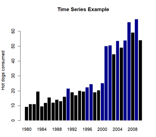
setwd("E:/College/Intro to Data Science/Rstuido") data <- read.csv(file = "Hot Dog.csv") (library("ggplot2")) colors <- ifelse(data$Beaten == 1, "darkblue", "black") barplot(data$Eaten, names.arg = data$Year, col=colors, border=NA, main = "Time Series Example", xlab="Year", ylab="Hot dogs consumed")
0 notes
Text
LIS 4317: Module #7 Assignment
For this assignment- I created visuals in R reflecting distribution analysis. 1. For the first plot, I created a scatterplot with an added grid as I thought it would be helpful to keep track of the points and their alignment to the y-axis in particular.
2. For the second plot, I created a barplot where I omitted the grid as I felt it unnecessary as it wasn’t much too difficult to read without it. (I like how the bar plot is chunked and provides some insight into the distribution of cylinders!)
Code and Plots below:


0 notes
Text
visualisation
import pandas
import numpy radioimmuno= pandas.read_csv("radioimmuno.csv") radioimmuno.head()
# Draw barplot CD3 T cell import seaborn as sns sns.set_theme() sns.catplot(data=radioimmuno, kind="bar",x="Treatment.group", y="CD3_T_Cell", hue="Treatment.group", palette="dark", alpha=.6, height=5, aspect=2).set(title='Average of CD3 T cell') plt.xlabel('Treatment Groups') plt.ylabel('CD3 T cell (count)') plt.show()

Draw barplot CD4 T cell import seaborn as sns sns.set_theme() sns.catplot(data=radioimmuno, kind="bar",x="Treatment.group", y="CD4_T_cell", hue="Treatment.group", palette="dark", alpha=.6, height=5, aspect=2).set(title='Average of CD4 T cell') plt.xlabel('Treatment Groups') plt.ylabel('CD4 T cell (count)') plt.show()

# Draw barplot CD8 T cell import seaborn as sns sns.set_theme() sns.catplot(data=radioimmuno, kind="bar",x="Treatment.group", y="CD8_T_cell", hue="Treatment.group", palette="dark", alpha=.6, height=5, aspect=2).set(title='Average of CD8 T cell') plt.xlabel('Treatment Groups') plt.ylabel('CD8 T cell (count)') plt.show()
# Bivariate plot #Relationship between CD3 & CD8 T cells sns.regplot(x="CD8_T_cell", y="CD3_T_Cell", data=radioimmuno).set(title='association of CD3 vs. CD8 T cells') plt.xlabel('CD8 T cells') plt.ylabel('CD3 T cells') plt.show()

# plot opf Frequency distribution of the status of animal ! sns.histplot(data=imm_RT, x="status", hue="status").set(title='Status of animal') plt.xlabel('Treatment Groups') plt.ylabel('Status (death/alive (Count))') plt.show()

# comments Overall, based on the three barplot, groups that were treated with radiotherapy and immunotherapy increased CD3 and CD8 T cell to the tumour compared with other groups. Also, many animals experienced death and most of them are in untreated and radiotherapy treated group, whilst alive animals were mostly in radiotherapy & Immunotherapy group.
0 notes
Photo

Seaborn is a Python data visualization library based on matplotlib. It provides a high-level interface for drawing attractive and informative statistical graphics.It’s one of the best visualization packages in any tool or language. Seaborn gives me the same overall feel.Seaborn is an amazing Python visualization library built on top of matplotlib. Check our Info : www.incegna.com Reg Link for Programs : http://www.incegna.com/contact-us Follow us on Facebook : www.facebook.com/INCEGNA/? Follow us on Instagram : https://www.instagram.com/_incegna/ For Queries : [email protected] #seaborn,#python,#datavisualization,#matplotlib,#matplotlib,#conda,#datascience,#dataframes,#dataset,#Scatterplot,#lineplot,#boxplots,#violinplots,#barplots,#pointplots,#tableau,#businessanalyst https://www.instagram.com/p/B9lRp-KgPoC/?igshid=euf636x4ji4j
#seaborn#python#datavisualization#matplotlib#conda#datascience#dataframes#dataset#scatterplot#lineplot#boxplots#violinplots#barplots#pointplots#tableau#businessanalyst
0 notes
Text
Tfw you spend literally all day coding and for your effort you have made exactly zero progress...
#i just want to print lables on my barplots. thats it.#i spent prob 7 hrs trying to figure this out and now i have my lables and i have my barplots but they refuse to become one#its so fucking annoying#i dont want to do it by hand but that would actually be easier#r why are u like this?!#im not even gonna display these so i dont kno why i try so hard#ugh im so tired#unrelated#i meant boxplots. bc i was running anovas#im too tired for this
16 notes
·
View notes
Text
I never said that. ggplot2 is my friend.
#the frustration of R is offset by how satisfying it is to make pretty graphs#I want to show u guys my beautiful barplots and boxplots SO bad but I feel like that is probably ill advised in some confidentiality way#mine#stemblr#bioblr#stats#thesis posting
13 notes
·
View notes
Photo

How “naked” barplots representing means of groups and showing standard error of means can conceal data distribution. Picture was made using scatter plot maker that combines data points with bar charts - ScatterPlot.Bar web app and R with ggplot2 library
1 note
·
View note
Text
Graphs and Data Sets in Python
Graphs and Data Sets in Python
Graph show in python¶ Categorical variables¶ BarPlots¶ In [1]: import seaborn as sns import matplotlib.pyplot as plt sns.set_theme(style="ticks",color_codes=True) titanic = sns.load_dataset("titanic") #it will load built-in data from seaborn library stored as titanic. sns.catplot(x="sex", y="survived", hue="class", kind="bar", data=titanic) plt.show() Count Plots¶ In [2]: import seaborn as…
View On WordPress
#adaption#applications#barplot#best#categorical#computer#countplot#data#graphs#introduction#language#programme#programming#scatterplot#sets#solution#variables
0 notes
Text
Séquençage du génome du moustique-tigre Aedes albopictus à partir d'échantillons de différentes populations dans le monde | bioRxiv
Aalbo1200: global genetic differentiation and variability of the mosquito Aedes albopictus
Jacob E. Crawford, Nigel Beebe, Mariangela Bonizzoni, Beniamino Caputo, Brendan H. Carter, Chun-Hong Chen, Luciano V. Cosme, Carlo Maria De Marco, Alessandra della Torre, Elizabet Estallo, Xiang Guo, Wei-Liang Liu, View ORCID ProfileKevin Maringer, Jimmy Mains, Andrew Maynard, Motoyoshi Mogi, Todd Livdahl, Noah Rose, Patricia Y. Scarafia, Dave Severson, Marina Stein, Sinnathamby N. Surendran, Nobuko Tuno, Isra Wahid, Xiaoming Wang, View ORCID ProfileJiannong Xu, Guiyan Yan, Don Yee, Peter A. Armbruster, Adalgisa Coccone, Bradley J. White
doi: https://doi.org/10.1101/2023.11.21.568070
-------
NDÉ
Traduction
Le moustique Aedes albopictus transmet des virus humains tels que la dengue et le chikungunya. Il s'agit d'une espèce envahissante extrêmement efficace qui s'étend à de nouvelles régions du monde. De nouveaux outils sont nécessaires pour compléter les outils existants afin d'aider à surveiller et à contrôler cette espèce. Les ressources génomiques s'améliorent pour cette espèce, y compris les séquences de référence du génome, et les données de séquençage du génome entier contribueront à cataloguer la diversité génétique de cette espèce et à permettre une analyse génétique plus poussée.
Nous avons collecté des populations d'Ae. albopictus dans l'ensemble de sa distribution et généré des données de séquençage du génome entier à partir d'échantillons de population. Ces données seront utilisées pour répondre à un certain nombre de questions fondamentales et appliquées concernant cette espèce.
Nous montrons ici des schémas de différenciation génétique entre les formes tropicales et tempérées, ainsi que des regroupements génétiques plus fins à l'échelle régionale et à l'échelle de la population. Ces données et ces résultats constitueront une ressource précieuse pour la poursuite des études et le développement d'outils pour cette espèce.
[Image] Genetic differentiation and admixture. Barplots show estimates of admixture proportions using NGSadmix with the number of ancestral populations (K) ranging from 2 (top) to 8 (bottom). Each vertical line is one mosquito. Broad regions and continents are delineated by black lines and labels above the plot. Population labels are included below.
via https://www.researchgate.net/publication/375841456_Aalbo1200_global_genetic_differentiation_and_variability_of_the_mosquito_Aedes_albopictus
1 note
·
View note