#basic tutorials
Explore tagged Tumblr posts
Visit Tumblr Blog
Explore Tumblr blogs with no restrictions, modern design and the best experience.
Last Seen Tumblr Blogs


electricalengineeringassignment
Electrical Engineering Help, Electrical Engineering Assignment
1 post

Fun Fact
Tumblr has been providing a Korean-language service since 2013.
Text
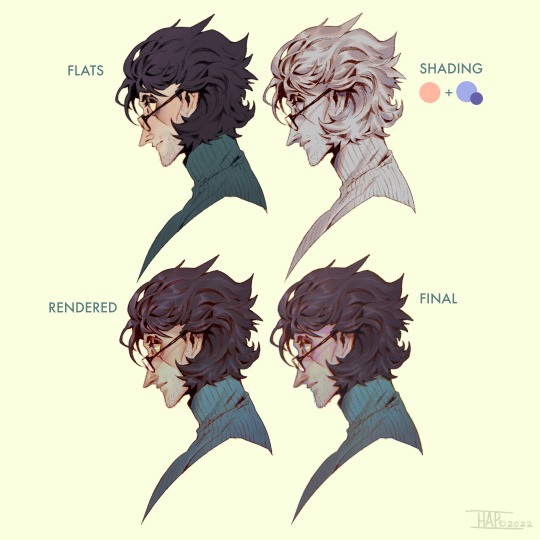
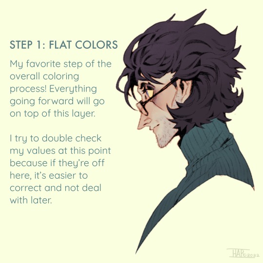
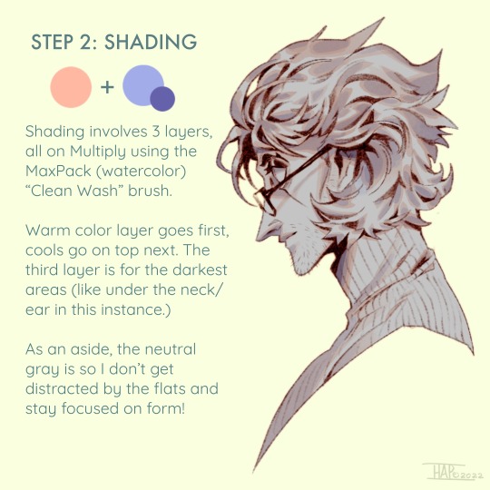
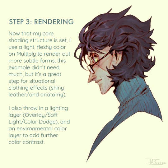
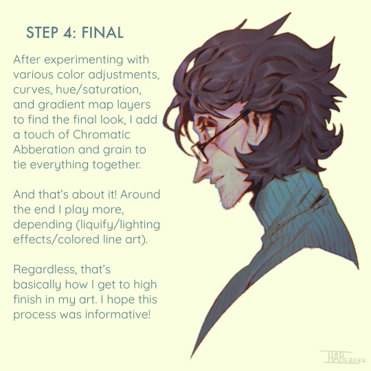
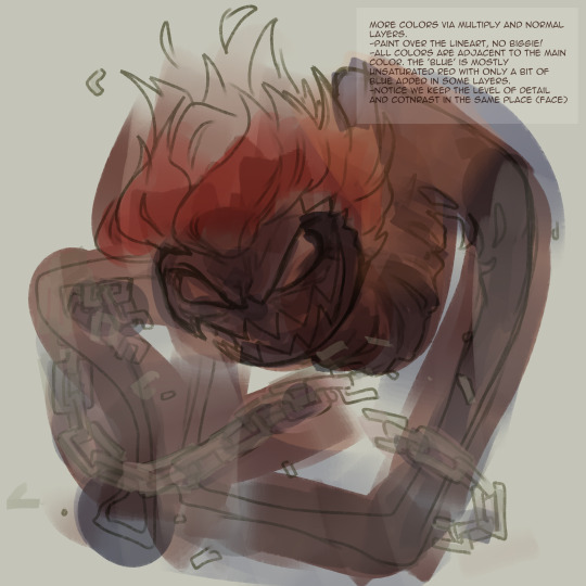
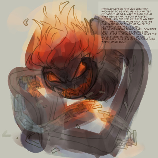
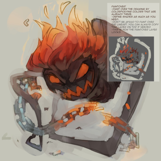
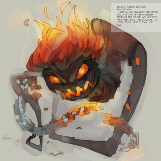
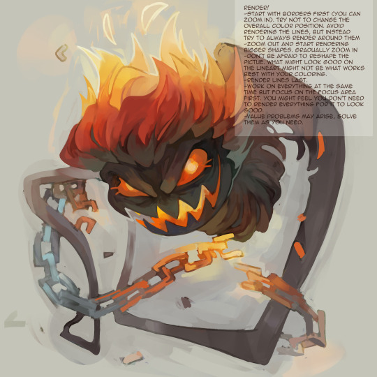
Rendering step-by-step (2022)
#kodasea#own art#2022 art#digital artwork#procreate art#art#artists on tumblr#art tutorial#step by step#shading tutorial#rendering tutorial#drawing tutorial#cold case crew#own character#cold case detective#lawrence#Still follow this basically! Although recently I've been playing with inching back the realism in the light logic/shadows a bit
4K notes
·
View notes
Note
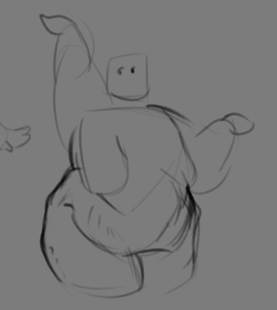
If you don't mind my asking, how do you go about drawing fat? :3
JUST THE EXCUSE I WAS LOOKING FOR
So, for me personally, a lot of the time when I draw fat characters, I'm not looking to specifically capture the specifics of fat as much as the feel of fat. Bulkier, rounder shapes in the right places that has a feeling of weight to em! A lot of that is intuition and simplification at this point, but it all works on the same frame as just any ol' person. Like take this-

For example. This is the basis for any body shape, not just the more average one that it may imply. Sure- it can be that average body shape:
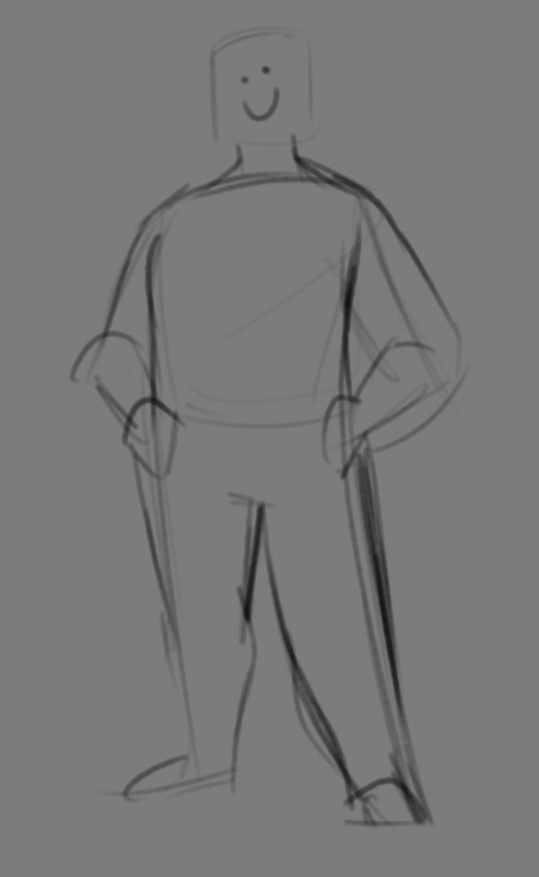
But also a fat one too!

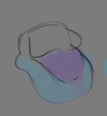
And a big part of that is knowing where fat usually tends to bunch up on the body, so lets take a look piece by piece! (Please keep in mind this is very simplified, and not completely precise in some parts)
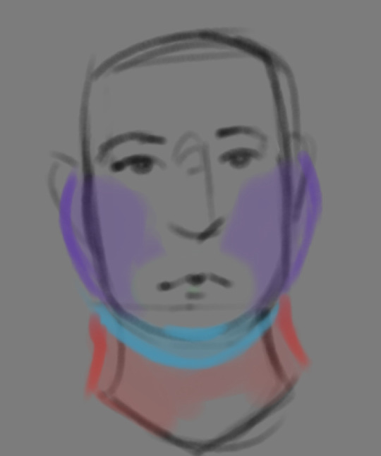

THE FACE: Cheeks (in purple) and especially the chin (in light blue) are the places where a lot of the fat is gonna wanna gather and round out on your face! Additionally, theres a small pocket of fat beneath the cranium on the backside of your head. It's small, but it is there. I believe fat can build up elsewhere like the bridge of your nose and forehead, but generally speaking, you're gonna have a whole lot more buildup in other places first.
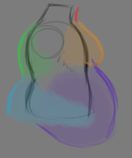
THE TORSO: A lot of the fat built up on the torso is gonna be sent to your tummy. More cushioning for vital organs, mostly out of the way, it just makes sense. Additionally, the lower backs fat builds up and joins with a patch of fat on your sides that forms what is typically referred to as the love handles to make that double belly look. Along with this, the immediate next target for the torso is the breasts, followed by the upper back!
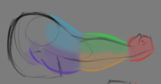
THE ARMS: For this limb, a VERY notable amount of the fat present builds up on the tricep and bicep areas, lessening once you get towards the flexor and extensor areas. You can almost think of the arm as a sort of triangular shape, wide side starting from the shoulder and tapering towards the hand, which itself mostly builds up fat around the back of the hand and the fingers. The shoulders themselves don't build up too much fat unless you got a lot
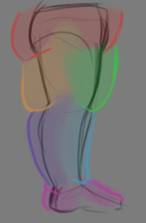
THE LEGS: And finally, you can think of the legs having pretty similar curves to what you're probably already used to thinking. The front of the thighs getting a big buildup, along with the back of the calves, the other parts being flatter in turn. As far as the feet go- similarly to the hands, the top of the feet, along with the heels get most of the buildup, as fat on your soles would impede mobility. The glute, hip and crotch area will also especially build up fat, lending to the same triangular shape that you can see in the arm!
A big thing to note with fat is that it tends to taper off towards joints. Your knees, elbows, shoulders, hips, and all the other places are gonna have significantly less fat so that you remain mobile and flexible, as that's important!
Now that we have an idea of where fat builds up on the body, you might have something that looks kinda like this
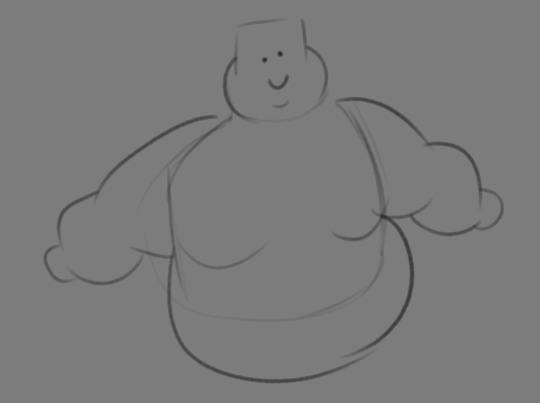
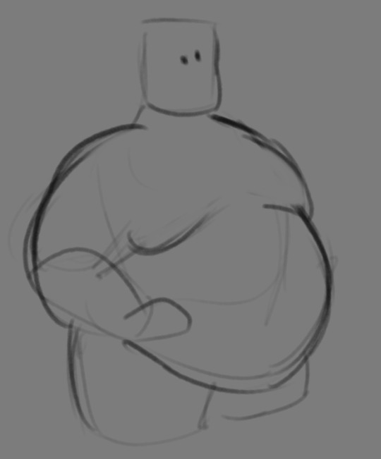
Which yes, does demonstrate a solid understanding of the places fat builds up, lacks the weight you're probably trying to convey, which brings us to out next point! Fat is well... heavy! Gravity is what gives fat much of it's shape, especially as you tread towards larger and larger bodies.
This is demonstrated really well on the arms especially-


Those big ol' bits of fat'll really start to sag when left hanging, and they will squish like hell if they run into something. I like to think of these bits of fat as big ol' ovals that squash and stretch depending on if there's an obstacle in their way or not


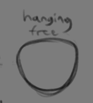
These are the important shapes to remember when it comes to the weightiness of fat! If you take all of this into mind, you should be getting something a lot closer to that shape you've been after!

Oh, and always remember that fat bodies come in all variety of shapes and sizes! Play around with a whole lot, and seek out all the resources you can! it'll really lend to your knowledge when it comes to this kinda stuff!
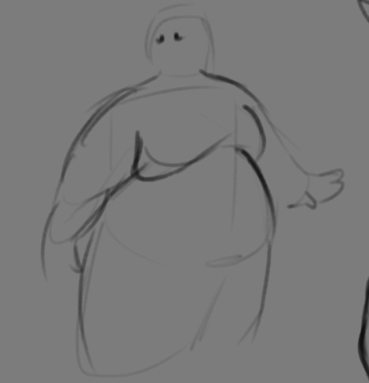
And as I always recommend when it comes to learning art- look at what your favorite artists do with fat bodies. See what you really like about the fat bodies they draw and try to replicate it in your own work, I promise you it's one of the most helpful things ever.
This is like the most basic of basics when it comes to drawing fat bodies though. If there's any additional thing about fat bodies, or maybe you want clarification on something, don't be afraid to ask! If there's enough to cover, I'll make an addition to this post!
#hat answers#my art#design talk#tutorials#yeah im unfortunately pretty tired so this gets a liiiitle rambly at the end but i think this covers like the basic basics#i hope this was helpful at all#and again dont be afraid to ask questions and stuff#if theres enough traction/questions on this i will most definitely try to clear up as much as i can in an addition to the post#whoops this took a bit!
3K notes
·
View notes
Text


Here are some painting tips, as promised. I hope they will help beginner artists!
Composition
Position of characters on the sheet
Choose the location of your character to be beneficial to the appearance of the art in general, you can accentuate the important places where the viewer should look first by using perspective and composition.
Tone sketch
Set the lights based on references, but adjust to your own, favourable lighting.
Contrasts come in many forms. Contrast in color (warm and cold), values (dark and light), shapes soft and hard, straight and curve, etc.
Less is better. Work on the details of the most important part of your work while cutting down everything else. If you do strong detail in one place, don't forget to add looser detail in another so the viewer's eye can rest. For example: If you are detailing a portrait, don't detail the background as much. Next to a place of high detail, there should be a place of low detail so that the picture does not look overloaded.
All in all, you can twist and break perspective, anatomy and shapes to convey your idea better. No rules are made of steel, they should support your imagination, not restrict it
Anatomy
Break down objects into simple shapes to arrange them in space.
Check references! plasticity comes first, then structure (muscles are important, but proportions and line of movement come first).
Take a photo of yourself, you will be able to understand how to perform your pose naturally. Color/light.
Light is part of the composition, put it in a way that highlights the important things. Air perspective
General rules of composition. From the general to the particular, first prepare the general scene, correctly place contrasts and accents, make everything important in contrast, and take the unimportant into an aerial perspective. (aerial perspective, or atmospheric perspective, refers to the technique of creating an illusion of depth by depicting distant objects as paler, less detailed, and usually bluer than near objects.)
When all the points are ready we can start working out the details.
When all the details are finished again it's back to the overall picture, looking at it from a distance. Check if the accents you wanted to draw attention to are working. They should have the highest contrast. Check if the contrast is not created by objects on the edges, where you don't want the viewer to pay attention. For example, if you are painting a portrait then the focus should be on the face and not on the details of the clothes or details in the background. (You can always convert the image to black and white and check the contrast)
Save the stages of your work to check against the initial idea and see what things have changed for better or worse!
#digital art#art tips#beginner artist#small artist#digital artist#art advice#art tutorial#art guide#step by step#drawing basics
753 notes
·
View notes
Text
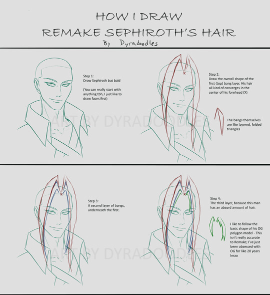
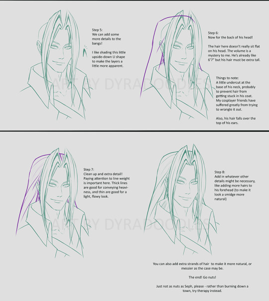
A couple people in my ZS server mentioned referencing my drawings to figure out Seph's hair, so I figured I'd make a tutorial about how I do it! I hope it's helpful lmfao I think this is only the second tutorial I've ever made
#sephiroth#ff7#final fantasy 7#my art#I also wanna be so clear that as long as you have the basic silhouette#it's gonna look like Seph LMAO#he's so iconic it's hard to NOT recognize him atp#tutorial
129 notes
·
View notes
Text
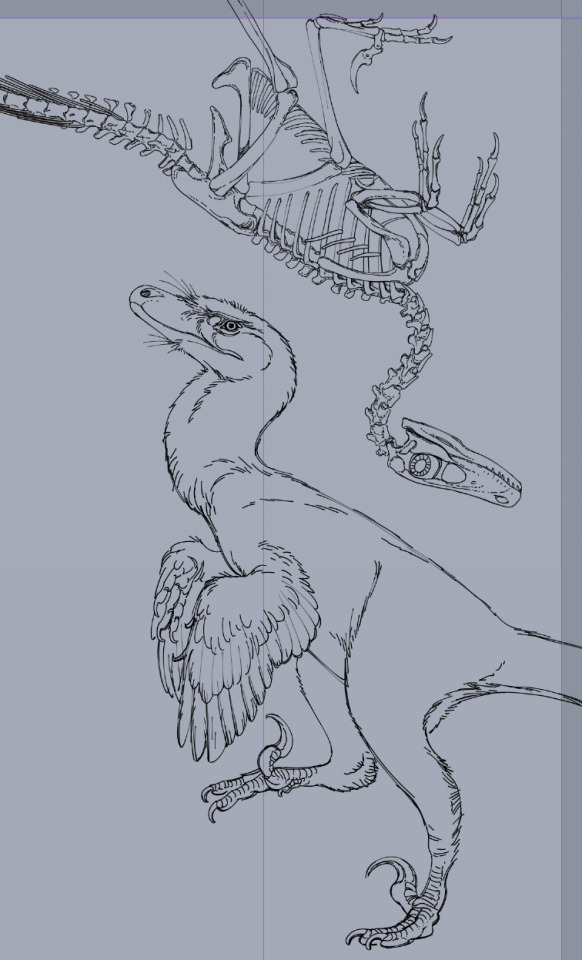
really happy with how this (unspesified) (heavily velociraptor inspired) raptor lineart is turning out, this is from a comic project i'm working on so stay tuned if you like historical fiction settings with victorians, domesticated dinosaurs and time travel shenanigans !!
#comic art#comic#paleobr#paleoart#paleontology#graphic novel#antikythera comic#original comic#webcomic#webtoon#art tutorial#paleoillustration#paleomedia#paleo art#theropod#velociraptor#its basically a velociraptor but some kind of very close unspesific species dont look into it too much dfghdfgh
568 notes
·
View notes
Text

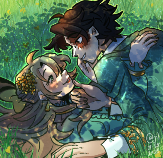
happy 6th constabell anniversary ♡
(and a happy birthday to dear irene!)
[5.28.25]
a few months ago, it was his birthday, and i wanted to say my words but i decided to keep it short to save it for the anniversary :)
i remember when i was still very fresh to id.v, it was 2018 back then. the concept of new survivors joining the faction was still a brand new thing to me ... i remember when aes.op carl came out, i was always eager to find new characters to play with!
i remember when nor.ton were teased to come out. i didn't think much of him, but i did adore his design a lot. i remember that well. his playstyle confused silly me back then, so i had nothing but appreciation for prospector mains at the time
i don't know how it happened, but one thing led to another - i made an oc for this game, but it was for the purpose of roleplaying with a friend (who also happened to be the reason why im playing, hi xelle <3) and i thought it would be very fun to pair her with nor.ton. but as i slowly learn about him more and more, i came to like him a lot! favorite character at best. it was hard to learn anything about him, because his lore was little to nothing at the time.
i suppose, the more i just shipped irene with nor.ton as is, the more i started to actually like him, and started to project my feelings more into the ship. but i only had myself and xelle to share this at the time, and then i dropped the game for a few years.
for a brief time, nor.ton debut on my tumblr around 2021 or 2022? i had a little spark that made me miss him, and so i indulged for a bit. but it was short lived, unfortunately.
and another spark came in, when fool's gold became a real concept. he became a hunter. i still look back at this silly post of mine and giggle about it... the final nail in the coffin was when i decided to watch id.v stageplay and goodness gracious i fell back in the hole so hard and look at me. typing this out as i celebrate the 6 years ive known this man
while i regret not being with him in-between my years- i'm glad i can catch up to genuine lore that has been provided for him and it's still ongoing, so it feels like i can fix myself into the loop again :) now that i finally know his story, i feel incredibly attached to him for that too. he feels right at home in my heart again, i hope younger me is happy that i'm back to him again ^^ his story is nothing but difficulty- the kind of struggle that almost hits close to home sometimes and i truly care for what he's gone through. he is such an amazing character design and i want to continue appreciating him as much as i can. his story is still unfolding, and i look forward to the future for that :)
cheers to more content with you norton campbell, and that i can continue to make lovely stories for these two 💚
#i was gonna post my fic here but it still needs proofreading so I don't think ill post it today but that's okkk!#remember - absolutely not necessary to read my letter!! it's okaaay~#~ art#💚 constabell#very proud of this! this was heavily inspired off a picrew xelle sent me. the picrew basically looked like this but i drew it 💚 heheh#i was lucky enough to find a tutorial on pinterest regarding the shading of the trees.. thank goodness#out of all the irenes i drew - I think this one takes the cake ^u^ she is so stunning :)#divider by cafekitsune
55 notes
·
View notes
Text
the blake lively and justin baldoni drama continues to remind me just how willing and ready people are to rise at the defense of a man just because they hate women. taking blake lively's comments in bad faith and out of context, claiming "she was actually the abusive one the whole time." it's amber heard all over again. as long as we don't acknowledge why this is happening (misogyny), nothing is going to change.
#blake lively#justin baldoni#not even a fan of either of these actors#but i think when a man is being accused of abuse of power within the workplace#and his go to move is to hire the fucking team that defending johnny depp and enacted a smear campaign so heinous#that it was basically a livestreamed DARVO tutorial#you should perhaps try to be a bit critical of what he and his team are saying
79 notes
·
View notes
Note
hi, I just saw an ask where you said that you wouldn't mind making a tutorial on how you draw and stuff and I wanted to say that I would really appreciate a tutorial since I love your art style and would like to have a similar one but I'm really struggling, so a tutorial on how you do the general shapes and stuff, or the proportions, or anything really, would be really nice ^^
-🐾

98 notes
·
View notes
Text
I knew I had my dads coding gene hidden within me
#feeling proud i could code a basic sanity system without following a tutorial#listen usually when i have a i want to make a game phase i can barely learn a thing about coding#but now i think it finally clicked & i'm happpy
76 notes
·
View notes
Text
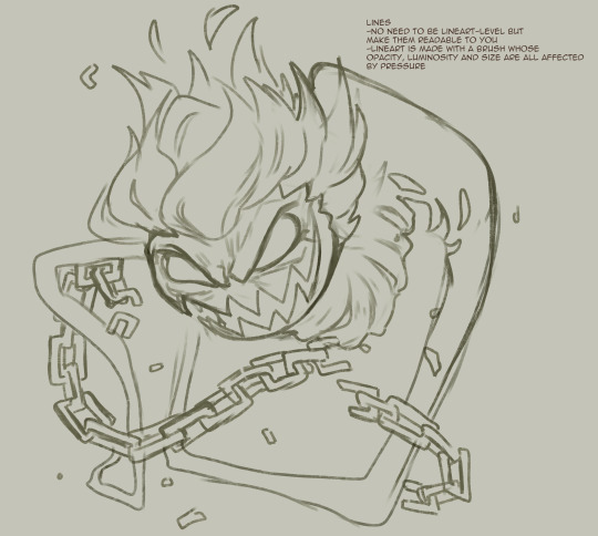
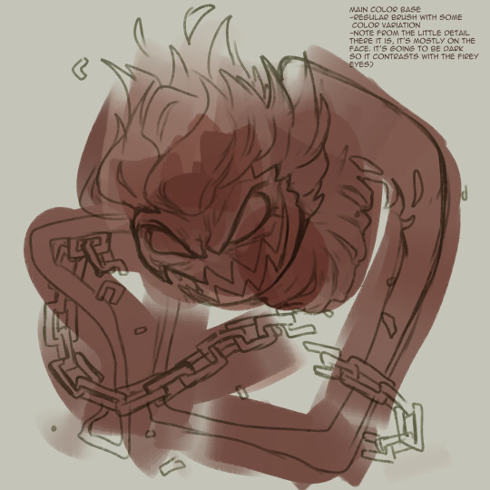
I guess I had enough spoons on me that when I was asked to do a tutorial on this picture I did
It's not perfect but it might help someone:
216 notes
·
View notes
Text
Poets LOOOVE standing in front of their own emblems. They're pretentious like that!
#ibispaint said thsi took me 6 hours and like yeah. basically#aside from also taking a whole week of procrastination#my art#tes#tesblr#the elder scrolls#morrowind#eso#elder scrolls online#vivec#do u guys want a stained glad tutorial. i could try but#only if i am asked politely. because i am sensitive
62 notes
·
View notes
Text
nny and edgar in the dance club be like
OKAY LOL this is SUPER DUMB but
it all started when @zarla-s sent this video to a gc i'm in saying " edgar goes with nny to the club to go dancing and he sees nny do this and just stands there paralyzed " " DANCE EDGAR nny shouts at him, edgar sways awkwardly back and forth " i was like haha that's so funny when i do have the time i'm gonna animate that i think guess what i did have the time . right now
#sunny's art#vargas#edgar vargas#vargas zarla#zarla s#shitpost#jthm#johnny c#jthm nny#okay i just banged this whole thing in like FIVE HOURS .#THE WHOLE THING . the guidelines the animation EVERYTHING#this is actually the first csp animation i've made#or like . my first animation EVER#the interface is actually not that hard to understand#it's just that i was forced to watch a tutorial for more than 8 minutes to understand the basics#( i can't finish tutorials to save my life#god i'm still surprised i wanted to finish this before going to sleep and I DID#me : takes a week to make a 9 frame animatic#also me : takes 5 hours to make a 70 FRAME ANIMATION#( well of course this is not colored and stuff#i think this is the most iconic thing i've made for this fandom . proud of myself .
148 notes
·
View notes
Text
Oh my god oh my god oh my god
There's a Vash and Wolfwood dog papercraft
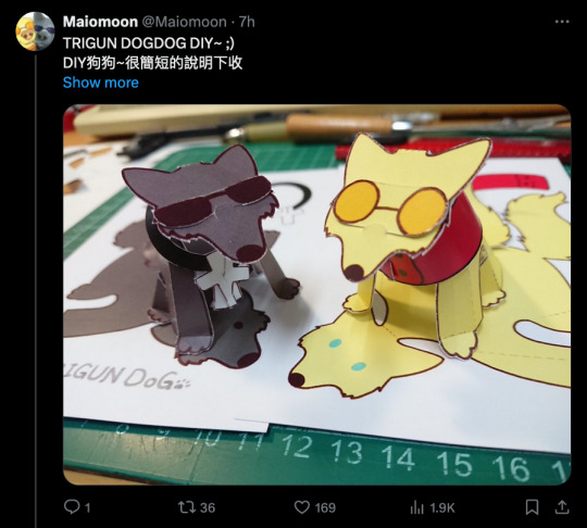
#Trigun#I know that op shows a lot of tools at the beginning of the tutorial#But this is a SUPER basic papercraft if you want to give it a go!#I highly recommend cardstock if you can#But you can get away with it if it's all you got#I don't think regular paper will stand up as well#Matte photo paper would probably be the best but that shit's expensive#I'm going to work on a couple modifications for my version#Either double-sided printing or two layers...#I think the former#Anyway#The moment this awful migraine is gone#I KNOW WHAT I'M DOING#(As it may be apparent I'm a papercraft addict and I'm totally willing to give anyone advice if they need it!)#(I'm still working on the Trigun foxes btw just working Vash and Wolfwood yin yang kitties first)#I LOVE that this is glue-free tbh#I'm so fucking messy at gluing
256 notes
·
View notes
Text
I wanna give a quick update on the skillset situation. Ever since this boycott gained traction, it appears that they deleted their Instagram and also everything on their website.


I am so baffled ?????? What the fuck were they doing? We already have confirmation that they used one football club's name without their permission. Were they also using high-profile footballers like Alexia without their permission, too?
What the fuck is this company????
Either way, boycott works.
Free Palestine and fuck Israel.
#bombon's yapping#football#free palestine#fuck israel#fc barcelona#alexia putellas#woso#might use this company as a reference in a project because WHAT#listen i just woke up#but like ????????#what kind of business is this to sell basically youtube videos of football tutorials ???????
29 notes
·
View notes
Note
Nice, I like how you pony's, can you make a tutorial?
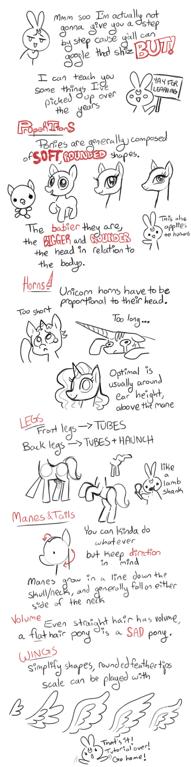
#art#fanart#my little pony#mlp#tutorial#art tutorial#mlp drawing tutorial#mlp drawing#mlp g4#this is very basic stuff but better you learn here than deviantart
84 notes
·
View notes
Text
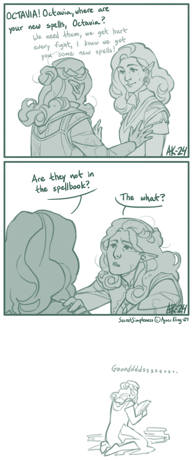
I figured this out somewhere along the second-to-last act. Octavia, the Baroness / Pathfinder Kingmaker (c) Owlcat Games
#pfkm#pfkm baroness#octavia#comic#pathfinder kingmaker fanart#pathfinder kingmaker#owlcat games#oc ailcha#spellbook#game mechanics#I tend to re-read tutorial messages for all sorts of things but this one apparently passed me right by. whoosh. gone.#“this class needs to prepare their spells” what like at camp or? and then I just forgot and was a tad annoyed after each level up.#almost all of the companions only had their level 1 and basic stuff. for most of the game. great. it was a great experience.
246 notes
·
View notes