#rendering tutorial
Explore tagged Tumblr posts
Visit Tumblr Blog
Explore Tumblr blogs with no restrictions, modern design and the best experience.
Last Seen Tumblr Blogs


Fun Fact
The average Tumblr user visits about 67 pages every month.
Text
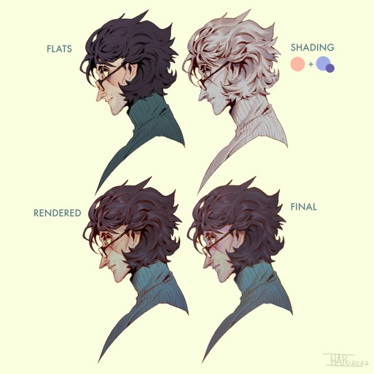
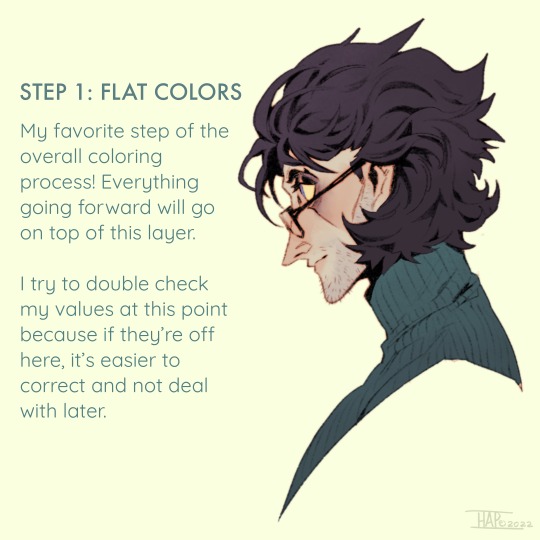
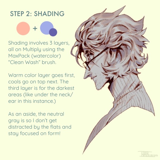
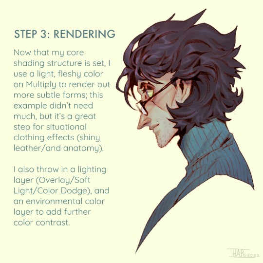
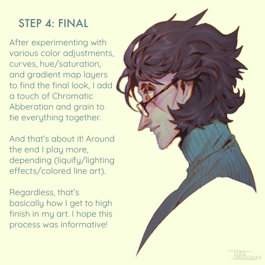
Rendering step-by-step (2022)
#kodasea#own art#2022 art#digital artwork#procreate art#art#artists on tumblr#art tutorial#step by step#shading tutorial#rendering tutorial#drawing tutorial#cold case crew#own character#cold case detective#lawrence#Still follow this basically! Although recently I've been playing with inching back the realism in the light logic/shadows a bit
4K notes
·
View notes
Text


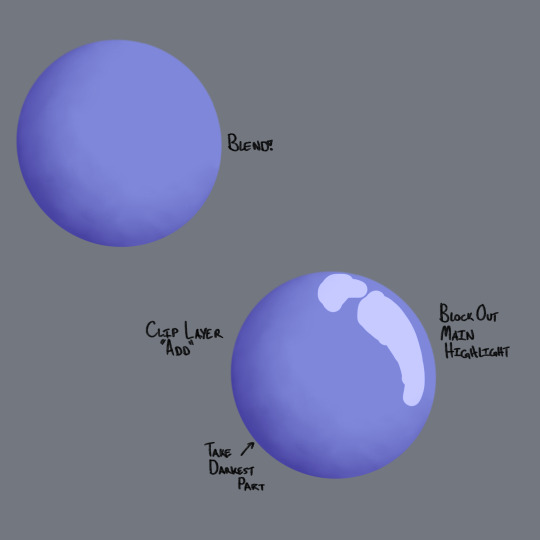
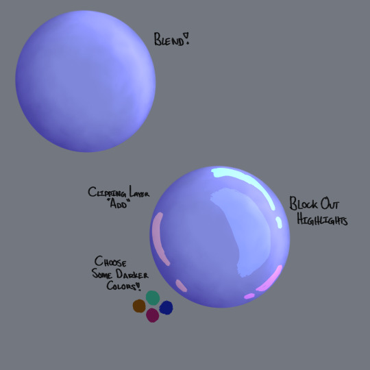


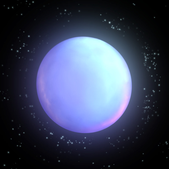
I've been working on a digital painting and I wanted to share some tips on how I'm rendering some things like shiny balloons!
♻️Please Reblog To Support The Artist♻️
#art#illustration#artists on tumblr#art tutorial#rendering tutorial#2d render#shiny#tutorial#how do i tag this#digital art#digital painting#digital art tutorials
84 notes
·
View notes
Note
Hello :D
I have been following you for the last year or so (a few days after I got my Tumblr lmao) and I absolutely love your art!
I have been wanting to study your art style for a while but don't really know where to start,,,
Could you please show me a small portion of your art process, if it isn't too much trouble of course. Thank you and have a nice day!
hello. oh my god. this took forever to find.
im sorry it took 2 WHOLE FUCKING MONTHS for me to respond to this but i wanted to put it off until i felt happy with my art process again, so here it is
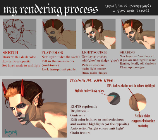
my fall 2024 rendering tutorial!
(this will be very very long)

FLATS AND WHATEVER YOU WANNA DO WITH LINES GIRL. then make sure to recolor the lineart to better match your base. trust me it helps, bold dark lines are Not your best friend when rendering. wait for that post-rendering
i start off with a doodle or a sketch, and then filling it in with flats and other details such as blush

FIGURE OUT YOUR LIGHT SOURCE. FIGURE IT OUT GIRL YOU CAN DO IT you can make it as simple as possible, make it as big as possible, dont even THINK about the details.........just make it really fucking big so you at least know where the shadows and the light goes THEN add smaller shading details LISTEN TO ME. LISTEN TO ME OKAY!!!!!!!!
my key point with this is for you to learn lighting fundamentals.
it's SOOO ANNOYING but alas......they are all correct. it helps a lot.
one thing i also really want to point out is that i like creating a big shadow shape first before fixing up the little details (such as folds and whatever) because it helps me focus on the way the lighting actually works instead of tunnel vision-ing into making the shading make sense on the clothing.

contact shadows (i dont remember if thats what theyre called okay) theyre fucking ugly because im not actually thinking sorry 💔
okay so basically:
contact shadows (if that's what they're called) are the spots in shading and lighting where light will NEVER hit.
shadows are still influenced by the colors and lights around it (it's why a blue shadow and a yellow shadow feel completely different, despite both being shadows) so it's not always COMPLETELY dark.
BUT! there are small points in shadows where light never hits, and they're almost always super dark or pitch black.
it's hard to explain shadow and light so briefly for a tutorial, but you'll notice it when watching fundamental studies and when trying it out for yourself


YES i unclipped the multiply layer YES its ugly and terrifying but it makes coloring the multiply layer easier okay the colors merged w multiply so now it looks cool and has depth overlaying colors that actually make sense
so basically what i did was color the multiply layer that i used to shade the overall drawing
adding a band of red/orange/yellow around where the light hits, and blue where the shadows get big and wide, gives it a fake ambient occlusion effect in the way that a person would get if they stood under the sun with a clear blue sky
the colors don't have to make sense, especially because i never draw backgrounds, but coloring the shadows really help it give a sense of depth and extra subtle detail and effect that just helps make the painting look nicer
around the end, i also put in colors (in an overlay layer with a low opacity brush) that actually make sense in context of the drawing, which is the lit cigarette and the yellow eyelights
mostly because none of the colors were making sense and i needed to actually make use of the lighting that DOES exist in the drawing lol

adding a muddy golden yellow pin light layer (opacity turned down to like 40-50%) to make the light colors less ugly lol
i SWEAR by the fucking pin light layer style. it's so useful and so so underrated.
i used an almost brown-ish gold color on stop of all the layers, and with the pin light layer, it helped make the bright (almost blue-ish) white colors more warm and more yellow. it just helps make things more warm (something i prefer)
i could probably show what it looks like without adjusting the layer opacity to truly show off what i mean (like in the coming section) but i sadly forgot to do that lol


make a layer on top of your drawing with this color in these ranges YES the drawing is fully merged NO don't be afraid, the base was fucking ugly anyway 💔 make this layer into an exclude/exclusion layer style TRUST turn down your exclusion layer opacity from a range of 10% to 40% literally until you're happy with the contrast and the way the color over the drawing. use your eyeballs. i know you can do it im so proud of you
this is pretty self-explanatory instruction-wise, so i'll go into why i do this instead
i really like art that seems like it has low contrast, with almost mid-gray shading and lines. i don't personally use dark and bold lines and shading, unless i find it necessary for the tone of the piece, so using this method helps lower the contrast of the art and make it look "pleasantly muddy" in the way that it's easier and softer on the eyes.
the inverted blue color also helps makes things warmer!
the exclusion layer style is still a bit of a mystery to me but i really like the effect it gives, even if i don't completely get how it works lol
if you want an alternative method to this, and if you have access to it (because i primarily use sai and sai only),
i absolutely encourage you to play around and experiment with gradient maps.
there are so many out there you can make yourself or even get from others that just give the painting an extra amount of depth and color variation. they're SO fun.
personally, if sai2 gets a gradient map update, it's over for y'all it will literally be so over no one will be able to stop me


then i merged everything and actually adjusted the contrast back up because it was looking too muddy for me 💔 but the color adjustments are still there so all hope is not lost here's a comparison of the adjusted contrast in black and white (adjusted on the left) (newly merged layer without adjusting the contrast on the right)
as you can see, i actually turned the contrast back up (despite talking all about how i liked things with less contrast lol)
i wanted to demonstrate that doing adjustments should be done in moderation, and is why i adjust layer opacity often when making color effects
you are free to play around with colors to help your style, but don't lose your initial idea and colors along the way.
you still need to trust your own colors and intuition!
along with that, i just want to say that it's completely okay to change your mind mid-painting, and it's okay to make somewhat drastic changes.
don't be afraid to change things you don't like or change your mind about certain aspects way later on
that's basically the whole thing of this!!! don't be scared!!!

now im gonna hold your hand when i say this..........but you need to learn how to render by yourself. it seems like i can teach you but i literally can't, because rendering is different on every piece and depending on how clean your base is. i have to render A LOT because of how fucking ugly my sketches are LMAO to simplify it, think of it as obsessively cleaning up every detail you can see, but with a color picker and a clean, hard edged brush. if you have shit lineart, you don't have to redraw it cleanly over and over, just paint over it. that's basically what rendering is
THIS especially is where you need to be brave and stop being scared.
like i said, i can't teach you how to render, and it's something you have to discover yourself because rendering is something that will always be personal to every single piece you make. the way you render on every piece is different.
on one piece, you will barely need to render, and on another, rendering is more than half of your ENTIRE process.
don't be afraid to paint over your old art.
rendering is a process that's both very perfectionist yet also very careless.
find your balance and just go for it.

and then that's it……..u did it………..now yuo know how to paint and render. it's literally just layering shading and lighting knowledge until you think it makes sense and looks okay lol additional note: since i render in only one layer (you don't HAVE to do this, but it'll be harder for you…), i also made slight adjustments with the transform (and liquify, if you have it) tool to make things more proportionate. (i drew the head too big lol)

if you compare the finished piece to the final unrendered base, you can see that a LOT changed, including a bit of subtle proportion adjustment.
particularly, the sleeves changed A LOT (because i really didn't like them)
but it's also over all cleaner and more coherent, instead of having haphazard colors and shading just thrown about.
rendering is when you finally use all 100% of your brain to finalize and figure out where the shading should go, where to clean up your lines, where to ERASE or ADD BACK in lines, and make sure all your colors look coherent.
it's not as intimidating as it seems, i only use a hard edged brush with a little bit of color mixing and my color picker.
it's like dragging and dropping colors to cover up mistakes, it's really quite fun when you get used to it
i wish i could explain it clearer but it's hard to describe without visuals!
i hope this helped, and i hope all my yapping isn't annoying (art as a special interest beloved)
have fun studying and trying to render in my art style!
#long post#art tutorial#rendering tutorial#art help#art tips#tutorial#kia doodles shit#artxstic-scr1bbles#tutoriel
200 notes
·
View notes
Note
Heya, you are an absolute beautiful person and seeing the way you make colors and values pop always make my day.
I'd love to see the tips for the progress of rendering if you can.
Nevertheless, good luck with school and remember you are the coolest cat ever to exist.
<3
oh man this made my day now YOU are the coolest cat to ever exist
since my most recent drawing was done in greyscale and simply adjusted with gradient maps, i thought id base a ‘tutorial’ off my second most recent piece since it has more substance to it
sorry if this isnt the most helpful haha… feel free to modify and interpret the following ‘advice’ as you wish, i am not at ALL qualified to be teaching people shit about art i kinda just fuck around and hope it looks cool in the end


let me know if yall are interested in a greyscale/gradient map tutorial
oh and to the people wondering yes the lighting symbolism was intentional!!!
#foreversagacious asks#rendering tutorial#i guess????#homestuck#digital art#artists on tumblr#hs#my art#sorry if the terminology is way outta wack ive never taken an actual art class#woohoo
182 notes
·
View notes
Text
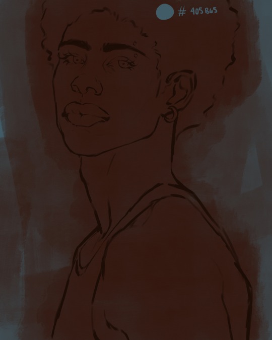
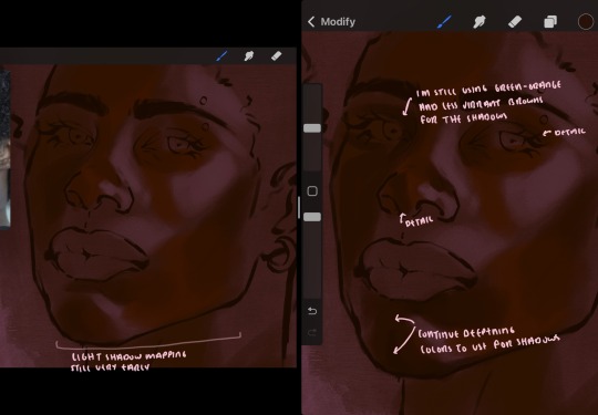
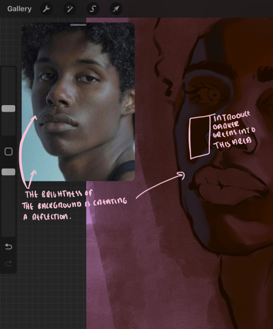
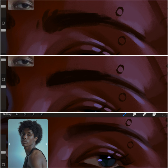
eaudera's detailed tutorial for skin rendering
okay loves i've put together a tutorial in text form detailing my step by step process of shading darker skin + the brushes and techniques I use and why I use them. you will be following along as we shade a piece together, you can find the lineart to the piece here. *turn off your true tone and night shift displays for the most objective viewing.
i wrote a lot on the preview pictures, if you find spelling errors (which you def will) or are unable to read my handwriting, you'll find the typed out version of the writing in the alt text feature.
disclaimer: i'm not an art professor nor am i academically/classically trained in art. a lot of the verbiage and techniques i'm using to teach you all here are from my current self taught and observed understanding of art, light, and anatomy
support me: kofi / ig / twt / commissions
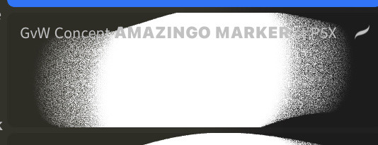
firstly, here are my two staple brushes. you can find the second brush here, i modified it by making it larger.
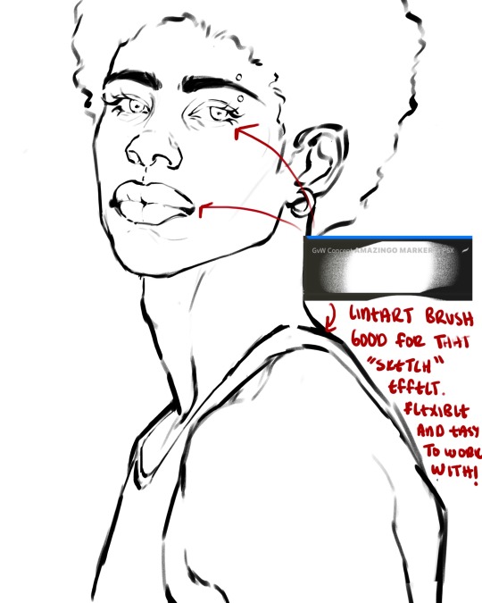
the lineart brush is very good for easy sketching and simultaneously cleaning up that sketch to produce the final lineart you'll be using in your piece. the diffusion from the erased parts/the diffusion created by lowering the pressure of your pen creates a light graphite effect which i enjoy! give it a shot.
you'll notice quickly that there are lighter strokes throughout this lineart, these are simply acting as rendering guides for me in order to remember certain placements. i erase/draw over these lines a lot.
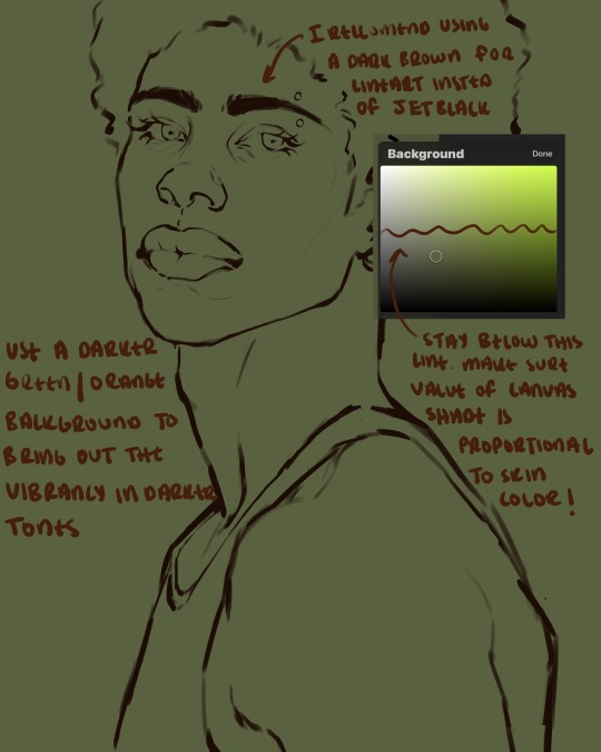
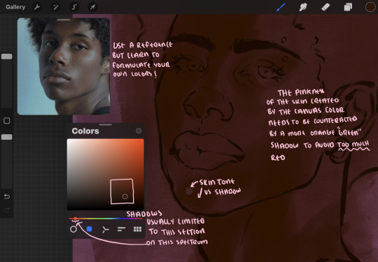
i initially learned to shade skin on a completely grey background with very slight orange undertones, and for a while this was very helpful in providing the most objective view of the base colors you're using (objective as in free of being effected by colors of different values). as you might know, using a white background for dark skin will seemingly darken the value and dim the vibrancy of your base colors, and using a black background will do the opposite. if you're using a darker skin tone, you want your canvas shade to be of a value that is proportional to your skin tone to avoid the same problems created by colors with too light or dark of a value. now if you're using a screened device to draw, you have the extra burden of screen reflections/wavering color output on different screens, so you're never really sure if the exact color you're using will be consistent across the board. priming your canvas with neutral colors will help with that. whereas priming with more vibrant colors will slightly change the undertone of your skintone (especially if you're using a low opacity brush), but it makes for a funner canvas and more creativity with your color palette imo. if you're a beginner i recommend you stay below the wavy line to avoid too light of a canvas shade.
for these same reasons i avoid keeping my lineart jet black. when you lay down the base colors under a black lineart it can look very unfavorable.
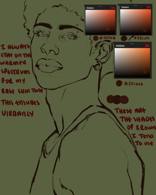
here are some skin tone variants that i tend to use the most, peep how i never wander off too far to the left of the spectrum where the reds are. i definitely favor red-oranges as compared to green-oranges for my skin tones, however, because i stay primarily on the left side of the color spectrum for my rendering, red can quickly become too much too fast. so i make sure to use a skin tone that can work very well with green-orange shadows. for this specific piece i will use the third shade (#2d1606).
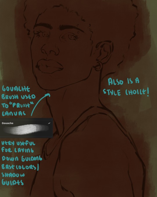
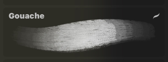
heres where the gouache brush comes in handy. i use it very loosely to "prime" the canvas almost. if you've ever done oil painting you'll realize very few artists draw directly onto a completely white canvas, though i've already primed my canvas essentially by changing the background color, i loosely shade over it with the skin tone color using the gouache brush. i find this gives me a better grasp on the composition of the piece due to increased harmony between the canvas and the skin color. it also looks really cool to me and resembles a real canvas almost.
as stated before, priming your canvas with neutral colors (grey) can help give you a more consistent view of your base colors, when you get the hang of understanding the colors you most often use (i.e, how they interact with other colors), you can start using more vibrant and fun colors to color your canvas with! the gouache brush changes opacity depending on the pressure exerted by the pen, if you zoom in you'll notice patchy areas where the canvas color bleeds through the layer more prominently than it does in other areas. for some people this might throw off the consistency of the shadows, but you should be fine as long as you're using a consistently opaque brush (which we will be doing)
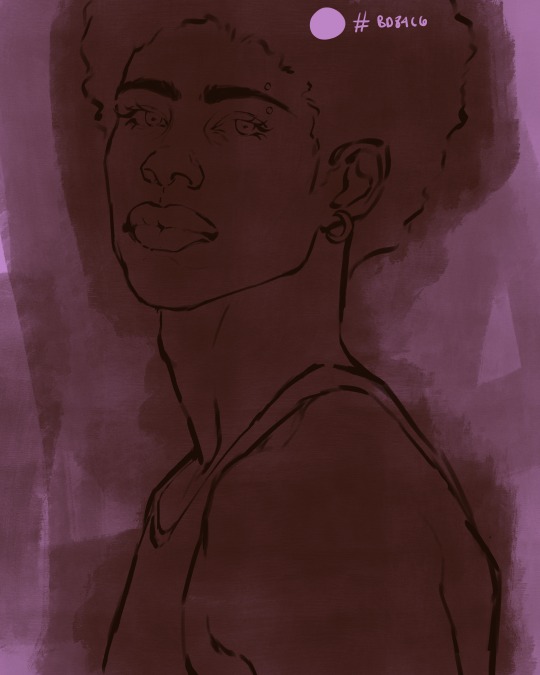
i know i recommended beginners use a grey canvas like i did, but since this tutorial is using my techniques i figured i'd also teach you guys how to use variantly opaque brushes to your advantage. we will be drawing on the pink canvas from here on out.
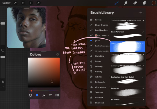
a reference is so helpful, i still rely on references to guide my shadows/lights. i'm past the point of relying on references for exact coordinates for rendering or lineart, but they are still incredibly helpful. in most references of darker skintones you come across, color dropping directly from the picture will give you very grey colors! we want to prioritize vibrancy in this case, so attempt to formulate your own colors or colordrop and increase the vibrancy :)! keep in mind i'm now using the lineart brush to shade. the diffuse/soft corners of this brush allows fewer pixels to be scattered wherever you lessen the pressure, this is perfect for color dropping medium colors to blend two colors together. you'll see how i blend colors later on.
as mentioned previously, red can become too much too fast- so i avoid monochrome rendering as much as possible by using shadows of different undertones. my most frequent combination is using a red-orange skin tone and then using a green-orange shadow.
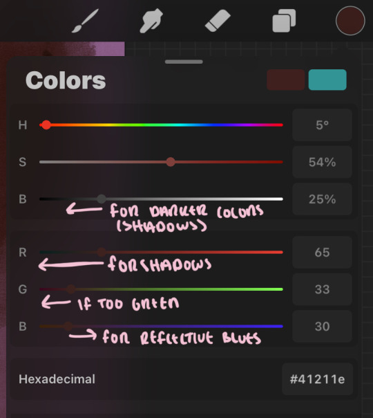
the value spectrum will be your best friend in mixing values and undertones, i use it all the time to formulate the best less saturated darker shadow that is proportional (not too dark, not too grey) to my skintone value. if the shadow is too green simply increase the magenta, if you're looking for a "reflective" shadow, increase the blue.
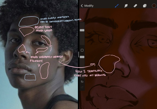
when i begin shading, i always slide the curser to a truer orange color on the spectrum and increase the saturation (slide towards the right) while i decrease the brightness (slide down). heres how it looks when i'm jumping between shadows and highlights while trying to keep my colors proportional (but not identical) to whats happening in the reference ^. i most often times will rely on the value tool, however.
you will notice that a lot of darker skin tones have patches of orange vibrancy, these areas are most common on the nose and cheeks. this is only a detail to pay attention to if you're going for more of a realism rendering style :)
now onto how i prefer to bridge/blend colors together by utilizing the blend tool.
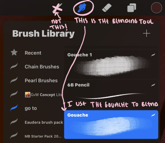
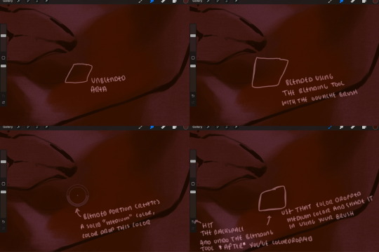
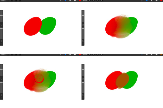
i do not like simply blurring colors in order to blend colors together, it can lead to overblending which can make your portrait look heavily gaussian blurred (think 2010 deviantart art... yea that). the brilliant thing about procreate is you can utilize brushes really efficiently, which include changing the brushes you use for blending. so in reality, artists who use the blending tool on its own can still have portraits that don't look it! there also exists plenty of brushes that have properties allowing it to blend into its surrounding colors are you draw. but in my case, the above photo is 99% of the times how i will bridge two colors together. doing this allows me to keep pretty consistent brushstrokes across the whole portrait, which i enjoy. it also gives me better control of the shapes i use in my rendering, an aspect that is pretty easy to lose when you're using the blending tool directly and solely.
in case the blending process is a bit hard too see, heres that same process recreated with different more visible colors:
now once you've placed your shadows where they generally tend to be (according to the reference photo), let's make those shapes a bit more specific and pick up on smaller details to make your rendering look more complete.
your base colors will never be as dark or as light as you need them to be when you begin rendering, making sure you have a decent contrast between your lightsource highlights and the shadows is key to capturing the essence of a light being cast on your character. it's much easier to keep building upon your shadows before rendering the highlights, i laid down the highlights only to create a guide/help me map my shadows better. do not darken the entirety of the areas affected by shadow, you'll find that shadows are rarely ever the same value, it's a gradual process affected by things like position, height, etc. so make sure the darkest of your shadow colors are preserved only in areas where the shadows are the or should be the darkest.
you'll notice i labeled some areas as "detail", adding very specific shadow placements is a detail. in the reference, the model has a pretty prominent brow bone, creating a shadow over where his eyelid creases just above his lash line, paying attention to feature details like this help enhance the rendering and its realism.
now that i've mapped my shadows i'm going to move onto to rendering my highlights and the region of the face where the lightsource is most prominent.
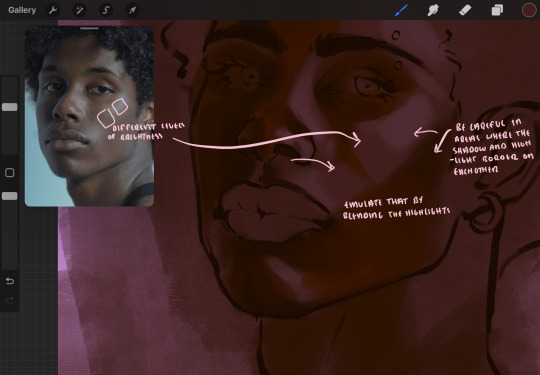
i described shadows as a gradual process earlier, this is because of the lightsource. light tends to spread when its further from the affected surface, creating a larger area affected by the light. of course, this varies depending on how intense and how close/far the light source is. in this case, the light is being casted above him further to the other side of his face, but again, remember that the face is not 2d and more prominent areas are affected more by light. it's due to this that there still exists a, albeit very minimal, shadow beneath his cheekbone. i exaggerate the shadow here for stylistic purposes, but it also helps in keeping me uphold that contrast between the highlight and shadow once again. so i refrain from blending the light into this area like i did in other areas.
midtones are the areas most unaffected by the light source, they're neither shadows nor highlights. and because light spreads, it is brighter in certain areas and darker in others. it is most easiest to blend the darker ends of the highights into the midtones of your portrait. you can emulate this by once again using your blend tool. blend the outer areas of the light and colordrop this color and use it as the darker light more proportional to the midtones. note that before i add even lighter shades to the areas where light is most concentrated, i blend what highlight placements i currently have there.
we're going to switch gears now and focus on the reflective shadow occurring on the darker half of his face.
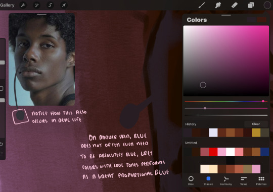
this shadow is a reflection from the lighter background the model is up against, the light being casted above him is allowing for some bounce back from his surroundings, leading to very faint light visible in areas primarily affected by shadows. hence why i'm referring to these colors as "reflective shadows".
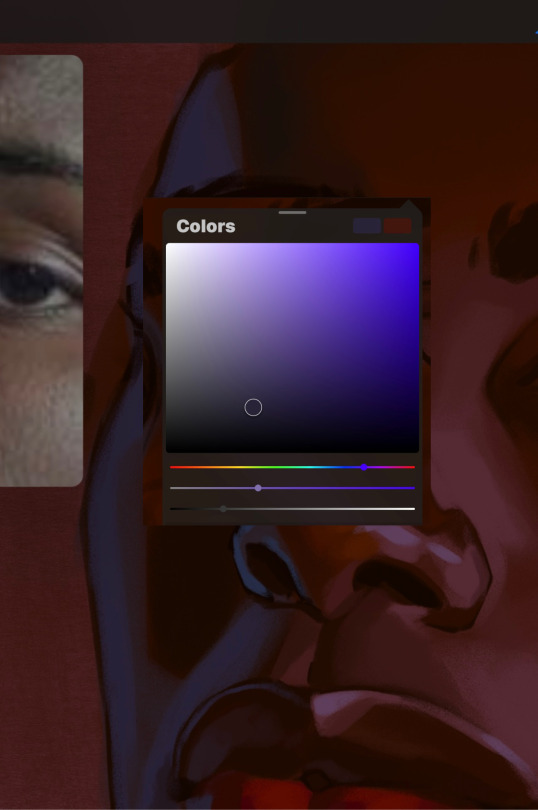
in this case, the reflective shadows are blue, or appear to our eyes as blue. on darker skin, "true" blues (blue-purple) are not often times present. what is present rather, is a very grey tone with cool undertones/a grey tone on the blue side of the spectrum, which creates a blue that is much more proportional to the value of the skintone than a true blue. in this case i used a deeper grey on the pink color spectrum, which is more purple. this was intentional, and was done in order to create some sort of color harmony between the contrasted deep oranges im using for the bordering shadows and the blue-grey i'm attempting to emulate.
while i utilize this blue-grey, out've a purely stylistic choice, i still introduce true blues to my rendering. in fact i love using blue/purple reflective shadows in my art, it creates a stunning and colorful render. in this case, i used the blue-grey as a stepping stool to introduce that trueer blue more naturally. you'll see this happening in the second picture above, where i used a slightly more vibrant and slightly more brighter blue, and used it on areas where this reflection was more prominent (and therefore brighter).
you'll notice how the shadows that border on these reflective colors are less saturated and darker than the shadows on his chin. introduce a darker and less saturated (more green) shadow to that area on his cheek and the darkest shadow of this photo, the sunken area near his nose bridge and inner eye corner. i emphasize this line in the lineart so you can follow this shadow more accurately:
this is also a detail in my opinion and can make your portrait more realistic if you include.
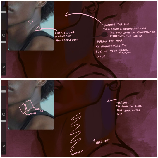
we're going to pivot to his neck area before continuing. you'll find the area of his neck with the most light is also the least vibrant, i laid down a grey base color to emphasize this detail in the portrait. afterwards i added key details. i wanted to stay at least somewhat true to the color dynamics occurring in the reference hence why i used the grey, but i'm not a very big fan of using blatant grey directly on the skin, so i made it more blue.
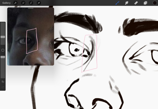
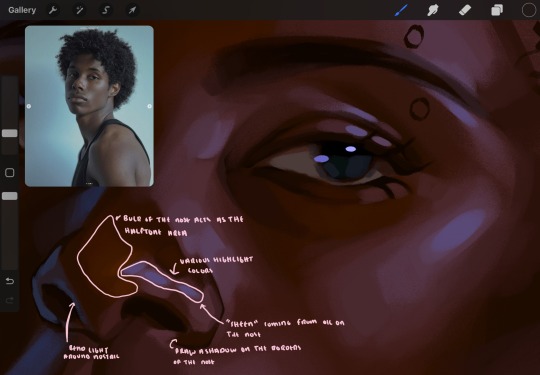
moving forward, the outer eye and the nose can be some of the most "detail focused" areas of the face when it comes to rendering. due to their more "bulbous" anatomy, light tends to curve around them in more complex ways than the flatter parameters of the face.
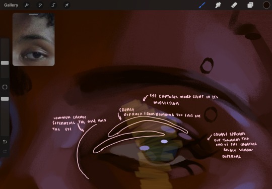
when it comes to the many creases that surround the eye, the skin folding over itself creates a very thin shadow from between the folds. the key to rendering this crease is to concentrate the blending to a very small scale, do not overblend the area because the hill created by the crease very easily captures light, creating an area where the shadow and highlight meet in very close proximity. slight blending is needed for this area, you can deepen the shadows in both horizontal corners of the eye for more accuracy. the midsection of the total eye area (eyeball and socket) tends to capture the most light, remember this is due to how bulbous rounder shapes tend to capture light from whichever direction its coming from.
this is of course the case for the nose as well. highlights are typically placed as a dot on the outermost part of the nose by artists, but highlights also spread on either side of the tip of the nose. the nose tends to collect a lot of oil, creating a sort of sheen on the upper parts of the nostril. when rendering a portrait where the position of the head is more cast to the side, the highlight of the nose changes from the bulb of the nose, to the upper nostril. in this case, the highlight spreads, causing a "half tone", or the remnants of the light on the bulb of the nose. this is the easiest place to blend highlights and shadows together. now for the shadow detailing on the nose, i'm actually drawing on top of the lineart on a separate layer. which i'll go into detail about in the next part. you want to focus the shadow on where your lineart is, the outermost part of the nose.
now were going to really detail your portrait by introducing a new layer, the detail layer! this isn't technically apart of the skin rendering, so i'm gonna keep it very brief. this is the layer you're going to render the lips, eyeballs, and eyebrows. more specifically, the purpose of this layer is to reduce the reliance on lineart. in terms of order, it goes above the lineart layer. we're going to soften and even erase the lineart in certain aspects. i use bolder/thicker lines when creating my lineart, but this can become a nuisance/hinderance when rendering.
starting out with the lips:
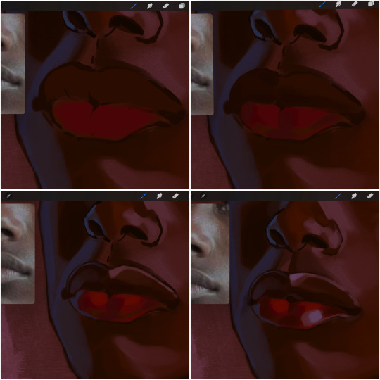
people w brown skin tend to have two toned lips, with the top lip resembling the same skin tone as the face and the bottom lip being redder/pinker and lighter than the upper lip. in my case, i prefer a more vibrant red for the bottom lip. once i lay down these base colors, i begin shading on the second layer.
i personally enjoy the look of a poutier lip shape, this includes emphasizing the middles of the lips as opposed to the ends. i've highlighted the shapes that this lip shape often entails. the small circles on the corner of the lip line are just pockets that occur when the mouth is closed and become emphasized by the fat around the mouth. the parameters of the lip lines do not often meet these round corners, theres often times a "double lip line", that exists around these areas. i love including that in the art, its very easy to emphasize by simply drawing a highlight from the corner of the lips along the curvature of the bottom lip towards the middle.
shadow mapping on the lips tend to go: highlight, shadow, highlight, shadow. the top lip going inward creates a highlight on the most outward part: the top of the lip. and the bottom lip curving outward thus creates a shadow on the bottom of the lip.
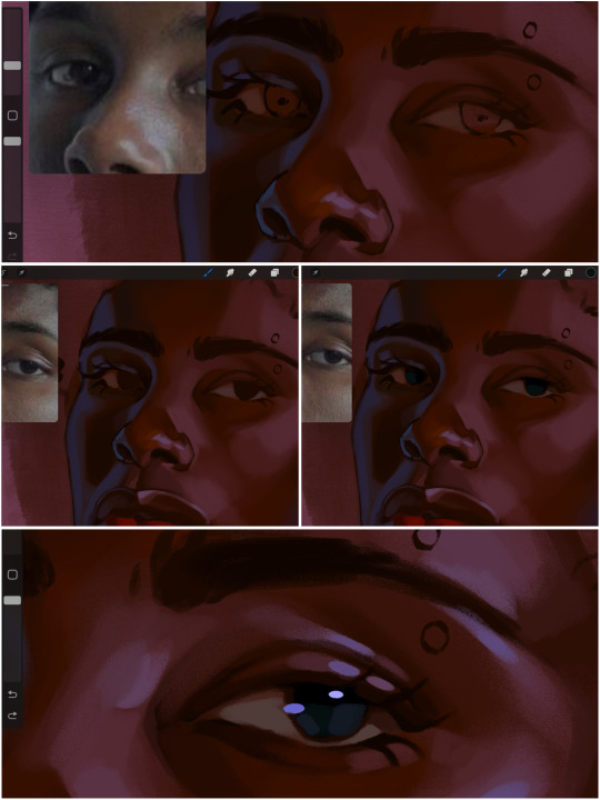
when it comes to the eyeball, i don't draw the white parts as solid white, nor do i make them too bright most of the time. they're most often times an orange grey, i also dont spread this color out if you can notice the uncolored white part of the eye. i do this intentionally to keep some of the shadows that are naturally present on the eye. very specifically right where the upper eyelid sits on the eyeball, it tends to create a small shadow that follows the curvature of the eye. this shadow is crucial, if you can see the first and second picture do not have this shadow, making the iris look more exposed and the eye appears to be held wider.
when it comes to the iris, i do very little. if i'm drawing a dark colored eye i will cover the entire iris brown, before darkening it with an almost black color. i leave the brown sides of the iris exposed to aid in bridging the values between the whiter parts of the eye and the very dark iris. this blended ring also appears on all eyes in real life. lastly, dark eyes tend to show light reflections much easier than lighter eyes. these reflections can be any color in art, in this case i kept it blue-green. i bend these reflections around where the pupil would most likely be depending on the drawing.
next, the eyebrow. i find it tedious to draw individual eyebrow strands when it comes to rendering, i actually prefer to blend the parameters of the eyebrows to create cohesiveness. sparse and fine eyebrow hairs are penetrated by light and shadows more than what you'd find on the scalp. it's harder to see light on someones scalp due to the bulk of hair crowding the scalp, whereas as its easier to see such light on the eyebrow. to introduce this concept to my art, i will initially draw the entire shape of the brow. then when rendering, i erase the parameters, leaving the darkest part of the brow. then i blend. the lower brow bone will be blended the least, whereas the area of the eyebrow connected to the T zone will be the most blended thanks to the shadow following the nose bridge. the far end of the brow by the hairline tends to be the lightest given the light source.
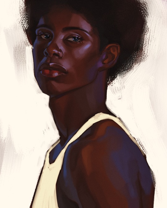
and lastly, i loosely draw a white border around the portrait for stylistic purposes. then i combine the layers (group together your layers, then duplicate and compress the duplicate group so that you still retain your individual layers) to edit. i typically add noise and play with the curve setting. and heres the finished image:
i hope you enjoyed!!
#i didnt proofread this if u find spelling errors pls lmk#black artists on tumblr#digital art#illustration#painting#black art#commissions#tutorial#art tutorial#how to shade#rendering tutorial#brushes
298 notes
·
View notes
Note
I love your art soo much man, the way all of your anatomy and your colours are always so enchanting says a lot about your skills as an artist as well as an adamant fan of biology :] I gotta ask, what is your process for colouring your art? I struggle a lot with trying to make mine look appealing, and was hoping you have just a few pointers on how to go about laying down flat colours all the way to rendering, but take your time before answering this, and I hope you have a good day!
Hiii thank you for the pipebomb and for appreciating my art. I tried to explain it the best I could, but also, my art varies a lot depending on what I want to do first. I have no order nor any clue on how I do this 😭
Im dropping more tutorials soon on other textures and stuff, like clothing, mostly. But for now I hope this is enough.


#art#my art#original art#splatoon#splatoon art#splatoon oc#splatsona#tutorial#shading tutorial#rendering tutorial#coloring tutorial#art tutorial#tutorials#pipebomb
82 notes
·
View notes
Text


^ this is what i used to learn shading
im self taught so this is in no way professional its just what i could make at 3am
most my rendering process is a suprise to me cause i really dont know what im doing most the time

129 notes
·
View notes
Text
I've seen some people ask for how I render, sooo..
Here you go! A short thingy on how I render. And also my new line art brush and the brush I use to render other than the airbrush. Sorry if you still don't understand, english isn't mmy first language


If the qr codes don't work in this picture ↑↑↑


130 notes
·
View notes
Text
TUT (ASKED BY @nuggetz-w-marz on the Identity V oc community ) ON HOW I DREW MARIUS’ “IN-GAME” MODEL SHEET + IN-GAME APPEARANCE


For starters, I used procreate for this! But you can use any other digital art app (ibis, csp, fresco, etc etc). This is not a 3D model but rather a mock-up of one. It’s not perfect, but it’s pretty good for my first time making something like this!
STEPS START NOW!!
#1 - FIND REFERENCES OF IN-GAME MODELS


this part is super important for getting the style right! I used multiple refs to see how the 3D models are shaded as well as regular character skeletons and how angles looked.
this pose would be how they look in the exhibition showroom— if it’s like an actual model turn around, then look at the poses used for new skins
#2- SKETCH TS OUT

i think the main issue would be making the full turnaround, i just mainly use a reflection of the front pose and a reflection of one of the side poses and edit them from there
once you have the sketch solidified, you could do the lineart if you want to— but it would be completely unnecessary in the long run
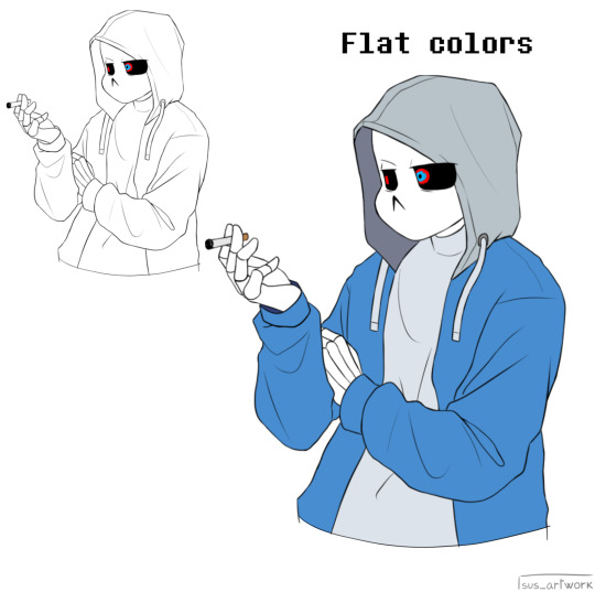
#3- FLAT COLORS

i just have a layer underneath the sketch (sketch is on multiply) and put out the flat colors for everything
#4- SHADING AND HIGHLIGHTS


these are like the early stages of my rendering process for the model sheet. One with the blending mode on “multiply” and the other on “normal” to see the colors i used.
there was a lot of airbrushing and layers used. i had like three layers EACH for shading and highlighting. the symmetry tool is also your best friend for the opposite side models and the face. I could make a whole rendering tut too if asked bc THAT needs a whole post for itself. the hair takes the longest, but the one that’s hardest to master is the clothing bc of needing to know how wrinkles work (which i don’t…)
for the skin i mainly used purples and pinks for the shading and orange and yellow for lighting. Clothing was the same but also blues, greys, and greens in the shading as well.

for the hair, i recommend shape out the strand first and then shade them like long tubes
#5 FUN PART: END RENDERING
I loved putting on the last details of the drawing and watching it come together. the rendering I did was only his glasses and his satchel…
#6 EXPORT + IN-GAME EDIT
basically export it as a transparent png for the sheet!! And then what you can do is go into the game and screen record a character’s skin animation and for a split sec it’ll be blank and screenshot it…orrrr you can use the one i have right here!! honestly go nuts.

For the shadow is a low resolution silhouette of the character and offset a bit and i used the color #0d0337 on a multiply layer at 55% opacity. For the character itself, lower the saturation until it fits the character and on another layer, put it to add/screen and use #7f774d for any lighting needed to make them fit the background. If you want to, you can even use the same color from the shadow to add more shadows on the character model
AND THATS IT!!!!
This post took way longer than i wanted it to but that’s okay!! I like helping other artists and esp when asked directly it’s pretty banger!!
30 notes
·
View notes
Text


did this for my best friend @krowmachine so yeah this is how I render!!
#Uhm#art reference#art tutorial#lighting tutorial#Rendering tutorial#My art#Fanart#Ayyunah#Don’t mind if this looks uhh sloppy I’ve never made a tutorial b4 lol
34 notes
·
View notes
Text
using the sketch i did for the phantom ghoul design, here is a rendering tutorial as requested by @planett-marss.
please keep in mind that this is just how I personally do things and it may not fit everyone. just have fun with it !
if you’d like more info, please let me know.
399 notes
·
View notes
Note
uh hi can you give some shading tips? pls?
Sure! :DD
I think the easier way to give some tips is by showing my own process.
(I won't explain here the basics of shading, but if you want I linked a tutorial down at the end of this.)
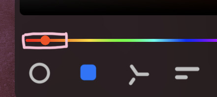
First off, the program I use is Krita (but any program is ok 👍✨) And here's the brushes I use:

I'd say use at least two brushes. A soft one and a harder one.
To show you I'll use this doodle I did of Murder!Sans (by @/ask-dusttale)
First, flat colors.
Then start shading on a new layer and put it in Multiply mode, then change the opacity at your liking. Don't use black for the shadows! Use a dark color. I usually use a purple or a brown.

Now with the same color, go on a new layer (Multiply mode), and add extra shadows where light has trouble reaching. This gives more depth to the drawing. (To make this process easier I use the Select Opaque option, by right clicking on the Base Shading layer, down in the menu, and then paint on the new layer)
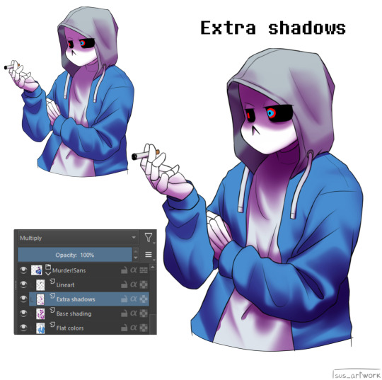
Now fill the canvas with the light's color (or do like me and duplicate the Flat Colors layer, and recolor it if you want the light to be only on the subject). I'm using yellow since it makes a nice contrast with the purple. Put it in Pin Light mode and change the opacity at your liking.

Aaaand
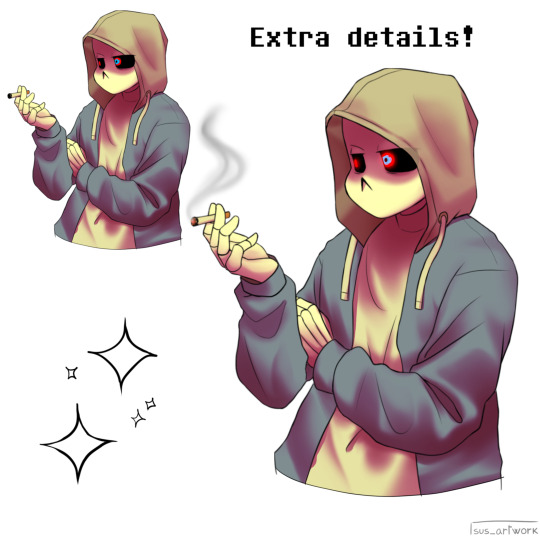
You could say finished! We could stop here, but if you want some extras, go under the cut:
-EXTRA-
Now I- I can't explain what "Bouncing Lights" and "Sub-Surface Scattering" are, so... go see on internet :''D Basically slap some red and blue over the shadows layer in Overlay mode and voilà
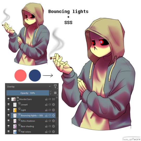
It'd be more noticeable with less light but trust me, it's good
Now let's talk about ambience. We can create many different scenes just by playing with the light and shadow layers! Change their colors, change the blending mode, play with 'em and see what you get:
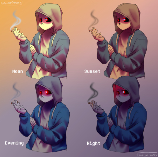

Also I suggest studying how color schemes work (I'll link you a video down below). I uhh actually kinda suck at color schemes XD but having at least a basic understanding of them it's useful.
And, here's some tutorials that personally helped me a lot:
Shadows and lights tutorial/tips <- great for learning the basics of shading
Time saving shading solutions
This great rendering tutorial by @/licollisa
Different color schemes
For any questions don't hesitate to ask me (^w^)
#ask answered#miramoonli#undertale#undertale au#dusttale#sans#murder!sans#dust!sans#art tutorial#drawing tutorial#art tips#drawing tips#shading tutorial#coloring tutorial#rendering tutorial#This was oddly fun to do :D#maybe cause I LOVE shading. It's my fav part of drawing#Also Murder is fun to draw-#You know whose fault it is XD#This doodle was to practice drawing hoods tbh.
175 notes
·
View notes
Text
art tutorial slideshow!!
spent about 2 hrs making this askdjsjkcskjckhsc
also posted on my tiktok!
the link to the shadow method
if yall like it im thinking of making a traditional art version. if you try these and they work tag me in the art i wanna see em!!!
#nics stuff#my art#art tutorial#digital art#digital fanart#art tut#art tutorials#shadow tutorial#sketching tutorial#rendering tutorial#how to draw#rrcenic
80 notes
·
View notes
Text


Rendering tutorial?
34 notes
·
View notes
Text
My new and updated rendering tutorial!(feat: my boy Begonia)


Sorry if it’s unclear or something, I tried my best ’:]
I you have any questions feel free to comment :>
#artists on tumblr#art#digital art#eyestrain#illustration#art tutorial#rendering tutorial#shading tutorial#oc#my oc#ocs
10 notes
·
View notes
Text
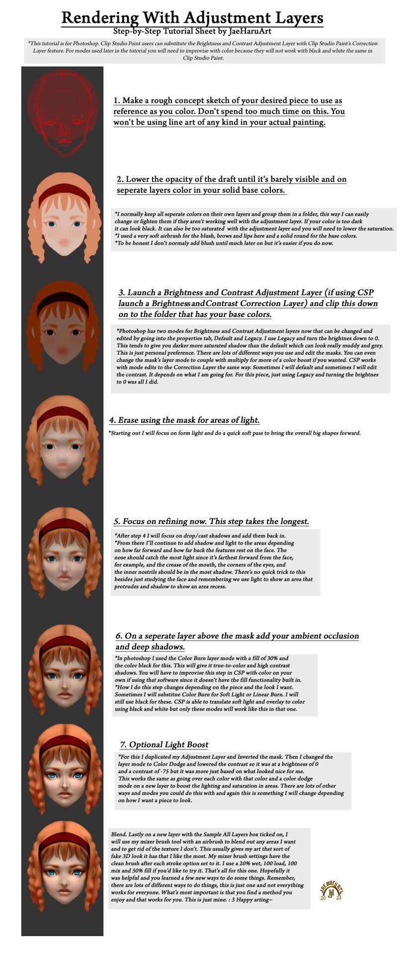
Something my past self wish I had. This might be a bit hard to see here so it's posted on my other socials as well feel free to hop over to DA or Arstation or whatever and grab it if you want to.
Patreon
LikTree
Prints
#art tutorial#digital art tutorial#digitalart tutorial#rendering tutorial#semi realism tutorial#semi realistic tutorial#semirealism tutorial#semirealistic tutorial#jaeharuart#tutorial
14 notes
·
View notes