#batch gradient decent
Explore tagged Tumblr posts
Visit Tumblr Blog
Explore Tumblr blogs with no restrictions, modern design and the best experience.
Last Seen Tumblr Blogs


Fun Fact
There are dozens of funny blogs to kill time on Tumblr.
Text
Batch normalisation part 2 - day 26
Introduction to Batch Normalization Batch normalization is a widely used technique in deep learning that significantly improves the performance and stability of neural networks. Introduced by Sergey Ioffe and Christian Szegedy in 2015, this technique addresses the issues of vanishing and exploding gradients that can occur during training, particularly in deep networks. Why Batch Normalization? In…
#batch deep learning#batch gradient decent#batch normalisation#deep learning#machine#machine learning
0 notes
Photo
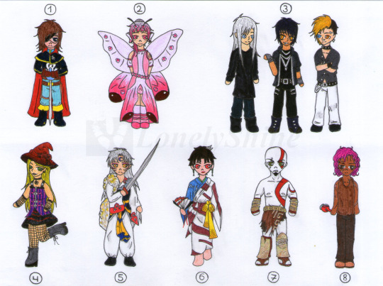
Request Box- 2nd batch
And here we have the second batch of my Request Box!! :D With this all of them are done. Info about each of them under the cut:
1- Captain Harlock, from the series with same name (requested by my mom) So many details!! And on top of it this one came even tinier than the others xD I'm pretty happy with how it came out, however ^^ 2- Vinisha (OC requested by Metanaito-kyou over dA) This OC is so cuuute!! >w< I really enjoyed working on this one, specially with the gradients (man I'm loving gradients). I usually don't use much pink in my drawings, so it has also been a great chance to practice that! Aah, but seriously, so cuute <3 3- Kuria, Damian and Hiro (OCs requested by FlareZenyu over dA) Love those guys' style! There was a lot of black to work with, so I took the chance to experiment with undertones (not sure how well that went xD). I hope their posing looks right as well, as I was not sure about how to pose them. 4- Liesalotte (OC requested by Solidus-Skully over dA) This character's so cool! Must go and read about her. Anyway, it was so fun to get to play with the colours and the hat gradient! Did my best to keep the details even with the tiny chibi, hope it looks right :3 5-Sesshomaru, from Inuyasha (requested by Maalar99 over dA) I want to kill you by requesting this character with all his details xD I ended up enjoying the colouring tho (sketching and lineart were a pain to get right). Anyway, hope you like how your love is looking. 6- Kagura, from Inuyasha (requested by Maalar99 over dA) I don't really have anything to say about this except she also had some details to her and that I gave up some of them. Man, I don't remember almost anything about this character, it's been so long since I last watched the anime... Anyway, here she is! 7- Kratos, from God of War (requested by L7R over dA) Woo, man! It took some time to colour this and the whole time I only half-knew what I was doing with the metallic parts. I think it came out decently well... I hope. Tried to make him look more angry and agressive, but it's difficult to make a chibi look anything other than cute xD 8- D'gafjy (OC requested by MudFae over dA) I wasn't super inspired with this one TwT I tried to keep in mind what you told me about her when I was drawing it, but I don't know if I got everything right. I hope it looks good enough tho?
#lonelyshine#shine-draws#art#fanart#captain harlock#inuyasha#sesshomaru#kagura#god of war#kratos#other's ocs#requests
8 notes
·
View notes
Text
Turns out its a helluva mess when i start messing beyond flat colors!! Might be a sign to not do so much again (but yet .. practice to get to where im one day happy??)
Like ive done as much as i know how to do at this point in time to the portraits (still gratuitously bloody shame on me :') ) oh except for a background bc WHAT does one DO for a character shoulders up portrait background??? Settled for now on a gradient old school photo style lmao
I like the fix it one as is, a lot (but also i liked the lineart for the portraits better i think) and idk, imngonna try give it a light bit of shadows and lights, maybe step away from a lot of blending bc i think i think thats where i went wrong on the other one
Like, they look fine, but they also look. Meh. Like ive used too much blur tool (i havent, i tried using kritas wet brush thing and it looks....ok close up but the effect is no good when zoomed out like posting size APPARENTLY) and its all noncommittally washy.
(cont'd over thinking)
Am i gonna 'render' them a third time??? Do i have the mental strength?? Bc i think maybe trying for something not so, "realistic" could do me better, like a little more cell shady. But also i dont?? I dont know how to cell shade? I dont watch anime or cartoons v much and my style isnt that cartoony or clean lined?
Maybe on the fix it i can try a more....... Conservative and less blended shade/highlights? (And if i like it/learn smth new go back and re re do the portraits same style) I also just. Idk. How does one make it not look so. Flat and meh?? Im doing basic color stuff ok i think, ive got a bit of texture but its still? Eh???
Honestly i could just post them and move on but i dunno, i have the energy to problem solve a lil bit so why not?? (Not tonight. Im gonna sleep on this all)
Why post shit im not 100% proud of? (Ngl kinda been in the mood to take down that first sketch of the fix it bc it looks nowhere near as good as what i fixed it up to but ....... Ah fuck it i was happy w it when i did it so eh)
Why why why oh why is art so hard?????????
I wanna try and become one of those cool artists who post multiple fun things yknow, like u get inspired and can draw it beginning to post in one evening! Im probably way over thinking and pushing myself to some standard of unrealistic perfection i have for myself...
(also i like thumbnail doodled out like, all these things i wanna draw for a really nice fic i read and even after editing some i have like 8 bits i wanna draw?? 4 as like a mini comic bc i havent done one since i was a child and i think itd be kinda rad if i learned to draw short comics for fic scenes i like??? But yeah basically in one inktober post there would only be 5 ideas (a lil more complicated on average i do give for granted but like. Those took me WEEKS) but yeah i just. I wanna draw them. Even if itll probably take me for fuckin ever... (And i didnt even finish off the last two inktober batches, oh. And i have a uni thesis to do ew) .... I wanna push myself to draw faster (less iterations to get it right) and so i can have rly solid and good and quickly done drawings to then color in as i learn to for future?)
Ugh man. You know what i need to do/shouldve been doing before i jumped into coloring original stuff?? I shouldve done colored studies. Like ive been drawing scenes both from reference and original on the inktobers and i think thats why my drawing/character stuff has gotten decent. I really should just whip out like prettily colored movie screencaps and work on painting studies of them. That would really fix up why i cant figure out lights and shadows and blending in coloring! No horrid tutorials just figuring out how can i make it work for me
And you know? You know what it is okay to have pieces that are from before i figured it out right? Im gonna try a slightly different thing for the fix its (if i hate it, theyre good as flat colors too) and yes they dont have a background either please love of god someone tell me how to add random backgrounds bc im not in the mood of scene building further but they float in off white space atm.
If i learn smth ground breaking and can QUICKLY do a bette rendition of the portraits, sure the perfectionist wins. But maybe just maybe. It would be fine to post them as they are. Yea, they look roughly as lifeless as my first big painting/that dinluke poster redraw. And maybe thats okay. Because hi if i do dedicate to doing like a good few color focused studies of star wars scenes as a treat i can come back stronger and have a better piece???? Its about growth babes. YEA
Alright i said to myself thats it in gonna go sleep on it and continue tomorro but. I thought id slip in here a secret surprise for anyone unfortunate enough to have clicked read more... And i got a little whiplash opening the picture bc it looks. SO WRONG but the more you look at it its like ... Fine. Ok judge for urself and tell me pls, first and second attempts at 'rendering' the portraits (the darker bground was the first attempt just going by gut, the lighter one after trying to watch like 1 tutorial and using more brushes and just generally trying rly hard!!)
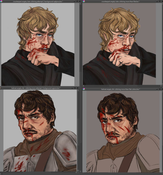
yes ive clearly fixed issues in the sketch differently in both so they... look... like different expressions?? idk man idk idk idk see now this small they look differently off!! god the curse of the zoom in and out and perception.
#art woes#but make it extra long because im DISTRESSED at not being able to just whip out ideas from my brain to page and it look good in one try#long and rambly and probably doesnt make much sense no pressure or expectation for anyone to read lmao#love yall kiss kiss time for bed itll be easier after sleep#did include a pic of current progress at the v bottom eheheheh
0 notes
Photo

HP Spectre x360 (Kaby Lake G) Review
So, about 2 weeks ago I got my HP Spectre x360 with the i7-8705G processor, and I've decided to a little review on it, just for fun. My model has a 4K touchscreen display, 12 GB of DDR4 2400 (so dual channel memory doesn't work quite correctly), the i7-8705G (4 CPU cores, 4 GB of HBM2, and 20 CUs), and a 256 GB NVME SSD from Samsung, the one that comes with the laptop. I'm mostly going to be testing performance but I will touch on all aspects of the laptop.
Overview
The HP Spectre x360 is a 15 inch laptop that launched a couple of months ago at $1300-$1500; HP has sales pretty frequently so if you're lucky you can get this for about $1300 like I did. It comes with only one option for Kaby Lake G, the i7-8705G. You can configure the RAM from 8 to 16 GB and configure the SSD from 256 to 2 TB. The screen only comes in at 4K. The Spectre also includes a fingerprint scanner and a Windows Hello compatible webcam for quick sign in. IO is pretty good as well; HP includes one T3 port, one USB type C port, one USB 3.1 port, one HDMI port, a headphone jack, and an SD card reader. It can be charged either through its AC port or through the USB type C compatible ports, but only if you own one of HP's branded chargers. HP's software will reject anything that isn't from HP. Also, you can open up the Spectre (with some difficulty) and upgrade the RAM and SSD and even fiddle with the heatsink if you want. Finally, the Spectre is just under 20 mm in thickness and weighs about 4.6 pounds. Okay, with all that being said, let's get into it.
Chassis
The first thing you notice with a laptop is how it looks, and the Spectre looks and feels really good. It's very sturdy and feels very premium. I previously owned an HP Envy x360 15 inch, and I have to say it's actually not that much better. It definitely looks better with its gold accents though. There is very minimal keyboard flex and the screen hardly bends at all. Another nice upgrade over the Envy is the fact that its fans are configured in a much smarter way: intake on the bottom (like the Envy but with more holes) and output on both sides of the laptop (instead of out of the back). Using dual fans pushing air out of the sides makes it much easier to keep the Spectre and you cool, especially if you're putting the Spectre on top of something like a blanket. Overall, it's very thin and it's a little heavy but not too heavy.
Keyboard and Touchpad
This keyboard is about the same as on the HP Envy x360. It's pretty decent, and the backlight is pretty good. It's also full size, so you get your numpad as well. There's nothing particularly special about the keyboard. It's good. Some people might dislike the half sized up and down arrow keys, but personally I'm fine with it. The touchpad is okay, it's not quite as tall as I would like but it works good enough. No deal breakers here, though the Spectre isn't really amazing me with the keyboard and touchpad.
Display
While a 4K display does consume more power than a 1080p display, I have to say it's an incredible monitor. 4K may be overkill at such a small display, but damn does it look good. Just sublime. And compared to the Envy x360, the brightness is much better too. It's not the brightest monitor out there, but it'll do the job even in the sun. Colors look good as well, I haven't noticed any obvious gradients where colors gradually changed. On my Envy I could clearly see bands of colors on something like the sky. The Spectre has no problem displaying all the colors you need to see a smooth transition from one type of blue to another similar, but distinct blue. Bezels on the left and right are very thing, and while they're kind of thick on the bottom and top, it does allow for more space for the speakers and touchpad, as well as the webcam which is directly above the display.
Speakers
Kind of a mixed bag. I actually liked the speakers on the Envy, because they got pretty loud without distorting. When I couldn't get my cheap soundbar connected to my TV working one time, I used the speakers on the Envy instead, and the experience was pretty good. However, the experience with the Spectre is different. The speakers are now spread out over above the keyboard, and on the bottom of the chassis on the closest lower left and right corners. It just sounds a little off. It's totally fine, but it's not special.
Battery life
Battery life is okay, definitely not great though. Using the better battery life plan, setting the brightness to half, and running a Slow Mo Guys video at 4K resolution and 50 FPS, the laptop lasted a total of 3 hours and 46 minutes. For such a large battery, it's a disappointing result, but it's not surprising. The Vega M GPU, even though it was not used for this task, does require power even when it's idling, perhaps 5 or so watts. That's not nothing, and especially over time it's going to drain the battery.
Noise
Under full load, and even when watching 1080p60 videos or other high resolution content, the fans get pretty loud. Thankfully this keeps the system cool, but again, it does get loud. If you wanted a really quiet machine, the Spectre is not for you. Of course, there's a very good reason why it gets so loud and requires two fans.
Performance
Yep, that's right, it's because this laptop has alot of horsepower. The Spectre is based on the i7-8705G, which has not just an Intel CPU, but also a Radeon GPU. The Intel CPU has 4 cores, 8 threads, running at a maximum 4.1 GHz turbo and features Intel HD 630 graphics for use in low load applications. The Radeon Vega M GPU (which is really a Polaris GPU) has 20 CUs running at a maximum turbo of 1011 MHz and 4 GB of HBM2. On paper, this combination looks really good for everything from video editing to professional applications like CAD to gaming, and it should perform similarly to 7700HQ laptops with GTX 1050s to 1050Tis. Well, we'll see about that.
Our test suite includes these applications: Cinebench R15, 3D Mark Firestrike and Timespy, Ashes of the Singularity, Civilization VI, Total War: Rome II (with the new graphics patch), and the Witcher 3.
On Cinebench R15, the i7 scored 623 points on its best run, but in other runs the scores were as low as 480 and usually hovered around 550. This is likely due to thermal throttling. The i7 should boost very well under short loads but will fall behind if it can't finish a task before throttling sets in.
In 3DMark's Timespy, the Kaby Lake G processor scored 2167, and in Firestrike it scored 5161. Laptops with 7700HQs and 1050Tis typically make about 3000 points in Timespy and 7000 points in Firestrike. This is nearly a 50% difference, and it may surprise some of you. How could a 20 CU and 4 core CPU combo lose so heavily? Perhaps this processor lies closer to the 1050, but 1050Tis are not 50% faster than 1050s. Before I explain why the discrepancy exists, let's move on.
Using the standard preset at 1080p with the DX12 API on Ashes, the GPU focused benchmark scored an average framerate of 27.1 FPS (with all batches being GPU bound entirely) and the CPU focused benchmark scored an average of 16.8 FPS. I don't have any other hardware to compare this with, but I'm using mostly standardized benchmarks so that you can compare your own hardware or other benchmarks yourself.
Using the medium preset at 4K with the DX12 API on Civilization, the graphics benchmark ended up having an average frametime of 37.226 ms, which is mostly playable, and a 99th percentile of 44.947 ms. I'd recommend turning the settings down to low or the resolution down to 4K, but on a game like Civ it seems like a waste to not use 4K since the FPS doesn't matter that much. The AI benchmark resulted in an average turn time of 22.01.
And for our final benchmark, we have Rome II, which recently got some updates and new DLC. Using the in game benchmark with ultra settings at 1080p, the Kaby Lake G processor was able to achieve a framerate of 30.7. I'd recommend turning the settings down a tad since framerate is somewhat important for Total War and you won't be caring too much about looks when you're doing battle.
Now, I did say I was going to test Witcher 3, but not actually benchmark it since there's no point. I wanted to bring attention to the fact that the 8705G can play Witcher 3 with a blend of low and ultra settings (because going from low to ultra on some settings does not impact performance) at about 45-60 FPS. Overall, the Kaby Lake G processor is very impressive given the cooling limitations of the laptop's design.
Now, why is the processor underperforming? On paper, it should be a good deal faster than a 1050 and at least only a little slower than a 1050Ti. Well, earlier I mentioned thermal throttling playing a part in Cinebench's performance, but in this case I believe something else is more to blame: power throttling. You see, the CPU and GPU only have 65 watts between them. A 7700HQ alone can use 35-45 watts. The HBM and GPU also need to get power. What will happen is that the harder the GPU is hit, the less power the CPU is allowed to use, and in some games you may see the i7 go as low as 2 GHz on all cores. However, I personally am very happy with performance.
Conclusion
Overall, the HP Spectre is a very well balanced machine. It's pretty thin, it's got good performance, it has a 4K display with enough brightness and color accuracy, it has good battery life, and it's not super expensive. If I had to give this a score out of ten, I'd give it a 9. Points off for disappointing battery life and performance, but you will have a hard time finding a laptop this thin, with this battery performance and computational power, at this price point. It's not a gaming laptop, but it works fine as one. Stuff like CSGO should work really well since it's a game highly dependent on the CPU and not the GPU. With many laptops, you make compromises like having a really big battery and then having almost no performance to speak of, or having a great GPU and CPU but it weights like 15 pounds, is more than an inch thick, and costs a fortune. The Spectre on the other hand has no major compromises and is an excellent choice for people who don't need a laptop that's the best at only one thing.
2 notes
·
View notes
Photo

1939 Mercier Moto-Сhenille | France 🇫🇷 Mercier Moto-Chenille is a motorcycle with a track instead of a front wheel. The engine is located at the front, on the front fork (you could say on the steering wheel). The motorcycle was developed for the Swiss army, but it so happens that its prototype was tested in France. Considering the invention very useful, the French military conducted a test drive for this conceptual vehicle, after which the motorcycle went into production. A small batch, consisting of only three copies of tracked motorcycles, with technologically advanced for that time JAP OHV engines, was made in several different versions. The 350 cc Mercier Moto-Chenille engine was started with a kick-starter. The power of 11 hp was not enough for full operation, but it was enough to overcome the hills with gradients up to 42° and to develop a decent speed for such a non-standard machine. #avernusbikerlifestyle #bikerlifestyle #biker #motorcyclelovers #bikers #bikersofinstagram #motorcycles #trikes #motorbikes #streetfighter #ratbike #custommotorcycles #classicmotorcycles #vintagemotorcycle #classicmotorcycle #vintagemotorcycle https://www.instagram.com/p/CFW087BAnmw/?igshid=4h1sq8ux67ld
#avernusbikerlifestyle#bikerlifestyle#biker#motorcyclelovers#bikers#bikersofinstagram#motorcycles#trikes#motorbikes#streetfighter#ratbike#custommotorcycles#classicmotorcycles#vintagemotorcycle#classicmotorcycle
0 notes
Text
MODERN WORLD OF DIGITAL PRINTING
High Quality, Color Digital Outputs with the newest in equipment & technology
Digital printing gives you cost-effective, high-quality, short-run colour printing within the tightest imaginable timeframes with all the customization you'll imagine, and adaptability to print the precise quantities of materials you would like once you need it. Business Cards | Flyers | Brochures | Postcards | Door Hangers | Pull up Banners | Roll up Banners | fair Banners | Vinyl Banner Inside | Vinyl Banners Posters | Large Format Posters | Books | Car Magnets | Pocket Folders | purchasable Signs | party Signs | T-Shirts Printing.

Digital T-Shirt Printing
• Suitable for Full colour complex designs with gradients and tones
• Ideal for a coffee order quantity
• Custom digital images or photos
• For numerous logos/designs to print per garment
• Can be processed quickly if you've got a decent deadline.
Digital t-shirt printing Dubai is employed for multi-colour artwork with complex gradients and tones and photographic imagery.
The digital printing is performed by printing the digital-based image on to a vinyl base, which is then machine cut and processed by hand to be positioned on to the garment before applying heat and pressure to transfer to the merchandise.
Transfer printing
• One-off samples for client meetings or press events
• Multicolored logos that require seeming bright and bold
• Nylon fabrics – waterproofs, umbrellas Sports, hi-vis jackets, sponsors for sports kits
Transfer printing is extremely popular and most suited to smaller orders and print runs of up to around 100 units. a way which involves heat pressing plastisol, foil, flock or CAD-cut vinyl onto garments.
Transfer printing will outlive the garment it's printed on!! Once printed the clothes are often washed at up to 40 degrees.
Business Cards
Digital Signs & Printing provides the very best quality grade of cardstock and different options, starting at 12pt up to 16pt double-sided full-color printing. Also offer embossing and foil while other options are available. Provide a hassle free and quick turnaround on small batches of business card printing and lots of different options for printing your cards in various quantities to satisfy your budget.
Door Hanger
Door Hanger design requires a special touch. Design an attractive door hanger for your business or brand promotion.
Studies show that 80% of your marketing success depends on the deal offered and therefore the distribution. That leaves 20% for copy, design, and printing.
While strong copy and compelling design appear to be a no brainer, it’s equally important to recollect that the print quality of your door hanger plays a neighbourhood in how customers view your company.
Here are some tips to stay in mind with door hanger printing:
• Stick to full-colour, double-sided custom hangers that allow you to incorporate all necessary information
• Print as many customs hangers as you'll afford to chop down on overhead.
Printed door hangers still, be an economical marketing tool that's often ignored when marketing a business, product or service. But, their rock-bottom printing costs make them a beautiful marketing prospect for cash-strapped businesses.
Local businesses like restaurants, dry cleaners, beauty salons, and convenience stores find them to be an efficient thanks to market promotions and an excellent thanks to pushing for holiday sales. Service-based businesses can advertise monthly maintenance packages and repair contracts.
Every marketing plan should find a home for them because:
• People can’t ignore them
• Versatility: small, local businesses and more massive franchises can use custom door hangers for general purposes or specific promotions
• Laser-focused geographic targeting
Printed paper bags
Printed paper bags became a standing symbol in today’s market. They provide many benefits to their users and also gain importance thanks to being 100% reusable, biodegradable, recyclable and environmentally friendly. They’re also preferred because they're neat, easy to hold, can hold many items and are used for various purposes.
Because of the rise in demand for a personalized paper bag, businesses are designing them in line with their brand as a sort of free advertisement, endorsement and brand awareness. People get to understand about you, your brand, and company and therefore the benefits and repair they will get from it.
Customizing a printed gift bag may be a highly cost-effective marketing tool that each one business got to adopt as how of selling their brand. It’s a useful and robust way of promoting businesses by providing an honest picture of your product and a high level of service to your customers. It creates a conscious bond between your business and customers.
By the top of this post, you’ll understand 3 ways in which brands can make their bags stand out for Easter promotions with printed tissue, printed ribbon and tips for an attention-grabbing design.
0 notes
Text

I’ve tried quite a few different methods for iconing during my time in the rpc, but I always end up going back to Photoscape because to me it’s easier and more intuitive than other methods that I’ve found. This tutorial covers the basics of making base icons and using the batch editor to edit them, including how I personally do the borders on my icons with an aside about rainbow borders since someone asked me about it a while ago. I’ve never done a tutorial before, so hopefully it all makes sense. If not, I’m happy to answer questions!
This tutorial is specifically for Photoscape X (free version) for Windows 10, which you can find in the Windows Store. There’s also a version for Mac. If you’re running a different version of Windows, you should still be able to follow the same basic process in Photoscape 3.7 but some of the interfaces are different and it lacks some of the newer tools/features.
Part 1: Making Base Icons
The first thing you’re going to need is your source images from which to make icons, whether saved on your computer or copy/pasted from somewhere. I’m working from screencaps I previously took, so when I go into the photo editor I navigate to the folder they’re in using the navigation pane on the left side. Clicking on an image in the bottom left pane brings it up in the editor. On the right side of the screen choose crop.

You’ll get a pop up of preset ratios you can crop your image to as well as options for custom ratios/dimensions and free cropping. I intend to make 100x100 icons when all is said and done, so I've chosen the 1x1 option. Then click and drag on the image to select what you want to keep and click crop at the bottom of the pop up.

And now we have a base icon! We should save it. You can click the save button in the bottom right corner of the screen or ctrl+s.

To save, you’ll get this pop up window. If you want to overwrite the source image with your newly cropped one, click the first “save” option. “save to” saves to a specified folder with the image under the same name. “save as” lets you change the name and also choose what folder it saves to. How you save and name your base icons is completely up to you but I personally have a “dump” folder set as my “save to” option and save them that way for the sake of expediency because of how often I do this.

Now go back to the beginning and repeat until finished with all source images.
Part 2: Editing
Now that we have all of our base icons, we’ll switch to the Batch Editor. You can either drag your images from the folder into the center (ctrl+a will select all in the folder to be dragged at once) or you can click open in the bottom right corner and do so that way. The image in the center acts as a preview and will display any changes you make. In the scroll box above it you can click on a different icon to change the preview image. On the right you’ll see several drop down menus. I’m not going to cover the crop section because I never use it, but we’ll go through the others.

Resize. You’ll see several options for how to resize your images. I find it’s easiest to adjust the width so I have it set to 100 and the image will resize accordingly.
Color Mode. Pretty self explanatory.
Filter. Allows you to adjust all kinds of light and color settings. It’s just a matter of playing around until you find something you like.

Film. This section gives you many options for further coloring and other effects. These can be layered on top of each other by using multiple slots at once. When you use the editor for the first time, all of the slots will have + instead of a check box. To see all of the options, click the + or (once you’ve used a slot) check the box and click the film selection to change it.

This, unfortunately, is one of the places where I wish I had the full version of the program because you’ll notice as you scroll through that a majority of the options are marked ‘pro’, meaning you’ll have to shell out $30 to use them all. But the free version still gives you a decent amount to work with. At the top of this popup you can choose the type of effect you want to add and it will switch to a different tab to show you those options. At the bottom you can use the slider to adjust the amount of the effect. Depending on what type of effects you’re looking at you’ll also see some other options (flipping/rotation in the light leaks tab, for example). When you’re satisfied, click apply.

As I mentioned earlier, you can layer multiple effects on top of each other by using multiple slots in the Film drop down. For example: two film effects and then a texture.
Part 3: Frame
The next two drop downs are Insert and Frame. For the sake of this tutorial I’m going to go a little out of order and talk about Frame first. You’ll notice that there is only one slot for this section which means you can only choose one of these options at a time. This is the first option for adding borders, though not the route I personally go. In the pop-up, the frames tab has a bunch of pre-made frames you can choose from, some with extra options that will appear below the scroll-box with the frames. The borders tab lets you round corners and add simple borders and shadows. I don’t have a lot of experience with this option so you’ll have to mess around with it yourself if you want to go that route.

If you want to make circle icons, the shapes tab is where you can do so. There are also a plethora of other shapes you can choose from as well; all the basic and speech bubble shapes are included in the free version and one shape in each of the other groups as well. When you choose a shape, you can choose either a solid color, a pattern, or transparent background. Also, if you choose to follow my border technique covered below, you may want to increase the margin (slider to the left) so as not to cut part of your border off.

When you’re satisfied with your choice, click apply.
Part 4: Insert
Now we’ll double back to Insert. Again, we have several slots here to work with like we did in the Film section so we can have more than one object. When you click the + you’ll be presented with these choices.

Sticker. Gives you the option of inserting clipart that comes with the program. When you select one you’ll be able to move/adjust the sticker however you wish on the preview image.
Image. This allows you to insert images saved on your computer as an object on your icons. This could be a symbol that represents your muse or even a custom texture or pre-made border. If you search through various graphics/rph tags you can find a lot of pre-made borders and textures to put on top of icons like this post. Once you insert the image you can move/adjust as you see fit.
Clipboard Image. Same as Image except it’s whatever you’ve got on your clipboard.
Figure. Lets you insert a host of shapes and figures. This is how I make my borders, so I’m going to go through it in that context. When you first click figures you’ll get the window below. Because I’ve made my icons circular, I’m going to choose the hollow circle on top to insert that figure. If I was doing square, for example, I’d choose the hollow square.

Once I’ve inserted the image, I adjust it to the correct size by clicking and dragging the edges and center it by clicking on the middle bubble in the square of the top left of the pop up (you may have to click a different bubble and then click the middle to get it to work). Then I start editing using the other options. (Side note that the pop up is essentially what the options for sticker and image look like with a few minor differences.)

Here’s a run down of the options that I regularly adjust:
Color: You can either make the fill a solid color or a pattern.
Type: Allows you to change the figure from a solid line to dotted/dashed lines.
Thickness and Opacity: Adjust sliders to adjust thickness and opacity.
Outline: Adds an outline to the figure. Allows you to adjust color and thickness.
Outer Glow: Adds a glow to the outside of the figure. Allows you to adjust color, thickness, and amount of blurring.
Gradient: Changes the fill color to a gradient. If you came for the rainbow borders, your time has come! Under this drop down you have three options for coloring: preset gradient, two color, and single color. You can also adjust the angle of the gradient by using the angle slider.

If you click the first option you’ll be presented with all the preset gradients. Below the scroll box you can adjust the chosen gradient by moving the sliders along the bar. Below that you can adjust the opacity of different parts of the gradient by dragging the line down at a specific point, with the top of the box being 100% opacity and the bottom being 0%.

For the second and third options, you can click the boxes to choose the color(s) you want to use. To the right of the color options are the options for how the colors appear in the gradient. Pictured is the two color options, the single color options are similar.

Text. Allows you to insert text. As you’ll notice, many of the options are the same as those of the other objects with the addition of text specific options. You can type your text in the black text box (has a G in the picture) and change your font and size, bold/italic/underline/strikethrough, text alignment, and color.

Step 5: Save and Enjoy!
Before you save, make sure to check the preview for all of the icons to make sure they’re to your liking by either clicking on them individually or scrolling through using your arrow keys. Then click the save button in the bottom right corner or ctrl+s.

And you get this save pop up. I have my save location set as an output subfolder (which Photoscape will automatically create) in the folder the base images are currently in, but you can save them to the same folder or choose a custom folder as well. Other options allows you to choose the image format and (if you’ve chosen jpg) the quality of the image. As for naming, I prefer to use the Advanced Naming tab and choosing <sequence> from the drop down menu as this will name/save the icons in numerical order. In the picture I also have ‘a’ as a prefix for something I was doing earlier and forgot to change. So with the settings I have below, my icons saved to the ...garnet\output folder as a001.png, a002.png, a003.png, a004.png, and a005.png.
**EDIT: If you are making shaped icons with a transparent background, DO NOT save as a JPEG because the format does not support transparent pixels and it will replace them with white instead. I’d recommend PNG in that case.

Be sure to check your icons before you exit the program by either looking at them in your photo viewer or uploading a couple to a draft just to see how they’ll look on the dash. Sometimes things look a little different between the preview in the batch editor and the saved version.

In the event that you want to make more icons in the future, it’s useful to save your settings so that everything stays exactly the same with your next batch. Click on the three dots next to the save button and then save settings on the menu. Then just give your settings a name and you’re ready to go for next time! All you’ll have to do is click load settings instead and select your saved settings.

So there you have it! Once you get the hang of working in Photoscape it becomes really simple to make icons and the more you play around the more you’ll learn how to do. In the future, I’ll probably do further tutorials on other specific things I’ve learned how to do as well as how I make gifs, but for now, enjoy your iconing! And if you have any questions, feel free to ask.
38 notes
·
View notes
Text
Day 8 _ Gradient Decent Types : Batch, Stochastic and Mini-Batch
Understanding Gradient Descent: Batch, Stochastic, and Mini-Batch Understanding Gradient Descent: Batch, Stochastic, and Mini-Batch Learn the key differences between Batch Gradient Descent, Stochastic Gradient Descent, and Mini-Batch Gradient Descent, and how to apply them in your machine learning models. Batch Gradient Descent Batch Gradient Descent calculates the gradient of the cost function…
#artificial intelligence#batch#batch gradient decent#classification#gradient decent#gradient decent types#large gradient decent#machine learning#Stochastic gradient descent
0 notes
Text
photo editor for everyone
Experiment with styles and looks. Use the variety of FX Photo Studio Filters to create custom pictures. Choose from over 200 effects. Combine or apply them selectively with the kit's most convenient Mac photo editor. However, only the desktop version offers the possibility of RAW conversion. I really like this free photo editor - almost no ads, lots of great effects, and scenes similar to the presets in Lightroom. What many photographers really like is the ability to open and edit PSD files. You have access to many lessons and training videos. GIMP is the most powerful free photo editor that Photoshop can completely replace. Above all, the effects and filters are often used by many users. Images more hints can be done here with just a click of the mouse. This is the only program that opens the RAW photo folder in a few seconds. The color correction menu is even more attractive - there are a considerable number of different settings that are more reminiscent of Lightroom than similar programs. The web version of this free image editing program is not suitable for editing RAW files, but is quite suitable for JPG and PNG.
WebP Plug-in for Gimp
You also hardly need any familiarization time here, because the program can be operated according to intuition.
For beginners, ease of use and decent performance are plus points.
97 Move Gradient Photo Editor iPhone / iPad app.
Whether you want to adjust colors or change contrast - everything is possible with just a click of the mouse.
The advantage of the photo editing program is that it can process RAW files that are so often omitted by free software.
ul> The software is an adequate replacement especially for photographic image processing. Adobe's Lightroom can no longer be subscribed to individually. Whoever opts for the "photography" version of the Creative Cloud is then a licensee of Photoshop and Lightroom. Lightroom only becomes an alternative for Photoshop if you subscribe to the program individually. Photoscape has also been a popular alternative to Photoshop for years, at least among amateur photographers. Remove an annoying element here, a little brightening there - quite a few pictures shine with a new shine after a short post-processing. 70 Satisfactory Photopus - Free Batch Photo Editor BEW. 73 Satisfactory WebP plug-in for Gimp BEW. 0.1.1 English WebP Plug-in for Gimp The free "WebP Plug-in for Gimp" enables you to import and export the image format from Google. With the Prime Noise Reduction, DxO offers a tool in the detail corrections to get useful images even from ISO values beyond the 16,000. Luminar can be sharpened with three different tools. As the only program in the test, Capture One offers the possibility to take photos directly from the camera into the software.

3.40 German FotoSketcher FotoSketcher is a freeware program with which you can give your photos the look of colored pencil hatching. 21 Very good PhotoLine 32 75.
0 notes
Photo

"[P] Leela Chess Zero - an open-source distributed project inspired by Deepmind’s AlphaZero"- Detail: Overview:Most people here have likely heard of Deepmind’s AlphaZero which used a general self-reinforcement approach to train a competitive Go/Chess/Shogi engine from scratch using only the rules of the games (Why Zero). Since not all the details of the code and weights were made public, Carlo Pascutto initiated an effort to reproduce the results (and perhaps eventually improve upon them). Not having the massive computing power of thousands of Google’s TPUs, the only way to generate the necessary number of games without similar massive computing power or centuries/millennia to train was to distribute the computing effort and, as a result, the Leela Zero project was born. Gary Linscott (also a Stockfish chess engine developer) adapted Leela Zero (a Go project) to become Leela Chess Zero.This project was mentioned here 9 months ago, but Leela is a year old now and has improved greatly since then. She is at an exciting point in her life where she’s becoming competitive with the very best chess engines and just started a training a new version (T40) that incorporates the Squeeze-and-Excitation concept.How Leela Works:As explained more fully on the LCZero blog and the Github wiki (this page has a great glossary of terms too), Leela uses a deep convolutional neural network (NN) that is trained iteratively through self-play (reinforcement learning). For one step, the NN has given starting weights (randomized for the initial net) and generates a batch of self-play games using those weights. Those games are then analyzed and the weights are updated using backpropagation and gradient descent so that they better predict the results for the batch that was generated. A quick quality check of the new net is performed and, if passed, these updated weights are then used as the starting weights for a new batch of games and everything repeats. Currently, each batch is about 32,000 games.Current Competitions:Leela is participating in Top Chess Engine Championship during TCEC Season 14 Division 4 (Top 8), currently sitting rank 2 with no losses (using T30 net #32194) behind the dominant StockFish engine and has a decent shot at making it to the superfinal. Future rounds will be played with newer nets.She’s also competing in the Computer Chess Championship, which recently started Stage 3 (top 4 engines from Stage 2). Leela qualified 4th in Stage 2. That result was with an older net (T10 #11248) and she’s trained on many millions of games since then and playing using a newer net (T30 #32425) in Stage 3, which is currently in progress. It’s still early, but she’s currently ranked 2nd here as well.Although possible, Leela is not likely to beat StockFish in these tournaments. However, she’s very young compared to the other engines and learning quickly thanks to lots of people contributing to her training and the talented developers working on the project. The next generations of Leela (T40 and beyond) might be the GoAT chess bots after a few months of training. Only time will tell.Selected LCZero blog postsLc0 trainingContributing to Leela Chess Zero. Creating the Caissa of Chess engines...Setting up Leela on a Chess GUIAchilles heel of Chess engines... Neural net engines and Leela the only hope!Understanding Training against Q as Knowledge DistillationA Standard DatasetContribution StatsOver the last few months, the project has averaged about 120 distinct users contributing games each day for a total of 1 to 2 million games uploaded per day. Between the different training runs, Leela has accumulated close to 200 million total games. The main page on the LCZero site has recent stats and top 50 leaderboards.Contributing:If you’d like to contribute computing power, it’s easy to run training games on your own PC, but you can also train for free in the cloud using Google Collab and/or Google Cloud Compute. See the Github wiki for instructions and check out this LCZero blog post for more background and detail.If you’d like to contribute to the programming and development, Github and Discord are probably the best place to start looking at code and talking with the current developers.Useful Links:Web Site: http://bit.ly/2LVoU1e http://bit.ly/2see0e3 http://bit.ly/2LVoV5i http://bit.ly/2sieRKR Groups Forum: http://bit.ly/2LVoY0Y Programming Wiki: http://bit.ly/2sieShT Articles:Lessons From Implementing AlphaZeroMastering the game of Go with Deep Neural Networks & Tree SearchMastering the game of Go without Human KnowledgeAlphaZero: Shedding new light on the grand games of chess, shogi and GoA general reinforcement learning algorithm that masters chess, shogi, and Go through self-playMastering Chess and Shogi by Self-Play with a General Reinforcement Learning Algorithm. Caption by IllIlIIlIIllI. Posted By: www.eurekaking.com
0 notes
Text
I listed the fried eggs! Wheee! Looks like I might be on track for twice weekly shop updates for a while.........maybe. Definitely if I also release some limited charms. I thought it would be cute if I cut the thread and pulled it apart to tie the charms to the board. I'm thinking using a needle and regular thread and doing what Levi does work their tags would be a better system. Maybe I'll stick with the gradient thread pulled apart. Still...... I can't think of any better methods for attaching my charms to the cards. I experimented a little with letting the charms just be in the bag, but the presentation of the fixed charms is just nicer. So I dug myself into that one. I'll probably start tomorrow finishing the paperwork for that part time thing and then move right into finishing the strawberries. A big part of that will definitely be gluing the pins in. Ugh. Then I'll probably need to wait till Wednesday to take that photo. Finally. And knowing my luck, the weather will be shit by the time I finally get around to it...... I'm almost finished with the polaroids I have right now. It's kind of a small, sad collection. I think I'll want to wait to take that photo and make that listing. I can't wait to fill up the little box I have for the packaged charms. The strawberries will definitely keep me busy, but I think with all these things going on, I need to structure my time better, rather than just doing one batch at a time. Right now, I sculpt until I fill a pan, bake, paint everything, photograph and list, then package. Maybe I need to assign a day or two to everything, even though right now, I'm just trying to flesh out my collections and produce decent listing photos. I realize instead of going for decent, I should be going for eye catching. I think I need to work my way up to that, somehow..... Anyway, I think giving myself a set period to work on each part, rather than just working till each batch is complete, would be a technique worth trying. Plus, it would give me a set amount of time to work on the things I'm not so keen on doing.....Ugh it's just everything is so out of whack with all the charms I have to paint or make into huge batches before painting and all the accompanying packaging. But good packaging is worth it. Thoughtful packaging is worth it.
0 notes
Photo

I’m assuming this is a scale model of the bike, as it looks too small to ride. Mercier Moto-Сhenille | France , 1939. Mercier Moto-Cennelle is a motorcycle with a track instead of a front wheel. The engine is located at the front, on the front fork (you could say on the steering wheel). The motorcycle was developed for the Swiss army, but it so happens that its prototype was tested in France. Considering the invention very useful, the French military conducted a test drive for this conceptual vehicle, after which the motorcycle went into production. A small batch, consisting of only three copies of tracked motorcycles, with technologically advanced for that time JAP OHV engines, was made in several different versions. The 350 cc Mercier Moto-Cenille engine was started with a kick-starter. Power of 11 hp was not enough for full operation, but it was enough to overcome the hills with gradients up to 42° and to develop a decent speed for such a non-standard machine. #avernusbikerlifestyle #bikerlifestyle #biker #motorcyclelovers #bikers #bikersofinstagram #motorcycles https://www.instagram.com/p/B_7OLDIA0VX/?igshid=1r35ale574ig
0 notes
Photo

"[D] Training Neural Nets on Larger Batches: Practical Tips for 1-GPU, Multi-GPU & Distributed setups"- Detail: With the current trend toward bigger models (like OpenAI's GPT or BERT in NLP), it is often difficult to fit more than a handful of samples/GPU.But stochastic gradient descent algorithms often require more than few samples/batch to get decent results.I've gathered in a post practical tools and tips I've been using to train such large models with reasonable batch sizes (from simple tricks like gradient accumulation to efficient multi-GPU code & distributed setups):https://ift.tt/2PzNFRF would be happy to hear your thoughts and whether you know and use other technics.. Caption by Thomjazz. Posted By: www.eurekaking.com
0 notes