#gradient decent types
Explore tagged Tumblr posts
Visit Tumblr Blog
Explore Tumblr blogs with no restrictions, modern design and the best experience.
Last Seen Tumblr Blogs


Fun Fact
Tumblr has 4 main sources of revenue.
Text
Day 8 _ Gradient Decent Types : Batch, Stochastic and Mini-Batch
Understanding Gradient Descent: Batch, Stochastic, and Mini-Batch Understanding Gradient Descent: Batch, Stochastic, and Mini-Batch Learn the key differences between Batch Gradient Descent, Stochastic Gradient Descent, and Mini-Batch Gradient Descent, and how to apply them in your machine learning models. Batch Gradient Descent Batch Gradient Descent calculates the gradient of the cost function…
#artificial intelligence#batch#batch gradient decent#classification#gradient decent#gradient decent types#large gradient decent#machine learning#Stochastic gradient descent
0 notes
Text
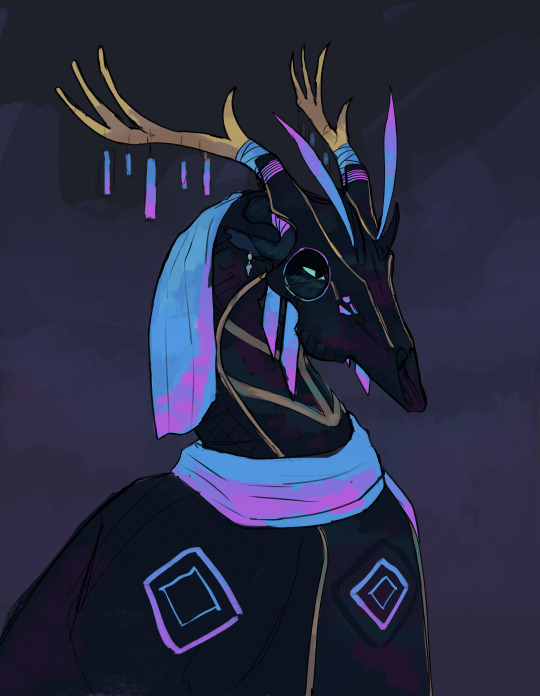
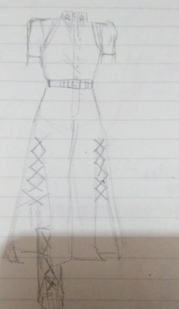
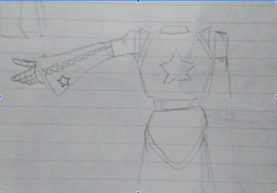
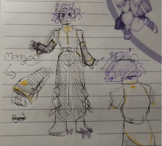
A suit of armor masquerading as formal wear, designed for parties and social events.
The bioluminescent cloth is made using firefly silk, a form of firesilk that can be safely worn without risk of burning. To give it its blue coloration, the firefly silk is dyed with pigment processed from Moon Globe flowers, changing the orange shine of the fabric into a vivid gradient of blues and purples, reminiscent to that of the moon globe.
A weave of deactivated blaze and firefly silk is used for the rest of the garment. Though having lost their glow, they still retain their fire retardant properties, serving as a decent guard against fire-breath. Gold silk is then woven over to stylize the cloth.
Meteoric iron is used to forge the helmet. The Ripples of blues and purples are the result of the traces amounts of sky fire added to the alloy, the purpose being to protect the wearer from prying mindreaders.
(I headcanon that the length of time firesilk can burn for depends on the type, with sun silk burning for only several hours or days, blaze silk for several months, firefly silk burning for several years, and goldsilk forever, because gold never erodes.)
#wof foeslayer#foeslayer#wof#dragon#wings of fire#art#dragons#wof fanart#fantasy#wingsoffire#fanart#armor#foeslayer wof#clothing design#dragon armor#dragon clothing#deer skull#wof headcanon
357 notes
·
View notes
Note
how do you imitate the danganronpa style so well?? it's always so good!!
Great Question!
First, having a somewhat decent grasp on anatomy (which is something I still need to practice lol) or “the basics” of character art is always a must imo. Having a good understanding of forms is our starting grounds for further stylization. Think of it as the “skeleton” of any style. Moreover, the Danganronpa style comes in various forms, all with different characteristics/visual characteristics.
However, and I think this is a very important distinction, I try to study Rui Komatsuzaki’s overall style as opposed to just Danganronpa. In other words, Rui Komatsuzaki, like any other creative, has his own personal stylization and artistic evolution throughout his career as an illustrator.
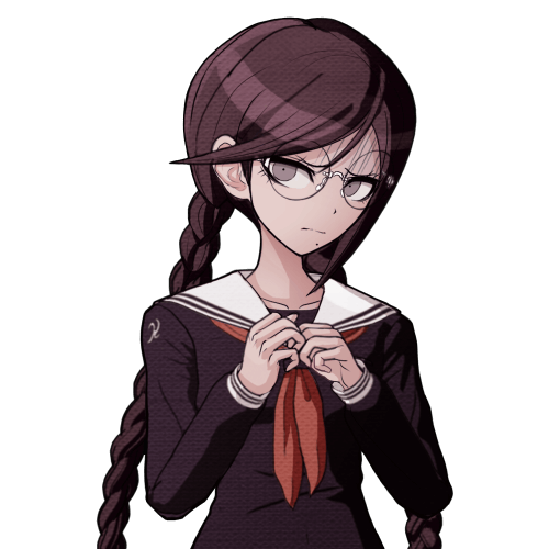
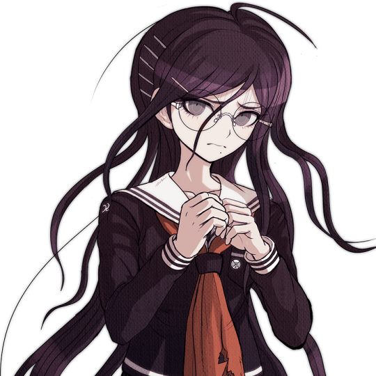
In DR1, Komatsuzaki’s style included much thinner lineart, bigger heads, and more gradients with the softer shading. The vibe is very much more “grounded” compared to later titles. (Example: Toko!)
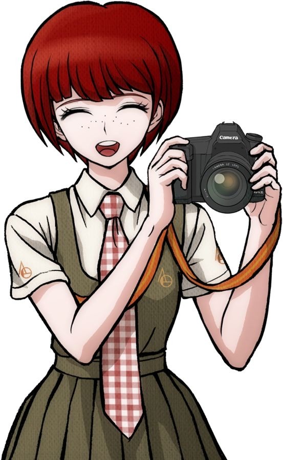
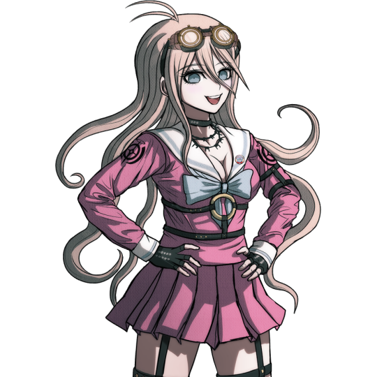
In contrast, DR2 has slightly modified proportions (like bigger hands), simplified shading, and much more vibrant color palettes. The line art during this time was also streamlined with less lines and thicker pen pressure. It makes the sprites pop out a bunch! (Example: Mahiru!)
Of course, with UDG, we see these two styles somewhat overlap, resembling his later stylization. Here we see the modified proportions and color preferences from DR2 with the thinner linework and detail of DR1. (See Toko Again!)
Finally, we see this similar style philosophy continued in V3, only with even more contrasting colors, reflecting the hyper bright/attention grabbing palettes of serialized work. The shading is much darker than previous titles, and somewhat colder too. (See Miu this time.)
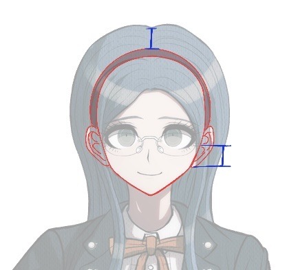
Of course, with all of this in mind, taking notes is imperative! Especially if you want to replicated a specific entry’s stylization. You can draw over some of the dr sprites just to get a general feel of the proportions. I can probably post more latter down the line, but this was the most recent thing I’ve done. See below! (I was trying to get a sense of how “high” the hair sits on top of dr)
Now, for his splash art work, Komatsuzaki’s began his process by blocking out his pieces in bluish hues before the polishing phase. he most likely applied a mix of “color”, “multiply”, or “color dodge” once we finishes rendering for finalizing colors. (As depicted below.)
You can also see how Komatsuzaki simplifies clothing and the like. He very much uses thicker brush work for these types of illustrations as opposed to the lines of his 2D work during this point in his career. Future points show how he plans his stuff with more thin line work. From here he most likely did the same thing. Focusing on the forms before getting to the hues and values
Sorry for going on a bit of a tangent, I have A LOT of thoughts on DR and Komatsuzaki’s artwork in general. I really love seeing his process, so I hope this brief overview can provide as a decent introduction! If more people want me to go over specific aspects of the style, I’d be more than happy to share my own thoughts! Thank you for reading!
#Danganronpa#danganronpa 2#danganronpa v3#Rui Komatsuzaki#danganronpa sprite#r0sie rambles#r0sie asks
43 notes
·
View notes
Text
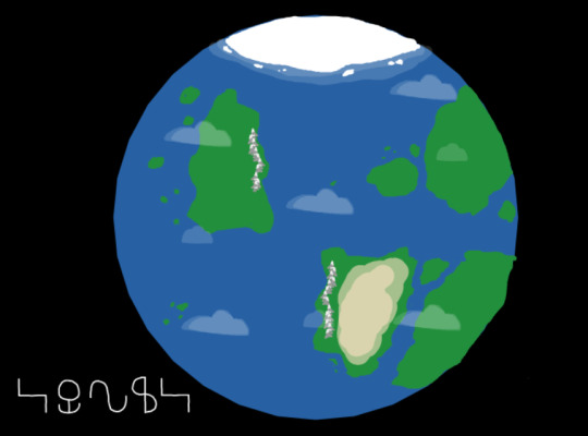
Black. The color of the emptiness between all matter, from the largest of galaxies to the smallest of molecules. A terrestrial planet could be seen within the suffocating emptiness, of which the dominant species of said planet has named Sonus.
Above it all, is the same observer as before.. " ...? "
Again, they are unable to be seen, but they can certainly see us. " Huh.. I didn't realize you would be able to make it out this far. But, since this is now evident, I may as well let you witness a part of me. "

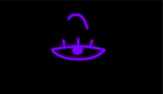
The symbol of an eye appears in the void.
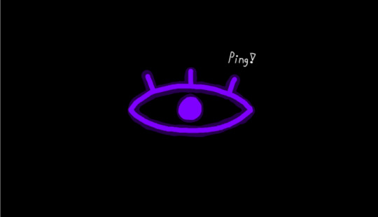
" There we go, now you actually have something to look at while I speak. "
" Now, I presume that you are wanting to learn what I researched on the dominant species of Sonus, AKA Sprunki, yes? "
" Well, I must admit.. "
" It's not much. " " I don't know what it is about Sonus or Universe U1BSVU5LSQ, but it is taking me unusually long to reach full corporeality, and therefore I am yet unable to study Sprunki directly. "

" But, I have been able to gather a decent amount of information through studying what Sprunki have learned about themselves, albeit the process has been much slower. "
" With that, we may begin. "
THE SPRUNKI:
" Sprunki are the dominant species of the planet they have dubbed as Sonus, sporting a physiology reminiscent to that of what I can best describe as a living chess pawn. "
" Sprunki appear to stand at around 91 centimeters tall on average, and share a multitude of similarities with humans, such as a bipedal stance, four limbs, and an omnivorous diet. " " Interestingly, their hands appear to be entirely disconnected from their bodies, and yet tethered by a force yet unknown to them. "
" Out of multiple theories presented for this anomaly, the leading theory is that their arms are entirely incorporeal, yet remain attached to their shoulders & wrists as well as transmitting blood & electrical signals via some form of teleportation magic, which seems to be the most likely answer for until I can observe one up close. "
" Sprunki also do not appear to have much sexual dimorphism outside of reproductive organs, with the only notable differences I can spot being that Female Sprunki have larger, more pronounced eyelashes, as pictured above. So far, this is the only difference I have found between males & females. "
" Now, before we discuss genetics, we must first discuss the Sprunki's young, Sprunklings. "
" Sprunklings are incredibly small compared to their adult counterparts, with newborns only measuring in at around 22 centimeters tall standing, & grow to adulthood over the course of approximately 20 Sonuan years. Pictured here, is a sprunkling of around 4-5 Sonuan years. " " Now, assuming there are no genetic mutations or defects, A sprunkling's color will be that of a color within the gradient of both parents. " " Here, I have taken the colors of two Sprunki I am currently observing. "

" One blue, & one green. " " Assuming that these two Sprunki are able to produce young with each other, their child could be any color within the following gradient, albeit starting off in a pastel shade of said color. "

" Of course, as stated before, this is assuming that the resulting Sprunkling doesn't have any mutations that can affect its coloration. " " But before I delve into any potential mutations a Sprunki may develop, I must first talk about each class of Sprunki. "
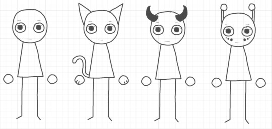
" Planum, Bestia, Cornutus, & Lux. " " Planum Sprunki are what I can best describe as the sprunki equivalent to a blank canvas. These sprunki are devoid of any outstanding features for the most part, but it has been found that they can sport features that do not correspond to any other class. " " Bestia Sprunki are sprunki that have evolved to appear as any form of real life animal, though they mostly resemble pets. In most cases, this does not appear to affect the types of sustenance they can consume, but they do appear to lean towards foods the animals they look like consume. " " Cornutus Sprunki are sprunki that sport anywhere from 2 to 6 horns on their head. Sometimes, these horns can appear more like antlers, though the sprunki do not seem to count this as a mutation, and therefore, I shall not either. " " Lastly, Lux Sprunki are sprunki that have developed bioluminescence, often appearing as facial markings or antennae. More often than not, they appear as the opposite to the sprunki's base color. "
" Bestia, Cornutus, & Lux Sprunki are also able to hybridize with one another, though these hybrids are unable to produce young. " " With both Color & Class out of the way, we may finally delve into mutations that can happen to both, of which I have discovered 4 as of now, with them being the following: "

" Monochromia, Tenebria, Honorificim, & Anuloculus. " " Monochromia is a genetic defect in which the genes that control the saturation of a Sprunki's color are overclocked, resulting in the Sprunki losing almost, if not all saturation, resulting in them becoming a shade of gray. " " Tenebria, on the other hand, is what happens if the genes that control the brightness of a Sprunki's color aren't turned on at all, resulting in a sprunki that is either pitch black, or is close to being so. " " Honorificim is especially interesting, as it appears to completely swap a sprunki's base hue with its exact opposite, even taking into account any alterations that the other two color mutations may apply. " " Lastly, is a mutation that seems to only affect bestia sprunki, known as Anuloculus. Usually, A sprunki's iris & pupil appear as one uniform black circle within the sprunki's eyeball, but Anuloculus makes it so that the pupil shows up as completely white. Normally, this'd suggest that this mutation is creating cataracts & therefore blindness, but this does not seem to be the case. "

" I am glad that you all decided to indulge me in talking about this species, as, frankly, I've never seen any other species like this within the omniverse. (which is VERY surprising, considering there's virtually infinite universes.) "

" Now, do keep in mind that my research on Sprunki is ongoing, and what you hear is subject to change. "
" And with that, I shall let you do whatever it is that you shall do next, be it interacting with the people of Sonus, interacting with myself, or going back to your personal lives. "
#now before i reveal this mysterious voice's name#i may as well mention that you may refer to them as “the observer” for now! :]#sprunki#sprunki twin gods#sprunki observer#???#also#if you guess who the blue & green sprunki are#you get a cookie
13 notes
·
View notes
Text


Happy PRIDE?! SURPRISE MINI RAFFLE?
Ends on the 7th of June. This is a joint raffle between my multiple art site/socmed accounts, with all entries across them added to a single pool of entries.
Winner receives a headshot of their character with 🔴🟣🔵bi flag🔴🟣🔵 gradient style coloration!
I'm running a quick, simple raffle for a simple headshot like this: https://i.imgur.com/cZVKZ4U.png -- sketchy line, gradient style coloring. Ends on 7th of June
This is a joint raffle between several art sites/socmed im on, and all the participants will be pooled together into one draw pool. The catch is.............. your character has to be bisexual, and the gradient given to the headshot will be that of bi flag. Well, to be more precise: your character CAN be asexual biromantic. Your character CAN technically be pansexual or omni or any other orientation attracted to multiple genders, but the gradient I'm adding to the character will be bi flag colors, so you must be ok with your character being implicitly labeled as bi, even if they primarily identify as pan/omni.
Your character can be any gender/race/species/type.
I understand that I can't really "verify" a character's identity unless it's explicitly stated on their references, so we are working with an honor system here, but if your character isn't bi, why would you want art of them being depicted as bi anyway? To enter the raffle, please do the following 1) follow me [meoproject] 2) add a reply or reblog with your character ref! include a character reference (1-3 pictures, must have a decent view of the face, do not link full galleries/toyhou.se profiles, direct link pictures). Label NSFW references. 3) that's it. I would appreciate it if you also shared this to get more people participating.
7 notes
·
View notes
Note
Hiya! I really dig your modeling style. Would you mind giving a high level overview of what you aim for? Like polygon count, texture resolution, etc?
Heya! Thank you!! Appreciate the tech question too. I enjoy answering these types of things :)
I aim for in the realm of 60k polys on the base mesh. In addition to the outline method where you duplicate the mesh and invert normals + extrude faces a little, this ends up being like 120k total. Outlines get culled at a distance and in addition to that I use Level of Detail (LOD) meshes to reduce polycount when things don't need to be so detailed/to improve performance with a lot of models on the screen. Honestly though these days polycount doesn't matter as much as it used to.
As for texture resolution I start with 4096x4096 textures and scale it down or just keep it at 2048x2048. Everything is painted in Substance Painter, and I make/animate all my models in Blender.
In terms of texture painting I don't spend a lot of time on realism and just rely on gradients/drawn on, simplified textures. It saves me a lot of time and I think it looks like a pretty coherent art style!
When it comes to rigging and animation these days I'm really trying to save time, so I use a base human rig even for non human characters so I can steal all of the already made animations I have for humans and adjust them for the non human characters.
I think that's a pretty decent high level overview? Feel free to ask me more questions if you have any :)
12 notes
·
View notes
Text


I tried fixing his wig once again. I feel like it still needs to be a touch darker, and have a heavier gradient effect, from the roots. However, I am so happy with how he's looking so far. I am very much in-love with this figure now! I only wish I could sew decently, so I could hope to recreate te jacket he's wearing here. It's his OG-RE4 jacket that I got with a set, with everything he's wearing here. However, the material the jacket is made out of, is peeling everywhere! It's already literally tearing at the seams. I know it's not going to survive for much longer, so I try to avoid making him wear it.
I did make an accurate top for another Leon I was working on many years ago, it was terrible, but I feel it might not look too bad with the jacket on. Sadly, this one is already disintegrating on me. DX
I will try to remake the top, as I have zero clue where I left the other one. I believe I still have the pattern I made for that one, so I might get away with just sewing a new piece, instead of trying to do another patter. Which I suck at as well, so... (:
This are super repetitive, but I don't have hands that look good, and for some reason my cell's camera exaggerates the size of the hands he's wearing, making him look so disproportionate and weird. I need to repair his right iris, as I damaged that already more than once. I also need to thin the bangs on the right side a bit further. I suck at cutting and styling hair, let alone 1:6 tiny hair. Although this hair is pretty awesome, soft and extra thin (strand wise), I wish I knew what type it was. I was gifted it, by my bff and she doesn't recall where it came from, sadly.
#LeonSkennedy#Leon Scott Kennedy#LeonScotttKennedy#ResidentEvil4#RE4#OGRE4#1:6#1:6ActionFigure#ActionFigure#Toy#Collectible#Photography#DollRepaint#DollCustomizing#FigureCustomizing#HandMadeWig#Repaint#Leon S Kennedy#3D Modeled#Artist Resin Cast#3D Sculpted
10 notes
·
View notes
Note
Do you have any info about your Lux variant? :O Her design is literally so gorgeous; I'd love to know more about her!
OKAY, SIT DOWN BECAUSE I HAVE MORE TO SAY ABOUT HER THAN I ORIGINALLY THOUGHT (I've been here for like an hour or more)
Her design was made by both me and my friend @xommed, and more than a variant we think of her as our interpretation of the character, which may or may not be very different from the original Lux because the only thing we have from he is fro when she was a kid, so we kinda made up all about her lol
She lives in the Omega Timeline with her parents Dream and Cross, and her half brother Palette. Her best friends are Shino (one of the afterdeath kids) and Drew/Sasha (Mine and Xomma's horrordust fankid), though she is friend with a whole lot of other characters and fankids (The Death kids, Gradient, Blue Print, PJ, etc)
Lux doesn't have a defined age, as sometimes we may draw her older or younger depending on the situation, but most of the time we draw her as a teen or young adult. If I had to be a bit more specific regarding her age, I'd say she's about a year older than Shino and Drew
She is a calm and kind person who won't hesitate to help people, but she's not afraid to say things just how they are or kick someone's ass for being an asshole. Her world view is similar to Dream's but a bit more realistic; she belives that anyone can be a good person if they try, but she knows that not everyone really wants to try to be good
In her friend group she is the voice of reason, but just because she's usually the smart one it doesn't mean that she doesn't have her stupid moments either. She can be very silly, but knows when to get serious. Lux usually likes going along with whatever dumb thing Sasha and Shino have going on, sometimes even she herself initiating said dumbery, but knows where the line lies for things
Regarding school, Lux is a decent enough student. She is a smart girl, but school is just so boring! She does just the bare minimum to pass, leaving homework undone and projects half baked. She may be the "voice of reason" in most occations, but that doesn't mean she follows her own advice when it comes to responsability
As noted in the previous paragraph, Lux can be a bit "rebelious". She doesn't take certain laws, rules and regulations seriously, either because she thinks they're dumb or can't make any sense of them (Example: doing grafities in the Omega Timeline, eating in class, elbows on the table while eating, etc). There has also been ocations in which she has skipped classess she finds easy (like English class to give an example) out of boredom or gotten out of her house when she wasn't allowed to (She always notifies Palette though, so at least someone knows where she is + she knows her brother is not gonna snitch, because she does the same for him)
Lux has a very good relationship with her family, but her parents can sometimes be a bit too overbearing for her, specially when they talk about responsability. With Palette everything is all good all the time. They constantly tease each other about certain things, but they know there's no intent to hurt behind their words. The siblings are always there for each other when they need them
Some fun facts about her:
· She can change her "hair" however she wants. Most of the time she has it like how you see in my art, but if she wanted to she could change it so it lookes more like canon Lux, or make it longer, make it defy grabity, etc. The only thing she can't change about it is the colour
· She's very intuitive when it comes to figuring out people's feelings and what to do about them. However, she has a bit of a rougher time when it comes to figuring out her own feelings
· She is a self sacrificing type of person. She'd do and give anything, and I mean, ANYTHING for the people she loves
· She's a lesbian (of course she is)
· Her design was subconciously inspired by Hatsune Miku (we didn't realise how similar they were until later on)
Lastly, I'd like to share some sketches me and Xomma did while trying to figure out her design because, WHY NOT?
(All pencil drawings were made by Xomma)


(Thank god we didn't go with this one ↓)


24 notes
·
View notes
Text
Gradient oc go!!!!!

(Click for better quality)
Decent gradient... he sucks and is a pathetic man I love him.
I wanna make him an rp blog... I might just do it...
(Btw his gradient under cut)

pale green-yellow into a minty green into a periwinkle type purple!!!!!!
24 notes
·
View notes
Note
HAII!! I’m not sure if u did it in photopea but for ur mizuki trans icon how do u have like a small little gap between the icon and border? 🐬

hi doll! all my editing is in photopea unless stated otherwise <3 i’ll do my best to explain this in a way that makes sense!
there are two ways to get the gap which give you two different outcomes! there’s this one, which is all in one shape:
and this one, which is two separate shapes:
either one works well, but i recommend using the first for solid color, gradient, or pattern borders and the second for image borders (i.e. pride flags, etc.) they’re both pretty easy to make though!
for the first one, all you do is make a shape as per usual (i made a circle bc that’s easiest to measure) and then go to layer styles and add a stroke. make sure to add two—a small one first and a bigger one second. to add two, click the little plus sign after adding the first!

then go to your first stroke and find where it says “opacity” and turn that all the way down to 0%. make sure your second stroke is at 100% opacity—also make sure your second stroke is bigger than the first, or else it won’t show up. if you want a two pixels stroke on the edge and a three pixels gap, your first stroke has to be 3px and your second has to be 5px, because otherwise it just gets eaten by the first.
after that you can set the fill type of your outermost stroke and clip an image as per usual. it should look like this:

which gives you the result as seen above!
the second method requires two shapes and i think can only be done with the shape tool—if you want a customized shape that isn’t in photopea’s list, make sure to add it in edit > define new > custom shape!
make one shape and then a bigger version of that same shape—the exact sizing depends on how big your icons are, but i did 135x135 & 145x145 for mine. just make sure there’s a decent amount of space between the two.
after making both your shapes, click the second one and go up to the top of the shape menu. remove the “fill” and give it a “stroke” instead—setting the pixels and colors as you like. with the shapes, you can also do fun little borders, but i typically just do solid. make sure your stroke is small enough that there’s still a gap, but you can always use edit > free transform and adjust the sizing as needed!

(you can change the position as necessary to make sure your stroke is within your canvas—“inside” puts it inside of the blue outline of your shape, “center” puts half inside half outside, and “outside” puts it outside of the blue outline!)
from there you clip your images as usual, like this:

or you can turn them both into raster masks, which i did to save as a template. it’s up to your personal preference.
anyway, i hope this was helpful for you, lovely!! if it’s not feel free to ask me any questions you may have haha
9 notes
·
View notes
Text
Little behind the scenes post on this painting/drawing I did.

After taking several dozen screenshots from BIG to try to find one for a decent reference I eventually did and practiced drawing shitty outlines on my phone's photo app until I got the gist of how I might do a basic outline for it. Then I started with the outline sketch and made marks where the colors change. I wasn't sure exactly what I was going to do with this, whether I'd do a rainbow gradient over the whole thing or just the background. This paper is 3x3 inches and I can't lie I did try and trace a little of it on my phone screen to get the placement of the features (not well) but marginally better than freehanding it so call it cheating if you want but at least it has less wikihow man vibes this way.


I left the pencil because I was going to trace over it and did the watercolor outline first to see where I wanted to go with it. Then I liked the outline, so I went nowhere with it and kept it as it was. I started from yellow and used the tiny Sennelier brush that came with the palette and did the outline with 579 Sennelier Yellow, 645 Orange, 690 Rose Madder Lacquer, 913 Cobalt Violet Hue, 341 Phthalo Turquoise, and 805 Green Yellow.

Once I realized I wasn't going to paint the background I wanted to fill the space somehow so I decided on the "and the future is clear: it's pretty queer" quote because it was the first thing that came to mind and I thought I could carefully fit it. I divided each side into three segments of 1.5cm each and roughly sketched the letters to make sure they had any chance of fitting and then erased the marks and went over them in ultra fine sharpie. I lowkey hate sharpies, they're useful and easy to get and last longer than expensive pens but the ink doesn’t come out consistently at all which sucks for thin lettering but I don’t have much choice since it’s what I have in the greatest color variety. I tested several shades of each color to try and have the general brightness match up because the scanner I have can get weird with colors, especially light oranges and pinks not rendering. So the colors came out okay but the lettering is far from my best.


Then finally I inked the outline in black (off-brand) micron pen size 0.3 (Superior Needle Drawing Pen, whoever that is, but they work) to cover the pencil lines. I went slightly thicker on the hair because I hadn't erased the pencil as well and didn't want gaps between the outline and the paint, so then I traces all the outer lines in double to make it more consistent.

Then of course I took some photos and scanned and edited it. My scanner is weird with some colors, that day it decided to exact its vengeance on purple and turn it all the same shade of pink. Its only redeeming quality is that I can scan a stupidly small 3x3 inch paper in 1200 dpi and have it come out decently. I was technically trained in photoshop once upon a time but I don’t have adobe subscription type of money so I use GIMP and wing it.
First I cropped the excess edges and added a second almost-white layer underneath because the right edge was too close to just crop it and leave it, and I added the margins that way and smoothed out the edge line. Then I used the overlay brush on the purple section on 20ish percent opacity to color correct and have it look closer to the real color. I also edited out the mysterious mark on the paper that wouldn’t come out.
I assure you nothing else is edited otherwise I would’ve made my handwriting look less shitty. It’s worse than my usual letter work and I’m blaming the sharpies but if I’m being honest it’s just lack of practice because I used to freehand entire fucking maps that were better than this. It happens.
Anyway, here’s my makeshift painting station on the floor on the back of an old picture frame and the color correcting edits I did the next morning. It was hard to get the lighting but you can sort of see that the actual paper is more purple and the outline was very red and not blending with the blue on the scanned version.


Anyway, that's all for that one. Even if it's not perfect I had fun with it and it didn't take forever like the tour sets did, so that's a win for me.
2 notes
·
View notes
Text
Day 7 _ Gradient Decent in Machine Learning
Introduction Question: How can we find the optimal parameters (weights) of a linear regression model to minimize the error between the predicted values and the actual values using gradient descent? Purpose: The purpose of using gradient descent in linear regression is to iteratively adjust the parameters to minimize the cost function, thereby reducing the prediction error and improving the…
#deep learning#gradient decent#gradient decent types#large gradient decent#machine learning#mathematic#mathematic behind gradient decent#optimal gradient decent#small gradient decent
0 notes
Text
SVTFOE headcanons because why not
We haven't watched Star vs in a decent while, but we've been getting back on the hyperfixation so why not pour some creative energy into a headcanons list? This'll just be individual character headcanons, but if enough people like it I might post some duo/group headcanons! (and more character headcanons, hehe)
Starting off with our favorite whimsical princess, Star!
While she's had a few ups and downs in her own love life, Star is a master wingman! Even with magic-related hiccups, she'll still manage to get people together... somehow.
She would 100% collect those little Tsum Tsum plushies. She gets every single size she can find for each character she gets and stacks them up in pyramids in her closet.
Star is a very talented gift giver! She pays extremely close attention to what her friends like, and goes above and beyond for them any chance she gets!
Star's experience with hair dyeing is far more extensive than just that one episode where she had the alt/punk getup. She's done blue and pink highlights before! (I feel like her being as close to Ponyhead as she is warrants some silly hair dyeing headcanons)
Now it's Marco's turn!
Since Love Sentence is basically a One Direction parody, Marco is a die-hard 1D fan. You can't tell me I'm wrong. (He also listens to 90s and early 2000s boy bands though! He seems like he'd be an NSYNC fan.)
Unlike Star, Marco isn't the best at gift-giving. Not in the sense that he doesn't know what people like, not at all. He just spends so much time overthinking his gifts for people that he ends up screwing himself over. So he usually has Star go gift shopping with him to keep him from spiraling.
You can't tell me that Marco wouldn't get into drag after the first Princess Turdina episode. After that ordeal, him and Ponyhead bonded over her teaching him how to do his own makeup! He has a section of his closet dedicated to more feminine clothing that Star both lends him and buys for him! (His favorite fem thing to wear would definitely be sundresses)
During one of his stays in Mewni, Moon taught Marco some basic sewing! She also taught him medical stitching just in case something went wrong during one of his and Star's adventures.
Here's some for Tom, and then I'm gonna call it a day lol
He absolutely LOVES anything pink. He acts like he doesn't, but he can't hide it forever. He still has a bracelet that Star made for him back when they were together and it is the brightest, pinkest, most neon thing he owns and he'd never get rid of it for anything in the world.
Tom would be a damn good nail artist. While he usually paints his own nails plain black, he's done Star's nails before with gradients, stickers, rhinestones, the whole package. (Maybe he'd also paint Marco's nails for him...)
He's total drummer energy, no questions asked. I could also see him playing bass guitar, but he's still leaning more towards drummer to me. He also seems like the type of guy who used to be in a punk metal band.
While Tom would also be a die-hard 1D fan, I don't see him as the early 2000s boy band type. Though, I could see him being an on-and-off k-pop fan! That and j-rock (or any rock for that matter, I just think j-rock would be his favorite)
#star vs the forces of evil#star vs foe#star vs evil#star butterfly#svtfoe#tom lucitor#marco diaz#headcanons#hcs#my headcanons#head canon#headcannon#svtfoe headcanons#star vs headcanons#star vs the forces of evil headcanons#star butterfly headcanons#marco diaz headcanons#tom lucitor headcanons
12 notes
·
View notes
Text
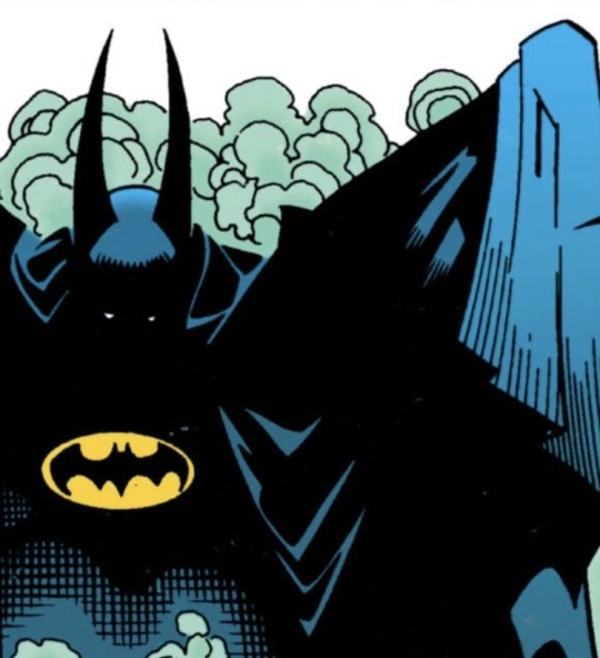
Batman Cass
I think this one will be shorter, since I'm iterating on a canon costume rather than creating an identity from scratch.
I know I'm giving Dick his discowing colors (several artists have actually given them to the Flying Graysons over the years, to keep Dick's costume being inspired by them without him just running around Gotham in his performance costume. I think Robin should be the tribute rather than Nightwing, but I'm happy to steal that as an excuse to put Dick in the blue & gold.) Cass's Batman costume was basically designed in tandem with the Moonbeam suit, so the two should compliment eachother.
Cass's cape is jet black, but the underside has a yellow-to-black gradient (ombre) where it's bright up high & fades out towards the edge. I'd actually make that highly reflective, since as Moonbeam Cass learned to use light as a weapon, and it makes her look downright angelic when the cape flares out, like she has a golden sun caught under her cape.
(This is definitely inspired by the fic Loading & Aspect Ratio, whose use of colors makes me rabid. Read it, please.)
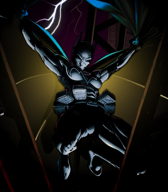
(Have a quick & messy bit of concept art I threw together from the "Mark of Cain" cover to show what this cape might look like. Ignore the rest of the suit, we're getting to it.)
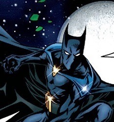
Next, Batman is losing about a foot of height. Cass will be compensating for this with ears. Not the super-absurdly-long ears Batman sometimes has, but still big.
(Thanks to broosepayne for literally collecting these. Very handy.)
She'll also be wearing lift-boots. Not platforms, not heels, those both threaten to seriously twist your ankle. But Cass is used to running around in lifts as Black Bat, and it helps make up the difference. Based on my observations of her costumes over the years, Cass genuinely likes fitted knee-high boots. (Is it a "make it more feminine" sexist command from on high? Probably. But it's a consistent part of her design, and I'm using it.)
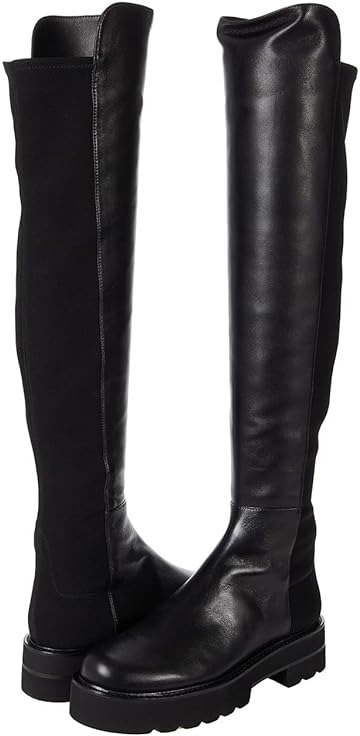

(Something like these, probably. Maybe with a more emphasized/rugged sole, like these.)
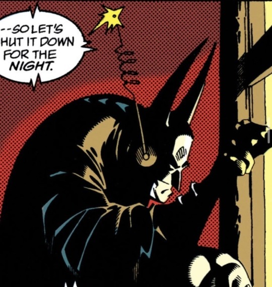
For the cowl itself, I think Cass would probably still stick to her mouthless look. So probably something like Batman 1,000,000's cowl:

...which, now that I'm looking at it, I love the detail of the cape-clasp. And the shoulder pads kinda work too? She needs to add some breadth/bulk to her build, and their almost pauldron-like look is a nice callback to her Moonbeam days. Cass does wear more traditional shoulderpads under the suit, and then these pauldrons over the cape. I'd make them matte black, just slightly lighter than the cape. The little golden clasp should be bat-shaped, obviously. (This detail probably gets ignored a lot of the time, but it lets her have a bat visible even with the cape closed.)
Solid black body suit (also seen in the 1,000,000 pics) but I do think Cass should have a bat-symbol on her chest. After consulting my favorite chart, I think a slightly stretched version of the 70s bat symbol with a perfect circle behind it would probably be best.

(Quickly thrown together in GIMP. I really, really like the way the gold outline turned out, even though I wasn't leaning towards just an outline when I started.)
I think her utility belt is black, but the pouches are yellow/gold.
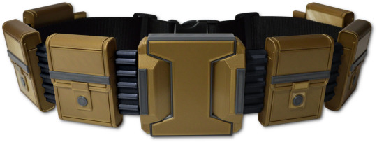
(Okay, this is the best version I can find, but I do want to draw everyone's attention to this comprehensive breakdown of every bat-belt because it's very impressive.)
Finally, rather than gauntlets, Cass wears black gloves with a folded cuff. Kinda like the Zero Year purple gloves, but with a much thicker cuff. The top & bottom of the cuff has a gold trim, but I'm going back & forth on whether there's more details (like capped knuckles or wire-thin fingerstripes) or if they're just plain aside from that trim.

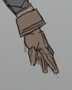
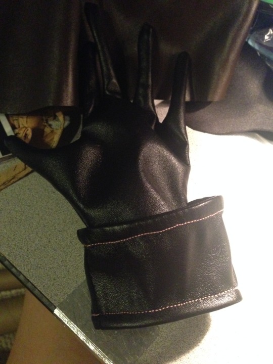
(Here's the two best pics of these type of gloves I could find.)
I'm actually really pleased with this look. It helps Cass bridge the gap between her Black Bat (Batgirl) look and Batman, compensating for the difference in build decently well (especially when you remember most people aren't going to see Batman for very long or very well.) The wing-shaped shoulderpads & touches of glittering gold add a hint of showmanship, which means both thematically & color-wise she'll look good standing next to Moonbeam!Dick. The gloves then bring it back down to earth, looking like slightly fancier work gloves, emphasizing utility over flair or combat. Personally, I think the gloves soften the whole look a little, helping to show this is an older, more mature Cass who has taken an apprentice of her own, and especially how much she's healed & grown since donning the stitched-up Black Bat (Batgirl) suit after Steph's death. I even got to bring back my idea of the Shadows wearing Moonbeam's circle to represent their connection, very specifically with Cass's golden ring, to show that Cass is once again part of a matched set---it's just that this time, Cass is the shadow to Dick's light.
#batman cassandra cain#batman!cassandra#batman cass#batman!cass#reverse!robins#reverse robins#reverse robins au#reverse order robins#reverse order batkids#reverse batkids#reverse batfam#reverse batfamily#batfamily#bat family#bat fam#batfam#batkids#bat kids#bat siblings#batsiblings#cass cain#cassandra cain#cassandra wayne#my writing#mine
16 notes
·
View notes
Note
hello there!! how's your week been? any projects, playlists, books, recipes, etc that strike your fancy to ramble about?
i've been sick this week but i am slowly overthrowing the goop that has taken over my body. putting this together has been a nice distraction, so it got super long
Knitting
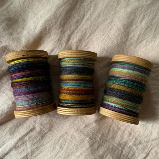
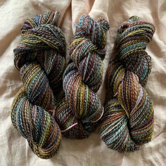
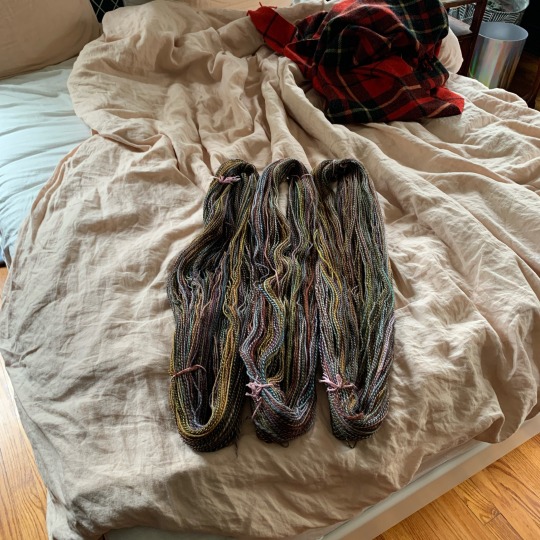
just before i got sick, i put a (mostly) handspun cardigan to block. the spinning of this was a tiny bit of a spite project, based on how frequently people talk about "muddy" colors in handspun in a disparaging way. as a brown lover, i took offense and decided to make a rainbow-but-brown cardigan incorporating every technique i could think of that people tell new spinners not to use because it will muddy their yarn. the last two pics gives a vague sense of how much optical color mixing you get from afar vs. up close, but the effect works better irl.
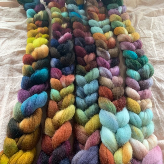
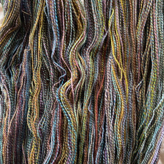
(fiber is all corriedale from Hello Yarn's fiber club)
i used 8+ years old leftover brown cascade eco for the cuffs, hem, pocket trim, and double-knit buttonband. this bit me in the ass, because i ran out with about 6" of band to go, and obviously couldn't get a dyelot match. thankfully, it was the button side of the band so the lighter bit will be mostly hidden, but i am pissed that i had to buy another 250g skein of yarn for a project where i was using up leftovers. also my button order got canceled so i need to source new ones. perhaps this project is slightly cursed. but i'll stash it away until autumn and it'll feel like i get a new sweater, just like i imagined, that i didn't even have to knit.
Spinning
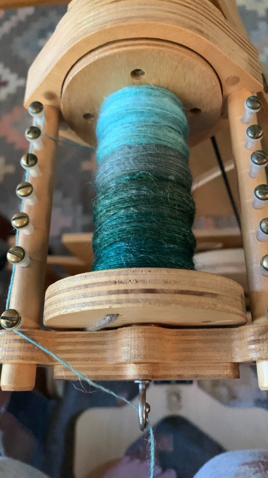
currently working on two different spins, both for scarves.
on my spinolution wheel i have a brown-green-blue-white gradient destined to be woven, although i haven't been able to find the right weft yet. (fingering weight, plied, primarily nonsuperwash wool, pale pink that leans coral/orange...) i may end up dyeing it myself if i haven't found the right yarn by the time i get to weaving it.
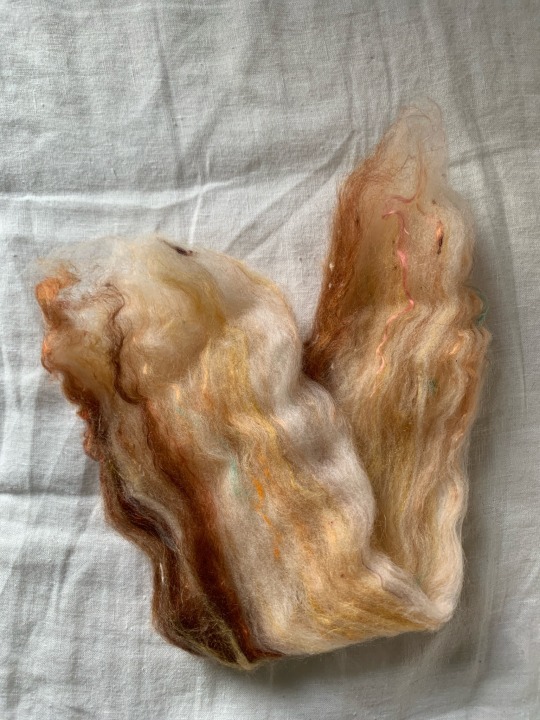
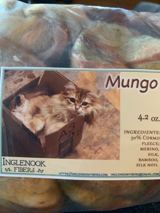
i'm also spindling the finest yarn i possibly can, for some sort of garter stitch lace shawl situation. the fiber is a decently textured batt that includes silk nepps, so it will be gently tweedy. everyone who sees it says the fiber looks like bacon, but it's based on the dyer's cat, Mungo.
Weaving
before i got sick, my goal was to warp my loom for floral overshot kitchen towels, which is what everyone in my family will be getting as a winter holiday gift. maybe next week when i am more confident in my ability to count.
Music
here's what's been stuck in my head lately for each language i speak. apparently i'm stuck in the 90's and very much the bug, not the windshield this week
Vittles
my go-to tea for the past 6 months has been a 50/50 mix of adagio's hazelnut and this baked apple tea. this started as an attempt to make the most autumnal tea possible (and tone down the cinnamon of the baked apple), but i recently committed to it enough to pre-mix a whole tin of it instead of just blending it in the infuser. i take it with homemade vanilla syrup and milk.
any day that i'm not eating çilbir i'm thinking about when i can have it again
i'm also obsessed with claire saffitz's gooey butter cake recipe (if you have ever wanted to just eat cake batter, this is the cake for you).
i have recently perfected my pretentious grilled cheese game with
some type of fruit preserve (i've used earl grey and apple jelly, apple butter, marmalade)
one slice of american cheese for melt
one slice of trader joe's scotch bonnet cheddar for heat
thick cut ham
homemade pickled red onions
serve with sliced cucumber or tomato sprinkled with cavender's seasoning, and/or apple slices, preferably arranged in a silly design so you feel like your adult self (sandwich) is reaching through time to shake your toddler self's (sides) hand
i've also been making what can only be described as a vaguely korean crunchwrap, which started as a fridge clean-out meal and has taken on a life of its own
trader joe's frozen bulgogi beef
egg scrambled over the reheated beef
matchstick carrots or cucumber
pimento cheese spread
kimchi
cilantro
green onion
tortilla chips for crunch (optional, i rarely have chips around)
wrapped in a flour tortilla, griddled until golden
Other Things I've Been Enjoying Lately
my new haircut and color (lime green! i've never dyed my hair before! i'm such a brave little cartoon character now!)
https://weepingwitch.github.io/sudoku
https://www.youtube.com/@BerylShereshewsky
modded minecraft. i'm splitting my time between vault hunters (i am so so bad at it), my own whimsical but slightly dark fantasy 1.20.1 pack, and my gritty 32x conquest+ pack inspired by https://www.youtube.com/@lowresbones's the hammer series
daydreaming about an unfaithful recreation of my favorite summer drink from a closed cafe. their thing was orange juice, soda water, and jasmine syrup. i made jasmine syrup last summer and it turned out weirdly grassy and gross, so i'm going to try lavender or rosemary instead.
speaking of rosemary, i also have the stuff to make brown butter rosemary rice krispie treats! can't wait until i have the energy to both make and eat food that's interesting again. herby sweet treats my beloved <333
7 notes
·
View notes
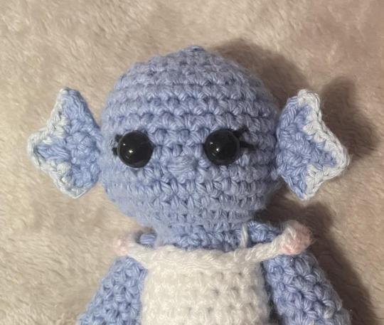
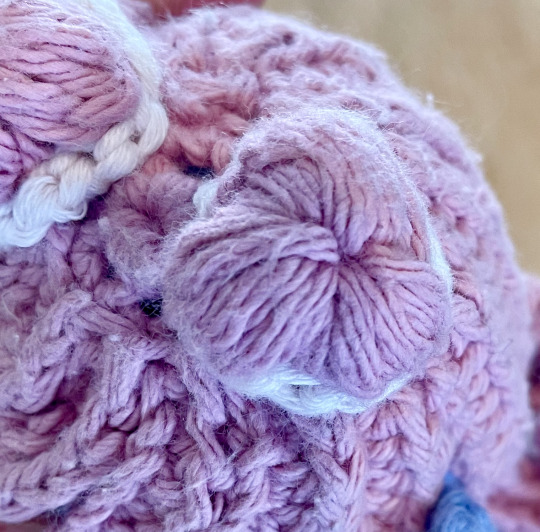
Text
Hi everyone!!
Lots of people asked for the pattern I used for my Joel and Lizzie dolls, but due to my mental unwellness, my "pattern" was actually a chaotic blend of multiple patterns, as well as my own spontaneity.
Nonetheless, I am going to attempt to explain the method to my madness in this post! (Fair warning, it will get long.)
(If you actually want to try to recreate this please PLEASE reach out to me!!! I can go into way more detail and do diagrams and whatnot if you really wanna see the full idea!!!)
I'm gonna do my best to divide this up into sections based on how I made them, but because I modified a lot of things and Joel and Lizzie are clearly not the same, it may get a little muddled along the way, but here goes!
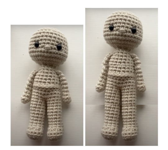
The Bodies
First thing's first, this is the link to the tutorial I used for the basic body shape. Super great video, easy to understand, fantastic starting point for any doll!! :D
For Joel, I followed the tutorial pretty exactly, minus that middle seam for a belt. I changed colors for the boots, pants, and coat and kept all the measurements the same.
For Lizzie, I modified her pattern to be a little bit bigger bc haha funny tall wife. On parts of the pattern where the stitch count stayed the same, I added a few more rows to make them longer. I added 4 rows to the legs, 3 rows to the chest, and two rows to the arms.
Like this!
listen I had to visualize it somehow-
I also did a gradient for Lizzie's arms/legs/tail! Here is the video I used to figure out how to do it (I don't have the measurements for where I changed colors I'm sorry I'm goofy </3)
Also, here is a link to a post where I half-heartedly liveblogged the early stages of making them. You can kinda get a rough idea of where I changed colors for different parts of their outfits, etc. but I only got two steps, really- oops.
The Clothes
Now, this is the part where I documented virtually nothing, but honestly, it still turned out just fine!
For Joel, I made boot and sleeve cuffs by just single crocheting a chain to fit around his arm/leg and adding a couple of sc (single crochet) rows. Then I sewed the ends together with a long yarn tail, used thinner gold yarn to add some detailing (look up backstitching! it works really well!!), and sewed the edges on.
His coat ends were made in the same way, but bigger, and instead of sewing the edges fully together, I only connected the top stitches when I was attaching it. And because I'm a messy sewer, I easily hid the seam with a black sc-chain belt :)
The gold details of his coat is also a sc-chain just sewed on. The edges at the bottom... were sorta a sc-hemming type deal-? I don't know, I winged it and I don't like how it turned out </3
The shoulder pads I actually can tell you! It's 5 sc in a magic circle, sc around, and then I picot stitched around in each stitch. Then I tied off a long tail and sewed it onto the top of the arms before I attached them. The badge/flower is the same pattern, but without the sc round in between the mc and the picots.
The sash was a little wonky doing it as a full loop the whole time, so it was basically a long rectangle and when I was attaching the ends together I did it under the shoulder things so it wouldn't be bulky and ugly on top. I think it's decently easy to understand from the pictures in the original post, but if not lmk! (if any of this is coming across at all then bless you tbh.)
The collar is just two rectangles I sewed side by side, they don't continue to the back at all bc they were ugly /lh
And this is the tutorial I used for the crown! I threaded a little piece of green yarn through to make the jewel and tied a knot in the back :)
For Lizzie, I literally made the skirt up as I went along, but it was roughly based on this video. I started with a sc chain to get the right size, then made it a rectangle for a couple of rows (maybe like four?) before joining it together. (That way, I could make the skirt separately and still be able to get it back on her when I was done without being too tight!)
At some point, I picked a stitch as my "center point" and started going back and forth from about that point instead of completing the full circle, doing half double crochets close to it, then double crochets, then triple crochets, then back to dc and hdc as I got close to it again. I think I did about 6-8 for each stitch type section? The GOAL was to make the skirt's hem asymmetrical, which worked, but it's hard to explain bc I literally made it up.
Then I made another sc chain for the belt thing after I attached it :)
The top detailing is also a sc chain, but with some joined yarn above the arms for extra color. There's also bits of yarn that are supposed to be straps, but you can't really see them in any of the pictures, so that's optional rip.
For the frilly hem, I joined the yarn at the "center point" and basically just worked around the whole hem repeating (1 dc, 2dc inc) to make it all wavy and fun!
The Hair
The pattern I based the hair off of was from this kpop star doll that I was originally going to base my entire Joel doll off of.
The difference is I changed the lengths of the strands (I did it based off looks, so all of them are slightly different in length to look more natural) and also color changed the very front few strands of Joel's hair to be green. I also put two strands in a few of the back stitches instead of just one so they completely covered the back of the head (so there are 15-16 strands instead of 14.)
To attach the hair, I used pins to mark out where I wanted to place each strand. Here's a quick progress shot I sent to my friends:
Now, I wasn't smart, and used long pieces of thread from tying off the "hair mop" to sew all the strands onto the head individually. It took forever and make it kinda messy in the back because of weird overlapping. If I could redo it now, I'd use fabric glue or something to glue each strand so it lays flat, although if you don't have it or want to avoid the potential mess, sewing it does in fact work just fine.
Extra Bits (mostly for Lizzie)
Lizzie's tail is more or less the same as her arm, but it starts thinner and goes for longer at the end. For the frilly edge, I remember using a crochet beta fish fin design, but I can't for the life of me find it in my history now?? But it was essentially joining the yarn a few stitches from the point and crocheting (hdc, dc 2x, tr, dc 2x, hdc, dc 2x, tr) and mirroring it on the other side so it looked like this:
Here's a closer view of both the tail and the skirt's hem.
Lizzie's fins were made by making a magic circle, chaining 4 and sc-ing back, and slip stitching back into the circle three times to make the three points. Then I joined onto one point with the lighter color and sc-ed along to the other point to make it more detailed.
Here's a cursed image I sent to my friends of bald Lizzie and her fins.
Lizzie's space buns were a fever dream to me because I made them at 1 am, but I did something that looks similar to this puff stitch flower with only three "petals." I attached it to the head and then used a short chain of another color to add some color and detail.
Here's a view of a bun from the top.
---
I think that's just about it! If I missed anything or want to know how I did something better, please please PLEASE reach out to me!!
I'd love to go into more depth on things, but I predict this post will top off at 5 notes so I don't really want to spend hours explaining something that'll go completely unseen /lh
Nonetheless, I hope you enjoyed this little insight into the inner workings of my brain! Feel free to share and tag me in anything if you decide to try to do this yourself.
Cheers!! <3
#WOO I DID IT.#hope you enjoy this it took forever AHSJDSA#pho.posts#pho.doodles#<- bc it's from my project haha#when i eventually make a dl pearl i'll document it better so you can see it in action haha#empiresblr#empires smp#esmp s1#smallishbeans#joel smallishbeans#ldshadowlady#lizzie ldshadowlady#jizzie#crochet#amigurumi#amigurumi doll#pho.crochets
30 notes
·
View notes