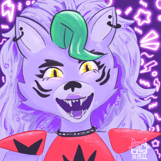
#bit of a real attempt and the rendering style
Explore tagged Tumblr posts
Visit Tumblr Blog
Explore Tumblr blogs with no restrictions, modern design and the best experience.
Last Seen Tumblr Blogs


coachoutletonlinestorerevie-blog
Coach outlet online store reviews - Fake coach swingpack purse
2 posts


Fun Fact
There are dozens of funny blogs to kill time on Tumblr.
Text

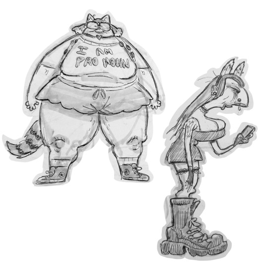
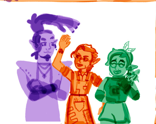
I think I’m done with this for now, might try and make the actual character screen background at some point, but for now it’s a bamf cloud
Buy a print here: https://jhaleykart.bigcartel.com/product/bamf
#nightcrawler#xmen#marvel rivals#bit of a real attempt and the rendering style#I think I could have gone blockier#maybe more brush effects
398 notes
·
View notes
Text
Thinking about that that "slop accelerationism" post, and also Scott's AI art Turing test.
I also hope AI text- and image-generation will help shake us loose from cheap bad art. For example, the fact that you can now generate perfectly rendered anime girls at the click of button kindof suggests that there was never much content in those drawings. Though maybe we didn't really need AI for that insight? It feels very similar to that shift in fashion that rejected Bouguereau-style laboriously-rendered pretty girls in favor of more sketchy brush work.
But will we really be so lucky that only things that we already suspected was slop will prove valueless?
As usual with AI, Douglas Hofstadter already thought about this a long time ago, in an essay from 2001. Back in 1979 he had written
Will a computer program ever write beautiful music? Speculation: Yes, but not soon. Music is a language of emotions, and until programs have emotions as complex as ours, there is no way a program will write anything beautiful. There can be "forgeries"—shallow imitations of the syntax of earlier music—but despite what one might think at first, there is much more to musical expression than can be captured in syntactical rules. There will be no new kinds of beauty turned up for a long time by computer music-composing programs. Let me carry this thought a little further. To think—and I have heard this suggested—that we might soon be able to command a preprogrammed mass-produced mail-order twenty-dollar desk-model "music box" to bring forth from its sterile [sic!] circuitry pieces which Chopin or Bach might have written had they lived longer is a grotesque and shameful misestimation of the depth of the human spirit. A "program" which could produce music as they did would have to wander around the world on its own, fighting its way through the maze of life and feeling every moment of it. It would have to understand the joy and loneliness of a chilly night wind, the longing for a cherished hand, the inaccessibility of a distant town, the heartbreak and regeneration after a human death. It would have to have known resignation and world-weariness, grief and despair, determination and victory, piety and awe. In it would have had to commingle such opposites as hope and fear, anguish and jubilation, serenity and suspense. Part and parcel of it would have to be a sense of grace, humor, rhythm, a sense of the unexpected and of course an exquisite awareness of the magic of fresh creation. Therein, and therein only, lie the sources of meaning in music.
I think this is helpful in pinning down what we would have liked to be true. Because in 1995, somebody wrote a program that generates music by applying simple syntactic rules to combine patterns from existing pieces, and it sounded really good! (In fact, it passed a kind of AI art turing test.) Oops!
The worry, then, is that we just found out that the computer has as complex emotions as us, and they aren't complex at all. It would be like adversarial examples for humans: the noise-like pattern added to the panda doesn't "represent" a gibbon, it's an artifact of the particular weights and topology of the image recognizer, and the resulting classification doesn't "mean" anything. Similarly, Arnulf Rainer wrote that when he reworked Wine-Crucifix, "the quality and truth of the picture only grew as it became darker and darker"—doesn't this sound a bit like gradient descent? Did he stumble on a pattern that triggers our "truth" detector, even though the pattern is merely a shallow stimulus made of copies of religious iconography that we imprinted on as kids?
One attempt to recover is to say Chopin really did write music based on the experience of fighting through the maze of life, and it's just that philistine consumers can't tell the difference between the real and the counterfeit. But this is not very helpful, it means that we were fooling ourselves, and the meaning that we imagined never existed.
More promising, maybe the program is a "plagiarism machine", which just copies the hard-won grief, despair, world-weariness &c that Chopin recorded? On its own it's not impressive that a program can output an image indistinguishable from Gauguin's, I can write such a program in a single line:
print("https://commons.wikimedia.org/wiki/File:Gauguin,Paul-Still_Life_with_Profile_of_Laval-_Google_Art_Project.jpg")
I think this is the conclusion that Hofstadter leans towards: the value of Chopin and the other composers was to discover the "template" that can then be instantiated to make many beautiful music pieces. Kind of ironically, this seems to push us back to some very turn-of-the-20th-century notion of avant-garde art. Each particular painting that (say) Monet executed is of low value, and the actual valuable thing is the novel art style...
That view isn't falsified yet, but it feels precarious. You could have said that AlphaGo was merely a plagiarism machine that selected good moves from historical human games, except then AlphaGo Zero proved that the humans were superfluous after all. Surely a couple of years from now somebody might train an image model on a set of photographs and movies excluding paintings, and it might reinvent impressionism from first principles, and then where will we be? Better start prepare a fallback-philosophy now.
131 notes
·
View notes
Text
The Mishandling of LO’s S3 Mi(n)season Hiatus - Part 3 1/2
Here we go, Part 3 of my analysis of the current FP episodes - a three-parter episode set leading up to the midseason finale of LO.
Part 1
Part 2
Truth is, I had actually forgotten a lot of the weird (and very stupid) shit that happened in this episode, that I thought Episodes 251 and 252 had already offered up the worst that this three parter set could dish out. Boy, was I wrong, because when I went back to check out Episode 253, I was reminded of a reality that my brain had wiped out in an attempt to protect my withering psyche-
I also forgot just how long this episode is. It's so long that I frankly can't even fit it all into this post, so this is gonna be part 3 1/2.
Anyways, let's just get on with it. This is the final stop on our trip into absolute nonsense.
CAUTION: THIS IS PART 3 OF A 3 PART SERIES IN WHICH I WILL BE SPOILING MUCH OF EPISODES 251-253. THIS WILL BE A LONG POST. BRACE YOURSELF.
Well, it's the midseason finale, and what better way to open it up than with the final title card-
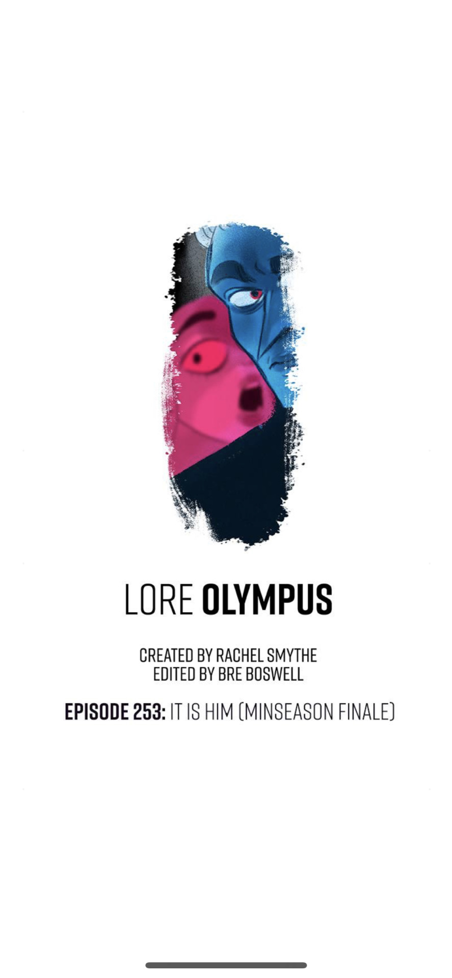
Typo and all. It wouldn't be an LO episode without one. Granted, IIRC this typo has been edited out, but the version of the screenshots I have from it feature it in all its original unedited glory. So enjoy that.
And yes, just like the last two times, the title itself only applies to the final cliffhanger, which is an absolute doozy especially for those who were there to experience it in real time.
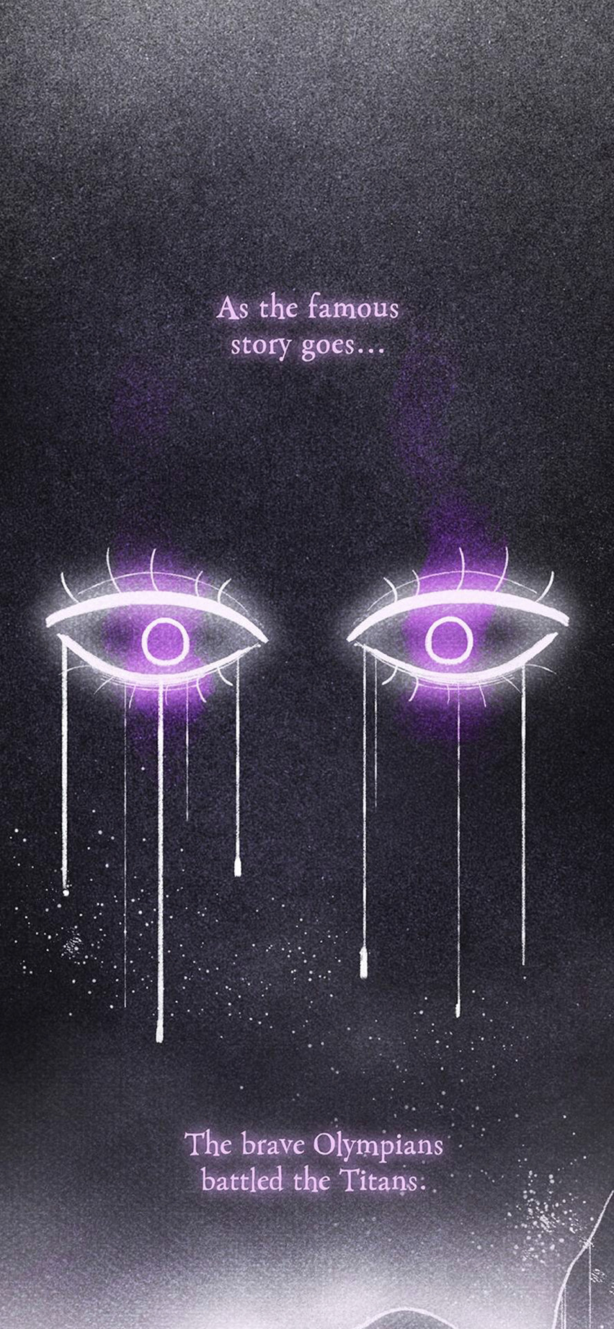
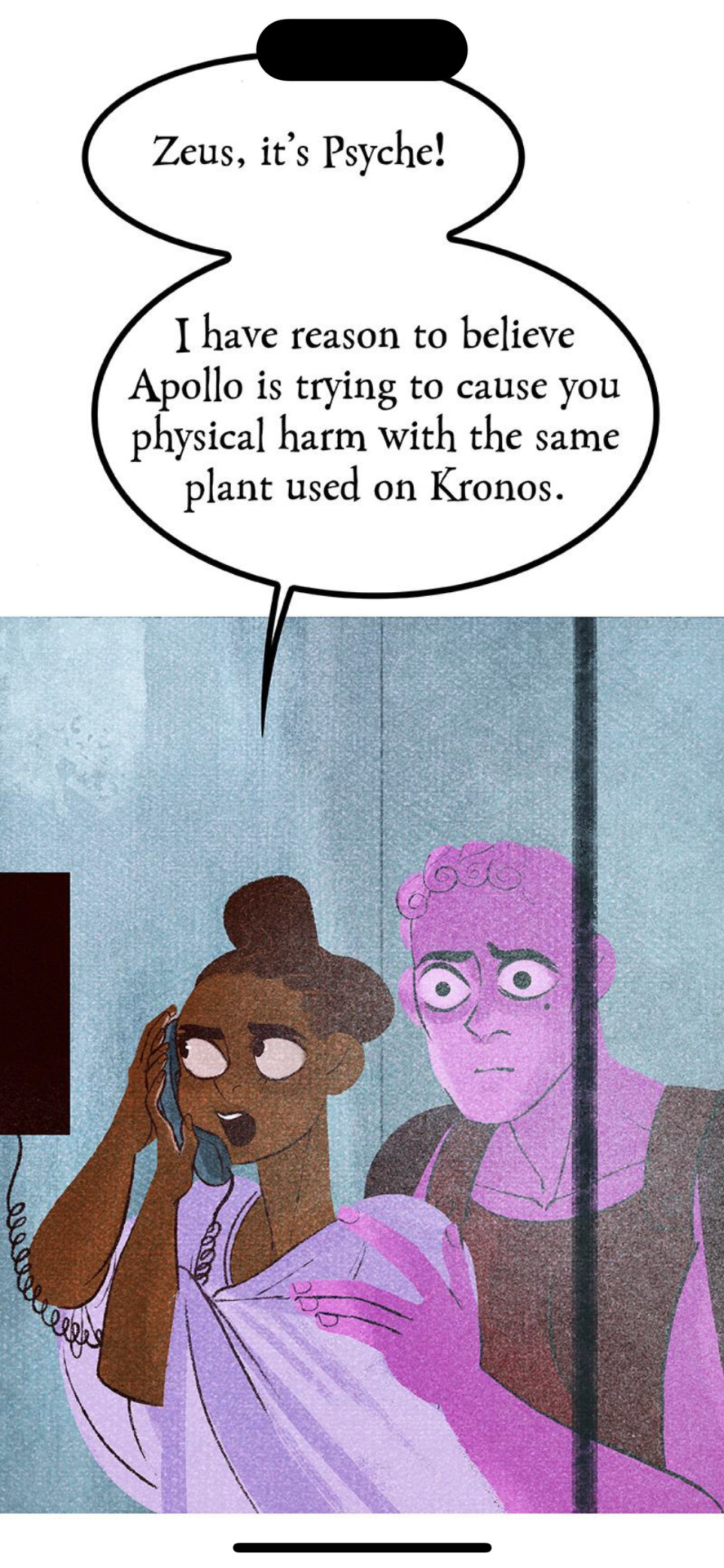
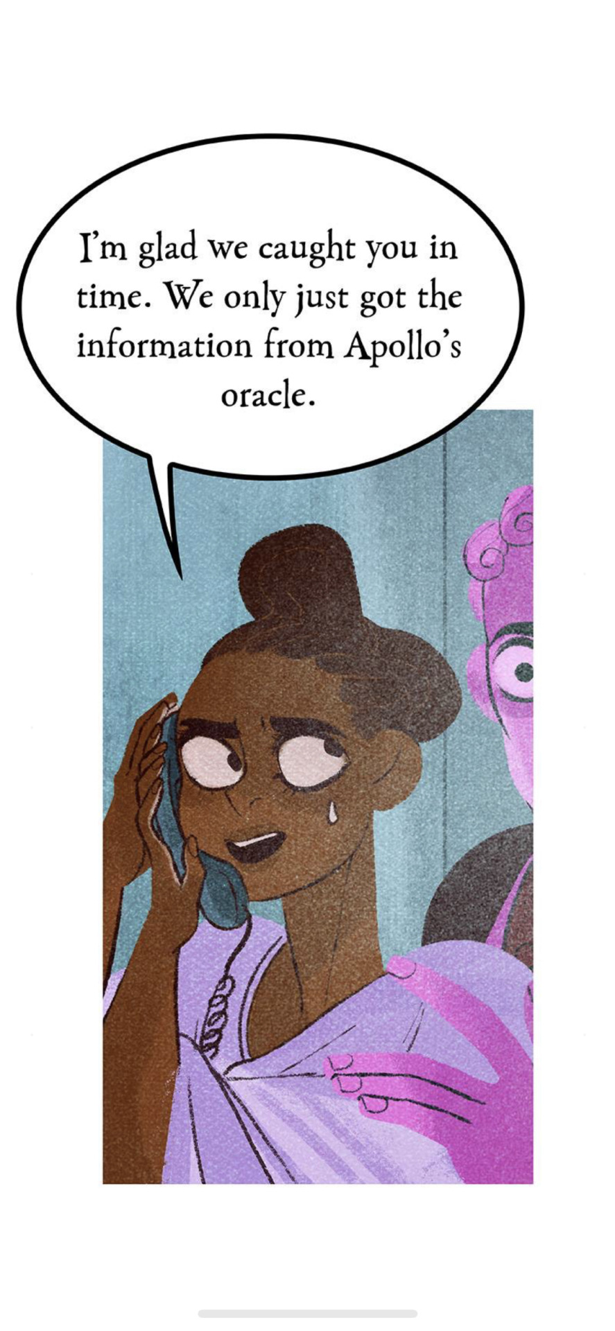
This is already a bit of a wild opening compared to the last two episodes, but it's quickly revealed that this is laying the foundation for the prophecy that Psyche gave to Apollo back in Episode 252. In true LO fashion, the story can't actually be linear in any regard, we're always segmented from pieces of information at a time. Loyal fans will call this a "writing style", I call it Rachel just trying to get another 70 cents out of me.
That said, I will say the art here is fairly decent, but I think that just goes to show that LO's one of worst features these days - ironically enough - is its coloring. What began as its strongest feature has now become one of its biggest weaknesses due to the sheer laziness in its rendering and the colors become more and more saturated into the grotesque over time. So at this point, you pretty much have to rob these characters of their colors to make them look decent, and of course at that point it just further highlights Rachel's same-face problems. She definitely tried to make them look distinguishable here, at least, with Hestia and Poseidon being the most unique.
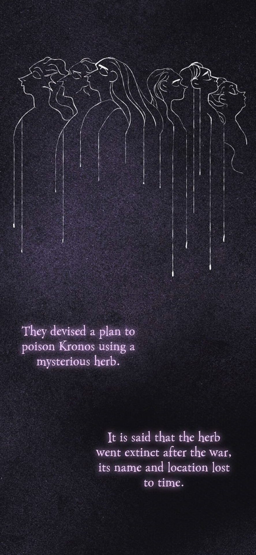
Now, this isn't the first time that we've heard of this herb being referenced - it was stated by Hades that Hera was the one to originally poison Kronos with the herb after gaining his trust - but to see it suddenly just pop up and play a role again out of nowhere already gives me a bad feeling in my stomach. It feels like yet another plot device - especially when presented in this type of format - that Rachel is suddenly using to try and seem "unique" in her writing, much like the strange narration we got back during the "Run For Your Life" sequence. It's just once again LO lacking any specific identity, it's always trying to be a million other things at once.
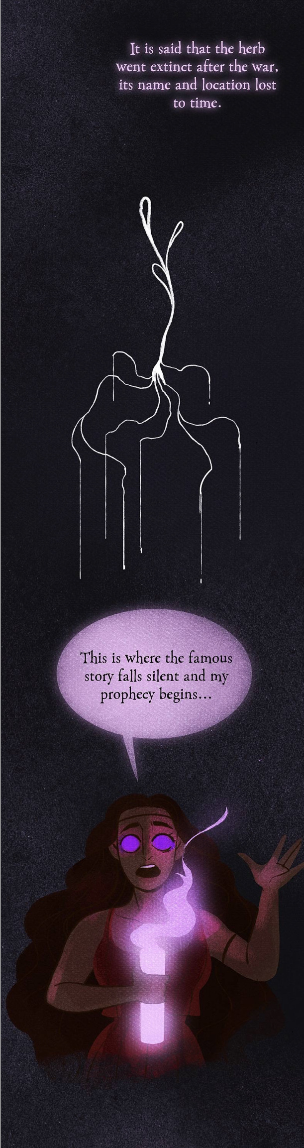
I will say, much of this in and of itself is panel filler. Why? Because the location of the herb doesn't matter. You'll see what I mean in a moment, but the mentioning of Anthedon plays no role here, it's just yet another obligatory "see, I know how to Google things!" lip service moment from Rachel "self-proclaimed folklorist" Smythe.
Anyways, Eros is perplexed by this but Psyche immediately catches on, knowing right away that Apollo is going for Zeus. And this is where we get yet another one of the dumbest sequences in this comic.
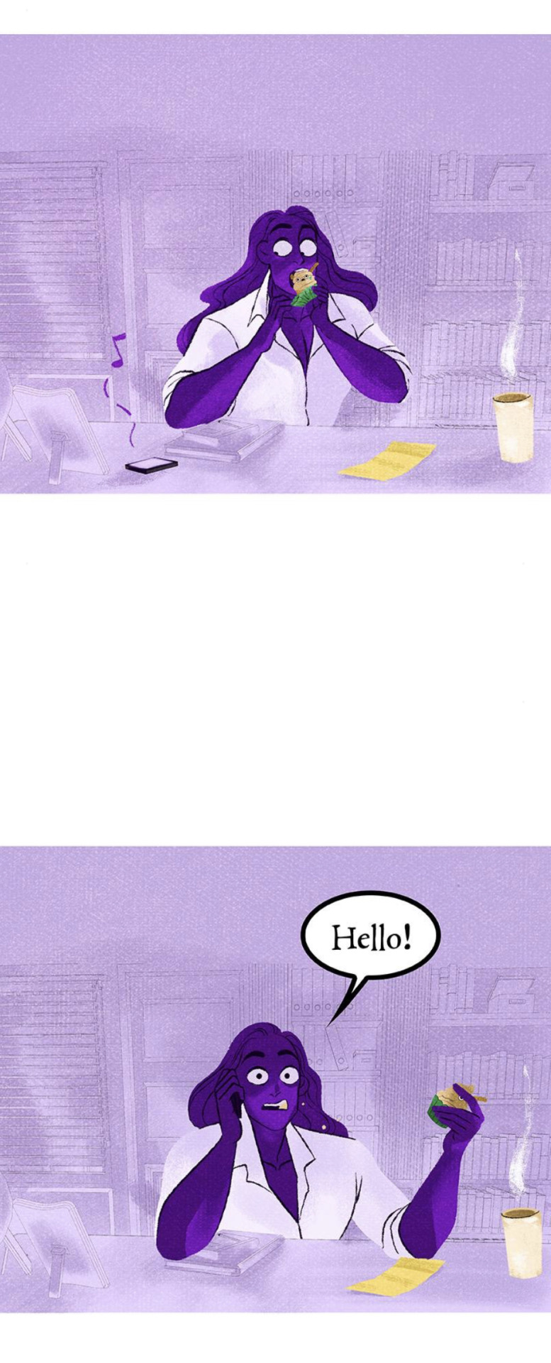
(see what I mean that the location of the herb doesn't matter? Because Apollo already got it and laced it into the cupcake).
Now, first of all, the fact that Eros and Psyche believe Kassandra's prophecy is already hilarious in and of itself, because ... well, because it literally defeats the point of her establishing it as a curse in the previous episode. Unless it only works on mortals? It never stated as such, so we literally just have to go with it and pretend not to notice that.
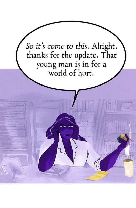
But most of all, of course LO had to play this off as some joke. Like, "hahaha how awkward! I've already eaten the cupcake!" and he still doesn't seem to really be in shock. Zeus has seen what this herb has done to gods before him, and yet his reaction to this is akin to a dad getting upset that he stepped LEGO's that he asked his kid 20 times to pick up off the floor. The whole "record scratch" style formatting of this followed by Zeus' lack of reaction just really makes me not care about any of this, because clearly the story doesn't care either.
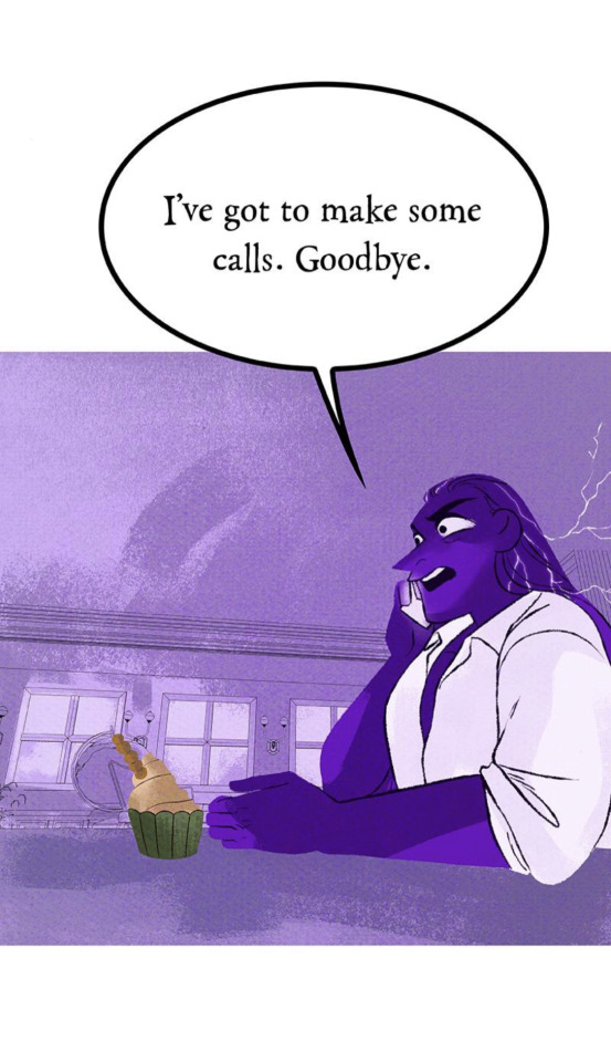
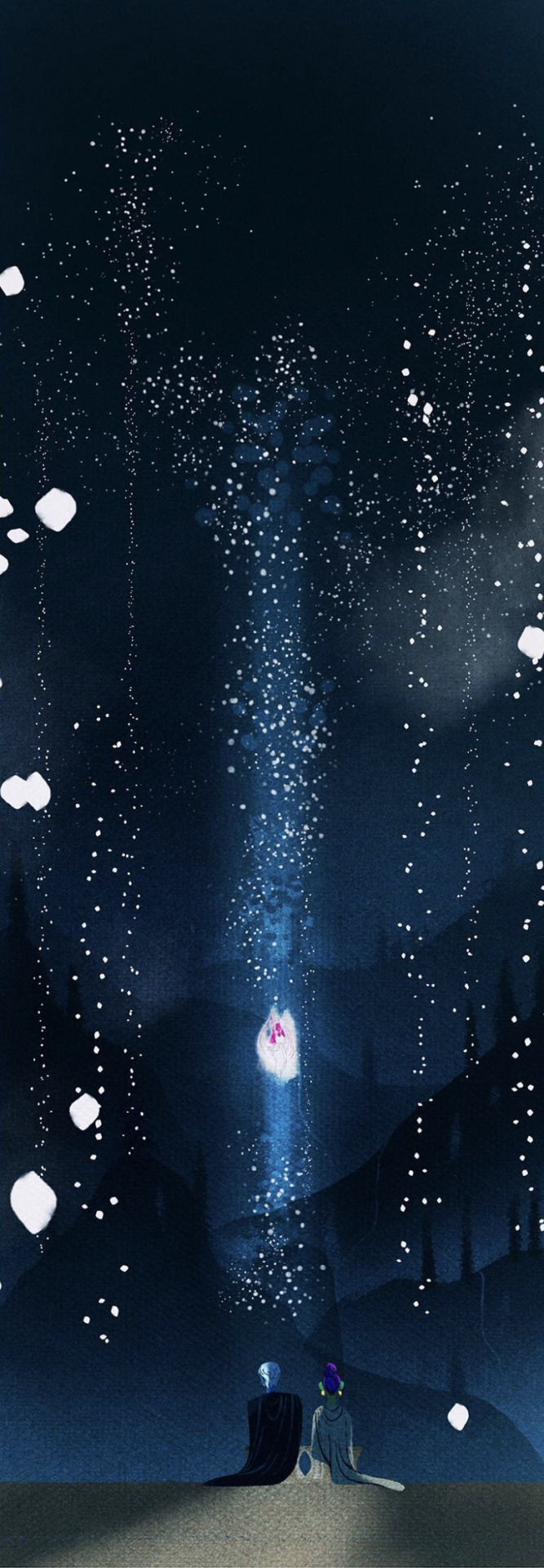
But we don't see who he makes these calls to because the comic, of course, can't spend any longer than 10 panels on a single scene, so we cut to Hades and Persephone.
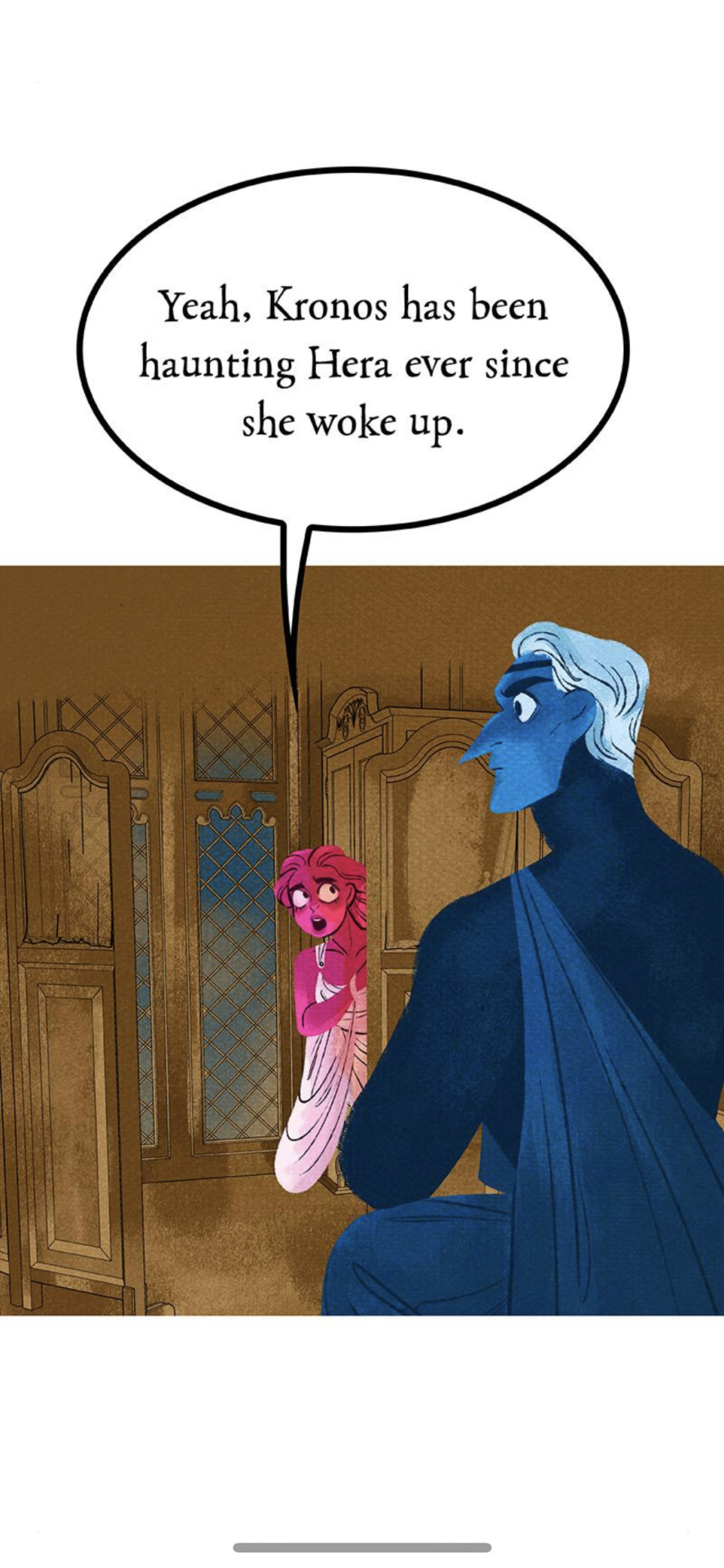
Again, I don't know what the point was of having Hera relay this information to Persephone for her to relay to Hades, aside from the fact that Rachel needed to act smart with Therapy Speak that didn't even apply to Hera's situation (as we talked about in the last part). They gotta make Persephone the center of everyone's world though, so it's Persephone who's delivering this info and trying to come up with the solution.
Hades, though, wants to focus on his wife's birthday the commemoration of spring.
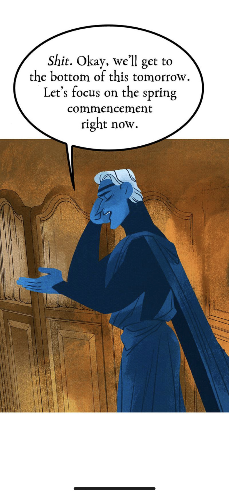
SIR. THE WOMAN YOU WERE IN AN AFFAIR WITH SINCE BEFORE YOUR WIFE WAS BORN IS CURRENTLY GRAPPLING WITH YOUR FATHER WHO ABUSED HER AND IS NOW HAUNTING HER. THIS IS NOT THE TIME FOR FLUFFY ROMANCE TIME. THERE IS A CHILD BEING HELD CAPTIVE IN TARTARUS AND LITERALLY NO ONE SEEMS TO CARE.
Anyways, apparently (for some reason) Hades is the one who has to go meet Demeter out front. Even though Hades has literally NOTHING to do with this ceremony, it's not his domain, but Persephone literally says "yep, that's correct" when he asks if he needs to go out to meet Demeter.
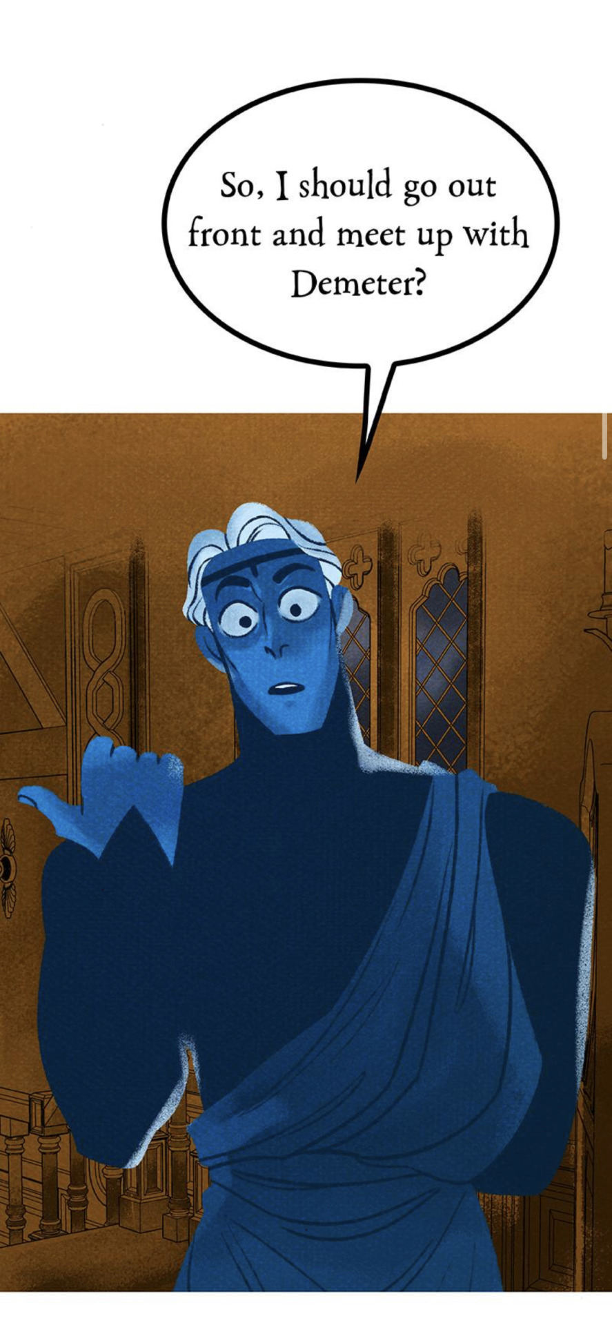
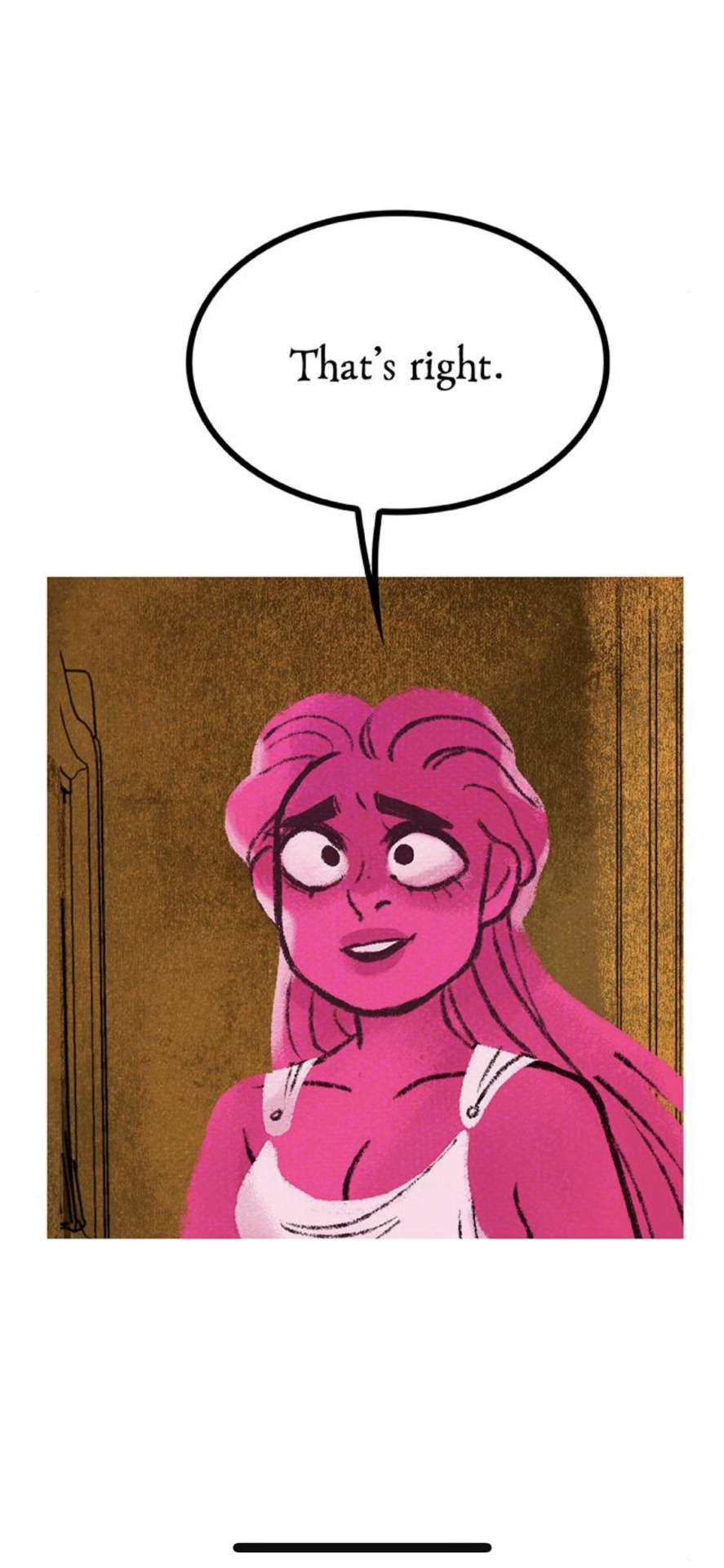
This just feels like such a pointless conversation and I don't get what the point of this exact exchange is. Again, this isn't Hades' domain, so I don't see why he needs to be the one to go meet with Demeter.
But then, of course, to make matters worse, this man has the absolute audacity to pretend like he's never done anything wrong to Demeter. As if she should be obligated to be cool with sharing a bench with this man who literally terrorized her for years and then essentially groomed her daughter.
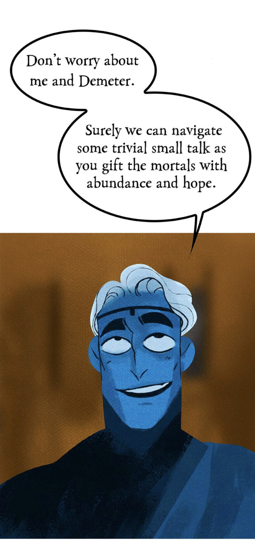
I hate him so fucking much and I can't believe we're supposed to be rooting for him. He has not undergone ANY of the character development necessary for me to want to care about him.
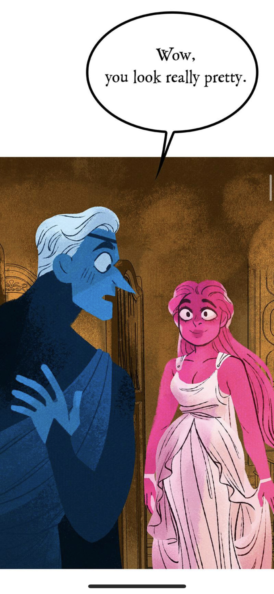
Anyways, Hades has a seat with Demeter, and the conversation is very brief before Hades says that he has a gift for her. And what is it, exactly?
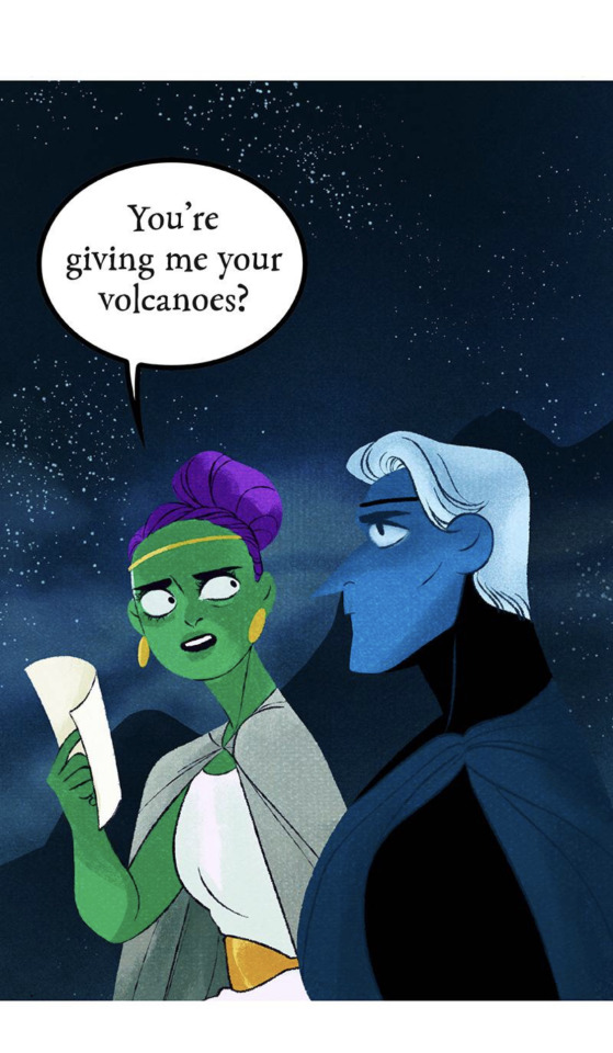
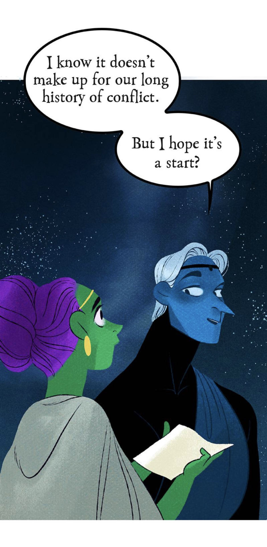
Oh great, Hades. Sure wish you would have had this consideration hundreds of years ago. I fail to see what good this does for her now because it doesn't change the fact that he still cost her the role of Queen of the Mortal Realm and treated her like shit for hundreds of years. This comes across as such a shallow and empty "apology" because it's barely even a "gift", rather something she was OWED back then that he didn't want to hand over for his own selfish reasons. He still comes out the winner here because he's gotten to spend thousands of years being a rich slave-driving oligarch while Demeter has had to maintain the Mortal Realm on her own even without the glory of having a title.
I especially detest this "twist" because it's less of a twist and Rachel finally accepting the fact she couldn't come up with anything better than what her fans had to come up with for her. If this had been the fact the whole time, we would have seen it established back when we first got those flashbacks showing Hades being a total prick to her over the volcanoes. Instead, Rachel dragged it out for weeks and weeks until finally dumping this "twist" that her fans had been talking about all that time. This is yet another one of those "Rachel used her fanbase to come up with her ideas" moments. I know that that seems a little mean and presumptuous, but the fact of the matter is that the writing in this story is such an absolute mess that you just know Rachel's writing by the seat of her pants and has to rely on her audience's headcanons to actually fill in the gaps of her story. Most of the time when people commend her for the "great storytelling" in LO, what they're referring to are things they came up with entirely on their own because of how easy it is to just make assumptions about LO's storyline. Rachel benefits off the story being as vague as possible because then her fanbase will fill in the gaps with their own assumptions and give her all the credit for an idea they came up with.
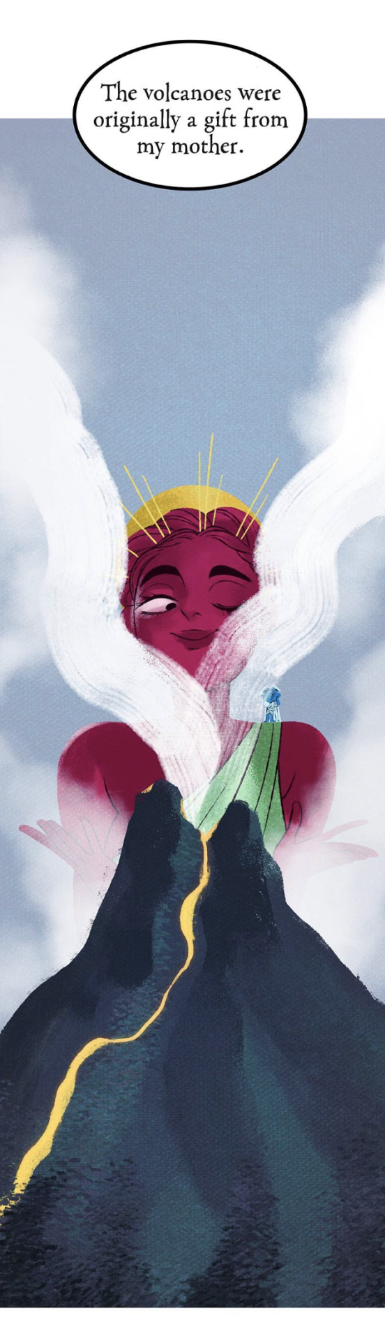
By the way, to the "self-proclaimed folklorist" who wrote this, the volcanoes were really just entrances into the Underworld. Hades did not own them. They were owned by Hephaestus. And I would argue that the volcanoes were only seen as "entrances" into the Underworld because, fun fact - if you jump into a volcano, you die!
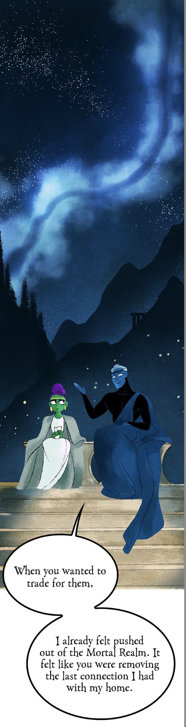
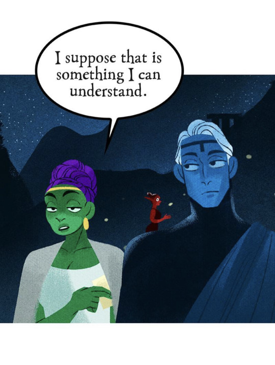
Hades frames his reasoning as feeling like Demeter was pushing him out of the Mortal Realm, but this makes no sense because none of that is on her. He claims that he felt like an "outsider" but the reality is that he made himself that way. He resigned himself to being King of the Underworld, he ate the pomegranate and made the deal with Erebus, and even he stated that he could still actually leave the Underworld, just not for long periods of time. So he was the only one keeping himself away from the Mortal Realm, not Demeter. We even see that in the VHS tape flashbacks where Hades stumbles onto Demeter's property and she lets him sleep it off in her home. So this whole sob story about how he felt "pushed out" by Demeter is such a bad take from someone who's routinely known to make himself out to be the victim. Because Hades can't have an actual reputation for a reason, no, this is a "retelling" told by someone who got all their Greek myth info off Tumblr circa 2016 and the front page of Google, so Hades has to be the misunderstood uwu sad underdog. Even though he routinely does things that reinforce the reputation he has within the comic, like being a slave driver, abusing lower class nymphs, and grooming teenagers.
Minthe showing up for a split second in the background is the best this comic has been since S2. We stan our girl Minthe, fucking run girl, do what Persephone couldn't do. She's the real hero of this story (。・∀・)ノ゙
And honestly, I'm sorry, but Demeter really SHOULDN'T be taking the high ground on this. She has more than enough reason to be upset. For a comic that tries to celebrate feminism and holding abusive men accountable, it sure is willing to make the women - often victims of the men - the real villains who have to "do better". Except for Persephone of course. Persephone is married into the system now, she doesn't have to "do better", she's a "boss babe" for being abusive and petty and undeserving of her status because she's the self-insert Y/N character.
So the ceremony for commencing Spring begins. I gotta say, for the final major scene of the mi(n)season finale, the art is severely underwhelming. You can really tell the difference between S3 and S1 art here, there's barely anything extra done to make this scene even half as impactful as the most basic of scenes from S1.
Like, it's fine, but it still feels so half-baked and rushed to attempt to replicate the kind of art that's been gone from the series for years now. The full sequence itself is actually quite lengthy, with a lot of nymph hands just moving around and playing instruments, but it's about as bland as any other panel, so it makes the sequence itself feel dragged out and boring.
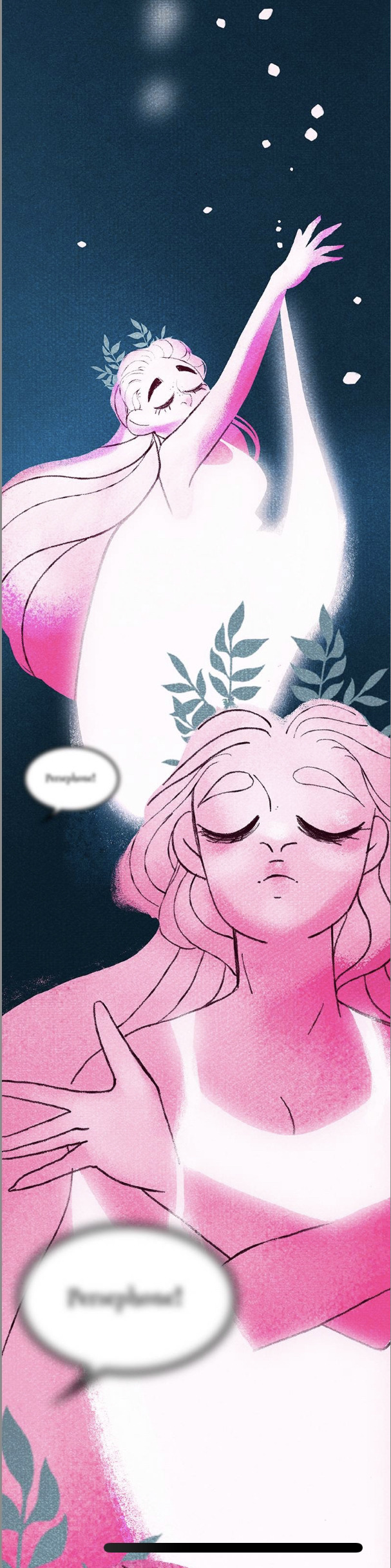
This is about as pretty as the sequence gets and it's still not even as good as the original Dread Queen transformation. There's barely any rendering in the skin, and they couldn't even be bothered to make the hands look normal. It's like it's trying so hard to be "original LO" but is fundamentally missing the point of what made the original LO so captivating.
But oh noooo, looks like Persephone did a bad!
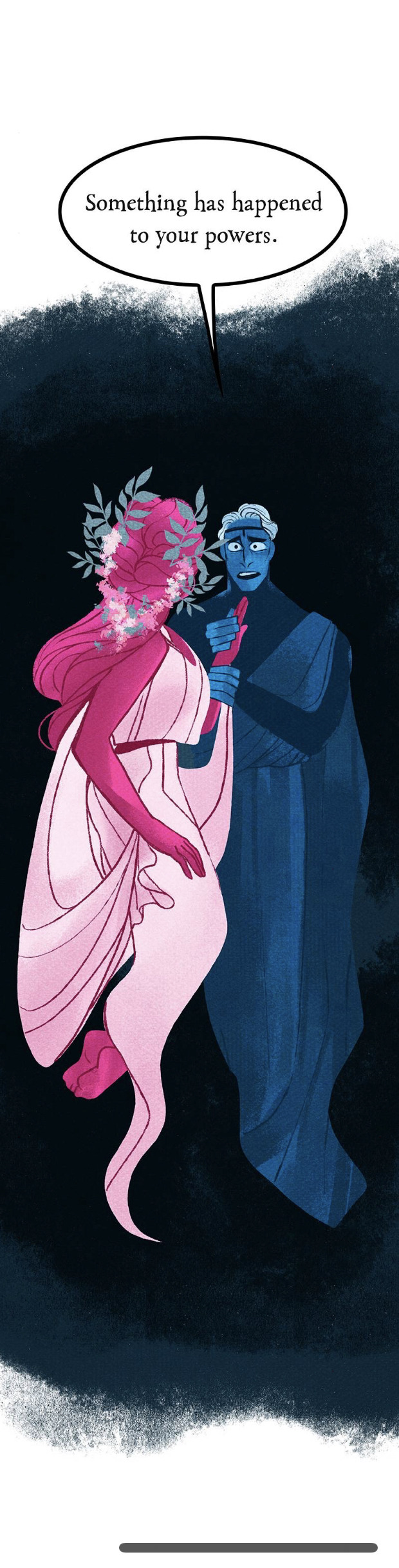
Are they actually gonna give her some kind of flaw? Are we gonna FINALLY gonna find out what she traded to Erebus?
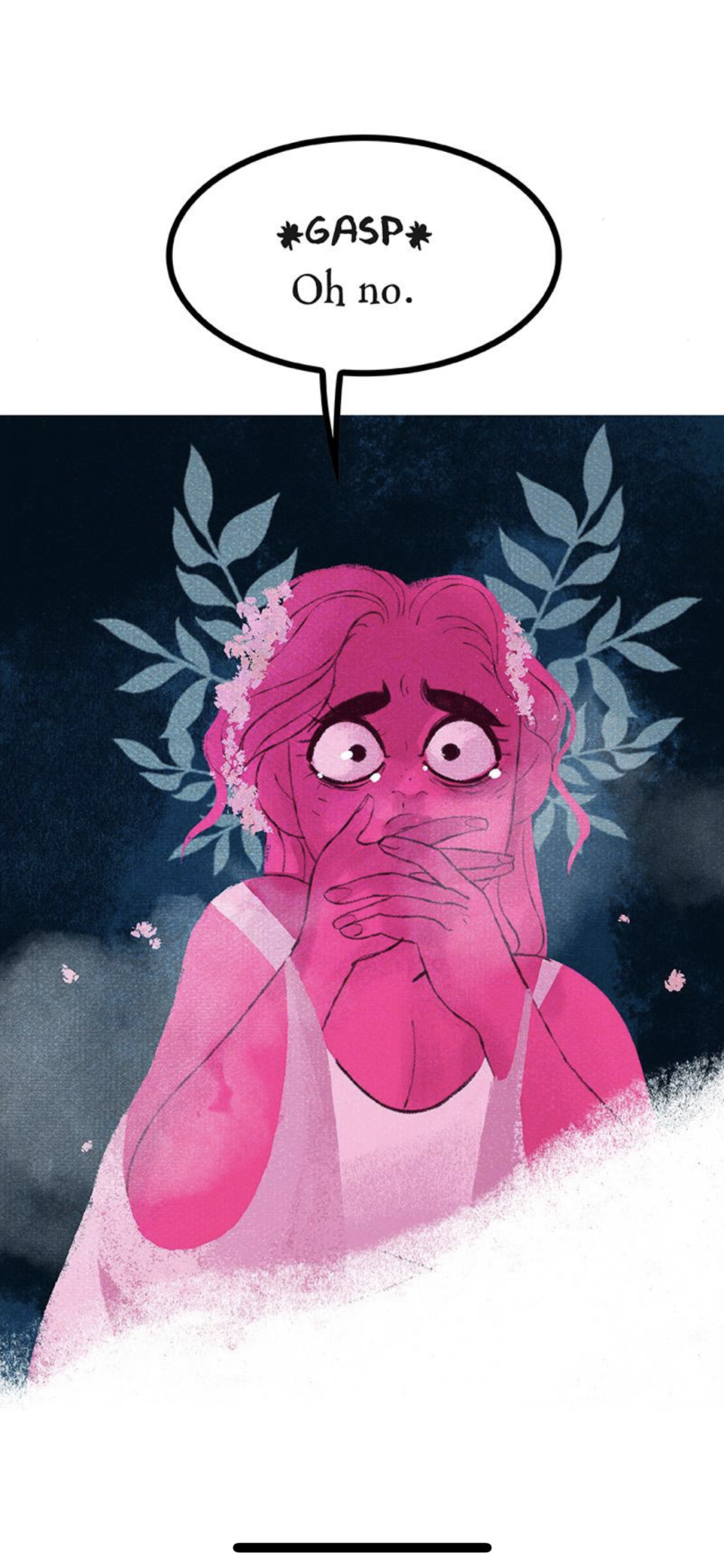
No. We're just gonna make her the cause of winter.
Spaghettios.
And that's where I'm leaving this review for now because, as mentioned in the beginning, this episode is a LOT longer than I remember it being. There's still a whole ass segment with Apollo that we need to cover and I don't want to leave it out but I also don't want to do it entirely in text format and I've hit that pesky image limit. So I'll be posting that second part as soon as I can!
That said, I really can't stand this "subversion" by making Persephone the reason for winter.
First of all, because this is a common problem in a lot of H x P "retellings", as many of them fundamentally miss the point of why Persephone is the "Goddess of Spring".
Persephone was not born the "Goddess of Spring". She was born Kore (Κόρη), a maiden born from Demeter. It wasn't until after she was taken by Hades that Demeter, in her grief, took away the harvest and created winter. It was the return of Persephone every six months that brought about the spring, hence, she earned the name, "Goddess of Spring". What these retellings COMPLETELY MISUNDERSTAND is that the gods aren't 'born' with their titles, they're granted these titles by the mortals who comprehend them and write of them as harbingers of their respective elements, stories, and messages. Zeus wasn't "born" the God of the Sky and Heavens, he was granted that title after he overthrew Kronos and took the Heavens for himself. Hades wasn't "born" the God of the Underworld and the Dead, he was granted that title after he became the ruler of the domain of death.
Where these retellings really fuck up is constantly trying to "subvert" the H x P myth in an attempt to romanticize it, thus undoing the point of why Persephone is called "The Goddess of Spring". A Touch of Darkness also made this mistake by putting a "twist" on Persephone's character by having her start out as someone who couldn't make things grow. But if she sucks at making things grow, then why is she still referred to as The Goddess of Spring? In LO, Hades is referred to as "Grandpa Winter" and the seasons already seem to exist as we saw in this episode through the ceremony, so why has she been called "The Goddess of Spring" this whole time?
But I also can't stand this "subversion" because it fundamentally misunderstands the very myth it's trying to "retell". By giving Persephone the "curse" of creating winter, it further robs Demeter of her own agency in this story, more than it already has. It wasn't enough to make Demeter a helicopter mom, it wasn't enough to drive an actual rift between her and her daughter, they had to take away Demeter's entire role in the story and the creation of the seasons and give it to Persephone.
And this is, surprisingly enough, NOT the first time the comic has done this. There are many traits associated with different gods that have been given to Persephone and Hades. The volcanoes belong to Hades rather than Hephaestus, Persephone is "more beautiful than Aphrodite", Thanatos' and Psyche's butterfly symbolism is given to both Hades and Persephone, Aphrodite's symbolism of roses is given to Persephone, the list goes on. Every single plotline has to involve Persephone as the hero, and every single attribute that's commonly associated with other gods has to be granted to H x P in some way to make them better and more interesting than every other cast member in the comic, and yet they still come across as vapid and boring protagonists with nothing to show for themselves.
So to give the ONE thing from the source material that made LO what it is, it comes across as so unbearably cruel.
But then again, we should have seen this coming. After all, Rachel does not cite this as a retelling of The Hymn to Demeter. She simply refers to it as its more unofficial name: The Taking of Persephone.
Look, I get it, the story is meant to be told from Persephone's POV (or at least through the lens of her being the main character) so I can understand why Rachel may have chosen to reword this to make it more clear. But it's really depressing that she went to such an extent with making it about Persephone that she had to rob one of the most integral character of her moment and retribution. Especially when one of the only books in her cited "research" that's primarily about Persephone is, shocked, The Hymn to Demeter, which is listed at the very bottom of every "research" list you can find in LO's history.
LO should have just stayed as self-indulgent fluff. This isn't "subversion", this isn't a "twist", it's just yet another item on the list of making Persephone the most Important One of all. Even when it attempts to be a 'flaw', it fails tremendously by acting as yet another aspect of her being a Mary Sue, because her 'flaw' has come at the cost of another character's story, identity, and strengths. What was originally a tale of grief, retribution, and standing up against a patriarchal system, has now been warped into a consequence of a muddied plot that doesn't have anywhere left to go. For a story that claims to be "feminist", it has ironically missed the original point of its source material entirely, and completely robbed itself of the feminine strength it could have had if it hadn't tried to be "subversive".
I don't really have anything much more to say than that. I could leave it here for good, but we do still have that extra segment to talk about that covers the actual final cliffhanger in this episode, so... we'll see you on the other side.
203 notes
·
View notes
Text
Real sentimental hours are happening right now, and I feel so stupid. But in a dopey way I mean.
You ever get a thought that crosses your mind that makes you feel inspired or sentimental (or both), but what caused it is something so minor? That's what I'm feeling at random right now.
So a little history about how I started art (sometimes I mentioned this in passing already, but I don't mind the walk-back). When I started art, I started off pixel art first before drawing, and I was really hopeless about learning how people did the bare basics. How did they make lines that had these tiny gradients to them? (before I learned it's literally just lineart with anti-aliasing.) How can people make those fine lines? (Before I learned the importance of brush sizes and how an art program adapts to pen pressure with a tablet.) People can just... color? Under the lines? Without having to redo the lines??? (Before I transitioned out of MSPaint into an art program that had layers.)
Besides that last one, I learned through drawing stuff rigidly with pixels, coloring in said pixels like a coloring book, and then going over to do the shadings and re-touch on the lines. Precise pixels, precise lines, and a rigid style that still left its mark on my current style even in the present.
Earlier on, every time I tried to experiment with lineless style, or just any style where you color in patches and build up on it through shades and renders and then add subtler lines on top after the fact, my results looked like absolute garbage mush. I don't mean 'woe is me' self-pity bad, but legitimately BAD bad. I got discouraged I couldn't live up to a lot of those styles, moreso as they became super popular back in the day and present, and although I COULD adapt if I wanted to do some of the techniques you usually do with that style in mind, I only can really do so in pixel art, but not drawings otherwise, cuz that fear lingered. So, my style heavily fixated on drawing lineart and rigidly following said lineart, and that's just something I had to live with.
Though occasionally, I had some what-if epiphanies in moments when I turn my lineart entirely off to go back and recolor the parts post-flat-making. Including here. Like a glimpse of what-could've-been or maybe-ifs.
Is this render super fantastic? Probably not, I dunno. But it's decent. Better than the attempts I did when I was way younger and attempted stuff like this earlier. That bit like this froggy chair part isn't the best damn thing I could paint, but it's like... it felt less scary now compared to it did way back when. Maybe paint-like lineless style isn't quite as off the table anymore. Maybe it's something to consider practicing.
Maybe not now and not for this piece, but... something to put in the back pocket. For now.
4 notes
·
View notes
Text
WASP REVIEW - QUEEN SECTONIA (& ANTLERS) (KIRBY: TRIPLE DELUXE)

[Image ID: A 3D render of Queen Sectonia from Kirby: Triple Deluxe /End IDs.]
I love the Kirby series! It's a great series for a more casual platforming experience, and almost game I've played has been super memorable. Now, in all honesty, don't remember much of my time playing Kirby: Triple Deluxe, but I feel like it has more to do with how sparse my play sessions were at the time, and how long ago it was, rather than the actual quality of the game. One of the things I do remember, though, is the big stinger of a final boss that is Queen Sectonia!
This review is gonna be a quick one because, for one, she doesn't appear for that long in the game, and secondly because there really isn't all that much to pull from in terms of real world equivalents. In terms of appearance, her body is thin-waisted, akin to a member of the family Sphecidae, her exoskeleton seeming fairly smooth (although most of is covered by her regal clothing. Her eyes are seemingly somewhat mammalian in nature, with sclerae, irises, and darker spots that at least resemble pupils. She doesn't actually have any limbs at all, with her gloved hands floating Rayman-style off to her sides. Honestly, her thick antennae and partially clear, very distinctly venated wings, remind me of a Hornet Moth, more than anything, with some further wing comparisons to be drawn from the venation of Cicada wings.


[Image Sources: iNaturalist, Bill Keim, Wikimedia Commons, Colette Kerr, and Biomimicry Institute, Sarah Batsford | Image IDs: A photo of a black and yellow, Yellow-Legged Mud Dauber, followed by a photo of a black, yellow, and brown Hornet Moth, further followed by a photo of a Cicada's forewing /End IDs.]
Furthermore, and I have to give props to the editors of WiKirby for this observation, it seems as though some of her features, as well as her backstory, may also be in reference to the Japanese legend of the Jorōgumo, and by extension the real world Jorō Spider, the Jorōgumo being a Yōkai which takes the form of a Jorō Spider but possesses the ability to transform herself into another form, that of a beautiful, human woman.

[Image Source: Flickr, Christina Butler | Image ID: A photo of a black, yellow, grey, and red Jorō Spider /End ID.]
Speaking of her backstory, interestingly enough, this is where she gets a bit odd, as she was actually originally more spider-like. In her original form, she was obsessed with beauty, so her at the time friend (later lackey, and even later enemy), Taranza, bestowed her with the Dimension Mirror, which gave her the form we see in the game now. Perhaps she simply saw some insectoid forms as being more elegant and/or beautiful than her original form, spurred on by thoughts of the regal queens of wasps (Vespids, Bees, Ants), or mayhaps this is just a design choice entirely intended just to tie in to the plant theming of the game, with wasps being essential pollinators. It seems as though she was then corrupted by the Mirror, attempting to take over Floralia and Planet Popstar.


[Image IDs: Two 3D renders of what is implied to be Queen Sectonia's original form /End IDs.]
As for her behaviors, it's hard to see much that really ties her current form in with real world wasps apart from the aspect of queenship, she doesn't even truly seem to use her stinger, instead opting for swords (A common choice amongst Hymenopteran enemy designs it seems) and magic. One could say that the implications that her kind feed on the life force of others to survive is referential to parasitic wasps, including the aspect of control (See last week's review of 'Parasitica' from TMNT 2012 for more on real world parasitic wasps that control other insects), but it could just as easily be said that this could once again be in reference to the man-eating Jorōgumo.
It certainly doesn't get any more easy to analyze in terms of the real world when we get into the second part of the fight, as she fuses herself with the Dreamstalk to become Flowered Sectonia, feeding indiscriminately on all life below (not even close to the most fucked up thing in this mostly E For Everyone franchise, between Shiver Star, Fecto Forgo, Zero, and the extremely Dark Souls sounding boss Astral Birth Void). Her face becoming the pistil of the flower and her antennae the stamens, multiplying into three pairs, her wings taking on a different and more angel-like shape. In this form, her attacks still use magic but are also heavily plant-based.

[Image ID: A screenshot of Flowered Sectonia /End IDs.]
One more thing of note are her other lackeys, the Antlers, fairly standard platformer enemies that use maces and shields to attack Kirby, taking orders from and often summoned by Sectonia in battle. They have an anthropomorphic build, similarly Rayman-esque, with the floating hands and feet that may or may not be connected to the body, and have a head that reminds me of that of a Paper Wasp, Sphecid, or Cuckoo Wasp, although they are wingless, like some ant castes or female Mutillids. They also come in four unique flavors! Original, Ice, Fire, and Spark.


[Image Sources: New Scientist, and Australian Museum, Mark Raward | Image IDs: A screenshot of the Antlers during the fight against Queen Sectonia DX, followed by a photo of a black, yellow, and brown Paper Wasp's face, followed then by a photo of an iridescent green, blue, and black Cuckoo Wasp /End IDs.]
Not much to say about these guys (Gals?), other than that it shows that Seconia does in fact have some sort of hive, in all honesty, but I do find them supremely charming.
With all that said, what would I rate Queen Sectonia and her followers? Well I usually like to rate these wasps on accuracy, and if I did that for these characters, the rating would probably be fairly low. However, it seems like she's really a bit too far from the real thing to really do that, especially with her more apparent ties to folklore, so, I'll have to go for just a straight up opinion here. Really, this is a type of character I've seen a few times before, the overlord obsessed with beauty and power, which isn't necessarily a bad thing but I don't find it very interesting. I do find myself really enjoying her backstory and inspiration, and her design is pretty alright!
-
Overall: 6.5/10
-
Leave your wasp review suggestion in the replies, tags, or askbox!
11 notes
·
View notes
Note
Hi BPP,
I'm convinced Billboard has a spilt personality for real because how do you write an article about it being difficult to produce big stars right now, turm around a do a hit job on K-pop and Jimin specifically in order to quash his chances for any American noms and awards
***
Hi @ejassy
Lol Billboard doesn't have a split personality, you're just not really listening to all they're saying.
(Brian is something of a twat sometimes but even he has his moments)
Billboard's problem is not that it's difficult to produce big stars right now, it's that (1) the big stars that are being produced are doing so outside the legacy framework and direct influence of the American rainmakers - the American labels and middlemen who would demand their cut, and instead it's fans of various artists who can influence which artists rise to the top; and (2) that the big artists that are being produced (by fan engagement) are increasingly non-white, non-American, and non-English-speaking.
That's their conundrum.
It's a problem they've had since 2018 when BTS out of nowhere showed up in the top 10 on the Hot 100 with Fake Love after it not just went viral, but was sustained on the charts driven by demand from American pop listeners (this was the time many members of the Bey hive joined the ARMY fandom and BTS caught on with the pop-listener 'gp' in huge numbers). Since then, every award-season article Billboard has published (since 2019) has had the same tone as the one published yesterday, with each year Billboard getting more overt in their disdain, and the quiet part of what they actually mean to say, getting louder.
I've been writing on this blog for over a year about BTS, k-pop, fandoms, and the music industry, and if there's one thing I suggest people take from it, it's this: it's important to understand that everything about BTS represents a world in which the industry gatekeepers as they're currently structured, are rendered obsolete.
It's why the Korean music establishment had a similar reaction to BTS from 2013 - 2017. BTS should not have been as successful as they became, they didn't come from a Big 3 company with all their industry connections as most successful groups did, they didn't have the backing of an American conglomerate as more recent breakout groups like Fifty Fifty did, they didn't have the typical visuals, sound, vocals, styling, etc that the most popular and successful groups did.
All they had was their hunger, their talent, their hopes, and their pride, with Bang PD using every bit of streetsmarts he had to navigate the cutthroat competitive environment in the industry. And the fandom quickly realized, as early as 2014, that they could not possibly operate like every other k-pop fandom if they wanted BTS to ever have a fair chance.
It wasn't until BTS became too big to ignore both inside and outside Korea, that the Korean music establishment start giving them their dues. Personally, I expect the same pattern for Western recognition. BTS was well on pace to deliver on that promise in 2020 with their MOTS tour - it was planned to be bigger than Taylor Swift's tour is today, back then. It was rumoured to be bigger than anything anyone, even Beyonce, had done till that point.
...but we all know what happened. Dynamite was a huge hit but in comparison to what could've been, it was a pitiable substitute.
Cue the English trilogy and Grammy attempts, snubs, and hiatus. Now there's a vacuum left by BTS, that most k-pop groups are trying to use to establish themselves with the same toolbox ARMYs and Western stans are using, while leveraging BTS's reputation, and the American middlemen are watching to see which groups are most compatible for them to partner with so they too can get in on the action and not get left behind.
Because the reality is that the landscape has changed. Fan engagement is not going away and will have to become a key consideration for creating 'big stars'. Everybody recognizes this. Not everybody likes it, not everybody accepts it, but everyone understands that this is now how the cookie crumbles, and that BTS and ARMY are a big reason this is now the status quo.
And the fact is this has earned the group and fandom, more enemies than friends.
Jimin, by virtue of being a BTS member, is not exempt.
Like I said before, there are many types of people in fandom spaces and everyone has their own reasons for being here. Some trivial, some not. But anybody who actually considers themselves an ARMY should take the time to understand what it means to be a fan of BTS. In my opinion.
#I suspect the nominations we see for the Grammys will show how the industry is adapting with non-BTS k-pop players#It's going to be educational#bts#bangtan#jimin#park jimin#kpop#kpop music#music industry#kpop industry#hybe#bighit#grammys#grammys 2024
60 notes
·
View notes
Text
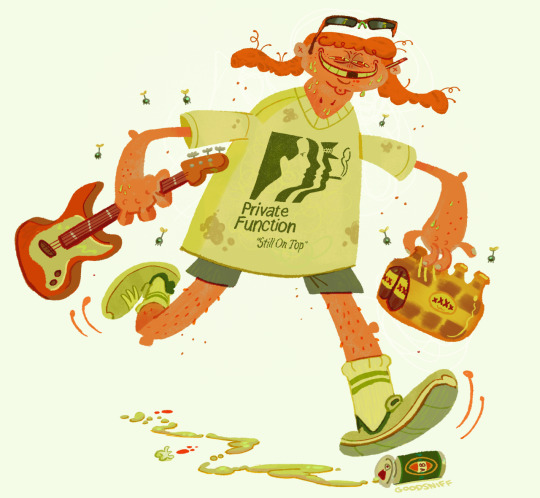
Catriona Drummond (aka goodsniff)

one of my favourite cartoonists working right now is Catriona Drummond (@goodsniff)

the 2 things that really stand out to me in her work are her character designs and backgrounds

catriona's one of the only artists i've found that captures the inherent goofiness of modern day fashion and people in a fun, cartoony style.


we've all seen people like this in real life

so many drawing principles done well in one picture. line of action, clear silhouettes, contrasts, colour choices, shading & rendering etc. to me, this paints a picture of how utterly ridiculous superficial, try-hard people attempt to appear 'cool'
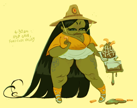
the work is titled "Lip Fillers & Frosé pt.1 // Beautiful creatures seen at Burleigh Pavilion on the Gold Coast". even the choice of words are very intentional. for anyone familiar with Australian culture, the Gold Coast is essentially the Miami of Australia. they share similar stereotypes, and the Burleigh Pavilion is the epicenter of these types of people
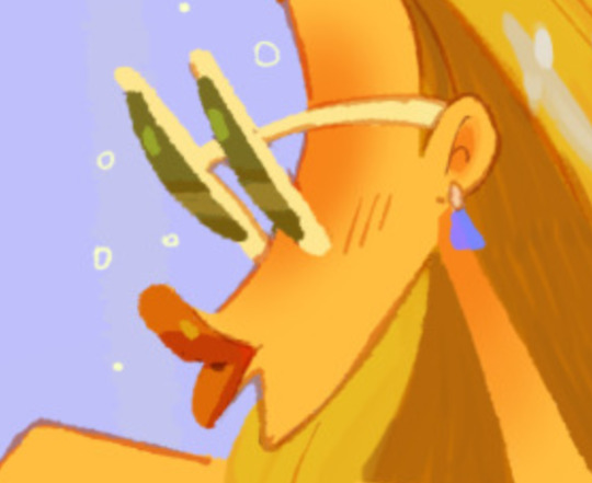
I like the dr. bunsen honeydew approach to just having the glasses as the eyes. it's very funny.
some of the drawings you'll see a date and location. i'd love to know what the process is for making these. was it all from memory? was there photo reference?
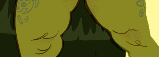
look at how a couple of lines can represent cottage cheese thighs!!! catriona really has a knack for drawing short, chubby women
as an australian, another thing i adore is the australian caricatures and references. this is the first time i've seen a cartoon depiction of state of origin fans (if you're outside Australia: state of origin's one of the biggest sporting events in the country)
here's a caricature of eamon sandwith, lead singer of the chats. one of the most aggressively australian sounding bands right now
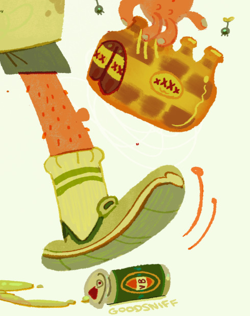
look at the attention to detail. i love how the brown is rendered on the beer pack to make it look like plastic. the lines on the inside of the sock is in a slightly different colour to show stitching. there's over a dozen colours on the VB can. you keep discovering more and more details. (note: every australian state has a beer brand that's uniquely theirs and XXXX is the beer of queensland. VB is the beer of victoria. if you drink it, you'll quickly understand why australians call beer 'piss')
the other aspect of catriona's art that really stands out to me are the backgrounds
she achieves something i thought was nearly impossible, make Brisbane look like a nice place to live
she's also worked on animated tv shows like bluey and smiling friends
all of this careful study of colour and light is reflected in how she renders her drawings of people
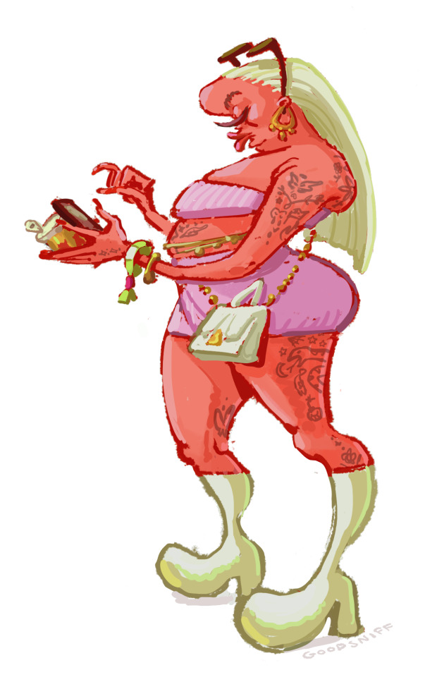
as someone who's trying to develop my digital art skills more, i tried recreating the thighs in Procreate to try and reverse-engineer how she did it, and i still can't quite figure it out. with the left thigh i tried using the eyedropper, picking out the exact colour and painting with a hard brush, but the colour looks wrong if you do it that way.

i tried a different approach on the right thigh. my guess is you have the base red colour, create another layer, use the clipping mask, lower the transparency a bit, and use a lighter colour. the difficulty is what type of brush to use. i went for the flat brush because you get that pressure sensitivity. who knows? i could be totally wrong with this. it's hard to see, but there's also a slightly darker scribbly line that goes down the middle of the thigh.
anyway i highly recommend you check out her work on tumblr, and she's also made a substack detailing her time working at bluey
5 notes
·
View notes
Text
l'aventure de canmom à annecy épisode DEUX - lundi 2 - cats and pigs
So this one's going to be a little chaotic in terms of order of events but hey. Let's gooo.
First up! I saw Flow, as mentioned earlier. Director Gints Zilbalodis from Latvia was the very first person to win the Contrechamp award at Annecy in 2019 for his solo-animated movie Away. Now he has a team, and they decided to make a totally wordless movie about a cat. Honestly I could leave it at that - this is a movie which you should watch unspoiled and just let it take you on a ride - but for a more detailed summary...
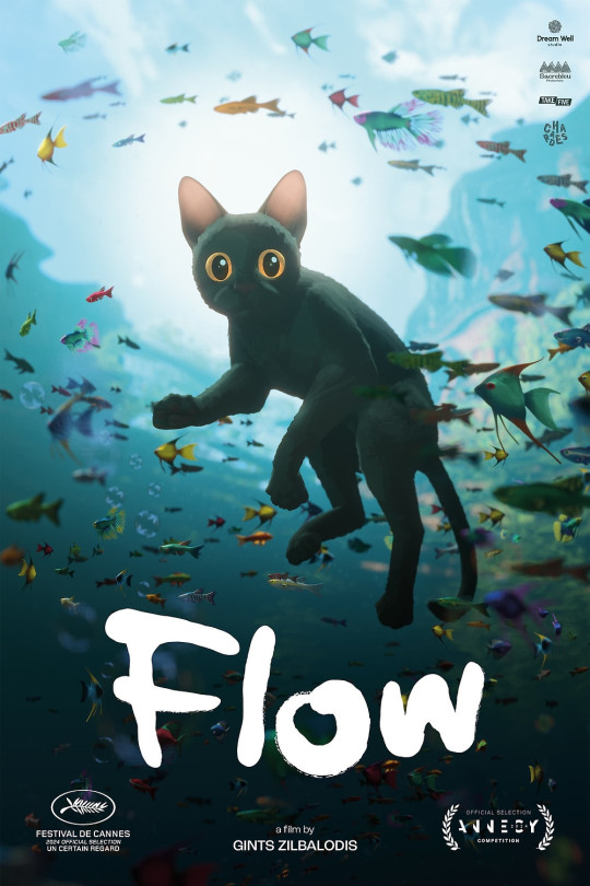
Our adorable little cat is living alone in the forest, surrounded by statues left by their former owner, when the world abruptly gets flooded, sending the cat on a journey to try to find higher ground and survive. The cat falls in with a group of other animals - over the course of the film, this group grows to include a capybara, a ring-tailed lemur, a secretarybird and a dog. It's the story of the struggles of these animals as they try to navigate the rising water towards higher ground, dealing with both outside threats and conflict within the group. I won't tell you where they end up but things get a tad mystical.
The thing is this film is totally wordless. The animation has to do absolutely everything. And it does so with aplomb. This is hands down some of the best character animation I've ever seen in a CG movie. Every animal moves naturally and expressively, their relationships shown with humour and clear expression. I honestly don't know how they did it so well.
It's also gorgeous on a rendering level. I'm not entirely sold on the posterisation effect used on the animals, but their environments are so vivid and richly detailed, looking natural even as they enter stranger architectural zones. Under water, over water, in storms... it looks absolutely great. It makes me so happy that this was done in Blender, it's like, that's what we dreamed of back in the day on the blenderartists forums.
The film already got a Cannes nom, which is wild for animation, and honestly while I haven't seen the other features yet, this is gonna be a tough act to follow and I think it has a pretty good shot at winning. I have no insight into the mind of the annecy jurors though! Regardless, spectacular film, makes me really want to make shit in blender lol.
I got some photos of the team getting a standing ovation at the end but it's super late so I'll have to upload them later lol.
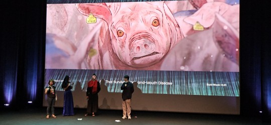
Later I saw the premiere of The Pig That Survived Foot and Mouth Disease, a new Korean film which makes a much better case for using mocap in an animated horror movie, also in the midnight specials slot. Impressively all the roles of around 30 characters were played by one mocap actor, which is wild. It's a classic Korean style of film - a spiral of death and trauma rooted in social violence, particularly military hazing and animal agriculture.
A pig, surviving the mass slaughter of pigs during the foot and mouth epidemic, eats the body of the farmer who raised him and transforms to become more human and becomes something of a cult leader for wild boars; a military deserter becomes a yeti-like creature but finds new hope when he rescues a girl from her suicide attempt, but is she even real?
It calls to mind films like King of Pigs and The Fake, and it's no less uncompromisingly bleak in its view of society - but by comparison to those films, it's shot very stylishly, with a cool nonphotorealistic shader and a frequently gorgeous forest setting. It's not as fancy as something like Flow, the models looking a little videogamey at times, but it's definitely solid - the rigs detailed enough to capture the acting. The style works very well for the film, and there's a couple of really standout stylised sequences, playing with religious iconography or dream sequences.
The film it reminded me most of is actually Unicorn Wars, another violent story of transformation and people going a bit nuts in the woods. But it also gets a bit Shakespearean with all the stabbings by the end.
Whatever you compare it to, it's a compelling drama, unblinkingly facing the cruelty of society. The two directions of escape - the human who wants to live like the animals, free from social cruelty, and the animal who wants to live as a human, free from the imminent threat of death, present a strong contrast and a good pincer movement on the theme of what it means to be human.
Sadly it didn't have nearly the turnout as WSDIB, but I did get to tell the director and mocap actor I liked the film - unfortunately I don't know enough Korean to really ask the questions I wanted to (though I learned they used Unreal for rendering) but the director did very kindly run over to his friend to give me a little postcard with some art.
I wish the crowd had been more enthusiastic tbh, this was a good movie!
I also watched a bunch of XR stuff today, and another WIP panel for Canadian film Death Does Not Exist which is looking real cool, more on that in a mo... and I met Malaysian director Suresh Eriyat in a comic book shop and bought his art book direct from him which he fully signed for me, bless him...
seriously how adorable is this?
12 notes
·
View notes
Text

This took a while to win me over, but it did, and I'm glad it did, although it leaves me in an odd position going forward.
Some context: some friends and I are doing a monthly anime groupwatch starting in November, and since it's almost November I figured I'd get a head start on Tamayura, since the tentative plan is to do both this OVA and both seasons of the TV show and maybe the presumably direct-to-bluray movies as well. That's a fair amount of stuff, so I wanted to get an early start.
As for Tamayura itself, it follows the shy schoolgirl Potte and explores her love of photography. Potte, in particular, is interested in the phenomenon of what are often called ghost orbs over here in the states. She associates them with photos of her late father, thus giving her a personal connection to the phenomenon (which is, evidently, called tamayura in Japanese and is thus also the namesake of this series), and thus giving the show some emotional stakes. (The fact that backscatter artifacts as they're more properly known are a well-explained phenomenon doesn't seem to enter into the equation here. I could be a dick and nitpick this, but that seems like not taking the show on its own terms, and I don't like being that person.)
More generally, she is fascinated with the mysterious nature of photography itself, and this is what propels our plot, such as it is, forward. She spends most of these OVA episodes at least tangentially attempting to find the location where she took a picture of her dad several years back. The ephemerality of the tamayura orbs, and thus the ephemerality of things in general, is a factor here as well. The cycle the series focuses on is thus; experiences become memories, memories can be preserved by pictures, and pictures can in turn drive new experiences, such as our main character group venturing to a particularly scenic hill in the last episode of this OVA. It's a simple thesis, and hardly one unique to this series, but it works well enough, and Tamayura plays it pretty effectively.
On a craft level, it's fitting that a show about photography was able to win me over mostly off the strength of its environments. We have a setting on the border of the suburban and rural here, and the townscape and nature alike are rendered with a grounded timbre that nonetheless imparts them with a little bit of sparkle. If you're the kind of person who gets easily bored by shows like this in which "nothing happens" and much of the focus is on the environment, Tamayura is unlikely to win you over and I can imagine such people finding the show dull. Still, for what it's going for, I think it scores high in these areas.
The character art is pretty nice as well. Done in a very straightforward moe` style, with big eyes and round faces, the show often wobbles its characters around in lightly amusing ways when something funny is happening. It's worth mentioning though that the humor is probably Tamayura's weakest point, most of it is not so much bad as it is simply kind of basic, but there are a couple of moments that *really* don't work and veer close enough to ecchi humor to feel wildly out of place with the rest of the work. Characters are a mixed bag too. Thankfully, Potte herself is great, but some of her friends have very one-note personalities (at least here in the OVA), and one in particular, Norie, is just kind of annoying in a way that actively clashes with the rest of the series. (Of course, I also like some characters a lot, including Potte herself as mentioned, Potte's grandma, and Maon, who mostly communicates by whistling. Give me some context for why the heck she does *that.* There's an interesting story there, I'm sure.)
In any case, these criticisms aside, my biggest question about Tamayura on the whole is what exactly they're going to do for stories as I move into watching the TV series. Potte's quest to find the place she took her father's photograph ends with the end of this OVA, and it's a nice enough ending, a real full-circle moment, that I struggle to think of how we're going to wring 24 episodes out of this. I suppose I'll find out in the coming days.
2 notes
·
View notes
Text
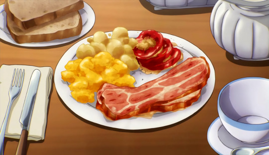
Welcome to my Studio Ghibli food rant (slash why you keep fucking up trying to recreate it in other anime)
people talk abt how studio ghibli animates food perfectly, but every attempt to recreate that style falls flat imo. and I feel like the reason is because people get too caught up on the "perfect" part and forget the fact its still food????
Like. ok. Howl's eggs and bacon are iconic, but actually look at them for a second. The bacon bubbles with grease. The eggs are wobbly imperfect circles that overlap and slide to the side of the pan. It's the platonic ideal of food, but it also looks like real food you could actually put in your mouth. It's better for its imperfections because it reminds you of the flavor of the real, actual bacon you've eaten, then coupled with the amazing art and animation. Studio Ghibli paints the mundane as beautiful and it makes the magic hit even harder. It's not even particularly detailed bacon and eggs either in terms of the actual food, but the details around it give it that extra flair.
I think the colors are really important as well and honestly could be their own post- the bacon is just slightly warmer than actual bacon, the eggs are just a tiny bit whiter/more opaque. That's where the fantasy part comes in and brings out the charm. A lot of the food in Studio Ghibli is just a liiittle bit warmer in tone than it is in real life, which also helps it come across as cozy and good feeling.
Kiki's herring pie is another example of this too !! Look at the slightly burnt edges, the way the fish has changed shape with the baking and how the edges are a tiny bit uneven. It's just realistic enough to remind you of what herring pie tastes like, but then brings it up another level with the subtle ways the food is exemplified, like the rich color of the brown and tan of the crevices. It's really subtle but effective.
But then when we look at other foods people like to call "anime food porn" (hate that phrase but whatever), it looks,,, kind of off???

I think the reason stuff like the images above fail to capture the same effect is because they think all the love is in how you animate the food itself and not the details around it. Like yeah that's some super well rendered bacon, but it doesn't sit on the plate quite right. The tomatoes are so shiny and red they actually stop looking like tomatoes and just become weird. It looks posed and staged, and it reminds me more of an advertisement than something a real person would make. It's also really apparent when you look closer that most of this food is almost unidentifiable??? Genuinely I have no idea what the yellow and golden blobs are supposed to be besides maybe home fries and eggs???? maybe mashed potatoes?????? The same and more can be said about the second image, I feel like my point is pretty clear here.
Like I said, the actual food isn't always *that* detailed in Studio Ghibli (excluding Kiki's pie honestly bc goddamn), but it's the way it feels so real and at the same time like the platonic ideal of food. Trying to recreate Ghibli food by only caring about the food loses the forest for the trees.
#studio ghibli#anime#howls moving castle#kikis delivery service#apparently pneumonia makes me hyperfixate on anime food. who would've known#if anyone wants to identify the screenshots of the other two foods I would be really grateful#news from the anthill
18 notes
·
View notes
Text
Lucky Star
Recently had the pleasure to re-watch Lucky Star. It's been years since I last went through it and surprisingly I remembered Jack Shit about it, so it was in a way like watching it for the first time. Stellar vibes. Just genuinely comfy show, nice pacing, didn't strain or struggle to hit its marks, relaxed art style. The Lucky Channel segment made me smirk each time as the series progressed as well.
Konata is honestly such a fucking vibe, I'd say goals even but I'd like to think I take my education a bit more seriously. That said, her approach to her hobbies and the things that make her happy are admirable. If I could channel that, I'd probably have a better time of things, because the entire time I was watching Lucky Star I felt relaxed and happy. I struggle with taking actual breaks, and often just wind up stress refreshing instead of, say, reading or watching something I've wanted to indulge in for quite some time bit by bit. It really gave me the gumption to keep pressing Play and make the most of my weekend.
Tsukasa is a sweetheart. I feel for her struggles with day to day things, because she does try, but those attempts are always very difficult for her. I just wanted to give her a hug and want only the best for her, it feels like she's always going to be a few steps behind of where would be most comfortable progress-wise, so it's like you can kind of predict she'll have struggles in college too.
Kagami is also a sweetheart, even if she's got a bit of a shell to her. She's goal oriented, focused, dedicated. Goals in their own right really, I wish I could approach things as directly as she can, and point things out fearlessly. She's got such a sensitive soul though, as evidenced now and then by thoughts of romance or close friendship displays, by how she's practically rendered speechless and flushing with warmth.
Miyuki is just straight up adorable. I'm certain she'll make a wonderful doctor someday with how methodical she is, but her original reasons for becoming so knowledgeable are adorable. Wanting to be praised by her mother more? My heart. She really is Moe incarnate though, it makes you wonder how someone would react to her if she were a real person for how ditzy she can come across as now and then.
The later introduced characters all left their positive impressions, but the one who really stuck with me most was Hiyori. Just. Nerd to the core, with the added double strength of being an artist so she can participate in the lifestyle from the very core as a creator. There's something to be said about that, being able to look at the things you love then create more of it so others can share in that enjoyment with you. I loved every scene she was in, looked forward to seeing her more, and she made me want to re-read/re-watch different series I enjoy that focus around creating doujinshi.
All in all: major positive enjoyment of the series all around. It makes me want to try reading the manga too!
5 notes
·
View notes
Text
I’ve been doing some reflecting on this past year, and I really truly think it is the most artistic improvement I have made in any span of time. Of course, I’m going to be completely insufferable about it and have collected my best piece from each month with a few personal notes, so why don’t we go on a sprint down memory highway together?
January
At the start of the year, I was both adrift between fandoms and art styles. I was mostly aiming to find which style I could keep using, finish pieces quickly yet still feel proud of. It certainly worked in the moment, but as I pushed my boundaries more it didn't stick. Still, I look back on this style fondly! also proper throwback to my old username that i had for far too long
February
This was the start of me working on colour palettes. I lay down my main colour in the background and fit the rest of my colours around that. It was a good way to start experimenting!
March
Then the shift back to finding my style- I particularly like how the hair turned out in this piece! I also started trying more interesting poses here, and actually properly attempting hands.
April
I didn't finish any pieces in april as I had started working more hours and didn't quite know how to balance myself creatively at that point. I did lean into this style of sketch much more, which was good fun while it stuck around but ive leant away from it in more recent times.
May
Not much to say about may in particular, lots of the same things as the past few months with improvements here and there! just some steady progress :)
June
Cue the crunch of getting character refs done before artfight, and then only actually finishing one (which isn't actually complete, even to this day). But hey, more solid reference for My Guy ! I also leaned into drawing furries a lot more and have improved heaps in the difference of proportions!
July
artfight baybee!! no artistic differences, but it was a lot of fun scouting out other peoples character designs! I do hope to participate more this year :3
August
back to colours, though this month felt like a bit of a backtrack. Don't get me wrong, I do quite like this piece, but contrast-wise it doesn't have as much visual clarity as I would like. Regardless, a good learning opportunity!
September
Fun fact, I rendered this one entirely in greyscale! This was the start of me getting back into hatchetfield after being reminded of NPMDs release, and lets be real this part of black friday was chilling so I had to do something about it! I consider this piece a landmark in terms of my art journey.
October
Once again no real finished pieces, I was too busy watching nightmare time while waiting for the group watch of npmd. I did do a lot of studies of star wars characters from their live-action shows though, which was a fun learning experience!
November
This was the piece where I applied pretty much everything I had learnt throughout the year. contrast, colour themes, interactive environments and poses, the lot! and also. its them. how could i not
December
A perfect piece to wrap up the year with! Another step up from november, this applied lots of what I had learnt and pushed my boundaries even more. I have been aiming for more realism to actor's faces and body types, not out of it-has-to-be-canon-sake, but rather learning how to accurately depict someone's likeness from a few photo references. good practice for both live-action and animated characters!
Overall last year was absolutely wild. I can't wait to share my journey with you all as we go into 2024 strong!
#art#my art#art journey#art progress#the owl house#nerdy prudes must die#black friday#hatchetfield#artfight#fnaf sb#furry#oc art
6 notes
·
View notes
Text
Process
I wanted the style for this comic to be quite messy to reflect the character. The character is being cornered by hunters, so I wanted the style to be a bit scratchy. I find it quite difficult to pull off this style because my style is generally quite clean, I find it hard to be messy on purpose without cleaning it up.
Sketch

To be honest, this was the one draft I used for the comic. I had other sketches but this was the only one that was turned into an actual draft. I do recognise that in a professional context this probably wouldn’t be acceptable and I would be required to experiment with other scenes.
I wanted the scene to look like the Angel was cowering in a bush after being found by the hunters. I wanted to have foliage around the outside of the bottom panel, to add to the immersion and just because it looks cool. I really like when artists have pieces of the comic coming out of the panel and when they use something instead of a box as a gutter.
I wasn’t really sure what to do for the second panel so I left it blank and just started colouring.
Flat colour

These were the base colours I used, and there was some attempts made to paint it before I actually got to what I wanted it to be, and I was getting frustrated with it at this point. I was using textured brushes but none of them were giving me the effect I wanted. They were textured yes but there just wasn’t enough visible grit.
While I wasn’t aiming for realism, I wasn’t aiming for the classic comic style. I was going for more of a graphic novel style. This practice probably wouldn’t be very useful when creating a full comic, because this one page took me 11 hours. The average graphic novel could be about 100 pages, so it would take me far too long to keep using this style for a real comic.
This practice is very different from what I’m used to. I usually do clean lineart and base colours but I just went straight into colouring. This made things a bit difficult later on because my sketches aren’t always the cleanest, so I found it hard to understand what I was actually colouring.
As well as this, I did everything on one layer. I quite literally never do this and I always have around 100 layers by the end of a bigger piece like this. So this was definitely a learning curve for me in that maybe I don’t always need a million layers when colouring.
This also helped since the canvas size was A4, meaning Procreate only allowed 27 layers. 27 is usually way too little for me but I ended up not using all 27 in the end. This also made the app less slow, because when there’s too many layers and too much data it sometimes makes my app lag.
Render I

I started using this brush, it’s basically a rake brush, but the artist who made it uses it to draw hair. This immediately worked for me despite not being a painting brush and I used it for the whole piece. I really like it because it allows me to overlap colours and give a blended appearance without having to use a blending tool, using a blending tool would smooth everything out which isn’t what I was going for.
My technique was to use the sketch as a guide and create an outline with the shadow colours, and then use a lighter colour against those outlines to create a blended look, and as if there wasn’t any harsh line. This can be seen better in the speedpaint of the previous post.
Using a rake brush helped a lot with this, I was able to overlay colours in an almost crosshatching way to give the appearance of diffused light.
Render II

This what what the character looked like when I finished colouring her. I could’ve been much faster with this because it took me about 8 hours which isn’t very optimal.
When considering the light source I wasn’t really thinking about it too much at this point so I used a bright yellow just to add some dimension and I would add overlay layers where applicable later on.
Overall I’m really happy with how she turned out but I still think I could’ve been a bit more messy with the textures, her skin looks too smooth. I’m not really happy with her expression but it was really hard to capture her face at this angle and with a lot of it covered by her arm.


I ran into an issue when colouring the lamp, I kept accidentally making the palette really dull when rendering it.

To fix this I added a bright orange overlay layer to it, which added the appearance of glow back. I also added this to the character to make the palette of the whole page harmonious, as this orange light would be coming from the light and reflecting onto the character. Additionally, I added a blue bounce light to combat the orange. Blue and orange are opposites on the colour wheel which makes this work. In retrospect I could’ve made the bounce light a green instead, because she’s surrounded by green leaves. But I think the addition of the blue balances out the palette a bit.
I also added dots of white to act as light hitting the camera.
I added action lines to make it obvious the lamp was swinging because it was being held by someone. There isn’t a panel of it actually swinging so doing this helps it suggest motion while being a still image. This is very common in comics and drawing in general and it really helps.

When it came to the foliage I struggled a bit. I kept going back and forth on it but I eventually just caved and used the built in leaf brushes on Procreate. Some people (usually traditional artists) consider this “cheating”, but I don’t really care. They’re there for a reason and they’re really helpful, they’re also very useful for saving time because I would’ve had to draw every leaf individually. And with me already being about 10 hours into the drawing at this point I wasn’t willing to do that.
I used a warm green as the base and added a darker and lighter green to it to act as layers of leaves. I also turned down the saturation of them a bit so that they’d blend in more.
To add the shadows of the leaves, I just copy and pasted the layer, coloured it red, set it to multiply, changed the position by making it smaller and lowered the opacity. This makes her look like she’s sitting further back into the bush as the light comes through the bush.
I also added little shaky lines in white to make the Angel look like she was trembling.


This panel was relatively straightforward, the same processes as before. I wanted it to look like the hunter had stopped in front of the bush to find the Angel, so I tried to draw a shoe standing in front of it. I think it captured my idea pretty well.
0 notes
Text
(none of this is in response to the actual artist above, whose cats are very cute)
If you have a clever idea just make it. There is no need to involve AI in the process.
"But I can't draw!"
Make it anyway. Maybe you can't draw. But if your crappy art gets the point across, maybe that's good enough. Or maybe there's a way to achieve what you want without drawing yourself. There's picrews, commissioning artists, or finding hacks and workarounds.
Example: I saw an actually funny bit of AI art on Twitter, it was a fake movie poster for Fast and Furious: Dinosaurs. You had a Dodge Charger jumping an explosion, a T-Rex, etc. But that was the drawback, it was exactly what you'd expect from the premise, rendered roughly like a real poster. Now, I can't draw. But if I'd had that idea and wanted to make it, I could have. Because I have image-editing software and tenacity. And it wouldn't be hard to slap together a photoshop of real movie stills, actor headshots, and paleoartist renderings of dinosaurs that match the style of an actual FF poster. AND I'd be able to credit my image sources when I did it, put in jokes that add layers(put Roman on something flashy, Shaw swinging a thagomizer at someone, the villain is the guy who played live-action Fred Flinstone), etc. All the benefits of a real human brain being involved.
The downside, of course, is that it would look like crap. Obvious artifacting, clearly not matching styles, no attempt to blend, etc. But that's fine. If it looks like crap and still sends the message you want it to, then it doesn't look like crap.
If you know 3 chords, you know enough to start a band. If you don't know 3 chords, learn. There's no situation where the solution to "I can't art" is "outsource your creativity to a machine".
*Or at least you don't want to devote 10 years to developing the skills, which, fair.
Stop putting AI-generated bullshit on my dash. I'll care about the cats who spell out "GAY SEX" with their bodies when it's art made by a human person.
44K notes
·
View notes
Text
Water Shader 1 - Interior
Here's a water shader I made. I think it's not bad for a first attempt.
Made possible by heavy reference to the following tutorials:
Looking Through Water - Catlike Coding Yet Another Stylised Water Shader - Half Past Yellow Stylized Water Shader - Alexander Ameye Depth - Cyanilux
Plus some others that I'll link in part 2 when I get to the bits that I used them for.
I also used this beautiful example as a bit of a reference throughout for the sort of style I’d like to aim for.
Process under the cut.
My test scene looks like this.

We’ve got the generic Unity skybox, some generic sand-colored terrain (made of a simple noise function), a generic grey cube to demonstrate intersection with the water, and the water, which is currently a solid blue plane.
Step 1 - Transparency
Water is famously transparent. To make a transparent shader we essentially tell the renderer "instead of drawing this surface, draw the things behind it actually".
Here's if I just ask Unity to do that:

You can see that the underwater section comes out slightly darker than the rest of the scene. This happens (it turns out) because the scene color (everything behind the water) is passed to the water shader before Unity finishes processing all of the lighting.
I think in this case its the effect of the skybox that's missing from the underwater area. This actually suits me just fine, since the terrain underwater should be less influenced by the sky light anyway.
Here it is with a watery blue-green tint:

If you saw this you'd probably understand that it was meant to represent water, but that's about as much as you can say for it.
Real water is not perfectly transparent. The more water between us and the bottom of the lake, the less clearly we should be able to see through it. To implement this, we need to know the distance between the water surface and the bottom of the lake.
Depth shaders were a new topic to me and I am greatly indebted to this Cyanilux tutorial for explaining them very clearly.
Here’s the camera depth for my test scene, normalised to a decent range of values for the lake in question:

Here the water simply fades from transparent to opaque with depth:

And here's my final version of the transparency effect:

For that last image I've used: - a color gradient from greener shallows to deeper, bluer depths - a less aggressive fade (more transparent in the middle of the lake) - an exponential rather than linear depth function, and - a subtractive tinting function as described in this tutorial.
I think it looks pretty good so far.
Step 2 - Refraction
When we see objects through water we notice two main refraction effects.
Left (image by Bcrowell, en.wikipedia) we see the entire straw appear to bend at the surface of the water. Right (photo by Sam E Di) we see a rippled distortion of the sand caused by refraction through the rippled surface of the water.


In a natural body of water we tend to notice only the second effect (rippled distortion), because we don’t know the exact shape of the sticks/rocks/etc we’re looking at anyway. So, like many other water shaders, I’ll only be modelling the distortion for this quick and dirty simulation of refraction.
Since I’m working in Shader Graph, I primarily followed Ameye’s tutorial, although the section on refraction artifacts required me to dip into the more technical Catlike Coding tutorial to get it working.
To create ripple distortion we first need some ripples. Here’s the ripples I will be using. It’s two layers of ridged Simplex noise panning across each other.

I’ll be the first to admit it doesn’t look that much like water ripples. That’s a major area for improvement that I’d like to tackle as I learn more about creating procedural textures from noise.
But it looks okay once it’s actually being used as ripples rather than viewed directly, so it’s good enough for a first attempt.
Applying the ripple noise to the scene color gets us this:

And with color:


In the close-up you can see the refraction artefacts mentioned above.
At the upper right edge of the cube the ripples take on the “deep water” color, and at the lower left, in the spaces that were inside the original outline of the cube but are not inside the new, distorted outline, you can just about see that the water looks shallower than it should.
The first fix is to feed the ripple noise into the depth calculator – but this introduces new problems.


The bottom left of the cube now looks right, but the top right has the cube itself “refracting” into the water even though it should be in front of the water. We also now have artifacts at the shoreline where similarly the shore is “refracted” into the water.
You may have seen either breed of artifacts in published games, I certainly have.
The fix involves making sure we don’t grab any pixels from above the waterline, and reverting back to the un-refracted image as a “default” if we were at risk of doing that.

Step 3 - Caustics
When light shines through rippled water, it produces distinctive patterns on objects under the water. These patterns are called caustics. (Photo by BrockenInaGlory)

There’s a fantastic tutorial on caustics by Allan Zucconi here, but I didn’t end up using most of it, since I’m still working (mostly) in Shader Graph.
Even more than the ripples, a good caustics texture would go a long way towards making my caustics look better. But for now I am once again using two layers of ridged simplex noise moving across each other (this time at a slightly lower spatial frequency).
Here they are, tinted slightly yellowish to represent sunlight:

(In a more complex model, like I will eventually need to handle multiple liquids and lighting conditions, the colour of the caustics should be determined by both water colour and light colour.)
And here they are projected down onto the underlying terrain:

Not very convincing. Two problems:
1 - We tend to only see caustics clearly in relatively shallow water. They fade out pretty quickly with depth as the light gets more thoroughly scattered by the water and stuff floating in the water.
We can fix that pretty easily:

(This is using the same depth function I used for colour and transparency above. Technically it would be more accurate to use the vertical depth of the water or even the depth in the direction of the light source – but the visual difference is slight and this is the quicker, lazier solution.)
Second problem:

Caustics should only form where the light falls. They absolutely should not be visible in the shadows.
The Half Past Yellow tutorial mentions the need to access the shadow map, which pointed me in the right direction, but didn’t give me a lot to go on.
Figuring out how to access the shadow map was a whole journey and unfortunately:
I don’t seem to have written down all the sources I consulted (a lot of forum threads as well as articles, tutorials, and the official Unity documentation, iirc), and
I don’t fully understand what I did or how the shadow maps are represented under the hood.
In the end it involved dipping into HLSL to write a custom node that retrieves the shadow map. But I got it working.

Cutting the shadows out instantly makes the caustics effect more believable. It’s still not perfect, but this is where I called it good enough.
Combined with the other “water interior” effects (I wanted to show the animated version but the lower-contrast animation doesn't survive compression/conversion well) :

So far, so good!
Next up, the water surface.
1 note
·
View note
Note
well-known well-loved blogger who posts about their exploration missions into monoliths suddenly stops posting out of nowhere and a few months later has an hbomberguy style video essay debunking them talking about how earlier on in their blog all the photos were actually realistic 3d renders but as their blog goes further and further they start being real photos of monoliths and its concluded that this person was lying for clout but eventually developed monolith syndrome and attempted an uncharted descent into a monolith, presumably killing them and it's split between the people who are like "omg nobody deserves that this is so sad" and "i always knew something was up with them". theres a hugely popular post where someone is like "idek why yall are upset abt that person i mean this is obviously fake" and someone replies with "you can tell bcs of the pixels" and the op deactivates out of shame
[insert jooke about committing to the bit]
0 notes