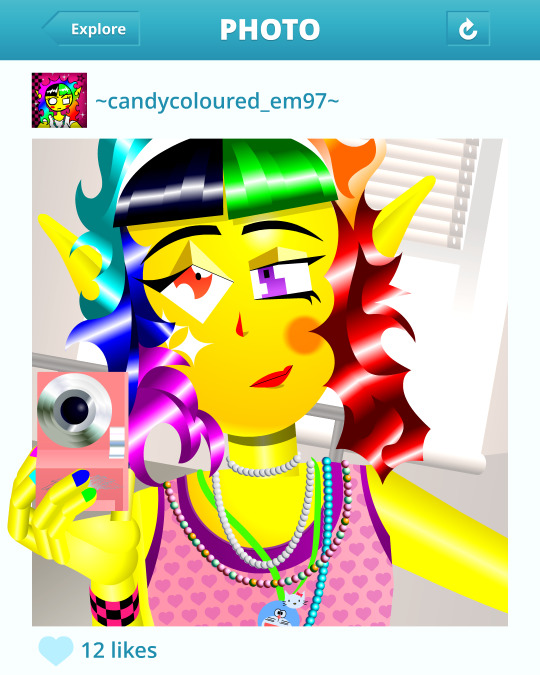
#bitmap effect
Explore tagged Tumblr posts
Visit Tumblr Blog
Explore Tumblr blogs with no restrictions, modern design and the best experience.
Last Seen Tumblr Blogs


Fun Fact
Tumblr.com is the 103rd most visited website in the world.
Text
Video about doing a collaborations or a future collaborations and bit about me as a graphic designer :)
Hit me up for some collabs
#graphic design#typography#video#adobe photoshop#adobe after effects#black and white#bitmap effect#design#visual design#graphic#freelance#music#bass
1 note
·
View note
Text
youtube
Red Panda Bitmap Pedal | Reverb Demo Video
love this pedal and how well the modeling experience is for its glitch effects.
the v2 version of this pedal is full stereo; i sent an email to them to find out if the v1/original is also full stereo, but i'm not holding my breath for good news there as it isn't mentioned in the user manual.
2 notes
·
View notes
Text
The CRPG Book: A Guide to Computer Role-Playing Games (Expanded Edition)
An exhaustive treatise on the genre, covering all the seminal games across a 40-year period.
Out now: https://www.bitmapbooks.com/collections/all-books/products/the-crpg-book-a-guide-to-computer-role-playing-games
#bitmapbooks #book #retrogaming #crpg #jrpg #rpg #masseffect
0 notes
Note
Can you share what your art-making process is? What software and tools do you use?? I'm falling in love with your work!!
Thank you, I'm so happy you like my work and are interested in the process. The short answer is I mostly use Adobe Animate.
I hate how I'm using an Adobe product (although I still regard it as a MacroMedia Flash product), but there's just no other software that compares to its jankiness. Perhaps it's just my long familiarity with the program, but nothing I've experienced matches how it simultaneously feels like drawing in MS Paint and using Microsoft PowerPoint vector shapes. The result is something that feels in-between the two; handmade yet computer-generated.
Typically, I'll start with a hand-drawn sketch, often beginning as a thumbnail done with pencil and paper.
I'll then do a mix of hand drawing and vector shape tool rendering. I use the Paint Brush tool to hand draw strokes, and the line and shape tools mixed with transform to make more geometrically accurate shapes. The design is rendered into divided closed loop shapes, ready to be filled with a solid. The strokes are kept or removed depending on the design.
These fill shapes are then either coloured and rendered in Adobe Animate, using fills, gradients, or a more complex process of masks and effects.
Alternatively, I'll bring all these vector shapes into Photoshop and use them as clipping masks. The vector shapes act like masking taped areas or shields to maintain sharp edges, while the brush is like an atomized airbrush used to build soft volumed forms.
Please excuse all that horrible Adobe Cloud and AI bloatware...
And there we go!
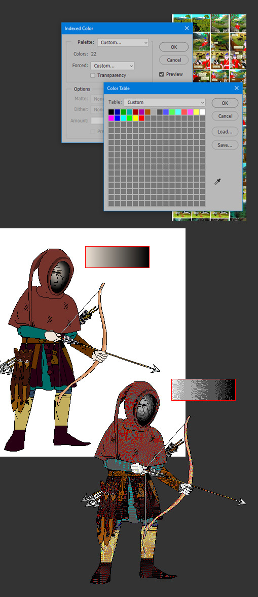
Variations in the process include just using MS Paint, index color in Photoshop, or 3D programs.
Very old works of mine were almost abstract, just exploring digital mark-making, which was a trend I was following in the mid 2010s that I loved. This kind of stuff.
While my current work uses its digital material specificity as an intermediary to the subject in the illustration.
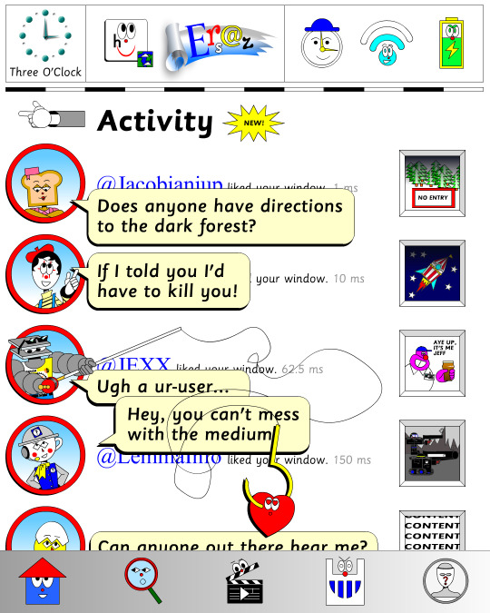
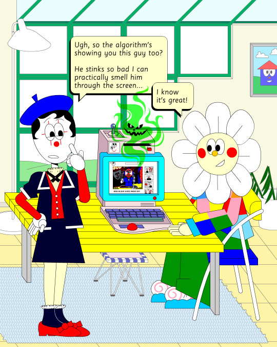
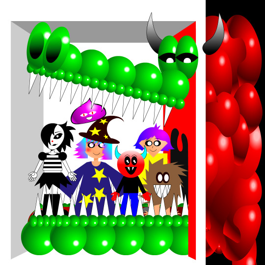
For example, #ersatz.world parodies clip-art and flash edutainment styles but imagines the characters living within that kind of world. The designs are meant to be cute, easy to read, light in computer processing, but also irreverent, janky, and generic too.
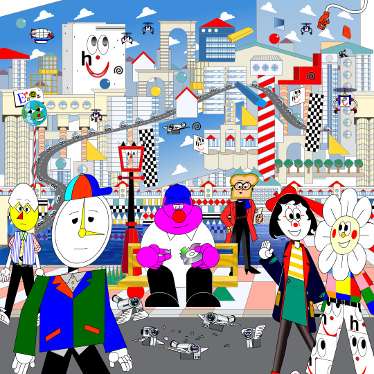
People typically regard this sort of clip art style as ephemeral trash, but I always found them charming. I use Ersatz World primarily as a satire vehicle, parodying educational formats to spoof corporate explainer content and digital media.
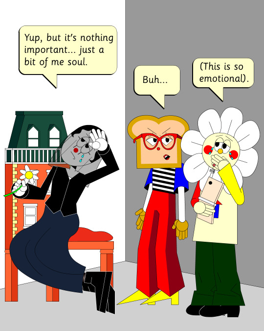
However, part of the problem with Ersatz is I've made it look too polished, complex, and I've grown too attached to the characters, which I imagine is a typical issue with overbuilding a world. So recently, I've made an even jankier Ersatz-like set of characters to play about with, using an even simpler style with less cohesion. I like to try and use slightly different styles and digital material styles to relate to the property at hand.
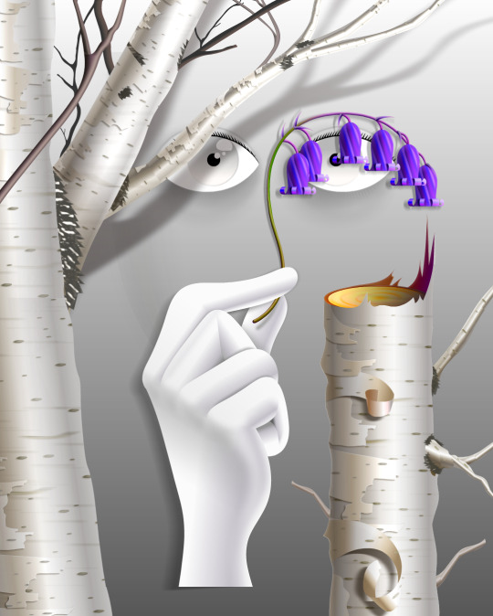
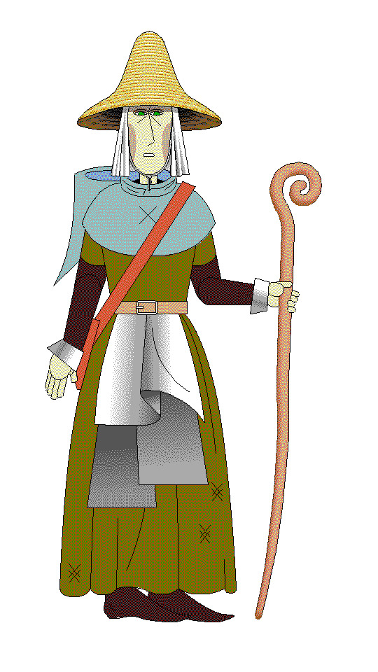
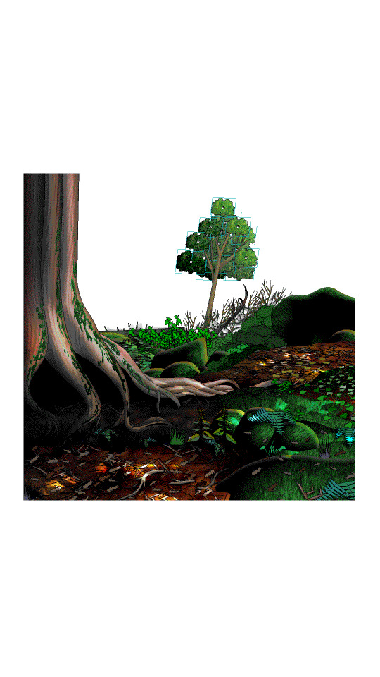
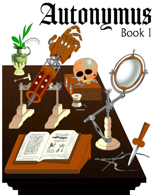
That’s why #autonymus has a bitmap digital material and a denser feel to it. Unlike Ersatz, Autonymus is not meant to be an overt semi-meta fiction. It’s not exactly pixel art, but the pixels are just about visible, as the intention is to create a digital expressionist depth to the setting. Although it’s still stylized and not realistic to our world, I definitely still want to evoke semblances of our world. That’s why there’s attention to landscape, plant life, and implied life beyond what you see in the frame with the characters, etc. But I'm still making a cartoon, and I still want it to feel at ease with itself being a digital material work. Characters are therefore flat, simple, stiff, and the speech style is like a bad Shakespeare parody. I like to balance between ugly and appealing, simple and complex, familiar and unfamiliar.
In regard to things like inspiration, references, and my relationship to aesthetic genres; these things certainly factor into my work, perhaps I'm even overtly dependent on them. My work can definitely be post-modernist in method; creating new, ironic, or fragmented interpretations through deconstructing a mix of various styles or methods. But at the same time, I'm still trying to make a digital gestural representation where the aesthetic is driven by my relationship to the software and techniques directly—not simply in an attempt to reference a style. For example, I like drawing lines in sweeping strokes, not to a point of geometric perfection, but just in a way where the curves are smooth and simple. But if I want perfectly curved or straight lines, I'll use the vector tools.
Working this way, you can sort of learn why certain styles and design choices in past vector aesthetics were made, as they would have also needed to make similar choices. That’s why I’m more mindful of using digital material specificity as a foundation to build narrative and subjects upon these days.
For example, genre references like cyberpunk clichés for #cyberhell or late medieval design for #autonymus or 2005 to 2015 era subculture fashion for #gradientgoblinz.
I think it’s important to take inspiration and reference from a wide variety of sources, but I think they’d mean nothing without having something to say or express. Autonymus, although it is a collection of tropes and clichés, isn’t just about that. It’s a story about the tensions of socially constructed systems and how that shapes faith, technology, and the natural world, or at least that's what I'm aiming for anyway.
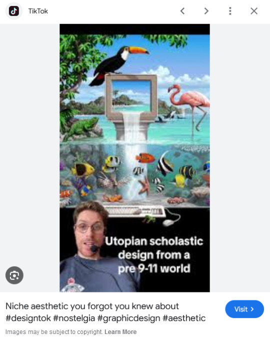
But despite all that, I think there’s a danger of locking myself into the past by using these methods. For example, using nostalgia and references to past aesthetics can result in just recreating the past in a form of role-play. To avoid that, I try and evoke the past through a messy, inaccurate pastiche rather than caring to accurately re-enact anything. I’m probably not always successful at communicating the deliberateness of this, and it can certainly get very frustrating and pedantic. To be honest, I do kind of hate aesthetic labels (terms like Y2K, global coffee house, utopian scholastic designs from a pre-9/11 world).
I do not believe that a project aimed solely at mapping history through aesthetic styles is worthwhile. Sure, they can be handy for organizing style trends, but they can also be reductive and ahistoric. Who are these people to define the history of these design eras? The result is a kind of suffocating simulation of design history but removed from context, perfect for moodboardism. I wish it felt more tongue-in-cheek, less absolute of itself in its own practice. Instead, it acts to legitimize and engender those making these labels, almost giving them ownership of the design styles. It’s similar to the logic and process of generative AI and its databases in a way, just done manually.
I’m very inspired by artists like Oneohtrix Point Never in this regard, as I think he’s able to create an aesthetic portal to all kinds of memories, feelings, and worlds reminiscent of the past, while still being in the present. It’s more a reflection of how timelines are messy now, like a memory or dream, rather than an audacity to say the past was actually like that, or to try to actually map some kind of timeline.
I think the benefit of this process is how it avoids the other side of the spectrum—being locked into chasing the cutting edge of digital processes. I don't necessarily think using an old digital process means your work inherits the semiotics of old aesthetics. Non-digital mediums don’t have this issue to this degree, as you can still paint in oils and be considered contemporary, or at least it's not frowned upon to such a degree. And I also don't think anyone in the heyday of Flash ever made work the same as I do, especially as computers are more powerful now so can handle more. I probably shouldn't boast too much about that though, as artists at the time probably just had more sense than to use Flash like a painting program! So then, why is my use of Adobe Animate critiqued as obsolete and an aesthetic dead-end? Because to whose standards is this process obsolete? If you value digital aesthetics as an apparatus in industry practice, then sure, my work is redundant.
But as wonderful as the latest tech can be in creating new aesthetics, I do feel it can be overtly dependent on the trends and directions of tech corporations, and therefore act as an indirect propaganda tool to their hegemony over digital aesthetics, such as the ever-demanding processing power needed for simulated realism. If anything, work that does follow in the direction of the latest tech trends is ironically the quickest to date once the trends move on.
I've noticed I've not really described what my work is about, just the process, in this text. But I don't know, maybe I like Flash because it is regarded as redundant. No one really cares about it, so I feel free to make whatever I want, and can decide on form myself, to my own standards, the quality of my work. As fun as making images is, I find it difficult to put into words what it is exactly I'm expressing in my work, and perhaps that would spoil it anyway.
221 notes
·
View notes
Text

⠁ ⠀⸻⠀BITMAP is a free bitmap photo effect made with adjustment layers, available on ko-fi for free. it requires basic knowledge about "pattern" adjustment layer.
⸻⠀TERMS OF USE
don’t repost nor reupload don't reuse my layers don't claim it as yours personal use only credits are MANDATORY
⸻⠀CONTENT
⠁ ⠀one photo effect.
⸻⠀A LATINO AMERICA
⠁ ⠀𝗚𝗥𝗔𝗧𝗨𝗜𝗧𝗢.
#♱﹔coloring#rp psd#psd#rp resources#coloring#psd download#psd coloring#roleplay#coloring psd#photoshop resources#character psd#psd for icons#psd moodboard#psd template#psds#roleplay psd#soft psd#icons with psd#filter#aesthetic#rp#twitter#twitter rp#discord rp#discord#rp help
101 notes
·
View notes
Text

if u set your average bitmap brush to Color Burn in the setting of its individual layer effect (for ex this is a soft edge pen) you can basically "paint" with minimal colors and mixing , to get that saturated edges of lines effect, if u want
22 notes
·
View notes
Note
Wait, how do you make brushes in medibang? I've used it for quite a while and couldn't really figure it out as it seemed to limit me to only making replicas of existing preset brushes.
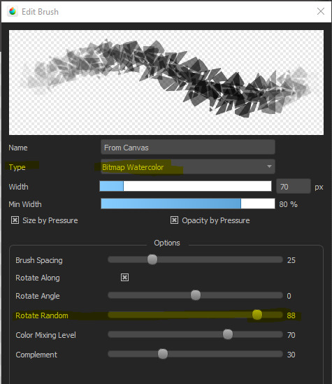
It's true that MediBang is not nearly as customizable with their brushes as, say, CSP, but you can do a lot by messing with the settings in the Add Brush or Edit Brush menu!
For example, this is a brush I created using a simple random shape, without adjusting the setting at all:


But if I set it to Watercolor Bitmap and adjust the Rotate Random setting, I can get a neat little scatter pattern going that's very edgy.
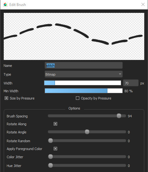
For example, I made this stitch pattern brush by messing with the brush spacing on a single line.
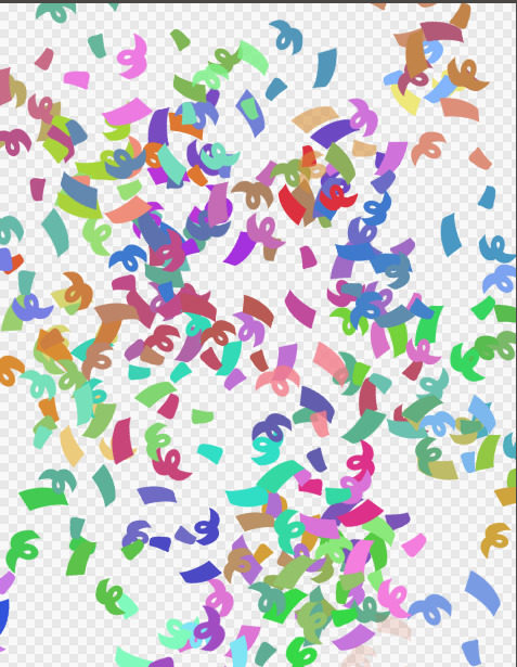
I also have a brush called CONFETTI which is just some swirls and lines with the Randomness turned up and the Color Jitter and Hue Jitter maxed out.

which, when used with a color setting, looks like this:
You can even do rain effects!
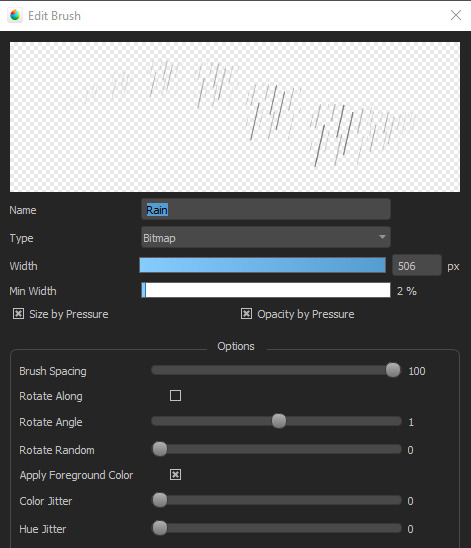
And this brush called Fuzzy, that I use for very fuzzy sweaters, started out as a single multi-pointed star.

And if you know how to do seamless patterns, you can also slap down patterns!
Anyway, MediBang is actually pretty great! It just takes a lot of trial and error to see what works.
371 notes
·
View notes
Text
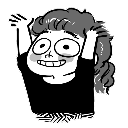
Pickaxe - Animation Commission for "Robot"
My Commissions are open here.| Scratch link | Youtube link
Do not use my animation or Robot's character for your own purposes.
This was a really fun character to draw!
Character belongs to "Robot" from another site. @savebatsfromscratchsavebats (me) for the animation. Scratch bitmap. Sound effect is a combination or a default scratch sound effect and me punching a couch.
4 notes
·
View notes
Note
hii, sorry to bother but i just got my first drawing pad and i wanna start drawing stuff, i wanted to ask what program and brushes you use, if that's not a problem :3
No biggie! I use Medibang Paint on my ipad, but they have a PC version too!!
As for brushes, I use the circled ones typically. I have many many maaaaany instances of Medibang's textured pencil brushes with various settings changed based on my mood.
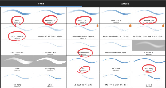
And for quality of life/effects I recommend these brushes:

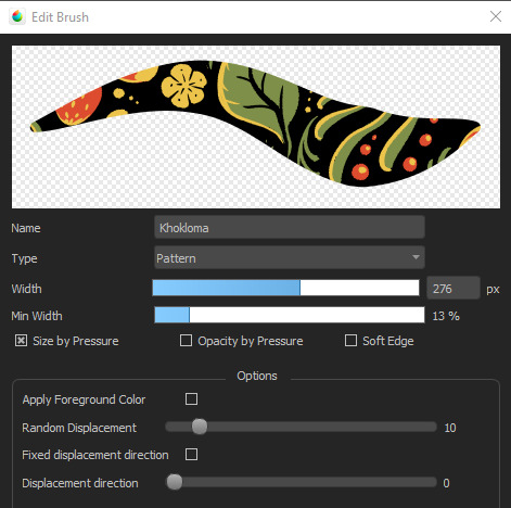
And once you're comfy playing with various brushes and their settings, I recommend making your own if you like textured brushes over the simple hard round pencil. To make your own, find the bitmap brush under the standard tab :)

Medibang has a great site with various tutorials, also! Maybe you'll find something useful there.
Here's also the things I usually nudge around when making a brush that feels good. But be sure to try all settings to see what they do and if they can be useful to you!

58 notes
·
View notes
Text
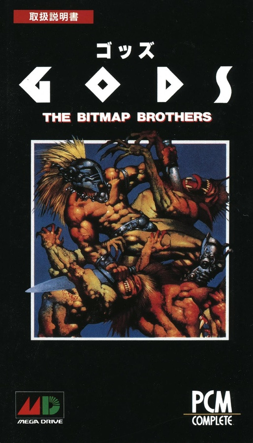
Sega Mega Drive - GODS
Title: GODS / ゴッズ
Developer: Renegade Software / The Bitmap Brothers / Graftgold
Publisher: PCM Complete
Release date: 26 March 1993
Catalogue No.: T-85013
Genre: 2D Action
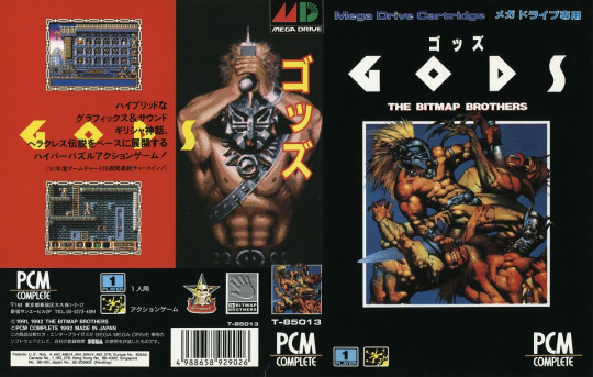
PCM Complete really need to be commended for bringing conversions of some of the Bitmap Brothers' finest Amiga games over to Japan. To my knowledge, only two of their games were given the PCM Complete label on the Mega Drive - this and Speedball 2 (though really Speedball 2 was primarily published by CRI). This is a nice-looking game and has the typical Bitmap Brothers style which is 80s sci-fi meets medieval; think Robocop meets Conan the Barbarian. While the Mega Drive version was the only version released in Japan, the Mega Drive version is also better looking than the SNES version, which has a zoomed in perspective and seems to run less smooth. The game is a puzzle platformer which was a rare thing then and it's still rare now. The puzzles are well implemented usually flick a switch and see what happens or collecting artifacts to open a locked door.
The in-game music while well composed sounds a bit tinny and grated on me after a while. I played it with the sounds off. This music does have its fans so I am putting it down to personal preference, you may like it you may not. However, the sound effects are almost iconic. The main character feels underpowered even with the best weapons and items in the game, the game will often spawn three enemies at you at once even on the early levels. This is a tough game I doubt anybody could complete it without losing a life, that said power-ups are plentiful and the enemies spawn in the same place every time making it a memory test and a bit easier than random enemy placement. The level design while OK for the time can be a bit confusing. For example, I spent 30 minutes trying to find a door which was on a top level.
Although an Amiga port (really, it was originally on the Atari ST), it translates really well to the Mega Drive. The graphics are smart. The game will probably take a first-time player four hours or more. The difficulty will put off some gamers, but I think this is a rewarding game, worth persevering with and it has the Bitmap Brothers magic. Playing as a muscular God character in a Roman Gladiator helmet is also pretty cool.
Now that got me thinking. PCM Complete was supposed to release the Mega Drive version of Xenon 2 Megablast (another Bitmap Brothers classic) over to Japan, but in the end, they only brought out the Game Boy version. PC-98 and Sharp X68000 versions exist but they are published by Epic/Sony Records. The Mega Drive version of Xenon 2 Megablast is a Europe exclusive and is region locked unfortunately so if you want to run it on a NTSC-US or NTSC-J system without region modding, tough luck.


youtube
4 notes
·
View notes
Text
I, a first-year computer science student, decided that for my object-oriented programming course (C++), I need to make a project that deals with quantum mechanics (a project is not mandatory for the course, btw). Since starting this project, I've been looking for ways to intuitively explain things like quantum superposition to both people who have and have not had the pleasure of living through a linear algebra course.
Recently, I came up with with an example, that I personally find cool and somewhat intuitive so I decided to share it here:
Imagine a pixel with the values RGB(128, 64, 192). This is just purple. We can now say that this pixel is in a superposition of red, green and blue. Now imagine that when we "observe" the pixel, it collapses into either red, green or blue. Due to blue having the highest value, the pixel will most likely collapse into it, but it's still possible to go for red or green.
I also made a python script that takes a bitmap image and performs this exact process and then outputs the resulting image. Additionally, there is a normalization step, because we can't directly convert RGB values into percentages. The code is available here, as well as a deeper explanation of the whole process and an example image.
Additional notes:
My whole knowledge of quantum mechanics consists of a month or two of YouTube research and procrastinating about reading an actual QM textbook, so errors are inevitable
This is effectively my first time touching python
mandatory "this is my first time posting on Tumblr, so apologies for any potential violations of etiquette"
2 notes
·
View notes
Text
youtube
Did You Know Red Panda Bitmap Could Do This?
this is an excellent demo video for the red panda bitmap (v2), showing off its wide range of other effects beyond glitch/bitcrushing. some of the distortion effects have a nice audio patina that i am not sure is easy to reproduce.
0 notes
Text
Mass effect 3!
Featured in our book - The CRPG Book: A Guide to Computer Role-Playing Games (Expanded Edition) - Coming Soon 📚
More than 500 pages long, this lavish hardback is a compete history of the computer role-playing scene from 1975 to 2015.
Sign up for a handy email reminder: https://www.bitmapbooks.com/collections/all-books/products/the-crpg-book-a-guide-to-computer-role-playing-games
#bitmapbooks #book #retrogaming #retrogames #gaming #art #reading #foryou #crpg #jrpg #rpg #bookstagram #booktok #fyp #masseffect3
1 note
·
View note
Text
8 Best Logo Design tips/techniques
Logo design plays a vital role for any brand or company to make or break its business of a company can make or break its business vision. A well-designed logo can establish a new brand and also help a running organization to build rapport with the customers. Other than an imperfectly created logo fails to communicate a brand nature and ultimately harms business.

Avoid using multiple colors use a maximum of 3 Colors
A Logo should always neat and clean as it’s not only a piece of design it is also a brand communicator for the entire media. Using more color can distract your user’s interest also it’s very hard to create its chemistry with other media like printing and web display. Using less color will make your logo more prominent.
Use simple and avoid sharp edges / cursive fonts’ type
Uses of your logo can be in any size from bigger in hoarding to smaller in Ads, especially for the newspaper ads. Sharp edges font type can decrease the visibility of your brand also we shouldn’t use more than 2 font’s type.
Compatible with Black & White Background
Always create a reverse type of your logo (white on black & black on white). It’s better if the colors and font type we use should be in contrast on white & black background. If your logo suffices the given purpose it’s a well created Logo Design.

Stick to two-dimensional design
Your logo can either be two or three dimensional. But it’s recommended creating 2D Logo for beginner always. First, it’s easy to conceptualize if compared with 3D design. Also, it helps us to understand the process of logo designing.
Create a vector logo
The logo should always be in vector format as we discussed earlier that the uses of your logo can be anywhere right from giant size hoarding to a one columns newspaper ad. The best part of vector design is that most of the beginners wouldn’t aware as it doesn’t have a size limitation, means its pixels would not affect if we increase or decrease its size at any level. It will not affect its pixels. Other than bitmap format has a limited size. We will have in length discussion on Vector and raster Graphics in our future topics.

Avoid using shadow, bevel, gradient, or emboss techniques
There are N numbers of techniques which can make our design more beautiful and attractive but it’s hard or sometimes impossible to reproduce it on a various medias like screen printing, foil stamp printing & embroidery as it is unable to support gradient& shadow. Even the premium signages like ACP board doesn’t support it. The only process which supports all kinds of colors and effects is Digital printing but it has its own limitation.
Avoid using photos
As we already discussed the bitmap/ raster images for its limited resolution and photos supports the same format, so we should do avoid using photos in Logo Design. Also, it doesn’t reproduce well in many media like hoarding, many parts of sublimation/heat transfer printing, embroidery for T-shirts, etc.
Best Software for Logo Designing
There are many free tools online and offline to create Logo of your choice. You can take help of them to create some basic designs. But it all has some restricted features which won’t allow you to do experimental design. We Designs recommend Corel Draw (any version) and Adobe Illustrator (any version) as the best vector Logo Designing tool which is capable enough to suffice your entire designing requirement.
3 notes
·
View notes
Text
Capturing the ambience of Mr. & Mrs. Potato Head Go On Vacation
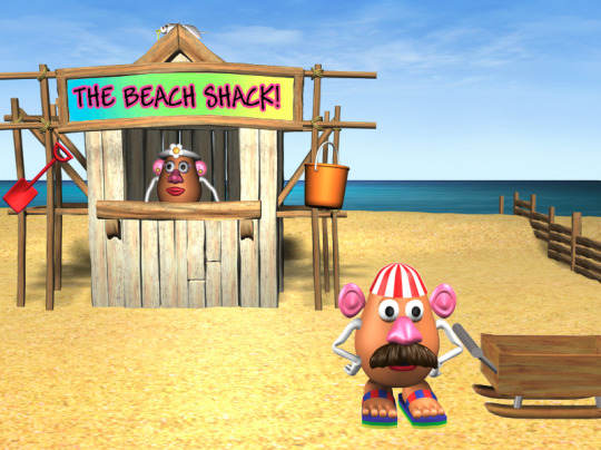
Running the game
I had a lot of trouble with this. I tried a Windows 95 and Windows XP virtual machine. Often the game's installer would fail, or it would crash at runtime due to a scripting error. I finally got it to run via a Windows 95 VM inside PCem.
Extracting sounds
Certain sound effect and voice files are located inside the relevant subdirectories of potato\data\audio. You can check the install directory if you performed a full install, or simply check for the files on-disk.
Remaining assets can be extracted from relevant DXR files using a tool like Director Cast Ripper.

Capturing environments
The majority of the game's assets are contained inside its DXR Macromedia Shockwave files. You can convert these to DIR with a decompiler. From there, you can read the DIR files inside Director. Open the desired DIR file, open the Stage window, and click play.
Exporting to AVI via Director
I couldn't get this working for Potato since it seems to use frames in a non-linear way. For example, frame 11 on the Australia level seems to be used for the idle state. I tried editing the per-level scripts to change how looping works, but gave up.

Removing UI
To remove these graphics we can simply edit or remove the relevant sprites via Director.
Capturing Spain
The scripting to control this level's scenery is amazingly complex. There are about 20 unique state values for blending between two background bitmaps to simulate various times of day. At certain points, the level's background sounds switch over to go along with this.
3 notes
·
View notes
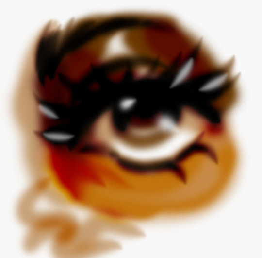
Text
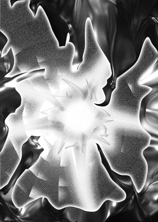
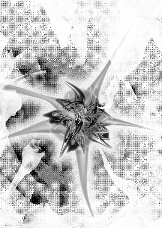
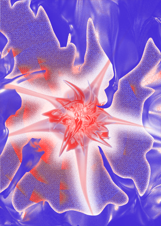
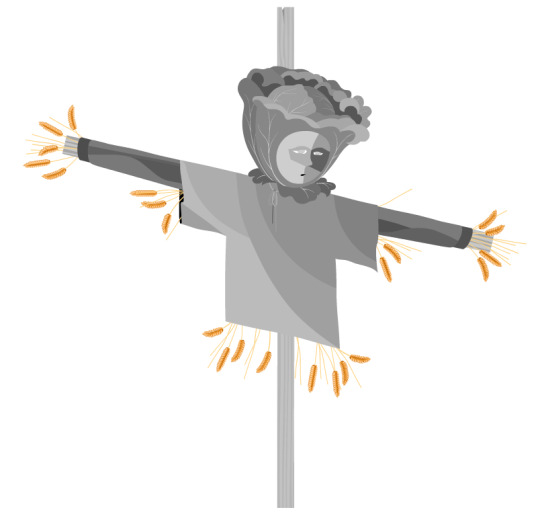
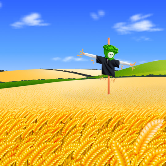
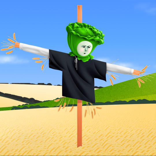
Blue and red layers for a riso print in a collaborative zine we made in 2021 Black and white 3d looks pretty great with some bitmap effects - especially with risograph printing!
5 notes
·
View notes