#blue and orange: opposite but complementary colours
Text


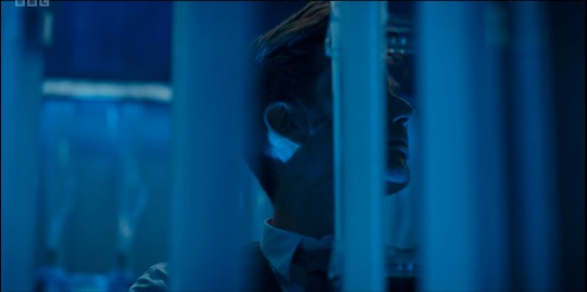
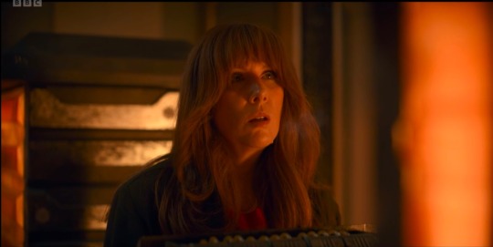


wild blue & orange yonder
#okay but the use of colour in this episode was so satisfying#blue and orange: opposite but complementary colours#just like the Doctor and Donna#perfect for an episode all about them getting to know eachother again after being apart for so long and finding how they still fit together#even though they’ve both been through a lot and changed#they still know and love eachother in all the ways that matter#also side note the concept of blue and orange morality fits the no-things to a t#is this…colour theory?#i have no regrets#wild blue yonder sploilers#dw spoilers#dw#dw 60th spoilers#dw 60th#doctordonna#doctor donna#tennant and tate#wild blue yonder
72 notes
·
View notes
Text
OMORI and colour- an analysis
hey, so this is a post I’ve been wanting to make for a while and never got round to doing, but here I am.
Something I noticed in OMORI and have continued to notice throughout the game is the symbolism between colours and characters, and what they say about their relationships or their mannerisms, because there’s actually a LOT there, more than I expected.
keep in mind this is a pretty basic analysis and I’m sure there’s much more to be discovered, but I haven’t fully learned everything there is to know about colour theory and so this isn’t really my field of knowledge, I just wanted to share my findings.
also, spoilers ahead, so beware!
Filling in the wheel
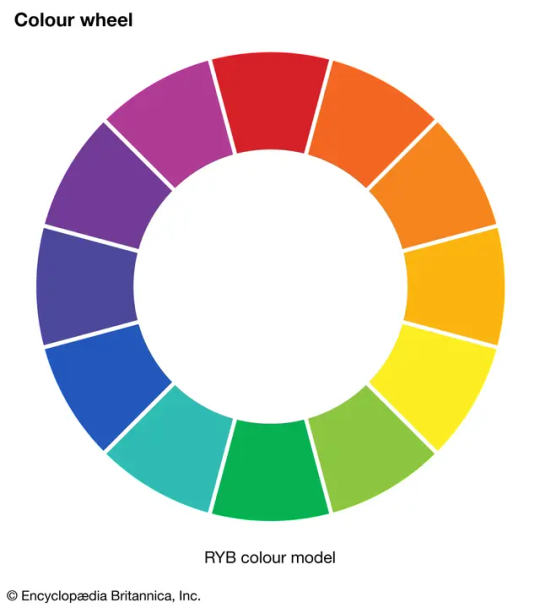
This is a basic colour wheel, and the model I will be referring to throughout this analysis.
in OMORI, and even in external items outside of the game like merchandise each of the main cast are associated with a specific colour.
for example, SUNNY is associated commonly with yellow throughout the game. Here’s a small chart I made to keep track of my references…
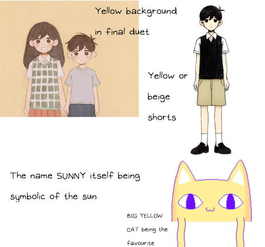
I’m sure there’s more but here’s what I’ve got.
so now we know where sunny stands on the colour wheel, in the yellow region.
the rest of the cast can be easily identified on the wheel- KEL clearly falls into orange, HERO clearly falls into blue, MARI clearly falls into purple, BASIL clearly falls into green and AUBREY clearly falls into pink.
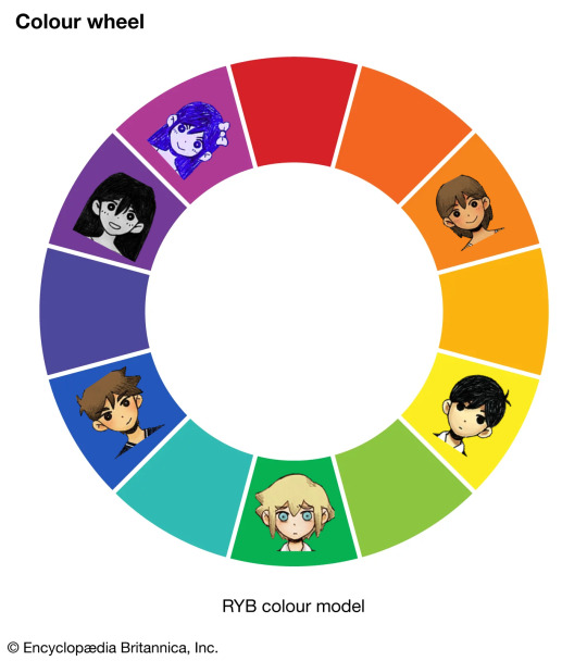
But wait, that’s not the complete wheel.
you’ll notice AUBREY’s positioning differs from the rest of the group, and that’s because I’ve specifically put HEADSPACE AUBREY in that section. Where REAL WORLD AUBREY actually falls is on the red segment of the wheel as that colour is better associated with her emotional state and also slots her better into place on the wheel.

So that means the rest of these midtones represent the rest of the HEADSPACE counterparts, right?
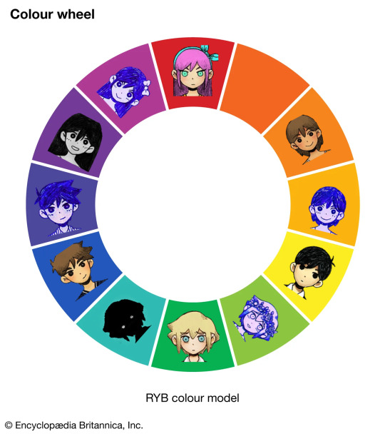
You’ll notice one more blank space, but let’s put that one aside for now. We’ll fill it in later. For now let’s begin to focus on the relationships between these segments on the wheel.
Complementary colours
Complementary colours are defined as “pairs of colours which, when combined or mixed, cancel each other out (lose hue) by producing a grayscale color like white or black. When placed next to each other, they create the strongest contrast for those two colors. Complementary colours may also be called "opposite colours"”.
in other words, these colours complement each other, and are paired together as they are the most striking next to one another. They are opposites, but belong together.
so, who do we have complementing on our OMORI wheel?
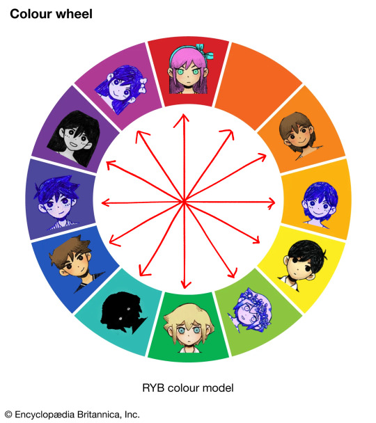
Now, this is quite complicated to look at but I’m going to use what I think is probably the most important relationship in the game and use it as an example.
MARI is commonly associated with purple throughout the game, so much so that it’s constantly in our faces. The main colour for SUNNY’s headspace where he escapes the tragedy of what happened to her is purple, AUBREY laments about a lost promise of dying their hair purple and pink together, MARI gets a grape flavoured (purple) popsicle in one of the photos in BASIL’s album, etc. she’s very clearly shown to be “purple”symbolically throughout the game, no question there.
and as for SUNNY, as we’ve gone over earlier, he is represented by yellow.
so when we reference our colour wheel once having placed these two in their respective spots, what do we see?
MARI and SUNNY complement one another.
And we see this consistently for other key or contrasting relationships through the game. HERO and KEL complement both in the REAL WORLD and HEADSPACE, and so do AUBREY AND BASIL.
They are shown to complement each other, when placed with their associated colours on the wheel.
so, what about STRANGER? Who does he complement with? After all the segment opposing him is empty.
I feel as though there’s only one answer which makes sense for the game.
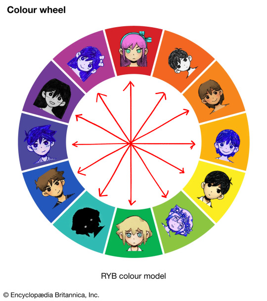
OMORI complements STRANGER and STRANGER complements OMORI.
but, for OMORI, this seems out of character. The character itself is typically associated with black to represent the repression of the truth and also the darkness behind his actions to keep SUNNY guarded from the truth, so this warm colour feels out of place.
but looking deeper into the symbolism, I disagree. Orange itself represents liveliness, optimism, and enthusiasm, which I think represents HEADSPACE. However red, while associated with anger for AUBREY, is more commonly associated with danger and most importantly sacrifice.
As well as this, this specific hue shows to carry more of a red pigment than an orange.
so I believe this can represent this distracting and overwhelming joy of HEADSPACE whilst having great sinister undertones just Millimeters beneath the surface, something very fitting for OMORI as he’s portrayed in the game. (Side note: I don’t think OMORI is evil, by the way. I’m talking about his actions and portrayal in contrast to HEADSPACE, nor his intentions. I view OMORI more as a robotic kind of character than anything but that’s an analysis for another day.)
so, in conclusion, there’s a lot to be told from this wheel. Here’s a finished polished version for anyone who wants to use it, including some extra notes I didn’t discuss here. If there is anything at all you want me to elaborate on or go more in depth into, or just neglected to discuss at all, please let me know! Thank you for reading!

(PS also open for criticism on the wheel- especially if you know more about colour theory than me! I don’t go into much detail about what each colour association represents within the characters themselves here so that may be for another post)
#omori#omori analysis#omori mari#omori sunny#omori basil#omori hero#omori kel#omori aubrey#omori game#colour theory#omori stranger#omori character
96 notes
·
View notes
Text
Since my brain won't shut up about Hunter and also opposite colours on the colour wheel..
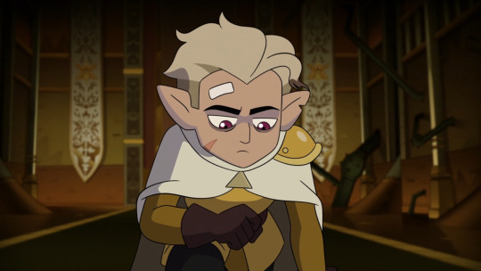
Allow me to ramble a bit about three pairs of complementary colours, used as lighting in Hunter's character arc to reflect the significance of what's going on and to reflect his internal state:
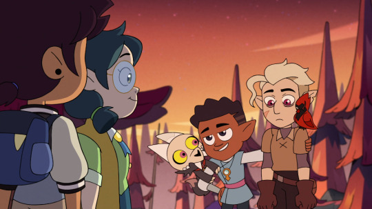
Orange and blue:
I noticed that orange - a really warm colour - is when he is the safest and happiest.
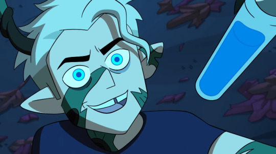
Blue seems to imply great danger, since it's also Belos's monster glow colour.
Orange is alluded to at the end of Hunting Palismen but starts to come into the picture for him in Clouds On The Horizon, and is contrasted with the medium blue in Eclipse Lake, vivid blue in Labyrinth Runners and dark blue in King's Tide:
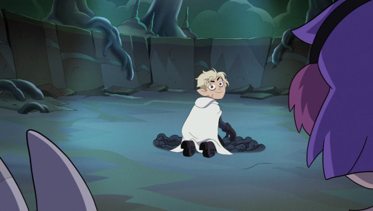
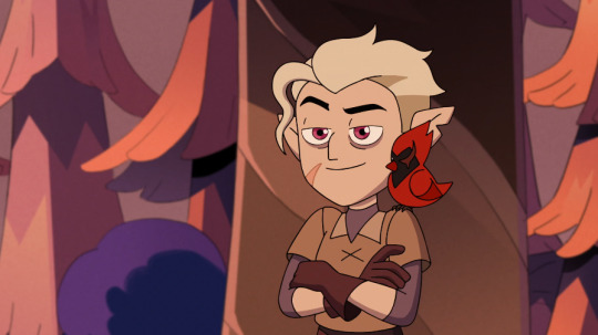


The most vivid orange shade was when Luz told him "You're family now", versus the vivid bright blue right after he got possessed and had the absolute worst night in his life:

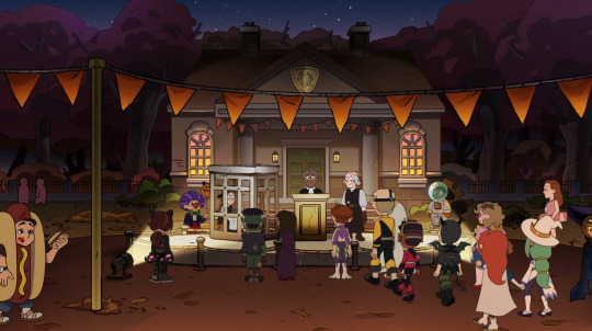
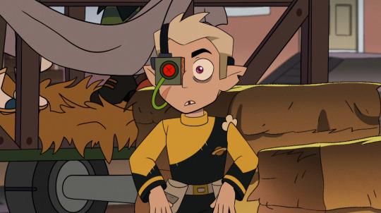
The Noceda house basement where he and Gus stayed was mostly orange. The Halloween Festival scene showed both colours, showing the transition from safety to danger:


Red and green:
Flapjack was a vivid red colour, and the artificial magic used by Hunter and Belos was the same shade.
Belos's goop colour is a sickly dark green shade.
Something tells me that red points to Belos's portrayal of strength on the outside and his agenda as Emperor, since the most striking red lighting we see in the show is related to the Day of Unity. (Whereas blue might point to his chaotic internal state that unravels especially in King's Tide and the final act of Thanks to Them).
It's interesting that Hunter has red lighting behind him, holding Flapjack in staff form as support, during the first time he stands up to Belos:
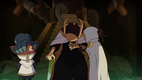
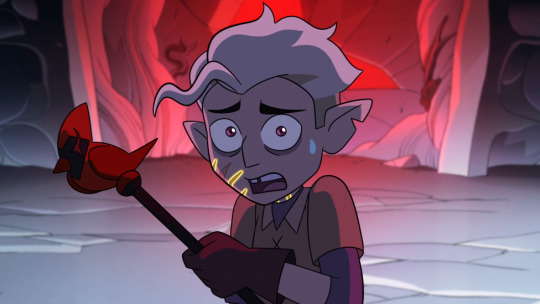
Hunter witnesses Belos's 'death' in the frame with the most striking red, contrasted with his dread that Belos was in fact alive in the following episode:
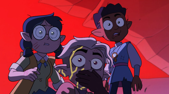
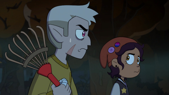
But what stood out to me when he was so caring towards Willow in the most recent For the Future, was that the lighting was also dark green:

Maybe I'm reading too much into it but it's a really interesting colour choice for an overlap between Willow (whose theme colour is obviously green) at her lowest point and Hunter being in such a painful vulnerable place himself, to be able to connect with her from the emotional place of releasing some of his own immense traumatic grief.
Compare this point in his development where he has beautiful moments of vulnerability, to way back in Hollow Mind when we are faced with the big reveal and he's surrounded by red artificial magic as his world truly started to fall apart:
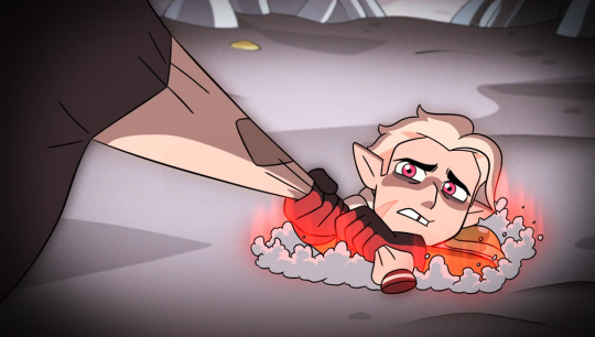
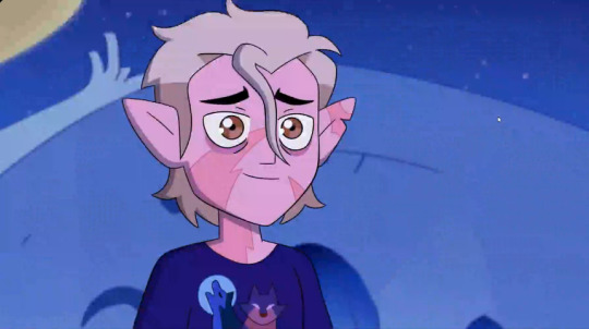
Finally there's the combination I have saved for last, yellow and purple, comparing Hunting Palismen and For the Future:
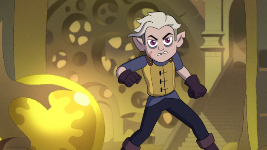

If you notice, a prominent portion of Hunting Palismen had yellow backgrounds and lighting (the location being Latissa), and clearly he was the character who stood out the most in that episode, being unmasked and all that.
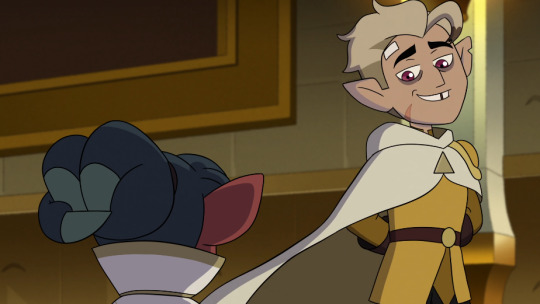
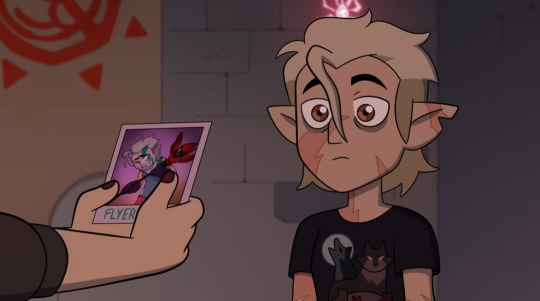
Whereas For the Future showed a good deal of purple in the Boiling Isles - including what I think is a muted purple in the photo classroom of Hexside - since it is Luz's theme colour and was building up towards Luz gaining her staff and Stringbean hatching.

It's also interesting that 1) in Hunting Palismen, Luz had the major struggle of not pairing up with any palisman but goes through the challenge of rescuing the palismen that are taken by Hunter, and she ends up getting to know him.
But 2) in For The Future, Hunter suffers from major grief after losing his palisman, and faces the challenge of accepting the loss while Luz gains her palisman:
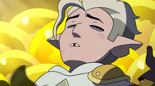
In For the Future, there is this short scene where the lighting harks back to Flapjack fading away:

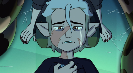
Some scenes with very low saturation of colour, but very light or very dark value, also marked significant turning points in his arc:
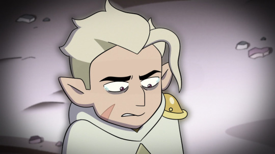
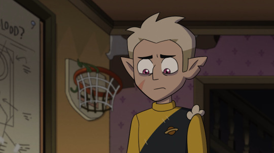
For obvious reasons, the lighting is neutral and not striking in more light-hearted scenes (though the first half of Labyrinth Runners is a bit of an exception here), such as the flyer derby scene in Any Sport In A Storm, or the thrift store scene in Thanks to Them.
How I wish I could've sat in the pre-production and production team meetings where these lighting-related decisions were made. Let's see what will happen in Watching and Dreaming!
#toh hunter#the owl house#toh analysis#hunting palismen#eclipse lake#hollow mind#labyrinth runners#clouds on the horizon#king's tide#thanks to them#for the future#loz writes a meta
346 notes
·
View notes
Text
Costume meta 6x14
Its like one extreme to the other with costumes from week to week on this show!! Last week I had so many to talk about and somehow managed to sneak 42 pictures into my meta. This week however, everyone was mostly hanging out in uniform so I have far fewer costume to talk about (but probably just as many words to say knowing me!!!)
So theres no Buck or Bobby this week as we don’t see either of them out of uniform, but I am going to talk about some background characters because they’re relevant in relation to costumes being worn by out mains!
As always the reest is under the cut to save your dash!
The Buckley-Han’s
Starting with Jee in her light teal top with a rainbow on. Like i’ve said a million times before the imagery they use on the kids clothing is very intentional and always says something about the scene/arc. The rainbow on Jee’s top is telling us that the Buckley-Han’s are in harmony (and not just with the singing) - that rainbows come after the rain - its signalling they are in a good place and are connected. they are a sign of new beginnings and hope. But it also takes both rain and sun to make a rainbow, so its a reminder that the rough times are a part ofwhat got them to the good times they’re now in.
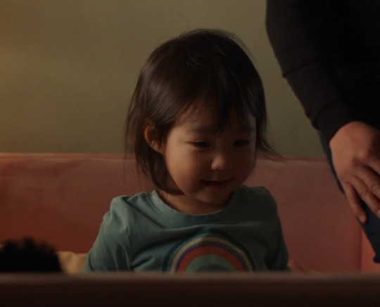
Maddie is wearing a black top

and so is Chimney.

I’m pretty sure this is the first time we’ve seen them wearing the same colour at the same time. its showing us they’re in balance - that they are strong (black is a colour of strength), it is also a colour of security and protection - after last week, we see that they (and Jee by virtue of being in-between them) are feeling secure and protected in their family. I do also think there is a bit of foreshadowing going on here as well - for Death and taxes - Black can be a colour of mourning and I think that we might be about to mourn the loss of this innocent time. How that plays out remains to be seen, but this moment captures the moment before things change for Madney.
The Wilsons & Athena
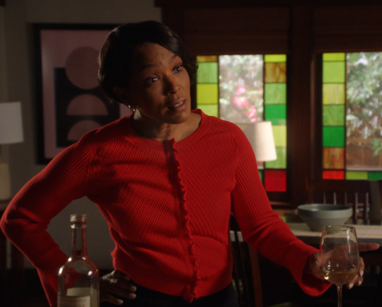
Here we have Hen in an acid yellow top with orange and blue sections that also have some purple in them. Blue and orange are complementary colours, as are yellow and purple. complementary colours create the strongest contrast - making each other appear more intense, but they also cancel each other out if mixed together - creating black or white. This gives us a hint of where Hen is mentally - especially in relation to Nathaniel. They sit at opposite sides of the parenting spectrum - established and legal and unestablished and technically with no legal rights. the fact that we have hen in a black tee underneath and later see Denny in black establishes the idea of the complementary colours mixing together and creating black - it is suggesting that the issues will be ironed out and that Denny will remain at the centre of any decisions Hen (and Karen) make. Its just an indicatior of good parenting by them and I love that
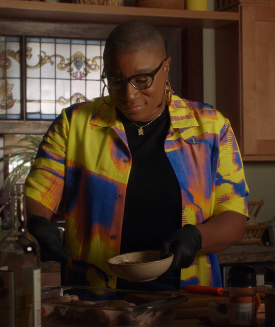
Athena in red - the colour of passion and intensity. interestingly she also sits in the colour wheel with Hen - just without the opposition of a complementary colour. So Hen is the yellow and blue aspects of the colour wheel while Athena is red - thats all three primary colours in one scene and with the green behind her in the glass (red’s complementary colour) making all three of the secondary colours present as well. This is all about creating harmony - that goes for Hen and her family as well as Athena and hers.
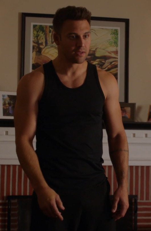
Denny in black...

with Hen in this blue and green shirt.

remind you of another parent child combination at all????

yeah - they are gong hard with the parallels - very very hard. The choices here place Hen in a similar situation to Chris and Denny in the same place as Eddie and the two scenes have similar over arching themes. Themes of children seeking some independence from parents, but also the establishment of new boundaries and it is about the loss and reforming of trust. We see Chris continuing to keep doing the sneaky things he’s been doing - making it clear that he want’s to do things his way and that (to a certain extent) Eddie is going to have to be the one to fall into line here - That it was Eddie who was being too rigid in his behaviour/ way of parenting Chris. Hen is similar to Chris - in that she is going to do things her way when it comes to Nathaniel - she isn’t going to pander to him and she is going ensure that both Nathaniel and Denny fall into line. This is about her setting a clear boundary - especially in light of Nathaniels behaviour (as the adult who should’ve known better) with both of them.
We see Eddie come round to Christophers way of thinking - understanding that Chris wasn’t acting out of character because he’s going to become a troublesome kid/teen, but it was out of a genuine desire to want to start to have some independence. Denny is in a similar situation - realising that his expectations are un reasonable - that Hens (and Karens) boundaries are reasonable (like Chris’s were with Eddie) and therefore he will have to adjust to them.
The Diaz’s (and co!)
Okay so I don’t normally comment on the decor in the houses in costume metas, but I actually think the choices made in the decoration of Tia Pepa’s house was very important and intentional so we’re gonna have a little look at it.
There is just so so much blue going on! In a season where the blue and green theming has been very noticeable and especially in connection with Eddie and Buck. To choose to have so much blue present in a scene with Eddie wearing green - when Eddie is being set up - is very literally meant to ensure we’re subconsciously making connections with Buck - the choice to have him in so much blue, especially paler blues this season has always been deliberate and now we’re seeing pay off for it beyond just what the blue can tell us as a colour - its so loud I’ve gone deaf!!

Tia Pepa’s family portrait on the wall - looming behind her right shoulder is also very loud - its presence - the presence of extended family, it as important as Pepa and Eddie in this scene. Pictures/ portraits etc are not something i tend to focus on, but all burgundy and black of their outfits is telling a very loud story - especially in combination with Eddies and Pepa’s later outfits. Its also worth pointing out the olive tree in the background - the symbol of peace and friendship! The family in burgundy is sowing us unity - Eddies later date outfit being the same colour way also envelops him in the family fold.
Pepa’s own outfit, includes burgundy, but also the yellow of communication and the calmness of beige. its about establishing her as both the voice of reason and the communicator of important information!

Sorry Eddies face in the above pic gets me every time I see it 😂
Eddie himself is wearing his trademark black and army green. his wearing it here is a symbol of his being ambushed and signifies him feeling at war - with himself and with his family wants. We’ve actually been seeing Eddie in less khaki green this season than previously, so its use now is more impactful - Eddie has been feeling less and less at war - with himself, with life etc. Now we’re seeing the use of this green in moments that appear to be playing a part in his moments of panic or repression. The brighter more sagey green from last episode is a clear contrast to this - more yellowy its a warmer colour while this one is more aggressive. I wrote in more detail about Eddies khaki jackets here 6x04

Vanessa’s introduction is a pretty loud and telling one - it combines nicely with all the blue in Pepa’s home and only serves to remind us of a certain firefighter who is wearing A LOT of blue this season. In an episode where we don’t see Buck out of uniform this choice is even louder - it puts Vanessa directly into the shoes of Buck - so that the green and blue theme continues its presence and continues as a connection between them specifically - I talk about it later on, but there are some very intentional thngs being done with costumes as a way of connecting Buck to Eddiee - 6a was about establishing a theme and 6b is about using that establishment to further the agenda. we are very much meant to recognise the link to Buck and therefore recognise his absence - in the same way Eddie was absent from the coma dream - they are very much playing on the absence of things being louder than their presence and the presence of other things in the same colour being a reminder of that absence.
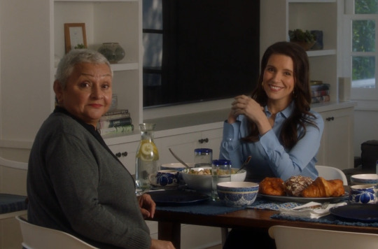
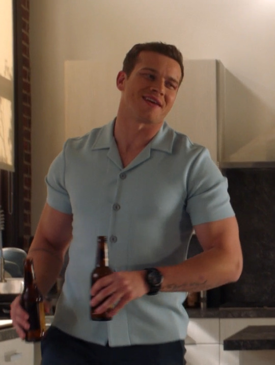
Vanessas not date night outfit is super interesting now I’ve managed to get a good look at it! The bouquet of flowers on the front of the dress (not her impressive cleavage but feel free to look if you want 😂) has me feeling a lot of feelings about the insanity of the costume department and the lengths they go to to tell a story! So the bouquet is made up of wild flowers and grasses. They are cow parsley, poppies, daisies and the grass itself.
Grass in bouquets is symbolic of growth, health and abundance, the fact we have grass heads - with seeds on is also relevant - its about germination and new beginnings.
Daisies are a symbol of new beginnings and innocence (but even that connection with innocence stems from death - Celtic legend has it that when a child died, God would sprinkle daisies over the grave as a way of bringing comfort to the family. Medicinally they are used in the soothing of coughs, colds and breathing difficulties.
Poppies are very heavily associated with sleep and death - it is why they have become a symbol of armistice and peace after war. All of this is relevant to Eddie as a character - a man who has fought a war in the literal sense, but also one who has been fighting a war internally - repression is an active form of fighting agains ones self - against ones truth - it is also connected to sleep - repressing something is suggestive of it lying dormant or asleep - waiting to be woken up. this types in with the Hollywood meaning of the poppy - forever connected with the wizard of Oz - a story very literally about a coma dream (and one the show has referenced before with the lady in the earthquake hotel - with her red shoes and paisley the dog!
The cow parsley is very interesting - there are two meanings at play with it - firstly cow parsley is said to represent sanctuary and refuge - due to the fact it was commonly grown in monastery herb gardens - and its use was for the treatment of breathing difficulties (panic attack reference anyone?!!). then there is the greek myth connection, it is associated with Archemorus - the herald of death - the translation literally means the beginning of doom and that feels like a sign regarding Eddies future relationships with women. At this point Vanessa is the manifestation of Eddie dating women - past, present and possibly future is going and the dress is just helping the story along. Eddie is growing and learning and figuring out that women are not his future - that path only leads to doom!

Eddies not date outfit is doing some heavy lifting - it’s emphasising the tie into family - linking his tias family with his own, Eddie being dressed in the same colour ways as the family portrait tells us that he is here on this ‘date’ as a ‘duty’ to family, he’s not here from his own free will. Of course there is also the connection to Buck from last episode - at the poker game. I’m truly fascinated by this choice because there is the obvious parallel of Buck thinking he was on a date only to find out that he wasn’t in the same way that Eddie here thinks he’s on a date (even if he intends to let her down) only to find that he isn’t isn’t. But there is also another interesting theme at play here, I’ve already said how Eddies suit matching Pepa and her family’s portrait outfits is symbolic of family ties, well that theme therefore also applies to Buck - that he is family, because if it only referred to one of the two themes then it would’ve been easy to make use of a different colour for one o the themes so that only the one connection was made - if it was only about dates not being dates then you change the colour choices for Pepa and her family, or if its about family then you change the colour of Bucks suit. What this does is strengthen the idea that Buck is family, but not just to Eddie (and Chris), but also to Tia Pepa and her family, its perhaps a hint at the familial connection going deeper that we’ve been presented in canon thus far.

Tia Pepa’s last outfit only further strengthens the arguement about both metaphors/themes being at play. the entire conversation centres around her previous failed relationship and getting back out there, we get a link to work colleagues as well. but Tia Pepa is happily married to her second husband Tio Paco - who is dressed in the same colour way in the portrait - making the suggestion that the answer for Eddie is in someone we’ve seen wearing the same colour way as him *cough* Buck *cough*
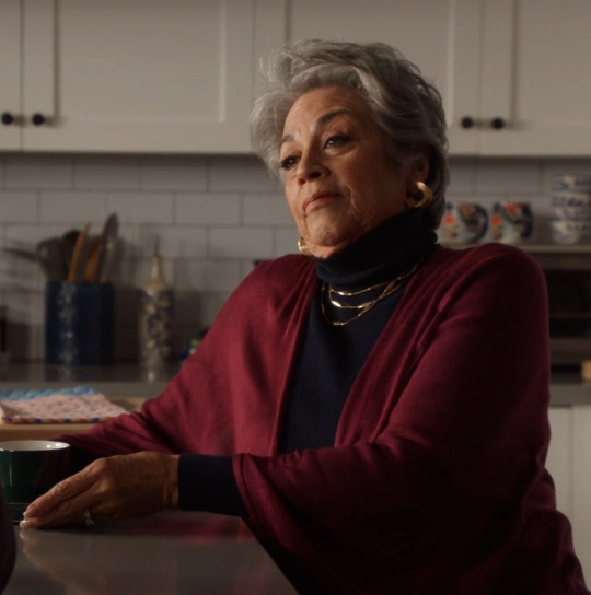
Ok last costume - Eddies dark grey denim shirt. So Eddie wears denim shirts at key moments with family - 2x04 visiting Abuela in hospital, 2x07 when he reconnects with Shannon so he can get Chris into Durrand, 3x03 dropping Chris off with Buck post tsunami, 3x15 in flashback when he decided to move to LA with Chris, 4x08 when he introduces Ana to Chris as his girlfriend 6x11 when they visit Buck in hospital and now this one. This one is a bit different to all of his other ones though as its not a western style shirt, but that in and of itself tells its own story. All the shirts are connected to family - but that comes with the proviso of it being about whichever member of family is also involved in the scene and not for Eddie himself- usually Christopher! So Eddie reconnecting with Shannon is about Chris, introducing Ana (and the conversation with Carla about following his heart not Christophers) - about Chris, dropping Chris of at Bucks post tsunami - about Chris and Buck (its bringing him into the fold of family) etc etc. This new shirt - the non western one, is Eddie recognising and accepting something for himself - this is not about Chris or any other member of his family, this is solely about Eddie himself and that ties in very nicely with the journey we’ve seen Eddie on since his breakdown in 5b. For me it is a marker of Eddie actually starting to focus on his own feelings rather than Christopher (or anyone else’s).

Thank you as always for reading - it really does mean the world to me that you're interested in the costuming of our wee woo show and I love reading your thoughts in the tags and notes!!! I’ll shut up now and let you have your lives back.
As always, tag list below! Until the next episode! 💜💜💜
@mistmarauder @theladyyavilee @loveyourownsmiilee @leothil @girldadbuddie @kitkatpancakestack @buckscurls @lemotmo @trashendence @elishareads @clipboardsandstethoscopes @comfortbuddie @fiona-fififi @callanee @calyssmarviss @pbandjeremiah @batgrldes @spotsandsocks @livingwherethesidewalkends @idontshitpostbuttheolympicpark @diazboysbuckley @sweettsubaki @shortsighted-owl @sherlocking-out-loud @dickley-buddie @favouritealias @hearteyesdiaz @ktinastrikesback @princesschez75 @bucksbuddie @oneawkwardcookie @leatherati @moniquekatie @wanderingwomanwondering @trickster-archangel @outrunningthedark @asharadaine @ajunerose @talespinner230 @pop-kam @swiftiebuckleys @xxfiction-is-my-realityxx @butchjerry @mandzuking17 @yelenascowboys @copyninjabuckley @name-code-black-widow @rogerzsteven @bi-moonlight @usercowboy @inthecarwithaboy @inandoutoffocus-blog @toboldlynerd
#kym costume meta#911 costume meta#costume meta#colour theory#911 colour theory#kym talks costumes#911 costumes#911 on fox#911 fox#eddie diaz#athena grant#hen wilson#denny wilson#911 season 6#6x14
187 notes
·
View notes
Text
APH CREW SHIP NAMES
(BUT COOLER‼️)
Since I'm in the Lego ninjago fandom (aka the fandom with THE BEST ship names) I've decided to take it apon myself to create rlly cool and awesome list of ship names for the aph crew
DIS-FUCKING-CLAIMER
I do NOT. ship every ship you see in this post. If u see a ship u dislike, that's fine, don't harass me or others who might ship it this is jst 4 fun.
LET'S GOOOOO
Aaron x Aphmau: ew /hj, scars, cuts,
- Red colour of blood, & purple colour of bruises it made sense 2 me
Aaron x Ein; opposites
-pretty obvious
Aaron x Kim: apple
-red apple green leaf
Aaron x Mac: primary
-they got primary colours
Aaron x Nana: caked fur
-ultima Aaron, + Nana like 2 bake
Aaron x Noi: fire
-red & orange are the main colours of fire so it made sense ig
Aaron x Pierce: opposites, blue blood
-same as ein but I chose blue blood cuz deamos have diff colour blood & normal blood is red so ye
Aaron x zane: midnight, blood moon
-I feel like blood moon makes more sense cuz yk zanes all dark and emo
Aphmau x Ein: analogous, galaxy
-there colours r beside each other so they look nice & galaxy cuz blue & purple are the main colours when u think of one
Aphmau x kim: feather
-aph has Irene's wings purple and teal r cool brid colours
Aphmau x mac: complementary
-self explanatory
Aphmau x Nana: sweet potato
-ONE OF MY FAVE RAGH
Aphmau x Noi: fragrant, orange lavender
- orange & lavender apparently taste/smell good 2gether, 2nd 1 is self explanatory
Aphmau x Pierce: navy
-purple and blue make navy
Aphmau x Zane: black lavender, mist
-1st is obv 2nd mist is dark but also calm like the smell/colour of lavender
Ein x kim: glasses,
-Ein can't rlly read Kim likes books
Ein x mac: Ena /j
-I couldn't think of any srry lol
Ein x Nana: exploding cupcakes,
-Nana's r always great this one's a bit long tho
Ein x Noi: complimentary,
-self explanatory + I couldn't think of anything else
Ein x Pierce: piercing
- cuz I said so
Ein x Zane: bombs
-they both work on bombs n stuff (also ref 2 that 1 vid where they fall inlove)
Kim x Mac: nature
-Kim's all teal/green and Mac likes giraffes
Kim x Nana: cook book
-again Nana at it again with the best names
Kim x Noi: fantasy
-Kim likes books Noi is a deamos from another realm
Kim x Pierce: tertiary
-there a mix of primary&secondary colours
Kim x Zane: nerds, sci-fi
-I don't think I need 2 explain
Mac x Nana: exotic
-Nana bakes giraffes r cool mix em together boom exotic ass cupcakes
Mac x Noi: sunset
-simaller 2 Aaron there right beside each other & r colours in sunsets
Mac x Pierce: Ena /j
-again I'm srry mac
Mac x Zane: bumblebee, bees
-NVM MAC PULLING UP⁉️
Nana x Noi: cupcake, Sweet's
-There both cuties
Nana x Pierce: bby shower(get it cuz), cotton candy
-1st ones a joke but they both got them cotton candy colours
Nana x Zane: catnip, robo kitty,
- cat rlly explain the first one but the second one is just based off that one animation meme trend
Noi x Pierce: deamos, dusk, dawn
-very boring but the pics of dusk & dawn I found had rlly pretty mixes of blue and orange
Noi x Zane: pornhub,(JOKE) Halloween, autumn, Lantern
-there colours r great! (Not just cuz of the 1st one sicko) lanterns my personal fav
Pierce x Zane: Android
- again don't rlly know how 2 explain it, it jst seemed right
AND THAT'S IT GOD THIS IS GONNA BE A LONG POST
#aphmau#aphblr#aphmau smp#aphmau crew#aph smp#aph crew#aphmau kim#aphmau zane#aphmau aaron#aphmau pierce#aphmau noi#aphmau nana#aphmau kc#aphmau ein#aphmau mac#ships#aphmau ships#bro idfk why ur reading the tags but good on u ig
8 notes
·
View notes
Note
omg pine i also rewatched vincenzo recently and i noticed something rlly cool this time around, made me appreciate KHW's directing even more and you gotta know about bc idk if anyones ever talked about it. the entire show is shot in this distinct color palette and weve seen many shows use a certain palette in the directing (like the super vibrant hues in hdl) but i love what KHW did here. if u pay attention, so many shots, like almost the entire show uses cold blue tone and warm orange/golden/yellow tones in contrast, esp in indoor scenes. i always associated the show in general with blue and golden-ish colors but my mind is kinda blown now lol. if u know a bit about color theory these are at the exact opposite from each other on the wheel! KHW is using complementary color shemes. it also reminds me of the flame of a lighter, cold blue and warm golden light. vincenzo is starts out as a rather cold character but he finds warmth in life throughout the series as he meets the characters. COINCIDENCE??? I THINK NAWT😭😭😭
i definitely noticed the colour scheme because i made tons of gifs of the show but wow i never thought about it like that!!!! that is soooo cool my girl kim hee won always coming in clutch

i'm really just in awe of the directing this time around as well. not only because the cinematography is gorgeous but around the comedic scenes too? she lets the jokes breathe or these amazing character actors do their thing and the jokes land so much better idk how to explain it.
thank you for bringing this to my attention, this is so cool
7 notes
·
View notes
Text
so. i was thinking about sander sides recently. and how theyre coloured. and i realised something. red and green are complementary, and roman and remus are both creativity. theyre opposite creativity, but they need to work together, in a sense. and ourple and yellow are complementary, and whats a lie, if not a way to keep us safe, out of anxiety-inducing places? but then that leaves us with logan and patton. sure, your heart and brain need to work together in a similar way, but their colours arent complementary. but wait, whats this? the complementary colour of blue... is orange! which means whatever orange is, its something that is able to work with both the brain and heart. i don't know what orange will be, but if thomas purposefully did this, its gotta be something that seems, at first, like an opposite, caution, maybe? but then when you actually look, you realise its not so dissimilar after all.
#underside rambilides#sander sides#sanders sides#virgil sanders#roman sanders#logan sanders#patton sanders#janus sanders#remus sanders#please i spent too long thinking ab this lmao
42 notes
·
View notes
Note
Hello!! Ive been a big fan of your art for a while now and I really adore your use of colour to shade/make compositions (like in your pfp piece!! (of jack and tim on the blue/orange background) it’s one of my favs i admire it and think ‘how did this wonderful artist come up with this’)
so i suppose i was wondering if you had any tips on colour choice, or what your thought process is behind picking colours or textures (like the water-like lines from the aforementioned pfp) for a work? thank youu sm <3
Hello! First of all, thank you so much for your kind words, it means a world to me! Although I usually just go with the flow and usage of any means to achieve my idea in art, I tried to at least pick something, that might help, but it`s very far off from professional advice.
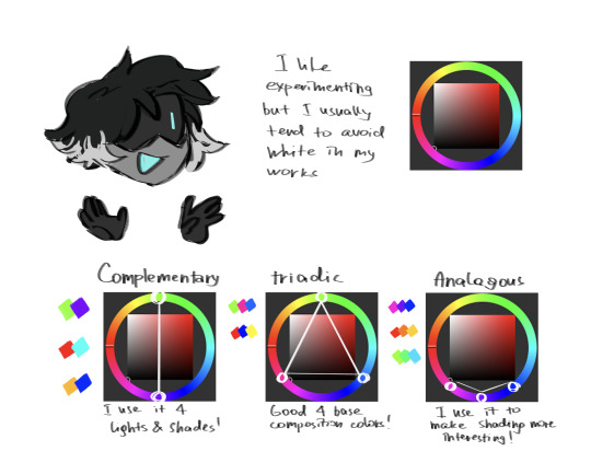
firstly, even if it was said a thousand times before, it`s best to get accustomed with the color wheel and color theory, because the use of color depends on the intended composition and mood of the drawing! For me personally, I like to use triadic and complementary palettes for my drawings, so the contrast is more visible and you have more freedom to play with the shades in the rendering process! Try to use colors that you associate with the mood that you want to have in your drawing, let them be your partner in telling the story, accents and the mood (like how I used opposite colors for the background behind Jack and Tim in the pfp)
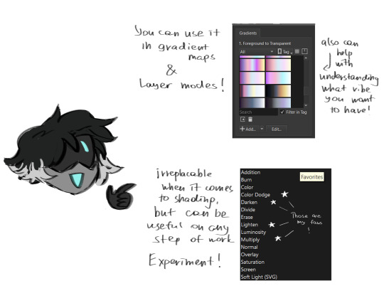
secondly, gradients and layer effects are a lot help! not only they can give you palette ideas, they help to accumulate the color that you already have!
I don`t really know, what to say about the textures and stuff, other that forms can tell as much as colors can. Use references, your understanding of forms and patterns to set the right atmosphere in your work!
I really hope, that you will find my rambling helpful, and thank you so much again for your words and your questions!! If anything, you can always message me, and I'll try to explain things better!
14 notes
·
View notes
Note
Can you do a tutorial of sorts on how you do color?
Ok so this is kind of hard to awnser since I don't have any real clue of what im doing but im gonna try and brake it down :)
I tend to draw in a complementary collor sceme, meaning i love using contrast between two collors opposite on the collor weel (like orange+blue | purple + green) I do love using very saturated collors for this.
So I’ll use secondary collors on one end of the wheel ( meaning collors next to each other) for, for example the charackter, and then use complementary collors on the other end for background.
So for example; I will have a character in more warm colours and will use more cool colours to collor in the background or/and details (such as highlights on eye, hair and clothing)
But i also feel like the collors depend on the mood of the painting? Like i will use „ loud collors* in more dramatic artwork ( it also depends on the personality of the character im drawing) and more „dull" collors in more sad or
" soft?" artwork, tho i also realy like using dull* less saturated collors in other more „dramatic ; drawings aswell ( for example horror-ish artwork, give it an oldlook?) id that makes sense.
also like to get inspired by my surrounding ( colourful wraping paper, posters, nature) but as I said I don't really have a clue what im doing just put what feels right.
Sooo yeahh I hope that was some how helpful!!
>:D
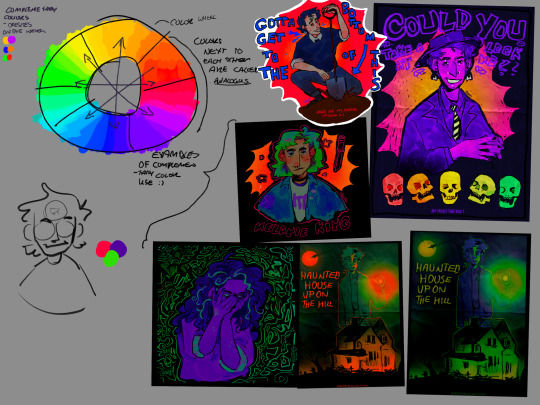
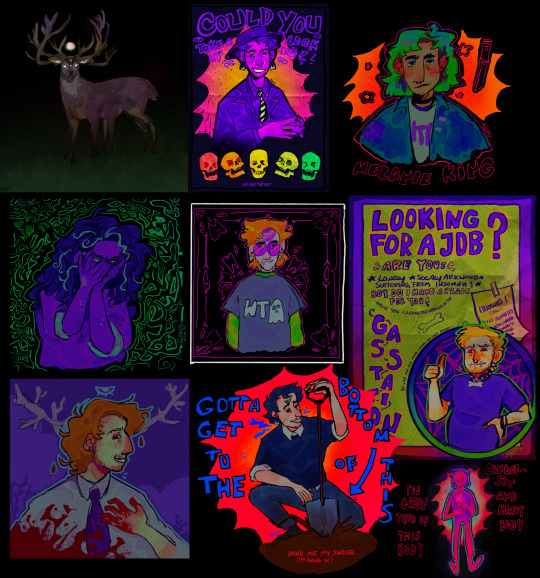
Examples where i used that technique:
16 notes
·
View notes
Text
I think it's so thoughtful of p'aof to associate blue and orange with moonlight chicken. the series which talk about the marginal character's life and the time they thrive the most -at night
blue and orange are known as complementary colors, which means they're directly opposite each other on the color wheel. complementary colours have the highest level of contrast between their two hues, which makes them much easier for an observer to see.
ALL the characters in moonlight chicken distinctively have their own characteristics and stand out in the crowd, while being the crowd themselves. it's so easy to differentiate them.
all of them has blue or orange/yellowish orange in their frame. for some it is toned down, for some, they are wearing that colour, for some it may be the lightning.
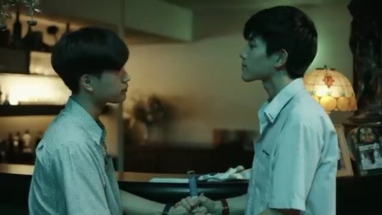
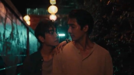
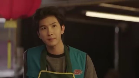
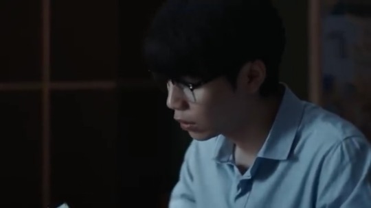
I'm still a bit sceptical about gaipa and alan. about what will be happening to them. or are they out of the spectrum?
Blue and orange morality refers to fictional characters whose moral compasses are alien to the typical human experience and therefore cannot be pinned as good or bad. Blue and orange are two different colors on the spectrum, and they alone offer no clues about whether they represent good or evil.
none of the characters in moonlight chicken are explicitly "good" or "bad". they all are dealing with their own problems and just reacting to the situation their are in. so another reason why we can't exactly blame anyone there.
this rant was sponsored by this pic I took a while back.🤧
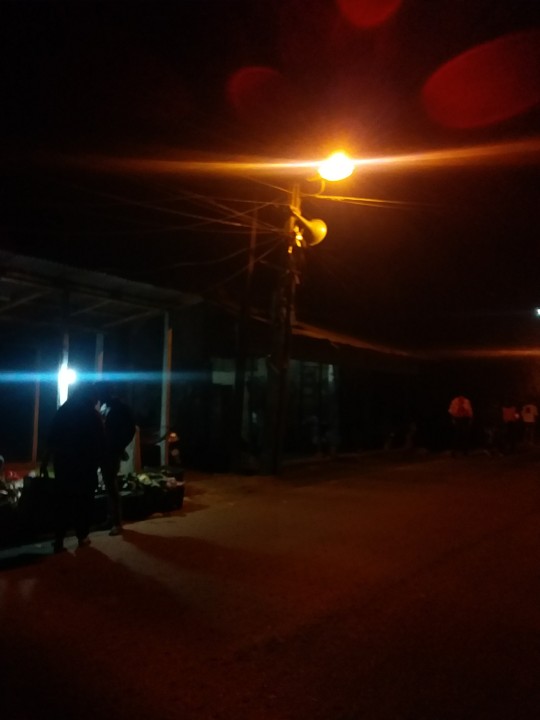
#I experience 6 different emotions everytime I think of moonlight chicken#moonlight chicken#alangaipa#lmfao that's a tag???#jimwen#heartliming
30 notes
·
View notes
Text
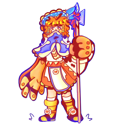
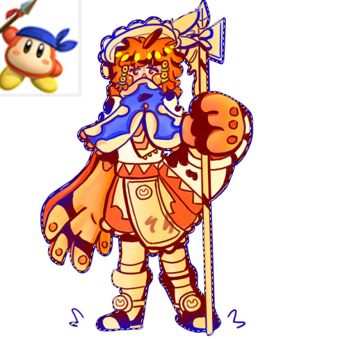
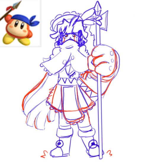
Fanart of Waddle Dee (female version) of the series Kirby.
In this one i worked with the complementary and analogical colours.
Complementary colours are example blue and orange u can find them on opposites sides of the colour wheel.
Analogical colours are colours that are next to eachother on the colour wheel i used for this drawing the colours yellow and green, blue, orange and red.
I remember being really damn proud of this one. Maybe the left hand perspective wasn't as good.
2023
2 notes
·
View notes
Text
Colour Theory & Romance in Butterfly Court
I was re-reading before the newest episode of the show dropped, and I realised that there's a whole wealth of shipping material that's gone (as far as I can tell) untouched. So naturally, I had to channel my inner Rory and get to exploring - so grab your kittens, your art supplies of choice, and get ready to have your mind BLOWN below the cut.
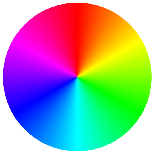
See that? No, it's not the colour of the sky, but it is the key to a lot of interesting nuance in Butterflyverse ships. All those gorgeous descriptions of clothing, magic, and physical appearance put a lot of emphasis on colour, specifically what colour each character is associated with.
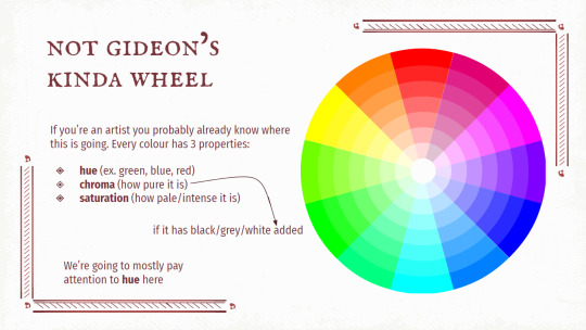
What does this have to do with ships, you ask? Let's get into it, using some of the most popular ones as examples. DISCLAIMER: these are the most popular BC ships as of april 2023, based on how many fics are on ao3 tagged for each ship (book/show/movie all included).
MatRory
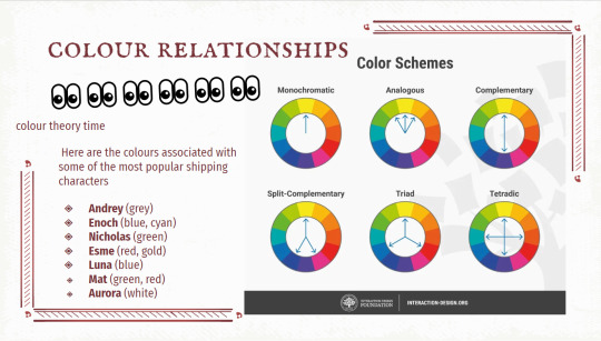
Mat: green-red are at a 90 degree angle to each other, so he’s got an element of opposition within himself as well as stability. His whole arc is based on internal conflict (remember his kitchen thoughts right before Andrey got stabbed?) thanks to the external conflict that he’s involved in. When he meets Aurora, she becomes a focal point - and her main colour association is white, which is centred in the colour wheel. Rory and Mat challenge each other’s views and ultimately stabilise each other to work towards a common goal - and IT SHOWS. Literally. Even if we take out Mat’s red association, MatRory stays stable based on the monochromatic scheme; they’re constantly working along the same parallel. Monochrome schemes evoke senses of calm and peace, which makes sense for one of the only canon couples that hasn’t gone through a ton of angst because of being together.
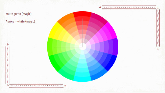
Moving onto something a little more controversial: Esme/Enoch, aka E-squared. A lot to unpack here. Let’s start with Esme: she’s almost comically consistent with wearing red all the time as “her” colour, her hair is red, she’s careful to only perform fire magic in public (or at least look like it), and the amount of time she spends covered in blood is non-negligible. The book also spends a good amount of time describing her eyes: one of the first things we learn about her in the books is that “her eyes are the colour of greed” and there’s a mention of her eyes matching a gold body chain she wears at Razac’s party. Her magic is "fierce gold light". So Esme is strongly red/gold associated. A stretched-out analogous combo, if you will. She’s independent on her own spectrum of warm colours; Esme supports herself throughout the books and it’s only when she gets involved with things outside that spectrum of power that stuff gets Complicated.
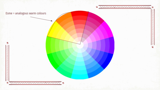
Enoch’s eyes are also given a lot of screentime; they’re consistently described as very pale, icy blue, and his magic manifests as “pale aqua” or “cyan” light. If we include Ward colours or his preferred “benthic blue” ink for letters, it’s impossible to miss the association between Enoch and blue. Let’s compare their magic (the focus of their first meeting, when Esme comments on Enoch’s magic after he heals her): gold is essentially yellow, maybe with a touch of orange, and blue is directly across from that on the colour wheel. Esme and Enoch are complementary; constantly opposed despite their attraction and ability to make the other person more vibrant. Some might say opposites attract…or that their differences are irreconcilable and at the heart of why they’ll never be completely happy together. However you look at it, there’s a lot of tension there.
For another spin on the blue/gold complementary angle, let’s take a look at Lunesme. Luna’s hair is naturally “blue”; on the cover art and special edition illustrations, it looks either sky blue or slightly cyan depending on which printing you’re looking at. Regardless, Luna and blue are very, very strongly linked. So we’ve got the same complementary colour relationship - but Esme’s interactions with Luna are completely different from with Enoch.
Although they both share intimate moments, Esme does a lot more “hesitating” and “considering” around Luna, and in the church scene we can see that she’s taking space to be more active and engage with/for Luna, whereas with Enoch (the assassin scene, ice skating, Razac’s party), Esme is more reactive. She’s not on a back foot, necessarily, but there’s definitely a different dynamic (and this could be intentional. Esme does flaunt her relationship with Enoch at the beginning, when she’s still sure of herself within that warm hue spectrum, but the whole thing at her apartment after the Seraphine gala throws her off).
The complementary tension in Lunesme draws them together, but the reasons they support each other so well are the same as why they keep having this will-they-won’t-they energy. Esme’s fear of hurting Luna pushes her away - and it’s why she takes the protective initiative in the church. With Esme’s red/gold and Luna’s blue, we’re looking at a triad - arguably the same as E-squared, but with what we know about Luna and how she and Esme have shared a surprising amount of secrets with each other (the scene where Esme let her pet her ears lives in my head RENT-FREE, and I live in London :P), their stability is challenged by the secrecy of their relationship. They usually only meet in shadowy scenes (remember the lighting in the church scene and all the times shadows are mentioned? Seraphine gala escape in evening…Esme only turns the lights fully on after Enoch arrives). The vibrancy of Lunesme is dulled by their fears of being exposed or bringing harm to one another, since they’re only totally honest in whispers or in letters.
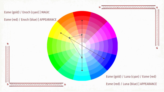
Next example: Imperial Triad. We’ve established that Enoch is blue; Nicholas is pretty obviously green (the eyes, the magic, the Remington colours) and Andrey is most often seen in variations of grey (usually “pearl” and “dove”, with Taran’s hair overlapping a little on “dove” and exclusively taking “ash”). Just looking at hue, green and blue are analogous and grey (a tone) mutes them - this isn’t a bad thing, don’t worry! It’s a bit ironic because Andrey’s antics create more chaos than not, but in the context of his relationship with Nicholas and Enoch, the colour shows how he stabilises them (because let’s be honest, they’re both Unhinged and varying levels of good at hiding it). Their higher saturations are evened out by Andrey keeping them occupied, and overall their hues are harmonious together.
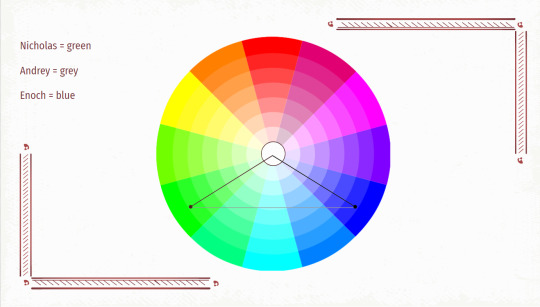
I don’t think we can necessarily try to predict any endgames just through this theory, but it’s pretty obvious that there was a lot of thought put into the symbolism of each character’s colour association and how they play into the relationships between them. It’s already been stressed that wearing certain colours in court is a way of showing or requesting favour, so even in-universe, we might see some mention of something similar! My personal guess is that it’d be focused on magic colours, but we’ll have to see.
#butterfly court colour theory#i'm still an rp/writing main! just had this theory idea and had to share#i was actually rereading bc i wanted to do a flashfic about esme (my main muse) before watching the new ep so it worked out i think#anyway going to do a mun intro and a muse intro soon!#long post
8 notes
·
View notes
Text
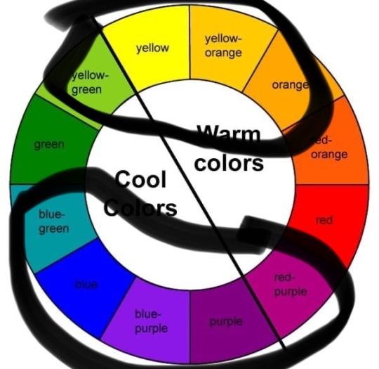
Also here is another Colour Theory Post for laymen;
When you’re pairing colors, you can find harmony through choosing complementary colors. In this case, opposites attract. This particular color scheme draws from two colors on the opposite side of the color wheel. When you do this, the result is a high-contrast color combo that’s bright and that pops.
Examples of complementary color combinations are: Red and green;
yellow and purple;
orange and blue;
green and magenta.
Complementary color combos tend to be bold, which is why sports teams often use this formula for their colors.
So in addition to Yellow/purple we have MAGENTA/GREEN!? Say what now!?
15 notes
·
View notes
Text
Vice Versa ep 5
I find it just a little bit cool - whether a coincidence or not - that I noticed a lot of black and white use in last week's ep and then this week's theme is Winter White...maybe I was on to something?
Anyway, this week follows a little on from last week, in that there are a lot of blue-and-red and black-and-white pairings, a couple of green-and-yellow pairings, and then some some bits of brown and even less orange. And straight off the bat, we get almost all of these (just no green...although purple is its complementary colour):
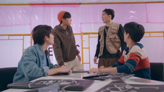
In the next scene - following the episode title screen which blends 'shadowed'/black areas in with the white - Puen and Talay switch from colour to black and white (with the black and white sign behind them) whilst being told "Your soulmate might be closer than you think. Pay close attention to the person sitting next to you." The theme 'Winter White' might be a commentary on Talay's coolness towards love and relationships (and the use of black and white showing how Puen's views and actions sit on the opposite of that) and so him in white here seems apt. Blue is also seen as a 'cold' colour (which I think is Talay's colour), so his 'icy heart' is probably going to be thawed out by Puen's 'fiery redness'...or something... (Incidentally, in this scene both Aou and Up have blue on, and Chang has light pink).
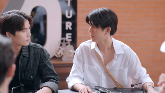
Then, interestingly, when Pang is introduced, she's also in black and white and even though Talay and Puen aren't in colour, the light behind is full of it. Blue, of course for Talay (with Dol in red) and pink/purple behind Puen. I think the ambiguity of the colour (some might say pink, some might say purple) is also a nod to the ambiguity of Puen's words and actions towards Talay...especially following the library conversation where Talay offers his real name to Puen but Puen still continues to withhold his identity from Talay. It also indicates the coming uncertainty around Pang and her role in both the series and in either of them getting back to their home universe.

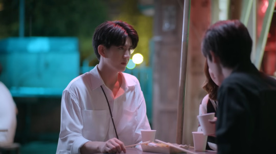
And once they're at dinner, this background lighting continues - with blue (and yellow) behind Talay, and red (and green) behind Puen. I love the placement of the umbrella pole, separating Puen and Pang on one side and Talay on the other, a visual representation of how Talay feels in this moment.
On the film set, we get more small blue and red details in the background...and Puen and Talay again in black and white but this time also with brown. If the show is continuing with the connection of brown with "seriousness", then I'm hoping it shows that the affection Puen has towards Talay is genuine. Notice also the random yellow objects in the background - the ladder and the cloth someone is folding - it was during this scene that I suddenly wondered whether the yellow and green pairings were actually just a nod towards the Oishi tea product placements. That would be hilarious if so!

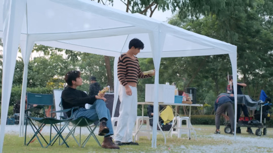
Red-and-blue and black-and-white also showed up in the association (with a pop of brown maybe to indicate the seriousness of the recently-returned man's predicament and the reality of the consequences of the universe/body swap)...
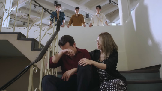
...as well as in the four suits of the four friends - Up and Aou's trousers are white, Puen and Talay's black, and I think Up's jacket is a navy blue with red stripes (I actually wonder if I've seen someone wearing it before...), plus the blue seats. These four looked fantastic. This is how to colour co-ordinate with friends! (Dol and Jubjaeng also looked incredible!)

Then, towards the end, brown came back a little more (with Puen and Talay in the cinema) and Up and Aou bringing the blue and red. The orange hat also returned, and with black and white still featuring. All of this echoed back to the colours in the first scene, which is poignant since this is when they decided/realised that the Friend Credits group would be splitting up.

And in the last scene, the emphasis feels more towards the yellow/beige/ochre colours (although there are still small elements of red and blue [up's sweater and phone and Aou's t-shirt] and black and white [Puen's t-shirt and Up's hat]). It's this and some of the colours in the ep 6 preview that makes me want to make another prediction (even though I might be wrong) that I think next week's ep will be a shade in the region of yellow/ochre/beige/brown...we'll see!

[Ep 1] [Ep 2] [Ep 3] [Ep 4] [Ep 5] [Ep 6] [Ep 7] [Ep 8] Ep 9] [Ep 10] [Ep 11] [Ep 12]
#vice versa#vice versa the series#vice versa ep 5#I did say I would do a concise post this time...#but it looks like I can't shut up once I start talking about this stuff#even though it may only be interesting to me#vice versa colour theories#I'm starting to think that the show isn't using the colours in any symbolic way#just that they're a palette that they're working with in each scene#to curate the 'look' of each scene but not necessarily using the colours to add meaning#but I might say something different later...#I'm going to tag some folk...this might not be the kind of content you're usually tagged/interested in#so let me know if you don't want to be tagged...#userkit#userconcrete#mjtag#tonanons#userjjessi#tosnimeat#ninisdarlings#usersarawatine#useraishi#samblr#forangel#userjap#nellsdani#and if you want to tag me it's ->#pdribs
24 notes
·
View notes
Text
All About Tarot: The Major Arcana

The Lovers

The Lovers card, also called The Twins or L'Amoureux in some decks is associated with the sign Gemini and the air element. It is the fifth card pulled in a new unshuffled deck and number 6 in the major arcana.

Upright this card can mean love, harmony, trust, a leap of faith, choice, perfect union, attraction or attractiveness, conscious connections, meaningful relationships or perfection in relationships and so on.
Reversed this card can often be interpreted as meaning unreliability, seperation or a breakup of sorts, second guessing, values, conflict, coldness within a relationship, being out of sync with those around you, a struggle to take responsibility or own up to a mistake or bad decision you made and more.
In general, this card talks of finding balance in ones self and relationships, though it may talk of love, ties, attraction and relationships it isnt always necessarily romantic, it may be platonic, aesthetic or some other form of attraction as there are many types of attraction and love and its important to keep that in mind.
This card is very focused on talking about your relationships and paired with other cards, say the Emperor or the Empress, it may talk about certain figures in your life and your relationship with them.
It's all up for interpretations of the reader and yourself of course, everyone thinks differently and knows different details another might not so whatever you feel the cards are telling you is entirely up to you.

Common sighting in the cards depictions are of course, two people. These two people could be male and female to represent opposing energies (or because heterosexuality is "the norm"), they could be human or non-human. The card from my deck depicts beauty and the beast(a woman and a man cursed to live in a beasts form), figures from tales with similar meanings to the cards are a frequent thing in art for the major arcana, as interpretations are heavily based on association this sort of thing tends to help get the point across.
You may see other things in the card such as a figure above the two or light and dark contrasts (as ballance is an important part of relationships as well as possibly representing the phrase "opposites attract"), often some form of nature like trees or clouds. A lot of cards depict the two lovers or twins as across from one another and apart but just as many may show the two embracing one another.
(its also extremely common to see these two naked in the card's art, at least in older cards that seem to be depicting adam and eve, but there are a few people have made that might show something like a nakey coupla' gays. now adays the cards are depicting more clothed couples. this doesnt necessarily mean anything i just thought it was worth noting)
Common colours tend to be black and white, yellows, pinks and/or reds, and blues and/or purples. Its common to see both complementary and contrasting colours which help bring out both the upright and reversed meanings of the card, as well as just look very nice together. Its also common to see colours that are close to each others complementary or contrasting colours on the colour wheel but arent quite that (yellow being close to orange which is blue's contrast and so on).

if you have anything more that you'd like to add or noticed something i havent brought up, or if you have any questions, please feel free to let me know!
please support me on kofi - the previous card - the full list

#the lovers#tarot the lovers#tarot blog#witch blog#witchblr#tarot cards#tarot witch#tarot deck#tarot reading#tarot divination#divination#tarot#tarot readings#the lovers tarot#about the major arcana#the major arcana#the major arcana the lovers#major arcana#major arcana the lovers#the lovers major arcana#the lovers the major arcana#about tarot#all about tarot#tarot online#tarot reader#witchcraft blog
17 notes
·
View notes
Note
What color or colors do you think puckurt is?
Oooo I love this question thank you!!
Kurt is blue. There is absolutely no question in my mind whatsoever that Kurt Hummel is blue, and I don't really think anyone would try to argue that with me either. Call up Blue Man Group because we have found a new Blue Man just kidding that is so very much not Kurt's vibe BUT he is definitely blue.
And then my boy Puck. He's orange. This is the one that might be more open to disagreement, so let me explain. He's gotta be a warm colour, he's energetic and loud and goofy and impulsive and extroverted and just- he's a warm colour, okay? He's not yellow because he's not quite bubbly and optimistic enough for that. He's also not red, because I think that while he certainly can be fiery when he needs to be, he's actually naturally a lot more mellow than that. Orange is the perfect middle ground, it's relatively calm and bright but still has a little bit of spice, you know? Maybe that makes no sense, but it does in my head, so Puck is orange.
So I guess together they're blue-and-orange. I'm not sure that I could pick a single colour for them, they're very opposite but complementary.
#glee#puckurt#kurt hummel#noah puckerman#gleekidshooray#mine#ask#I love colour questions tysm#also I meant to answer this sooner but then I forgot it was in my ask box SORRY
17 notes
·
View notes