#bootstrap cdn
Explore tagged Tumblr posts
Visit Tumblr Blog
Explore Tumblr blogs with no restrictions, modern design and the best experience.
Last Seen Tumblr Blogs


Fun Fact
BuzzFeed published a report claiming that Tumblr was utilized as a distribution channel for Russian agents to influence American voting habits during the 2016 presidential election in Feb 2018.
Text
As of right now (October 2024) what is the SHORTEST chunk of CSS necessary to make a page "responsive"?
In terms of font size and spacing changes for main body text (p h1 h2 blockquote li etc). There's no nav here. You're not going anywhere.
DO NOT USE an @ import of any kind you bitch of a FUCK !!! And NO LINK TAGS that's HTML
#i can SEE you ctrl+c ing that FUCKING BOOTSTRAP cdn !!!!#clear your clipboard or i empty my clip#css#html#coding
7 notes
·
View notes
Text
Skillnad mellan emojis och bootstrap- eller Font Awesome-ikoner
När jag byggt min sida har jag ibland tagit hjälp av AI för att skynda på tråkiga och repetetiva uppgifter eller för att kontrollera koden. Jag bygger min sida med bootstrap men började blanda in Font Awesome för bullets och liknande. När jag fick hjälp av AI började den blanda in smiley-bilder. Det blir ju inte enhetligt så när jag skulle börja få ihop allt frågade jag AI och fick detta svar…
0 notes
Text
Web Components Demystified
New Post has been published on https://thedigitalinsider.com/web-components-demystified/
Web Components Demystified
Scott Jehl released a course called Web Components Demystified. I love that name because it says what the course is about right on the tin: you’re going to learn about web components and clear up any confusion you may already have about them.
And there’s plenty of confusion to go around! “Components” is already a loaded term that’s come to mean everything from a piece of UI, like a search component, to an element you can drop in and reuse anywhere, such as a React component. The web is chock-full of components, tell you what.
But what we’re talking about here is a set of standards where HTML, CSS, and JavaScript rally together so that we can create custom elements that behave exactly how we want them to. It’s how we can make an element called <tasty-pizza> and the browser knows what to do with it.
This is my full set of notes from Scott’s course. I wouldn’t say they’re complete or even a direct one-to-one replacement for watching the course. You’ll still want to do that on your own, and I encourage you to because Scott is an excellent teacher who makes all of this stuff extremely accessible, even to noobs like me.
Chapter 1: What Web Components Are… and Aren’t
Web components are not built-in elements, even though that’s what they might look like at first glance. Rather, they are a set of technologies that allow us to instruct what the element is and how it behaves. Think of it the same way that “responsive web design” is not a thing but rather a set of strategies for adapting design to different web contexts. So, just as responsive web design is a set of ingredients — including media fluid grids, flexible images, and media queries — web components are a concoction involving:
Custom elements
These are HTML elements that are not built into the browser. We make them up. They include a letter and a dash.
<my-fancy-heading> Hey, I'm Fancy </my-fancy-heading>
We’ll go over these in greater detail in the next module.
HTML templates
Templates are bits of reusable markup that generate more markup. We can hide something until we make use of it.
<template> <li class="user"> <h2 class="name"></h2> <p class="bio"></p> </li> </template>
Much more on this in the third module.
Shadow DOM
The DOM is queryable.
document.querySelector("h1"); // <h1>Hello, World</h1>
The Shadow DOM is a fragment of the DOM where markup, scripts, and styles are encapsulated from other DOM elements. We’ll cover this in the fourth module, including how to <slot> content.
There used to be a fourth “ingredient” called HTML Imports, but those have been nixed.
In short, web components might be called “components” but they aren’t really components more than technologies. In React, components sort of work like partials. It defines a snippet of HTML that you drop into your code and it outputs in the DOM. Web Components are built off of HTML Elements. They are not replaced when rendered the way they are in JavaScript component frameworks. Web components are quite literally HTML elements and have to obey HTML rules. For example:
<!-- Nope --> <ul> <my-list-item></my-list-item> <!-- etc. --> </ul> <!-- Yep --> <ul> <li> <my-list-item></my-list-item> </li> </ul>
We’re generating meaningful HTML up-front rather than rendering it in the browser through the client after the fact. Provide the markup and enhance it! Web components have been around a while now, even if it seems we’re only starting to talk about them now.
Chapter 2: Custom Elements
First off, custom elements are not built-in HTML elements. We instruct what they are and how they behave. They are named with a dash and at must contain least one letter. All of the following are valid names for custom elements:
<super-component>
<a->
<a-4->
<card-10.0.1>
<card-♠️>
Just remember that there are some reserved names for MathML and SVG elements, like <font-face>. Also, they cannot be void elements, e.g. <my-element />, meaning they have to have a correspoonding closing tag.
Since custom elements are not built-in elements, they are undefined by default — and being undefined can be a useful thing! That means we can use them as containers with default properties. For example, they are display: inline by default and inherit the current font-family, which can be useful to pass down to the contents. We can also use them as styling hooks since they can be selected in CSS. Or maybe they can be used for accessibility hints. The bottom line is that they do not require JavaScript in order to make them immediately useful.
Working with JavaScript. If there is one <my-button> on the page, we can query it and set a click handler on it with an event listener. But if we were to insert more instances on the page later, we would need to query it when it’s appended and re-run the function since it is not part of the original document rendering.
Defining a custom element
This defines and registers the custom element. It teaches the browser that this is an instance of the Custom Elements API and extends the same class that makes other HTML elements valid HTML elements:
<my-element>My Element</my-element> <script> customElements.define("my-element", class extends HTMLElement ); </script>
Check out the methods we get immediate access to:
Breaking down the syntax
customElements .define( "my-element", class extends HTMLElement ); // Functionally the same as: class MyElement extends HTMLElement customElements.define("my-element", MyElement); export default myElement // ...which makes it importable by other elements: import MyElement from './MyElement.js'; const myElement = new MyElement(); document.body.appendChild(myElement); // <body> // <my-element></my-element> // </body> // Or simply pull it into a page // Don't need to `export default` but it doesn't hurt to leave it // <my-element>My Element</my-element> // <script type="module" src="my-element.js"></script>
It’s possible to define a custom element by extending a specific HTML element. The specification documents this, but Scott is focusing on the primary way.
class WordCount extends HTMLParagraphElement customElements.define("word-count", WordCount, extends: "p" ); // <p is="word-count">This is a custom paragraph!</p>
Scott says do not use this because WebKit is not going to implement it. We would have to polyfill it forever, or as long as WebKit holds out. Consider it a dead end.
The lifecycle
A component has various moments in its “life” span:
Constructed (constructor)
Connected (connectedCallback)
Adopted (adoptedCallback)
Attribute Changed (attributeChangedCallback)
Disconnected (disconnectedCallback)
We can hook into these to define the element’s behavior.
class myElement extends HTMLElement constructor() connectedCallback() adoptedCallback() attributeChangedCallback() disconnectedCallback() customElements.define("my-element", MyElement);
constructor()
class myElement extends HTMLElement constructor() // provides us with the `this` keyword super() // add a property this.someProperty = "Some value goes here"; // add event listener this.addEventListener("click", () => ); customElements.define("my-element", MyElement);
“When the constructor is called, do this…” We don’t have to have a constructor when working with custom elements, but if we do, then we need to call super() because we’re extending another class and we’ll get all of those properties.
Constructor is useful, but not for a lot of things. It’s useful for setting up initial state, registering default properties, adding event listeners, and even creating Shadow DOM (which Scott will get into in a later module). For example, we are unable to sniff out whether or not the custom element is in another element because we don’t know anything about its parent container yet (that’s where other lifecycle methods come into play) — we’ve merely defined it.
connectedCallback()
class myElement extends HTMLElement // the constructor is unnecessary in this example but doesn't hurt. constructor() super() // let me know when my element has been found on the page. connectedCallback() console.log(`$this.nodeName was added to the page.`); customElements.define("my-element", MyElement);
Note that there is some strangeness when it comes to timing things. Sometimes isConnected returns true during the constructor. connectedCallback() is our best way to know when the component is found on the page. This is the moment it is connected to the DOM. Use it to attach event listeners.
If the <script> tag comes before the DOM is parsed, then it might not recognize childNodes. This is not an uncommon situation. But if we add type="module" to the <script>, then the script is deferred and we get the child nodes. Using setTimeout can also work, but it looks a little gross.
disconnectedCallback
class myElement extends HTMLElement // let me know when my element has been found on the page. disconnectedCallback() console.log(`$this.nodeName was removed from the page.`); customElements.define("my-element", MyElement);
This is useful when the component needs to be cleaned up, perhaps like stopping an animation or preventing memory links.
adoptedCallback()
This is when the component is adopted by another document or page. Say you have some iframes on a page and move a custom element from the page into an iframe, then it would be adopted in that scenario. It would be created, then added, then removed, then adopted, then added again. That’s a full lifecycle! This callback is adopted automatically simply by picking it up and dragging it between documents in the DOM.
Custom elements and attributes
Unlike React, HTML attributes are strings (not props!). Global attributes work as you’d expect, though some global attributes are reflected as properties. You can make any attribute do that if you want, just be sure to use care and caution when naming because, well, we don’t want any conflicts.
Avoid standard attributes on a custom element as well, as that can be confusing particularly when handing a component to another developer. Example: using type as an attribute which is also used by <input> elements. We could say data-type instead. (Remember that Chris has a comprehensive guide on using data attributes.)
Examples
Here’s a quick example showing how to get a greeting attribute and set it on the custom element:
class MyElement extends HTMLElement get greeting() return this.getAttribute('greeting'); // return this.hasAttribute('greeting'); set greeting(val) if(val) this.setAttribute('greeting', val); // this setAttribute('greeting', ''); else this.removeAttribute('greeting'); customElements.define("my-element", MyElement);
Another example, this time showing a callback for when the attribute has changed, which prints it in the element’s contents:
<my-element greeting="hello">hello</my-element> <!-- Change text greeting when attribite greeting changes --> <script> class MyElement extends HTMLElement static observedAttributes = ["greeting"]; attributeChangedCallback(name, oldValue, newValue) if (name === 'greeting' && oldValue && oldValue !== newValue) console.log(name + " changed"); this.textContent = newValue; customElements.define("my-element", MyElement); </script>
A few more custom element methods:
customElements.get('my-element'); // returns MyElement Class customElements.getName(MyElement); // returns 'my-element' customElements.whenDefined("my-element"); // waits for custom element to be defined const el = document.createElement("spider-man"); class SpiderMan extends HTMLElement constructor() super(); console.log("constructor!!"); customElements.define("spider-man", SpiderMan); customElements.upgrade(el); // returns "constructor!!"
Custom methods and events:
<my-element><button>My Element</button></my-element> <script> customElements.define("my-element", class extends HTMLElement connectedCallback() const btn = this.firstElementChild; btn.addEventListener("click", this.handleClick) handleClick() console.log(this); ); </script>
Bring your own base class, in the same way web components frameworks like Lit do:
class BaseElement extends HTMLElement $ = this.querySelector; // extend the base, use its helper class myElement extends BaseElement firstLi = this.$("li");
Practice prompt
Create a custom HTML element called <say-hi> that displays the text “Hi, World!” when added to the page:
Enhance the element to accept a name attribute, displaying "Hi, [Name]!" instead:
Chapter 3: HTML Templates
The <template> element is not for users but developers. It is not exposed visibly by browsers.
<template>The browser ignores everything in here.</template>
Templates are designed to hold HTML fragments:
<template> <div class="user-profile"> <h2 class="name">Scott</h2> <p class="bio">Author</p> </div> </template>
A template is selectable in CSS; it just doesn’t render. It’s a document fragment. The inner document is a #document-fragment. Not sure why you’d do this, but it illustrates the point that templates are selectable:
template display: block; ` /* Nope */ template + div height: 100px; width: 100px; /* Works */
The content property
No, not in CSS, but JavaScript. We can query the inner contents of a template and print them somewhere else.
<template> <p>Hi</p> </template> <script> const myTmpl = documenty.querySelector("template").content; console.log(myTmpl); </script>
Using a Document Fragment without a <template>
const myFrag = document.createDocumentFragment(); myFrag.innerHTML = "<p>Test</p>"; // Nope const myP = document.createElement("p"); // Yep myP.textContent = "Hi!"; myFrag.append(myP); // use the fragment document.body.append(myFrag);
Clone a node
<template> <p>Hi</p> </template> <script> const myTmpl = documenty.querySelector("template").content; console.log(myTmpl); // Oops, only works one time! We need to clone it. </script>
Oops, the component only works one time! We need to clone it if we want multiple instances:
<template> <p>Hi</p> </template> <script> const myTmpl = document.querySelector("template").content; document.body.append(myTmpl.cloneNode(true)); // true is necessary document.body.append(myTmpl.cloneNode(true)); document.body.append(myTmpl.cloneNode(true)); document.body.append(myTmpl.cloneNode(true)); </script>
A more practical example
Let’s stub out a template for a list item and then insert them into an unordered list:
<template id="tmpl-user"><li><strong></strong>: <span></span></li></template> <ul id="users"></ul> <script> const usersElement = document.querySelector("#users"); const userTmpl = document.querySelector("#tmpl-user").content; const users = [name: "Bob", title: "Artist", name: "Jane", title: "Doctor"]; users.forEach(user => let thisLi = userTmpl.cloneNode(true); thisLi.querySelector("strong").textContent = user.name; thisLi.querySelector("span").textContent = user.title; usersElement.append(thisLi); ); </script>
The other way to use templates that we’ll get to in the next module: Shadow DOM
<template shadowroot=open> <p>Hi, I'm in the Shadow DOM</p> </template>
Chapter 4: Shadow DOM
Here we go, this is a heady chapter! The Shadow DOM reminds me of playing bass in a band: it’s easy to understand but incredibly difficult to master. It’s easy to understand that there are these nodes in the DOM that are encapsulated from everything else. They’re there, we just can’t really touch them with regular CSS and JavaScript without some finagling. It’s the finagling that’s difficult to master. There are times when the Shadow DOM is going to be your best friend because it prevents outside styles and scripts from leaking in and mucking things up. Then again, you’re most certainly going go want to style or apply scripts to those nodes and you have to figure that part out.
That’s where web components really shine. We get the benefits of an element that’s encapsulated from outside noise but we’re left with the responsibility of defining everything for it ourselves.
Select elements are a great example of the Shadow DOM. Shadow roots! Slots! They’re all part of the puzzle.
Using the Shadow DOM
We covered the <template> element in the last chapter and determined that it renders in the Shadow DOM without getting displayed on the page.
<template shadowrootmode="closed"> <p>This will render in the Shadow DOM.</p> </template>
In this case, the <template> is rendered as a #shadow-root without the <template> element’s tags. It’s a fragment of code. So, while the paragraph inside the template is rendered, the <template> itself is not. It effectively marks the Shadow DOM’s boundaries. If we were to omit the shadowrootmode attribute, then we simply get an unrendered template. Either way, though, the paragraph is there in the DOM and it is encapsulated from other styles and scripts on the page.
These are all of the elements that can have a shadow.
Breaching the shadow
There are times you’re going to want to “pierce” the Shadow DOM to allow for some styling and scripts. The content is relatively protected but we can open the shadowrootmode and allow some access.
<div> <template shadowrootmode="open"> <p>This will render in the Shadow DOM.</p> </template> </div>
Now we can query the div that contains the <template> and select the #shadow-root:
document.querySelector("div").shadowRoot // #shadow-root (open) // <p>This will render in the Shadow DOM.</p>
We need that <div> in there so we have something to query in the DOM to get to the paragraph. Remember, the <template> is not actually rendered at all.
Additional shadow attributes
<!-- should this root stay with a parent clone? --> <template shadowrootcloneable> <!-- allow shadow to be serialized into a string object — can forget about this --> <template shadowrootserializable> <!-- click in element focuses first focusable element --> <template shadowrootdelegatesfocus>
Shadow DOM siblings
When you add a shadow root, it becomes the only rendered root in that shadow host. Any elements after a shadow root node in the DOM simply don’t render. If a DOM element contains more than one shadow root node, the ones after the first just become template tags. It’s sort of like the Shadow DOM is a monster that eats the siblings.
Slots bring those siblings back!
<div> <template shadowroot="closed"> <slot></slot> <p>I'm a sibling of a shadow root, and I am visible.</p> </template> </div>
All of the siblings go through the slots and are distributed that way. It’s sort of like slots allow us to open the monster’s mouth and see what’s inside.
Declaring the Shadow DOM
Using templates is the declarative way to define the Shadow DOM. We can also define the Shadow DOM imperatively using JavaScript. So, this is doing the exact same thing as the last code snippet, only it’s done programmatically in JavaScript:
<my-element> <template shadowroot="open"> <p>This will render in the Shadow DOM.</p> </template> </my-element> <script> customElements.define('my-element', class extends HTMLElement constructor() super(); // attaches a shadow root node this.attachShadow(mode: "open"); // inserts a slot into the template this.shadowRoot.innerHTML = '<slot></slot>'; ); </script>
Another example:
<my-status>available</my-status> <script> customElements.define('my-status', class extends HTMLElement constructor() super(); this.attachShadow(mode: "open"); this.shadowRoot.innerHTML = '<p>This item is currently: <slot></slot></p>'; ); </script>
So, is it better to be declarative or imperative? Like the weather where I live, it just depends.
Both approaches have their benefits.
We can set the shadow mode via Javascript as well:
// open this.attachShadow(mode: open); // closed this.attachShadow(mode: closed); // cloneable this.attachShadow(cloneable: true); // delegateFocus this.attachShadow(delegatesFocus: true); // serialized this.attachShadow(serializable: true); // Manually assign an element to a slot this.attachShadow(slotAssignment: "manual");
About that last one, it says we have to manually insert the <slot> elements in JavaScript:
<my-element> <p>This WILL render in shadow DOM but not automatically.</p> </my-element> <script> customElements.define('my-element', class extends HTMLElement constructor() super(); this.attachShadow( mode: "open", slotAssignment: "manual" ); this.shadowRoot.innerHTML = '<slot></slot>'; connectedCallback() const slotElem = this.querySelector('p'); this.shadowRoot.querySelector('slot').assign(slotElem); ); </script>
Examples
Scott spent a great deal of time sharing examples that demonstrate different sorts of things you might want to do with the Shadow DOM when working with web components. I’ll rapid-fire those in here.
Get an array of element nodes in a slot
this.shadowRoot.querySelector('slot') .assignedElements(); // get an array of all nodes in a slot, text too this.shadowRoot.querySelector('slot') .assignedNodes();
When did a slot’s nodes change?
let slot = document.querySelector('div') .shadowRoot.querySelector("slot"); slot.addEventListener("slotchange", (e) => console.log(`Slot "$slot.name" changed`); // > Slot "saying" changed )
Combining imperative Shadow DOM with templates
Back to this example:
<my-status>available</my-status> <script> customElements.define('my-status', class extends HTMLElement constructor() super(); this.attachShadow(mode: "open"); this.shadowRoot.innerHTML = '<p>This item is currently: <slot></slot></p>'; ); </script>
Let’s get that string out of our JavaScript with reusable imperative shadow HTML:
<my-status>available</my-status> <template id="my-status"> <p>This item is currently: <slot></slot> </p> </template> <script> customElements.define('my-status', class extends HTMLElement constructor() super(); this.attachShadow(mode: 'open'); const template = document.getElementById('my-status'); this.shadowRoot.append(template.content.cloneNode(true)); ); </script>
Slightly better as it grabs the component’s name programmatically to prevent name collisions:
<my-status>available</my-status> <template id="my-status"> <p>This item is currently: <slot></slot> </p> </template> <script> customElements.define('my-status', class extends HTMLElement constructor() super(); this.attachShadow(mode: 'open'); const template = document.getElementById( this.nodeName.toLowerCase() ); this.shadowRoot.append(template.content.cloneNode(true)); ); </script>
Forms with Shadow DOM
Long story, cut short: maybe don’t create custom form controls as web components. We get a lot of free features and functionalities — including accessibility — with native form controls that we have to recreate from scratch if we decide to roll our own.
In the case of forms, one of the oddities of encapsulation is that form submissions are not automatically connected. Let’s look at a broken form that contains a web component for a custom input:
<form> <my-input> <template shadowrootmode="open"> <label> <slot></slot> <input type="text" name="your-name"> </label> </template> Type your name! </my-input> <label><input type="checkbox" name="remember">Remember Me</label> <button>Submit</button> </form> <script> document.forms[0].addEventListener('input', function() let data = new FormData(this); console.log(new URLSearchParams(data).toString()); ); </script>
This input’s value won’t be in the submission! Also, form validation and states are not communicated in the Shadow DOM. Similar connectivity issues with accessibility, where the shadow boundary can interfere with ARIA. For example, IDs are local to the Shadow DOM. Consider how much you really need the Shadow DOM when working with forms.
Element internals
The moral of the last section is to tread carefully when creating your own web components for form controls. Scott suggests avoiding that altogether, but he continued to demonstrate how we could theoretically fix functional and accessibility issues using element internals.
Let’s start with an input value that will be included in the form submission.
<form> <my-input name="name"></my-input> <button>Submit</button> </form>
Now let’s slot this imperatively:
<script> customElements.define('my-input', class extends HTMLElement constructor() super(); this.attachShadow(mode: 'open'); this.shadowRoot.innerHTML = '<label><slot></slot><input type="text"></label>' ); </script>
The value is not communicated yet. We’ll add a static formAssociated variable with internals attached:
<script> customElements.define('my-input', class extends HTMLElement static formAssociated = true; constructor() super(); this.attachShadow(mode: 'open'); this.shadowRoot.innerHTML = '<label><slot></slot><input type="text"></label>' this.internals = this.attachedInternals(); ); </script>
Then we’ll set the form value as part of the internals when the input’s value changes:
<script> customElements.define('my-input', class extends HTMLElement static formAssociated = true; constructor() super(); this.attachShadow(mode: 'open'); this.shadowRoot.innerHTML = '<label><slot></slot><input type="text"></label>' this.internals = this.attachedInternals(); this.addEventListener('input', () => this-internals.setFormValue(this.shadowRoot.querySelector('input').value); ); ); </script>
Here’s how we set states with element internals:
// add a checked state this.internals.states.add("checked"); // remove a checked state this.internals.states.delete("checked");
Let’s toggle a “add” or “delete” a boolean state:
<form> <my-check name="remember">Remember Me?</my-check> </form> <script> customElements.define('my-check', class extends HTMLElement static formAssociated = true; constructor() super(); this.attachShadow(mode: 'open'); this.shadowRoot.innerHTML = '<slot></slot>'; this.internals = this.attachInternals(); let addDelete = false; this.addEventListener("click", ()=> addDelete = !addDelete; this.internals.states[addDelete ? "add" : "delete"]("checked"); ); ); </script>
Let’s refactor this for ARIA improvements:
<form> <style> my-check display: inline-block; inline-size: 1em; block-size: 1em; background: #eee; my-check:state(checked)::before content: "[x]"; </style> <my-check name="remember" id="remember"></my-check><label for="remember">Remember Me?</label> </form> <script> customElements.define('my-check', class extends HTMLElement static formAssociated = true; constructor() super(); this.attachShadow(mode: 'open'); this.internals = this.attachInternals(); this.internals.role = 'checkbox'; this.setAttribute('tabindex', '0'); let addDelete = false; this.addEventListener("click", ()=> addDelete = !addDelete; this.internals.states[addDelete ? "add" : "delete"]("checked"); this[addDelete ? "setAttribute" : "removeAttribute"]("aria-checked", true); ); ); </script>
Phew, that’s a lot of work! And sure, this gets us a lot closer to a more functional and accessible custom form input, but there’s still a long way’s to go to achieve what we already get for free from using native form controls. Always question whether you can rely on a light DOM form instead.
Chapter 5: Styling Web Components
Styling web components comes in levels of complexity. For example, we don’t need any JavaScript at all to slap a few styles on a custom element.
<my-element theme="suave" class="priority"> <h1>I'm in the Light DOM!</h1> </my-element> <style> /* Element, class, attribute, and complex selectors all work. */ my-element display: block; /* custom elements are inline by default */ .my-element[theme=suave] color: #fff; .my-element.priority background: purple; .my-element h1 font-size: 3rem; </style>
This is not encapsulated! This is scoped off of a single element just light any other CSS in the Light DOM.
Changing the Shadow DOM mode from closed to open doesn’t change CSS. It allows JavaScript to pierce the Shadow DOM but CSS isn’t affected.
Let’s poke at it
<style> p color: red; </style> <p>Hi</p> <div> <template shadowrootmode="open"> <p>Hi</p> </template> </div> <p>Hi</p>
This is three stacked paragraphs, the second of which is in the shadow root.
The first and third paragraphs are red; the second is not styled because it is in a <template>, even if the shadow root’s mode is set to open.
Let’s poke at it from the other direction:
<style> p color: red; </style> <p>Hi</p> <div> <template shadowrootmode="open"> <style> p color: blue; </style> <p>Hi</p> </template> </div> <p>Hi</p>
The first and third paragraphs are still receiving the red color from the Light DOM’s CSS.
The <style> declarations in the <template> are encapsulated and do not leak out to the other paragraphs, even though it is declared later in the cascade.
Same idea, but setting the color on the <body>:
<style> body color: red; </style> <p>Hi</p> <div> <template shadowrootmode="open"> <p>Hi</p> </template> </div> <p>Hi</p>
Everything is red! This isn’t a bug. Inheritable styles do pass through the Shadow DOM barrier.
Inherited styles are those that are set by the computed values of their parent styles. Many properties are inheritable, including color. The <body> is the parent and everything in it is a child that inherits these styles, including custom elements.
Let’s fight with inheritance
We can target the paragraph in the <template> style block to override the styles set on the <body>. Those won’t leak back to the other paragraphs.
<style> body color: red; font-family: fantasy; font-size: 2em; </style> <p>Hi</p> <div> <template shadowrootmode="open"> <style> /* reset the light dom styles */ p color: initial; font-family: initial; font-size: initial; </style> <p>Hi</p> </template> </div> <p>Hi</p>
This is protected, but the problem here is that it’s still possible for a new role or property to be introduced that passes along inherited styles that we haven’t thought to reset.
Perhaps we could use all: initital as a defensive strategy against future inheritable styles. But what if we add more elements to the custom element? It’s a constant fight.
Host styles!
We can scope things to the shadow root’s :host selector to keep things protected.
<style> body color: red; font-family: fantasy; font-size: 2em; </style> <p>Hi</p> <div> <template shadowrootmode="open"> <style> /* reset the light dom styles */ :host all: initial; </style> <p>Hi</p> <a href="#">Click me</a> </template> </div> <p>Hi</p>
New problem! What if the Light DOM styles are scoped to the universal selector instead?
<style> * color: red; font-family: fantasy; font-size: 2em; </style> <p>Hi</p> <div> <template shadowrootmode="open"> <style> /* reset the light dom styles */ :host all: initial; </style> <p>Hi</p> <a href="#">Click me</a> </template> </div> <p>Hi</p>
This breaks the custom element’s styles. But that’s because Shadow DOM styles are applied before Light DOM styles. The styles scoped to the universal selector are simply applied after the :host styles, which overrides what we have in the shadow root. So, we’re still locked in a brutal fight over inheritance and need stronger specificity.
According to Scott, !important is one of the only ways we have to apply brute force to protect our custom elements from outside styles leaking in. The keyword gets a bad rap — and rightfully so in the vast majority of cases — but this is a case where it works well and using it is an encouraged practice. It’s not like it has an impact on the styles outside the custom element, anyway.
<style> * color: red; font-family: fantasy; font-size: 2em; </style> <p>Hi</p> <div> <template shadowrootmode="open"> <style> /* reset the light dom styles */ :host all: initial; !important </style> <p>Hi</p> <a href="#">Click me</a> </template> </div> <p>Hi</p>
Special selectors
There are some useful selectors we have to look at components from the outside, looking in.
:host()
We just looked at this! But note how it is a function in addition to being a pseudo-selector. It’s sort of a parent selector in the sense that we can pass in the <div> that contains the <template> and that becomes the scoping context for the entire selector, meaning the !important keyword is no longer needed.
<style> * color: red; font-family: fantasy; font-size: 2em; </style> <p>Hi</p> <div> <template shadowrootmode="open"> <style> /* reset the light dom styles */ :host(div) all: initial; </style> <p>Hi</p> <a href="#">Click me</a> </template> </div> <p>Hi</p>
:host-context()
<header> <my-element> <template shadowrootmode="open"> <style> :host-context(header) ... /* matches the host! */ </style> </template> </my-element> </header>
This targets the shadow host but only if the provided selector is a parent node anywhere up the tree. This is super helpful for styling custom elements where the layout context might change, say, from being contained in an <article> versus being contained in a <header>.
:defined
Defining an element occurs when it is created, and this pseudo-selector is how we can select the element in that initially-defined state. I imagine this is mostly useful for when a custom element is defined imperatively in JavaScript so that we can target the very moment that the element is constructed, and then set styles right then and there.
<style> simple-custom:defined display: block; background: green; color: #fff; </style> <simple-custom></simple-custom> <script> customElements.define('simple-custom', class extends HTMLElement constructor() super(); this.attachShadow(mode: 'open'); this.shadowRoot.innerHTML = "<p>Defined!</p>"; ); </script>
Minor note about protecting against a flash of unstyled content (FOUC)… or unstyled element in this case. Some elements are effectively useless until JavsScript has interacted with it to generate content. For example, an empty custom element that only becomes meaningful once JavaScript runs and generates content. Here’s how we can prevent the inevitable flash that happens after the content is generated:
<style> js-dependent-element:not(:defined) visibility: hidden; </style> <js-dependent-element></js-dependent-element>
Warning zone! It’s best for elements that are empty and not yet defined. If you’re working with a meaningful element up-front, then it’s best to style as much as you can up-front.
Styling slots
This does not style the paragraph green as you might expect:
<div> <template shadowrootmode="open"> <style> p color: green; </style> <slot></slot> </template> <p>Slotted Element</p> </div>
The Shadow DOM cannot style this content directly. The styles would apply to a paragraph in the <template> that gets rendered in the Light DOM, but it cannot style it when it is slotted into the <template>.
Slots are part of the Light DOM. So, this works:
<style> p color: green; </style> <div> <template shadowrootmode="open"> <slot></slot> </template> <p>Slotted Element</p> </div>
This means that slots are easier to target when it comes to piercing the shadow root with styles, making them a great method of progressive style enhancement.
We have another special selected, the ::slotted() pseudo-element that’s also a function. We pass it an element or class and that allows us to select elements from within the shadow root.
<div> <template shadowrootmode="open"> <style> ::slotted(p) color: red; </style> <slot></slot> </template> <p>Slotted Element</p> </div>
Unfortunately, ::slotted() is a weak selected when compared to global selectors. So, if we were to make this a little more complicated by introducing an outside inheritable style, then we’d be hosed again.
<style> /* global paragraph style... */ p color: green; </style> <div> <template shadowrootmode="open"> <style> /* ...overrides the slotted style */ ::slotted(p) color: red; </style> <slot></slot> </template> <p>Slotted Element</p> </div>
This is another place where !important could make sense. It even wins if the global style is also set to !important. We could get more defensive and pass the universal selector to ::slotted and set everything back to its initial value so that all slotted content is encapsulated from outside styles leaking in.
<style> /* global paragraph style... */ p color: green; </style> <div> <template shadowrootmode="open"> <style> /* ...can't override this important statement */ ::slotted(*) all: initial !important; </style> <slot></slot> </template> <p>Slotted Element</p> </div>
Styling :parts
A part is a way of offering up Shadow DOM elements to the parent document for styling. Let’s add a part to a custom element:
<div> <template shadowrootmode="open"> <p part="hi">Hi there, I'm a part!</p> </template> </div>
Without the part attribute, there is no way to write styles that reach the paragraph. But with it, the part is exposed as something that can be styled.
<style> ::part(hi) color: green; ::part(hi) b color: green; /* nope! */ </style> <div> <template shadowrootmode="open"> <p part="hi">Hi there, I'm a <b>part</b>!</p> </template> </div>
We can use this to expose specific “parts” of the custom element that are open to outside styling, which is almost like establishing a styling API with specifications for what can and can’t be styled. Just note that ::part cannot be used as part of a complex selector, like a descendant selector:
A bit in the weeds here, but we can export parts in the sense that we can nest elements within elements within elements, and so on. This way, we include parts within elements.
<my-component> <!-- exposes three parts to the nested component --> <nested-component exportparts="part1, part2, part5"></nested-component> </my-component>
Styling states and validity
We discussed this when going over element internals in the chapter about the Shadow DOM. But it’s worth revisiting that now that we’re specifically talking about styling. We have a :state pseudo-function that accepts our defined states.
<script> this.internals.states.add("checked"); </script> <style> my-checkbox:state(checked) /* ... */ </style>
We also have access to the :invalid pseudo-class.
Cross-barrier custom properties
<style> :root --text-primary: navy; --bg-primary: #abe1e1; --padding: 1.5em 1em; p color: var(--text-primary); background: var(--bg-primary); padding: var(--padding); </style>
Custom properties cross the Shadow DOM barrier!
<my-elem></my-elem> <script> customElements.define('my-elem', class extends HTMLElement constructor() super(); this.attachShadow(mode: 'open'); this.shadowRoot.innerHTML = ` <style> p color: var(--text-primary); background: var(--bg-primary); padding: var(--padding); </style> <p>Hi there!</p>`; ) </script>
Adding stylesheets to custom elements
There’s the classic ol’ external <link> way of going about it:
<simple-custom> <template shadowrootmode="open"> <link rel="stylesheet" href="../../assets/external.css"> <p>This one's in the shadow Dom.</p> <slot></slot> </template> <p>Slotted <b>Element</b></p> </simple-custom>
It might seem like an anti-DRY approach to call the same external stylesheet at the top of all web components. To be clear, yes, it is repetitive — but only as far as writing it. Once the sheet has been downloaded once, it is available across the board without any additional requests, so we’re still technically dry in the sense of performance.
CSS imports also work:
<style> @import url("../../assets/external.css"); </style> <simple-custom> <template shadowrootmode="open"> <style> @import url("../../assets/external.css"); </style> <p>This one's in the shadow Dom.</p> <slot></slot> </template> <p>Slotted <b>Element</b></p> </simple-custom>
One more way using a JavaScript-based approach. It’s probably better to make CSS work without a JavaScript dependency, but it’s still a valid option.
<my-elem></my-elem> <script type="module"> import sheet from '../../assets/external.css' with type: 'css' ; customElements.define('my-elem', class extends HTMLElement constructor() super(); this.attachShadow(mode: 'open'); this.shadowRoot.innerHTML = '<p>Hi there</p>'; this.shadowRoot.adoptedStyleSheets = [sheet]; ) </script>
We have a JavaScript module and import CSS into a string that is then adopted by the shadow root using shadowRoort.adoptedStyleSheets . And since adopted stylesheets are dynamic, we can construct one, share it across multiple instances, and update styles via the CSSOM that ripple across the board to all components that adopt it.
Container queries!
Container queries are nice to pair with components, as custom elements and web components are containers and we can query them and adjust things as the container changes.
<div> <template shadowrootmode="open"> <style> :host container-type: inline-size; background-color: tan; display: block; padding: 2em; ul display: block; list-style: none; margin: 0; li padding: .5em; margin: .5em 0; background-color: #fff; @container (min-width: 50em) ul display: flex; justify-content: space-between; gap: 1em; li flex: 1 1 auto; </style> <ul> <li>First Item</li> <li>Second Item</li> </ul> </template> </div>
In this example, we’re setting styles on the :host() to define a new container, as well as some general styles that are protected and scoped to the shadow root. From there, we introduce a container query that updates the unordered list’s layout when the custom element is at least 50em wide.
Next up…
How web component features are used together!
Chapter 6: HTML-First Patterns
In this chapter, Scott focuses on how other people are using web components in the wild and highlights a few of the more interesting and smart patterns he’s seen.
Let’s start with a typical counter
It’s often the very first example used in React tutorials.
<counter-element></counter-element> <script type="module"> customElements.define('counter-element', class extends HTMLElement #count = 0; connectedCallback() this.innerHTML = `<button id="dec">-</button><p id="count">$this.#count</p><button id="inc">+</button>`; this.addEventListener('click', e => this.update(e) ); update(e) if( e.target.nodeName !== 'BUTTON' ) return this.#count = e.target.id === 'inc' ? this.#count + 1 : this.#count - 1; this.querySelector('#count').textContent = this.#count; ); </script>
Reef
Reef is a tiny library by Chris Ferdinandi that weighs just 2.6KB minified and zipped yet still provides DOM diffing for reactive state-based UIs like React, which weighs significantly more. An example of how it works in a standalone way:
<div id="greeting"></div> <script type="module"> import signal, component from '.../reef.es..min.js'; // Create a signal let data = signal( greeting: 'Hello', name: 'World' ); component('#greeting', () => `<p>$data.greeting, $data.name!</p>`); </script>
This sets up a “signal” that is basically a live-update object, then calls the component() method to select where we want to make the update, and it injects a template literal in there that passes in the variables with the markup we want.
So, for example, we can update those values on setTimeout:
<div id="greeting"></div> <script type="module"> import signal, component from '.../reef.es..min.js'; // Create a signal let data = signal( greeting: 'Hello', name: 'World' ); component('#greeting', () => `<p>$data.greeting, $data.name!</p>`); setTimeout(() => data.greeting = '¡Hola' data,name = 'Scott' , 3000) </script>
We can combine this sort of library with a web component. Here, Scott imports Reef and constructs the data outside the component so that it’s like the application state:
<my-greeting></my-greeting> <script type="module"> import signal, component from 'https://cdn.jsdelivr.net/npm/reefjs@13/dist/reef.es.min.js'; window.data = signal( greeting: 'Hi', name: 'Scott' ); customElements.define('my-greeting', class extends HTMLElement connectedCallback() component(this, () => `<p>$data.greeting, $data.name!</p>` ); ); </script>
It’s the virtual DOM in a web component! Another approach that is more reactive in the sense that it watches for changes in attributes and then updates the application state in response which, in turn, updates the greeting.
<my-greeting greeting="Hi" name="Scott"></my-greeting> <script type="module"> import signal, component from 'https://cdn.jsdelivr.net/npm/reefjs@13/dist/reef.es.min.js'; customElements.define('my-greeting', class extends HTMLElement static observedAttributes = ["name", "greeting"]; constructor() super(); this.data = signal( greeting: '', name: '' ); attributeChangedCallback(name, oldValue, newValue) this.data[name] = newValue; connectedCallback() component(this, () => `<p>$this.data.greeting, $this.data.name!</p>` ); ); </script>
If the attribute changes, it only changes that instance. The data is registered at the time the component is constructed and we’re only changing string attributes rather than objects with properties.
HTML Web Components
This describes web components that are not empty by default like this:
<my-greeting></my-greeting>
This is a “React” mindset where all the functionality, content, and behavior comes from JavaScript. But Scott reminds us that web components are pretty useful right out of the box without JavaScript. So, “HTML web components” refers to web components that are packed with meaningful content right out of the gate and Scott points to Jeremy Keith’s 2023 article coining the term.
[…] we could call them “HTML web components.” If your custom element is empty, it’s not an HTML web component. But if you’re using a custom element to extend existing markup, that’s an HTML web component.
Jeremy cites something Robin Rendle mused about the distinction:
[…] I’ve started to come around and see Web Components as filling in the blanks of what we can do with hypertext: they’re really just small, reusable chunks of code that extends the language of HTML.
The “React” way:
<UserAvatar src="https://example.com/path/to/img.jpg" alt="..." />
The props look like HTML but they’re not. Instead, the props provide information used to completely swap out the <UserAvatar /> tag with the JavaScript-based markup.
Web components can do that, too:
<user-avatar src="https://example.com/path/to/img.jpg" alt="..." ></user-avatar>
Same deal, real HTML. Progressive enhancement is at the heart of an HTML web component mindset. Here’s how that web component might work:
class UserAvatar extends HTMLElement connectedCallback() const src = this.getAttribute("src"); const name = this.getAttribute("name"); this.innerHTML = ` <div> <img src="$src" alt="Profile photo of $name" width="32" height="32" /> <!-- Markup for the tooltip --> </div> `; customElements.define('user-avatar', UserAvatar);
But a better starting point would be to include the <img> directly in the component so that the markup is immediately available:
<user-avatar> <img src="https://example.com/path/to/img.jpg" alt="..." /> </user-avatar>
This way, the image is downloaded and ready before JavaScript even loads on the page. Strive for augmentation over replacement!
resizeasaurus
This helps developers test responsive component layouts, particularly ones that use container queries.
<resize-asaurus> Drop any HTML in here to test. </resize-asaurus> <!-- for example: --> <resize-asaurus> <div class="my-responsive-grid"> <div>Cell 1</div> <div>Cell 2</div> <div>Cell 3</div> <!-- ... --> </div> </resize-asaurus>
lite-youtube-embed
This is like embedding a YouTube video, but without bringing along all the baggage that YouTube packs into a typical embed snippet.
<lite-youtube videoid="ogYfd705cRs" style="background-image: url(...);"> <a href="https://youtube.com/watch?v=ogYfd705cRs" class="lyt-playbtn" title="Play Video"> <span class="lyt-visually-hidden">Play Video: Keynote (Google I/O '18)</span> </a> </lite-youtube> <link rel="stylesheet" href="./src.lite-yt-embed.css" /> <script src="./src.lite-yt-embed.js" defer></script>
It starts with a link which is a nice fallback if the video fails to load for whatever reason. When the script runs, the HTML is augmented to include the video <iframe>.
Chapter 7: Web Components Frameworks Tour
Lit
Lit extends the base class and then extends what that class provides, but you’re still working directly on top of web components. There are syntax shortcuts for common patterns and a more structured approach.
The package includes all this in about 5-7KB:
Fast templating
Reactive properties
Reactive update lifecycle
Scoped styles
<simple-greeting name="Geoff"></simple-greeting> <script> import html, css, LitElement from 'lit'; export class SimpleGreeting extends LitElement state styles = css`p color: blue `; static properties = name: type = String, ; constructor() super(); this.name = 'Somebody'; render() return html`<p>Hello, $this.name!</p>`; customElements.define('simple-greeting', SimpleGreeting); </script>
Pros Cons Ecosystem No official SSR story (but that is changing) Community Familiar ergonomics Lightweight Industry-proven
webc
This is part of the 11ty project. It allows you to define custom elements as files, writing everything as a single file component.
<!-- starting element / index.html --> <my-element></my-element> <!-- ../components/my-element.webc --> <p>This is inside the element</p> <style> /* etc. */ </style> <script> // etc. </script>
Pros Cons Community Geared toward SSG SSG progressive enhancement Still in early stages Single file component syntax Zach Leatherman!
Enhance
This is Scott’s favorite! It renders web components on the server. Web components can render based on application state per request. It’s a way to use custom elements on the server side.
Pros Cons Ergonomics Still in early stages Progressive enhancement Single file component syntax Full-stack stateful, dynamic SSR components
Chapter 8: Web Components Libraries Tour
This is a super short module simply highlighting a few of the more notable libraries for web components that are offered by third parties. Scott is quick to note that all of them are closer in spirit to a React-based approach where custom elements are more like replaced elements with very little meaningful markup to display up-front. That’s not to throw shade at the libraries, but rather to call out that there’s a cost when we require JavaScript to render meaningful content.
Spectrum
<sp-button variant="accent" href="components/button"> Use Spectrum Web Component buttons </sp-button>
This is Adobe’s design system.
One of the more ambitious projects, as it supports other frameworks like React
Open source
Built on Lit
Most components are not exactly HTML-first. The pattern is closer to replaced elements. There’s plenty of complexity, but that makes sense for a system that drives an application like Photoshop and is meant to drop into any project. But still, there is a cost when it comes to delivering meaningful content to users up-front. An all-or-nothing approach like this might be too stark for a small website project.
FAST
<fast-checkbox>Checkbox</fast-checkbox>
This is Microsoft’s system.
It’s philosophically like Spectrum where there’s very little meaningful HTML up-front.
Fluent is a library that extends the system for UI components.
Microsoft Edge rebuilt the browser’s Chrome using these components.
Shoelace
<sl-button>Click Me</sl-button>
Purely meant for third-party developers to use in their projects
The name is a play on Bootstrap. 🙂
The markup is mostly a custom element with some text in it rather than a pure HTML-first approach.
Acquired by Font Awesome and they are creating Web Awesome Components as a new era of Shoelace that is subscription-based
Chapter 9: What’s Next With Web Components
Scott covers what the future holds for web components as far as he is aware.
Declarative custom elements
Define an element in HTML alone that can be used time and again with a simpler syntax. There’s a GitHub issue that explains the idea, and Zach Leatherman has a great write-up as well.
Cross-root ARIA
Make it easier to pair custom elements with other elements in the Light DOM as well as other custom elements through ARIA.
Container Queries
How can we use container queries without needing an extra wrapper around the custom element?
HTML Modules
This was one of the web components’ core features but was removed at some point. They can define HTML in an external place that could be used over and over.
External styling
This is also known as “open styling.”
DOM Parts
This would be a templating feature that allows for JSX-string-literal-like syntax where variables inject data.
<section> <h1 id="name">name</h1> Email: <a id="link" href="mailto:email">email</a> </section>
And the application has produced a template with the following content:
<template> <section> <h1 id="name"></h1> Email: <a id="link" href=""></a> </section> </template>
Scoped element registries
Using variations of the same web component without name collisions.
#:not#2023#Accessibility#ADD#adobe#amp#animation#API#approach#aria#Article#assets#attributes#author#avatar#background#background-image#barrier#bass#Behavior#Blue#board#Bootstrap#box#browser#bug#buttons#cascade#cdn#cell
0 notes
Text
Page Optimization Best Practices: A Blueprint for Online Growth
Page optimization is an essential system in virtual advertising and net development that ensures websites are person-friendly, functional, and aligned with seek engine tips. It encompasses quite a few techniques and practices aimed at improving a website's performance, visibility, and general user revel in (UX). By optimizing a page, companies and content creators can achieve better search engine ratings, force organic visitors, and ultimately enhance conversion costs. This complete manual explores the facets of page optimization, from its technical factors to consumer-centered techniques.

On-Page Optimization
The Importance of Page Optimization
In the state-of-the-art competitive digital landscape, merely having an internet site is inadequate. Users anticipate rapid-loading, cellular-friendly, and easily navigable pages. Moreover, serps like Google prioritize web sites that supply value through optimized overall performance. Here’s why page optimization is essential:
Enhanced User Experience: Optimized pages load quickly, are visually appealing and provide intuitive navigation. This maintains users engaged and decreases bounce costs.
Higher Search Engine Rankings: Search engines reward optimized pages with better ratings, growing visibility, and natural reach.
Increased Conversions: A properly optimized web page encourages customers to take desired movements, including creating a purchase, signing up for a publication, or downloading content.
Better Accessibility: Optimization guarantees your content is on the market to all customers, such as people with disabilities, through features like alt textual content and proper structure.
Cost Efficiency: Pages optimized for speed and overall performance lessen server load and bandwidth utilization, reducing hosting expenses.
Key Elements of Page Optimization
Page optimization is multi-faceted, involving each technical and content-associated components. Below, we delve into its middle elements:
Page Speed Optimization
Page speed refers to how quickly a webpage masses its content. It's a crucial rating issue for search engines like Google and Yahoo and significantly affects consumer retention. A postponement of even a 2nd can bring about massive drops in personal engagement and conversions.
Minimize HTTP Requests: Reduce the number of factors like photographs, scripts, and CSS documents.
Compress Images: Use equipment like TinyPNG or ImageOptim to lessen image sizes without compromising quality.
Enable Browser Caching: Cache static files so returning site visitors don’t need to reload all factors.
Use a Content Delivery Network (CDN): Distribute content across more than one server to reduce latency.
Optimize Code: Minify CSS, JavaScript, and HTML to put off unnecessary characters.
Mobile-Friendliness
With over half of internet traffic coming from cellular gadgets, ensuring a web page is cell-pleasant is non-negotiable.
Responsive Design: Use CSS frameworks like Bootstrap to ensure the page adapts to specific screen sizes.
Viewport Settings: Define the viewport for your HTML to govern how your website is displayed on cell devices.
Clickable Elements: Ensure buttons and hyperlinks are properly sized and spaced for touchscreens.
Content Optimization
Content is at the heart of any website. Optimizing content for relevance, readability, and engagement is crucial.
Keyword Research: Identify and use goal key phrases naturally in your content.
Structured Data: Use schema markup to help serps recognize your content material.
Readability: Use brief paragraphs, subheadings, and bullet points to make content material scannable.
Engaging Visuals: Incorporate great images, movies, and infographics to complement textual content.
On-page search engine marketing
On-page search engine marketing entails optimizing character internet pages to rank better in seek engine results.
Title Tags: Create compelling and keyword-rich titles within 50-60 characters.
Meta Descriptions: Write concise descriptions that summarize the page content material and consist of target keywords.
Header Tags (H1, H2, and so forth.): Use headers to shape content material logically and improve readability.
Internal Linking: Link to different applicable pages in your website to enhance navigation and search engine optimization.
Technical Optimization
Technical optimization makes a specialty of backend upgrades to beautify overall performance and seek engine crawlability.
Robots.Txt File: Guide engines like Google on which pages to crawl or ignore.
Canonical Tags: Avoid duplicate content material problems by specifying the favored version of a website.
SSL Certificate: Secure your website online with HTTPS to reinforce consideration and ratings.
404 Error Pages: Create consumer-friendly error pages to guide users to lower back to practical parts of your website online.
Tools for Page Optimization
Several tools can simplify and streamline the optimization manner:
Google PageSpeed Insights: Analyzes web page speed and affords actionable guidelines.
GTmetrix: Offers insights into website performance and areas for development.
Ahrefs/Semrush: Helps with keyword studies, content optimization, and search engine marketing monitoring.
Hotjar: Tracks user behavior via heatmaps and session recordings.
Strategies for Effective Page Optimization
To reap meaningful effects, you want a well-rounded strategy. Here’s a step-by-step approach:
Conduct an Audit
Before enforcing modifications, conduct a comprehensive audit to identify existing troubles. Tools like Screaming Frog or Google Analytics can reveal overall performance bottlenecks, broken hyperlinks, and content gaps.
Prioritize User Intent
Understand your target market's wishes and design pages that cope with them. Whether users are seeking data, products, or services, make certain your content aligns with their intent.
Focus on Core Web Vitals
Google’s Core Web Vitals — Largest Contentful Paint (LCP), First Input Delay (FID), and Cumulative Layout Shift (CLS) — are crucial for web page optimization. Aim to meet their benchmarks for stepped forward user revel in and scores.
Test and Iterate
Optimization is an ongoing system. Use A/B checking out to experiment with web page layouts, calls-to-movement (CTAs), and different elements. Monitor overall performance and refine based on results.
Keep Up with Trends
The digital landscape evolves swiftly. Stay knowledgeable about updates to look engine algorithms, layout developments, and emerging technologies.
Common Challenges and Solutions
While web page optimization gives huge advantages, it also affords challenges:
Balancing Speed and Functionality: Advanced capabilities like animations can sluggish down your website online. Use light-weight libraries and green coding to strike stability.
Content Overload: Too a whole lot of content material can crush users. Focus on turning in concise, cost-driven information.
Managing Multiple Platforms: Ensuring steady overall performance across desktop, cell, and drugs requires thorough testing and responsive design.
The Future of Page Optimization
As technology advances, web page optimization will keep evolving. Emerging tendencies like voice seek, AI-pushed personalization, and augmented truth (AR) integration will redefine consumer expectations. Websites will want to leverage these improvements at the same time as adhering to foundational optimization ideas.
Additionally, the rise of privacy policies emphasizes the want for transparent facts practices. Optimized pages will not only perform nicely but additionally build acceptance as true through secure and ethical dealing with of personal records.
2 notes
·
View notes
Text
Bootstrap 5 Select Dropdown Enhancer - AvalynxSelect
AvalynxSelect is a JavaScript plugin that transforms the regular <select> element into a Bootstrap dropdown component with support for live search, custom styles, scrollable lists, and more. How to use it: 1. Download the main script avalynx-select.js and insert it into your Bootstrap project. <link rel="stylesheet" href="/path/to/cdn/bootstrap.min.css" /> <script…

View On WordPress
3 notes
·
View notes
Text
How to Build a YouTube Clone App: Tech Stack, Features & Cost Explained
Ever scrolled through YouTube and thought, “I could build this—but better”? You’re not alone. With the explosive growth of content creators and the non-stop demand for video content, building your own YouTube clone isn’t just a dream—it’s a solid business move. Whether you're targeting niche creators, regional content, or building the next big video sharing and streaming platform, there’s room in the market for innovation.
But before you dive into code or hire a dev team, let’s talk about the how. What tech stack powers a platform like YouTube? What features are must-haves? And how much does it actually cost to build something this ambitious?
In this post, we’re breaking it all down—no fluff, no filler. Just a clear roadmap to building a killer YouTube-style platform with insights from the clone app experts at Miracuves.
Core Features of a YouTube Clone App
Before picking servers or coding frameworks, you need a feature checklist. Here’s what every modern YouTube clone needs to include:
1. User Registration & Profiles
Users must be able to sign up via email or social logins. Profiles should allow for customization, channel creation, and subscriber tracking.
2. Video Upload & Encoding
Users upload video files that are auto-encoded to multiple resolutions (360p, 720p, 1080p). You’ll need a powerful media processor and cloud storage to handle this.
3. Streaming & Playback
The heart of any video platform. Adaptive bitrate streaming ensures smooth playback regardless of network speed.
4. Content Feed & Recommendations
Dynamic feeds based on trending videos, subscriptions, or AI-driven interests. The better your feed, the longer users stay.
5. Like, Comment, Share & Subscribe
Engagement drives reach. Build these features in early and make them seamless.
6. Search & Filters
Let users find content via keywords, categories, uploaders, and tags.
7. Monetization Features
Allow ads, tipping (like Super Chat), or paid content access. This is where the money lives.
8. Admin Dashboard
Moderation tools, user management, analytics, and content flagging are essential for long-term growth.
Optional Features:
Live Streaming
Playlists
Stories or Shorts
Video Premiere Countdown
Multilingual Subtitles
Media Suggestion: Feature comparison table between YouTube and your envisioned clone
Recommended Tech Stack
The tech behind YouTube is serious business, but you don’t need Google’s budget to launch a lean, high-performance YouTube clone. Here’s what we recommend at Miracuves:
Frontend (User Interface)
React.js or Vue.js – Fast rendering and reusable components
Tailwind CSS or Bootstrap – For modern, responsive UI
Next.js – Great for server-side rendering and SEO
Backend (Server-side)
Node.js with Express – Lightweight and scalable
Python/Django – Excellent for content recommendation algorithms
Laravel (PHP) – If you're going for quick setup and simplicity
Video Processing & Streaming
FFmpeg – Open-source video encoding and processing
HLS/DASH Protocols – For adaptive streaming
AWS MediaConvert or Mux – For advanced media workflows
Cloudflare Stream – Built-in CDN and encoding, fast global delivery
Storage & Database
Amazon S3 or Google Cloud Storage – For storing video content
MongoDB or PostgreSQL – For structured user and video data
Authentication & Security
JWT (JSON Web Tokens) for secure session management
OAuth 2.0 for social logins
Two-Factor Authentication (2FA) for creators and admins
Analytics & Search
Elasticsearch – Fast, scalable search
Mixpanel / Google Analytics – Track video watch time, drop-offs, engagement
AI-based recommendation engine – Python + TensorFlow or third-party API
Media Suggestion: Architecture diagram showing tech stack components and flow
Development Timeline & Team Composition
Depending on complexity, here’s a typical development breakdown:
MVP Build: 3–4 months
Full Product with Monetization: 6–8 months
Team Needed:
1–2 Frontend Developers
1 Backend Developer
1 DevOps/Cloud Engineer
1 UI/UX Designer
1 QA Tester
1 Project Manager
Want to move faster? Miracuves offers pre-built YouTube clone app solutions that can cut launch time in half.
Estimated Cost Breakdown
Here’s a rough ballpark for custom development: PhaseEstimated CostUI/UX Design$3,000 – $5,000Frontend Development$6,000 – $10,000Backend Development$8,000 – $12,000Video Processing Setup$4,000 – $6,000QA & Testing$2,000 – $4,000Cloud Infrastructure$500 – $2,000/month (post-launch)
Total Estimated Cost: $25,000 – $40,000+ depending on features and scale
Need it cheaper? Go the smart way with a customizable YouTube clone from Miracuves—less risk, faster time-to-market, and scalable from day one.
Final Thoughts
Building a YouTube clone isn’t just about copying features—it’s about creating a platform that gives creators and viewers something fresh, intuitive, and monetizable. With the right tech stack, must-have features, and a clear plan, you’re not just chasing YouTube—you’re building your own lane in the massive video sharing and streaming platform space.
At Miracuves, we help startups launch video platforms that are secure, scalable, and streaming-ready from day one. Want to build a revenue-generating video app that users love? Let’s talk.
FAQs
How much does it cost to build a YouTube clone?
Expect $25,000–$40,000 for a custom build. Ready-made solutions from Miracuves can reduce costs significantly.
Can I monetize my YouTube clone?
Absolutely. Use ads, subscriptions, tipping, pay-per-view, or affiliate integrations.
What’s the hardest part of building a video streaming app?
Video encoding, storage costs, and scaling playback across geographies. You’ll need a solid cloud setup.
Do I need to build everything from scratch?
No. Using a YouTube clone script from Miracuves saves time and still offers full customization.
How long does it take to launch?
A simple MVP may take 3–4 months. A full-feature platform can take 6–8 months. Miracuves can cut that timeline in half.
Is it legal to build a YouTube clone?
Yes, as long as you’re not copying YouTube’s trademark or copyrighted content. The tech and business model are fair game.
1 note
·
View note
Text
Common Mistakes to Avoid in Architecture Website Design

In today's digital landscape, your website is the blueprint of your brand. For architecture firms, Architecture Website Design is more than just aesthetics — it's about communicating expertise, attracting leads, and standing out in a competitive market. Yet, many firms fall into common design traps that can cost them credibility and conversions. In this blog, we explore the most frequent architecture website design mistakes and how to avoid them with practical, technical insights.
1. Overloading the Website with Visuals
Architecture is a visual industry — and while high-quality images are essential, overloading your website with large, unoptimized visuals can backfire. Many firms try to showcase every project, resulting in cluttered layouts and painfully slow load times.
This not only frustrates users but also harms SEO rankings and mobile performance. According to Google, 53% of mobile users abandon a site that takes more than three seconds to load.
How to fix it:
Use next-gen formats like WebP for images.
Compress and lazy-load media files.
Limit portfolio items per page and link to full case studies.
Balanced visual storytelling is the key to effective architecture website design — show just enough to entice without overwhelming.
2. Ignoring Mobile Responsiveness
With over 60% of global web traffic now coming from mobile devices, a desktop-only approach to design is outdated and risky. Architecture websites often suffer from oversized galleries or awkward layouts that don’t translate well to smaller screens.
Responsive design isn’t optional anymore.
Technical tips:
Use flexible grids (CSS Grid or Flexbox).
Set breakpoints for multiple screen sizes.
Implement mobile-first design in frameworks like Bootstrap or Tailwind.
A responsive architecture website design ensures accessibility and a positive user experience for every device.
3. Poor Navigation and User Experience (UX)
Visitors to architecture websites are often clients or collaborators looking for quick answers: Who are you? What have you done? How can they contact you?
Clunky menus, broken links, or buried content can drive them away.
UX best practices:
Use a clear top menu with categories like "About," "Portfolio," "Services," and "Contact."
Implement sticky navigation bars for easy access.
Highlight CTAs like “Book a Consultation” or “Download Portfolio.”
Great UX in architecture website design helps users discover your value fast — and keeps them engaged longer.
4. Lack of Project-Focused Portfolio Structure
An unstructured portfolio is a major red flag. Visitors want to explore your past projects, but many architecture sites either show too much or too little, with no way to filter or drill down.
Fix this with:
Categorized portfolio pages (e.g., Residential, Commercial, Urban). -
Filters for project type, location, or size.
Detailed case studies with challenges, solutions, and visuals.
Smart portfolio presentation sets the tone for your capability and professionalism, enhancing the impact of your architecture website design.
5. Neglecting SEO and Site Performance
A beautiful website that no one finds is a wasted investment. Architecture firms often neglect the foundational elements of SEO — like proper tagging, clean code, and content strategy — which limits their visibility.
Key SEO & performance practices:
Add relevant meta titles and descriptions.
Use schema markup for projects and team profiles.
Optimize for Core Web Vitals using tools like Google PageSpeed Insights.
Host on fast, reliable servers and use a CDN for image delivery.
Platforms like WordPress combined with plugins like Yoast SEO and WP Rocket can streamline performance and SEO for your architecture website design.
6. Inconsistent Branding and Aesthetic
Architecture is about precision and design integrity — your website should reflect that. Yet many firms suffer from branding inconsistency: mismatched fonts, erratic color schemes, and uneven design patterns.
Establish a cohesive identity with:
A defined color palette and typography hierarchy.
Consistent use of logos and visual styles.
A style guide or design system.
Strong branding makes your firm instantly recognizable and sets the tone for trust — a crucial goal of any architecture website design.
7. Not Integrating Contact or Lead Generation Tools
Some websites make it surprisingly hard to reach the company. Others fail to include forms, live chat, or even clickable phone numbers — turning potential clients away.
Conversion-focused design tips:
Include visible CTAs on every page.
Use sticky “Contact” or “Schedule a Call” buttons.
Integrate tools like Calendly, HubSpot, or Mailchimp for leads and automation.
Seamless lead capture transforms your architecture website design from a digital brochure into a business asset.
Conclusion
A well-executed architecture website design should function as a showcase, a sales funnel, and a statement of your firm's identity — all in one. Avoiding the mistakes we’ve covered — from poor mobile optimization to missed SEO opportunities — will help position your brand at the forefront of the industry.
0 notes
Text
Top 10 UX/UI Best Practices for Your Website that transforms User Experience

You build a website, but does it offer the best user experience for optimum conversions? Without the right UX/UI best practices in place, even the most visually appealing sites can suffer from low impressions, poor CTRs, and weak engagement. A lot of it comes down to the front-end designers and developers who fail to factor in key UI/UX metrics, and your business ends up with a mildly aesthetic but otherwise cluttered site.
Inconsistent design, confusing navigation, or unresponsive layouts can quietly undermine user trust, lower engagement, and hurt conversions. Great UI/UX design, on the other hand, is not just about aesthetics — it is about performance, accessibility, responsiveness, and alignment with user behavior.
In this article, we break down 10 essential UX/UI best practices that can transform your website into a high-performing, user-first platform. These are the same principles Altumind follows to help clients build digital experiences that engage, convert, and retain.
Top 10 UX/UI Best Practices
1. Performance: Slow page loads diminish user experience (UX) and increase bounce rates. You must optimize your Core Web Vitals — CLS, FID, and LCP — optimize your database, compress multimedia assets, and use a Content Delivery Network (CDN). Minify CSS, JavaScript, and HTML, reduce server response time, eliminate render-blocking resources, and regularly audit site performance using tools like Lighthouse or GTmetrix.
2. Responsiveness: Frustration from poor mobile experiences leads to drop-offs. Ensure a mobile-first, intuitive design using responsive frameworks like Bootstrap or Tailwind. Optimize for multiple screen sizes, adjust typography for readability, use scalable images and icons, and prioritize essential content for smaller screens.
3. Images: Images breathe life into a webpage, but when used randomly, can bloat the same and diminish user experience. Use icons and visuals meaningfully, use proper formats (JPEG, PNG, WebP, or AVIF), compress images using TinyPNG or ImageOptim, cache images, and reduce dimensions. Avoid using large resolution images unnecessarily, enable HTTP/2 for faster loading, preload key images, use sprites to reduce HTTP requests, try adaptive device-specific delivery, and finally audit image assets and remove unused files.
4. Accessibility for all users: Make your website inclusive. Add descriptive alt-text, transcripts, semantic HTML, and accessible forms. Follow the latest WCAG guidelines. Consider screen reader compatibility, readable color contrast, and structured headings. As Design should not just work for most it should work for everyone.
5. Call-to-Actions (CTA): CTAs get users to buy or drop a lead for your business. So, you want them to be clear and concise. Keep them short & relevant, use action-oriented text such as “Get Started,” “Claim Your Offer,” etc., and maintain consistency across the page, avoid clutter, and have more whitespace instead. Optimize CTAs for mobile devices, position them strategically, and place primary CTAs above the fold. Always A/B test them to arrive at the best converting one.
6. Forms: Keep forms short and user-friendly. Minimize the number of fields, auto-format entries, and use clear validation cues. Consider multi-step flows for complex data and tailor forms for mobile entry. A well-designed form is the difference between a lost lead and a conversion.
7. Whitespace: Whitespace reduces cognitive overload, leading to higher engagement. Whitespace enhances readability and improves user focus. Maintain consistent spacing, avoid clutter, and balance visuals with text and leave sufficient margins between sections and to the left and right of the page content.
8. Videos: Videos are a great way to captivate resources, but they tend to get a bit heavy on the page resources. So, avoid auto-playing videos, only preload the metadata, use compressed formats, implement lazy loading, and optimize thumbnails. Keep load time in check and prioritize usability across devices.
9. Pop-ups: Pop-ups are a great asset for catching user attention and highlighting offers but can disturb user experience. So, limit the number of intrusive pop-ups per session, minimize heavy animations, compress text and image assets in it, make them responsive, use lightweight pop-up scripts, reduce HTTP requests, and use succinct messaging in pop-ups. Further, defer loading non-essential elements, avoid auto-play videos, prefetch resources for critical ones, and update outdated frameworks or libraries used in them.
10. Textual Content: Content is good for SEO and for readers but stick to some hygiene standards. Keep content concise, structured, and SEO-optimized. Use readable fonts, break text into digestible sections, and maintain brand tone. Clear content enhances both usability and discoverability. Further, localize content for multilingual websites, add metadata, use descriptive anchor text, left-align body content, and center-align headings, and fact-check the content.
Final Thoughts: UX/UI Best Practices
Your website is your digital identity, and the UX/UI is the personality and voice that shape how your site is perceived, not just by bots/crawlers for SEO but mainly by users. A bad sitewide UX/UI can leave a terrible first impression, ultimately affecting your branding, revenue, and profits.
54% of users want the content to appeal to their design sensibilities and 45% expect it to work across multiple devices for it to be successful — Adobe
Want to turn casual visitors into buyers? At Altumind, we specialize in building user-first digital journeys backed by data and design expertise. From wireframes to fully responsive designs, we help businesses deliver web experiences that don’t just look good they work, convert, and scale! We bring years of expertise in delivering exceptional data-driven UI/UX experiences that resonate across all touchpoints.
0 notes
Text
How to Make Your ASP NET Website Work Smoothly on Mobile Devices
Turning your ASP NET website into a mobile-friendly platform starts with designing a layout that can flex and adapt to different screen sizes. One of the smartest moves is to use a responsive front-end framework like Bootstrap, Tailwind CSS, or Foundation. These tools come with built-in grids and mobile-first design features that help your website look great and function well across desktops, tablets, and smartphones.
Don’t forget the small but essential stuff—like adding a viewport meta tag in your HTML <head>. This tag helps the browser adjust the page’s width and scale according to the device, so users don’t need to zoom or scroll sideways. Without it, even a responsive layout might display incorrectly on smaller screens.
When designing for mobile, keeping things simple is key. Make sure buttons are big enough to tap comfortably, skip hover-based features that won’t work on touchscreens, and use a clean menu style—like a hamburger menu—for easier navigation on compact screens.
To fine-tune how your site looks on different devices, CSS media queries come in handy. They let you tweak your styles depending on the screen’s size, ensuring your content stays readable and well-organized whether it's viewed on a phone or a laptop.
Testing your site across a variety of screen sizes is just as important as building it. Use browser dev tools to preview how things appear on mobile, or go further with device-testing services like BrowserStack to spot issues on real phones and tablets.
If you’re still using an older version of ASP NET, it might be time to upgrade to ASP NET Core. It runs faster, works across platforms, and plays nicely with modern front-end tools—making it a great match for mobile web development.
Speed matters a lot on mobile. To keep your site fast, minimize the size of your CSS and JavaScript files, compress images, use caching wisely, and load static files from CDNs. This not only shortens load times but also improves the overall experience, especially for users on slower mobile networks.
Think beyond design and performance—add touch-friendly features too. Tools like Hammer.js can bring in swipe gestures, and FastClick.js helps reduce touch input delays on older devices. These small upgrades make your site feel more polished and responsive to real users.
Making your ASP NET site mobile-compatible doesn’t have to be complicated. Focus on clean design, smart navigation, fast loading, and thorough testing. Whether you’re starting fresh or updating an existing site, these steps can help you create a better experience for every visitor—no matter what screen they’re using.
1 note
·
View note
Text
Why Your Website Isn’t Mobile-Friendly (And How to Fix It!)
In today's digital era, having a mobile friendly website is no longer optional; it's a necessity. If your website isn't optimized for mobile devices, you're losing traffic, frustrating users, and hurting your search engine rankings. But why exactly is your website not mobile-friendly, and how can you fix it? Let's dive into the key reasons and solutions.
Why Mobile Friendliness Matters
A mobile friendly website ensures a seamless user experience across different devices, improves SEO rankings, and boosts engagement. With over 60% of web traffic coming from mobile users, businesses that ignore mobile optimization risk falling behind.
Signs Your Website Isn’t Mobile-Friendly
Users must zoom in or scroll horizontally to read content.
Slow loading times on mobile devices.
Unresponsive design elements.
Buttons and links are too small or too close together.
Poor navigation leading to high bounce rates.
Reasons Why Your Website Isn’t Mobile-Friendly
1. Your Website Lacks a Responsive Design
A responsive website automatically adjusts its layout based on the screen size. If your site isn't using a responsive design, mobile users will struggle with distorted images and unreadable text.
Solution: Opt for a Website Designing approach that includes responsive design frameworks like Bootstrap or CSS media queries.
2. Slow Page Loading Speed
Mobile users expect pages to load within 3 seconds. If your site is slow, visitors will leave before it even loads.
How to Fix It:
Compress images without losing quality.
Use browser caching to speed up repeat visits.
Optimize code and remove unnecessary plugins.
Enable lazy loading for images and videos.
3. Poor Navigation Structure
A cluttered menu and unorganized navigation make it difficult for mobile users to browse your site.
Solution:
Implement a mobile-first navigation design.
Use a hamburger menu for easy access.
Keep the number of menu items minimal.
4. Touch Elements Are Too Small
If buttons and links are too tiny or too close together, users may struggle to click them accurately.
How to Fix It:
Increase the button size to at least 48px by 48px.
Ensure proper spacing between clickable elements.
5. Flash and Non-Mobile Compatible Elements
Flash-based content doesn’t work on most mobile browsers, making your site inaccessible.
Solution:
Replace Flash with HTML5 or JavaScript.
Use mobile-friendly formats like SVG for animations.
6. Intrusive Pop-Ups and Ads
Full-screen pop-ups or excessive ads ruin the mobile experience and increase bounce rates.
How to Fix It:
Use smaller, non-intrusive pop-ups.
Provide a clear and visible exit option.
Ensure ads do not cover essential content.
7. Not Using Accelerated Mobile Pages (AMP)
AMP helps pages load instantly on mobile, enhancing user experience and improving rankings.
Solution: Implement AMP for your website to improve speed and engagement.
How to Make the Website Mobile Friendly
If you're wondering how to make the website mobile friendly, follow these best practices:
Use a Responsive Website Design: Ensure your website adapts to different screen sizes effortlessly.
Optimize Images and Content: Compress images and use readable fonts.
Improve Page Speed: Leverage caching, CDN, and optimized code.
Ensure Easy Navigation: Keep the layout intuitive and user-friendly.
Test Across Devices: Regularly test your website using Google’s Mobile-Friendly Test.
Need a Mobile-Friendly Website? We Can Help!
At Arrowpace, we specialize in Website Design Services that ensure your website is not only visually appealing but also optimized for mobile users. Whether you need a redesign or a brand-new mobile-friendly site, our website design and development services have you covered.
Get a High-Performing Mobile-Friendly Website Today!
Partner with Arrowpace to transform your website into a mobile-optimized, high-converting powerhouse. Contact us now to get started!
0 notes
Text
# **دليل شامل لتصميم موقع إلكتروني احترافي**
# **دليل شامل لتصميم موقع إلكتروني احترافي**
## **مقدمة** تصميم موقع إلكتروني احترافي أصبح أمرًا ضروريًا لأي **شركة، متجر إلكتروني، مدونة، أو مشروع رقمي**. الموقع هو **واجهة علامتك التجارية على الإنترنت**، ويجب أن يكون **سهل الاستخدام، سريع التحميل، متجاوب مع جميع الأجهزة، ومُحسّن لمحركات البحث (SEO)**.
في هذا الدليل، سنستعرض **الخطوات الأساسية لإنشاء موقع إلكتروني احترافي، الميزات المهمة، الأدوات المستخدمة، وأفضل الممارسات** لضمان النجاح.
---
## **أهمية تصميم موقع إلكتروني احترافي** ✅ **تعزي�� العلامة التجارية:** موقعك هو هوية مشروعك الرقمية. ✅ **جذب العملاء المحتملين:** تحسين الظهور في نتائج البحث يزيد من الزيارات والعملاء. ✅ **تحقيق المبيعات:** خاصة إذا كنت تدير متجرًا إلكترونيًا. ✅ **إمكانية الوصول من أي مكان:** متاح 24/7 للزوار والعملاء. ✅ **زيادة المصداقية والثقة:** يمنح العملاء انطباعًا احترافيًا عن عملك.
---
## **خطوات تصميم موقع إلكتروني احترافي** ### **1. تحديد هدف الموقع** قبل البدء في التصميم، حدد الهدف من موقعك: 🔹 **متجر إلكتروني** لبيع المنتجات. 🔹 **موقع شركة** لعرض الخدمات والمشاريع. 🔹 **مدونة أو مجلة إلكترونية** لمشاركة المحتوى. 🔹 **موقع شخصي أو بورتفوليو** لعرض الأعمال الشخصية.
---
### **2. اختيار المنصة المناسبة** يعتمد اختيار المنصة على احتياجاتك الفنية والعملية:
🔹 **WordPress** – الأفضل لإنشاء مواقع الشركات والمدونات. 🔹 **Shopify** – خيار مثالي لمتاجر التجارة الإلكترونية. 🔹 **WooCommerce (WordPress)** – لمتجر إلكتروني متكامل مع تخصيص مرن. 🔹 **Wix أو Squarespace** – للمبتدئين الذين يريدون تصميمًا سهلاً. 🔹 **Laravel أو React + Next.js** – لتطوير مواقع مخصصة بأداء عالٍ.
✅ **نصيحة:** إذا كنت مبتدئًا، استخدم WordPress لأنه يوفر سهولة في الاستخدام مع تخصيص متقدم.
---
### **3. اختيار اسم النطاق والاستضافة** 🔹 **اسم النطاق (Domain Name):** اختر اسمًا بسيطًا وسهل التذكر يعبر عن علامتك التجارية مثل: 👉 `www.YourBusinessName.com`
🔹 **الاستضافة (Hosting):** اختر مزود استضافة سريع وآمن مثل: ✅ **Bluehost** (للمواقع العادية وWordPress). ✅ **SiteGround** (لأداء عالي). ✅ **Cloudways** (للمواقع المتقدمة). ✅ **Shopify Hosting** (للمتاجر الإلكترونية).
💡 **نصيحة:** اختر استضافة توفر **شهادة أمان SSL** لضمان أمان موقعك وظهوره كموقع موثوق.
---
### **4. تصميم واجهة المستخدم (UI) وتجربة المستخدم (UX)** 🔹 استخدم **تصميم بسيط وحديث** يجعل الموقع سهل التصفح. 🔹 احرص على **استخدام الألوان والخطوط** المتناسقة مع هوية العلامة التجارية. 🔹 وفر تجربة **تصفح سريعة وسهلة عبر الجوال والكمبيوتر**. 🔹 ضع **أزرار CTA (Call To Action)** واضحة مثل "اشترِ الآن" أو "تواصل معنا".
✅ **أدوات تصميم UI/UX:** 🎨 **Figma، Adobe XD، Sketch** لتصميم النماذج الأولية. 🔍 **Hotjar** لتحليل سلوك المستخدم على الموقع.
---
### **5. تطوير الموقع (البرمجة وإضافة الميزات)** إذا كنت تريد موقعًا مخصصًا، فستحتاج إلى تطويره باستخدام لغات البرمجة التالية:
🔹 **HTML, CSS, JavaScript** – أساسي��ت تصميم الويب. 🔹 **Bootstrap أو Tailwind CSS** – لإنشاء تصميم سريع الاستجابة. 🔹 **React.js أو Vue.js** – لإنشاء مواقع ديناميكية. 🔹 **PHP مع Laravel أو Node.js** – لتطوير مواقع مع قواعد بيانات. 🔹 **MySQL أو Firebase** – لقواعد البيانات.
✅ **إذا كنت تستخدم WordPress، يمكنك بناء الموقع بدون برمجة باستخدام Elementor أو Divi**.
---
### **6. تحسين الموقع لمحركات البحث (SEO)** حتى يظهر موقعك في نتائج البحث الأولى على **Google**، يجب تحسينه وفقًا لمعايير **SEO**:
🔹 **تحسين سرعة الموقع:** ✅ استخدم **PageSpeed Insights** لاختبار الأداء وتحسينه. ✅ قلل حجم الصور باستخدام **TinyPNG**. ✅ استخدم CDN مثل **Cloudflare** لتحسين سرعة التحميل.
🔹 **تحسين الكلمات المفتاحية:** ✅ اختر **كلمات مفتاحية قوية** عبر **Google Keyword Planner**. ✅ استخدم **الكلمات المفتاحية** في العناوين والمحتوى بشكل طبيعي.
🔹 **تحسين الروابط الداخلية والخارجية:** ✅ أضف روابط داخلية بين صفحات الموقع. ✅ احصل على **باك لينكات** من مواقع موثوقة لتعزيز ترتيبك.
✅ **أفضل إضافات SEO لـ WordPress:** 🔹 **Yoast SEO** أو **Rank Math** – لتحليل المحتوى وتحسينه.
---
### **7. تحسين تجربة الجوال (Responsive Design)** ✅ تأكد أن الموقع يعمل بسلاسة على جميع الأجهزة. ✅ استخدم **CSS Media Queries** لجعل التصميم متجاوبًا. ✅ اختبر الموقع عبر **Google Mobile-Friendly Test**.
---
### **8. إضافة ميزات الأمان والحماية** 🔹 تثبيت **شهادة SSL** لحماية بيانات المستخدمين. 🔹 استخدام **Firewall وCDN** مثل **Cloudflare**. 🔹 النسخ الاحتياطي المنتظم عبر **UpdraftPlus** أو **Jetpack Backup**. 🔹 منع محاولات الاختراق باستخدام **Wordfence Security**.
---
### **9. اختبار الموقع وإطلاقه** ✅ تأكد من أن جميع الروابط تعمل بدون مشاكل. ✅ اختبر سرعة الموقع على **GTmetrix**. ✅ اجعل الزوار يختبرون الموقع للحصول على ملاحظاتهم. ✅ أطلق الموقع بعد التأكد من جاهزيته.
---
### **10. التسويق لموقعك الإلكتروني** بعد إطلاق الموقع، يجب البدء في **التسويق الرقمي** لجذب العملاء:
🔹 **تحسين محركات البحث (SEO):** لضمان ظهور موقعك في البحث. 🔹 **التسويق عبر السوشيال ميديا:** الترويج عبر Facebook، Instagram، Twitter. 🔹 **الإعلانات المدفوعة:** حملات **Google Ads و Facebook Ads** لزيادة الزيارات. 🔹 **التسويق عبر البريد الإلكتروني:** إنشاء **قوائم بريدية وعروض حصرية** لجذب العملاء.
---
## **أهم التحديات وكيفية التغلب عليها** ### **1. بطء تحميل الموقع** ✅ استخدم **تصغير الصور، Cache Plugins، وتقنيات Lazy Loading**.
### **2. ضعف الظهور في محركات البحث** ✅ ركّز على **تحسين المحتوى الداخلي، استخدام الكلمات المفتاحية، والروابط الداخلية**.
### **3. ضعف تجربة المستخدم** ✅ تأكد من **التصميم البسيط، وسهولة التصفح، والسرعة العالية**.
---
## **خاتمة** تصميم **موقع إلكتروني احترافي** هو خطوة أساسية لأي مشروع رقمي ناجح. باتباع هذه **الخطوات، يمكنك إنشاء موقع سريع، متجاوب، ومُحسّن لمحركات البحث** يحقق تجربة مستخدم رائعة ويُساعدك على تحقيق أهدافك. 🚀💻
يمكنك الاطلاع على مزيد من المعلومات من خلال زيارة موقعنا : تصميم موقع إلكتروني احترافي
0 notes
Text
Most Common Features in Demand for Web Development

Web development has evolved significantly over the years, with businesses and individuals seeking more robust and user-friendly online solutions. As a web developer or someone interested in web development, it’s crucial to understand the most common features that are in high demand. This knowledge can help you create competitive and functional websites that cater to modern user needs. Below are some of the most sought-after features in web development today.
1. Responsive Design
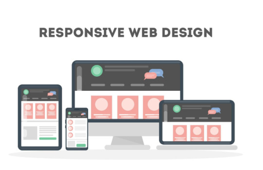
With the growing variety of devices, including smartphones, tablets, and desktops, responsive design is essential. Websites must adapt seamlessly to different screen sizes and resolutions, ensuring a consistent user experience across all devices. Implementing responsive frameworks like Bootstrap or using CSS media queries can help achieve this.
2. Fast Loading Speed

Users expect websites to load within seconds. Slow loading times can lead to higher bounce rates and poor user experiences. Optimizing images, using content delivery networks (CDNs), and minimizing HTTP requests are some common techniques to enhance website speed.
3. User-Friendly Navigation

Intuitive navigation ensures users can find the information they need without frustration. Features like dropdown menus, clear call-to-action buttons, and a well-organized site structure are vital for creating user-friendly navigation.
4. Search Engine Optimization (SEO)

SEO is a crucial aspect of web development, as it determines a website’s visibility on search engines. Features like clean URLs, meta tags, fast page speed, mobile-friendliness, and schema markup are in demand to boost search rankings.
5. High-Level Security

With increasing cyber threats, security is non-negotiable. Websites need HTTPS protocols, secure payment gateways, data encryption, and regular software updates to protect user data and maintain trust.
6. Content Management Systems (CMS)

Many clients prefer CMS platforms like WordPress, Drupal, or Joomla for easy website management. These systems offer flexibility, scalability, and user-friendly interfaces that empower non-technical users to manage their websites efficiently.
7. Integration with Third-Party Tools

Modern websites often require integration with tools like CRM systems, email marketing platforms, and analytics tools. APIs play a key role in enabling seamless integration and enhancing website functionality.
If you want to Discover more about this topic, click here
8. E-Commerce Functionality

For businesses selling products or services online, e-commerce features are indispensable. Secure payment gateways, shopping carts, inventory management, and customer reviews are some of the most requested functionalities.
9. Interactive Features

Interactive elements such as forms, chatbots, and animations keep users engaged. Chatbots, for instance, can provide instant customer support, while interactive forms simplify data collection.
10. Accessibility

Web accessibility ensures that websites are usable by people with disabilities. Features like screen reader compatibility, keyboard navigation, and sufficient color contrast are increasingly important to meet legal requirements and enhance inclusivity.
11. Progressive Web Apps (PWAs)

PWAs combine the best of web and mobile apps, offering offline access, fast loading times, and push notifications. They’re in high demand for businesses looking to enhance user engagement without the cost of developing native apps.
12. Real-Time Functionality

Real-time features like live chats, notifications, and collaborative tools are becoming more popular. These features rely on technologies like WebSockets to provide instant updates.
Conclusion
Staying up-to-date with the most common features in web development is crucial for creating modern and functional websites. Whether you’re a developer, designer, or business owner, focusing on these features can help you deliver exceptional user experiences and meet market demands. By prioritizing responsive design, speed, security, and interactivity, you can ensure your web projects remain competitive in an ever-evolving digital landscape.
0 notes
Text
How to Increase Traffic with a Mobile Responsive Design

Creating a mobile-responsive website is one of the smartest strategies to attract more visitors. With over half of global web traffic coming from mobile devices, ensuring your site is optimized for mobile users is no longer optional – it's essential. A mobile-responsive design not only improves user experience but also helps you reach a broader audience and drive traffic. Here's how you can increase website traffic by leveraging a mobile-responsive design:
1. Improve Search Engine Rankings
Search engines like Google prioritize mobile-friendly websites. A mobile-responsive design ensures your website performs well on mobile devices, aligning with Google’s mobile-first indexing. By optimizing your site for mobile, you can improve your SEO rankings, making it easier for potential visitors to find you online.
Tips:
Use tools like Google’s Mobile-Friendly Test to check your website’s responsiveness.
Optimize images and videos to reduce load times.
Ensure your site uses a responsive framework like Bootstrap.
2. Enhance User Experience
A mobile-responsive website provides a seamless experience across devices. Visitors can easily navigate your site, read content, and complete actions, leading to longer time spent on your site and lower bounce rates. When users have a positive experience, they are more likely to return and recommend your site to others.
Tips:
Use larger buttons and legible fonts for mobile users.
Simplify navigation with a mobile-friendly menu.
Test your site on multiple devices to ensure optimal usability.
3. Leverage Social Media Traffic
Social media platforms are predominantly accessed on mobile devices. Sharing links to your mobile-responsive website on platforms like Instagram, Facebook, and Twitter can help drive traffic. A responsive site ensures that users clicking through social media links have a smooth experience, increasing the likelihood of engagement and conversions.
Tips:
Create shareable content, like blog posts or infographics, to drive social traffic.
Use eye-catching visuals optimized for social media sharing.
Add social sharing buttons to your website.
4. Reduce Bounce Rates
A poorly optimized site can frustrate users and lead to higher bounce rates. A mobile-responsive design ensures fast load times and a user-friendly interface, encouraging visitors to stay longer and explore your content.
Tips:
Use a Content Delivery Network (CDN) to speed up load times.
Compress large files to improve mobile performance.
Regularly monitor site speed using tools like Google PageSpeed Insights.
5. Target Local Searches
Mobile users often search for local businesses and services. A mobile-responsive design combined with local SEO strategies can help you capture this audience and increase traffic.
Tips:
Optimize your Google My Business listing.
Include location-specific keywords in your content.
Ensure your contact information is easy to find on mobile.
6. Focus on Mobile Advertising
Investing in mobile ads can help you attract more visitors to your responsive website. Platforms like Google Ads and Facebook Ads allow you to target mobile users specifically, driving traffic directly to your site.
Tips:
Create mobile-optimized ad campaigns.
Use clear call-to-action (CTA) buttons that lead to responsive landing pages.
Monitor ad performance and adjust targeting as needed.
7. Utilize Email Marketing
Email campaigns are often opened on mobile devices. Ensure that your email links lead to mobile-friendly pages to drive traffic and boost engagement.
Tips:
Use responsive email templates.
Include compelling CTAs that lead to your website.
Test your emails on mobile devices before sending.
8. Provide Quality Content
Content remains king, and mobile users appreciate easy-to-read, high-quality content. By offering valuable, engaging content optimized for mobile devices, you can attract more visitors and keep them coming back.
Tips:
Use shorter paragraphs and bullet points for better readability.
Optimize images and videos for mobile viewing.
Update your blog regularly with fresh, relevant content.
9. Monitor Analytics and Adapt
Regularly tracking your website’s performance can help you identify areas for improvement and adapt your strategy to increase traffic. Pay special attention to metrics like mobile traffic, bounce rate, and average session duration.
Tips:
Use tools like Google Analytics to monitor mobile traffic.
Identify pages with high bounce rates and optimize them for mobile.
Continuously test and improve your website’s responsiveness.
Conclusion
A mobile-responsive design is more than a technical upgrade; it’s a strategic tool to boost your website traffic. By improving search engine rankings, enhancing user experience, and tapping into mobile audiences, you can drive more visitors to your site and achieve your business goals.
0 notes
Text
What role does mobile-friendliness play in technical SEO, and how can I improve it?
Mobile-friendliness is crucial in technical SEO due to Google's mobile-first indexing policy. This means Google primarily evaluates the mobile version of a site for ranking. A mobile-friendly site enhances user experience, reduces bounce rates, and boosts SEO performance.
How to Improve Mobile-Friendliness:
Responsive Design: Ensure your site adapts seamlessly to different screen sizes using responsive web design frameworks like Bootstrap.
Mobile-Optimized Content: Use readable font sizes, avoid pop-ups that cover content, and ensure buttons are easy to tap.
Optimize Images and Videos: Use lightweight formats and adjust dimensions for mobile screens.
Improve Mobile Speed: Optimize for fast loading by compressing files, enabling caching, and using a CDN.
Test Mobile Usability: Use Google’s Mobile-Friendly Test to identify and fix issues.
Implement AMP (Accelerated Mobile Pages): If appropriate, create AMP versions of your pages for faster loading on mobile devices.
Prioritizing mobile-friendliness ensures a better ranking and user experience.
0 notes
Text
Bootstrap in WordPress: Setup, Themes, Pros & Cons, and Alternatives
Web development keeps to conform, with responsive layout emerging because the gold trendy for web sites. At the leading edge of this movement is Bootstrap, a effective the front-give up framework. Paired with WordPress, the sector’s maximum famous content cloth control device (CMS), Bootstrap offers developers a streamlined technique to constructing responsive, netherland rdp at&t vps residential rdp cell-first web sites.
This manual explores the whole thing you want to realize approximately the use of Bootstrap in WordPress, from setup and issues to pros, cons, and alternatives. Throughout the blog, we’ll also display how tools like Netherlands RDP, AT&T VPS, and Residential RDP can enhance the improvement, finding out, and website hosting system.
What is Bootstrap?
Bootstrap is a front-give up framework that simplifies net improvement. Created thru Twitter in 2011, Bootstrap has grown into a comprehensive toolkit with pre-designed CSS lessons, responsive grid structures, JavaScript plugins, and reusable UI additives.
Why is Bootstrap Important?
The primary motive for Bootstrap’s popularity lies in its functionality to create websites which are responsive, mobile-first-class, and visually attractive. Integrating Bootstrap with WordPress permits developers to:
Rapidly prototype responsive websites.
Create visually cohesive difficulty topics.
Optimize consumer revel in throughout devices.
Use Cases for Bootstrap and WordPress
Bootstrap’s flexibility makes it quality for a number of WordPress tasks, including:
Business web sites.
Portfolios.
E-commerce systems.
Blogs.
While working on those use cases, gadget like Netherlands RDP can offer a stable, remote surroundings for trying out usual performance globally. Similarly, an AT&T VPS ensures that the hosted internet site on line runs seamlessly underneath heavy site traffic.
Why Use WordPress with Bootstrap?
WordPress and Bootstrap together provide the exceptional of each worlds. WordPress manages the backend, at the identical time as Bootstrap handles the the front-quit layout, ensuring a seamless workflow.
Advantages of Combining WordPress with Bootstrap
Rapid Development: Pre-designed additives reduce coding.
Responsive Design: Ensures a regular person experience at some stage in devices.
Customizable Themes: Easy to regulate with Bootstrap’s grid and software instructions.
Community Support: Both systems boast widespread communities for troubleshooting and assets.
For builders operating remotely, a Residential RDP allows brief get right of entry to to files and servers, making sure paintings continuity.
How to Set Up Bootstrap in WordPress
Setting up Bootstrap in WordPress involves three essential steps: including Bootstrap, customizing the subject matter, and trying out responsiveness.
Step 1: Adding Bootstrap
Bootstrap may be introduced the use of:
CDN: Quick and lightweight.
Local Files: Provides extra manage however requires net web hosting Bootstrap documents in your server.
Here’s an instance of together with Bootstrap via CDN on your functions.Php report: -\code\- function add_bootstrap_to_theme() { wp_enqueue_style('bootstrap-css', 'https://cdn.jsdelivr.net/npm/[email protected]/dist/css/bootstrap.min.css'); wp_enqueue_script('bootstrap-js', 'https://cdn.jsdelivr.net/npm/[email protected]/dist/js/bootstrap.bundle.min.js', array('jquery'), null, true); } add_action('wp_enqueue_scripts', 'add_bootstrap_to_theme');
Testing the mixing the usage of Netherlands RDP permits make certain the scripts load efficiently for the duration of numerous networks.
Step 2: Customizing Your Theme
Bootstrap calls for modifications to the WordPress situation count number documents, along with header.Php, footer.Php, and index.Php. Add Bootstrap instructions to factors like menus, buttons, and paperwork.
Bootstrap Navbar Example
Here’s a clean Bootstrap navbar in your WordPress theme:
<nav class="navbar navbar-expand-lg navbar-light bg-light"> <a class="navbar-brand" href="#">Site Name</a> <button class="navbar-toggler" type="button" data-bs-toggle="collapse" data-bs-target="#navbarNav"> <span class="navbar-toggler-icon"></span> </button> <div class="collapse navbar-collapse" id="navbarNav"> <ul class="navbar-nav"> <li class="nav-item"><a class="nav-link" href="#">Home</a></li> <li class="nav-item"><a class="nav-link" href="#">About</a></li> </ul> </div> </nav>
Tools like Residential RDP can be used to test the ones adjustments for the duration of numerous devices with out disrupting neighborhood environments.
Step 3: Testing Responsiveness
Bootstrap’s grid tool is the coronary heart of its responsive layout. Create layouts that adapt to unique display sizes:
<div class="container"> <div class="row"> <div class="col-md-6">Left Column</div> <div class="col-md-6">Right Column</div> </div> </div>
Testing on an AT&T VPS ensures your website performs properly under awesome situations, collectively with low bandwidth or immoderate traffic.
Top WordPress Themes Built with Bootstrap
Several WordPress subjects leverage Bootstrap’s skills. Here are a few famous alternatives:
Shapely
Features: A one-web page layout suitable for portfolios and corporation internet websites.
Ideal For: Showcasing awesome snap shots or merchandise.
Use Case: Hosting on AT&T VPS guarantees speedy loading instances for photo-heavy pages.
Sparkling
Features: Minimalist format with a focal point on clarity.
Ideal For: Blogs and private web web sites.
Testing: Use Netherlands RDP to assess international net page overall performance.
Newspaper
Features: A modern-day difficulty designed for content material-heavy web sites.
Ideal For: Online magazines or records blogs.
Advantages: Pairing this with Residential RDP ensures seamless a long way flung updates.
Pros of Using Bootstrap in WordPress
Responsiveness
Bootstrap guarantees your internet site is cellular-first, providing fantastic usability in the course of gadgets. Test the responsive features the use of Netherlands RDP to validate global overall performance.
Customization Options
With pre-designed additives and grid structures, Bootstrap permits countless customization. Accessing those files remotely thru Residential RDP guarantees consolation.
Developer Efficiency
Using Bootstrap minimizes the time spent on repetitive coding obligations. Hosting on an AT&T VPS similarly hurries up improvement with quick loading environments.
Cons of Using Bootstrap in WordPress
Learning Curve
Beginners may additionally find Bootstrap’s application instructions overwhelming. Using Residential RDP for committed studying durations can assist decrease downtime.
Code Overhead
Bootstrap consists of capabilities that might not be used, which includes unnecessary bulk. Testing load times on an AT&T VPS can spotlight regions for optimization.
Limited Originality
Websites constructed with Bootstrap on occasion appearance comparable. Customizing designs on Netherlands RDP ensures a completely unique appearance.
Alternatives to Bootstrap for WordPress
While Bootstrap is strong, a few developers select different frameworks. Here are tremendous alternatives:
Tailwind CSS
A software-first CSS framework that gives flexibility with out Bootstrap’s bulk. Test its integration with WordPress the usage of Residential RDP.
Foundation through Zurb
Known for advanced responsiveness and accessibility functions. Hosting it on an AT&T VPS affords fast net web page masses.
Bulma
A lightweight framework with a simple syntax. Use Netherlands RDP to test its basic performance in splendid regions.
RDP and VPS in Bootstrap Development
Netherlands RDP for Global Testing
Testing your WordPress internet web site via Netherlands RDP ensures compatibility throughout particular areas and net situations.
AT&T VPS for Hosting
Using an AT&T VPS provides immoderate-tempo website hosting, decreasing downtime and making sure clean average performance for Bootstrap-powered web sites.
Residential RDP for Remote Work
A Residential RDP lets in developers to paintings securely on their WordPress tasks, even on public networks.
…Conclusion…
Bootstrap and WordPress are a dynamic duo for growing responsive, feature-rich internet websites. By leveraging tools like Netherlands RDP, AT&T VPS, and Residential RDP, developers can streamline their workflow, take a look at successfully, and host effectively.
Whether you pick Bootstrap or explore alternatives like Tailwind CSS or Foundation, the essential thing to fulfillment lies in adapting the device and technology for your specific wishes. With the proper setup and assets, you may construct a internet site that not best meets man or woman expectations however exceeds them.
0 notes
Text
Building Cutting-Edge Websites: A Guide to Web Development in Coimbatore
In today’s competitive digital landscape, a robust website is the cornerstone of any successful business. For companies looking for tailored, efficient, and scalable solutions, Technox Technologies, a leading website development company in Coimbatore, offers a comprehensive range of web development services.
Why Choose a Website Development Company?
Choosing the right website development company ensures that your online presence is optimized for performance, functionality, and growth. From small businesses to large enterprises, companies can benefit from custom-built websites that not only look professional but also function smoothly across devices and platforms.
Why Coimbatore?
Coimbatore has become a hub for technological innovation, boasting a rich talent pool of web developers and a rapidly growing IT industry. Technox Technologies stands out as one of the top choices for businesses that want to scale their digital presence.

Services Offered by Technox Technologies
1. Custom Website Development
Whether you need a dynamic e-commerce platform or a simple static site, Technox crafts custom websites that align with your business goals. They use HTML, CSS, JavaScript, and various back-end technologies like PHP and Python to develop responsive, scalable websites.
2. E-commerce Website Development
Technox specializes in building e-commerce websites that enhance user experiences and drive conversions. Using platforms such as WooCommerce, Shopify, and Magento, they create custom online stores with user-friendly navigation, secure payment gateways, and seamless product management features.
3. CMS-Based Development
Using WordPress or Drupal, Technox builds content management systems (CMS) that allow you to manage your website's content efficiently. This feature empowers you to easily update product listings, publish blog posts, and edit pages.
4. Third-Party API Integration
Technox integrates third-party APIs to enhance functionality—whether it's connecting to payment gateways, social media platforms, or external databases, ensuring that your site is as functional as it is beautiful.
Advanced Tools and Technologies Used by Technox
Technox leverages cutting-edge technologies and tools to ensure high-performance websites:
Front-End Technologies
HTML5 & CSS3: For structuring and styling.
JavaScript Frameworks: Libraries like React.js and Vue.js for smooth user interactions.
Responsive Design: With frameworks like Bootstrap, sites adapt seamlessly to all device sizes.
Back-End Technologies
Node.js and PHP: For building scalable and fast back-ends.
Python (Django/Flask): For high-performance web applications.
MySQL and MongoDB: Reliable databases for handling complex data operations.
Security and Performance Optimization
Security and performance are integral to any website's success. Technox Technologies employs SSL certificates, firewall protection, and regular security audits to prevent vulnerabilities. Additionally, they optimize websites for faster load times using CDNs and lazy loading techniques, which enhance user engagement.
Website Development Process at Technox
At Technox, the web development process is broken down into several key stages:
1. Strategic Planning
A project begins with identifying business goals, understanding the target audience, and performing a competitive analysis. A roadmap is then created to align design and functionality with business objectives.
2. Design and User Experience (UX)
The team focuses on creating visually appealing designs while ensuring ease of use. Tools like Figma and Adobe XD are utilized for wireframing and prototyping to create intuitive and engaging user experiences.
3. Development
Once the design is approved, development begins. The front-end team works on translating the design into code, while the back-end team sets up databases, server configurations, and APIs.
4. Testing and Quality Assurance
Before the launch, Technox rigorously tests websites across multiple devices and browsers. They employ automation tools like Selenium to perform load testing, cross-browser testing, and performance evaluations.
5. Deployment and Maintenance
Once the site is ready for the live environment, Technox deploys it to the client’s server and monitors for any issues. They offer continuous support and updates, ensuring that the website runs smoothly even after launch.

Latest Trends in Web Development
Technox Technologies stays at the forefront of the industry by incorporating the latest trends:
1. Progressive Web Apps (PWAs)
PWAs offer a mobile app-like experience directly from a browser, improving engagement and performance. With features like offline accessibility and fast loading times, PWAs are becoming increasingly popular.
2. AI and Chatbots
Integrating AI-powered chatbots into websites can enhance customer service by offering real-time, automated assistance. This is particularly useful for e-commerce websites where users may have frequent inquiries.
3. Voice Search Optimization
Voice search is on the rise. Technox ensures that your website is optimized for voice searches, which can help improve SEO rankings and user experience.
4. Motion UI
Motion UI adds dynamic transitions and animations, making the website more engaging. This improves the user experience by providing visual feedback and improving overall usability.
Frequently Asked Questions (FAQs)
1. Why should I hire a website development company?
A website development company offers expertise in creating professional, high-performing websites that align with your business goals. They bring technical expertise and modern design principles, ensuring your site is both functional and visually appealing.
2. How long does it take to develop a website?
The development time can vary depending on the complexity of the project. On average, a basic website can take 4-6 weeks, while a more complex e-commerce site may take 8-12 weeks.
3. Can I update my website on my own after development?
Yes, if you opt for a CMS-based solution like WordPress, you will have the flexibility to update content, images, and other elements of the website without technical expertise.
4. What security measures are taken to protect the website?
Technox prioritizes security by implementing SSL certificates, firewalls, regular software updates, and performing security audits to prevent hacking and other vulnerabilities.
Conclusion
Technox Technologies, a premier website development company in Coimbatore, offers a comprehensive range of services that help businesses establish a strong online presence. By leveraging the latest tools and technologies, they create custom, scalable, and secure websites that drive engagement and conversions. Whether you need a simple landing page or a full-fledged e-commerce platform, Technox has the expertise to turn your vision into reality.
1 note
·
View note