#browser width
Explore tagged Tumblr posts
Visit Tumblr Blog
Explore Tumblr blogs with no restrictions, modern design and the best experience.
Last Seen Tumblr Blogs


Fun Fact
25% of US internet users with an annual income of $80-100K use Tumblr.
Text
I CANT USE CSS ON ARTFIGHT...............
#I WAS REALLY HOPING TO FIX THE FUCKING. PARAGRAPH WIDTH. SIGH#idk why but it stretches across the ENTIRE page like. it takes up the full width of the browser and it BOTHERS ME. ON ALL THE PAGES#i could try manually putting shift breaks but im worried it might not look so good on mobile. ugghh... auyggghhh.....#im already learning CSS and API so i thought i could put it to good use but. AUGH#this whole time ive had to go into the inspect panel myself and change the padding so i dont have to read the length of the screen#like a fucking typewriter... i would have also loved to use custom fonts and animations......#i did find a guide for BBCode which the site uses on default and it covers basic styling but its not the same. sniffle#you CAN unlock CSS if you donate $25 to the page which seems fair. and if i could do it i would but. i do not have any way of#sending or receiving money online </3 i really need to figure out how to do that so i can set up comms like i said i would last summer#but it intimidates me.... and im already kept on a short leash when it comes to that so it feels like a lot of things could go wrong#i think toyhouse allows CSS or some sort of code...?? i remember seeing some oc pages with custom layouts#if thats the case i'll try fiddling with it but im not very familiar with using toyhouse so thatll take a while#(thanks again for the code sal ^_^ ill put it on my pin once its ready but im trying to learn my way around the site heh ;;)#at least i can use my pixel dividers.. ive been digging around for pixels to use and found some really cute ones#yapping
50 notes
·
View notes
Text
#needed this as a reaction clip#so i wanted to crop/trim it#kept saying the file was corrupted whenever i tried to view the thing through a browser so i struggled with that for over an hour#turns out the video couldn't be under 400 pixels (or something close to that) in height/width without deciding to die#so i had to give him a bigger enclosure#newt posting#jerma#video
4 notes
·
View notes
Text
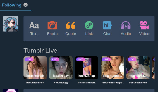
no offense to these people but this literally looks like the front page of a porn cam site. on top of all the other issues
#this is horrendous#but i am not installing browser addons#it's only really a problem in full width and iuse half-width windows anyway#still. jesus christ#tumblr#tumblr live
6 notes
·
View notes
Text
i love my 45 (browser) bookmarks and my 45 bookmarks love me
#labyposting#they almost take up the width of my browser window#no text or anything just little website icons#i hardly even go to most of these maybe i sould do a little clean up
1 note
·
View note
Text
Comment resources
Receiving comments means so much to fic authors so we’d love to encourage people to leave more. But we appreciate that leaving comments can be a bit daunting or draining, especially on days when we are tired or already stressed. So here are a few resources to hopefully encourage us all to leave more and to make doing so easier.
Archive of Our Own floating comment boxes
There are a couple of versions of these out there and they can be helpful. They are browser extensions that allow you to keep the comment box on the screen whenever you like so that you can easily comment as you read, rather than getting to the end and panicking about what to say.
Here are two different versions:
AO3 Floating Comment Box by ScriptMouse
Floaty Review Box by ravenel ← I use this one and think it’s great - Squid 💕
Feed The Fandom Fest
Have you heard of the @feedthefandomfest bingo cards? Because if you’re participating in these, maybe one of the recs on this blog could be the perfect way to tick off a square on these cards. Or, if you’ve not started one yet, why not pick one to encourage yourself to comment more and have some fun while doing so?
Here are the different cards:
Original Card
For Beginners
Fluff Edition
Angst Edition
Smut Edition
Old Fic Edition
Billy Hargrove Edition
Or put your own together!
I’d also just recommend having a look through the Feed The Fandom Fest blog in general, it’s such a wonderful resource 💖
Additional AO3 Kudos
Here’s some images of additional kudos for when you’re longing to mash that button again but all it greets you with is that mocking red smiley face. These are complete with the html to easily put them in!
AO3 Random Nice Comments
This browser extension will give you a short, nice comment from a list at the press of a button. It may be useful for beginner commenters who want to say something nice but are unsure what.
Comment prompts
If you want to craft your own comments but are unsure what to say, here’s a few starting points:
What is the first thing that comes to mind when you think back on the fic? I’m sure the author would love to know
Who was your favourite character in the fic?
Where are you reading the fic?
Speculate on what could happen after the end of the fic
How did you react emotionally? Did you laugh? Cry? Smile? Scream?
Or there’s the simple but ever loved:
Keyboard smash
String of emojis
‘Loved this!’
Here’s some more lists of prompts:
Good and easy comment ideas by ao3-shenanigans
Some more easy comment suggestions by ao3-shenanigans
Unhinged fic comment ideas by magpie-murder
Our comment stickers
Here’s a few stickers we made to use in place of comments if you want to leave something but still don’t know what to type out yourself:


html for the above, in order:
<img src="https://i.postimg.cc/yYRJxJ8C/readforbookclub-sticker.png" alt="sticker with stars and text reading: I READ THIS FIC FOR FANFIC BOOK CLUB AND LOVED IT" width=45% />
<img src="https://i.postimg.cc/yxgDFxh9/greatwork-sticker.png" alt="sticker with stars and text reading: I ADORE THIS FIC GREAT WORK" width=45% />
<img src="https://i.postimg.cc/c12gd7Zc/howtheactualheck-sticker.png" alt="sticker with stars and text reading: HOW THE ACTUAL HECK IS THIS SO GOOD?" width=45% />
<img src="https://i.postimg.cc/V6HSrntm/amazingwriting-star-sticker.png" alt="star-shaped sticker with text reading: AMAZING WRITING!" width=45% />
<img src="https://i.postimg.cc/RZzWHMW6/screamingcryingthrowingup-star-sticker.png" alt="star-shaped sticker with text reading: SCREAMING CRYING THROWING UP" width=45% />
<img src="https://i.postimg.cc/1XkfMSMd/mayiofferyoumyfirstborn-star-sticker.png" alt="star-shaped sticker with text reading: MAY I OFFER YOU MY FIRSTBORN? OR PERHAPS MY SOUL?" width=45% />
3K notes
·
View notes
Text
Old Tumblr Dashboard (Userstyle)!!
I created a Userstyle for the Chrome/Firefox Stylus Extension that reverts the new dashboard to the old look!
You need to have Stylus installed. So if you don't have it:
Install the Stylus Firefox Addon or the Manifest V2 Chrome Extension (You can install Chrome Extensions on Edge as well)
Once it's installed into Firefox/Chrome/Edge you can proceed with adding this style or any other.
To add the style (Stylus), follow the instructions:
Go to this link: https://userstyles.world/style/11286/old-tumblr-dashboard-userstyle (If it says 'style not found' then the Userstyle.world server is just down, try again in an hour)
Click on "install".
Style will open a tag with it and in the left side you'll have a button that says "install style", click there. (Step-by-step copied from the lovely dorothyoz39 who wrote this in a reply!) If you don't want the sticky header you can remove the labelled script at the top of the css below /* Sticky Header*/
For Manifest V3 only Chrome Or Stylus incompatible browsers:
For Chrome Manifest V3 install the Tampermonkey Extension
Then add the Tampermonkey Backup Script instead of the Stylus version
https://greasyfork.org/en/scripts/492279-old-tumblr-dasboard-backup I highly recommend you switch to Firefox for continued use of good extensions! Stylus does not have a V3 update yet; however, the tamermonkey script works just as good.
Be sure to check for updates regularly and if you'd like, consider supporting me on Ko-Fi https://ko-fi.com/pixiel !
I'm currently taking donations so I can afford a much-needed wheelchair, so please check out my GoFundMe for more details! Any Ko-Fi donations will be added manually to the GoFundMe
..::::HOW TO UPDATE::::..
click the Manage button on Stylus and click the check for update button next to the userstyle, then click again to install!

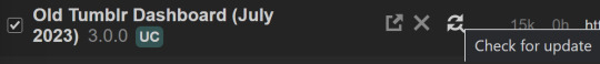
Make sure to check the Userstyle and see if the version number matches the one below if you don't see any changes!
NEW UPDATE: 25/05/25 (D/M/Y) 17:28PM BST v17.13
16.16: Fixed activity and notifications, they now look like the previous version 17.0: Final update to the new icons bs! Every page should be functional. If theres any missed parts or bugs - let me know! 17.9: Minor fixes and Tampermonkey update! You can also fix the positioning of the Communities button and subnav from this menu as well - it should remember your settings when you update!


Tumblr Post Width & More (OTD+ Userstyle) Is now available!!
OTD+ is an add on for Old Tumblr dashboard that you can use to edit the Post Width, Content Positioning & More - It must be used with Old Tumblr Dashboard installed as well on the latest update! This style might be merged with OTD in the future.
THE CREATOR OF THIS USERSTYLE SUPPORTS THEIR TRANS SISTERS. WE'RE ALL IN THIS TOGETHER!
Check the readmore for the changelog, custom code & known issues!
----- Known issues:
Only two columns in Masonry view. Semi-Unfixable, Tumblr creates columns based on monitor size, if I try adding another column (because it doesn't exist) it just perpetually loads on screen. Semi-fix: Zoom out in chrome/firefox and it adds more columns, you may need to change the font size of the page though
Search bar doesn't appear on some pages (like viewing a post), this is because Tumblr removed the search bar on those pages completely. Unfixable but not a big deal
Tumblr has ONCE AGAIN CHANGED THE ACCOUNTS MENU. The menus are now shorter and have less information on them. This is unfortunately permanent. I do not see any way to fix this. Unfixable.
If you want people's icons to stay fixed in place, instead of scrolling with the dashboard change this in Stylus;


Or if you're using the tampermonkey version

Find text:
.NLCTe > div.Evcyl > div > div > .So6RQ.YSitt > .ge_yK > .c79Av > article > header > .RYkKH > .nZ9l5 { pointer-events: auto; top: 55px; transition: top .25s; position: -webkit-sticky; position: sticky; } and replace it with;
.NLCTe > div.Evcyl > div > div > .So6RQ.YSitt > .ge_yK > .c79Av > article > header > .RYkKH > .nZ9l5 { pointer-events: auto; top: 0px; transition: top .25s; position: absolute; }
Solved issues: (Update)
Menus need to be manually closed SOLVED! in V.4 and updated in V.5! The menu & icon WILL scroll with you if you have removed the sticky header CSS, however, clicking anywhere on screen will make the Menu disappear still.
Masonry view in searches is now fixed!
Resized Messenger Chat Box!
NEW UPDATE 16/08/23, 23:55 BST v6.5: Figured out how to reorganise the icons in the header. Let me know if you have any problems with it and make sure to update your Userstyle! Some icons are hidden with Display: Block; you can hide more icons with this method!

Solved issues p2
Brought back SOME of the icons for Tumblrs latest update - Unfortunately, this does not bring back user icons for Reblogged posts! Make sure to yell at Tumblr for removing the icons as well as the horrible dashboard update here! v7.5 Fixed icons for all posts and put them back where they came from!
v6.9.6.9 (I promise this is the last funny number): Fuck Off Buggy The Clown Update + All languages support for the old header design!
v7.0: Fixed the search bar for tumblrs new collections feature, so it looks like the original search bar!
v8.0: Fixed masonry view icons, hidden the reblog icon on dashboard icons, fixed icons in blog viewport
V8.1: Fixed issue with icons not working on soft-refresh & with endless scrolling disabled - be sure to complain to staff!
v9.3: Changed a few things with the search feature, I also made the posts less round.
UPDATE2 11/04/2024: SO We mighhtttt have overrun their servers. 😅 I'm getting a 500 Internal Server Error every time I try to fix it or upload it as a new style - the massive influx of people downloading the userstyle was probably too much. The Tampermonkey backup on Greasyfork works just fine though! Probably easier for a lot of people migrating anyway! UPDATE 11/04/2024:: My code has broken on Userstyles.world, (it is now fixed as of 12/04/24) until this is fixed I have created a Tampermonkey Backup Version of the Userstyle so feel free to use this version if you've broken yours!
https://greasyfork.org/en/scripts/492279-old-tumblr-dasboard-backup
v9.6: Moved the Following | For you | Your Tags to below the create a post panel. Fixed the Accounts Menu! + Bugfixes V10.3: Patio compatibility. Added a way to hide the Patio button & "patio feedback?" button, just search for patio in the code and follow the instructions! v11.0: Temporary Chat feature fix after Tumblr broke it, fixed some positioning issues and j/k scrolling!
v12.3: Fixed a text issue (my bad!), I undid the changes to the replies function and added a way to fix icons order for when you get the communities update!
v12.5: Update to make compatible with the Content Positioning using Tumblr Post Width & More (OTD+ Userstyle) v12.6: Post buttons fixed, icons unable to be fixed yet as I haven't got the tumblr changes just yet - but I will fix them asap!
v11.7: Communities Update, changed the new search bar on communities page to resemble the old one. The search bar still doesn't work on these pages yet for some reason. Blog view icons fixed. v13.0: The icons change should now have a working patchfix! BIG THANK YOU to arcadian-asgardian for sending me the screenshots I needed and testing if it worked. + Minor tweak, communities button resized to fit the rest of the icons better v13.2: Mini fixes now that I have better access to the new changes! Communities icon re-centered, usernames nudged back into place.
V13.5 & v13.7: Nuked the Go Premium button - Re-positioned the search bar on search pages v13.10: Changed a lot of the new look for replies - it's not perfect yet mind. Small bug with the "..." menu moving to the left with shorter replies. Looks a lot more like the old replies section though! Made it possible to remove the reply to reply button just search for "NEW Replies UI" in the userstyle and remove the /* */ around "display: none" OR use Ublock to block the element! v14.1: Reverted the "Original Poster" border + text to look like old version. Edit: Whoops, fixed an issue with showing the timestamps
v13.4: Added a way to fix the communities icon position if you don't have the New Xkit button or have hidden any of the icons. Just remove the highlighted /* */ pair in the code for what you need.
v14.11: Made Premium Perks button available in the bottom left corner for all premium users v15.2: Fixed the Tumblr fuckup AND added a cool new feature that allows you to customise the look of your header & hide the reply-to-replies button if you like, here's how to customise this. Set to "Block" if you want the button/icon visible, Set to "None" if you want it hidden! V15.5: Given labels to options for clarity - now says 'show' or 'hide'!
v15.9: The Boopdate! V16.0: Fixed Search view pages and made them look normal, unfortunately, I can't bring back the dropdown menus for "top"/"All Time" etc - but it should look more like the original now
v16.3: Minor tweaks to make search pages look better
16.10: Fix changes to the notification icons 16.14: Fixed many issues with Tampermonkey Version - including a bug that makes the header go weird when you click on a post, fixed notification icons in small view
16.16: Fixed activity and notifications, they now look like the previous version
16.26: TEMPORARY UPDATE - only changes some aspects of the dashboard - THIS IS FULLY INCOMPLETE AND I AM WORKING ON A FULL FIX FOR THE REST OF THE SITE EDIT: added changes for timestamps!
25K notes
·
View notes
Text
Honestly I recommend everyone learn just a littttle bit of CSS because it really is powerful and just makes bits and pieces of your internet experience more convenient.
Right now I'm cataloguing recipes I've really enjoyed, just trying to get them all in one place. Many of these are instagram recipes and, because I don't trust link rot (aka the possibility that the instagram link goes dead one day), I'm including a screenshot of the recipe along with the link.
But instagram on desktop... looks like this
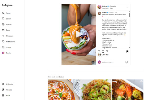
(Link, for credit. It's a good recipe)
I obviously could just copy-paste the recipe out of there. But a screenshot would be cleaner for how I'm cataloguing these.
And as-is, I'd have to scroll the whole height of that small right-side window about 4 times to fit it all.
But actually... I can just resize that div holding that whole right-side content
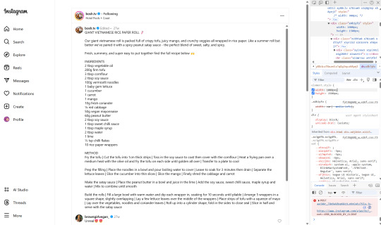
Basically I
hit f12 to open the dev tools
clicked the element finder
clicked on an element inside the recipe side
followed it up the tree until I found the element holding the whole recipe side (do this by hovering the div in the dev tools panel way on the right, then hovering upward and up until I find the element which is the highest up that still only contains the recipe-side content)
in the element.style part, set "width: 1000px" and "height: 1500px"
(I notice the width seems to still be less than 1000px, even though it got bigger)
likely suggests there's an element above it with a max-width set
go up the tree higher until I find the element with the max-width and uncheck that style
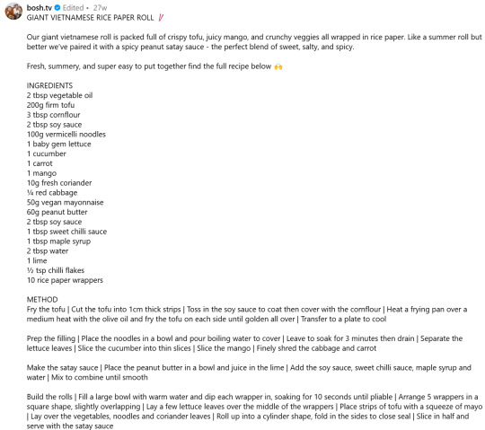
screenshot ready
Maybe that sounded complicated but it took me probably 20-30 seconds
And this isn't just about screenshotting recipes like.
website with an annoying gif? select gif, delete gif
do you want a clean screenshot of a digital receipt for record-keeping without a large company banner or irrelevant information? delete unnecessary elements, adjust widths, screenshot
SOMETIMES, you can bypass paywalls if they're relying on something like overflow: hidden, or an overlay in the way, or some JS that runs (you can disable JS in the dev tools)
lost the jpg/png file you used for your profile picture and size doesn't totally matter? grab it from the img src while logged in. (you might even be able to find it in a bigger size by changing the url query parameters)
color contrast on an article really bad? find and change background color. find and change font color
want to make a funny fake screenshot without learning photoshop? just edit the page content in the dev tools
This isn't about like being good enough to write scripts or browser extensions. Really if you just have some basic HTML/CSS understanding a hat worth of tricks, you can make so many little adjustments in your favor.
683 notes
·
View notes
Text
Dashboard Unfucker v3.3.0!
As I first discovered today from the massive surge of people reblogging my previous update posts, the shitty new layout is now universal despite widespread protest, since us existing users are now apparently backseat to a Tumblr's hypothetical endless stream of high-revenue new users who are allergic to using social media sites that don't look like every other site. Well, thankfully at least for the time being, reverting the update via userscript is still as easy as ever!
Version 3.3.0 even fixes the new server-side bug where avatars next to posts disappear, because apparently I spend more time reviewing my commits than a multimillion dollar social media platform.
Installation Guide:
A userscript extension is required to run the script. Currently, the only tested extensions are Tampermonkey and Violentmonkey, but you might have still have luck with a different extension if you already use it.
Once you have the userscript extension installed, simply click this link to open the install page. This also works for updating, but make sure the version listed near the top is up to date, since it only fetches the script from GitHub every so often.
And of course, it's all open-source! Contributions, bug reports, and general insights are all appreciated.
Common troubleshooting info under cut:
Script not working
I can't offer specific help without knowing exact details, but two common issues are caching (try clearing your browser cache) and conflicts with New XKit (the script works fine with XKit Rewritten, which I would recommend anyways). If neither of those solve it, you can open an issue on the repository with more details.
Content takes up the full width of the page
This is an XKit feature, Panorama.

6K notes
·
View notes
Text
I have gotten a lot of messages saying that they really love the presentation of CURSE/KISS/CUTE. Often the commenter in question can’t say what exactly it is about the formatting that they appreciate, but that it just reads well and looks good. Well!!! Allow me to bare my wealth of secret knowledge for you once and for all:
I sorta just did some research into book typography...?
Here’s something you should know about web development, alright: typography on the web is really, really bad. The tools we have at our disposal—HTML and CSS—are incredibly powerful, but they are set up to fight you every step of the way towards Good Typography. When you know what you’re looking for, you can fix all the common issues quickly and easily. But it’s not easy to know what to look for, because
problematic typography is overwhelmingly the norm on the web, and
good typography is invisible.
Here’s a screenshot from CURSE/KISS/CUTE episode 0:

Now, I don’t want this post to come across as prescriptive. It is not my intention to tell you, “This is what good typography looks like, so follow my lead exactly.” I made a lot of choices with the typography of my web novel: many of those choices would not make sense in other contexts. What I want to convey to you is what those choices are, so that you will know they’re available to be made.
I mentioned that the web “fights you” when it comes to good typography. What do I mean by that? Well, check this out:

This is how that passage of text renders “by default.” In other words, this is how a web browser would render that text without any input from me about what styles to apply. It kind of sucks ass! But it also looks pretty familiar, right? This is not that far off from how a lot of websites—even websites full of prose (looking at you, AO3)—render text.
I think the most illustrative thing to do here would be to walk you through my thought process and show you, step by step, what decisions I made to turn this unstyled text into the styled version you see in the novel.
So, first things first:
1. We have got to shrink that text column.
Computer monitors... are wide. They are wider than they are tall. They are so wide, and they have so many pixels. This means you can fit a lot of characters on them. If you wanted, you could just have a wall of characters from the left side of the screen all the way to the right side. Talk about efficient!!
You should never, ever, ever do this.
This is one choice that I actually will make a prescriptive statement about, because it’s supported by quite a lot of research: fairly narrow text columns are more legible. Specifically, research seems to support the idea that a width in the range of 50 to 70 characters per line is the most comfortable for people to read*. Every font is different, so it takes a little doing to turn that “characters” figure into a pixel measurement; I went with 512 CSS pixels for the maximum width of my text column:

Isn’t that just so much nicer to read already?
*A commenter reminds me that I’d be remiss not to point out that the research on column width legibility isn’t completely conclusive. You do want to limit the width of your text columns, but going over the 70 character-per-line recommendation isn’t necessarily the end of the world, and you might have good reasons to do so. I did not: as mentioned, one of my goals was to mimic book-style typography, and books by nature have fairly restrained column widths, on account of they’re books.
2. Picking a font.
I’m not going to give you the blow-by-blow on how I decided what font to use. The short story is that I asked some designers, and one of the recommendations I got was the free font Crimson Pro, which I took a liking to immediately:

It’s just an all-around attractive serif font, but one thing I really like about it for use in a novel is its highly-visible quotation marks. They’re just kinda jumbo! They’re real big! Easy to see! In a novel, those things aren’t just ornamentation. It makes a great deal of practical sense for them to stand out just a bit. It also has a fairly large x-height, unlike a lot of the more traditional options, which is good for legibility on a computer screen.
3. Adjusting the line-height
Web browsers default to a line-height of about 1.2em, which, as you can probably tell, is quite cramped. If you go and Google “optimal line height for legibility”, you’ll get a number of results right off the bat suggesting 1.5em. Sounds good! Let’s do that:

Well... hmm. That’s definitely an improvement, but between you and me, it actually looks a bit too spacey to my eyes. I wonder why?
I’ll cut to the chase: the 1.5em recommendation makes some assumptions about the font you’re using. In Arial, the letter “A” is about 0.6em tall; in Crimson Pro, it’s about 0.5em. That means that there’s no one-size-fits-all solution to spacing your lines, because different fonts have different amounts of empty space baked in. How annoying!
Let me tell you something about the kind of nerd I am. When I had this realization, I grabbed some books off my shelf and pulled out a literal micrometer. I started measuring the line-heights against various font features to see if there were any patterns I could spot in professional typesetting. Here’s what I found:

Almost every book on my shelf spaces lines such that the distance between one baseline and the next is about three times the x-height. How cool is that? I clapped my hands like a seal when I put this together.
Adjusting the line-height to match what I observed in the wild gives us this:

It’s a subtle difference, but to my eyes it feels just right. It’s almost like magic!
4. Paragraph spacing...
Let’s address the elephant in the room. Probably the most controversial choice I made with CURSE/KISS/CUTE’s typography was to opt for book-style paragraph indentation rather than web-style paragraph spacing��like so:

I did this for a few reasons:
It’s what I’m used to. I’ve read a lot of books, and this is just the way that books are formatted. I think for something aspiring to the title of “novel”, there’s value in making it look the way a reader probably expects a novel to look.
A novel has a lot of paragraph breaks in it. A paragraph in, say, an encyclopedia entry might go on for half a page or more; whereas it is unusual for a paragraph in a modern work of narrative prose to run for more than a handful of sentences, especially in any scene with dialogue. Because paragraph breaks are so common, spacing between paragraphs in a novel results in a lot of wasted space. Also, subjectively speaking, the additional space seems to me to lend an undue amount of weight to paragraph breaks. I’m just starting a new thought; there’s no need for a 21-gun salute, you know?
Having said that, here are some good reasons you might decide not to do paragraph indentation anyway:
Doing it right requires a bit of extra legwork. Notice how the very first paragraph in the image above has no indentation. That’s because it’s the start of a new section, and the first paragraph in a section traditionally goes unindented. This is an easy detail to miss, and it can be difficult to wrangle CSS into doing it for you automatically.
Web users don’t expect it. For the first decade of the web’s existence, there was no good way to do paragraph indentation; by the time CSS rolled around and made it easy, paragraph spacing had already become the norm. And while CURSE/KISS/CUTE may be a novel, it is also, specifically, a web novel!
But it’s my house and I get to make the rules, so I went with indentation. Incidentally, there seems to be a dire lack of research into the question of whether indentation or spacing is more legible for readers—but the data that does exist appears inconclusive at best. So, the choice really does come down to vibes.
5. The tragedy of justification.
You’ll note that one way in which I did not make my web novel look like a paper novel is the text alignment. It’s un-justified: the right margin is ripsaw-ragged.
This is because it is not possible to justify text on the web.
Oh, you can try. Look right here: there’s a CSS property for it and everything. Just turn on “text-align: justify” and...

Nightmare! The interword spacing on that first line is almost as wide as the indentation!
Reader, I’m afraid that your web browser is simply too dumb. That’s not the browser’s fault: robust algorithms for justifying text without creating these distractingly huge gaps between words have existed for many decades, and modern computers are powerful enough to run them in real time with little performance impact. It’s just, uh—nobody has ever bothered to implement them into web browsers. It is the damnedest thing.
I tried, I really did. You can mitigate this problem a bit if you enable automatic hyphenation, but browsers are unfortunately also kind of dumb at hyphenating. Firefox, for example, will refuse to hyphenate any word containing a capital letter, so any sentence with a lot of proper nouns in it is a lost cause. I tried manually inserting soft hyphens with a text preprocessor I wrote myself, but still these overjustified lines plagued me: when the text column narrows, for example on a phone, even hyphens can’t save you. The line-breaking algorithm is simply too naïve to optimize for well-justified text, and that’s not something you can fix as a web developer.
As a result, my heavy-hearted recommendation is to never use text justification. It’s just too distracting.
6. And then some extra stuff just for me
I added drop-caps because it looks neat and I made the ellipses spacier because I think it looks good when it, uh, when they are spacier. I think that looks pretty good that’s just my opinion though.
That’s all! Hope you learned something bye!!!
526 notes
·
View notes
Text
Digital Stamp Making Tutorial
Hello, and welcome to the long-awaited(at least on my part) digital stamp-making tutorial from neosprites! I’d like to preface that I learned what I was doing from this tutorial so it may be a bit redundant, but if anything I get a bit more specific. Thank you so much to @graphic--horde for your work, it changed me as a graphic maker. This is gunna be a long post so feel free to bookmark it for later. Now, onto the show!

The frame I will be using for this tutorial (which is the frame I use on 99.9% of my stamps) I found from the above linked post, which I believe is from a creator that OP lost track of. Its inner dimensions are 94x50 pixels and its outer dimensions are 99x56 pixels. Here it is!

Find your material! - I recommend using websites like Tumblr and searching with the “GIF” filter only on, or alternatives such as Giphy or Tenor. Your browser may let you directly save the .gif file; if not and you are noticing it restricts you to save it as a .webp file you can try an extension like “Save webp as PNG or JPEG” (for Firefox but I image other browsers have similar functions, but I really recommend you switch to Firefox). To use this you will right click on your source .gif like normal but instead of clicking on “Save image as…” click “Save webP as…” and then click “GIF”. You should be redirected to the website ezgif.com where we will actually be doing all of our editing! Here’s the .gif we’ll be working with.

Convert to GIF (optional) - if you used the extension from the above step you should already be ready to click the blue “Convert to GIF” button. If not, go ahead and open ezgif.com and click on “webP” and then “WebP to GIF”; then convert to a gif with the blue button.

Resize the GIF - now that we have a gif ready to edit, let’s make it the right size. The easiest method I have found is to change it directly to the frame’s inner dimensions, 94x50 pixels. [EDIT: Make sure in the aspect ratio drop drop menu you select "stretch to fit" and not "center and crop to fit" like I did in the photo example.] Click “resize” and then type [94] in for the width and [50] for the height. Next press the blue “resize image” button.


Add the frame - next click “overlay” then click the thin blue button that says “Extend canvas size(use if overlay exceeds GIF sizes)”. This will give us some extra room to add the frame onto the design. Next click “Browse…” and find the frame you have saved onto your device, then click the blue “Upload image” button.


After that it’s going to be misaligned, that’s normal! It will say you have the option to drag it into place, but don’t bother. That’s one of the reasons my old stamps look wack, it’s just harder to do. Instead type [44] in for the Left box and [22] in for the Right box. It took me a while to figure out these dimensions to be honest, and I’ve only tested it with this frame so I don't know if it works with others. Then click the blue “Generate image” button.


Crop the transparent edges - click on “crop”. You will have the option to check a box that says “trim transparent pixels around the image” however, I don’t recommend this as it tends to crop a few of the frame’s pixels with it sometimes. Next, set the Left position to [44] and the Right position to [22]. For the other dimensions we will use the outer dimensions of the frame which are 99x56 pixels, this will trim everything except the tiny spaces in between the stamp frame’s spikes. Type the width as [99] and the height as [56] and click the tiny blue button that says “set”. After that click the blue “Crop image” button.


Save and use! - all that's left is to click “save” and upload the graphic to your liking. (best seen on dark mode obviously)

If you’d like to tag me in stamps you’ve made using my tutorial I would love to see them, but it’s not required!! Make sure to always give credit for pictures/gifs when you can and try not to make stuff out of personal/fan art. Thank you to the person in my inbox who requested this tutorial, I had been meaning to for a while but it was just the kick I needed. :)
#carrd graphics#carrd resources#carrd stuff#rentry graphics#rentry resources#rentry decor#rentry pixels#rentry stuff#rentry inspo#deviantart#neocities#mine#my graphics#my tutorials#resources#tutorials#tutorial#how to#stamps#blinkies#graphics#web graphic#old internet#early internet#spacehey#da stamps#page decor#custom#old web#frames
429 notes
·
View notes
Text
Tuesday, August 22nd, 2023
🌟 New
We’re running a new experiment that changes the header on posts to reduce the redundancy of avatars in reblogs, save some vertical space by moving recommendation labels around, afford more room for badges, and more! On desktop web, it also removes the floating avatars and makes posts full width with the sidebars. If you have feedback about this change, please send it in to Support using the “Feedback” category.
We’ve removed the blog carousel at the top of the Blog Subs dashboard tab (for those who have it enabled), as it was causing the load time to worsen dramatically. (You can enable this tab in your Tumblr Labs settings, or via the new experimental dashboard tab configuration button if you have it.)
🛠 Fixed
Fixed an issue in recommended and related tag card carousels that would show a “Follow” button when you’re already following that tag.
We were having some issues with SoundCloud embeds not working in posts, but it’s cleared up now.
In mobile phone browsers, the “Source” and “Submitted by” text at the bottom of posts is now correctly aligned on the left (it was a few pixels off).
Also in mobile phone browsers, we’ve cleaned up a visual glitch on trending tag pages that was causing the “Trending now” label to be on the same line as the tag itself.
🚧 Ongoing
Nothing to report here today.
🌱 Upcoming
We’ve recently posted on @labs about something that is not upcoming, but stay tuned for info there on something that is upcoming!
Experiencing an issue? File a Support Request and we'll get back to you as soon as we can!
Want to share your feedback about something? Check out our Work in Progress blog and start a discussion with the community.
4K notes
·
View notes
Note
hi tumblr wip! is there anything that can be done about images stretching to the full width of a tumblr post? i make art and images that are sometimes under 540px, and there seems to be a point where they will stretch automatically to 540px. it makes things like pixel art or otherwise small images look terrible!
Answer: Hi there, @moxley!
We’re really glad you asked this question, as we love getting the opportunity to share the tips and tricks that are applicable in this area.
First off, here are the rules of our image stretching:
On mobile apps and mobile sites, we always stretch images to the full width of the post—since a small image on a small screen doesn’t make for an easy viewing experience.
On the desktop site, we only stretch images to the full width of the post if the image is at least 300px wide and/or 600px tall.
Any images that are placed side-by-side are always stretched to fit their frames, no matter the image’s dimensions or the viewer’s platform.
However, the vast majority of devices and browsers use antialiasing in their default image scaling algorithms. This, as you point out, doesn’t play nicely with pixel art at all. Boooooo!
So, how can you preserve your sharp pixels with 100% consistency for your viewers? The answer is simply to upscale the image yourself before uploading. To keep the pixels square, you’ll need to resize by factors of 100% (200%, 500%, etc.) and use a simple upscaling algorithm that doesn’t use antialiasing. For example, in Paint.NET’s image resize dialog, you can use “Resampling: Nearest Neighbor”, or in GIMP’s, “Interpolation: None”.
The trick here is to resize your pixel art to dimensions above 540px wide so that every viewer’s device is actually forced to downscale the resultant image instead. That way, instead of the resizing algorithm making up details by blurring the pixels, each original pixel is preserved as a perfect square.
We really hope this helps you and the other pixel artists out there. Please, have a great day, week, and month. No, in fact—a great rest of your Tumblr experience, however long it may last. Of course, if you have any other questions on this subject, we will be happy to answer those too!
466 notes
·
View notes
Text
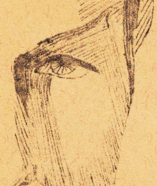
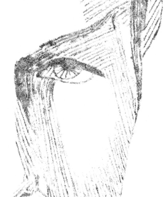
SPOCKANALIA VOLUME 1 IS NOW ON AO3!
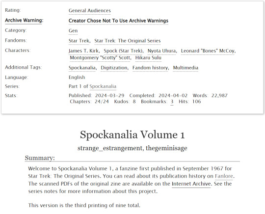
do you like vintage fanzines, but hate reading tiny font? do you love spock, but hate the headache you get from squinting at textured paper and imperfect scans? are you someone who wants to read SPOCKANALIA but has trouble getting your screenreader to cooperate with 60-year-old PDFS? have we ever got news for you. @maulthots and i have been very, very, VERY hard at work digitizing SPOCKANALIA, a SFW star trek fanzine about spock first published in 1967, and now you, YES YOU, can read it on AO3!
updated features of SPOCKANALIA on AO3 include:
text has been meticulously retyped and can now be read at whatever size you have your browser settings on, which means the line width also changes based on the width of your browser window or device screen
images are dynamic to fit on your screen whether you are on a pc or a mobile device so you don't have to scroll until your hand breaks and still only see mr. spock's eyelashes (you have to turn work skins on for this feature)
backgrounds/paper texture/echoes of ghost text removed (by hand!) from images for easier viewing, and in some cases the images have been rotated to correct tilted/sideways scanning
images come with ALT TEXT for those using screen readers!
here are a few before/after shots for your perusal:
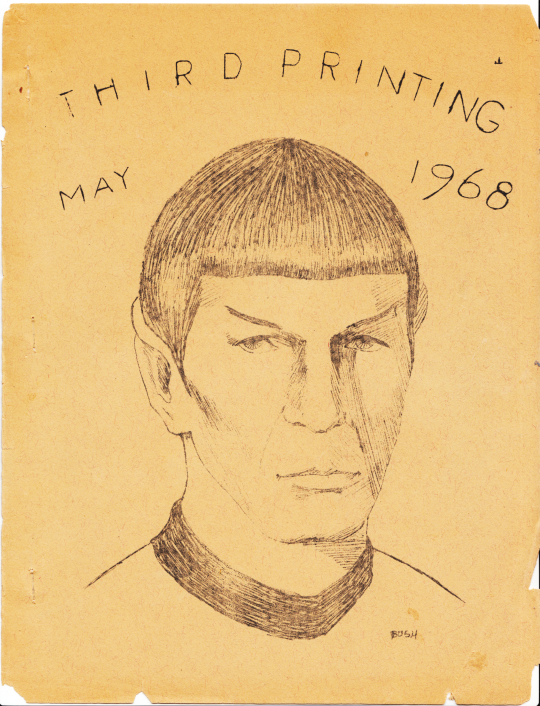

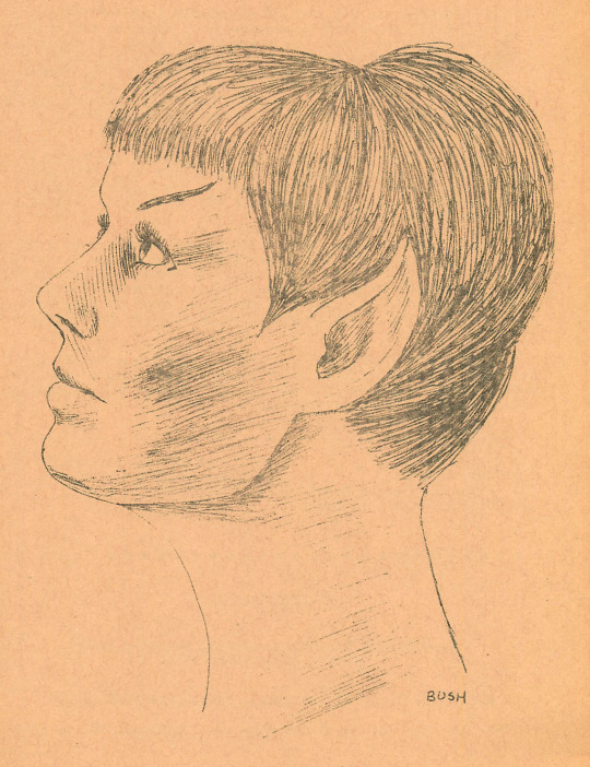
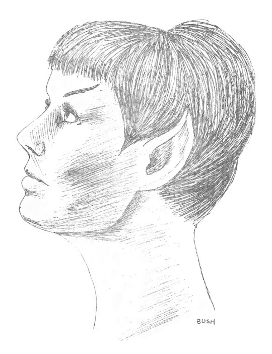
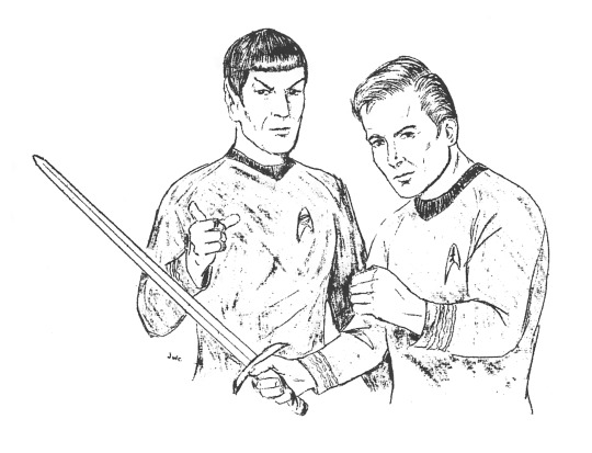
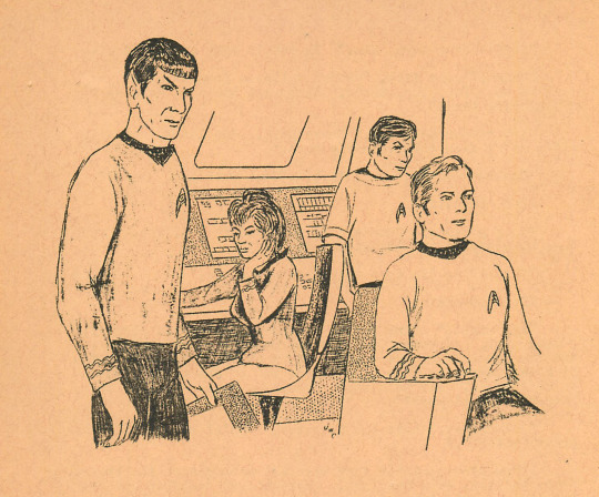
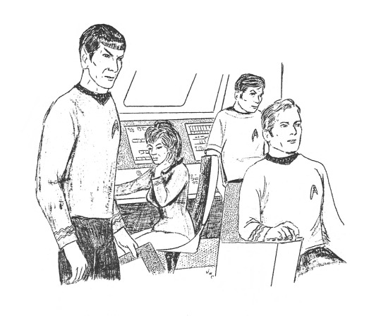
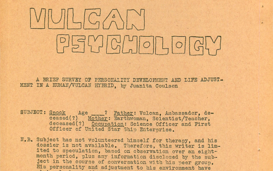
so what are you waiting for?! get your inner 60s fangirl (gender neutral) on and read SPOCKANALIA today!!
and if you think this is COOL AS SHIT (i do), please consider giving this post a reblog or leaving us some love on AO3! we have only your good vibes to fuel us as we contemplate volume 2 💪
#ok sorry in advance i'm about to add every relevant tag on earth. we worked so hard on this and i am def fishing for notes#s'chin t'gai spock#spock#mr. spock#mister spock#star trek#tos#star trek tos#star trek the original series#the original series#spockanalia#vintage trek#vintage star trek#vintage fanzine#fanzine#fandom history#whew!#now i need my blog tags#liz makes stuff#liz's star trek stuff#ok thanks everybody for being patient
839 notes
·
View notes
Text
Yo? Just did a hard refresh in my Tumblr tab and it looks like staff reverted the hidden icons and the "X reblogged Y" change they made.
Staff actually fucking listening? Maybe?
#I'm not getting my hopes up#but this is nice to see#still no sticky icon as I scroll down posts in 50% width view though#half-width windows really are the most oppressed.#i get the shitty mobile-browser version of the site but on PC#tumblr#staff
1 note
·
View note
Text


juniper | theme by sage
get the code: $4 - static preview v1 / preview v2 a left or right sidebar theme
features (more info below the cut):
toggle: tags on click, right sidebar, updates tab, explore menu
responsive sidebar includes an uploadable image, blog icon & custom title, custom description, and up to 6 links
headerbar includes blog title, home/ask/archive links, explore button or search bar, scroll to top, sidebarbutton, updates, day/night, & tumblr controls buttons
updates tab includes up to 5 updates with an icon & text
explore menu includes an uploadable image, up to 6 info stats, up to 3 skills, about text, up to 4 blogs, and up to 10 links
customizable: title, colors, body & title fonts, and font size
npf supported, responsive design, 3 post width options, 4 corner options, tabler icons
nothing needs to be changed in the code, everything can be changed in the customize panel!
terms:
reblog if using
do not touch the credit
all terms / faq
credits listed in the code / credits page
please consider tipping or supporting me ♡
blog name !! important
make sure you fill out the blog name field, this is what will show on the top of all your original posts. to clarify: your blog name is your blog’s url - for example: phantomcodes
custom title
similar to the blog name, your custom title will show on top of all your original posts as well as the sidebar, i recommend making this title pretty short
responsive sidebar
when the browser window width gets too small the sidebar will disappear and become toggleable! the sidebar button will appear on the right side of the header
updates tab
the updates tab is toggleable, it has up to 5 updates each with an icon & text
explore menu
the explore menu is toggleable, will scroll if it gets too long, and has:
(optional) uploadable image
info stats: up to 6
(optional) skills section: up to 3 - you can use this for statuses, projects, progress, etc. the title can be changed. leave the skills title field blank if you don't want this section
about text section
(optional) blogs section: up to 4 blogs - leave the blog 1 field blank if you don't want this section
(optional) links section: up to 10 links - leave the explore link 1 field blank if you don't want this section
reminders
remember tumblr’s customize panel is buggy, make sure to toggle all the options on/off before saving
i’m still on a sort of semi-hiatus, i’ll be around for questions but please check my faq, answered asks, etc. before asking - i will not answer repeat questions!
#tumblr theme#tumblr themes#tumblr resources#completeresources#allresources#code hunter#userbru#userdre#usernik#userbrina#useraashna#tuserlucie#usercharithra#userrajan#usertj#usermaguire#userbess#phantom code#phantom theme#juniper
307 notes
·
View notes
Note
What extension adds those hand buttons to the tumblr post if you don't mind me asking
It's XkitrRewritten for Firefox! I extremely recommend it for anyone using Tumblr through a browser. and that your browser should be Firefox.
Those are the "Block this post specifically from my feed" and "Block notes from this post specifically from my activity page" toggles, but it also includes features like:
A robust Tag-blocker that filters posts that even have the blocked word in the text or image descriptions
Timestamps
Acessability tools like freezing gifs until they're hovered over, highlighted links and regular-width scrollbars
An additional adblocker that blocks out Tumblr's in-house nonsense too
The old, more user-friendly search function
Open links in New Tab
Queue Management tools
Additional privacy managment tools
SO MANY dashboard management tools no for real get NewXkit and toggle it to your preferences, it's like going from a golf cart to a cadillac.
AN ASKS OUTBOX I CANNOT TELL YOU HOW MANY TIME
You can get the NewXkit add-on for firefox in the browser extensions, you can download Firefox and import all your bookmarks, history and other stuff from chrome HERE. The browser and extensions are totally free and will make your online experience so much better.
For those of us that already have it, Maybe spare a few bucks for the nice lady who built the best tool ever?
572 notes
·
View notes