#advice...?
Explore tagged Tumblr posts
Visit Tumblr Blog
Explore Tumblr blogs with no restrictions, modern design and the best experience.
Last Seen Tumblr Blogs


Fun Fact
Tumblr was the first site to host the blog for President Barack Obama in 2011.
Text
I have gotten a lot of messages saying that they really love the presentation of CURSE/KISS/CUTE. Often the commenter in question can’t say what exactly it is about the formatting that they appreciate, but that it just reads well and looks good. Well!!! Allow me to bare my wealth of secret knowledge for you once and for all:
I sorta just did some research into book typography...?
Here’s something you should know about web development, alright: typography on the web is really, really bad. The tools we have at our disposal—HTML and CSS—are incredibly powerful, but they are set up to fight you every step of the way towards Good Typography. When you know what you’re looking for, you can fix all the common issues quickly and easily. But it’s not easy to know what to look for, because
problematic typography is overwhelmingly the norm on the web, and
good typography is invisible.
Here’s a screenshot from CURSE/KISS/CUTE episode 0:

Now, I don’t want this post to come across as prescriptive. It is not my intention to tell you, “This is what good typography looks like, so follow my lead exactly.” I made a lot of choices with the typography of my web novel: many of those choices would not make sense in other contexts. What I want to convey to you is what those choices are, so that you will know they’re available to be made.
I mentioned that the web “fights you” when it comes to good typography. What do I mean by that? Well, check this out:

This is how that passage of text renders “by default.” In other words, this is how a web browser would render that text without any input from me about what styles to apply. It kind of sucks ass! But it also looks pretty familiar, right? This is not that far off from how a lot of websites—even websites full of prose (looking at you, AO3)—render text.
I think the most illustrative thing to do here would be to walk you through my thought process and show you, step by step, what decisions I made to turn this unstyled text into the styled version you see in the novel.
So, first things first:
1. We have got to shrink that text column.
Computer monitors... are wide. They are wider than they are tall. They are so wide, and they have so many pixels. This means you can fit a lot of characters on them. If you wanted, you could just have a wall of characters from the left side of the screen all the way to the right side. Talk about efficient!!
You should never, ever, ever do this.
This is one choice that I actually will make a prescriptive statement about, because it’s supported by quite a lot of research: fairly narrow text columns are more legible. Specifically, research seems to support the idea that a width in the range of 50 to 70 characters per line is the most comfortable for people to read*. Every font is different, so it takes a little doing to turn that “characters” figure into a pixel measurement; I went with 512 CSS pixels for the maximum width of my text column:

Isn’t that just so much nicer to read already?
*A commenter reminds me that I’d be remiss not to point out that the research on column width legibility isn’t completely conclusive. You do want to limit the width of your text columns, but going over the 70 character-per-line recommendation isn’t necessarily the end of the world, and you might have good reasons to do so. I did not: as mentioned, one of my goals was to mimic book-style typography, and books by nature have fairly restrained column widths, on account of they’re books.
2. Picking a font.
I’m not going to give you the blow-by-blow on how I decided what font to use. The short story is that I asked some designers, and one of the recommendations I got was the free font Crimson Pro, which I took a liking to immediately:

It’s just an all-around attractive serif font, but one thing I really like about it for use in a novel is its highly-visible quotation marks. They’re just kinda jumbo! They’re real big! Easy to see! In a novel, those things aren’t just ornamentation. It makes a great deal of practical sense for them to stand out just a bit. It also has a fairly large x-height, unlike a lot of the more traditional options, which is good for legibility on a computer screen.
3. Adjusting the line-height
Web browsers default to a line-height of about 1.2em, which, as you can probably tell, is quite cramped. If you go and Google “optimal line height for legibility”, you’ll get a number of results right off the bat suggesting 1.5em. Sounds good! Let’s do that:

Well... hmm. That’s definitely an improvement, but between you and me, it actually looks a bit too spacey to my eyes. I wonder why?
I’ll cut to the chase: the 1.5em recommendation makes some assumptions about the font you’re using. In Arial, the letter “A” is about 0.6em tall; in Crimson Pro, it’s about 0.5em. That means that there’s no one-size-fits-all solution to spacing your lines, because different fonts have different amounts of empty space baked in. How annoying!
Let me tell you something about the kind of nerd I am. When I had this realization, I grabbed some books off my shelf and pulled out a literal micrometer. I started measuring the line-heights against various font features to see if there were any patterns I could spot in professional typesetting. Here’s what I found:

Almost every book on my shelf spaces lines such that the distance between one baseline and the next is about three times the x-height. How cool is that? I clapped my hands like a seal when I put this together.
Adjusting the line-height to match what I observed in the wild gives us this:

It’s a subtle difference, but to my eyes it feels just right. It’s almost like magic!
4. Paragraph spacing...
Let’s address the elephant in the room. Probably the most controversial choice I made with CURSE/KISS/CUTE’s typography was to opt for book-style paragraph indentation rather than web-style paragraph spacing—like so:

I did this for a few reasons:
It’s what I’m used to. I’ve read a lot of books, and this is just the way that books are formatted. I think for something aspiring to the title of “novel”, there’s value in making it look the way a reader probably expects a novel to look.
A novel has a lot of paragraph breaks in it. A paragraph in, say, an encyclopedia entry might go on for half a page or more; whereas it is unusual for a paragraph in a modern work of narrative prose to run for more than a handful of sentences, especially in any scene with dialogue. Because paragraph breaks are so common, spacing between paragraphs in a novel results in a lot of wasted space. Also, subjectively speaking, the additional space seems to me to lend an undue amount of weight to paragraph breaks. I’m just starting a new thought; there’s no need for a 21-gun salute, you know?
Having said that, here are some good reasons you might decide not to do paragraph indentation anyway:
Doing it right requires a bit of extra legwork. Notice how the very first paragraph in the image above has no indentation. That’s because it’s the start of a new section, and the first paragraph in a section traditionally goes unindented. This is an easy detail to miss, and it can be difficult to wrangle CSS into doing it for you automatically.
Web users don’t expect it. For the first decade of the web’s existence, there was no good way to do paragraph indentation; by the time CSS rolled around and made it easy, paragraph spacing had already become the norm. And while CURSE/KISS/CUTE may be a novel, it is also, specifically, a web novel!
But it’s my house and I get to make the rules, so I went with indentation. Incidentally, there seems to be a dire lack of research into the question of whether indentation or spacing is more legible for readers—but the data that does exist appears inconclusive at best. So, the choice really does come down to vibes.
5. The tragedy of justification.
You’ll note that one way in which I did not make my web novel look like a paper novel is the text alignment. It’s un-justified: the right margin is ripsaw-ragged.
This is because it is not possible to justify text on the web.
Oh, you can try. Look right here: there’s a CSS property for it and everything. Just turn on “text-align: justify” and...

Nightmare! The interword spacing on that first line is almost as wide as the indentation!
Reader, I’m afraid that your web browser is simply too dumb. That’s not the browser’s fault: robust algorithms for justifying text without creating these distractingly huge gaps between words have existed for many decades, and modern computers are powerful enough to run them in real time with little performance impact. It’s just, uh—nobody has ever bothered to implement them into web browsers. It is the damnedest thing.
I tried, I really did. You can mitigate this problem a bit if you enable automatic hyphenation, but browsers are unfortunately also kind of dumb at hyphenating. Firefox, for example, will refuse to hyphenate any word containing a capital letter, so any sentence with a lot of proper nouns in it is a lost cause. I tried manually inserting soft hyphens with a text preprocessor I wrote myself, but still these overjustified lines plagued me: when the text column narrows, for example on a phone, even hyphens can’t save you. The line-breaking algorithm is simply too naïve to optimize for well-justified text, and that’s not something you can fix as a web developer.
As a result, my heavy-hearted recommendation is to never use text justification. It’s just too distracting.
6. And then some extra stuff just for me
I added drop-caps because it looks neat and I made the ellipses spacier because I think it looks good when it, uh, when they are spacier. I think that looks pretty good that’s just my opinion though.
That’s all! Hope you learned something bye!!!
523 notes
·
View notes
Text
Computer Science major here, it's not working because the computer doesn't respect you. download viruses on it to remind it who's boss.
follow for more tits
69K notes
·
View notes
Text
10 Non-Lethal Injuries to Add Pain to Your Writing
New Part: 10 Lethal Injury Ideas
If you need a simple way to make your characters feel pain, here are some ideas:
1. Sprained Ankle
A common injury that can severely limit mobility. This is useful because your characters will have to experience a mild struggle and adapt their plans to their new lack of mobiliy. Perfect to add tension to a chase scene.
2. Rib Contusion
A painful bruise on the ribs can make breathing difficult, helping you sneak in those ragged wheezes during a fight scene. Could also be used for something sport-related! It's impactful enough to leave a lingering pain but not enough to hinder their overall movement.
3. Concussions
This common brain injury can lead to confusion, dizziness, and mood swings, affecting a character’s judgment heavily. It can also cause mild amnesia.
I enjoy using concussions when you need another character to subtly take over the fight/scene, it's an easy way to switch POVs. You could also use it if you need a 'cute' recovery moment with A and B.
4. Fractured Finger
A broken finger can complicate tasks that require fine motor skills. This would be perfect for characters like artists, writers, etc. Or, a fighter who brushes it off as nothing till they try to throw a punch and are hit with pain.
5. Road Rash
Road rash is an abrasion caused by friction. Aka scraping skin. The raw, painful sting resulting from a fall can be a quick but effective way to add pain to your writing. Tip: it's great if you need a mild injury for a child.
6. Shoulder Dislocation
This injury can be excruciating and often leads to an inability to use one arm, forcing characters to confront their limitations while adding urgency to their situation. Good for torture scenes.
7. Deep Laceration
A deep laceration is a cut that requires stitches. As someone who got stitches as a kid, they really aren't that bad! A 2-3 inch wound (in length) provides just enough pain and blood to add that dramatic flair to your writing while not severely deterring your character.
This is also a great wound to look back on since it often scars. Note: the deeper and wider the cut the worse your character's condition. Don't give them a 5 inch deep gash and call that mild.
8. Burns
Whether from fire, chemicals, or hot surfaces, burns can cause intense suffering and lingering trauma. Like the previous injury, the lasting physical and emotional trauma of a burn is a great wound for characters to look back on.
If you want to explore writing burns, read here.
9. Pulled Muscle
This can create ongoing pain and restrict movement, offering a window to force your character to lean on another. Note: I personally use muscle related injuries when I want to focus more on the pain and sprains to focus on a lack of mobility.
10. Tendonitis
Inflammation of a tendon can cause chronic pain and limit a character's ability to perform tasks they usually take for granted. When exploring tendonitis make sure you research well as this can easily turn into a more severe injury.
This is a quick, brief list of ideas to provide writers inspiration. Since it is a shorter blog, I have not covered the injuries in detail. This is inspiration, not a thorough guide. Happy writing! :)
Looking For More Writing Tips And Tricks?
Check out the rest of Quillology with Haya; a blog dedicated to writing and publishing tips for authors!
Instagram Tiktok
#hayatheauthor#haya's book blog#haya blogs#writing community#quillology with haya#writing tools#writer things#writing advice#writer community#writing techniques#writing prompt#writing stuff#creative writing#ya writing advice#writing tips and tricks#writer tools#writers of tumblr#writer blog#writers block#quillology with haya sameer#writers on tumblr#writerscommunity#writer stuff#author help#author advice#author#writing inspiration#writeblr#novel writing#on writing
60K notes
·
View notes
Text
if you're trying to get into the head of your story's antagonist, try writing an "Am I the Asshole" reddit post from their perspective, explaining their problems and their plans for solving them. Let the voice and logic come through.
68K notes
·
View notes
Text
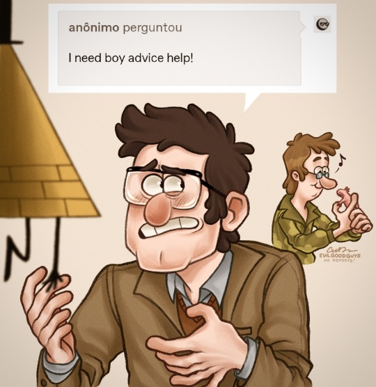
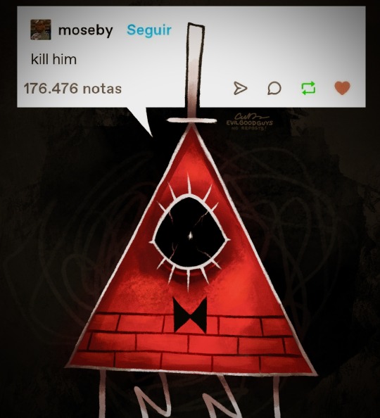
...clearly, he's not jealous.
#pro tip: don’t take dating advice from a demon in a situationship#the book of bill#gravity falls#billford#Art Of The Sun Chip#gravity falls fanart#stanford pines#bill cipher#fiddleford mcgucket#fiddauthor#artists on tumblr#ford pines#art#drawing#fanart#my art#doodle#illustration#procreate#comic#please don't repost my artwork onto other sites thank you!
62K notes
·
View notes
Text
Small fantasy worldbuilding elements you might want to think about:
A currency that isn’t gold-standard/having gold be as valuable as tin
A currency that runs entirely on a perishable resource, like cocoa beans
A clock that isn’t 24-hours
More or less than four seasons/seasons other than the ones we know
Fantastical weather patterns like irregular cloud formations, iridescent rain
Multiple moons/no moon
Planetary rings
A northern lights effect, but near the equator
Roads that aren’t brown or grey/black, like San Juan’s blue bricks
Jewelry beyond precious gems and metals
Marriage signifiers other than wedding bands
The husband taking the wife's name / newlyweds inventing a new surname upon marriage
No concept of virginity or bastardry
More than 2 genders/no concept of gender
Monotheism, but not creationism
Gods that don’t look like people
Domesticated pets that aren’t re-skinned dogs and cats
Some normalized supernatural element that has nothing to do with the plot
Magical communication that isn’t Fantasy Zoom
“Books” that aren’t bound or scrolls
A nonverbal means of communicating, like sign language
A race of people who are obligate carnivores/ vegetarians/ vegans/ pescatarians (not religious, biological imperative)
I’ve done about half of these myself in one WIP or another and a little detail here or there goes a long way in reminding the audience that this isn’t Kansas anymore.
#writing#writing a book#writeblr#writing resources#writing advice#writing tips#writing tools#fantasy#world building#worldbuilding
37K notes
·
View notes
Text
sometimes the best writing advice is "just let it be bad." revolutionary. terrifying. but it works.
#writing#writeblr#writer problems#writing humor#writers on tumblr#writing memes#writing community#writing struggles#writer life#creative writing#writer things#writing motivation#ao3 writer#writer memes#writing is hard#on writing#writerblr#writers block#writing funny#writer thoughts#fiction writing#writer struggles#writing tips#writing advice#writer woes#writing woes#writer quotes#writing inspiration#plot problems#writer chaos
34K notes
·
View notes
Note
You probably get asked this a lot, but how do you draw hands? Even when I'm tracing, they look so weird 🙃


I could probably go on and on and on about hands, but here are some key points I compiled! I LOVE drawing hands, and I never hesitate to use my own as a reference
22K notes
·
View notes
Text
“Be curious about what you’re writing about” is not stock Common Writing Advice but it really, really should be. There are a lot of written works that fail due to the authors just being obviously incurious about what they are writing about.
#writing#writing advice#ties in with ‘write what you know’—if there’s something you want to write about that you don’t know much about: be curious about it!#Find out about it!#Don’t just assume you know everything you need to know about it and then write shallow pap at best and offensive stereotypes at worst!
37K notes
·
View notes
Text

35K notes
·
View notes
Text
>Join a union
>Hear people constantly complaining that the current union leadership is super corrupt, it's all just the same ten guys making all the decisions in secret and nobody else in the union ever gets to know what's going on
>Go to the monthly union meetings that are completely open to all 1200 union members
>The only attendees are the same ten guys every month, giving detailed reports about everything that's going on
#anyway this is why i'm the way i am about politics and people who advocate against 'participating in the system'#i am on my way to becoming one of the ten guys and frankly? it's fucking exhausting#i chatted with the union president afterwards and he got this haunted look in his eye#and was like 'i'm glad to see you getting involved but remember you can say no. you can always say no.#don't let anyone bully you into doing more than you want to. make time for yourself. YOU CAN SAY NO.'#which was good and much appreciated advice! but also. ominous
55K notes
·
View notes
Text
If you have achieved something, please remember to observe a mandatory period of basking in the warm glow of your achievement like a lizard on a stone, lest you teach your brain that effort is futile, actually, because it didn't get to enjoy its happy chemicals, so, naturally, nothing good ever comes of trying. (And no, avoiding punishment is not a reward!)
I recommend, like, 5% of basking time in relation to whatever time you invested into achieving the thing minimum. And if you can't make your own bask, friend-brought is fine (= tell your friends!).
#life advice#adulting#mental health#I know this comes harder for some people than for others but it's important to try
79K notes
·
View notes
Text
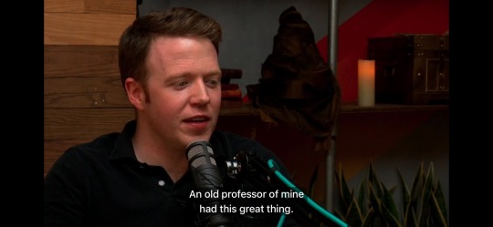
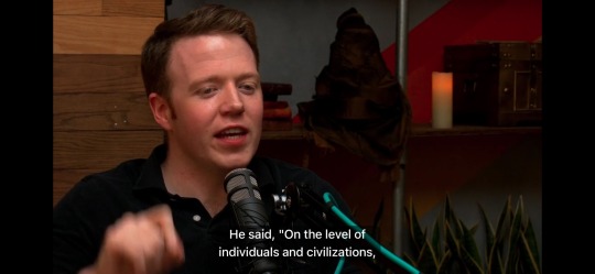
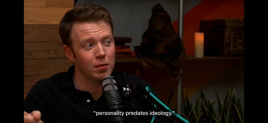
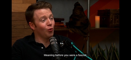
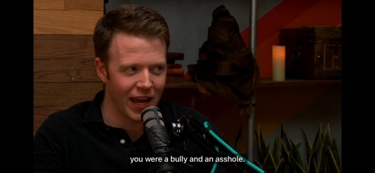
"An old professor of mine had this great thing. He said "On the level of individuals and civilization, personality predates ideology." Meaning that before you were a fascist, you were a bully and an asshole." -Brennan Lee Mulligan in conversation with Amy Vorpahl, Adventuring Academy S1E2
#brennan lee mulligan#adventuring academy#dropout#amy vorpahl#sage advice#going through a backlog#dimension 20#sorry for the bad cropping
23K notes
·
View notes
Text
probably my most powerful interpersonal communication hack is to, whenever possible, ask either/or questions rather than yes/no questions
for example, when chatting with coworkers, i’ll often ask if they have any fun weekend plans. but let’s be real - we all feel like friendless losers when someone asks that question and we go “uhhhhh… no.” so instead, i phrase it as “so, do you have anything fun planned over the weekend, or are you just going to enjoy having some time to relax?”
phrased like this, there’s rarely any awkwardness. you’ve presented two options & given both equally positive connotations, so your conversational partner has an automatic “out,” so to speak
but it works for higher stakes conversations too!!!! my mom was saying this weekend how she and her neighbor both like walking around the neighborhood & that she wanted to suggest they take a walk together sometime, but was worried about how to approach the conversation
so i said “how about you just say ‘i’ve noticed we both like taking walks! would you be interested in going for one together, or do you use walks for some precious alone time?’”
now Walking Neighbor has an automatic “get out of jail free card” if she wants to say no!!!! which means my mom doesn’t have to worry about the conversation being uncomfortable, because she’s set it up to go smoothly
either/or questions rather than yes/no questions. it is really like magic
63K notes
·
View notes
Text
Me, on the welcome desk in the library: Good morning, how are you today?
Customer: I have welcomed Jesus into my heart and so I am well today and every day.
Me, a little unnerved: Okay then! Is there something I can help you with?
Customer, digging around in his bag and pulling out an iPhone in a box: Unfortunately, Jesus can't help me with this fucking phone, so I came to the library.
#libraries#we offer tech advice in the library#so it wasnt an out of pocket request#but people really do come to the library for help with the strangest things#its the buffy impulse#when in doubt#go to the library
75K notes
·
View notes