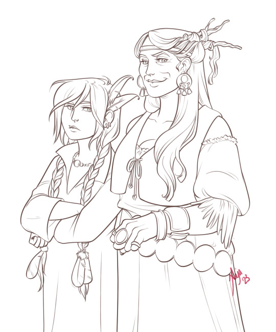
#brush pen on paper and digital colouring
Text

🇫🇮 Beat - Fri?
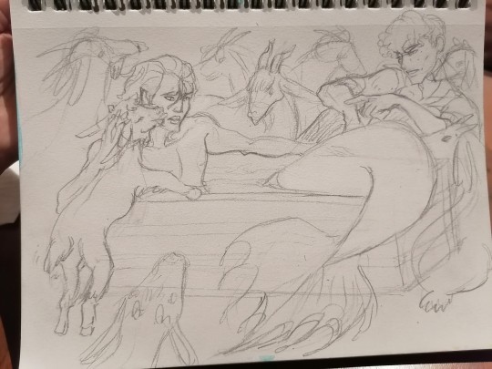
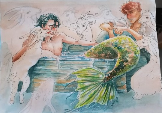
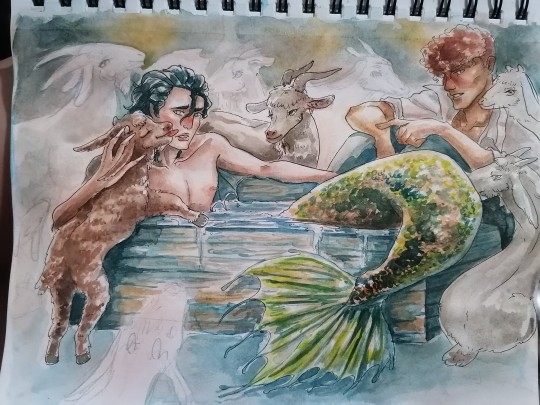
#Beat#Fri?#Finland esc#Finland eurovision#esc 1990#eurovision 1990#sorry was feeling a little weak yesterday but I'm better and I'll catch up!! Can't wait to get to 1991 - one of my favourite years :'D#not a deserved last place imo!#brush pen on paper and digital colouring
25 notes
·
View notes
Text
Crisp those Lines!
Or: a small collection of suggestions for a crispy, neat lineart.
SO MANY OF YOU ASKED FOR THIS (it feels absurd to say, yes), so here you go.
A premise: there's no right or wrong way of inking, and some of the following tips entirely depend on the type of inking I do. Which is neat and clean, with no blacks, and moreover: digitally. More under the cut because it's gonna be long and full of explanatory pictures. Here's an example:
SOFTWARES AND BRUSHES:
Let's address the elephant in the room: Photoshop SUCKS for inking and linework. The stabilisation of the brush there is SHIT. Good for colouring and painting and doing photobashing, but for Lineart you want it to be precise. Do yourself a favour and don't use Photoshop.
I generally use Clip Studio Paint, but i have to say that the best program for it that I've tried keeps being Paint Tool SAI 2. It has few functions, it's true, and I use CSP because it has more instruments. But if you don't want to pay much, SAI is incredible as for brush rendition and stabilisation.
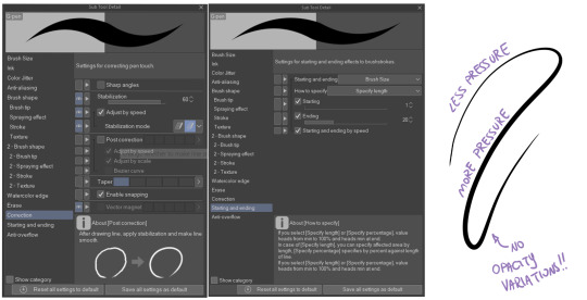
As for the brush: you don't need a fancy brush, anything in your software will go. What I use and what works best tho must have:
Tapered start and end.
High stabilisation (I go from 60 upward, lower it down for trees and grass or anything more natural that needs to be less neat and flowy)
Low tapering.
It must be set so that pressure controls only the dimension. The more you push on your pen, the bigger the line gets. No colour or opaciy variation!
On Clip Studio Paint, I use the G-Pen in the program. It's good as it is, but I think I did some variations as per here:
FILE DIMENSIONS:Better work larger and then resize down. Sizing files up digitally is possible, but it leads to unfocused images.
I generally work on files at 600dpi (300 is fine too, but don't go any lower. Particularly if that's something you want to print later on, any printing wants a minimum of 300dpi). in roughly an A3 format (bigger dimension is 43cm). Most pictures I upload here are 6000x5000 pixel.
A bigger file will give you more possibilities with brush sizes, and it'll be easier. Remember: digitally, sizing down is ok, sizing up is not something you should do.
SKETCH:
This is the suggestion I should follow but never do.
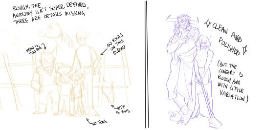
Having a clean, polished sketch simplifies your life A LOT. This is because if you don't have to worry about drawing details and fixing the anatomy of your drawing during the lineart, and doing it so GOOD because it's the lineart... You'll go that much slower and your life will be more complicated (it's not impossible, my sketches usually are very rough. I am ok with it, the most I do drawing wise is during the lineart... But I'm lazy, don't do like me. A good sketch will help you out.)
Compare the two sketches below:
Another note about your sketch layer: you know those memes that complains that the sketch looks good but when you hide it the lineart is shitty? That's easily solvable.
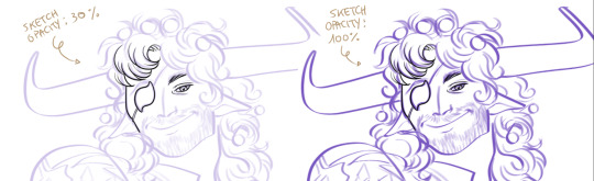
When you're inking, lower the opacity of the sketch layer down, A LOT. I generally go for a 30 or 40% opacity (depending on the colour of the sketch. the yellow sketch will go around 40% because it's less visible, the purple one lower).
When you're inking, you MUST see clearly the lineart you're doing. If the sketch isn't contrasting enough, you won't see clearly what you're doing... It's like trying to sketch with a dim light, not seeing the paper clearly. See the difference:
BEFORE YOU START:
You probably have read it everywhere, but it bears repeating: warm up your hand.
You're using muscles and for more than five minutes. The warmer they are, the firmer your hand is, the easier it gets controlling your lines. It also prevents you from damaging your wrist. Stretching is also great, and grippers are nice to have. Keep your hand fit!
As for warming up: I usually do some calligraphy exercises, practicing on flowy cursives. You want to practice varying the pressure of your lines in a single trait, hence why calligraphy is good. But generally, what you can do is...

PRESSURE VARIATION AND LONG LINES:
So. My main tip and trick is to vary the pressure of your lines. In the same line, and between different details. This will help making the lineart more dynamic and interesting.
A note: this works for semi-realistic styles. If your goal is obtaining a Cartoon Network style: they have generally little to no variation and it works. My suggestion would be to study the kind of style and effect you want to obtain, different styles will work best with different linearts. If you're aiming at hyperrealistic painting, there's no point in spending time over a lineart, for example, I inked the same lineart, but with a brush that doesn't vary it's dimensions with pressure, and not changing the dimension of the brush.
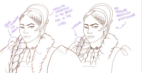
What makes my linearts look "flowy" and "neat" is the fact that I tend to draw less lines and longer, and pay attention when I stop, to start the line where I end it. This will give the impression of one continuous, single line, and make everything more fluid. See above in the french hood: on the right, I left the line rough on purpose, you can see where I stopped and started again. On the left, where I took care of it, you can't.
Generally speaking:
Thick, dark lines communicate that the object is close to the viewer (always keep the viewer in mind!) or in shadow. Lines should be thicker on the outside of your objects, to separate two planes, and in stuff closer to you.
Thin lines are delicate, they should be used in the background, for small details (see the hair, the lips, the small wrinkles around her eyes.)
As for line continuity: in both cases, the line of her face is one single line I drew. This can be obtained with a smooth result, particularly in curved lines, by getting the brush stabilisation on higher settings (80-100): sacrifice speed for accuracy.
MORE IS MORE, WHEN IT COMES TO LEVELS:
Particularly when there are two objects intersecating, or more characters interacting… Instead of inking all on the same level, I always do one level for each object, trace the WHOLE line as if there was nothing above, and then erase where it's not shown. This is a little thing, but pays off. Always in the drawing of above, the feather and the hem of the bodice were on separate layers, and then I erased the bodice under the feather. Take advantage of being inking digitally and not traditionally!

For many characters, here's an example of a vignette of a comic page before cleaning it up and erasing. Every single character and the weapons are on separate layers

For this it's very useful knowing your recurring mistakes. For example, I tend to draw heads bigger than they should. I know I do, so generally I keep the head on its own level, and the body on another, so it's easier to modify and size down just the head without getting crazy selecting only the lines you want with the lazo.
Again, you're inking digitally. It's not easier than traditionally necessarily, take full advantage of your instrument!
OTHER TIPS AND TRICKS:
High brush stabilisation sacrifices speed for accuracy. The line will lag a little from your cursor. Get used to watching the cursor and not the line, and trust that the line will follow.
GO SLOW.
Rotate and flip the canvas. Don't ask me why, but tracing long lines towards me is always easier than not the other way around.
Use the Free Transform, Warp, Distort etc etc and the Liquify to your heart's content if you notice the lineart has something wrong. The only cheating in art is using fucking AI generators (and AI pictures are not art, sorry not sorry)
References are your friends. Study how an artist you like does the lineart. Try and imitate them, and if you can and need to post them: tag them! (don't trace and sell it as your own)
Experiment with brushes, find one that you like for the effect you'd love. You do you, there's no right or wrong way of inking.
Remember to breathe when you trace those lines! (and to drink and do pauses and stretch, you don't want a tendonitis!)
Have fun. Lineart is not evil, lineart is your friend!
I hope this essay is exhaustive enough. I'm tagging ALL THE PEOPLE that requested it (and giving each of you a muffin).
@ndostairlyrium @narina-gnagno @salsedine @whimsyswastry @layalu @n7viper
If you have any questions, don't hesitate in asking!
#tutorials#lineart#inking#digital inking#digital art#tips and tricks#petrel explains#COME LO FECI (cit)#listen if we're mutuals and we chat... ask me to share my screen I don't mind the company when I work if it's not something I can't show#or if it's not too late at night for me#also I unironically like how Alyra inked without variation looks even angrier and more judgemental than normal LOL#also some spoilers for The Last Bacchae if you follow that#“Marmotta” means “Groundhog” in italian#art ref
126 notes
·
View notes
Text
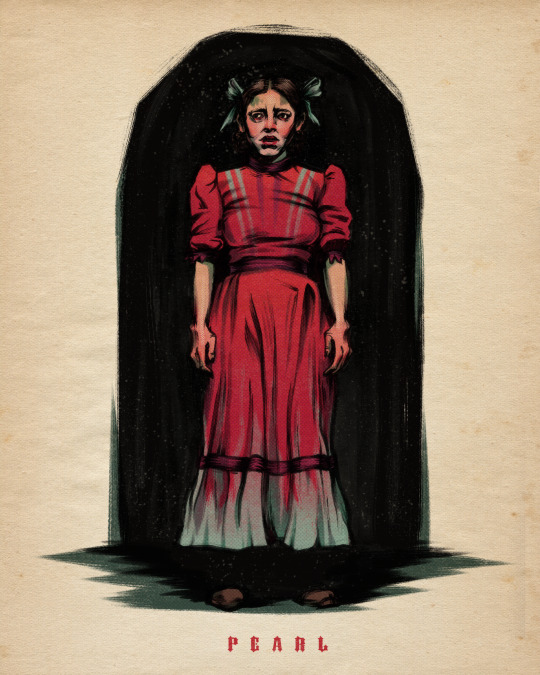
watched pearl with friends tonight and i cannot get her out of my head
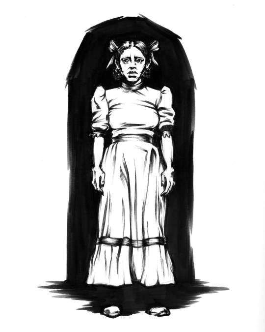
lineart, done on bristol paper with a brush pen then scanned and coloured digitally :)
39 notes
·
View notes
Text
another ramona drawn traditionally and scanned + coloured digitally <3
really proud of this one!! you can tell from the line art around the left side of the hair that my brush pen is starting to fray a bit 😭
over the years ive constantly been switching from digital art to traditional and back to digital but ive kinda recently discovered i like to mix them together like this. it gives this beautiful texture on the lines and i dont have to worry too much about errors since i can just remove them digitally. i still like to try and avoid errors ofc, but like for example i made her ears wayy to small so i just resized and then redrew them digitally.
i highly recommend trying this technique at least once if you have the printer and programs available!! this illustration was drawn on strathmore bristol paper, with a faber castell pitt brush pen. i used col-erase prisma colour pencils to sketch it. this is scanned with a basic 10+ year old HP Printer-copy machine, and edited in procreate. the half tone textures are from a brush pack made by true grit texture supply.
#ramona flowers#ramona#scott pilgrim#scott pilgrim takes off#scott pilgrim vs the world#spto#spvtw#someone please get me a new brush pen </3
45 notes
·
View notes
Photo
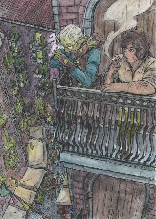
my SUPER late secret samol for @tzeimi in which i got way too ambitious with some lemmanuel. i've wanted to draw that balcony scene in season 1 for a long time :)
full res
process gif under the cut
apologies for the weird.... sizing on this. i didn't realize until the final image that my scanner had been cutting like half an inch off of everything 🙃

rough 3D model sketch in CLIP STUDIO PAINT. big grey boxes and grey lil dudes
BREAKING IT OUT OF THE DIGITAL... printed out the model and transferred it onto paper using carbon paper. had to do this lightly bc erasing the transfer is a bitch (i don't have a lightbox )
sketched details over the traced outline
inked using my dip pen (mostly JP nib, school nib, then mapping nib for cross-hatching)
coloured in with watercolour pencils. kinda started getting slapdash with it
brushed over the dry pencils with water and hoped to god everything blended OK
(not pictured) me fussing with the scanner for like half an hour because it insisted on cutting millimeters off the edges
170 notes
·
View notes
Text
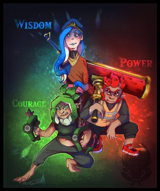
Wisdom | Power | Courage
Congrats team power for bodiying everyone into the floor!
------
I got inspired playing the splatfest and realised that these blorbos are a perfect fit and just had to draw them in the splat 3 timeline.
Unfortunately for me my tablet pen broke after a nasty drop, so I had to return to pencil and paper for the linework and then coloured it all digitally... with a mouse. Progress shots below cut!

The raw scanned in page. Honestly I was getting quite impatient on Julie and had trouble with her leg but honestly it came out fiiiiine. I considered just snapping a picture then lining everything on my ipad instead, but you know what? no. I have a score to settle with god and that is to prove I can colour, shade and render everything with a mouse instead.

Editing the whole picture to make it actually usable. Contrast + brightness + levels adjustment. I ADORE CSP's function of 'convert brightness to transparency'. It completely gets rid of the white background and gives me a transparent linework of this. Normally with traditional images like this youd have to make new layers on top of the linework all set to 'multiply'. I didn't really want to deal with the artifacts of that though, and it would slightly tint the linework too. So I opted for this method for the first time with a trad base.
And all coloured. I know dapples are either pink or blue but i dont care actually theyre green now. The soft brush/spray paint tool is my favourite friend as well as the blend tool. And honestly the only place you can see this is done with a mouse is uhhh mint's tenta spots lmaoo
#splatoon 3#splatfest#legend of zelda#agent 3#neo agent 3#captain 8#mint#chili#julie#myart#splatoon art
69 notes
·
View notes
Text


David Bowie in the 70’s, assuming a dynamic pose in a wide-legged cat suit. ☀
Illustration study of an original photograph by Masayoshi Sukita, with a design by the late Kansai Yamamoto. 🏓
Illustrated with a brush, pen and ink on paper and digitally coloured. ❤
#davidbowie#fashionillustration#fashion#illustration#gallery#art#masayoshisukita#kansaiyamamoto#icon#iconography#ink#noaiart
6 notes
·
View notes
Text
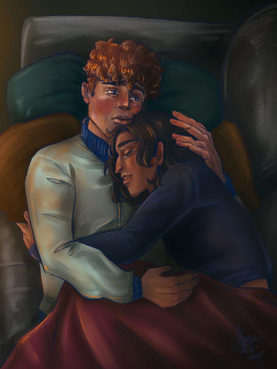
Six Sentences Sunday (except is an art process)
Well, hello there, beautiful creatures! :D thank you so much for the wonderful tags!!! they mean a lot for meeee!!
I haven't posted in a bit, doing a master is a bit stressful. But! I'm always lurking around and seeing as much as I can the amazing things you all are creating!!
As you might know, I'm right now doing lots of fan work for my amazing and beautiful friends @confused-bi-queer and @hushed-chorus, which stories are very close to my heart <3
This time, I would like to share my art process. It is a contrast between the traditional art, and the digital one.
Each process is different with each person. When you want to represent something someone else created, it is important to get as many insights and feedback from them, and know the source material.
Previous: The Talk ™
First and foremost, you need to talk with the author. Maybe if you are doing fanart, is not that needed. But when you are doing a collab, it is important to be in the same channel as the author, and have a brainstorming about the ideas, vision or insights they might have. Contrasting ideas, situations, deciding which illustrations are more viable, scheduling the releasing, etc. all those topics are important!
Feel free to suggest creative adjustments, might or might not work for the author, but is worth the shot. A creative idea is never a wasted one ;) once you have decided, then is time for:
1. Sketching
The sketching part is very important! You layout your scene for the first time! start deciding where light and dark will be, the color palette, the feeling you want to evoke, and work with the expressions the characters will have. It doesn't need to be perfect to be a good sketch! It needs to evoke the idea!
This stage is the same in both traditional and digital, at least for me. I always start on paper :) I show my sketches to the author, and we fangirl together ;) then (after maybe some adjustments, maybe a whole new sketch) they approve the idea! Is time for:
2. Lineart
Lineart is different for traditional and digital, but not really.
For traditional, I first decide which kind of medium I will use. This will be crucial for the materials I will procure myself with. This time I went for watercolor with a bit of mixed media, so I needed a paper strong enough for the watercolor to behave. Then, I chose the liners, which are waterproof and light fast. I line with 0.5, 1.0, 4.0 and some edged broader pens meant for calligraphy.
In digital, I work with a Wacom bamboo and Photoshop, and I use some hard brushes with pressure sensitiveness activated. You can customize your brushes, or use packs available on the internet. The wonders of digital are that you can make as many mistakes as you want, and you can always go back. I usually paint my lineart in the darkest shade I will use in the whole illustration, but never black.
When you are happy with your lineart, then is time for:
3. Colours!!

The fun part! The one I enjoy (and suffer) the most!!
Color. I love painting, but both traditional and digital can be as demanding as you wish!
In traditional, you have to be more careful with the mediums. Watercolor is such a wonderful and nightmare way of expression, because you can't really control it. You have to be ok not being in that control, understand how it behaves, and work fast. I always end up adding acrylics for color enhancing, lights, and specific details I want to represent. Let your work rest, I can have a finished piece in two hours, or in three days.
In digital, unhinge. Unhinge my child, have fun! You can correct, filter, move values and start again as much as you want!! There are so many brushes, so many filters, so many textures, the whole color palette light allows! Have fun!
But two important things I always do: make a folder for each character. Don't be me some years ago, when I used to paint everything in a single layer, or not name any of them. Order is important when you want to correct things. Also, I encourage you to limit your color palette, this way the whole illustration makes sense.
I always do something I call 'The ambience layer', where I put a layer over the lineart and everything, and I add lights, shadows, textures, etc. not specific of any object but of the whole scene. And I always add filters and color correction and tweak the values here and there.
Great! Now you have a:
4. Finished piece
You have finally finished! Make sure you sign your pieces, and you give them digital treatment if you are going to publish them on the internet. Always work with RGB values, and export for web :) always send your advances to your authors, and send the finished piece via e-mail, so it doesn't lose quality.
- - - - - -
So yeah, this is basically the whole process :D soon I will share a different process with different versions of the art involved.
Would you like me to create a guide with export values and formats and all that jazz? I hope you enjoy this! :D
Please check the fics these pieces (and many more) were made for:
The Rise and Fall of Us and What Remains After the Storm.
I tag:
@hushed-chorus @confused-bi-queer @kohatenz @artsyunderstudy @moodandmist @mostlymaudlin @palimpsessed @henreyettah @aristocratic-otter @cynopoe @bookish-bogwitch @cutestkilla @wellbelesbian @skeedelvee @cattocavo @krisrix @johnwgrey @asticou @takitalks @ionlydrinkhotwater @dragoneggos @ic3-que3n @castawaypitch @ileadacharmedlife @stitchyqueer @facewithoutheart @fatalfangirl @thehoneyedhufflepuff @aroace-genderfluid-sheep @bazzybelle @basiltonbutliketheherb @nausikaaa
#art#art process#six sentences sunday#fanart#fic fanart#snowbaz#simon snow#simon snow salisbury#tyrannus basilton grimm pitch#basilton pitch#traditional art#digital illustration#art based on fic#carryon#carry on#carry on rainbow rowell#co/ws/awtwb
43 notes
·
View notes
Note
i was wondring how you started custom painting because i'm a beginner with little to no experience but i've started to have an interest in it. what would be your recs for beginners? anything would be helpful really! i'm mostly looking to do custom painting on action figures and dolls but maybe start at a larger scale first
hi! you do need a slightly intimidating amount of materials for starting out, but it really doesn’t matter what quality it is apart from a few things !
things you absolutely need regardless of project are a primer/sealant like mr. super clear (very important, materials won’t stick to the doll without it!) and a mask for using it, something for removing the factory paint like acetone (results really vary so this takes some experimenting! acetone can melt some types of figures. some people say rubbing alcohol works but I haven’t had much luck with it. some figures require a soak but generally you can remove paint with cotton buds and a lot of scrubbing), soft brushes (like makeup brushes), medium paint brushes, at least one good quality fineline brush, something pointy like toothpicks or a nail dotting tool
from there it’s pretty optional what you use! though I’d recommend always having gloss for finishing the eyes/lips regardless
for shading/tone/blushing you can use chalk pastels ground up and applied with soft brushes or washes of watered down acrylic paints (watercolour paints aren’t suitable!)
for details you can use acrylic paints, watercolour pencils, or especially for action figures you can use paints like citadel (I don’t have much experience with these, but they’re much more permanent and better than acrylics for things like repainting the hair colour on figures and doing really solid details like tattoos. I think they’d be good for a strong painterly style!). please don’t be tempted to use fineline pens 🤧
other stuff: kitchen paper/a cloth for wiping brushes off, cotton pads/cotton buds for applying pastel and cleaning, if you can get a magic eraser™️ they’re very useful for gently removing pastel. palette for mixing and thinning paints
preparing is quite a long process! remove paint, wash them in warm soapy water, make sure they’re 100% dry, 2 base coats of primer. boring but important stage 😴
always make sure things are 100% dry before you use primer/sealant or you’ll get bubbles on the surface 🫧
in my experience pastels work best for larger dolls, where as little figures work better with washes of paint and some blotting
on larger dolls you can use watercolour pencil to plan shapes with a steadier hand and then paint over them. on small figures sometimes you have to use kind of roundabout methods to get a result;; (like you just can’t draw an eye! too tiny. so it’s more like doing lots of dotting and gentle smudging until it resembles an eye)
sealant is useful whenever you want to make sure you don’t damage the work you’ve already done, and especially if you’re using pastels and pencils - you can increase vibrancy by sealing and repeating
making a digital mockup and/or drawing the design on paper before starting work can really help
standard beginner advice for anything, but practice lots and lots! it can be really frustrating because removing the paint and starting over is a time consuming process, so having a supply of cheap dolls for experimenting on is useful. it’s definitely a type of work where you have to try things and get a feel for the materials and what works for you
ok I hope that all makes sense ;u; I have experience working with bjd, fashion dolls and wrestling figures, so if there’s anything you’d like help with hopefully I’d have answers 🙋 good luck !!
#I hope this doesn’t look too scary 😭 it’s an initial commitment and then just restocking when necessary#it’s a very fun hobby I hope you enjoy !!#answered
3 notes
·
View notes
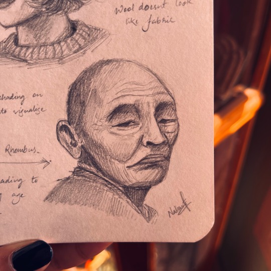
Text
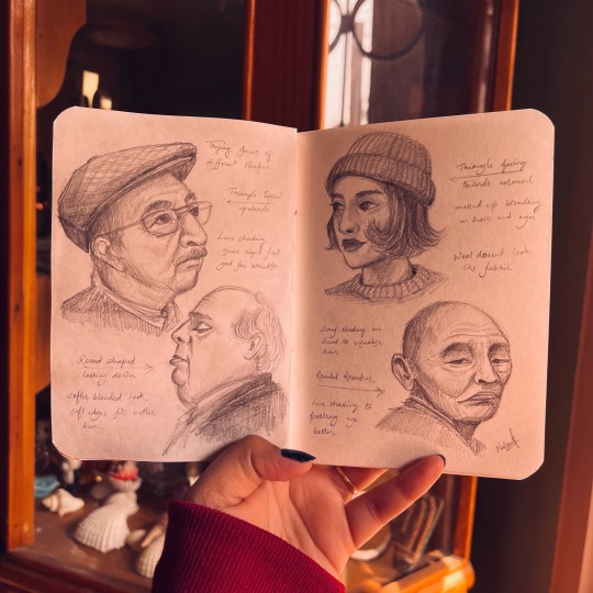


I've been doing digital art for almost 2 years now, with little to no practice on actual paper for these 2 years, and that got me thinking did I Lose my touch with traditional art, Haven't picked up an actual paint brush in so long. Its easy to get lost in the vast possibilities that digital painting softwares offer, ranging from hundreds of brush textures, to tools to make your shaky lines smooth, making the perfect circles, filing a solid colour in an instant.
Where you absolutely dont have to wait for your oils or watercolor to dry up before going for the next layer, and most importantly no need to spend dollars on art supplies and if you make any mistake the undo option is always there for you.
It did make painting easier in a way, but it also comes with its own cons, when I started digital painting I felt like I had to learn from scratch how to use the particular software, and had to learn to paint all over again. Tho it catches up quick but still figuering out how to use each tool, how all the functions, brushes, layers, blend modes work. It does take some time.
Nevertheless I ventured from my point, so since I've been painting dgitally for 2 years I figured its time to indulge in some traditional work, touch base and see If im still worthy.
I tried painting a couple of small canvas and got stuck figuring out what to draw, to have the exact outcome planned out because if I decide halfway through coloring my background that I dont like how it looks, I dont have a ctrl Z to help me this time, I'll have to paint over the whole thing and start from scratch. Painting on the canvas directly is a commitment and theres a looming pressure that the outcome should look beautiful and completed, and I already have enough anxiety, not really excited about been anxious about the thing i love.
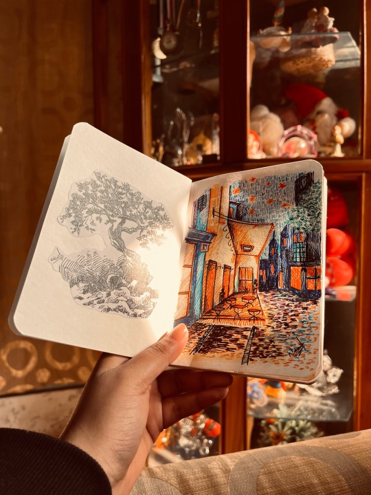
One warm afternoon I picked up a tiny notebook I had, bought it on a whim last year and it has been sitting on my shelf since then, its a 4"x4" pocket notebook with decent paper quality, perfect to try out the random black gel pen I found lying around. And I got to it, found a cozy warm place and made a small pen sketch of a tree. The texture looked nice, i did mess up a couple timeson the leaves but since its just a disposable paper I didnt worry much on it, just covered it up with more scriblings. It felt pretty good, ad I realised with digital art the one thing I'm missing is customisign how I organise and decorate my work collection.
With digital software all your art is stored as mere .png or .jpg or whichever format you prefer, but thats it, its just a photo album, unlike a sketchbook where you can decorate the cover, add a couple of sticker or notes to it, stick a dried flower you found, or just about anything creative.
The overall feel of a sketchbook is entirely different and I dont have to worry about each page looking like a finished work.
I love painting digitally but painting on a sketchbook is almost nostalgic, so I finally started one.
Got myself a small A6 sketcbook with a pretty floral cover,cut out the pen sketch i did and glued it on the first page, and thus started to fill each page with totally random unrelated paintings.
So anyway this was a lengthy way to tell you how painting on a sketchbook somehow made me improve my art, and felt incredibly amazing, tho I've completed just couple pages, each page looks beatifull in its own way, and i got to try out a couple of pens, and paints that I havnt used in so long.
got to try doing simple portraits, tried to double tap multiple times on the page (stupid muscle memory).
so anyway here are a few pages that I have completed, and if you did read till the end, thanks for bearing with the (rant)?
#artists on tumblr#artwork#illustration#art#drawing#ink art#mini sketchbook#sketchbook tour#sketchblog#painting#portrait#portrait study#graphite sketch#rant post#personal rant#traditional art#tradiotional art#creative inspiration#how to draw#art tips#classical art#i wrote something#i drew something#goth#dark core gothique#cottage core#dark academia#dark aesthetic
5 notes
·
View notes
Note
I am very not normal about your Adamandi art, what brushes and programs do you use to draw? Hits the skrunkly autism part of my brain.
hi!!! sjdhdjfh thank you for the compliment! <33 (i was very not normal when i made it /lh)
i'm going to take this as an excuse to Ramble beneath the cut
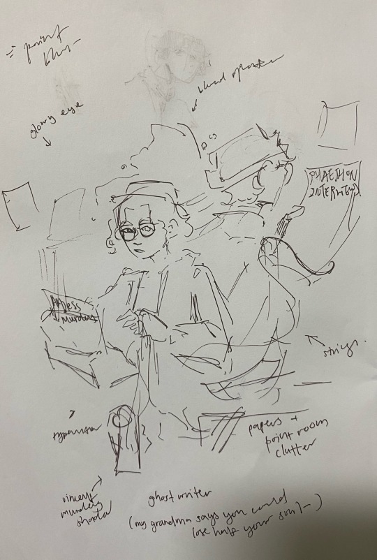
most of the adamandi stuff started out as sketches i was messing around with in between the madness of school coursework season! so like. <insert pen/ mechanical pencil on paper>
there's nothing quite like discovering dark academia during what was essentially our last year of high school finals season: practically all of the fanart, serious and unserious, began as barebones sketches and text, before the obsession took over and i somehow (???) managed to render the idea across.
see below for the ghostwriter one- the original sketch- as it went the ideas got cut, but if the original sketch was legible enough i'd use it as a base for the digital painting + outline.
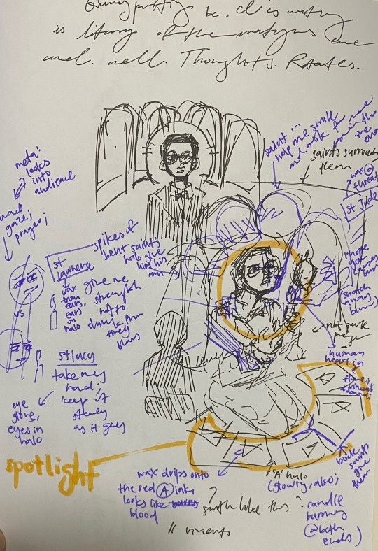
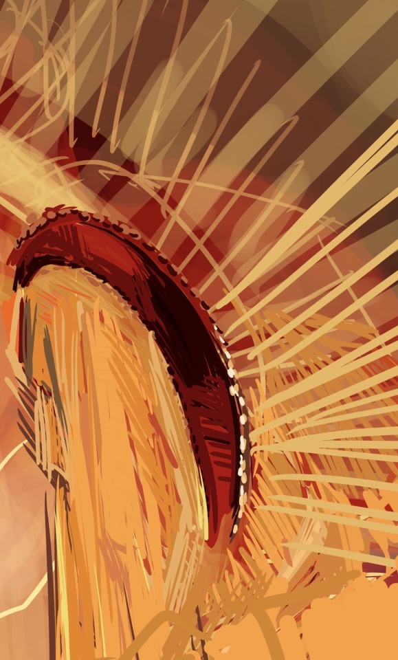
i've also added in-progress pics of the litanyofthemartyrs one: this one might have been the most ambitious? to answer your original question, my comfort mode is photoshop, default brushes,,, it varies a lot depending on the vibes of the work. <litany of the martyrs> was done first with the hard tapered brush in photoshop, 100% opacity, then i went over with lower opacities / softer brushes in photoshop as i added details, so it looked less harsh.
for quincy, though, since i struggled so much, this file got shifted back and forth through fingerpainting in autodesk sketchbook on my phone (colour builder brush, varying opacity), and photoshop on my laptop with the wacom! painting on my phone is usually harder for me to adapt to, but allows me a much greater freedom and easier blending. so....
the brushes do alternate on vibes- vincent here was the hard tapered brush at almost consistent 100% opacity; while this ambrose had a low opacity hard round brush throughout!
and, well. sometimes i just redraw the sketch nicer, take a photo and call it a day.


#djhdhfhf i have seen you about in cc/yh's inbox nice to!! meet you!!!! ur analysis is rly very cool#hi :33#taking this entirely as a point to Ramble#sorry for like. all the tangents ksjfgh#ask me stuff???#something about me is that like. i have No Fixed Style so brush / program/ etc. is just up to fate when i do stuff ><#and so i could gesture to each piece individually and tell you exactly what i think i did but when it's just all of them#<insert meme of gesturing at red strings>
6 notes
·
View notes
Text
I’ve been meaning to post this forever
The speedpaint and process of my “Piano Concerto No.2” painting for the Cadenza Zine::
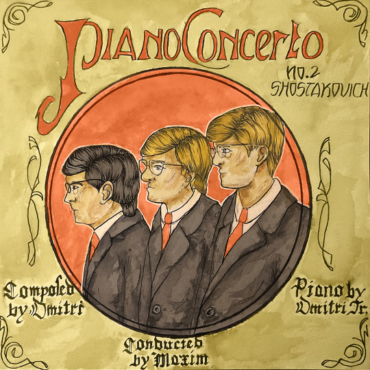
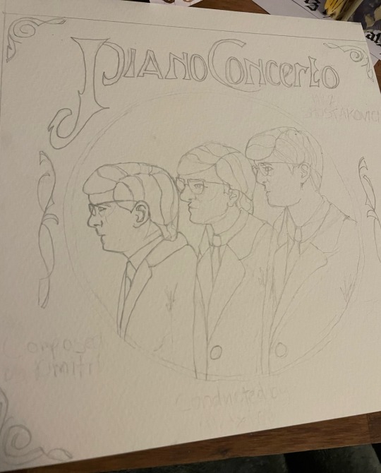
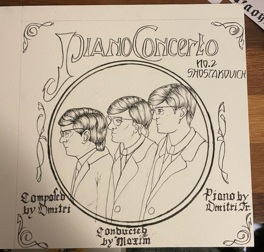
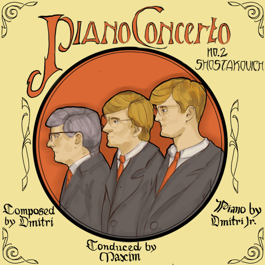
Materials used ::
- Procreate (for the digital version)
- Daler Rowney cold pressed watercolour paper
- Zebra Fude Brush pen (for the lineart)
- Windsor and Newton Cotman watercolour pans
- Photoshop (For digital colour correction)
#shostakovich#dsch#dmitri shostakovich#Piano Concerto No.2#watercolour#art nouveau#cadenza zine#calligraphy#thevw
5 notes
·
View notes
Note
Can I ask what may possibly be a dumb question but why do people do virtual art, like where they do drawings but on an ipad or some kind of thing? Is it less time consuming than drawing on paper? Can you erase mistakes easier than on paper? Also what happens if the ipad/tech drawing thing breaks, do you lose all your work then?
I'll take this as a good faith question and assume you're being genuine. I'm someone who does both digital and traditional art, but generally prefer traditional.
First and foremost, let me clarify one thing: Digital art (virtual is a bit of a weird phrasing, but that might be because English isn't your first language?) is not in any way 'lesser' than traditional. It's still art and it requires pretty much the same types of skill as traditional.
Digital has a whole host of advantages over traditional art. Some being in the process itself and others in the end result.
Digital pieces are easier to reproduce, for example. They are already in a printable format and don't have to be scanned/digitized to be shared. In today's world where so much happens online, that's a huge plus.
Digital is also much more 'approachable' and accessible for a lot of people. Most people have a computer already and a starter drawing tablet is less than 50 bucks, while there's plenty of free drawing programs out there like Krita. Yes, that is a lot more than a pencil and paper, but it is capable of more than the paper and pencil combo and will last you for years.
Digital, as you already figured out, has plenty of advantages over traditional like the ability to infinitely erase (which isn't possible when with a pencil), reshaping/repositioning elements endlessly, having layers and adjustments that can be manipulated individually... The list goes on and on.
Something that might be less obvious when it comes to the advantages of digital especially when we're talking about devices like an iPad or other standalone tablet device (I use a Samsung Galaxy Tab S8+, or example) is that it has a lower barrier for getting started. These devices are easy to have with you, are instant on, can be used handheld or on your lap and as soon as we start going beyond a simple sketch (which in traditional would require just a pencil and paper) it has zero setup time.
If I set up my paints, it requires special paper, my paint palette, my mixing palette, at least one, ideally two cups of water, my brushes... If I want to colour something digitally, I just need my tablet and pen.
Professional art supplies are also expensive and require space to store them (often under specific conditions. Dry, dark, clean, cool), while a tablet or PC has a use beyond art.
Digital has a long, long list of benefits over traditional, all coming down to 'if you mess up, you can fix it a lot easier and you don't have to waste materials on it'. Not everything is perfect with it (for example, it's much easier to learn bad habits on digital, the tactile aspect of traditional media is lost and the ability to infinitely erase and manipulate your pieces can hobble your progress with the mindset of 'eh, I can always fix it later') but generally, it's 'easier' in a lot of ways.
As for your last question: all digital drawing programs have the ability to export workable files like .psd files and it's generally just good digital hygiene to back up your files regularly in at least one or two locations. I recently upgraded my drawing tech (not because something broke, but because I was fortunate enough to get the chance to) and already had all my files in another location.
18 notes
·
View notes
Note
so i just discovered your art and im wondering what utensils do you use when coloring stuff on paper? im sorry if im being dumb😭 also ur art is sups cute i luv it
watercolours ‘pastel dreams’ set I think? and Winsor & Newton
Himi miya gouache (24 set)
caran d’ache water soluble crayons
copic markers
prismacolour pencils
posca paint pens
any type of brush !!
I hope this answers your question? Over the who knows how many years I’ve been drawing I’ve accumulated A LOT of supplies lmao
The majority of my art is sketched on paper and then coloured in digitally…
But I do colour on paper I lot, I just don’t have the courage to post it yet :) And thank you so much! I’m glad you like my art <3
12 notes
·
View notes
Note
What do you draw with?
for digital art I use a Wacom tablet (from around 2017?) and Paint Tool SAI
for traditional art, I use Sakura Pigma brush pens in various colours, cheap off-brand ink pens in various colours and line weights, stylefile and letraset markers, a mix of off-brand and faber castell coloured pencils, as well as off-brand gel pens. and I draw in canson art books. decent quality paper + mid-range price.
5 notes
·
View notes
Note
Hi, Your Art is amazing and I love it! How do you make it? Is it made digitally on a computer?
I'm not sure when I received this (I don't always get pings when I receive messages, so I'm sorry for the delay), but-- I make my art in multiple ways! I love drawing digitally as well as traditionally, so I change it up regularly. :D
My first comic, Chirault, was done almost 100% traditionally (with markers and brush pen inks on paper); my current comic, Wychwood, is made fully digitally, in Clip Studio. When it comes to illustrations, a lot of them start out on paper and then get scanned in for colours, or for inks and colours, depending on how I feel. Occasionally I'll do something fully in marker, just for fun.
I've got a tag for my Sketchbook stuff for anyone interested in seeing what my traditional stuff/process look like prior to digital tweaks. I've been thinking of starting to do more "sketchbook tour" videos (you can see the first couple on my YouTube), though life has gotten in the way for a bit, I'm hoping to resume these in February.
I've also got a Process tag with a breakdown of how I do marker stuff! Because I work in so many different mediums, I don't really have a single definitive answer for "how", but I'm always happy to explain my process when it comes to specific pieces or mediums :D
4 notes
·
View notes
Last Seen Blogs

mertina4life
Welcome!

askrrigby
Ask Rigby! Oooohhh!!

uyduantentvservisiorg-blog
istanbul uydu servisi & çanak anten 0507 078 8495
runandhide21
Run_and_hide

sexiforever
Senza titolo