#but for me personally i dont think so lol
Text

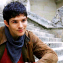
mira !!! :]
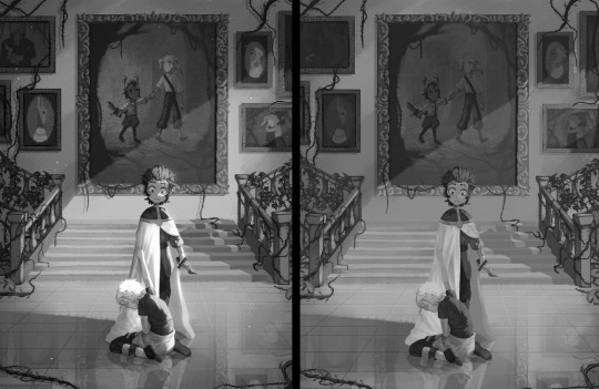
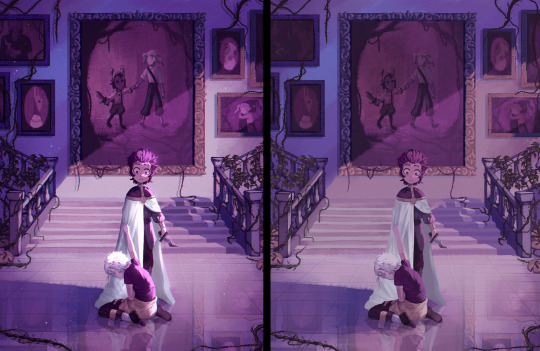
#isat#in stars and time#isat mirabelle#isat spoilers#<- due to act 3 optional content !#the img might be being chewed due to weird canvas size oops ah well#one of these miras is not like the other#one of these miras doesnt belong ASFASFSDAFA#a majority of these are based on things mentioned / that happen in the house cuz i thought itd be fun to draw :D#so like the wilting plant is from gardening room dialogue#the poster with ppl holding hands and sparkly eyes is (i think??) from some SAPSAPSAAP dialogue in one of the first rooms#i tried looking around ISAT to see if it's also in there too but couldnt find it so uh correct me if im wrong if thats NOT an exclusive LOL#side note the 2 in the poster are some old nuz ocs isatified ASDFASFA#funnily enough tho they are from 2 different games if they actually ever met they would hate each others guts i think. hmm...#however both are also the most qualified to help with promotional stuff so theres that ASDFAFA#mira looking at her bonding proposals is sorta on the tin but#the fact that she has like right next to her while she sleeps in her dresser makes me :(#cuz to me it potrays how much theyve been weighing over her cuz of how close shes been keeping them with her vs putting them on a bookshelf#or something idk if that makes sense i dont have proper words atm#but uhhh moving on chalkboard is from one of the optional events#which i think is! important!!! i dont think ive seen many ppl talk about it but!! yeah!#however i too do not have words on it atm but!!! yeah!!!! moving on for now!#the 'mira' that is really just the change god is ofc from the change god event :]#aaand ofc the iconic finish from mira towards the king#and then some misc miras with swords for funsies tbh ASFAFA#but yeah! i like mira a lot actually but as with many things i do not currently have many words to properly articulate *why*#all i know in my heart of hearts is that she is near and dear and special to me personally#one day. one day i will be able to gather my thoughts in a cohesive manner but that day. is not today!#anyway tag talk over :]
173 notes
·
View notes
Note
Love your art! What's your shading process / any tips? I really like how vibrant it is
Thank you!! also sorry this is a long post
I usually start painting the character after I already have a background, super sketchy or with a placeholder (a photo usually), just so i know what colors to use
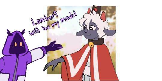
I fill the character with a color from the BG or a similar color and use the multiply blending mode

then i paint the lights on another layer with the "add glow" blending mode (i also pick the color depending on the bg).
I add another multiply layer for anything that needs to be darker, like stuff under the characters clothes

I paint a line with a saturated color between the lights and shadows, for example i added a bright red for the cape and light purple for their skin (? this is subsurface scattering, it doesnt happen on every surface but i like how it looks so i use it on everything lol.
Then i paint the lineart a similar color to each part of the character or you can paint it all red and use multiply

that's basically it
some tips (these are just things that work for me)
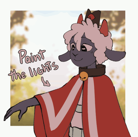
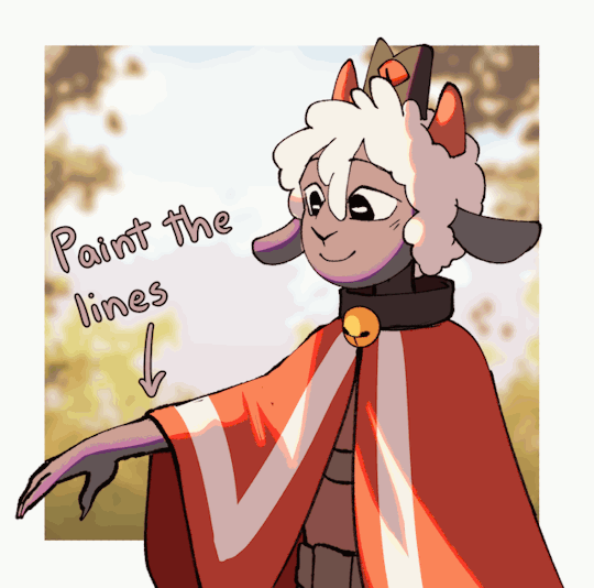
I think is better to paint the lights, not the shadows. it helps to see the shapes of the thing/character you're drawing better (its what i did with lambert ⬆️)
Draw backgrounds, i think it makes every drawing look more interesting and its easier to decide the lighting for the character, if you dont want to draw anything detailed you can paint something simple and blur it
i really recommend to start with a thumbnail, experiment with colors, perspective, composition, etc. before actually starting the drawing thumbnails of this post
this tip is something that everyone has heard before but use references, real life references like photographs for perspective and lighting, 3d models for anatomy and perspective, paintings to see how other artists stylize objects, bgs or characters. use references for everything
this tip is super important for me: check the values of your drawing, (lower the saturation, with the lineart hidden) if it isnt readable/ doesnt look good in black and white it most likely wont look good with colors (this depends on artstyle and personal preference tho)
155 notes
·
View notes
Text
Orbital trajectory.
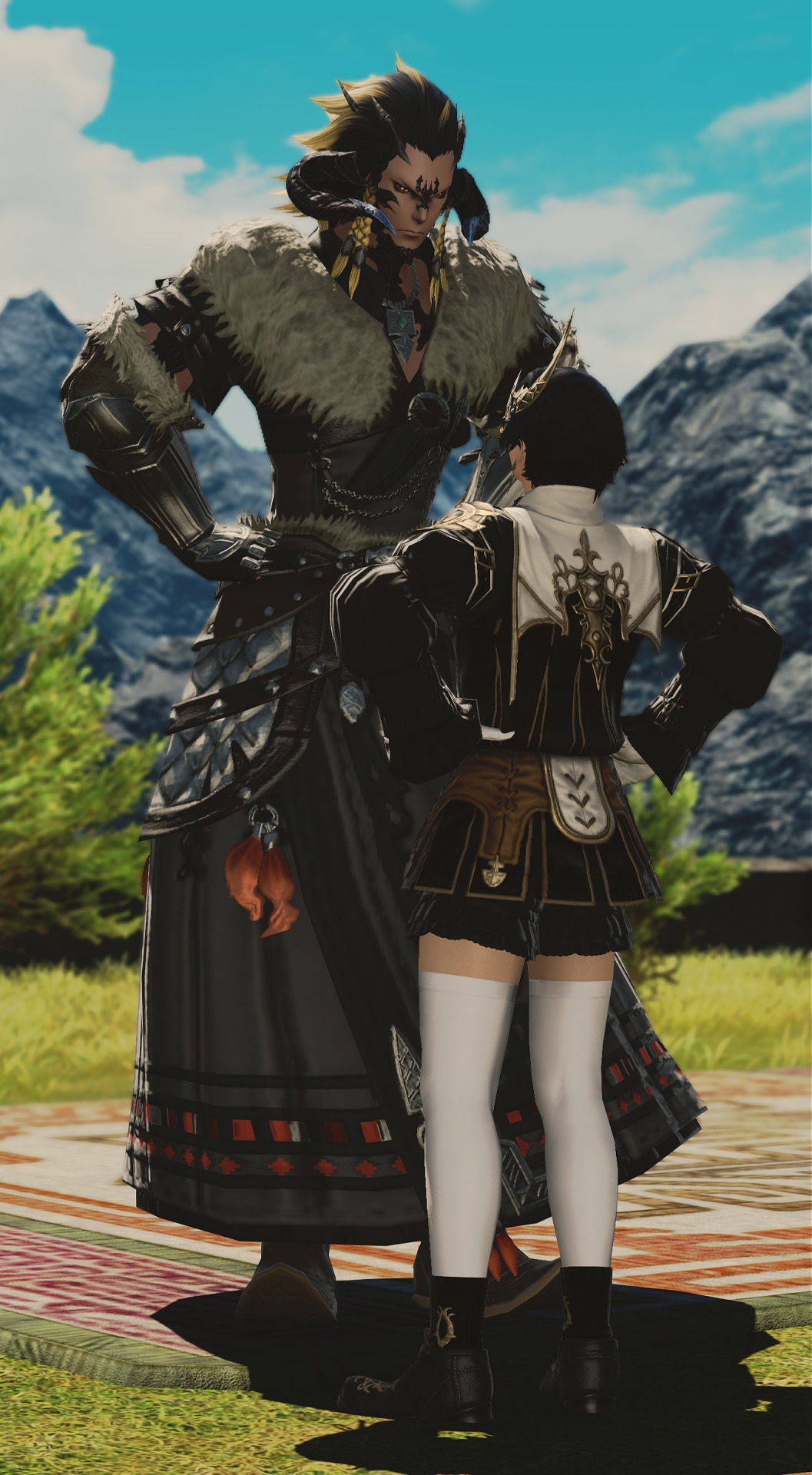
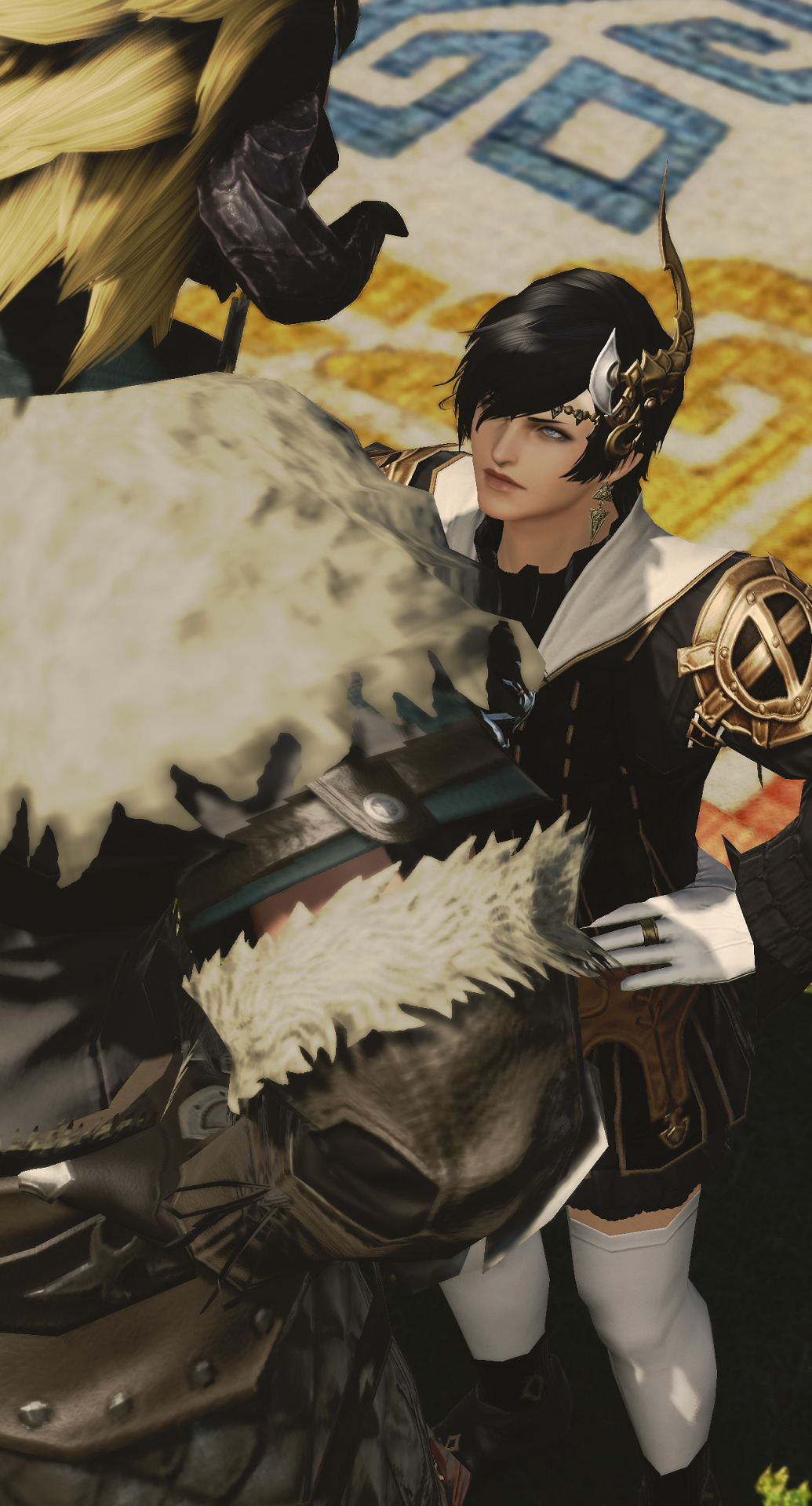
#ieeha grew up with horrible tall people hes not scared of anything (even when he should be. actually *especially* then.)#ieeha ''i will not be the bigger person i WILL drag you down to my level'' de verral#sincerely hes a pain in the ass LOL. hissy cat coded#he and magnai are so funny to me cause theyre both passionate and clueless#in ways that are similar but also different simultaneously#its a LONG road. i dont think bridging the gap even comes into question until EW *earliest*#but im running out of tag space thanks for coming to my shiptalk--#ffxiv#final fantasy xiv#ff14#final fantasy 14#hyur#midlander#magnai oronir#xaela#au ra#wolship#gpose#magnai oronir x warrior of light#wol#ffxiv screenshot#ieeha#ieeha de verral#nabaath-areng#ffxiv ship#ffxiv oc#and so they bicker a lot especially at first. and then dont know what to do once they grow closer
34 notes
·
View notes
Note
Hello :D
I have been following you for the last year or so (a few days after I got my Tumblr lmao) and I absolutely love your art!
I have been wanting to study your art style for a while but don't really know where to start,,,
Could you please show me a small portion of your art process, if it isn't too much trouble of course. Thank you and have a nice day!
hello. oh my god. this took forever to find.
im sorry it took 2 WHOLE FUCKING MONTHS for me to respond to this but i wanted to put it off until i felt happy with my art process again, so here it is
my fall 2024 rendering tutorial!
(this will be very very long)

FLATS AND WHATEVER YOU WANNA DO WITH LINES GIRL. then make sure to recolor the lineart to better match your base. trust me it helps, bold dark lines are Not your best friend when rendering. wait for that post-rendering
i start off with a doodle or a sketch, and then filling it in with flats and other details such as blush

FIGURE OUT YOUR LIGHT SOURCE. FIGURE IT OUT GIRL YOU CAN DO IT you can make it as simple as possible, make it as big as possible, dont even THINK about the details.........just make it really fucking big so you at least know where the shadows and the light goes THEN add smaller shading details LISTEN TO ME. LISTEN TO ME OKAY!!!!!!!!
my key point with this is for you to learn lighting fundamentals.
it's SOOO ANNOYING but alas......they are all correct. it helps a lot.
one thing i also really want to point out is that i like creating a big shadow shape first before fixing up the little details (such as folds and whatever) because it helps me focus on the way the lighting actually works instead of tunnel vision-ing into making the shading make sense on the clothing.

contact shadows (i dont remember if thats what theyre called okay) theyre fucking ugly because im not actually thinking sorry 💔
okay so basically:
contact shadows (if that's what they're called) are the spots in shading and lighting where light will NEVER hit.
shadows are still influenced by the colors and lights around it (it's why a blue shadow and a yellow shadow feel completely different, despite both being shadows) so it's not always COMPLETELY dark.
BUT! there are small points in shadows where light never hits, and they're almost always super dark or pitch black.
it's hard to explain shadow and light so briefly for a tutorial, but you'll notice it when watching fundamental studies and when trying it out for yourself


YES i unclipped the multiply layer YES its ugly and terrifying but it makes coloring the multiply layer easier okay
the colors merged w multiply so now it looks cool and has depth
overlaying colors that actually make sense
so basically what i did was color the multiply layer that i used to shade the overall drawing
adding a band of red/orange/yellow around where the light hits, and blue where the shadows get big and wide, gives it a fake ambient occlusion effect in the way that a person would get if they stood under the sun with a clear blue sky
the colors don't have to make sense, especially because i never draw backgrounds, but coloring the shadows really help it give a sense of depth and extra subtle detail and effect that just helps make the painting look nicer
around the end, i also put in colors (in an overlay layer with a low opacity brush) that actually make sense in context of the drawing, which is the lit cigarette and the yellow eyelights
mostly because none of the colors were making sense and i needed to actually make use of the lighting that DOES exist in the drawing lol

adding a muddy golden yellow pin light layer (opacity turned down to like 40-50%) to make the light colors less ugly lol
i SWEAR by the fucking pin light layer style. it's so useful and so so underrated.
i used an almost brown-ish gold color on stop of all the layers, and with the pin light layer, it helped make the bright (almost blue-ish) white colors more warm and more yellow. it just helps make things more warm (something i prefer)
i could probably show what it looks like without adjusting the layer opacity to truly show off what i mean (like in the coming section) but i sadly forgot to do that lol


make a layer on top of your drawing with this color in these ranges YES the drawing is fully merged NO don't be afraid, the base was fucking ugly anyway 💔
make this layer into an exclude/exclusion layer style TRUST
turn down your exclusion layer opacity from a range of 10% to 40% literally until you're happy with the contrast and the way the color over the drawing. use your eyeballs. i know you can do it im so proud of you
this is pretty self-explanatory instruction-wise, so i'll go into why i do this instead
i really like art that seems like it has low contrast, with almost mid-gray shading and lines. i don't personally use dark and bold lines and shading, unless i find it necessary for the tone of the piece, so using this method helps lower the contrast of the art and make it look "pleasantly muddy" in the way that it's easier and softer on the eyes.
the inverted blue color also helps makes things warmer!
the exclusion layer style is still a bit of a mystery to me but i really like the effect it gives, even if i don't completely get how it works lol
if you want an alternative method to this, and if you have access to it (because i primarily use sai and sai only),
i absolutely encourage you to play around and experiment with gradient maps.
there are so many out there you can make yourself or even get from others that just give the painting an extra amount of depth and color variation. they're SO fun.
personally, if sai2 gets a gradient map update, it's over for y'all it will literally be so over no one will be able to stop me


then i merged everything and actually adjusted the contrast back up because it was looking too muddy for me 💔 but the color adjustments are still there so all hope is not lost
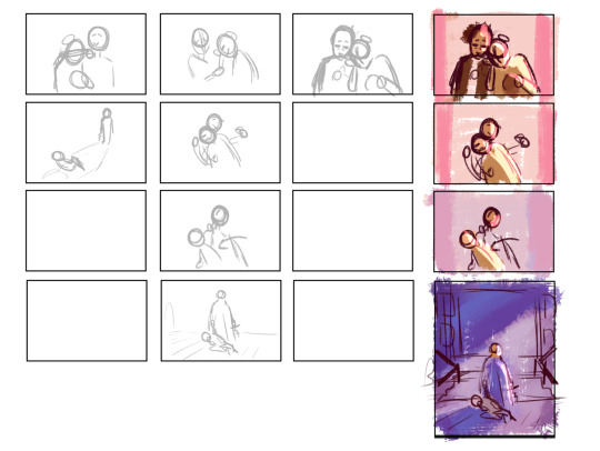
here's a comparison of the adjusted contrast in black and white
(adjusted on the left) (newly merged layer without adjusting the contrast on the right)
as you can see, i actually turned the contrast back up (despite talking all about how i liked things with less contrast lol)
i wanted to demonstrate that doing adjustments should be done in moderation, and is why i adjust layer opacity often when making color effects
you are free to play around with colors to help your style, but don't lose your initial idea and colors along the way.
you still need to trust your own colors and intuition!
along with that, i just want to say that it's completely okay to change your mind mid-painting, and it's okay to make somewhat drastic changes.
don't be afraid to change things you don't like or change your mind about certain aspects way later on
that's basically the whole thing of this!!! don't be scared!!!

now im gonna hold your hand when i say this..........but you need to learn how to render by yourself. it seems like i can teach you but i literally can't, because rendering is different on every piece and depending on how clean your base is. i have to render A LOT because of how fucking ugly my sketches are LMAO
to simplify it, think of it as obsessively cleaning up every detail you can see, but with a color picker and a clean, hard edged brush. if you have shit lineart, you don't have to redraw it cleanly over and over, just paint over it. that's basically what rendering is
THIS especially is where you need to be brave and stop being scared.
like i said, i can't teach you how to render, and it's something you have to discover yourself because rendering is something that will always be personal to every single piece you make. the way you render on every piece is different.
on one piece, you will barely need to render, and on another, rendering is more than half of your ENTIRE process.
don't be afraid to paint over your old art.
rendering is a process that's both very perfectionist yet also very careless.
find your balance and just go for it.

and then that's it……..u did it………..now yuo know how to paint and render. it's literally just layering shading and lighting knowledge until you think it makes sense and looks okay lol
additional note: since i render in only one layer (you don't HAVE to do this, but it'll be harder for you…), i also made slight adjustments with the transform (and liquify, if you have it) tool to make things more proportionate. (i drew the head too big lol)

if you compare the finished piece to the final unrendered base, you can see that a LOT changed, including a bit of subtle proportion adjustment.
particularly, the sleeves changed A LOT (because i really didn't like them)
but it's also over all cleaner and more coherent, instead of having haphazard colors and shading just thrown about.
rendering is when you finally use all 100% of your brain to finalize and figure out where the shading should go, where to clean up your lines, where to ERASE or ADD BACK in lines, and make sure all your colors look coherent.
it's not as intimidating as it seems, i only use a hard edged brush with a little bit of color mixing and my color picker.
it's like dragging and dropping colors to cover up mistakes, it's really quite fun when you get used to it
i wish i could explain it clearer but it's hard to describe without visuals!
i hope this helped, and i hope all my yapping isn't annoying (art as a special interest beloved)
have fun studying and trying to render in my art style!
#long post#art tutorial#rendering tutorial#art help#art tips#tutorial#kia doodles shit#artxstic-scr1bbles
123 notes
·
View notes
Text
.
#no offense to my multishipper oomfs but whenever i see posts that are like “even if bvddie happens” “maybe bvddie will happen one day but”#etc etc i cant even entertain the if lol#it'll never happen#it was never gonna happen#it's so starkly unrealistic#has been since ep 2x01 and at no point in me watching this show did i think they would/could go that route#the studio the cast the audience the unspoken limits to the queer storylines on mainstream media like...#sorry i had to get this off my chest#it is one of many juggernaut ships since the dawn of fandom that's clearly always gonna stay fanon#(and might be the second one after st3rek that i personally dont get the appeal of but thats another topic)#when i see spec posts (past and present) about how/when bvddie can happen i feel like im living in another reality#this is not a you cant ship it post bc people loooove getting offended#it's a logistics of it never made sense to me post feel free to unfollow block whatever if you want to 🤷♀️
20 notes
·
View notes
Text
p5 Percy Jackson au
Joker: son of Zeus. stay with me
Akechi: son of Hades. it makes the most sense that joker and akechi are the only ones who are kids of the big three. of those options, this is just what makes the most sense. neither of them are posideon kids lol
Ann: daughter of Aphrodite. imagine atlus wrote her arc well. also sexy technique is literally charmspeak
Ryuji: Son of Hermes. I like him, the runner, being the son of a god of travel and athletes. also, as the Hermes cabin is the newbie cabin, it would make sense for him to be the first person joker (assuming we're following his POV similar to p5/percy) meets and befriends. also I think he'd just be very sweet helping new campers and helping them feel welcomed.
Yusuke: Son of Apollo or Dionysus. look. ik that he should be an Apollo kid. I know. but he gives the vibes of a Dionysus kid more. soooooo... whatever.
Makoto: Daughter of Athena. fucking obviously. no elaboration needed.
Futaba: Daughter of Hephaestus. technology, obviously, but also I feel like she'd resonate with the sort of. ugly unwanted recluse nature.
Haru: Daughter of Demeter. she gardens. she's pretty. thats abt it.
Sumire: Would it be weird to say daughter of Nike? since so much of her character is about pursuing victory as/on behalf of her sister, I feel like it could present an interesting internal conflict. this one is still up for debate tho.
BONUSES:
Shiho: Hebe or nemesis? not sure yet
Hifumi: Also probably an Athena kid. this makes sense as makoto is her knock-off LMAO
Mishima: Mishima isn't real because I dont like him
Morgana: Maybe .... . . a satyr????? id ont fucking know
#trinket close them peepers#persona 5#ren amamiya#ryuji sakamato#ann takamaki#yusuke kitagawa#makoto niijima#goro akechi#futaba sakura#haru okumura#sumire yoshizawa#shiho suzui#hifumi togo#Yuuki mishima#morgana#long post
32 notes
·
View notes
Text
it's so hard to be a lesbian in this household
#im out to my little sister and she has enough of a conscience to not out me but shes also Such a cishet 'ally'#in that she just wants to seem politically correct but she only really tolerates me#like any mention of an actual development in my romantic/sex life would set her off on a rant about how thats 'weird'#shes religious in a way where she doesn't want to have sex before marriage and i respect that and dont find it weird bc im also muslim so#i get where its coming from / why / how that can be beneficial to some people#but for me personally i dont think so lol#at the same time I'm not one for casual hookups (clearly) (because im so single so consistently)#and like if anything im so tame so the fact that she reacts with negative judgement and a holier than thou attitude#when we talk about our love lives is so uncomfortable#like tolerating is not the same as accepting#z.post
2 notes
·
View notes
Text

I don't know what this is all I know is that LimL Joel makes me really emotional
#I know he has a tendency to go deranged on his red lives but idk something about him beginning to lose it after Jimmy died and killing Grian#joel smallishbeans#smallishbeans fanart#trafficblr#Again its his red life shenanigans but... If only Jimmy had known how affected someone was by his death. I'm choosing to believe this#and him then going out like a sad pathetic wet cat even with Grian's sacrifice... He really deserves a win one of these days lmao please#Also I cant stop thinking about how Jimmy wouldn't have left him. Grian was sensible to and most players probs would have#Joel really does become a lost cause so its fair and Grian did still care (and went to say goodbye as well as sacrifice his time for him)#But Jimmy would have stuck by even if Joel were in this state (and they'd both get themselves killed pathetically but)#And Joel having shown such genuine care for Jimmy and concern over his limited time... man anything w Jimmy makes me so emotional lol#I love them so#oh Ig about the art itself. I dont like it but hey thats how it tends to go when you try smth new. And no shame in trying#but if one person likes this then yayy I will still feel accomplished and happy#Im looking at this again and hey its not that bad actually yay I love to approve of my own art. self love hell yea#tubby art
1K notes
·
View notes
Text
On average, what is the total MONTHLY amount that you spend on dining out*?
*(This doesn't only count going out to restaurants, but also stuff like picking up fast food to bring home, getting a coffee on the way to work, getting a premade sandwich from a grocery store deli during lunch, buying a quick snack from a convenience store or food cart whilst walking somewhere, ordering a pizza or any other food to be delivered to your home, etc.)
*(If you often dine out in groups/as a household: calculate and divide the costs so that you get a Per Person average. This is for YOU individually, NOT the total household/group costs)
(I'm sure polls similar to this have been made before (very common topic), I just haven't personally seen one that I can remember, so, I was curious to do my own! I was discussing this with a group of people today and it was very interesting to see how widely the number varied between individuals. :0c )
(Reblog for bigger sample size if you can, and feel free to explain your answer in tags if there's anything extra to add!)
#polls#tumblr polls#I'm mostly in the 0/1 - 25$ category. Maybe the rare month is a bit over $25 if there's something specific going on like birthday.#Which I'm NEVER eating in an actual restaurant (erm... covid... plus I just hate restaurant environments. i would rather pickup#the food and bring it home to a peaceful quiet environment that I control lol). But more typically like stopping by a grocery store deli#section or something. I don't have coffee that much. And I can't eat fast food much due to my health issues/diet restriction stuff#so if I'm out like coming back from an appointment and I start feeling really sick and weak. I know that a hamburger will just#blow up my system and cause nausea or something. So I try to pick the breadiest most#neutral looking turkey sandwich at the safeway deli to eat during the hour ride home or whatever lol#I actually kind of wish I could do stuff like get food more often vecause it would take the burden of cooking everything off of me#but.. alas... Money... and Health Things... T o T#I still wouldn't do it ALL the time but like... once a week instead of once a month or something.. or maybe turning into a coffee#person.. I do love drinks A LOT .. i am a drink person who will have 5 different drinks sipping on at all times#But i just have to make them all myself mostly lol#And I cant really have too much coffee since it will make me sick. so like.. teas and juice mostly#When I inevitably become a millionaire by never using social media never networking and only finishing one#sculpture every 5 months which I dont even post about or sell - then I shall... get more drinks..#I will somehow wean my body onto coffee and drink one a day solely for the ritual of it#Though even then... I would still probably just like.. buy the mateirals to make it at home or something#Like if you had a million dollars you could just buy a kitchen grade ice cream machine and other stuff to make your own milkshakes and#coffees and smoothies and bubble teas. Genuinely I think even if I were a BILLIONAIRE I would still look at playing likr $8 for a single#coffee and go .. uh.... I could just buy the equipment to make this and then save that money. PLUS. its in my house now so no need to#have to leave. I can make my own drinks in the comfort of home. .. ideal..#Like no matter how rich I ever got I would still have the lingering scroogey stinginess. like i am NOT paying for that. I will jus#make it myself. Especially if it was an Everyday thing. Anythign thats part of my routine I try to optimize and make as efficient as#possible... ANYWAY.. In an IDEAL world I would get treats. but probably not that much. as on a daily basis it would start to get#to me and I would just save up to buy kitchen machinery if I was rich lol
315 notes
·
View notes
Text
one thing I really really appreciate abt riz gukgak as a character is that he is un-self-aware to the max. he inhabits his body so completely. the arc that would usually be run as "I'm different and unable to connect with my friends in this way that everyone seems to be able to do and so something's wrong with me and I don't like myself" when it comes to riz is actually like no! I have literally no problems or praises for myself personally. I don't stand outside of my own self and judge it. it's phrased as "other people will eventually find someone more important to them than you" rather than centering it on his self-perception. he doesn't know why he doesn't have the best social life on earth even though he's not afraid at all to talk to other people. every time he sees himself in someone else's actions or behaviour he gets startled by it. his latest epilogue is realizing seemingly for the first time that he's not just an agent of causes but an actual character. he's my hero and I want to be him when I grow up
#not art#fantasy high#this trait with him is kinda why I don't really ascribe any prominent trans narrative to him. even though hes very gender#I think I said once like bc he didn't just walk into the girls bathroom I don't think he finds himself on that axis in general#bc if he's any less attached to his gender he would 100% have done it lmao#and the great thing is the more he gets comfortable with his friends the less self aware he becomes#saying shit like ''chop his head off so he doesn't revive'' fully uncaring for the optics. I love him#its honestly great esp. with the Living While Goblin stuff going on too. no inner conflict with that dude#he's fully great! he's awesome he's all gucci. the world is just fucked and that's why shit sucks for him#(this makes me doing something model-minority-adjacent for bard!riz a bit harrowing shdjsh I dont wanna lose this)#(he's dictated by fear but it doesn't mean he reflects those fears back onto himself as a person lol. at least kid got better)
284 notes
·
View notes
Text
rhaenyra could say 'I wish I was a man with dick and balls' and hotd twitter would still be like 'umm she just means she wants freedom and respect but otherwise she is a FEMININE WOMAN stop making her into a man you weirdos'
#.txt#I mean she did kinda say that already 'daemon was everything I wanted to be...a man' what did she mean by this#btw I'm not saying you have to see her as trans I'm just saying it's an entirely reasonable interpretation/headcanon lol#but also like. she's not a real person she's a character and the things she says are a deliberate choice by the writers#so I dont think they wrote those lines about wanting to be a man just to mean 'I wish people werent sexist to me'#like yes they obviously mean that but stuff can be two things +its phrased in a specific way#once I saw someone be like 'well cersei has these thoughts too and nobody calls her trans' .....does he know?#the kicker is most of the time when these people are like 'stop making her a man' shes not even being hc as trans just. a masc woman lol
226 notes
·
View notes
Text
Small headcanon that max actually never knew who the mascot was and would talk to zeke about his hopes and deepest fears, and richie just sort of awkwardly comforted him and nodded along hoping max never found out who he was, and in a way, zeke was actually maxs closest friend.
#i think in this scenario max either believes its an adult the costume or actually thinks hes talking to zeke#but i dont think hes that dumb…right?#and richie kept his secrets because they were so personal and hes a stand up kid#ignore my previous headcanon that max randomly chose richie#i need this one more#i bet theres a fic like this#there has to be#if you know of one please direct me :)#richie lipschitz#max jagerman#max jägerman#npmd#nerdy prudes must die#starkid productions#starkid#hatchetfield#hatchetverse#i might write this myself lol
151 notes
·
View notes
Text


ninjago s11 redraw
#alek art#ninjago#zane julien#lloyd garmadon#ice emperor#2024#ice emperor zane with a ponytail is canon to me#this is technically a redraw ... buy also a rework of what happened#i dont go with the vex wiped zane's memory. zane being stuck with the cursed scroll for 6 decades is what did him in#here he sees lloyd and takes off his helmet . then somewhere along the lines after being sent to the dungeon area he sees kai#lloyd is like .. hey kai zane is the emporer btw ... and kai heads over there and fights him . zane is obviously not himself but the whole#power of friendship thing bothered me so bad . he commited genocide he isnt a good person . give him a better ending#kai has to get the scroll away from him . then theyre just left fighting and fighting until zane is wore thin mentally. its like withdrawal#its a very complicated thing when they get back . zane is half himself half another terrible person . he wont ever be the same . the ppl#he hurt wont ever be the same . i dont think he uses ice for a while . i dont think he talks to them the same way he used to .#kai lloyd zane dynamic drives me up the wall i wish it was explored better here .. lol
196 notes
·
View notes
Text
hermann thoughts: if i discredit newton and his approach enough, the martial won't give him the equipment for his kaiju drift, and i can protect him from himself. if he despises me for it, so be it. there is little i wouldn't sacrifice to see him safe.
newt thoughts: this is a Best Science competition and i have to Win
#unscientific aside#newmann#pacific rim#thinking about them again today#it's very easy to read hermann's animosity during the movie as him being pissed off at newt for his 'completely crazy'#theories getting attention + being a massive nuisance in general#that's exactly what it looks like if you just listen to WHAT he's saying#however if you pay attention to WHEN he says it & pay attention to his face when no one is looking it's very clear there's more going on im#like the kaiju entrails comment. newt has all these tables with guts set up right next to the line & has clearly been working there for age#theres a big pile of intestinal-looking tubes over on hermann's side of the floor already! not a peep from hermann!#but then when newt tries to join the conversation he happens to throw another little squidgy bit & suddenly hermann jumps on him about it#brings up in front of the marshall how CONSTANT this unprofessional conduct is while also cutting newt off#he physically puts himself between newt & pentecost#interrupts newt every time he tries to talk#starts making snarky little personal comments AT newt to discourage him - 'don't embarrass yourself' 'yes [just get to the point]'#'this is the point where he goes completely crazy' [significant look at newt]#keeps hovering in the background looking between newt & pentecost#like. ok he is SO MAD that newt is getting pentecost's attention here. obviously#the thing that does it for me though is how sad and resigned he looks when newt finally does get to the point#this is not the face of an angry rival#this is the face of a man with ulterior motives for his animosity#i dont think newt has any ulterior motives hes aware of lol he thinks hes in a movie about 2 geniuses vying for scientific superiority#happens to be in love with hermann but hasnt realized because hes so mad at him all the time#he only realizes how much hermann cares when he offers to drift with him
244 notes
·
View notes
Text

ive been thinking about the red string superstition recently and also sol bufo always and it makes me sick how uncannily caldwell tanner has made sol to perfectly target me personally


(+ cropped versions !)
#naddpod#ba2mia#ba2umia#solum bufo#swag daniels#calliope petrichor#calder kilde#alexandrite#posts by me dot com#okay..... SECRET TAGS RAMBLE!#so basically this superstition is like ... i think a chinese/buddhist/taoist superstition?#ive taken some creative liberties with it... but its mostly accurate to how its been told to me?#but of course theres lots of variations! some more abt bad luck; some say to tie it on the doorknob#etc etc ... lots a variations#i was also rlly interested in the .... weird illogic? of the thing?#like the red attracts and repels spirits at the same time#so thats something i was thinking about with too. red is assocuated with both swag and alexandrite. which to me was kinda reflecting like#i think what murph said . swags place in the wild is in a way. an extension of what he learned from the network#mothership s inextractivle from sol and swags lives. they will always be held doen by it. thats the spirit that will follow them forever#that they choose to hold on too! as much pain as it brought ... some of the experience was worth it#and anyway. theres somethingwrong w me that the minute someone brought up this superstition my brain went#'ohhh just like sol!' < needs to touch grass moment#but i CANT BELIEVE. CALDWELL DID THE RED STRING. AND ITS LITERALLY A MOURNING RITUAL#caldwell keeps accodentally makig that frog ASIAN. to MEEEE!!!!!!#but. anyway. idk. ive always hced sol kept the piece of yarn and it makes me kinda .... what if y let the malicious spirits follow you.#and haunt you. what if its the closest you can get to keeping the person still around#and sol and swag obviously have so much about homes .... so!#(ok. weve reached the pt where maybe nobodys reading? so confession is this is sort of a well. ive just been doodling this comic everyday#after a wake. and it was sort of inspired after realising i was even a bit sad about it maybe. so. idk its about sol but also?#i guess the projection doesnt end at him being asian. hehe. is what i mean. LOL. okay secret tags over . buried lore. dont look here folks)
179 notes
·
View notes
Text

Oh, I'll bow my head, I'll clip my wings
I was never gonna make it anyway (x)
#haha whats this doing here I dont remember drawing this#jimmy solidarity#jimmy solidarity fanart#trafficblr#thank you to the person who introduced me to this song among others in the Jimmy brainrot#you know who you are#it was Bree#tubby art#Im not going to expand on ideas here lol but fuck yeah Jimmy clipped wing symbolism#sorry to anyone whos annoyed by the constant canary theme etc but dude its way too good symbolism and imagery sorry#I dont make the rules#this is why his character is so cool and compelling and makes me wanna rip my hair out#Jimmy is a very good and capable man. I hope the angst art etc doesnt make people think that I think otherwise#you can be cool and capable and still suffer baby!!!
511 notes
·
View notes
Last Seen Blogs

moedull
not even a robot

lonewaffle0-blog
Putin in my heart

camilojulianc
camilojulianc

visionielts
Untitled
servanttoaprat
Just Your Average Servant