#but here’s them without any spec or bump maps or anything
Text
I’m still in the process, but I’m making progress
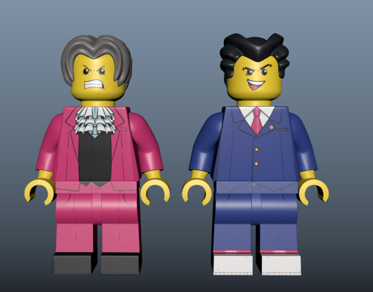
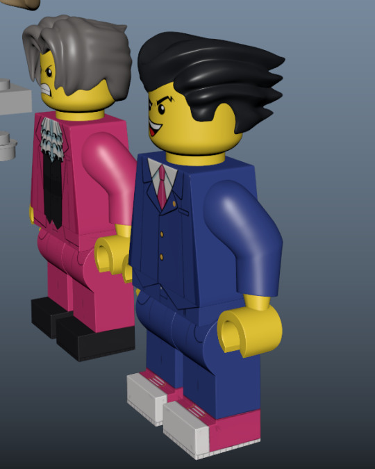
#doctorsiren#ace attorney#phoenix wright#miles edgeworth#ace attorney fanart#wip#autodesk maya#I’m so happy I saved a billion iterations of the last Lego project I did#because it meant I didn’t have to remake the Lego models this time :3#I only had to make new hair pieces#which turned out miles better than the old ones#(lmao get it haha)#but here’s them without any spec or bump maps or anything#I used zbrush to sculpt the hair bc I was not gonna do that in Maya#😭💀💀#I might make Larry to be the witness
475 notes
·
View notes
Text
the man who can’t be moved || a tarlos fic
summary: Carlos finds unexpected comfort as he grapples with TK's prognosis.
[3x03 coda; 3x4 spec fic]
word count: 4.1k || read on ao3
‘Cause if one day you wake up and find that you're missing me
And your heart starts to wonder where on this earth I could be
Thinking maybe you'll come back here to the place that we'd meet
Hell, Carlos decides, isn’t a fiery world down below but rather the waiting room hearing firsthand that the love of his life is knocking on Death’s door.
TK’s doctor speaks words he doesn’t fully understand but the message is clear, whether he wants to receive it or not.
We could lose him.
“I think I need to get some fresh air,” he says decidedly.
Though they’re seated in an open space, the walls still feel as if they’re pressing in on him and the sharp antiseptic smell along with the doctor’s words is making him feel sick.
He’ll gladly take the arctic conditions outside. Anything is better than the feeling of suffocation right now.
He grabs his coat, material far too thin for the snow outside, his eyes fixed on the blue door that calls to him like a beacon when Nancy's voice distracts him.
“You want someone to come with?”
It’s a kindness he appreciates, but Carlos is barely able to hold himself together as it is. He doesn’t need an audience for the impending breakdown he feels breathing down his neck.
“No,” he’s quick to say. Nancy’s brows furrow just marginally, concern etched into her face.
She’s already so worried about TK. The last thing he wants to do is add one more item to her list of things to be preoccupied with.
His heart breaks for her. She’s been through this before, the loss of a partner. How cruel, he thinks, for the universe to make them all repeat their worst days once again.
He politely declines, begs off for just a minute to himself before turning to leave. He walks briskly to the door, an irrational part of him ready to bolt through it. But he keeps up appearances long enough to make the journey without raising any flags.
The moment he’s through, the first tear falls and Carlos lets out a choked breath, his right hand pressing against the center of his chest where a fierce knot blooms.
Panic attacks are rare for him, but he knows enough of the telltale signs to put a name to this feeling.
The lights overhead are far too bright, the ringing in his ears too loud. It’s all too much, feeling everything at once.
His fingers bump against the concealed bit of metal under his shirt. The pads of his index and middle fingers trace the outline of a cross he hadn’t touched for about a decade before TK landed here.
He’d been compelled when he’d gone home to change. He’d packed this symbol of his faith away years ago. He’s had a complicated relationship with church, to say the least. But at a time like this, Carlos figured it couldn’t hurt to stack the deck as best he could.
He’s been lucky enough to have Tommy and Nancy at his side, holding his hands through it all and explaining the words he hasn’t been fully able to grasp.
He’ll call on a higher power, too, if that’s what it will take to get TK through this harrowing time.
Carlos’ fingers dip below the collar of his shirt, the chain warm to the touch. His vision blurs, eyes swimming with tears and his thoughts almost paralyzing.
He clings to it now like a child with a security blanket, allowing it to ground him like the very religion he once held on to.
Carlos forces his legs to move forward. He maps out the trip to the ground floor, his mind on autopilot as he manages to get himself down the hallway and into the elevator.
Mercifully it’s vacant and Carlos rests back against the paneling immediately after pressing for the button, his eyes closed as the lift descends to the first floor.
He feels every bit of the distance away from TK, but in order to fully be there, to be present at this time when TK needs him the most, he needs a short reprieve to get his head on straight. He’s no good to anyone like this now.
The pressure on his chest hasn’t let up, and it feels an awful lot like he’s dying by the time he makes it to the ground floor.
His legs barely feel as if they can support his weight any more. He looks ahead, sees the snow covered hospital grounds through the sliding glass doors but the hallway sways and he does too. The world is spinning around him and one wrong move will send him straight into oblivion.
Carlos reaches out a hand to keep himself steady against the wall but it gives. It takes him a moment to realize it’s actually a door. He needs privacy. He needs to sit, think, breathe.
Without a thought, he goes inside and stops short when he realizes where he’s wound up.
The chapel is eerily empty, save for a woman up front at the quasi altar. He supposes families and loved ones are holding bedside vigils of their own in the rooms upstairs. Or maybe, he hopes above all else, no one else in this building is grappling with a situation as severe as his.
Carlos walks slowly up the aisle, each step measured and quiet so as to not disturb the woman. But as he draws nearer, really takes a moment to look at her, Carlos stops in his tracks against the flat carpet.
“Ma?” he says.
At once the woman turns at the sound of his voice and sure enough, Carlos finds himself staring into his mother’s face, the warm brown eyes he’s been told since birth he inherited from her.
She rises from where she’s been kneeling in prayer, her head tipping to the side as she looks at him. He’s sure he looks worse for wear but there’s nothing he can do to save face.
“How are you here right now?”
With how out of it he’s been since he was ushered out of TK’s room, Carlos can’t quite put it past himself not to think he’s somehow conjured her up.
“Mitchell called me...told me what happened to TK during your shift. I thought I’d come by and see how you were holding up and to check in on him. I just stopped by here first before heading up,” she says, gesturing up to the cross.
Carlos shakes his head, blinks three times like a system rebooting.
“I’m sorry. I should have been the one to do that, to call you. I wasn’t thinking.”
Andrea crosses the room to him, reaches both her hands up and frames his face. With nowhere else to look, he holds her gaze as she speaks.
“TK is the only person you should be thinking about right now. Don’t apologize, mijo. I understand.”
Carlos closes his eyes and lightly holds on to one of her wrists, feels her strong and steady pulse and lets it sink in that she is in fact actually here. Always showing up when he needs her most.
When he opens his eyes, tears race down his face, his bottom lip quivering. He’s never felt so small as he does at this moment.
“Come here,” Andrea says, lowering her hands and leading Carlos to take a seat beside her in the first row.
The silence of the chapel presses uncomfortably on his skin, crawls up the length of his spine and just seems to grip him tight.
He stares up at the cross while fiddling with the one around his neck. He can’t shake these last few hours, the way it has all worn down as if it’s actually been days. It’s been so hard to decipher anything through all the static in his head. But he doesn’t feel as if he has a right to complain or protest. His life isn’t hanging in the balance. Just his sanity.
“Carlos,” his mom says gently, a careful hand on his knee.
Carlos’ head snaps towards her. There’s so much concern in her eyes and guilt sinks heavy in his stomach as she speaks again.
“Talk to me.”
Carlos opens and closes his mouth but he can’t seem to think, let alone put his thoughts into concise words.
“I don’t have anything to say. There’s nothing I can say to make this better, to fix this. And that kills me. I can’t help him.”
Carlos rubs the sweaty palm of his hand against the front of his jeans.
“I can’t afford to be without him—not like this.”
Truth is he has been without TK for months now and he’s barely been getting by, despite all his big talk to Marjan and everyone in his life of knowing when a thing is done. Those had just been words spoken, a front to disguise the utter pain of his seemingly perfect relationship ending. In time Carlos hoped he’d grow to believe it, trick himself into buying into his own bravado. But being here now proves in the most brutal of ways that he isn’t over TK. He could never be.
This is not a circumstance he’s willing to accept, a world in which TK Strand no longer exists.
He closes his eyes at the thought, blocks it out as best he can.
“He’s not even mine to lose,” he says softly, not even to his mother in particular. “But for his sake. His parents’. Jonah’s,” he tacks on, voice breaking over the infant’s name.
Beyond his blood relatives, TK has a family here in Austin too that will be reduced to nothing if he’s taken from them so soon.
Carlos would like to think he’s still counted among that group in TK’s eyes but he can’t say with certainty. And that cuts something fierce and raw right into the heart of him.
So much has gone unsaid these last few months and Carlos regrets every day, every second he’s let slip by out of stubbornness and pride. It all seems so inconsequential now. Foolish even, in the grand scheme of things. These months have been nothing but time wasted.
Carlos sighs, his trembling hands steepling. Beside him, his mother tuts softly and shakes her head.
“I wish I could take all of this pain away from you.”
Carlos frowns. “There’s a lot of that going around,” he says wistfully.
He’d give anything to save TK now, if only he had the power to do more than anything but hope and pray. It feels empty.
Carlos closes his eyes and buries his face in his hands, counts to ten and tries to remember the basic function of how to breathe.
In through the nose. Out through the mouth. Repeat.
He takes small comfort in the exercise as it actually helps to ease the tension briefly before another wave of sadness pulls him under. He blinks and sees the haunting image of the medical staff rushing to TK as he began to crash. Carlos had been unable to do anything other than look on in horror, too stunned to even move.
He’d been powerless to help. It just felt like one more way he’d failed TK.
Carlos turns to his mother now, sees the worry in her eyes for him.
“Ma, I can’t…I can’t do this. I’m not strong enough,” he admits.
Andrea opens her arms to him and Carlos goes effortlessly into her embrace. His ear presses against her heart. He counts the beats as she strokes his hair.
“No one is expecting you to be. And besides, that’s what I’m here for and your friends too. To help you carry this,” she murmurs against the crown of his head. “This is far too much for one person.”
That feels like a cop out but Carlos knows better than to say that outright. Instead he just nestles in closer against his mother, letting her arms keep him from falling to pieces.
“You feel everything so deeply,” she continues. “It’s one of the very best things about you, mi amor. But it’s a blessing and a curse, I know.”
Carlos can only agree. The highs of being empathetic can be rewarding but the lows make him feel as if he’s hit rock bottom.
“You don’t have to carry it all. You shouldn’t. It’s also okay to feel this, to acknowledge your pain. Just remember, above all else, that it's crucial you let it out. It does you no good to keep all that hurt locked up inside, Carlitos. Set it free. Give yourself permission to react.”
She places a kiss against his hair and rocks him gently. Suddenly it’s as if he’s five years old, crying over a scraped knee. He’d do anything to return to a time like that, before he knew just how badly his heart could actually hurt. Before he knew what true pain was.
Carlos shakes as a sob rips through him. It pierces the silence of the chapel until his choking breaths seem to echo off the walls but he doesn’t care. This place is meant to be a sanctuary, a refuge, a place to lay his burdens down.
Above all else, there’s no need to pretend with his mother. He can let his soul sit bare before her and she won’t judge.
His hands bunch firmly onto the back of her blouse as he lets himself feel the full weight of all that he’s been trying to keep at bay.
Within a few short months, he has lost so much already: his home, his relationship. And now—
Carlos won’t allow himself to complete the thought, to put it further into the universe for fear of willing it into existence.
TK has to make it through. For both their sakes.
Carlos doesn’t know how long he stays sobbing in his mother’s arms but she holds him without protest. In soothing tones she whispers assurances that plant themselves like seeds in his heart.
When it feels as if he doesn’t have a single tear left in him, he pulls away and dries his face.
He opens his mouth to say sorry but she shakes her head just slightly and the apology dies on his tongue. He smiles softly at her in thanks.
“What can I do for you? What do you need?” she asks.
A miracle, he thinks. A crystal ball that will show him the light at the end of this tunnel. A solemn vow from the universe that TK will pull through.
She cannot provide any of those things and he can’t ask that of her but her company is a salvation all its own.
“Just…keep sitting here with me a little while longer,” he says, reaching for her hand and lacing their fingers together.
It’s funny to think that years ago, his hand was eclipsed by hers,but he holds on just as he’d done as a child, knowing without question that so long as his mother was beside him, there wasn’t a challenge he couldn’t face.
He brushes his thumb along the back of her hand as she gives him a reassuring squeeze.
“There is one more thing you could do,” he says as he looks down at their joined hands for a moment.
“Anything, my sweet boy. Just name it.”
“Will you pray with me?”
~*~*~
Carlos resumes his post at TK’s bedside once again. He felt restored thanks to his mother inside of the chapel. But here alone in TK’s room, he can feel that confidence waning bit by bit.
He thinks of the last two times he found himself at TK’s hospital bedside. That first trip, their relationship was so undefined but it brought his feelings into stunningly clear view. He’d been able to brush TK’s hair, to offer comfort in the only ways he could at the time.
Their second trip had been scary but at least he knew TK was safe. He was awake, alert, and making jokes. At least then Carlos had a prominent role in TK’s life, and knew that he was truly wanted in that room with TK.
Now he’s not so sure, but he stays anyway. He watches the artificial rise and fall of TK’s chest, just grateful for the fact that his heart is still beating. He sits quietly, unable to take his eyes off TK as if his ex will fade right out of existence if he isn’t careful.
Since TK stepped foot into Austin, he has stitched himself to the very fabric of Carlos’ life. His mind plays back the most vivid memories of their year together, from small moments like cuddling on the couch together to big moments like celebrating birthdays. Despite these last few months apart, TK is still very much a part of him.
Carlos sighs softly as he keeps up his watch. The gentle beeps from the machines are little more than white noise. The room is barren, devoid of warmth and welcomed sounds. He feels compelled to fill it with his tangled thoughts.
“There’s so much I want to say but I don’t even know where to begin,” he starts out.
His eyes trail over TK’s unnaturally still body. His jaw clenches. This isn’t right.
“The brave thing would be to tell you that I still love you. That I’ve never stopped.”
Carlos scoffs, shakes his head at himself, picks absentmindedly at the arm of this chair he’s far too acquainted with as he thinks.
“I don’t know. Maybe it actually makes me a coward to say it now that you can’t hear me…to finally say it when you can’t even say anything back one way or another. I hope you’ve been able to feel it anyway though…these last few months, despite everything.”
This is far too much like being within the chapel, speaking aloud to someone who may not even be listening. But it’s enough just to get the words out, to unburden himself from the crushing weight of all that’s been left unspoken since he and TK called it quits.
“I’m here, TK. You aren’t alone. I need you to know that. I’m here and I love you. That might not be enough but it’s all I have to give to you right now.”
Carlos bites back on his lower lip, a fresh batch of tears prickling his eyes. TK doesn’t move, doesn’t offer any sign that he can hear a word Carlos is speaking or acknowledge Carlos’ presence.
TK’s always been like a firework against the night sky of his life, burning so bright and bursting with color all at once but gone in the next breath.
He thinks of how quickly he and TK had gotten together, how he instinctively just seemed to know that this man had the power to steal his heart. But he’d given it over willingly and would do it a thousand times over. For all the highs and lows, Carlos wouldn’t undo that, letting TK in in the first place.
Somehow, they managed to take a wrong turn and wound up on a dead-end road, but the journey had been worth it since day one. A part of him quietly held on to the hope that they’d find their way back.
But life, he’s been learning, is a sadistic creature that takes just as much as it gives.
He has no clue if his words are getting through. He wonders if touch would work but that’s not an option. TK’s left hand lies right within view but it’s an ocean away. Nothing has changed between them. His touch may not be a welcome thing.
“If this is goodbye, I can’t even hold your hand,” he says in defeat.
His palm itches with the phantom feel of TK’s skin. To go from spending over a year memorizing every inch of him to now being left with a ghost of it is dizzying. Memories are no match for the real thing but it’s the only thing Carlos has to latch on to now.
What is he meant to do with hands that can no longer hold on to the very thing that’s kept him afloat? Hands that still feel the weight of a lover that’s been lost to him for months? That may be lost to him forever now?
Carlos settles on comforting himself, his hands clasping and settling on his lap.
He swallows hard past the lump in his throat, nausea in the pit of his stomach as he looks at TK’s unmoving frame. He wonders what he might be feeling or dreaming.
He hopes, at the very least, he’s not in any pain.
“I want you to know that it’s okay,” he starts out, his voice thick with emotion. “If you’re hurting too much to hold on, TK, do w-what you need to. I’m so sorry for all of this. You shouldn’t be here right now. Not again.”
Carlos wipes at his eyes, clearing his vision long enough to get a good look at the man he dreamed of spending forever with.
“You taught me how to open my heart too, you know. I don’t think I’ve ever said it in as many words but you changed my life. You’ve given me more than I ever thought I could have. And I know we aren’t…that you might not even still…,” Carlos’ jaw clenches, his face crumpling.
This doesn’t sit well yet it needs to be said.
“You’ll always be my best friend and the love of my life. Thank you for that, TK...for letting me in, even for a little while. Your heart is my home.”
Carlos lets out a sharp breath. None of this even feels real yet he knows he’s living out his worst nightmare in real time. TK has been through hell and back and has always come out the other side.
Would it be asking too much of him or the universe to pull off one last trick? It feels wrong to think it yet the words still fall from his lips.
“If there’s still some fight left in you, please come back to me. To all of us,” he quickly amends.
It’s a selfish request, he knows, but if he’ll take any odds. TK’s pulled it off before. Despite how dire this situation is now, his faith will always be in TK’s strength.
Carlos isn’t sure how much time has passed but he doesn’t budge from his seat. He’ll wait until the end of time he has to.
He looks on as TK remains still. The world as Carlos knows it is confined here in these four walls. Whatever exists beyond them doesn’t register.
Carlos leans closer, aching to brush TK’s hair back soothingly as he’d done the first time he sat next to an unconscious TK in a hospital bed. Their relationship wasn’t defined then but lines have been drawn now and he won’t dare to cross them, no matter how much his heart is calling out for TK’s.
He gets as close as he can to TK without actually touching him. He studies his face, every line he’s long since committed to memory.
There’s a faint movement behind TK’s closed eyes, so faint he might have missed it if he weren’t so close. Carlos sits up at once, not even daring to breathe as he watches. TK’s fingers flex slightly and Carlos is on his feet in an instant, heart pounding.
“TK?” he whispers, his shaking hand finding his cross.
TK’s body twitches, his eyes fluttering open and Carlos lets out a sharp sob, his hand flying to his mouth at the sight of those blue green eyes.
TK blinks, his gaze casting about wildly and Carlos can see how scared he is, can only imagine how jarring this must be. TK’s hand moves to the ventilator, his eyes growing wide as he makes a muffled sound.
“It’s okay, TK,” Carlos urges. “I’m right here.”
At the sound of his voice, TK settles down and looks at him with tearstained eyes. It breaks Carlos’ heart and mends it all the same.
TK is awake, here and present and it’s more than enough. It’s everything.
TK blinks and a tear falls. Carlos steps closer to the bed, tears streaking his own face.
“I’m here,” he repeats.
Logically Carlos knows he should be racing for the nearest nurse or doctor, but he can’t move, terrified that if he steps out of this moment, this whole thing will turn out to be fiction.
TK’s breathing is hard but his face relaxes as he looks back at him. It steadies Carlos too as he holds his gaze. He only looks away at the movement of TK’s left hand as he turns it, palm up towards him.
An invitation Carlos is quick to accept.
#tarlos#tarlos fic#carlos reyes#tk strand#andrea reyes#911ls fic#ronenrubinstein#userthai#pragmaticoptimist34#useralie#tuserpaige#userbones#usernicholas#jazzyjess#bellakitse#userjillian#tuserangela#usernorah#kimmy writes
150 notes
·
View notes
Text
LoveDrug
Summary: That trope where someone's eyes dilate when they see someone they love. That's it. That's the whole fic.
OR
Virgil and his accomplice play matchmakers for some literal star-crossed lovers.
Word count: 2198
Pairing: Romantic Roman/ Logan (college AU)
Warnings: drinking (not underage), other drugs mentioned but no one uses any
Yes this happened to me. Hush and let me project
AO3 Link
Roman was going to murder his roommate. Or at least shave an eyebrow off in his sleep.
He had been trying to navigate a small apartment decorated in polaroids and newspaper paintings, crowded with people he didn’t know. He had done his best flitting around from group to group: parties weren’t exactly a foreign entity to him and usually he would relish in the chance to make new friends. However, he had been looking for a particularly stormy visage among the sea of people.
He locked eyes with his target: Virgil Kross, aforementioned roommate who had dragged him here in the beginning of the night and told him to stay close before uncharacteristically darting off.
The get together was for everyone in Virgil’s physics class and when Roman found him, Virgil was propped up against a wall and sitting on some steps, swirling around a cider and talking to someone in square glasses and an almost comically over-formal button down.
Virgil caught his eye and lifted an eyebrow. Roman shook his head in a restrained don’t you dare Virgil I swear sort of way. Virgil either didn’t see it or outright ignored him. He waved Roman over, made some sort of excuse that Roman didn’t hear, and left the two alone.
Roman was going to fill Virgil’s pillowcase with popcorn kernels. He was going to tape his toothbrush to the ceiling. He was going to hide his socks in the freezer. He was going to-
“Roman?”
Roman sucked in a breath, litany of threats against his horrible, no good roommate suddenly coming to a halt.
In front of him sat Logan Nova, Virgil’s study partner from when he had taken astronomy a semester ago and also, less important, the person Roman had been pining for ever since Virgil had dragged them on their fieldtrip in September. The class was supposed to map out the stars they saw, identify them, and measure their distances or something. Roman didn’t really keep track of the details. He wasn’t even too interested in looking at the stars, coming from a city where they were mostly blocked out by the light pollution.
And sure, they were pretty in the open sky, but not prettier than the wide eyes that drank them in, than the elated expression that same face had when Roman asked him a question about the class since Virgil was off probably shotgunning a beer with their professor and Roman was bored out of his mind. Logan had shown Roman his star maps and pulled out a worn out textbook with tenderly placed bookmarks of his favorite constellations. Roman had been fascinated by the stories behind them and the two spent the night going through the book, cover to cover.
By the end, Roman was sure he never thought the stars were beautiful until he saw them reflected in Logan’s eyes.
Virgil continued to bring Logan over, even after their astronomy classes had ended, sometimes completely unannounced, before flouncing off to run some errands with his art major friends (how Virgil managed to double major never ceased to amaze Roman, especially given that both those majors were so hard). And for the past six months, Roman had gone from crushing to something close to besotted. It wasn’t something very easy to hide so the next time Roman caught that spider he was going to put ice down his back and-
“Um, there aren’t anymore seats. I can move if you’d like?”
Logan’s voice brought Roman back to the present. He took an extra swig of his drink, hoping that Logan wouldn’t notice how he almost downed it for the courage, and shook his head.
“Scooch on over, Specs, we can share,” Roman said, the burn behind his sternum fueling his words.
Logan laughed, a little bubbly and Roman guessed that his cup was full of something with a similar texture, and moved for Roman to balance on half the seat.
Roman took another sip, looking out over the room of people.
“So this is what you physics people do on a Friday night, huh?” Roman asked, a little teasingly, “not bad.”
Logan bumped him and Roman barely kept his heart from fluttering out of his chest like a frantic dove.
“Did you see how drunk half the class got at the Meteor Fields?”
Roman snorted, “Fair. We almost had to carry Virgil back to the room.”
“You almost had to carry him. I did carry him.”
Roman made a noise of offense, “Excuse me! I am a knight in shining armor! Not a carriage!”
Logan laughed and Roman finally turned to look at him, startling when his face was much closer than he had anticipated.
“I don’t appreciate that I am the carriage in this metaphor,” Logan said with a faux-pout. Roman wanted to quip something back, but he had something of an elephant-sized lump in his throat. Logan tilted his head before leaning in. Roman just barely managed not to squeak.
“Goodness,” Logan said, “your eyes are so dilated!”
Roman blinked, taking another sip of his drink and trying to will a blush down.
“Yeah?” he asked.
“Yeah!” Logan exclaimed back, leaning in even more and woo-boy was he close.
Roman looked to his drink slightly, not able to hold Logan’s wide eyes for a second without turning cherry-red.
“It’s pretty bright in here, they shouldn’t be,” Roman said, trying to ‘science it out’ like Logan loved to do. Logan, mercifully to Roman’s thundering pulse, sat back a bit: considering.
“Well. Quite a few things can cause one’s pupils to dilate. Lack of light. Opiate withdrawal. Looking at someone you’re attracted to. Love. Parasympathetic activat-”
“Coke,” Roman nearly choked out. Logan paused in the list he was rattling off and blinked.
“I beg your pardon?”
“Coke. I did coke. Just- whole line of cocaine all in one gulp.”
Logan furrowed his eyebrows. “You don’t drink cocaine, Roman. Furthermore-”
Roman didn’t hear the rest of Logan’s sentence. He pushed off the wire seating, sputtering out something about refilling his drink, and made a beeline for the back exit.
When he got to the balcony, he nearly slammed his head into the corner of the railing.
Well Roman thought miserably better for him to think you’re on drugs than hopelessly in love with him. Really dodged a bullet there.
The thought didn’t help. Roman let out a groan and let himself slump. He poked his legs between the columns of the balcony and swung his feet. Above him, the sky was hazy. The moon was barely visible as it peeked through a curtain of clouds. Not a star in the sky. A part of Roman thought that was rather fitting given how royally he had just messed up.
A door opened and closed behind him. For a moment, Roman thought it was Virgil from how quiet the footsteps were and was about to get up and tell him he was heading out when he turned around.
Logan Nova, adorable wavy black hair and now slightly-crumpled but still endearing button down, was staring back at him. Clutching his drink a little as he moved to sit next to Roman. He didn’t say anything for a moment. Then-
“Whoever your dealer is, I don’t think they gave you cocaine,” he finally said.
Roman swiveled around to meet his eyes. Logan’s eyebrows furrowed even further.
“Your eyes are dilated again. And while that is a symptom of its ingestion, your behavior otherwise does not indicate its use.”
Something bubbled out of Roman’s throat. For a horrifying moment, Roman thought it was his drink trying to take revenge, but no- it was laughter. Croaky at first, but rapidly devolving into full-bellied howling.
“Perhaps I misjudged?” Logan said after Roman’s guffaws continued, Roman shook his head, trying to stop the shake in his shoulders as Logan, obviously more than a little concerned at Roman’s ‘illicit drug use’, got more and more worried by the minute.
“I didn’t do any drugs, Logan,” Roman finally got out between heaving breaths. Logan stuck out his bottom lip a little.
“But you said..?”
Roman waved at him, he must have misjudged the distance because his hand caught Logan’s shoulder but Roman didn’t feel like moving it.
“I know what I said,” Roman said, laughter trickling, “I know, it was stupid, I promise though. I haven’t had anything besides this crappy beer and,” Roman took in a breath, now or never he guessed, “maybe a little love,” he finished quietly, not sure whether he should thank the alcohol or curse it for letting him say it.
Logan’s eyebrows shot up, “Lovedrug? Like ecstacy?!”
“What?!” Roman shot back, looking incredulous before rubbing his face, “NO, not- not lovedrug you-UGH- how are you smart but so dense??”
Logan only blinked in return. Roman supposed he deserved that.
“Lo,” Roman said, taking his legs out of the balcony and setting them in a lazy kneel, “what were the things you listed off for making someone’s eyes dilate?”
Logan’s nose scrunched, “Em. Parasympathetic activation?”
“Keep going,” Roman said, exasperated but woefully fond.
“Ecstasy would certainly be on the list.”
“Logan.”
Logan huffed, “Ah. I believe I also said looking at someone you’re attract-”
Logan stopped. His expression almost sent Roman into hysterics again but he didn’t give in because if he did he might have ended up crying.
“Oh,” Logan said in a small voice.
“Yeah, oh” Roman echoed softly, “sorry I lied, I kind of just. Panicked. A little.”
“So you led me to believe you had taken a bad strain of cocaine?” Logan replied, voice strained but still shocked out of emotion.
Roman squirmed. “Yee. My bad, you don’t- you know. Have to say anything though. I know you don’t- I just wanted you to know since you seemed a little freaked that I was having a bad drug reaction.”
“You know I don’t what?” Logan asked suddenly as he spun to face Roman. Roman looked down and scratched his nose.
“You don’t-ugh. Don’t make me say it dude, you know what I mean.”
“Roman, look at me.”
Boy, Logan was not making it easy. But he supposed if he was going to get rejected, he should look at him straight in the eyes. At least he’d retain some of his dignity then. Roman lifted his chin.
“What color are my eyes?”
Roman blinked, a little caught off-guard from the question. Was it that obvious that Roman had been waxing poetic about Logan’s eyes in his own mind from the moment he had met him? How they caught the light and sucked it in, like two galaxies swirling in his irises. How his lashes curled naturally, almost touching his brow bone when they were alight with wonder. How it didn’t even matter now that he couldn’t see a star in the sky because they were all caught in Logan’s eyes. They were a force of gravity pulling him in and everything else with them.
“…black?” Roman said, tamping down on his raging thoughts. Logan cocked his head.
“Are you sure about that?” he asked.
Roman almost would have been offended if Logan hadn’t chosen that moment to tug Roman’s chin towards him.
“Look closer,” Logan said.
Breathe, dumbass Roman’s brain said. He listened to both as he squinted.
There were still the swirling galaxies in the middle. The soft gaze did nothing to curb that, but there- Roman tilted his head as he saw something else. Like the sun brimming over the earth, a honey brown at the very edges. Logan must have seen Roman’s expression as he realized it.
“My eyes are amber, Roman.”
There was something in Logan’s voice, it was the same one he used when he was helping Roman with his GenEd calc class. Like he was trying to lead him somewhere. If Logan’s eyes were amber, then his pupils must have been massive because they took up the majority of the…oh.
“But-I-I don’t,” Roman stuttered.
“What were the reasons for someone’s eyes to dilate?” Logan pushed.
“Didn’t take you for a coke guy,” Roman said, trying for cool but bordering on watery. Logan huffed, his face was so close that Roman could feel the breath.
Then, Logan’s lips were on his own and suddenly Roman could care less about eyes.
“Logan,” Roman breathed, smiling when he pulled him forward into another kiss. He turned to pepper more along his jaw bone. Logan giggled. Roman tried to stamp the sound into his brain.
“You’re amazing, you know. Amazing, smart, beautiful, so beautiful,” Roman whispered, half out of his mind as he tugged on the hair at the nape of Logan’s neck.
“Are you sure that’s not the alcohol talking?” Logan managed, though it came out a bit garbled.
“Nothing can addle my brain more than your beauty already has,” Roman replied instantly, pulling Logan in again.
-
Behind the window of the balcony, a blue sweater clad boy adjusted his round glasses and gleefully took a five dollar bill from a pouting spider.
“I told you all they needed was a little push,” whispered the glasses boy.
“Fucking finally,” replied the spider, not missing his five dollars all that much.
#sanders sides#sanders sides fanfic#logince#ts roman#ts logan#fluff#all the fluff#only fluff#I did my boy Logan dirty in the last fic so#I wrote this
76 notes
·
View notes
Text
Someone Left to Save (4)

Cal Kestis x Reader
Requested by Anon
Summary: The Mantis crew arrives to the capital of Ulfin, in the planet of Pevera, under siege. They meet the local rebel cell spearheaded by the former Republic admiral, Jax Beneb, who seeks to destroy the Empire’s occupation that was aggressively imposed upon while exploiting the planet of its natural resources. A plan is devised to destroy the Imperial’s main base of operations—as well as their influence—in the planet; however, it was a do-or-die mission that you and Cal had gotten yourselves caught in.
A/N: I was actually a bit afraid that this chapter won’t exactly have the oomph that I was going for ;;w;; Let me know what you think of this chapter and sorry for the delay! My compulsive self had the need to make it perfect and emotional the way I imagined it to be.
Also in AO3
Chapters: 1 – 2 | Previous: Part 3 | Next: Part 5 | Masterlist
4 of ?
The inferno had died down, sated of the metal and flesh that it had devoured upon its blistering wake.
In the rubble, you lay there half-dead, perhaps half-awake. Though in this case, did it even matter which half is which?
Your eyelids slowly opened, particles of dirt that seated along the lining of your eyes made it hard for you to open them. You can’t make of your current location, though the last thing you remember is the heat boiling under your feet while the fire catches up to the elevator while you recovered your strength, the speed of the turbolift cell in a nerve-racking race against the cascading flame, and throwing yourself out of the elevator the very split second the door opened.
“Am I dead…?” your voice was dead quiet that it’s almost as if your subconscious was the one speaking. You asked yourself, still as a stone in where you lie. “Is there something broken?”
The former’s answer was no. Air still entered your lungs.
A few more blinks and the dust had cleared off of your lashes; your field of vision is filled with the monotonous shade of brown, gray, and black mingling together, with specs of glowing red embers floating about the clouds of smoke wafting over you. No heavy debris fell on you, but bodily movement is limited, the only thing you can move is your head. The dust and smoke constantly pricked your eyes that you couldn’t keep them open for long.
You hear footsteps, heavy and slow, you search the person only to find a silhouette closing in on you. When it got close enough, he bent down but you still couldn’t recognize whoever this was.
“C-Cal…?”
The shadow didn’t speak, except a baritone growl rumbled out of him. He stands back up and vanished from your line of sight. The next thing you know, you feel two arms hooking under your shoulders, dragging you out of the debris, bumping into a slab of concrete or metal here and there. He didn’t notice that the bracelet you wore, now scorched to the point that the thread has split and fell to the ground as he towed you.
A few inches of being dragged across the floor later, the hulking figure adjusted himself and lifted you up to his shoulder, carrying you like a sack. It didn’t last long though, the stranger had settled you in a hovering gurney, you felt it sink as it accepted your weight and then rise again to its default level; while you’re still clinging onto the last string of consciousness, a pair of voices—distinguishably female and male, the latter being the one who pulled you out of the rubble. You didn’t know that these were the other Inquisitors who were sent to the scene.
As they conversed, their words faintly trailed in your head to the walls of your skull. You could only hear and listen, but you’re too weak to bob your head slightly to the side to look at them. Their words echoed as you stare into the charred ceiling of the stronghold.
“…Sure she’s alive? The… will have to… about…” the female voice echoed.
“Found her… utility lobby… Can’t find him…” the male replied.
“Alive too… from the fire…”
Their butchered conversation—at least in your own perspective—eventually blocked off as you slowly lose consciousness. The gurney hovers and then pushes forward, following the trail of the female and male Inquisitors—namely the Seventh Sister, a skinny Mirialan—and the Fifth Brother who’s a tall humanoid with gray skin.
They escort you, along with the Second Brother who barely escaped the fire but still managed to maintain a pulse, out of the site and into the transport waiting for them in the far southern side of the stronghold.
The Mirialan examined your comatose-like state. Past through the soot and grime smeared across your cheeks, the streak of dried blood from your forehead to your temples, the reddening of your face due to the extreme heat—she thought it’s actually a miracle that you even survived.
“You sure look though,” the Mirialan female commented.
“Let’s see if the Master is just as impressed as we are,” the Fifth Brother added.
-----
Cal, Larki, and Morzen arrived to the site. Unbeknownst to the boys, the Inquisitors have beat them to it in their endeavor. The fires have lessened in size, not as bad as the initial blast. Some areas of the stronghold were accessible and can be safely traversed. Cal hopped off of his speeder, followed by Larki and Morzen, and the boys hindered the reckless, eager ginger by calling out his name—stopping him in his tracks to give him his own set of protective gear: a breathing mask with a filter tube and a complementary pair of goggles.
“Ready?” Larki confirms the other two as they all donned the gear.
They enter the stronghold through a gaping hole created by the explosion. Prior to going any further, Cal divided the areas per person—taking into consideration your last known location, according to his radar, the path that you took in and apparently out. But since the building has been partially obliterated, the three boys had to think of another way in certain areas.
“Larki, see if you can find your way to the reactor chamber. Morzen, check if there are any other paths created by the blast for survivors to pass through,” Cal instructed. “I’ll head to the annex, or whatever’s left of it.”
The trio split, Cal had masterfully distributed the areas per man; Larki was a tad bit leaner and smaller—give that he’s the youngest among them—so it gives him an advantage to slip through gaps and crawlspaces, on the other hand, Morzen was heavily-built young man. Whether or not it was by coincidence or by pure observation, Cal had tact in dividing the party.
Cal trekked through the remains of the annex, the floor and a good portion of the walls remained intact—although charred and torn open by the impact of the bomb—and the heat from the nearby fires was enough to make him sweat. Fortunately for him, the mask protected his lungs from the dangerously-thick smoke.
“Mind your head, BD-1,” Cal warned.
Cal squeezed his way through the gap between a wall and a fallen metal ceiling beam leaning against it. He ducked and crawled, then landed on fours for a safe landing. He was feeling goof, albeit a little out of place to be so, because he’s hopeful that you’re still alive; rather, he convinced himself that you were, for he could still feel a trace of your presence even though it was gradually getting fainter by the minute.
“Bee-woo…” BD-1 suddenly hopped down from Cal’s shoulder and skittered towards the debris, flashing his light and peeking over small to see if you were in the other side.
There was nothing much Cal could find, so he decided to further investigate in another spot. He navigated the ruins, he followed his instincts to go to the reactor chamber where Larki ought to be; as he ran along the way, his comm rang.
“Cal, do you copy? It’s Larki,”
“I copy, Larki. Did you find anything?”
Cal detected the hesitation in Larki’s voice. He demanded Larki to respond.
“I’m gonna send you my coordinates, meet me there,”
“Where are you right now?”
“I don’t know. Some kind of utility lobby. Just come through, I’ve already radioed Morzen. He’s on his way too,”
Cal had a bad feeling about this. BD-1 received Larki’s coordinates after popping out his little satellite dish, promptly, he flashed the holomap in front of Cal. The young Jedi’s eyes trailed from his current location to a portion of the map colored in yellow, there was a significant, vertical gap between him and his destination—he would have to find a way down.
“Not too far away,” he mumbled under his breath.
Without a moment’s hesitation he sprinted through the corridor, navigating through the ruins to find the quickest way down. At the end of the corridor, the edge of it had been bombed off and torn apart, but Cal looked around to see if he can use anything to his advantage. Hanging on another set of beams over his head is a cable coiled around it, he pulled it out using the Force and rappelled down.
He checked the map again and saw that the distance had shrunk. He struggled to remain optimistic, he could still feel your trace, but it’s becoming nothing more than a wafting swirl of smoke. Cal and Morzen arrived nearly at the same time, but the latter came from the eastern side and circled his way to Larki’s meeting point.
“Look at this place,” Larki gasped in full disbelief of the sheer damage that their bombs have wrought. He gestured at his surroundings with open arms.
The three of them investigated the entire area. Morzen climbed a mountain of rock and metal only to find the chunky remains of the structure. Had there been more bombs planted here, then this structure wouldn’t last for a search party to even go through—that’s what the young man thought. Larki, on the other hand, surveyed the fallen columns that once were the great energy reactors; he dared to step closer to the banister and peek over it, he saw the ground level of the chamber—he couldn’t see anything that would resemble life.
“Looks like we’re not finding anything down there,” Larki commented.
“I sense something, though I can’t explain it,” Cal said to no one in particular.
“You think [Y/N] could still be here?”
“Like I said, Larki, it’s difficult to explain. It’s like… she’s here but she’s not… I know I felt her…”
As Cal continued to ponder and muse about your faint trail that he’s picked up ever since he got here, Morzen continued to search in the rubble; nothing caught his eye—save for a single bracelet lying around. The silvery finish had been dirtied by the grime, the cord had been charred in the middle for it to tear—leaving the torn ends of it as black as coal, contrast to its original beige.
Morzen couldn’t make of the bracelet, but he still considered it a clue.
“Look,” he uttered, catching the two’s attention. He nestled the bracelet gently on the flat of his palm as he approached the two standing by the banister that overlooks the pillars.
Cal almost didn’t want to see what was in Morzen’s hand, because a part of him already knew what it was—he just didn’t make peace with it yet—and when the boy’s hand angled to show the trinket resting on his palm, Cal’s eyes widened.
“Oh Cal… Isn’t that…?” Larki sighed, he felt his heart sink when the only clean spot of the silver pendant shone against the firelight.
He hovered his hand towards the bracelet, Morzen patiently waited for Cal to take it—what neither of these two boys understand is Cal’s Psychometry: if he touches that bracelet of yours, he will never be ready to accept what he will see, hear, and feel.
“Beee…” BD cooed sadly, worried of Cal’s anxiety.
Cal sucked it in, then snatched the bracelet off of Morzen’s hand—a tad bit harshly rather—and the wave of the Force Echo was overwhelming, coming from a tiny trinket such as this.
The blazing inferno roared in his eardrums, he could almost feel the searing heat burning through his sleeves. The sounds of your labored breathing as you struggled to haul yourself out of harm’s way—while being severely injured at that—matched with Cal’s breathing, his body has mimicked the exhaustion taking its toll on your body. His ankles buckled and then failed, he submits to the floor while trapping your bracelet in his fist—this reaction startled Larki and Morzen, they took a step closer but stopped by Cal himself as he continues to absorb the Force Echo—and the last thing he saw was the debris falling over you as the fire caught on. He saw the last few images in your eyes—he felt you lying flat on your back as the rubble shrouded your vision in pure darkness and the bracelet slipping off of your hand.
The singular twanging of the silver pendant against the metal floor was the stimulus that snapped Cal back to reality. The exact same trace of you that he’s been desperately holding on had suddenly disappeared. When he opened his eyes, he saw Larki and Morzen gawking at him, both confused and expecting an answer from the Jedi.
“Cal…?” Morzen softly murmured, sensing the overwhelming stress within his companion.
Cal’s next action further confused the two: he frantically searched the utility lobby, past Larki and Morzen’s shoulders, and took big breaths in a rapid pace that his breathing mask fogged in between sobs. The embers twinkled red against the tears appearing along the rim of his eyes.
“No, she… SHE WAS ALIVE!! I FELT IT!” Cal growled ferociously.
He stared back at the little bracelet resting on his tremoring hand, the tears that had been welling up in his eyes while being stuck in his Psychometry trance eventually wetted the bracelet and his open palm. They continuously fell like rain. He couldn’t believe it. He refused to.
The final thing this structure heard was the roaring “No” of the Jedi ultimately destroyed by his discovery—echoing across its burnt walls, the wind that caught it flew over the fires and disturbed its flares.
#cal kestis#cal kestis fic#cal kestis x reader#cal kestis x reader fic#force-sensitive! reader#inquisitor! reader#jedi! reader#fake death#jedi turned inquisitor#seduction to the dark side#turn to the dark side#the dark side of the force#aftermath of torture#torture#psychological torture#redemption arc! reader#possible redemption#premonitions#anon#anon ask#anon prompt#anon request#fic#angst#angst fic#fic request#star wars#star wars jedi fallen order#jedi fallen order#swjfo
54 notes
·
View notes
Text
Don't cover yourself with thistle and weeds
CW's for this chapter: minor character death, semi-graphic descriptions of injuries, parental death, unsympathetic Remus
Relationship: romantic logince
This prompt was suggested to me by the lovely MizzMarvel on ao3
Chapter title is from thistle and weeds by Mumford and sons
This is Logan’s backstory in my superhero AU. You can find the whole thing on ao3 here or on the masterlist here
As Logan walked home that morning, he felt invincible, untouchable. All the grey days at school fell away, all the teasing and bullying and all the fear was suddenly gone.
He felt like he was soaring, floating somewhere high above his life. He was so much more than himself in that moment.
Maybe, he didn’t want this to end. However terrifying chasing after criminals was, that particular high almost made the danger worth it. He mourned the fact that it would be over soon. That they would put the gang away, file away the info they had collected and go back to school, alone in the knowledge of what they had done.
The ecstatic feeling faded when he entered his garden and noticed the front door was open. His blood ran cold.
Logan dropped his bag to the floor, frustration written in the lines of his posture.
“Hey sweetheart, how was your day?” His mother called from her office.
“It was uneventful as always and I am not in the mood to discuss it further.” He replied shortly.
His mother rounded the corner and took in his drawn face and the force with which he set his books down on the table.
She held out her arms invitingly and Logan let himself be wrapped up in her embrace, savouring the feeling of safety it gave him.
“Are the other kids giving you trouble again?” She asked.
The other kids were the least of his worries, currently. He could handle their childish taunting. His other problems were related to the more dangerous, night time aspect of his life. But he couldn’t exactly burden his mother with that.
She would worry too much and while he wouldn’t exactly blame her for that, he didn’t need her nagging atop all his worries about Roman and Remus.
So he just nodded and left it at that.
His mother didn’t pressure him to say more. She understood that he didn’t always feel like talking.
Once he was finished with his homework, he locked the door to his room and grabbed the locked box he kept hidden away at the back of his dresser. He opened it and carefully arranged the papers inside into orderly stacks.
The box contained a wealth of information, information that could likely get him in serious trouble if it got into the wrong hands. These files were the fruit of months of research and careful surveillance.
Supply routes, lists of buyers, lists of couriers, the entire ledger, even the names of the most elusive members.
This information could dismantle the entire gang and that was their goal. A few more weeks and they had all the evidence they needed.
Public scandals that would knock the leaders off their thrones, accounts of crimes and evidence so solid no judge would be able to refute it.
They would just have to drop it off at the police station and the gang’s fate would be sealed. It made Logan feel a little better whenever he looked at it. Despite the dangers, they were doing something good, something that would make this shithole of a city just a tiny bit more liveable. And hopefully, would help Remus.
Logan had to admit, he didn’t have that much faith in Roman’s plan. In theory, rolling up the drug rink so Remus lost his debts and could leave without fear of repercussions made sense.
But that theory was heavily relying on the fact that Remus even wanted to leave. He seemed way too comfortable in the criminal environment than Logan cared to see.
His phone started ringing and Logan picked it up without looking away from the supply route he was copying onto another paper.
“Hey erlenmeyer trash, you ready for tonight?”
Logan sighed at the nickname.
“Hello Roman, I told you at school I have everything prepared for tonight. I don’t see why you felt the need to call.”
“It’s just...something feels off. I’m scared something’s gonna go wrong.”
“Did something happen to make you feel like this?”
“No, not really. Well, I haven’t seen Remus in a while and he was acting weird the last time I called.”
“Remus dropping off the map or acting strange is not usually a cause for concern. He is prone to doing things like that.”
“Yeah, I know. I just…” Roman sounded uncharacteristically quiet. He must really be nervous.
“Is there anything else that caused this concern?”
“No…”
“Then we will be alright. We know what we do is dangerous, but there are no signs the gang is aware of what we are doing. We have gone undetected for months, it is improbable they would suddenly know now and not give us any sort of indication. But, if you really are worried, we can call tonight off.”
“No! No, the sooner we get this done, the better. And if you say we’ll be alright, I believe you.”
“So you’re listening to me for once. How novel.”
“Yeah, well, don’t get used to it, specs.”
Logan rolled his eyes.
“Just don’t forget the flashlights this time.”
“You’ll bring back up ones anyways. I don’t see why I bother.”
“It’s important to be prepared, definitely if you’re trying to fight crime with someone as scatterbrained as you.”
“You sound like Batman.”
“Good, that’s what I’m going for.”
“Well, caped crusader, I gotta go make dinner. See you tonight.”
“Yes. Don’t forget your scaly panties, robin.”
Roman signed off with a snort and Logan continued looking through the documents. But Roman’s words kept running through his head and his feeling of unease grew. Maybe it would be better to call it off for tonight.
No, Roman was right, they had to get this done as soon as possible. The longer they waited, the more time the gang had to discover what they were doing.
He decided to head downstairs. He had done all his prep work for tonight and sitting in his room feeling anxious wasn’t helping anyone.
Downstairs, music was playing and his mom and dad stood in the kitchen. They held each other close and were sloppily slowing along to the music, horribly off beat.
His dad noticed him standing in the door opening and beckoned him over.
They took him up in their embrace and his dad kept trying to dance, even though Logan was tripping over his own feet and his mother was laughing too much to follow along.
“Logan! Don’t tell me you don’t know how to slow.” His dad exclaimed as Logan bumped awkwardly into his mother again.
“It’s not like I’ve ever done it before. Nobody slows anymore, dad.”
“What a disgrace. My son should at least know how to slow. What if a pretty boy asks you to dance?”
Logan rolled his eyes but his dad was not to be dissuaded and grabbed him.
“Just follow along to the music.” He instructed.
They ran through the steps slowly and after a while, Logan felt himself loosen up a little. His steps became less mechanical and more like an actual dance.
He smiled as he imagined himself dancing like this with Roman, the other boy was sure to enjoy it, always one for outdated romantic gestures.
His mom laughed and then grabbed his father.
“As important as teaching our son outdated school dances is, I still need your help with dinner.”
They finished making dinner together while Logan set the table.
“ Lettuce eat.” His dad called as he set a bowl of salad down on the table and Logan groaned and hid his head in his hands.
“That pun was souper bad.” His mom groaned.
“Stop.” Logan whined.
“What, don’t you loaf my jokes?” His dad asked.
“They’re terrible.”
“I think they’re sub lime. ” His mom laughed.
Logan lay in his bed, the light from his phone lighting up his face as he waited for his parents to go to bed.
Finally Logan deemed it safe enough to leave and he slunk out of the house.
He walked through the silent neighbourhood till he reached the busier, less ideal parts of town.
There, he found Roman leaning against a wall, in a red leather jacket and heavy black boots, blending in with the crowd of people out on a friday night. Logan felt his heart stutter at the careless way Roman was slumped against the wall, his face cast in stark shadows by the neon lights from a nearby club.
He reminded Logan of the devil, of the incarnation of pride, everything about him inviting yet dangerous.
Logan stopped staring and walked over to join him, trying to lean against the wall with the same graceful abandon but only managing to look like an awkward stick.
“Hello, my dark night.” Roman said.
“You forgot the panties.”
“Oh no, what a tragedy. Guess I can’t be your Robin tonight. Maybe I can be your batwoman?”
“Batwoman’s gay, you dolt.”
“I mean, same.”
“And they’re cousins.”
“Yeah, nevermind.”
“Come on, we have a job to do.” Logan reminded him.
They stayed out all night. Skulking in the shadows and trailing couriers all over the city. Logan felt a strange thrill every time he looked over at Roman. His eyes glinted with excitement and adrenaline.
During the day, they were just teenagers, being pushed and shoved and keeping their heads down as they walked to class.
But now, they were so much more. They became a part of the city, let her bustling energy envelop them. They slipped out of their skin under the streetlights and let themselves disappear into the hubbub and danger that prowled the city streets.
They were angels bringing her justice, they were devils tearing her apart.
They hid behind dumpsters in cold alleyways and walked along the busy promenades, holding each other and pretending to get lost in the others touch, all the while keeping their eyes trained on their mission.
Finally, when the sky was turning a murky gray and Logan’s eyes felt gritty with sleep, they ended up on a bench two streets from Logan’s home. In the suburban neighbourhood, nothing was stirring and, even in the city, it was too early for even the earliest risers.
Roman curled up on the bench and stared at him. Logan stared right back, too tired to care about being seen as weird.
“Do you think it’ll work?” Roman asked, his voice breaking the quiet of the park.
“The evidence we have collected is irrefutable, as long as we take care to deliver it to the right people, there is no reason it shouldn’t.”
“Yeah, I know that. I meant Remus. You said he might not come back, even if he is relieved of his debts. What if he’s really just in it because, I don't know, he likes it? Or he just feels like he fits in there?”
“I don’t know your brother as well as you do. If you have faith in him, then I believe it will work.”
“That’s the thing, I don’t know if I have faith in him. He’s just… So different nowadays. It’s like I don’t even know him anymore.”
“Roman, it will be alright. Your brother may have made some mistakes, but it doesn’t mean he is changed forever. Sometimes people just have trouble figuring themselves out. And either way, whether he makes the right choice or not, at least we did our best.”
Roman smiled at him, his mascara smudged and the glow of the street light lighting up his frizzy hair in a halo of golden light.
“You’re a great friend, you know that right?”
“I try my best.” Logan said with a soft smile.
Roman sat up and leant forward. He reached out and gently traced his thumb over Logan’s jaw. Logan looked up into his eyes, his breath stopping somewhere along the path from his lungs to his mouth. Roman’s thumb came to a stop on his lips.
“Is this alright?” He whispered.
Logan just nodded, his usual eloquence rendered mute.
Roman moved in closer and gently, ever so gently, slotted his lips onto Logan’s.
It was soft, and sweet and when he drew back, he pressed his forehead to Logan’s with a bubbly laugh. He threaded his fingers through Logan’s hair.
Finally, after a long moment of his brain incoherently looping the last moment over and over again, he managed to regain some mobility and placed his hand over the one Roman had cupped around his cheek. He turned his head and placed a kiss on Roman’s palm.
“We’re going to change the world.” Roman breathed, ecstatic with sleep deprivation and adrenaline.
“Together.” Logan whispered back.
As Logan walked home that morning, he felt invincible, untouchable. All the grey days at school fell away, all the teasing and bullying and all the fear was suddenly gone.
He felt like he was soaring, floating somewhere high above his life. He was so much more than himself in that moment.
Maybe, he didn’t want this to end. However terrifying chasing after criminals was, that particular high almost made the danger worth it. He mourned the fact that it would be over soon. That they would put the gang away, file away the info they had collected and go back to school, alone in the knowledge of what they had done.
The ecstatic feeling faded when he entered his garden and noticed the front door was open. His blood ran cold.
Had his parents noticed his absence? He had no idea how he would explain this to them.
He entered the house quietly, trepidation burning in his stomach. Should he call out? Maybe he had just left the door open?
But Logan distinctly remembered checking it was locked before leaving.
Downstairs, all was quiet. Everything looked as it should have been except that muddy footprints tracked in from the door to the stairs.
That was disconcerting, there was a very strict ‘no shoes upstairs’ policy in the house.
Logan’s unease grew. He crept upstairs.
“Mom? Dad?” He called out hesitantly.
The house stayed dead quiet.
With a deep breath, he kept moving. He looked in his room first, as it was right next to the stairs.
The door was pulled open. Strange, Logan could swear he had closed it.
His breath hitched when he saw his room. All his drawers were pulled open. His papers were strewn out over the floor.
The box!
Logan found it upturned and shoved in a corner of the room. All the papers were gone. All the evidence they had collected missing.
Ice cold terror clenched around his heart.
They knew.
Without a second thought, he tore out of his room and ran to his parent’s room.
“Mom! Dad!” He choked off when he entered the room.
No! No, no, no, no!
This wasn't real. This was just a nightmare. He would wake up any second. This just couldn't be real.
Blood painted the walls and bedsheets. It looked like a scene from a horror movie, almost comical in its goriness. If he had seen this in a movie he would have scoffed at the overuse of fake blood.
He hesitantly stepped closer and kneeled next to his mother, who was sprawled out on the floor, her entire back a mess of torn flesh and blood and glistening things Logan didn’t want to examine too closely.
“Mom?” His voice came out waveringly.
He reached out. A pulse, he should look for a pulse. He tried to take her arm but recoiled from the blood that covered it.
It was warm and sticky and already seeping through his pants.
“Mom, wake up.” He whispered.
“Mom, I’m sorry. I’m sorry I wasn’t here, I’m sorry I stayed out all night, just please, wake up.” He begged, like apologizing would fix anything.
She still wasn't moving and neither was his dad. Somewhere in the back of his mind, Logan was aware that begging wasn’t doing him any good. He needed to call for help.
But all that came out of his mouth were more pleas.
“Mom! Stop ignoring me! Just wake up!” He yelled and then he started crying, great gasping sobs that tore all the air from his lungs.
He needed them to wake up, he needed to feel their arms around him, needed their comfort. They couldn’t be gone. Not like this, not now, not when just an hour ago, Roman had kissed him, not when outside he could hear the trucks thundering by. This wasn’t real. It just couldn’t be.
He screamed, desperate and heartbroken.
Wake up .
His eyes got caught on a flash of green on the walls and he looked up.
On the wall, painted in a bright neon green, was the symbol he had been studying for months, the gang's symbol, a sword pointed downwards, and underneath it, like an artist’s tag, a sloppy R.
Remus.
Logan felt anger curl in his gut. After everything they had done to help him, this was his answer.
He would pay.
This wasn’t the end. If they thought they could stop him with this, they were wrong. He would get his revenge, he would burn that gang to the ground and he would destroy Remus.
This was personal now.
#sander sides#sanders sides fic#logan sanders#ts logan#roman sanders#ts roman#u!remus#unsympathetic remus#logince#romantic logince#superhero au#ts superhero au#my writing#tell me if i forgot to tag something
10 notes
·
View notes
Photo

So you got your brand new Sparkle Pony avatar in Second Life... But what’s this? The new HUD doesn’t control textures or colors? You may even look like a black blob or completely invisible? Or... worse...

Fortunately, these are all easy fixes! If you are seeing the image above while the mesh is being worn, CONGRATULATIONS you desperately need to update your viewer. Once that has been taken care of, you can continue to the rest of this tutorial.
BOM is fairly new still, but there are many benefits to using it on your avatar, including but not limited to the ability to load multiple layers of textures onto the mesh without the use of ‘onion’ layers which increase avatar complexity, the ability to control color sliders for each layer without use of a HUD, easily mix/match several marking layers, and no need for modders to have to load their textures into a scripted applier or give out their texture files ( bump and specular maps still need to be applied, however. More on that in the modding section!).
First, The BASICS
As it is a different way than we have become accustomed to texturing avatars, there will be a bit of a learning curve. Which is why you are here now. I will stop talking.
Bakes On Mesh layers are controlled by objects in your inventory that originally controlled only layers on the system avatar.

Skin, eye, and hair layers also can effect the mesh. But most of these are useless because they don’t control all bake layers. So, we are ONLY going to focus on the new object, Universals.
“Universal”, shown at the bottom, is a new clothing type in SL. In your inventory this object will still be designated by 3 layered blocks representing alphas. Universals hold texture data like skins, marking, tattoos, and painted on clothing. If you aren’t wearing a Sparkle Pony Universal you may find yourself looking something like this...

horrifying...
The Sparkle Pony comes with a base skin universal and several marking layers. Put the bottom layer on first, and any put on after will layer on top of what is already worn. If you cover something you don’t want to, simply take that layer off your outfit and put it back on to bake it on top.

Here you can see the wild Ruby, wearing the Sparkle Pony Skin tinted black, a wing tattoo, and a pinto marking in desperate need of fixing before it is released. All three of these are separate Universal texture layers, ‘baked’ together by the BOM system. Sweet, right?
“But Ruby, I don’t look anything like that! I look solid black or like an edgy tiefling OC!”

This happens when you are using an Alpha. (such as the full body alphas normally used for mesh avatars) These are no longer needed! If you are wearing a mesh that uses a BOM channel, it will automatically turn off the system mesh of that type, forcing the alpha to attempt to hide your BOM textures instead. Take that thing OFF!
COLOR TINTING
Alright, so you finally got those layers in line and are starting to look like your pony self again. Except you STILL don’t have your rainbow colors. Disaster.
Not to worry, the color of each individual Universal wearable can be changed easily through its edit menu!

This way you can color your body, markings, tattoos, thongs, and whatever else individually!
MODDING
If you are wanting to make a mod for the sparkle pony, you probably opened up the base Universals and went “What the heck? This doesn’t make any sense. The sections say ‘head’,’upper’,’lower’ etc but that isn’t how they are mapped on the pony. Some of these are random transparent textures. What goes to what?”
First, IGNORE THE SYSTEM NAMES FOR THE CHANNELS. They were named with human avatars in mind, without the ability to override/nickname the channels for other uses. This graphic shows how the channels actually appear on the avatar:

The skirt layer is, at the time of writing this, known to be bugged, so it is excluded. The only part of the body NOT controlled by BOM is the booty mark. It was easier to keep it controlled through your HUD or an applier.
If the mesh is rezzed out on the ground, you will only see the system textures for the channels, however, you can set a local texture to a Universal and wear it. This way you can easily test your textures before uploading them.
NOTE: If you are making a mod they do not ALL have to be filled! Fill in only the ones that you want the texture to go onto and leave the others as a grey X. I suggest that you offer 3 Universals in your listing for all mirrored parts: Left, Right, and Both sided.
An extra note on eyes: The eyes are set up where they will be mirrored unless a Universal with the ‘right eye’ slot is worn. This way you can easily achieve heterochromia. So it is important to make sure your eye listing contains two universals, each with only one eye slot filled.
BUMP/SPEC MAPS
For those wanting to add these textures to your mods, they are still not handled by BOM. These will layer on top of all textures on the body, so keep that in mind if you are making something for a specific marking. Appliers for these will be provided in your Modder’s Resources Box alongside Booty Mark appliers.
2 notes
·
View notes
Note
Hello! i recently downloaded daz studio (because i was inspired by your works! theyre amazing!! especially the one of torian you just did its just so cool!) and i was wondering if you have any pointers for a newbie. Also how do you get the stuff to make swtor things?
I’m so glad you like my stuff! Before I go into some description, I just wanted to say this…please don’t think I’m trying to be discouraging. I’m not. But there are some facts I wish I knew before I ever got started making 3D artwork.
It’s expensive as hell. Yes, Daz as a program is free. The assets to use with that program are not (yes, there are some freebies you can find here and there, but the vast majority of said freebies are…lacking). I won’t say how much I’ve spent on assets over the past year or so…take $1,000 and multiply that several times. I’m actually ashamed of how much I’ve spent, and when I think about it, I literally get sick to my stomach. My only justification is that it’s a hobby and I don’t spend money on much else.
You need the horsepower. This can be added to the above, but as a separate expense, you need a rig that can handle being put through the paces of rendering. Gaming is nothing compared to how much rendering can shred a CPU and/or GPU. Think 100% load for several hours at a time (and yes, heat is very much a thing so you need cooling and air flow up the yang). To the point where you can’t use your computer for anything else while it’s rendering. In 2017 I spent roughly $4,000 going completely overboard on building my own dream gaming rig. That was before I ever thought of 3D art…but I was lucky that what I built was so overkill that it can handle rendering. Note - AMD graphics cards WILL NOT work with the NVIDIA Iray render engine, which is what I use.
You need knowledge of Photoshop (or other comparable editing program that can handle layers). Ok, so you can render without it. But there’s a reason photographers (almost all) post-process their work. Rendering is the same. And good post-processing is a form of art all on its own. It also helps immensely that I have a background in photography, so things like lighting and composition come naturally to me. Lighting in Daz is one tough nut to crack, and I’ve seen people who have been doing 3D artwork for way longer than I have continue to struggle with it. That photography background really helps.
Magic doesn’t happen overnight. Take a look at my Flickr page. It’s all there…all my old stuff. And then take a look at the progression. We all have to start somewhere, and making 3D artwork is the same as any other form of art…you have to start at the beginning and keep working at it. I’ve only been doing this for just over a year now, and I’ve had experienced artists tell me that it’s crazy how fast I’ve progressed…but I still learn something new with each piece I do.
Playing with stuff out of the box is okay, but customization is where things are taken to the next level. I tweak the hell out of or completely retexture pretty much all the assets I use (this is where Photoshop knowledge comes in again). Take that Torian piece for example…his skin, hair, armor, scarf…all of it was customized. So learning about texturing and texture maps is so so so important. Color maps, specular maps, bump maps, displacement. What helped me get started with that is a background with making mods for games like Skyrim and Fallout.
Video game assets are hard to find. Okay, so you asked about the SWTOR stuff. The tattoos that you’ve seen pop up on a few of my characters that are straight out of the in-game CC are from mod packs made for The Sims 4. Some people have figured out how to get those assets and pack them up. They’re free and easy to find on Tumblr. The harder part is using them, because to get them to sit right on the model without distortion, you need to use a 3D paint program such as Mudbox. Other things, such as Torian’s scarification, are completely custom. I made those myself (again with the Photoshop and knowing about texture maps).
So to get started. Just start playing with it. Go through the free tutorials included in Daz itself. Join a 3D artist Facebook group. Other than that, pretty much everything I’ve learned is self-taught. You can find good YouTube videos and tutorials here and there for specific things, but it’s kind of something you come across when you need it.
I hope that helps! Here is a list of programs that I currently use for my artwork:Photoshop CC MudboxZBrushDaz Studio
My computer specs:AMD Ryzen 7 1800x w/ NZXT Kraken X62 AIO coolerMSI Gaming ProCarbon mobo32GB Corsair Vengeance 3200 RAM EVGA GTX 1080TI FTW3EVGA SuperNova P2 850 Platinum PSUSamsung EVO 960 250GB M.2 (Operating System)Samsung EVO 960 1TB M.2 (Daz Studio, soon to be upgraded to 2TB)Samsung EVO 850 500GB 2.5″ (games)WD Black 3TB (storage)WD Black 4TB (storage, backups)WD 3TB external (storage, backups)Acronis (annual subscription)(solid local backup program, highly recommended)Carbonite (annual subscription)(solid online backup program, highly recommended)
8 notes
·
View notes
Text
How We Planned The Beach House Kitchen
The beach house kitchen will be our seventh kitchen project (!!!) after redoing three of our own (this one’s our favorite), a showhouse that we did in 2014, a spec house for a local builder in 2016 (seen below – we loved that blue tile), and a local teachers’ lounge that we redid last year.
And while that sounds like a lot of kitchens to have under our belts, the process can still feel pretty daunting – probably just due to the sheer number of decisions that a kitchen reno brings. “What’s the most functional layout? Is that too many drawers or not enough? Will I live to regret the lighting? Is it all going to come in within budget?” So many questions. And decisions. And changing of minds.
But as much work as it is to plan, stress, overthink, and replan a kitchen – it can easily be one of the biggest improvements you can make to a house. And now that we’re so close to FINALLY installing the beach house kitchen (hello light at the end of the tunnel!), we thought we’d take you through the steps (and kitchen planning tools) that we used to make our plan.
That photo above is what the space looked like as of last week. The lights are hung, trim is getting painted, and the floor holes are all patched with matching reclaimed pine. Once they’re sanded and sealed we can begin the kitchen install! It’s feeling very real all of a sudden. And it’s a far cry from what it looked like when we first started planning the space last year:
I won’t rehash all of the floor planning we did (it’s in this post) but you can see where we ended up below. Well, mostly ended up (the master bath got rearranged one more time to accommodate a shower). But the important part is the kitchen, which you can see in the upper left of these schematics:
We made those initial floor plans in Photoshop (like I’m sure all the professional architects do…. right?) so it wasn’t precisely to scale and not even close to something we could rely on to order cabinets. So having made the decision to order our cabinetry from Ikea, we turned to their free 3D kitchen planning software.
It’s not my favorite interface in the world (you can read all my pros & cons in this post) but if you’re using Ikea products, it’s a great way to plan the precise items you’ll need. We also used it when ordering our laundry room cabinets and our bonus room built-ins (shown below), both of which we’ve been very happy with – so Ikea was a no-brainer for keeping the beach house kitchen looking good, without costing a fortune.
We went through a few different ideas and layouts within the software – like do we do upper cabinets or skip them? We eventually landed on no uppers, just because we’re suckers for open shelves and the cabinets were looking pretty heavy in the rendering, even in white (we want the room to feel balanced, not left-heavy with too much stuff on that wall as you walk into the room). And since this is going to be a weekly vacation rental, nobody is going to be living here for months on end, so we realized we’d have plenty of storage space for vacation goers – especially with the extra cabinets that we added to flank the back door.
One challenge with the Ikea software is that you can’t pull in products that aren’t theirs – so I couldn’t render our 40″ pink stove or the exact dimensions of the fridge we’ve had our eye on. And I can never get their shelves to look the way I want (this is reminding me that I really need to relearn Google SketchUp). So the renderings are a little imperfect, but this one is probably the closest to what it’ll be like (just add sconces, pendants, and shelves in your mind).
Before ordering, we also loosely mapped things out in real life to make sure we liked the clearance of everything. You can see our fancy stand-ins for the island. Not the big saw, just the wood scraps on the floor. Told you they were fancy.
It’s also pretty hard to get a sense of the finishes in these renderings, so we ended up making some mood boards to be sure we liked the road we were headed down. Here’s the final one, but I’ll show you how we got to this mix in a second:
1. Stove / 2. Faucet / 3. Hood / 4. Sconces / 5. Island Pendants / 6. Counter (inspo pic) / 7. Cabinet doors / 8. Fridge (inspo pic)
From the get-go, Sherry and I both agreed we wanted this kitchen to feel casual and unfussy. The beach is supposed to be relaxing, so we wanted the kitchen to feel the same way. One of our first big inspiration pictures is shown above as #7, because it just looks very chill. Still plenty nice, but not too formal or uptight (which is generally right where we’re aiming with this beach house). Sorry, I can’t find a source better than this one.
The flat-fronted cabinets really stood out to us in that picture because we’ve never been drawn to them before. They always struck us as crazy modern or too commercial (like a school cafeteria from the 90’s). But after hunting down more inspiration photos on Pinterest, we were officially flat-front converts for the beach house.
(sources: left image, right image)
You’ll also notice that 4 out of these 5 photos don’t show upper cabinets, which further confirmed our lean towards a more unfussy/casual look with lots of open space for the eye to move around.
(sources: left image, right image)
We haven’t chosen hardware yet because we’re waiting to see how everything looks once we have it installed – but the idea of leather pulls is pretty cool (and clearly they’re very popular with flat-front drawers). We’re considering a few other options, and we also might try to hunt down some wood knobs to play off of some of the old wood doorknobs in the house. We’re hoping the right choice will be much clearer once we can actually hold up some samples in the finished space, but here are a few of the ones we’re considering: 1 / 2 / 3 / 4 / 5 / 6 / 7 / 8 / 9
Another big source of inspiration for us is Orlando’s kitchen. He revealed it on Emily Henderson’s blog right around the time we were ordering ours, so it helped us lock in our decision to do butcher block counters (we actually switched our plan last minute to get the exact ones that he chose – these from Ikea). We even ordered extra butcher block so we can make our floating shelves from the same stuff.
(source)
People have mixed feeling about butcher block in a rental, but we like that it’s affordable (like 10 times more affordable than some other options) and we LOVE that we can sand and refinish any major beatings that it might take (can’t say that if someone cracks/scratches/stains an expensive stone slab). We’ve actually heard a ton of helpful info from those of you with butcher block counters about how to seal them / treat them so they look good and last, so we’ll definitely be sharing all of that once they’re in (and we’ll be honest about how they hold up too – so stay tuned for photos and stuff as they get used and abused).
Orlando’s kitchen was also reassuring because he used the exact fridge we were considering. We don’t have space for a large fridge and we worried this one might look cheap, but – phew! – it looks great.
All of these decisions were made back in April, and we happened to lock everything in right as Ikea was having their semi-annual Kitchen Event Sale (more on that in podcast episode #52). The total (for cabinets and counters) would’ve been about $3200 – but we got 20% off our entire order thanks to the sale. Which saved us about $600 and brought the total closer to $2,600. That even includes the sink, soft close drawers/doors, and a pull-out trash can!
But even with most of the big items ordered, we still had lighting to figure out. Our first challenge was actual brightness, because I, John Petersik, am a lighting over-thinker to the Nth degree. First, we nixed the idea of adding recessed can lighting because we worried it would feel too “new” for the look we wanted in this 100 year old house. We have a few recessed lights elsewhere, so we’re not totally against them for the house, but the kitchen/dining room ceiling is SUCH a large plane, we wanted to avoid having a bunch of glowing circles dotting those pretty extra-high ceilings.
In the past we’ve relied on recessed lights to provide most of the functional lighting in our own kitchens, with pendants providing task and accent lighting. But in the beach house, our kitchen lighting – two island pendants and three sconces (along with two lights over the dining table nearby) – would need to do it all. So we quickly realized we needed to nix anything with a solid shade, so that every bulb could cast light in all directions instead of just shining it down. For instance, anything like the ones in our house’s kitchen were immediately out of the running. Sorry, guys.
Even with that no-shades rule helping us narrow things down, we still had a ton of lights that we were considering. So I mocked up this graphic to get a better sense of how our options looked with the rest of the kitchen. This was a failed option we were just playing around with at first (note the solid shades on both the sconces and pendants) but it was a huge help to see things this way. The subway backsplash isn’t for sure either, just a nice simple choice that lets us focus on what lights could work best:
We considered a few multi-light pendants, but most of them got eliminated for being the wrong style (these felt too modern) or so large that they dwarfed the island (or broke the bank).
A lot of the lights we typically would choose in a heartbeat (like these guys from Ballard Designs) felt too traditional for the vibe we were going for once we saw them in the mockup. Much of that had to do with the pink stove I think. It’s really cool and old and fun, but it might not lend itself to anything too formal.
The other thing we started bumping up against was scale. For instance, we started to think these beauties were the answer to all of our problems: glass shades, vintage look, right finish…
…but I was alarmed by 6″ measurement in its description (and that was the LARGER option they offered). My rendering above wasn’t to scale, so I started making a new version that was a bit more representative of size – particularly of the light in proportion to the eight foot island. That shed A LOT of light on the situation (pun completely intended). These were definitely too small.
I’ll cut to the chase. We ended up with this, as you saw in the original mood board up top. The pendants are 15″ wide and the clear shades allow them to throw light in every direction. Oh how I wish they were still on the Internet to link to them for you (they’re even prettier in person than in photos) but they seem to be out of stock everywhere. They were Trent Austin from Wayfair, so cross your fingers they come back someday.
We love how large the glass shades are without feeling heavy. The room instantly feels a lot closer to “done” with them hung, like they’re just begging for an island to be there. And the rest of the cabinets. And the appliances.
The sconces have shades that are wire mesh, so the light passes through them just like we wanted. We actually saw them in a showhouse shortly after ordering them and they looked GREAT all lit up. You can see how they’re not solid a bit better in this shot (there’s one more across the room too, which you can see in the second picture in this post).
Okay and one last mock-up. We also did this one that included plans for the adjacent dining area, just to try to picture how that would work with everything going on in the kitchen. Of course it has a pair of capiz pendants, because it wouldn’t be a beach house without Sherry’s favorite material of all time.
We opted for two lights over the dining table so that from the couch in the living room, the kitchen lights wouldn’t intersect at an odd place (once centered fixture would have). We also thought it would be fun to try two smaller pendants instead of one large chandelier. They don’t look great in the shot above because they’re hung higher than they’ll eventually go (and there’s no table under them to ground them). Oh yeah and the capiz is all still wrapped in its plastic shipping. Mummified capiz is the new black.
So that’s where we are. We’re headed out there soon to finish restoring the tub upstairs and to see how a few last floor repairs went upstairs. There are just a few tiny things on the to-do list (like finishing a railing for the back stairs) and then floor sanding and sealing can begin! After that, we can finally get started on making this kitchen come to life… and finally get those Ikea boxes out of our garage, which I’m also pretty stoked about.
Psst- You can read all about our past progress at the beach house by clicking into Our Beach House category.
*This post contains affiliate links
The post How We Planned The Beach House Kitchen appeared first on Young House Love.
How We Planned The Beach House Kitchen published first on http://ift.tt/2qxZz2j
0 notes
Text
How We Planned The Beach House Kitchen
The beach house kitchen will be our seventh kitchen project (!!!) after redoing three of our own (this one’s our favorite), a showhouse that we did in 2014, a spec house for a local builder in 2016 (seen below – we loved that blue tile), and a local teachers’ lounge that we redid last year.
And while that sounds like a lot of kitchens to have under our belts, the process can still feel pretty daunting – probably just due to the sheer number of decisions that a kitchen reno brings. “What’s the most functional layout? Is that too many drawers or not enough? Will I live to regret the lighting? Is it all going to come in within budget?” So many questions. And decisions. And changing of minds.
But as much work as it is to plan, stress, overthink, and replan a kitchen – it can easily be one of the biggest improvements you can make to a house. And now that we’re so close to FINALLY installing the beach house kitchen (hello light at the end of the tunnel!), we thought we’d take you through the steps (and kitchen planning tools) that we used to make our plan.
That photo above is what the space looked like as of last week. The lights are hung, trim is getting painted, and the floor holes are all patched with matching reclaimed pine. Once they’re sanded and sealed we can begin the kitchen install! It’s feeling very real all of a sudden. And it’s a far cry from what it looked like when we first started planning the space last year:
I won’t rehash all of the floor planning we did (it’s in this post) but you can see where we ended up below. Well, mostly ended up (the master bath got rearranged one more time to accommodate a shower). But the important part is the kitchen, which you can see in the upper left of these schematics:
We made those initial floor plans in Photoshop (like I’m sure all the professional architects do…. right?) so it wasn’t precisely to scale and not even close to something we could rely on to order cabinets. So having made the decision to order our cabinetry from Ikea, we turned to their free 3D kitchen planning software.
It’s not my favorite interface in the world (you can read all my pros & cons in this post) but if you’re using Ikea products, it’s a great way to plan the precise items you’ll need. We also used it when ordering our laundry room cabinets and our bonus room built-ins (shown below), both of which we’ve been very happy with – so Ikea was a no-brainer for keeping the beach house kitchen looking good, without costing a fortune.
We went through a few different ideas and layouts within the software – like do we do upper cabinets or skip them? We eventually landed on no uppers, just because we’re suckers for open shelves and the cabinets were looking pretty heavy in the rendering, even in white (we want the room to feel balanced, not left-heavy with too much stuff on that wall as you walk into the room). And since this is going to be a weekly vacation rental, nobody is going to be living here for months on end, so we realized we’d have plenty of storage space for vacation goers – especially with the extra cabinets that we added to flank the back door.
One challenge with the Ikea software is that you can’t pull in products that aren’t theirs – so I couldn’t render our 40″ pink stove or the exact dimensions of the fridge we’ve had our eye on. And I can never get their shelves to look the way I want (this is reminding me that I really need to relearn Google SketchUp). So the renderings are a little imperfect, but this one is probably the closest to what it’ll be like (just add sconces, pendants, and shelves in your mind).
Before ordering, we also loosely mapped things out in real life to make sure we liked the clearance of everything. You can see our fancy stand-ins for the island. Not the big saw, just the wood scraps on the floor. Told you they were fancy.
It’s also pretty hard to get a sense of the finishes in these renderings, so we ended up making some mood boards to be sure we liked the road we were headed down. Here’s the final one, but I’ll show you how we got to this mix in a second:
1. Stove / 2. Faucet / 3. Hood / 4. Sconces / 5. Island Pendants / 6. Counter (inspo pic) / 7. Cabinet doors / 8. Fridge (inspo pic)
From the get-go, Sherry and I both agreed we wanted this kitchen to feel casual and unfussy. The beach is supposed to be relaxing, so we wanted the kitchen to feel the same way. One of our first big inspiration pictures is shown above as #7, because it just looks very chill. Still plenty nice, but not too formal or uptight (which is generally right where we’re aiming with this beach house). Sorry, I can’t find a source better than this one.
The flat-fronted cabinets really stood out to us in that picture because we’ve never been drawn to them before. They always struck us as crazy modern or too commercial (like a school cafeteria from the 90’s). But after hunting down more inspiration photos on Pinterest, we were officially flat-front converts for the beach house.
(sources: left image, right image)
You’ll also notice that 4 out of these 5 photos don’t show upper cabinets, which further confirmed our lean towards a more unfussy/casual look with lots of open space for the eye to move around.
(sources: left image, right image)
We haven’t chosen hardware yet because we’re waiting to see how everything looks once we have it installed – but the idea of leather pulls is pretty cool (and clearly they’re very popular with flat-front drawers). We’re considering a few other options, and we also might try to hunt down some wood knobs to play off of some of the old wood doorknobs in the house. We’re hoping the right choice will be much clearer once we can actually hold up some samples in the finished space, but here are a few of the ones we’re considering: 1 / 2 / 3 / 4 / 5 / 6 / 7 / 8 / 9
Another big source of inspiration for us is Orlando’s kitchen. He revealed it on Emily Henderson’s blog right around the time we were ordering ours, so it helped us lock in our decision to do butcher block counters (we actually switched our plan last minute to get the exact ones that he chose – these from Ikea). We even ordered extra butcher block so we can make our floating shelves from the same stuff.
(source)
People have mixed feeling about butcher block in a rental, but we like that it’s affordable (like 10 times more affordable than some other options) and we LOVE that we can sand and refinish any major beatings that it might take (can’t say that if someone cracks/scratches/stains an expensive stone slab). We’ve actually heard a ton of helpful info from those of you with butcher block counters about how to seal them / treat them so they look good and last, so we’ll definitely be sharing all of that once they’re in (and we’ll be honest about how they hold up too – so stay tuned for photos and stuff as they get used and abused).
Orlando’s kitchen was also reassuring because he used the exact fridge we were considering. We don’t have space for a large fridge and we worried this one might look cheap, but – phew! – it looks great.
All of these decisions were made back in April, and we happened to lock everything in right as Ikea was having their semi-annual Kitchen Event Sale (more on that in podcast episode #52). The total (for cabinets and counters) would’ve been about $3200 – but we got 20% off our entire order thanks to the sale. Which saved us about $600 and brought the total closer to $2,600. That even includes the sink, soft close drawers/doors, and a pull-out trash can!
But even with most of the big items ordered, we still had lighting to figure out. Our first challenge was actual brightness, because I, John Petersik, am a lighting over-thinker to the Nth degree. First, we nixed the idea of adding recessed can lighting because we worried it would feel too “new” for the look we wanted in this 100 year old house. We have a few recessed lights elsewhere, so we’re not totally against them for the house, but the kitchen/dining room ceiling is SUCH a large plane, we wanted to avoid having a bunch of glowing circles dotting those pretty extra-high ceilings.
In the past we’ve relied on recessed lights to provide most of the functional lighting in our own kitchens, with pendants providing task and accent lighting. But in the beach house, our kitchen lighting – two island pendants and three sconces (along with two lights over the dining table nearby) – would need to do it all. So we quickly realized we needed to nix anything with a solid shade, so that every bulb could cast light in all directions instead of just shining it down. For instance, anything like the ones in our house’s kitchen were immediately out of the running. Sorry, guys.
Even with that no-shades rule helping us narrow things down, we still had a ton of lights that we were considering. So I mocked up this graphic to get a better sense of how our options looked with the rest of the kitchen. This was a failed option we were just playing around with at first (note the solid shades on both the sconces and pendants) but it was a huge help to see things this way. The subway backsplash isn’t for sure either, just a nice simple choice that lets us focus on what lights could work best:
We considered a few multi-light pendants, but most of them got eliminated for being the wrong style (these felt too modern) or so large that they dwarfed the island (or broke the bank).
A lot of the lights we typically would choose in a heartbeat (like these guys from Ballard Designs) felt too traditional for the vibe we were going for once we saw them in the mockup. Much of that had to do with the pink stove I think. It’s really cool and old and fun, but it might not lend itself to anything too formal.
The other thing we started bumping up against was scale. For instance, we started to think these beauties were the answer to all of our problems: glass shades, vintage look, right finish…
…but I was alarmed by 6″ measurement in its description (and that was the LARGER option they offered). My rendering above wasn’t to scale, so I started making a new version that was a bit more representative of size – particularly of the light in proportion to the eight foot island. That shed A LOT of light on the situation (pun completely intended). These were definitely too small.
I’ll cut to the chase. We ended up with this, as you saw in the original mood board up top. The pendants are 15″ wide and the clear shades allow them to throw light in every direction. Oh how I wish they were still on the Internet to link to them for you (they’re even prettier in person than in photos) but they seem to be out of stock everywhere. They were Trent Austin from Wayfair, so cross your fingers they come back someday.
We love how large the glass shades are without feeling heavy. The room instantly feels a lot closer to “done” with them hung, like they’re just begging for an island to be there. And the rest of the cabinets. And the appliances.
The sconces have shades that are wire mesh, so the light passes through them just like we wanted. We actually saw them in a showhouse shortly after ordering them and they looked GREAT all lit up. You can see how they’re not solid a bit better in this shot (there’s one more across the room too, which you can see in the second picture in this post).
Okay and one last mock-up. We also did this one that included plans for the adjacent dining area, just to try to picture how that would work with everything going on in the kitchen. Of course it has a pair of capiz pendants, because it wouldn’t be a beach house without Sherry’s favorite material of all time.
We opted for two lights over the dining table so that from the couch in the living room, the kitchen lights wouldn’t intersect at an odd place (once centered fixture would have). We also thought it would be fun to try two smaller pendants instead of one large chandelier. They don’t look great in the shot above because they’re hung higher than they’ll eventually go (and there’s no table under them to ground them). Oh yeah and the capiz is all still wrapped in its plastic shipping. Mummified capiz is the new black.
So that’s where we are. We’re headed out there soon to finish restoring the tub upstairs and to see how a few last floor repairs went upstairs. There are just a few tiny things on the to-do list (like finishing a railing for the back stairs) and then floor sanding and sealing can begin! After that, we can finally get started on making this kitchen come to life… and finally get those Ikea boxes out of our garage, which I’m also pretty stoked about.
Psst- You can read all about our past progress at the beach house by clicking into Our Beach House category.
*This post contains affiliate links
The post How We Planned The Beach House Kitchen appeared first on Young House Love.
How We Planned The Beach House Kitchen published first on http://ift.tt/2r6hzQy
0 notes
Text
How We Planned The Beach House Kitchen
The beach house kitchen will be our seventh kitchen project (!!!) after redoing three of our own (this one’s our favorite), a showhouse that we did in 2014, a spec house for a local builder in 2016 (seen below – we loved that blue tile), and a local teachers’ lounge that we redid last year.
And while that sounds like a lot of kitchens to have under our belts, the process can still feel pretty daunting – probably just due to the sheer number of decisions that a kitchen reno brings. “What’s the most functional layout? Is that too many drawers or not enough? Will I live to regret the lighting? Is it all going to come in within budget?” So many questions. And decisions. And changing of minds.
But as much work as it is to plan, stress, overthink, and replan a kitchen – it can easily be one of the biggest improvements you can make to a house. And now that we’re so close to FINALLY installing the beach house kitchen (hello light at the end of the tunnel!), we thought we’d take you through the steps (and kitchen planning tools) that we used to make our plan.
That photo above is what the space looked like as of last week. The lights are hung, trim is getting painted, and the floor holes are all patched with matching reclaimed pine. Once they’re sanded and sealed we can begin the kitchen install! It’s feeling very real all of a sudden. And it’s a far cry from what it looked like when we first started planning the space last year:
I won’t rehash all of the floor planning we did (it’s in this post) but you can see where we ended up below. Well, mostly ended up (the master bath got rearranged one more time to accommodate a shower). But the important part is the kitchen, which you can see in the upper left of these schematics:
We made those initial floor plans in Photoshop (like I’m sure all the professional architects do…. right?) so it wasn’t precisely to scale and not even close to something we could rely on to order cabinets. So having made the decision to order our cabinetry from Ikea, we turned to their free 3D kitchen planning software.
It’s not my favorite interface in the world (you can read all my pros & cons in this post) but if you’re using Ikea products, it’s a great way to plan the precise items you’ll need. We also used it when ordering our laundry room cabinets and our bonus room built-ins (shown below), both of which we’ve been very happy with – so Ikea was a no-brainer for keeping the beach house kitchen looking good, without costing a fortune.
We went through a few different ideas and layouts within the software – like do we do upper cabinets or skip them? We eventually landed on no uppers, just because we’re suckers for open shelves and the cabinets were looking pretty heavy in the rendering, even in white (we want the room to feel balanced, not left-heavy with too much stuff on that wall as you walk into the room). And since this is going to be a weekly vacation rental, nobody is going to be living here for months on end, so we realized we’d have plenty of storage space for vacation goers – especially with the extra cabinets that we added to flank the back door.
One challenge with the Ikea software is that you can’t pull in products that aren’t theirs – so I couldn’t render our 40″ pink stove or the exact dimensions of the fridge we’ve had our eye on. And I can never get their shelves to look the way I want (this is reminding me that I really need to relearn Google SketchUp). So the renderings are a little imperfect, but this one is probably the closest to what it’ll be like (just add sconces, pendants, and shelves in your mind).
Before ordering, we also loosely mapped things out in real life to make sure we liked the clearance of everything. You can see our fancy stand-ins for the island. Not the big saw, just the wood scraps on the floor. Told you they were fancy.
It’s also pretty hard to get a sense of the finishes in these renderings, so we ended up making some mood boards to be sure we liked the road we were headed down. Here’s the final one, but I’ll show you how we got to this mix in a second:
1. Stove / 2. Faucet / 3. Hood / 4. Sconces / 5. Island Pendants / 6. Counter (inspo pic) / 7. Cabinet doors / 8. Fridge (inspo pic)
From the get-go, Sherry and I both agreed we wanted this kitchen to feel casual and unfussy. The beach is supposed to be relaxing, so we wanted the kitchen to feel the same way. One of our first big inspiration pictures is shown above as #7, because it just looks very chill. Still plenty nice, but not too formal or uptight (which is generally right where we’re aiming with this beach house). Sorry, I can’t find a source better than this one.
The flat-fronted cabinets really stood out to us in that picture because we’ve never been drawn to them before. They always struck us as crazy modern or too commercial (like a school cafeteria from the 90’s). But after hunting down more inspiration photos on Pinterest, we were officially flat-front converts for the beach house.
(sources: left image, right image)
You’ll also notice that 4 out of these 5 photos don’t show upper cabinets, which further confirmed our lean towards a more unfussy/casual look with lots of open space for the eye to move around.
(sources: left image, right image)
We haven’t chosen hardware yet because we’re waiting to see how everything looks once we have it installed – but the idea of leather pulls is pretty cool (and clearly they’re very popular with flat-front drawers). We’re considering a few other options, and we also might try to hunt down some wood knobs to play off of some of the old wood doorknobs in the house. We’re hoping the right choice will be much clearer once we can actually hold up some samples in the finished space, but here are a few of the ones we’re considering: 1 / 2 / 3 / 4 / 5 / 6 / 7 / 8 / 9
Another big source of inspiration for us is Orlando’s kitchen. He revealed it on Emily Henderson’s blog right around the time we were ordering ours, so it helped us lock in our decision to do butcher block counters (we actually switched our plan last minute to get the exact ones that he chose – these from Ikea). We even ordered extra butcher block so we can make our floating shelves from the same stuff.
(source)
People have mixed feeling about butcher block in a rental, but we like that it’s affordable (like 10 times more affordable than some other options) and we LOVE that we can sand and refinish any major beatings that it might take (can’t say that if someone cracks/scratches/stains an expensive stone slab). We’ve actually heard a ton of helpful info from those of you with butcher block counters about how to seal them / treat them so they look good and last, so we’ll definitely be sharing all of that once they’re in (and we’ll be honest about how they hold up too – so stay tuned for photos and stuff as they get used and abused).
Orlando’s kitchen was also reassuring because he used the exact fridge we were considering. We don’t have space for a large fridge and we worried this one might look cheap, but – phew! – it looks great.
All of these decisions were made back in April, and we happened to lock everything in right as Ikea was having their semi-annual Kitchen Event Sale (more on that in podcast episode #52). The total (for cabinets and counters) would’ve been about $3200 – but we got 20% off our entire order thanks to the sale. Which saved us about $600 and brought the total closer to $2,600. That even includes the sink, soft close drawers/doors, and a pull-out trash can!
But even with most of the big items ordered, we still had lighting to figure out. Our first challenge was actual brightness, because I, John Petersik, am a lighting over-thinker to the Nth degree. First, we nixed the idea of adding recessed can lighting because we worried it would feel too “new” for the look we wanted in this 100 year old house. We have a few recessed lights elsewhere, so we’re not totally against them for the house, but the kitchen/dining room ceiling is SUCH a large plane, we wanted to avoid having a bunch of glowing circles dotting those pretty extra-high ceilings.
In the past we’ve relied on recessed lights to provide most of the functional lighting in our own kitchens, with pendants providing task and accent lighting. But in the beach house, our kitchen lighting – two island pendants and three sconces (along with two lights over the dining table nearby) – would need to do it all. So we quickly realized we needed to nix anything with a solid shade, so that every bulb could cast light in all directions instead of just shining it down. For instance, anything like the ones in our house’s kitchen were immediately out of the running. Sorry, guys.
Even with that no-shades rule helping us narrow things down, we still had a ton of lights that we were considering. So I mocked up this graphic to get a better sense of how our options looked with the rest of the kitchen. This was a failed option we were just playing around with at first (note the solid shades on both the sconces and pendants) but it was a huge help to see things this way. The subway backsplash isn’t for sure either, just a nice simple choice that lets us focus on what lights could work best:
We considered a few multi-light pendants, but most of them got eliminated for being the wrong style (these felt too modern) or so large that they dwarfed the island (or broke the bank).
A lot of the lights we typically would choose in a heartbeat (like these guys from Ballard Designs) felt too traditional for the vibe we were going for once we saw them in the mockup. Much of that had to do with the pink stove I think. It’s really cool and old and fun, but it might not lend itself to anything too formal.
The other thing we started bumping up against was scale. For instance, we started to think these beauties were the answer to all of our problems: glass shades, vintage look, right finish…
…but I was alarmed by 6″ measurement in its description (and that was the LARGER option they offered). My rendering above wasn’t to scale, so I started making a new version that was a bit more representative of size – particularly of the light in proportion to the eight foot island. That shed A LOT of light on the situation (pun completely intended). These were definitely too small.
I’ll cut to the chase. We ended up with this, as you saw in the original mood board up top. The pendants are 15″ wide and the clear shades allow them to throw light in every direction. Oh how I wish they were still on the Internet to link to them for you (they’re even prettier in person than in photos) but they seem to be out of stock everywhere. They were Trent Austin from Wayfair, so cross your fingers they come back someday.
We love how large the glass shades are without feeling heavy. The room instantly feels a lot closer to “done” with them hung, like they’re just begging for an island to be there. And the rest of the cabinets. And the appliances.
The sconces have shades that are wire mesh, so the light passes through them just like we wanted. We actually saw them in a showhouse shortly after ordering them and they looked GREAT all lit up. You can see how they’re not solid a bit better in this shot (there’s one more across the room too, which you can see in the second picture in this post).
Okay and one last mock-up. We also did this one that included plans for the adjacent dining area, just to try to picture how that would work with everything going on in the kitchen. Of course it has a pair of capiz pendants, because it wouldn’t be a beach house without Sherry’s favorite material of all time.
We opted for two lights over the dining table so that from the couch in the living room, the kitchen lights wouldn’t intersect at an odd place (once centered fixture would have). We also thought it would be fun to try two smaller pendants instead of one large chandelier. They don’t look great in the shot above because they’re hung higher than they’ll eventually go (and there’s no table under them to ground them). Oh yeah and the capiz is all still wrapped in its plastic shipping. Mummified capiz is the new black.
So that’s where we are. We’re headed out there soon to finish restoring the tub upstairs and to see how a few last floor repairs went upstairs. There are just a few tiny things on the to-do list (like finishing a railing for the back stairs) and then floor sanding and sealing can begin! After that, we can finally get started on making this kitchen come to life… and finally get those Ikea boxes out of our garage, which I’m also pretty stoked about.
Psst- You can read all about our past progress at the beach house by clicking into Our Beach House category.
*This post contains affiliate links
The post How We Planned The Beach House Kitchen appeared first on Young House Love.
How We Planned The Beach House Kitchen published first on http://ift.tt/2qCHnUt
0 notes
Photo
How We Planned The Beach House Kitchen http://ift.tt/2fxRI48
The beach house kitchen will be our seventh kitchen project (!!!) after redoing three of our own (this one’s our favorite), a showhouse that we did in 2014, a spec house for a local builder in 2016 (seen below – we loved that blue tile), and a local teachers’ lounge that we redid last year.
And while that sounds like a lot of kitchens to have under our belts, the process can still feel pretty daunting – probably just due to the sheer number of decisions that a kitchen reno brings. “What’s the most functional layout? Is that too many drawers or not enough? Will I live to regret the lighting? Is it all going to come in within budget?” So many questions. And decisions. And changing of minds.
But as much work as it is to plan, stress, overthink, and replan a kitchen – it can easily be one of the biggest improvements you can make to a house. And now that we’re so close to FINALLY installing the beach house kitchen (hello light at the end of the tunnel!), we thought we’d take you through the steps (and kitchen planning tools) that we used to make our plan.
That photo above is what the space looked like as of last week. The lights are hung, trim is getting painted, and the floor holes are all patched with matching reclaimed pine. Once they’re sanded and sealed we can begin the kitchen install! It’s feeling very real all of a sudden. And it’s a far cry from what it looked like when we first started planning the space last year:
I won’t rehash all of the floor planning we did (it’s in this post) but you can see where we ended up below. Well, mostly ended up (the master bath got rearranged one more time to accommodate a shower). But the important part is the kitchen, which you can see in the upper left of these schematics:
We made those initial floor plans in Photoshop (like I’m sure all the professional architects do…. right?) so it wasn’t precisely to scale and not even close to something we could rely on to order cabinets. So having made the decision to order our cabinetry from Ikea, we turned to their free 3D kitchen planning software.
It’s not my favorite interface in the world (you can read all my pros & cons in this post) but if you’re using Ikea products, it’s a great way to plan the precise items you’ll need. We also used it when ordering our laundry room cabinets and our bonus room built-ins (shown below), both of which we’ve been very happy with – so Ikea was a no-brainer for keeping the beach house kitchen looking good, without costing a fortune.
We went through a few different ideas and layouts within the software – like do we do upper cabinets or skip them? We eventually landed on no uppers, just because we’re suckers for open shelves and the cabinets were looking pretty heavy in the rendering, even in white (we want the room to feel balanced, not left-heavy with too much stuff on that wall as you walk into the room). And since this is going to be a weekly vacation rental, nobody is going to be living here for months on end, so we realized we’d have plenty of storage space for vacation goers – especially with the extra cabinets that we added to flank the back door.
One challenge with the Ikea software is that you can’t pull in products that aren’t theirs – so I couldn’t render our 40″ pink stove or the exact dimensions of the fridge we’ve had our eye on. And I can never get their shelves to look the way I want (this is reminding me that I really need to relearn Google SketchUp). So the renderings are a little imperfect, but this one is probably the closest to what it’ll be like (just add sconces, pendants, and shelves in your mind).
Before ordering, we also loosely mapped things out in real life to make sure we liked the clearance of everything. You can see our fancy stand-ins for the island. Not the big saw, just the wood scraps on the floor. Told you they were fancy.
It’s also pretty hard to get a sense of the finishes in these renderings, so we ended up making some mood boards to be sure we liked the road we were headed down. Here’s the final one, but I’ll show you how we got to this mix in a second:
1. Stove / 2. Faucet / 3. Hood / 4. Sconces / 5. Island Pendants / 6. Counter (inspo pic) / 7. Cabinet doors / 8. Fridge (inspo pic)
From the get-go, Sherry and I both agreed we wanted this kitchen to feel casual and unfussy. The beach is supposed to be relaxing, so we wanted the kitchen to feel the same way. One of our first big inspiration pictures is shown above as #7, because it just looks very chill. Still plenty nice, but not too formal or uptight (which is generally right where we’re aiming with this beach house). Sorry, I can’t find a source better than this one.
The flat-fronted cabinets really stood out to us in that picture because we’ve never been drawn to them before. They always struck us as crazy modern or too commercial (like a school cafeteria from the 90’s). But after hunting down more inspiration photos on Pinterest, we were officially flat-front converts for the beach house.
(sources: left image, right image)
You’ll also notice that 4 out of these 5 photos don’t show upper cabinets, which further confirmed our lean towards a more unfussy/casual look with lots of open space for the eye to move around.
(sources: left image, right image)
We haven’t chosen hardware yet because we’re waiting to see how everything looks once we have it installed – but the idea of leather pulls is pretty cool (and clearly they’re very popular with flat-front drawers). We’re considering a few other options, and we also might try to hunt down some wood knobs to play off of some of the old wood doorknobs in the house. We’re hoping the right choice will be much clearer once we can actually hold up some samples in the finished space, but here are a few of the ones we’re considering: 1 / 2 / 3 / 4 / 5 / 6 / 7 / 8 / 9
Another big source of inspiration for us is Orlando’s kitchen. He revealed it on Emily Henderson’s blog right around the time we were ordering ours, so it helped us lock in our decision to do butcher block counters (we actually switched our plan last minute to get the exact ones that he chose – these from Ikea). We even ordered extra butcher block so we can make our floating shelves from the same stuff.
(source)
People have mixed feeling about butcher block in a rental, but we like that it’s affordable (like 10 times more affordable than some other options) and we LOVE that we can sand and refinish any major beatings that it might take (can’t say that if someone cracks/scratches/stains an expensive stone slab). We’ve actually heard a ton of helpful info from those of you with butcher block counters about how to seal them / treat them so they look good and last, so we’ll definitely be sharing all of that once they’re in (and we’ll be honest about how they hold up too – so stay tuned for photos and stuff as they get used and abused).
Orlando’s kitchen was also reassuring because he used the exact fridge we were considering. We don’t have space for a large fridge and we worried this one might look cheap, but – phew! – it looks great.
All of these decisions were made back in April, and we happened to lock everything in right as Ikea was having their semi-annual Kitchen Event Sale (more on that in podcast episode #52). The total (for cabinets and counters) would’ve been about $3200 – but we got 20% off our entire order thanks to the sale. Which saved us about $600 and brought the total closer to $2,600. That even includes the sink, soft close drawers/doors, and a pull-out trash can!
But even with most of the big items ordered, we still had lighting to figure out. Our first challenge was actual brightness, because I, John Petersik, am a lighting over-thinker to the Nth degree. First, we nixed the idea of adding recessed can lighting because we worried it would feel too “new” for the look we wanted in this 100 year old house. We have a few recessed lights elsewhere, so we’re not totally against them for the house, but the kitchen/dining room ceiling is SUCH a large plane, we wanted to avoid having a bunch of glowing circles dotting those pretty extra-high ceilings.
In the past we’ve relied on recessed lights to provide most of the functional lighting in our own kitchens, with pendants providing task and accent lighting. But in the beach house, our kitchen lighting – two island pendants and three sconces (along with two lights over the dining table nearby) – would need to do it all. So we quickly realized we needed to nix anything with a solid shade, so that every bulb could cast light in all directions instead of just shining it down. For instance, anything like the ones in our house’s kitchen were immediately out of the running. Sorry, guys.
Even with that no-shades rule helping us narrow things down, we still had a ton of lights that we were considering. So I mocked up this graphic to get a better sense of how our options looked with the rest of the kitchen. This was a failed option we were just playing around with at first (note the solid shades on both the sconces and pendants) but it was a huge help to see things this way. The subway backsplash isn’t for sure either, just a nice simple choice that lets us focus on what lights could work best:
We considered a few multi-light pendants, but most of them got eliminated for being the wrong style (these felt too modern) or so large that they dwarfed the island (or broke the bank).
A lot of the lights we typically would choose in a heartbeat (like these guys from Ballard Designs) felt too traditional for the vibe we were going for once we saw them in the mockup. Much of that had to do with the pink stove I think. It’s really cool and old and fun, but it might not lend itself to anything too formal.
The other thing we started bumping up against was scale. For instance, we started to think these beauties were the answer to all of our problems: glass shades, vintage look, right finish…
…but I was alarmed by 6″ measurement in its description (and that was the LARGER option they offered). My rendering above wasn’t to scale, so I started making a new version that was a bit more representative of size – particularly of the light in proportion to the eight foot island. That shed A LOT of light on the situation (pun completely intended). These were definitely too small.
I’ll cut to the chase. We ended up with this, as you saw in the original mood board up top. The pendants are 15″ wide and the clear shades allow them to throw light in every direction. Oh how I wish they were still on the Internet to link to them for you (they’re even prettier in person than in photos) but they seem to be out of stock everywhere. They were Trent Austin from Wayfair, so cross your fingers they come back someday.
We love how large the glass shades are without feeling heavy. The room instantly feels a lot closer to “done” with them hung, like they’re just begging for an island to be there. And the rest of the cabinets. And the appliances.
The sconces have shades that are wire mesh, so the light passes through them just like we wanted. We actually saw them in a showhouse shortly after ordering them and they looked GREAT all lit up. You can see how they’re not solid a bit better in this shot (there’s one more across the room too, which you can see in the second picture in this post).
Okay and one last mock-up. We also did this one that included plans for the adjacent dining area, just to try to picture how that would work with everything going on in the kitchen. Of course it has a pair of capiz pendants, because it wouldn’t be a beach house without Sherry’s favorite material of all time.
We opted for two lights over the dining table so that from the couch in the living room, the kitchen lights wouldn’t intersect at an odd place (once centered fixture would have). We also thought it would be fun to try two smaller pendants instead of one large chandelier. They don’t look great in the shot above because they’re hung higher than they’ll eventually go (and there’s no table under them to ground them). Oh yeah and the capiz is all still wrapped in its plastic shipping. Mummified capiz is the new black.
So that’s where we are. We’re headed out there soon to finish restoring the tub upstairs and to see how a few last floor repairs went upstairs. There are just a few tiny things on the to-do list (like finishing a railing for the back stairs) and then floor sanding and sealing can begin! After that, we can finally get started on making this kitchen come to life… and finally get those Ikea boxes out of our garage, which I’m also pretty stoked about.
Psst- You can read all about our past progress at the beach house by clicking into Our Beach House category.
*This post contains affiliate links
The post How We Planned The Beach House Kitchen appeared first on Young House Love.
0 notes
Text
How We Planned The Beach House Kitchen
The beach house kitchen will be our seventh kitchen project (!!!) after redoing three of our own (this one’s our favorite), a showhouse that we did in 2014, a spec house for a local builder in 2016 (seen below – we loved that blue tile), and a local teachers’ lounge that we redid last year.
And while that sounds like a lot of kitchens to have under our belts, the process can still feel pretty daunting – probably just due to the sheer number of decisions that a kitchen reno brings. “What’s the most functional layout? Is that too many drawers or not enough? Will I live to regret the lighting? Is it all going to come in within budget?” So many questions. And decisions. And changing of minds.
But as much work as it is to plan, stress, overthink, and replan a kitchen – it can easily be one of the biggest improvements you can make to a house. And now that we’re so close to FINALLY installing the beach house kitchen (hello light at the end of the tunnel!), we thought we’d take you through the steps (and kitchen planning tools) that we used to make our plan.
That photo above is what the space looked like as of last week. The lights are hung, trim is getting painted, and the floor holes are all patched with matching reclaimed pine. Once they’re sanded and sealed we can begin the kitchen install! It’s feeling very real all of a sudden. And it’s a far cry from what it looked like when we first started planning the space last year:
I won’t rehash all of the floor planning we did (it’s in this post) but you can see where we ended up below. Well, mostly ended up (the master bath got rearranged one more time to accommodate a shower). But the important part is the kitchen, which you can see in the upper left of these schematics:
We made those initial floor plans in Photoshop (like I’m sure all the professional architects do…. right?) so it wasn’t precisely to scale and not even close to something we could rely on to order cabinets. So having made the decision to order our cabinetry from Ikea, we turned to their free 3D kitchen planning software.
It’s not my favorite interface in the world (you can read all my pros & cons in this post) but if you’re using Ikea products, it’s a great way to plan the precise items you’ll need. We also used it when ordering our laundry room cabinets and our bonus room built-ins (shown below), both of which we’ve been very happy with – so Ikea was a no-brainer for keeping the beach house kitchen looking good, without costing a fortune.
We went through a few different ideas and layouts within the software – like do we do upper cabinets or skip them? We eventually landed on no uppers, just because we’re suckers for open shelves and the cabinets were looking pretty heavy in the rendering, even in white (we want the room to feel balanced, not left-heavy with too much stuff on that wall as you walk into the room). And since this is going to be a weekly vacation rental, nobody is going to be living here for months on end, so we realized we’d have plenty of storage space for vacation goers – especially with the extra cabinets that we added to flank the back door.
One challenge with the Ikea software is that you can’t pull in products that aren’t theirs – so I couldn’t render our 40″ pink stove or the exact dimensions of the fridge we’ve had our eye on. And I can never get their shelves to look the way I want (this is reminding me that I really need to relearn Google SketchUp). So the renderings are a little imperfect, but this one is probably the closest to what it’ll be like (just add sconces, pendants, and shelves in your mind).
Before ordering, we also loosely mapped things out in real life to make sure we liked the clearance of everything. You can see our fancy stand-ins for the island. Not the big saw, just the wood scraps on the floor. Told you they were fancy.
It’s also pretty hard to get a sense of the finishes in these renderings, so we ended up making some mood boards to be sure we liked the road we were headed down. Here’s the final one, but I’ll show you how we got to this mix in a second:
1. Stove / 2. Faucet / 3. Hood / 4. Sconces / 5. Island Pendants / 6. Counter (inspo pic) / 7. Cabinet doors / 8. Fridge (inspo pic)
From the get-go, Sherry and I both agreed we wanted this kitchen to feel casual and unfussy. The beach is supposed to be relaxing, so we wanted the kitchen to feel the same way. One of our first big inspiration pictures is shown above as #7, because it just looks very chill. Still plenty nice, but not too formal or uptight (which is generally right where we’re aiming with this beach house). Sorry, I can’t find a source better than this one.
The flat-fronted cabinets really stood out to us in that picture because we’ve never been drawn to them before. They always struck us as crazy modern or too commercial (like a school cafeteria from the 90’s). But after hunting down more inspiration photos on Pinterest, we were officially flat-front converts for the beach house.
(sources: left image, right image)
You’ll also notice that 4 out of these 5 photos don’t show upper cabinets, which further confirmed our lean towards a more unfussy/casual look with lots of open space for the eye to move around.
(sources: left image, right image)
We haven’t chosen hardware yet because we’re waiting to see how everything looks once we have it installed – but the idea of leather pulls is pretty cool (and clearly they’re very popular with flat-front drawers). We’re considering a few other options, and we also might try to hunt down some wood knobs to play off of some of the old wood doorknobs in the house. We’re hoping the right choice will be much clearer once we can actually hold up some samples in the finished space, but here are a few of the ones we’re considering: 1 / 2 / 3 / 4 / 5 / 6 / 7 / 8 / 9
Another big source of inspiration for us is Orlando’s kitchen. He revealed it on Emily Henderson’s blog right around the time we were ordering ours, so it helped us lock in our decision to do butcher block counters (we actually switched our plan last minute to get the exact ones that he chose – these from Ikea). We even ordered extra butcher block so we can make our floating shelves from the same stuff.
(source)
People have mixed feeling about butcher block in a rental, but we like that it’s affordable (like 10 times more affordable than some other options) and we LOVE that we can sand and refinish any major beatings that it might take (can’t say that if someone cracks/scratches/stains an expensive stone slab). We’ve actually heard a ton of helpful info from those of you with butcher block counters about how to seal them / treat them so they look good and last, so we’ll definitely be sharing all of that once they’re in (and we’ll be honest about how they hold up too – so stay tuned for photos and stuff as they get used and abused).
Orlando’s kitchen was also reassuring because he used the exact fridge we were considering. We don’t have space for a large fridge and we worried this one might look cheap, but – phew! – it looks great.
All of these decisions were made back in April, and we happened to lock everything in right as Ikea was having their semi-annual Kitchen Event Sale (more on that in podcast episode #52). The total (for cabinets and counters) would’ve been about $3200 – but we got 20% off our entire order thanks to the sale. Which saved us about $600 and brought the total closer to $2,600. That even includes the sink, soft close drawers/doors, and a pull-out trash can!
But even with most of the big items ordered, we still had lighting to figure out. Our first challenge was actual brightness, because I, John Petersik, am a lighting over-thinker to the Nth degree. First, we nixed the idea of adding recessed can lighting because we worried it would feel too “new” for the look we wanted in this 100 year old house. We have a few recessed lights elsewhere, so we’re not totally against them for the house, but the kitchen/dining room ceiling is SUCH a large plane, we wanted to avoid having a bunch of glowing circles dotting those pretty extra-high ceilings.
In the past we’ve relied on recessed lights to provide most of the functional lighting in our own kitchens, with pendants providing task and accent lighting. But in the beach house, our kitchen lighting – two island pendants and three sconces (along with two lights over the dining table nearby) – would need to do it all. So we quickly realized we needed to nix anything with a solid shade, so that every bulb could cast light in all directions instead of just shining it down. For instance, anything like the ones in our house’s kitchen were immediately out of the running. Sorry, guys.
Even with that no-shades rule helping us narrow things down, we still had a ton of lights that we were considering. So I mocked up this graphic to get a better sense of how our options looked with the rest of the kitchen. This was a failed option we were just playing around with at first (note the solid shades on both the sconces and pendants) but it was a huge help to see things this way. The subway backsplash isn’t for sure either, just a nice simple choice that lets us focus on what lights could work best:
We considered a few multi-light pendants, but most of them got eliminated for being the wrong style (these felt too modern) or so large that they dwarfed the island (or broke the bank).
A lot of the lights we typically would choose in a heartbeat (like these guys from Ballard Designs) felt too traditional for the vibe we were going for once we saw them in the mockup. Much of that had to do with the pink stove I think. It’s really cool and old and fun, but it might not lend itself to anything too formal.
The other thing we started bumping up against was scale. For instance, we started to think these beauties were the answer to all of our problems: glass shades, vintage look, right finish…
…but I was alarmed by 6″ measurement in its description (and that was the LARGER option they offered). My rendering above wasn’t to scale, so I started making a new version that was a bit more representative of size – particularly of the light in proportion to the eight foot island. That shed A LOT of light on the situation (pun completely intended). These were definitely too small.
I’ll cut to the chase. We ended up with this, as you saw in the original mood board up top. The pendants are 15″ wide and the clear shades allow them to throw light in every direction. Oh how I wish they were still on the Internet to link to them for you (they’re even prettier in person than in photos) but they seem to be out of stock everywhere. They were Trent Austin from Wayfair, so cross your fingers they come back someday.
We love how large the glass shades are without feeling heavy. The room instantly feels a lot closer to “done” with them hung, like they’re just begging for an island to be there. And the rest of the cabinets. And the appliances.
The sconces have shades that are wire mesh, so the light passes through them just like we wanted. We actually saw them in a showhouse shortly after ordering them and they looked GREAT all lit up. You can see how they’re not solid a bit better in this shot (there’s one more across the room too, which you can see in the second picture in this post).
Okay and one last mock-up. We also did this one that included plans for the adjacent dining area, just to try to picture how that would work with everything going on in the kitchen. Of course it has a pair of capiz pendants, because it wouldn’t be a beach house without Sherry’s favorite material of all time.
We opted for two lights over the dining table so that from the couch in the living room, the kitchen lights wouldn’t intersect at an odd place (once centered fixture would have). We also thought it would be fun to try two smaller pendants instead of one large chandelier. They don’t look great in the shot above because they’re hung higher than they’ll eventually go (and there’s no table under them to ground them). Oh yeah and the capiz is all still wrapped in its plastic shipping. Mummified capiz is the new black.
So that’s where we are. We’re headed out there soon to finish restoring the tub upstairs and to see how a few last floor repairs went upstairs. There are just a few tiny things on the to-do list (like finishing a railing for the back stairs) and then floor sanding and sealing can begin! After that, we can finally get started on making this kitchen come to life… and finally get those Ikea boxes out of our garage, which I’m also pretty stoked about.
Psst- You can read all about our past progress at the beach house by clicking into Our Beach House category.
*This post contains affiliate links
The post How We Planned The Beach House Kitchen appeared first on Young House Love.
How We Planned The Beach House Kitchen published first on http://ift.tt/2uiWrIt
0 notes
Text
How We Planned The Beach House Kitchen
The beach house kitchen will be our seventh kitchen project (!!!) after redoing three of our own (this one’s our favorite), a showhouse that we did in 2014, a spec house for a local builder in 2016 (seen below – we loved that blue tile), and a local teachers’ lounge that we redid last year.
And while that sounds like a lot of kitchens to have under our belts, the process can still feel pretty daunting – probably just due to the sheer number of decisions that a kitchen reno brings. “What’s the most functional layout? Is that too many drawers or not enough? Will I live to regret the lighting? Is it all going to come in within budget?” So many questions. And decisions. And changing of minds.
But as much work as it is to plan, stress, overthink, and replan a kitchen – it can easily be one of the biggest improvements you can make to a house. And now that we’re so close to FINALLY installing the beach house kitchen (hello light at the end of the tunnel!), we thought we’d take you through the steps (and kitchen planning tools) that we used to make our plan.
That photo above is what the space looked like as of last week. The lights are hung, trim is getting painted, and the floor holes are all patched with matching reclaimed pine. Once they’re sanded and sealed we can begin the kitchen install! It’s feeling very real all of a sudden. And it’s a far cry from what it looked like when we first started planning the space last year:
I won’t rehash all of the floor planning we did (it’s in this post) but you can see where we ended up below. Well, mostly ended up (the master bath got rearranged one more time to accommodate a shower). But the important part is the kitchen, which you can see in the upper left of these schematics:
We made those initial floor plans in Photoshop (like I’m sure all the professional architects do…. right?) so it wasn’t precisely to scale and not even close to something we could rely on to order cabinets. So having made the decision to order our cabinetry from Ikea, we turned to their free 3D kitchen planning software.
It’s not my favorite interface in the world (you can read all my pros & cons in this post) but if you’re using Ikea products, it’s a great way to plan the precise items you’ll need. We also used it when ordering our laundry room cabinets and our bonus room built-ins (shown below), both of which we’ve been very happy with – so Ikea was a no-brainer for keeping the beach house kitchen looking good, without costing a fortune.
We went through a few different ideas and layouts within the software – like do we do upper cabinets or skip them? We eventually landed on no uppers, just because we’re suckers for open shelves and the cabinets were looking pretty heavy in the rendering, even in white (we want the room to feel balanced, not left-heavy with too much stuff on that wall as you walk into the room). And since this is going to be a weekly vacation rental, nobody is going to be living here for months on end, so we realized we’d have plenty of storage space for vacation goers – especially with the extra cabinets that we added to flank the back door.
One challenge with the Ikea software is that you can’t pull in products that aren’t theirs – so I couldn’t render our 40″ pink stove or the exact dimensions of the fridge we’ve had our eye on. And I can never get their shelves to look the way I want (this is reminding me that I really need to relearn Google SketchUp). So the renderings are a little imperfect, but this one is probably the closest to what it’ll be like (just add sconces, pendants, and shelves in your mind).
Before ordering, we also loosely mapped things out in real life to make sure we liked the clearance of everything. You can see our fancy stand-ins for the island. Not the big saw, just the wood scraps on the floor. Told you they were fancy.
It’s also pretty hard to get a sense of the finishes in these renderings, so we ended up making some mood boards to be sure we liked the road we were headed down. Here’s the final one, but I’ll show you how we got to this mix in a second:
1. Stove / 2. Faucet / 3. Hood / 4. Sconces / 5. Island Pendants / 6. Counter (inspo pic) / 7. Cabinet doors / 8. Fridge (inspo pic)
From the get-go, Sherry and I both agreed we wanted this kitchen to feel casual and unfussy. The beach is supposed to be relaxing, so we wanted the kitchen to feel the same way. One of our first big inspiration pictures is shown above as #7, because it just looks very chill. Still plenty nice, but not too formal or uptight (which is generally right where we’re aiming with this beach house). Sorry, I can’t find a source better than this one.
The flat-fronted cabinets really stood out to us in that picture because we’ve never been drawn to them before. They always struck us as crazy modern or too commercial (like a school cafeteria from the 90’s). But after hunting down more inspiration photos on Pinterest, we were officially flat-front converts for the beach house.
(sources: left image, right image)
You’ll also notice that 4 out of these 5 photos don’t show upper cabinets, which further confirmed our lean towards a more unfussy/casual look with lots of open space for the eye to move around.
(sources: left image, right image)
We haven’t chosen hardware yet because we’re waiting to see how everything looks once we have it installed – but the idea of leather pulls is pretty cool (and clearly they’re very popular with flat-front drawers). We’re considering a few other options, and we also might try to hunt down some wood knobs to play off of some of the old wood doorknobs in the house. We’re hoping the right choice will be much clearer once we can actually hold up some samples in the finished space, but here are a few of the ones we’re considering: 1 / 2 / 3 / 4 / 5 / 6 / 7 / 8 / 9
Another big source of inspiration for us is Orlando’s kitchen. He revealed it on Emily Henderson’s blog right around the time we were ordering ours, so it helped us lock in our decision to do butcher block counters (we actually switched our plan last minute to get the exact ones that he chose – these from Ikea). We even ordered extra butcher block so we can make our floating shelves from the same stuff.
(source)
People have mixed feeling about butcher block in a rental, but we like that it’s affordable (like 10 times more affordable than some other options) and we LOVE that we can sand and refinish any major beatings that it might take (can’t say that if someone cracks/scratches/stains an expensive stone slab). We’ve actually heard a ton of helpful info from those of you with butcher block counters about how to seal them / treat them so they look good and last, so we’ll definitely be sharing all of that once they’re in (and we’ll be honest about how they hold up too – so stay tuned for photos and stuff as they get used and abused).
Orlando’s kitchen was also reassuring because he used the exact fridge we were considering. We don’t have space for a large fridge and we worried this one might look cheap, but – phew! – it looks great.
All of these decisions were made back in April, and we happened to lock everything in right as Ikea was having their semi-annual Kitchen Event Sale (more on that in podcast episode #52). The total (for cabinets and counters) would’ve been about $3200 – but we got 20% off our entire order thanks to the sale. Which saved us about $600 and brought the total closer to $2,600. That even includes the sink, soft close drawers/doors, and a pull-out trash can!
But even with most of the big items ordered, we still had lighting to figure out. Our first challenge was actual brightness, because I, John Petersik, am a lighting over-thinker to the Nth degree. First, we nixed the idea of adding recessed can lighting because we worried it would feel too “new” for the look we wanted in this 100 year old house. We have a few recessed lights elsewhere, so we’re not totally against them for the house, but the kitchen/dining room ceiling is SUCH a large plane, we wanted to avoid having a bunch of glowing circles dotting those pretty extra-high ceilings.
In the past we’ve relied on recessed lights to provide most of the functional lighting in our own kitchens, with pendants providing task and accent lighting. But in the beach house, our kitchen lighting – two island pendants and three sconces (along with two lights over the dining table nearby) – would need to do it all. So we quickly realized we needed to nix anything with a solid shade, so that every bulb could cast light in all directions instead of just shining it down. For instance, anything like the ones in our house’s kitchen were immediately out of the running. Sorry, guys.
Even with that no-shades rule helping us narrow things down, we still had a ton of lights that we were considering. So I mocked up this graphic to get a better sense of how our options looked with the rest of the kitchen. This was a failed option we were just playing around with at first (note the solid shades on both the sconces and pendants) but it was a huge help to see things this way. The subway backsplash isn’t for sure either, just a nice simple choice that lets us focus on what lights could work best:
We considered a few multi-light pendants, but most of them got eliminated for being the wrong style (these felt too modern) or so large that they dwarfed the island (or broke the bank).
A lot of the lights we typically would choose in a heartbeat (like these guys from Ballard Designs) felt too traditional for the vibe we were going for once we saw them in the mockup. Much of that had to do with the pink stove I think. It’s really cool and old and fun, but it might not lend itself to anything too formal.
The other thing we started bumping up against was scale. For instance, we started to think these beauties were the answer to all of our problems: glass shades, vintage look, right finish…
…but I was alarmed by 6″ measurement in its description (and that was the LARGER option they offered). My rendering above wasn’t to scale, so I started making a new version that was a bit more representative of size – particularly of the light in proportion to the eight foot island. That shed A LOT of light on the situation (pun completely intended). These were definitely too small.
I’ll cut to the chase. We ended up with this, as you saw in the original mood board up top. The pendants are 15″ wide and the clear shades allow them to throw light in every direction. Oh how I wish they were still on the Internet to link to them for you (they’re even prettier in person than in photos) but they seem to be out of stock everywhere. They were Trent Austin from Wayfair, so cross your fingers they come back someday.
We love how large the glass shades are without feeling heavy. The room instantly feels a lot closer to “done” with them hung, like they’re just begging for an island to be there. And the rest of the cabinets. And the appliances.
The sconces have shades that are wire mesh, so the light passes through them just like we wanted. We actually saw them in a showhouse shortly after ordering them and they looked GREAT all lit up. You can see how they’re not solid a bit better in this shot (there’s one more across the room too, which you can see in the second picture in this post).
Okay and one last mock-up. We also did this one that included plans for the adjacent dining area, just to try to picture how that would work with everything going on in the kitchen. Of course it has a pair of capiz pendants, because it wouldn’t be a beach house without Sherry’s favorite material of all time.
We opted for two lights over the dining table so that from the couch in the living room, the kitchen lights wouldn’t intersect at an odd place (once centered fixture would have). We also thought it would be fun to try two smaller pendants instead of one large chandelier. They don’t look great in the shot above because they’re hung higher than they’ll eventually go (and there’s no table under them to ground them). Oh yeah and the capiz is all still wrapped in its plastic shipping. Mummified capiz is the new black.
So that’s where we are. We’re headed out there soon to finish restoring the tub upstairs and to see how a few last floor repairs went upstairs. There are just a few tiny things on the to-do list (like finishing a railing for the back stairs) and then floor sanding and sealing can begin! After that, we can finally get started on making this kitchen come to life… and finally get those Ikea boxes out of our garage, which I’m also pretty stoked about.
Psst- You can read all about our past progress at the beach house by clicking into Our Beach House category.
*This post contains affiliate links
The post How We Planned The Beach House Kitchen appeared first on Young House Love.
How We Planned The Beach House Kitchen posted first on http://ift.tt/2qOPBf9
0 notes
Text
How We Planned The Beach House Kitchen
The beach house kitchen will be our seventh kitchen project (!!!) after redoing three of our own (this one’s our favorite), a showhouse that we did in 2014, a spec house for a local builder in 2016 (seen below – we loved that blue tile), and a local teachers’ lounge that we redid last year.
And while that sounds like a lot of kitchens to have under our belts, the process can still feel pretty daunting – probably just due to the sheer number of decisions that a kitchen reno brings. “What’s the most functional layout? Is that too many drawers or not enough? Will I live to regret the lighting? Is it all going to come in within budget?” So many questions. And decisions. And changing of minds.
But as much work as it is to plan, stress, overthink, and replan a kitchen – it can easily be one of the biggest improvements you can make to a house. And now that we’re so close to FINALLY installing the beach house kitchen (hello light at the end of the tunnel!), we thought we’d take you through the steps (and kitchen planning tools) that we used to make our plan.
That photo above is what the space looked like as of last week. The lights are hung, trim is getting painted, and the floor holes are all patched with matching reclaimed pine. Once they’re sanded and sealed we can begin the kitchen install! It’s feeling very real all of a sudden. And it’s a far cry from what it looked like when we first started planning the space last year:
I won’t rehash all of the floor planning we did (it’s in this post) but you can see where we ended up below. Well, mostly ended up (the master bath got rearranged one more time to accommodate a shower). But the important part is the kitchen, which you can see in the upper left of these schematics:
We made those initial floor plans in Photoshop (like I’m sure all the professional architects do…. right?) so it wasn’t precisely to scale and not even close to something we could rely on to order cabinets. So having made the decision to order our cabinetry from Ikea, we turned to their free 3D kitchen planning software.
It’s not my favorite interface in the world (you can read all my pros & cons in this post) but if you’re using Ikea products, it’s a great way to plan the precise items you’ll need. We also used it when ordering our laundry room cabinets and our bonus room built-ins (shown below), both of which we’ve been very happy with – so Ikea was a no-brainer for keeping the beach house kitchen looking good, without costing a fortune.
We went through a few different ideas and layouts within the software – like do we do upper cabinets or skip them? We eventually landed on no uppers, just because we’re suckers for open shelves and the cabinets were looking pretty heavy in the rendering, even in white (we want the room to feel balanced, not left-heavy with too much stuff on that wall as you walk into the room). And since this is going to be a weekly vacation rental, nobody is going to be living here for months on end, so we realized we’d have plenty of storage space for vacation goers – especially with the extra cabinets that we added to flank the back door.
One challenge with the Ikea software is that you can’t pull in products that aren’t theirs – so I couldn’t render our 40″ pink stove or the exact dimensions of the fridge we’ve had our eye on. And I can never get their shelves to look the way I want (this is reminding me that I really need to relearn Google SketchUp). So the renderings are a little imperfect, but this one is probably the closest to what it’ll be like (just add sconces, pendants, and shelves in your mind).
Before ordering, we also loosely mapped things out in real life to make sure we liked the clearance of everything. You can see our fancy stand-ins for the island. Not the big saw, just the wood scraps on the floor. Told you they were fancy.
It’s also pretty hard to get a sense of the finishes in these renderings, so we ended up making some mood boards to be sure we liked the road we were headed down. Here’s the final one, but I’ll show you how we got to this mix in a second:
1. Stove / 2. Faucet / 3. Hood / 4. Sconces / 5. Island Pendants / 6. Counter (inspo pic) / 7. Cabinet doors / 8. Fridge (inspo pic)
From the get-go, Sherry and I both agreed we wanted this kitchen to feel casual and unfussy. The beach is supposed to be relaxing, so we wanted the kitchen to feel the same way. One of our first big inspiration pictures is shown above as #7, because it just looks very chill. Still plenty nice, but not too formal or uptight (which is generally right where we’re aiming with this beach house). Sorry, I can’t find a source better than this one.
The flat-fronted cabinets really stood out to us in that picture because we’ve never been drawn to them before. They always struck us as crazy modern or too commercial (like a school cafeteria from the 90’s). But after hunting down more inspiration photos on Pinterest, we were officially flat-front converts for the beach house.
(sources: left image, right image)
You’ll also notice that 4 out of these 5 photos don’t show upper cabinets, which further confirmed our lean towards a more unfussy/casual look with lots of open space for the eye to move around.
(sources: left image, right image)
We haven’t chosen hardware yet because we’re waiting to see how everything looks once we have it installed – but the idea of leather pulls is pretty cool (and clearly they’re very popular with flat-front drawers). We’re considering a few other options, and we also might try to hunt down some wood knobs to play off of some of the old wood doorknobs in the house. We’re hoping the right choice will be much clearer once we can actually hold up some samples in the finished space, but here are a few of the ones we’re considering: 1 / 2 / 3 / 4 / 5 / 6 / 7 / 8 / 9
Another big source of inspiration for us is Orlando’s kitchen. He revealed it on Emily Henderson’s blog right around the time we were ordering ours, so it helped us lock in our decision to do butcher block counters (we actually switched our plan last minute to get the exact ones that he chose – these from Ikea). We even ordered extra butcher block so we can make our floating shelves from the same stuff.
(source)
People have mixed feeling about butcher block in a rental, but we like that it’s affordable (like 10 times more affordable than some other options) and we LOVE that we can sand and refinish any major beatings that it might take (can’t say that if someone cracks/scratches/stains an expensive stone slab). We’ve actually heard a ton of helpful info from those of you with butcher block counters about how to seal them / treat them so they look good and last, so we’ll definitely be sharing all of that once they’re in (and we’ll be honest about how they hold up too – so stay tuned for photos and stuff as they get used and abused).
Orlando’s kitchen was also reassuring because he used the exact fridge we were considering. We don’t have space for a large fridge and we worried this one might look cheap, but – phew! – it looks great.
All of these decisions were made back in April, and we happened to lock everything in right as Ikea was having their semi-annual Kitchen Event Sale (more on that in podcast episode #52). The total (for cabinets and counters) would’ve been about $3200 – but we got 20% off our entire order thanks to the sale. Which saved us about $600 and brought the total closer to $2,600. That even includes the sink, soft close drawers/doors, and a pull-out trash can!
But even with most of the big items ordered, we still had lighting to figure out. Our first challenge was actual brightness, because I, John Petersik, am a lighting over-thinker to the Nth degree. First, we nixed the idea of adding recessed can lighting because we worried it would feel too “new” for the look we wanted in this 100 year old house. We have a few recessed lights elsewhere, so we’re not totally against them for the house, but the kitchen/dining room ceiling is SUCH a large plane, we wanted to avoid having a bunch of glowing circles dotting those pretty extra-high ceilings.
In the past we’ve relied on recessed lights to provide most of the functional lighting in our own kitchens, with pendants providing task and accent lighting. But in the beach house, our kitchen lighting – two island pendants and three sconces (along with two lights over the dining table nearby) – would need to do it all. So we quickly realized we needed to nix anything with a solid shade, so that every bulb could cast light in all directions instead of just shining it down. For instance, anything like the ones in our house’s kitchen were immediately out of the running. Sorry, guys.
Even with that no-shades rule helping us narrow things down, we still had a ton of lights that we were considering. So I mocked up this graphic to get a better sense of how our options looked with the rest of the kitchen. This was a failed option we were just playing around with at first (note the solid shades on both the sconces and pendants) but it was a huge help to see things this way. The subway backsplash isn’t for sure either, just a nice simple choice that lets us focus on what lights could work best:
We considered a few multi-light pendants, but most of them got eliminated for being the wrong style (these felt too modern) or so large that they dwarfed the island (or broke the bank).
A lot of the lights we typically would choose in a heartbeat (like these guys from Ballard Designs) felt too traditional for the vibe we were going for once we saw them in the mockup. Much of that had to do with the pink stove I think. It’s really cool and old and fun, but it might not lend itself to anything too formal.
The other thing we started bumping up against was scale. For instance, we started to think these beauties were the answer to all of our problems: glass shades, vintage look, right finish…
…but I was alarmed by 6″ measurement in its description (and that was the LARGER option they offered). My rendering above wasn’t to scale, so I started making a new version that was a bit more representative of size – particularly of the light in proportion to the eight foot island. That shed A LOT of light on the situation (pun completely intended). These were definitely too small.
I’ll cut to the chase. We ended up with this, as you saw in the original mood board up top. The pendants are 15″ wide and the clear shades allow them to throw light in every direction. Oh how I wish they were still on the Internet to link to them for you (they’re even prettier in person than in photos) but they seem to be out of stock everywhere. They were Trent Austin from Wayfair, so cross your fingers they come back someday.
We love how large the glass shades are without feeling heavy. The room instantly feels a lot closer to “done” with them hung, like they’re just begging for an island to be there. And the rest of the cabinets. And the appliances.
The sconces have shades that are wire mesh, so the light passes through them just like we wanted. We actually saw them in a showhouse shortly after ordering them and they looked GREAT all lit up. You can see how they’re not solid a bit better in this shot (there’s one more across the room too, which you can see in the second picture in this post).
Okay and one last mock-up. We also did this one that included plans for the adjacent dining area, just to try to picture how that would work with everything going on in the kitchen. Of course it has a pair of capiz pendants, because it wouldn’t be a beach house without Sherry’s favorite material of all time.
We opted for two lights over the dining table so that from the couch in the living room, the kitchen lights wouldn’t intersect at an odd place (once centered fixture would have). We also thought it would be fun to try two smaller pendants instead of one large chandelier. They don’t look great in the shot above because they’re hung higher than they’ll eventually go (and there’s no table under them to ground them). Oh yeah and the capiz is all still wrapped in its plastic shipping. Mummified capiz is the new black.
So that’s where we are. We’re headed out there soon to finish restoring the tub upstairs and to see how a few last floor repairs went upstairs. There are just a few tiny things on the to-do list (like finishing a railing for the back stairs) and then floor sanding and sealing can begin! After that, we can finally get started on making this kitchen come to life… and finally get those Ikea boxes out of our garage, which I’m also pretty stoked about.
Psst- You can read all about our past progress at the beach house by clicking into Our Beach House category.
*This post contains affiliate links
The post How We Planned The Beach House Kitchen appeared first on Young House Love.
How We Planned The Beach House Kitchen published first on http://ift.tt/2qxZz2j
0 notes
Last Seen Blogs

justiniopmarshall
Justinio Marshall's Blog

maha-vakar
Untitled

gemaculate
GEMACULATE

reversaloftheheart1
I'm not good at this

thereturnofgodzilla
The Return of Godzilla